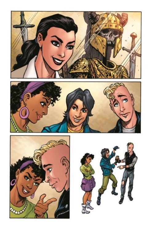
LUDOCRATS #3, available this Wednesday from Image Comics, continues the utterly insane journey full of passion, ill-formed plots, and so much more. These are Aristocrats taken to the farthest extreme imaginable.
***SPOILER WARNING***
Ludocrats #3 continues the vibrant and chaotic tale of aristocrats, the nature of boring (and how forbidden it is in this world), torture, and more. If you’re looking for an absurd series to help you escape from your quiet life, this is the series for you.
I usually don’t bring up the issue description in a review, but this is one of those rare times where it is extremely relevant: “Ludocrats, the comic that makes its whole creative team shout ‘Oh God. What have we done? Why didn’t anyone stop us?’ on a monthly basis.”
That is arguably the best description ever seen and is also hilariously fitting for this insane and unpredictable series. There is no better way to sum up this series other than chaos-fueled entertainment. Seriously, even the credits are unconventional.
That is one heck of an alternate cover for Ludocrats #3.
The Writing
To say that Ludocrats is nothing like Kieron Gillen’s other works would be an understatement. Yet the iconic writing style can still be spotted here and there. While the world itself is fueled by chaos, there is some rhyme and reason to be found in the character designs. Working alongside Gillen is Jim Rossignol, and one can easily spot their influence as well. It makes for a highly entertaining read.
Ludocrats #3 is one of those issues that will make readers chuckle, blink, and stare at it. All at once. It bounces back and forth between pandemonium and humor at a moment’s notice (and that’s if you’re lucky).
Additionally, this is an issue that has earned its mature rating. The opening scenes involve torture that feels more like BDSM than anything else, but at least the comic is clear to define lines there. What’s more comical is that it is a scene that would probably pass over a younger audiences’ head – the same can not be said for what follows.
This issue is probably the most chaotic one yet, which is saying something. It’s actually quite hard to believe that there are only two issues left in this series. More accurately, it’s hard to imagine these characters solving the issue in only two issues.
A peek at what is in store in Ludocrats #4.
The Art
Ludocrats #3 is as vibrant as it is…well…unique. It’s full of dynamic characters, colors, and scenery. It’s the sort of issue that demands your attention when sitting quietly on a shelf, which is about the only quiet thing these characters will ever do.
Jeff Stokely is the lead artist for the series, and you can tell that they had a lot of fun designing the world and characters within. They’re all incredibly unique, while also playing off familiar comic tropes. It makes for a hilarious foundation.
Meanwhile, Tamra Bonvillain provided the colors for this series. Her iconic bright colors shine through the pages, with bold backgrounds, and even more vivid details. All of it comes together to create something, unlike any other series.
Finally, Clayton Cowles has been the letterer for this series, and if you think lettering can’t get quirky, you need to check this series out. While the lettering does help to bring the series back down to earth, it also gets a little odd at times, which is fitting.
Conclusion
Ludocrats #3 perfectly continued this chaotic tale, creating something that has never been seen before. It’s the sort of issue that will make you burst out laughing, or shudder at the implications within. Either way, it’s going to be quite the reading experience.
A striking (and terrifying) cover for Family Tree #7.
FAMILY TREE #7, available this Wednesday from Image Comics, continues the horror-filled family drama. The world is starting to see permanent changes, courtesy of the actions of the lead characters.
***SPOILER WARNING***
Family Tree is a series that merges family drama with horror, something that doesn’t sound like much until you dive into reading it. The horror elements of the series are increased due to the smaller focus – one family.
Yet there’s no denying that the rest of the world is starting to see an impact as well. Whether that makes it more or less horrifying…well, only time will tell. One thing is certain, Family Tree #7 is marching this one family – and the world – closer to the point of no return.
This series was created by Jeff Lemire, Phil Hester, Eric Gapstur, and Ryan Cody, and it is, without a doubt, one of the most unique horror series available today. It’s thrilling and haunting, and it gets under your skin in a way that no other series can.
Josh is little a little bit…different here.
The Writing
Family Tree #7 brings with it the biggest changes in the series thus far. Yet it’s balanced out by some creative storytelling. The issue is set in two points in time—the not-so-far future, where all of the worst changes have occurred. And then there’s the present, where one family is still confused and grieving, in their own way.
Grandpa Judd’s tale felt like it was nearing an end in recent issues, yet now it appears that there is more to this stubborn bear’s tale. As for the rest of his family? Well, it’s clear that their impacts are having a significant effect on that future already mentioned.
It’s fascinating, seeing the two timelines unfold side by side. Already theories are forming, thanks to the small hints here and there. Yet there are so many questions that need answering, and not just about the leading characters.
There’s no doubt that this series is still a horror tale…and yet at times, it almost feels hopeful. Like a horror series bordering on solarpunk themes. Yet another unique combination to throw into this mix.
Even in the future, the fights follow Josh.
The Art
The artwork within Family Tree #7 is gritty and reminiscent of tree bark – a fact that could not possibly be more appropriate. It sets the tone for the series, all while giving off this air of what is to come.
The cover for this issue is probably the most striking of the series thus far. Though in this case, striking carries multiple meanings. There’s something beautiful yet horrifying about this image, which was certainly the intent.
The present and the future are easy to tell apart, thanks partially to the color palette changes that occur (though it is a mild transition). Mostly it’s apparent thanks to the surrounding elements, as some pretty significant changes have occurred between the two.
Wonder what he’s looking for?
Conclusion
Family Tree #7 is another haunting addition to this series, one that raises just as many questions as it answers. The future and the present seem so drastically different, and yet the timing is not as far off as one would think. That only raises more questions – and concerns about what will happen to this family.
While movie audiences await the October arrival of Wonder Woman 1984 in theaters, DC is bringing the world of the movie to comic pages. Here are the details on a special tie-in issue, along with a sneak peek at the art:
DC’s Wonder Woman1984 #1 Comic Book: A Great Companion to the Highly Anticipated Warner Bros. Pictures Feature Film
New 32-Page One-Shot Features Movie Tie-In Story Co-written by Wonder Woman 1984 Associate Producer Anna Obropta
Arriving at Participating U.S. Walmart Stores by Sunday, September 20
Available at Open and Operating Comic Book Stores and Participating Digital Retailers Tuesday, September 29
BURBANK, CA (July 14, 2020) – Fans everywhere are anxiously awaiting Princess Diana’s next great adventure when Warner Bros. Pictures’ Wonder Woman 1984 arrives in theaters on October 2. But before being transported to the “totally radical” days of neon colors, leg warmers, portable cassette recorders, and hanging out at the mall, DC is getting you ready with a special one-shot comic celebrating director Patty Jenkins’s exciting sequel to the smash-hit 2017 Wonder Woman film.
The first story in Wonder Woman 1984 #1 is a direct tie-in to the upcoming movie and is co-written by Wonder Woman 1984 associate producer Anna Obropta and Louise Simonson (“The Death of Superman” story arc, Wonder Woman: Warbringer graphic novel), with art by Bret Blevins. When a failed burglary attempt causes a hostage situation at the Smithsonian Museum of Natural History, Diana Prince is forced to leave her teenage tour group behind so that Wonder Woman can save the day! But will she be able to bring 10 gunmen to justice and get back to her tour group in time?
The second story is a 1980s flashback by writer Steve Pugh (artist, Harley Quinn: Breaking Glass) and artist Marguerite Sauvage. In the ’80s, “greed is good,” especially if you have it all! A reckless mastermind has made the ultimate power move by stealing Wonder Woman’s golden Lasso of Truth, and it’s up to Diana and Steve Trevor to get it back before the worst happens!
Wonder Woman 1984 #1 features a powerful and dynamic cover by another great WonderWoman artist, Nicola Scott. The book arrives at all participating U.S. Walmart retailers by Sunday, September 20 and all open and operating comic book stores and participating digital retailers on Tuesday, September 29.
For more information on Wonder Woman and the World’s Greatest Super Heroes, visit DC’s website at www.dccomics.com and follow on social media @dccomics and @thedcnation.
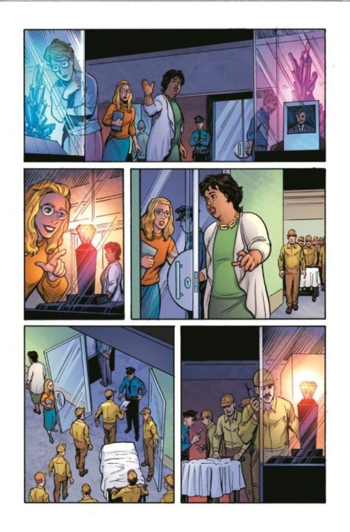
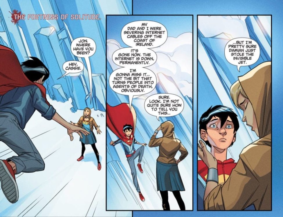
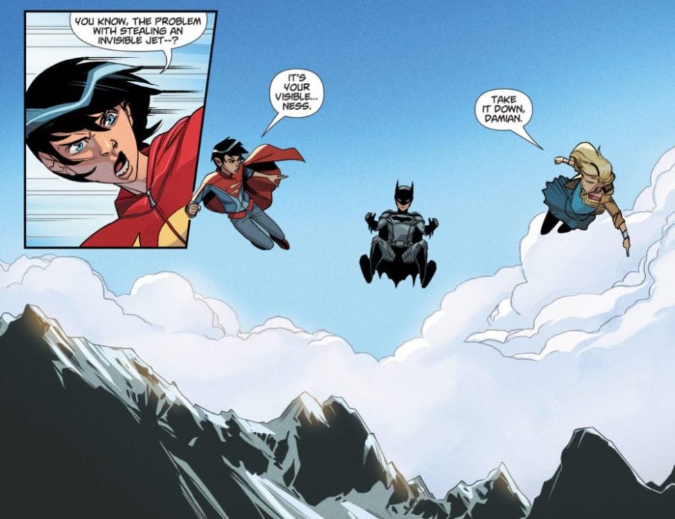
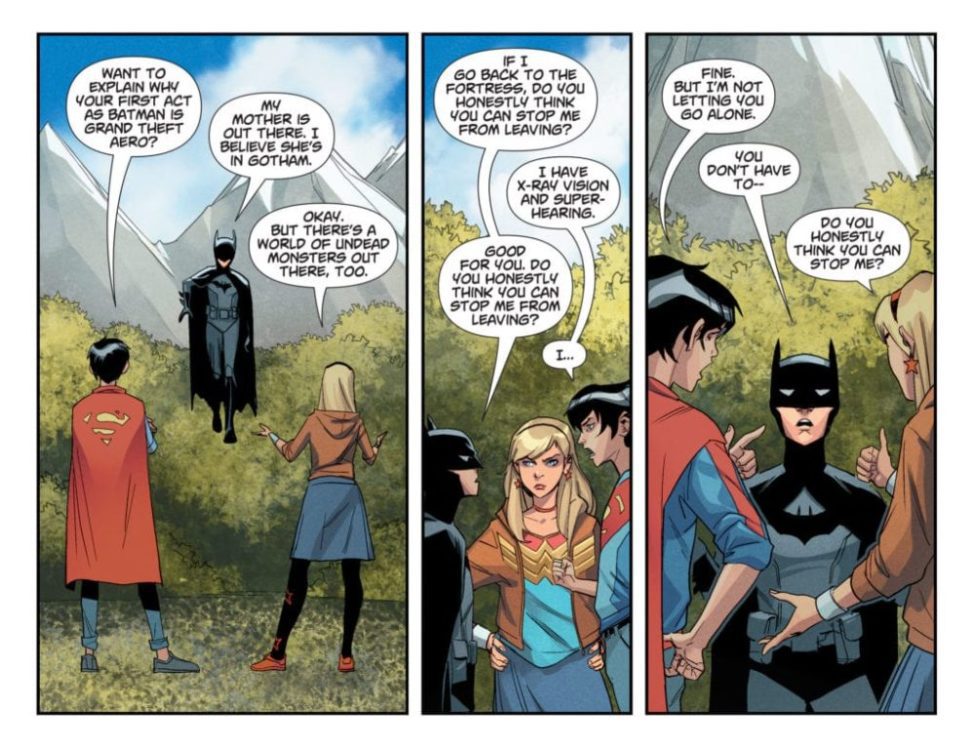
When Cassie Sandsmark, Damian Wayne and Jon Kent suit up and team up, Fallen Gotham is in for a visit by a different kind of Trinity. In DCEASED: HOPE AT WORLD’S END #5, Tom Taylor brings the junior trio together for the first time in the DCeased Universe before the mass exodus to Earth-2. Damian has unfinished business, and his friends are determined not to let him face it alone.
Check out the DC’s press release on this digital-only release and a collection of preview pages below.
Are you enjoying the DCeased storyline so far? What do you think about seeing the Junior Trinity in action? Let us know in the Comments section, and please share this post on social media using the links below.
Good morning! Happy NCBD! This new issue of DCeased: Hope at World’s End is a can’t-miss, hilarious look at young Jon, Damian and Cassie, delivered by the incredible team of Tom Taylor, Marco Failla, Rex Lokus and Saida Temofonte.
The fifth chapter of DCeased: Hope At World’s End has arrived! A new story featuring DCeased: Dead Planet’s Trinity (Cassie Sandsmark, Damian Wayne and Jon Kent), set before the Earth’s surviving population fled to Earth-2, is now available on participating digital platforms, including readdc.com, Comixology, Amazon Kindle, Apple Books, and more!
Damian, Jon, and Cassie take a trip to the deadliest place on Earth—Gotham City! Damian has unfinished business in the fallen city and his best friends aren’t going to leave him to face it alone. A Trinity team-up for the ages!
DCeased: Hope At World’s End Chapter Five by Tom Taylor, Marco Failla and Rex Lokus, lettered by Saida Temofonte, is available now. Chapter Six, “The Siege of Jotunheim,” will publish on Tuesday July 28.
DC’s comics are available on participating digital platforms seven days a week, including readdc.com, Comixology, Amazon Kindle, Apple Books, DC UNIVERSE, and more.
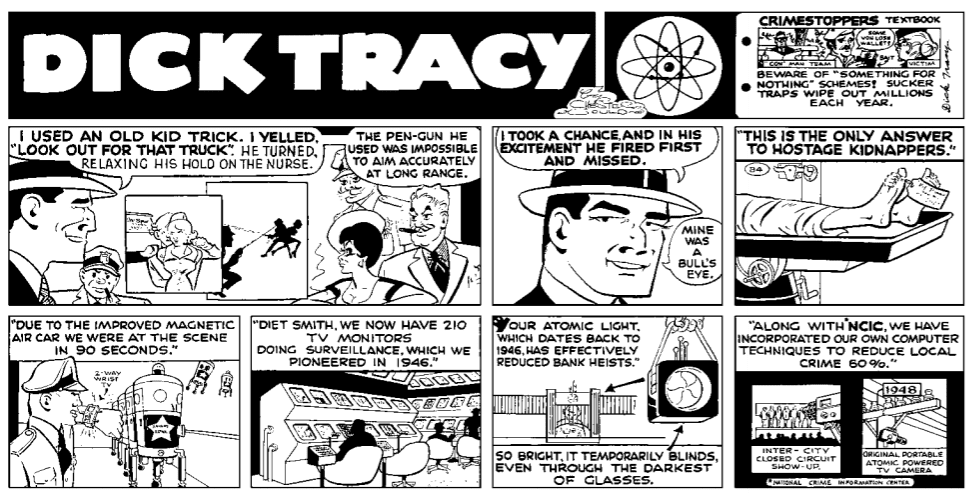
The Complete Chester Gould's Dick Tracy Vol 28 Credit: IDW Publishing
This week sees the latest release of IDW’s continuing reprint of The Complete Chester Gould’s Dick Tracy. This book contains the daily and Sunday strips from mid 1974 to early 1976 and feature a number of new villains and regular cast members.
This is volume 28 of the run and there is only one more book to go until the collection is complete. These have been a beautifully produced range of books and this volume is no different. They all are sturdy hardbacks with a simply designed, yet very effective and fitting, dust jackets. Each has a number of essays relating to the content and the larger Dick Tracy franchise. As a whole they are worthwhile books for any collector or fan of Chester Gould’s detective.
However, with arguably the best years of Gould’s tenure behind him, how do the mid-seventies strips compare with the earlier stories? After four decades of continuous storytelling, is Gould still managing to engage fans in a compelling way?
The Complete Chester Gould’s Dick Tracy Vol 28 Credit: IDW Publishing
Transition To The 1970s
Dick Tracyhad started as a street level crime fighter, convinced to join the police force to avenge the brutal killing of Tess’ father. As the years passed, Gould drew on real life criminals and their well documented behaviours as influences for his own detective stories. Throughout the 1940s and into the 50s the villains were grotesque caricatures of the criminals real newspapers often reported about.
Then the 1960’s happened and Gould’s guiding influences started to change. With a national obsession on space travel and the rise of Science Fiction across multiple mediums, Gould took his firmly rooted detective to the moon. There are as many opinions on this move as there are extras in the comic strip. It’s enough to say that opinion was divided.
In 1969 Apollo 11 landed on the moon and everything changed again for Gould. The images coming back massively contradicted the world that Dick Tracy was living in and Gould brought his hero home, returning him to the streets that had made him famous and popular.
Unfortunately the transition from Space Age Tracy back to his roots came with a number of hang-overs. The Moon Valley characters were slowly moved to the background but a large amount of the future tech hung around. Dick Tracy had always been ahead of the curve when it came to technology, take the famous two-way wrist radio as an example, but some of the creations were just a step too far. The comic strip was best as a grounded, crime fighting action story and some of the technical gadgetry simply got in the way. This is illustrated perfectly in IDW’s recent Dick Tracy: Forever mini series where the final issue, set in the future, is the weakest of the run.
The Complete Chester Gould’s Dick Tracy Vol 28 Credit: IDW Publishing
Opening Ups and Downs
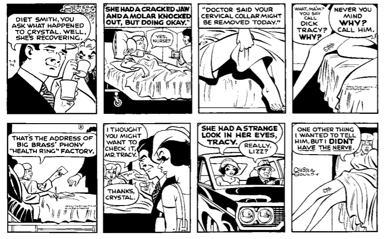
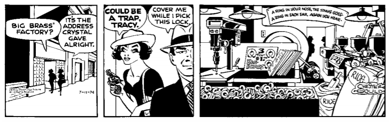
Volume 28 boasts on it’s cover two exciting new villains: Brains and Lipsy. The former, and his story, perfectly sums up this era for Gould, containing as it does, the best and worst of his work.
On the one hand you have a wonderful introduction to the villain as a backstory in another adventure. As Gould wraps up one story with the matter-of-factly named Mr and Mrs Fencer, he slips the mobster Bolton Gilz, aka The Brain, into the mix. Fencer was stealing from the mob and Brain wanted him out of the way. The murder attempts bring the mob into Tracy’s line of fire and as one villain is dispatched the detective’s focus shifts. This is a prime example of Gould’s talent for running one story seamlessly into another. This is one of those elements that make the earlier strips so addictive: it’s often difficult to find a good place to stop.
With Fencer and Brain the transition is a clever one but the characters aren’t as interchangeable. The Brain proves to be a lacklustre follow up to the often funny and ultimately tragic Fencer. The ineffectual crook is torn apart by the death of his wife and destruction of his home. Gould shows how this pushes him over the edge into a fit of despair. Unfortunately the lack of sympathy that Gould then shows the character, although in keeping with the hard-line policing, does not play out as well today. The goading of the cities inhabitants, encouraging Fencer to commit suicide is unnerving to read especially as the way it is written gives the impression that this is also Gould’s view.
Also within this opening story there are a number of inconsistencies in the art and the narrative. Plots holes become apparent when binge reading the strips as presented in the collection. These plot holes may have been easier to overlook reading them day to day. Unfortunately the same cannot be said about the artwork where Gould’s attention to detail isn’t as finely tuned as it once was. There are some strips that aren’t pretty, especially with his depiction of women.
On the flip side, there are some outstanding strips within the story. The destruction of Fencers house is a tragic scene and when Mrs Fencer’s body is found in a tree, it is reminiscent of those earlier years where Gould excelled in the horrific and grotesque.
The Complete Chester Gould’s Dick Tracy Vol 28 Credit: IDW Publishing
Frustrations And Violence
The Brain’s tale turns quickly into a straight forward track and chase story that many of Tracy’s adventures follow. It has its highs and lows but lacks the characters that other stories contain. The henchmen and Brain’s girlfriend Toots don’t amount to much more than nondescript extra’s there to fill space. Even Brain doesn’t really come far out of his shell with no explanation about his unique hat and nickname; he isn’t after all particularly clever.
The character moments in this story, and the ones that follow, come mostly from Tracy’s supporting cast. Characters like Liz and Groovy get some magnificent sub-plots with near death experiences and broken relationships.
What is more apparent in these strips is Gould’s own voice coming through, effecting the stories and the characters. Tracy becomes a mouthpiece for Gould’s own beliefs and frustrations towards society at large. In one scene Tracy steps on his soap box to express anger at the parole system. While looking directly at the reader Tracy exclaims:
“Are parole boards like this, motivated by sociological stupidity, bribery, or just an inferiority complex that puts them on a level with the murderer?”
Gould doesn’t even try to hide outbursts like this and they are clearly his views expressed through his art. There is even a short story in this volume that addresses the violence that the police force uses; the outcome isn’t favourable to those in society complaining. The Tracy of the 70s has no time for bureaucracy and almost revels in the violence. With the current state of the world, these Tracy strips are particularly jarring. There is plenty of great artwork and engaging narratives in this volume, however the delight of police violence and the glee at criminals suffering is a much harder pill to swallow.
Chester Gould pokes fun at himself. Credit: IDW Publishing
Endings In Sight
After 40 plus years of non stop scripting anyone could be forgiven a few missteps along the way. As this 28th volume of Dick Tracy’s adventures unfolds it is packed with new crimes, such as Obscene Phone Calls, old family dramas, drug runners, and an expected amount of violence. The social commentary is more blatant and can be off putting in places, especially if you disagree with Gould’s politics.
It is also hard to avoid the character’s turn to religion and prayer in times of need. Liz prays at the bedside of Groovy when he is fighting for his life and there is even a scene where Tracy leads a group prayer before completing a test to prove the innocence or guilt of Vera, Sparkle’s husband. This religious aspect will delight or grate depending on your personal beliefs, although the obviousness within the scenes makes them difficult to avoid.
By this stage in the collection, most readers will be used to the ups and downs of Gould’s writing and art. There are more noticeable errors in this collection than earlier volumes but not to the detriment of the whole. There is enough great work on these 300 pages to please any fan, although not the best starting point for someone trying to get into the Tracy-verse.
The usual collection of essays are as exciting and informative as ever. At this point those elements are the highlight of the books, giving the readers something new and insightful to read. With only one more volume to go in the series, Dick Tracy fans will want to get as much mileage out of this one as possible because all too soon there will be no more to look forward to.
NIGHTWING #72, available in comic book stores Tuesday, July 14th, adds more fuel to the chaotic fire that is Dick Grayson’s life. Our hero is still sorting the conflicting memories in his head, leading to bouts of frustration. But when he starts acting unusually happy and carefree, it’ll be up to Batgirl to investigate.
Story
Our story opens with Dick’s friend and love interest, Bea, wandering alone in a park. Curiously, the young woman is seen marking the Bat-Signal in the grass with fire. Barbara Gordon, a.k.a. Batgirl, meets with her in her civilian guise, only to learn of Dick’s unusual behavior. So, she sets out to bring in the lost Bat-Family member.
Deep down, Barbara still sees Dick as family, new identity and all. And Bea seems to be comfortable accepting his past life. But when the former confronts Dick, a third person comes into the picture: Punchline, the Joker’s new partner. And she reveals that the former Nightwing has been brainwashed into joining their side.
Dan Jurgens’s narrative continues to up the ante in Dick’s ever-changing life. The characterization of both Bea and Barbara shows how each one is fully committed to preserving their unique relationship with him.
Artwork
Ronan Cliquet’s penciling and ink work, Nick Filardi’s coloring, and Andworld Designs’s lettering provided readers with well-crafted illustrations. The panels depict the characters’ action through the use of sharply penciled lines, generating a sense of movement. This is combined with flashes of bright color amidst the dark backdrops to further highlight Dick, Barbara, and Punchline. We also found that the lettering bubbles followed the trail of action so as to further frame the scenes.
Conclusion
Overall, NIGHTWING #72 drives the memory loss narrative an unexpected yet intriguing direction. We’re anxious to see if Barbara can break through to Dick before he’s lost forever.
Do you think Dick will ever sort of his scrambled memories? Let us know in the comments below.
In DC Comics’ Dark Nights: Death Metal #2 (on sale July 14,) the hits keep coming, as writer Scott Snyder continues to spin a suspenseful tale that’s full of surprises. A few shocking returns and unexpected twists in the story leave the reader anxiously awaiting the next chapter, and it’s becoming clear that, at the end of the day, Death Metal maybe even better than its predecessor.
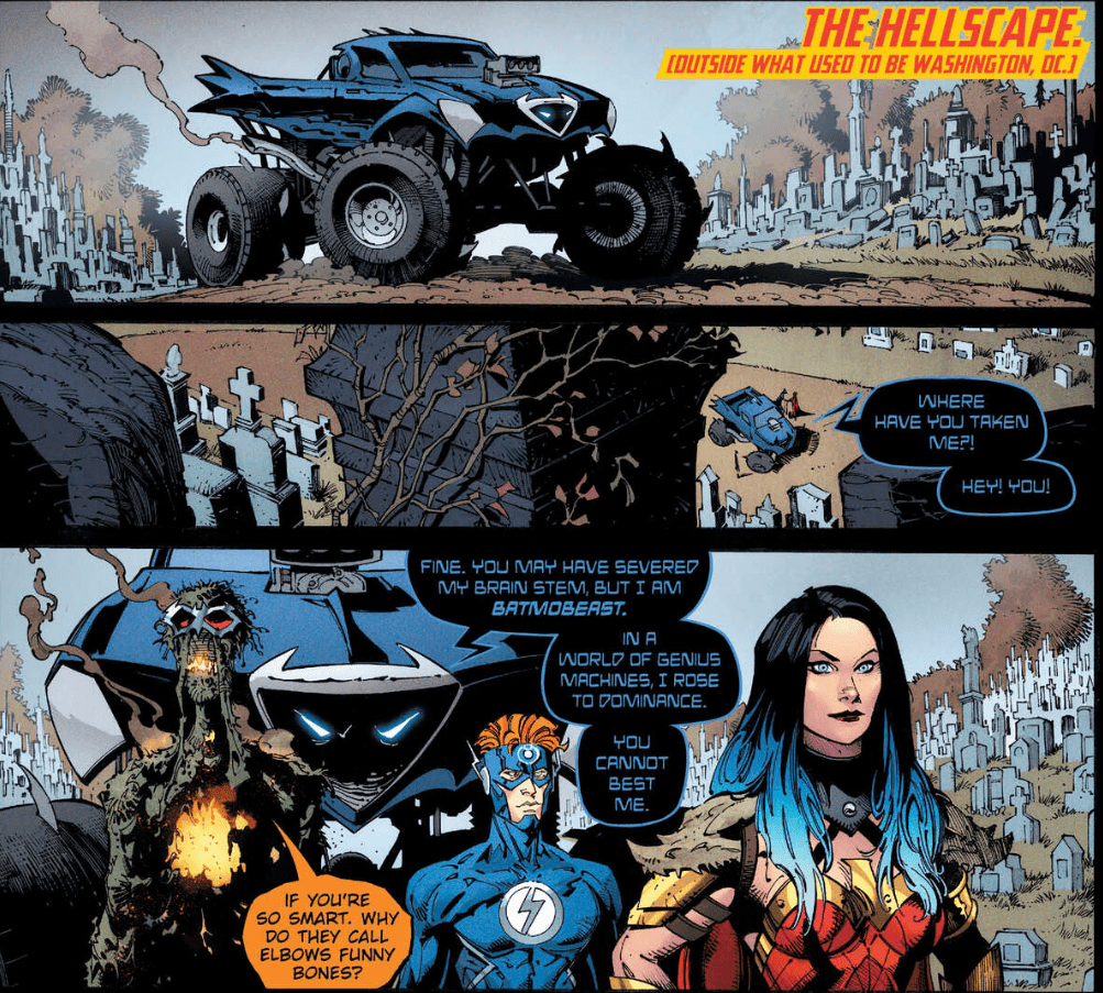
Dark Nights Death Metal #2 Story: Scott Snyder & Greg Capullo Inks: Jonathan Glapion Colors: FCO Plascencia Letters: Tom Napolitano
It seems like we’ll never get to know more about the Batom, who is quickly killed off.
As always, Scott Snyder’s bat-centric innovations are one of the best parts of the Metal series. Here, we see the Batom (a dark take on DC’s famous diminutive hero,) and he’s brutally killed on page one. The rapid death lines up with Snyder’s consistent “Anything can happen” tone. Fittingly, the Batom’s death comes at the hands of another Snyder original: the Batmobeast. This vehicle is a sentient monster truck that’s stolen by the good guys. Though the Batom’s death can be considered a somewhat gratuitous case of vehicular manslaughter, the art team still uses it to showcase their subtle storytelling. Capullo zooms in on the image of a wheel crushing the Batom, and he leaves little to the imagination. We see a close-up burst of blood, which is accompanied by a “squirlp” sound effect. (Credit to letter Tom Napolitano for capturing exactly how you’d imagine the Batom getting run over would sound like.) In the next panel, Capullo shows the dark hero’s bloody, squashed body. Inker Jonathan Glapion and color artist FCO Plascencia maximize the blunt violence, and this sequence is just one of several examples where the art team is in harmony with the story on the page.
Snyder’s Justice League isn’t a traditional lineup, but this group needs to save the multiverse.
In addition to the Batom and the Batmobeast, a few fun newcomers are sprinkled throughout the issue, but Snyder and Capullo save the best for last. On the final page, they reveal another wonderfully wacky creation that smoothly calls back to Dark Nights: Metal. The two events remain closely linked together, which feels like a recognition of Metalverse fans’ loyalty.
The success of most epic events boils down to the characterization of the heroes we know and love. Batmobeasts and Snyder’s other unpredictable creations are fun and they easily hook the reader’s interest. But the heart of these stories can be found in the interactions between the protagonists. In that regard, Snyder hits a bullseye in the second installment of Death Metal. He juxtaposes Wonder Woman’s stubborn hope with Batman’s dejected defeatism. One enlightening exchange features the Dark Knight’s explanation as to why he’s more pessimistic than ever. He reminds everyone how, in Dark Nights: Metal, he made the same mistakes Diana is approaching, and we all know how that turned out.
Snyder amps up the emotional weight of this contrast when Diana tries to remind Batman what his symbol stands for. When she says bats taking flight is a metaphor for the human spirit reaching for the impossible, Batman shuts her down. “I need to stay here…on the ground this time,” Batman says. The Caped Crusader’s bullheadedness almost drives the friends farther apart. Capullo conveys this distance by showing Diana turning her back on Bruce, whose face is obscured by shadows. For a moment, it seems like the remnants of the Justice League will be unable to compromise. Thankfully, they come together and realize that they need each other to have any chance of winning this doomsday scenario.
As with most major events, it’s so tempting to dig into the eye-opening reveals that leave us on the edge of our seats. For the sake of spoilers, we won’t discuss them right now, but it’s fair to say that Snyder continues to bring in every corner of the DCU in unconventional ways. As a result, he practically has something to offer for every fan. From a creepy resurrection that’s right out of “Frankenstein” to a tear-jerking reunion, Snyder is firing on all cylinders.
In the first installment of Death Metal, Snyder hit the ground running with some amazing twists and turns. Death Metal #2 is a successful follow-up, as it offers a few several new wrinkles to the mystery and gives us even more memorable moments to sink our teeth into while we wait for the next issue.
What’d you think of Death Metal #2? Check out your local comic store to see if you can pick it up there, or consider buying it online.
There’s a beautiful rhythm to DC Comics’ Strange Adventures. Like watching a tennis match, the issues play off of one another. Writer Tom King, artists Mitch Gerads and Evan “Doc” Shaner, and letterer Clayton Cowles focus back in on Adam Strange in this issue. Again, this issue of Strange Adventures tells two stories. Stories that work off of one another to paint a disturbing image of how Adam sees himself, while commenting on who he actually is. And it’s not long before we’re all wondering, what the hell are Alanna and Adam hiding?
Adam Strange: Savior / Alanna Strange: Proud Wife
Writing
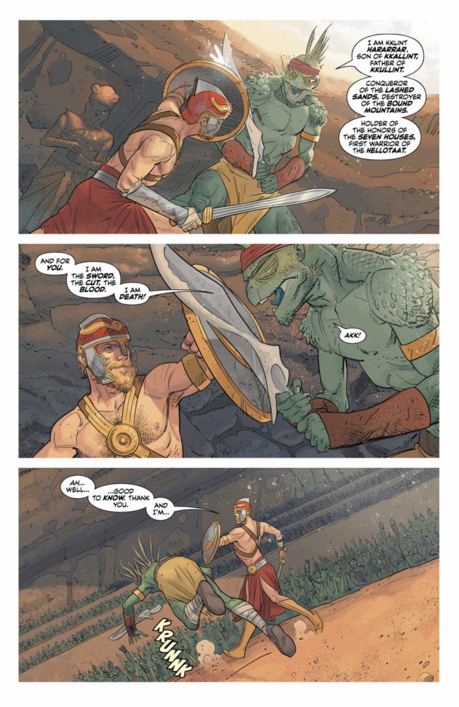
When describing the events of Adam’s autobiography, Strange Adventures, King is speaking in Adam’s voice. The things Adam says or does are things he wrote down and edited, for release to the general public. It doesn’t take that much skepticism to think of these moments as airbrushed and deceptive. What’s interesting in this chapter, though, is how much we see Adam was willing to reveal about his time on Rann in the pages of Strange Adventures. In a ceremonial fight before the Hellotaat, a group of aliens brushed off as “other” and therefore lacking true human qualities, Adam becomes nearly deranged as he kills his adversary.
Alanna seems completely unmoved by the whole thing. She had faith that Adam would be the winner. It never occurred to her he would lose. And so, as Adam stands over his bloody rival, Alanna’s next line is nonchalant. “Ah. The ceremony is done.” It feels as though this is a proud moment in this couple’s history. Alanna’s unwavering nature. But the tendrils of truth are beginning to sneak their way into the cracks of this story. We are beginning to see the sheer power of two people who simply think they’re the heroes, and therefore, whoever should oppose them must be in the wrong.
Art
Shaner’s art is always so crisp and clean. It’s in the Gerads panels that we see distortions and blurs, until now. With every issue, the impression these artists are making on each other is becoming clearer and clearer. Not only are they pushing each other to new heights, but they’re adopting each others’ storytelling techniques. And so, as Adam succumbs to a poisoned blade, the blurred outline of his approaching enemy seems very un-Shaner. But it works as a method of showing the hints of reality in Adam’s Strange Adventures autobiography.
Similarly, as Adam brings his helmet down on his enemy’s neck, over and over, his face is wild. It’s not the smiling, adventurer we’ve seen in the last two issues. He’s not clean. He’s not even clean-shaven. Instead, he has crazy hair and a wild beard. His eyes look animalistic. And as Shaner zooms closer in on Adam’s face, we lose the outline of his face. The details are obscured in lines over the page and the overlapping lines of his features. This only serves to further underline Alanna’s indifference. We see her in the next panel and she looks calm. We can barely tell if her eyes are open, her face looks so relaxed and unmoved. The juxtaposition is haunting.
Coloring
Shaner dirties his colors in this issue. What once was a world of purely solid colors has become speckled with dirt. Even before Adam throws down with the Hellotaat warrior, the air is filled with specks of dust. The light catches them in the darkness and give the room a sense of physicality. As the issue progresses, these “corruptions” of the color palette continue. Adam’s helmet gets its paint chipped; we see the grey metal beneath the red. But Adam paints the helmet again, giving it a new coat of red. The red of his enemy’s blood as he holds his helmet over his head and is himself engulfed in the murderous rage of red on the page. It’s all a clear stylistic shift in Shaner’s work, and it’s a beautiful physical representation of the progression of the plot.
Lettering
Cowles’ lettering in this section is not as simple as it may seem. The first sound effect Cowles gives us is in small but fat block letters with a black outline. It’s the sound of Adam tripping his opponent. When his opponent swings back at him, the sound of the sword has no outline to its lettering. It makes the sound feel both smaller and more dangerous. It’s this small, almost innocuous noise that begins the evolution. Soon Adam is screaming in large red lettering, which breaks past the bounds of his word balloon. As the scene progresses, sound effects lose their black outline. When the outline is present it’s cracked, like the sounds are refusing to be contained. It all ends in the large white lettering of Adam screaming. Lettering that refuses to even be contained by the page.
Adam Strange: Coward / Alanna Strange: Lady Macbeth
Writing
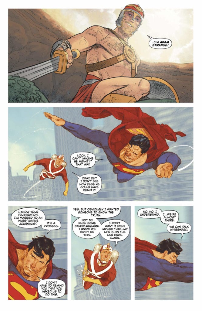
King sure knows how to make you doubt everything he’s told you. As Terrific begins his investigation, we see the immediate panic in Adam and Alanna. Panic that is so based in reassuring themselves, and even fighting back, it’s clear they’re harboring a secret together. In the last issue, we learned that Terrific is convinced that Strange’s daughter never died. Whatever else that is all tied to can’t be good. Adam immediately jumps to legal action. Should he sue the Justice League to get them off his back? Through this King opens up a brilliant grey area: can the Justice League even be sued? And while Adam certainly seems guilty of something, is it not still wrong that the JL could be above the law?
There’s something gorgeous that follows. An interview Adam and Alanna give on TV about the investigation. Adam stumbles over his defense, but soon he shuts up. King gives Alanna all the lines. She comes to her husband’s aid; she protects him as a proud wife. As we see Alanna watching the interview later that night (or an alternate version of Alanna watching it live?? It does say “live” in the corner of the screen, after all… It might just be a recording she’s watching, but let me first say here that she might by a Pykkt clone.) she puffs on a cigarette and simply says, “Boom.” Her support suddenly feels calculated and cold. The whole thing suddenly feels wrong.
Art
Gerads art also takes some pages out of Shaner’s book, just as Shaner borrowed from Gerads. Some scenes feel strangely simple for a Mitch Gerads panel. Hawkman’s mace has a clearer outline. Superman and Adam Strange fly through the air, looking a little less fuzzy than is typical of Gerads. It gives us the feeling that these are the elements of the story that just make sense. They’re simple. And so, the gospel of Gerads begins to become the gospel of Shaner. Where once Shaner was saying “nothing to see here!” he is now sprinkling in red flags. And Gerads’ panels, chock full of worry and woe, are now full of clean smiles and clear action sequences.
In the world of acting, actors are often told to “play against a scene.” If it’s a sad scene, hold back the tears, if it’s an angry scene, try and keep your shit together. Holding back, or even pushing firmly into denial, elicits a stronger response from viewers. If you cry, you cry so the viewer doesn’t have to. If you don’t, then they may cry on your behalf. Gerads is doing this here. Pushing into “everything is Hunky Dory” so strongly, that we’re becoming more and more convinced of the opposite. Alanna and Adam’s brave faces, their big smiles, feel like masks over a sea of worry. Even their framing as they sit on their bed. With Alanna in the foreground looking much bigger and more confident, Gerads communicates who wears the pants in the relationship brilliantly. And it’s the very fact that they’re so desperately trying to hide all their angst makes us truly scared of what’s really going on.
Coloring
While there is certainly an element of clarity in these pages, solid colors in Superman and Adam’s suits and the like, Gerads’ doesn’t sacrifice all of his style in this narrative shift. We still get the variance in textures and color that make his pages pop so vividly. But some of the most splendid examples are the shift from one to the other. Superman’s flight with Adam is colored rather simply. The tone is very bright. But they fly around the corner of a building and are suddenly head to head with a giant alien spaceship. Red covers the top half of the page; distortions radiate out along with the alien tentacles.
It’s this shift that gives that moment weight. For Superman and Adam Strange, this is just a Saturday. Life is normal, the end of the world on the horizon is nothing they’re not used to. The bottom half of the page maintains the color scheme of the previous page. Superman and Adam won’t let this alien baddie spoil their bright and pleasant day. And in the final scene, Gerads swerves in the opposite direction. As Alanna gets out of the pool after a late-night swim, the page is colored in beautiful blues and greens. It’s menacing and spooky, while beautiful at the same time. It gives her all the class and allure of a Bond villain. The brightly lit news channel that recounts this late-night swim and chat makes it feel as though her sinister plans are making it out into the everyday world.
Lettering
As has so far been the case, Cowles goes out of his way to stay incredibly restrained in the Gerads scenes. The opportunities for sound effects are endless. Adam Strange wears a jetpack for Pete’s sake. But there are no whooshing noises. Hawkman even smashes a robot in the face, and no “boom” or “wham” accompanies the art. Similarly Cowles does the same with emphasizing words in dialogue. Very few words are bolded, especially when compared to the dialogue in the Shaner scenes. All of this is to focus readers on the deeply important things. Only the most important words are bolded, one or two for every few pages. We have to know what it sounds like when Alanna says Terrific’s name. And the only sound effect that shows up is the snapping of a camera. Cowles needs us to know Batman was caught talking with Alanna late at night. And so he makes sure he only puts the one sound effect in. It’s small, but it carries incredible weight.
Strange Adventures has an immense range from the swashbuckling adventures of faraway planets to the cut-throat politics of book tours. This creative team is working with each other, but also against each other, to produce some of the most breathtaking work to hit DC Comics. Pick up Strange Adventures #3 from DC Comics on July 14th!
In anticipation of Ubisoft Montreal’s next Assassin’s Creed game, Assassin’s Creed Valhalla, Dark Horse Comics will be releasing a prequel comics series entitled Assassin’s Creed Valhalla: Song of Glory. The three issue series will be available in shops on October 21, 2020, prior to the game’s expected release some time in December.
Written by Cavan Scott and drawn by Martin Tunica, Song Of Glory follows a 9th-Century Viking as she contends with the fallout of a raid on a nearby village. You can read all about it in the full press release below.
Are you looking forward to the new Assassin’s Creed game? Does this prequel comic add to the anticipation? Let us know what you think in the Comments section, and please share this post on social media using the links below.
MILWAUKIE, Ore., (July 13, 2020)—Blades clash in this prequel to Ubisoft’s next hit video game, Assassin’s Creed Valhalla. Written by Cavan Scott (Star Wars Adventures, Vikings), illustrated by Martin Tunica, and colored by Michael Atiyeh (The Orville, Dragon Age: Blue Wraith), Assassin’s Creed Valhalla: Song of Glory takes readers back to a Mid-9thCentury Norway.
Eivor, a Viking warrior, observes a village raided by a neighboring kingdom. Bloodshed and mayhem erupt as she seizes the attack in her own favor—but will her victory be a blessing to her clan or a terrible curse? Elsewhere, another Viking searches for a different kind of prize, one of crucible steel . . .
Assassin’s Creed Valhalla: Song of Glory #1 (of three) will be in comic shops on October 21, 2020. It is available for pre-order at your local comic shop.
Be sure to check out The Art of Assassin’s Creed Valhalla and The Art of Assassin’s Creed Valhalla Deluxe Edition, which will be hitting shelves later this year timed with the release of the game. The books are available for pre-order on Amazon, Barnes & Noble, TFAW, and at your local comic shop.
Just like any medium there are a number of elements that make up a comic. Some are essential; some relate only to the comics medium; some are artist extravagance. Elements fall in and out of favour and others are more suited to a particular genre.
When the modern American comic first became popular there was an element that most readers would recognise: The Caption Box. The Caption was most often used to provide the narration for the story, a voice-over or, on occasion, an inner monologue. Pick up any genre of comic in the 1940’s and 50’s and the Caption would have been readily used. Everything from pulp fictions, through horror and romance titles, and on into the superhero comic, Captions were a mainstay of comic book storytelling.
These days the Caption is less widely used and its purpose changes depending on the genre of comic. More weight is given to the art on a page that the need for a narrator has diminished greatly. You only need to look at the modern Superhero comic to see how Captions have changed. Once they were descriptive, telling the reader what was happening. These days they are mostly inner thoughts or emotional reactions of a character.
The use of Captions depends on a number of factors, including but not limited to, genre, storytelling, artistic style. Over the last 100 years the reliance on Captions has diminished. To truly appreciate this you have to understand the uses in the first place, and recognise the differences between narrative and emotive scripting.
Blade Runner Adaptation Credit: Marvel Comics
Blade Runner
Before I start to look at the use of the Caption within the Blade Runner comic I am going to define their purposes with the help of the movie. Or to be more precise, the movie’s original theatrical release.
After Ridley Scott delivered the movie to the studio, a poor test audience reaction resulted in the inclusion of a post production voice-over recorded by the star, Harrison Ford. The following two scenes are of significance and, in a way, illustrate the points I am going to make later on.
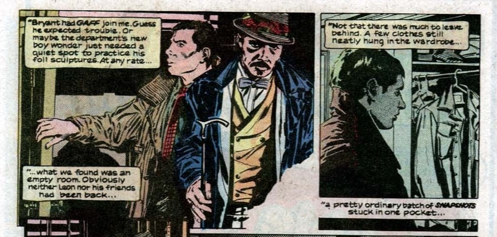
The first scene involves Deckard hunting down the Replicant Leon. He is travelling in his squad car, listening to an interview where the killer reveals his home address. Cut scene to Deckard and Gaff entering a hotel room. The voice-over states:
“I didn’t know whether Leon gave Holden a legit address. But it was the only lead I had, so I checked it out.”
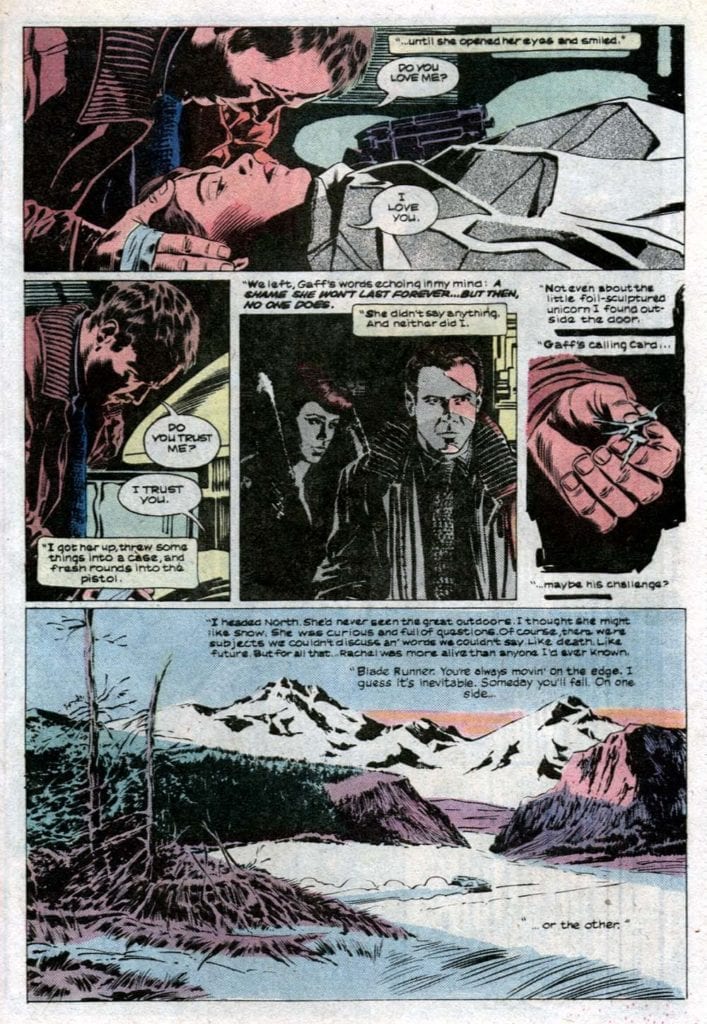
The next scene I want to look at is at the very end of the movie. Deckard and Rachel have left his apartment to run away together, away from the city and away from the Blade Runners. As Deckard heads towards the elevator he discovers a small origami unicorn on the floor. Picking it up he remembers the words Gaff, who has been making origami creatures throughout the film, spoke to him in the previous scene, ‘It’s too bad she won’t live’. As Deckard and Rachel drive away into the idyllic countryside the voice-over informs the viewers:
“Gaff had been there, and let her live. Four years, he figured. He was wrong. Tyrell had told me Rachel was special: no termination date.”
The voice-over for both of these scenes does essentially the same thing and is unnecessary in both cases. In scene one Deckard is telling the audience what is currently happening, they are entering Leon’s home, but this was already established at the end of the previous scene. In fact the previous scene exists as a transition into the hotel investigation. In the second scene Deckard is informing us what has just happened, confirming that Gaff left the unicorn after having been at the apartment. Again this is unnecessary because the act of picking the origami unicorn up, mixed with the flashback of Gaff’s voice, gives the audience all of the information they need to work out what happened.
Both instances, and in fact the majority of the voice-overs in the film, serve no purpose other than to explain what is going on in the visual element of the movie. There is no stylistic or narrative enhancements provided by Ford’s halfhearted tones and pointless words. They belittle the visual storytelling and assume the audience doesn’t understand what they are seeing. It’s inclusion in the film illustrates a poor misunderstanding of the target audience and in the end makes the final product less than what it is.
And that leads us into the use of Captions with a Comic Book
Blade Runner Adaptation Credit: Marvel Comics
Comic/Movie Comparison
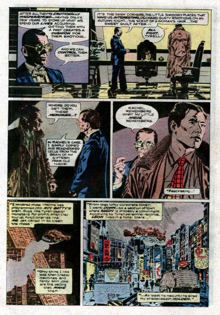
In the 1982 MarvelComic adaptation of the movie, written by Archie Goodwin and pencilled by Al Williamson and Carlos Garzon, the two scenes mentioned above are quite different. The comic itself contains considerably more voice-over and this primarily takes the form of Captions, filling the pages. Every detail of Deckard’s thought process is brought out via his inner monologue, displayed in the caption boxes.
In the first scene example, the monologue in the comic leads the reader across the bottom of the page, relaying the information that Deckard has received in order to find Leon. It acts partially like the computer recording in the movie version but also expresses the differences between the rich, powerful Tyrell Corporation and the destitute living conditions of the poor workers. The images in the panels do not reflect the rich/poor divide as clearly as they could, instead focusing on the cinematic visuals from Scott’s movie vision. However, the panels don’t need to carry this weight because the narration does.
After the page turn, the voice-over continues but instead of just telling the reader what is happening, as in the movie version, it gives us more detail. It includes character development, with it’s mention of Gaff, and sets a more detailed scene. It expands on the images that the panels portray to create a fuller experience.
The Captions have more of a narrative function than the voice-over in the film. You just need to look at the final page of the comic to see this. Deckard’s final words are an expansion of his character and how far he has travelled through the story. His relationship with Rachel and his outlook on life itself has been affected and this comes out through his thoughts. It goes way beyond explaining what the audience is looking at or what it means. In fact, it only hints at and insinuates what happened at the end, outside Deckard’s apartment.
This ending displays another purpose of Captions: a reflection of style. Blade Runner is seen as a neo- noir movie and links are made to classic pulp fiction films and novels of the 1940/50’s. However, the film, especially in it’s Directors cut version, leans more towards a science fiction thriller rather than a detective mystery. Although the elements of a Raymond Chandler novel are there, this isn’t a Philip Marlowe hard-boiled adventure. The comic, however, leans much further into this kind of narrative. It sets a tone more in line with a classic private eye tale, creating claustrophobic inner city scenes of deprivation and hopelessness. J F Sebastian’s apartment feels much smaller in the comic compared to the vast floor space depicted in the film. Even the interior of the Tyrell Corporation is scaled down to produce more intimate confrontations.
In short, Deckard’s inner monologue, lettered beautifully throughout by Ed King, fits with the stylistic visual choices made by the artists. The aesthetics, the pace, and ultimately the narrative, is more akin to a Chandler or Hammett novel. The movie is a visual treat but the comic really works the narrative gears.
Blade Runner Adaptation Credit: Marvel Comics
Narrative Versus Style
Within the pages of the Blade Runner comic adaptation, Captions are used to tell the story and enhance the themes and style of the overall comic. Everything you need to know about the use of Captions in comics can be found in these pages, especially when compared to the movie version. There are elements of narrative progression, atmospheric setting, and stylistic interpretation. This 1984 comic bridges the gap between the more functional use of Captions in the 1940s and 50s and the stylistic approach of modern comics.
An array of comics have used Captions for different purposes but ultimately they come down to one of two main functions: Style and Narrative. They either set the mood for the reader or help to move the narrative forward. Genres such as Crime and Suspense are more inclined towards the use of Captions but the technique is still widely used, albeit with a different intent to those early American comics published by the likes of EC Comics.