On September 2, Marvel Comics releases Wolverine #5. Brought to you by writer Benjamin Percy, artist Viktor Bogdanovic, color artist Matthew Wilson, and letterer VC’s Cory Petit, issue #5 sees Logan team up with a group of renegade vampire youth to protect a small town and the vampire nation’s plans become more clear!
In this issue, Wolverine finds himself captured, drained of blood, and subsequently rescued as he pursues two vampires making their way through isolated Canadian towns, turning their populations into vampires and releasing them in larger cities. Whether or not Percy’s choice of making that city Minneapolis has any particular significance given current events, who’s to say.
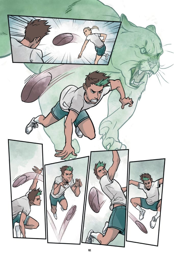
Wolverine #5 is a high octane issue, and the art team gives the readers several really great shots of Wolverine, claws out and ready to let loose on some vampires.
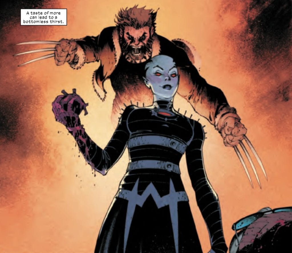
Above is a gorgeous shot, everything from the design of the vampire with the blood running down her arm to Wolverine emerging out of the background orange and browns.
Wolverine #5 is a decently bloody issue, and while the art team doesn’t shy away from blood, given the subject matter, it’s never over the top, but always fits with the tone of the story. Wilson’s colors help to convey the horror themes well, and his colors are always darkened and grainy in contrast to the brighter, smoother colors of a book like Excalibur.
Wolverine as a character lends himself to a lot of action and not a lot of talking, and in an age when word balloons sometimes crowd the page a little too much, Petit’s letters complement the story well as a supplement to the action in the book. One particular section of the issue sees Wolverine battling the vampires while Petit provides the narration of Logan’s inner dialogue. It’s a profound bit of internal dialogue as Wolverine considers the temptations of immortality that vampires and mutants now share, and how just like a vampire, a bottomless pit of desire or thirst for more can destroy a mutant’s character.
A lot of Wolverine fans will appreciate this issue because even though Wolverine starts at a disadvantage, by the end, readers see him “be the best at what he does.” However, after the page listing the upcoming X-titles, Wolverine is walking through the woods before being transported by a rainbow. Given the lettering of the person’s voice and the use of the rainbow, one gets the impression that this is the Bifrost transporting Wolverine to Asgard. More than likely, it is probably related to the upcoming X of Swords event. Readers will have to wait to find out.
What did you think of Wolverine #5? Tell us in the comments below!
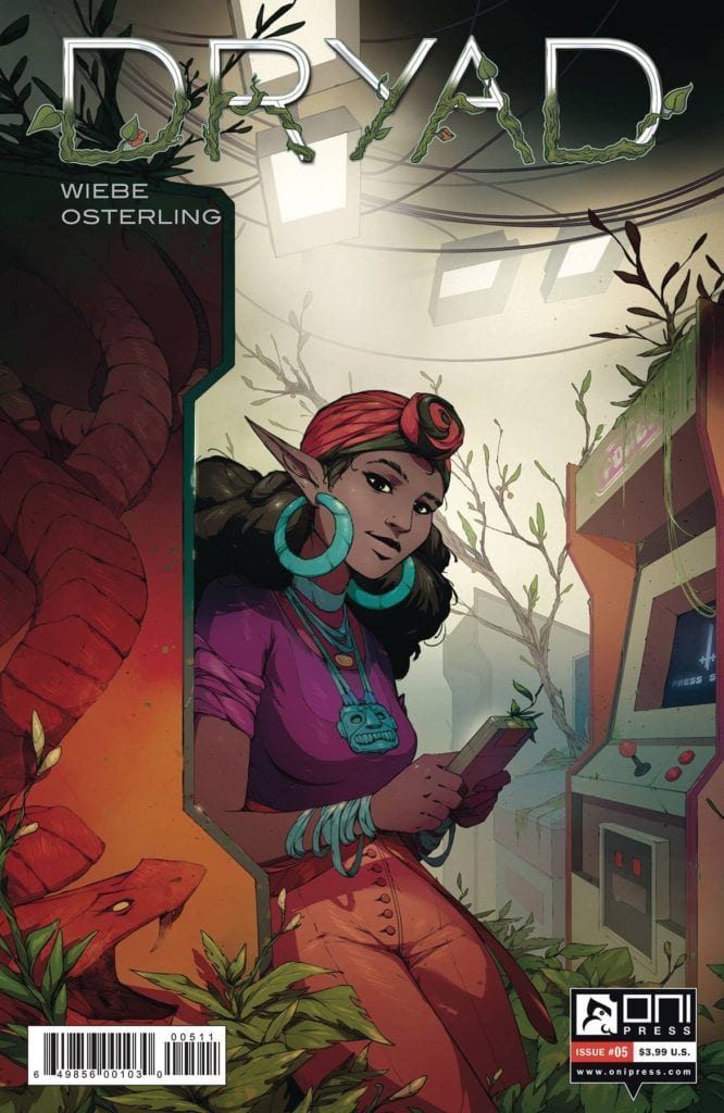
DRYAD #5, available September 23rd from Oni Press, continues the tale of one family and just how out of place their story has become. Theirs is a story full of fantasy and science fiction elements, creating a new adventure for all.
***SPOILER WARNING***
While it’s true that every family has secrets, it’s worth arguing that the Glass family has taken it too far. They fled from a world of technology and magic, only to raise two children in a small town without any of the advancements they’ve come to expect.
Now they’re back in that world of magic and tech and are entirely unprepared to handle it – and all of the threats heading their way. That would be the downside of keeping secrets, especially ones as big as this.
Dryad #5 throws the Glass family back into the thick of it, with one ally down for the count, and the other in need of rescuing. Just how often is this pattern going to repeat itself?
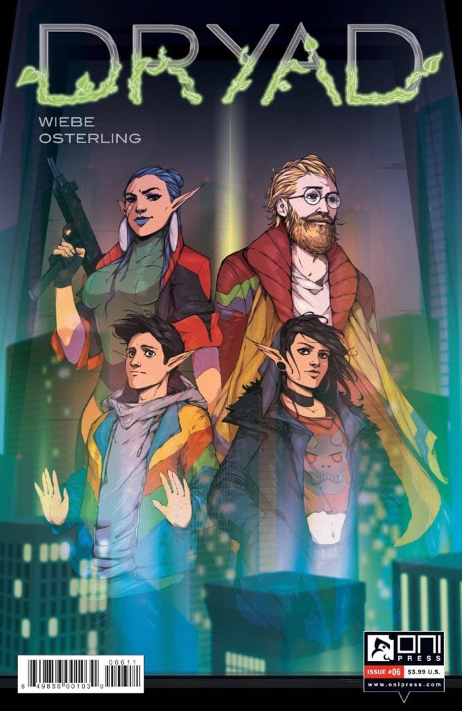
A new character is on the horizon in Dryad #5.
The Writing
Dryad #5 doesn’t hesitate to throw readers (and characters) into this new world full of technology and danger. It’s nothing like the calm and backward life they had been living, and there’s still so much to learn.
Kurtis Wiebe is behind the writing for this issue, as well as the entire series. This world is dark and enticing, with brilliant moments strewn about. It’s also a world that is growing increasingly complex with each passing moment.
This is an issue that raises just as many (if not more) questions as it answers. The balance is a fine one, ensuring that we’re all still invested in what is happening. All while leaving little rewards in the form of some answers.
The complexity, combined with the family drama, science fiction, and fantasy elements, has evolved into something new. This story does read as something completely other. Something foreign. All of these individual elements may be things we’re familiar with, but what makes them unique is the way they’re applied here.
The Art
The artwork inside Dryad #5 is just as bold and eye-catching as the plot itself. Every detail of this world begs for attention, pulling the readers further into a world full of technology and magic. It’s a world that simultaneously feels foreboding and dark while leaving room for light and hope—something the artwork does a beautiful job of portraying.
Justin Osterling provided the framework for this issue, along with the rest of Dryad thus far. The newly introduced characters almost steal the show, thanks to their unique designs (and the way they fashioned the world around them). However, the combat sequences are a close second, naturally.
The colors were created by Francesco Segala, who had a lot of fun, from the looks of things. The colors are bold and bright. Imagine all of the bright tones known to science fiction series, those dramatic blues and whites. Now imagine a fantasy, with the bold yellows and reds. This is a series that merges both, turning them into a buffet of colors and themes.
Jim Campbell did the lettering, and it’s the final touch this issue needed. There’s a certain level of finesse here, countering the brightness portrayed everywhere else. Even so, there are plenty of details to spot throughout the pages as the plot moves onward.
Conclusion
Dryad #5 continues this unique blend of genres, carrying the plot forward to unexpected levels. The characters are quickly finding that the situation is even more complicated than imagined, with the readers finding out alongside them. It’s going to be challenging to predict what happens next.
Beast Boy's origin story is about to be unveiled in Teen Titans: Beast Boy.
TEEN TITANS: BEAST BOY, available now from DC Comics, continues DC’s latest run of young adult series. Once again, we’re diving back into the world of Teen Titans, this time to focus on arguably the most charismatic character of the bunch. Beast Boy.
Origin stories can be exhausting, I know. That being said, this latest run of origin stories has been memorable for a variety of reasons. The younger take on the characters, for one. Secondly, this series has been more accommodating for a varied (and younger) audience. It changes things, making the world feel refreshing and new.
That goes doubly so for Teen Titans: Beast Boy. The book is already looking to be the best origin of the bunch, leaving fans (and a certain reviewer) eager to see what is going to happen next in this story. It should probably go without saying that this whole adventure is perfect for fans of this unique character.
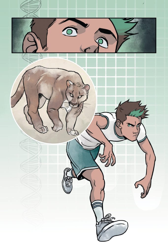
Using those animal traits in Teen Titans: Beast Boy!
The Writing
Teen Titans: Beast Boy is not the origin story you might expect. It’s better. Think of all the fun that Beast Boy (aka Garfield Logan) has regularly. Now spin that fun into the story of how he became a hero. Suddenly it’s sound a bit more exciting.
Written by Kami Garcia, there’s no room for doubt about who Garfield is. Even without his iconic green hue, he’s still the Beast Boy we all know and love. Just at a point before he knew of or gained his powers.
This series also did something truly remarkable; it highlights Beast Boy’s insecurities. Garfield is a teenager who was extremely uncomfortable in the way he looked, and it showed. That’s going to forge such a strong connection for many readers, providing a potent reminder that Beast Boy is a person first and a hero second.
More than that, this series shows him working through those insecurities and trying to push onward. It’s empowering to see, even if he sometimes makes mistakes or the wrong choices in the process.
The secondary characters are another vital element in this origin. They bring in more diversity, backgrounds, and reasons to love everything about Garfield and the world he lives in. It’s all of these details that flesh out that world and make it such an enjoyable (and approachable) read.
Playing fiercely and making the best use of his natural talents in Teen Titans: Beast Boy.
The Art
The artwork inside Teen Titans: Beast Boy is phenomenal. Look at the cover, and you’re going to have a firm idea of what is in store. Every little detail and element in this series screams Beast Boy, from the design down to the colors, and everything in between.
Gabriel Picolo and Rob Haynes were the lead artists, bringing the plot to life. That means they were responsible for portraying all of Garfield’s shenanigans, of which there were many. These felt fun and light, yet even visually they were tinged with the threat of what could go wrong.
The artwork also brought out all of those nuances in Beast Boy’s behavior. The way he looked at himself in the mirror, the way he’d try to stand taller around the cool kids, and even the way he interacted with friends, family, and animals. All of these details went towards establishing his character and showing us his potential.
David Calderon is the one responsible for the colors, and they are divine. The steady infusion of green throughout the pages brought the whole tone home while providing a thematic feel to it all. Couple with little details, like the green eyes and hair, and there’s no avoiding who this kid is. The colors also brought about some of the best backgrounds I’ve seen in a while. Even the credit pages are worth an extra look, thanks to the watercolor effects they portray.
Last, but certainly not least, there’s Gabriela Downie, who was in charge of lettering. The lettering was the perfect embodiment of Beast Boy and in more than one way. It felt playful and full of hope, even while dealing with the worst that the plot arc had to offer.
Freeing all the cute bunnies in Teen Titans: Beast Boy.
Conclusion
Teen Titans: Beast Boy is the origin story that fans, old and new, deserve. It took a charming character and provided insight into his backstory, all while making the tale feel fresh and new. All while giving younger readers a chance to identify with his struggles. In short, this tale is peak Beast Boy.
On August 25, DC Comics released Legion of Superheroes #8. The issue is written by Brian Michael Bendis, who is joined by colorist Jordie Bellaire, letterer Dave Sharpe, and so so many artists, including Evan “Doc” Shaner, Jeff Lemire, Jöelle Jones, Liam Sharp, and Alex Maleev, among others, each doing one page per artist.
Legion of Superheroes #8 was billed as an artist extravaganza, and as indicated above, contains the work of a number of notable DC artists.
That’s fine enough, but it falls a little flat due to the unexceptional nature of the story. There are some flashbacks to previous Legion auditions, the Legion defeats the king of Rimbor, some drama happens with Mon-El and Cosmic Boy (separately), and then President Brande puts the Legion on trial.
Extraordinary revelations include the fact that Mon-El is a descendant of Jon Kent, which longtime Legion fans may balk at given that it erases the Daxamites from Mon-El’s history. However, perhaps Bendis will address this in the future.
While the story itself is a bit lackluster, the artists bring their A-game to this issue. Some stand out pages includes Dustin Nguyen’s, with his Dream Girl sequence, Darick Robertson’s Timber Wolf page, and Michael Allred’s Ferro Lad, each of whom is joined by Bellaire on colors.
Nguyen’s page showing Dream Girl’s Legion audition is gorgeous because of the golden glow given to Dream Girl and the effects added to the page when she shows the Legion how she sees them. At the same time, the Timber Wolf sequence is quintessential Robertson, which has about as much blood and viscera as you’d expect him to add into a Legion story. While Allred’s style is a bit cartoony, longtime Legion fans will enjoy seeing Ferro Lad take center stage.
Of course, the lettering in Legion continues to be gorgeous, making this Legion book look truly alien and genuinely futuristic.
While the writing in this issue falls somewhere between “by the numbers” and “a bit all over the place,” each artist creates a very unique looking page. It would’ve just been nice if the issue had a more noteworthy story.
What did you think of the Legion of Superheroes #8? Tell us in the comments below!
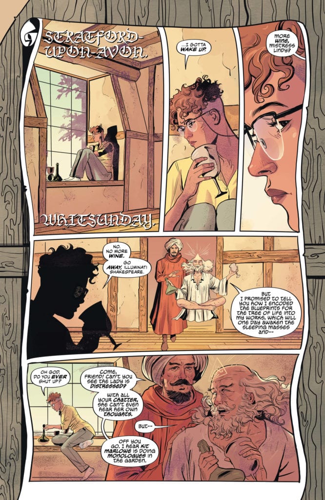
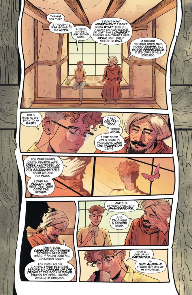
Writer G. Willow Wilson and artist Nick Robles, along with colorist Mat Lopes and letterer Simon Bowland, bring us the second chapter of their wildly ambitious Sandman Universe tale in “The Dreaming: The Waking Hours” #2. This issue takes more time to introduce the backstory of our new nightmare, Ruin, while still introducing fascinating new characters – as well as reacquainting readers with old ones. With a fun and mysterious script, incredible artwork, and some pleasant treats for classic Sandman fans, “The Waking Hours” impresses yet again.
“New mother Lindy is trapped in the Dreaming, and the lovestruck nightmare Ruin is loose in the real world. Dream must put this situation right—but to do so, he’ll have to travel into the Black Chest where he keeps his most dangerous nightmares…and pull the answers right from the mouth of the unimaginable Endless Teeth!”
Writing & Plot
The focused mixture of naturalistic dialogue writing and mysterious literary intrigue crafted by a line of Sandmanand The Dreaming writers holds strong with G. Willow Wilson’s script on “The Waking Hours” #2. This issue serves as a bridge between the opening chapter‘s setup and where these characters’ goals and conflicts are headed. While this kind of chapter could easily end up just placidly treading water, Wilson instead continues to cleverly shape her characters and add welcome new elements to the plot that all feel earned. Where Lindy was the main focus in the first issue, here we get more of Ruin’s backstory as a lovestruck experiment of Dream’s creation. From here we’re also introduced to an interesting new friend whose family tree is sure to make classic Sandman fans smile with intrigue. The presentation of where the story needs to head is always fleshed out by intelligent and emotional character writing, and its just the stylistic touch I was hoping for when Wilson jumped on this book. The focus of The Dreaming has always been separate from Sandman in the fact that this series is really about the beings living in the Dreaming, and how humans interact with it. Dream’s inclusion in the story is more a reaction to what is happening in his domain. This fact makes his scenes have that much more gravity, especially since he is trying to contain whatever situation Ruin has created. Wilson chooses a more simplistic and natural approach to writing that focuses less on narrative than Spurrier’s or even Gaiman’s work did, but this doesn’t harm the integrity of the Sandman Universe’s style. This is just as intricate and smart as any Sandman story thus far, and is proving to be a riveting addition to the lore of this universe.
Art Direction
The long legacy of unique visual work in the Sandman Universe is being continued in “The Waking Hours” by the gorgeous work of Nick Robles’s pencils and Mat Lopes’s colors. As I said in the review for the prior issue, Robles’s work bears a striking similarity to Bilquis Evely’s art in the previous Dreaming comic. However, this again is no complaint. Robles once again proves to be a tour-de-force of visual talent, as his details in character design, setpiece design, and panel direction are all incredible to perceive. Robles’s characters are flush with vivid life and unique design. I mean, how can a person draw Shakespeare over a dozen times and every one of them look both similar yet totally different? There’s an incredible amount of care that goes into Robles’s character detail, and much of this is due to how he frames and focuses on characters from a direction standpoint. Robles constantly pans and refixes his focuses on the cast to catch their every moment of reaction and emotion. His panel layouts are certainly more standard than Evely’s, but this is largely due to his, and the comic’s as a whole, focus on character over the larger plot. Adding dimension and complexity to Robles’s pencils is the colorwork of Mat Lopes, who also colored Evely’s pencils on the prior Dreaming series. I spent pretty much every review of that comic praising Lopes’s work, and I’m here to do the same. The insane versatility and variety in the color palette here is mind-blowing, offering every bit of dimension, beauty, wonder, and horror that Robles’s pencils and this comic as a whole demands. Finally, Simon Bowland returns to offer his dynamic lettering to another Sandman series. Bowland’s multi-dimensional letters offer texture and character to the motley cast of nightmares, angels, and graduate students that populate this fantasy. Every bit of the visual direction in this comic is absolutely superb.
“The Dreaming: The Waking Hours” #2 is a fun second chapter that digs into Ruin’s backstory, sets up the trajectory of the overall story, and offers a pleasant surprise or two for long time Sandman fans. G. Willow Wilson’s script is sharp, emotionally driven and full of engaging characters and their interactions. The art of Nick Robles and Mat Lopes is a vibrant mix of unique character design, scenes of fantasy and horror, and a vast array of panel direction and color. If you were impressed with the first issue, whether a fan of Sandman or not, be sure to pick up this second issue when it releases on 9/1!
Beast Boy's origin story is about to be unveiled in Teen Titans: Beast Boy.
Writer Kami Garcia continues her varied run of work for DC, going from Black Label material like Joker/Harley to YA fare like her Teen Titans graphic novels. Here’s the press release and a book trailer for Beast Boy:
DC REVEALS TEEN TITANS: BEAST BOY OFFICIAL BOOK TRAILER
New Young Adult Graphic Novel from New York Times Bestselling Creative Team Kami Garcia and Gabriel Picolo Hits Stores Everywhere Books are Sold Today
To celebrate the release of Teen Titans: Beast Boy, DC revealed today the official book trailer of the highly anticipated young adult (YA) graphic novel from Kami Garcia and Gabriel Picolo.
Teen Titans: Beast Boy is the sequel to Garcia and Picolo’s smash hit Teen Titans: Raven graphic novel and follows 17-year-old Gar Logan as he takes on a dangerous set of dares in an attempt to get in with the popular crowd and win over the girl of his dreams. But when he starts going through an unexpected transformation, Gar discovers the savage truth about himself and who his real friends are. Teen Titans: Beast Boy is a journey of self-discovery and acceptance, while reminding us the value of true friendship–especially when life gets wild.
Fans picking up Teen Titans: Beast Boy will also be treated to a sneak preview of the recently announced Teen Titans: Beast Boy Loves Raven that will be featured in the back of the book. Teen Titans: Beast Boy Loves Raven will be the third installment in Garcia and Picolo’s Teen Titans graphic novel series and is available to pre-order now.
Garcia and Picolo are set to talk more about Raven, Beast Boy and what’s next for their series in a special one-on-one conversation at DC FanDome: Explore the Multiverse on September 12.
Below is more information about Teen Titans: Beast Boy. The YA graphic novel is now available to purchase everywhere books are sold.
Teen Titans: Beast Boy
Written by Kami Garcia
Illustrated by Gabriel Picolo
On sale now
MSRP: $16.99
Author Kami Garcia (Beautiful Creatures) and artist Gabriel Picolo, the creative duo behind the New York Times, USA Today, and Publishers Weekly bestseller Teen Titans: Raven, take you on a journey of self-discovery and acceptance, while reminding us of the value of true friendship–especially when life gets wild.
Garfield Logan has spent his entire life being overlooked. Even in a small town like Eden, Georgia, the seventeen-year-old with green streaks in his hair can’t find a way to stand out—and the clock is ticking. Senior year is almost over. If Gar doesn’t find a way to impress the social elite at Bull Creek High School, he will never know what it’s like to matter. Gar’s best friends, Stella and Tank, can’t understand why he cares what other people think, and they miss their funny, pizza-loving, video game-obsessed best friend. Then Gar accepts a wild dare out of the blue. It impresses the popular kids, and his social status soars. But other things are changing, too. Gar grows six inches overnight. His voice drops, and suddenly, he’s stronger and faster. He’s finally getting everything he wanted, but his newfound popularity comes at a price. Gar has to work harder to impress his new friends. The dares keep getting bigger, and the stakes keep getting higher.
When Gar realizes the extent of his physical changes, he has to dig deep and face the truth about himself—and the people who truly matter—before his life spirals out of control.
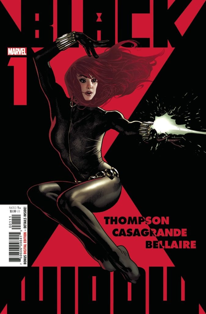
She's back in action on the cover of Black Widow #1.
BLACK WIDOW #1, available Wednesday from Marvel Comics, brings Natasha Romanoff back to her own series, with several twists along the way. For when the Black Widow is involved, there is no such thing as an ordinary day.
***SPOILER WARNING***
Black Widow has long been famous (or infamous, depending on how you choose to look at it) in the Marvel Universe. She’s gone through so much in her time, both on the page and on the big screen.
Now she has a new series, alongside a new creative team. Kelly Thompson (writer), Elena Casagrande (art), Jordie Bellaire (colors), and VC’s Cory Petit (letters) have joined forces to bring this latest adventure to life.
Marvel has been marketing Black Widow #1 as groundbreaking, a series that is about to change everything. Just one issue in, and those changes are going to be immediately clear to any reader out there – both old and new.
Good to know that this series is planning on keeping every promise made.
She’s back in action on the cover of Black Widow #1.
The Writing
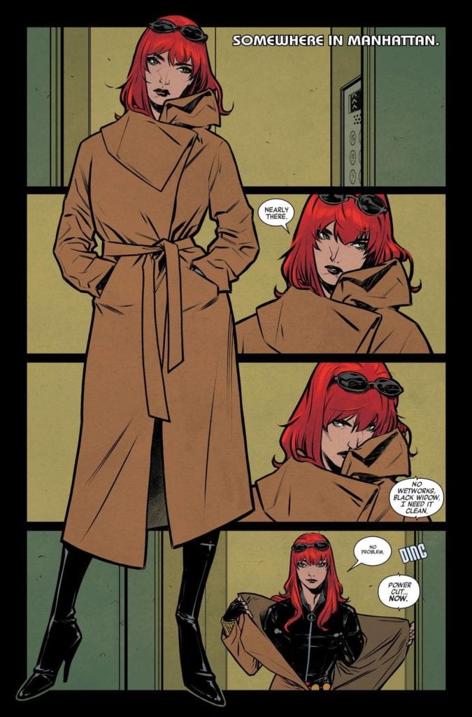
Black Widow #1 gets to have a fun start, and is full of action and intrigue – in the typical Black Widow way. Yet even then, there are already hints of the changes in Natasha’s life. Is it a case of foreshadowing, or simply clever writing?
This is already proving to be a series that doesn’t deny Black Widow her complex past. Given that Thompson is at the helm, that’s not all that shocking. She has a way of gently weaving in major plot arcs, turning them into reminders. All with a simple phrase or two.
Don’t worry, even though the series is taking her past into consideration, it is still written in a welcoming manner. If you’ve been wanting to read a Black Widow series, but haven’t had a chance until now, it is still the perfect time to do so.
The smaller details are where this issue really starts to shine. Those references mentioned above, the little comments Natasha or her allies throw around. It all merges together into one cohesive story, while still leaving plenty of room to be filled in – it is a tale of intrigue, one with a major gap that has to be explained.
It’s amazing how quickly the scenes and events change over the course of just a single issue. Then again, this is Black Widow we’re talking about, the master of adaptation. All of the changing events suit her character quite nicely, while setting the scene for something much larger – and likely significantly more dangerous.
A new mission in Black Widow #1
The Art
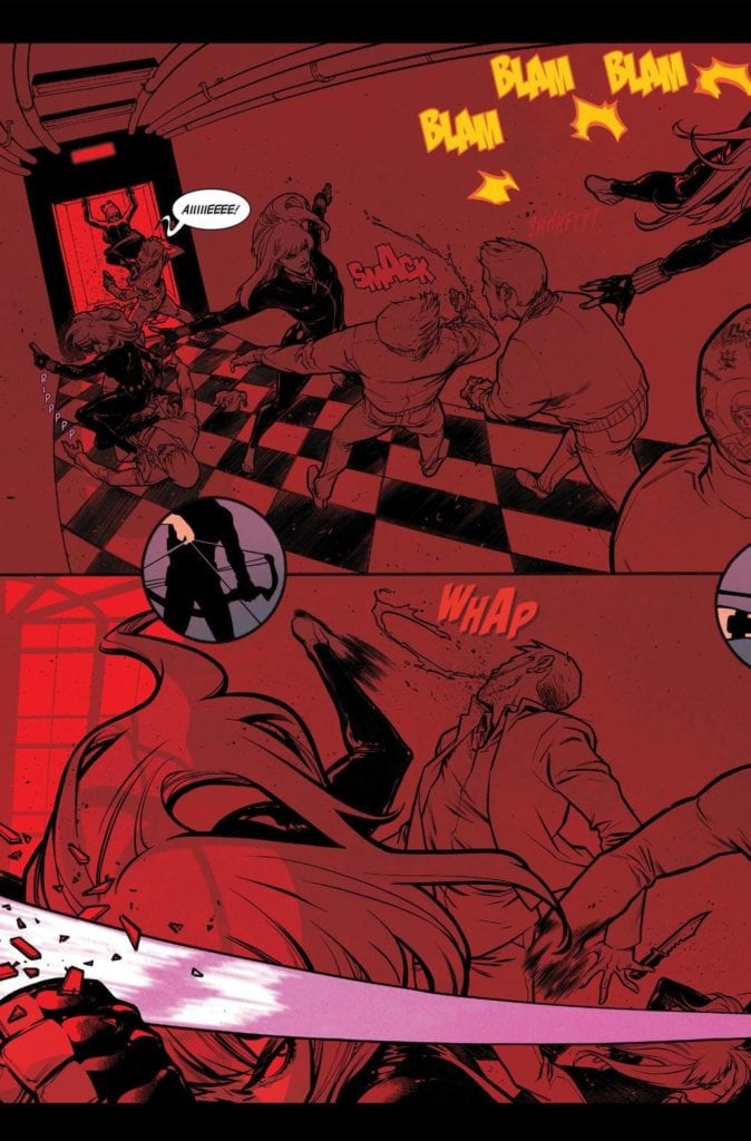
Any series that involves Black Widow is basically guaranteed to be bold and dynamic. It goes with the character. So it’s no surprise to hear that the images within Black Widow #1 are fierce, brilliant, and memorable.
The iconic black and red have made their way onto the cover, and that seeps into the pages as well. Mostly in any scene that is particularly full of action. It makes for a stark contrast to the rest of the artwork.
Yet that contrast is perfect for Natasha. This is a woman who puts on many faces and guises, and the color palette suits those changes. As does the core art style, for that matter. The art allows for Natasha to be strong and confident, while leaving room for vulnerability and surprise – when called for.
It’s a poignant reminder of the human underneath the mantle. Considering everything that is happening in this plot, that reminder has never been so vital. Now it’s just a matter of waiting to see where it’s going to lead us.
It’s not just Black Widow who is allowed to be herself on these pages, but many of her allies as well. Ironically, it’s the lettering that allows the quirky personality of Clint Barton (Hawkeye) to stand out. Yet that also feels so perfectly on point.
Diving right into the action in Black Widow #1 .
Conclusion
Black Widow #1 is a tense and clever start to Nat’s latest chapter. This is a woman who has gone through hell and back, and clearly her story is far from over. It’s going to be fascinating to see how this latest twist plays out – and how everyone else reacts to what is happening as well.
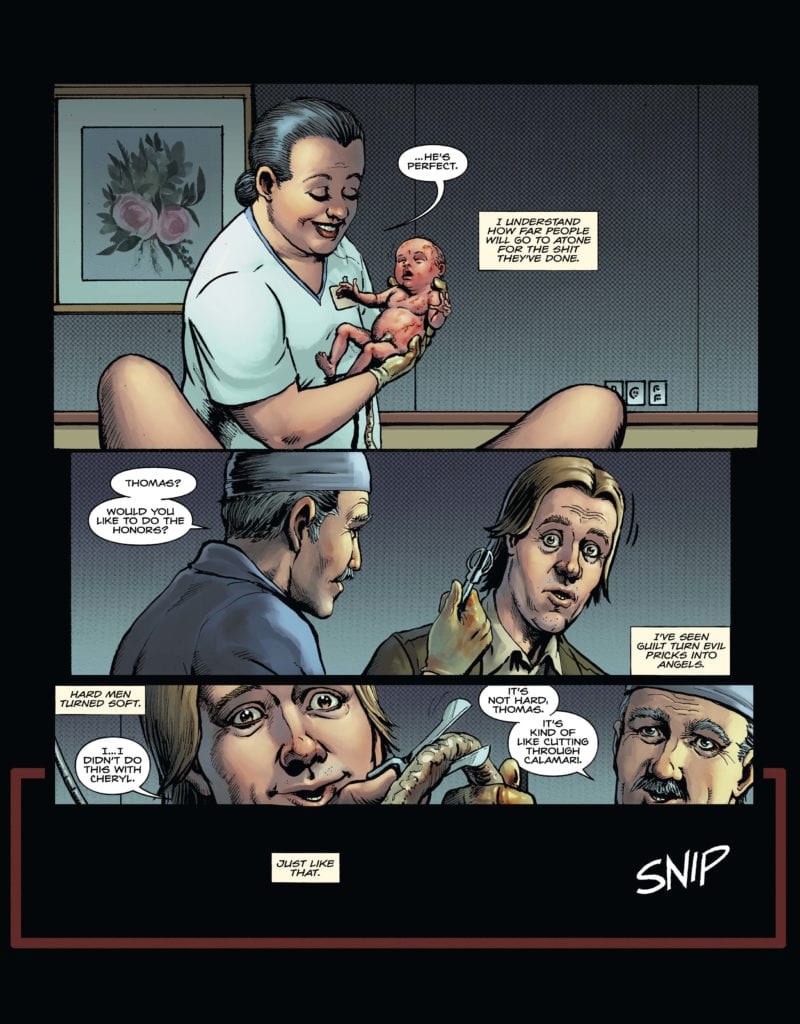
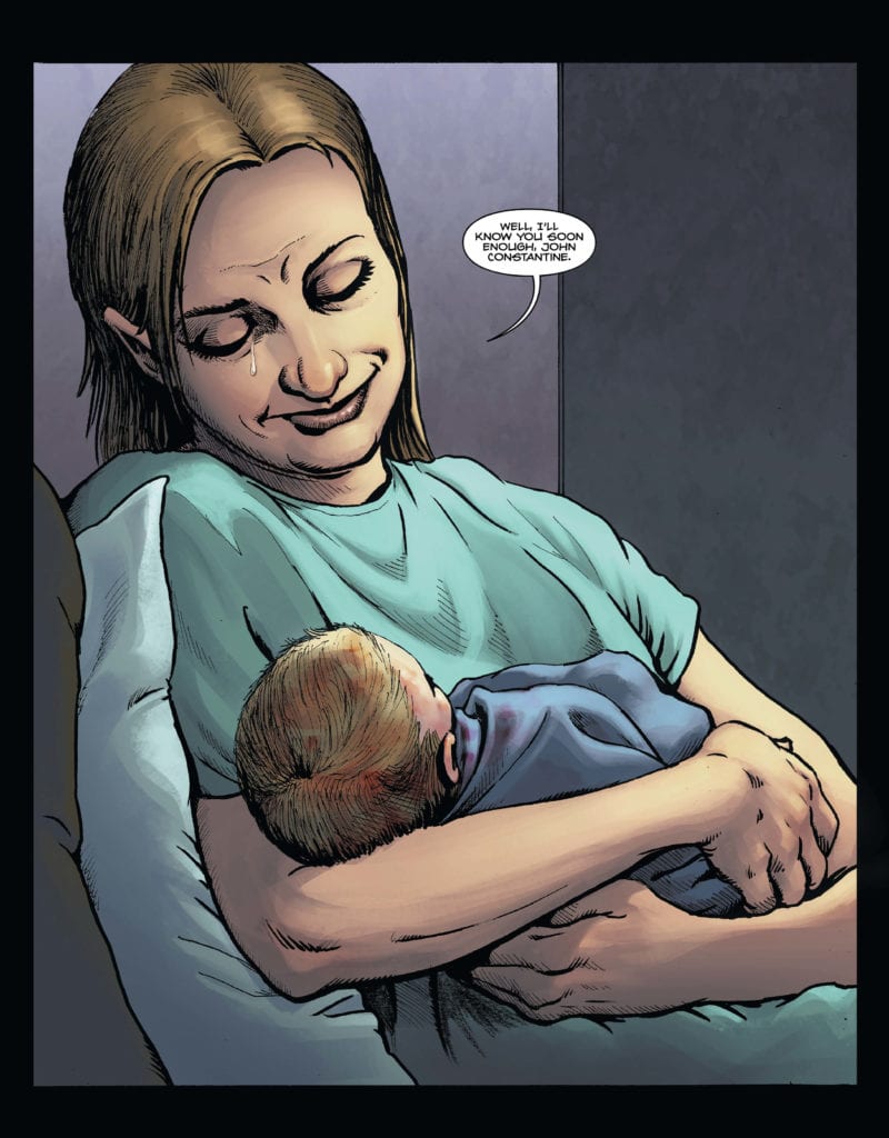
Don’t read DC Comics’ Hellblazer: Rise and Fall #1 right before bed. It’s the casually terrifying story we’ve always wanted from a John Constantine title. Writer Tom Taylor, artist Darick Robertson, colorist Diego Rodriguez, and letterer Deron Bennett show us John Constantine in his element: haunted by his past and dodging angry demons. With this first issue, this creative team promises a big, violent and spooky ride.
Writing
Taylor makes sure we know the kind of person Constantine is, right off the bat. When we learn about Constantine’s past, we see it’s full of tragedy. But Constantine narrates it with a casual, unfeeling tone. Taylor doesn’t actually focus on Constantine though. He allows Aisha Bukhari, a childhood friend of Constantine’s, to play our protagonist. This is brilliant, because it allows Constantine to maintain his sense of mystery. Following Aisha, we feel almost haunted by John, like he and his problems could pop up around any corner. And sure enough, they do. Taylor puts us in a normal person’s shoes, so that we have someone whose horror we can relate to when shit hits the fan.
Art
Robertson has the perfect gritty feel for a Hellblazer comic. Not only does he break all the rules when it comes to violence or terror, but he refuses to let his own panels hold him in. When Constantine is swirling around in a river, the panels on the page are as battered and twisted as he is. Robertson shows us the chaos on the page by breaking through the panel borders, and squishing them all together. Later, when a ghost shows up in the path of these demon hunters, Robertson again plays with his panel borders. He makes it unclear where the panel ends, so when we see the face of the ghost, three different places on the page, it’s like the ghost is three different places at once. Like the whole page is one scene and the ghost is everywhere. It doesn’t help that Robertson knows how to draw a face that could haunt you. The whole scene is outright spooky.
Coloring
Rodriguez’s colors show us the dual nature of a character like John Constantine. One minute he’s making deals with demons, the next he’s getting drunk with the lads. Rodriguez colors everyone in warm, fleshy tones. It makes the comic feel human, gives each character some warmth, and makes it feel as though Constantine is actually connecting with people. At one point, though, as Constantine is trying to set up a ritual with his friends in the rain, the colors are grey and blue. When nothing happens, they begin to walk off. But Rodriguez is the one who stops them in their tracks. He covers the bottom corner of the page in red, giving the cue for danger to come rushing in. Rodriguez uses red to show the dangers of demonic influences, or the warmth of the interior of a bar. He’s telling us Constantine feels just as at home in both places.
Lettering
Bennett’s lettering in this issue is big and bold, but subtle as well. His “squeltch” sound of a body hitting the pavement is as gruesome as the scene itself. The large “bang” of a gun is followed by the small “thd” of the bullet finding its mark. Bennett is constantly adapting his letters to fit each situation, never settling for cliches. But his lettering really shines when we see one of Constantine’s flashbacks. Constantine’s narrations are in little text boxes, but they deliberately interrupt the dialogue of the page. When Billy, Constantine’s rich friend, asks if John knows what he’s doing, John’s narration explains briefly that he liked having a rich kid around who was scared of what he could do. He then says he still had to look out for him though. This is all in the narration before John responds, saying “Don’t worry. I won’t let anything happen to you, mate.” The narration, slipped in between these lines, allows us to see John’s insecurities. He doesn’t think he can just care about someone, he feels he needs a sidebar with us to explain he doesn’t care as much as it might look. He’s fine when faced with death or demons, just not human intimacy.
DC Comics’ Black Label title Hellblazer: Rise and Fall #1 is spooky, funny and brilliant. Taylor, Robertson, Rodriguez and Bennett bring their A game to the table. But they also don’t get too in their own heads about telling a big, crazy story. They find the horror in the mundane, and the fear in casual settings. It lends this issue a truly terrifying tone, and assures us that this creative team has us well in hand. Pick up DC Comics’ Hellblazer: Rise and Fall #1 August 1st at a comic book shop near you!
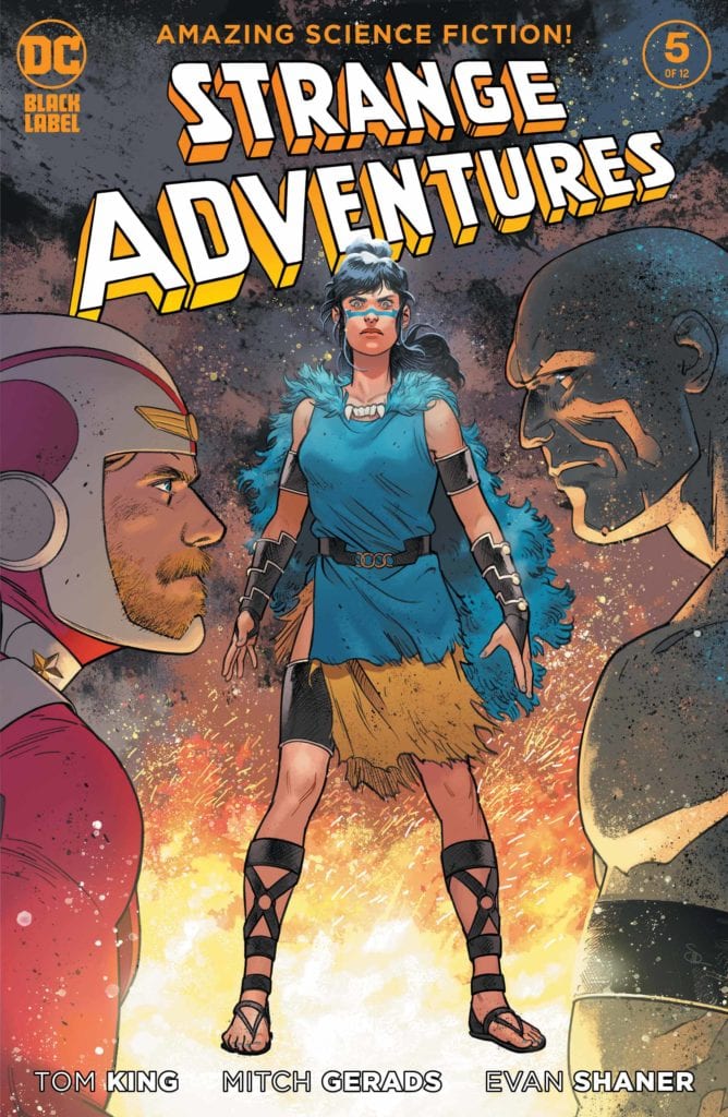
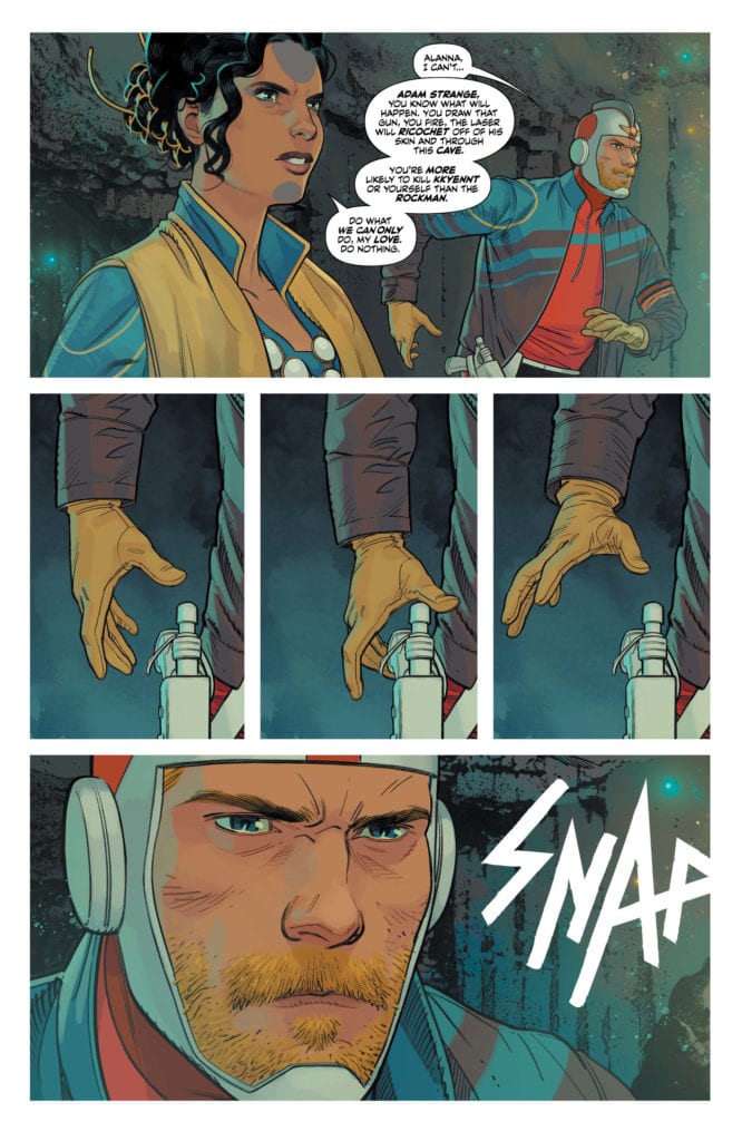
Written by Tom King, with art by Mitch Gerads and Evan “Doc” Shaner, and letters by Clayton Cowles, DC Comics’ Strange Adventures #5 begins to focus on events outside their story. With so much going on in the political sphere, with elections coming up, this creative team draws more parallels between the real world and their story. While this creative team seems completely incapable of ever making a bad comic, they do get a little bogged down in this issue, distracted by the world going on off the page.
Adam Strange as Donald Trump
Writing
Subtlety is King’s best friend. His work on DC Comics’ Mister Miracle or Sheriff of Babylon shows he knows how to focus on characters and storytelling, and let readers draw parallels where they will. Unfortunately, the modern day scenes of Strange Adventures #5 don’t have subtlety going for them. As Adam Strange becomes a political figure in this chapter, his speeches about the investigation into him begin to feel a little on-the-nose. King seems to get distracted by current events and what he wants to say about everything. His pages in this issue are uncharacteristically text-heavy. There’s a lot King is feeling about what’s going on in the world, but the script feels like it’s one draft short of a final copy. Perhaps King is pointing to a politician’s ability to never stop talking, but the modern scenes certainly make for a slower read than we’re used to in this series.
Art
Gerads brilliantly shows us the dynamic between Alanna and Adam with his positioning of characters on the page. When Alanna is on a board, speaking to Congress, she is pictured in the foreground with a tired Adam in the background. She is large on the page, and she looks calm and collected. Later, when she is standing on the balcony of the White House, we get an over-the-shoulder shot of her looking out at DC. She looks like a Queen overlooking her kingdom. As Adam zooms onto the scene, we suddenly see him above her, in what would be the dominant position of the scene. But it’s just his feet that dangle down, we maintain Alanna’s level, and she lazily holds a glass out to him. Her body language assures us, Adam is not above her.
Coloring
Gerads’ coloring suggests that Strange Adventures #5 may mark a turning point in this series. His warm gold, red and orange coloring throughout has the feeling of a sunset, cast over the page. It’s as though something is coming to an end. With the Pyykt invasion looming, maybe this is the calm before the storm. It also gives the impression that things might be turning in Adam and Alanna’s favor. After all, red and yellow are the colors of Adam’s costume. Seeing Congress covered in orange hues is like a visual representations of the Stranges’ sway over the room.
Lettering
Cowles helps show the power that Alanna holds. While speaking to Congress, we see Martian Manhunter going into a monologue. His words overpower each panel. Cowles makes sure his word balloons take up as much space as they can. And he even overlays Martian Manhunter’s speech over a panel of a bored looking crowd, Adam almost sleeping in the middle. The chairman responds in turn, going into his own monologue, but he’s interrupted by an orphaned word balloon. “Bullshit.” It’s like nothing else on those pages, short but to the point. By not giving the word balloon a tail, Cowles allows the smallness of it on the page to shock us. Like a bullet, it rips through the speeches and lectures, and sets all eyes on Alanna Strange, the woman who said it.
Adam Strange, Survivor
Writing
Adam’s own words, in his book Strange Adventures, actually make for the most compelling plotline in this issue. King places Alanna and Adam in a trial they don’t know if they’ll survive, and they come out on the other side, as nationalistic as ever. But King’s treatment of the characters, their belief in what they’re doing, lures us into understanding them. We can see the toxicity of what Adam believes about himself, but we can also see his desperation. His need to be the hero. As Alanna and Adam fight for their lives, stuck in a cave and imprisoned by people who treat them as lesser beings, we begin to see why they have come to believe unwaveringly in their own virtue.
Art
When Shaner depicts Alanna and Adam, he flips the tables on their relationship. Alanna is behind Adam, or she’s leaning on him, seeking his support. We see, in Shaner’s pages, the strong man Adam wants to be for Alanna. His account in Strange Adventures makes him look like the swashbuckling hero, with the beautiful maiden counting on him to save her. But even in Adam’s own self-aggrandizing account, it’s hard to deny Alanna’s large presence. She may be depicted looking maidenly and fragile when Adam is by her, but she still takes up the page. She has a sway and presence that can’t be denied. And as she stands before the Rock Queen, it’s as though the beast inside has awoken. She looks ferocious, and Shaner has her superimposed onto the page, so that she’s larger than any of the characters and standing strong.
Coloring
If Gerads’ scenes are a sunset, then Shaner’s are the twilight. The cool blue palette shows us the dark night of the soul for Alanna and Adam. As they enter the cave, the whole scene is almost entirely blue. They are doing what they are doing out of duty. It’s a cold task and a foreboding one too. As Alanna and Adam make the cave their temporary home, color begins to come back into the scene. We see the color of their flesh and the pink embers of the fire. When they reach desperate ends, the color drains back out again, only to be replaced by an overpowering pink. As Alanna and Adam embrace each other, their love and passion, like a pink flame, is the dominant tone in the scene. The final scene in this chapter of Strange Adventures is set in the stark, cold light of the morning. The white light of the morning sun washes over the scene, it’s the dawn of a new day. With the night over, Adam’s book might be reaching their glorious battle with the Pyykt soon.
Lettering
Cowles’ lettering for this section starts strong, right out the gates. The sound of a snapping neck, in white lettering with no border, breaks through the fantasy and adventure. Placed next to Adam’s heroic looking face, it begs the question, what is all his heroism good for if people keep dying? Our introduction to the rock people on Rann is terrifying. Having not seem them on panel, only seeing the sounds of what they have done, gives them an air of no-nonsense. “You have. Come with Upworlders. To my cave. Is there? A reason?” The giant rock creature says to them. The periods separating his text make him feel otherworldly, but also give his lines a rhythm. He finishes off the line, trailing off down to the a word balloon lower in the page which says: “Do you? Also wish? To die?” The low position of the word balloon makes the line feel nonchalant. Cowles allows his big threats to hit home, by placing them in small, unassuming areas on the page. This rock man doesn’t need to flex, he means what he’s saying.
DC Comics’ Strange Adventures #5 is another incredible issue in this series. It does get a little distracted from the story it’s telling, veering into a few on-the-nose jabs at current events, but this issue’s faults are dwarfed by the incredible art, coloring, lettering, and empathetic writing on every page. King, Gerads, Shaner and Cowles continue to deliver as DC Comics’ Strange Adventures seems to be transitioning into a new act. Pick up Strange Adventures #5, out August 1st from DC Comics, from your local comic book shop
SH*TSHOW #1 hits the October PREVIEWS Catalog and your local comic book shop in December, but thanks to Scout Comics, Monkeys Fighting Robots has an exclusive four-page preview for our readers. The cover definitely gives you all the feelings of 2020.
The book is written and created by Adam Barnhardt, with art by Samir Simão, Warnia Sahadewa drops some color, and you will read LetterSquids’ letter work.
About SH*TSHOW #1: There was once an Age of Heroes, a time Earth was protected by the demigod hero Legend and his band of heroes called Legend’s Legion until one day, the three-headed demon Balam was summoned to the planet. In the ensuing fight, the powers were ripped away from any enabled beings on the planet — heroes and villains, alike. Battered, broken, and losing his entire Legion in the process, Legend was able to cobble together whatever remaining powered beings he could find but by that time, Balam was long gone.
To try coping with an all-new world, the heroes banded together to form The Magnificent McCoys, a traveling circus where the performers use their powers to entertain the masses in a time where powers are rare. A god with a dying star for a heart, Legend has taken Balam’s destruction worse than anyone and has since become a crippling alcoholic. Then suddenly one day, Balam returns. Will Legend be able to stay sober long enough to use his powers and end this threat once and for all or will he give up only to doom humanity forever?
Enjoy The Preview Below:
Are you going to add SH*TSHOW #1 to your pull? Comment below with your thoughts.