Home Blog Page 253

Review: DETECTIVE COMICS #1027 – A Few Batman Stories More…

Celebrating 1000 issues since Batman’s first appearance, DC comics released Detective Comics #1027 on September 15. The issue features Batman writers current and past like James Tynion IV, Peter Tomasi, Scott Snyder, and Tom King, along with Kelly Sue DeConnick’s first Batman story. The plethora of writers is joined by many legendary artists, including John Romita Jr., Klaus Janson, Walter Simonson, and Dan Jurgens.

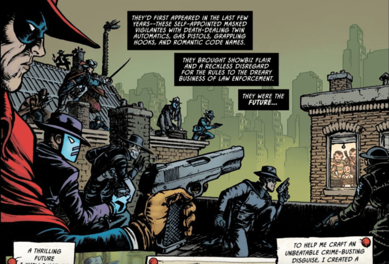
Fans of Grant Morrison’s Batman run will be happy to see his return to the title in a story entitled “Detective #26.” In standard Morrison fashion, he tells a meta-story incorporating the real-world publishing history and precedents to Batman in this retelling of Batman’s first adventure from Detective Comics #27, “The Case of the Criminal Syndicate.” The story follows “The Silver Ghost,” a gun-wielding pulp hero who answers Gotham’s call for a hero to fight crime in the tradition of the pulp heroes that preceded superheroes like Batman and Superman. However, the Silver Ghost quickly discovers that Gotham has given birth to a new hero, leaving the pulp heroes of the earlier era behind. In exemplary Morrison fashion, the story ends with an anti-climax for our hero, who after waxing eloquent about the importance of the vow he made to be Gotham’s savior, states rather wryly that he’ll never make another vow again, having seen that Gotham has a hero, and he’s not it.

There are several cool easter eggs in this story. Characters who preceded Batman in Detective Comics, like Crimson Avenger and Slam Bradley, are mentioned by name. In one image beautifully rendered by Chris Burnham, one can make out The Grey Ghost.

If you can name each of these characters in the comments, you will get 1,000 cool points.

If you love Morrison’s penchant for going meta, you’ll love this story!

It was also nice seeing Greg Rucka return to write a very Gotham Central style story about a rookie cop attempting to navigate the politics of a corrupt police force (one wonders how much Rucka intended this story to speak to our current historical and political moment). Renee Montoya and Crispus Allen make an appearance, and Batman remains a constant but peripheral presence throughout the story, just like in Rucka’s former series. Fans of Gotham Central will want to grab this issue.

Walter Simonson joins Tom King in a tale dedicated to the late, great Denny O’Neil. In this story, readers discover how Batman dies, not at the hands of one of his more classic rogues gallery, but by the more obscure (and poisonous) Dr. Phosphorus (initially designed by Simonson in his first appearance in Detective Comics #469). Simonson’s images move back and forth between Phosphorus’s fight with Batman and an older Bruce Wayne, smiling at Selina Kyle as he passes away from cancer. Simonson’s action scenes are kinetic and action-packed, while his scenes of Bruce on his deathbed capture the final tender moments between Selina and her dying love.

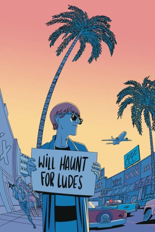
Riley Rossmo serves as the artist for James Tynion IV’s for “Ghost Story,” a tale that sees Batman and Robin (Dick Grayson, judging by the outfit) team up with Deadman to stop a villain who captures the spirits of the dead and feeds on them, destroying them before they can find their final resting place. As I’ve noted elsewhere, Rossmo’s style is reminiscent of a Tim Burton aesthetic and is a perfect complement to the horror themes of this story. Rossmo’s style communicates an almost demonically mischievous when his characters smile, while the shape of his characters’ bodies is a bit inhuman and unsettling in a Jack Skellington kind of way.

This issue has a lot going for it. Several great artists are contributing to the posters and stories in this issue, and the writers create some very entertaining short stories (remember standalone comic stories? Good times…). The weakest stories in this issue, the ones that won’t stand up as potentially timeless in this milestone issue, are those that tie into current ongoing series like Death Metal, Tomasi’s Detective run, and Tynion’s Joker War. These stories aren’t bad, but I’m just not sure they belong in an anniversary issue like this one.

Detective Comics #1027 also follows in a long line of special anniversary issues from DC Comics. While 1027 is indeed a significant number for Batman as a character, it comes across as a little bit of a gimmicky cash grab, considering that readers have done this already with Detective Comics #1000.

That said, this was still a very enjoyable issue with many talented creators bringing their A-game.

What did you think of Detective Comics #1027? Tell us in the comments below!

Monkeys Fighting Robots Youtube

Review: STILLWATER #1 Sometimes Dead Is Better

Stillwater #1, Perez cover

STILLWATER #1, available from Image Comics on September 17th, begins a new series about a down-on-his-luck stranger answering the call to a mysterious town where death has taken a permanent holiday. Written by Chip Zdarsky, this new story feels right at home as a potential Twilight Zone-esque series with a harder edge.

Cover Art

Ramon K. Perez’s cover gets right to the point with the contrast between a snuggling baby and a matronly skeleton meeting at a black heart. The positioning of the characters symbolizes a continual relationship between life and death that permeates the town’s foundation—Perez piles on enough symbolism to make this cover a conversation starter for hours.

Writing

Zdarsky’s story centers around the main character, Daniel, who has no shortage of anger issues, frequently leading to violence. After being fired for inappropriate conduct, Daniel receives a mysterious letter summoning him to a mysterious town to receive an inheritance. As the previews have already revealed, nobody can die in Stillwater, and that revelation puts Daniel at odds with the townsfolk desperate to keep their secret.

The story is well written, well structured, and well-paced, and the characters feel like real people. That said, the main character is wholly unlikable for his angry, violent demeanor, and the plot of the mysterious town is, in a word, unoriginal. Granted, this is the first issue, and the cliffhanger reveal at the end has potential, but anyone who’s been exposed to SciFi anthologies of the last fifty years, ala The Twilight Zone or The Outer Limits, will see this as very familiar territory. Overall, it’s a well crafted story, but it’s generally disappointing for lack of originality.

Pencils/Inks

Perez’s art is hit or miss throughout the inaugural issue. Where the art is the strongest is in the close up scenes when the characters are interacting in an animated fashion. The fistfight between Daniel and Deputy Ted is the most potent example of solid anatomy and dramatic tension through action.

Where Perez’s work doesn’t quite work is in the long shots. The wide panels with detailed backgrounds tended to be very rough and unpolished. To be fair, that can be an artistic choice, but it only works if it’s applied consistently throughout the issue. I’m interested to see how Perez’s art settles into a rhythm in subsequent issues.

Coloring

Mike Spicer’s coloring captures light and shadow very effectively. There are several venue changes throughout the issue, from a neon-soaked night club to a lonely forest road to a harshly bright office. Spicer makes handy work of the transitions that lead characters through each setting and uses the color shading to push Daniel’s mood further than the facial expressions can do on their own.

Lettering

Rus Wooton’s lettering is solidly executed throughout the issue. As you can imagine, there’s a ton of indirect exposition as the townspeople react to Daniel’s reaction about the town’s secret. Hint dropping and confused surprises pepper nearly every page, and Wooton keeps the dialog moving so as not to bog you down with unnecessary explanations.

Conclusion

STILLWATER #1, available from Image Comics on September 17th, is a familiar story with generally passable art. There’s potential for the second issue based on the ending, but it’s too soon to tell if this series is a winner.

Monkeys Fighting Robots Youtube

Review: THOR #7 – For a Good Time, Call…

Marve Comics drops Thor #7 at your local comic book shop on September 16. Superstar writer Donny Cates is joined by artist Aaron Kuder, color artist Matt Wilson, and letterer VC’s Joe Sabino. Thor continues to be haunted by the vision of the Black Winter, the growing heaviness of Mjolnir and makes up with an old friend.

After a pretty dour issue with #6, Thor #7 introduces a bit of levity into Cates’s story. Sometimes, comics attempting humor to lighten the mood or to provide characterization end up creating a 22-page quip-fest with a bunch of generic jokes that could be spoken interchangeably by any character. Not so in this story. All of the humor is grounded in each character and their histories while serving the overall narrative rather than detracting from its weight.

When Thor throws his hammer down to Broxton, OK (that poor city…), Tony Stark comes to investigate when a local town mechanic calls him. How did he have Tony’s number, you might ask?

This is one of the best scenes in the comic. The panel design and lettering, courtesy of Sabino, helps this scene flow well, particularly in the transition between pages, so that the joke really lands. Sabino’s letters, from Stark’s number on Mjolnir, to Tony’s transition from whispering to shouting, to Thor’s own mumbled comments to himself about Stark are well-paced (is there anything worse than someone dissecting a joke to explain why it works?).

Kuder and Miller’s drawing of the panel to show readers how Tony looks from Thor’s perspective as he sees him through the eyes of his raven is also a nice touch and makes me wonder what it must be like to be Thor’s friend, yelling impotently toward his throne in the sky when he does something irritating.

After a few pretty intense and serious issues, it’s nice to see a little humor injected into Thor’s world, although the threat of Thanos stills looms in Thor’s mind, as does his changing relationship with Mjolnir. With a new wielder of the hammer, we’ll have to wait until issue #8 to see how events continue to unfold on the way to Thor’s destiny, but with Beta Ray Bill at his side once again, hopefully, he will be able to beat fate.

What did you think of Thor #7? Tell us in the comments below!

Monkeys Fighting Robots Youtube

Review: Sharon Carter Carries The Team In CAPTAIN AMERICA #23

CAPTAIN AMERICA #23, available in comic book stores on Wednesday, September 16th, details the final battle with Selene of the Power Elite. After Steve Rogers, Sam Wilson, and Bucky Barnes failed to take down the threat, Sharon Carter steps up to the call. And watching her rally the team makes this issue quite the exciting read.

Story

Ta-Nehisi Coates’s narrative is divided into two parts–one focused on Sharon‘s past training and reflection periods, the other dedicated to her present struggle against Selene. The beauty of this format lies in its ability to show readers each step of her journey toward becoming a powerhouse in the present.

Sharon uses a modified version of the Iron Patriot armor during the fight, and notes how fortunate she is to have a super soldier partner. But the irony in this conflict is that the one woman army seems to be dealing with Selene all by herself.


As Sharon holds off the powerful sorceress, readers will find the battle to become more engaging by the second. This issue shows she is just as much of a hero as Steve.

Artwork

Bob Quinn’s penciling and ink work, Matt Milla’s coloring, and VC’s Joe Caramagna’s lettering combined elements of both classic Captain America and Iron Man comics. The melee fighting styles of Steve, Sam, and Bucky as juxtaposed with the sleek suit and nebulous energy pulses from Sharon’s suit. The heroes are brought to life with rich hues of blue and red, keeping with Steve’s color scheme. But the lettering breaks this up with yellow balloons for Sharon’s speech, giving the entire book a pleasing swath of primary colors.

Conclusion

CAPTAIN AMERICA #23 gives Sharon the respect she deserves, complete with an utterly surprising ending. Readers will be on the edge of their seats the entire issue.

Did you enjoy the focus on Sharon in this issue? Let us know in the comments below!

Monkeys Fighting Robots Youtube

Review: UMBRELLA ACADEMY: YOU LOOK LIKE DEATH #1 Is Too Mellow To Be A Fever Dream

Way Dark Horse You Look Like Death

Dark Horse’s You Look Like Death #1 should read like a fever dream. From the pages of Umbrella Academy, we follow Klaus as a teenager. Klaus can talk to ghosts, has a drug problem, refuses to wear shoes, and gets tied up in some nasty business with a vampire chimpanzee crime boss. But writers Gerard Way and Shaun Simon, artist/colorist I.N.J. Culbard, and letterer Nate Piekos of Blambot, make it all seem like just another day.

Writing

Since the first issue of Umbrella Academy, Way has done something brilliant (and Simon seamlessly steps into this world as co-writer, matching the tone Way established). In the face of an incredibly quirky world, Way’s characters have always seemed totally unfazed. In fact, a lot of Klaus’s struggles in this issue come from the fact that he’s used to people just going along with his weirdness. Kicked out of the mansion, Klaus has to use all his guile to survive. Unfortunately he’s one of the most self-sabotaging people to ever walk the earth. Simon and Way depict this tug-of-war in big and small ways.

One moment, Klaus is jumping on a plane and heading to Hollywood, and the next he’s hitching a ride to a funeral parlor. He’s torn between a knack for adventure and a craving for the familiar. Pissing everyone off in the parlor, he’s thrown out on his face. He dusts himself and says “That didn’t go as planned.” But that’s Klaus. There is no clear plan. And Way and Simon have us guessing his motivations constantly, in order to see that Klaus himself is as lost as we are. He’s just lost with a cool smile.

You Look Like Death Dark Horse Way

Art

Culbard maintains a feeling of nonchalance, even indifference, in You Look Like Death #1. It’s incredibly obvious, in the opening moments of this issue, where Klaus’s indifference comes from. As he speaks with his father about being tossed out of his home, they’re both trying to prove they don’t care about the conversation. The senior Hargreeves barely even shows his face. He looks out the window, at a newspaper, down at his desk. Klaus responds by smiling through the whole thing. It’s family dysfunction at its finest. Culbard somehow shows us that they’re both coping by deflecting, just in different ways.

This issue, much like Klaus, seems almost allergic to emotion. Klaus is smiling coolly from page one to page thirty-two, but in the brief moments that characters do get emotional, Culbard zooms out. Their faces are drawn minimalistically, the details lost. Culbard puts us into Klaus’s mind. We see the world through his eyes. Klaus is disconnected from humanity, so when people get angry or sad, Culbard yanks us away and makes us looks elsewhere. We gain a brilliant understanding of the character in the process.

Coloring

Culbard’s coloring in You Look Like Death is gorgeous. His greens, blues, and pinks are like neon signs lining the sex-filled streets of Los Angeles. But his coloring isn’t just beautiful, it’s dangerous. It becomes clear pretty quickly that Culbard is associating certain colors with certain things. Klaus’s powers are green. We can see it in Klaus’s eyes when he begins to summon the dead. Danger is pink. We see it on the sign for the funeral parlor, the lights in the drug store, and the glasses of Mister — I mean, The Shivers. It’s beautiful and seductive, but it’s also destructive. Culbard illustrates Klaus’s cycle of self-sabotage. It’s like a habit Klaus just can’t quit, he’s always running into danger and loving every second of it.

You Look Like Death

Lettering

Piekos’s lettering is versatile, so it’s noticeable when he starts using a default. The datelines in this issue, first telling us we’re at the Umbrella Academy, then the City, use the same font. And when Klaus finds himself in “The Void,” again Piekos uses the same font. This brings us back to the indifference this comic has about strange things. Using one unchanging font for every place, no matter how “out there” the setting may be, gives us a sense of these places being normal. Hollywood is just as normal as the Void.

Or at least that’s what Klaus wants us to think. Piekos gives a few subtle tells that this isn’t the case. After luring us into the page with a big neon sign that says “Drugs” (which is an awesome page by the way), Piekos shows what Klaus is saying as he thinks he might be dying. “Uhn!” he says in large lettering, thinking it might be the last sound he makes. When he wakes up in the Void, we get one textless panel. Then Klaus simply says “Oh…” in small lettering. It’s so subtle, but Piekos gives us a chink in the armor. Klaus gives a crap if he dies, and for a character like him this small moment, quickly followed by another normal word balloon full of regular-sized text, is groundbreaking.


You Look Like Death #1 is a great tie-in to the Umbrella Academy universe. It captures the nonchalant strangeness of its parent series, while focusing in on the reasons everyone wants to insist that everything is normal. It’s a really fun comic, and it’s gorgeous to look at. Pick up You Like Death #1, out from Dark Horse Wednesday September 16th, at a comic book shop near you!

Monkeys Fighting Robots Youtube

BLOODSHOT #8: Showing The Scars Of The Hiatus Period

Bloodshot #8 Cover

Bloodshot #8 out last week, is the return of Tim Seeley’s take on the Valiant Entertainment character with new artist Pedro Andreo, colorist Andrew Dalhouse, and letterer Dave Sharpe.

Background

Bloodshot #8 returns the title after a long hiatus per COVID activities. Bloodshot’s nanites now power monstrosities the Black Bar group kept imprisoned after the Burned hijacked them.

Bloodshot #8 Jumping Back In

A lot of time seems to be passing between the last issue and Bloodshot #8. After the outbreak of experiments, Bloodshot and Eidolon are working with Black Bar to exterminate them. Because with Bloodshot’s nanites powering them, he’s the only weapon powerful enough to stop them. Which does not look easy as the Burned have found a way to weaken Bloodshot’s healing abilities. Not helping is how Black Bar leader Grayle is resolute in trying to keep Bloodshot contained like the experiments. This view on duty for a greater cause certainly weighs heavy on Bloodshot, who feels the agony of every being he kills through the nanites. All of it actually makes the Burned’s leader Nix all the more sympathetic despite being a terrorist.

Nix’s flashback at the beginning of Bloodshot #8 shows the darkness he went through as an MI6 agent. On where he was forced to kill a man on the orders of the man knowing too much. Only to later receive orders on killing the man’s family. Considering the Burned composes of spies thrown away by their governments, this makes Nix’s morals breaking all the more tragic. It’s also why his connection to Bloodshot feels so powerful as the character is well on his way to being thrown away once his usefulness ends. Not even Eidolon can protect him, as the end shows.

Art Shifts

Bloodshot #8 attraction

With Marc Laming and Jason Masters departing for some reason, Spanish artist Pedro Andreo illustrates Bloodshot #8. Andreo retains some of the cinematic styles but instead utilizes panels shifting based on the movement and posture of characters. This makes the movements more dynamic and tells different sides of a story. In a two-page spread, there is even a moment that freezes in time that perfectly displays Bloodshot. With Eidolon providing the descriptions, the moment perfectly encapsulates his general description while also showing the wounds he received the last issue. It shows that while Bloodshot is still the capable soldier willing to help others, he’s more vulnerable.

The colors by Andrew Dalhouse continue to tell the story with reds being the main means. In the beginning, the reader sees Nix in a flashback going through a traumatic event. His control over the numerous monstrosities through their glowing red eyes is a two-fold display; having gained control over Bloodshot’s nanites, which are a source of trauma for many, Nix is effectively weaponizing his and Bloodshot’s traumas.

The lettering by Dave Sharpe is efficient and accents conflicts in Bloodshot #8. The word balloons arrange in a way easy to follow and never interrupt the above displays. In fact, in just the double-spread, it’s what makes the image more eye-catching by guiding the reader through Bloodshot’s actions. It even describes Bloodshot and contrasts the terrorists he fights. The white wordmarks ensure whatever actions are seen with the most impact. The only trouble is how a colored caption shifts into a menacing word balloon with barely any subtlety.

Wait No Longer For Bloodshot #8

The world waited, and they might be rewarded with Bloodshot #8. A new artist might make this look strange in a trade, but it is one that will excite readers to get back into the series, especially since it’s about the scars that come from unfinished business.

What do you all think of this development? Too sudden a change? Leave your thoughts in the comments.

Monkeys Fighting Robots Youtube

Review: VAMPIRE THE MASQUERADE #2 Brings Out The Family With The Beast

Vampire The Masquerade
Vampire The Masquerade #2 Credit: Vault Comics

Vampire The Masquerade issue 2 from Vault Comics continues to mine the rich mythology of the role playing game while telling an intriguing set of stories. With such an abundant seam of readily available background material, part of the world building has already been completed however, turning complicated game rules into a successful narrative is no easy task. A host of movies, books, and comics have been game related tie-in’s and very little of it appeals to anyone not already familiar with the original material.

The very premise for Vampire The Masquerade has a wide reaching appeal: who doesn’t enjoy a good vampire story? And with a constant swing in and out of favour there is always an audience waiting for a new blood sucking tale to get their teeth into. Have Vault Comics managed to prepare a substantial and rewarding meal for these hungry readers?

Vampire The Masquerade #2
Vampire The Masquerade #2 Credit: Vault Comics

Origins and Guidance

One of the main themes for any vampire tale in the modern age is that of mentor-ship. The idea that when one vampire sire’s another they have to accept some responsibility for them. It is a parent and child relationship and has been central to vampire stories for a number of decades with Interview With The Vampire being one of them most famous.

Tim Seeley introduced his characters to the readers in the first issue while laying out a backstory of impending war between the vampire castes. In this second issue he reminds us of this vast underworld society of vampires and their ancient tiers of leadership however this is not the main thrust of the story. Instead it quickly becomes about the growing relationship between Cecily Bain and the newly sired Alejandra Deluna.

The dynamic between the two central characters allows Seeley to examine the nature of vampires in this world. By having the old and the young, a mother and daughter, the writer is able to educate the reader as Ali herself learns of her powers and needs. This makes for some great character work, engaging and emotional, even if it does feel a touch familiar. Seeley gives his characters naturalistic voices, each with their own personalities.

Drawing Blood

Devmalya Pramanik uses thin inked lines to bring the characters to life. With the help of colorist Addison Duke, he creates distinctive looks for each of the characters; giving one glowing orange hair, while another character’s is jet black. The simple contrast between characters makes the action easy to follow from panel to panel, especially as Pramanik employs the use of black shadows to create the murky world where the vampires dwell.

The transitions between panels and pages is surprisingly energetic considering the lack of physical action. Pramanik gives the conversational scenes a sense of drama using detailed backgrounds or environmental elements to reflect the mood. Duke’s colors also veer away from pure realistic interpretations in order to emphasise emotion or theme. The panels become saturated with a particular hue to hammer home a point.

The pace of the story is kept in check by Andworld’s lettering. Large speeches are broken down into their relevant beats and spread across a panel with variable links to illustrate the changing urgency of the speech. This gives some characters a wilder, less controlled tone, and highlights the preciseness of other characters. This works especially well with Prince Samantha who comes across as a figure of authority, instilling fear and awe into her vampire subjects. She’s like Tilda Swinton in the Constantine movie.

Vampire The Masquerade #2
Vampire The Masquerade #2 Credit: Vault Comics

More Anarch Tales

One of the main selling points of Vampire The Masquerade is the back up story by Tini Howard, Blake Howard, with Nathan Gooden on art duties. The Anarch Tales is a companion piece to the main event dealing with similar themes but with different characters. This second chapter features an origin story for one of the characters.

Gooden’s art style is smoother than Pramaniks, giving it it’s own look and feel. However, Addison Duke and Andworld provide the colors and letters for both, providing a consistency between stories.

The writers appear to be having more fun in this backup tale than Seeley is in the main story. They have created a cast of outcasts and are playing around with vampire cliches and genre tropes. That’s not to say it’s all roses and fangs, there’s a darkness behind the frolics with some disturbing allegorical threads weaving through the narrative.

Vampire The Masquerade #2
Vampire The Masquerade #2 Credit: Vault Comics

Conclusion

Both stories featured in Vampire The Masquerade are enjoyable creature features but mask hidden depths. Like a combination of 30 Days of Night and American Vampire, this offering from Vault Comics brings classic ideas of vampirism into the modern day. It mixes politics and family relationships to tell the tales of the lost and powerful.

Engaging and entertaining, Vampire The Masquerade is a great way to spend 20 minutes and will leave you thirsty for more. It may even make you pull out the role playing rule book.

Monkeys Fighting Robots Youtube

Review: IRON MAN #1 Enters A Mid-Life Crisis For Tony Stark

Iron Man #1, Ross cover

IRON MAN #1, available from Marvel Comics on September 16th, finds Tony Stark trying to give up his business ties, his dependencies on technology, and everything that forms the public image of Tony Stark in favor of that age-old question: “Who am I?” Written by Christopher Cantwell, this is a personal and introspective approach to Iron Man that just might elevate the character to a more mature level.

Cover Art

It’s Alex Ross. If you love Alex Ross’ work, you’ll love this cover. Iron Man is dead smack in the middle of a melee assault against a host of Iron Man villains in all their photo-realistic glory. The big news with this cover and the series is a spiffy new suit redesign by Ross that looks original and modern but with a slightly retro feel.

Writing

Cantwell adds a touch of the modern social climate in this “re-calibration” issue. Tony is aggressively casting off the trappings of the life he built for himself. The Malibu mansions. The billion-dollar corporations. The jet-setting lifestyle. And he is rediscovering who is the man inside the heart of the machine. There are multiple layers of depth here, and Cantwell is asking whether Tony Stark is Iron Man and all the mythology that goes with it, because of all he’s done over the years or is Tony Stark a separate and distinct persona that’s been neglected for too long. Where does the myth end and the man begin?

This is thought-provoking stuff, and the questions Cantwell is asking through Tony Stark are increasingly common in a world dominated by electronic gadgets and social media. In a fairly amusing running bit, Tony posts innocent or thoughtful posts online and is viciously roasted at every turn. An all too familiar scene with celebrities online, and to quote the phrase: “It’s funny because it’s true.”

Iron Man #1, writing sample

Toward the end of the issue, Iron Man and Hellcat encounter a petty crime in progress. The end result hints at a more serious villain in Tony’s future. This Iron Man is new, different, and chock full of potential.

Pencils/Inks

CAFU’s artwork is an excellent match for the tone of this issue. Despite the action ending, this is very much a character piece, and CAFU’s style focuses heavily on photo-realistic characters that convey emotions through highly detailed facial expressions. You can empathize with the disappointment in Tony’s eyes when he loses a street race. Tony’s frustration is palpable through his slumping posture after he’s blamed for the destruction of a priceless book. Even the little odd touches, like throwing a Dinner party while wearing bunny slippers, amplify Tony as a real person. Flawed, but very human.

That said, the action sequences are still crackling with energy (literally). CAFU really captures the details equally well in the simple conversations and the fight scenes to bring this book up to film-level quality. This is a beautiful book by CAMU.

Iron Man #1, penciling sample

Coloring

Frank D’Armata’s colors take CAMU’s work and punches it up several more notches. The color shading gives every character visual depth and texture. When Tony is serious or surprised, the coloring on his face darkens and lightens through shadows to add more drama to the moment captured in the panel. The drama sells this issue, and D’Aramata uses color to maximum dramatic effect.

Iron Man #1, coloring sample

Lettering

For an issue that’s themed around getting away from machinery, there’s more than enough electronic voices and AI to go around. VC’s Joe Caramagna handles the lettering in stride by giving every non-human voice a distinctive look with their own visual cues for a hint of personality. It’s not technically necessary for the story, but it adds to the story in a way that makes the reading more visually interesting—nice work by Caramagna.

Conclusion

IRON MAN #1, available from Marvel Comics on September 16th, is a powerful departure from the esoteric “imagination armor” of the recent run and puts Tony Stark on a path to rediscovery. The artwork is gorgeous, and the writing hits a symphony of emotional notes. This first issue is highly recommended.

Monkeys Fighting Robots Youtube

Review: Shooting Your Way to Heaven in HEAVY #1

Writer and Say Anything vocalist Max Bemis (Polarity, Crossed: Badlands) teams up with artist Eryk Donovan, colorist Cris Peter, and letterer Taylor Esposito to craft “Heavy” #1. This brutal mix of gallows humor and over-the-top action has some original elements, but it’s painfully grim tone and inconsistent plotting make it a bit of a chore to read. Some unique ideas and fantastic work by the visual team however make this likely to be a worthy pickup to fans of this kind of sardonic and bloody affair.

“Bill may be dead, but he’s got a job to do. Welcome to the Big Wait, where folks who don’t quite make the cut go to work off their debt. Everyone in the Wait’s got a job. Bill is a Heavy, whose job is policing the multiverse, making sure bad eggs get what’s coming to them. He’s on track to earn his Climb and reunite with the woman he loves… until he meets his new partner: the worst dude of all time.”

Writing & Plot

I have to hand it to Bemis for coming up with a uniquely twisted take on afterlife mythology in “Heavy” #1. Bill’s job as a multiverse-traveling hitman trying to rack up enough karma points to get into heaven is delightfully cynical, reminiscent of something out of Garth Ennis’s Preacher. Then there’s of course the bleak, brooding nature of our protagonist. Bill’s manner of murdering his way through the grief of losing his wife and hating every moment of existence that he isn’t eviscerating someone is always somehow endearing. He’s very obviously inspired by the likes of Frank Castle or Sin City’s Marv. I keep comparing this comic to the comics that obviously inspired it, but what separates this issue from its predecessors is that this issue doesn’t quite nail down its signature style the way these others have. What makes these other comics so memorable is not only the stylistic signature they craft, but the intimate relationships built with the characters within them. Thus far, “Heavy” is not only a cookie-cutter comic in comparison to its inspirations, but it’s also tonally inconsistent. It tries mixing the bitter seriousness of Ennis’s Punisher MAX run with the absurdity of Preacher, but it never quite gels. There are also some plot events that make the rules of this particular universe a little iffy. Even the most absurd of fiction needs it own set of rules to get the audience familiar with how a fictional world operates, especially before you decide to break said rules. The narration and dialogue both are sometimes overstuffed with massive gobs of exposition that take up half a panel, but don’t offer very much to the story. All of these critiques could very well be first issue headaches, as the setup for the next chapter is very promising. This is a comic that could easily be one of those that takes a few issues before it really starts exploring its themes and characters, and it has enough promise to keep a reader interested in what comes next.

Art Direction

The storytelling element that really does this comic justice is the visual work of artist Eryk Donovan and colorist Cris Peter. Donovan’s use of heavily textured and shaded details give everything in this book a grimy sheen, from the characters themselves to the mock heaven they reside in. The panel layouts and direction are lightly cinematic, with roaming visual cues that often build tension for our bloodthirsty protagonist’s own arrival. Donovan’s style is a perfect match for the tonal shifting this comic pulls. His drawings swing from a sort of light-hearted and cartoonish weirdness in the lighter moments exploring this universe’s cast and main setting, to the dour and staunch visuals of Bill’s lone brooding. A major component in pulling this aesthetic together is the coloring from Cris Peter, whose palette is just as all-over-the-place as Bemis’s script. Neon-tinged purples and golds blend into the deep blacks in Bill’s memories and the dirty fluorescent whites in his bathroom mirror. The lettering from Taylor Esposito does a solid job of carrying the reading experience, delivering pretty standard fonts and bolds to each dialogue bubble, and italics for Bill’s internal narrative. It’s nothing special, but with how much lettering Bemis’s script forces at times, he doesn’t have a lot of room to work with. Donovan and Peter’s visuals tie this comic together in ways that the script honestly sometimes fails to.

“Heavy” #1 offers the potential for a thematically rich and absurdly over the top series in the form of a messy opening chapter. The inconsistent tonal shifts, overwritten dialogue, and mishandled world-building are saved by a genuinely unique and enticing concept bolstered by a stellar art team. Again, while I think this issue is a bit of a mess in terms of writing, the visuals are great and there is a ton of potential for this to turn into a great comic over the course of its future issues. If this interdimensional bloodbath sounds like your kind of ride, pick up this debut issue from your local comic shop on 9/15!


Monkeys Fighting Robots Youtube

Marvel Preview: Logan Turns The Big (3)-5-0 in WOLVERINE #8

Wolverine #8, Kubert cover

What do you give the mutant that has everything for his birthday? Give him a fancy anniversary issue, of course. Marvel Comics is doing just that by celebrating Wolverine’s 350th solo adventure in WOLVERINE #8, available to retailers this December.

Says Marvel of this milestone issue: “When a secret enemy starts making moves against Wolverine’s old crew, Team X, Logan has to go on the hunt before more bodies pile up.” You can check out the cover for WOLVERINE #8 and read the full press release from Marvel below.

Are you one of Wolverine’s forever fans? Will you stick around for 350 more? Let us know what you think in the Comments section, and please share this post on social media using the links below.

CELEBRATE 350 ISSUES OF WOLVERINE’S SOLO ADVENTURES THIS DECEMBER WITH WOLVERINE #8!

Benjamin Percy, Adam Kubert, and Viktor Bogdanovic team up for the extra-sized milestone issue!

New York, NY�� September 15, 2020 — Since 1982’s groundbreaking limited series by industry legends Chris Claremont and Frank Miller, Wolverine has enjoyed numerous acclaimed stories in the pages of his solo comic series. Over the years, top industry talents including Larry Hama, Mark Millar, Jason Aaron, Paul Cornell, Steve McNiven, and Alan Davis have contributed to the character’s incredible legacy, and this December, Wolverine pops his claws for his 350th issue. Written by Benjamin Percy with art from longtime Wolverine artist Adam Kubert and Viktor Bogdanovic, WOLVERINE #350, the eighth issue of the current run, will celebrate the iconic hero with a story that takes him back to one of his most classic eras.

When a secret enemy starts making moves against Wolverine’s old crew, Team X, Logan has to go on the hunt before more bodies pile up. As the mystery deepens, he’ll pick up the scent of his old compatriot, the mutant known as Maverick. What follows will be a dangerous adventure that will introduce new enemies, redefine old allies, and give Wolverine plenty of opportunities to do what he does best. This special extra-sized issue will be both a celebration of Logan’s history AND a perfect jumping on point for new readers!

“Listen up, bub. Wolverine is my favorite comics character, and I’d consider myself lucky to write him at any point in time, but especially now. The Dawn of X has brought about a rich, exciting, and inarguably historic era for the X-Men,” Percy said. “This is a milestone moment, and now we have a milestone issue to mark the occasion—Wolverine #350. That’s a number to celebrate.

“Even as we look back and value the wealthy arsenal of stories already available to us, we can also look forward, because there’s so much rotgut whiskey and berserker mayhem and pop-clawed SNIKT-ing to come. What are we doing to celebrate the occasion? We’re giving you an oversized issue, offering even more action-packed, mystery-filled pages to shove in your eye, drawn by both Adam Kubert and Viktor Bogdanovic. And appropriately, we’re delivering a story that celebrates the past even as it looks toward the future.

“I’m not going to reveal too much about what’s behind the curtain, but get ready for an enemy I’ve been geeked to write since I first got the job. Legacy House is coming. And X-fans…know that we’re not only headed to Madripoor, but we’re bringing back a character you’ve all been missing: Maverick! So as soon as the dust and blood settles after X of Swords, be sure to get your SNIKT on with Wolverine 350.”

Celebrate Logan’s great legacy when WOLVERINE #350 hits stands this December! For more information, visit marvel.com.

WOLVERINE #8 (LGY #350)

Written by BENJAMIN PERCY

Art by ADAM KUBERT & VIKTOR BOGDANOVIC

Cover by ADAM KUBERT

To find a comic shop near you, visit www.comicshoplocator.com

Wolverine #8, Kubert cover

Monkeys Fighting Robots Youtube