Home Blog Page 252

Review: The Unstoppable Force Vs The Immovable Object In GRIT #3

Grit #3, Castaniero cover

GRIT #3, available from Scout Comics on September 16th, pits Barrow against Ari in a competition to see who can beat the Blood Demon first. Brian Wickman’s story takes the concept of the lone wolf and gives it a twist that ends with a refreshingly human reaction.

Cover Art

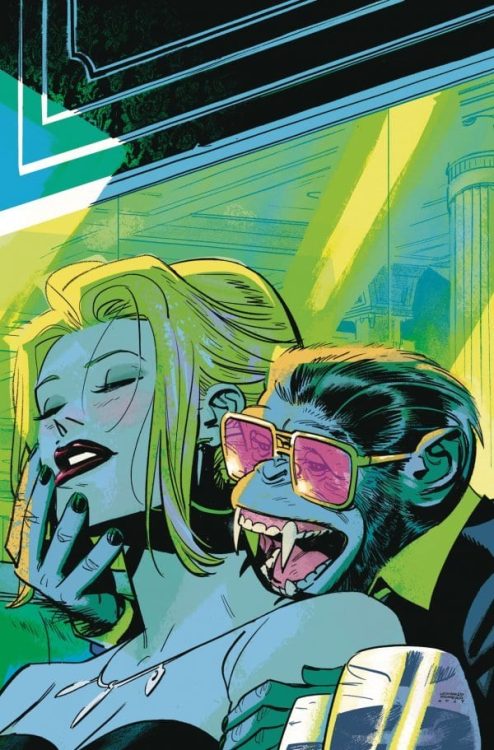
Kevin Castaniero’s cover sets up the issue perfectly. Ari believes the Blood Demon was never truly vanquished and picks up the hunt where Barrow left off. Barrow, not wanting to be shown up for failing his job, follow suit. The Blood Demon uses every tool at its disposal, including the townspeople, to stop the hunters. All that can read from this one cover, and Castaniero nails it.

Writing [No Spoilers]

Wickman’s continuation of Barrow’s hunt leans heavily into the old adage: “You can’t teach an old dog new tricks.” Barrow is feeling his age, and Ari’s constant challenges to Barrow’s capabilities aggravate Barrow’s stubbornness and push him to recklessness. In the end, Barrow is forced to question whether or not he’s too old to keep hunting.

The ending of Wickman’s story was swift but extremely potent. Too often, the grizzled hunter is stereotyped into a caricature of invincibility. Unflappable. Unstoppable. Here, Wickman chose a different path that’s much more relatable and opens up a wider possibility for storytelling in the following issues.

Pencils/Inks

You can tell Castaniero had fun pushing the comedic elements of the story much more in this issue than previously. Barrow’s exaggerated attention to scat in his attempt to track the demon. Ari’s bizarre plant magic attacks that de-possess the possessed. And Barrow’s bare hint of a smile as he’s enticed to buy some unsavory looking street food. It’s these little touches that layer on dark humor charm to the issue.

In stark contrast, Castaniero’s designs for the blood demon and the big battle are tense and horrific. The juxtaposition of the humorous shows of bravado from both Barrow and Ari, combined with the deadly urgent action sequences, makes for an exciting and thoroughly enjoyable issue.

Coloring

Simon Gough continues to make a very powerful choice with the coloring by keeping everything restrained in as many earth tones as possible. When the Blood Demon shows itself, the red stands out shockingly and with a much higher impact. The coloring signifies that the Blood Demon doesn’t belong in this world, and it projects an unnatural element to the character—nice work by Gough.

Lettering

Micah Myers’ lettering is most notable here for the imaginative creation of sound effects that have no analog in the real world. Myers dreams up a Blood Demon manifesting through vomit and seed pods that explode on impact. All through very imaginative, and at times gross, sound effects that match the tone and spirit of the issue. Great work by Myers.

Conclusion

GRIT #3, available from Scout Comics on September 16th, takes the story of the old dog being shown up by the young upstart and gives it a fresh coat of paint. The writing has plenty of rise and fall to keep the reader engaged, and the stylized artwork marries to the story perfectly. A strong series so far from Scout.

Monkeys Fighting Robots Youtube

How A Legend Dies in ONCE & FUTURE #11

A new monster rises in Once & Future #11.

ONCE & FUTURE #11, available Wednesday from Boom! Studios continues to merge the present and the past through lore and legends coming back to life. Yet this retelling has a few horrifying twists – literally.

***SPOILER WARNING***

spoilers ahead

The legends of old are waking up, and they are proving to be far from benevolent. First, it was King Arthur – who had a different sort of plan for his country. Now he’s working alongside other beings of old, and that is less than ideal for humanity.

Once & Future #11 brings fans right back to the fight, with Duncan and his grandmother facing a classic foe, and all of the challenges that come with it. It’s hard to believe that only recently, Duncan had no idea that monsters were real. Now he’s charging into danger and without even a second’s thought or hesitation.

A new monster rises in Once & Future #11.

The Writing

Once & Future #11 is one of those issues that doesn’t hesitate to dive right back into the action. Then again, the cliffhanger from the last issue required it. It’s hard to know how things are going to go, but easy to picture the worst.

Kieron Gillen has done an excellent job of setting the scene, that much is for certain. We’re talking about a giant monster attacking an elderly home. Even with somebody like Gran around, it’s still going to be a problem. Especially when there’s no available weapon stash (kind of a critical point when battling monsters).

The issue is mostly action, reactions to said violence, and that sort of thing. Yet it’s all very well done, showing a surprising amount of wit and an appreciation of dramatic irony. There are even a few more humorous moments woven into the mix, to help lighten the mood.

All of which sets up for the next series of events. It’s starting to look like Duncan and his Gran are not going to be getting a break anytime soon. Which is a bit of a shame since before this battle took place, it was starting to look like they both needed one. No rest for the wicked, huh?

Once again, all of the references to lore and legend have enhanced the series. In this case, it created new foes to battle, while also setting the tone, as well as setting up a perfectly timed conclusion.

The plan unfolds, with a few new complications in Once & Future #11.

The Art

Once & Future #11 is another vibrant and intense issue. As mentioned above, it’s dominated by battles, which means there’s a lot of excitement and flash to go around. Dan Mora (art), Tamra Bonvillain (colors), and Ed Dukeshire (letters) all teamed up to make this issue what it is – and it was worth the effort.

The battle is surprisingly long, with lots of clever moments and details – none of which would have carried across without the help of the artists. Little things, such as the taxi’s expression, to that little surprise Duncan found, and more. It all created a fight that actually felt surprisingly believable and real.

As with the rest of this series, the colors are so bold and beautiful. It’s a signature of Bonvillain’s work, and yet it’s perfect here. Her colors have added that required ethereal and fantasy element, transporting readers to a world where dead kings and monsters really can rise back up.

Finally, the lettering is everything this issue needed to bring it all together. There’s a lot going on in these pages, and Dukeshire’s work makes sure that not a single detail is missed, leading our eyes with intention. All while making sure that the screams and stakes felt larger than life – as it should be.

And so the fight continues in Once & Future #11.

Conclusion

Once & Future #11 was another tense addition to this series, one that is full to the brim of fighting – and blood. It’s an issue that doesn’t leave much room for relaxing, and it looks like it’s setting up for the next issue to follow suit as well.

Monkeys Fighting Robots Youtube

The Search for a Home in FIREFLY #20

Firefly #20's cover is a throwback to 'Out of Gas.'

FIREFLY #20, available Wednesday from Boom! Studios dives back into the world of Firefly, but with a few unique twists. Our beloved characters seem to keep growing up and changing.

***SPOILER WARNING***

spoilers ahead

The crew of Firefly has gone through a whole lot of changes in the most recent comic series. In many ways, it’s hard to believe that these are the same characters that we first fell in love with back when the show launched.

Yet there’s still no doubt that they are one and the same, especially during certain moments when their core characteristics shine through. Malcolm Reynolds may be a sheriff – which is hard enough to believe on its own – but he’s still shown trying to take care of his crew. Time and time again.

The last several issues have focused heavily on Mal and his imploding plot arc. All while others have barely made an appearance at all. That being said, Firefly #20 is about to give some of those wayward characters a chance.

The Writing

So for those fans wondering where on earth (or rather, in the ‘verse) the rest of the crew has gotten to, Firefly #20 is going to be a refreshing change of pace. Suddenly our missing characters (Zoe, Walsh, Shepherd Book, River, Simon) are all back again.

Greg Pak’s version of events has been a bit of a deviation, but it’s still been fascinating regardless. Here is a version of Zoe who has not lost her husband – but she’s still very strongly driven to find a safe space for everyone she loves. More than that, she wants to protect every friend and ally they’ve ever made.

That basically sounds like the most Zoe thing of all time, and it was refreshing to see her once again. The others are basically getting dragged along for this adventure, which also sounds about right. River’s side of things is borderline depressing, as she struggles to make something for herself with each attempt.

On the whole, the change of focus for this issue was appreciated and is starting to give back the hope that we might just see the crew back together. It may not be in the next issue, but it’s certainly on the horizon.

Firefly #20 featuring Malcolm Reynolds, Captain, and Sheriff.

The Art

The artwork inside Firefly #20 is bold and dynamic – as it should be, given the world and stories that have occurred within it. Daniel Bayliss (art), Francesco Segala (colors), Jim Campbell (letters) all worked together to bring this issue to life.

There’s a lot of action in the earlier scenes for this issue, some of which can be a bit confusing at first glance. Once it all comes together, though – that’s when it gets pretty comical (with intent, that is). It suddenly is feeling exactly like something the Serenity crew would have tried to pull off.

Another highlight of this issue has got to be the settings. Zoe’s quest forced the artists to portray several different scenes, each more different than the last. Yet they all have one thing in common – the lack of civilization nearby. That’s something the artwork makes painfully clear, and with good reason.

It’s the lettering that really gives a sense of volume and impact during that initial scene, and it carries the story forward towards the end as well. It carefully ties everything together in an understated way that really shouldn’t be ignored.

The Bandit King versus Malcolm Reynolds, that would be a fight worth watching,

Conclusion

Firefly #20 finally brings us back to the missing characters we love so much, showing us what they’ve been up to this whole time. With that little bit of insight, suddenly, everything that has been going on begins to make a lot more sense. Now to see how long it’ll be before the crew is back together again.

Monkeys Fighting Robots Youtube

How CATWOMAN #25 Marks the Occasion

A very special edition of Catwoman #25.

CATWOMAN #25, available Tuesday from DC Comics, celebrates the 25th issue of Catwoman with an extended issue. That essentially means there’s more material than ever for the fans, as well as a little bit more room to play with.

***SPOILER WARNING***

spoilers ahead

There are three stories to be told within Catwoman #25. It makes sense; this extended issue doesn’t focus entirely on one individual plot. Though it does begin to tie in the events from the latest Batman run – something that fans have been waiting for.

It should go without saying that you really shouldn’t read this issue if you’re not up to date with Batman. Not unless you’re okay with spoilers, that is, in which case, go right on ahead. The context should be fairly easy to follow, even if you haven’t been keeping up, so that isn’t a problem.

A very special edition of Catwoman #25.

Duende

The first in Catwoman #25 story is the longest and is the one that ties into current events. Duende flows like a dance – which was certainly the intention. Written by Ram V, the entire plot makes direct comparisons between the two. Catwoman’s plans, and a deadly dance she has found herself in.

It’s a pretty easy connection to draw, truth be told. Yet that doesn’t make it wrong. The comparisons in this issue are well done, though admittedly, the artwork does go a long way in carrying it further forward.

There are a lot of moments to appreciate here, from getting a chance to truly see Selena’s reaction to the entire mess to the villains included alongside her adventure. Bringing back characters from previous adventures in her series was an added bonus, really.
There are still questions about everything that has happened. Events and details that need to be wrapped up. But again, it’s all tying into something larger, so the assumption is that it will be handled elsewhere.

The artwork side of things was covered by Fernando Blanco (pencils), FCO Plascencia (colors), and Tom Napolitano (letters). Together they brought Selena’s story into brilliant focus. The heavily stylized portions of the tale – where the comparisons are made – is beautifully done. You can almost feel the rhythm of the music she’s dancing to.
The colors are divine, varying from vibrant golds to muted sepia tones, as the scene calls for it. It all sets the tone, all while providing room for those classic touches that scream Catwoman.

Selena Kyle is on the prowl on this variant cover of Catwoman #25.

Return to Alleytown

Next up in Catwoman #25 is Return to Alleytown, also written by Ram V. Given that this issue is one of those landmark numbers, taking a moment to celebrate Selena’s past is actually pretty perfect. It’s a strong reminder of all the weight she still carries from her past – but how she carries it differently than many others out there.

In many ways, this story is a lot more lighthearted than the previous one. That’s probably a good thing, given how dark things have been getting in Gotham as of late. It’s refreshing to see a bit of hope in this city. Almost like a reminder of why everyone, Catwoman included, has been fighting so hard.

This is a side of Selena not frequently shown – the mentor. Fans know very well how sharp she is, but usually, her intelligence is only ever shown when applying it to heists or getting what she wants. This time, it’s being used to read the adolescents in need of a second chance and her way of solving the problem.

The Artwork for Alleytown

John Paul Leon took charge of the artwork for this story, while FCO Plascencia provided the colors, and Ariana Maher the letters. All of their work blends nicely together, creating a calmer moment. Even the background colors suggest it’s time to take a breath and to see what the future will bring.

The characters introduced here are young and believable, especially given where they’re growing up. All of that is explained rather quickly, thanks in large part to the details provided by the artists.

Speaking of the characters, it seemed like all of the sass and personality was really allowed to shine here. Not just for those adolescents, but for Selena as well. She got to play with people just like her, after all.

The dance of Catwoman begins.

Cat vs. Woman

The final story in Catwoman #25 is Cat vs. Woman, and you guessed it; it’s also written by Ram V. This one is, without a doubt, the most casual and fun of the group, as it takes a bit of a twist. It’s told from the perspective of a cat.

Yes, you read that right. Normally that’d be totally silly, but it sort of fits the theme of Catwoman. It’s a quick story, and it doesn’t take itself too seriously. It makes for a fun conclusion to this issue.

Juan Ferreyra (artist), FCO Plascencia (colors), and Ariana Maher (letters) were also involved in this segment, and it is wonderfully done. The attention to detail around that black cat is so lovely. They could have gone simple, but they didn’t. It made the whole story (and cat) come to life.

Duende is one of three stories found within Catwoman #25.

Conclusion

Catwoman #25 collects three completely different stories. Some are relevant to the core events happening right now, while others are fun and a much-needed distraction. All of them felt like they were celebrating the history of Catwoman, and that alone makes this issue the perfect way to mark the twenty-fifth issue in her series.

Monkeys Fighting Robots Youtube

Review: DETECTIVE COMICS #1027 – A Few Batman Stories More…

Celebrating 1000 issues since Batman’s first appearance, DC comics released Detective Comics #1027 on September 15. The issue features Batman writers current and past like James Tynion IV, Peter Tomasi, Scott Snyder, and Tom King, along with Kelly Sue DeConnick’s first Batman story. The plethora of writers is joined by many legendary artists, including John Romita Jr., Klaus Janson, Walter Simonson, and Dan Jurgens.

Fans of Grant Morrison’s Batman run will be happy to see his return to the title in a story entitled “Detective #26.” In standard Morrison fashion, he tells a meta-story incorporating the real-world publishing history and precedents to Batman in this retelling of Batman’s first adventure from Detective Comics #27, “The Case of the Criminal Syndicate.” The story follows “The Silver Ghost,” a gun-wielding pulp hero who answers Gotham’s call for a hero to fight crime in the tradition of the pulp heroes that preceded superheroes like Batman and Superman. However, the Silver Ghost quickly discovers that Gotham has given birth to a new hero, leaving the pulp heroes of the earlier era behind. In exemplary Morrison fashion, the story ends with an anti-climax for our hero, who after waxing eloquent about the importance of the vow he made to be Gotham’s savior, states rather wryly that he’ll never make another vow again, having seen that Gotham has a hero, and he’s not it.

There are several cool easter eggs in this story. Characters who preceded Batman in Detective Comics, like Crimson Avenger and Slam Bradley, are mentioned by name. In one image beautifully rendered by Chris Burnham, one can make out The Grey Ghost.

If you can name each of these characters in the comments, you will get 1,000 cool points.

If you love Morrison’s penchant for going meta, you’ll love this story!

It was also nice seeing Greg Rucka return to write a very Gotham Central style story about a rookie cop attempting to navigate the politics of a corrupt police force (one wonders how much Rucka intended this story to speak to our current historical and political moment). Renee Montoya and Crispus Allen make an appearance, and Batman remains a constant but peripheral presence throughout the story, just like in Rucka’s former series. Fans of Gotham Central will want to grab this issue.

Walter Simonson joins Tom King in a tale dedicated to the late, great Denny O’Neil. In this story, readers discover how Batman dies, not at the hands of one of his more classic rogues gallery, but by the more obscure (and poisonous) Dr. Phosphorus (initially designed by Simonson in his first appearance in Detective Comics #469). Simonson’s images move back and forth between Phosphorus’s fight with Batman and an older Bruce Wayne, smiling at Selina Kyle as he passes away from cancer. Simonson’s action scenes are kinetic and action-packed, while his scenes of Bruce on his deathbed capture the final tender moments between Selina and her dying love.

Riley Rossmo serves as the artist for James Tynion IV’s for “Ghost Story,” a tale that sees Batman and Robin (Dick Grayson, judging by the outfit) team up with Deadman to stop a villain who captures the spirits of the dead and feeds on them, destroying them before they can find their final resting place. As I’ve noted elsewhere, Rossmo’s style is reminiscent of a Tim Burton aesthetic and is a perfect complement to the horror themes of this story. Rossmo’s style communicates an almost demonically mischievous when his characters smile, while the shape of his characters’ bodies is a bit inhuman and unsettling in a Jack Skellington kind of way.

This issue has a lot going for it. Several great artists are contributing to the posters and stories in this issue, and the writers create some very entertaining short stories (remember standalone comic stories? Good times…). The weakest stories in this issue, the ones that won’t stand up as potentially timeless in this milestone issue, are those that tie into current ongoing series like Death Metal, Tomasi’s Detective run, and Tynion’s Joker War. These stories aren’t bad, but I’m just not sure they belong in an anniversary issue like this one.

Detective Comics #1027 also follows in a long line of special anniversary issues from DC Comics. While 1027 is indeed a significant number for Batman as a character, it comes across as a little bit of a gimmicky cash grab, considering that readers have done this already with Detective Comics #1000.

That said, this was still a very enjoyable issue with many talented creators bringing their A-game.

What did you think of Detective Comics #1027? Tell us in the comments below!

Monkeys Fighting Robots Youtube

Review: STILLWATER #1 Sometimes Dead Is Better

Stillwater #1, Perez cover

STILLWATER #1, available from Image Comics on September 17th, begins a new series about a down-on-his-luck stranger answering the call to a mysterious town where death has taken a permanent holiday. Written by Chip Zdarsky, this new story feels right at home as a potential Twilight Zone-esque series with a harder edge.

Cover Art

Ramon K. Perez’s cover gets right to the point with the contrast between a snuggling baby and a matronly skeleton meeting at a black heart. The positioning of the characters symbolizes a continual relationship between life and death that permeates the town’s foundation—Perez piles on enough symbolism to make this cover a conversation starter for hours.

Writing

Zdarsky’s story centers around the main character, Daniel, who has no shortage of anger issues, frequently leading to violence. After being fired for inappropriate conduct, Daniel receives a mysterious letter summoning him to a mysterious town to receive an inheritance. As the previews have already revealed, nobody can die in Stillwater, and that revelation puts Daniel at odds with the townsfolk desperate to keep their secret.

The story is well written, well structured, and well-paced, and the characters feel like real people. That said, the main character is wholly unlikable for his angry, violent demeanor, and the plot of the mysterious town is, in a word, unoriginal. Granted, this is the first issue, and the cliffhanger reveal at the end has potential, but anyone who’s been exposed to SciFi anthologies of the last fifty years, ala The Twilight Zone or The Outer Limits, will see this as very familiar territory. Overall, it’s a well crafted story, but it’s generally disappointing for lack of originality.

Pencils/Inks

Perez’s art is hit or miss throughout the inaugural issue. Where the art is the strongest is in the close up scenes when the characters are interacting in an animated fashion. The fistfight between Daniel and Deputy Ted is the most potent example of solid anatomy and dramatic tension through action.

Where Perez’s work doesn’t quite work is in the long shots. The wide panels with detailed backgrounds tended to be very rough and unpolished. To be fair, that can be an artistic choice, but it only works if it’s applied consistently throughout the issue. I’m interested to see how Perez’s art settles into a rhythm in subsequent issues.

Coloring

Mike Spicer’s coloring captures light and shadow very effectively. There are several venue changes throughout the issue, from a neon-soaked night club to a lonely forest road to a harshly bright office. Spicer makes handy work of the transitions that lead characters through each setting and uses the color shading to push Daniel’s mood further than the facial expressions can do on their own.

Lettering

Rus Wooton’s lettering is solidly executed throughout the issue. As you can imagine, there’s a ton of indirect exposition as the townspeople react to Daniel’s reaction about the town’s secret. Hint dropping and confused surprises pepper nearly every page, and Wooton keeps the dialog moving so as not to bog you down with unnecessary explanations.

Conclusion

STILLWATER #1, available from Image Comics on September 17th, is a familiar story with generally passable art. There’s potential for the second issue based on the ending, but it’s too soon to tell if this series is a winner.

Monkeys Fighting Robots Youtube

Review: THOR #7 – For a Good Time, Call…

Marve Comics drops Thor #7 at your local comic book shop on September 16. Superstar writer Donny Cates is joined by artist Aaron Kuder, color artist Matt Wilson, and letterer VC’s Joe Sabino. Thor continues to be haunted by the vision of the Black Winter, the growing heaviness of Mjolnir and makes up with an old friend.

After a pretty dour issue with #6, Thor #7 introduces a bit of levity into Cates’s story. Sometimes, comics attempting humor to lighten the mood or to provide characterization end up creating a 22-page quip-fest with a bunch of generic jokes that could be spoken interchangeably by any character. Not so in this story. All of the humor is grounded in each character and their histories while serving the overall narrative rather than detracting from its weight.

When Thor throws his hammer down to Broxton, OK (that poor city…), Tony Stark comes to investigate when a local town mechanic calls him. How did he have Tony’s number, you might ask?

This is one of the best scenes in the comic. The panel design and lettering, courtesy of Sabino, helps this scene flow well, particularly in the transition between pages, so that the joke really lands. Sabino’s letters, from Stark’s number on Mjolnir, to Tony’s transition from whispering to shouting, to Thor’s own mumbled comments to himself about Stark are well-paced (is there anything worse than someone dissecting a joke to explain why it works?).

Kuder and Miller’s drawing of the panel to show readers how Tony looks from Thor’s perspective as he sees him through the eyes of his raven is also a nice touch and makes me wonder what it must be like to be Thor’s friend, yelling impotently toward his throne in the sky when he does something irritating.

After a few pretty intense and serious issues, it’s nice to see a little humor injected into Thor’s world, although the threat of Thanos stills looms in Thor’s mind, as does his changing relationship with Mjolnir. With a new wielder of the hammer, we’ll have to wait until issue #8 to see how events continue to unfold on the way to Thor’s destiny, but with Beta Ray Bill at his side once again, hopefully, he will be able to beat fate.

What did you think of Thor #7? Tell us in the comments below!

Monkeys Fighting Robots Youtube

Review: Sharon Carter Carries The Team In CAPTAIN AMERICA #23

CAPTAIN AMERICA #23, available in comic book stores on Wednesday, September 16th, details the final battle with Selene of the Power Elite. After Steve Rogers, Sam Wilson, and Bucky Barnes failed to take down the threat, Sharon Carter steps up to the call. And watching her rally the team makes this issue quite the exciting read.

Story

Ta-Nehisi Coates’s narrative is divided into two parts–one focused on Sharon‘s past training and reflection periods, the other dedicated to her present struggle against Selene. The beauty of this format lies in its ability to show readers each step of her journey toward becoming a powerhouse in the present.

Sharon uses a modified version of the Iron Patriot armor during the fight, and notes how fortunate she is to have a super soldier partner. But the irony in this conflict is that the one woman army seems to be dealing with Selene all by herself.


As Sharon holds off the powerful sorceress, readers will find the battle to become more engaging by the second. This issue shows she is just as much of a hero as Steve.

Artwork

Bob Quinn’s penciling and ink work, Matt Milla’s coloring, and VC’s Joe Caramagna’s lettering combined elements of both classic Captain America and Iron Man comics. The melee fighting styles of Steve, Sam, and Bucky as juxtaposed with the sleek suit and nebulous energy pulses from Sharon’s suit. The heroes are brought to life with rich hues of blue and red, keeping with Steve’s color scheme. But the lettering breaks this up with yellow balloons for Sharon’s speech, giving the entire book a pleasing swath of primary colors.

Conclusion

CAPTAIN AMERICA #23 gives Sharon the respect she deserves, complete with an utterly surprising ending. Readers will be on the edge of their seats the entire issue.

Did you enjoy the focus on Sharon in this issue? Let us know in the comments below!

Monkeys Fighting Robots Youtube

Review: UMBRELLA ACADEMY: YOU LOOK LIKE DEATH #1 Is Too Mellow To Be A Fever Dream

Way Dark Horse You Look Like Death

Dark Horse’s You Look Like Death #1 should read like a fever dream. From the pages of Umbrella Academy, we follow Klaus as a teenager. Klaus can talk to ghosts, has a drug problem, refuses to wear shoes, and gets tied up in some nasty business with a vampire chimpanzee crime boss. But writers Gerard Way and Shaun Simon, artist/colorist I.N.J. Culbard, and letterer Nate Piekos of Blambot, make it all seem like just another day.

Writing

Since the first issue of Umbrella Academy, Way has done something brilliant (and Simon seamlessly steps into this world as co-writer, matching the tone Way established). In the face of an incredibly quirky world, Way’s characters have always seemed totally unfazed. In fact, a lot of Klaus’s struggles in this issue come from the fact that he’s used to people just going along with his weirdness. Kicked out of the mansion, Klaus has to use all his guile to survive. Unfortunately he’s one of the most self-sabotaging people to ever walk the earth. Simon and Way depict this tug-of-war in big and small ways.

One moment, Klaus is jumping on a plane and heading to Hollywood, and the next he’s hitching a ride to a funeral parlor. He’s torn between a knack for adventure and a craving for the familiar. Pissing everyone off in the parlor, he’s thrown out on his face. He dusts himself and says “That didn’t go as planned.” But that’s Klaus. There is no clear plan. And Way and Simon have us guessing his motivations constantly, in order to see that Klaus himself is as lost as we are. He’s just lost with a cool smile.

You Look Like Death Dark Horse Way

Art

Culbard maintains a feeling of nonchalance, even indifference, in You Look Like Death #1. It’s incredibly obvious, in the opening moments of this issue, where Klaus’s indifference comes from. As he speaks with his father about being tossed out of his home, they’re both trying to prove they don’t care about the conversation. The senior Hargreeves barely even shows his face. He looks out the window, at a newspaper, down at his desk. Klaus responds by smiling through the whole thing. It’s family dysfunction at its finest. Culbard somehow shows us that they’re both coping by deflecting, just in different ways.

This issue, much like Klaus, seems almost allergic to emotion. Klaus is smiling coolly from page one to page thirty-two, but in the brief moments that characters do get emotional, Culbard zooms out. Their faces are drawn minimalistically, the details lost. Culbard puts us into Klaus’s mind. We see the world through his eyes. Klaus is disconnected from humanity, so when people get angry or sad, Culbard yanks us away and makes us looks elsewhere. We gain a brilliant understanding of the character in the process.

Coloring

Culbard’s coloring in You Look Like Death is gorgeous. His greens, blues, and pinks are like neon signs lining the sex-filled streets of Los Angeles. But his coloring isn’t just beautiful, it’s dangerous. It becomes clear pretty quickly that Culbard is associating certain colors with certain things. Klaus’s powers are green. We can see it in Klaus’s eyes when he begins to summon the dead. Danger is pink. We see it on the sign for the funeral parlor, the lights in the drug store, and the glasses of Mister — I mean, The Shivers. It’s beautiful and seductive, but it’s also destructive. Culbard illustrates Klaus’s cycle of self-sabotage. It’s like a habit Klaus just can’t quit, he’s always running into danger and loving every second of it.

You Look Like Death

Lettering

Piekos’s lettering is versatile, so it’s noticeable when he starts using a default. The datelines in this issue, first telling us we’re at the Umbrella Academy, then the City, use the same font. And when Klaus finds himself in “The Void,” again Piekos uses the same font. This brings us back to the indifference this comic has about strange things. Using one unchanging font for every place, no matter how “out there” the setting may be, gives us a sense of these places being normal. Hollywood is just as normal as the Void.

Or at least that’s what Klaus wants us to think. Piekos gives a few subtle tells that this isn’t the case. After luring us into the page with a big neon sign that says “Drugs” (which is an awesome page by the way), Piekos shows what Klaus is saying as he thinks he might be dying. “Uhn!” he says in large lettering, thinking it might be the last sound he makes. When he wakes up in the Void, we get one textless panel. Then Klaus simply says “Oh…” in small lettering. It’s so subtle, but Piekos gives us a chink in the armor. Klaus gives a crap if he dies, and for a character like him this small moment, quickly followed by another normal word balloon full of regular-sized text, is groundbreaking.


You Look Like Death #1 is a great tie-in to the Umbrella Academy universe. It captures the nonchalant strangeness of its parent series, while focusing in on the reasons everyone wants to insist that everything is normal. It’s a really fun comic, and it’s gorgeous to look at. Pick up You Like Death #1, out from Dark Horse Wednesday September 16th, at a comic book shop near you!

Monkeys Fighting Robots Youtube

BLOODSHOT #8: Showing The Scars Of The Hiatus Period

Bloodshot #8 Cover

Bloodshot #8 out last week, is the return of Tim Seeley’s take on the Valiant Entertainment character with new artist Pedro Andreo, colorist Andrew Dalhouse, and letterer Dave Sharpe.

Background

Bloodshot #8 returns the title after a long hiatus per COVID activities. Bloodshot’s nanites now power monstrosities the Black Bar group kept imprisoned after the Burned hijacked them.

Bloodshot #8 Jumping Back In

A lot of time seems to be passing between the last issue and Bloodshot #8. After the outbreak of experiments, Bloodshot and Eidolon are working with Black Bar to exterminate them. Because with Bloodshot’s nanites powering them, he’s the only weapon powerful enough to stop them. Which does not look easy as the Burned have found a way to weaken Bloodshot’s healing abilities. Not helping is how Black Bar leader Grayle is resolute in trying to keep Bloodshot contained like the experiments. This view on duty for a greater cause certainly weighs heavy on Bloodshot, who feels the agony of every being he kills through the nanites. All of it actually makes the Burned’s leader Nix all the more sympathetic despite being a terrorist.

Nix’s flashback at the beginning of Bloodshot #8 shows the darkness he went through as an MI6 agent. On where he was forced to kill a man on the orders of the man knowing too much. Only to later receive orders on killing the man’s family. Considering the Burned composes of spies thrown away by their governments, this makes Nix’s morals breaking all the more tragic. It’s also why his connection to Bloodshot feels so powerful as the character is well on his way to being thrown away once his usefulness ends. Not even Eidolon can protect him, as the end shows.

Art Shifts

Bloodshot #8 attraction

With Marc Laming and Jason Masters departing for some reason, Spanish artist Pedro Andreo illustrates Bloodshot #8. Andreo retains some of the cinematic styles but instead utilizes panels shifting based on the movement and posture of characters. This makes the movements more dynamic and tells different sides of a story. In a two-page spread, there is even a moment that freezes in time that perfectly displays Bloodshot. With Eidolon providing the descriptions, the moment perfectly encapsulates his general description while also showing the wounds he received the last issue. It shows that while Bloodshot is still the capable soldier willing to help others, he’s more vulnerable.

The colors by Andrew Dalhouse continue to tell the story with reds being the main means. In the beginning, the reader sees Nix in a flashback going through a traumatic event. His control over the numerous monstrosities through their glowing red eyes is a two-fold display; having gained control over Bloodshot’s nanites, which are a source of trauma for many, Nix is effectively weaponizing his and Bloodshot’s traumas.

The lettering by Dave Sharpe is efficient and accents conflicts in Bloodshot #8. The word balloons arrange in a way easy to follow and never interrupt the above displays. In fact, in just the double-spread, it’s what makes the image more eye-catching by guiding the reader through Bloodshot’s actions. It even describes Bloodshot and contrasts the terrorists he fights. The white wordmarks ensure whatever actions are seen with the most impact. The only trouble is how a colored caption shifts into a menacing word balloon with barely any subtlety.

Wait No Longer For Bloodshot #8

The world waited, and they might be rewarded with Bloodshot #8. A new artist might make this look strange in a trade, but it is one that will excite readers to get back into the series, especially since it’s about the scars that come from unfinished business.

What do you all think of this development? Too sudden a change? Leave your thoughts in the comments.

Monkeys Fighting Robots Youtube