A world in peril, cataclysmic disaster, and a massive amount of deaths might make Greenland hit home for some more than others. Any disaster centered film this year will have everyone’s attention should they choose to tune in. Greenland isn’t a must watch, but it’s still an adequate film that many can relate to this year.
Greenland has a lot of positive messages about family and hoping for the best during difficult times, but the family at the center of this film is completely uninteresting. The film is fast paced, emotionally draining, and a visual treat. Unfortunately, it doesn’t end in the best way, and the characters we focus on are forgettable. Directed by Ric Roman Waugh and written by Chris Sparling, Greenland stars Gerard Butler, Morena Baccarin, David Denman, Scott Glenn, Roger Dale Floyd, and Andrew Bachelor. In the film, fragments from a comet are set to hit earth in a few days, and will lead to the extinction of humanity.
Morena Baccarin and Gerard Butler in Greenland
This felt very formulaic, but in a good way, which is rare. Most of that can be attributed to the great performances given in the film. Greenland follows John Garrity (Butler), a man trying to atone for his infidelity, as he travels across the country to save his family from the pending extinction. That’s all we are given about John, and then we have his wife, Allison (Baccarin), who is struggling to let him back in. Minor details for everyone, and the little progression for them both is ending up back together. While minimal, the script provides enough detail for you to slightly care about the Garrity’s.
Greenland has two solid first acts, and then crumbles slightly in the third. You have your typical global news alert, a visual spectacle of carnage, and tension that just keeps building throughout. Some of the logic involved is laughable and should have been reevaluated. Still, when it comes to disaster films, this is up there on the rare list of good ones. The performances from Butler and Baccarin are amazing. It really comes down to these two giving it their all to make you care about this family because without the performances, the Garrity’s are boring. If one film would benefit from a theater release, it’s Greenland.
Gerard Butler as John in Greenland
At this point, Butler seems to portray the same character in every film he’s in because once again he finds himself tasked with saving the world, or saving his family from the world in this case. Surprisingly, this apocalyptic film features a rare child performance that doesn’t upset you. Floyd stars as Nathan Garrity, John’s son, and his performance is perfect for a kid in this type of scenario. The script never makes him unbearable, and Floyd does a great job showcasing the terror and sadness any child would feel during this.
As mentioned, Waugh does a terrific job getting viewers on the edge of their seat. Once the carnage starts, you won’t be looking away because he reels you in. Both the tension and suspense are relentless, but he does take a few pit stops along the way. Also, there is a thrilling score incorporated by David Buckley, and this helps raise the emotions this film wants you to feel. In terms of visuals, there was just a single instance towards the end involving a crash that was absolutely atrocious.
Comet Destroys Land In Greenland
Greenland is definitely going to be received as an exaggerated depiction of whats currently unfolding across the world. Not out to make a point, just a typical disaster film with more heart than others. Its been pulled from its planned release date, but many will find something to enjoy from this formulaic disaster film when it is finally released.
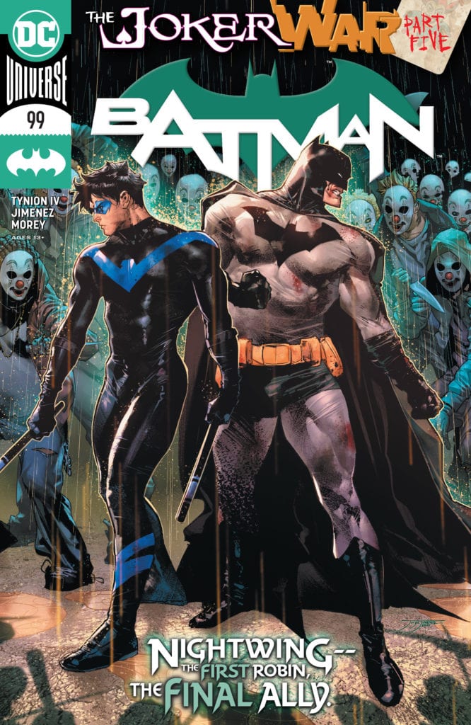
The Joker War continues to torment Batman. After being infected by the new Joker serum, Bruce has been going through visions of his guilt. It first started with the death of his parents, but soon it turned into Alfred. While detoxing, he has a conversation with the hallucination. Through a powerful speech, Alfred convinces Batman that this is not the end of his story. He has to let him go and gather the family. Bruce awakens just in time to help Harley Quinn defeat Punchline and heads off to gather everyone for one final battle. Will Gotham survive?
**Some Spoilers Below**
Story:
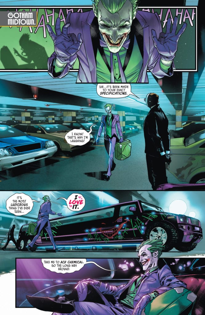
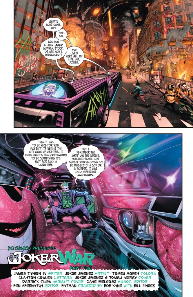
We open with Joker, preparing for a final mass killing in Gotham. He exposits about how Batman believed the city was his when, in truth, it is really his own. The clown prince makes his way to Ace Chemicals to unleash his final joke. Meanwhile, across the city, Batman gathers the family. He explains how each of them needs to find and stop the joker gang. Before they all separate, Bruce gives Nightwing his costume back. The Dark Knight goes off to face Joker one-on-one but has an unexpected follower: Harley Quinn. She gives the Bat an ultimatum: either he kills Joker or she will.
I think the biggest problem with this issue is that there is too much and too little at the same time. Due to this event being as big as it is, there is plenty of action in tie-in books to catch up on. The problem is that they’ve been doing a hell of a lot more than the central Batman comic. Sure, we’ve had Batman fight off the zombie victims, but besides that, most of the stuff he’s faced is in his head. This is a gang war more immense than any other, and while most of the family has been fighting, Bruce has been stuck in his own head. It was nice having him come to terms with Alfred’s passing, but I expect more from the series at the heart of the war.
There are a few parts that do stand out. The ultimatum between Harley and Batman was actually well done and raises excellent points about the future. She points out that Joker always comes back with a bigger and more deadly scheme, meaning he’d bring something even worse than the Joker War. She wants to stop that from happening, and honestly, it’s a fair argument to make. Will they kill the Joker? Probably not, but it’s still a very difficult choice.
Art:
Jorge Jimenez has been doing a fantastic job during the Joker War arc, and this issue is no exception. Jimenez’s is able to provide crazy, mind-bending visuals for creepy scenes. The monologue the Joker has the beautifully drawn chaos of Gotham as a visual, and it’s damn near perfect. Every page feels larger than life, fitting the dire nature of the situation. Tomeu Morey brings these illustrations to life with fantastic colorwork. The pair work well together, and I can’t wait to see what they do for issue 100.
Conclusion:
Honestly, this issue might look amazing; the story does not live up to it. There are some great moments like Harley’s ultimatum that try to make the issue feel epic, but it’s not enough. This is just a filler issue with little to no action that is just hyping up issue 100. Jimenez and Morey provide fantastic art, especially in character design, giving us a character reveal that will stay in my head for years to come. The Joker War concludes next issue, so let’s hope the hype this issue tried to provide was worth it.
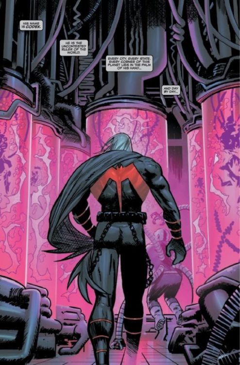
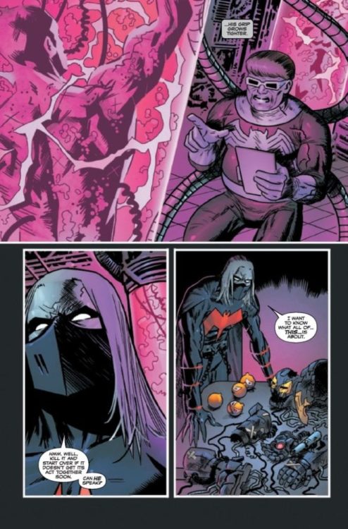
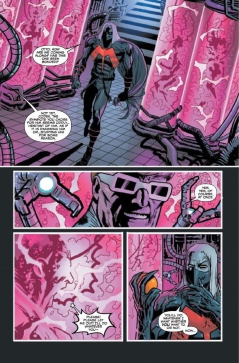
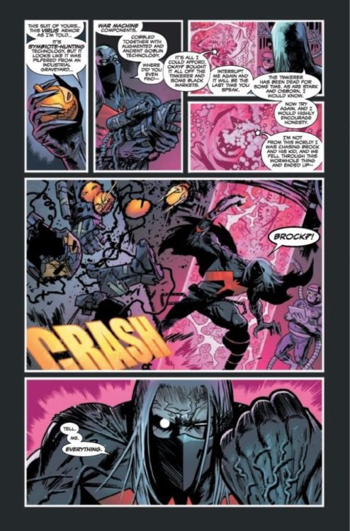
Venom #28 hits your local comic book shop on September 23, but thanks to Marvel Comics, our readers have a four-page preview.
About the issue: As if ONE new threat to Eddie Brock and his son, Dylan, wasn’t bad enough, an entirely different foe rears its monstrous head as Eddie and Dylan try to find their way! But in this dangerous new world, Eddie’s also enlisted the help of some new allies, some of whom have familiar faces – and who Eddie may never want to leave!
Venom #28 is written by Donny Cates, with art by Juan Gedeon, Jesus Aburtov drops some color, and you will read Clayton Cowles’ letter work. Geoff Shaw and Frank Martin worked on the cover, with a variant cover created by Ryan Stegman and Martin.
Are you excited for KING IN BLACK? How have you liked VENOM? Sound off in the comments!
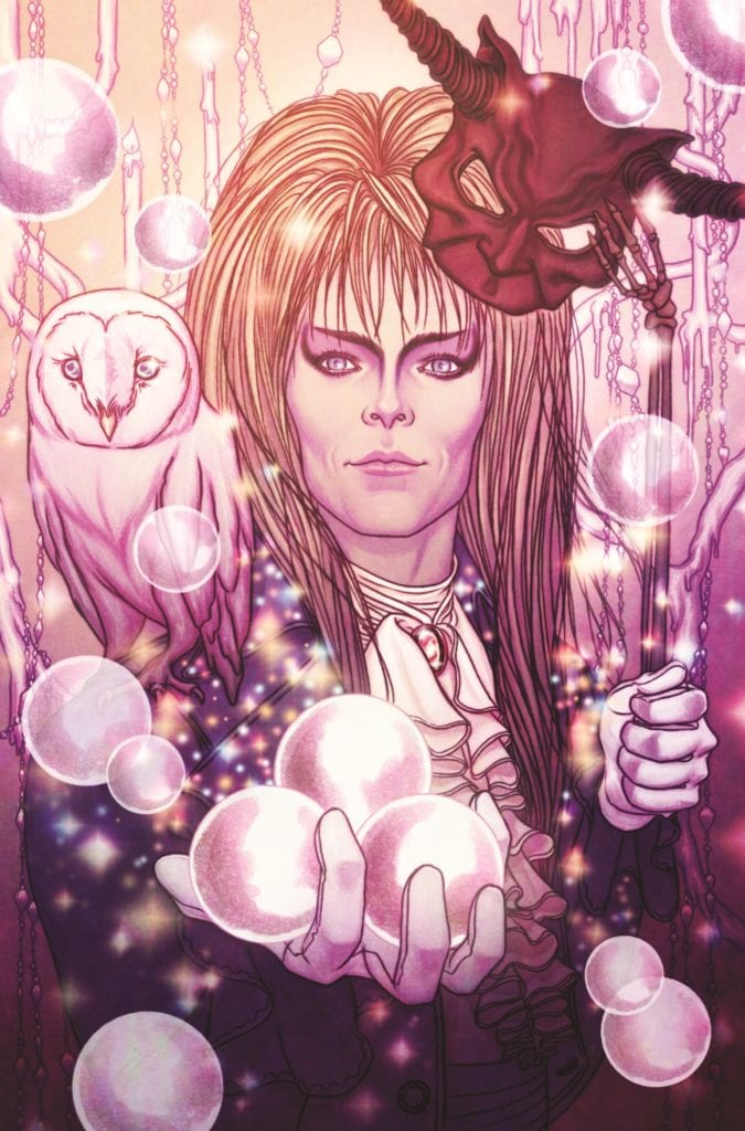
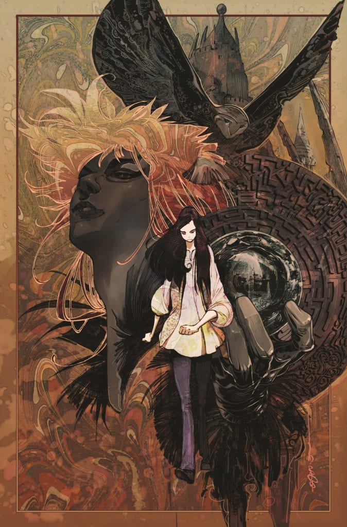
JIM HENSON’S LABYRINTH: MASQUERADE #1 features main cover art by artist Jenny Frison.
BOOM! Studios dropped some Labyrinth news today with JIM HENSON’S LABYRINTH: MASQUERADE #1 one-shot coming out in December.
The book is written by Lara Elena Donnelly, with art from French Carlomagno, Samantha Dodge, and Pius Bak. Jenny Frison worked on the main cover (below), and Evan Cagle created the variant cover (below the article).
JIM HENSON’S LABYRINTH: MASQUERADE #1 features main cover art by artist Jenny Frison.
According to BOOM! Studios, the special issue, part of the Archaia imprint, centers around the famous mirror ball scene from the 1986 film starring Jennifer Connelly and David Bowie.
You’re invited to the ball of the season! But all is not as it seems with the guests of Jareth’s famous Masquerade, as one of the partygoers slowly awakens to the reality of her topsy-turvy existence in the Goblin Kingdom after Sarah’s escape from the ball. As this mysterious participant puts together the pieces of who she is and where she is, her discoveries could unravel the very fabric of this fantasy world!
Variant cover art by Evan Cagle.
Do you plan to add JIM HENSON’S LABYRINTH: MASQUERADE #1 to your pull list? Comment below with your thoughts.
Marvel Comics releases Hellions #4 on September 16. Writer Zeb Wells, artist Stephen Segovia, colorist David Curiel, and letterer VC’s Ariana Maher bring the mission in Sinister’s old cloning lab to a close and demonstrates that some wounds may be too deep to heal.
Congratulations to the creative team for this issue! They took Madelyne Pryor, a terrifying villain with a horrifying plan for Krakoa, and by the end of the issue, made me feel sorry for her. Madelyne’s character history has been one of tragedy, being constantly hurt, forgotten, and left behind, always being in the shadow of Jean Grey.
Madelyne’s story is made even more tragic in the end when the Quiet Council refuses to grant her resurrection. Scott’s revelation that the council doesn’t want to resurrect a clone of Jean (the implication being that she isn’t a unique person) makes Madelyne’s last words all the more tragic.
Segovia’s art humanizes Madelyne as Maher’s letters convey the tragic sadness of Madelyne’s existence.
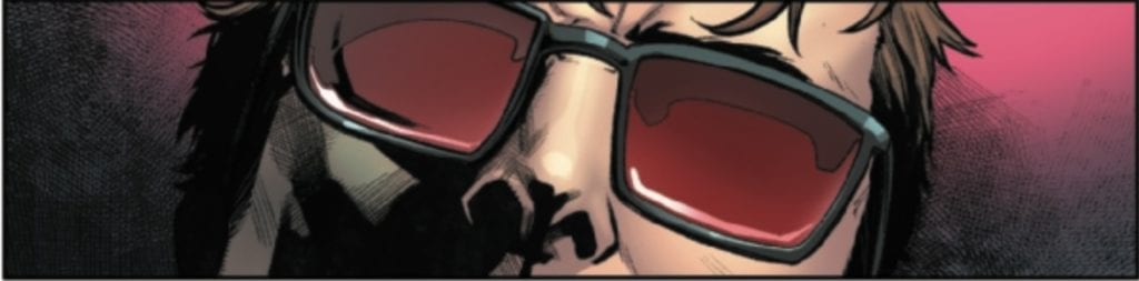
When Scott informs Alex of the council’s decision, Alex asks Scott what HE wants, and all he can do is stare.
Segovia and Curiel are able to capture the unease in Cyclops’s face. He was, after all, the one who first abandoned Madelyne for the “real” Jean Grey. This image does a good job conveying the complexity of Scott’s feelings, even his behind the deep red of his glasses.
This issue is, in many ways, a tribute to all the people that Mr. Sinister has hurt: Scott, Alex, Madelyne, Greycrow, and the original Marauders.
All is not lost though. As he watches (and takes pleasure in) Alex and Scott’s painful conversation, Sinister is approached by Nanny, who informs him that a reckoning is coming. That, and Beast’s ominous note about Psylocke from last issue, along with Alex’s disagreement with the Quiet Council’s decision, may indicate that the Hellions are on a collision course with Krakoa’s rules.
What did you think of Hellions #4? Tell us in the comments below!
December’s arrival of the King In Black is touted by Marvel Comics as a threat to the whole universe, but the universe won’t go down without a fight. Marvel has announced a new team of British heroes will come together to face this new threat in THE UNION #1, available from Marvel in December.
Says Marvel about the new team’s mission: “to be an exemplar of what Britain can be…to show that we can overcome our differences, and work together to protect with a common purpose!” You can check out a preview of the first issue’s cover by R. B. Silva and read the full team lineup from the full Marvel press release below.
What do you think of this new team? Let us know in the Comments section, and please share this post on social media using the links below.
A NEW SUPER HERO TEAM UNITES AGAINST THE KING IN BLACK!
Prepare to meet The Union!
New York, NY— September 16, 2020 — THE UNION by writer Paul Grist (Judge Dredd, Jack Staff) and artist Andrea Di Vito (Annihilation) will make its grand debut this December! When Knull and his symbiote dragons invade Earth, the Britannia Project, a top-secret program, will assemble a new team of British super heroes. The goal: to be an exemplar of what Britain can be…to show that we can overcome our differences, and work together to protect with a common purpose!
The Union is led by the beloved Britannia, the noble warrior-hero who has long stood as a beacon for all that is best and bright in these historic isles. But despite the Project’s best efforts, these heroes aren’t quite what they seem, and Britannia may have her work cut out for her!
In addition to Union Jack, readers everywhere will soon meet exciting new UK-based heroes such as:
The Choir, a victim of scientific experiments who became a living weapon with sonic abilities: whether that’s subtle sounds to disorient people’s brains, or screams that could knock over buildings! The most tragic member of the team, she finds it hard to trust others.
Kelpie, an ancient water demon who can turn her body to water and has control over water around her. Though she seems light and breezy, she may be the most volatile member of the team.
Snakes, the muscle of the team…but also the most mysterious. He’s a man of few words–probably because he’s a telepath to boot! People are uncomfortable around him. Is he a man to be trusted?
And of course, Britannia, one of Britain’s oldest heroes. She symbolizes all that’s bright and good about Britain. If she can’t whip these heroes into a team, no one can!
Don’t miss out on an exciting new chapter of Marvel when THE UNION hits stands this December! For more information, visit marvel.com.
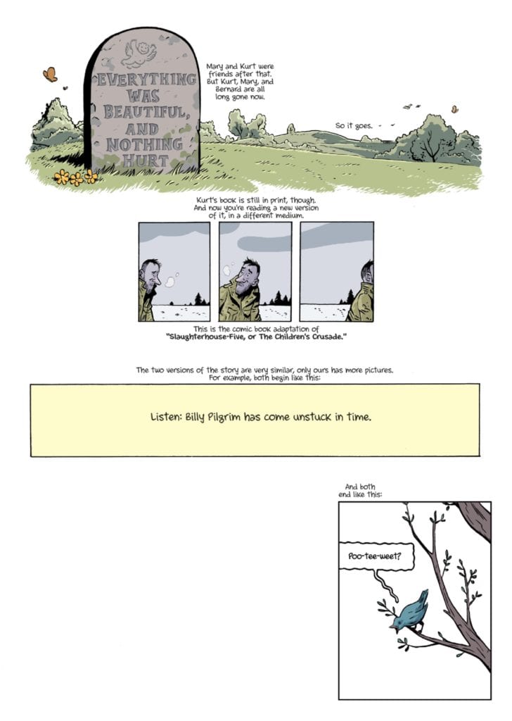
Slaughterhouse-Five, a retelling of Kurt Vonnegut’s classic story as a graphic novel published by Archaia, is a fantastic read that takes advantage of storytelling that can only be found in comic books.
About the Book:
Vonnegut’s classic novel follows Billy Pilgrim, a man who has come unstuck in time. Due to this, Billy does not experience his life linearly and jumps back and forth between different moments. His time as a soldier in World War II, his career as an optometrist, and his time spent on the planet Tralfamadore could all be shown back-to-back, despite taking place years apart. Ryan North and Albert Monteys retell this story in a completely new way that makes it deeply enjoyable whether you have read Vonnegut’s novel before or not.
Slaughterhouse-Five Story
Vonnegut’s novel has rightfully earned its place as a classic, so the work of Ryan North is not to create a riveting story but to adapt it. In the graphic novel Slaughterhouse-Five, North knocks this task out of the park. Before we even get to the part of the story concerning Billy Pilgrim, North retells the section of the novel told by Vonnegut in the first person about how the novel will be set up. North changes this to third-person and speaks about Vonnegut’s experiences. This works well because it allows North to discuss how several parts of this story — mainly the parts about being a soldier in World War II — are based upon a true story. This also allows North to set up how the graphic novel will end in the same way the original novel ended: Poo-tee-weet?
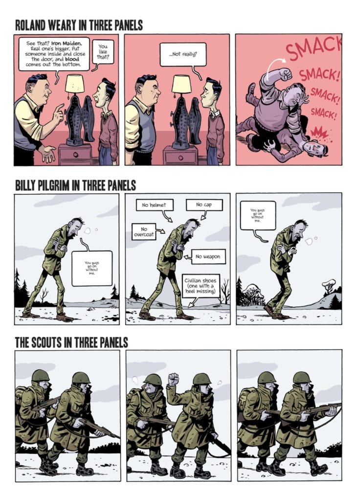
One thing that North must be applauded on is his use of storytelling elements that are specific to the comic book medium. These make Slaughterhouse-Five so much more entertaining, and mirror the unconventional storytelling Vonnegut chose when he decided to tell such a nonlinear story with an omniscient narrator. Some panels layout the entire inventory of a character on a page, a timeline, a supporting cast list, and even a reoccurring technique that describes a character in three panels. Each instance brings new life to an old story, and could not be done nearly as well in any other medium.
Art
The art style of Albert Monteys is reminiscent of newspaper comic strips and feels much like a cartoon character. This style does two things for the story. One: it makes young characters seem very young, which helps drive the point that the soldiers who fought in the war were barely adults. This is why the novel is also called The Children’s Crusade, a Duty-dance with Death. The style also makes the death of characters less impactful, which goes along nicely with the phrase repeated in both the novel and graphic novel whenever someone dies: “so it goes.” When the way characters die become harsher, and they are humanized thoroughly before their demise, the continued accompaniment of “so it goes” is haunting. The framing of panels is clearly well thought out throughout Slaughterhouse-Five, and it is a great touch when Billy is in the same position before and after he travels through time.
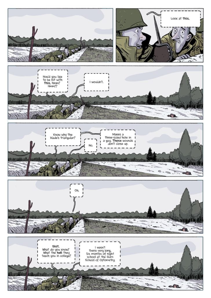
The colors of Slaughterhouse-Five pair nicely with the line art and reflect the tone of scenes incredibly well. So much so that it is abundantly clear when Billy travels through time, When items from one time enter a panel set in a different time while Billy is transitioning, it is clear that those items don’t belong. The colors of Billy’s surroundings, while he is in Europe fighting in World War II, are very bleak, which helps highlight the harsh conditions.
Slaughterhouse-Five has a standard black-and-white speech bubble whenever the narrator speaks, which helps set a non-emotive tone that pairs well with what he is saying. Monteys also uses lettering to add small sound effects in certain scenes, that helps effectively immerse the reader in what is happening.
Conclusion
This retelling of Slaughterhouse-Five is an absolute joy to read and is something I recommend to anyone who is a fan of Vonnegut’s classic tale. For those who haven’t read the original novel, the comic book adaptation is also a great place to start and is true to the original story. The story is a well-deserved classic, and this adaptation honors it while also introducing many unique storytelling elements specific to the medium.
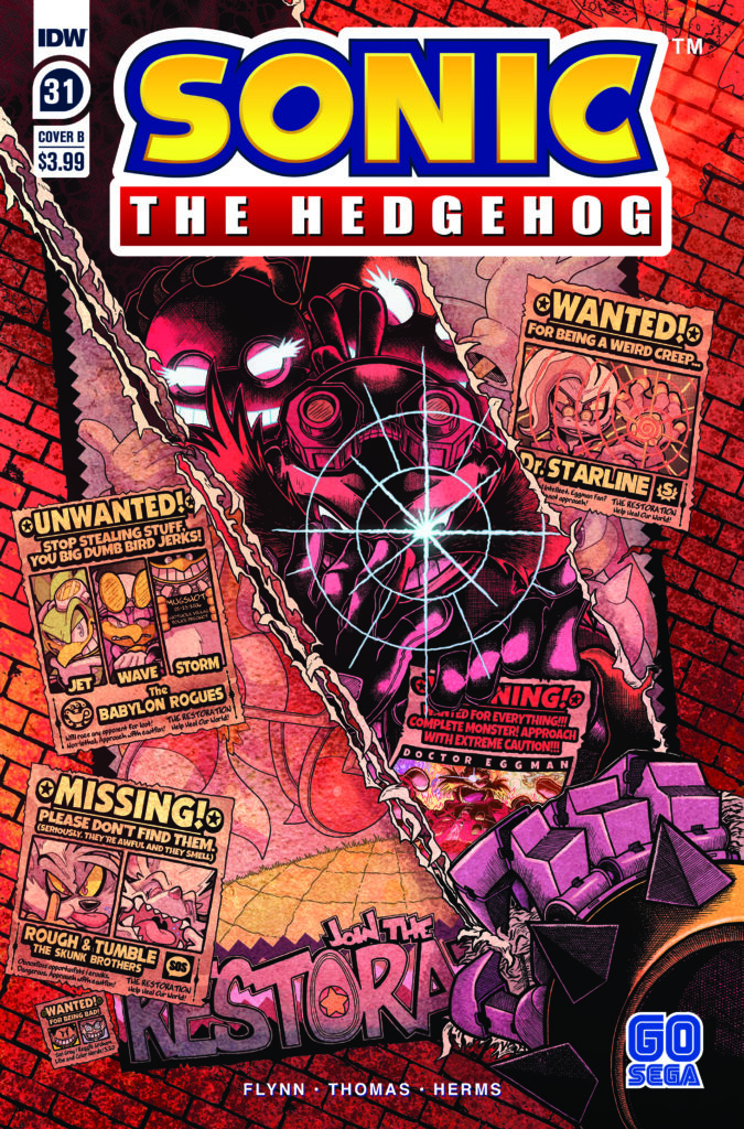
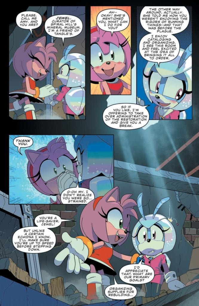
Sonic the Hedgehog #31 releases this week from IDW Publishing and focuses on wrapping up the metal virus saga. Even though the heroes were able to save the world, it becomes apparent they have a lot of rebuilding to do moving forward. The artist team consists of Ian Flynn (Writer), Adam Bryce Thomas (Pencils and Ink), Matt Herms (Colors), and Shawn Lee (Lettering).
It’s all led to this, the thrilling two-part epilogue to the Metal Virus Saga. The world has changed. Heroes and villains plan for the future as reconstruction begins. But one hero remains missing…
Writing
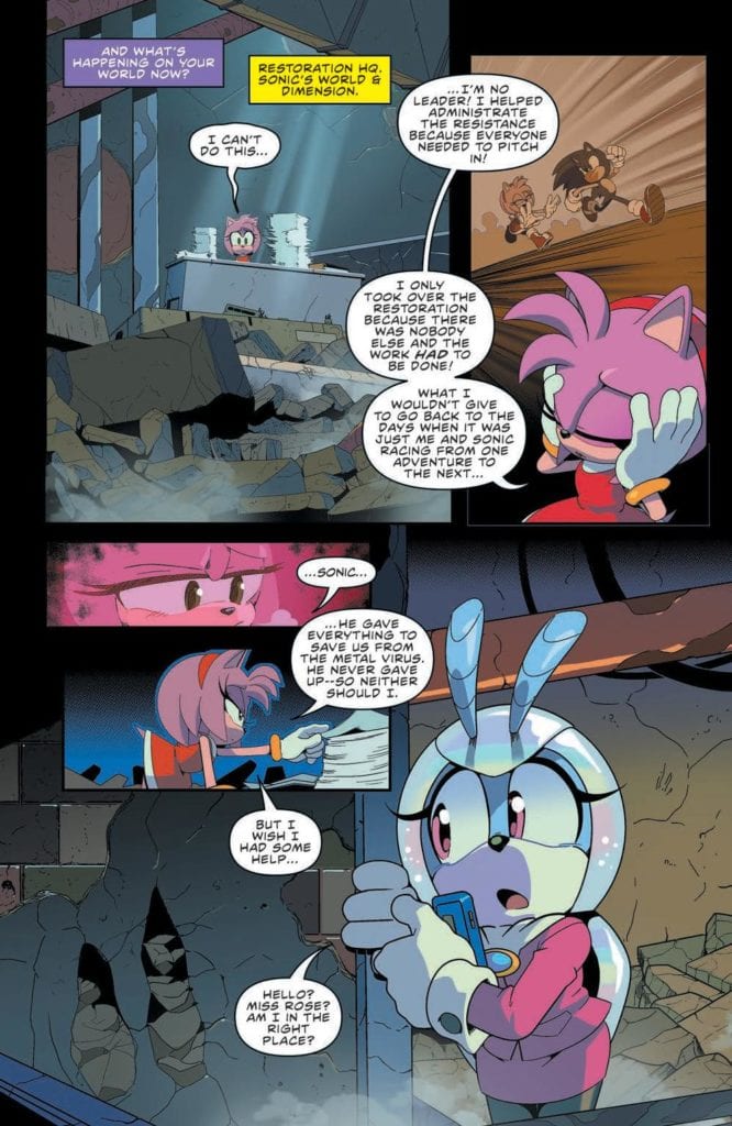
The issues feature all the characters moving forward in the aftermath of the metal virus. Most of them feel overwhelmed by the challenges in front of them. Amy Rose struggles to rebuild the Resistance base, The Chaotic are overwhelmed with person cases, and even Dr. Eggman struggles to come up with a new plan to take over the world. Luckily, all of these groups soon find they are not alone in their struggles.
The end of Ian Flynn’s time as the writer (who worked since on the first issue since IDW launched the new series) is drawing close but it is apparent there is intent to leave the characters in a good place for the next creative team. At the same time, seeds of possibilities are being laid for those who come after to address. Such as a very charming interaction between Vector and Vanilla.
Artwork
Adam Bryce Thomas pays close attention to the use of body language in this issue. Character moments vary from having more lighthearted moments but also take the time to get serious and reflect. When the moments do become heavy, Thomas makes sure to show the characters as being stiff as they feel the weight of their situation as they struggle to move forward.
The colorwork by Matt Herms emphasizes the emotional moments from panel to panel. One of the best examples comes as Silver the Hedgehog is shown making a shocking revelation. The coloring aids to show a sense of hopefulness the character has achieved after the metal virus arc.
The lettering work by Shawn Lee helps with the smooth transitions from panel to panel. Proper bubble placement allows for the reader to experience a great sense of flow the characters take the time to reflect on all they have overcome. Additional points for Lee’s use of sound effects which never distract from the overall story.
Conclusion
Sonic the Hedgehog #31 is the first part of the conclusion of Ian Flynn’s run on the title. The first part is a reminder of everything the fans enjoyed and how well the character interacts with one another. There is little worry the next issue won’t be more of the excellent quality fans have seen in the previous 31 issues.
Note: this article includes some minor spoilers for Stillwater #1. If you want to get the best experience out of the comic, don’t read anything about it. Buy it and read it first. Then come back here or check out the MFR review.
Setting a scene is important. Not just because it gives the characters a location to inhabit but because it can create a tone for the story. The setting is important for mood, for genre, and for highlighting characters. The location for a story and the way that it is depicted is as much a trope as a trench-coat wearing detective. The opening sequence in The Walking Dead is as much about the world Rick wakes up in than it is about Rick himself.
In a medium where we talk so much about character and action, it is easy to overlook the locations. However, the setting leads the reader through the narrative, signposting the genre through recognisable motifs and creating a mood that enhances the foreground action.
In Stillwater #1, published by Image Comics, Chip Zdarsky and Ramon K Perez use a changing landscape to reaffirm the central characters’ journey and draw the reader into their pseudo horror story.
Stillwater #1 Town Scene Credit: Image Comics
Cold Introductions
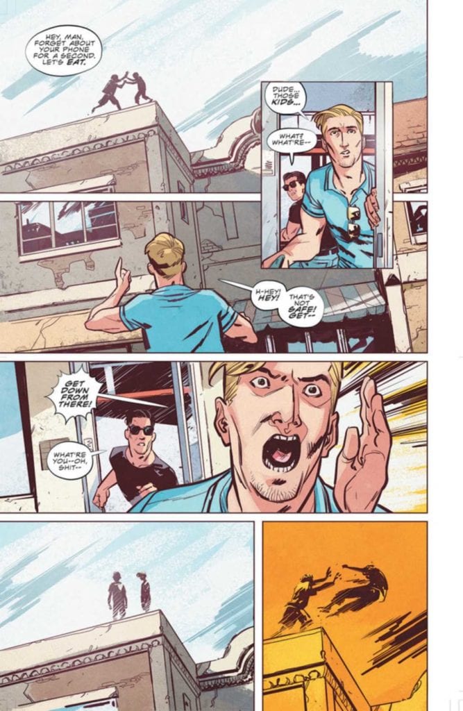
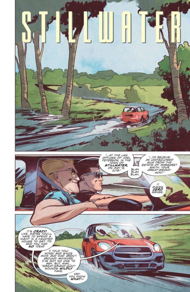
The first issue of Stillwateris a classically framed opening for a horror story. As to where the series eventually goes may be somewhat different but for the introduction Zdarsky and Perez have adopted a familiar journey. Their two main characters, one down on his luck and the other too rich to care, are mysteriously summoned to a small, out of the way town, by the promises of an inheritance.
The journey takes the characters from the urban sprawl to a quiet backwater and the changing landscapes really tell the story. One is sterile, uncomfortable and violent while the other is serene and laid back, however every horror fan knows that the grass is never greener. The contradictions between the scenery and the experiences of the characters is the mechanism that gives Stillwater it’s narrative punch. The opening scene is a perfect example of the contradiction inherent throughout the comic.
Daniel is at work, in an open plan office surrounded by fellow co-workers. It is a scene that many will identify with and must surely be a safe space. Everything is open and bright. Nothing every bad happens during the day, especially not at a mundane place of work. But if you look closer at the panels not everything is at it seems. The office is open plan but Daniel is still cut off from the rest of the workers. His desk is a physical barrier between him and everyone else; he has oversized earphones on cutting him off from the office chatter; and his name, our introduction to the character, is placed beside a large red wall hanging, the only vivid color in the room.
Letterer Rus Wooton places the speech balloons above and below the red painting which emphasises the placement and draws your attention to the vivid warning color. The added border of yellow around the second shout of the characters name gives extra weight to the interpretation that not all is as it seems. Far from being a safe place, the first panel actually insinuates that something bad is about to happen.
As the page progresses and we learn that Daniel is in trouble with his boss and the character becomes further isolated by the scenery. The red wall of the manager’s office surrounds Daniel putting him under threat. The distance between him and his Boss is exaggerated by the comparison between the different sides of the room: on one side is furniture and personal belongings which create a sense of permanence, on the other is a flat red wall with blank, white paintings, unwelcoming and empty. There is a clear division in one panel created by the desk and a cleverly placed plant, separating the characters. The panel is also silent because no words are necessary: this is clearly a man getting fired.
Stillwater #1 Into The Country Credit:Image Comics
From City to Country
In the opening scene the writer/artist uses the backgrounds to enhance the character interaction. As you move through the comic, you come to realise that the scenery also feeds into the greater narrative in a similar, but more expansive, way. The growing tension and the sense of unease that the story relies on comes from the changing landscape.
Daniel lives in the city. Zdarsky tells us through the plot that it is a dangerous and violent place. In turn Perez gives it a kind of grittiness however it is not uninviting. Mike Spicer throws a cool pink light across a nightclub scene, highlighting the characters against the grey backdrops. Despite the conflict evident on the page there is a comfort to the location, as if Daniel is at home in this place. This theme is continued into the next scene which is literally his home. He wakes up wrapped in blankets, his friend comfortable on the floor playing a games console, the warming sunlight drenches the scene.
It is a safe place and still clearly the city. The architecture and the greys in the background link Daniels apartment to the nightclub of the previous night. It is an aggressive place but one that is familiar to the characters and therefore desirable to them.
All of this is about to change with the arrival of the unassuming, little old man.
A classic unexpected inheritance is the catalyst for the story and forces Daniel and Tony to embark on their road trip. From this point onward the importance of the landscape becomes unmistakable.
Think of any horror movie or comic where the protagonists journey into an unknown location. In every single one, the change from their home, their place of safety, to the dangerous location is represented visually. The classic is the switch from the city to the county. From Evil Dead to Cabin in the Woods, 30 Days of Night to Winnebago Graveyard, the contrast of locations fuels the tone of the narrative.
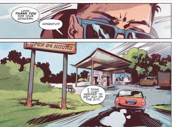
In Stillwater Perez contrasts the rigidness of the city with a free flowing, expressionistic countryside. From the moment the characters leave the urban setting Spicer’s colors become softer, greens and light browns, but there is an overbearing element to the panels and pages. Perez changes the reader’s viewpoint, moving it lower so that we are constantly looking up at the surroundings. This gives the impression of the landscape towering over us, trapping us. This is often a feeling people experience in large cities surrounded by skyscrapers, so to invoke that feeling in wide open spaces is telling of the situation. There is a moment of discomfort as Daniel drives up to a local gas station because the forecourt stretches over the reader like the lid of a box. And the further into the wilderness the two men drive, the more oppressive the landscape becomes. Perez uses dutch angles, low angles, and a lot of over the shoulder shots in order to make us as uncomfortable as possible.
Stillwater #1 Gas Station Credit: Image Comics
Unnerving outcomes
By the time Daniel and Tony reach the town of Stillwater, we already know that there is something different, something wrong with this place. Long before the unusual actions of the townspeople fill us with dread, the location has us longing for Daniel to turn around and go home.
The horror tropes are there, within the narrative but as with so much of this genre it’s the presentation that marks a title out. Zdarsky, Perez, Spicer, and Wooton encapsulate the readers expectations of a horror story in dramatic ways. They build a visual landscape that reflects the unnerving narrative so that one aspect feeds beautifully into the other. Simply put, it’s engrossing. This is exactly what you need to make the jump scares work, especially in a comic.
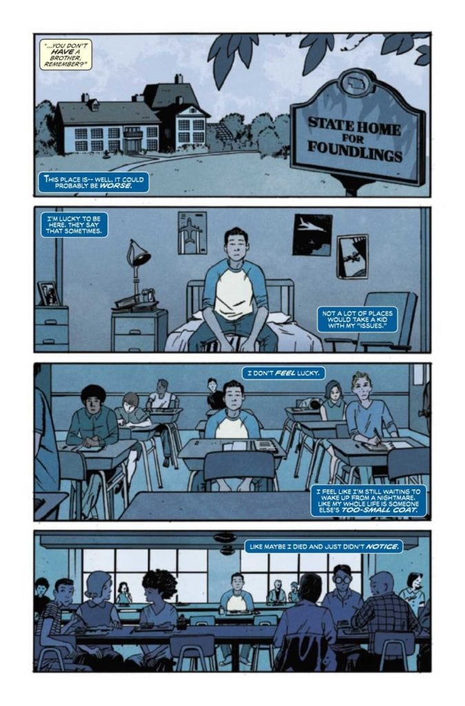
MARVEL’S SNAPSHOTS: X-MEN #1, available from Marvel Comics on September 16th, reaches back into Scott Summers’ childhood and retells how heroes are born with a little inspiration from other heroes. Written by Jay Edidin with art from Tom Reilly, this is the first Marvel Snapshots issue to showcase the tactical leader of the X-Men, and it’s the best Marvel’s Snapshots issue this reviewer had read to date.
Cover Art
Despite the vague title, Alex Ross’ cover nails the content by focusing on the subject of this issue. Scott is the planner, the leader who gets everyone moving in the right direction. He’s as laser-focused as his optic blasts, but he wasn’t always that way. It’s an interesting play to show a cover of the ending for an issue that starts at the beginning.
Writing
Edidin’s story deeply inhabits the personality of Scott Summers before he becomes Cyclops and before he even discovers he’s a mutant. We often see the origin of X-characters when they turn, and the X-gene becomes activated. That would have been the easy choice. Instead, Edidin goes back further to the plane crash that “killed” his family and subsequent life in an orphanage. From those early years, Edidin portrays a boy feeling the pull of heroism and leadership. The force grows more potent with the dawn of heroes, mostly via the arrival of the Fantastic Four and the realization that heroes inspire and beget more heroes.
MARVEL’S SNAPSHOTS: X-MEN #1 is a strong character piece by Edidin that tells a personal story of growth for a boy who chooses his path to become a man, and eventually, a hero in his own right. This comic is an excellent story by Edidin.
Pencils/Inks
Reilly’s art style works very well for the type of narrative and the time frame in which the story is set. Scott is awakened to the concept of heroes by watching the Fantastic Four’s first public battle on TV. Reilly designed the issue in a retro, mid-century 1950’s style that’s reminiscent of the dawn of the American space age. That style typifies the nuclear family tone of the Fantastic Four, and it sets a time period for the story that places Scott in Marvel continuity in an organic way.
Reilly also chose to keep most of the panels zoomed in on Scott to force the reader to view the world as near as possible from Scott’s perspective. It’s a great panel choice to maintain the personal feel of the story—lots of great creative choices here by Reilly.
Coloring
Consistent with the retro style of the issue, Chris O’Halloran uses liberal amounts of blues on most of the pages to imply the story is in Black & White. It’s not, and when the full-color panels pop, they boldly stand out, but the patina of blues helps emphasize the sense that you’re watching an old documentary. O’Halloran’s color choices elevate Edidin’s story nicely.
Lettering
Tom Orzechowski’s lettering is the glue that holds this issue together. Edidin’s story is heavily dependent on Scott’s inner monologue to carry the whole way through. By specifically coloring and breaking up Scott’s thoughts into a very specific lettering style, it makes the story very easy to read, and the technique enhances the idea that you hear Scott’s thoughts as he wrestles with his choices. Great work here from Orzechowski.
Conclusion
MARVEL’S SNAPSHOTS: X-MEN #1, available from Marvel Comics on September 16th, is the best of the Snapshots so far by a country mile. The story is a thoughtful coming-of-age tale during the dawning age of heroes, and the artwork blends seamlessly with the writing. I strongly recommended picking up the book.