Home Blog Page 249

Review: JUGGERNAUT #1 A Kinder, Gentler Giant

Juggernaut #1, Shaw cover

JUGGERNAUT #1, available from Marvel Comics on September 23, visits the unstoppable giant during his day job as he encounters a wayward teen at a crossroads in life. Continuing the trend in recent releases with Iron Man #1 and Marvel’s Snapshots: X-Men, Fabian Nicieza’s story is a personal and self-reflective character piece on the traditionally destructive character.

Cover Art

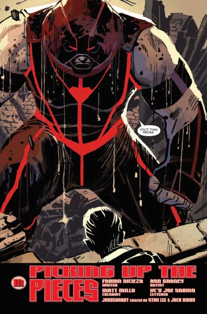
Geoff Shaw’s cover is raw and powerful. True to the reputation of the Juggernaut character, he charges at the reader with unstoppable force. It’s a visually exciting cover, and the art is nearly identical to the internal pages in style and tone.

Writing

Nicieza’s story is a solid character piece that puts Cain Marko in the mentor role to a homeless teen with force powers. The modern Juggernaut is now cast as a blue-collar every man who uses his power as a one-man wrecking crew for Damage Control. You get the sense Nicieza wants to show a Juggernaut who’s grown as a person, released his perpetual anger, learned more than a few lessons from the past, and is at peace with pursuing a “quiet” life.

Nicieza wrote a quieter, gentler Juggernaut. On the one hand, it’s a long departure from the character’s origins, which may put some readers off. On the other, it’s a refreshing take that shows how you can grow and evolve a character through life experience rather than jarring event shenanigans that throw canon out the window. I like this Juggernaut. He’s relatable. He’s fun to watch in action. And you get an unexpected Superman vibe as a character that’s aware of his destructive strength but gingerly tries to use it without hurting anyone.

Pencils/Inks

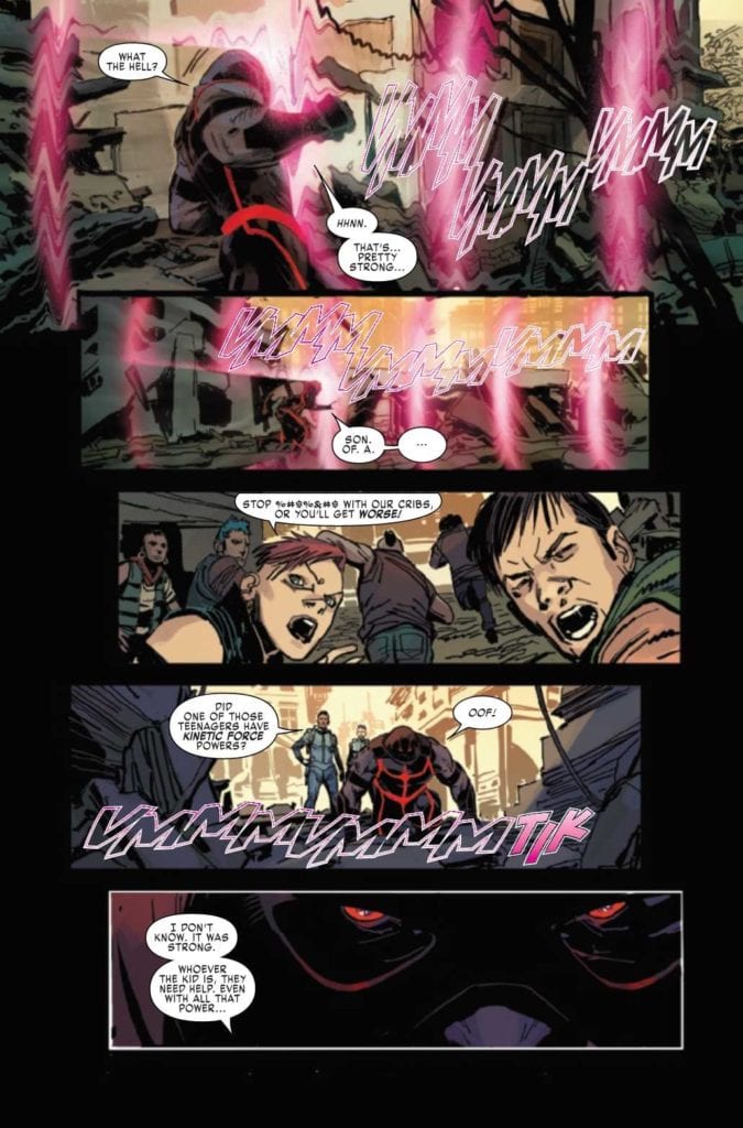
Ron Garney’s art style is rough and unrefined but in a way that’s consistent with the Juggernaut’s grounded personality. Marko is continuously surrounded by rubble, debris, and dust, so it makes sense that the lines for both the characters and the surroundings are roughed up for emphasis. This is an earthy, grounded story and the art is equally earthy to match.

Juggernaut #1, art sample

The highlight of Garney’s art is the sparing use of blurring techniques applied to flying rubble and force powers. D-Cel’s deceleration blasts warp the air in a convincing way, and Marko’s smashing blows look more potent with the blurring applied to rubble flying in all directions. Great work by Garney.

Juggernaut #1, art sample 2

Coloring

Matt Milla’s coloring compliments Garney’s art style with intentionally rough shading. Juggernaut, and every scene he’s in, has more depth and weight in a very grounded way. Milla shows off excellent use of color to bolster the art style that suits the main character’s personality.

Lettering

VC’s Joe Sabino executed a fine job with the lettering. The text was easy to read, it flowed through the panels in a natural way, and it didn’t interfere with the art. That said, the lettering tended to become a distraction because it was too bright and clean. Where the colorist and artist went to great pains to stylistically rough up the art, the lettering was not organically worked in, and it looks pasted on like a sticker. Overall, good lettering, but it needed more attention to an organic integration with the panels.

Conclusion

JUGGERNAUT #1, available from Marvel Comics on September 23, is a kinder, gentler, and frankly, more likable exploration of a character that’s evolved beyond his origins. The writing is well done, and the art greatly compliments the story. I strongly recommend this book.

Monkeys Fighting Robots Youtube

I’d Buy That For A Dollar: WOLVERINE #5 (Marvel Comics 1989)

Wolverine

Welcome to ‘I’d Buy That For A Dollar’ a column where I will be exploring the weird and wonderful world of dollar bin diving. The only rule is each and every comic is purchased for one dollar (or less!).

This week’s book is Wolverine #5 from the first on-going series!

Wolverine is one of Marvel’s most represented characters, often starring in multiple series at a time. But back in the late ’80s, the character was just getting more popular and got his first on-going series. That series was fantastic and laid the groundwork for much of the Wolverine lore today.

So let’s take a look at Wolverine #5, where Logan finds himself in his ‘Patch’ persona on a shady mission in Mardipoor! It’s got grit, action, intrigue and some truly beautiful art. The issue was written by Chris Claremont, with art by John Buscema, Al Williamson, Janice Chiang and Glynis Oliver. That’s one hell of a creative team!

Wolverine
Classic and cinematic opening page. I miss these! And that hard-boiled narration!
Wolverine
This sequence with Wolverine taking down a propeller plane is so good. Total ’80s action vibe!
Wolverine
Another great action scene!
Wolverine
Let’s get a close up of that slice to the neck! Brutal! Great use of composition!

Now let’s look at some fantastic coloring up close.

Wolverine
This panel is gorgeous. Look at those colors. And the small detail of the falling plane. Fantastic!

Wolverine

Here is my favorite page of the issue. It’s just badass! Wolverine coming out of the muck is frame-worthy!

Wolverine

This series had pin-ups on the back cover of a lot of the issues. Here’s issue 5’s from the great John Bolton! Wolverine


You can find great dollar bins at almost every local comic shop. So find a shop, ask a comic clerk what they can do for you during this time and get some dollar comics! Pick them up curbside and have them delivered if you must!

Got your own awesome dollar bin finds? Toss them at me! 
Send emails to manny@monkeysfightingrobots.com
Follow me on Instagram: _idbuythatforadollar_
Tweet at me: @MannyG1138

Monkeys Fighting Robots Youtube

Review: BOOKS OF MAGIC #23 Shows Us Possibilities Are Endless

BOOKS OF MAGIC #23, available in comic book stores on Tuesday, September 22nd, concludes the Dwelling in Possibly story arc in intriguing fashion. When faced with the knowledge of his potential villainous future, Timothy Hunter entered a deep bout of self-doubt and self-hate. What’s more, his former friends and school bully find themselves involved in a meeting of the future and the present. The resulting effect is a story of unexpected proportions.

Story

Our story opens with Ellie, Fatima, and  Tyler—three schoolmates of Tim who have been roped into his magical mishaps, finding themselves at a literal crossroads. A mysterious figure shows up to offer them a choice: turn left and assist the young wizard, or take the right path to oppose him.

Given how much trouble Tim has caused his friends, it’s easy for readers to understand their choice. In this way writer David Barnett humanizes these characters—we don’t agree with their decision, but we recognize that even “good” characters are morally complicated.

The story proceeds to detail Tim’s otherworldly trial for supposedly killing thirty-six Cold Flame cultists. At this trial is Ms. Rose and Izzy, his two closest confidants. What’s confusing, however, is Rose’s double nature as Richard Occult.

This issue was full of unexpected events that nevertheless tied into the established lore of the world. We loved diving into Tim’s world of possibilities.

Artwork

The illustrations in this issue are full of energy. Tom Fowler’s penciling and Craig Taillefer’s ink work gives readers characters fluid in their motions and detailed in their appearances. Marissa Louise’s coloring differentiates between each storyline—using eery reds, greens, and gray shades for the darker elements of the story and natural colors for Tim, Dr. Rose, and his friends’ panels. Todd Klein’s lettering helps distinguish these rival elements further by employing squiggled lines for the cultists’ speech and even curves for the protagonists’.

Conclusion

BOOKS OF MAGIC #23 wraps up this arc nicely. It gives readers just enough closure to salsify their queries while opening the door up for various other adventures in the series.

Were you satisfied with this arc’s conclusion? Let us know in the comments below!

Monkeys Fighting Robots Youtube

REVIEW: SUICIDE SQUAD #9 is Perfectly Doom-Filled

Suicide Squad Tom Taylor DC

Written by Tom Taylor, with art by Bruno Redondo, colors by Adriano Lucas, and letters by Wes Abbott, DC Comics’ Suicide Squad #9 is full of dramatic irony at its best. There’s no way to talk about this issue without spoilers. This creative team has been incredibly forthright about what this issue includes. They’ve shared spoilers on Twitter, through solicitations, and even in the comic itself. That’s because Suicide Squad isn’t a series that is “spoiled” by spoilers. It thrives off of them.

spoilers ahead

Writing

Taylor has crafted this whole issue around one simple idea: the readers know Deadshot will die. I mean, even the cover goes out of its way to make sure we know. But Taylor is banking on us knowing. He isn’t in this to shock us. He wants us to care. We see Deadshot’s conversations with his daughter and his teammates. Every moment is bittersweet. But Taylor doesn’t play up the doom and gloom either. He plays against the tragedy of the issue by making Deadshot as confident as ever. He’s invincible until he isn’t.

The moments in this issue that are “lasts” for Deadshot still carry his signature nonchalance. We don’t see him hugging or weeping with anyone. That’s because Taylor wants Deadshot to live like he’s never going to die. Just like he always has. Taylor brings us the joy, badassery, and humor that we love Deadshot for, right up until his final moments. It makes it all the more tragic when we see him go.

Suicide Squad Tom Taylor DC

Art

Throughout this issue, Redondo shows us Deadshot at peace. He’s talking with Harley over a waterfall or with his daughter in the woods. These pages don’t have a border to them. The picture continues right off to the edge of the page. It makes each of these moments feel like they last forever. It’s as though the page layouts are begging Floyd to stop. Don’t go see Ted Kord, don’t try and get revenge. Just stay in the woods. Talk with Harley. Talk with your daughter.

But as the Suicide Squad enters the city, we get another borderless page. This time, it feels like we’re trapped. The explosions and violence in the panels in the center of the page are all Floyd knows. This is his entire world. And when things begin to boil to a head, the borders come back. Each panel becomes another small step towards Floyd’s doom. And Redondo leaves us with one final, borderless page. A tragic page that goes on forever.

Suicide Squad Tom Taylor DC

Coloring

Lucas stays wonderfully fun in this issue. This isn’t a funeral march; it’s a party. In fact, it’s the moments Deadshot is out of danger that feel the least fun. His conversations with his daughter and Harley out in the woods look beautiful, but they’re more serene and calming than anything. When Deadshot does what he does best, the colors get crazy. We get the bright yellows, oranges, and reds that come with a battle scene. And Lucas almost seems to be signaling to us how close Floyd is to danger.

The yellow action backgrounds turn to orange when Osita starts yelling. It’s as though she’s putting them in danger. Blowing her lid means they could all die. She brings them a step closer to danger. When she leaves, the action sequences have a yellow background again. The moment has been defused. We’re safe. But Lucas makes us feel safe for a second. As Floyd stares at a gun in his face, the background of the panel is red. Lucas faked us out, and the danger comes back in with a vengeance, cruelly skipping orange on its way.

Lettering

Abbott’s subtlety is really on display in this issue. As this issue of Suicide Squad opens, we see Chaos Kitten and Thylacine infiltrating a building. Kitten’s punches are shown in block letters with a clear outline; Thylacine’s are given a messy edge. We get a sense that Thylacine is holding something back and that if it broke through, it would be messy. And later, as Floyd and Harley talk about their time together on the Suicide Squad, their dialogue practically overlaps each other.

This is their typical banter. But as they finish talking, Harley says, “But… I’m proud of you, and I’ll miss you.” Deadshot’s next line gives hers a wide berth. We feel how deliberate his response is, and we can sense the pause between the lines. “Yeah, you too, Quinn,” he responds. With a simple change of spacing in each panel, Abbott gets this moment to stand out and gives it the center stage it’s due.


DC Comics’ Suicide Squad #9 gets tragedy so perfectly right. It lets you know what you’re in for and then tricks you into believing that maybe they’ll all make it through alright. It’s an issue that plays with our hope and breaks our heart like only a brilliant story can do. Pick up DC Comics’ Suicide Squad #9 Tuesday the 22nd from a comic shop near you. It’s incredible!

Monkeys Fighting Robots Youtube

How The Investigation Unfolds in BATGIRL #49

BATGIRL #49, available Tuesday from DC Comics, brings fans ever closer to the end of Barbara Gordon’s series (for now). It’s also bringing us closer to the truth, as Babs tracks the mysterious Batgirl killer.

***SPOILER WARNING***

spoilers ahead

The Joker War may have concluded, but it’s clear that Babs is not going to be getting a break anytime soon. She survived what the Joker had intended for her, but now she’s up against a whole different killer.

This killer is dressing up women to look like Batgirl, and then killing them. Though perhaps not in that order, that is harder to be certain of. What is certain is that this killer has a type, and both Batgirl and Babs fit it.

The last issue brought with it that dramatic revelation, and now it’s time to see how Babs deals with it all. Not to mention how Gotham responds to the idea of Batgirl being dead (and identified, as far as they know).

A twisted game has begun in Batgirl #49.

The Writing

Batgirl #49 was written by Cecil Castellucci, and you can see how carefully she wove this web. With only so many issues left to wrap up Batgirl’s latest adventures, she’s decided to go out on a bang. One that is quintessentially Batgirl – and Barbara Gordon.

It’s safe to say that this is a pretty dark issue, what with the death of Batgirl looming over everyone’s heads. Once again, we’re facing the trauma that seems to prevalent to Batgirl. Yet it almost feels like we’re on the outside watching in. In this instance, that includes Batgirl as well. It’s an odd twist to that scenario, yet it’s almost refreshing in a way.

Another surprise for this plot arc is the sheer level of family drama going on within the pages. The Gordon family has never been a normal family, but lately, they’ve been worse than ever. Each and every surviving member of the family has their own baggage, and it seems like none of them are capable of forgiving the others.

That may feel like it’s irrelevant to the death of Batgirl, but it is so essential here. In a way, it’s setting the scene, for there’s no doubt that this hunt is a symbol of the baggage that Batgirl herself carries with her. And the enemies she’s created along the way.

The drama also laid the groundwork for the dramatic conclusion to this issue. It’s hard to be certain how Babs will react to what has been done. Or how others will react to her, but the odds are good that it isn’t going to go well. In a way, this feels like we’re heading towards a natural conclusion to the series, which is appropriate.

The death of (a) Batgirl in Batgirl #49.

The Art

Naturally, the artwork in Batgirl #49 is every bit as daring and bold as the writing itself. However, it shouldn’t surprise fans to hear that the artwork gets a little dark as well. Not literally – the scenes are crisp and clear. It’s merely the scenes portrayed that carry with them a darker tone.

Robbi Rodriguez paved the way for this issue, creating a variety of scenes and emotions – all of which are pivotal to this plot in particular. The implications made within this issue wouldn’t have had the same impact without Rodriguez’s artwork and scenes to make the truth hit home.

Jordie Bellaire was responsible for the colors, which are a striking balance of bright and dark. The shadows within intentionally obfuscate the truth, while the bright colors seem to remind readers of the lives being lost.

Andworld Design provided the lettering, and it was so carefully done here. There’s a lot going on in these pages, from all the dialogue to the running thoughts – not just of Babs, but of her family as well. Yet it is never difficult to tell who is speaking or thinking. Given what happens here, the distinction of characters was vital.

The city is about to have its heart broken in Batgirl #49.

Conclusion

Batgirl #49 is setting up for a potentially dark and foreboding conclusion to Batgirl‘s series. Yet it also feels right, in a way. The themes and twists that the series is currently dealing with. It all feels right at home in Babs’ story.

Monkeys Fighting Robots Youtube

MARGO: ATTACK OF THE SPACE-VAMPIRE – Love Overcomes Assaults

Margo: Attack Of The Space-Vampire Cover

Margo: Attack of the Space-Vampire is this week’s two-issued complementary story from creator Jim Whiting’s Whiting Studio‘s Margo: Intergalactic Trash Collector. Joining Whiting is Charles Santino as co-writer and colorist Chuck Michael Obach for Whiting’s art. The second story features Whiting as writer, letterer, and co-colorist while Marcelo Trom acts as artist, and Thyago Brandao serves as co-colorist. Despite this series’s pulpy nature, this two-pronged release has a theme concerning sexual assault and how familial love acts as a deterrent.

Margo: Intergalactic Trash Collector Prologue/Story Dynamic

Rather than diving right into the titular situation, readers instead get an introduction to the title character. In Applicant, Whiting and Charles Santino introduce new readers to a rather decent first impression. One that shows both Margo’s rocky relationship with her mother but still appreciates what it does for Margo. Especially when it comes to a plot point that has become increasingly relevant for its depiction of workplace sexual harassment, even if it does come with implications of needing to bring cameras everywhere to expose misappropriation and conversely elevate status, even Margo isn’t too fond of the result despite getting the job of the series and her mother’s insistence everything was okay.

Which brings us to Margo: Attack Of The Space Vampire from just Whiting. Margo’s relationship with her mother is as rocky as ever. Yet it’s Margo’s relationship with her late father that takes center stage. This manifests in two forms, an image that is either a recording or a memory, and Margo’s loyal dog Millie. In this way, when the titular vampire appears, it’s a father’s love that goes out of its way to protect his daughter from assaults. No steamy gothic fantasies about vampires are allowed in this story—only affection matters in this and the rest of the series.

Art

Art duties split up among the different takes of the narrative. Whiting does the art in Applicant, where the rough yet simplistically chaotic line work is applicable in different cases. The use of backgrounds really tells the mood of the setting. A very vibrant background is a piece in time to remember, like a mural of an emergency worker. Or a dangerous area that can happen in other places in the Margo series. Meanwhile, a lack of background is where things disappear and transition to a new moment in time. All of which heighten with Chuck Michael Obach’s coloring. For example, a bright and uplifting setting in yellows transition to a green one to reflect a change in less certain times. Or when things are about to become harder with orange and reds, which match the colorations of Margo herself.

Margo: Attack of the Space-Vampire features art from Marcelo Trom. The smoother artwork comes with more cinematic transitions that always seem to shift angles. This can allow for more storytelling, like when parallel points come up. Points like that highlight Whiting’s lettering where word balloons positions intersect from one scene until they come together. The wordmarks with stylizations like a heavy ship landing with a loud “klunk” serve as the lynchpin of those points. The coloring between Thyago Brandao and Whiting mostly highlights points of interest, including lights that guide the reader.

Feel The Love In Margo: Attack of the Space-Vampire

Margo: Attack of the Space-Vampire is a pretty good piece for new readers to get acquainted with. Not only does it introduce a character in a way people relate to at the time of its release, but it also has a good message about familial love. It’s something that manifests differently, like a pet that’s an extension of a late relative. All in an environment that’s constantly changing perspectives but still comes back to the point of origin.

Monkeys Fighting Robots Youtube

Review: BLACKHAND & IRONHEAD–Not Your Father’s Anti-heroes

Amy and Alexia at odds

Available this week, writer and artist David Lopez’ opus Blackhand & Ironhead adapts a Watchmen-esque story for the modern era. Published initially through Brian K. Vaughan’s Panel Syndicate website, script tutor David Munoz and translator Stephen Blanford helped bring this story to life for Image Comics, with a logo by Cris Castan and colors by Nayoung Kim.

Blackhand & Ironhead imagines a future in which a corporate elite has capitalized on battles between superheroes and villains. Much like Watchmen, it deconstructs the superhero mythos, but through the fresh perspectives of two naive young heroines who struggle with a complicated inheritance. Lopez’s keen character writing, combined with his expressive art, make for a fun, thought-provoking book.

The final page of part one, entitled “Family,” is an excellent example of Lopez streamlined, almost cinematic storytelling. It shows us the funeral of Alexia’s (one of the heroines) father, Charles a. k. a. Ironhead, the corporate CEO of Lessep’s. His foundation created televised “cage matches” between heroes and villains, the profits of which covered costs of damages caused by the fights.

Shattered

The wide page is composed of rectangular and triangular panels, like pieces of shattered glass. From close-up to extreme close-up to bird’s eye view, the page communicates emotionally how Alexia’s life has now changed; her image of her father shattered. When the daughter of the notorious villainess Blackhand crashes the funeral to deliver the news that Ironhead was also her father, Alexia reacts stubbornly and violently. Living up to her new inherited name, Ironhead Alexia headbutts Amy, the new Blackhand.

And it’s this interaction that sets up the sister’s dynamic throughout the book. Their reluctant partnership provides a balance of fun and serious reflection, carrying the narrative from moments of social commentary to scenes of classic comic book action. Like a buddy comedy, the sisters banter and ultimately learn how to work together to find out hard truths about their father, Lessep’s, and themselves.

Weird Hero Powers
AMY DESCRIBES HER POWERS.

Given Lopez’s choice of heroines, one might see the book as a love letter to the new generation of young twenty-somethings shouldering the burden of cleaning up their parents’ mess and leading the way into a better future. Blackhand & Ironhead’s outlook seems at once hopeful and wary.

Remains

It ends with Alexia looking back at the foundation as it burns, having uncovered her father’s many dirty secrets sold as good deeds. She holds up half of a fifty dollar bill Amy gave her as symbolic of the dangers of corporate greed; in Amy’s words, “So both of us remember that money is the only thing that matters in this world.” By juxtaposing the burning foundation with Alexia’s consideration of the torn fifty, Lopez is ostensibly saying that we have the power to dismantle corrupt systems but the greed which created them remains.

Or something like that. Blackhand & Ironhead isn’t exactly preachy after all. Ultimately, Lopez created a work intentionally as fun as it is timely and meaningful. It’s a must-read to close out 2020.

Monkeys Fighting Robots Youtube

REVIEW: SKULLDIGGER AND SKELETON BOY #4 Takes the Gloves Off

Skulldigger and Skeleton Boy Lemire Dark Horse

Written by Jeff Lemire, with art by Tonci Zonjic and letters by Steve Wands, Skulldigger and Skeleton Boy #4, out this week from Dark Horse Comics gives us the Gotham City we always wanted. This creative team reminds us over and over again that in Spiral City, anything can happen. Without the safety of being a big-two superhero comic, this issue of Skulldigger and Skeleton Boy is guaranteed to have you on the edge of your seat.

SKULLDIGGER and Skeleton Boy Lemire Dark Horse

Writing

Lemire’s whole Black Hammer universe straddles the line of homage and parody. But in series like Skulldigger and Skeleton Boy, he makes these mirror images of DC and Marvel’s characters his own. GrimJim, Lemire’s Joker-esque character, doesn’t just kidnap people and monologue. His promises pack a punch. So when Tex is at GrimJim’s mercy, we are genuinely worried for Tex’s safety. Lemire also shows us the inherent dysfunction of a vigilante’s world. “Let’s make them hurt,” Skulldigger says as he and Skeleton Boy head out for the night. They’re in it for the catharsis, not for righteousness. Their sheer joy in beating up thugs is proof. Lemire humanizes these characters by making them sadistic. Yet their troubling upbringing makes them impossible to hate.

Art

Zonjic focuses us in on everything that matters. When Detective Reyes is being chewed out by her chief, Zonjic focuses in on their eyes. The chief’s forehead is bulging with a vein, his eyes are wide, and his nose is flared. Reyes looks bored and slightly annoyed. This shows us how used to being chewed out Reyes is. She’s the underdog, and she can’t be bothered with working within the system anymore. These men who think they hold all the power mean nothing to her.

Later, as Skulldigger and Skeleton Boy enter a bar full of thugs, Zonjic sets up three panels on a black background. Each panel is a picture of a thug getting beaten up. One’s head is being pushed through a window, and another is having a cue ball shoved in his mouth, with the last having his teeth knocked out with a board. Each is from the perspective of Skulldigger and Skeleton Boy. They aren’t in frame, they’re the ones causing the pain. By placing this on a black background, and giving us their point of view, Zonjic shows us that they’re savoring each moment. They’re enjoying each swing of their fists.

SKULLDIGGER and Skeleton Boy Lemire Dark Horse
Pencils and inks work in progress from Tonci Zonjic’s Twitter. https://twitter.com/tozozozo/status/1285734555790585857?s=21

Coloring

As Tex and GrimJim talk about the early days of Tex’s time with Skulldigger, back when Skulldigger was the Alley Rat, Zonjic shows us these moments in a light red tone. Tex and the Alley Rat, are just silhouettes jumping over rooftops. The simple imagery makes it look as though those were simpler times. But the red haze Zonjic has colored those scenes in, interplayed with the red blood of Tex at GrimJim’s mercy, shows us it wasn’t so simple. Tex found Skulldigger in a closet; he was born into a world of violence and blood.

When we see Skulldigger back at his hideout, it’s colored in the same tone. He hasn’t escaped his past; he just lives on in the ways Tex taught him, for better or worse. But when he and Skeleton Boy hit the road, as they’re jumping across rooftops, suddenly all color drains from the page. Everything is black and white. This is what makes sense to them. This is simple. It’s as though blood has become a norm for Skulldigger. He lives in a butcher shop, and he beats the crap out of thugs. But in those brief moments, running over rooftops between punches, he’s clean.

Lettering

At one point, as Skulldigger and Skeleton Boy chat in their hideout, Wands gives us a sense of the dynamic between them. When Skeleton Boy asks to go on patrol with Skulldigger, Skulldigger asks him why. “What do you mean?!” Skeleton Boy’s response is high above his head. But Skulldigger’s lines follow, coming down from his mouth. It points out his height in that moment, and Skeleton Boy’s lines that reach upward point out how short he is in comparison. This highlights the difference between them. Skulldigger is a man, a big man at that, while Skeleton Boy is still just a boy.

Wands fills this issue with noise. The thud of a head hitting a table, the slam of a door, the honk of a car horn. He makes the lettering for each sound effect large and emphasized. But as the issue comes to a close, a couple sound effects are noticeably missing. As guns go off, there’s no “blam” to mark the noise. As a result, the moment feels deafening. It’s like the guns are so loud you can’t hear anymore. It also allows us to focus on the damage they’ve caused, more than the sounds of them going off.


Dark Horse’s world of Black Hammer has always been a joy to read. Every issue is an excellent chapter in that universe’s history. But Skulldigger and Skeleton Boy is proving to be the best series yet. With a sense of danger on every page and an incredible feeling of high stakes, this creative team delivers on every issue. Dark Horse’s Skulldigger and Skeleton Boy #4 is the strongest issue yet! It’s definitely a must-read. Pick it up, out from Dark Horse Wednesday September 23, from a comic shop near you.

Monkeys Fighting Robots Youtube

Review: ANGEL + SPIKE #14 Is An Atmospheric Tour De Force

Angel + Spike
Angel + Spike #14 Credit: BOOM! Studios

A new creative team takes on BOOM! Studio’s Angel + Spike comic starting with this week’s issue. Picking up from issue 12, with Fred in the clutches of the evil law firm Wolfram and Hart, experienced horror writer Zac Thompson and award winning artist Hayden Sherman instantly put their stamp on the characters and the series. Where Bryan Edward Hill’s run was about bringing the characters together, this new arc starts by tearing them apart.

Often a change in creators midway through a story can have a fundamental effect on a comic: sometimes good and sometimes not so much. Changes in tone and focus can derail a fast moving narrative, bringing it to a screeching halt and staling further development. This happened to a certain degree with Angel’s sister comic Buffy the Vampire Slayer but how well do Thompson and Sherman adapt to Angel’s world?

Angel + Spike
Angel + Spike #14 Credit: BOOM! Studios

Hit The Ground Running

The previous 13 issues of Angel + Spike have built up an engaging and abundant world, populated with strong, fascinating characters. There has been a story growing underneath but Byan Edward Hill’s focus on character has made the series unmissable month after month. This new issue gives Angel and his crew a new evil to track but ‘character’ is still at the heart of the story and Thompson knows the cast very well.

A violent creature is tearing the homeless of LA apart and it’s up to Angel Investigations to stop the threat. With the help of Kate Lockley it isn’t long before Angel has picked up the creature’s trail. Thompson uses a ‘creature of the week’ formula to ease the reader back into the story after last month’s one shot. The premise of the narrative is not the violent attacks but how each member of the cast reacts to them. This approach allows Thompson to illustrate his understanding of the central characters and the driving forces behind their personalities.

Gunn’s obsession with Lukas: Kate’s devotion to justice: Lilith’s penchant for obscure premonitions: And Angel’s over-protectiveness. All the character beats are here, reiterated and reinforced. None of it feels forced, however, because the framing narrative is so enticing and gripping. The simple slasher-on-the-street story is elevated by the dynamic artwork and Thompson’s commitment to the horror narrative embedded into the Angel mythos.

Angel + Spike
Angel + Spike #14 Credit: BOOM! Studios

Fangs and Claws

The opening page of this issue instantly informs the reader that there is a new look to Angel + Spike. The style is unapologetically different from Gleb Melnikov’s with warped perspectives and brighter coloring. Hayden Sherman uses exaggerated shapes to create the images within the panels, while maintaining a figurative distinction between the characters. The pages are almost impressionistic in style giving the reader a sense of the cold, unforgiving streets and Angel’s equally unwelcoming home.

Roman Titov uses contrasting colors to highlight the action and the characters across the panels. For example, the brightness of the clothing sits starkly against the blues of Angel’s office. When Lilith enters the scene, her jacket and trousers almost blend into the background, as if she is emerging from the scenery and not quite present in the room. Sherman uses a lot of heavy black shadows to create an overpowering atmosphere and Titov enhances this by keeping the majority of the coloring dark, carefully picking out one or two elements per panel.

The overall effect is oppressive. The art truly sets the scene for the cast of characters who are not in a great place. Tensions are running high and rifts are forming. Neither the plot nor the artwork allows the reader to feel comfortable throughout this issue. Not even Ed Dukeshire’s lettering offers any respite. There is a strong emphasis on the negative aspect of the speech, especially near the beginning, through the captions. Dukeshire leads the reader across the page leaving a specific impression in your mind. The words Darkness, Die, Loss and Monster stand out and linger as the images become disturbing and full of fear.

Angel + Spike
Angel + Spike #14 Credit: BOOM! Studios

Conclusion

Angel + Spike has been an impressive comic staking out its horror credentials and building a cast of damaged characters. Hill and Melnikov are a hard act to follow but Thompson and Sherman have filled the roles perfectly. The tone and themes that have kept readers coming back month after month are still front and centre in this new arc but there is the sense of new blood behind the scenes.

Some of the panels are outstanding. A low angle shot of Gunn dipping his fingers into a pool of blood and a field of dead haunting Kate’s vision are dynamic examples that steal the page. These panels capture the reader’s eye on the page turn and draw you through the layouts with a sense of anticipation.

Mixed in with the action and the shocking character moments, and there are a few in this issue, are some wonderful comedic elements. The inclusion of lightness amongst the prevailing darkness is a welcome element. The TV show always relished moments of comedy and it’s pleasing to see that Thompson and Sherman aren’t afraid to add elements of laughter and ridiculousness into the mix. It makes the narrative more rounded, more realistic, and above all more enjoyable.

A change in creative team can usually signal a good dropping off point for regular readers but to do so here would be a massive mistake. Thompson and Sherman, along with Titov and Dukeshire, have taken the reins of Angel + Spike and are driving the comic in the right direction.

Monkeys Fighting Robots Youtube

RAI #7: Making The Connection In Times Of Crisis

Rai #7 Cover

Rai #7 is this week’s release from Valiant Entertainment of Dan Abnett’s epic shared with artist Juan Jose Ryp, colorist Andrew Dalhouse, and letterer Dave Sharpe.

Recap

Rai follows the titular cyborg ronin and his brother Raijin journeying across the land to prevent the rise of their creator. Along the way, Rai sees how his past actions shape the world around them.

Rai #7 Story

Rai #7 details the importance of reaching out to others despite the risks to oneself. Abnett could not have released this issue at a more crucial time after the Covid-19 isolation periods. On one front Rai and Raijin encounter one of Father’s former slaves who, despite her mixed feelings about Rai, help the brothers out. It’s not even to get a hand in surviving; Alice Klane just did what she thought was right. Not unlike Rai’s ward Lula (Spylocke), who, despite the risks, reaches out to Bloodshot. Despite the threat of Father controlling Bloodshot, Spylocke approaches anyway. As of Rai #7, no one can tell if these encounters are good or bad. But they are essential in going forward.

Art

Ryp’s artwork continues to show the visceral nature of Rai #7. Details go into how serious things, even the datastream of Spylocke’s section gives this feeling. The binary code looks like walls obstructing communication between Spylocke and Bloodshot despite being in the background. That’s not even including how pixelated objects look like hazards. From debris that, when viewed from a certain angle, looks like the head of a shark to human bones. Since Spylocke talks about how dangerous they are, it’s like crossing into a predator’s territory. All the more worse when such an important plot point between Spylocke and Bloodshot takes place here.

This actually works well when it comes to Andrew Dalhouse’s coloring. The dull pixelated detail makes Spylocke’s colorful appearance stand out even more. This brings a sense of isolation to a very intense situation. Even in the real world, a looming threat’s effect by shifting the colors of its victims into a pinkish paste creates a sense of foreboding.

Dave Sharpe’s more efficient use of lettering in Rai #7 sees a great use of it in Bloodshot’s contact with Spylocke. The word balloons look like static glitches that display Bloodshot’s state, weakening, limited communication, and desperate. This ends up enhancing the previous artwork near the end when Spylocke and the audience actually see him.

Get Ready in Rai #7

Rai #7 is a display of doing good despite an ever-looming threat. Helping others during bad times might not be too beneficial, but it does pay in the long run, especially when the next issue is about to go into threats on two fronts. One that’s important to Rai’s quest, and the other being Spylocke and Bloodshot doing their part.

Monkeys Fighting Robots Youtube