Home Blog Page 249

The Depths and Horrors of Magic in NOMEN OMEN #9

Becky is stepping up to fight her enemies in Nomen Omen #9.

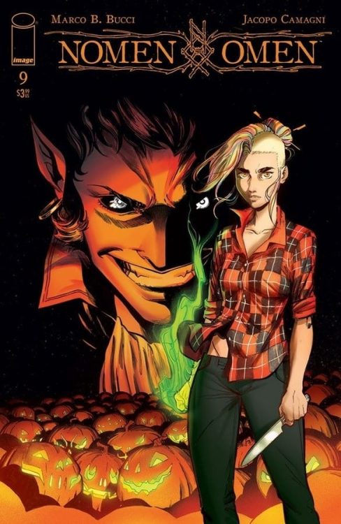
NOMEN OMEN #9, available Wednesday from Image Comics, continues Becky’s story in the most unsurprising ways. She may have mastered her magic, but her story is not quite complete. After all, she still has to retrieve her heart.

***SPOILER WARNING***

spoilers ahead

Over the course of Nomen Omen, fans have had the opportunity to watch Becky grow up. To watch her accept this world of magic that she has been thrust into, and learn to make it her own. Yet the story isn’t quite done. There are still six episodes left to this series, and she has yet to retrieve the one thing that was stolen from her (literally), so long ago. Her heart.

The series stands out among the rest that features magic, largely due to two facts. The first, the way magic is portrayed. While most of the series is lacking color, when magic makes an appearance, it infuses that missing color. Making the world seem vibrant and alive once again.

The second fact is the way lore and legend have been woven into the tale. There are times where the story feels almost familiar. And then there are times where it feels alien. The combination is enough to stick into one’s head.

*Please be warned, Nomen Omen #9 has a couple of scenes that some would find upsetting. Much like the last two issues before this one, there are scenes that imply sexual assault and abuse. These scenes always cut away quickly, but they still very much exist.

Becky is stepping up to fight her enemies in Nomen Omen #9.

The Writing

Nomen Omen #9 starts out at a darker point. A harsh reminder of what is happening while Becky takes the time to learn her magic. From there though, it quickly balances into something that feels alarmingly like hope.

The transition is almost jarring, but it also feels intentional. Marco B. Bucci has carefully crafted a narrative that blends the hope and fear into one, courtesy of the two plots running simultaneously.

This issue has several details worth highlighting. The unique combination of magic and technology is perfect, especially when considering the main character. It feels right at home with both sides of her world, as well as providing an opportunity to do something different with magic.

Then there’s a stronger inclusion of fae elements. The otherworldly presence in this issue is strong, and it’s reminiscent of legends revolving around the fae and faerie. Yet as with the magic, there are unique twists to it all.

A dark and ominous cover variant for Nomen Omen #9.

The Art

The artwork inside Nomen Omen #9 is as bold and unique as the writing itself. As with the rest of the series, there’s this careful balance between the panels devoid of colors, and those bursting with it. It makes it fairly clear when magic is playing a more active role in the series.

Jacopo Camagni is responsible for everything minus the lettering, which was provided by Fabio Amelia (Arancia Studio). All of those brilliant (and sometimes extremely dark) scenes, the bold color choices. Everything.

The theme for this issue was especially lovely, pulling in masquerade and fae elements all in one. It’s beautifully done. The main characters also got a redesign to go with the decor change, and it’s absolutely perfect.

Conclusion

Nomen Omen #9 is a dark issue, yet there is this odd sense of hope at the same time. With Becky getting stronger, it’s only a matter of time before the story comes to a conclusion. Either she wins, and gets her heart back. Or she dies. Currently, it seems as though there is no third option.

Monkeys Fighting Robots Youtube

How Family Always Makes it More Complicated in SPIDER-WOMAN #4

Getting ready to face down her latest challenge in Spider-Woman #4.

SPIDER-WOMAN #4, available Wednesday from Marvel Comics, proves that when it comes to the world of superheroes, family tends to make everything all the more complicated. That’s certainly the case when it comes to the Spider heroes running around.

Getting ready to face down her latest challenge in Spider-Woman #4.

Jessica Drew’s latest series has thrown her into a desperate run, all with the hopes of saving her own health – and the health of a newly introduced character. It’s been tense from the start, with foreshadowing elements dropped left and right.

Now it’s time to see what is so concerning. It truly is never simple for characters like Spider-Woman, is it? This dark twist in Jessica’s series may not be what fans expected, yet in many ways it’s feeling right at home in the larger world.

Too bad Jess doesn’t actually get a say in the matter – that would probably have changed things for the better. One thing is certain, the complications Jess has been facing in this series are far from over. If anything, it’s about to get a whole lot worse.

A dark and complex history, indeed.

The Writing

Spider-Woman #4 is arguably the darkest issue in the series so far, though perhaps not for the obvious reasons. Karla Pacheco has crafted a complex tale here, with dangers that even Spider-Woman’s senses couldn’t pick up.

As Spider-Woman #3 hinted at, this issue is rich with backstory. Jess’ past is not as far behind her as she might think, and it shows here. But even newer fans shouldn’t have any trouble following along, as Pacheco summed up all the important (and relevant) information.

There are so many twists to be found in this issue, it’s borderline exhausting. Mostly for the leading lady, that is. Her emotions seem to spill out from the pages, and all of it’s feeling pretty justified. With any luck, she’ll have a chance to help others understand how she’s feeling at a later date (she’s kind of earned it at this point).

The action is fast-paced, bringing about a thrilling sensation. Right up until the cliffhanger conclusion for this issue. It’s going to be a long month, waiting to see how everything plays out.

And so the history of it all comes out.

The Art

Spider-Woman #4 carries with it all the needed impact, thanks largely to the artwork. For example, the final image of this issue may be only one panel, yet there are countless details to pick up on. All of which raise more alarm.

Pere Perez’s work provided the necessary foundation for the artwork. The toll of the past few issues is showing clear on Jess, from the red eyes to the slightly crazy look. Yet it all feels oddly in place, given everything else that’s happening around her.

The colors, courtesy of Frank D’Armata are vibrant, especially in regards to the backgrounds. It works nicely when combined with the darker clothing worn in the foreground, and really makes the features stand out even further.

VC’s Travis Lanham provided all of the lettering, and there’s a lot to appreciate here. Especially if you enjoy feeling like explosions actually carry weight and sound with them. Combined with careful outlining, it makes for an effective and enthralling read.

Time for a well deserved freakout, don’t you think?

Conclusion

Spider-Woman #4 is a dark and twisted issue, showing fans that Jessica Drew’s tale is far from over. Though it is starting to feel like Jess really can’t get a break. While it’s tempting to guess at how the next issue is going to start, in a way it’s going to be fun to see how she finds a way to save the day. Again.

Monkeys Fighting Robots Youtube

THE IMMORTAL SHE-HULK #1: A Tale of Life, Death, and Beyond

THE IMMORTAL SHE-HULK #1, available Wednesday from Marvel Comics, is an issue that many fans have been waiting for. The theories surrounding She-Hulk are finally out in the open – with plenty of new information to delve into.

The fighting never ends, not for the heroes.

The Immortal Hulk has been a groundbreaking series right from the start. Yet it left many fans wondering what the implications were about the other Hulks out in the universe. Including, perhaps especially, She-Hulk.

After all, she’s taken front and center ever since the events that led to her cousin’s drastic changes. She stepped up, joined the Avengers. She battled in the War of the Realms, and put everything on the line when the Cotati showed up.

Literally, as it turned out. The last major Marvel event claimed her life – but was unable to keep it. It was a moment that fans were almost anticipating. The confirmation that she too is an Immortal Hulk.

‘The Three Deaths of Jennifer Walters’ delves into the mystery of her resurrection. As you can guess from the title, it’s going to go quite a bit further than her most recent death. Will this issue contain all the answers fans have been waiting for?

A sneaky little reference on Wolverine’s part.

The Writing

The Immortal She-Hulk #1 is a powerful issue. It simultaneously tackles the complex past of one hero, while also portraying the struggles that come from her present. Jennifer Walters has a long history, both as an Avengers, and with death itself.

So do many Marvel heroes (and comic heroes in general), for that matter. Frequently the sheer number of resurrections that occur tends to be overlooked or intentionally obfuscated. That is far from what is happening in the Immortal Hulk storyline.

This issue takes the concerns that come with death, and the concept of coming back to life. It does so in bold strokes, while also laying down the groundwork for what has been happening this entire time. It’s an intriguing concept, to say the least.

Al Ewing’s writing perfectly carried this story along, allowing for Jen to be beautifully human, while also being so painfully conflicted. Best of all, it puts everything into context. It’s sort of the issue that we’ve been waiting for, ever since that first dramatic moment back during War of the Realms.

There are many tangled threads within this issue, made all the more so thanks to the emotional ties they carry. Yet they’re all marvelously portrayed here, showcasing different elements of a beloved character.

It’s time to sit down and have a chat.

The Art

The Immortal She-Hulk #1 is a bold piece of work, from the cover to the conclusion. There are so many moments to appreciate, from the smallest details to the major changes in setting. All of it works together to make Jennifer’s plight come to life (no pun intended).

Jon Davis-Hunt (art), Marcio Menyz (colors), and VC’s Cory Petit (letters) worked together for this particular project. There are so many eye-catching scenes, it’s almost difficult to decide where to start.

It’s shocking how well the colors work in this issue, pulling in classic green hues, as well as several complimentary colors to pull the look together. It makes for the perfect backdrop, with the foreground taking center stage.

Unsurprisingly, the characters in this issue run the gambit in terms of expressions. Grief, confusion, determination, anger, it’s all there in spades.

He’s not a bad person to get advice from, given the help she needs.

Conclusion

The Immortal She-Hulk #1 is a tense yet fascinating issue, diving into the mind and history of Jennifer Walters, aka She-Hulk. It is every bit the issue that fans have been waiting for, answering questions, while raising even more along the way.

Monkeys Fighting Robots Youtube

Review: One Hunt Ends, Another Begins In STAR WARS: BOUNTY HUNTERS #5

Star Wars Bounty Hunters #5, Bermejo cover

STAR WARS: BOUNTY HUNTERS #5, available from Marvel Comics on September 23, is a chaotic shootout between Lash, Fett, Valance, and the forces of the Mourner’s Wail, with a healthy dose of flashbacks to fill in Lash’s backstory. Heavy on the action and the exposition, Ethan Sacks’ story is a satisfying conclusion to this act in the overall arc.

Cover Art

Lee Bermejo’s cover is a broadcast reminder that Boba Fett still is the most feared bounty hunter in Star Wars. Evoking imagery of figures in carbonite and the orange-yellow lighting from the Empire Strikes Back, Bermejo heavily leans on the nostalgia. It serves as a hint as to who comes out on top in this issue.

Writing

Sacks’ story packs a lot of action and exposition in equal measure in this episode. What’s impressive about the writing is how much information is packed into a small amount of space without slowing down the story or making the info dump too confusing.

When you finish the comic book, you feel like you got a lot of story. Many of the questions asked from previous issues had been answered, and Sacks writes in a healthy helping of action that contributes to the forward progress of the story.

Pencils/Inks

Paolo Villanelli’s art builds on Sacks’ story with a lot of great line work. The character renderings are sharp, and using fine point lines adds clarity to the plethora of fight panels so that the characters stand out from the blurs and action lines cleanly.

Villanelli’s linework here really speaks to the success of the issue. It’s the equivalent of watching a movie in high definition. Sacks’ words fill in the story, but the art keeps you glued to each panel.

Coloring

Arif Prianto’s coloring adds to Villanelli’s fine lines with superbly textured coloring that adds to the cinematic realism. The coloring stands out most in the weathered texture on Fett’s armor, making it look scraped and worn and weathered. The excellence of Prianto’s work is not just in the color selection, but also in the brushes and applications used to make every surface near photo-realistic.

Lettering

VC’s Travis Lanham’s lettering is excellent in this issue. There are so many different sound effects in this issue, from bioenergy disruptors to cybernetic hand cannons to blaster rifles. Lanham takes the time to organically blend the sounds into each panel with great color choices and letters the shape and direct the reader’s eye to make the sounds part of the action. The sound lettering fills in the visuals to give it more depth and make the issue more eye-catching.

Conclusion

STAR WARS: BOUNTY HUNTERS #5, available from Marvel Comics on September 23, gives you a ton of story and a ton of action. The plot is satisfying, and the art is full-on eye candy. I highly recommend this book.

Monkeys Fighting Robots Youtube

Review: JUGGERNAUT #1 A Kinder, Gentler Giant

Juggernaut #1, Shaw cover

JUGGERNAUT #1, available from Marvel Comics on September 23, visits the unstoppable giant during his day job as he encounters a wayward teen at a crossroads in life. Continuing the trend in recent releases with Iron Man #1 and Marvel’s Snapshots: X-Men, Fabian Nicieza’s story is a personal and self-reflective character piece on the traditionally destructive character.

Cover Art

Geoff Shaw’s cover is raw and powerful. True to the reputation of the Juggernaut character, he charges at the reader with unstoppable force. It’s a visually exciting cover, and the art is nearly identical to the internal pages in style and tone.

Writing

Nicieza’s story is a solid character piece that puts Cain Marko in the mentor role to a homeless teen with force powers. The modern Juggernaut is now cast as a blue-collar every man who uses his power as a one-man wrecking crew for Damage Control. You get the sense Nicieza wants to show a Juggernaut who’s grown as a person, released his perpetual anger, learned more than a few lessons from the past, and is at peace with pursuing a “quiet” life.

Nicieza wrote a quieter, gentler Juggernaut. On the one hand, it’s a long departure from the character’s origins, which may put some readers off. On the other, it’s a refreshing take that shows how you can grow and evolve a character through life experience rather than jarring event shenanigans that throw canon out the window. I like this Juggernaut. He’s relatable. He’s fun to watch in action. And you get an unexpected Superman vibe as a character that’s aware of his destructive strength but gingerly tries to use it without hurting anyone.

Pencils/Inks

Ron Garney’s art style is rough and unrefined but in a way that’s consistent with the Juggernaut’s grounded personality. Marko is continuously surrounded by rubble, debris, and dust, so it makes sense that the lines for both the characters and the surroundings are roughed up for emphasis. This is an earthy, grounded story and the art is equally earthy to match.

Juggernaut #1, art sample

The highlight of Garney’s art is the sparing use of blurring techniques applied to flying rubble and force powers. D-Cel’s deceleration blasts warp the air in a convincing way, and Marko’s smashing blows look more potent with the blurring applied to rubble flying in all directions. Great work by Garney.

Juggernaut #1, art sample 2

Coloring

Matt Milla’s coloring compliments Garney’s art style with intentionally rough shading. Juggernaut, and every scene he’s in, has more depth and weight in a very grounded way. Milla shows off excellent use of color to bolster the art style that suits the main character’s personality.

Lettering

VC’s Joe Sabino executed a fine job with the lettering. The text was easy to read, it flowed through the panels in a natural way, and it didn’t interfere with the art. That said, the lettering tended to become a distraction because it was too bright and clean. Where the colorist and artist went to great pains to stylistically rough up the art, the lettering was not organically worked in, and it looks pasted on like a sticker. Overall, good lettering, but it needed more attention to an organic integration with the panels.

Conclusion

JUGGERNAUT #1, available from Marvel Comics on September 23, is a kinder, gentler, and frankly, more likable exploration of a character that’s evolved beyond his origins. The writing is well done, and the art greatly compliments the story. I strongly recommend this book.

Monkeys Fighting Robots Youtube

I’d Buy That For A Dollar: WOLVERINE #5 (Marvel Comics 1989)

Wolverine

Welcome to ‘I’d Buy That For A Dollar’ a column where I will be exploring the weird and wonderful world of dollar bin diving. The only rule is each and every comic is purchased for one dollar (or less!).

This week’s book is Wolverine #5 from the first on-going series!

Wolverine is one of Marvel’s most represented characters, often starring in multiple series at a time. But back in the late ’80s, the character was just getting more popular and got his first on-going series. That series was fantastic and laid the groundwork for much of the Wolverine lore today.

So let’s take a look at Wolverine #5, where Logan finds himself in his ‘Patch’ persona on a shady mission in Mardipoor! It’s got grit, action, intrigue and some truly beautiful art. The issue was written by Chris Claremont, with art by John Buscema, Al Williamson, Janice Chiang and Glynis Oliver. That’s one hell of a creative team!

Wolverine
Classic and cinematic opening page. I miss these! And that hard-boiled narration!
Wolverine
This sequence with Wolverine taking down a propeller plane is so good. Total ’80s action vibe!
Wolverine
Another great action scene!
Wolverine
Let’s get a close up of that slice to the neck! Brutal! Great use of composition!

Now let’s look at some fantastic coloring up close.

Wolverine
This panel is gorgeous. Look at those colors. And the small detail of the falling plane. Fantastic!

Wolverine

Here is my favorite page of the issue. It’s just badass! Wolverine coming out of the muck is frame-worthy!

Wolverine

This series had pin-ups on the back cover of a lot of the issues. Here’s issue 5’s from the great John Bolton! Wolverine


You can find great dollar bins at almost every local comic shop. So find a shop, ask a comic clerk what they can do for you during this time and get some dollar comics! Pick them up curbside and have them delivered if you must!

Got your own awesome dollar bin finds? Toss them at me! 
Send emails to manny@monkeysfightingrobots.com
Follow me on Instagram: _idbuythatforadollar_
Tweet at me: @MannyG1138

Monkeys Fighting Robots Youtube

Review: BOOKS OF MAGIC #23 Shows Us Possibilities Are Endless

BOOKS OF MAGIC #23, available in comic book stores on Tuesday, September 22nd, concludes the Dwelling in Possibly story arc in intriguing fashion. When faced with the knowledge of his potential villainous future, Timothy Hunter entered a deep bout of self-doubt and self-hate. What’s more, his former friends and school bully find themselves involved in a meeting of the future and the present. The resulting effect is a story of unexpected proportions.

Story

Our story opens with Ellie, Fatima, and  Tyler—three schoolmates of Tim who have been roped into his magical mishaps, finding themselves at a literal crossroads. A mysterious figure shows up to offer them a choice: turn left and assist the young wizard, or take the right path to oppose him.

Given how much trouble Tim has caused his friends, it’s easy for readers to understand their choice. In this way writer David Barnett humanizes these characters—we don’t agree with their decision, but we recognize that even “good” characters are morally complicated.

The story proceeds to detail Tim’s otherworldly trial for supposedly killing thirty-six Cold Flame cultists. At this trial is Ms. Rose and Izzy, his two closest confidants. What’s confusing, however, is Rose’s double nature as Richard Occult.

This issue was full of unexpected events that nevertheless tied into the established lore of the world. We loved diving into Tim’s world of possibilities.

Artwork

The illustrations in this issue are full of energy. Tom Fowler’s penciling and Craig Taillefer’s ink work gives readers characters fluid in their motions and detailed in their appearances. Marissa Louise’s coloring differentiates between each storyline—using eery reds, greens, and gray shades for the darker elements of the story and natural colors for Tim, Dr. Rose, and his friends’ panels. Todd Klein’s lettering helps distinguish these rival elements further by employing squiggled lines for the cultists’ speech and even curves for the protagonists’.

Conclusion

BOOKS OF MAGIC #23 wraps up this arc nicely. It gives readers just enough closure to salsify their queries while opening the door up for various other adventures in the series.

Were you satisfied with this arc’s conclusion? Let us know in the comments below!

Monkeys Fighting Robots Youtube

REVIEW: SUICIDE SQUAD #9 is Perfectly Doom-Filled

Suicide Squad Tom Taylor DC

Written by Tom Taylor, with art by Bruno Redondo, colors by Adriano Lucas, and letters by Wes Abbott, DC Comics’ Suicide Squad #9 is full of dramatic irony at its best. There’s no way to talk about this issue without spoilers. This creative team has been incredibly forthright about what this issue includes. They’ve shared spoilers on Twitter, through solicitations, and even in the comic itself. That’s because Suicide Squad isn’t a series that is “spoiled” by spoilers. It thrives off of them.

spoilers ahead

Writing

Taylor has crafted this whole issue around one simple idea: the readers know Deadshot will die. I mean, even the cover goes out of its way to make sure we know. But Taylor is banking on us knowing. He isn’t in this to shock us. He wants us to care. We see Deadshot’s conversations with his daughter and his teammates. Every moment is bittersweet. But Taylor doesn’t play up the doom and gloom either. He plays against the tragedy of the issue by making Deadshot as confident as ever. He’s invincible until he isn’t.

The moments in this issue that are “lasts” for Deadshot still carry his signature nonchalance. We don’t see him hugging or weeping with anyone. That’s because Taylor wants Deadshot to live like he’s never going to die. Just like he always has. Taylor brings us the joy, badassery, and humor that we love Deadshot for, right up until his final moments. It makes it all the more tragic when we see him go.

Suicide Squad Tom Taylor DC

Art

Throughout this issue, Redondo shows us Deadshot at peace. He’s talking with Harley over a waterfall or with his daughter in the woods. These pages don’t have a border to them. The picture continues right off to the edge of the page. It makes each of these moments feel like they last forever. It’s as though the page layouts are begging Floyd to stop. Don’t go see Ted Kord, don’t try and get revenge. Just stay in the woods. Talk with Harley. Talk with your daughter.

But as the Suicide Squad enters the city, we get another borderless page. This time, it feels like we’re trapped. The explosions and violence in the panels in the center of the page are all Floyd knows. This is his entire world. And when things begin to boil to a head, the borders come back. Each panel becomes another small step towards Floyd’s doom. And Redondo leaves us with one final, borderless page. A tragic page that goes on forever.

Suicide Squad Tom Taylor DC

Coloring

Lucas stays wonderfully fun in this issue. This isn’t a funeral march; it’s a party. In fact, it’s the moments Deadshot is out of danger that feel the least fun. His conversations with his daughter and Harley out in the woods look beautiful, but they’re more serene and calming than anything. When Deadshot does what he does best, the colors get crazy. We get the bright yellows, oranges, and reds that come with a battle scene. And Lucas almost seems to be signaling to us how close Floyd is to danger.

The yellow action backgrounds turn to orange when Osita starts yelling. It’s as though she’s putting them in danger. Blowing her lid means they could all die. She brings them a step closer to danger. When she leaves, the action sequences have a yellow background again. The moment has been defused. We’re safe. But Lucas makes us feel safe for a second. As Floyd stares at a gun in his face, the background of the panel is red. Lucas faked us out, and the danger comes back in with a vengeance, cruelly skipping orange on its way.

Lettering

Abbott’s subtlety is really on display in this issue. As this issue of Suicide Squad opens, we see Chaos Kitten and Thylacine infiltrating a building. Kitten’s punches are shown in block letters with a clear outline; Thylacine’s are given a messy edge. We get a sense that Thylacine is holding something back and that if it broke through, it would be messy. And later, as Floyd and Harley talk about their time together on the Suicide Squad, their dialogue practically overlaps each other.

This is their typical banter. But as they finish talking, Harley says, “But… I’m proud of you, and I’ll miss you.” Deadshot’s next line gives hers a wide berth. We feel how deliberate his response is, and we can sense the pause between the lines. “Yeah, you too, Quinn,” he responds. With a simple change of spacing in each panel, Abbott gets this moment to stand out and gives it the center stage it’s due.


DC Comics’ Suicide Squad #9 gets tragedy so perfectly right. It lets you know what you’re in for and then tricks you into believing that maybe they’ll all make it through alright. It’s an issue that plays with our hope and breaks our heart like only a brilliant story can do. Pick up DC Comics’ Suicide Squad #9 Tuesday the 22nd from a comic shop near you. It’s incredible!

Monkeys Fighting Robots Youtube

How The Investigation Unfolds in BATGIRL #49

BATGIRL #49, available Tuesday from DC Comics, brings fans ever closer to the end of Barbara Gordon’s series (for now). It’s also bringing us closer to the truth, as Babs tracks the mysterious Batgirl killer.

***SPOILER WARNING***

spoilers ahead

The Joker War may have concluded, but it’s clear that Babs is not going to be getting a break anytime soon. She survived what the Joker had intended for her, but now she’s up against a whole different killer.

This killer is dressing up women to look like Batgirl, and then killing them. Though perhaps not in that order, that is harder to be certain of. What is certain is that this killer has a type, and both Batgirl and Babs fit it.

The last issue brought with it that dramatic revelation, and now it’s time to see how Babs deals with it all. Not to mention how Gotham responds to the idea of Batgirl being dead (and identified, as far as they know).

A twisted game has begun in Batgirl #49.

The Writing

Batgirl #49 was written by Cecil Castellucci, and you can see how carefully she wove this web. With only so many issues left to wrap up Batgirl’s latest adventures, she’s decided to go out on a bang. One that is quintessentially Batgirl – and Barbara Gordon.

It’s safe to say that this is a pretty dark issue, what with the death of Batgirl looming over everyone’s heads. Once again, we’re facing the trauma that seems to prevalent to Batgirl. Yet it almost feels like we’re on the outside watching in. In this instance, that includes Batgirl as well. It’s an odd twist to that scenario, yet it’s almost refreshing in a way.

Another surprise for this plot arc is the sheer level of family drama going on within the pages. The Gordon family has never been a normal family, but lately, they’ve been worse than ever. Each and every surviving member of the family has their own baggage, and it seems like none of them are capable of forgiving the others.

That may feel like it’s irrelevant to the death of Batgirl, but it is so essential here. In a way, it’s setting the scene, for there’s no doubt that this hunt is a symbol of the baggage that Batgirl herself carries with her. And the enemies she’s created along the way.

The drama also laid the groundwork for the dramatic conclusion to this issue. It’s hard to be certain how Babs will react to what has been done. Or how others will react to her, but the odds are good that it isn’t going to go well. In a way, this feels like we’re heading towards a natural conclusion to the series, which is appropriate.

The death of (a) Batgirl in Batgirl #49.

The Art

Naturally, the artwork in Batgirl #49 is every bit as daring and bold as the writing itself. However, it shouldn’t surprise fans to hear that the artwork gets a little dark as well. Not literally – the scenes are crisp and clear. It’s merely the scenes portrayed that carry with them a darker tone.

Robbi Rodriguez paved the way for this issue, creating a variety of scenes and emotions – all of which are pivotal to this plot in particular. The implications made within this issue wouldn’t have had the same impact without Rodriguez’s artwork and scenes to make the truth hit home.

Jordie Bellaire was responsible for the colors, which are a striking balance of bright and dark. The shadows within intentionally obfuscate the truth, while the bright colors seem to remind readers of the lives being lost.

Andworld Design provided the lettering, and it was so carefully done here. There’s a lot going on in these pages, from all the dialogue to the running thoughts – not just of Babs, but of her family as well. Yet it is never difficult to tell who is speaking or thinking. Given what happens here, the distinction of characters was vital.

The city is about to have its heart broken in Batgirl #49.

Conclusion

Batgirl #49 is setting up for a potentially dark and foreboding conclusion to Batgirl‘s series. Yet it also feels right, in a way. The themes and twists that the series is currently dealing with. It all feels right at home in Babs’ story.

Monkeys Fighting Robots Youtube

MARGO: ATTACK OF THE SPACE-VAMPIRE – Love Overcomes Assaults

Margo: Attack Of The Space-Vampire Cover

Margo: Attack of the Space-Vampire is this week’s two-issued complementary story from creator Jim Whiting’s Whiting Studio‘s Margo: Intergalactic Trash Collector. Joining Whiting is Charles Santino as co-writer and colorist Chuck Michael Obach for Whiting’s art. The second story features Whiting as writer, letterer, and co-colorist while Marcelo Trom acts as artist, and Thyago Brandao serves as co-colorist. Despite this series’s pulpy nature, this two-pronged release has a theme concerning sexual assault and how familial love acts as a deterrent.

Margo: Intergalactic Trash Collector Prologue/Story Dynamic

Rather than diving right into the titular situation, readers instead get an introduction to the title character. In Applicant, Whiting and Charles Santino introduce new readers to a rather decent first impression. One that shows both Margo’s rocky relationship with her mother but still appreciates what it does for Margo. Especially when it comes to a plot point that has become increasingly relevant for its depiction of workplace sexual harassment, even if it does come with implications of needing to bring cameras everywhere to expose misappropriation and conversely elevate status, even Margo isn’t too fond of the result despite getting the job of the series and her mother’s insistence everything was okay.

Which brings us to Margo: Attack Of The Space Vampire from just Whiting. Margo’s relationship with her mother is as rocky as ever. Yet it’s Margo’s relationship with her late father that takes center stage. This manifests in two forms, an image that is either a recording or a memory, and Margo’s loyal dog Millie. In this way, when the titular vampire appears, it’s a father’s love that goes out of its way to protect his daughter from assaults. No steamy gothic fantasies about vampires are allowed in this story—only affection matters in this and the rest of the series.

Art

Art duties split up among the different takes of the narrative. Whiting does the art in Applicant, where the rough yet simplistically chaotic line work is applicable in different cases. The use of backgrounds really tells the mood of the setting. A very vibrant background is a piece in time to remember, like a mural of an emergency worker. Or a dangerous area that can happen in other places in the Margo series. Meanwhile, a lack of background is where things disappear and transition to a new moment in time. All of which heighten with Chuck Michael Obach’s coloring. For example, a bright and uplifting setting in yellows transition to a green one to reflect a change in less certain times. Or when things are about to become harder with orange and reds, which match the colorations of Margo herself.

Margo: Attack of the Space-Vampire features art from Marcelo Trom. The smoother artwork comes with more cinematic transitions that always seem to shift angles. This can allow for more storytelling, like when parallel points come up. Points like that highlight Whiting’s lettering where word balloons positions intersect from one scene until they come together. The wordmarks with stylizations like a heavy ship landing with a loud “klunk” serve as the lynchpin of those points. The coloring between Thyago Brandao and Whiting mostly highlights points of interest, including lights that guide the reader.

Feel The Love In Margo: Attack of the Space-Vampire

Margo: Attack of the Space-Vampire is a pretty good piece for new readers to get acquainted with. Not only does it introduce a character in a way people relate to at the time of its release, but it also has a good message about familial love. It’s something that manifests differently, like a pet that’s an extension of a late relative. All in an environment that’s constantly changing perspectives but still comes back to the point of origin.

Monkeys Fighting Robots Youtube