It’s easy to see someone as a monster and not a person. In fact, life is often simpler when we see those who disagree with us as being totally inhuman. Of course, there’s a price for seeing others as monsters, and it’s this price that writer Joe Hill, artist Gabriel Rodriguez, colorist Jay Fotos and letterer Shawn Lee are interested in. In IDW’s Locke and Key… In Pale Battalions Go… #2, this creative team revisits World War I and asks us to see something new.
Writing
Hill drops us in the middle of World War I in the first page of this issue, but we land in unfamiliar territory. We’re not following American or British soldiers, but German soldiers. The enemy. But what kind of enemy does Hill make us face? The most frightening of all. One with a human heart beating in their chest. These German soldiers don’t sneer at dead bodies, or get giddy at the idea of killing their opponents, they stand up to their leaders over the use of chemical weaponry. So when John Locke comes swooping in and German soldiers crumble in his wake, there isn’t a sense of victory. There’s a feeling of loss over human life, no matter the side they stood on. Hill humanizes the enemy to lead us into a final issue where we may not fully know who we’re rooting for.
Art
Rodriguez brilliantly shows in this issue how the brutality of war feels both personal and impersonal at the same time. Focusing in, at the opening of the issue, on discolored corpses choking on their own vomit, the brutality feels close and real. But when German soldiers are being brought down in large numbers, Rodriguez pulls us back. The scene no longer feels close or personal, but like it affects everyone. War doesn’t discriminate, it’ll take whoever it can get. Yet, in the final moments of the battle, we see an up close attack and the panicked look on a dying man’s face. This tension Rodriguez creates is both terrifying and depressing, just as war should be.
Coloring
Much of this issue seems monochromatic, even dull. Fotos uses many of the same colors, creating a kind of bland look on the battlefield. But the moments that stick out, stick out for a reason. The green canisters, and later green clouds, of chlorine gas stick with the reader, as do the bright red spurts of blood. It’s all the most difficult moments to swallow. The moments Fotos knows we want to ignore. But Fotos makes them impossible to ignore. Lastly, as soldiers enter a house, Fotos shows the juxtaposition of the earthy tones of the battlefield and the brighter tones of a welcoming home.
Lettering
One of the most noticeable things about IDW’s Locke and Key… In Pale Battalions Go… #2 is its lettering. Lee shows the confidence of these characters with the large balloons, full to the brim with dialogue. Their words aren’t parsed out or broken up, they’re like speeches with brief intervals. At one point, as two German brothers talk, Lee does with the balloons what the younger brother does with his dialogue. He’s saying his older brother isn’t like everyone else, says he’s still back in the classroom talking about ethics while the rest of them are all here fighting in the mud. But when he describes his brother, it’s in one balloon, and when he describes everyone else, it’s in another word balloon attached to its side. Through this, Lee creates a sense of alienation for the brother. He isn’t just divided from everyone else in how he acts, but even in how he is spoken about.
IDW’s Locke and Key… In Pale Battalions Go… #2 makes war feel universal. It focuses in on “the enemy,” and makes us like them. In so doing, it complicates the simple “right” and “wrong” of the battle and of this series’ plot. We’re left wondering who we’re rooting for. An American who revels in taking the lives of Germans, or Germans who are agonizing over the indecencies of war? IDW’s Locke and Key… In Pale Battalions Go… #2 is a brilliant new issue in a strong series, and it’s out October 7th at a comic shop near you!
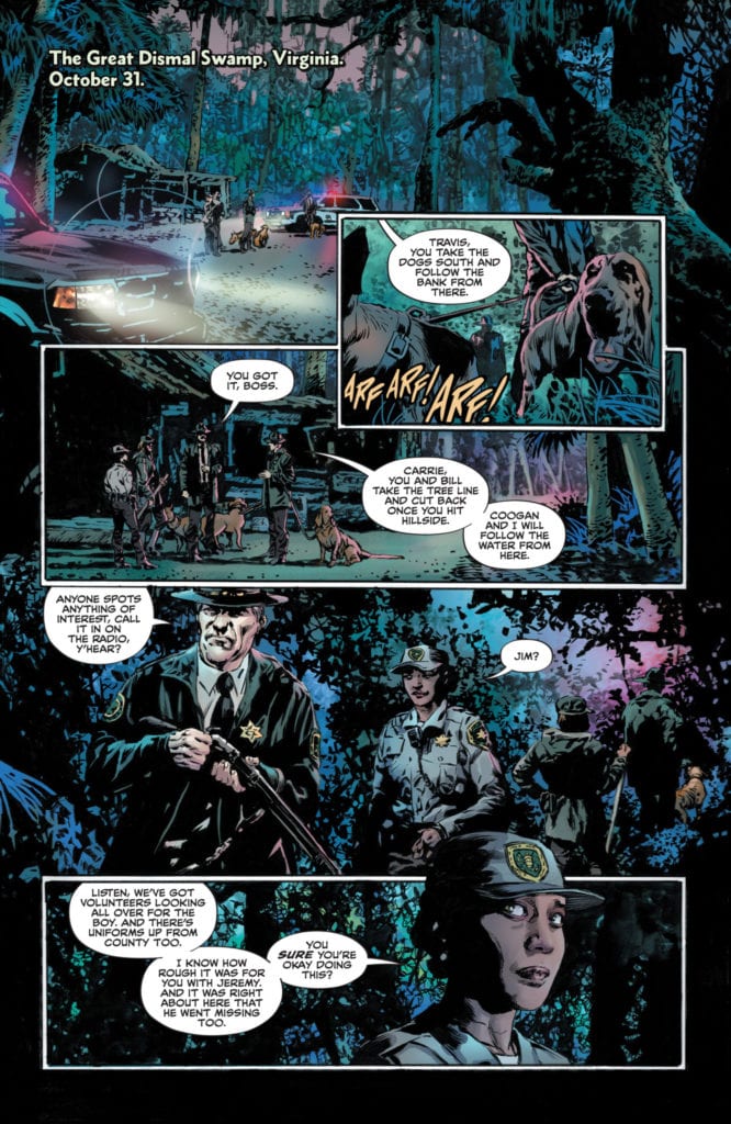
LEGEND OF THE SWAMP THING HALLOWEEN SPECTACULAR #1, available from DC Comics on October 6th, follows Big Green’s anthology of life, loss, and revenge over the ages. Created by an assortment of artists and writers, this anthology is more tragedy than horror, and it reminds you that the green, crawling things of nature are as much a part of this world as we are.
[Author’s Note: For an atypical comic, this will be an atypical review. Each section will cover each short story’s art and writing in a quick-hit style so you can get a sense of the overall work. There will be some mild spoiler throughout]
At The Heart Of Trees
(Writer: Ram V, Artist: Mike Perkins, Colorist: Andy Troy, Letterer: Aditya Bidikar)
This is the wrap-around story of the anthology. Swamp Thing saves a boy lost in the swamp while the boy is cared for by one of the swamp’s tree spirits. The ancient tree spirit has taken on so much pain and grief from other lost souls over the years that the thought of this boy’s death drives it to unnatural means of protection. Swamp Thing frees the boy and offers comfort to the tree in exchange by sharing how Swamp Things of the past have given aid or wrought justice when needed.
This is one of the best stories in this anthology. Ram V does an excellent job establishing the players and their motivations, especially the Sheriff leading the search party. Every character has a past that’s scarred by the pain of loss, and it sets the tone for the rest of the book nicely.
Likewise, the art suits the subject matter perfectly with deep heavy lines and long dramatic shadows. It’s a mix that pays homage to Bernie Wrightson’s grotesque body-horror style and Gene Colan’s dramatic shadow work by nailing the deep sadness of the Halloween season… and the grave.
Set in Druidic times when Roman forces occupied Britain, this short tells of a Roman commander who forfeits his allegiance to Rome and sacrifices everything in service to the Green and Britain’s native people.
Johnson’s story is the stuff of ancient legends where monsters rise to protect their people in mercilessly violent ways. It’s a stiff reminder that old rituals from even older cultures have a dark power that shouldn’t be taken lightly. More warning fable than revenge tale, this story portrays the most symbiotic take between Swamp Thing and the land people he protects.
The highlight of this entry is its utterly monstrous version of the Swamp Thing character as a patchwork beast formed from Earth’s elements. Hulk-like and raging, this version of the creature is an organic weapon of mass destruction. You could easily picture how such a beast effectively puts Britain’s country off-limits to the entire Roman Empire.
Sleeping Giant
(Writer: Vita Ayala, Artist: Emma Rios, Colorist: Jordie Bellaire, Letterer: Ariana Maher)
A girl seeks revenge for her sister’s death at the hands of a local sugar mill owner. Revenge, in this case comes, by way of a petition to waken the Green that rests at the base of the mountain at the heart of the island. The Green then raises a Swamp Thing to set things right.
Ayala’s story is the weakest in the anthology, not for its premise but its clunky execution. Several times I caught myself going back a few pages or panels to understand what was going on. This could be chalked up by a gap in a synergy between writer and artist, but the result is a lopsided story with a bait and switch for an ending that fell flat.
Mostly, the art in this story works to match the story’s jungle island flavor, but the big creature reveal near the end was odd. This version of Swamp Thing looked closer to a bizarre jungle flower plant with a wrinkled face. As far as a fresh take on Swamp Thing, this version is unrecognizable and misses the mark.
No Sign Of The Enemy
(Writer: Julian Lytle, Artist: John Timms, Colorist: Gabe Eltaeb, Letterer: Clayton Cowles)
This short would fall into the “alternate history” category. A Japanese soldier, abandoned on a remote island during World War II, continues his mission for decades with only the Green to keep him company before he meets a tragic end.
Emulating the real-world circumstances of Hiroo Onada, Lytle’s story leans heavily on the bitter pill of carrying out your duty against all reason. The main character chooses to endure any hardship from living alone on the Pacific island over the shame of returning home defeated while the war rages on. In the form of a small plant, the Green encourages him to give up his mission repeatedly over the years. Lytle crafts an interesting character piece about how easily honor and responsibility can devolve into obsession when left unchecked, with the spirit of Swamp Thing acting as a spiritual force instead of a physical one.
Despite the lack of physical representation from Swamp Thing, the art is loaded with intense and personal moments for the soldier. Even while carrying out such mundane tasks as digging a ditch, the offset camera angles imply a manic and desperate tone that escalates with each passing year in the soldier’s life. You can feel the soldier degenerating into madness with each panel until the bitter, final scenes where Swamp Thing appears for a saddened goodbye. This is the most emotional story of the bunch.
Age Of Discovery
(Writer: James Tynion IV, Artist: Christian Ward, Letterer: Travis Lanham)
The honor of most fantastical short goes to this story by Tynion IV. Spanish sailors motivated to plunder by greed, encounter an uncharted island that will take from the men much more than it gives. This is an interesting facet to the Swamp Thing’s history that shows the Green can be the very land itself.
Tynion IV has a knack for whimsy with a dark edge, and this story is no exception. Told through a young sailor’s eyes aboard the doomed ship, the narration starts on a note of excitement for the undiscovered future. Once the island’s nature is revealed, Tynion IV layers on creeping dread as the young sailor realizes how foolish and naïve he truly was. What makes the story more fantasy-like is the almost poetic narration style that gives the short a dreamy quality.
What sells the dreaminess of the story is Ward’s gorgeous art. The story becomes more horrific because the setting is bright, colorful, and beautiful. The art makes the island seem peaceful and the stuff of dreams the young sailor longs for, but once the island’s voracious actions take its toll on the crew, the dream shifts to a nightmare. And bonus points to Ward for the most esoteric, yet recognizable, interpretation of Swamp Thing revealed as a gut punch in the very last panel.
At The Heart Of Man
(Writer: Ram V, Artist: Mike Perkins, Colorist: Andy Troy, Letterer: Aditya Bidikar)
This story book-ends the anthology by revisiting the rescued boy from the first story many years later. The boy, now an old grandfather, encounters Swamp Thing and the Green during a camping trip and tells his own tale about his search for personal meaning after he was rescued all those years ago.
Ram V expertly captures a sense of tragic irony with this final short. A boy is so shaken by an experience that he spends his life searching for a way to justify his worth in being saved. At the very end, he fails to realize that the search itself was all the justification he ever needed and more. Here, like with No Sign Of The Enemy, it’s the desire to be more than we choose to believe we already are, which leads to obsession and a tragic end. And as with any good Halloween story, the hero who thinks he escaped his fate winds up right back where he started.
Conclusion
LEGEND OF THE SWAMP THING HALLOWEEN SPECTACULAR #1, available from DC Comics on October 6th, is a satisfying collection of tragic tales with an alternate version of Swamp Thing throughout history. There are more hits than misses, and it’s a melancholy collection that will put you in just the right mood for the holiday. Happy Halloween!
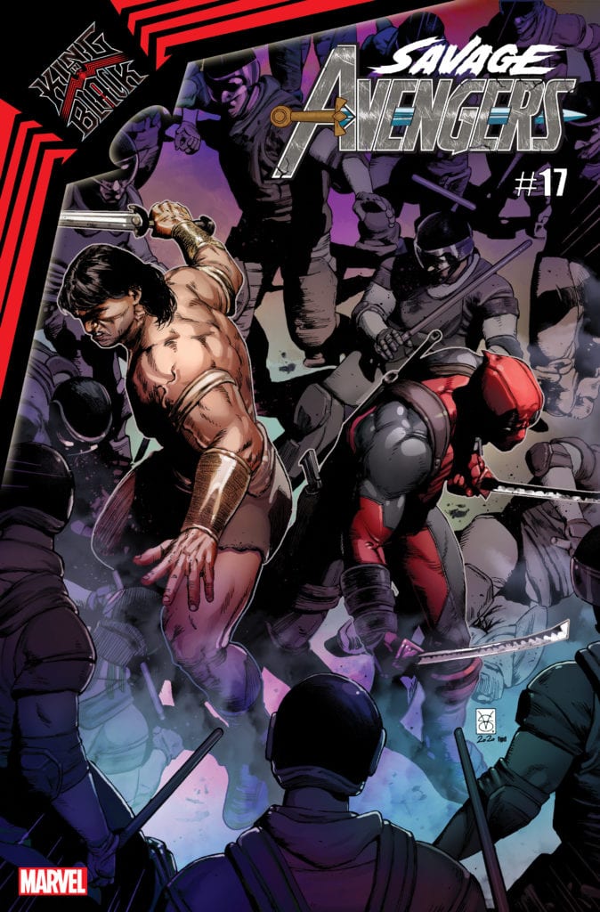
SAVAGE AVENGERS #17 hits your local comic book store in January, but thanks to Marvel Comics, Monkeys Fighting Robots has the privilege of revealing the cover and solicit text for you.
The comic is by writer Gerry Duggan and artist Kev Walker, with the cover by Valerio Giangiordano.
About the issue: “BLACK SKIES” PART 1!
CONAN rings in the New Year on Ryker’s Island — which he promptly breaks out of with the help of…DEADPOOL. The two warriors fight together against the symbiotes of KNULL, and Conan makes a surprising discovery that may help him overcome KULAN GATH.
As the solicit text suggests, SAVAGE AVENGERS #17 will serve as a tie-in to KING IN BLACK, Marvel’s big winter event for 2020, and will pit Conan the Barbarian and Deadpool against the army of the Symbiote King, Knull.
Check out the SAVAGE AVENGERS #17 cover below:
Are you reading SAVAGE AVENGERS? Sound off in the comments!
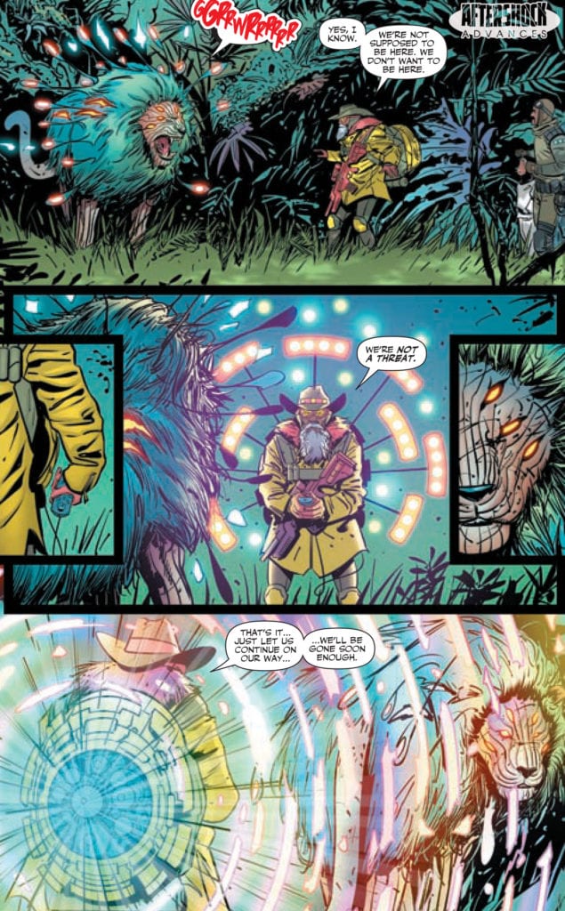
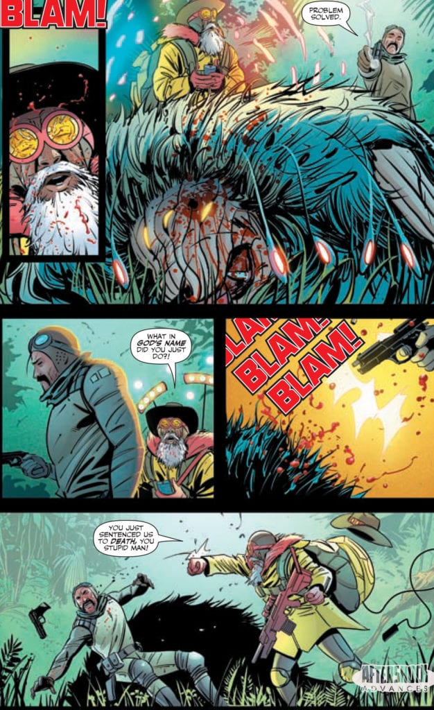
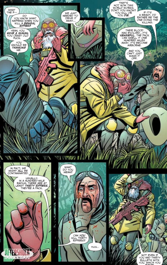
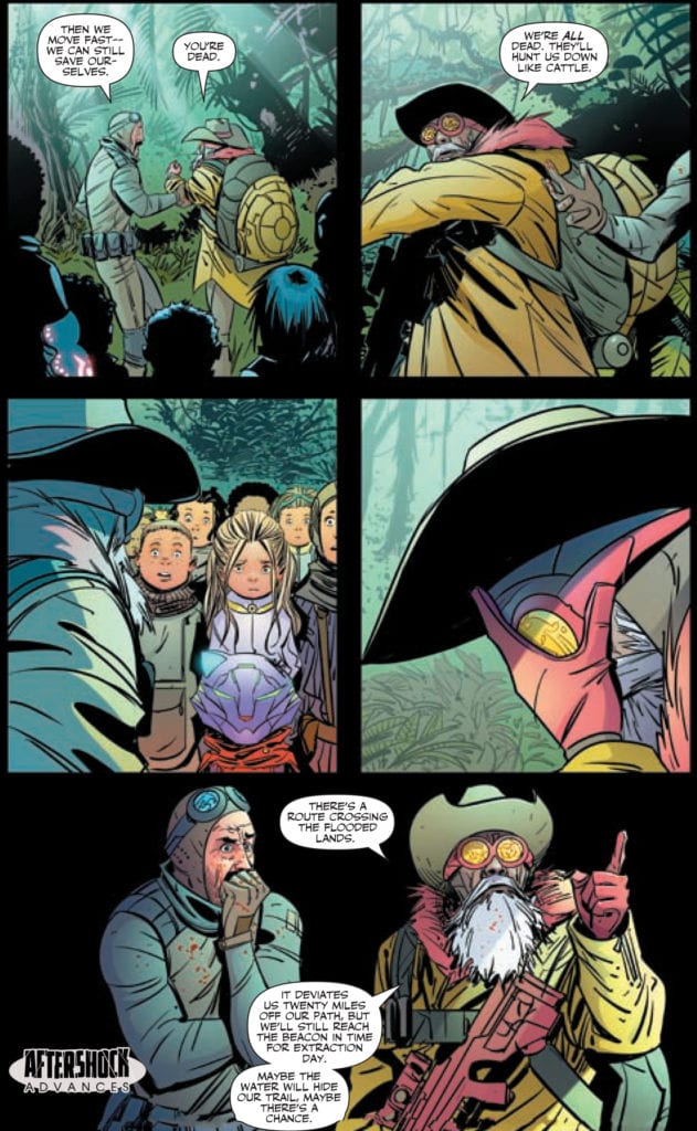
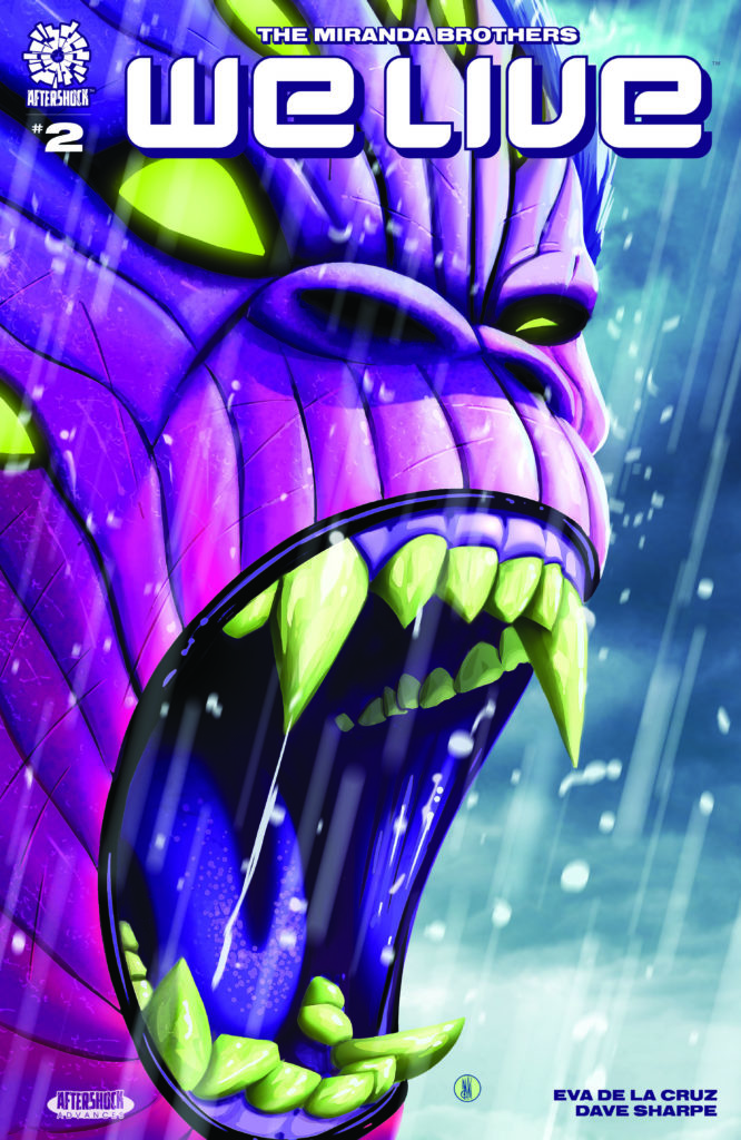
WE LIVE #2 hits your local comic book store November 18th, but thanks to AfterShock Comics, Monkeys Fighting Robots has an exclusive four-page preview for you.
About the issue: The encounter with the Bengal Ripper puts the group’s survival to the test. Their lives now rest on Simon’s shoulders, but in the Broken Lands every wrong step comes with a consequence.
Tala and Hototo, now joined by their new friends, Humbo and Alice, find themselves dragged onto a new and unsafe path. Reaching the train to Mother Megalopolis Nine is becoming an uncertain milestone.
WE LIVE #2 is written by brothers Roy and Inaki Miranda, with art and cover by Inaki, colors by Eva de la Cruz, and letters by Dave Sharpe.
Check out the WE LIVE #2 preview below:
What did you think of the first issue of WE LIVE? Sound off in the comments!
On November 4th, Marvel Comics will release the latest in their Black & White series with an anthology of Marvel’s favorite Adamantium mutant, Wolverine, in WOLVERINE: BLACK, WHITE, & BLOOD #1. This special preview cover, drawn by Ron Garney, gives readers a taste of what’s to come with Wolverine in all his violent, bloody glory.
You can check out the cover and read the full Marvel press release below.
Are you a fan of the Black & White series? What character would you like to see Marvel do next? Let us know what you think in the Comments section, and please share this post on social media using the links below.
WOLVERINE SLASHES HIS WAY TOWARDS HIS NEXT ADVENTURE IN RON GARNEY’S WOLVERINE: BLACK, WHITE, & BLOOD #1 COVER
New York, NY— October 7, 2020 — This November, fans will experience all-new tales of the best there in WOLVERINE: BLACK, WHITE, & BLOOD #1! These untold adventures are set throughout the storied saga that is Wolverine’s life and will be presented in unadulterated black and white format (with a healthy splash of blood-red). Told through the lens of an all-star cast of creators including Gerry Duggan, Donny Cates, Adam Kubert, Joshua Cassara, and Chris Claremont, WOLVERINE: BLACK, WHITE, & BLOOD promises to be Wolverine’s bloodiest comic yet and today, Marvel is proud is reveal Ron Garney’s variant cover for the debut issue. Known for his recent work on books like
Savage Sword of Conan and Juggernaut as well as decades of experience on books like Amazing Spider-Man and Captain America, the industry great brings Wolverine to life in an explosive cover that perfectly captures the brutal adventures this new series has in store for him. Check it out below and don’t miss WOLVERINE: BLACK, WHITE, & BLOOD when it goes on sale November 4th!
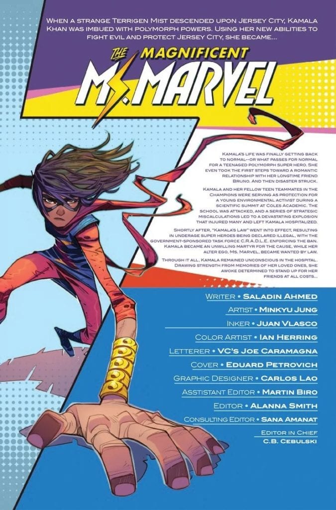
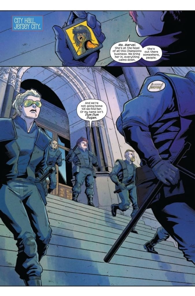
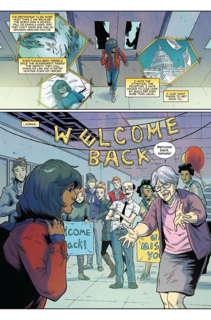
THE MAGNIFICENT MS. MARVEL #15, available Wednesday from Marvel comics, comes right at the heels of Champions #1. Kamala Khan is awake, and boy, does she ever have opinions about Kamala’s Law.
The lineup for The Magnificent Ms. Marvel #15.
It’s safe to say that Ms. Marvel has been facing many changes and decisions, as of late. This pattern doesn’t seem to be slowing down, as Kamala and her underage allies make decisions about their rights as heroes.
The Magnificent Ms. Marvel #15 is, without a doubt setting up for something more. It is an issue that goes hand and hand with Champions #1 (something fans won’t want to miss), bringing the conflict into a whole new light.
Or, more accurately, shining a light on Kamala’s side of things. She’s been made into a scapegoat, adding insult to injury for the young heroine. It’s almost surreal, in a way, to see the same old argument rear it’s ugly head once again.
Ms. Marvel has become one of the most wanted heroes, by C.R.A.D.L.E. standards.
The Writing
The Magnificent Ms. Marvel #15 is a powerful issue, once again showing the heart that resides within Kamala’s series. She’s never been a hero afraid to tackle difficult discussions, which makes her the perfect perspective for Outlawed’s events (and fallout).
Saladin Ahmed’s writing made the complex situation that is Kamala’s life feel so incredibly relatable here. While also reminding fans of everything else that she has gone through in recent times – recently enough where she hasn’t had much if any, time to cope. It’s a relevant reminder and could very well factor into decisions made. If nothing else, it stands to remind us of her character, which never hurts.
This issue is a delicate balance. On the one hand, there’s the raw buildup, the rising tension surrounding C.R.A.D.L.E., and everything it stands for. On the other hand, there’s that reminder of hope. A hope that resonates so beautifully within the Marvel universe and shines through when times are at their worst for heroes.
While the future may be uncertain, one this is clear (and will always be clear), there will always be a hero willing to step up. Right now, that hero is Ms. Marvel, and with her we’ll likely see many Champions standing by her side.
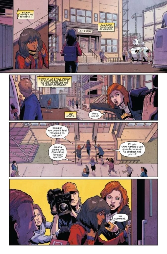
Meanwhile, the reporters want to get their hands on Kamala Khan.
The Art
The Magnificent Ms. Marvel #15 is vibrant, and the tension practically vibrates off the pages. Minkyu Jung (art), Juan Velasco (inks), Ian Herring (colors), and VC’s Joe Caramagna (letters) all worked so hard to bring this particular plot to life, and it shows.
This issue had a lot to show and very little time to do so. As such, the artists carried much of that weight, allowing the story to be told to the fullest. The plight is made clear, as is the fact that Kamala isn’t over everything else that has happened this year.
Her emotions and the emotions of many of her friends are all over the place, reacting to events as they happen. The colors themselves seem to reflect that, bringing about a cohesive look. Ironically, even the weather of this issue seems to be an agreement on that.
There’s one especially moving series of events towards the end of this issue. It’ll raise the hearts of many a reader and bring flashbacks to other inspiring moments in Marvel history. The artwork enhanced that entire scene tenfold.
Somehow this welcome back doesn’t feel so…welcoming.
Conclusion
The Magnificent Ms. Marvel #15 is an issue we’ve been waiting for. Yet it also works nicely in regards to another release this week. Together they tell a story that rings a bell to many Marvel fans, yet it still feels different.
Once again, the heroes of a generation are getting a chance to show fans what they are made of, all while being forced to make some of the hardest decisions of their lives.
The Amazing Spider-Man #850, out now from Marvel Comics, is a super-sized anniversary issue comprised of four fantastic stories of everyone’s favorite wall-crawler.
The Amazing Spider-Man #850 Main Story
The main story that comprises most of the issue is a continuation of the current The Amazing Spider-Man run and follows Peter as he helps prevent the Green Goblin from being “cleansed” by the Sin-Eater. Many of Spider-Man’s friends, going by the new name “The Order of the Web,” want Peter to let the Sin-Eater cleanse the Green Goblin, and are out to stop him. Nick Spencer successfully, as always, makes the story riveting on nearly every page, and builds up to an exceptional cliffhanger that leaves fans desperate for the following issue. Another aspect of The Amazing Spiderman #850’s story that Spencer handles remarkably well is the writing of Norman Osborn. The Green Goblin is given several moments to highlight the infamous villain’s maniacal soul, and Spencer does an amazing job of chilling the reader through dialogue.
The art of The Amazing Spider-Man #850’s main story was penciled by Ryan Ottley, Humberto Ramos, and Mark Bagley, and was inked by Cliff Rathburn, Victor Olazaba, and John Dell. The artists each worked on one of the three chapters of the story, each having a distinct style. While each chapter featured a different penciler and inker, there were many common links between the three chapters. For one, the action scenes were immaculate throughout the entire issue. There was also always an excellent choice of framing and even some unique framing choices that stood out.
The Amazing Spider-Man #850 features the talent of the colorists Nathan Fairbairn, Edgar Delgado, and David Curiel. Each worked on separate chapters of the main story, and each did a wondrous job at helping the story be visually stunning. Chapter 1 was full of vibrant colors that worked well with the stylized line art, and similar coloring of this returned in Chapter 3. Chapter 2 featured some coloring that seemed slightly bland, but this choice reflected the story’s tone well.
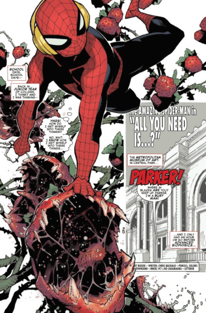
“All You Need”
“All You Need” is a fantastic short tale by Kurt Busiek that encapsulates what Spider-Man is all about very well. Going back to earlier times, Busiek tells Peter’s story while he is a junior in college. The story has every component that makes an enjoyable Spider-Man story: an interesting villain, lots of snappy dialogue, and maybe even a little romance. The story is full of fun and is a wonderful short read.
The pencils of Chris Bachalo and inks of Tim Townsend provide for some stunning art in “All You Need.” I believe the most notable aspect of their fine work is the expressiveness of character’s faces, and the monsters — despite being slightly silly in concept — were portrayed to be tremendously menacing.
Bachalo was also the colorist for The Amazing Spider-Man #850‘s story “All you Need,” and utilized a light green background to compliment the massive amounts of red in the story. The tale also features a brief flashback to prior events, given no color besides certain objects to highlight their importance. This tactic does a great job of clarifying the scene shown was a flashback, but the choice of going nearly without color for a substantial portion of the entire story was odd.
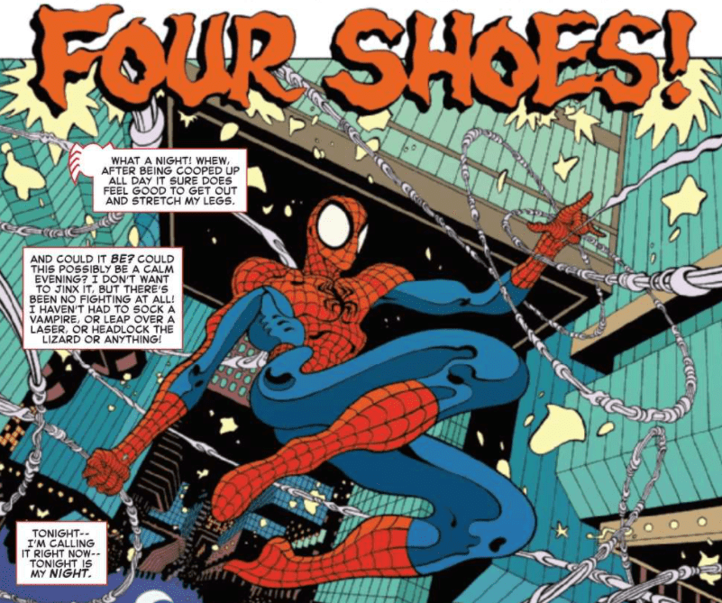
“Four Shoes”
“Four Shoes is a story unlike most, and will easily leave you deeply curious and confused multiple times. The story of Tradd Moore features Spider-Man falling into a fantasy world, and even with the small number of pages, the story can twist in ways you won’t expect many times.
The art of Tradd Moore does an amazing job of complementing the story he put forth and is exceptionally unique. Moore is absolutely not afraid to break the status quo, which is blatantly clear once you see some of his framing choices later in the tale. Moore’s art is truly one-of-a-kind, and reading “Four Shoes” is a pleasant change from the styles Spider-Man is typically drawn in.
Tamra Bonvillain does a tremendous job of coloring the work of Tradd Moore. His bright colors go so well with the strange art style and help establish the fantasy world that Spider-Man enters into. Every page is so densely packed with a wide variety of colors that a first glance at each leaves you with a lingering feeling of awe.
“A Family Affair”
“A Family Affair” is a delightful short tale of Spider-Man encountering one of his oldest foes’ granddaughter. The dialogue of Spider-Man features some of my favorite quips in The Amazing Spider-Man #850, and Saladin Ahmed explores the theme of not always trusting those closest to you in a heartfelt way.
The art of Aaron Kuder is some beautiful semi-realism, and the fight sequence that comprises most of the story is a sight to behold, full of action lines to give the illusion of speed and forms that always seem they are in the midst of the action.
The colors of “A Family Affair” do an extraordinary job of immersing the audience in the story’s scene. However, there is little variety in the color palette due to the story taking place mostly in one small spot in New York City. The limits of the background hamper the story’s potential, which I believe could have been improved immensely if there was a wider spread of images for the background.
The Amazing Spider-Man Lettering
Each of the stories in The Amazing Spider-Man #850 utilized the talent of VC’s Joe Caramagna for their lettering, and his skill shown throughout the issue very clearly. It did not matter whether the tone of a scene had changed or if the art style was entirely different, Caramagna was able to adapt and bring solid lettering throughout the issue. For example, in “Four Shoes,” Caramagna provided captions similar to those from fantasy comic books set in the Middle Ages. It paired wonderfully with the fantasy world the story was set in.
Conclusion
There is so much to say when discussing The Amazing Spider-Man #850. I could fill page after page of what I thought of each of these stories, and what strategies the writers, artists, colorists, and letterers used to tell such an astonishing story. Every page is an absolute pleasure to look at, and the super-sized issue is filled with so much content, it is sure to leave you satisfied with the book you purchased.
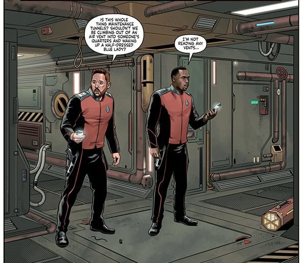
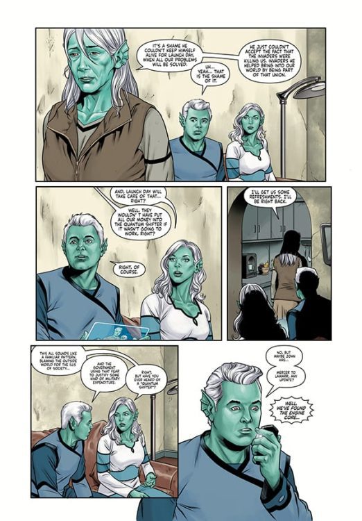
THE ORVILLE #2: LAUNCH DAY (PART 2 OF 2) hits comic book stores on Wednesday, October 7th, giving readers the conclusion to this action-packed two-party story. Last issue, the crew of the Orville discovered a mysterious moon-sized object in the planet Krill’s orbit. Upon attempts to destroy it, Captain Ed Mercer convinced his team to inspect the unknown structure. But the device appears to be a weapon. What’s more, the other crew members discovered that the Krill citizens are gearing up for a mysterious event called “Launch Day.”
Story
This issue’s story comes in three sections; Ed and Commander Kelly Grayson’s investigation, Lieutenants Gordon Malloy and John LaMarr’s infiltration of the suspicious space station, and Lieutenant Commander Bortus’s negotiations with the Krill leader Captain Kratok. The main focus lies with Ed and Kelly.
Ed and Kelly, disguised as Krill, spend much of the issue talking with the citizens. And after speaking with the mother of a deceased soldier, they learn the purpose of “Launch Day.” It refers to the civilization’s planned escape from their universe. Sparked by a fear of immigrants and visitors to their planet, the Krill plan to use the space station to teleport their people to a new dimension.
David A. Goodman’s writing takes everything fans loved from the television show and fits it perfectly within the realm of comics. It also explores real world themes of xenophobia that will make us examine our beliefs.
Artwork
The artists for this issue stitch together a fantastic tapestry of illustrations. David Cabeza’s penciling and ink work, Michael Atiyeh’s coloring, and Richard Starkings & Comicraft’s Jimmy Betancourt’s lettering, provides characters with lifelike details. Our favorite characters’ faces were almost spitting images of their real life counterparts. The extensive color varieties place us in their experience of the alien planet. In addition, the lettering does an amazing job of giving readers context through the use of pointy word balloons for electronic communication to differentiate them from in-person speech.
Conclusion
THE ORVILLE #2: LAUNCH DAY (PART 2 OF 2) wraps up the “Launch Day” storyline quite well. Questions were answered, but more were brought to our minds in anticipation of the next issue.
Were you satisfied with the conclusion to this two-part story? Let us know in the comments below!
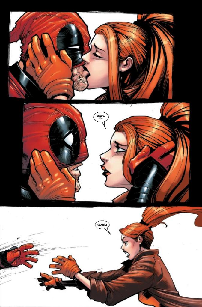
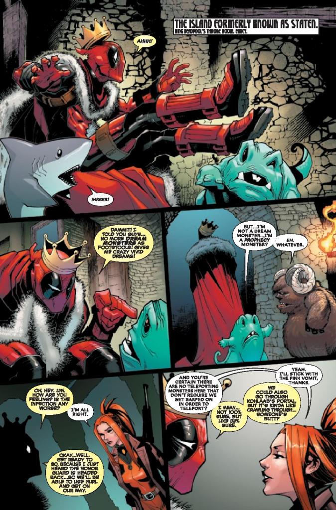
DEADPOOL #7, available in comic book stores Wednesday, October 7th, dives into the relationship between Elsa Bloodstone and Deadpool. The monster hunter recently discovered that the stone embedded in her palm is killing her, putting all romantic feelings between her and Deadpool aside. But this task is easier said than done. In fact, the opening panels show readers a possible consequence of their love.
Story
Upon receiving news of his Honor Guard’s return from their royal duties, Deadpool and Elsa make plans to begin their journey. Readers will find the two bickering over what travel method they should use. Watching the two argue over Barf’s unsavory teleporting methods, whether or not to bring Jeff, and whether the seam’s dimension will kill them or not.
Kelly Thompson’s writing proceeds to guide readers through Elsa’s memory of the dark dimension in fourth wall breaking fashion. We loved how much this annoyed Deadpool halfway through the tale.
Readers will enjoy following the two warriors to Greenland as they confront various monsters. The narrative mix of awkward romance and dire straits makes for an engaging story.
Artwork
Gerardo Sandoval’s penciling and ink work, along with Victor Nava’s penciling, cast brilliant images of the mercenary, the hunter, and the shark. Each individual is drawn with highly detailed expressions—so much so that one can tell exactly what the masked Deadpool is feeling. Alongside Chris Sotomayor’s bright red coloring and VC’s Joe Sabino’s use of varied lettering sizes, readers enter a dimension of highly expressive scenes. The finished product captures the pure essence of Deadpool’s character.
Conclusion
DEADPOOL #7 offers readers a thrilling tale of passion, betrayal, and, most of all, humor. It’s issues like these that make us love the character of Deadpool.
What was the funniest part of this issue for you? Let us know in the comments below!
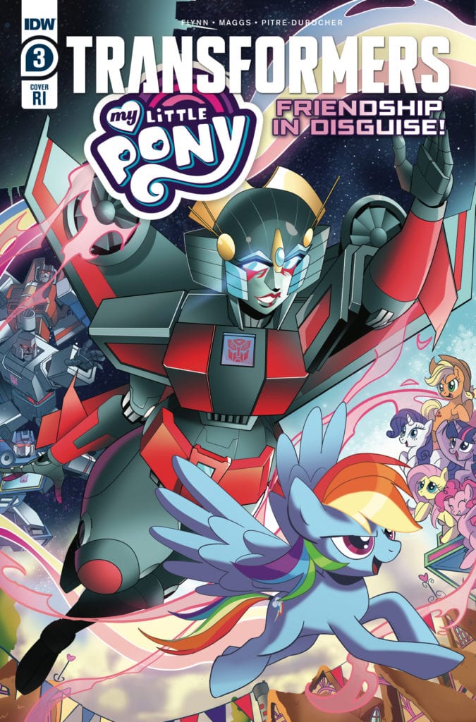
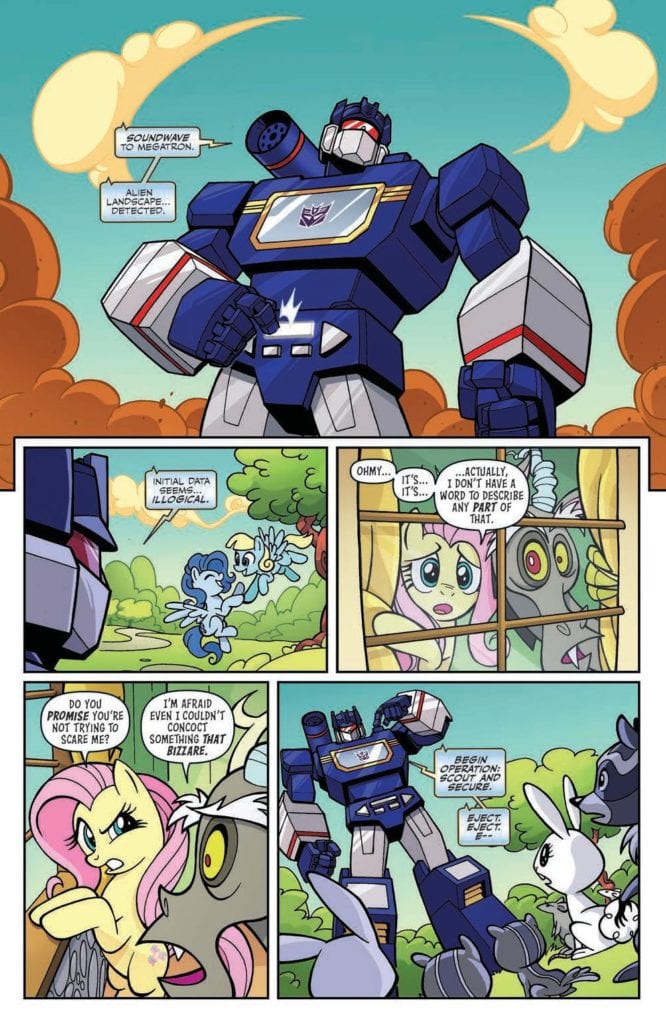
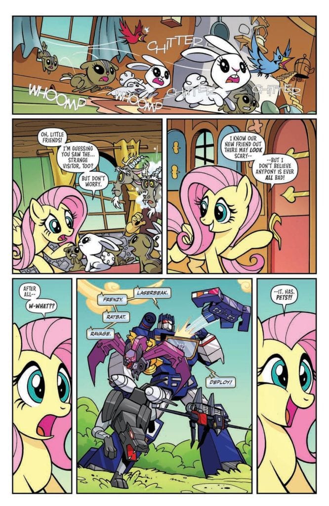
My Little Pony/Transformers #3 out this week from IDW Publishing keeps up the charming nature of this unexpected crossover. The issue has Fluttershy meet Soundwave as Rainbow Dash races Windblade. All thanks to James Asmus (writer), Sam Maggs (writer), Jack Lawrence (pencils and inks), Priscilla Tramontano (pencils and inks), Luis Antonio Delgado (colors), Jake M. Wood (lettering), and Neil Uyetake (lettering).
When Fluttershy and Discord’s tea time is interrupted by Soundwave, it’s robot logic vs. whimsical chaos! And Rainbow Dash, sure that she can fly faster than any Autobot can drive, finds herself in a race with the one and only Windblade.
Writing
“Pet Sounds” by James Asmus has Soundwave meetup with Fluttershy. The results are amusing as Fluttershy thinks to Ravage and the rest of the cassette robots are Soundwave’s pets. Seeing Rumble get annoyed at the kindness is hilarious and in keeping with the humor Asmus laid out in the first issue of the mini-series.
The second story “The Flying Fox Trot” by Sam Maggs features a race between Rainbow Dash and Windblade but not everything goes as planned. It’s a bit predictable and wraps up a little too quickly. You’d think how popular Rainbow Dash and Windblade are as characters they would get a more in-depth story.
Artwork
The pencils and inks by Jack Lawrence and Priscilla Tramontano help to enhance the stories they are trying to tell. Lawrence’s work helps with the comedy scenes especially as Discord faces off with Soundwave. Meanwhile, Tramontano captures impressive speed effects as Rainbow Dash and Windblade race and sneaks a cameo in of the two horse-based Transformers: Mach Kick and Battle Unicorn. Even though its just one panel, it’s still worth noting they took the time to make sure it was in the mini-series.
The colorwork by Luis Antonio Delgado does double duty by magnifying the most important elements of each story. With “Pet Sounds” careful attention is paid with coloring to ensure the comedy moments land. Meanwhile in “The Flying Fox Trot” Delgado ensures the speed effects emphasize just how fast Rainbow Dash and Windblade are going during their race.
The lettering work by Jake M. Wood And Neil Uyetake makes sure to help with both of the stories. Wood and Uyetake pull off the use of sound effects with a variety of fonts specific for what each panel needs. They also ensure the effects don’t distract from the panels they are in and only help with helping to tell the story.
Conclusion
My Little Pony/Transformers #3 isn’t the best of the mini-series but it’s still entertaining. With only one issue left the mini-series is poised to wrap up without overstaying its welcome. Still, given how entertaining this series has been, more adventures of Transformers meeting My Little Pony would be a welcomed sight.