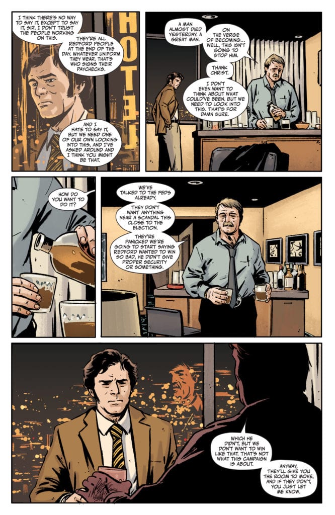
ONCE & FUTURE #12, available Wednesday from BOOM! Studios, dives back into the world of lore and legends come back to twisted life. What started off as an ordinary retelling has quickly turned into anything but.
Behold, the creative team for Once & Future #12.
There’s nothing quite like an Arthurian retelling. Only, that isn’t exactly what is happening within these pages, is it? It’s a retelling, sure, but it’s gotten twisted. Tales and creatures from other legends are rising up alongside, meshing all of the stories together.
That is where Once & Future #12 picks up, with classic legends becoming warped beyond recognition – leaving Duncan and his gran to clean up the mess. Not exactly an ideal situation, but somebody has to do it.
Apparently that somebody is the family born and raised to hunt monsters…which makes a fair bit of sense. In a world that has gone awry, any bit of sense is worth holding onto with both hands.
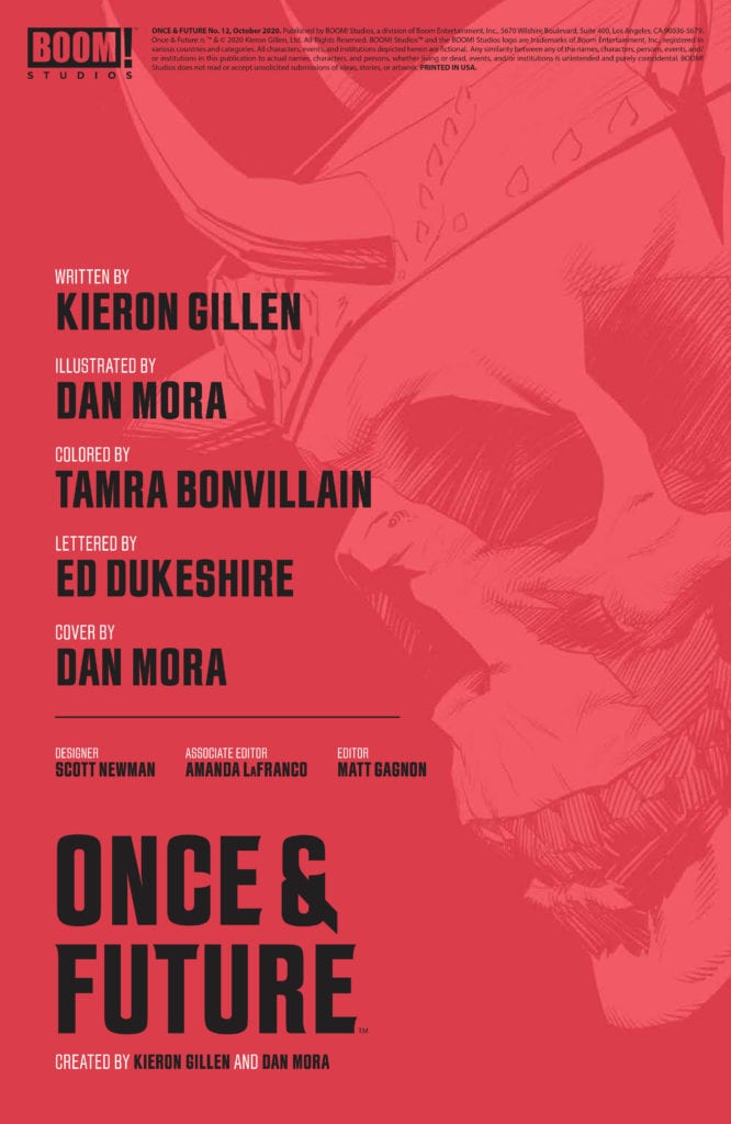
This monster has patiently waited a month to begin killing again.
The Writing
Once & Future #12 dives right into the action, almost literally as the case may be. People are never safe when monsters of legend go hunting – that is a lesson taught time and time again in the past eleven issues.
Written by Kieron Gillen, this is a twisted issue through and through – meant in the best ways possible, of course. There’s something so visceral yet ephemeral about the battle that is hovering on the horizon.
A battle that Duncan is destined to be a part of, thanks to the actions of everyone else in his life. It’s chilling, thinking about all the ramifications that may come from it all. Yet there’s something so compelling, it’s simply impossible to turn away.
There’s a lot of creative writing in this issue in particular, weaving narratives together to create something wholly new. It’s a clever way to obfuscate the truth, while also finally providing an answer or two to questions being asked. Now we just have to sit and wait to see how bad it’s all going to get.
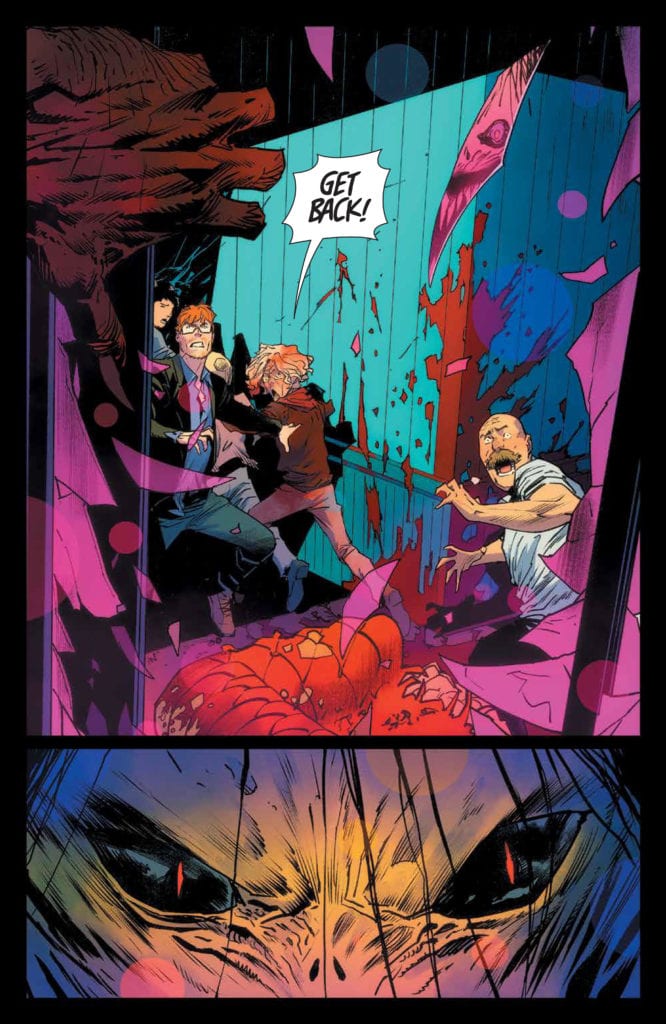
That… is not a pretty monster, to say the least.
The Art
As with literally every other issue of this series, Once & Future #12 is full of vibrant and stunning artwork. The illustrations are horrifying yet compelling, while the colors are eye-popping and memorable.
Dan Mora is the lead artist, bringing those horrifying monsters to life, as well as the very human reactions to them. This is an issue full of events and details, from the grotesque to the intriguing, and it’s all perfectly balanced upon these pages.
The shock and horror of everything that happened are undoubtedly enhanced by the colors that Tamra Bonvillain brought to the table. The hues of purple and blue work in a delightful addition to the green that implies magic and rot. All of it comes together to create a world that truly does seem full of magic – and horrors.
Finally, there’s the lettering, provided by Ed Dukeshire. The monsters in this series are larger than life, and the noises they bring about are scaled appropriately. All of this (and more) is showcased thanks to the lettering.
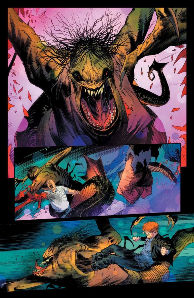
The devastation of battle.
Conclusion
It’s been a long month waiting to see how the cliffhanger from Once & Future #11 would pan out, yet Once & Future #12 did not disappoint. In fact, in some ways, this is the darkest and most twisted issue of the series. So far, at any rate. By the look of things, it’s going to get so much darker before the story comes to an end.
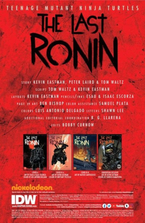
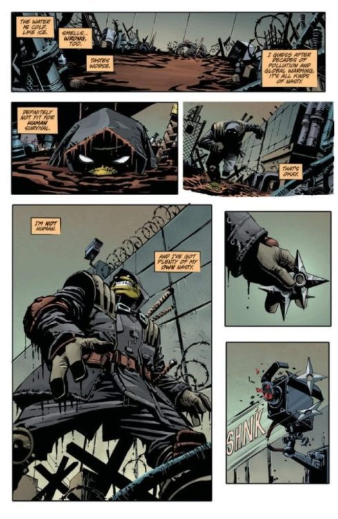
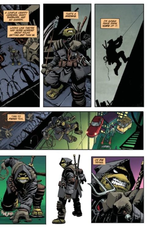
Teenage Mutant Ninja Turtles: The Last Ronin #1 of 5 hits your local comic book store on October 28, but thanks to IDW Publishing, Monkeys Fighting Robots has a five-preview to share with our readers.
Kevin Eastman, Peter Laird, and Tom Waltz worked on the story. Eastman and Waltz scripted the book. Eastman also designed the layouts, and Esau & Isaac Escorza handled the pencils and inks. Luis Antonio Delgado dropped the color on the book, and you will read Shawn Lee’s letter work. The art on page 39 is by Ben Bishop with color assistance by Samuel Plata (but that’s not part of the preview).
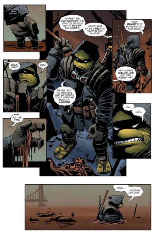
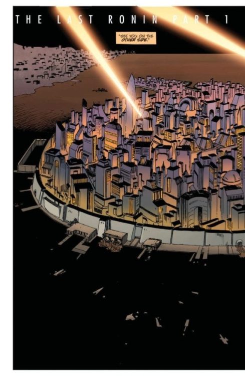
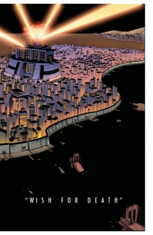
About Teenage Mutant Ninja Turtles: The Last Ronin #1: It’s the TMNT event of 2020! Springing from the minds of TMNT co-creators Kevin Eastman and Peter Laird comes an epic like you’ve never seen before! In a future NYC far different than the one we know today, a lone surviving Turtle goes on a seemingly hopeless mission to obtain justice for his fallen family and friends. Kinetic layouts from Eastman, inks from Esau and Isaac Escorza, and a thrilling script full of surprises from longtime TMNT scribe Tom Waltz all combine to make this one of the most memorable TMNT stories you will ever read!
Oversized in both format and page count, this is a perennial TMNT tale that can’t be missed!
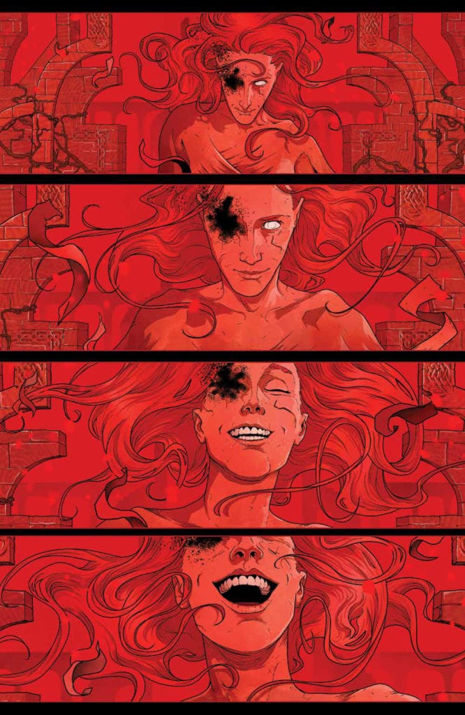
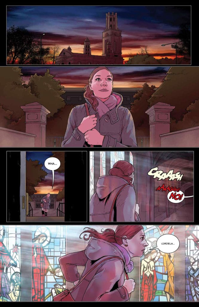
THE RED MOTHER #9, available Wednesday from BOOM! Studios, brings us back to the horrors that lie in wait for Daisy McDonough. There is something in the dark that is far from done with this young woman.
Even the title page appears foreboding in The Red Mother #9.
Life has not been easy for Daisy, not since the attack, at any rate. Yet she’s worked hard to put her life back together and keep moving forward. Unfortunately for her, the darkness that follows is also moving forward.
This is a psychological horror through and through and is perhaps not a great series for those looking for something…calmer. Daisy’s journey has not been easy, or free of bloodshed, and it is certainly not about to change anytime soon.
That is a fact that could not be more accurate in The Red Mother #9, as once again major events and changes are about to reshape Daisy’s life. Arguably, not for the better, but only time will tell.
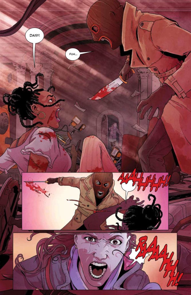
That’s not haunting or terrifying…nope! Not at all.
The Writing
Where the previous issue was harrowing, The Red Mother #9 is terrifying. Everything that could possibly go wrong is in the process of doing so, with little to no explanation as to how (or why). Only the hint of something…supernatural seems to linger in the air.
Jeremy Haun’s writing hits new levels in this issue. It’s dark and foreboding, while also tearing open Daisy’s psyche, forcing fans to look into the nightmares that have haunted her from the very first page.
The hope that seemed to rise up in the last issue has all but been obliterated. The absence left behind is raw and jagged, and yet it doesn’t feel like the story is done. Not yet, at any rate. There’s still more to Haun’s tale, and that is simply put, terrifying.
Speaking of terrifying, the conclusion of this issue is very much that. There is no such thing as a break in this twisted world, apparently. Now fans are going to have to wait a month to see what exactly is going to come from this cliffhanger.
And so it begins (The Red Mother #9).
The Art
The artwork within The Red Mother #9 is the perfect match to the story within. Both are vibrant and haunting, demanding attention, and leaving more than a few emotional scars in the process. Danny Luckert (art and colors) and Ed Dukeshire (letters) have truly created something wonderful here.
Wonderful, and terrible, that is. They have somehow taken the mundane and turned it into something dark and insidious. There is nothing calming about seeing Daisy walk down a quiet street – only the fear of what could be hiding in plain sight.
From the very start of this issue, everything simply felt wrong. It’s amazing how those introductory panels truly do set the scene. Even without words, without any true idea of what is going on, there’s something unforgettable about those scenes.
The struggles and battles brought to Daisy in this issue had a real sense of physicality to them, thanks in large part to the lettering, as well as the chosen color palettes. Together they grounded the fight, and that made it feel so much more real.
She’s not standing aside this time.
Conclusion
The Red Mother #9 is a heavy issue, with Daisy taking hit after hit. That sense of hope is gone, and yet there’s still something that demands our attention. It’s more than enough to leave fans anxiously waiting for the next issue in this series.
Available now from Vault Comics, writer Cavan Scott and illustrator Corin Howell continue their genre-hybrid series in Shadow Service #2. Assisting them in their efforts are colorist Triona Farrell and Andworld Design for lettering. Shadow Service #2 delves deeper into the magical noir-like London underbelly of the private investigator witch, Gina Meyer.
In Shadow Service #1, readers were introduced without pause to Vault’s answer to Jessica Jones, Gina Meyer. She’s a lone-wolf private investigator and witch whose best friend is a telepathic rat. Behind her rough exterior, Gina reveals that an incident with her stepfather at age eight haunts her through extended flashbacks.
While the first issue did include some of this backstory, the second issue spends more time on the details and what happened after the incident, leading from Gina as a child into adulthood. This backstory is sort of a D-plot, if you will, interwoven with the A, B, and C plots.
MI666
Providing the fast-paced A-plot is Gina’s kidnapping by an organization called Section 26. As it happens, Gina is an inadvertent rogue witch in this society in which all magical activity and people are tracked by Section 26, a. k. a. MI666.
Underscoring Shadow Services‘ witchy spy drama, Howell’s London is ominously drawn with scratchy line work. For example, in one panel, Gina is suspended in a sickly sort of green backdrop with small nails surrounding her. She’s trapped in severe lines in her facial expression and background, emotionally highlighting the character’s anxiety and frustration. It evokes the same feelings in the reader.
In concert with Howell’s illustration, Farrell’s use of red, black, and gray support the book as a noir. On the other hand, purple, radium green, and yellow make up the color palette’s supernatural aspects. Beyond Farrell’s use of purple, letterer Andworld Design often used purple in the narrative captions, contrasting the noir elements. Together, such artistic choices help transcend genre formulae. Consequently, as the reader becomes immersed in the story, one carries the same anxiety and pessimism Gina carries.
Artistically and in the story, nothing about Shadow Service is entirely conventional. It’s noir, supernatural, and part crime drama all compellingly balanced and paced by Scott, Howell, and Farrell. Regardless of genre, the emotional core and esoteric mood make for an electrifying experience. This British, magical answer to Jessica Jones successfully freshens up the familiar.
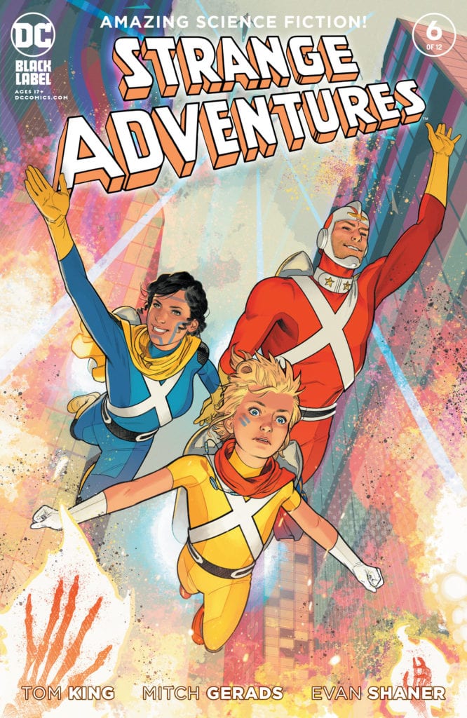
DC Comics’ Strange Adventures has been an incredibly strong series. Most of my reviews thus far have given it a 5/5 on all fronts. But Strange Adventures #5‘s score dipped quite a bit in the overall rating for one simple reason: Strange Adventures got political. Before I go further, I should say I’m a huge advocate for politics in comics. Art should discuss current events and shouldn’t solely serve as a form of escapism. Politics in comics in and of themselves are not a bad thing. But there’s a big difference between writing a story to make a political point and inserting a political point into a story that serves the plot.
Strange Adventures #5 felt like it had more to say about current events than it did its own characters. Thankfully, Strange Adventures #6 course corrects masterfully. Writer Tom King, artists Mitch Gerads and Evan “Doc” Shaner, and letterer Clayton Cowles manage to continue their discussion of our political climate without sacrificing their story. They focus in on their characters and turn big ideas into a deeply personal struggle.
Mr. Terrific/Alanna: Keep Your Enemies Closer
Writing
King’s modern-day scenes are surprisingly laid back. Mister Terrific, who has thus far shown a tireless energy for the truth, and Alanna, who often comes off as the evil puppeteer, come face to face. Despite what they may think of each other, King doesn’t write a fight. Instead, he has them go out for drinks and a chat. Part of the pitfall of writing something that focuses on modern politics is that a writer can become a slave to what happens in the political world. Their script becomes commandeered by current events. But King takes a step back and says, “What do I wish were the kinds of things happening today? How could things be different and better?” King’s alternate version of events hones in on what makes these characters tick. Their conversations, and even their bonding, ups the stakes and complicates the plot with the messy strings of human experience.
Art
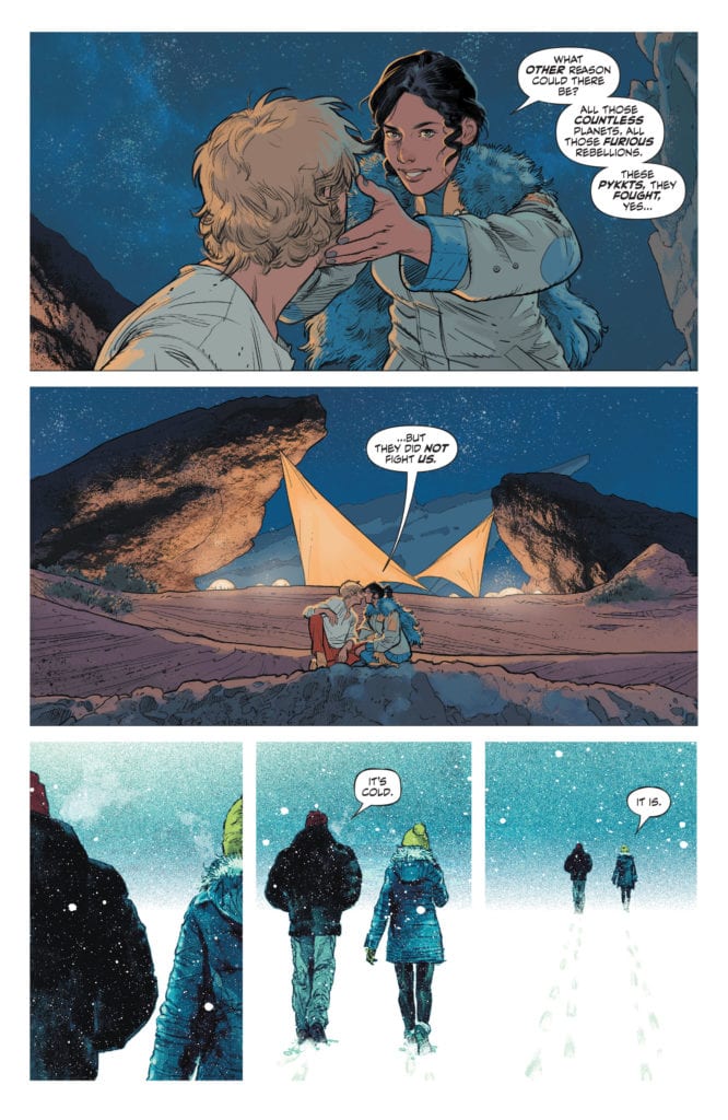
What’s most noticeable about Gerads’ art in this issue is how it differs from previous issues. The power dynamic between Adam and Alanna is impossible to miss. Alanna is almost always pictured bigger than Adam, often above him. But Mr. Terrific is not Adam Strange. In Strange Adventures #6, Terrific and Alanna are on equal footing. One commands the page just as much as the other. They walk together through the snow, side by side, and at the same pace. When one is given the spotlight or a close-up, the next page follows with a close-up for the other. Gerads makes these two feel like equals.
Coloring
Similarly, Gerads colors Alanna and Terrific in many of the same tones. They’re either in the warm color palette of Terrific’s home or cast in the blue light of a snowy night. Wherever they are, they’re colored with the same warm or cold hues. But when Alanna walks Terrific to his doorstep, something shifts. The whole issue, they’ve seemed like kindred spirits. Maybe it’s a plot by Alanna to get Terrific on her side, maybe it’s a genuine connection, but either way, Terrific makes it clear he’s unmoved. As he steps into his home, he’s suddenly colored in a completely different tone. The lights of his home make him stand out on the page, against the cold blues of the night. And when we shift back to Alanna, she’s still blue. It’s a sudden change that reminds us that they are still diametrically opposed to whatever communion these two might find.
Lettering
Alanna is a character who is very sure of herself. When she speaks, she either speaks in short bursts that get straight to the point, or in large chunks, only broken up slightly to provide a rhythm and cadence to her speech. But as Strange Adventures #6 progresses, Cowles begins to break up her dialogue more and more. She begins to seem unsure of what she’s saying, or unsure how much she believes it. Terrific, on the other hand, only seems to speak in short bursts, with few exceptions. His confidence and efficiency in speaking his mind lead to Alanna’s own confidence wilting. Alanna knows more than she lets on, but just maybe she’s beginning to worry that Terrific does too.
Adam/Alanna: Brutal Underdogs
Writing
In the pages of Adam’s autobiography, Strange Adventures, King shows the Rann Pyykt war as Alanna and Adam saw it. It’s brutality filled with smiles and heroism. Alanna and Adam gun down Pyykt soldiers one by one with very little energy spent towards trying to discuss terms of peace. Early on in the chapter, Alanna makes the assumption that the Pyykt can speak Rannian and choose not to. It’s based on this flimsy logic, which cannot be confirmed or disproven since we can’t, in fact, understand the Pyykt, that Adam and Alanna feel they’ve earned a license to kill unreservedly. But by making it seem like they’re the underdogs, fighting for their lives, King allows us to see how they could rationalize their brutality. They’re fighting for their planet against invaders that they assure us, over and over again with little proof, are cruel and sadistic. But we just have their word. We’ll have to see what happens if and when the Pyykt makes contact with Earth.
Art
Throughout this issue of Strange Adventures, Shaner depicts a dynamic between Alanna and Adam that we know isn’t true to life. Alanna is forever the submissive wife. She’s smaller than Adam on most pages, often pictured right behind him as a physical representation that she always has his back. At one point, she’s even smiling sweetly up at Pyykt ambassador, the ambassador’s shadow covering her. She is the romantic lead of an action movie in these pages. The beautiful woman who will follow her man to the ends of the earth. The moments that she is pictured above Adam, or looks bigger than him on the page, are moments where she’s encouraging him. Her strength exists to ignite his. Shaner shows us the lies Adam is telling in his book, and they’re familiar. We’ve seen them in blockbuster action movies for decades.
Coloring
Shaner’s colors confirm that Adam’s book is hitting its “Belly of the Whale” chapter. The colors begin as soft blues and browns. A night of serenity before the battle the following day. When the battle begins, Shaner colors the first scene in warm and bright colors. But as the war continues, the colors become more and more ominous. They begin to darken, looking like a day that’s drifting into the afternoon. And in the final moments, Shaner colors each moment in brilliant purples and pinks. These colors mix together to look like some kind of apocalypse. It’s destruction, but it’s washed in the glow of a planet that’s burning. Shaner somehow makes these moments feel both devastating and beautiful all at once.
Lettering
Cowles’ lettering maintains a sense of levity in this chapter. As alien races cross swords and blasters, Cowles’ bright blue and white “pew” noises make the violence seem cartoony. Cowles distracts us from the violence of the moment with big, bold lettering. But shots from the enemy don’t feel as fun. The lettering is less characterized, and they’re outlined in red instead of blue. So when Alanna and Adam are shot at, Cowles distracts us a little less from the violence. If anything, the red of the outline focuses us in on it. Cowles wants us to see this battle as Adam saw it. Adam’s own blasts were good and necessary. But the shots from the enemy were violent and destructive.
Strange Adventures has returned to the beautiful story it’s been telling all along. Instead of getting caught up in political parallels, it allows itself the chance to go outside of political events to explore characters and up the stakes. This creative team delivers another brilliant issue. Pick up Strange Adventures #6, out from DC Comics October 13th, from a comic shop near you!
Raised by Wolves is an outstanding adventure that will heighten your interest with each episode. Riddled with astonishing performances, stellar visual effects, and a Herculean score that gets under your skin. This sci-fi tale offers a thoughtful exploration of humans, religion, and how our beliefs can be our undoing.
HBO Max hasn’t been the best, but Raised by Wolves could be the series to draw more attention. With a second season already confirmed, this seems to be the strongest reason to subscribe at the moment. Alien director, Ridley Scott, helms the first two episodes, and his genius doesn’t go unnoticed. Created by Aaron Guzikowski, Raised by Wolves follows Mother and Father, two androids raising children on Kepler-22b after the fall of Earth. A great war between the Mithraic and atheists caused the destruction. Raising these children to be atheists becomes a challenge, as the Mithraic close in on them.
Abubakar Samil as Father in Raised by Wolves
The series stars Amanda Collin, Abubakar Salim, Winta McGrath, Niamh Algar, Travis Fimmel, and Cosmo Jarvis. From the beginning, Raised by Wolves sparks your interest when Mother and Father land on Kepler-22b, a vastly different area compared to Earth. They make use of the six human embryos given to them by Campion Sturges (Jarvis), a scientist who changed his faith and created Mother. After several unfortunate events, Campion (McGrath), the youngest of the six embryos, is the only one left alive.
This phenomenally structured series will secure a following with its religious-based narrative, but most of the human characters don’t impress. For instance, Fimmel and Algar star as Marcus and Sue, two atheist soldiers who have stolen the identity of a Mithraic couple. Their actual names are Caleb and Mary, but they aren’t fleshed out any further. Still, with amazing performances across the board, it makes up for it. Collin is fantastic as Mother, she personifies the lack of care an android could possess. While also making viewers question if there is a slight chance feelings can exist within her.
Marcus in Raised by Wolves
A lot of effort goes into highlighting the pros and cons between the atheist and the Mithraic. This allows viewers to identify that neither side is particularly right or wrong, and you can side with whomever. The effects are so remarkable and every sci-fi enthusiast should appreciate them. Raised by Wolves lacks in the development of its characters, but the second season should resolve that. Several discoveries are made throughout the series, but in the end, you are left with more questions than answers. Still, this initial season was only the beginning, and the impressive worldbuilding will continue next season.
The score by Marc Streitenfeld and Ben Frost is very powerful. It arrives during all the proper instances, raises the tension, and immerses you into the world of Kepler-22b. Raised by Wolves has the potential to be the next great sci-fi series, and this score will help secure that title. Raised by Wolves features impeccable cinematography that is so rich and vibrant. The look of this series is amazing from start to finish. It will be interesting to see how the second season picks up from the events of the season finale, and how the cinematography evolves.
Mother in Raised by Wolves
Raised by Wolves is a great sci-fi series with the potential to become the next big series. An action-packed, futuristic adventure that many fans of this genre will enjoy for one reason or another. The second season should clear up any unanswered questions viewers will have after the season finale, but aside from that, this series is amongst the best to be released this year. A terrifically crafted series, that offers complex characters and a premise every sci-fi enthusiasts will love to watch unfold.
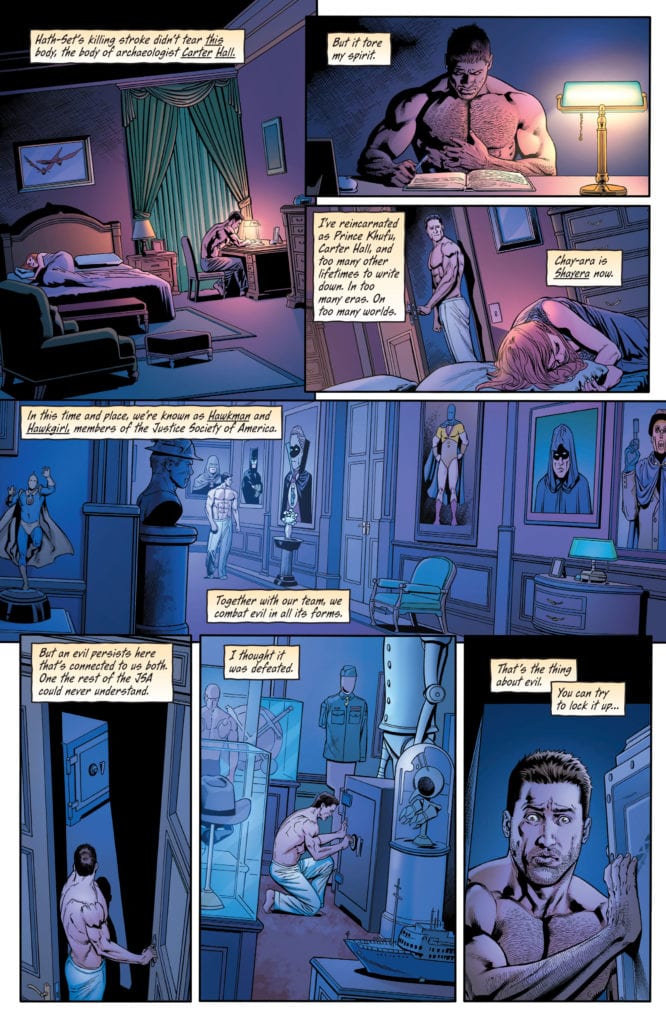
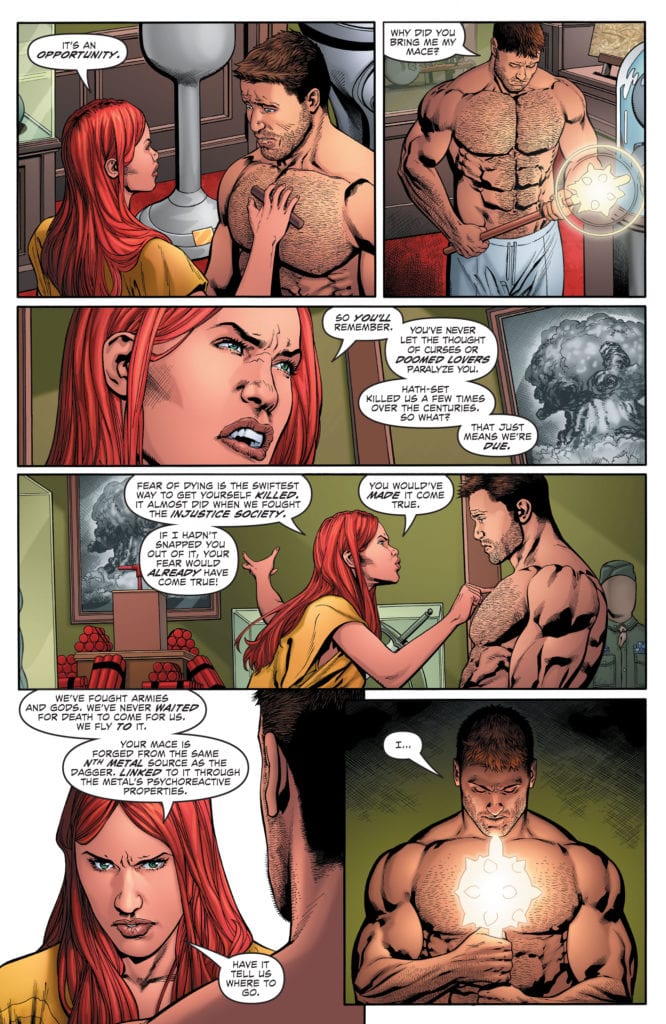
Written by Robert Venditti, with pencils by Fernando Pasarin, inks by Oclair Albert and Wade Von Grawbadger, colors by Jeromy Cox, and letters by Rob Leigh, DC Comics’ Hawkman #28hearkens back to the Golden Age of comics. Some moments are brilliant homages to an era gone by, while others don’t hit home quite as well. The previous issue was a strong start to this new arc, but this issue stumbles.
Writing
Venditti has a lot of fun in this issue. With a mustache to twirl and dapper suit, the big bad villain makes you wish there were more titles out there like DC Comics’ Hawkman. A dive back into the goofy, larger than life characters of the Golden Age. But some of Venditti’s choices don’t quite hit the mark. Hawkman’s meditation with his nth-metal mace leading them to their enemy feels like a shortcut. And Hawkman and Hawkwoman’s back and forth about dying feels like something that should exist between the lines.
A lot of these moments could be great homages in their own way to the Golden Age’s writing style. But Venditti imbues this script with too much modern angst to allow these moments to land. The script feels like it’s pulled in two directions. It’s either a modern drama, suffering from over-explanation or a Golden Age romp gleefully making writing errors in a fun nod to the 40s. This script suffers because it tries to be both.
Art
Pasarin, Albert, and Grawbadger suffer from some of the same problems. Their depictions of characters feel like they could be funny references to the exaggerated styles of the past. But the tone of each moment is constantly shifting back and forth from fun and goofy to overly serious. Instead of acting as a nod, Pasarin, Albert, and Grawbadger’s style just seems overdone. Every character’s expression is so pronounced, there’s no subtlety. As Hawkman looks like he’s about to get his eye cut out, his face is held there by the hands of the bad guy’s minions. His eyes held open, and his teeth gritting in preparation, he actually looks funny. Were these moments less serious, without blood spraying and wounds gaping, this art style could make Hawkman #28 really fun.
Coloring
Cox’s coloring is a step in the right direction. Every action sequence has a background of bright primary colors. As Hawkman dodges a knife, we see each moment with a background of red, yellow, or blue. It makes the fight feel comic-booky. It feels like it captures some of the tones of old comics. But The dark tones of the train car, and those used in Hawkman and Hawkwoman’s discussion at the opening of the issue, ground the comic in a serious tone that does it a disservice. While Cox helps create some moments of fun, the tension between modern and old comics still exists.
Lettering
Leigh’s lettering is also rather goofy at times. When a dismembered hand grabs at Hawkwoman’s ankle, the sound effect actually reads as “grab.” A slice of a knife reads as “slice.” These moments are kind of funny. They’re on-the-nose in a way that’s charming and fun. But again, it becomes a little muddled in the course of the issue. The “wutch” of Hawkwoman’s foot going through someone’s chest feels a little less fun. And as this issue ends on a violent note, the big messy lettering on the final page feels a little unearned. It’s a moment that feels a little too big and dramatic, maybe because there’s so much tonal whiplash throughout.
DC Comics’ Hawkman #28 attempts to do two things at once, but it bites off more than it can chew. Without the subtlety of a modern comic and a tone that fights against many of the fun moments that hearken back to older comics, this issue feels divided right down the middle. Hopefully, as this creative team gears up for the home stretch, they find their voice and the balance between a modern tone and fun homage. Hawkman #28 is out from DC Comics on October 13th.
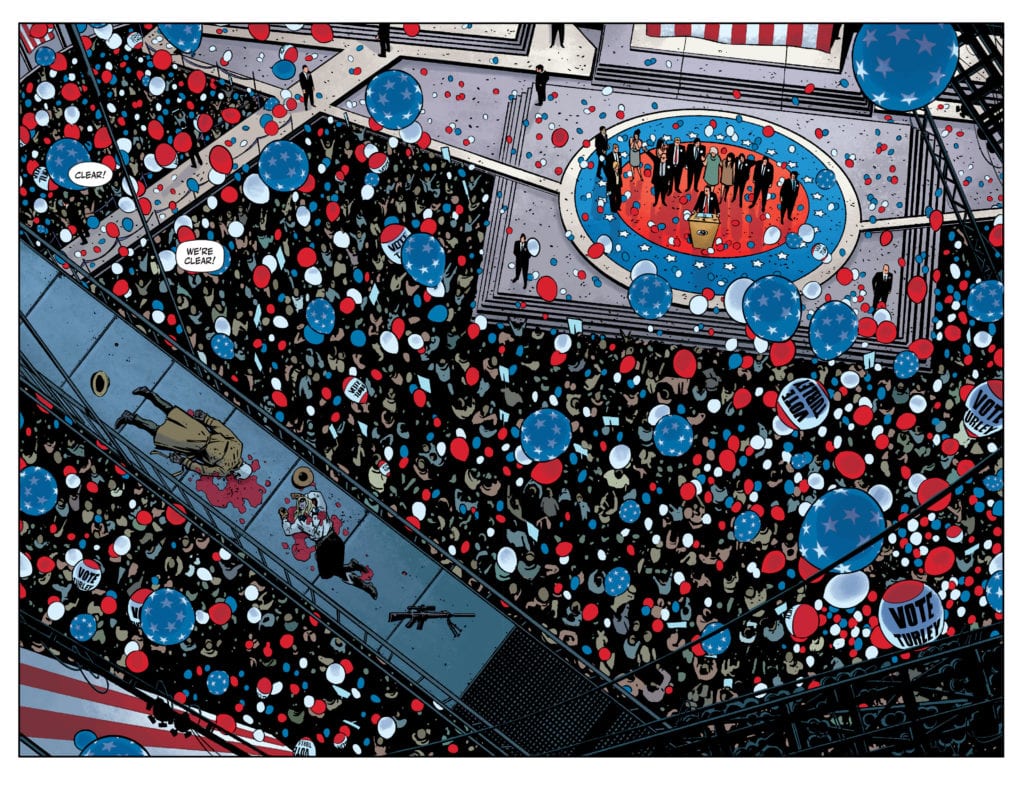
DC Comics’ Rorschach #1 has nothing to prove. Sure, it’s a comic based around one of the most pivotal characters in the formation of modern comics, but Rorschach #1 seems blissfully unaware of its own hurdles. It’s not a comic trying to measure up to Watchmen — hell, it barely feels like it exists in the same universe at times — but instead, it bravely does its own thing. Writer Tom King, artist Jorge Fornes, colorist Dave Stewart, and letterer Clayton Cowles present a comic that feels fresh and refuses to live in its parent series’ shadow.
Writing
King is typically a pretty minimalist writer. In some series, like Batman, he can have as little as a dozen words in a given issue. Yet, DC Comics’ Rorschach #1 is pretty text-heavy. At times, when minimalist writers dabble in text-heavy scripts, they lose all sense of subtext. They begin explaining everything that is happening, instead of just showing. But King uses this wordier issue to create a different tone. King creates the conversational back and forth of people trying to put together pieces that just aren’t there. It reads like Pulp Fiction. Characters, afraid silence will make them look unsure of themselves, fill every pause with their grasping at straws. It’s a new style for King, but one that he executes well. It’s fascinating to see an accomplished writer experimenting.
Art
Fornes is constantly splitting up panels in Rorschach #1. Panels that exist in the same moment, have a gutter running through the middle, turning one into two. At times, Fornes does this to keep us in that moment for just a second longer. Someone in a hospital finds out they’re dying, and the corner of the page split off from the rest of the panel gives us a moment to let that sink in. But other times, Fornes is just splitting up the scene. Captions sometimes even run over the gutter, making it clear there’s no real passage of time.
One could say this is decorative, that Fornes is doing it because it looks good on the page (which it does.) But ultimately, it has the feeling of fragmenting the details. As the cops try and piece together what happened, Fornes gives us the feeling that they’re not getting the full picture. Even the things they think they know are just snippets of the whole. At the end of Rorschach #1, we get several images laid out over a page, but they interrupt one another. An image of Will Myerson is connected by diagonal panels, but across the opposite diagonal, we see images of a Rorschach mask. Fornes obscures the whole so that we aren’t left with answers, but with a feeling that the answers aren’t everything. Instead, we have to look again and see what we notice this time.
Coloring
Stewart’s color palette is gloriously all over the place. We get the autumnal orange glow of scenes of the gunmen preparing. Their lives feel like something out of a western movie. They live by the seat of their pants and exist in a golden era. And the security crew cleaning up the mess first hear about the threat in a room that looks purple and dark. As the lead detective sits out on his bed, thinking about the case, the sky in the background is a brilliant mix of purple and orange. It seems like he’s stuck between worlds. He’s caught between Turley and Rorschach, and he’s being pulled in both directions. But maybe he’s neither extreme. He just exists in the hazy orange-purple middle.
Lettering
When possible, Cowles allows his captions or dialogue to straddle the gutters on the page. This makes moments feel as though they exist outside of time. When talking about the background of the gunmen, or ruminating over their motivations, Cowles’ lettering turns two panels into one moment. By establishing this tone, Cowles makes it so that when the characters are piecing things together, it feels like one thought. But on the last page, we get some answers to the questions that have been bugging us. And in 15 panels, not once does the lettering cross the panel boundary. So Cowles leaves us with a fragmented page, a bunch of confirmed details but no way to put them together. It’s a brilliant way to up the mystery factor and underlines how incomplete the answers to these questions feel.
Rorschach #1, from DC Comics’ Black Label, is a comic that probably does have a lot to prove. It’s a step back into a universe that changed comics forever. But this creative team, instead of wasting time sweating under the hot lamps of “what fans will think,” just tells their story. It’s a story that feels fresh and only tangentially related to Watchmen so far, but it looks to be diving deeper into Watchmen lore without over-complicating the matter. Rorschach #1 is a promising start to a new series with mystery baked into every page. Pick it up from your local comic book shop, out from DC Comics, on the 13th of October!
Writer Saif Ahmed and artist Fabiana Mascolo return with another brilliant but emotionally heavy chapter with “Yasmeen” #3. While this new issue isn’t as unsettling as the last, it’s got just as much impact as it deals with this family’s desperate attempts to try and make a normal life in America, while also watching Yasmeen accept the life she had experienced in imprisonment. With a human-focused script and fantastic visual direction, this is easily becoming one of the most well-crafted and important comics of the year – if not the decade. If not ever.
“Split between two times in her life, Yasmeen tells the story of an Iraqi girl who survives slavery in the ISIS terrorist regime in Mosul. Yasmeen was a happy 16-year-old until she was captured by ISIS invading forces and was forced to find the courage within herself to endure slavery. After surviving long two years of slavery, she is freed, but has become a different person. Unable to connect to the things that she loved before, she must go through a different kind of struggle, as she tries to adjust to the normal life with her family as refugees in a foreign country, America.”
Writing & Plot
With this third issue of “Yasmeen,” Ahmed focuses primarily on both Yasmeen’s and her father’s attempts to establish a new normalcy, with the latter of the two almost unable to even look at his own daughter anymore. It also covers the frightening notion of Yasmeen having started to accept her horrible life in imprisonment as a relative normal, as well as dealing with classic post-9/11 racism and islamophobia. Ahmed manages to impact a new emotional point with every issue, and this one runs the gamut of heartbreaking realizations. The traumatizing and life-fracturing events that Yasmeen’s family went through obviously did the most damage to the titular character, but watching this family remain true to their faith while also attempting to find happiness again is a seldom-seen brand of devastation. Once again, the characterizations and dialogue writing of Saif Ahmed feel so right and appropriate they almost disappear into the story. If there is one minor issue with this chapter, it’s that the flashback and flashforward structure that this comic has had so far actually gets a tad confusing this time around. It isn’t exactly head-spinning, but it feels less neat then the two prior issues’ approach to this style. This one nitpick aside, this is yet again a brilliantly written and impactful piece of comics storytelling.
Art Direction
The character-focused and intimate nature of “Yasmeen” #3 is crafted largely by Fabiana Mascolo’s artistic interpretation of Ahmed’s script. close-up shots on faces and detailed expressions masterfully exhibit the range of emotions going on within each character’s mind, many of which are just implied through subtext. There are actually some sequences in this comic that build suspense and dread during Yasmeen’s time in captivity, and Mascolo often uses simultaneous cuts and shot/reverse shot compilations to create tension. The events that this comic deals with are very much a horror story, so opting to use such a tactic makes considerable sense. The color palette Mascolo employs is also interesting, as it primarily focuses on lighter colors and bright aesthetics. This makes for an interesting contrast, as this pleasant color range brightens the book in even its most unpleasant moments. If the colors had been too naturalistic or gritty, I daresay that the more brutal moments would be almost too much. Mascolo’s work on this comic is yet again a tonal slam dunk, offering fantastic visual direction and animation for this character-drama.
“Yasmeen” #3 is an emotionally potent chapter about the pain of trying to find a new normal after unimaginable devastation. Saif Ahmed’s script contains an emotional focus that differs a bit from the previous two issues and develops the struggle of Yasmeen’s healing and her family’s attempts to reconcile their faith with what has happened to their daughter. Fabiana Mascolo crafts the intimate character storytelling with her detailed facial animations and stellar directorial eye. “Yasmeen” continues to be one of the most important comics being released right now, and at its current trajectory could end up becoming one of the most impactful pieces of the medium ever created. Be sure to order a copy of this issue from your local comic shop on 10/14!
For anyone thinking that the KING IN BLACK series beginning in December would be the end of all things, Marvel Comics has confirmed it’s just the BEGINNING of the end. Today, Marvel announced an anthology series highlighting key events in the King In Black’s invasion titled KING IN BLACK: PLANET OF THE SYMBIOTES #1, available January 2021.
Says Marvel of the new series: ” In this thrilling series, all-star talents join forces on stories that will set up key moments in the event, featuring epic clashes between Knull’s army and your favorite heroes, the return of fan-favorite characters, surprising revelations about the Venom mythology, and introductions to exciting new players in the Marvel Universe.”
You can check out a preview of the first cover and read the full Marvel press release below.
Are you ready for a never-ending winter of Symbiotes? Let us know what you think in the Comments section, and please share this post on social media using the links below.
DARKNESS REIGNS OVER THE MARVEL UNIVERSE IN KING IN BLACK: PLANET OF THE SYMBIOTES!
The return of Scream, a visit to Ravencroft, and more await in new King in Black: Planet of the Symbiotes series!
New York, NY— October 12, 2020 — This December, Knull makes his long-dreaded arrival in KING IN BLACK, the next chapter in Donny Cates and Ryan Stegman’s redefining run on Venom. No corner of the Marvel Universe will be safe, and in January, fans can witness all the chaos Knull is set to unleash during this monumental event in KING IN BLACK: PLANET OF THE SYMBIOTES. In this thrilling series, all-star talents join forces on stories that will set up key moments in the event, featuring epic clashes between Knull’s army and your favorite heroes, the return of fan-favorite characters, surprising revelations about the Venom mythology, and introductions to exciting new players in the Marvel Universe.
KING IN BLACK: PLANET OF THE SYMBIOTES #1 kicks things off with two essential KING IN BLACK chapters that fans won’t dare to miss! Teaming up with artist Guiu Vilanova (Web of Venom: Wraith), writer Clay McLeod Chapman (Scream: Curse of Carnage) returns to the adventures of Scream. Amidst Knull’s takeover, Scream is forced to take on her siblings, the other Life Foundation Symbiotes, in an action-packed family reunion that will prove once and for all who the strongest Venom offspring really is. Next, writer Frank Tieri and artist Danilo Beyruth (Web of Venom: Carnage Born, Web of Venom: Cult of Carnage) will take readers back to the Ravencroft Institute. Picking up directly on the developments from Tieri’s recent Ravencroft series, this haunting tale will house surprising discoveries about Knull’s legacy on Earth and reveal the role that Carnage’s ancestor, Cortland Kasady, has to play in things to come.
These two exciting tales are just the beginning of what KING IN BLACK: PLANET OF THE SYMBIOTES has in store. Stay tuned for more information on what’s to come in KING IN BLACK: PLANET OF THE SYMBIOTES when it begins in January! For more information, visit Marvel.com.