

Written by Robert Venditti, with pencils by Fernando Pasarin, inks by Oclair Albert and Wade Von Grawbadger, colors by Jeromy Cox, and letters by Rob Leigh, DC Comics’ Hawkman #28 hearkens back to the Golden Age of comics. Some moments are brilliant homages to an era gone by, while others don’t hit home quite as well. The previous issue was a strong start to this new arc, but this issue stumbles.
Writing
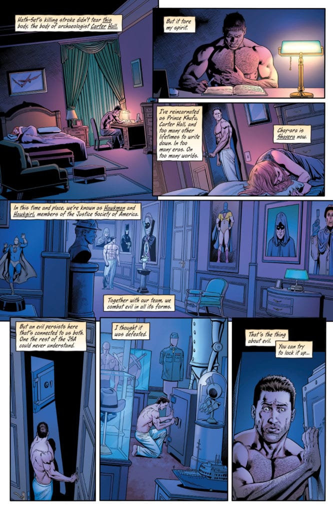
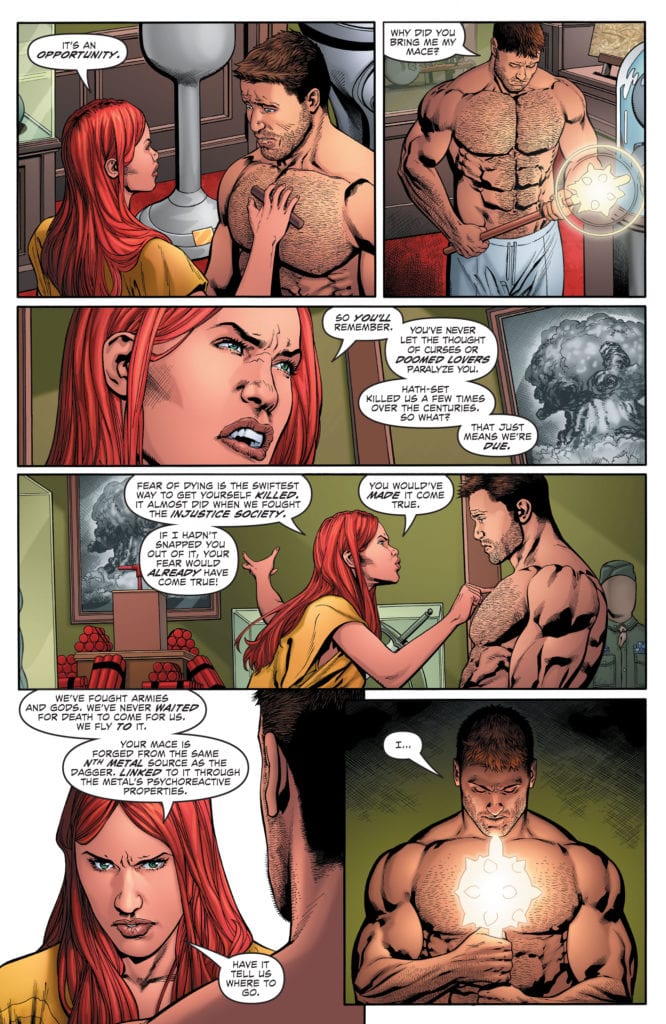
Venditti has a lot of fun in this issue. With a mustache to twirl and dapper suit, the big bad villain makes you wish there were more titles out there like DC Comics’ Hawkman. A dive back into the goofy, larger than life characters of the Golden Age. But some of Venditti’s choices don’t quite hit the mark. Hawkman’s meditation with his nth-metal mace leading them to their enemy feels like a shortcut. And Hawkman and Hawkwoman’s back and forth about dying feels like something that should exist between the lines.
A lot of these moments could be great homages in their own way to the Golden Age’s writing style. But Venditti imbues this script with too much modern angst to allow these moments to land. The script feels like it’s pulled in two directions. It’s either a modern drama, suffering from over-explanation or a Golden Age romp gleefully making writing errors in a fun nod to the 40s. This script suffers because it tries to be both.
Art
Pasarin, Albert, and Grawbadger suffer from some of the same problems. Their depictions of characters feel like they could be funny references to the exaggerated styles of the past. But the tone of each moment is constantly shifting back and forth from fun and goofy to overly serious. Instead of acting as a nod, Pasarin, Albert, and Grawbadger’s style just seems overdone. Every character’s expression is so pronounced, there’s no subtlety. As Hawkman looks like he’s about to get his eye cut out, his face is held there by the hands of the bad guy’s minions. His eyes held open, and his teeth gritting in preparation, he actually looks funny. Were these moments less serious, without blood spraying and wounds gaping, this art style could make Hawkman #28 really fun.
Coloring
Cox’s coloring is a step in the right direction. Every action sequence has a background of bright primary colors. As Hawkman dodges a knife, we see each moment with a background of red, yellow, or blue. It makes the fight feel comic-booky. It feels like it captures some of the tones of old comics. But The dark tones of the train car, and those used in Hawkman and Hawkwoman’s discussion at the opening of the issue, ground the comic in a serious tone that does it a disservice. While Cox helps create some moments of fun, the tension between modern and old comics still exists.
Lettering
Leigh’s lettering is also rather goofy at times. When a dismembered hand grabs at Hawkwoman’s ankle, the sound effect actually reads as “grab.” A slice of a knife reads as “slice.” These moments are kind of funny. They’re on-the-nose in a way that’s charming and fun. But again, it becomes a little muddled in the course of the issue. The “wutch” of Hawkwoman’s foot going through someone’s chest feels a little less fun. And as this issue ends on a violent note, the big messy lettering on the final page feels a little unearned. It’s a moment that feels a little too big and dramatic, maybe because there’s so much tonal whiplash throughout.
DC Comics’ Hawkman #28 attempts to do two things at once, but it bites off more than it can chew. Without the subtlety of a modern comic and a tone that fights against many of the fun moments that hearken back to older comics, this issue feels divided right down the middle. Hopefully, as this creative team gears up for the home stretch, they find their voice and the balance between a modern tone and fun homage. Hawkman #28 is out from DC Comics on October 13th.