Home Blog Page 238

Review: A Case Of Identity Crisis Arises In CAPTAIN AMERICA #24

CAPTAIN AMERICA #24, available in comic book stores on Wednesday, October 14th, follows Sharon Carter as she comes to terms with her de-aged body. It offers readers an intriguing look at someone learning to embrace a new way of living. But another person finds themselves in the middle of their own identity crisis. And this familiar character could prove to be a thorn in our heroes’ sides.

Story

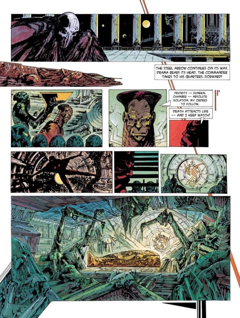
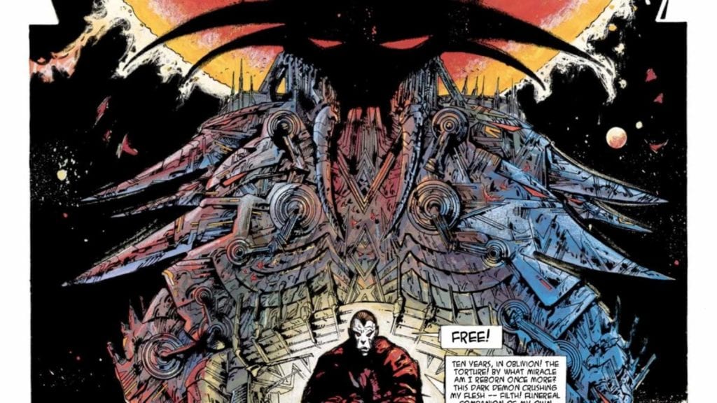
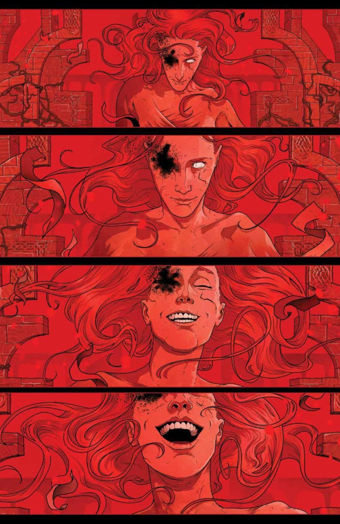
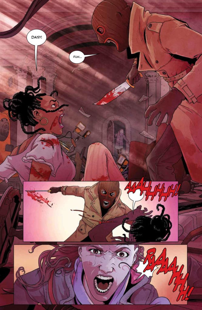
Our story opens with Aleksander Lukin, former foe of Captain America, waking up in a cold sweat. The former general notices the consciousness of the Red Skull arising in his mind once again. Long time fans of the character know these two villain’s history, and this reintroduction was particularly jarring. Readers will no doubt wonder how this affects Aleksander’s self-identity going forward.

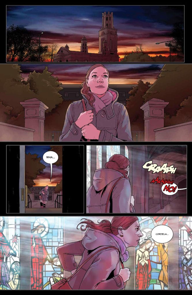
The tale abruptly shifts to Sharon and Steve Rogers’s training facility. Here readers get to see one of Marvel’s favorite couples in a

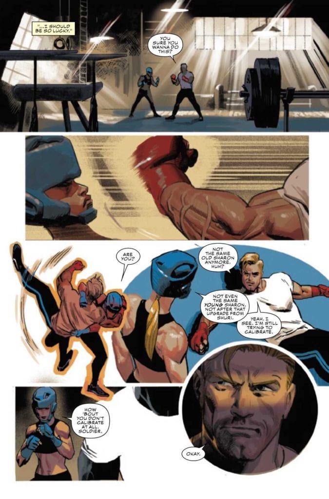
Writer Ta-Nehisi Coates masterfully weaves together Sharon and Steve’s storylines into one cohesive whole. We also loved the continued focus on the ramifications of events as far back as Secret Empire, as well as recent encounters with Selene and the Power Elite. But the most exciting aspect is the looming presence of the Red Skull.

Artwork

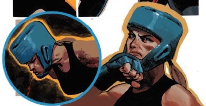
Daniel Acuña’s penciling, ink work, and coloring is perfectly suited to showcase Sharon and Steve’s many sparring scenes. The outlines of each character flow smoothly from panel to panel to show their motion. And VC’s Joe Caramagna’s lettering works in tandem by placing the word balloons along their shifting forms. We also loved the ominous themes generated by the gloomy background shading throughout Aleksander’s scenes.

Conclusion

CAPTAIN AMERICA #24 opens up doors to old foes and new possibilities. And we were thrilled to see Sharon in action once again.

Do you think the Red Skull is coming back? Let us know in the comments below!

Monkeys Fighting Robots Youtube

Review: ELFQUEST: STARGAZER’S HUNT #4 And The Bonds Of Family

ELFQUEST: STARGAZER’S HUNT #4 hits comic book stores on Wednesday, October 14th and follows Jink, the daughter of Skywise the Stargazer. While her father is on a mission of his own, the young elf ventures into a tribe of wolfriders. The resulting experience is a tale of familial bonds that reminds us of the importance of reconnection with those closest to us.

Story

The narrative opens with the fan favorite Skywise the Stargazer drifting through space in a seemingly endless sleep. In order to occupy himself, the elf reminisces about the his lifemate, daughter, and the home of the “High Ones.” Readers can sense his deep longing for his family, but unbeknownst to him, his child Jink finds herself amongst the majestic beings themselves. What’s more, her long lost sister reveals she’s been living with them for some time.

Readers join Jink on her quest to find her father, exploring the fantastical world of the High Ones. We follow the young maiden across lush forests, sparkling shorelines, and deep caves. She even finds a romantic partner in Goldruff.

Wendy and Richard Pini’s narrative takes readers on a fantastical quest through the elves’ world. We feel as though we’re right next to Jink as she searches for her father. The strong bond of family colors each panel.

Artwork

Sonny Strait’s penciling, ink work, and coloring capture the essence of the ElfQuest comics from the eighties. The panels are full of bright colors, sleek elven features, and crisp outlines. In addition, Nate Piekos of Blambot®’s lettering does a brilliant job of differentiating between each form of dialogue. The mental communication, spoken word, and narration are clearly distinguished.

Conclusion

ELFQUEST: STARGAZER’S HUNT #4 provides fans with everything they love about the ElfQuest series. We’re excited to see what adventures Jink embarks on next.

Do you think Jink will find her father? Let us know in the comments below!

Monkeys Fighting Robots Youtube

Review: Revenge Flows Like Blood In THE DEVIL’S RED BRIDE #1

The Devil's Red Bride #1, Bivens cover

THE DEVIL’S RED BRIDE #1, available from Vault Comics on October 14th, begins a new series about an Onna-bugeisha (female samurai) on a quest to avenge her fallen clan. Sebastian Girner writes the inaugural story, a fascinating mix of 47 Ronin, Mulan and Zatoichi set in feudal-era Japan.

Cover Art

John Bivens’ cover is roughly drawn, but what it lacks in finesse, it makes up for in composition. Ketsuko, the main character, strides toward the reader with solemn confidence while wearing her own mask of sadness. The Devil’s Mask over her right shoulder hints of the undercurrent of power. Power represents decades of honor and tradition that drives Ketsuko to uphold her family and her clan’s reputation. Bivens makes excellent use of symbolism in the cover’s composition.

spoilers ahead

Writing

Girner’s story feels familiar and completely new at the same time. Ketsuko, daughter of the Aragami clan’s leader, “helps” her brother establish himself on the battlefield as a capable warlord. Through events not revealed in this issue, Ketsuko wanders the land as Ronin in search of purpose and revenge for her clan’s fate.

There are so many bits and pieces that feel like some movie you’ve already seen or book you’ve already read, but nothing quite matches. In that way, Girner completely succeeds in telling a brand new samurai story without blatantly aping other works. It’s a truly inspiring story on multiple levels. As a reader, you immediately get the final dynamic between father, son, and daughter. You can feel Ketsuko’s frustration with her assigned place in the clan, and you willingly accept her position (shown three years later) without hesitation. It’s rare to see a collection of characters fleshed out so well in a first issue.

Pencils/Inks

Consistent with the cover, Bivens’ work on the internal pages is a bit rough on the lines and details but makes up for it in the composition. Bivens uses camera angles on the panels and asymmetric character positioning to pump up each page with maximum drama. Every conversation is tense. Every battle is anxious. Every confrontation feels ready to boil over in bloodshed. All that drama is accomplished through Bivens’ composition.

The Devil's Red Bride #1, art sample 1

Generally, the rough drawing style works because it infuses a rough, gritty tone. War is a dirty business, and this story is as much about war and the toll it takes on a country as it is about the main character. Bivens doesn’t glamorize the violence with “clean” art, and it makes the death scenes much more effective.

Coloring

Iris Monahan infuses the issue with a heavy mix of sepia tones and reds to give the reader the impression of an old Black & White film. It ages the story nicely to give you the impression of watching the story through the lens of history. When the reds appear, they punctuate the violence and gore that enhances Bevins’ grittiness well.

The Devil's Red Bride #1, art sample 2

Lettering

As with the coloring, Jeff Powell’s lettering work does well to augment Bivens’ excellent composition. More than a few times, you catch the panels showing odd camera angles or showing the speakers “off-screen.” Powell does an excellent job drawing the word balloons in the unseen speaker’s direction without confusing what’s happening and keeping the story moving in the right direction. Powell also makes the visually interesting choice of softening the fonts to depict whispering. Powell’s creative lettering techniques in this issue are visually interesting and keep narrative pace with Blevins’ art.

Conclusion

THE DEVIL’S RED BRIDE #1, available from Vault Comics on October 14th, takes some of the best parts of classic samurai tales and splices them into a uniquely original story. The art is gritty and dramatic, and the writing has the potential to tell another classic tale. This is a great read for any samurai fan.

Monkeys Fighting Robots Youtube

Review: Resurrection And Revolution In LONE SLOANE: CHAOS

Lone Sloane Chaos, Druillet cover

LONE SLOANE: CHAOS, available from Titan Comics on October 14th, recounts the delivery of Sloane’s corpse to Imperator Shaan as a prized trophy, but the journey doesn’t go as planned. This latest installment of the Sloane sage, written and drawn by Phillipe Druillet, brings Sloane and Shaan together for the first, and possibly last, time in their eternal struggle for the soul of the universe.

Cover Art

Druillet’s cover, as with the entire book, is a masterwork in visual design. Sloane holds Legend in a loving embrace as their figures tower over the demonic forces circling Shaan. As rich in symbolism as hatching texture, Druillet presents a multi-layered image that tells a story within a story on every square inch.

spoilers ahead

Writing

Sloane’s dead body is transported by train to Shaan’s palace as the trophy for years of conflict. En route, Legend infiltrates the train and resurrects Sloane to re-assume his place as a symbol of hope for all of Zazhann’s inhabitants against the dark, tyrannical rule of Shaan.

Druillet’s story is an esoteric mix of sci-fi space opera and baroque art. It isn’t easy to classify this as a comic. This work could easily be conceived as a series of bas relief paintings in an ancient cathedral or as a series of psychedelic posters found in some underground, experimental art house. Druillet pushes the Sloane mythology to messianic levels and finds new ways to interpret the value of art, sex, music, good and evil within a space drama context. In lesser hands, the plot would come off as some cheesy sci-fi melodrama. In Druillet’s hands, this is art.

Pencils/Inks

Druillet’s art style will not be to everyone’s liking. It’s a baroque style executed with obsessive amounts of hatching and line work that takes simple characters and settings and complicates them to mind-bending levels. Basic renderings, such as a wall, are brimming with hundreds and thousands of small lines, rectangles, triangles, and a plethora of other geometric shapes to give you the impression that everything has meaning in its texture. You’re almost forced to stare into the very molecules that make up every object.

Lone Sloane Chaos, art sample 1

Of course, this hyper-textured art style makes every character visually arresting, which could be interpreted as magnificent or grotesque. My perception picks up that it’s a bit of both. A true artist’s talent is to give the viewer something that begs interpretation with different outcomes for every viewer. And so, it’s up to the reader to decide if this is beautiful art or grotesque art, and both answers are correct, depending on your point of view.

Coloring

Jean-Paul Fernandez has the daunting task of coloring in the infinite number of geometries and lines to bring depth to Drullet’s world. In this, Fernandez succeeds admirably. The shading and palette in some panels save Druillet’s work from becoming so chaotic that it becomes unrecognizable. Fernandez satisfies the need to shade the worlds and slathers the entire book in the gritty, molten mood of a world on the verge of civil war. Outstanding work by Fernandez.

Lone Sloane Chaos, art sample 2

Lettering

The lettering work here is a superb example of organic integration with the art. This book is translated from Druillet’s native French by Edward Gauvin, but it’s unclear if Gauvin executed on the translated lettering or if Gauvin translated the script and Druillet re-penciled the translation. Either way, the word bubble designs also follow the model of excess (sometimes to an absurd degree) additions of geometric shapes and lines for just the simple tails. Those added shapes are technically unnecessary, but they match the art style perfectly.

Lone Sloane Chaos, art sample 3

Conclusion

LONE SLOANE: CHAOS, available from Titan Comics on October 14th, is the type of comic that pushes all the contemporary artistic boundaries. By itself, the story is imaginatively odd but coupled with the hyper-textured art, creates a completely different category of comic. I highly recommend picking up this book for anyone that wants to stretch their imagination.

Monkeys Fighting Robots Youtube

Review: It All Comes Down To This In STEALTH #6

Stealth #6, Howard cover

STEALTH #6, available from Image Comics on October 14th, opens the door (literally and figuratively) to answer all the questions about the origin of Stealth’s suit and the fate of Detroit. Writer Mike Costa’s finale ties up all the loose threads with a low-key climax that’s heavy on satisfying answers.

Cover Art

Jason Howard’s cover art shifts the specter of danger away from Dead Hand into a dramatic visage of Stealth. The winged hero’s shadow towers over his arch-nemesis and his son as he prepares to swoop down for the kill. It’s a great, dramatic composition that echoes the final battle in this issue.

spoilers ahead

Writing

Costa’s finale wraps up the mystery of Stealth’s suit efficiently and effectively by adding in a sci-fi trope that comes out of nowhere – time travel. Within the context of the story and how it all eventually comes together, it makes total sense. Using time travel as the deus ex machina for the story also adds an interesting twist to the nature of Stealth’s illness and Dead Hand’s power. Costa takes what could have been a predictable origin story and flips it on its head to open the door for a whole range of story possibilities in the future… the very far future.

As a story, it works. In service of tying up all the loose threads and open plot points throughout the miniseries, Costa’s twist is unique and satisfying. That said, the revelation of time travel is so potentially huge and fraught with potential that I wish it had been dropped in an earlier issue to give it time to breathe. It felt a little awkward introducing that plot point so late in the series. I wanted more time (no pun intended) to see where this story goes; that’s a criticism and a compliment to Costa’s writing.

Pencils/Inks

Nate Bellegarde’s art style works well for giving the characters and scenery a high degree of grounded reality. It would be easy to see this series getting picked up by some network or streaming service for a series ala Netflix. Bellegarde infuses so much realism into the characters on page as to be almost photo-realistic. Tony is bedraggled in every possible way given the gauntlet of fights he’s endured over the last few issues. Dead Hand looks frighteningly malignant but not in a cartoonish way. And Stealth’s action scenes rival anything you’d see in a recent MCU film.

Above the style, I give Bellegarde big credit for the emotional punch at the end of the last battle. The timey wimey revelation at the last battle’s end was trippy and mind-bending in a way not seen anywhere else in the series. Yet, Bellegarde integrated the tunnel, visions, and memories(?) into the issue in such a way as not to distract from the realism of the series but add a whole new layer. Great work from Bellegarde.

Coloring

Tamra Bonvillain really shows off some impressive psychedelic coloring techniques in this issue. Stealth’s blue radiation glow and the explosion from a wrecked car have been the only types of eye-catching pop over the sum of the series so far, but we get a little more here. The singularity, the tunnel, and the merging of events glow and flow like nothing we’ve seen before. It’s beautiful and expressive as a force of nature that makes complete sense.

Lettering

Sal Cipriano’s lettering gets high marks for doing exactly what it needs to do in an exposition-heavy comic – keep things moving. There’s a LOT of exposition, and Cipriano moves your eye through the dialog without feeling like your reading an instruction manual. The best kind of dialog is the dialog that doesn’t force you to stop and think about with every panel. This issue moves fast, and Cipriano gets a lot of credit for making that happen.

Conclusion

STEALTH #6, available from Image Comics on October 14th, takes a quantum leap into a sci-fi subgenre to open up a whole world of future stories with the main character. The plot is inventive, and the art adds depth and dimension to the finale’s twist. This is a solid finale from the whole team.

Monkeys Fighting Robots Youtube

TARTARUS VOLUME 1: A Space Opera With More Room To Grow

Tartarus Volume 1 Cover

Tartarus Volume 1 is the collection of the space opera series from Image Comics releasing September 30. From the minds of writer Johnnie Christmas, artist Jack T. Cole, and letterer Jim Campbell comes a grey vs. gray morality story.

Tartarus Volume 1 Story

Tartarus Volume 1 focuses on Tilde, a military cadet on the run from the life she knew. In the universe of Tartarus are factions of people who follow very extreme ideologies. Tilde runs from the military dictatorship she served Baxna. The reader sees that years of service don’t matter to the leaders, not even the general who saw her as a daughter. The fact her mother is a dangerous warlord who risked everything to get a better life on the mining colony Tartarus is too great a risk for a Galactic War they’re fighting. Because to them, any reminder of Surka is a threat to them. After this disheartening revelation, Tilde flees to her mother’s home.

Johnnie Christmas has the main conflict of Tartarus Volume 1 revolve around a web of actions that tie together. Everything from Tilde’s academy friend Klinzu and his attempt to get a date and an engineer’s attempt to better himself comes together. Unfortunately, with so many plot points, there is barely enough time to show character. Tilde is rather reactionary to everything around her, doing whatever the plot demands. But it’s only because most of her actions are about taking care of family and friends, including her twin Mogen, she meets on Tartarus. Again though, readers would benefit from seeing more of Tilde’s interactions with these people. Otherwise, it’s mostly just tidbits like with the high-strung Chief Ilzn who treats her well.

Art

What really attracts readers to Tartarus Volume 1 is the immersive and vibrant world the characters live in. Jack T. Cole decorates this world with images resembling middle ages illustrations. Not least of which are the tarot cards that serve as introductions to the chapters. When looking through the issues, a reader can easily reread the material to understand what takes place fully. On a side note, there are pieces of exposition on one page that describe pieces of the world. Each has a sense of identity where Baxan origins look like military reports; others include simple hazard warnings. This, along with 80’s era sci-fi designs, provides the series’ backgrounds with a sense of culture. Despite the name Tartarus, there seems to be a sense of living and thriving in this world.

Jim Campbell provides plenty of opportunities to communicate how people interact with everything in Tartarus Volume 1. Most word balloons float around to display activity. Even side characters feel like they actually live in these worlds rather than float in them. As for captions, blue captions are usually inner monologues from Tilde, unlike yellow captions for locations. This provides plenty of opportunities for people to see what she’s thinking and how it can differ from her actions. One time, Tilde even speaks out loud because keeping it in her head would blend with the cool colors.

Tartarus Volume 1 Is Only The Beginning

Tartarus is like movies such as Valerian and Mortal Engines, full of world and in-universe culture. Yet it’s storytelling potential feels limited in comparison. Because with so much going on, it’s hard to get a lock on the side plots. Hopefully, the issues following Tartarus Volume 1 can deliver more on character interaction than just the plot.

Monkeys Fighting Robots Youtube

Dinosaurs, Mermaids, and Friendship Galore in LUMBERJANES #74

LUMBERJANES #74, available Wednesday from BOOM! Box brings one beloved series ever closer to its conclusion. The End of Summer is nearly here, and that means the campers are working on their last big adventures.

A very endearing variant cover for Lumberjanes #74.

So, there’s some good news, and some bad (read: sad) news about Lumberjanes. We’ll do the sad news first. In case you haven’t heard, Lumberjanes is nearing the end of its series. Considering that it was originally created as an eight-issue run, it’s done pretty well for itself.

All things must come to an end though, even great things. The fun of Lumberjanes will always live on in our hearts. A fact that will probably be made easier by the good news; Lumberjanes has officially been picked up by HBO Max, with Noelle Stevenson (one of the original creators) at the helm.

Realistically, that’s a ways off. At least that will give fans time to finish Lumberjanes, as well as likely rereading the series a time (or two). With that in mind, let’s dive into our review of Lumberjanes #74.

How far do you think Ripley’s scream carried?

The Writing

Lumberjanes #74 continues ‘The End of Summer‘ plot arc, and it is a bittersweet read, of that there is no doubt. Written by Shannon Watters and Kat Leyh, this is an issue designed to wrap up all lingering plots – and to give fans a chance to say goodbye.

Think of all the insane adventures the Roanoak cabin has had over the years. Now, try and count up all the new friends they’ve made along the way…as well as a few enemies, here and there. Now picture trying to find a way to bring it all back together, and you’ll have a decent idea of how massive this current arc is.

This issue has a little bit of something for everyone. There’s chaos, dimension-hopping, dinosaurs, mermaids, friendship, and even a little bit of romance. All while setting the scene for what will surely be the final adventure (one can only assume).

What makes Lumberjanes #74 shine so brightly are the little moments. How each character is holding true, and showcasing what made fans fall in love with them. Even when they didn’t get a lot of screen time in this issue.

A candy eating dinosaur, what are the odds?

The Art

As always, the artwork inside Lumberjanes #74 showcases that iconic style, laying out vibrant groundworks for adventuring. The style may have changed over the years, as artists switch in and out, yet there has always been something so quintessentially ‘Lumberjanes‘ about the style itself.

Kat Leyh is the lead artist, as well as being one of the writers for this plot arc. It feels appropriate, given how everything is coming full circle at the moment. Leyh’s characters seem as spirited as ever, but that’s no surprise. What is intriguing is seeing how old elements are popping back up, but in new ways.

The colors were provided by Maarta Laiho, and it’s the colors that truly set the tone for this issue. From calming backdrops and bright dinosaurs (yes, really!), to starry skies and punk mermaids. It all seems to flow from one scene to the next, thanks largely to the dominant colors.

Aubrey Aiese was the letterer for this issue, and it’s the lettering that brings everything together. While the emotions of the campers are clear on their faces, it’s the lettering that really evokes that particular tone of voice known to each of them.

Aww, Ripley, don’t ever change.

Conclusion

Lumberjanes #74 is a vibrant collection of quick adventures, following the campers that fans have come to love. This may be the beginning of the end for the series, but it is still wonderfully done, doing justice to the characters, and the fans.

Monkeys Fighting Robots Youtube

The Twisting of a Legend in ONCE & FUTURE #12

ONCE & FUTURE #12, available Wednesday from BOOM! Studios, dives back into the world of lore and legends come back to twisted life. What started off as an ordinary retelling has quickly turned into anything but.

Behold, the creative team for Once & Future #12.

There’s nothing quite like an Arthurian retelling. Only, that isn’t exactly what is happening within these pages, is it? It’s a retelling, sure, but it’s gotten twisted. Tales and creatures from other legends are rising up alongside, meshing all of the stories together.

That is where Once & Future #12 picks up, with classic legends becoming warped beyond recognition – leaving Duncan and his gran to clean up the mess. Not exactly an ideal situation, but somebody has to do it.

Apparently that somebody is the family born and raised to hunt monsters…which makes a fair bit of sense. In a world that has gone awry, any bit of sense is worth holding onto with both hands.

This monster has patiently waited a month to begin killing again.

The Writing

Once & Future #12 dives right into the action, almost literally as the case may be. People are never safe when monsters of legend go hunting – that is a lesson taught time and time again in the past eleven issues.

Written by Kieron Gillen, this is a twisted issue through and through – meant in the best ways possible, of course. There’s something so visceral yet ephemeral about the battle that is hovering on the horizon.

A battle that Duncan is destined to be a part of, thanks to the actions of everyone else in his life. It’s chilling, thinking about all the ramifications that may come from it all. Yet there’s something so compelling, it’s simply impossible to turn away.

There’s a lot of creative writing in this issue in particular, weaving narratives together to create something wholly new. It’s a clever way to obfuscate the truth, while also finally providing an answer or two to questions being asked. Now we just have to sit and wait to see how bad it’s all going to get.

That… is not a pretty monster, to say the least.

The Art

As with literally every other issue of this series, Once & Future #12 is full of vibrant and stunning artwork. The illustrations are horrifying yet compelling, while the colors are eye-popping and memorable.

Dan Mora is the lead artist, bringing those horrifying monsters to life, as well as the very human reactions to them. This is an issue full of events and details, from the grotesque to the intriguing, and it’s all perfectly balanced upon these pages.

The shock and horror of everything that happened are undoubtedly enhanced by the colors that Tamra Bonvillain brought to the table. The hues of purple and blue work in a delightful addition to the green that implies magic and rot. All of it comes together to create a world that truly does seem full of magic – and horrors.

Finally, there’s the lettering, provided by Ed Dukeshire. The monsters in this series are larger than life, and the noises they bring about are scaled appropriately. All of this (and more) is showcased thanks to the lettering.

The devastation of battle.

Conclusion

It’s been a long month waiting to see how the cliffhanger from Once & Future #11 would pan out, yet Once & Future #12 did not disappoint. In fact, in some ways, this is the darkest and most twisted issue of the series. So far, at any rate. By the look of things, it’s going to get so much darker before the story comes to an end.

Monkeys Fighting Robots Youtube

5-Page Preview: TEENAGE MUTANT NINJA TURTLES: THE LAST RONIN #1

5-Page Preview: TEENAGE MUTANT NINJA TURTLES: THE LAST RONIN #1

Teenage Mutant Ninja Turtles: The Last Ronin #1 of 5 hits your local comic book store on October 28, but thanks to IDW Publishing, Monkeys Fighting Robots has a five-preview to share with our readers.

Are you excited for The Last Ronin?

Kevin Eastman, Peter Laird, and Tom Waltz worked on the story. Eastman and Waltz scripted the book. Eastman also designed the layouts, and Esau & Isaac Escorza handled the pencils and inks. Luis Antonio Delgado dropped the color on the book, and you will read Shawn Lee’s letter work. The art on page 39 is by Ben Bishop with color assistance by Samuel Plata (but that’s not part of the preview).

About Teenage Mutant Ninja Turtles: The Last Ronin #1:
It’s the TMNT event of 2020! Springing from the minds of TMNT co-creators Kevin Eastman and Peter Laird comes an epic like you’ve never seen before! In a future NYC far different than the one we know today, a lone surviving Turtle goes on a seemingly hopeless mission to obtain justice for his fallen family and friends. Kinetic layouts from Eastman, inks from Esau and Isaac Escorza, and a thrilling script full of surprises from longtime TMNT scribe Tom Waltz all combine to make this one of the most memorable TMNT stories you will ever read!

Oversized in both format and page count, this is a perennial TMNT tale that can’t be missed!


Enjoy the Preview Below:

Monkeys Fighting Robots Youtube

When Things Go Wrong in The RED MOTHER #9

THE RED MOTHER #9, available Wednesday from BOOM! Studios, brings us back to the horrors that lie in wait for Daisy McDonough. There is something in the dark that is far from done with this young woman.

Even the title page appears foreboding in The Red Mother #9.

Life has not been easy for Daisy, not since the attack, at any rate. Yet she’s worked hard to put her life back together and keep moving forward. Unfortunately for her, the darkness that follows is also moving forward.

This is a psychological horror through and through and is perhaps not a great series for those looking for something…calmer. Daisy’s journey has not been easy, or free of bloodshed, and it is certainly not about to change anytime soon.

That is a fact that could not be more accurate in The Red Mother #9, as once again major events and changes are about to reshape Daisy’s life. Arguably, not for the better, but only time will tell.

That’s not haunting or terrifying…nope! Not at all.

The Writing

Where the previous issue was harrowing, The Red Mother #9 is terrifying. Everything that could possibly go wrong is in the process of doing so, with little to no explanation as to how (or why). Only the hint of something…supernatural seems to linger in the air.

Jeremy Haun’s writing hits new levels in this issue. It’s dark and foreboding, while also tearing open Daisy’s psyche, forcing fans to look into the nightmares that have haunted her from the very first page.

The hope that seemed to rise up in the last issue has all but been obliterated. The absence left behind is raw and jagged, and yet it doesn’t feel like the story is done. Not yet, at any rate. There’s still more to Haun’s tale, and that is simply put, terrifying.

Speaking of terrifying, the conclusion of this issue is very much that. There is no such thing as a break in this twisted world, apparently. Now fans are going to have to wait a month to see what exactly is going to come from this cliffhanger.

And so it begins (The Red Mother #9).

The Art

The artwork within The Red Mother #9 is the perfect match to the story within. Both are vibrant and haunting, demanding attention, and leaving more than a few emotional scars in the process. Danny Luckert (art and colors) and Ed Dukeshire (letters) have truly created something wonderful here.

Wonderful, and terrible, that is. They have somehow taken the mundane and turned it into something dark and insidious. There is nothing calming about seeing Daisy walk down a quiet street – only the fear of what could be hiding in plain sight.

From the very start of this issue, everything simply felt wrong. It’s amazing how those introductory panels truly do set the scene. Even without words, without any true idea of what is going on, there’s something unforgettable about those scenes.

The struggles and battles brought to Daisy in this issue had a real sense of physicality to them, thanks in large part to the lettering, as well as the chosen color palettes. Together they grounded the fight, and that made it feel so much more real.

She’s not standing aside this time.

Conclusion

The Red Mother #9 is a heavy issue, with Daisy taking hit after hit. That sense of hope is gone, and yet there’s still something that demands our attention. It’s more than enough to leave fans anxiously waiting for the next issue in this series.

Monkeys Fighting Robots Youtube