DEAD DAY #5 hits your local comic book shop on November 18, but thanks to AfterShock Comics, Monkeys Fighting Robots has an exclusive four-page preview for our readers.
About the book: With nowhere else to run, Jeremy and the Haskin family find themselves under siege, caught in between the Lifers and the Revivalists…and not everyone will escape Dead Day alive. Witness the emotional conclusion to the supernatural holiday in a world where death isn’t the end and secrets never stay buried.
DEAD DAY #5 is written by Ryan Parrott, with art by Evgeniy Bornyakov, Juancho! drops the colors, and you will read Charles Pritchett’s letter work. Andy Clarke, with Jose Villarrubia, worked on the cover.
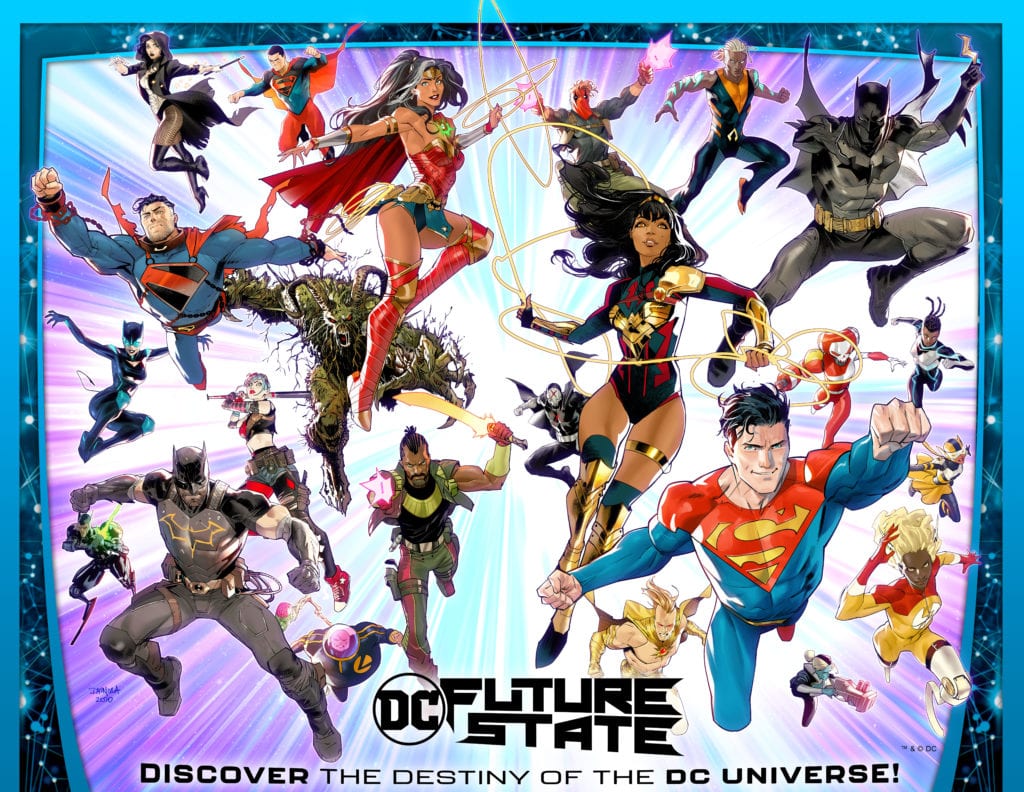
DC Comics has finally revealed details about their mysterious new project – DC FUTURE STATE – that begins in January 2021. There’s been some speculation that Future State was originally conceived as Dan DiDio’s defunct 5G project, but this new announcement confirms a much more limited scope event.
Says DC about Future State’s main subject: “DC Future State spotlights the World’s Greatest Super Heroes in fresh new roles, with all-new characters taking up their iconic mantle.”
You can read the full breakdown of Future State issues and read the full DC press release below.
What are your theories about the long-term impact to DC with this limited-run event? Let us know what you think in the Comments section, and please share this post on social media using the links below.
DC FUTURE STATE GIVES FANS A LOOK AT THE FUTURE OF THE DC UNIVERSE THIS JANUARY!
BURBANK, CA (October 15, 2020) – DC is starting 2021 off with a bang, giving fans a glimpse into futures both near and far, full of current and new characters as the publisher announced plans today for DC Future State, a two-month, line-wide event beginning in January. Through February 2021, the full title lineup will feature a combination of monthly and twice-monthly oversize anthologies, as well as a monthly schedule of miniseries and one-shots.
DC Future State spotlights the World’s Greatest Super Heroes in fresh new roles, with all-new characters taking up their iconic mantles. DC Future State features an incredible array of creative talent, combining award-winning writers and artists with new voices from the worlds of TV, movies and animation. In March 2021, the regular DC title lineup resumes, continuing existing story lines from 2020 and introducing new arcs for the year.
In DC Future State, the Multiverse has been saved from the brink of destruction, but the triumph of DC’s heroes has shaken loose the very fabric of time and space! The final chapter of Dark Nights: Death Metal (on sale January 5, 2021) brings new life to DC’s Multiverse, kicking off this glimpse into the unwritten worlds of DC’s future!
“The DC Universe has always been fertile ground for new and refreshing takes on our characters, and DC Future State definitely contributes to this legacy,” said DC Executive Editor Marie Javins. “When the event begins in January, some savvy readers will not only pick up on some of the breadcrumbs that have already been tossed out in our current titles, but they will also find new hints and clues of what’s to come in 2021.”
A stellar array of writers and artists are on hand to deliver this unique look at beloved DC characters, including fan favorites such as Mariko Tamaki, Brian Michael Bendis, Gene Luen Yang, Joëlle Jones, Joshua Williamson, Nicola Scott, Cully Hamner and John Timms, along with new voices such as award-winning screenwriter John Ridley (12 Years A Slave), Brandon Vietti (Young Justice), Meghan Fitzmartin (Supernatural, DC Super Hero Girls), Brandon Easton (Thundercats, Transformers: War for Cybertron), Alitha Martinez (REPRESENT! It’s A Bird!), L.L. McKinney (Nubia: Real One), Paula Sevenbergen (Stargirl) and Siya Oum (Lola XOXO), among others.
Batman Family
In this future, Gotham City is controlled by the Magistrate. This villainous regime has taken control of the city, now under constant surveillance. All masked vigilantes have been outlawed and Batman has been killed. But led by an all-new Batman, a new assembly of Gotham’s guardians rise to give hope to all of those who lost it!
Oversized Comics:
Future State: The Next Batman #1-4
The Next Batman, by John Ridley, Nick Derington and Laura Braga
Outsiders, by Brandon Thomas and Sumit Kumar
Arkham Knights, by Paul Jenkins and Jack Herbert
Batgirls, by Vita Ayala and Aneke
Gotham City Sirens, by Paula Sevenbergen and Emanuela Lupacchino
Future State: Dark Detective #1-4
Dark Detective, by Mariko Tamaki and Dan Mora
Grifters, by Matthew Rosenberg and Carmine di Giandomenico
Red Hood, by Joshua Williamson and Giannis Milonogiannis
Monthly Miniseries:
Future State: Batman/Superman, by Gene Luen Yang and Ben Oliver
Future State: Catwoman, by Ram V and Otto Schmidt
Future State: Harley Quinn, by Stephanie Phillips and Simone Di Meo
Future State: Nightwing, by Andrew Constant and Nicola Scott
Future State: Robin Eternal, by Meghan Fitzmartin and Eddy Barrows
Superman Family
Due to his involvement in an international crisis happening in the near future, Clark Kent has been rejected by Earth, causing him to focus his lifesaving efforts outside his adopted home. He travels to Warworld to rise through the ranks of gladiatorial combat in order to defeat Mongul with the help of some unlikely heroes. Back in Metropolis, Clark’s son Jon has taken on the mantle of Superman. After seeing the horrors that befell Gotham, he bottles Metropolis in order to keep it safe, putting him at odds with Supergirl.
Connecting the two oversized Future State: Superman titles, Shilo Norman, the man known as Mister Miracle, finds himself caught between the city he grew up in and the battle-torn planet that could be his downfall.
Meanwhile in the Amazon rainforest, Yara Flor is chosen to be the new Wonder Woman. Years later, the new Superman and Wonder Woman join forces to save their cities in a new superhero team-up the likes of which the world has never seen.
Oversized Comics:
Future State: Superman of Metropolis #1-2
Superman of Metropolis, by Sean Lewis and John Timms
The Guardian, by Sean Lewis and Cully Hamner
Mister Miracle, by Brandon Easton and Valentine De Landro
Future State: Superman: Worlds of War #1-4
Superman: Worlds of War, by Phillip Kennedy Johnson and Mikel Janin
Midnighter, by Becky Cloonan, Michael W. Conrad and Gleb Melnikov
Black Racer, by Jeremy Adams and Siya Oum
Mister Miracle, by Brandon Easton and Valentine De Landro
Future State: Immortal Wonder Woman #1-2
Immortal Wonder Woman, by Becky Cloonan, Michael W. Conrad and Jen Bartel
Nubia, by L.L. McKinney, Alitha E. Martinez and Mark Morales
Monthly Miniseries and One-Shots
Future State: House of El, by Phillip Kennedy Johnson and Scott Godlewski (one-shot on sale February)
Future State: Kara Zor-El, Superwoman, by Marguerite Bennett and Marguerite Sauvage
Future State: Legion of Super-Heroes, by Brian Michael Bendis and Riley Rossmo
Future State: Superman/Wonder Woman, by Dan Watters and Leila del Duca
Future State: Superman vs. Imperious Lex, by Mark Russell and Steve Pugh (3-issue series ending March 2021)
Future State: Wonder Woman, by Joëlle Jones
Justice League Family
A thread of great change runs through the Justice League heroes: a new League is built upon secret identities (even from each other), but an old and evolved enemy will use these secrets to try and overthrow the world. For the supernatural heroes of Justice League Dark, the very fabric of reality has shifted, and heroes are being hunted.
For Flash, Shazam, and the Teen Titans, it all begins when the four Riders of the Apocalypse unleash hell in a battle at Titans Academy, Barry Allen is cut off from the Speed Force, a Famine-controlled Wally West may be beyond saving, and Billy Batson makes a deal with the devil that will change Shazam forever. Off-world, John Stewart and the remaining Green Lanterns are stranded in the shadow of a dead power battery; Jackson Hyde and Andy Curry are separated across the galaxy; and Amanda Waller executes her ultimate plan with a new but terrifyingly familiar Suicide Squad on Earth-3.
At the end of time, Swamp Thing reveals its true intention, ruling supreme until a remnant of humanity launches a rebellion, and Black Adam looks to the past as the only way to save the future of the Multiverse.
Oversized Comics:
Future State: Justice League #1-2
Justice League, by Joshua Williamson and Robson Rocha
Justice League Dark, by Ram V and Marcio Takara
Future State: Green Lantern #1-2
Last Lanterns, by Geoffrey Thorne and Tom Raney
Tales of the Green Lantern Corps, by Josie Campbell, Ryan Cady and Ernie Altbacker, with Sami Basri and Clayton Henry
Future State: Suicide Squad #1-2
Suicide Squad, by Robbie Thompson and Javi Fernandez
Black Adam, by Jeremy Adams and Fernando Pasarin
Monthly Miniseries:
Future State: Aquaman, by Brandon Thomas and Daniel Sampere
Future State: The Flash, by Brandon Vietti and Dale Eaglesham
Future State: Teen Titans, by Tim Sheridan and Rafa Sandoval
Future State: SHAZAM!, by Tim Sheridan and Eduardo Pansica
Future State: Swamp Thing, by Ram V and Mike Perkins
For the latest information on DC Future State and the World’s Greatest Super Heroes, please visit the DC Comics website at www.dccomics.com and follow on social media @DCComics and @thedcnation.
The Amazing Spider-Man #50, out today from Marvel Comics, finally resolves many parts of its ongoing story while starting new ones and even presents a shocking reveal.
After such a colossal and important issue as The Amazing Spider-Man #850, you would expect the issue following it to decline in quality, as the writer has put his most exciting moments into the previous issue to make it as outstanding as possible. This is not the case whatsoever, and the gripping story of The Amazing Spider-Man #50 may even be better than the super-sized anniversary issue that came before it. It is so full of new reveals, conclusions to plots that have been going on for so long, and some awe-inspiring art that the issue itself is one of the best Spider-Man comic books in the past several months.
The Amazing Spider-Man #50 Story
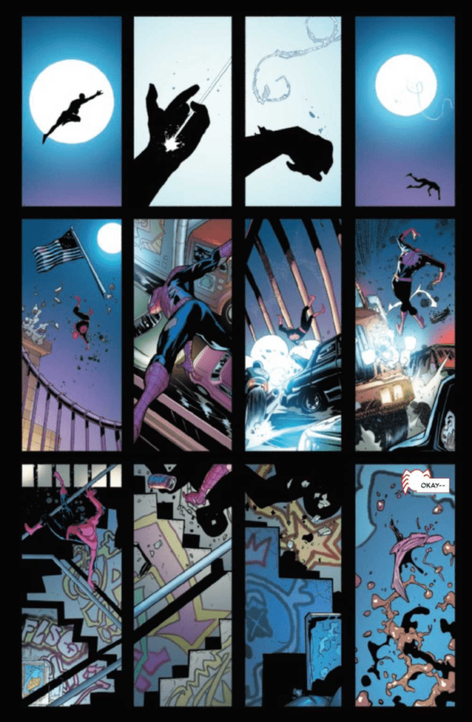
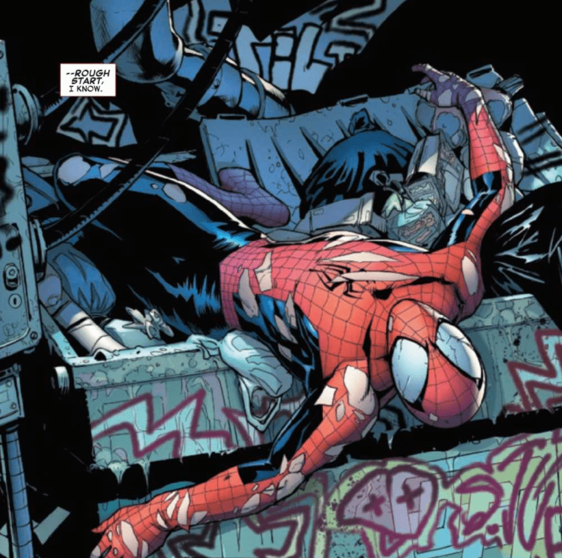
At the end of The Amazing Spider-Man #850, Spider-Man and “The Order of the Web” are fleeing the Ravencroft Institute, leaving the Green Goblin behind while the Sin-Eater is momentarily immobilized. This is not where The Amazing Spider-Man #50 picks up from. Instead, we are greeted with a silent 12-panel grid that shows our favorite web-slinger falling from the air and brutally crashing into various objects during his descent. The lack of sound effects or captions during this page gives it a haunting feeling, as it shows this beloved character beaten down nearly to the point of breaking. All of this works together to leave the reader to wonder how this came about. It is a brilliant way to open up the story and gets the reader excited to turn each page and watch as the issue unfolds.
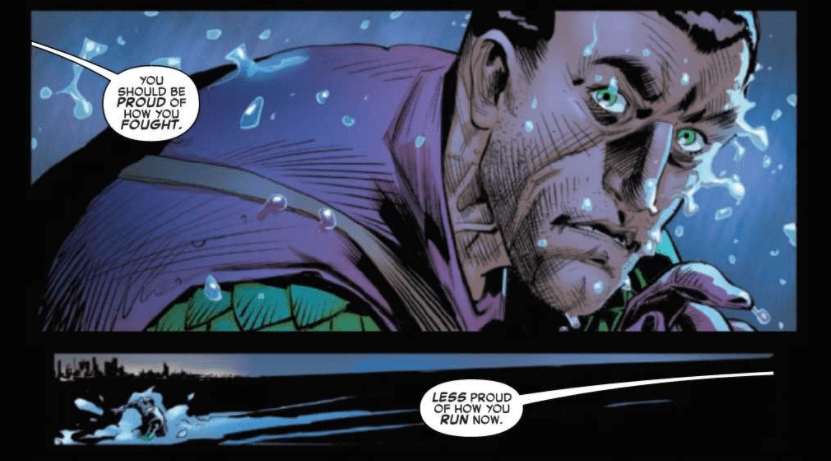
Not only does Nick Spencer provide an astonishing issue in its own right with The Amazing Spider-Man #50, but the issue also concludes and reveals several components of Spencer’s ongoing storyline while beginning new parts of it. There are major events centered around the Sin-Eater, the “Order of the Web,” Norman Osborn, and even Kindred in this single issue. Every page feels like another punch to the face as something else shocking occurs. It is an issue you will never want to put down.
I have nothing but admiration for Patrick Gleason’s work on this issue. The Amazing Spider-Man #50 is filled with tense, emotional scenes, and they wouldn’t have nearly the same impact it does without the wonderful emotive faces that Gleason brings to life. Gleason can also portray Kindred with a unique creepiness and presents some terrifying art for the monsters he unleashes. The paneling of The Amazing Spider-Man #50 is particularly notable, with Gleason constantly pushing the boundaries of what is expected in modern super-hero comic books. Whether it be borderless panels, overlapping panels, or intentionally not using all of the space available, Gleason’s paneling choices pay off tremendously and add a substantial amount to the issue’s narrative.
The coloring of The Amazing Spider-Man #50 does a nice job of reflecting the tone of the issue. Edgar Delgado uses dark colors for most of the issue, which goes along nicely with the tense moments portrayed. Due to the mostly dark tone of the issue, when bright reds and oranges are later used for the monsters unleashed by Kindred, it is a frightening image as it contrasts with everything around it.
VC’s Joe Caramagna provides some outstanding lettering in The Amazing Spider-Man #50, which does a beautiful job of allowing the story to progress seamlessly. Caramagna uses unique speech bubbles for an inhuman character like Kindred, which is a subtle yet effective way to make him seem otherworldly. Caramagna also does some amazing work at providing captions that are easily identifiable, which is important when more than one character speaks through captions in an issue.
I was absolutely dumbfounded with how much occurred in a single issue and how it will have a giant impact on what is to come later in the series. I haven’t read a Spider-Man issue that had me this excited in a long time, and it is an experience no fan should miss. The Amazing Spider-Man #50 leaves you in awe of how great it was and leaves you desperately waiting for the next issue so that the phenomenal story can be continued.
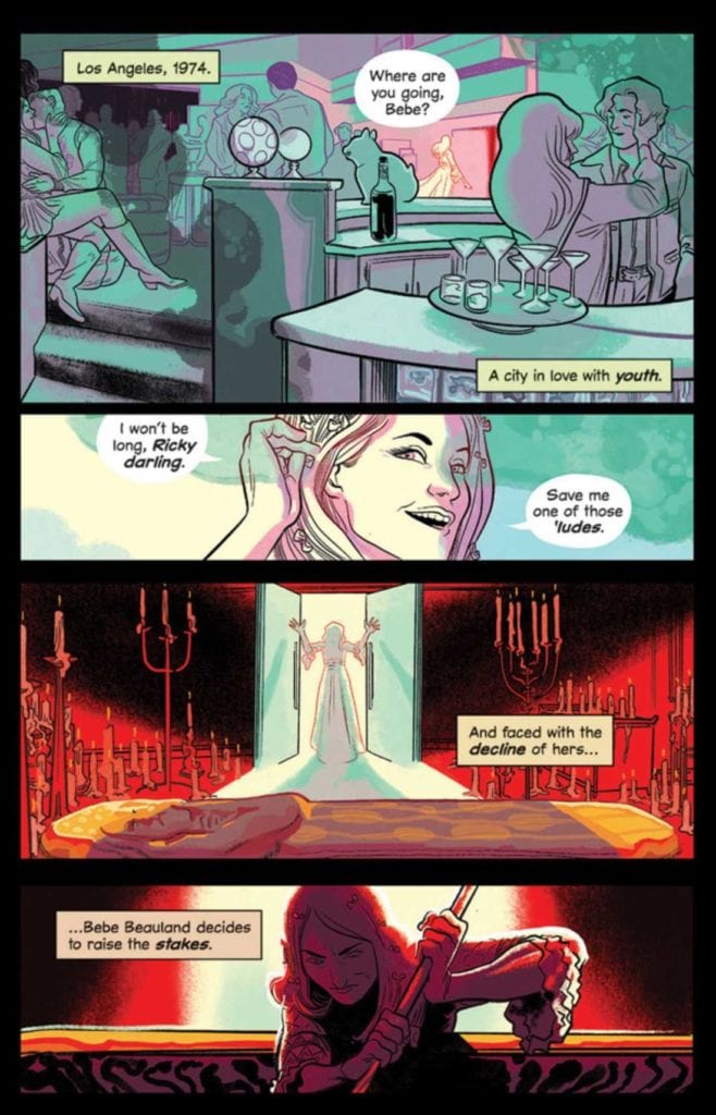
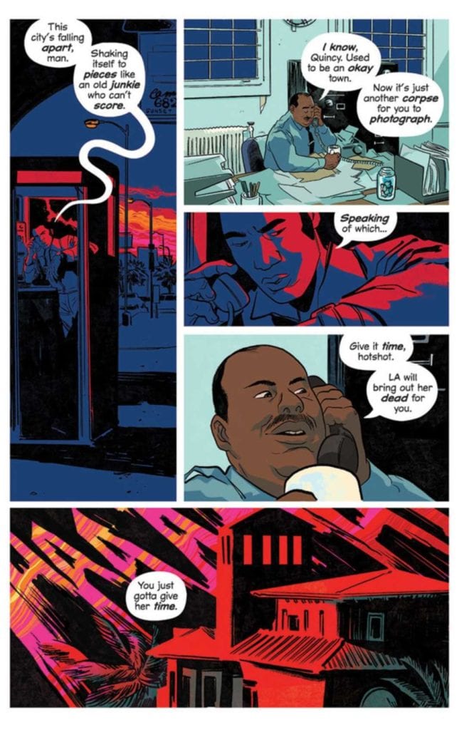
DRACULA, MOTHERF**KER!, available now from Image Comics, is a reinvention of the Dracula story that pays homage to the strongest examples of 70’s exploitation horror. Written by Alex de Campi and illustrated by Erica Henderson, this graphic novel has a lot to like for horror fans if you can get past some glaring rough spots.
Cover Art
Henderson’s cover is a pristine encapsulation of the story with a perfect tone to match the 1974 setting. The combination of colors is sickeningly garish, but they flow in mellow strokes and curves to create a fever dream of composition for all the central characters. It’s loud and tacky but smooth and dreamy all at the same time, and that pretty much sums up the 70’s aesthetic.
Writing
I really, REALLY liked the setup of this alternate version of Dracula. In 19th Century Europe, Dracula’s brides turn on him and imprison him “forever.” In 1974, an aging Hollywood starlet freed Dracula intending to petition Dracula to make her young and beautiful “forever.” A nighttime paparazzo photographs the bodies as they begin to pile up before he notices he’s attracted the attention of the monster. The pieces seem familiar, but nothing like this setup exists, and high praise goes to de Campi for dreaming it up.
That said, this is a frustrating book. The story setup is there. The 70’s setting is there. The characters, beyond the titular Count, are period-accurate and interesting. More importantly, giving the brides some agency in the Dracula story is something I’ve never seen before. It gives the legend a completely new layer of possibilities that I quite liked. What detracts from the greatness of this book are the plot holes, very big plot holes. This type of book feels good in the first reading and overall execution, but once you start to think about things that don’t make sense, the whole thing unravels.
For example, if the brides could incapacitate and imprison Dracula, why not simply destroy him instead of burying him in some undisclosed location? How did the aging starlet know Dracula was real and where to find him? If the brides knew about the starlet and her location, why not simply stop her from freeing the Count?
And the biggest question (less plot hole and more unexplained plot point) after reading the book through twice – why was Dracula so interested in going to extreme lengths to kill the paparazzo that posed absolutely no threat? I get the impression that if de Campi had added more pages to address these holes (and a few more not mentioned) this would have been a solid entry in the Dracula library. This is a big story, and by trying to tell too much too fast, it winds up feeling incomplete.
Pencils/Inks
Henderson’s artwork for this book is, generally, very good. It’s a treat to follow cars along the California coast with neon-soaked, streaking headlights on their way to crime scenes blown out in ambulance light reds. There’s a Hitchcockian feel to the panel work that would make Robert Burks (Hitchcock’s go-to cinematographer) proud. The setting and surroundings’ entire design is spot on for a stylistic impression of 1974, rather than a realistic recreation, and that was a great design choice.
By far, the artistic highlight is Henderson’s rendering of Dracula. Here, Dracula is no dusty, European aristocrat but a demonic force. He’s something akin to Lord Aku from Samurai Jack but with oodles of predatory malevolence (and many more eyes). He’s depicted as a true monster in every sense, and it makes him much scarier than your standard Count with fangs.
Where Henderson’s art doesn’t quite work is in the featureless character designs, excluding Dracula. The aging starlet is supposed to be “aging,” but there’s not a blemish or wrinkle on her to make you believe it. There are so many women in this book, but I constantly struggled to keep track of which woman was because they lack any distinguishing features and are never, except for the starlet, named. It would have served the book more to add some distinction to the characters’ look, especially the women.
Coloring
Again, frustrating. I love the neon-noir palette and Henderson’s choices in shading different settings in different colors to guide the story’s direction. In keeping with the 70’s time frame, all the right Day-Glo splashes are present, but the panels were never washed out.
The frustration comes in with the coloring and shading of the characters, particularly with Ateera. There are some scenes where the panel filter is so strong, coupled with the lack of facial definition, that it was difficult to tell which character was in panel. At one point, I thought a fourth bride had entered the story because the lighting on Ateera’s face was so extreme that she appeared as a completely different character. The coloring palette selection is great, and its application on the settings is excellent, but some colors were simply overdone.
Lettering
This is not good lettering. This is GREAT lettering.
Henderson uses a mix of fonts and applications to create a collage of visually interesting narration. The highlight, again, is the depiction of Dracula’s voice. The first time you read (hear?) it, the voice transmits as something speaking with old, malignant authority. Even Dracula’s voice feels inhuman, consistent with his outstanding design.
Conclusion
DRACULA, MOTHERF**KER!, available now from Image Comics, hits all the right notes for fans of 70’s horror, but incomplete story structure and uneven art keep it from being great. If you can overlook the rough spots, you’ll enjoy it. This book is a guarded recommendation.
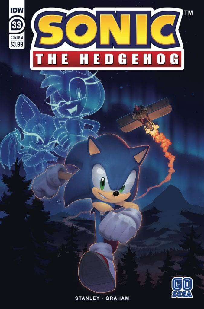
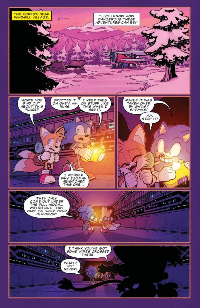
Sonic The Hedgehog #33 out this week from IDW Publishing is the start of a new journey. Rogue takes more of a leadership role as she pulls a team together to help find parts to repair Omega. The new work by Evan Stanley (writer and artist), Reggie Graham (colors), and Shawn Lee (lettering) are off to a decent start.
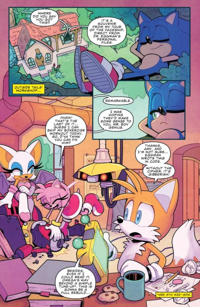
The Metal Virus is gone, but things aren’t quite back to normal. Omega is damaged and his allies turn to Tails and Sonic for help. The only way to rebuild him is to trade parts with a mysterious champion Chao racer… but things aren’t what they seem.
Writing
There is a lot of talk about how this issue is a great jumping-on point for new readers of Sonic The Hedgehog and there is a lot of evidence to support this claim. There isn’t a lot of overhang from the previous story a new reader needs to know coming. In fact, the main aspect of what the reader needs to know (in this case, it’s how Omega is damaged and needs to be repaired) is introduced in the first few pages of the issue. So, points for living up to this claim.
The writing by Evan Stanley seems to focus on the characters and their interactions with one another. Rogue acting like a team leader for a heist seems on point but at the same time shows off a more caring aspect to her personality. So far, Stanley is demonstrating they have a good sense of the characters and have set up a good start to a new arc.
Artwork
With Evan Stanley acting as both writer and artist a lot of scenes seem to pop. There is some great use of facial expressions to show off the emotions of the characters as scenes play out. One panel imparticular which stands out features Sonic the Hedgehog grimacing while exploring a former Badnik base. The panel encapsulates just how creepy the location is.
The new colorist, Reggie Graham helps to bring attention to the scenery and background of each panel. Graham seems to have a talent for helping to visually illuminate scenes. This helps as Amy and Rogue travel to White Park and enter a building structured like a ski lodge. The lighting feels warm and welcoming as if someone coming inside from a winter night.
The lettering by Shawn Lee helps with the auditory aspects of the issue. Special attention is paid as Cheese enters the Chao race. The words and font used convey the idea Cheese is trying is best but is not in real danger as the action unfolds. A perfect fit as such a tiny and adorable character takes the spotlight.
Conclusion
Sonic The Hedgehog #33 seems like the start of a great new chapter for the series. While it is slower and with less action than previousissues, this is to be expected with the start of a new arc. For now, it seems like the work of Stanley and Graham will have a lot to offer the series.
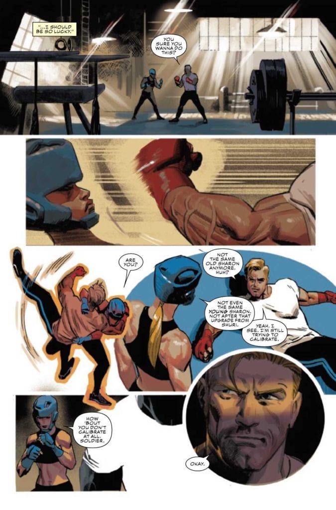
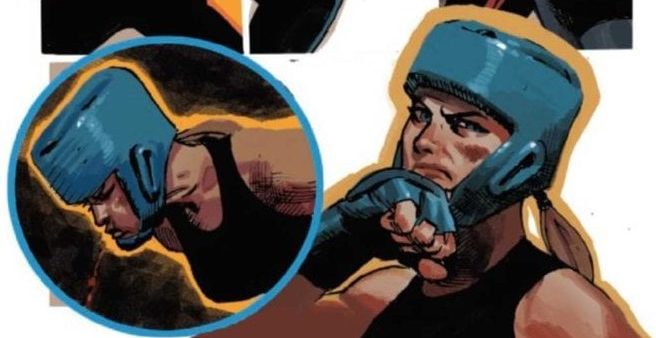
CAPTAIN AMERICA #24, available in comic book stores on Wednesday, October 14th, follows Sharon Carter as she comes to terms with her de-aged body. It offers readers an intriguing look at someone learning to embrace a new way of living. But another person finds themselves in the middle of their own identity crisis. And this familiar character could prove to be a thorn in our heroes’ sides.
Story
Our story opens with Aleksander Lukin, former foe of Captain America, waking up in a cold sweat. The former general notices the consciousness of the Red Skull arising in his mind once again. Long time fans of the character know these two villain’s history, and this reintroduction was particularly jarring. Readers will no doubt wonder how this affects Aleksander’s self-identity going forward.
The tale abruptly shifts to Sharon and Steve Rogers’s training facility. Here readers get to see one of Marvel’s favorite couples in a
Writer Ta-Nehisi Coates masterfully weaves together Sharon and Steve’s storylines into one cohesive whole. We also loved the continued focus on the ramifications of events as far back as Secret Empire, as well as recent encounters with Selene and the Power Elite. But the most exciting aspect is the looming presence of the Red Skull.
Artwork
Daniel Acuña’s penciling, ink work, and coloring is perfectly suited to showcase Sharon and Steve’s many sparring scenes. The outlines of each character flow smoothly from panel to panel to show their motion. And VC’s Joe Caramagna’s lettering works in tandem by placing the word balloons along their shifting forms. We also loved the ominous themes generated by the gloomy background shading throughout Aleksander’s scenes.
Conclusion
CAPTAIN AMERICA #24 opens up doors to old foes and new possibilities. And we were thrilled to see Sharon in action once again.
Do you think the Red Skull is coming back? Let us know in the comments below!
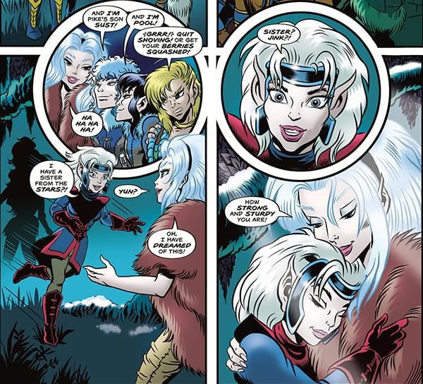
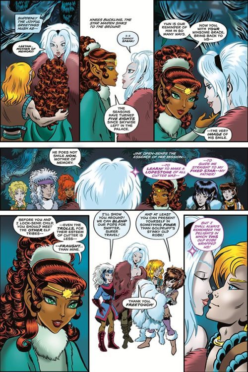
ELFQUEST: STARGAZER’S HUNT #4 hits comic book stores on Wednesday, October 14th and follows Jink, the daughter of Skywise the Stargazer. While her father is on a mission of his own, the young elf ventures into a tribe of wolfriders. The resulting experience is a tale of familial bonds that reminds us of the importance of reconnection with those closest to us.
Story
The narrative opens with the fan favorite Skywise the Stargazer drifting through space in a seemingly endless sleep. In order to occupy himself, the elf reminisces about the his lifemate, daughter, and the home of the “High Ones.” Readers can sense his deep longing for his family, but unbeknownst to him, his child Jink finds herself amongst the majestic beings themselves. What’s more, her long lost sister reveals she’s been living with them for some time.
Readers join Jink on her quest to find her father, exploring the fantastical world of the High Ones. We follow the young maiden across lush forests, sparkling shorelines, and deep caves. She even finds a romantic partner in Goldruff.
Wendy and Richard Pini’s narrative takes readers on a fantastical quest through the elves’ world. We feel as though we’re right next to Jink as she searches for her father. The strong bond of family colors each panel.
Artwork
Sonny Strait’s penciling, ink work, and coloring capture the essence of the ElfQuest comics from the eighties. The panels are full of bright colors, sleek elven features, and crisp outlines. In addition, Nate Piekos of Blambot®’s lettering does a brilliant job of differentiating between each form of dialogue. The mental communication, spoken word, and narration are clearly distinguished.
Conclusion
ELFQUEST: STARGAZER’S HUNT #4 provides fans with everything they love about the ElfQuest series. We’re excited to see what adventures Jink embarks on next.
Do you think Jink will find her father? Let us know in the comments below!
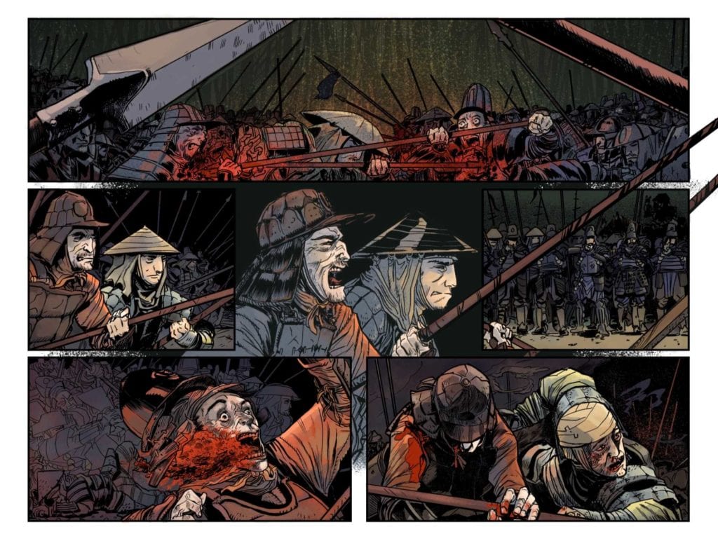
THE DEVIL’S RED BRIDE #1, available from Vault Comics on October 14th, begins a new series about an Onna-bugeisha (female samurai) on a quest to avenge her fallen clan. Sebastian Girner writes the inaugural story, a fascinating mix of 47 Ronin, Mulan and Zatoichi set in feudal-era Japan.
Cover Art
John Bivens’ cover is roughly drawn, but what it lacks in finesse, it makes up for in composition. Ketsuko, the main character, strides toward the reader with solemn confidence while wearing her own mask of sadness. The Devil’s Mask over her right shoulder hints of the undercurrent of power. Power represents decades of honor and tradition that drives Ketsuko to uphold her family and her clan’s reputation. Bivens makes excellent use of symbolism in the cover’s composition.
Writing
Girner’s story feels familiar and completely new at the same time. Ketsuko, daughter of the Aragami clan’s leader, “helps” her brother establish himself on the battlefield as a capable warlord. Through events not revealed in this issue, Ketsuko wanders the land as Ronin in search of purpose and revenge for her clan’s fate.
There are so many bits and pieces that feel like some movie you’ve already seen or book you’ve already read, but nothing quite matches. In that way, Girner completely succeeds in telling a brand new samurai story without blatantly aping other works. It’s a truly inspiring story on multiple levels. As a reader, you immediately get the final dynamic between father, son, and daughter. You can feel Ketsuko’s frustration with her assigned place in the clan, and you willingly accept her position (shown three years later) without hesitation. It’s rare to see a collection of characters fleshed out so well in a first issue.
Pencils/Inks
Consistent with the cover, Bivens’ work on the internal pages is a bit rough on the lines and details but makes up for it in the composition. Bivens uses camera angles on the panels and asymmetric character positioning to pump up each page with maximum drama. Every conversation is tense. Every battle is anxious. Every confrontation feels ready to boil over in bloodshed. All that drama is accomplished through Bivens’ composition.
Generally, the rough drawing style works because it infuses a rough, gritty tone. War is a dirty business, and this story is as much about war and the toll it takes on a country as it is about the main character. Bivens doesn’t glamorize the violence with “clean” art, and it makes the death scenes much more effective.
Coloring
Iris Monahan infuses the issue with a heavy mix of sepia tones and reds to give the reader the impression of an old Black & White film. It ages the story nicely to give you the impression of watching the story through the lens of history. When the reds appear, they punctuate the violence and gore that enhances Bevins’ grittiness well.
Lettering
As with the coloring, Jeff Powell’s lettering work does well to augment Bivens’ excellent composition. More than a few times, you catch the panels showing odd camera angles or showing the speakers “off-screen.” Powell does an excellent job drawing the word balloons in the unseen speaker’s direction without confusing what’s happening and keeping the story moving in the right direction. Powell also makes the visually interesting choice of softening the fonts to depict whispering. Powell’s creative lettering techniques in this issue are visually interesting and keep narrative pace with Blevins’ art.
Conclusion
THE DEVIL’S RED BRIDE #1, available from Vault Comics on October 14th, takes some of the best parts of classic samurai tales and splices them into a uniquely original story. The art is gritty and dramatic, and the writing has the potential to tell another classic tale. This is a great read for any samurai fan.
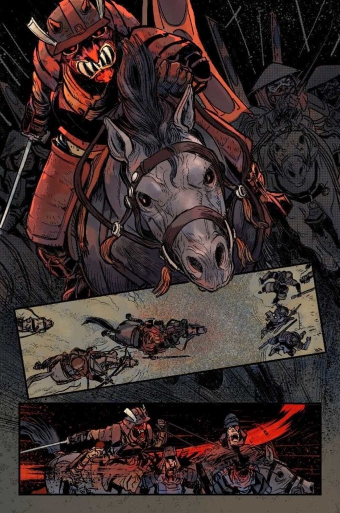
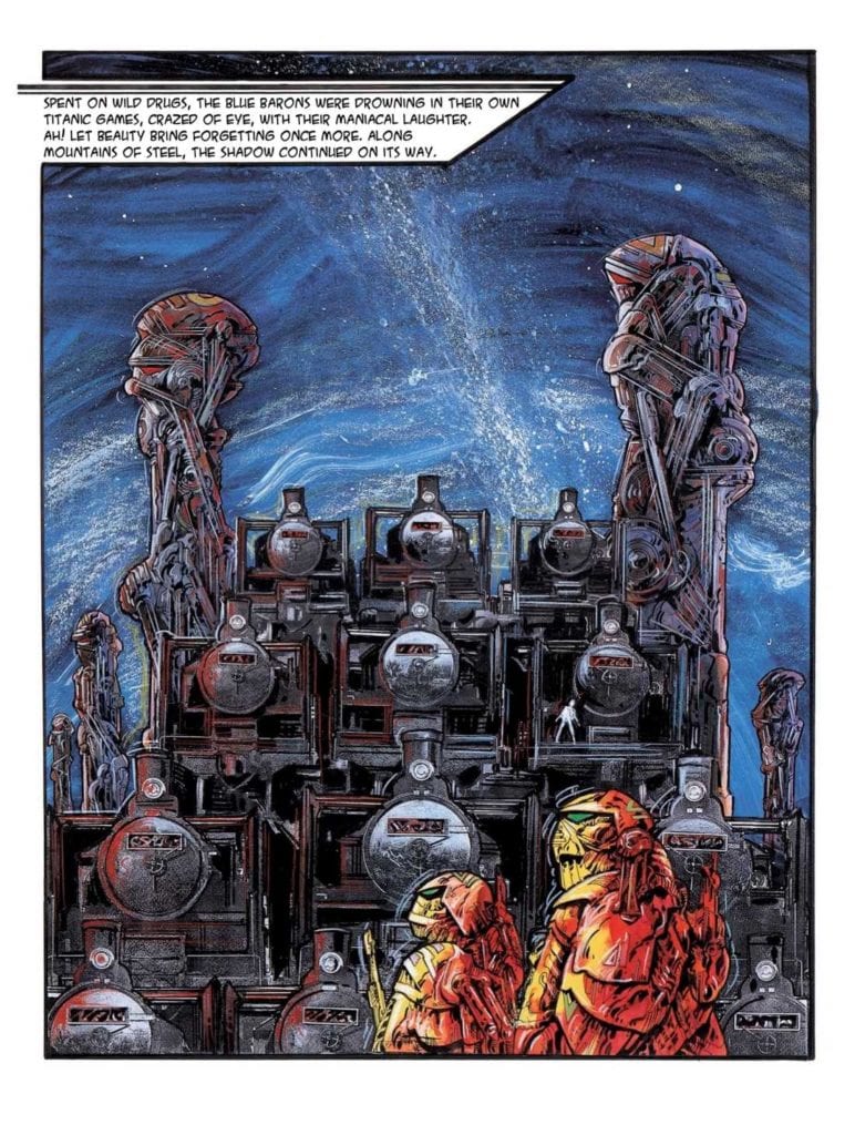
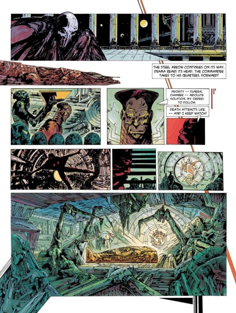
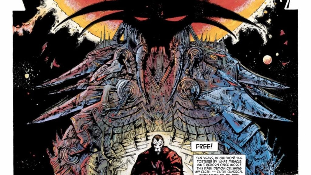
LONE SLOANE: CHAOS, available from Titan Comics on October 14th, recounts the delivery of Sloane’s corpse to Imperator Shaan as a prized trophy, but the journey doesn’t go as planned. This latest installment of the Sloane sage, written and drawn by Phillipe Druillet, brings Sloane and Shaan together for the first, and possibly last, time in their eternal struggle for the soul of the universe.
Cover Art
Druillet’s cover, as with the entire book, is a masterwork in visual design. Sloane holds Legend in a loving embrace as their figures tower over the demonic forces circling Shaan. As rich in symbolism as hatching texture, Druillet presents a multi-layered image that tells a story within a story on every square inch.
Writing
Sloane’s dead body is transported by train to Shaan’s palace as the trophy for years of conflict. En route, Legend infiltrates the train and resurrects Sloane to re-assume his place as a symbol of hope for all of Zazhann’s inhabitants against the dark, tyrannical rule of Shaan.
Druillet’s story is an esoteric mix of sci-fi space opera and baroque art. It isn’t easy to classify this as a comic. This work could easily be conceived as a series of bas relief paintings in an ancient cathedral or as a series of psychedelic posters found in some underground, experimental art house. Druillet pushes the Sloane mythology to messianic levels and finds new ways to interpret the value of art, sex, music, good and evil within a space drama context. In lesser hands, the plot would come off as some cheesy sci-fi melodrama. In Druillet’s hands, this is art.
Pencils/Inks
Druillet’s art style will not be to everyone’s liking. It’s a baroque style executed with obsessive amounts of hatching and line work that takes simple characters and settings and complicates them to mind-bending levels. Basic renderings, such as a wall, are brimming with hundreds and thousands of small lines, rectangles, triangles, and a plethora of other geometric shapes to give you the impression that everything has meaning in its texture. You’re almost forced to stare into the very molecules that make up every object.
Of course, this hyper-textured art style makes every character visually arresting, which could be interpreted as magnificent or grotesque. My perception picks up that it’s a bit of both. A true artist’s talent is to give the viewer something that begs interpretation with different outcomes for every viewer. And so, it’s up to the reader to decide if this is beautiful art or grotesque art, and both answers are correct, depending on your point of view.
Coloring
Jean-Paul Fernandez has the daunting task of coloring in the infinite number of geometries and lines to bring depth to Drullet’s world. In this, Fernandez succeeds admirably. The shading and palette in some panels save Druillet’s work from becoming so chaotic that it becomes unrecognizable. Fernandez satisfies the need to shade the worlds and slathers the entire book in the gritty, molten mood of a world on the verge of civil war. Outstanding work by Fernandez.
Lettering
The lettering work here is a superb example of organic integration with the art. This book is translated from Druillet’s native French by Edward Gauvin, but it’s unclear if Gauvin executed on the translated lettering or if Gauvin translated the script and Druillet re-penciled the translation. Either way, the word bubble designs also follow the model of excess (sometimes to an absurd degree) additions of geometric shapes and lines for just the simple tails. Those added shapes are technically unnecessary, but they match the art style perfectly.
Conclusion
LONE SLOANE: CHAOS, available from Titan Comics on October 14th, is the type of comic that pushes all the contemporary artistic boundaries. By itself, the story is imaginatively odd but coupled with the hyper-textured art, creates a completely different category of comic. I highly recommend picking up this book for anyone that wants to stretch their imagination.
STEALTH #6, available from Image Comics on October 14th, opens the door (literally and figuratively) to answer all the questions about the origin of Stealth’s suit and the fate of Detroit. Writer Mike Costa’s finale ties up all the loose threads with a low-key climax that’s heavy on satisfying answers.
Cover Art
Jason Howard’s cover art shifts the specter of danger away from Dead Hand into a dramatic visage of Stealth. The winged hero’s shadow towers over his arch-nemesis and his son as he prepares to swoop down for the kill. It’s a great, dramatic composition that echoes the final battle in this issue.
Writing
Costa’s finale wraps up the mystery of Stealth’s suit efficiently and effectively by adding in a sci-fi trope that comes out of nowhere – time travel. Within the context of the story and how it all eventually comes together, it makes total sense. Using time travel as the deus ex machina for the story also adds an interesting twist to the nature of Stealth’s illness and Dead Hand’s power. Costa takes what could have been a predictable origin story and flips it on its head to open the door for a whole range of story possibilities in the future… the very far future.
As a story, it works. In service of tying up all the loose threads and open plot points throughout the miniseries, Costa’s twist is unique and satisfying. That said, the revelation of time travel is so potentially huge and fraught with potential that I wish it had been dropped in an earlier issue to give it time to breathe. It felt a little awkward introducing that plot point so late in the series. I wanted more time (no pun intended) to see where this story goes; that’s a criticism and a compliment to Costa’s writing.
Pencils/Inks
Nate Bellegarde’s art style works well for giving the characters and scenery a high degree of grounded reality. It would be easy to see this series getting picked up by some network or streaming service for a series ala Netflix. Bellegarde infuses so much realism into the characters on page as to be almost photo-realistic. Tony is bedraggled in every possible way given the gauntlet of fights he’s endured over the last few issues. Dead Hand looks frighteningly malignant but not in a cartoonish way. And Stealth’s action scenes rival anything you’d see in a recent MCU film.
Above the style, I give Bellegarde big credit for the emotional punch at the end of the last battle. The timey wimey revelation at the last battle’s end was trippy and mind-bending in a way not seen anywhere else in the series. Yet, Bellegarde integrated the tunnel, visions, and memories(?) into the issue in such a way as not to distract from the realism of the series but add a whole new layer. Great work from Bellegarde.
Coloring
Tamra Bonvillain really shows off some impressive psychedelic coloring techniques in this issue. Stealth’s blue radiation glow and the explosion from a wrecked car have been the only types of eye-catching pop over the sum of the series so far, but we get a little more here. The singularity, the tunnel, and the merging of events glow and flow like nothing we’ve seen before. It’s beautiful and expressive as a force of nature that makes complete sense.
Lettering
Sal Cipriano’s lettering gets high marks for doing exactly what it needs to do in an exposition-heavy comic – keep things moving. There’s a LOT of exposition, and Cipriano moves your eye through the dialog without feeling like your reading an instruction manual. The best kind of dialog is the dialog that doesn’t force you to stop and think about with every panel. This issue moves fast, and Cipriano gets a lot of credit for making that happen.
Conclusion
STEALTH #6, available from Image Comics on October 14th, takes a quantum leap into a sci-fi subgenre to open up a whole world of future stories with the main character. The plot is inventive, and the art adds depth and dimension to the finale’s twist. This is a solid finale from the whole team.


")