Home Blog Page 222

Review: THE AMAZING SPIDER-MAN #52.LR – Three Enthralling Storylines

The Amazing Spider-Man #52.LR Cover

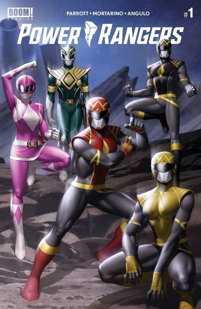
The Amazing Spider-Man #52.LR, out now from Marvel Comics, is an enthralling issue full of many evenly balanced storylines and gorgeous art.

The Amazing Spider-Man #52.LR Story Example

About the Book:
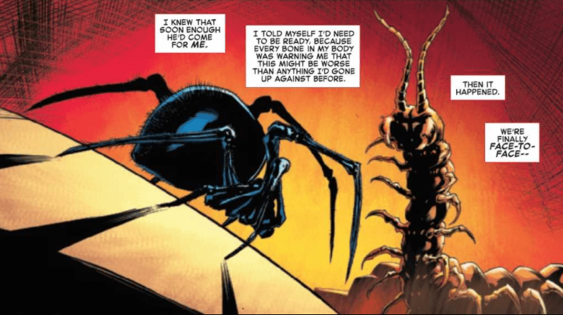
Doctor Strange and Black Cat are on a magical quest to save Spider-Man’s soul, and they need the help of the recently unpossessed spider-powered friends of Peter. Simultaneously, Norman Osborn, now cleansed of sin, needs to convince Mary Jane to help him talk down the demonic villain Kindred, whose identity we now know to be Harry Osborn. As they attempt to do good, the Sin-Eater and his cronies enact a plan to return them to their previous level of power: by taking it from the fearsome Morlun.

The Amazing Spider-Man #52.LR Story

Matthew Rosenberg and Nick Spencer do it again in The Amazing Spider-Man #52.LR, where three separate storylines are well-balanced in a single issue. The stories themselves are deeply engaging. Each set of characters perform actions that are surprising and hard to predict for the reader but are still are the next logical steps of their journeys. This provides for believable yet enjoyable stories. The best part of the issue’s story lies in how the scenes are laid out. Spencer and Rosenberg do a phenomenal job of juggling each of the storylines. They never dwell on one scene for too long or little, and whenever a scene consists mostly of dialogue and little action, it is followed by an intense, visually exciting scene. This fantastic setup of the issue causes it never to have a dull moment and makes it a delightful read.

The Amazing Spider-Man #52.LR Facial Expressions

Art

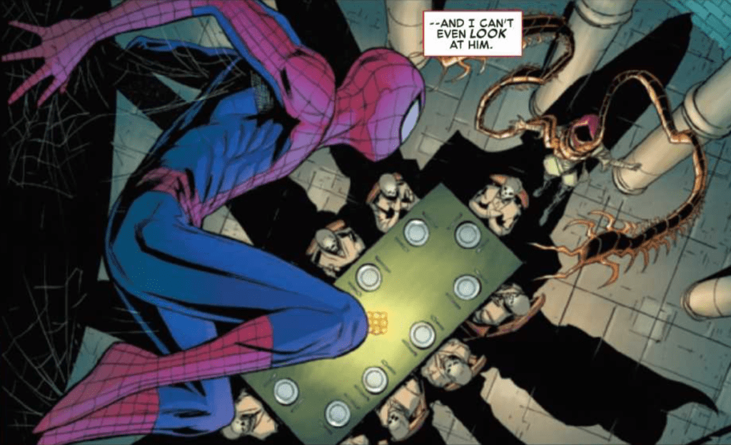
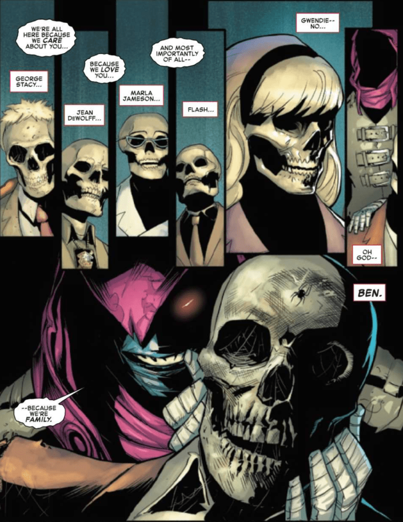
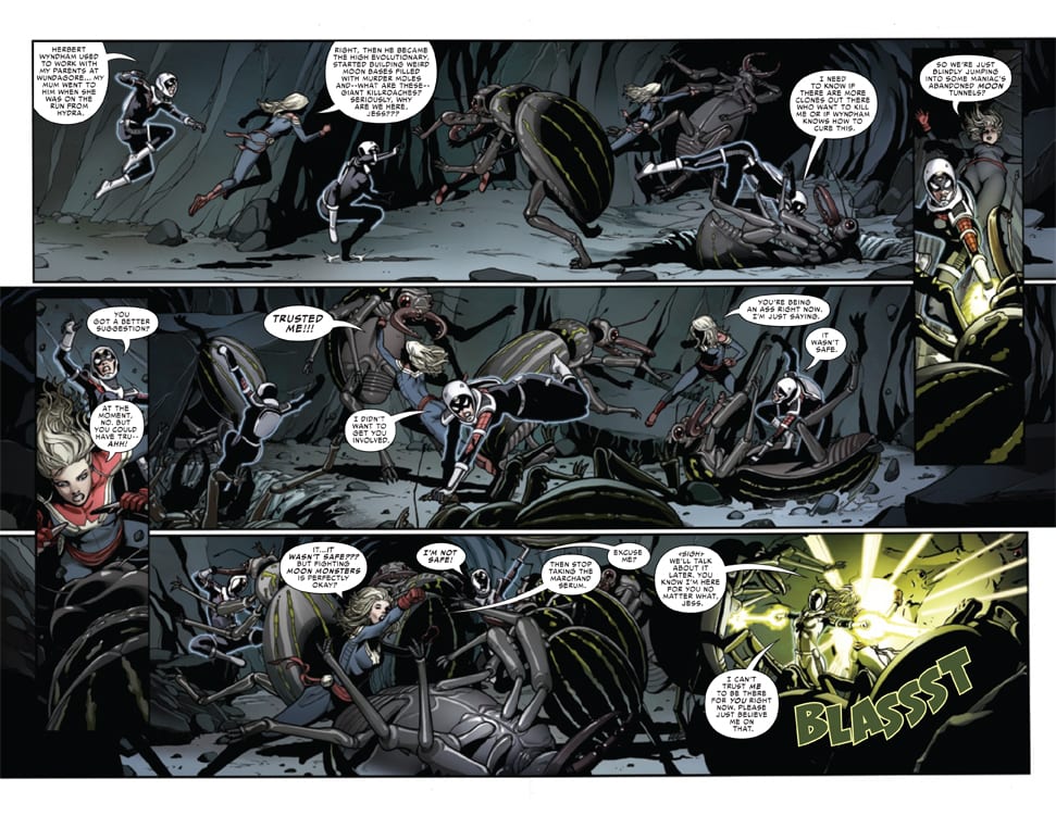
Federico Vicentini provides some stunning art in The Amazing Spider-Man #52.LR. It is evident from the incredible amount of detail in every panel that Vicentini put lots of effort into the issue, and it pays off by making the world feel more real. The debris that can be seen flying through the air in one panel is particularly notable and shows just how talented and dedicated Vicentini is. Another remarkable aspect of Vicentini’s art is his wonderfully expressive faces. This is very important, especially for the dialogue-heavy scenes of the issue. Without any visually gripping action in a scene, facial expressions need to be superb, and this issue certainly delivers on that.

The colors of Marcio Menyz and Erick Arciniega give life to The Amazing Spider-Man #52.LR. There is an admirably broad color palette that shifts for each scene to reflect the tone. There is an impressive tint to panels that are flashbacks. This tint allows the reader to distinguish that a panel is a flashback but does not overpower its colors. Menyz and Arciniega also use the technique of having a bright, single-colored background for panels where the action needs to be emphasized. This is a highly effective technique that provides an extra punch at the right moments in the story.

The Amazing Spider-Man #52.LR Debris Example

The Amazing Spider-Man #52.LR features some brilliant lettering thanks to the work of VC’s Ariana Maher. Throughout the issue, there are many sound effects with large bold fonts, and the issue features a different style of lettering for nearly every case of this. Some of the fonts used are not common in mainstream comic books but still fit nicely with the rest of the story and are a refreshing new choice. Maher does an incredible job of keeping the lettering interesting, and there is never a single stale moment.

Conclusion

The Amazing Spider-Man #52.LR is another excellent issue to go along with the current Amazing Spider-Man issues. It is great to focus on secondary characters’ actions, and each LR issue gets more and more exciting. Spencer and Rosenberg weave together the many storylines perfectly, and the art and colors tell the story beautifully. Not to mention the lettering of Maher, which adds an incredible amount of depth to the story. This issue is a gripping read and is a wonderful companion to the recent The Amazing Spider-Man books.

Monkeys Fighting Robots Youtube

Review: POWER RANGERS #1 Brings The Omega Rangers Home

Power Rangers

Power Rangers #1 out this week from Boom Studios brings the other side of the new direction for comics. While Mighty Morphin focuses on the team on Earth, Power Rangers will focus on the Omega Rangers as they explore the cosmos. The action comes together thanks to Ryan Parrott (writer), Francesco Mortarino (line art), Raul Angulo (colorwork), and Ed Dukeshire (lettering).

Summary

POWER RANGERS #1 reveals a new cosmic threat that only the original Power Rangers, now known as the Omega Rangers – Jason, Trini and Zack – can hope to defeat!

Power Rangers

Writing

With Ryan Parrott writing both of the new Power Ranger series, one of the common traps could be both books telling a similar story. Instead, Parrott makes sure to point out each series will have its own unique mission or mystery. With Mighty Morphin it will focus on the identity of the new Green Ranger. Power Rangers meanwhile explores the mystery of the Empyreal and where they come from.

The issue reintroduces the characters of Jason, Trini, and Zack and calls out how the comic series has diverted from the original show. There even is a joke poking fun at the “Peace Conference in Switzerland” where the characters disappeared to in the show’s continuity. As the Omega Rangers, the trio will do whatever it takes to stop the Empyreal from harming anyone else.

Power Rangers

Artwork

The artwork by Francesco Mortarino focuses heavily on body language. This comes in to play heavily as the cast visit Drakkon in his cell. All of the characters convey a mixture of tense, angry, and frustrated without a single word bubble needed.

The colorwork by Raul Angulo helps to make the visual effects feel alive. From the holograms to the robots and alien creatures the use of color gives the science fiction elements an otherworldly feel. This comes into play heavily later during the last few pages of the comic.

Power Rangers

The lettering work by Ed Dukeshire helps to move the story along. Thanks to the change in panel layouts from page to page the lettering acts as a guidepost helping to direct the reader through the issue. Special care is paid to ensure the sound effects don’t distract the reader.

Conclusion

Power Rangers #1 is the other side of the power coin for the new direction the franchise is taking. The amount of action and drama contained in both series is more than enough to keep the readers engaged. Fans of the franchise should make sure to check it out because the internet will be talking about what happens moving forward.

Monkeys Fighting Robots Youtube

Marvel Comics Exclusive Preview: SPIDER-WOMAN #6

marvel comics exclusive preview spider-woman #6

SPIDER-WOMAN #6 hits your local comic book store November 18th, but thanks to Marvel Comics, Monkeys Fighting Robots has an exclusive four-page preview for you.

About the issue:
ROAD TRIP…TO SPACE!

After learning some startling secrets about her family, Jess goes on a mission to find the one person who might know more…the High Evolutionary! But to do that, she’s going to have to go into space. And to do that, she’s going to need her good friend…

CAPTAIN MARVEL TEAM-UP TIME!!!

SPIDER-WOMAN #6 is by writer Karla Pacheco and artist Pere Pérez, with colors by Frank D’Armata, and letters by Travis Lanham. The cover is by Junggeun Yoon.

Jessica Drew was created by Archie Goodwin and Marie Severin. She is expected to co-star alongside other versions of Spider-Woman in an upcoming spin-off to Into the Spider-Verse.

Check out the SPIDER-WOMAN #6 preview below:

marvel comics exclusive preview spider-woman #6

marvel comics exclusive preview spider-woman #6

marvel comics exclusive preview spider-woman #6

marvel comics exclusive preview spider-woman #6


Are you reading SPIDER-WOMAN? Sound off in the comments!

Monkeys Fighting Robots Youtube

LOST SOLDIERS #4 (of 5) – The Loop Of The War Drum’s Tune Deafens

Lost Soldiers #4 Cover

Lost Soldiers #4 brings Ales Kot’s mini-series to its climax for this week’s release courtesy of Image Comics. The artwork by Luca Casalanguida displays a surreal grim-and-gritty situation that colors by Heather Marie Lawrence Moore make more terrifying. Aditya Bidikar further demonstrates this by showing how distant or smaller noises make more impact than direct actions.

Lost Soldiers #4: Looping The Signs

Ales Kot precedes the issue with a quote from Yuri Herrera’s Signs Preceding the End of the World. The novel details surviving in a violent world between US and Mexico borders while trying to bring back loved ones. The main conflict turns out to be how detached people become when they invest in that world. This translates well when it comes to the protagonist in Lost Soldiers #4. As the last issue demonstrates, he is so driven to hunt down his former squadmate he lost everything to that obsession.

That same former squadmate also can’t escape the Vietnam War; like the protagonist, the war has become his life, to the point of joining a drug cartel. But unlike the protagonist, the former squadmate is burned out by the battles and is genuinely tired of living. The only pleasure he gets from it now is the impressions he made on the protagonist. This brings out a genuine tragedy on both of these characters, which shows them shaped by war, but the war left them behind. Instead of affection, these characters could only communicate through conflict.

Art of War

Luca Casalanguida gives Lost Soldiers #4 a bleak atmosphere. Most of the scenes featuring the protagonist are in places full of shadow. This gives the protagonist a sense of being part of the shadows. Sometimes that’s taken to literal strides like when he appears behind his former squadmate like his own shadow. It demonstrates the dark place the protagonist is where he constantly chases a past event. Everything grinds to a halt when the page following this becomes pitch black, almost like everyone, including the reader, has been cut off from the protagonist.

The coloring by Heather Moore makes this illusionary feeling all the more apparent. The lighter colors of the setting look warm despite child gangsters holding rifles. But when that area is sprayed with red, the reader backs up as the splash page accompanying this blackens the area. Moore shows that the protagonist is not exactly comfortable in the shadows in a surreal flashback within Lost Soldiers #4. Within his hideaway, the protagonist experiences splotchy artwork in green and reds to reflect his Vietnam experiences. Often this gives way to hallucinations of him being back in Vietnam, almost like he’s in a neverending loop.

The Deadly Silence

Aditya Bidikar gives Lost Soldiers #4 a unique voice through a surprising lack of it. At the start, a sniper rifle and the reloading actions make noise. However, the noise can only be heard from a notable distance. People in the surrounding area hear it, but to anyone close is only a deafening silence. This repeats later where there are no wordmarks displaying gunfire or explosions. The protagonist and his former squadmate are used to it, but after the reader has been exposed to it all, silence remains. When the characters finally clash, readers have to read the white captions to know what happened. Because by this point, they’ve lost all connection to the protagonist.

Lost Soldiers #4 Readies One Last Tour

Before this mini-series closes out, readers see a protagonist from a safe distance because they’ve grown detached from the central conflict. Instead, they see two men clashing over practically nothing, and they know it. Lost Soldiers #4 isn’t even over yet, so will the protagonist finally get peace? Or will he just be stuck again for some meaning?

Monkeys Fighting Robots Youtube

RED MOTHER VOLUME 1: Beware, You Will Become Emotionally Invested

Red Mother Trade 1 Cover

Red Mother Volume 1 from Boom! Studios is out now, by writer Jeremy Haun, illustrator Danny Luckert, and letterer Ed Dukeshire. In it, a woman suffers a trauma that leads to a Lovecraft-esque encounter.

Red Mother Volume 1 Story

Trauma is at the heart of Red Mother, one that may just give a new definition to the phrase “seeing red.” The main character Daisy, lost both her boyfriend and her right eye to an otherworldly encounter. After losing a significant portion of her life, she goes through different forms of therapy. These treatments try to rationalize everything that’s happening to her, including seeing out where her eye used to be. Anyone familiar with these symptoms will likely try to find as much comfort as Daisy does. That is until they see the terrifying horror from the titular antagonist. What is this Red Mother’s motive, and what does a smiling figure have to do with it?

Art

Red Mother Volume 1 Introductory page
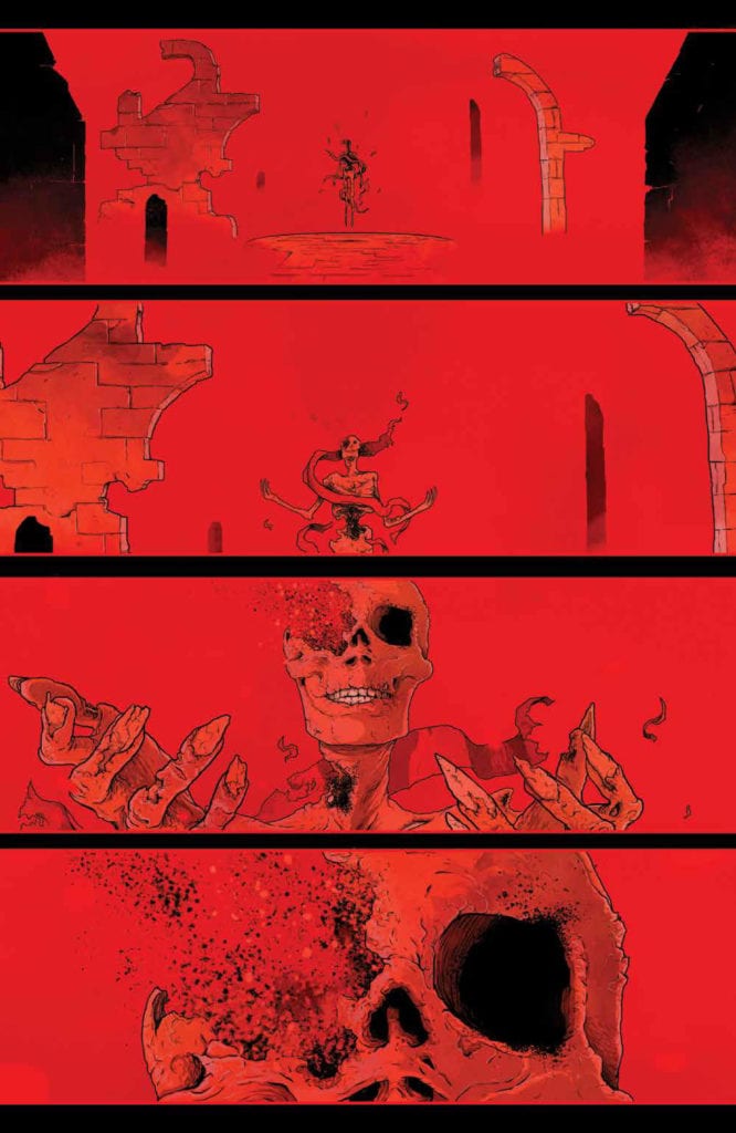
Luckert inserts Red Mother Volume 1 with plenty of foreshadowing imagery. At the beginning of each chapter, the titular queen is forming without her right eye. The color red has a history in comics for signifying danger and its use throughout this trade reinforces that perception. Only Daisy isn’t letting her anger get the best of her despite the above phrase’s meaning. Rather seeing the world in red out of her missing eye has a dual meaning, one of frustration at not finding the answers she needs and a seductive calling towards Daisy. Given how frequently it appears and the fact that barely anyone reacts to Daisy’s panic with enough concern, it forces the reader to question who is trustworthy among Daisy’s peers.

Everything else about this series
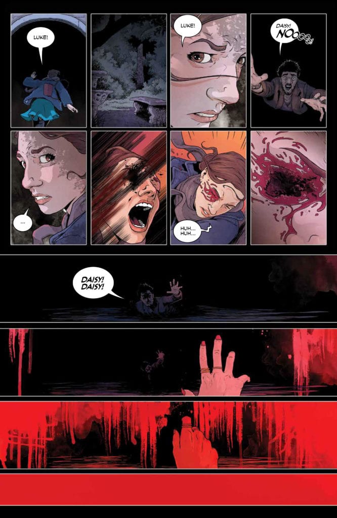
Dukeshire uses lettering as he sees fit throughout Red Mother Volume 1. It’s very uniform, never going out of panel. Even the word marks that would shift out of normally seen boundaries are perfectly contained. In this case, it matches with the panels by Luckert. Everything seems fine and uniform like it’s all going according to the Red Mother’s design. Nothing that Daisy or any of her friends or potential helpers do seem to reach one another. It’s a transitional sense of isolation to a feeling of helplessness.

Get Hooked On Red Mother Volume 1

Red Mother Volume 1 is a puzzle that readers are encouraged to solve alongside the main character. With all of the back and forth moments where the reader feels the need to empathize with a woman in need, they emotionally invest in a great story—one where they might be compelled to seek out the next issue.

Monkeys Fighting Robots Youtube

Review: THE AMAZING SPIDER-MAN #52 – The Long-Anticipated Battle

The Amazing Spider-Man #52 Cover

In The Amazing Spider-Man #52, out now from Marvel Comics, the confrontation between Spider-Man and Kindred has arrived — a battle that has been set up over dozens of issues.

The Amazing Spider-Man #52 story set up

About the Book:
We all knew this day would come. As his friends rampage through the city streets after being infested with sin by the demon Kindred, Spider-Man makes his way to once and for all end the wicked demon. But is Spider-Man powerful enough to stop the magical foe?

The Amazing Spider-Man #52 Story

Nick Spencer’s long story finally reaches its climax in The Amazing Spider-Man #52, and it is easy to feel excited as the two foes clash. Spencer’s writing has done a remarkable job of building up to this moment, and it begins to pay off in this issue. Kindred is further characterized in this issue through some horrendous actions that cross a line many villains will not even go past. Kindred is vicious in the issue and maniacally toys with Peter’s emotions, making sense given the recent revelation about the character’s identity. In addition to the malevolent characterization of Kindred, this issue also features a shocking ending that leaves readers dying to purchase the next issue. Spencer is a master of writing serialized fiction and always knows how to make an ending leave the readers wanting more. Nearly every issue contains an example of this, and The Amazing Spider-Man #52 is one of the clearest cases.

The Amazing Spider-Man #52 Kindred and Spider-Man Meeting

Art

The art of Patrick Gleason is stunning in The Amazing Spider-Man #52. His spectacular forms bring the monumental battle between Kindred and Spider-Man to life and make the conflict feel truly epic. A wonderful part of the issue is that we can see more of the designs of Spider-Man’s friends while they are possessed. We had seen them on covers of issues, and we were able to see Silk in The Amazing Spider-Man #51, but we never saw drastic changes in most of the spider-powered heroes. That changes in this issue, where we see freakish versions of them all, and it is an utter delight.

Edgar Delgado’s coloring in The Amazing Spider-Man #52 is astounding. He uses a dark palette for the climactic battle, which perfectly fits the conflict’s tone and setting. As the setting changes in the issue, the palette does as well but can still retain the dark tone. Also, the backgrounds of many panels often have pleasant gradients that showcase Delgado’s talents exceptionally well.

The Amazing Spider-Man #52 Deceased Friends of Spider-Man put around a table

The Amazing Spider-Man #52 has some brilliant lettering that adds to the work as a whole, thanks to VC’s Joe Caramagna. During the fight between Kindred and Spider-Man, sound effects are large, bold, and brightly colored, which does wonders to add to the battle’s intensity. The issue also features an uncommon use of lettering: as a means of censoring. The bold text overlaps an important action in the issue, which is a fantastic way to allow the reader to imagine the horrific image behind it. The lettering choice is similar to how the suspense in a horror tale is often more terrifying than the reveal, and it works phenomenally in the issue.

Conclusion

The Amazing Spider-Man #52 features the confrontation that Nick Spencer has been building towards for the entire series, and it does not disappoint. The art and coloring are astonishing, and the lettering considerably enhances the story. The ending is yet another brilliant cliffhanger that will leave you clambering to read the next issue.

Monkeys Fighting Robots Youtube

Comics Studies: It’s All in the Bias

Comics Studies
The Comics by Coulton Waugh

Today, this is what I think about Comics.

I open with this disclaimer because it highlights one of the major difficulties with Comics Studies: a lack of clear definition. The discussion surrounding what Comics are and what Comics Studies means is such a contentious one that much of the Comics discussion has to start with it, thus eating into the larger conversation or analysis. And the outcomes are never substantial enough to be carried forward to the next project as a given. Instead, each new chapter of discourse has to start the argument again.

For example, in Bart Beaty’s book Comics Versus Art, he argues comics to be considered alongside a High Art form. Throughout his book, he highlights a problem inherent with this approach to viewing comics, in that by trying to define comics, more often than not, it removes comics from the high art discussion. It creates a contradiction. To include the history and recognizable aspects of the Comic form, you instinctively draw attention to the mass production and consumer aims of the early years of comics, which become synonymous with modern mainstream comics. This then limits your ability to hold them up against works of Art. Beaty reflects aspects of each world, the High Art World and the Comics World, and links these together in a collection of different ways. Still, he cannot convince us that the two Worlds will ever function as one without conflict or resistance if indeed they want to.

This kind of thing happens across all of comics scholarship: with each new definition, the investigation’s inherent bias removes some aspect of the Comic World from the table. Coulton Waugh’s The Comics from 1947, for example, avoids all reference to aesthetics instead of focusing on form and content. Hillary Chute turns her attention to what she terms a Graphic Narrative to champion non-fiction within the Comics World, praising the form in literary terms but limiting her view of the medium*. In both examples, the writers are not dismissive of the full range of comics on offer but only reference the aspects of the Comic World that best suits their argument. They are not the only writers to do this; in fact, most writers of Comics Studies subjects will be guilty of this to a certain degree: it’s difficult not to be.

Comics Studies
Comics Versus Art by Bart Beaty

Let’s talk about Scott McCloud because it would seem that no discussion on comics can exist without his influence. McCloud is seen as one of the forerunners of Comic Studies, with his book Understanding Comics being one of the first examples of taking the medium seriously. Many articles will cite his work as such. However, there are two elements of this interpretation of his book that are problematic; firstly, it is by far not the first discussion on Comics Studies, and secondly, McCloud’s work is just as biased towards his own arguments as anyone else. Just as Waugh and Chute have to ignore or spotlight aspects of the Comic World to make their arguments, so does McCloud. He creates a definition for Comics, which allows him to include a wide breadth of visual imagery and produce a long and involved history for the art form. This gives Comics the weight of tradition and links the form to famous works of Art that are already accepted in society as High Brow or culturally relevant. The argument then becomes, if those pieces of work are accepted as High, or at least worthwhile, Art and we can link them to modern comics, then modern comics must also be worthwhile to study.

Not everyone would agree with this, including several cartoonists working within the industry. Robert Crumb was outspoken against Comics becoming part of a scholarly subject as can be seen in his 1969 comic strip ‘Drawing Cartoons is Fun’ which, as Beaty points out in chapter 3 of his book, visually attacked the idea by referring to Artists who ‘set themselves up on a pedestal’ and the dealers/promoters who are ‘pantywaist ivory-tower intellectuals.’ It becomes clear, especially when discussing comics with comics people, that there is no real desire to aim for the elitist heights of Fine Art or literature.

Drawing Comics is Fun, art page by Robert Crumb.

The importance of Comics Studies is not about the elevation of the Art form; it is about recognizing that there is an Art form there in the first place. Within Literary Studies, it is accepted that there are different degrees of the Novel. Some are seen as ‘worthwhile’ while others merely entertainment. The same is true in Film and Media Studies, and of course, fine arts like painting. There is an unspoken acceptance that some works of art will attain recognition and receive the capital ‘A’ while others will become a part of the general discourse, a way to help set the bar for excellence over the bland. The same is true of Comics, whatever definition of the form you decide on. Some comics will be printed, read, and discarded as nothing more than flights of entertaining fancy, while others will emerge out of the quagmire to be held aloft as fine examples of the medium. They will be remembered and studied for years to come, shining a light on Comics and what Comics can achieve.

Today, I believe that definitions of Comics are fed by the writer’s bias who, not from ill intent, wants to legitimize their own interpretations to champion their chosen texts. If this means focusing on a genre like Non-Fiction, or artistic process and style, then there is nothing wrong with this. As long as it is remembered that there is so much more involved, ranging from the pinnacle of Artistic achievement to the barrel scrapings of self-published propaganda. Comics are an art form unto themselves, difficult to define but easy to spot in a crowd**.


*In a later discussion in the pages of the PMLA journal, Chute defends her view of Comics and acknowledges that her essay Comics as Literature? Reading Graphic Narrative does focus on nonfiction as a point of analysis. However, she is not dismissing all other Comics or genres but instead using texts that illustrate the point she is making about Graphic Narrative and the reading as literature. I do not want to insinuate that her essay is narrow-minded because it is not, instead draw attention to it as an example of picking out of Comics what you need to prove a specific point.

**I have greatly simplified the argument in this article as the topic would require numerous studies, research, and discussions. However, as a place to start, and to make a point, a quick comparison of a few views highlights the road ahead, one that we can travel down or choose to ignore.

Monkeys Fighting Robots Youtube

Interview: Roberta Ingranata and Enrica Eren Angiolini Talk Working Together With Multiple Doctors

Doctor Who
Doctor Who A Tale of Two Time Lords Credit: Titan Comics

Every Fan loves a good crossover, whether it involves a transporter accident and the meeting of characters from different generations or a multi-publisher Superhero Event story. The thrill of seeing different incarnations of characters interact is a joyous feeling that many people have experienced, especially in the Doctor Who franchise, where multiple Doctor stories have become a tradition among the various mediums. Starting way back in 1973 to celebrate the tenth anniversary of the television show, The Three Doctors saw William Hartnell, Patrick Troughton, and Jon Pertwee share the screen for the first Multi-Doctor Adventure.

The fascination with various incarnations of the Doctor meeting up and sharing adventures has never waned, and this year Titan Comics released the first crossover to feature the 13th Doctor, as portrayed by Jodie Whittaker in the show.

In the first arc of A Tale of Two Timelords: A Little Help From My Friends, the 13th Doctor stumbles across her past self, the 10th Doctor, who is currently stuck in the Swinging 60s. With Two Doctors come two villains, and for once, the Weeping Angels may not be the scariest creature wandering the street.

A Tale of Two Time Lords Volume 1, written by Jody Houser, drawn by Roberta Ingranata, and colored by Enrica Eren Angiolini, was released in October, and Monkeys Fighting Robots have been lucky enough to speak to the artists about the comic.

Doctor Who
Doctor Who A Tale of Two Time Lords Credit: Titan Comics

Monkey Fighting Robots: Did having a successful first year on the comic make it easier to work on year 2, or was there greater pressure to be bigger and better?

Enrica Eren Angiolini: As far as I’m concerned, I felt much more pressure at the beginning of year one, since I was still very new to the world of Doctor Who. After the first few issues, that anxiety went away. The readers were always supportive, I know I have a great team on my side, and we all work really hard, so I was never stressed about Season 2.

Roberta Ingranata: There is always a bit of pressure; personally I always want to give my best, so the idea is to improve issue after issue!

MFR: With a creative team who have been working together for a while now, has the collaborative process changed much over time?

Angiolini: I wouldn’t say it has, no. We’ve always been close and very communicative: we began awesomely when Rachael Stott was on the pencils, and things didn’t change when Roberta joined in her place. We know we can rely on each other, and we work very well together.

Ingranata: It certainly got easier. Now we know each other better, it is easier to collaborate with each other!

MFR: The Thirteenth Doctor and her companions have had a bit more air time since you started on the comic, and the characters have had a chance to grow. Has this had an effect on the writing or art? Are there any changes that you’ve made as a reaction to the show?

Angiolini: Unfortunately, being based in Italy, I haven’t been able to watch Series 12 , as it is not yet available on any streaming platform in my country. I only watched the first few episodes released last year. I’m hoping that now that I’ll move back to the UK, I’ll be able to catch up. It’s a shame, because it’d be immensely helpful to be able to watch them, but I can only wait and hope.

Ingranata: Surely, they gave us many more references to work on, making our work easier. At first, there were few images online, now the internet offers many photos, gifs, and still images useful for creating pages!

MFR: In the new story, there are two Doctors to contend with. Was it difficult to merge the two different eras, and did you have to make any compromises to the storytelling to make it fit the style of both the 10th and 13th Doctor?

Angiolini: I think that the beauty of this arc comes exactly from the mix of themes and characters. There’s not really any particular element from one of the Doctors that clashes with the other; it all comes together as a crazy, fun adventure.

Ingranata: For me, it wasn’t very difficult; working on Jody’s stories is always simple. For me it was an honor to be able to design the Tenth Doctor; they are the two of my favourite Doctor’s, so seeing them together was wonderful!

Doctor Who
Doctor Who A Tale of Two Time Lords Credit: Titan Comics

MFR: With two Doctors, four companions, and two popular ‘monsters,’ there is a lot going on. Do you have any favourite moments that you’re pleased you were able to get into the book? How much fun was it to play around in the background of one of the most popular Nu-Who story-lines?

Angiolini: Being able to contribute to such an epic arc was incredibly fun and a great treat! I think we have tons of brilliant moments scattered around these issues, but I just loved working on the two Doctors and their expressions, playing with their surroundings and switching from funky, fun vibes, to creepy and dangerous atmospheres.

Ingranata: Sure, to insert a new alien in the story was very nice; being able to draw an alien and invent it is fun and rewarding. Sure, when there are a lot of characters in a scene it’s hard to handle them, but it’s nice to be able to draw so many characters that I love.

MFR: The end of ‘A Little Help..’ has an amazing cliff hanger, one that equals some of the best classic episode endings, but there has been a long gap between the last issue and the next due in November. Did you get a break from the series or have you been working on it throughout the year?

Angiolini: We didn’t stop. The first 2 issues of this series were made back in Spring, then we worked on the 2 double issues of Time Lord Victorious, and then we finally took a couple-week break at the end of August/beginning of September, to then start working on the series once more. Breaks are very rare in comics: it takes about a month to make a full issue (from script to finished lettering), so taking breaks is often a privilege that many comic artists can’t afford unfortunately.

Ingranata: We have always worked around the numbers of Doctor Who!

MFR: And finally, what does the future hold for your Doctor? Is there anything you’re especially looking forward to, or is there something you really would like to do?

Angiolini: As a colourist it’s always a bit difficult to reply to these questions, as I have no idea where the story is going until I get a new script: we are very rarely -or never- involved in the planning of the plot, so I really don’t know what the future holds for us and the Doctor. The only thing I can say is that I hope we can continue to bring a smile on our readers’ faces and have fun while doing so!

Ingranata: I can’t spoil, but my dog has the name of a character who appeared in an episode of the twelfth season of Doctor Who, and I drew it just today on a page. For me it was an honour and a sign of destiny!


Thank you to Roberta Ingranata and Enrica Eren Angiolini for taking time out of their busy schedule to talk to us. Doctor Who: A Tale of Two Time Lords Volume 1 is available now from your local comic/book shop.

Monkeys Fighting Robots Youtube

OUTER DARKNESS/CHEW: Pulling Off The Craziest Crossover

Outer Darkness/Chew Cover

Outer Darkness/Chew is a crossover comic series by Image Comics published in a trade on September 9, 2020. The book is surprisingly appropriate for both series’ tones. Both series creator John Layman works with his co-creators Afu Chan (artist of Outer Darkness) and Rob Guillory (artist of Chew) for hijinks, with some assistance in lettering by Pat Brosseau.

Background

Outer Darkness is about the crew of Starship Charon, a USS Enterprise-like vessel that encounters the occult. This includes Cosmic Horrors, similar to Lovecraft monsters. Chew revolves around Tony Chu, a health investigator who gets psychic impressions of whatever he eats. This includes acts of cannibalism. Despite these horrifying premises, Layman turns them into black comedy for over-the-top jokes. So what happens when you put two spiritually similar series together?

Outer Darkness/Chew: Self-Awareness

Outer Darkness/Chew begins in a pretty typical circumstance for crossovers; one side needs help from the other. The Charon crew summons Tony (and John Colby) for help in a situation requiring his abilities. One would expect this to be possible through things like time travel since Layman is writing this. It isn’t, but anything specific would be spoilers like Colby does when he gathers intel about their situation. The Chew cast really steals the show thanks to their sense of awareness and quirky personalities, unlike the Outer Darkness crew, where despite the interesting setting, are mostly just played for gags. It’s nice to see characters like Outer Darkness’s Chief Exorcist Malachi Reno act accordingly to Colby’s smarmy dialogue with a punch to the groin. Because you can only do so much with Star Trek parodies, deaths of characters nobody really cares about, and an irresponsible captain getting away with it.

Art

The art shifts between Afu Chan and Rob Guillory display both the tone and attitude of the story. Chan’s style looks more serious with its detailed anatomy, expressiveness, and overall dark environments. It really displays a calm, if not an apathetic, aesthetic that gets occasionally interrupted by a sudden emotional scene, unlike Guillory’s more bright and cartoony aesthetic. In fact, the clever use of Tony and Colby’s transport into Outer Darkness perfectly foreshadows the background theme. This results in a change in art styles resembling going through drafts. It also demonstrates how, despite the change, Tony and Colby don’t really fit in. Outer Darkness is about one-time gags, unlike Chew’s propensity for things biting back, hence why the apathetic atmosphere in Outer Darkness threatens the Chew characters.

Layman and Pat Brosseau take turns in lettering in Outer Darkness/Chew. If past reviews are any indication, Brosseau does his timekeeping pace through the dialogue. Layman is more than likely the one doing the captions with self-referential humor. Each with styles that seem appropriate for the task at hand. Yellow and black captions for issue references and stylistic captions for a holographic England setting. This helps bring out the humor between the ensuing story.

Outer Darkness/Chew For Layman Fans

In all considerations, Outer Darkness/Chew represents something about John Layman. His self-awareness allows him to muster any trope or cliche and bring out the most absurd aspects. This allows him and his co-creators to break the rules of storytelling convention and play them to their beats. One that brings out the strengths and weaknesses of two series. It actually wouldn’t be a stretch to say that this series might’ve pushed for the development of Chew’s sequel Chu.

Monkeys Fighting Robots Youtube

AfterShock Exclusive Preview: MISKATONIC #2 – Beware Of Mother Hydra And Father Dragon

AfterShock Exclusive Preview: MISKATONIC #2

MISKATONIC #1 hit your local comic book shop yesterday, and issue two drops on December 16, but thanks to AfterShock Comics, Monkeys Fighting Robots has a four-page preview for our readers.

The book is written by Mark Sable, with art by Giorgio Pontrelli, Pippa Bowland drops some color, and you will read Thomas Mauer’s letter work. Jeremy Haun, with Nick Filardi worked on the main cover featured above, and Tony Harris created the incentive cover.
About MISKATONIC #2:
Miranda Keller has been sent to the Miskatonic Valley to investigate a series of killer bombings targeting the community’s elite. She’s convinced that radicals are to blame. But her partner, Tom Malone, a retired Brooklyn detective, sees connections to a supernatural event in his past that left him scarred and scared, leading the pair to an occult conspiracy that pits them against forces from beyond this world.

PREVIOUSLY – Miskatonic Valley holds many mysteries – cultists worshipping old gods, a doctor deadset on resurrecting the recently deceased, a house overrun by rats in the walls – but none more recent than a series of bombings targeting the Valley’s elite.

These horrors reach a breaking point when the brilliant, hard-nosed investigator Miranda Keller is sent to stop the bombings. To J. Edgar Hoover, there can be no other explanation than those responsible for similar actions during the Red Scare of the 1920s…but when Miranda digs too deep; she uncovers an unimaginable occult conspiracy, one that may cost Miranda her job – and her sanity.

From writer Mark Sable (WAR ON TERROR: GODKILLERS, Graveyard of Empires) and artist Giorgio Pontrelli (Dylan Dog), MISKATONIC is a mix of historical crime fiction and Lovecraftian-horror that dives deep into the American nightmare.

Did you read MISKATONIC #1 this week? Comment below with your thoughts.

Monkeys Fighting Robots Youtube