Home Blog Page 220

Chaos and Order Battle in LUMBERJANES #75

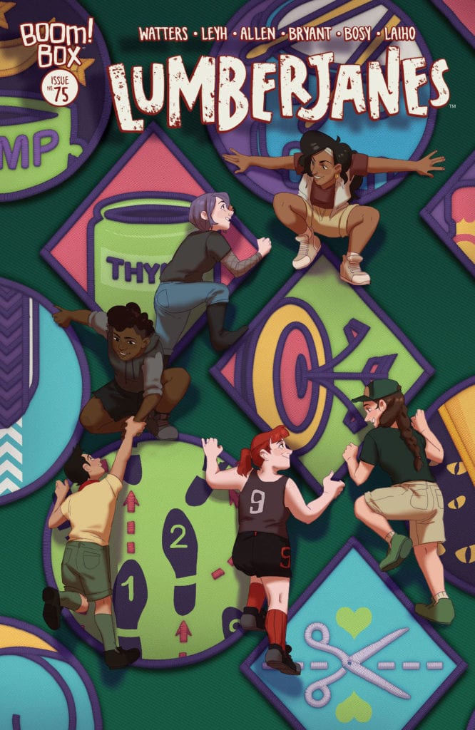
LUMBERJANES #75, available today from BOOM! Box, brings fans ever closer to the end as the series begins its final wrap up. Yet there is still one adventure left for these daring campers, naturally.

The characters of Zodiac Cabin take center stage on this variant cover of Lumberjanes #75.

The beloved series that is the Lumberjanes is creeping ever closer to the conclusion, which is a bittersweet thought, to be sure. While so far the ending is proving to be every bit a conclusion the characters and fans deserve, it will still be heartbreaking to see it go.

Lumberjanes #75 is the last issue that works towards setting up the true and proper finale. Next month, Lumberjanes: End of Summer #1 will conclude the series. Make sure that you don’t miss the supersized issue! It’s going to be something else.

There is one happy thought to hold onto here if you’re having trouble accepting the end. Lumberjanes was recently optioned for an HBO series. So far, that’s all it is, but there is hope somewhere on the horizon.

Everyone is in a mad dash to warn their friends of the impending danger.

The Writing

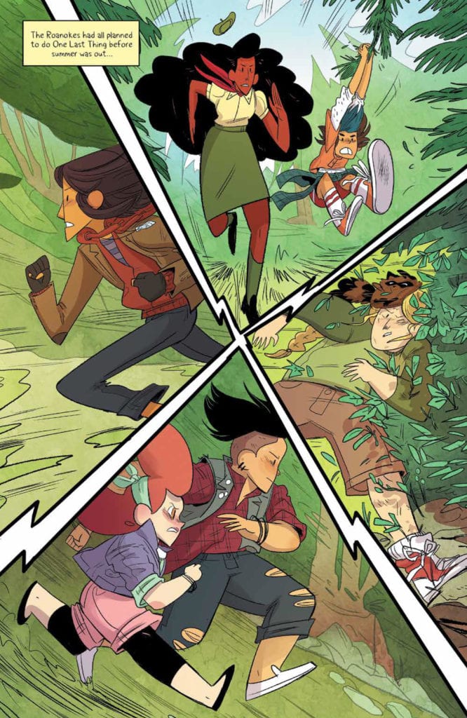
Lumberjanes #75 is a supersized issue, coming in at forty-seven pages. That’s forty-seven pages full of Lumberjanes chaos and fun. Okay, it’s more chaos than fun at the moment, but it’s still an entertaining read through and through.

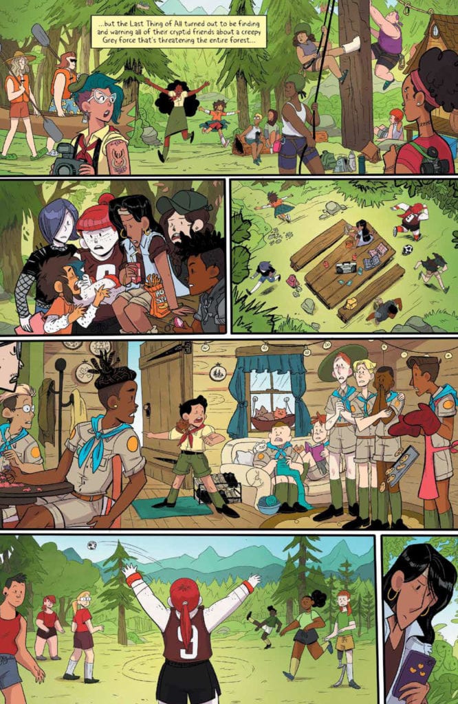
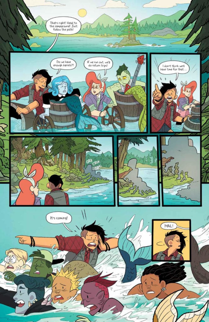
Written by Shannon Watters and Kat Leyh this issue is literally full of dozens of events and interactions. All of which is leading to the final event, of course — the end of the summer. The Lumberjanes are facing danger like no other, and it’s resulting in all of the characters that they have met, large and small, to come together one final time.

For that reason, it’s a pretty endearing read, seeing so many characters come together. For many, it’s a chance to say goodbye. For others, it’s a reminder of all the reasons why we fell in love with them in the first place.

Leave it to Watters and Leyh to write in such emotionally powerful moments. Yet that is only a fraction of what this issue holds. There are larger revelations found within — implications about the forest itself, and actions taken by the campers.

It would be the understatement of the year to say these actions are doing justice to the characters. Yet it’s also the truth. In many ways, these are things that fans have been waiting for. For years, literally.

And so the word is spread.

The Art

The artwork inside Lumberjanes #75 is bright and happy, a stark contrast to the threat that is sweeping across the land, and the pages. There’s no doubt that the contrast was done intentionally, yet it is still highly effective.

Brooklyn Allen was the lead artist for this issue, and he had his work cut out for him here. Working alongside Allen are Alexa Bosy and Kenesha C. Bryant (inks). Remember all of those characters I mentioned up above? Well, imagine drawing that many, all inside a single issue. In many times, even inside the same page and panels. It’s an impressive feat.

A feat made all the more impressive by their interactions and reactions. The Lumberjanes have never been the type to react quietly, and that shows here. The colors, done by Maarta Laiho, are a strong complement, both to the artwork itself, and to the confident and determined characters.

Finally, it’s Aubrey Aiese’s lettering that ties everything together. There’s a lot going on, obviously, yet it is never difficult to actually following what is happening. Or what is being said. That may sound simple, but it really is impressive, and worth acknowledging.

It is looking like some characters will be more difficult to evacuate than others.

Conclusion

Lumberjanes #75 is a large issue that practically bursts at the seams to tell its story. There is so much going on, and yet it is every bit an event that fans are not going to want to miss out on. It’s heartwarming and intense, all in those perfect proportions that the series has mastered.

Monkeys Fighting Robots Youtube

Review: A DARK INTERLUDE #1 — A Semi-Sequel To Fearscape

A Dark Interlude #1 Cover

A Dark Interlude #1, out today from Vault Comics, is the beginning of a new series that takes place after the events of the Fearscape, though it is able to stand on its own and welcome new readers while also pleasing fans of the previous series.

(Monkeys Fighting Robots also had the opportunity to interview writer Ryan O’Sullivan about the new series, which you can find here.)

About the book:
This series follows the events of Fearscape, a story which followed author Henry Henry as he is brought to a fantastic realm to battle humanity’s greatest fear by a Muse who believes him to be this generation’s greatest storyteller. The only problem is Henry Henry is a plagiarist. A Dark Interlude #1 picks up where Fearscape left off, with Henry Henry imprisoned for murder and attempted murder, and the muse — now reincarnated — living with Jill Proctor. This multitude of changes may make the story seem like it depends on its predecessor, but as the comic book repeatedly tells us, this is not a sequel. There are plenty of ways that A Dark Interlude #1 is able to inform us of what took place before and sets up what problems warrant a new story.

A Dark Interlude #1 Letter from Beginning

A Dark Interlude #1 Story

Many aspects of A Dark Interlude #1 make Ryan O’Sullivan’s story interesting and unique. The first of these aspects greets us immediately as we open the issue and are faced with paragraphs of text, rather than the panels one would expect to see from the medium. The issue does contain panels later, but that does not negate the impact of beginning solely with words. When expecting art and being greeted by text, it intrigues the reader to know why the writer chose to use this to open the series, rather than what the medium typically consists of. Some could argue that adding pages of pure text to a comic book is a cheap way to insert more story in less space, but that is not how O’Sullivan uses it. The text is not merely an explanation of what occurred in Fearscape, but instead is a letter written from our narrator, Henry Henry. The letter does give exposition about what happened before the issue, but it is also is a pleasant way to submerge the reader into the world of the issue. We get a feeling of who the character is, what happened in the past, and how his actions affected other characters.

O’Sullivan also makes A Dark Interlude #1 an intriguing read through the choice of narrator. Just as in Fearscape, Henry Henry is an egotistical narrator who often attempts to skew the narrative in his favor. It is rare to have such an unreliable narrator, and it changes how A Dark Interlude #1 is read. In all, O’Sullivan causes the story of the issue to be entertaining through its strange narrator, cool techniques such as the silent panel, and giving enough information for a new reader, even if they have no understanding of Fearscape.

A Dark interlude #1 Lettering Example

Art

The illustrations of Andrea Mutti are what make much of A Dark Interlude #1 an enjoyable experience. Despite having the fantastical realm of the Fearscape to explore, much of the issue centers around characters in the typical world. In these scenes, Mutti’s work with facial expressions comes heavily into play. The issue uses the technique of a silent panel multiple times as a dramatic pause in a scene. In these panels, when no word bubbles are present to take any attention away, the facial expressions become the only point of focus. Mutti delivers on this front and can portray complex emotion on characters’ faces in these panels. However, while Mutti’s art style is pleasant to look at and is terrific at capturing emotion, it does feel like there was a missed opportunity for the art to be stunning for new readers. This may be partly because the issue largely centers on the real world instead of the Fearscape, and while the art is very well done and fits the story here, one hopes that future issues will allow the art team to go nuts and fully explore the fantasy realm. (The smart money says they will.)

A Dark Interlude #1 features the wonderful coloring talents of Vladimir Popov. There is a pleasing contrast between the palette used for the realm of the Fearscape and the real world. Not only are there distinct areas due to this, but each realm has its own unique tone due to these palettes. My only hope for future issues is that Popov uses even more variety to reflect the different tones of each scene.

A Dark Interlude #1 Silent Panel Example

The lettering of A Dark Interlude #1 fits wonderfully with the story and allows the issue to flow naturally. Andworld Design also uses speech bubbles in an interesting way in the issue. When we finally are able to see our narrator in person, his entire face is covered by the speech bubble of someone talking to him. Why this was done is a question in terms of the writing, but the execution of having a word bubble cover his face built suspense, and is not an often seen form of lettering.

Conclusion

A Dark Interlude #1 is the beginning of a new journey in the world of Fearscape. Events are starting to build, and it is clear there are many thrilling stories to await in the series. The art pairs nicely with the story and provides for an excellent, captivating read.

Monkeys Fighting Robots Youtube

Review: ICE CREAM MAN #21 Answers Questions But Pulls Readers In Further

ICE CREAM MAN #21 hits comic book stores on Wednesday, November 18th, presenting readers with one of the series’ most unsettling issues yet. This suspenseful story follows a man who goes by Detective Kowalski through an investigation of a missing person: Bert Cohen. But unbeknownst to our protagonist is the fact that Cohen was abducted by a mysterious cult—one who worships the “Spider King.” Will readers, and Kowalski, discover the secrets of this organization?

Story

The opening scene of the story brings readers into a darkened room with the missing Cohen bound (naked) before mysterious hooded figures. What’s notable right is his professed job title: ice cream man. From the get-go, we see this unfortunate soul may be a pawn in the nefarious Ice Cream Man’s game.

Unfortunately, we don’t get to see Cohen’s ultimate fate as the following panels focus in on Kowalski and the wife of the victim. She expresses what appears to be genuine concern for her missing husband—a sight the detective isn’t used to. We soon learn he is living in constant regret and fear due to a failing marriage.

Writer W. Maxwell Prince takes readers on a journey through Kowalski’s double-life—one side drowning in existential despair while the other loses itself in work. What’s more, this relatable phenomenon is captured in a thrilling tale of suspense and horror. Kowalski finds himself running away from an ever encroaching despair, but does he know what he’s running into?

Artwork

Martín Morazzo’s penciling and ink work, Chris O’Halloran’s coloring, and Good Old Neon’s lettering did a fantastic job of setting the tone for this issue. The eery scenes, constructed with thin lines and darkened backdrops, successfully add an ominous tone. In addition, the curvy and slanted fonts foster a sense of uncertainty within readers. These elements work together in spectacular fashion.

Conclusion

ICE CREAM MAN #21 finally gives readers more information about the titular figure. But how many people have to suffer before he’s revealed?

What do you think of this mysterious cult? Let us know in the comments below!

Monkeys Fighting Robots Youtube

Heather Antos Talks The New World Of X-O MANOWAR

Interview: Dennis "Hopeless" Hallum Explains How X-O MANOWAR Fits In Today's World

X-O Manowar #2 hits your local comic book store on November 25, but thanks to Valiant Entertainment, Monkeys Fighting Robots was able to go behind-the-scenes with series editor Heather Antos to discuss team building, the process, and the impact of the pandemic.


X-O Manowar #2 is written by Dennis Hopeless, with art by Emilio Laiso, Ruth Redmond drops the color, and you will read Hassan Otsmane-Elhaou’s letter work. About the issue: A new threat emerges from the fires of X-O’s latest battle! Can X-O save the day, or does the world need a new kind of hero?


MFR: Heather, thank you for taking the time to talk with me.

ANTOS: Of course! Always happy to talk comics!

MFR: How much X-O Manowar did you read when you found out you would be the editor on the series?

ANTOS: Well, I spent the couple weeks before my Valiant start date reading the entirety of the Venditti run — did you know there’s a lot? — and then I think it was my second week on the team when I found out my first job would be to follow up Kindt’s amazing run. So I dove in and read through all of that to get caught up to speed.

MFR: Since Valiant has changed several times since 1992, what do readers need to know going into this new X-O series?

ANTOS: Nothing! Dennis does an excellent job explaining everything a new reader would need to know about Aric (the Visigoth warrior abducted from the 5th century by aliens), Shanhara (the sentient alien turned super-powered battle armor), and how together they make the superhero known as X-O Manowar! One of the biggest shifts from the previous series is — for the time being, at least — X-O is Earthbound. We’ve seen Aric battle Alien battalions on other planets, we’ve seen him protect Earth from Alien invasion in outer space, but now it’s time to see how exactly he deals with the consequences of being a superhero with boots on the ground — both from civilians as well as new villains. Needless to say, it’s a lot more complicated than I think he wants to admit…

MFR: To take our readers behind the scenes of producing a book, what’s the big picture look like when you relaunch a series like X-O Manowar?

ANTOS: There is a LOT that goes into play. From what the needs of the publisher are, the needs of the universe as a whole, as well as the needs of the character and what their next natural story progression looks like, there are a LOT of conversations that are typically had in-house between various team members from editorial, sales, and marketing BEFORE talent is ever approached — not to say this is always the case, though. From there, talent conversations begin — reaching out to a writer to begin the conversation to see if it’s a good fit and beginning to develop a story and a pitch. As X-O Manowar is a flagship character, the pitch will oftentimes need to be reviewed and approved by different people internally before it’s approved to move forward to scripting, selecting the art team, et cetera. Of course, each book has its own process, and not every book is put together the same exact way. Sometimes you’ll have an artist on board first, sometimes a different concept…making comics really is alchemy, when you get down to it!

MFR: I love flipping through a comic book and looking at the color palette used. Did you have conversations with artist Emilio Laiso and colorist Ruth Redmond regarding the colors used on the first two issues?

ANTOS: “Bright, colorful, and superhero!” I believe those were the exact words I gave to Ruth Redmond when she came on board. In order to bring Aric to a modern superhero story, we needed a modern superhero color palette — and Ruth does just that! Emilio was very open and excited to the idea, as well, and the warmth Ruth brings to the story really shines through!

MFR: Since this is a new series, did you have to work with writer Dennis Hopeless on Aric’s voice or tone? What’re conversations like when you feel a writer is veering off course with a character?

ANTOS: Lucky for me, Dennis actually was a Valiant fan and had pitched for Valiant a few times before X-O. Dennis and I had many conversations during the earliest stages of developing the series about what sets Aric, Shanhara, and X-O apart from other superheroes in comics — what are his core tenets? What motivates him? What makes his and Shanhara’s relationship so significant? So special and unique? In my experience, when you have these conversations and get on the same page creatively before any scripting happens, 99% of the time, you won’t have to worry about a writer veering off course with a character and can focus more so at the story at hand.

MFR: The first issue of X-O Manowar came out, and then the world shut down because of COVID. That has to be a huge disappointment. Can you talk about that on an emotional level? Did you think you might not ever publish the second issue?

ANTOS: It was super disheartening, for sure. Dennis, Emilio, Ruth, Hass, and I had been working together on the series for just about a YEAR by the time issue #1 came out. We were so excited to get this series out there and into the hands of the diehard Valiant fans and new readers, so for everything to be built up in anticipation only to come to a screeching halt was…well, it SUCKED. I don’t think anyone was concerned about the rest of the series never coming out; rather I think the biggest question on our minds was WHEN. Luckily…I think we know when that is happening now, ha!

MFR: For the future editors reading this interview, how do you get the most out of your creative team?

ANTOS: Every editor has a different editorial philosophy, but I think there are a couple of key things to always keep on the forefront of their minds: 1) Keep your expectations of your creators’, characters’, and stories’ limitations realistic. 2) Always keep an honest and upfront line of communication open with your teams. 3) Always anticipate something to go wrong. That way, you can be pleasantly surprised when things run smoothly.

MFR: Heather, thank you for your time and best of luck with the series

ANTOS: Thank YOU, and I can’t wait to hear what you (and all of your readers) think of it!


Do you have X-O Manowar on your pull list? Comment below with your thoughts.

Interview: Dennis "Hopeless" Hallum Explains How X-O MANOWAR Fits In Today's World

X-O Manowar #3 hits your local comic book store on December 23, 2020.

Monkeys Fighting Robots Youtube

Review: Sharon Fights For Liberty In CAPTAIN AMERICA #25

CAPTAIN AMERICA #25, available in comic book stores on Wednesday, November 18th, features an infiltration of Alexa Lukin’s Madripoor base by Steve Rogers and Sharon Carter. This dynamic duo stunned readers with their otherworldly chemistry in both battle and love for many issues. And they’ll surprise readers more in this thrilling issue full of action, betrayal, and unexpected outcomes.

Story

This issue mostly follows Sharon, Steve, and the rest of the team’s efforts to free the Daughters of Liberty. Readers enjoy a fully laid out rescue plan, which is complete with stealth, sniping, and espionage.

Ta-Nehisi Coates’s script is set up beautifully—by giving Sharon control of the narrative voice, the reader enjoys an intricate look at the relationship dynamics in play. It’s through this process that we learn more about Alexa’s history with the Daughters. And watching Sharon seek out Peggy and reclaim her organization’s legacy in this issue is awe-inspiring.

Artwork

Leonard Kirk’s penciling and ink work, Matt Milla’s’s coloring, and VC’s Joe Caramagna’s lettering made for excellent visual storytelling. Each hero on Sharon and Steve’s team is drawn uniquely, from Sam Wilson’s sleek, sharp winged uniform to Bucky Barnes’s buffed physique. In addition, the characters’ relatively bright hues are contrasted beautifully against mysterious dark blue, purple, and black shades. We also enjoyed Sharon’s bright yellow dialogue boxes set against these backdrops, which helped emphasize her speech.

Conclusion

CAPTAIN AMERICA #25 is the culmination of multiple character building issues for Sharon. We were thrilled to see how engaging of a character she’s become.

Do you think Sharon and Steve will be able to save all of their teammates? Let us know in the comments below!

Monkeys Fighting Robots Youtube

Review: The Dark AND THE WICKED Serves Bland Misery

The Dark and the Wicked has strong visuals combined with a growing sense of dread, but its narrative is offering meaningless misery. It’s impressive when films try to accomplish what Hereditary did two years ago, but each attempt lately seems to forget what made that film effective. The Dark and the Wicked has all the ingredients to be great, but the script hinders it multiple times. Still, this is one of the more terrifying films to be released this year.

Religious horror films always aim to make the audience’s skin crawl, and this movie will have a few people feeling uneasy. These films tend to leave portions left for the audience to interpret as they please. However, in the case of The Dark and the Wicked, not enough is given to come to a logical conclusion regarding the central conflict. Directed and written by Bryan Bertino, the film stars Marin Ireland, Michael Abbott, Julie Touchstone, Lynn Andrews, Tom Nowicki, Michael Zagst, Xander Berkeley, and Ella Ballentine. The Dark and the Wicked follows Louise (Ireland) and Michael (Abbott), two siblings who return to their family farm to mourn their dying father (Zagst) and help their sickly mother (Touchstone). Their week-long stay suggests that a demonic presence is haunting this family.

Marin Ireland in The Dark and the Wicked

Bertino fails to give you any reason to care about these characters because we get to know very little about them. It’s clear that Michael and Louise are atheists and they don’t share the religious views that their mother does. These small details are great, but that’s all he offers the audience. The Dark and the Wicked comes off like it just exists to cause misery with no real purpose to it. Developing the siblings could have caused a better execution because the script is lacking in many ways. A positive component from the script is the division amongst the family, as they gather to mourn the patriarch. The performances from the actors involved make the divide stronger. It’s this divide that adds to the growing evil that Bertino has chosen to haunt the family. Other than poor development, Bertino abandons the subtle approach here and conjures up more confusion as a result.

A film’s ambiguity is only effective when it can create logical outcomes. The outcomes presented here don’t feel logical for one reason or another. Thankfully, Ireland and Abbott deliver strong performances along with their on-screen parents. The depression this family struggles with is made very clear thanks to the actors, who save the film’s weak script in the process. Touchstone beautifully portrays a spouse with a broken heart, as she watches her husband slowly die while dealing with her demons too. The performances are adequate to make viewers feel sorry for the family, but not care what happens to them in the end.

Xander Berkeley as Priest in The Dark and the Wicked

Similar to The Strangers, Bertino delivers a tense, dreadful journey that will reel viewers in from the opening shot. The dread never leaves, it starts small and grows with each second that passes. There is an odd choice of pacing though, but Bertino still grips his audience and doesn’t release till the end credits begin. The shots captured in The Dark and the Wicked are very haunting, nail-biting, and disturbing. Tom Schraeder’s score will send chills down viewer’s spines, as it accompanies some horrific shots in the film. It adds another layer to the tension Bertino is creating and amplifies the feeling of unease felt throughout the film.

The Dark and the Wicked is all over the place in terms of its narrative, but it’s held up by strong performances and brilliant direction. Unfortunately, it won’t go down as one of the better religious horrors films, but it could be remembered for the haunting shots featured throughout. The Dark and the Wicked is a bland horror film for the most part with nothing too intriguing to offer the genre.


Monkeys Fighting Robots Youtube

INTERVIEW: Tracie Hotchner Discuses The Dog Film Festival, Emotions, And More

The Dog Film Festival and Cat Film Festival are precisely what you’d expect, a collection of films about the top two pets of just about every human on the planet, and the mastermind behind the whole thing is Tracie Hotchner.

The five years running, the Dog Film Festival premieres in New York then travels the world on a digital wave powered by dog fans. The festival collects films about our furry friends that range from hilarious to so heartwarming that a person could bake bread with the heat. It might sound impossible that a festival about dogs or cats would have enough programming, but pets are deeply connected to human existence and run the gamut of shared human experiences.

PopAxiom spoke with author, podcast host, and festival organizer Tracie Hotchner about dogs, emotions, and more!

Pet Influencer

Tracie’s connection to dogs goes way back but also takes two forms — personal and professional. “I grew up with a dog. He was my brother. They got him six months before me, and there are all these pictures of me crawling around with him and sharing snacks.”

“I always had dogs and donkeys,” Tracie says, “lots of animals. But in terms of dogs, always. In my adult life, I’ve always had at least two, if not three, dogs.”

Professionally, Tracie began research on her books the Dog Bible and Cat Bible roughly 15 years ago, leading to becoming a pet influencer. “My awareness of dogs and how important they are in other people’s lives began since doing research.” Most of us think about ourselves and not other people and how animals affect them.”

riker-tracie hotchner-interview

About Film Festivals

Tracie’s no stranger to the cinematic world. As an author, she’s written several screenplays and for TV shows. “The power of the visual image to delight or inform or inspire is something I’ve always been aware of. Several filmmakers came on as interviewees for my radio show, and that’s when I began to think about the possibility that there were other films out there.”

“The more I looked, the more I realized there was a lot of filmmaking going on,” Tracie declares. “And it was just for the passion of filmmaking like all short films are. Not to make money, not to be famous, but because the people are passionate about the subject.”

“The film festivals came out of the realization of the joy that people get from pets.”

The Dog Film Festival is a lineup of movies highlighting humanity’s best friends in a wide-range of touching ways. One story follows inmates at a prison who are part of a unique program where they train dogs. “I think they’ve had their lives transformed by taking care of dogs.”

Another story follows the bond between a handicapped dog and his disabled owner and how the furry one teaches the human to embrace life despite their disadvantages. Some are funny, some are joyfully sad, but all the films are immensely satisfying. “There will be more versions of the streaming Dog and Cat film festivals. More free, delightful entertainment.”

interview-tracie hotchner-cat film festival

Love & Dogs

Tracie is the host of Dog Talk And Kitties, Too, a radio show on NPR. The thing I’ve figured out over all these years is that unconditional love is a misplaced term. I think dogs and cats let us have the experience of giving unconditional love. It’s not the receiving of it.”

“People always say, ‘Oh, I love dogs because they love you unconditionally,’” Tracie brings up a phrase familiar to most dog owners. “But they don’t,” she adds, “we don’t know how they love us. We love them, unconditionally. They poop, eat a shoe, and make a mess, but we spend money, time, and energy to look after them. But unconditionally, we want to do it; it’s us who’s doing it. I think that’s an interesting thing I’ve come to realize.”

The average person moves from one environment to the next, whether it be an office setting or public, where we often disconnect from certain emotions. “The thing that moves us is connecting to our own emotions,” Tracie argues, “it’s important that we say, ‘These emotions are good.’ It’s good to have emotions. Sometimes pets are the only way we can access these really deep feelings of love, sadness, or anxiety.”

“Connecting to the feeling of loving an animal,” Tracie adds, “is a way of connecting to your empathy or feeling of connectedness. It’s a great feeling.”

riker-interview-tracie hotchner-star trek

Tracie The Author

At 25, Tracie wrote Pregnancy & Childbirth, which sold millions and made her “a premiere voice for pregnant women. I’d become a guru and wrote three or four books. I discovered there are things people don’t know about that they want to know about.”

I share with Tracie my thought that my dog thinks he’s a God because he gets love and attention (and treats!) sometimes for doing nothing. “It’s funny you should say that because I’m working on a children’s book. In it is a little girl who’s 12 and gets to have a dog for the first time. It talks to her saying things like that.”

“It’s so much fun imagining a slightly sarcastic, bright, with-it dog saying ‘Why are they doing that? What’s wrong with these people?’”

Wrapping Up

The Dog Film Festival is hours of programming featuring films as short as a minute to as long as thirty minutes. For Tracie, short filmmakers are “the poets of the film world. People don’t write poetry because they want to be rich or famous; they do it because they’re driven. It’s the purest form of expression.”

Short filmmakers are a passionate bunch, and Tracie likens them to those same passionate poets. “I think the same is true of short films, especially if it’s about animals because it costs a lot of money and time and people are likely not going to see it. So, the film festival became a way for these people to have a platform.”

Will you be watching The Dog Film Festival?

Thanks to Tracie Hotchner and October Coast
for making this interview possible.

Want to read more interviews? CLICK HERE.

Monkeys Fighting Robots Youtube

Review: YOU LOOK LIKE DEATH #3 Keeps The Weird, Loses Direction

You Look Like Death Way Dark Horse

Dark Horse’s You Look Like Death #3 amps up some of the weirdness, but loses something in the exchange. Writers Gerard Way and Shaun Simon, artist I.N.J. Culbard, and letterer Nate Piekos of Blambot may be letting the story get away from them. The charm of this wild world they’ve created can take them quite far, but not far enough to make up for characters who don’t know what they want.

Writing

Way and Simon have written some of our lovely characters into a corner. The Shivers and Klaus, previously the driving forces of the plot, have hit a standstill. Watching Klaus get paraded around by Vivian, it becomes unclear what he really wants. At one point, it seemed like he wanted to go to The Void. But now that he’s getting free passes willy nilly, he’s not doing much there. Any deeper reason for him wanting to go to The Void is unclear. The Shivers, on the other hand, who was after Klaus from the beginning, has been distracted by running an underground theme park. It’s funny, it’s weird, but it’s not moving. Vivian is the only major character at this point whose drive is clear. Despite her massive ego and flair for the dramatic, she can’t pull the plot forward on her own. Way and Simon need to delve back into what makes these characters tick, and know what each character wants, even when the characters themselves are unsure.

You Look Like Death Way Dark Horse

Art

Culbard’s page layouts are generally quite simple in this issue. You might even say they’re repetitive. But Culbard uses this to allow certain moments to stand out. When we first see the underground theme park, when Jack is confronted at the diner, or when Vivian gets into a fight in her mansion, the page changes. Culbard allows the panels to overlap each other. The orderly look of other pages, with the thin white gutters between each panel, is gone. It makes each moment feel bigger, and like it bleeds into the next. Sometimes literally. Culbard creates a rhythm and a norm that he then breaks to highlight moments of importance.

Coloring

Culbard does something similar with his colors. A lot of this issue is very minimalistically colored. But when Vivian gets into her fight, the page is very colorful. The scene is beautiful, with its dark reds and deep blues. But the next page is the exact opposite. We’re brought back to our writer in The Void. Everything is a pale blue except for the orange and yellow of a small infographic in the back. It’s such a boring page. But that’s what Culbard wants us to think. By sandwiching it between pages with deep colors, Culbard truly underlines what makes The Void a kind of hell. It’s not that it’s awful or that it’s amazing, it’s that it’s nothing.

You Look Like Death Way Dark Horse

Lettering

Piekos uses the length of his balloon tails to indicate the power of the person speaking. When we meet back with The Shivers, he seems a little less threatening than he once was. The word balloons that shoot up over his head, past a bunch of dead space, underline how short he is. It makes him seem harmless. Whereas, when the large man in white shows up at a diner, the tiny tail of his word balloon highlights how huge he is. Later, however, Piekos uses this same concept to create the opposite effect. When Sage is confronted by a band of vampires, their first line is powerful. A small tail leading to a word balloon right next to their head. But the follow-up line is different. We just see the vampire’s feet, and the tail curls down almost playfully. Piekos has the character establish dominance so that their playfulness only further proves how powerful they are in the scene.


There’s a lot about this issue that works. Culbard and Piekos have a visual chemistry that’s brilliant. But Klaus and The Shivers have lost their way, and Way and Simon’s script doesn’t help to make sense of how or why. Way and Simon need to reconnect with the underlying desire of their characters in order to push the plot forward. Tales from the Umbrella Academy: You Look Like Death #3 is out from Dark Horse November 18th at a comic shop near you!

Monkeys Fighting Robots Youtube

Review: STILLWATER #3 Settles Into A New Normal

Stillwater #3, Perez cover

STILLWATER #3, available from Image Comics on November 18th, gives Daniel a grand tour of Stillwater’s residents and starts to fill in the blanks about the good and the bad of immortality. Written by Chip Zdarsky, this issue is almost entirely exposition and setup that lays the foundation for the story to come.

Cover Art

Ramón K. Perez’s cover is an excellent attraction for this issue. Daniel screams into the void as he’s surrounded by blood and death, threatening to swallow him whole. Perez’s shock of red instantly draws you into Daniel as the center point. The scene’s energy is horrific.

Writing

Zdarsky’s story gives the reader plenty to chew on as far as filling in the blanks for how the town operates. The story satisfies on that level by building on the world that’s largely been a mystery up to this point (see our reviews of Stillwater #1 and Stillwater #2 to see how we got here).

Despite the grim circumstances, this issue also had a fair bit of black humor, which lightened the mood to make you feel this town isn’t so bad. For example, butchering cattle for meat in a town where nothing dies becomes a gruesome endeavor. That said, Daniel finally comes to terms with the reality that the leaders will go to any extreme to protect the town and its secrets.

What remains, which I feel continues to hinder investment in the story, is why. Why is this town immortal? And why should the reader care about the story beyond the curiosity of the situation? Now into issue #3, the longer that question remains unanswered, the less satisfying this run becomes because the zealotry of the residents becomes less relatable.

Pencils/Inks

Perez’s work remains strong for the series so far. This issue is largely character piece with a cavalcade of residents interacting with Daniel. There’s a heavy focus on faces and expressions to convey the reactions to punctuate each scene’s conflict.

Perez does a great job articulating natural poses and realistic gestures to make you feel like you’re watching a real conversation taking place. If there’s one oddity that stands out, it’s the frequently-changing shape of Daniel’s face. I like using non-flat camera angles in the panels, but sometimes the angle on Daniel’s face makes him look like a different character from one panel to the next. When an issue is hyper-focused on character conversations, it’s those little things that turn into a distraction.

Colors

Mike Spicer’s coloring work enhances this issue’s lighter tone by casting nearly all the panels in bright, sunny palettes. If not for the situation’s surreality, a majority of the book would look like it was about folks spending a pretty Summer day in a quiet little town. The contrast between the sunny mood and the dreaded circumstances creates a great mood of disease.

Lettering

Rus Wooton’s lettering work is excellent in this issue. Lots of exposition. Lots of conversation. And yet it’s spaced well, paced well, and gets you through the story quickly.

Conclusion

STILLWATER #3, available from Image Comics on November 18th, improves on the prior issues with some answers and humor. If you’re a fan of the series up to this point, this issue will give you more to like.

Monkeys Fighting Robots Youtube

Review: RORSCHACH #2 is a Slow-Burn Neo Noir Mystery

Rorschach King DC Comics

Writer Tom King, artist Jorge Fornez, colorist Dave Stewart and letterer Clayton Cowles take their time in DC Comics’ Rorschach #2. There’s no rush to the action. Instead, this creative team unfolds the drama slowly. So much of this issue just feels like normal life. No car chases, no heat vision, just humans getting themselves into trouble.

Rorschach King DC Comics

Writing

King continues to take a rather text-heavy approach in this series. It fits. We’re following a detective, piecing together the backstory of his “Rorschach.” Every character he interviews has a lot to say. Interestingly, they don’t tend actually to communicate much. Some seem like they’re looking for meaning. How can they find something in their memories that makes their connection to Myerson meaningful when the man was just so damn normal? Others seem to be insisting there isn’t much meaning to their connection to Myerson. So, King manages to fill his pages with text, but the story goes on between the lines. That’s what makes this script work—the meaninglessness of the dialogue, whether it’s the speaker railing against it or hiding behind it.

Art

Fornes uses repetition to show how close our detective is to figuring out these hitmen. We see the detective walking through the same scenes Myerson was in. At one point, Fornes even makes it look like the two will interact. We see Myerson’s empty apartment. In the next panel, we get Myerson at his desk, looking over to the door. He gets up and walks over to it. By that time, the detective has walked into frame. Like ships in the night, they’ve passed each other. But that’s because these moments are months apart. Fornes is tantalizing us. He shows us just how close the answers are by making the hunter and the prey look they could almost touch on the page.

Fornes uses similar elements to create our climax. As Rorschach busts down a door, the page layout goes haywire. We get close-ups of faces and a bunch of thin panels stacked up against each other. It makes the moment look fast and chaotic. But when the violence has passed, Fornes brings us back to a 9-panel grid. One angle, repeated 9 times with characters in various positions. It’s the calm after the storm. It allows the chaos of the previous moment to sink in and allows the reader and characters to survey the damage.

Rorschach King DC Comics

Coloring

Stewart uses yellows and reds to show Myerson’s transition into Rorschach. When we get a snapshot of Myerson’s earlier life, Stewart gives it a yellow glow. It feels promising, like the golden age of his youth. But as these flashbacks go on, the yellow begins to turn to red. The coolest thing about this is that Stewart uses red to represent many things that seem to feed off one another. The first time we see it is on Myerson’s date gone wrong. Red feels like embarrassment. It’s the blood rushing to his cheeks. But later, as we see Myerson’s brow furrow, the red begins to turn to rage. It’s a rage born out of embarrassment, so in a way, it’s both. By the end of the issue, we see Myerson with a Rorschach mask kicking in a door. His background is solid yellow. It’s as though this is a new golden age he is claiming. But quickly, his background turns solid red, and the anger takes over.

Lettering

Cowles bookends this issue with the same format of lettering. In the first and last pages of DC Comics’ Rorschach #2, we see the front of Lewis Tower. On both pages, the detective is being given instructions from his dispatcher. The first page is simple. It looks like a column—long, uninterrupted instruction. The detective says nothing in between each paragraph. But on the final page, we see the detective “give his report.” Cowles highlights how little the detective is saying. “Okay,” “Alright,” “Okay.” Cowles places these captions out of line with one another, making them winding instead of a straight column. It gives us the sense that this relationship is deteriorating. It’s no longer the strong column it was. Our detective friend is beginning to have his doubts.


DC Comics’ Rorschach #2  is a slow build. But it feels so normal and true to life. King, Fornes, Stewart, and Cowles feel no pressure to rush their story. This means that things still feel mysterious, even frustrating. But holding back answers is the key to creating a good mystery. This is another brilliantly simple and unassuming issue from this creative team. Pick up Rorschach #2, out from DC Comics on November 17th, at a comic shop near you!

Monkeys Fighting Robots Youtube