HOME SICK PILOTS #1, out on December 9th from Image Comics, is the first issue of an ongoing series by writer Dan Watters, artist Caspar Wijngaard, and letterer Aditya Bidikar.
With a story that takes very thrilling, unique turns, and a beautiful artwork that is a joy to look at, Home Sick Pilots begins to show signs of an extraordinary series every comic reader should watch out for.
About the series:
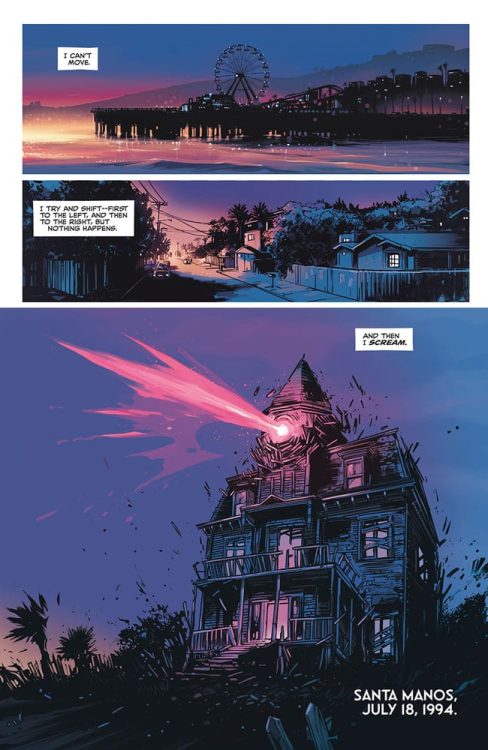
In the summer of 1994, a haunted house walks across California. Inside is Ami, lead singer of a high school punk band—who’s been missing for weeks. How did she get there, and what do these ghosts want?
Writing
If you’re a first-time reader of Watters’ work, prepare yourself to be amazed. Every element of Watters’ writing goes like clockwork. The story’s pace never drags out, with each reveal coming at exactly the perfect time. The characters are sharply-written, believable, and positively punk. The dialogue flows nicely and naturally, with each character having his or her own unique manner of speaking.
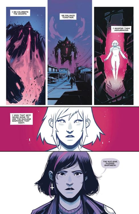
But, Watters’ writing especially shines when he gives the reader a breather from time to time in the form of a blank page with sparse narration. It gives the reader time to think- time to process what they had just read. Most importantly, this further puts the reader in the main character’s shoes and allows them to learn more about her past, personality, and relationship with this bizarre house.
Art
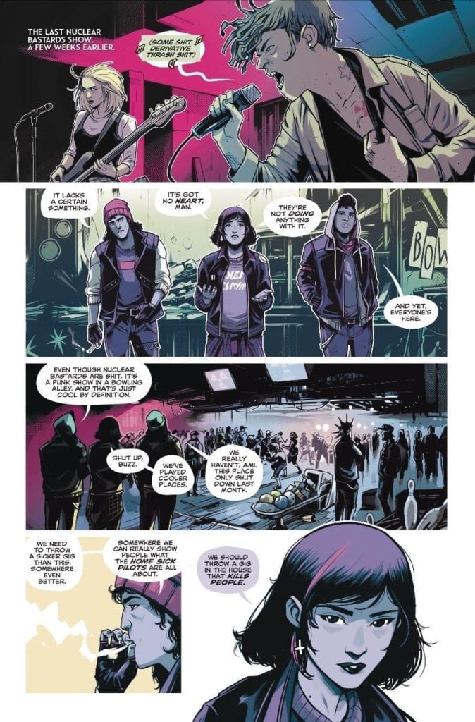
Wijngaard’s gorgeous artwork steals the show in Home Sick Pilots #1. The acting looks phenomenal yet simple, giving the reader the ability to tell how the characters feel at any given moment. His choice to always show the midst of a violent act, like a cop being kicked in the face, pulls the reader right into the action. In addition, the vibrant colors Wijngaard uses, especially in the pages’ blank backgrounds, make this comic look all the more alive and fun, and his choice to pull back on the amount of colors he usually uses in the rather freakish moments of this book gives these sequences all the more importance and tension.
Most notably, there is a two-page scene where all the characters we’ve met so far are inside the Old James house. The way those two pages are laid out is nothing short of brilliant. We’re watching the characters interact with each other and explore the house like puppets in a dollhouse. In this scene, it’s almost as if the reader themselves is taking the point of view of this strange house. Also, what adds to the weirdness and creepiness of it all is that the scene plays out non-linearly. With that, the reader also gets to take a peek at how this strange house might actually work—great work from Wijngaard.
Lettering
Bidikar‘s lettering style in Home Sick Pilots #1 is as punk as it gets. The balloons are never perfect shapes, elevating the comic’s rebellious mood. The simple, small sound effects never draw too much intention to themselves, which works great with the stylish artwork. Bidikar places the sparse narration in the blank pages and manages to keep the reader engaged, even though those pages don’t have much to offer.
It would’ve been easy for Bidikar to go crazy with his lettering style, considering the comic’s punk, hipster feel. But, Bidikar resists the temptation and letters in a very delicate, constrained manner, which works beautifully here.
Conclusion
Home Sick Pilots #1 is an exciting first issue. The story takes surprising turns and keeps the reader engaged from start to finish; The stunning art looks fresh and lively, which is exactly how a comic book about punk teens and a living house should look like. Strongly recommended for fans of Monster House and Green Room.
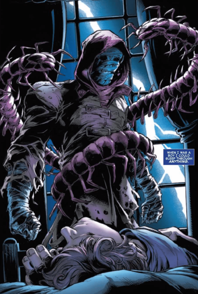
The Amazing Spider-Man #53, out now from Marvel Comics, features some gorgeous art and a neat revisiting of an old issue.
About the Book:
We have been aware that the villainous Kindred’s true identity has been Harry Osborn for many issues. Now, watch the tense reveal as Spider-Man is in the captivity of Kindred and must listen to what he has to say.
The Amazing Spider-Man #53 Story
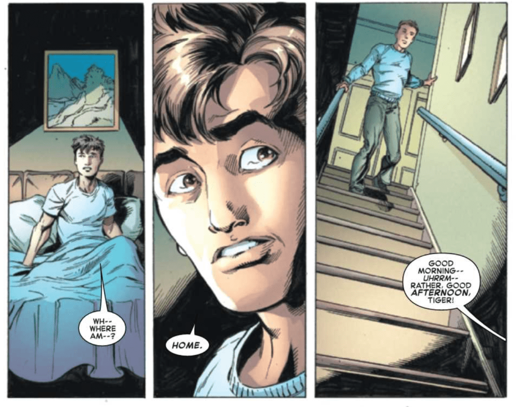
Having the identity of Kindred known to us but not our titular hero has been an enjoyable case of dramatic irony. We knew that when Spider-Man discovers this enormous secret, the moment would be tense and thrilling, and Nick Spencer understands how to make it just that. The Amazing Spider-Man #53 is undoubtedly a page-turner. It builds towards the critical moment, uses silent panels, and revisits an old issue to make it more interesting. Rather than using one or two silent panels to represent a pause in a scene, Spencer has pages full of silent panels. This results in a rise in suspense similar to that in a horror film, as you dread what actions Kindred will perform next. It creates some deeply unsettling moments and keeps the reader enthralled.
In The Amazing Spider-Man #53, Peter experiences a dream state forced upon him by Kindred. This dream has him reliving a day in his life shown in 2007’s Amazing Spider-Man #545 by Joe Quesada and Danny Miki. Before this issue, Harry Osborn was presumed dead after we saw him passing away in an ambulance. This turned out to be false, and his death had been faked. What makes Amazing Spider-Man #545 such an important issue is that it was the first time Peter had seen Harry since his “death.” Every character repeats their dialogue from the 2007 issue besides Peter, making The Amazing Spider-Man #53 feel like a Groundhog Day scenario. This direct referencing is fantastic because it rewards long-time readers by letting them know what is coming, and new readers can experience what is happening, just like Peter is. This referencing also demonstrates Spencer’s knowledge and love of the character and his history.
Art
Mark Bagley and John Dell provide some beautiful art in The Amazing Spider-Man #53 that makes each page a pleasure to read. Each panel has a delightful amount of detail, and Bagley and Dell create awe-inspiring shadows that bring scenes together. In mimicking Amazing Spider-Man #545, Bagley and Dell recreate the older comic’s characters and poses in a new art style, which is interesting to see. They also play with panel borders in the issue for a variety of outcomes. Often characters will overlap a panel, which brings more attention to them and fills the character’s action with more energy. Another use had a panel without borders, so all of the focus is directed onto one character, which provides an exciting effect.
The colors of The Amazing Spider-Man #53 were done by Edgar Delgado, whose work pairs wonderfully with Bagley and Dell’s art. For the long scenes without any dialogue, Delgado’s palette is dark and instills a creepy, disturbing tone. Delgado also provides some stunning shading, which adds drama to the issue.
The Amazing Spider-Man #53 was lettered by VC’s Joe Caramagna, who does an outstanding job making the dialogue flow with the art. In the issue, sentences are broken up over multiple tiny captions. Their placement allows them to be read in a natural way that makes it seem as if the character is talking slowly and stressing every word. Caramagna also uses techniques such as extending words past their speech bubbles, which is a great way to portray someone shouting or screaming, as it makes it seem as if their words can not be contained.
Conclusion
The Amazing Spider-Man #53 features more interaction between Spider-Man and Kindred, which has been built up over many issues. The art and lettering make the moment incredibly memorable, and the issue is a fun read.
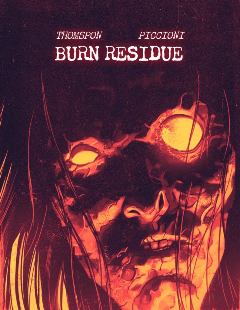
Burn Residue writer Jonathan Thompson has shared something very special with us at Monkeys Fighting Robots. Last month, when we spoke to Jonathan, he let it drop that Jacob Phillips (artist on That Texas Blood and colorist on the more recent Criminal comics) would be drawing the cover to the collected edition of the upcoming Burn Residue. And now, we at MFR have that cover for you all to see. Check it out below!
Art by Jacob Phillips
That’s one striking cover! You can practically feel the heat coming off it! Personally, I can’t wait to see this on a physical cover and neither should you. The book is one killer crime comic (check out our early review of the first issue) and this cover is just icing on the burned cake!
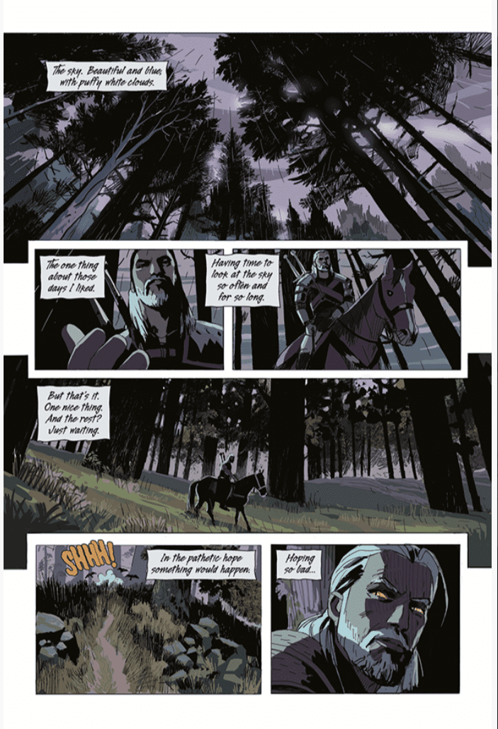
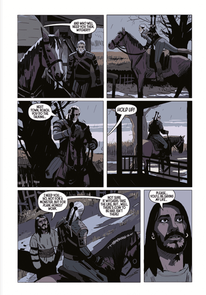
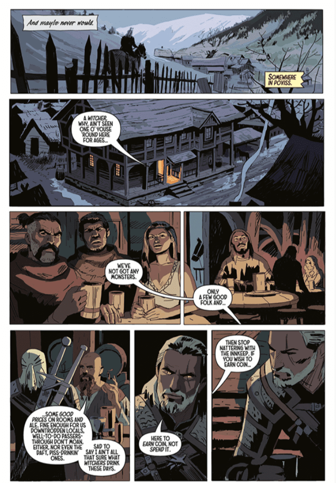
Dark Horse Comics will publish the first issue of a four-part series entitled, The Witcher: Fading Memories on November 25, under the supervision of CD Projekt Red. The story is written by Bastoz Sztybor, art by Amad Mir, colors by Hamidreza Sheykh, and letters by Steve Dutro. This comic is a masterful first issue that commands respect on page one and holds it through the entire issue.
Story
The world is changing, and our protagonist, Geralt is trying to discover if he can change with it. A Witcher is a monster hunter, and in this story, world monsters are becoming scarce. We journey along with Geralt as he reckons with what he will do if he becomes obsolete. The first issue does a great job of introducing a complex world and is easy to follow even if this is the first step you are taking into the Witcher universe. The character Geralt is curt, but he never comes across as unlikeable, and you want to follow him on his journey. While this issue does not have an abundance of action, a future call to action is seeded in what is a great character piece. Sztybor is amazing at episodic storytelling. While the issue is part of a larger story, it did not feel like a chapter; rather it felt like a self-contained story that fuels a larger narrative. After completing the comic, I wanted more. I laughed, I cried, and I wanted the story to keep going. I cannot wait for the second issue.
Art
Amad Mir’s art compliments the story perfectly and is a great fit for Sztybor’s story. Mir is adept at shadow works, and it conveys such a great tone in the book. The lighting dances across the page and fills the issue with life. The book also does a great job of conveying emotion through the eyes. This work evokes so much emotion and tells so much story in a short amount of time, and the art never makes the reader feel cheated. This comic is a master class on adapting material from another medium and employing comic art to make it work in this medium.
Colors
Hamidreza Sheykh employs a muted pallet to convey a somber (but appropriate) mood over the entire work. As mentioned above, the story focuses on Geralt contemplating his role as a Witcher in a changing world. The coloring gives the sense that night is ever impeding on the world and echoes Geralt’s feelings that his sunset is coming. The coloring is outstanding.
Lettering
Steve Dutro’s lettering in the caption boxes is exquisite. It helps the reader hear Geralt with a gravelly voice, as he is portrayed in the game. Dutro also uses a slight change to the lettering when he has Geralt reading a letter. It is a small and slight change, but it is a chef’s kiss to visualize internal dialogue masterfully. However, the letters in word balloons feel a smidge too big and throw off a panel’s proportion. Beyond that, the lettering does a fine job in aiding to tell a visual story.
Conclusion
If you are a fan of the Witcher series you will adore this comic. If you are new to the universe, you will adore this comic and want to explore other stories in the Witcher universe. My litmus test for the first issue is always how excited I am for the second issue. After reading The Witcher: Fading Memories, I find myself counting the days until next month. Until then, I am firing up the Xbox and installing The Witcher 3 to help calm the cravings.
All Joking Aside is a comedy-drama from director Shannon Kohli (The Magicians, Supergirl) about an up-and-coming comedian and a comedian on the rocks bringing out the best in each other.
Raylene Harewood (Legends of Tomorrow) plays Charlie in All Joking Aside. Charlie is a smart young woman taking her first shot at stand up comedy. Bob, played by Brian Markinson (Continuum), is a top-notch heckler in the sparse audience. Charlie and Bob’s paths cross again, where Bob takes the opportunity to troll Charlie some more. Charlie digs into Bob, learning that he’s a failed comedian. Soon, the pair form sort of odd-couple relationship that ends up uplifting both their lives.
PopAxiomspoke with Shannon Kohli about becoming a director, working in TV, and her first feature film, All Joking Aside.
Passion
Shannon new up in Geneva, Switzerland, where she says, “there weren’t many films being made there.” But the would-be director admits, “I loved anything to do with films. I researched everything. I watched everything.”
“We only had one English speaking channel,” Shannon says, diving into the kinds of films she grew up watching, “and it was Ted Turner Classics. I grew up on all the old classic films.”
Shannon was no doubt a cinephile, but also “loved photography. I got my first camera when I was six-years-old. I was always going out and taking photos. It was always a passion.”
“But I didn’t think I could make it a reality and a career,” she says, due to the lack of a film community in Geneva. That changed when Shannon “moved to Vancouver and went to the University of British Colombia. I was enrolled in economics, and soon as I got to Vancouver and saw all these film productions happening on the streets, I joined the film society at university and met a whole bunch of film people.”
A year or so into economics, Shannon “ended up switching to the film program.” Her dive into the Canadian film world was full steam. “At the same time, I was volunteering on the weekends and my days off on different sets. And quickly that lead to getting paid work in lighting.”
“I was getting all this theory at school,” she says, “but then I saw the real world while working on different TV shows and features. It was a great learning experience. Once I entered the film world, I knew I was hooked. I knew it was going to be a lifelong passion.”
Directing
Shannon’s directorial debut happened at university. “To get into the film program, you had to submit a film that you directed. So, I wrote a script and asked a friend to be in it. The film society came together to help me. That was my first directing experience.”
Now in the film program with only fifteen or so other students, Shannon “specialized a little more in cinematography, but I was always directing on the side doing music videos and short films.”
A few years ago, Shannon directed her first episode of TV with an episode of Shadowhunters. What’s it like coming in to direct one out of many episodes of a series? “It can be daunting. You’re the new kid at school. All the cast and the crew have been working together for, sometimes, years.”
“You get about a week-and-a-half to prep,” Shannon takes us into the world of a TV director, “so it’s a lot of meetings. Sometimes you get a script in advance; sometimes, you get it the day before. Then the next day, you’re sitting in these huge meetings being asked how you want to film this and do that.”
Preparation is vital for working in the film industry and perhaps nowhere else as much as on television. “I watch every episode of a show before I start, so I have a good idea of the style. They often send you a reference book with color palettes or, in the case of Supergirl because it’s a comic book, there’s information about camera movements.”
Shannon’s worked on Supergirl, Legends of Tomorrow, and The Magicians, all shows backed by major studios. All Joking Aside is Shannon’s first feature, and it’s an indie production. “The big difference with All Joking Aside was that since it’s an indie feature, we were figuring out a lot of different departments. I had more creative input in it but a lot less support and backing. We didn’t have a big studio or network behind us saying, ‘Yes, do it, it’s no problem.’”
“You have to be solution-based,” Shannon says about indie filmmaking. “If we lost a location, we had to think about where we could do the scene without producers who could say, ‘Oh, yeah, no problem, we can just do it here’ or ‘we can build a set for it.’”
About All Joking Aside
Shannon’s connection to All Joking Aside began through producer Jon Ornoy. “I’ve known Jon for a long time. He approached me about directing it. He’d optioned the script from InkTip, a place where writers can post tagline and synopsis of scripts they want to sell. It was from writer James Pickering. Jon adapted the script with James for New York. It was a great collaboration.”
Initial discussions about making All Joking Aside included a lot of adapting it for the United States. “A lot of the comedy was very British, so it didn’t translate to American characters.”
“Also, when we cast the characters,” she adds, “we were looking for the actors to bring a lot to the table. It’s difficult to write comedy, but it’s even more difficult to write comedy for other people. So, it was great when we cast Raylene Harewood and Brian Markinson, who could bring a lot. They had great ideas.”
All Joking Aside takes place in and around the beautiful city of New York. However, beauty sometimes comes with quirks. “At the duck pond, it was one of the coldest days of the year, and the pond was frozen over. So, instead of getting ducks swimming, we had ducks sliding around on the ice. We went with it. It’s pretty comical.”
“None of the ducks wanted to come near us,” Shannon says, “because they were staying huddled together for warmth. I went over and tried to entice them to come over. That was pretty funny too.”
What’s something Shannon will do differently for her next feature film? “All Joking Aside, because of the budget limits, I wish we had more days. I will fight for more days for my next feature.”
“It’s always time,” Shannon declares about the biggest enemy of any TV or film production.
Wrapping Up
“Growing up, Katherine Bigelow was a director who stood out for me,” Shannon says about one of the influences flowing through her filmmaking veins. “I loved Near Dark; I watched it so many times. Point Break was such a different film. I thought, wow, here’s a woman who’s out there making great action films. She’s always been a role model for me as a director. She was one who said ‘I can do anything.’”
Shannon focused on cinematography early on, “so I love watching films for the cinematography. Films like Delicatessen from Darius Khondji or Roger Deakins. Now is an exciting time; a lot of opportunities have opened.”
“I love biopics,” Shannon admits when asked about a dream project, “anything based around real characters. The Hedy Lamar biopic would’ve been fascinating to direct.”
All Joking Aside is available on a digital service near you. So, what’s next for Shannon? “I’m attached to direct a feature called Love Bomb based on the play by Meghan Gardiner. I’m directing two episodes of Another Life for Netflix.”
Is All Joking Aside on your watch list?
Thanks to Shannon Kohli and October Coast
for making this interview possible.
GI JOE – A REAL AMERICAN HERO #275, available from IDW Publishing on November 18th, concludes the Snake Hunt arc by staging a non-stop, action-fueled escape for Snake Eyes and the team. Written by Larry Hama, the story wraps up the 10-issue arc in classic Joe fashion with a ton of eye candy and not much else.
Cover Art
The Robert Atkins covers in this run have been a true treat of nostalgic fan service. The colors are bold. Snake Eyes assumes a classic hero action pose, and the overall composition looks like it was ripped straight from an action figure box. If you love the original cartoons and toys, this cover is pure joy.
Writing
Hama’s story concludes with an unrelenting escape from the hospital by Snake Eyes, and the Joe team sent in to rescue him. (Check out our review of GI Joe #274 to see how we got here.) This review’s title is not at all misleading as there’s not a single word in this entire issue. No dialog. No captions. No narration of any kind. It’s an entire issue of guns blazing and grenades exploding during a daring escape.
Of course, the Joes escape to fight another day. If you’re into stories where you flip through the pages and soak it all in, this one’s for you.
Pencils/Inks
This entire issue is exactly 30 panels. That’s it, and that’s all. 30 panels. Every page is a single splash page that’s good enough to pull double duty as a cover or a poster; for GI Joe fans or comics fans that like action in general, this issue is one continuous battle from start to finish.
What’s exceptional about this novelty type of comic is how well the art team (Robert Atkins, Netho Diaz, Brian Atkins, and Maria Keane) successfully tell a story simply through the motion and art on the page. To be fair, there’s not much story to tell, but action lovers won’t mind it one bit.
Coloring
J. Brown’s coloring work is one of the stars of this issue. The color captures the bold, eye-popping feel of an action cartoon without devolving into cartoonish tackiness. The explosions bloom brightly, and ordnance lights up every page—great work here by Brown.
Conclusion
GI JOE – A REAL AMERICAN HERO #275, available from IDW Publishing on November 18th, takes the “tell the story through art” model to an extreme with great success. The artwork is spot on for the material, and it wraps up the arc in a neat little bow. I highly recommend this series for GI Joe enthusiasts.
ENGINEWARD #5, available from Vault Comics on November 18th, reveals the origins of the Shades and opens Joss’ eyes to the real threat to her people. George Mann’s story picks up the pace from the prior issue as the race for the seed turns into a full-on sprint.
Cover Art
Joe Eisma puts Scorpio front and center for this month’s issue. The yellow eyes pop on the page, but the excess purple and black lose some of the focus on the main character. It’s an interesting cover but not the best of the series so far.
Writing
Mann’s story definitely moves the story forward issue by giving readers the backstory on the Shades. That backstory not only connects the dots to Joss’s quest, but it makes some surprising connections to predicaments faced by one of Joss’s friends.
“Surprise” is really the key to this issue that makes it satisfying. The story up to this point has fallen squarely in the slow burn category, which is fine to a point, but eventually, you’ve got to get things moving. Mann dispels the mystery of the Shades, enlightens Joss’s group to the true nature of the Celestials, and gives their goal some tangible stakes.
The issue is well-paced, answers more questions than the previous four issues combined, and gives the reader plenty of forward progress.
Pencils/Inks
Eisma’s artwork is solid in this issue. There’s plenty of action to go around, so Eisma takes the opportunity to select plenty of interesting panel angles and kinetic movement.
New to this issue is the inclusion of the Shade and his unique “powers.” The Shade is the highlight of the issue for its use of technology that is a unique mix of digital magic. To be frank, the Shade is much more interesting and enjoyable to read than the Celestials.
What doesn’t quite work is Eisma’s excessive use of 6-panel grids on nearly every page. Many of the scenes looked small and crowded, and the issue would have benefited from opening up the gird pattern more frequently.
Colors
Michael Garland’s color work is spot on for maximizing the effective presentation of the Shade. Its costume is alien-like in a captivating way with the mix of textures and highlights, and the glowing translucence of its powers is very engaging.
Lettering
Hassan Otsmane-Elhaou’s lettering work is especially interesting, again, for the dialog of the Shade. It speaks in an unknown language with the help of a translator droid, and the language characters are sufficiently alien to give its origin that much more authenticity. this is a nice bit of creativity from Otsmane-Elhaou that enhances the story even more.
Conclusion
ENGINEWARD #5, available from Vault Comics on November 18th, takes a big step forward in pace and plot to make for a more engaging story. The reveals are all satisfying, and the art is generally solid. This is a recommended buy.
THE DEVIL’S RED BRIDE #2, available from Vault Comics on November 18th, follows Ketsuko and Fubei on their guide mission to avenge the Aragami clan. Sebastian Girner’s story picks up the tale immediately after the events of issue #1 (read our review of issue #1 here) and shows how the bloodlust for battle within Ketsuko is so very close to becoming an all-consuming possession.
Cover Art
John Biven’s cover perfectly lays out what the reader can expect in this issue. Ketsuko will draw her blade for battle, in the present day and flashbacks. The specter of the Aragami clan’s red mask looms large as it urges her forward to feed its insatiable bloodlust, and the ronin she travels with are left in stunned disarray after the carnage they witness.
Writing
Girner makes a wise move in the sophomore issue to unleash Ketsuko’s full power in combat against seemingly overwhelming odds. Ketsuko is now established as a formidable fighter. One that may be struggling with inner conflict to hold back the instincts that push her towards indiscriminate killing.
It’s not clear if there’s something supernatural at work within Ketsuko, but that uncertainty makes the issue more mysterious in a thoroughly entertaining way. When the Tengu attacks her group, the ease with which Ketsuko defeats them is almost otherworldly. Her prowess instills fear in her group that creates welcome anticipation for future conflict in the series. This is a smart and enjoyable issue by Girner.
Pencils/Inks
John Bivens takes the opportunity to have fun with tons of mayhem and gore in this issue. The battles are brutally swift and messy. Ketsuko is expertly portrayed as a swordsman of the highest caliber with short, efficient strokes consistent with Japanese fighting styles. By portraying the swordplay in a manner consistent with actual Japanese teachings, Bivens demonstrates an admirable level of respect and honor for the training the samurai have made legendary through the centuries.
What doesn’t work is the rough detail in the character rendering, especially during quiet dialog exchanges. Those are the opportunities for the characters to emote and punctuate the conflicts of each scene, but sometimes the character renderings are a little too rough for the acting to come through. The rough style overall works in this series to accentuate the rough and tumble nature of traveling ronin, but I’d like to see the quiet moments drawn with a little more care and precision so that the characters’ acting can come through.
Coloring
Iris Monahan’s coloring work makes great use of a minimal palette. If not for the flowing red of Ketsuko’s robes, her armor, and the bloody aftermath of her battles, this would be a black and white story. Monahan places just the right amounts of red in just the right places to maximize the impact for visual attention.
Lettering
Jeff Powell’s lettering work is excellent in this issue. The highlight of Powell’s work is the quiet, red voice of the Aragami mask as it yearns to be let out. To feed. It peppers in and out like a small voice whispering to be released, and it adds creepiness to the story that accentuates the possibility of a supernatural force at work.
Conclusion
THE DEVIL’S RED BRIDE #2, available from Vault Comics on November 18th, slices a path of bloody carnage on the trek through the mountainside. The art grabs your attention, and the story continues to build a fully fleshed out world ripe for the killing. This is a highly recommended issue.
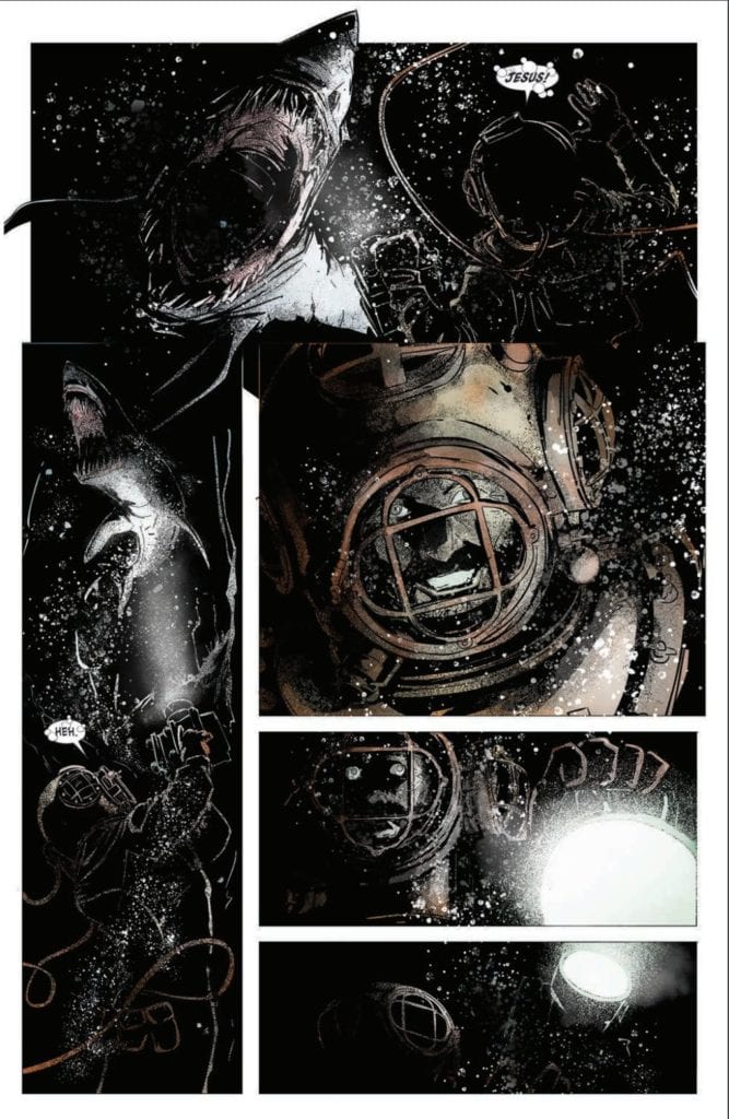
SEA OF SORROWS #1, available from IDW Publishing on November 18th, follows a salvage crew to the ocean floor, where they search for sunken treasure and find something worse. Written by Rich Douek, this first issue is a great story to a historical fiction epic with creepy monsters thrown in for good measure.
Cover Art
Alex Cormack’s cover sets the stage and the mood for the entire issue – the inky black unknown. Unfortunately, the cover spoils the mystery (it’s a mermaid), but the fear of unblinking, soulless monstrosities waiting in the dark speaks to a primal fear that’s hard to shake. There’s an almost Lovecraftian feel to the cover that I like a lot.
Writing
In the modern era of decompressed storytelling and forever on-going series, it’s nice to enjoy a story that has a clear setup and takes the reader somewhere. Douek establishes the characters as a rough, ragtag collection of privateers and gangsters on an expedition to recover a sunken U-Boat laden with Nazi gold. Douek’s story excels in how well the world is established, and backstories are told for several of the key players in a very short window. It’s effective, efficient storytelling at its finest.
Douek’s introduction of the main monster is also told with speed and efficiency that leaves you questioning whether or not she (it?) is a friend or foe. That simple question makes for a very clear cliffhanger that left me curious about what happens in the next issue.
Pencils/Inks
Alex Cormack carries the inky blackness from the cover all the way through the issue for maximum drama. Every character and setting is cast in deep, dark shadows – even during the day – to swath the issue in a constant state of dread. By turning up the darkness to an almost absurd degree, you feel like every character is about to do something wrong, has been wronged and carries the weight of it with them, or is about to have something terrible happen to them. Cormack’s use of shadow builds anticipation perfectly for a horror comic.
What about the mermaid? Yes, it’s a great design. The creepy, solid-white eyes give it the quality of a predator, indifferent to remorse or sympathy for its prey. There’s something shark-like in its empty stare that suits the horror style of this book well.
Coloring
Cormack’s coloring work is deceptively good in this issue. Except for a few bright spots, such as the briefly presented gold bars, the entire issue is almost entirely black and white. However, Cormack makes great use of tinting in flashbacks to reflect the nature of the threat. A WWI battlefield is illuminated with red signal flares at night. A disaster below decks tinges the air with green ammonia gas. In effect, every threat or element of danger pops with its own color to amplify its impact—great work here by Cormack.
Lettering
Justin Birch does an excellent job seamlessly integrating lettering into the art style. The book is heavily dependent on darkness and shadow, and Birch mutes and slightly darkens the fill in all the word balloons to give the lettering a hint of shadow. This is an excellent example of adjusting the style of lettering to match the art by Birch.
Conclusion
SEA OF SORROWS #1, available from IDW Publishing on November 18th, forces you to hold your breath while reminding you to be afraid of the dark. The art drowns you with a moody atmosphere, and the storytelling is brutally efficient. This is a must-buy for horror fans.
The Guardian Project aims to create a better online world by facing viral defamation and bullying in a reality show exposing the people who use the anonymity of the Internet to intimidate and belittle others.
The Internet is a ubiquitous space that creates a world where people are mostly free from real accountability. Anonymous accounts behind profile pictures say what they want, when they want, how they want, regardless of how it affects anything else in the world. This unchecked power is often used to bully others or defame people.
PopAxiom hopped on Zoom with Mark and Andrew to discuss their paths to the present and their union for The Guardian Project.
Drive
Mark Pellegrino is an actor best known for playing Lucifer/Nick on the long-running CW series Supernatural. But acting wasn’t his first goal.
Mark: “I grew up watching movies with my mom. But acting was never my gig. I wanted to grow up and save the world. I wanted to be a marine biologist.”
Andrew Rossow isn’t a face you’ll recognize because he works a gig that typically takes place behind the scenes and away from cameras.
Andrew: “Law has always been fascinating to me … I’ve grown up with technology like Napster, Limewire, Kazaa, and seeing how tech began to penetrate everything that my group of friends and colleagues interact with on a daily basis. I wanted to see how I could take tech and harmonize it with legal principles. I didn’t ever want to feel alone where I didn’t have a support system around me. I wanted to put myself in a position to help others through tech.”
Andrew: “Earlier this year, I had the privilege of meeting Mark through a Cameo request for my own anti-cyberbullying movement, #CYBERBYTE, only to immediately discover that we both had eerily similar upbringings and experiences with bullying. It was clear our interests aligned, which is fighting what seems the un-winnable. Minimizing harm that has such an effect on mental health. Being able to help the right person, pointing them in the right direction, and helping people not feel alone. That’s what drives me.”
Social Crutch
There’s a lot of debate about the best way to raise children. The term “helicopter parent” describes moms and dads who don’t give their kids breathing room to fail and succeed organically. It’s seen by many as contributing to larger problems.
Mark: “Going outside, playing, learning to resolve conflicts with your contemporaries, either by fighting or running or being snarky, you built up a moral immune system, just like your body builds up an immune system by being in contact with parasites and bacteria all the time.”
The same goes for facing challenging ideas, which is increasingly rare in an age of endless distractions. There was a time when one-third of the television viewing audience watched things like All In The Family, which boldly faced important and controversial topics.
Mark: “Seeing on the TV the relationship between ideas and prejudice fighting progressivism on-screen built up our debate immune system, our rational immune system, to be able to fight off prejudice because we dealt with them openly.”
Mark and many would agree that there’s a growing problem of people hiding in echo chambers.
Mark: “We’re isolating children who don’t play anymore. There’s a reason their bodies are hypoallergenic; they’re allergic to everything; they get sick easier, their immune systems are weaker, and they have no tolerance for difference and no means of coping with opposition. When I went out into the schoolyard, I probably punched friends I still have to this day in the face, and they punched me. I was a bully at times and got punched straight in the mouth and learned better. I protected kids. That comes from presenting a risk of accountability. Now, we have to bring that same kind of accountability into cyberspace.”
Andrew: “People are so used to being behind a screen that they forget how to interact face-to-face. What is hard about picking up a phone? We do it all the time. Someone leaves a voice mail, and we text them back. There are instances where time is of the essence, but when did we forget to stop communicating or see and feel emotions. The Internet’s become a crutch of sorts for how people act and behave.”
About The Guardian Project
Mark’s journey as an actor put him in front of the camera for roles like in Supernatural and 13 Reasons Why, a show which boldly faces many issues that most people want to run away from. Andrew was doing his part by running an organization meeting the online bullying threat head-on. How did the pair come together for The Guardian Project?
Andrew: “I’m grateful to be a part of Mark’s network, the Guardian Network. I reached out to Mark through Cameo. One of the many hats I wear is that of a journalist. I reach out to individuals and learn their stories. I’ve been running an independent social media movement called #Cyberbyte, which is trademarked. It is an anti-cyberbullying movement that I started after I passed the bar exam, which is designed to bridge the gap between Silicon Valley and Hollywood by bringing consumers and fans closer to these executives and public figures through storytelling. What I’ve learned through it is that everybody has a story.”
“I serve as a talent recruiter for Cameo,” Andrew explains, “so my job is to find individuals who serve as a model representation of positivity and inspiration. What they look for are people like Mark, who inspire and have a powerful message. I’ve used my personal Cameo account (not my talent recruiter) to request that individuals like Mark to join my #CYBERBYTE movement. All they would need to do is record a 30-60 second PSA about their story. What is their message on bullying? The communities that follow them might not know their story. People listen to Mark’s words, and if he could speak out, it would be powerful.”
Mark: “I did the Cameo, which was a very assertive attack on bullying.”
Andrew: Mark did the video, and it was one of the most inspiring videos I have seen. After watching it, I wanted to know more. I wanted to write about it. I reached out to him on Twitter and said I would love to speak with him about his story.”
Mark: “We did the interview, which went for about an hour. After the interview, we talked for another hour or so, and we had a very similar background and experiences with harassment and bullying. The way we grew up and being a step behind our peers which made us targets. That’s sort of the glue that stuck us together. We decided to form a business venture together and find ways to make people safer online.”
Andrew: “I think halfway through the interview, we realized we might be a missing piece for one another.”
Social Media Tool
A hammer is a tool and a weapon, and social media is no different.
Mark: “All technology brings with it good and bad. The good of all the accessibility is that everyone has a voice. The bad is that everybody has a voice, including sadistic, mean-spirited people, nihilistic people who just want to hurt.”
Mark asserts, “We want these people to think twice about doing what they’re doing.”
But the problem isn’t only the user but the platform.
Mark: “There’s a certain aspect of the medium that encourages this type of interaction because it sells and keeps people on the platform. Lies are more readily believed and spread more easily than the truth.”
Andrew: “Section 230 of the Communications Decency Act has shielded platforms since 1996. Today, it protects tech platforms from being held liable for users’ posts and allowing these platforms to moderate content in good faith, without repercussions. In many ways, this is a good mechanism to have. However, the question we must now ask is: at what point is there a line, or can there be a line drawn to where such hatred, libel, defamation, nihilism to where 230 no long protects a platform? Where objective harm is not part of Section 230 protection.”
“Especially if users like you and I are hitting that report button,” Andrew continues. “What good is a report button if it’s just an automated process that says ‘Thank you for reporting the violation.’”
Andrew: “Regulators are starting to get it because they have kids who themselves are being victimized. It’s a tough political climate right now, but it’s opened our eyes to some of the evils that our society has allowed to continue for years. Recently, Senator Ted Cruz called out Twitter’s Jack Dorsey on ‘who the hell made him king’ of such behavior?”
Mark: “I’m frightened by the political climate. But, who made Jack Dorsey king? We did. We solicited his product. Let us hold individual users accountable. These individual bullies or hordes of bullies need to be held accountable. We want to tie your identity to your handle so that if you get kicked off, you’re off.”
Andrew: “There’s no authentication or due diligence for users to be tied to an account; an email which can be a garbage email. For something like Twitter, they should submit information like a driver’s license or passport that ties them to the system. There’s got to be a way to track. The problem is right now, when someone is de-platformed or banned, what do they do? They make another account. In a very limited sense, Parler’s verification mechanism is a solution, requiring every user to submit a form of identification, like a driver’s license or passport, which gets them a “red verification badge,” indicating they are a REAL person. Other forms of verification badges for media networks, public figures, or other affiliate partners exist…this is okay. Why can’t this be done for Twitter, Facebook, Instagram, or TikTok?
Wrapping Up
The Guardian Project aims to strike hard with a show that protects and educates.
Mark: “We’re going to create a pitch platform for networks so that we can produce a reality show geared towards exposing victimizes and helping victims get justice. That’s the thumbnail sketch.”
Andrew: “It’s How To Catch A Predator meets Catfish. It’s not to entrap, but to bring to light the reality that cyber-bullying is real and does happen, every second of every day.”
Tackling any problem typically begins with erasing ignorance.
Andrew: “Many people still don’t believe that online bullying is a crime or should be a crime. States are still struggling with it. They all have a form of an electronic harassment law, but it’s a slap on the wrist. What happens when that harassment turns into another person harming themselves? We saw that with the Conrad Roy case. There are arguments on both sides. What that court did that was landmark was say, ‘Stick and stones is a lie,’ and it’s always been a lie. Words do hurt, and words do kill. If social media is used as a weapon, it creates a lot of problems. So, we want to make people aware that they have a platform to speak out and not feel isolated. They have a community.”
Often overlooked is the help that victimizers need. Andrew discusses just that. “On the flip side, it gives these aggressors a means to confront, if they choose, their actions and why they feel they have to act that way.”
Mark: “Words hurt. They can do objective damage to a person’s life. When you’re passing a false narrative, and it becomes viral, you’re hurting a person’s reputation. There are religions that consider the killing of someone’s reputation as equivalent to murder. And it is. If you prevent someone from getting a job because of the false narratives you put out about them … you’ve effectively stolen that person’s life. That’s objective damage, and those people who do that kind of thing need to be held accountable.”