Batman Annual #5 out now from DC Comics displays new and old Batman mythos meeting at a junction. Batman writer James Tynion IV with artist James Stokoe showcase dealing with the absurdities of Gotham and Batman. Joining them is letterer Clayton Cowles to display the voices of everyone dealing with the absurd.
Batman Annual #5: Finding Common Ground
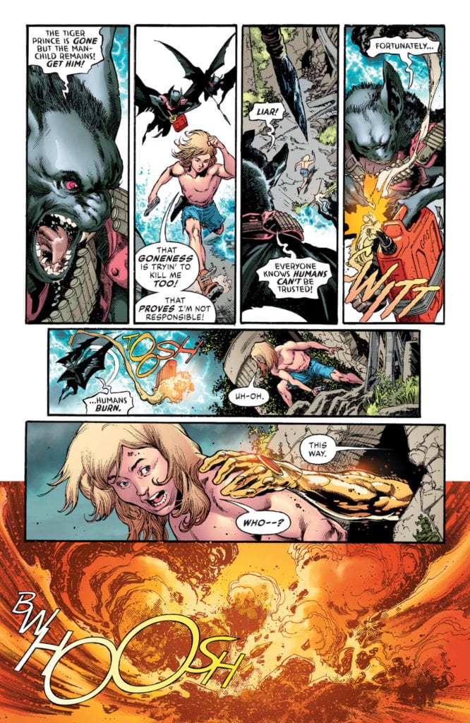
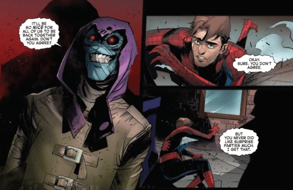
Tynion thankfully takes steps to introduce readers to Leslie Thompkins, Batman’s childhood caretaker. By juxtaposing Leslie’s presence and influence in Crime Alley, readers see her parallel with Batman. While Batman prefers to strike fear into criminals’ hearts, Leslie hopes to rehabilitate people by helping them work out their issues properly. This leads her to the main element of Batman Annual #5, the Clownhunter.
Leslie serves as an intersection for Bao Pham in his criticism of Batman. Like Bao, she thinks Batman isn’t doing what he is supposed to do while also disagreeing with Bao’s slaughter of clowns. Leslie empathizes with Bao’s struggles with the absurdities surrounding Gotham and Batman. Because needing to make sense in the absurd is a very human thing to do.
These struggles with identity and finding someone to bounce off make both Leslie and Bao good characters. It’s the interactions between different parties that can lead to greater developments. I certainly want to see where the Clownhunter goes after this.
Absurdly Grotesque
Stokoe’s art returning from Joker War Zone fits perfectly into Batman Annual #5. The inherent absurdity of Gotham City can feel like a walk through Hell, and Stokoe’s grotesque imagery displays that in full. That is certainly what Bao’s perspective has when it comes to his family’s murder.
At the same time, Stokoe’s art showcases a cooler colored glow that displays some hope in dark places. It’s something that comes to a head when Bao removes his red-accented helmet to speak with Leslie under this glow.
Cowles’ lettering showcases how characters speak under the circumstances. Most of the characters speak in an easy to follow format through the standard word balloon. Then there’s the Clownhunter who speaks in lowercase font, unlike his younger self who spoke like most people. It displays his trauma and how small he feels after encounters in the main comics.
The use of SFX from Cowles even showcases Bao’s transformation into the Clownhunter. Bao’s flashbacks have rather simple effects like knocking on a door until, eventually, Stokoe’s SFX takes over with how over-the-top they get. Every crack and crash gets as absurd as the situations they’re in.
Batman Annual #5 Is Climatic
Batman Annual #5 takes itself a step further by showcasing character development. By clashing one of the newer characters with an old but important one, a compromise is found. It’s almost like Batman’s fans, and critics find common ground by learning to live with the absurdities. Because living with that instead of against it might just be healthier. The Clownhunter is certainly a character to invest interest in his origin story.
The Elephant In The Room is a film on Amazon Prime directed by Allen Freeman (Dean LeCrone vs. the Mutants of Comic-Con) and starring Niko Vitacco (Prom Knight) as a nurse with an unusual way of treating patients based on true stories of the world of palliative care.
Based on City of Hope nurse Bonnie Freeman’s true stories, The Elephant In The Room is a dramedy following a team of doctors and nurses caring for people facing their final days. Michael (Niko Vitacco) is a nurse who adds humor and compassion to his toolkit for dealing with patients. Michael’s approach is out of the norm, and it’s put to the test when he meets Cooper, played by Craig Callo, who doesn’t see the light at the end of the tunnel.
PopAxiom spoke with Niko Vitacco, Tamir Gedalia, and William Dale about bringing Bonnie Freeman’s life to the big screen.
City Of Hope
Executive producer William Dale isn’t a movie guy. He’s the Chair in Supportive Care Medicine at the City of Hope. He worked closely with Bonnie Freeman and learned of her stories early on.
“Making the film was certainly easy for me since Bonnie Freeman did all the hard work,” William jokes. “She did a remarkable job of translating the experiences. Niko and Tamir took Bonnie’s vision and turned it into entertainment.”
Admittedly, William says, “I don’t like medical dramas and comedy very much because of the lack of realism.” He adds, “I have a soft spot for SCRUBS because they captured a couple of the real issues that go on.”
Getting the City of Hope to agree to become a film set was tricky. “We have a patient-family resource center that’s under my department. That was made available as a staging place,” William explains, “We got some approvals from the hospital to use it when essentially very few other people were around. There were caveats to that too.”
In the end, William says, “The hospital is thrilled with the way it all came out.”
Road To Hope
Niko and Tamir are both filmmakers, but their road into showbiz came via different routes.
Niko: “As a kid, I loved to tell stories. I knew at a young age that I wanted to be an actor. I’d done commercials, stage, and short films. This was my first lead in a feature. Because I was so involved during production, I was given the opportunity by Tamir, our director Allen, and writer Bonnie to take on a producer role.”
Tamir: “Back in Israel, I used to be an accountant. At some point, I started to follow my dreams of being a filmmaker. I left my job and career and moved to LA. I started volunteering on any production; short films, student films, videos, and commercials. Step-by-step, I started gaining experience and started my own production company. I started to produce commercials and videos. The Elephant In The Room is my first feature.”
How did Elephant In The Room come on everyone’s radar?
Niko: “It’s kind of a weird story. My wife knew Bonnie’s daughter (Ana) when my wife lived in Michigan. Ana reached out to my wife and asked if I’d be interested in auditioning because they just lost their lead actor. I was a little skeptical. Everyone claims to be a writer, and there’s a lot of bad material out there. Nevertheless, I said I’d be happy to read the script. Truthfully, I didn’t think I’d make it through the first ten pages. But it didn’t happen. Once I started reading the script, I couldn’t put it down. I laughed, I cried, I knew I was hooked.”
Tamir: “I got to know Allen through a friend. I knew his wife had a script, and she’s trying to make it into a film. As Niko said, we see a lot of bad material. So, that was my attitude, but I got the script, and I liked it. I thought it was different.”
Tamir admits, “We didn’t know how we were going to start, but Bonnie’s passion made me believe we would make the movie.”
William: “Bonnie worked at supportive care right next door to me. She came to me with the story early on. Niko came in and bribed me with a ball. We’re both from the southside of Chicago, and he gave me a White Sox World Series ball in the hopes that I would help more with the film. I went to my finance and risk-averse wife and said, ‘We don’t need that kitchen redesign, can we just do this film instead?'”
Becoming Michael
The Elephant In The Room is a character-driven drama that centers around Michael. How did becoming Michael happen for Niko?
Niko: “On the day of our table read, when I first met Bonnie, she told me that Michael was her alter-ego. Like Bonnie, Michael has a very unconventional approach to his patients. He values both humor and compassion. She wanted it to be clear that although Michael’s antics were over-the-top, it was only a dramatized representation of who he was. Michael is larger than life. But it was important to show the human connection with his patients and how he sees them for who they are, not where they are going to end up.”
The Elephant In The Room deals with a heavy topic with the kind of touch that has weight and levity. What’s a moment while filming that Niko will hold onto?
Niko: “I think a difficult scene that was tough for me was a scene in a stairwell. I knew how important this moment was for Bonnie. Before filming, she told me that she never got a chance to say goodbye to the real patient. So, writing this was her way of doing it, so I tried to give everything in the scene.”
“During the scene, the director let the camera roll a little bit longer,” Niko explains, “and I ad-libbed out loud ‘I love him so much.’ When the director called cut, Bonnie ran over to me with tears in her eyes and hugged me and said, ‘I never got a chance to say that out loud. Thank you.”
“Of course, the producer cut it out of the film,” Niko laughs.
Tamir: “It was the editor who did that.”
Selling The Elephant
The Elephant In The Room is a dramedy about some very weighty issues. How do they sell the film to a random person on the street?
Tamir: “It’s about a nurse in palliative care who treats terminally ill patients in unorthodox ways. He meets a tough patient and tries to get into his heart, and together they go on a journey through life and death. In the last year, I added one more sentence: ‘You will laugh, you will cry.'”
William: When I tell people it’s about palliative care, but it’s not all gloom and doom, people say, ‘You’re kidding.”
Niko: “Death doesn’t have to be dark and frightening if we talk about it. Without sounding lame, our film shows the delicate role that humor should play in this line of work.”
Wrapping Up
Who inspires Niko and Tamir as filmmakers?
Niko: “For me, two main actors stand out. Such polar opposites. Robert DeNiro, who I’ve grown up loving and watching and almost see as a father figure. He’s able to tell so much of a story with a blank face. I’ve always wanted to be more like that in my work. The other person would be Will Ferrell. He commits himself so much, regardless of how stupid the character is, he immerses himself. That commitment makes it real and brings it to life. As goofy as this sounds, my dogs inspire me a lot. They teach me to live in the present and live creatively with an open mind.”
Tamir: My favorite director who inspires me is Stanley Kubrick. I love films that every time you watch them, you find another more profound meaning. Each one of his movies you need to watch more than once. In general, I’m inspired by true stories and human stories.”
Though William isn’t a dedicated filmmaker, he admires one actor in particular. “I love Robin Williams. He’s my favorite actor. He loved doing medical characters. I loved Awakenings.”
What’s a dream project for Niko and Tamir?
Niko: “I’ve always loved The Lost Boys. It could be a great series. That would be incredible. As a teenager growing up, it gave me a sense of swagger.”
Tamir: “I would love to do our movie as a series with the same premise. Every episode would feature a different patient with different takes on life.”
The Elephant In The Room is out on Amazon Prime. So, what’s next from the filmmakers?
Niko: “A bunch of things are in the mix. The pandemic’s slowed things down, but it’s helped me re-focus on where I want my career to go. I finished a rewrite on a screenplay.”
Tamir: “I’m in the development of a series based on a true story about the Mossad’s most extraordinary operation that changed the way the world sees Israel.”
Is The Elephant In The Room on your Amazon Prime watch list?
Thanks to Niko Vitacco, Tamir Gedalia, William Dale, and Lumos PR
for making this interview possible.
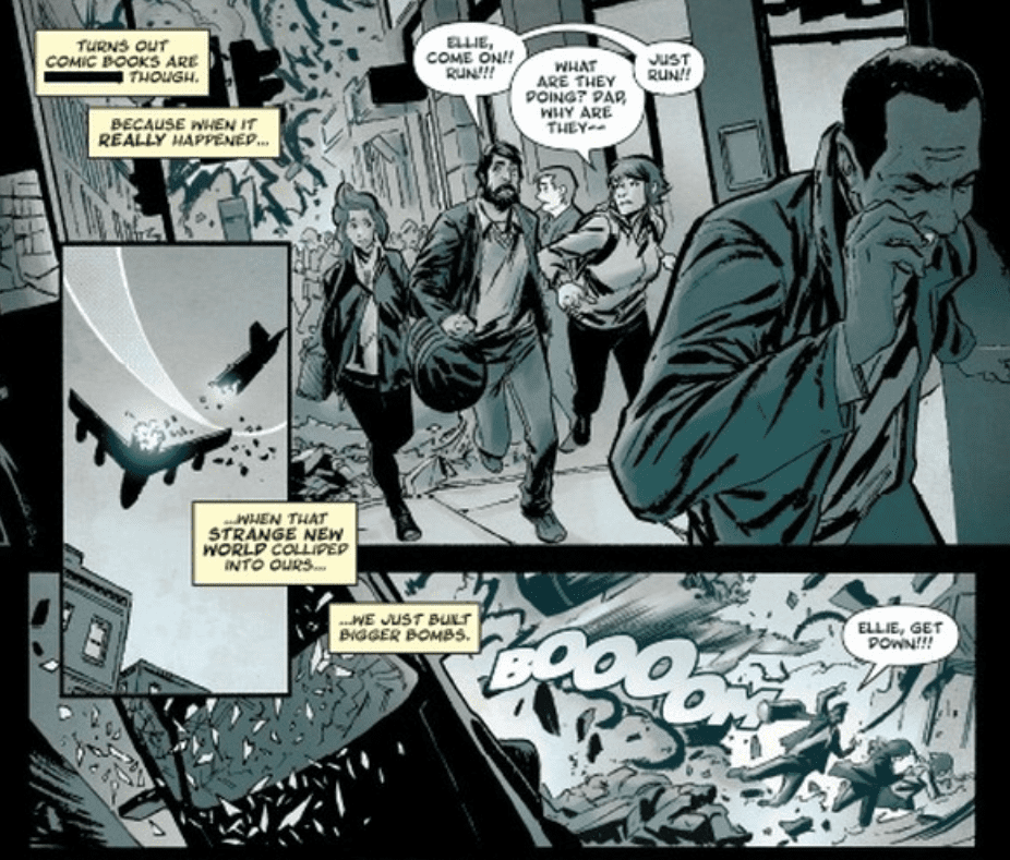
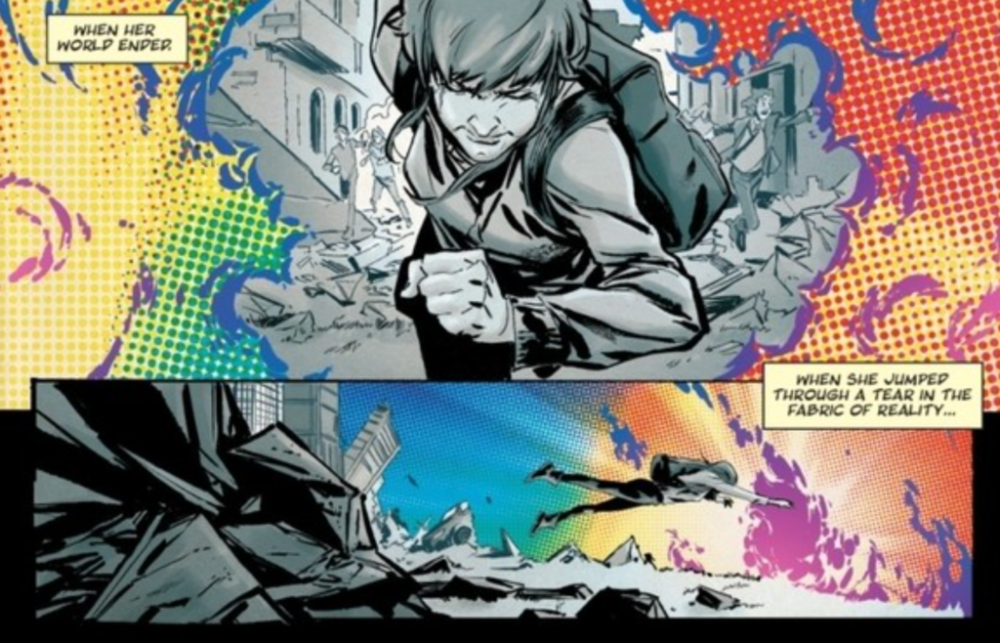
Crossover #3, out today from Image Comics, is the most monumental issue in the series thus far. Featuring the biggest battles, a great cliffhanger, and the most crossovers.
Donny Cates’ writing makes Crossover #3 a gripping read from start to finish. From us finding the truth about something we had misconceptions about, to earlier foreshadowed events beginning to fall into play (albeit just starting), the issue constantly supplies you with reasons to keep on reading. The most substantial aspect of the writing that makes this issue so notable is that it crosses over with characters from other series. This is no big surprise — note the title of the series — but who shows up in Crossover #3 is sure to shock readers. We had a taste of other characters in the previous issues, but now we get to see them directly involved in the main story, rather than just indirect cameos (for example, arms sticking out of prison cells or a drawing.)
Geoff Shaw’s art is brilliant, and I want more. There is something about his faces that make the protagonists seem friendly and approachable, and the mean characters seem absolutely despicable. There is only one character in Crossover #3 that I would classify as a villain with certainty, and the way Shaw draws him makes it looks as if he’s never felt love a day in his life. This issue also features some gorgeous use of shadows that instills a dramatic tone, some spectacularly done rainfall, and some complex architecture that is certain to impress if you stop to appreciate it.
Dee Cunniffe’s coloring is quite impressive in Crossover #3, particularly in the beginning. In the first few pages, we are greeted with a bleak color palette that reflects the grim events happening on the page. When the fantasy elements are introduced to this scene, they are brightly colored and provide a stark contrast to the previous panels. I’m not certain what effect was intended by doing this. I believe it could either be that the bright colors indicate that the world for Ellie in the future will be drastically different than what it was before, or they are used to show that while the comic book characters are ordinarily fantastic and colorful, their presence in the real world results in a chaotic and horrifying scene. The rest of the issue has a pleasantly wide palette, and Cunniffe does a phenomenal job of using colors to set the tone.
Crossover #3 benefits significantly from the lettering of John J. Hill, especially during giant fight scenes. The issue features one huge battle, and Hill’s font choice makes the blows exchanged have a deeper impact. His speech bubbles’ positioning also allows for the story to flow naturally, and captions are always clear.
Crossover #3 is an incredible page-turner that lives up to its name. The art and coloring provide some breathtaking pages, and the lettering allows the story to flow smoothly. From the quality of the first three issues and what it is building up to, Crossover is looking to be a highly promising series.
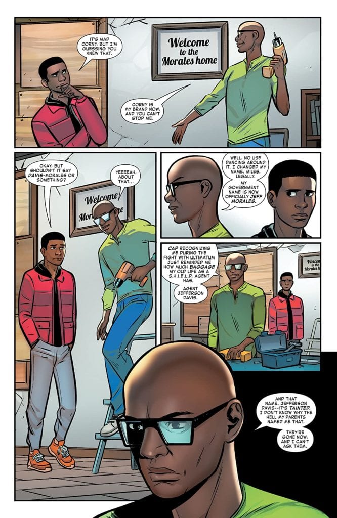
MILES MORALES: SPIDER-MAN #22, available in comic book stores on Wednesday, January 6th, details our hero’s response to the recent death of one of his beloved family members. In the concluding issue of the Ultimatum arc, Miles’s uncle Aaron Davis sacrificed himself to defeat the evil villain terrorizing the city. And his absence now leaves a vacuum in the Morales family. Yet hope seems to be brewing. The people in Miles’s life are finding new ways to express who they are in an ever-changing world.
Story
The idea of one’s name and its relation to their identity is explored throughout this issue. Readers first encounter it via a discussion with Miles and his father. The former “Jefferson Davis” reveals that he changed his surname to “Morales.”
Despite the obvious negative history associated with the name, Jefferson explains how this change represents an opportunity for a fresh start—a development in the former S.H.I.E.L.D. agent’s identity. He describes choosing this path to better represent who he is as a person.
We see this same dynamic played out throughout the rest of the narrative—whether it’s Starling’s explanation of her superhero moniker or the villainous Frost Pharaoh’s new title. Writer Saladin Ahmed demonstrates a remarkable ability to portray deeply human concepts and emptions in his characters.
Artwork
Natacha Bustos’s penciling and ink work, David Curiel’s coloring, and VC’S Cory Petit’s lettering worked well together in this issue. Miles and Tiana’s forms seem to glide effortlessly across each panel, drawing readers into their movements. Their costumes’ shades of black and red pop against the grays and browns of the cityscape. In addition, the word balloons are placed strategically—at times subtlety out of the action and at others a part of the city itself.
Conclusion
MILES MORALES: SPIDER-MAN #22 is the breath of fresh air needed after the heavy toll taken on our hero during the Ultimatum arc. Perhaps Miles will look deeper into his own identity and what his name represents in the coming issues.
Do you think Tiana will share more of her secrets with Miles? Let us know in the comments below!
Writer G. Willow Wilson and guest artist Javier Rodriguez’s bring us the start of the next arc of their staggeringly good Sandman Universe series with “The Dreaming: The Waking Hours” #6. This issue takes young witch Heather After, one of the best supporting cast members of the first five issues, and thrusts them in the main protagonist position to deal with the consequences of one of her more reckless actions in a prior issue. With colors from Mat Lopes and letters from Simon Bowland, this is yet another gorgeous and sharply written chapter in the legacy of Sandman comics.
“As life gets back to something almost like normal for Lindy, sorceress Heather After finds herself plunged into a waking nightmare of her own! The cruel creature known as Puck is stalking her, and no being she could possibly summon can protect her from his wrath! Unless… no, she couldn’t possibly try to summon…really?!”
Writing & Plot
Unlike prior issues, “The Dreaming: The Waking Hours” #6 has Wilson following the plot of only one character’s actions. As much as I loved Lindy and Ruin and the rest in the first five issues, I was most intrigued by Heather After, young sorceress and descendant of Sandman villain Roderick Burgess. This issues focuses in on her life with her himbo boyfriend and dealing with the consequences of one of her more hasty actions earlier in the series – involving one of Faerie’s more unpredictable residents. She naturally plans to resolve this issue by – in true Vertigo form – making more consequences. The tightly focused and immensely entertaining script is shaped by Wilson’s ear for naturalistic dialogue and her poetic narrative voice. This single issue feels the most likeSandman or early Vertigo-era of any of her issues thus far, while still maintaining a completely unique narrative voice. Heather is a brilliantly capable and wickedly smart character, who is also just arrogant enough to land herself in a heap of trouble – while being humble enough to ask for help. She’s completely contemporary and feels like a real person, making her one of the most easily relatable protagonists I’ve read in a comic in recent memory. The reintroduction and use of longtime Sandman and DC/Vertigo staples and the careful handling of their characterization makes this issue an absolute winner in all regards from a writing perspective.
Art Direction
“The Waking Hours” #5 sees guest artist Javier Rodriguez filling in for series regular Nick Robles on pencils. This is no small task, as Robles’s work on this series has been nothing short of staggering on each issue. Fortunately, Rodriguez absolutely murders it on this chapter, with not only fantastic detail and animation but wildly dynamic and intricate panel direction. Stylistically, it’s impressive how artists working on The Dreaming in the past couple of years have managed to have a sort of all-around stylistic similarity while still retaining their own style. Rodriguez’s fine penciling is alive with character, with every individual looking just as unique as Robles had designed them. There’s a liveliness in Rodriguez’s work here that’s a bit different than prior work on this series, and that’s largely afforded by the kinds of scenes in this chapter. This issue has Heather and her boyfriend in their apartment and going to nightclubs rather than mysterious eldritch veils, so the setting feels more relatable while still offering the strange mysticism needed in a Sandman Universe comic. Now the leading component for why Rodriguez’s work here is such a seamless addition to “The Waking Hours” visuals thus far is honestly the coloring of Mat Lopes. His work on this issue, as well as every issue of The Dreaming over the past couple of years, is marked by a saturated hues of both natural colors and sudden explosions of bright neons and fantastical shades. This issue is brightly lit with the comfortable colors of Heather’s apartment that switches over to the strobing lights of a nightclub (a cathartic sight here during a pandemic) and then to the otherworldly tones given off by eldritch entities and spells. The lettering by Simon Bowland is once again a use of the classic Sandman fonts, with different characters using their own fonts. This is especially cool when a character speaks from off-panel and we we have to guess who the new speaker is. This is once again, a brilliant work of visual storytelling that this series is now known for.
“The Dreaming: The Waking Hours” #6 is a phenomenal start to a new arc for this Sandman Universe series. G. Willow Wilson takes a fascinating supporting character and creates a thrilling chapter that is a tumultuous joy to read. The artwork of Javier Rodriguez and Mat Lopes is absolutely stunning, taking real-world settings and mashing them together with otherworldly visons in true Sandman fashion. Be sure to grab this issue from your local comic shop when it releases on January 5th!
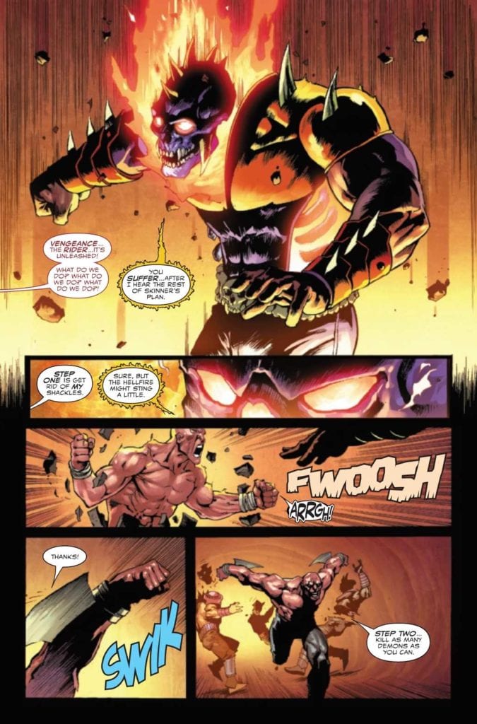
Ghost Rider Return of Vengeance #1 releases a return-to-form piece from the 90s Ghost Rider team of writer Howard Mackie and artist Javier Saltares on December 30 courtesy of Marvel Comics. Joining this duo is co-inker Marc Deering, colorist Arif Prianto, and letterer Joe Sabino.
Who Is Vengeance?
Michael Badilino/Vengeance (as his name suggests) is a Spirit of Vengeance, much like the Ghost Riders. Originally appearing as a co-star with the Danny Ketch Ghost Rider, he was killed in battle along with their mutual enemy Hellgate.
Ghost Rider Return of Vengeance #1: Bat Out of Hell
With current Ghost Rider comics in demand by creators, now seems like a great time to revisit some elements. Mackie keeps things simple in Ghost Rider Return of Vengeance #1 while getting readers up to speed. By showing Badilino in the lowest part of Hell, readers surmise his character without exposition.
From beginning to end, Vengeance shows himself off as a Punisher-esque anti-hero. The guy flat out admits he has no humanity. With his return, now’s a good time for readers to witness the manhunting days of the Spirit of Vengeance; that is if they don’t mind continuity errors. Besides the more enjoyable parts of this one-shot come from Badilino giving villains vicious payback after enduring their cruelty.
A Fearsome Presence
Saltares gives a fittingly hellish aesthetic to Ghost Rider Return of Vengeance #1. Just the new design of Vengeance displays the overall menace. The spiky armor with no chains or leather presents him as a direct product of Hell. There are no ties back to the main Ghost Riders, only a fury that goes in every possible direction.
The inking shared between Saltares and Deering attests to this even further by blurring Vengeance’s linework. This makes him look more spectral, which adds to his already threatening visage.
The colors by Prianto are best when looking at the end of Ghost Rider Return of Vengeance #1. With so many reds, oranges, and flesh colors in Hell, Vengeance’s appearance on Earth is what makes him stand out. This return signals a Hellish monster ready to wreak havoc on Earth’s sinful.
VC’s Sabino meanwhile demonstrates how each of Vengeance’s actions is a force of reckoning; between the SFX and flame-bordered word balloons, Vengeance is not a character to take lightly.
Try Out Ghost Rider Return of Vengeance #1
After two-and-a-half decades, readers are ready for a good old-fashioned Ghost Rider romp. No big internal battles for Hell, just giving the sinful a beatdown courtesy of a morally questionable. Because when a plot is manifesting, it’s good to have some alternatives. Ghost Rider Return of Vengeance #1 is certainly good enough to get attention from casual readers.
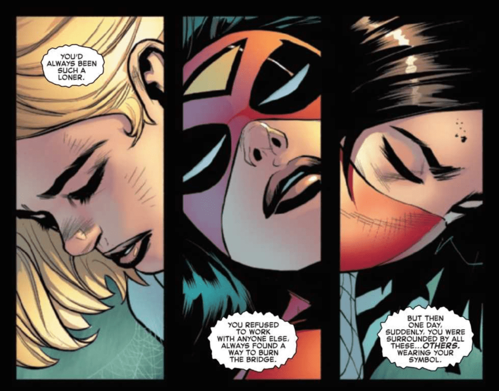
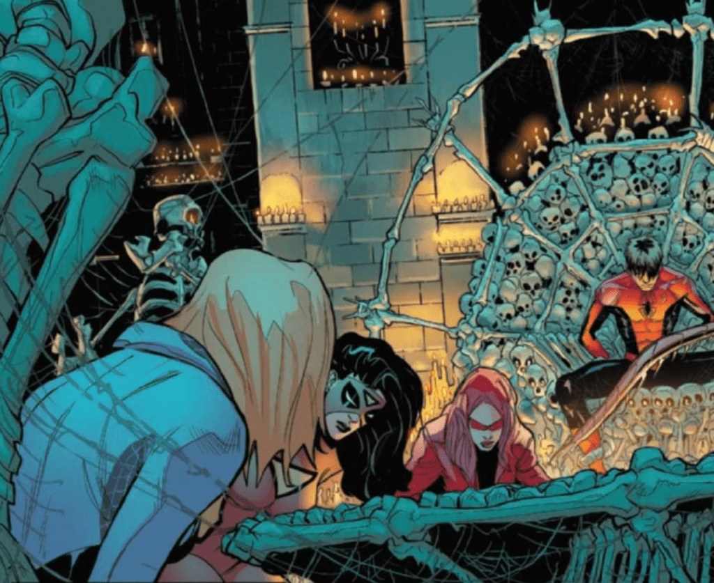
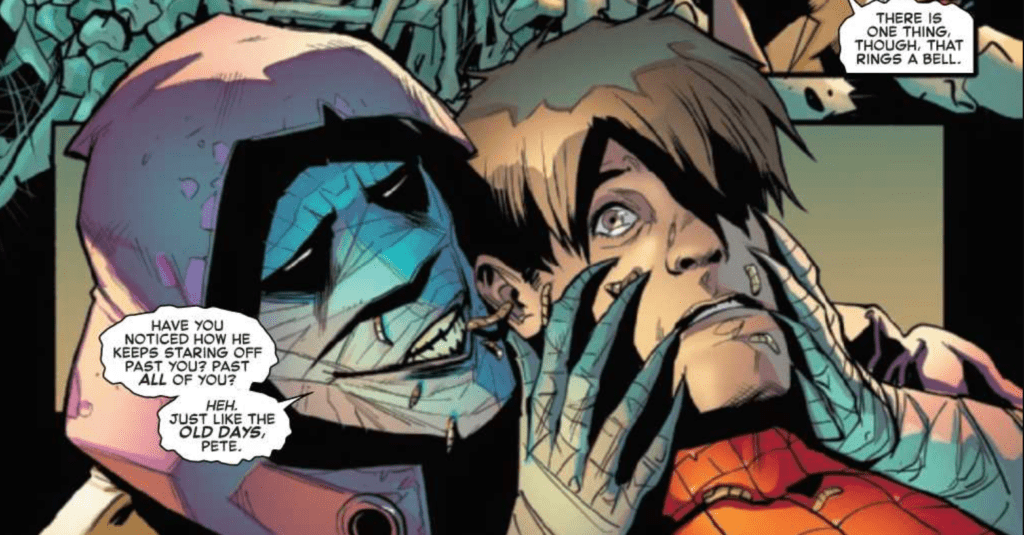
The Amazing Spider-Man #55 is where everything begins to come together but is still so far from concluding. Out now from Marvel Comics, this issue is a page-turner that will keep your heart racing, as the multiple storylines that we followed all culminate into one outstanding tale.
The Amazing Spider-Man #55 is some of Nick Spencer’s finest work in the entire series. After we have been following the stories of Kindred and Peter, Norman and Mary Jane, and the Order of the Web for the majority of the “Last Remains” arc; we finally get to see all of them connect in a scene so tense that you will be unable to stop turning the pages. The dialogue in the issue is superb and allows for scenes that effortlessly tug at the readers’ heartstrings. The dialogue is so heavily tied to the characters’ emotional connections, and we already care so much about all of the characters involved, that it is easy to become invested.
The best response I can give to describe Patrick Gleason’s art in The Amazing Spider-Man #55 is WOW. Just WOW. His work in some panels is incredibly intricate, and his characters’ faces perfectly capture the emotional scenes of the issue. The experience of reading the issue is one of flying through pages as you take in Spencer’s phenomenal story and then having to pause at the stunning artwork presented by Gleason. His depiction of Kindred is disturbing, the setting establishes a creepy tone with ease, and the action is some of the most intense I have ever seen. Gleason also uses some unconventional panel framing that adds to the eerie tone of the beginning of the issue, which helps tell Spencer’s story.
Edgar Delgado provides fantastic coloring in The Amazing Spider-Man #55, which reinforces the issue’s themes. Since the issue has a very dark tone, Delgado makes sure to reflect that in his color palette choice. However, he does not let the colors be too dark or dreary, which would result in a bland color composition, but instead finds a delightful middle ground. The colors still represent the tone, but there is still plenty of color that makes each page pleasant to look at. Delgado also provides some excellent gradients for the characters’ faces, which helps them come across as realistic.
The Amazing Spider-Man #55 features VC’s Joe Caramagna’s brilliant lettering talent, and it drastically improves the issue. Bold fonts and vibrant colors give sound effects a deeper impact and cause the blows inflicted to seem more brutal. Caramagna’s positioning of word bubbles also allows for the story to flow smoothly, which is vital for a tense issue such as this.
The Amazing Spider-Man #55 is a nearly perfect issue that had me deeply engaged the entire time. The art is jaw-dropping, and the story had me dying to turn the page and discover what happened next. The coloring helps the creepy art disturb the reader, and the lettering adds weight to the action. I really couldn’t recommend this issue enough. It had everything I wanted and more with combining the separate storylines that we followed in The Amazing Spider-Man.LR issues. I am eagerly waiting to see where the following issues will take the story.
The Amazing Spider-Man #54.LR, out now from Marvel Comics, is an issue where the plot is continually twisting and turning in ways that a reader couldn’t predict, and the art is stunning.
Nick Spencer and Matthew Rosenberg wrote The Amazing Spider-Man #54.LR, and successfully provided for a captivating issue. As the events that were set up by the previous issue begin to play out, there are twists that almost everyone would fail to predict. The surprising way the plot plays out leaves the reader wondering what will happen next and glues their eyes to the page. It all builds up to a shocking conclusion that excites the reader for the next issue in the series.
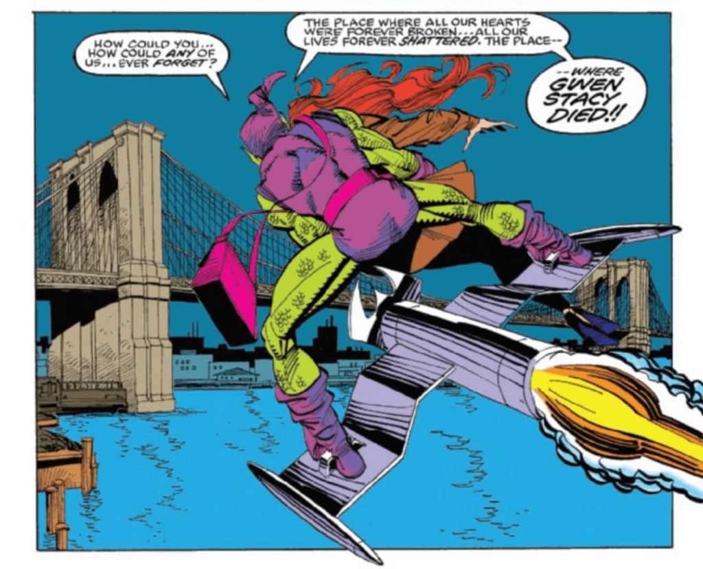
An intriguing aspect of The Amazing Spider-Man #54.LR is the inclusion of pages from Peter Parker: The Spectacular Spider-Man #200. Written by J.M. DeMatteis, drawn by Sal Buscema, colored by Bob Sharen, and lettered by Joe Rosen, Peter Parker: The Spectacular Spider-Man #200 is related to the issue because of its focus on the same characters. Since the history of the characters involved is so long, many readers may be unfamiliar with the dynamic between the characters the issue is focusing on. They included this scene to give context to new readers, and by having an actual scene from a past comic book, the reader knows the information about the past isn’t embellished in any way.
The pencils of Federico Vicentini and Takeshi Miyazawa combined with the inks of Vicentini, Miyazawa, and Scott Hanna result in a delightful cartoonish art style for The Amazing Spider-Man #54.LR. This cartoonish style allows for action scenes to have a lot of dynamism, which is difficult for highly realistic art. The exaggerated expressions they have would look ridiculous in other art styles, but here it helps easily carry the issue’s emotional moments. The style is also not overly cartoonish, but instead is a nice semi-realism that allows both a serious tone and exaggerated emotions.
The Amazing Spider-Man #54.LR features Erick Arciniega’s coloring talents, and he brings life to the issue that would have been absent otherwise. Each page’s color composition is beautiful, and the gradient backgrounds help add a creepy tone during one encounter. Arciniega also uses the technique of drastically changing a panel’s background color from the setting to help instill energy into the scene, and it works perfectly. I can not say enough good things about his performance in this issue.
VC’s Ariana Maher’s lettering never ceases to amaze. Her work in The Amazing Spider-Man #54.LR is particularly impressive, as the bold captions and choice of fonts do wonders to enhance the issue’s experience.
The Amazing Spider-Man #54.LR is an excellent issue, which shows that the story has lots of excitement to come. The art is terrific, the coloring is gorgeous, and the lettering helps make the issue a page-turner. If you’re a fan of what’s currently happening in The Amazing Spider-Man series, you will not want to miss this superb issue.
There’s not much that’s new about DC Comics’ Generations Shattered #1. It feels more like a retelling of DC history than its own original story. But somehow, writers Dan Jurgens, Andy Schmidt, and Robert Venditti, along with a huge cast of artists, colorist Hi-Fi and letterer Tom Napolitano, make this patchwork of DC favorites feel fun and fresh. It’s the dose of 80’s/90’s joy and weirdness comics sorely need right now.
Writing
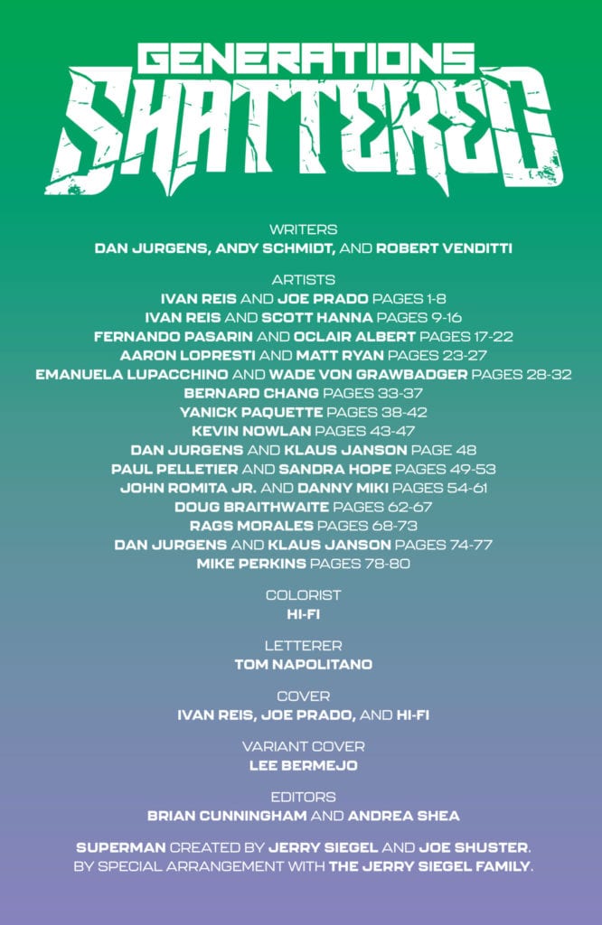
Jurgens, Schmidt, and Venditti borrow from a lot of major DC works. In fact, most of Generations Shattered #1 feels nearly identical to Crisis on Infinite Earths. A major villain is destroying the DC Universe, and a cast of heroes is brought together by someone who’s watching from out of time (dare I say, a monitor?) to put a stop to this big baddie. So why does Generations Shattered feel like it works? For one thing, it seems deeply aware of its own “plagiarism.” It rehashes Crisis to comb through it for opportunities missed. And the moments that Generations Shattered does its own thing are pitch-perfect. Old man Booster, Kamandi meeting Changeling, the general flubbing of Skeets’ entire plan. It feels so true to ’80s and ’90s comics, forever humbly nodding to its influences. It’s a creative team that’s throwing out the rule book for the sake of fun. They’re telling us a story we’ve seen before because they’ve decided it’s about time we got a rerun.
Art
There are a good 22 separate artists working on Generations Shattered #1. A little overkill? Well, actually no. Because Generations Shattered is a treasure hunt through DC’s multiverse and history. So when Dan Jurgens and Klaus Janson are drawing pages, following the Golden Age Batman, they’re deliberately imitating the style of 1940’s comics. But when we meet our very ’90s-esque supervillain, it’s John Romita Jr. and Danny Miki who take the helm, using the edgy stylistic linework we know from that era. When Generations Shattered #1 mimics works like Animal Man, with characters falling outside of panels, Rags Morales takes over. Morales’ style is remarkably similar at times to that of Chas Truog, Animal Man regular. And finally, we land in a world drawn by Mike Perkins. It’s a peek behind the curtain, a humanity behind the theatrics. Generations Shattered #1 is a spectrum of themes, eras, and styles. A team of artists brings their wildly different approaches to the table, with intense diversity to the spectrum.
Coloring
Hi-Fi is constantly adapting to each new scene in Generations Shattered #1. To match Kevin Nowlan’s style in the 1960’s scene of space battles, Hi-Fi makes the scene bright and vibrant. Much of the comic is incredibly colorful, in fact. It’s reminiscent of the Bronze and Silver Ages. Occasionally, like when Dr. Light fights Hector Hammond, we’re reminded that we’re reading a modern comic. And when we see our heroes falling through time, the scenes behind them are slightly faded. It’s like we’re watching these scenes through shards of glass as time is literally shattering. Finally, as the issue closes, Hi-Fi drains the page of all color. It’s an interesting turn. It reminds us both that we’re reading a modern comic, it feels quite new and experimental to change the color scheme so late into the issue suddenly, but it also reminds us this issue is dealing with the world of old comics. Like a 1920’s comic strip, we’re left in a strange, old world.
Lettering
So much of what makes this issue feel like a fun romp through time is Napolitano’s lettering. Napolitano’s lettering is constantly changing, especially noticeable in his sound effects. The thin lettering of an ’80s style “BWHOOSH,” marking an explosion, looks so different from the “KRAK” of 1940’s Batman breaking open a door. When we finally meet our big bad villain, Napolitano brilliantly shows us his state of mind. First, as he sees the heroes undoing his hard work, his lettering is all over the place, from small whispers of disappointment to screaming in anger. And as he makes his move, the change is chilling. We see the next few lines as cold, emotionless captions. It feels like a flex. This villain is so powerful that he doesn’t have to follow up with screaming and wailing when he makes his move. Instead, his actions speak for themselves.
DC Comics’ Generations Shattered #1 is a love letter to the DC Universe. It takes classic earth-shattering events like Crisis and Zero Hour and brings them together in one fun romp through time. It’s nothing new, but it makes for an awesome rerun. Pick up Generations Shattered #1, out from DC Comics on January 5th, at a comic shop near you!
Available now, Tales from the Dark Multiverse #1 Dark Nights Metal is the latest event comic from DC Comics written by Jackson Lanzing and Collin Kelly, originating from a story by Scott Snyder, Jackson Lanzing, and Collin Kelly. Providing pencils and inks are Karl Mostert, Trevor Scott, and Norm Rapmund. Finally, rounding out an appropriately epic creative ensemble, Romulo Fajardo, Jr. provided the colors, and Andworld Design created the lettering.
The difficulty in judging event comics lies in the fact that they aren’t really singular books. Obviously, there has been lots of set up leading to this comic. Because of the natural dependence on what came before, nothing much happens in this book. Despite the strong concept and art, the story’s heavy exposition and clichés mean the book falls flat.
Tempus Fuginaut, an interdimensional deity meant to preserve the boundaries between worlds, opens the book explaining who he is and how this world was corrupted. Batman became Barbatos, and everything was destroyed, including most of the Justice League. Now Duke Thomas, a metahuman and former Robin, is one of the few left along with Hawkman, Hawkgirl, Iron Man, and Nightwing who must defeat Barbatos.
Into the Darkness
In disguise, Nightwing has managed to fend off demons and dragons with his “multiversal frequency disruptor” that looks an awful lot like an electric guitar. But neither he nor the Justice League has managed to defeat the villains. Instead, they hide, doing their best to survive.
Duke Thomas seems to be the underdog of the story, but it’s his hope that galvanizes the remaining Justice League, and he devises a plan. While the high concept and inspiring underdog story are all well and good, by the end, Duke Thomas has an easy time defeating the enemy.
Aside from Barbatos, the story’s main villain is the Batman Who Laughs, an evil hybrid of Batman and The Joker. He’s equipped with Zatanna’s magical hand and a Joker dragon hybrid who does the dirty work. Here, we see the strengths of this book: character design.
Aesthetics
For example, The Batman Who Laughs, along with the rest of this dark, corrupted world, is full of sharp edges and muted coloring. Zatanna’s decomposing hand and the Joker Dragon are effectively disturbing for the same reason. Moreover, Zatanna’s hand permanently stuck in a Ronnie James Dio metal gesture and Nightwing’s guitar are a couple of decidedly metal aspects. Thus, Mostert, Scott, and Rapmund’s overall aesthetic are striking and exciting.
Andworld Design’s lettering, while fun, feels quite conventional in keeping with the established DC/Richard Starkings look. Unfortunately, each of these elements makes for a mediocre, forgettable read. Regardless of some conventionality, unnecessary expository monologues from Joker and Tempus Fuginaut, and plot conveniences, the most disappointing aspect of this event book is that it just isn’t very metal.


 Stokoe’s art returning from Joker War Zone fits perfectly into Batman Annual #5. The inherent absurdity of Gotham City can feel like a walk through Hell, and Stokoe’s grotesque imagery displays that in full. That is certainly what Bao’s perspective has when it comes to his family’s murder.


 Michael Badilino/Vengeance (as his name suggests) is a Spirit of Vengeance, much like the Ghost Riders. Originally appearing as a co-star with the Danny Ketch Ghost Rider, he was killed in battle along with their mutual enemy Hellgate.

")