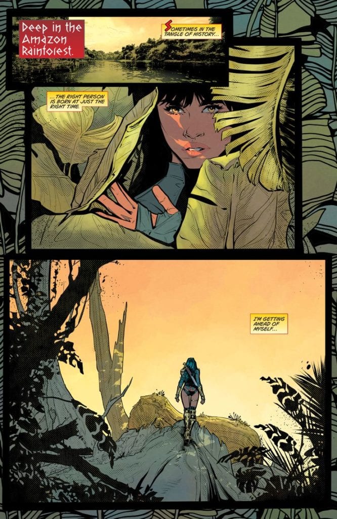
FUTURE STATE: WONDER WOMAN #1, out now from DC Comics, is the first issue of a two-issue miniseries by writer/artist Jöelle Jones, colorist Jordie Bellaire, and letterer Clayton Cowles. With an ingenious, fun plot and gorgeous, captivating artwork, this issueserves in these difficult times as the ultimate escapist adventure.
Writing
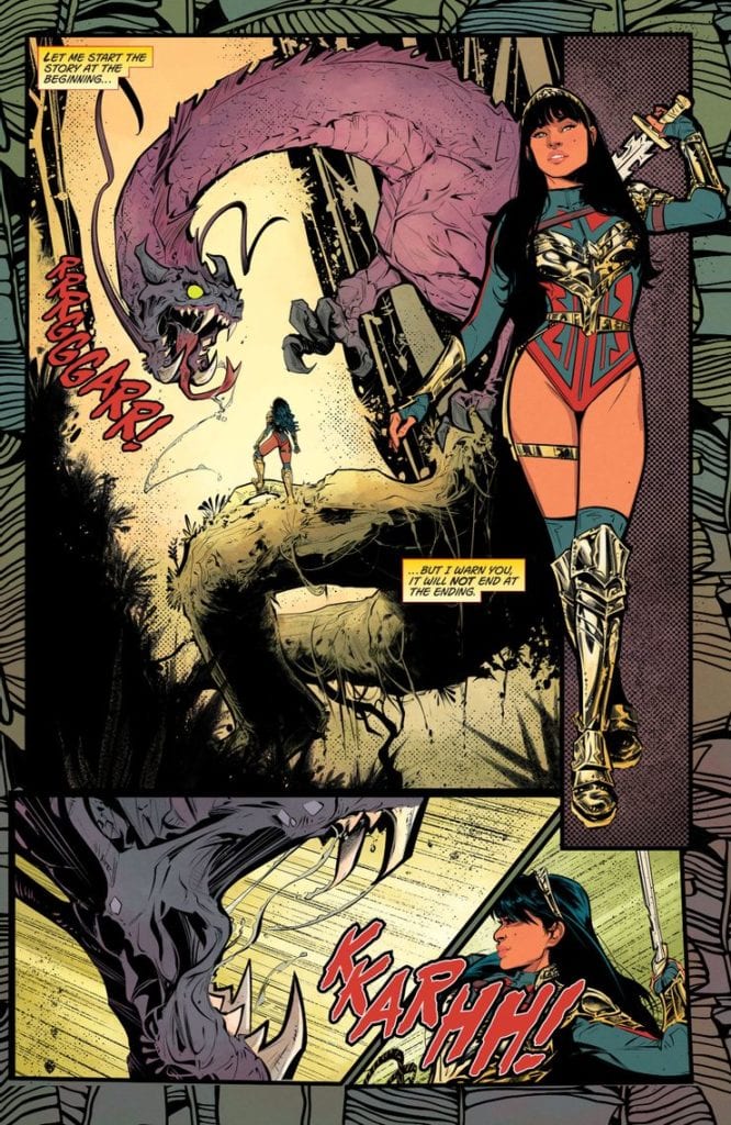
Within the first 8 pages, Jones solves an issue readers have pointed out for a long time regarding DC’s heroes- they’re too perfect and powerful to be able to relate to them. Jones manages to solve that by introducing Yara Flor as a heroic character, a woman on a mission; Yara serves as the mediator between the gods and humanity. She is powerful, cheeky, and unapologetic. But, Jones doesn’t let us forget throughout the entire issue- Yara is also flawed and makes mistakes. Those errors move the plot forward brilliantly and make it too easy for the reader to fall in love with the futuristic Wonder Woman instantly.
Art
To help the reader get further engaged, Jones hones in on each background character’s looks. The feeling I’ve personally got when catching glimpses of those background characters that end up having nothing to do with the plot reminds me of the feeling people got when experiencing Star Wars: A New Hope for the first time. I couldn’t help but feel this fiery curiosity inside to know more about these characters. I immediately started wondering about their backstory or about what adventures are they going to embark on- A feeling I haven’t felt in a long while.
Also, the facial expressions look skillfully expressive; the backgrounds look well-detailed, beautiful, and engulfing. Everything about the artwork enchants the reader. Personally, I’m looking forward to getting further lost in the world Jones has created.
Coloring
Bellaire’s coloring in this issue basically invites the reader to enjoy this world’s uniqueness even more. Bellaire colors each page with vibrant, bold colors that make the pages pop wonderfully, elevating Jones’ magnificent artwork and complimenting it. Most notably, the way Bellaire colors the skin tones always remains realistic to a certain extent but still makes each character look full of life. Great work from Bellaire.
Lettering
Cowles’ lettering definitely delivers and manages to elevate the fun even more with colorful sound effects and balloons. Almost every character in Future State: Wonder Woman #1 has its own unique, stylized balloon. Cowles also places the balloons in a way that never distracts the eye. I especially liked Cowles’ choice to never design the captions as a perfect square, making it a lot more appealing to the eye. It’s another “lettering rule” Cowles breaks to elevate the comic’s freshness.
Conclusion
Admittedly, this first issue makes me wish it didn’t have to end so soon. Future State: Wonder Woman #1 is a breath of fresh air; A perfect example of why Jöelle Jones is a rising star in the comics industry. Strongly recommended to anyone who wants to escape today’s harsh realities and embark on a wild adventure.
Comic superheroes are not Sherlock Holmes, who holds a Guinness World Record for being portrayed 254 times since his creation. In terms of this number, they are not even close. Yet, ask any kid whether they know Batman and Superman along with Sherlock? The answer will very likely be YES, with the high probability that younger kids will recognize superheroes even faster.
Kudos to DC Comis: they have surely succeeded in capturing the hearts of their fans and beyond. The dominance & rivalry of Marvel and DC in the comic industry became so evident that even people whose interests are far from the comic world know the central characters and the universe they come from. Both Marvel and DC penetrated not only cinema and video games but also the more distant niches. For example, you’ll easily find Marvel-themed LEGO packs or slots dedicated to DC superheroes — brands exploit this as a sure-bet theme for their new products.
However, the knowledge of an average person about comics ends here. Sometimes, we’re sorry to realize how many universes never intersect with the minds of the majority. DC and Marvel may be the largest brands, but not the only ones worth exploring.
Today we’re going to bring some justice into this Injustice and present you with a few indie comic publishers, some of which you could have never heard about.
Aftershock Comics
Aftershock is the freshman on the comic market — the company was founded in 2015. Despite being that young, it already gained some popularity among comic fans, to some extent thanks to the prior experience of founders: Joe Pruett, author of iconic experimental book Negative Burn, and Mike Marts, who was an executive editor at both Marvel and DC of X-Men and Batman franchise.
The publisher is known for superb visuals and future-oriented, dystopian narratives. The most popular examples of its titles are apocalyptic Stronghold, a tale of dark powers Babyteeth, and insanely uncomfortable Animosity.
Antarctic Press
Antarctic Press is quite a well-known yet still an alternative comic book publisher. Specializing in “amerimanga” with its distinctive art and storytelling practices, it offers a different perspective on the American comic market and also contributed a lot to developing furry comics. Overall, they published over 850 titles since the company’s birth in 1984.
The titles to pay attention to are iconic Ninja High School, the oldest publisher’s series, which is still running, Gold Digger, and Box Office Poison. Antarctic Press also issues a lot of political parody series — right now, for example, the main page of their website is all about Trump’s comic collection.
Last Gasp
Last Gasp is positioning itself as a distributor of underground art and writing for 50 years. The themes and attitudes of the company always have been ahead of time. They are known for exploring ecological issues in their Slow Death since 1970: the times when the plastic boom everyone is talking about now was only unfolding. Also, they created an influential all-female anthology titled Wimmen’s Comix, which focused on the feminist concerns of the 70s-80s.
Nowadays, Last Gasp is focusing on graphic novels, art, and photography books. However, the vintage underground comics series are definitely worth reading today — they are still available for purchase on their website.
Oni Press
It’s hard to say that Oni Press is a little-known publisher. There are plenty of Oni Press comics based on Nickelodeon. You, as a comic fan, likely know that Rick & Morty is one of the publisher’s flagships, with Invader Zim and Kaijumax following the leader.
The publisher avoids “superhero” themes, focusing more on romance, drama, thrillers, and cartoon-related topics. They value realism in their stories, yet with some exceptions: for example, a relatively new series, The Vain, is about the company of robbers who are also vampires.
Iron Circus Comics
Iron Circus Comics was founded in 2007 and was largely specialized in issuing an erotic comic anthology named Smut Peddler, which was created by women for women. The publisher stepped aside, creating only erotic comics later on, and now the company’s titles include political-themed books like Banned Book Club and re-imagination of traditional European folktales like The Nixie of the Mill-Pond and Other European Stories. This is the one from our list that is open for submissions now: who knows, maybe you will be the next rising star in the comics universe.
Aside from these five, there are dozens of decent publishers to check out, including the younger ones. The brightest examples of those started within the last 5 years are TKO Studios, Behemoth Comics, AWA Studios, and Darkside Comics.
“The Independent Filmmaker’s Guide to the New Hollywood: Success in the Era of Netflix and Streaming Video” is author and filmmaker Gabriel Campisi’s third book about the business of filmmaking, this time focusing on the streaming storm that’s evolving the way we consume entertainment.
PopAxiom spoke with Gabriel about falling in love with movies, how things have changed, and his latest book, “The Independent Filmmaker’s Guide to the New Hollywood: Success in the Era of Netflix and Streaming Video.”
First Films
“My father was a private investigator,” Gabriel says when I ask about where filmmaking came into his life. “He had a Super-8mm camera. When I was 8 years old, I watched Star Wars, and I wanted to make movies from that day forward. But I had no idea what I was doing at that age.”
Gabriel not only received the gift of a Super-8mm camera from his father, but he also learned a few tricks. “My father taught me how to do still-frame animation,” he says. And soon he started putting all these new skills to the test. “By the time I was 13, I was shooting a lot more elaborate short films. By the time I was 15, I did one and sent it out to a huge film festival, and I won first place.”
The success of The Lost Creature was only the beginning for Gabriel. “I just kept going after that. I love it. Filmmaking is in my blood. Right after high school, I started working ground-level as a production assistant, and eventually got into camera work, production supervising, and editing.”
About The Independent Filmmaker’s Guide
“The Independent Filmmaker’s Guide to the New Hollywood: Success in the Era of Netflix and Streaming Video” is Gabriel’s latest book on the film industry. “By the time I was 25, I was doing a lot of big stuff. I was working in Hollywood, and on my way up.”
But then life happened. “At 25, I took a big detour,” he reveals. “I was forced to step away from the business due to personal family issues. I still stayed in the game by advising other filmmakers and helping with their movies.”
Consulting work is what paved the way for writing about making movies in his first book, “The Independent Filmmaker’s Guide to Writing a Business Plan for Investors.”
“The first book I wrote because I helped a friend get financing for his film in Los Angeles. He wanted to make a movie and knew all about production, but not about the business and the money. So, I started coaching him.”
Later, Gabriel says, word got around, and he “helped a few others do the same thing.” Friends kept telling him to write a book to help independent filmmakers figure out financing, but Gabriel “wasn’t convinced.”
However, after a year of prodding from and arguing with filmmaker friends, Gabriel “finally put together a business plan with a cover letter and sent it out to five book publishers. All five publishers responded within a month or two and said yes, they were interested. I was blown away. I didn’t think that would happen.”
Gabriel’s second book, “The Independent Filmmaker’s Guide to Writing a Business Plan for Investors — Second Edition,” was the 2012 follow-up. Gabriel wrote it, he says, because “the business had started to change.”
Now, “The Independent Filmmaker’s Guide to the New Hollywood: Success in the Era of Netflix and Streaming Video” comes on the heels of more seismic changes in the industry. “I’ve seen how much has shifted in just the last five years. It’s completely upended the business.”
Gabriel says what has happened is unprecedented. “The market changed, the strategies changed, the technology changed, and the business changed,” he says about Hollywood over the past decade. “Before you could sell units, you could count DVD sales or movie tickets. Now, we are dealing with online metrics and analytics, and it’s a whole different thing. So, I told my publisher it might be time for a new book.”
“The Independent Filmmaker’s Guide to the New Hollywood: Success in the Era of Netflix and Streaming Video” is not about how to make a movie. “In the introduction, I say, today the technology is so cheap that just about anyone can go out and make a movie. The book’s not about that. It’s about making a movie for commercial success in today’s industry.”
Streaming Versus Cinema
“I interviewed a bunch of my friends from Hollywood — filmmakers, producers, and executives,” Gabriel says about the book. “I spoke to studio level, the middle of the road, and independent filmmakers alike. In the pre-COVID world, they were already trying to figure out how to get people out of their homes and into theaters.”
The pandemic has hurt the exhibition business even more. “However, I don’t think movie theaters are going to go away,” Gabriel says.
We discuss the possibility of “vertical integration.” Back in the 40s, judges considered it counter-productive to allow studios to also own theaters. “They considered it unfair to third-party players,” Gabriel says. “Now, with streaming, the competition shifted, and they took it down.”
The streaming showdown is in full effect. In 2020, NBC/Universal and Warner Brothers, two major studios, launched their streaming services to compete with Netflix, Amazon Prime, AppleTV, and Disney+. Gabriel says, “A lot of people don’t know this, but Netflix and all these companies are losing money hand over fist. The competition is so fierce, and you have to get new customers and retain old customers. The only way to do that is with more products. Content, content, content. So, they’re spending billions every year to make new content so that they can stay on top.”
“The other platforms, Disney, Amazon, etc.,” he continues, “are spending billions to fight Netflix and get a piece of the streaming pie. They’re betting on the future by spending billions today. Who knows who will be standing ten years from now?”
Can streaming services continue to justify spending hundreds of millions of dollars on a project? “There’s going to come a time when they can’t justify the expenses any longer, but the reason they do it is to offer the audience something they can’t see elsewhere.”
Gabriel says no one knows for certain where this is all going to lead, and then jokes, “There’s a lot of creative accounting, too, but that’s a whole other book!”
New Game
The age of streaming presents new opportunities for both creators and viewers. But it creates new problems, too. “The biggest thing is that it’s a whole new game. I have friends that are still stuck on the old system. They’ll shoot an indie movie for a few hundred-thousand dollars, and then they can’t get the sales they need to cover the budget. They take it all around the world, and nothing happens to their expectations. It’s a buyer’s market. There’s so much product.”
“The pie is getting bigger,” he says about the modern age of seemingly endless amounts of content. “But the slices are getting smaller. That’s the number one thing I tell everyone. As long as you keep that in mind, you can proceed accordingly.”
As Gabriel’s book discusses, the proper things include taking advantage of new paradigms. “You can work with an aggregator or distributor, know where the movie is going to end up. I tell everyone now, you need to talk with your distributor first. Get an idea, realistically, about what kind of money you can make. Ten years ago, you could shoot a movie for half-a-million dollars and sell it all over the world. You’d easily quadruple the money. You can’t do that anymore. You have to try and do a deal ahead of time.”
Gabriel shares a story of how things happen today in the business. “People will now go to a channel with several projects to pitch. And the channel will say, ‘No, on this one, we’re doing something like it; this one is too dark, but we like this one.’ The channel will say, ‘If you shoot this movie and get this actor, we’ll give you a million dollars. So, the filmmakers go off and shoot the movie for half-a-million, let’s say, because they know they’re not getting more than a million. They deliver the movie, receive the money, and profit that way.”
Gabriel’s book goes into great detail about the four elements you have to keep in mind these days, which he calls the four pillars of Hollywood. “First, it’s proper communication, second is entertainment, third is technology, and fourth is the business. You have to well-versed in all of these things. If just one of these is off, you run the risk of not doing well. A lot of filmmakers tend to only worry about one or two of the four.”
Gabriel talks about a guy he knew who went out and got the best equipment available, but made a terrible movie with it. “He had the technology,” Gabriel says. “But technology alone is nothing more than a tool. A paintbrush is only as good as the artist.”
Wrapping Up
Decades after learning a little animation and how to use a Super-8mm camera, there is no lack of enthusiasm for making movies when talking to Gabriel. “Movies are our imagination come to life, and it’s part of who we are. What’s the difference between a hundred years ago and today? Nothing. We’re still expressing our imaginations.”
“The Independent Filmmaker’s Guide to the New Hollywood: Success in the Era of Netflix and Streaming Video” is out and available at book retailers both online and off.
So, what’s next for Gabriel? “Well, I had two movies that came to a grinding halt because of the pandemic. The big thing now is, and I asked for permission to reveal this, I’m working with Scott Mitchell Rosenberg, one of the coolest filmmakers you’ll ever meet. He’s the guy behind all the Men in Black movies and Cowboys and Aliens at Platinum Studios. I’m on the production and creative team that also includes filmmaker John Lechago, another amazing person. I can’t say more at this time, but hopefully soon audiences will get to see what we’ve been working so diligently at.”
Is The Independent Filmmaker’s Guide to the New Hollywood: Success in the Era of Netflix and Streaming Video on your reading list?
Thanks to Gabriel Campisi and October Coast
for making this interview possible.
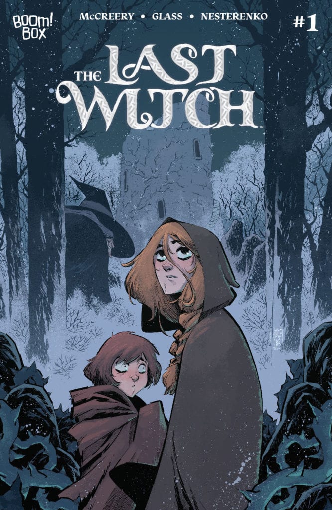
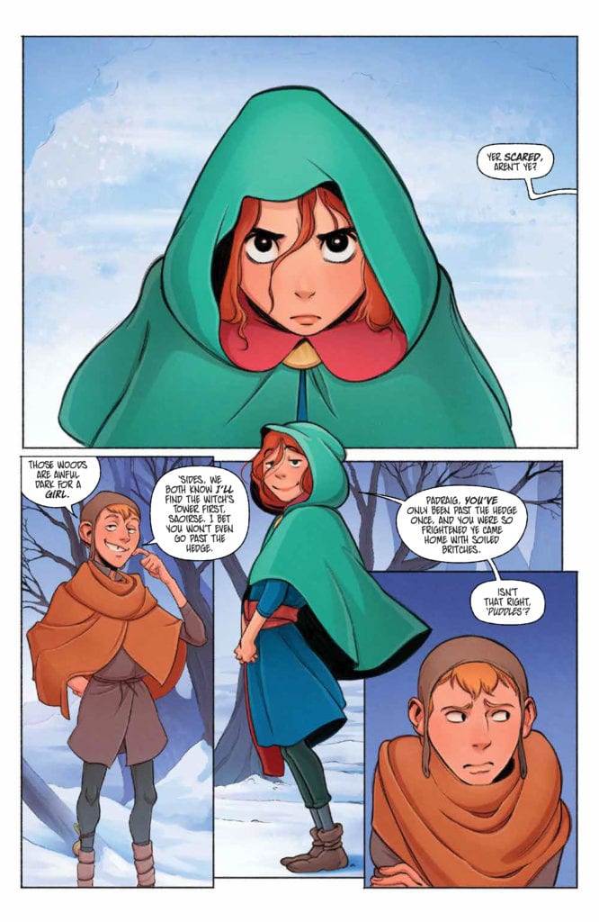
LAST WITCH #1, available now from Boom! Box is the first issue in a brand new series. One that feels like a fairy tale of old, as Saoirse starts an adventure that she will very likely find a very different ending for.
Saoirse and her brother are featured here on the variant cover of Last Witch #1
Last Witch #1 is a bright and bold introduction to a brand new series. One that feels eerily familiar in many ways. If you’ve ever read a fractured fairy tale, then the odds are good that you know exactly what feeling the Last Witch sets out to elicit.
Conor McCreery (Writer), V.V. Glass (artist), Natalia Nesterenko (colors), and Jim Campbell (letters) teamed up to bring this imaginative world to life, and it truly does strike upon the desired notes. Right from the first page, there’s this sense of magic about to descend.
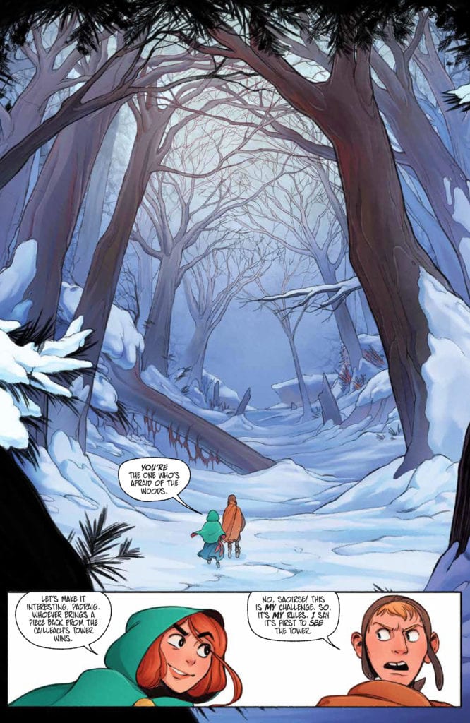
The series begins with young Saorise, a determined girl who wants to go off on an adventure. Boy, is she about to get that wish. She’s always been told to never enter the woods during this time of the year – for that is when the witch seeks her prey. As you might have guessed by now, the witch’s prey is children. Naturally, we all know that Saorise is about to disobey that order. Yet that is only the beginning of this strange new tale.
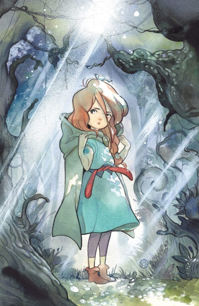
A little Saoirse takes center stage on this variant cover of Last Witch #1.
The Writing
Last Witch #1 is a tale that immediately sucks the reader into the narrative. Saorise is every bit a typical child. She’s stubborn and driven and feels chafed by all the rules that her elders set upon her. Feel familiar?
It’s the perfect setting for the rest of the tale to leap from. McCreery weaves in classic narrative elements, many of which are common to fairy tales and folklore, while also portraying a new journey in the process.
In many ways, the first issue reads with a strong sense of inevitability. We all know that Saorise is going to disobey the rules. We all know that she’s going to put herself (and potentially others) in danger. What we don’t know is how long it will take before the tide turns. Or how badly things will go once they do.
The fact that Last Witch is already proving to be compelling despite these known factors is impressive. It’s making creative use of our expectations and assumptions (thanks to years of reading tales with similar tones), and I, for one, can’t wait to see where it’ll take us next.
Another impressive feat for this first issue would have to be the characters themselves. We’ve only been reading about them for a little less than forty pages, yet they already feel real. They feel human, and thus their endangerment or loss also feels real.
A determined face for the start of this series.
The Art
The artwork is one of the many elements that make Last Witch #1 shine so. The colors are bright as the snow portrayed upon the pages. Which, combined with the bolder designs and shapes, makes for a captivating scene.
Saorise’s design steals the show on many occasions. Her vibrant hair and cloak are certainly meant to do exactly that. Yet, it isn’t the only feature worth talking about. The artwork carried with narrative elements as well, some of which would never have worked in any other format.
Take that sense of foreshadowing, which appeared simply by one repeating word. Followed by the horror that comes with its sudden absence. It was wonderfully done and helped to enhance that entire series of events.
Look at that stunning forest! No wonder she wants to explore it.
Conclusion
Last Witch #1 introduces a series worth checking out – especially for any fan that loves a good retelling. With a few twists, that is. The combination of familiar and new will leave readers enjoying this series; that much is already quite clear.
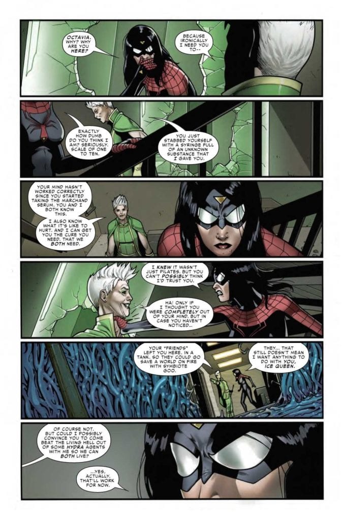
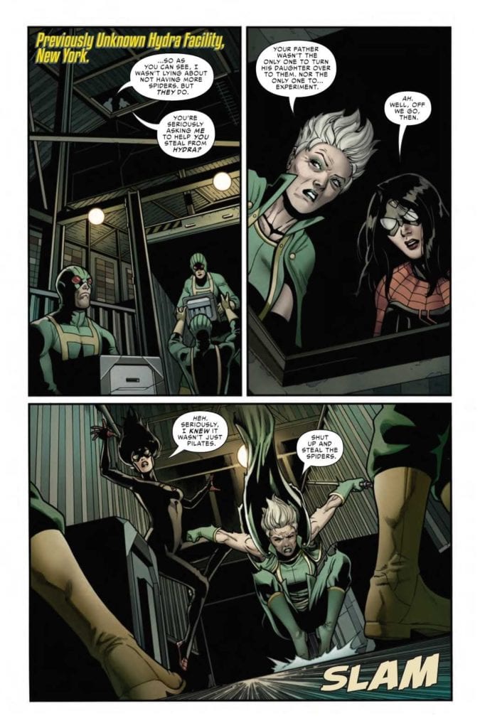
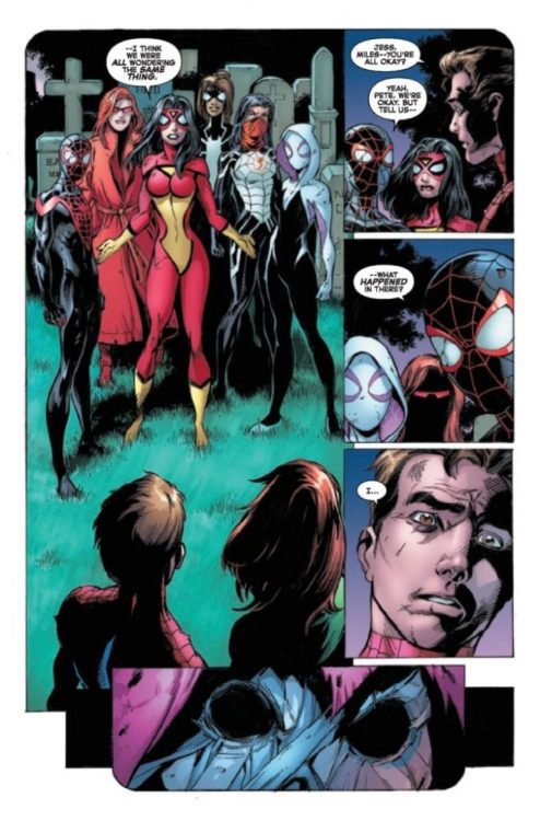
SPIDER-WOMAN #8, available now from Marvel Comics, is about to portray a version of Jessica Drew that fans don’t typically get to see. All while a major war is happening in the background, as The King in Black rages on.
Jess is not looking great in Spider-Woman #8.
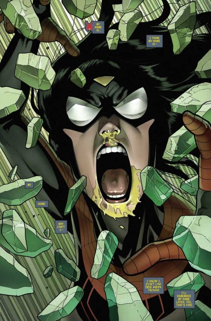
The Knull Invasion may be in full force, but that is not the first concern on Jess’ mind. Heck, it’s hardly a blip on her radar – despite all the reasons why she should be very concerned. Instead, she’s entirely focused on finding the cure not only for herself but for her niece, and eventually, for her son as well.
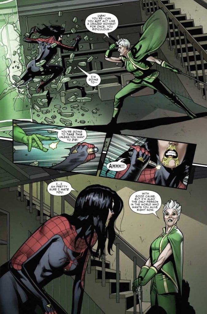
All good reasons to be concerned, to be sure. Yet her temporary cure comes with just as many problems as it solves. As evidenced by her behavior in Spider-Woman #7. Not to mention her reasoning for joining up with a new ally.
This is an ally that any Spider-Verse reader will recognize on sight, and with good reason. Now, Spider-Woman #8 is about to dive into a new series of adventures, and they’re going to come with quite the cost.
Not my first choice in a partner, but desperate times?
The Writing
As you might imagine, Spider-Woman #8 brings with it many surprises. Good to know that Karla Pacheco still has a few dramatic twists hidden up her sleeve. The progression (or rather, regression) of Jess’ mental state has become so painfully clear.
A fact that becomes even less avoidable if one was to go back and binge the series all in one go. Her character has changed drastically over the course of these eight issues, and it’s starting to feel like the transition is far from over.
What is really telling is that this major event, King in Black, has become a background event for Jess. Which, if one was to stop and think about it for even a minute, doesn’t make much sense. Seriously, where is her family at the moment? Is there anyone ‘safe’ at the moment?
Those concerns merge with concerns surrounding Jess’ actions, as Spider-Woman continues her hunt for a cure. It is admittedly interesting to see the different ways in which these two women think and how they handle different problems. Yet that interest is not enough to outweigh everything else rising to the surface.
And so a plan is forming.
The Art
As with the rest of this entire series so far, Spider-Woman #8 is full of brilliant artwork. Sometimes literally, as the case may be. It seems at times as if the colors themselves were about to pop right off the pages.
Pere Perez’s artwork is exactly what Spider-Woman’s series needed. The myriad of emotions and battles her character goes through in a single issue are perfectly captured here. Sometimes in shocking detail.
Meanwhile, Frank D’Armata’s set the tone. The green hues practically feel sinister, while the darker tones help to carry it all. The bright pops of color feel almost alarming in contrast, a fact that was certainly intentional.
VC’s Travis Lanham really outdid himself here, as once again, Jess’ actions really do carry impact. Sometimes literally, as crashes and crunches happen all over the pages. There’s no denying the damage this woman is causing.
Okay, this team-up is actually pretty terrifying.
Conclusion
Spider-Woman #8 is a tense and compelling read, albeit a concerning one. The creative team behind this series has done a wonderful job taking risks while also giving Spider-Woman plenty of chances to show off her abilities.
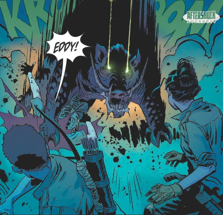
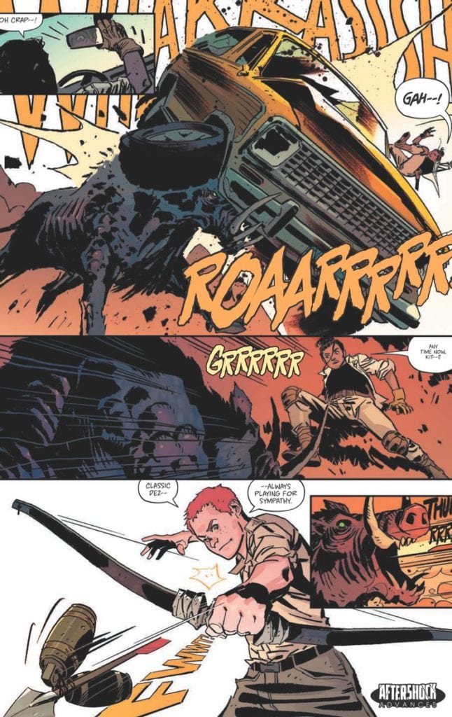
In AfterShock Comics’ latest futuristic drama, Scout’s Honor, a new world order has been built on an archaic belief system. This new series flings the reader into the distant future and asks the question on everybody’s mind, What happened to the Ranger Scouts of America? The comic is a character driven thriller from the writer of Going to the Chapel, David Pepose, and artist Luca Casalanguida.
Scout’s Honor #1 Credit: AfterShock Comics
Badge of Honor
A group of survivors fight to stay alive in a world that has turned against them. The remnants of a civilisation long since destroyed has grown up on the beliefs and teachings of one man, the true profit, Doctor Jefferson Hancock. With a problematic system of trial and reward, the new religion is based on the Ranger Scouts of America, with the worship of bravery and honor. But as the plot unfolds, age old corruption and greed are shown to have survived along with the hierarchy of power.
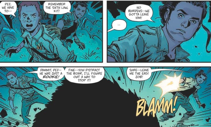
Scout’s Honor is a story told through character moments. David Pepose has crafted an elaborate world but it is presented to the reader by defining the people Pepose introduces. A dramatic opening plants the seed for the future environment before jumping forward in time to introduce Dez and Kit, the central characters. A battle with a radioactive boar is a chance to shape the environment and cement the characteristics of Dez and Kit but the moment is quickly over. The boar itself is a plot device to establish the dangers of the world and highlight the bravery of the two boys before the plot moves on.
Pepose plans each scene as a way of expanding the reader’s understanding of Kit and leaves the difficult world building to Luca Casalanguida. The art work is detailed and portrays an uninviting world where the only warmth is indicated through the orange glow around the uncomfortable religion. The contrast between the words the Scout Master says and the realities depicted across the pages is a scathing indictment of religion. The written words of a childhood organisation have been twisted to form a misogynist gang of reward seekers. It’s like the Cat Religion from Red Dwarf but without the jokes, or the assimilation of Church and Military in certain episodes of Doctor Who. Pepose has deconstructed two modern institutions and turned them into a hellish nightmare world.
Scout’s Honor #1 Credit: AfterShock Comics
Future Images
The atmosphere created in the opening of Scout’s Honor is reminiscent of The Last American published by Marvel in the 1990’s. John Wagner and Alan Grants dystopian future has a single character walk through the detritus of American culture in a burnt out, forgotten world. Casalanguida appears to be channelling Mike McMahon’s style in the opening pages of Scout’s Honor before he populates his world with a host of survivors. The sense of dissolution within the landscape is forefront in the art even as the action sequences swirl through the panels like miniature whirlwinds blowing up dust. It is clear that the actions of these survivors have no great impact on the world and this gives the entire book a solemn feel, punctuated only by the brightness of the central character.
Kit is bold and beautiful throughout. Written as a true hero, Casalanguida imbues Kit with a dynamic element that it’s impossible to ignore. The coloring throughout the book is reflective of the locations but Kit’s bright orange hair is both a reminder of the all consuming religion and a way to make Kit stand out on the page. Matt Milla makes sure that the reader can find the hero at all times. His use of lighting within the panels is cinematic at times but goes beyond this, creating a hyper-realistic setting. The emotional charge of the story is brought out through the ever changing emphasis on light and shadow. Returning to the character as the central theme of the comic, the lighting is a representation of Kit’s many emotional aspects, changing as the character’s situation changes.
Throughout the comic there are a number of overlapping voices. At some points the caption boxes relate to a church service while the panels follow Kit through the, mostly unseen settlement. Three different voices speaking together, overlaid across the panels. Carlos M Mangual gives each voice a distinctive color. He changes the intensity of the color in the caption boxes to represent the strength of the voice or voices that are speaking so that you can easily distinguish between preacher and congregation.
Scout’s Honor #1 Credit: AfterShock Comics
Conclusion
Scout’s Honor is packed with twists and turns. Pepose leads the reader through this world in the wake of Kit’s adventures, always one step behind and playing catch up. This story format never lets you take a breath so that by the end you find yourself totally engrossed in the world. It’s difficult not to be swept up in the action and, before you know it, you’re on the final page, eager to turn back to the start and retrace your steps at a slower pace. You will find yourself wanting to take in the majesty of the art work and the complexity of the storytelling.
The comic contains some big themes that it has only just begun to explore but because these fit snugly into the plot it never becomes preachy. The characters are engaging and the art work is superb. AfterShock Comics have a successful track record with thrilling and intriguing stories, check out Bad Reception and Undone by Bloodas perfect examples. And with Scout’s Honor they have another surefire hit on their hands.
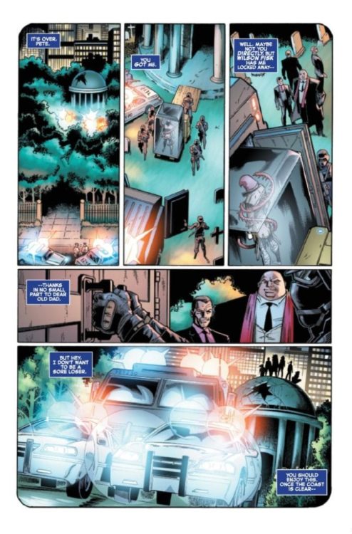
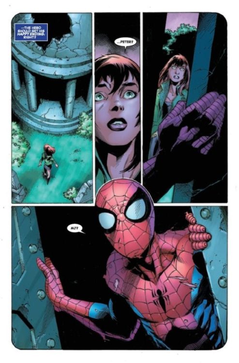
THE AMAZING SPIDER-MAN #57 hits your local comic book shop next week, but thanks to Marvel Comics, Monkeys Fighting Robots has an exclusive four-page preview for our readers.
“Last Remains: Post-Mortem, Part 2” is written by Nick Spencer, while Mark Bagley handles pencils, Andrew Hennessy and John Dell with Andy Owens drop inks, Rachelle Rosenberg and Edgar Delgado are the colorists, and you will read Joe Caramagna’s letter work.
About the issue:
Spider-Man continues to pick up the pieces and try to put his life together. But many of the gathering storms are swirling more and more violently… We want to tell you more, but it WOULD SPOIL SO MUCH OF LAST REMAINS!!!
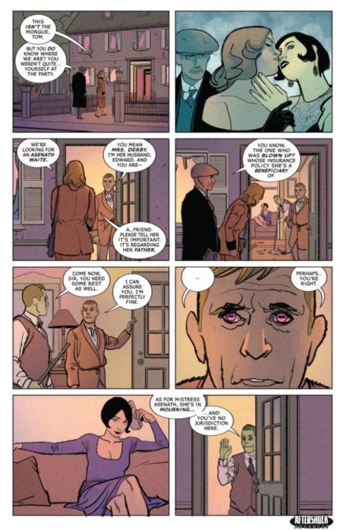
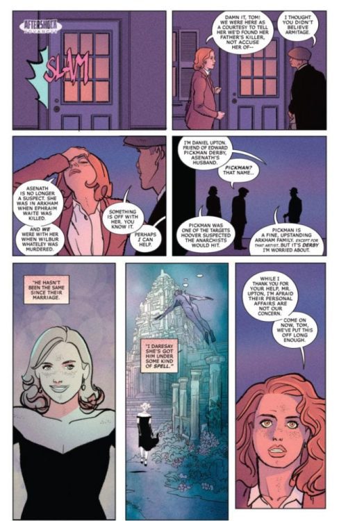
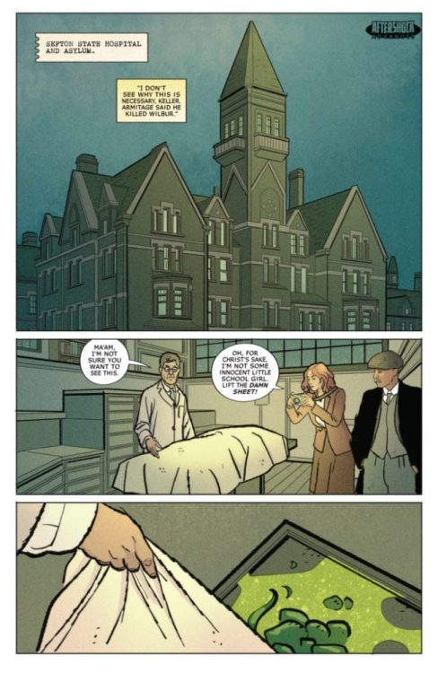
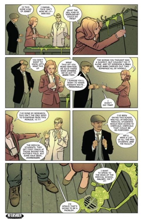
MISKATONIC #3 hits your local comic book shop on January 20, but thanks to AfterShock Comics, Monkeys Fighting Robots has an exclusive four-page preview for our readers.
The 32-page comics is written by Mark Sable, with art by Giorgio Pontrelli, Pippa Bowland drops the color, and you will read Thomas Mauer’s letter work. The main cover is by Jeremy Haun with Nick Filardi.
About the issue: Skeptical Bureau of Investigation Agent Miranda Keller and true-believer detective Tom Malone are tasked by J. Edgar Hoover to investigate a series of bombings in 1920s New England. Traveling to the Arkham Asylum, the investigators discover their suspects aren’t just insane, but also undead. Who could be re-animating them?
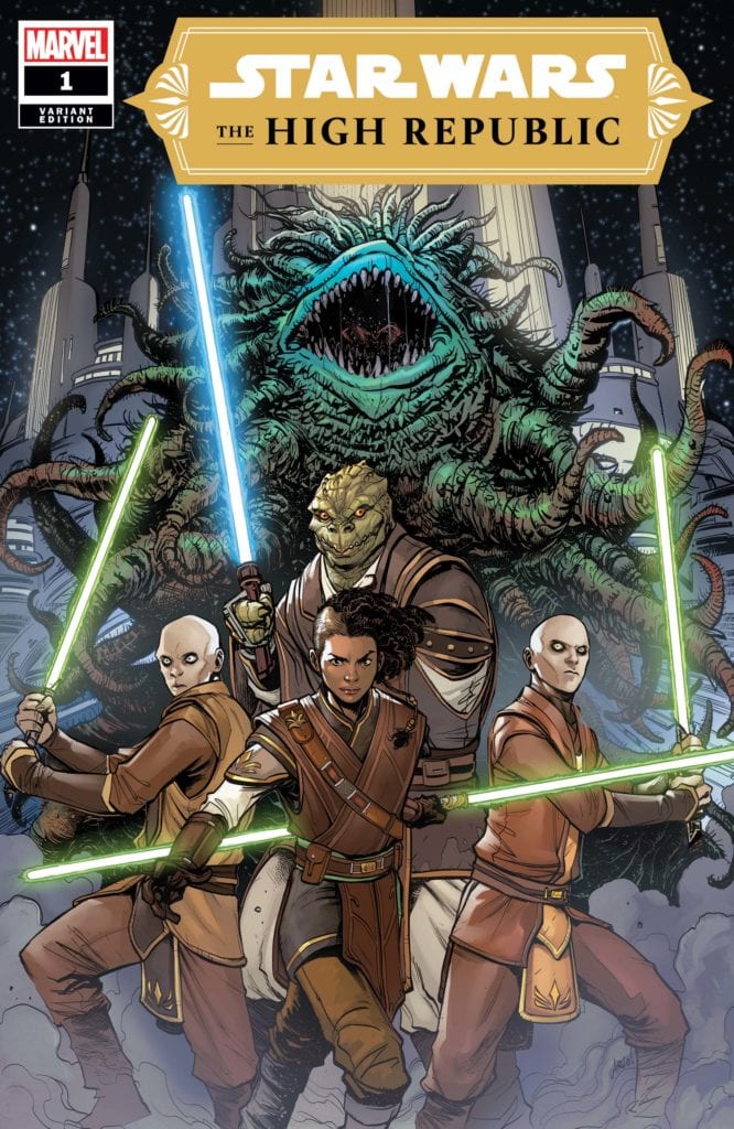
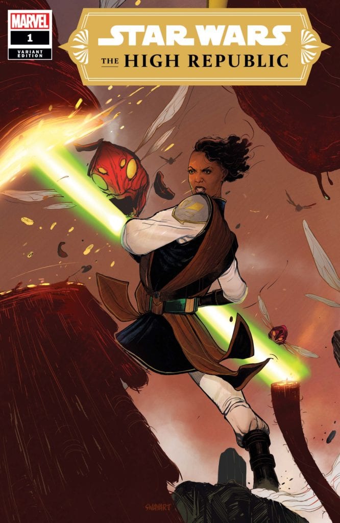
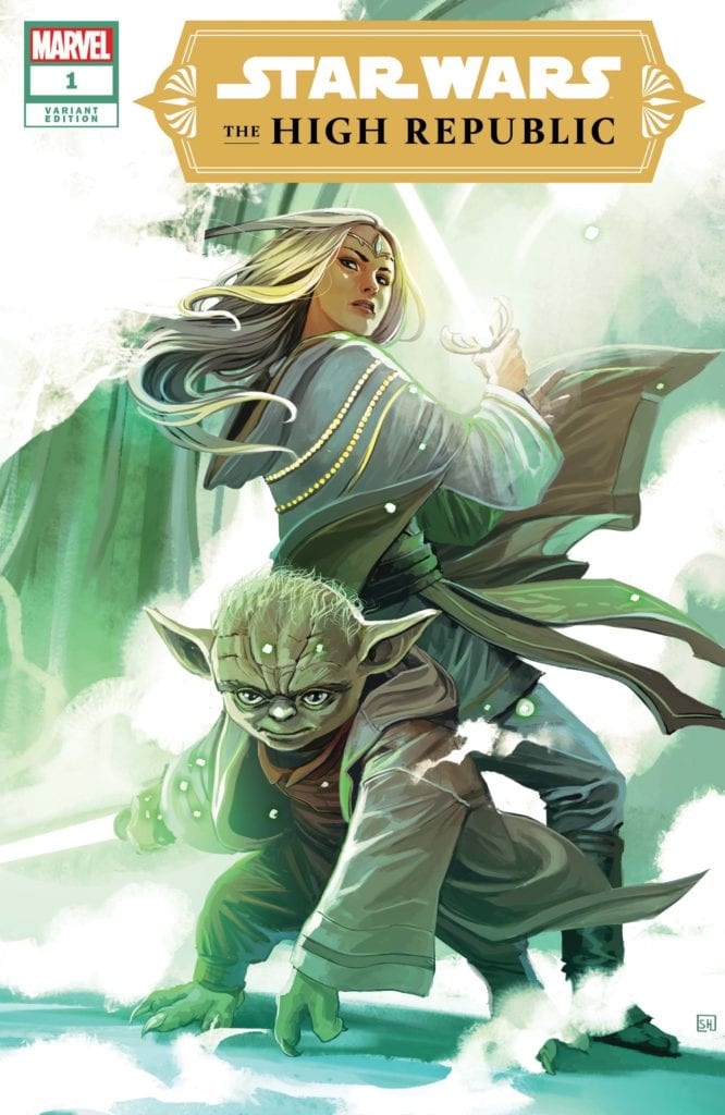
A long time ago, in a galaxy far, far away, the Republic and the Jedi Order were at the peak of their prosperity. Writer Cavan Scott and artist Ario Anindito, along with inker Mark Morales, colorist Annalisa Leoni, and letterer Ariana Maher put together “Star Wars: The High Republic” #1, the first chapter of this unseen age in the Star Wars universe. Set some 200 years before the rise of the Galactic Empire, this issue presents an era full of fantastic new characters (and some old ones) and exciting action, all through the lens of some of the best visual work seen in a Star Wars comic. There’s a lot to be excited for here.
“A new era of STAR WARS storytelling begins. It is centuries before the SKYWALKER SAGA. The JEDI are at their height, protecting the galaxy as REPUBLIC pioneers push out into new territories. As the Frontier prepares for the dedication of majestic STARLIGHT BEACON, PADAWAN KEEVE TRENNIS faces the ultimate choice – will she complete her Jedi Trials or rescue the innocent from disaster? New Jedi! New ships! New evils to fight!”
Writing & Plot
In terms of style, “The High Republic” #1 feels familiar while offering completely new faces, planets, and concepts. Tonally, Cavan Scott’s script feels like a combination of Filoni’s Clone Wars animated series and some of Dark Horse’s The Old Republic offerings. These are grafted together to create a chapter that still come off as totally new while still being undoubtedly Star Wars. Protagonist Keeve Trennis is an awesome new character, focused and loyal to the Jedi way while also having a sort of underworld grit. Her mysterious master is a character that I really look forward to reading more of, as well as just getting to witness the Star Wars universe at this time. This is an era of Star Wars we’ve never gotten a look at, in the centuries just before the fall of the Jedi Order. Scott doesn’t start this series with any kind of grandiose view of the Republic however, as he instead decides to just focus on character with some hints at the larger plot. This more intimate focus and pacing allows for an experience that makes you immediately get into the new characters ad they take you along for this force-wielding ride. The action in this issue again is reminiscent of that Filoni animated style, with a kind of wacky but serious disaster unfolding that is a blast to follow while still having serious stakes. There’s so much we still don’t know abou these characters and the focuses of the Republic and the Jedi Order (as well as their potential adversaries) in this time period, and this comic makes my desire to explore this story and part of the Star Wars universe inescapable.
Art Direction
Putting together the aesthetic and style of not just the iconic Star Wars universe, but a time period in that universe that has never been seen before, is no easy feat. Fortunately, “The High Republic” #1 has the visual talents of artist Ario Anindito and inker Mark Morales to craft a comic that is unmistakably Star Wars while still offering brand new sights. The designs and animations of alien species both new and classic are crafted with an eye for humanity, making them characters on their own regardless of their unusual physiology. Almost every panel has the mysterious design language of a Ralph McQuarrie painting, with the Star Wars brand of space opera beauty shining through. This is a comic book with obviously very high production value, and that can be seen in the high-fidelity visuals on each page. The art style of Anindito and Morales, along with the colors by Annalisa Leoni, fit in with the styles seen in the past few years of Marvel’s Star Wars comics. This is not a negative, as I’ve yet to see a recent Star Wars series with less-than-great art. The panel and page direction has the feel of a storyboard, giving the comic a very film-style feel. The highly dynamic use of lighting and fog here works brilliantly, making the stunning alien world this issue mostly takes place on feel humid, while being onboard the Starlight Beacon feels like taking a step inside the Jedi Temple in the prequel trilogy, but with a bit more golden atmosphere. The colorwork on display here is exceptional; the flora and fauna of alien planets is a varied but grounded array of natural colors, while character details (from Jedi robes to alien horns and scales) have their own wide array of tones. Seeing the cool blue reflection of readouts and holo-displays on characters is still a really cool artistic feat that I’ll never not be impressed by. The letters from Ariana Maher use a slim, modern kind of font that uses a bit of variance from character to character, along with standout sound-effect letters. Every aspect of this book’s visuals fire on all cylinders, and it’s easily one of the best looking Star Wars comics ever published.
“Star Wars: The High Republic” #1 has made me excited for Star Wars is ways I haven’t been in quite some time. This comic displays a fantastic understanding of the Star Wars universe, and uses said understanding to create characters and concepts that seamlessly blend into this fiction, but still feel totally new. The script from Cavan Scott takes the perspective of a protagonist I had a blast reading about from page one, and paints intriguing mystery into this new chapter in Star Wars history. The efforts of the visual team are absolutely astounding, creating some of the most gorgeous views and vistas seen in a Star Wars comic. Whether you’re a Star Wars fan or not, this is a comic worth reading. Be sure to pick it up from your local comic shop when it releases on 1/6!
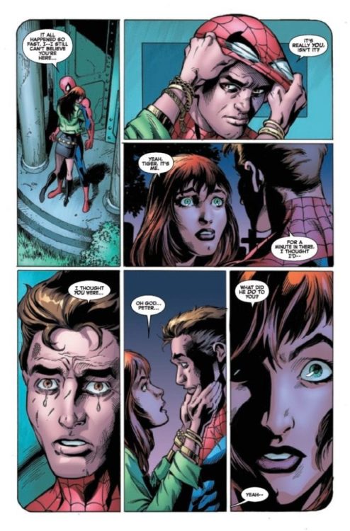
The Amazing Spider-Man #56, out now from Marvel Comics, is an explosive issue that is the first part of “Last Remains Post Mortem” and keeps the story twisting and turning.
About the book: Norman Osborn and the Kingpin have united to achieve a common goal of trapping the demonic Kindred. The alliance of two of his deadliest villains immediately spells bad news for Spider-Man, but will anyone else be caught in the crossfire?
Nick Spencer has a gift. He knows how to keep an issue entertaining, and he heavily applies that knowledge in The Amazing Spider-Man #56. It feels like every turn of a page is some twist or shocking event, making the entire issue an enthralling read. The issue also continues subplots that hadn’t been touched upon for many issues, and it was refreshing to see these characters and how their stories are playing out after everything that has been happening. The story continues to bombard us with new information, but there is always so much more that we don’t know. It is because of this that readers always want to get their hands on the next issue.
The Amazing Spider-Man #56 features Mark Bagley’s pencils and Andrew Hennessy and John Dell’s inks. Together, this team provides some breathtaking art. The characters’ facial expressions are complex but are still very easy to understand. This issue features a brilliant silent page that has so much storytelling just from the visuals alone. It’s always wonderful when the writer allows the artists to tell the story without dialogue, and there is a beautiful case of that in this issue. Bagley, Hennessy, and Dell also use the exciting technique of changing panel shapes to indicate a flashback. In this series, flashbacks were commonly portrayed through a tint applied to the panels, but the method of changing panel shape was most likely used here because the events shown were still very recent. The technique of changing panel shape is a subtle yet effective way to indicate flashbacks.
The coloring of Rachelle Rosenberg and Edgar Delgado in The Amazing Spider-Man #56 is astonishing and has a wonderfully broad color palette. This issue features many different scenes, and the wide color palette brings each of the settings to life. The shading of characters’ faces also serves a vital role in the book’s visual storytelling and causes the silent panels to pack a vicious punch. Rosenberg and Delgado use changes in the background color to indicate a shift in tone, reinforcing cues that could be understood from the characters’ facial expressions.
VC’s Joe Caramagna’s lettering in The Amazing Spider-Man #56 helps the story flow naturally and has an enjoyably diverse choice of fonts. Whether through giant bold lettering, dialogue bursting out of a speech bubble, or unique speech bubble designs for characters, Caramagna makes every instance of lettering count.
The Amazing Spider-Man #56 is another case of so much information thrown at us, yet so much is still left unexplained. The art and coloring work together to portray some beautiful and complex emotions in the characters, and the visual storytelling in this issue is remarkable. The lettering brings it all together and leaves us with an impressive issue and a story that leaves readers wanting more.