Home Blog Page 196

X-O Manowar #4: The Power Vacuum Tears Itself Open

X-O Manowar #4 Cover

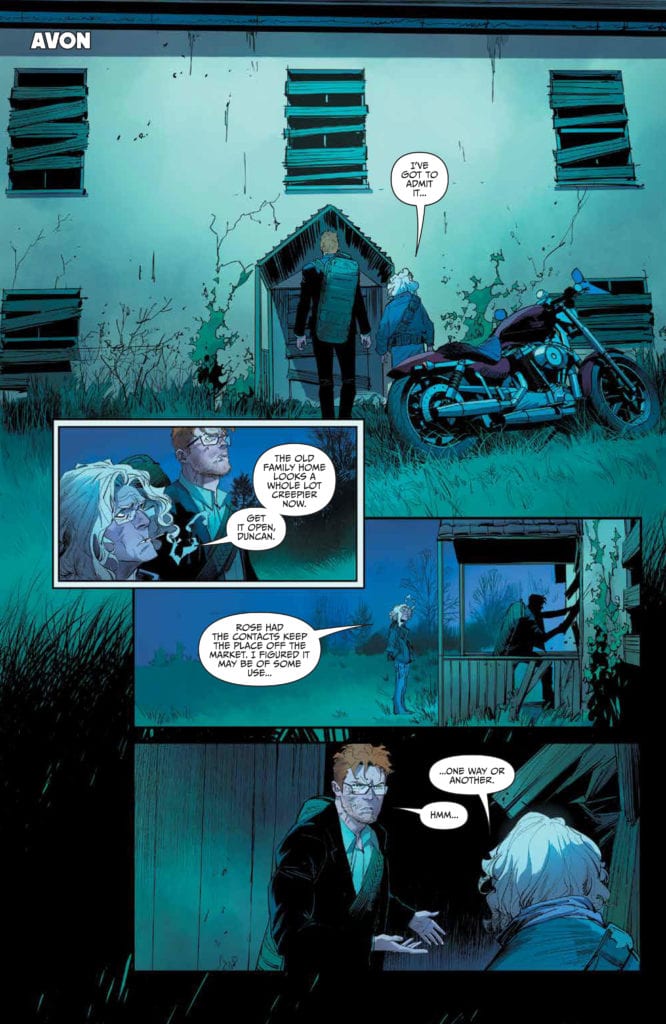
X-O Manowar #4 drops on January 27 to close out one subplot to focus on another more dire one. It’s a plot that writer Dennis Hopeless builds up since the introduction of Troy Whitaker. Artist Emilio Laiso provides a grand scale for the reader to follow within the issue. All while colorist Ruth Redmond and letterer Hassan Otsmane-Elhaou add a  decorative spectacle.

X-O Manowar #4: Firing On All Cylinders

Within X-O Manowar #4 is a conflict with Aric’s character and how it is shared between reader and characters. In the beginning, everyone is anticipating something to happen. The reader shares feelings with just about every character on display. Aric’s adoptive family remains hopeful for Aric to defeat Ukrainian warlord Yakiov after everything he’s done. Then there’s Yakiov who, while confident that his plan against Manowar will work, connects to the reader by not being dumb enough to think he goes down easily.

Hopeless displays the best and worst of X-O Manowar #4 during the climax. He presents Aric in a place that, while not perfect, is great after everything up to this point. The problem arises when all of that development seems to go down the drain in one moment. Just when things look good, Aric flies into a blind rage. The reader shares frustration with the armor Shanhara’s who tries to be the voice of reason.

Scales Of Spectacle

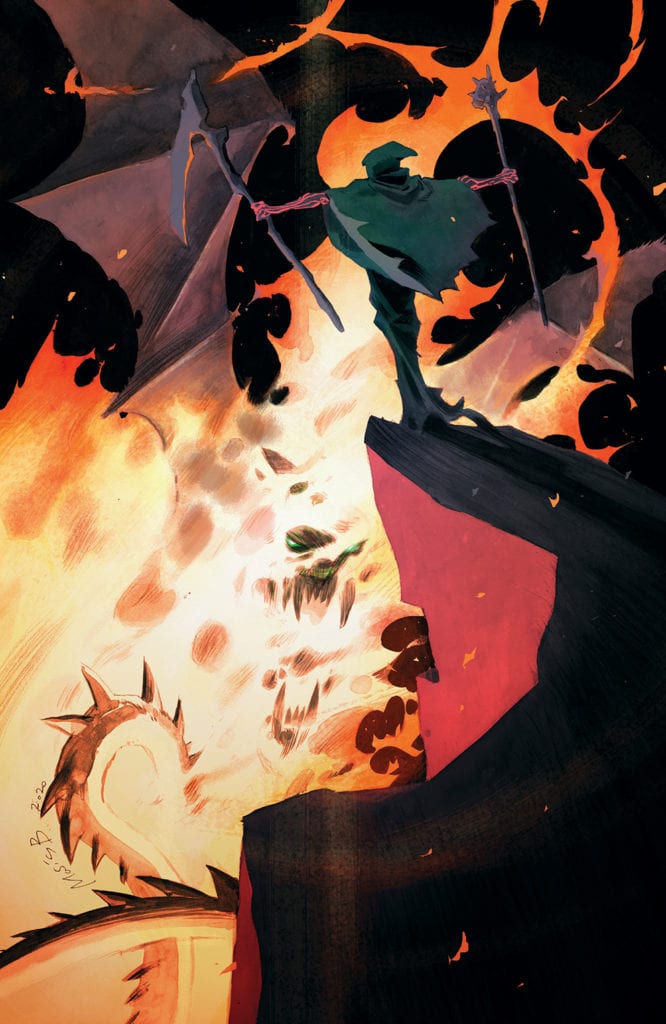
X-O Manowar #4 features stakes and action rising in scale. Laiso illustrates with both detail and panel size the conflicts of the issue. Aric’s adversary Yakiov gloats like a madman at some of the damage and equipment he has ready for a slaughter. That one large panel matches two other panels on the following pages for attacks on what looks like X-O Manowar.X-O Manowar #4 page plot point

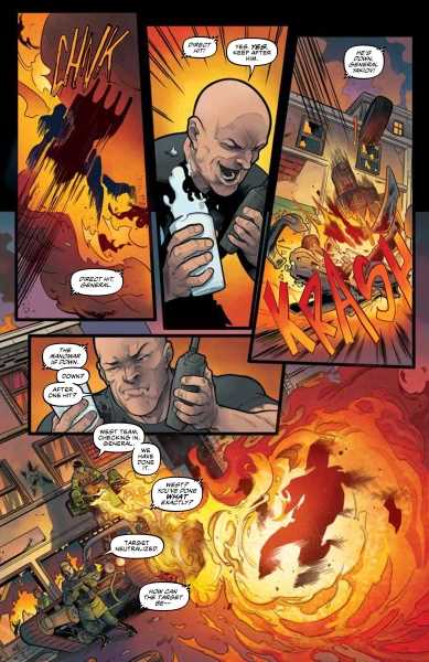
Redmond’s coloring furthers that illusion as the blow on “X-O Manowar” matches the fires Yakiov already set off. Combine this with intensely drawn SFX from Otsmane-Elhaou, and it looks like a killing blow. Unless like Yakiov, the reader finds the word balloons from his army odd after hearing conflicting descriptions. It’s nice to have characters and the reader on the same wavelength; it allows them to follow events easier.

X-O Manowar #4 Hooks Readers In

X-O Manowar #4 is enjoyable for taking the time to empathize and communicate with its readers to the point where the reader feels like they play an important part of the story. They genuinely feel the excitement, anticipation, and frustrations that come off the pages. The plot points and moods never feel like hand holding, just different points-of-view that the reader jumps into. Every character and artist brings out their best to reach out to the general audience, creating an experience where everyone is a piece of a bigger picture.

Monkeys Fighting Robots Youtube

WANDAVISION – Filmed Before a Live Studio Audience & Don’t Touch That Dial | TV Review

After an unintended yearlong break, the Marvel Cinematic Universe is back with their first show for Disney+, WandaVision. The first two episodes have been released on Disney+ and it sees the MCU go in an unusual direction.

Wanda (Elizabeth Olsen) and Vision (Paul Bettany) have moved into retro suburban America. Vision works as a company that does something, and Wanda is a housewife. They must deal with typical sitcom situations like cooking a meal for Vision’s boss and the pair having to perform at a neighborhood talent show. However, the suburban bliss is not all that it appears.

Out of all the Marvel Disney+ shows WandaVision was the one I was the most interested in. It seemed the most unique out of all the shows because of its visual style and retro approach. The first two episodes harp to sitcoms of the 1950s and ‘60s, particularly The Dick Van Dyke Show and Bewitched. They were both filmed in black-and-white, the aspect ratio was 4:3 and both episodes had title sequences that homage to the aforementioned sitcoms. The humor presented was also like what was in those shows like Vision causing a distraction to prevent his guests from seeing chaos in the kitchen and Wanda trying to fit in with the fellow housewives. Their superpowers added to the mix.

The first two episodes were more than just sitcom shenanigans. Vision died in Avengers: Infinity War and Wanda came back from the dead. This leads to questions about what’s really going on. The suburban world had a Truman Show/The Stepford Wives vibe because it seems perfect but there’s something more sinister going on. Even in the first episode Wanda and Vision get hints that not everything is what it seems, like not knowing what the message on the calendar meant and there were questions like what Vision’s company does, or why they don’t have wedding rings? It reminded a little bit of the scene in Inception where Ariadne realized she was in a dream.

The big question is Marvel doing a “House of M” style storyline where Wanda created an alternate reality to cope with her grief or is she being manipulated in some way. The first two episodes provide evidence for both cases. The first episode ends with the couple being watched on TV and the second episode showed Wanda changing the fabric of reality.

The first two episodes had a fair amount of surrealism to them. There were moments where the illusion of the sitcom was broken. In the first episode there was the eeriness of the dinner scene, whilst the second episode had the appearance of the Beekeeper. The surrealism, retro-styling, and the potential broken mental state of the main character made WandaVision seem like the MCU’s version of Legion. This surrealism and mystery give the series its hook and you would want to see where the story goes.

Even at this early stage WandaVision is a bizarre series that properly won’t please casual fans of the MCU who are more used to action and spectacle. It is an interesting homage to TV of yesteryear, and it would be interesting to see where the series goes.

Monkeys Fighting Robots Youtube

Review: FUTURE STATE: SHAZAM! #1 – The Big Red Cheese Has Changed

Future State: Shazam! #1 Cover

Future State: Shazam! #1, out now from DC Comics, introduces us to a colder and less caring version of the world’s mightiest mortal and leaves us questioning what could have made him this way.

Written by Tim Sheridan, Future State: Shazam! #1 tells the tale of the big red cheese as the leader of the JLA. As a leader, he is closed, cold, and secretive, basically the opposite of how we’ve known the light-hearted and childish hero in the past. Throughout the entire issue, the reader is left to wonder what could have caused this drastic change, and it results in each page drawing the reader in.

Future State: Shazam! #1 Writing Example

Eduardo Pansica’s pencils and Julio Ferreiro’s inks create some jaw-dropping art in Future State: Shazam! #1. The issue contains some unquestionably stunning splash pages. One thing that I really enjoyed about the art was the portrayal of Shazam. When he appears on-panel, his hulking muscles and clearly defined eight-pack make it entirely believable that he would have the power of the gods. It would also be a sin not to mention how well Pansica and Ferreiro can portray fabrics. The issue is full of capes billowing in the wind and clothes that aren’t skin tight, and each time they appear, they make the issue feel more realistic because of how accurately they are drawn. Pansica and Ferreiro also do a fantastic job at switching up perspectives between panels, which gives the issue a very cinematic feel.

Future State: Shazam! #1 Art Example

Future State: Shazam! #1 features the coloring talents of Marcelo Maiolo, who brings a broad color palette to the issue. Maiolo is never afraid to use distinct colors, which results in a visually compelling issue. The art of Pansica and Ferreiro seems to have a darker and more realistic tone, which is contrasted by the bright color choices of Maiolo. I found this quite enjoyable because the coloring felt like a nice reminder of the characters’ mystical world, despite the story taking a more grim tone. The gradients used and the shading of the faces in the issue are gorgeous and bring the art to life.

Future State: Shazam! #1 Coloring Example

Rob Leigh makes several atypical lettering choices in Future State: Shazam! #1, and each one does amazing things to improve the issue. Whether making lettering extend off-panel several times in a row to give the feeling of a blaring siren or making a font specific to a character, Leigh brings his A-game in this Future State title.

Future State: Shazam! #1 is an issue full of gorgeous art and a story that will leave you wondering. It is Shazam as we’ve never seen him before, and every page floods your mind with new questions to be answered. The end leaves off on such a cliffhanger that it would be difficult not to pick up the next issue when it is released.

Monkeys Fighting Robots Youtube

4-Page Preview RED ATLANTIS #4 From AfterShock Comics

4-Page Preview RED ATLANTIS #4 From AfterShock Comics

RED ATLANTIS #4 hits your local comic book shop on February 10, but thanks to AfterShock Comics, Monkeys Fighting Robots has an exclusive four-page preview for our readers.

The book is written by Stephanie Phillips, with art by Robert Carey, Rosh drops the color, and you will read Troy Peteri’s letter work. Robert Hack designed the cover.


About RED ATLANTIS #4:

A series of unexplained, violent crimes on Election Day around the U.S. leads the FBI to zero in on a covert group of Russian terrorists.

When a Texas journalism student named Miriam Roberts accidentally finds herself mixed up in the investigation, her life will never be the same. Gifted or perhaps cursed with powers that she can’t control, Miriam is on the run from the FBI and Russian secret agents, fleeing a crime she didn’t commit and can’t explain. Forced to question even her own identity, is there anyone left for Miriam to trust? With political espionage, treason, and even mind control, can she clear her name and stop the U.S. from entering a new Cold War?


Enjoy the AfterShock Preview Below:

Monkeys Fighting Robots Youtube

Review: RAIN LIKE HAMMERS #1 – Living The Stagnant Life In A Walking City

Master of weird and subversive comics, creator Brandon Graham (King City, Prophet) returns again with dead-future sci-fi comic “Rain Like Hammers” #1. This strangely beautiful first chapter echoes with its scant storytelling style and huge, empty rooms and landscapes. A clever and effective look at depression and dealing with change, this is likely to be one of the most unique and noteworthy comics in 2021.

“Eugene is a new inhabitant of Elephant, a walking city on the desert world of Crown Majesty. Far from friends and family, he spends most of his time navigating melancholy daydreams, toying with alien technology, and researching the best places to find high-quality fast food. At best, his life is lonely and monotonous—but all of that changes when a mysterious force begins destroying Crown Majesty’s walking cities!”

Writing & Plot

Brandon Graham’s messaging behind “Rain Like Hammers” #1 isn’t  grandiose in scale or subject like you may expect a science fiction comic to be. In fact, this is a book that only focuses on the monotonous day-in and day-out activities of the protagonist, Eugene. This entire comic is told from his perspective as he wakes up, gets cheap meals from a vending machine, goes to work, and comes home to his tiny apartment to watch reruns of his favorite tv shows before falling asleep. Then he wakes up and does the exact same thing. The fact that this all takes place in a walking city on a distant planet sometime in the presumably distant future means basically nothing until the last few pages of the comic. This could easily take place in Seattle or Little Rock for all we know. The only things going through Eugene’s mind are the people he misses in the city he came from and what he’s looking forward to later in the week (he saves his money to buy a better quality meal to go with his favorite show). Watching Eugene’s life felt uncomfortably relevant, which is exactly what good sci-fi does. What’s different here though is that the most obviously relevant part of this story is just how similar life for so many of us feels compared to Eugene’s. The man’s highlight of the week, after days of cyclically working a mind-numbing office job, is coming home to see a movie or show and getting to spend a bit extra on some slightly better quality food. The same could likely be said for many of us. The rest of the comic’s dystopian commentary doesn’t feel intentional, and more like a byproduct of the story Graham is telling. The vast emptiness of the environment reflects this dismal future, where the technological advances are incredible but they aren’t actually benefitting anyone. The scripted writing is a mixture of some scant dialogue among Eugene and his coworkers, but it mostly involves an omniscient third person take on Eugene’s own thoughts that elaborates on elements beyond the protagonist’s own understanding. There’s a quirky humor here that keeps the comic from being too bleak, as the story’s obvious commentary on depression would be too much if not for the small does of goofiness. This is a completely unique story in terms of writing, equal parts inventive, weird, and frighteningly relevant.

Art Direction

Like most comics, the true beauty and meaning “Rain Like Hammers” has is taken from the artwork, and Brandon Graham’s abilities as both artist and writer bring this book’s written and visual cohesion is as near-perfect as a comic can be. Graham’s quirky, minimalistic designs inhabit a gaping world devoid of personality, and this is exactly the point. Watching Eugene wander the massive near-empty rooms of Elephant makes the audience feel just as alone as he does. Stylistically, the art is definitely reminiscent of some of Moebius’s works, especially in the designs of the landscapes and the moving cities themselves. What’s so different in Graham’s work though is that his details are more pointedly obvious than they are just to make the world seem “real.” Everything in the city feels so sanitized, and every room looks almost the exact same as the last because that’s the point. We only get to see a few different rooms, from Eugene’s tiny apartment to the mess hall and to his office, and they all lack any sort of definition besides a couple objects and how Eugene interacts with them. The visuals make this story echo with both confused wonder and sadness and sadness. The color palette is scant and often dull, focusing on pale blues, grays, and pinks that engulf the entire page that they’re on, occasionally dotted by streams of abstract color. Eugene is often lit by the images of his television screen, which display a much larger variety of color than anything actually going on within the comic. Small details like these amplify the resounding sense of isolation that this book offers, even while its demonstrating its clever sense of humor. The lettering is a hand drawn and highly dynamic font that punctuates every moment with dialogue and narration in a manner that carves its tone across the panel just as much as the art does. This is a beautiful book in its own right, crafted in a manner that makes perfect sense for the kind of comic it strives to be.

“Rain Like Hammers” #1 is an immensely clever, deeply sad, and frighteningly relevant comic for our era in history. Brandon Graham has crafted an opening experience that is a one part dialogue on depression, another part commentary on life in our society, and another part dystopian science fiction tale. The dialogue and narration is deeply poignant and wickedly clever, while the visuals are perfectly unorthodox in such a manner that this story could only be presented in. Do yourself a favor and grab a copy when it hits your local comic shop on 1-20.


Monkeys Fighting Robots Youtube

Review: TEENAGE MUTANT NINJA TURTLES: JENNIKA II #3 Solves A Mutant Town Mystery

TEENAGE MUTANT NINJA TURTLES: JENNIKA II #3 hits comic book stores on Wednesday, January 20th, revealing the true culprit behind the unstable mutations in Mutant Town. These dangerous transformations of citizens living underground have led to an even greater stigmatization of the disenfranchised community. Fortunately, Jennika and her acquaintance Ivan are here to unearth the mystery. And as readers will find, appearances can often conceal the truth.

Story

This story opens with Jennika and Ivan exactly where it left off last issue—smack dab in the middle of a group of mutants living in the underground. Despite rumors of their danger, the two find the truth to be much more interesting. It turns out they’re no different than those living aboveground, yet they somehow face even more hardships.

Unfortunately, the conversation is broken up by an abrupt scorpion mutant’s attack. Armed with strange syringes, it becomes clear this mutant is responsible for initiating the underground people’s mutations. But is she acting alone?

Brahm Revel’s narrative accomplishes an important task. It offers clever social commentary on the nature of the haves and have-nots. Despite the supposed scariness of the mutants living underground, it appears there’s a separate player taking advantage of them. The question: Who is funding them?

Artwork

Revel’s penciling and ink work simultaneously details fast-paced action sequences and dramatic exchanges between Jennika and the other characters. These are fleshed out with his use of bright hues for our heroes set against darker backdrops, helping make their movements pop off the page. And Revel’s lettering is effectively placed around each character, preventing them from becoming obscured while simultaneously framing their forms.

Conclusion

TEENAGE MUTANT NINJA TURTLES: JENNIKA II #3 reveals the Mutant Town mystery in satisfying fashion. We’re anxious to see where this knowledge pushes Jennika in the following stories.

Do you think Jennika can handle these threats facing Mutant Town all by herself? Let us know in the comments below!

Monkeys Fighting Robots Youtube

Review: KING IN BLACK #3 – “Oh Shit!” Moments A Plenty

Review: KING IN BLACK #3 "Oh Shit!" Moments A Plenty

King in Black #3 hits your local comic book shop this week, and Donny Cates throws out one of my favorite insult lines which brought a chuckle to my body and had my kids questioning my sanity.

The first issue of King in Black was full octane, issue two took the pacing down several notches, and issue three is somewhere in the middle. King in Black #3 had several “Oh shit!” moments, but the book also felt very intimate and less like a blockbuster event. It’s like the difference between a Michael Bay and Robert Rodriguez film. This is where you would like to be a fly on the wall for the discussion between Cates and artist Ryan Stegman. Who chose the “camera angles” in the panel layout? My preference is wide shots so the reader can feel the scale of the story. The tighter shots used in King in Black #3 didn’t convey the story’s emotional tone and felt stiff. Stegman’s art is beautiful but didn’t take the story to the next level like he did in the first issue.

Review: KING IN BLACK #3 "Oh Shit!" Moments A Plenty
More panels like this, please!

Cates’ pacing in King in Black #3 works well, providing several insane comic book moments and leaves the issue with a solid cliffhanger begging us to read the next issue. Cates also sets up the issue well with the unknown narrator and hits the home run with the payoff. You can actually hear comic book nerds squeal when you read the last page of King in Black #3. It does crack me up how Cates uses Reed Richards, as he appears to be the story’s court jester. Reed is either aloof or panicking in the issue, and Cates’ intent is missed on me.

Review: KING IN BLACK #3 "Oh Shit!" Moments A Plenty
Is this in the 2021 “Marvel Way” handbook? Asking for a friend.

There were 12 large sound effects used in the story: THOK, BOOM, FWOOM, FWOOSH, BOOM (again), WHUMP, VWOOM, KRAK, KRAKKA-DOOMMM, SPLITCH, SKASH, and CLANG. Stegman and Clayton Cowles’ letter work was hit-or-miss in King in Black #3. Some sound effects were perfect and elevated the story, while others took you out of the moment. The BOOMs are the perfect example. The first BOOM looks like something directly from the current “Marvel Way” handbook given out every year (I don’t think that is a real thing, but you get the reference). The second BOOM reminded me of something out of the British animated series Danger Mouse from the early 80s. The fonts and design were all over the place.

Frank Martin’s colors are fine. I wish that the creative team took chances with a title called King in Black. The preference that appeals to me is more darkness and black tones. Convince me the heroes are going to perish with the color palette alone. You can evoke emotions with color; Martin needs to take every advantage possible to take over the reader’s mind with an epic comic book.

Overall, King in Black #3 has me excited for the next issue, the mystery at hand, and what Iron Man will do next (no spoilers!).


Review: KING IN BLACK #2 – Isn’t The Journey Supposed To Be The Fun Part?

Review: KING IN BLACK #1 — An Action-Packed Blockbuster With Heart

Monkeys Fighting Robots Youtube

Review: TEENAGE MUTANT NINJA TURTLES #113 – Can We Change Fate?

TEENAGE MUTANT NINJA TURTLES #113, available in comic book stores on Wednesday, January 20th, dives into the mysteries of time travel. A future version of Lita travels to the Turtle’s present in hopes of preventing dystopia in her own time. But knowing one’s destiny may prevent one from actually changing it. Readers will find that despite the numerous challenges the Turtles face in the present, the situation could prove exponentially worse if they don’t work together.

Story

This issue opens with an adult Lita in an unknown temple set in the future. Readers can tell she’s on a mission, taking a mysterious staff from a throne. She uses this to travel to the past in hopes of rewriting her family’s history.

Back in the present, readers find the Turtles’ nemesis Karai on a rooftop with none other than Hob; the person responsible for unleashing the Mutant Bomb. The villain appears to have gained access to a number of crated housing some creatures that readers might remember from issues past.

While this is all taking place, the Turtles continue to lead self-defense classes for the community. Their sole purpose at this point appears to be the disruption of Hob’s Mutant Town empire. But when Lita arrives on the scene, her foreboding words call for an altered perspective.

Sophie Campbell’s writing asks readers an important question: how much control do we have over our destiny? If certain events are set to take place, do we have the ability to choose otherwise?

One thing is certain: Lita and the Turtles have a long road ahead of them. Will Lita’s dystopian vision come to fruition?

Artwork

The illustrations in this dystopian-esque issue flow well with the narrative. Campbell’s penciling and ink work transitions smoothly from the dystopian future scenes to those set in the present. These are fleshed out more starkly with Ronda Pattison’s coloring, which uses lighter shades for the present events and darker colors for the future scenes. In addition, letterer Shawn Lee’s word balloons are placed effectively in each panel, helping pace the reader so they can take in every detail.

Conclusion

TEENAGE MUTANT NINJA TURTLES #113 ups the ante in the already fragile environment of Mutant Town. And now that time travel has been introduced, we’re sure to see more mind-boggling events in issues to come.

Do you think Lita can really change the team’s future? Let us know in the comments below!

Monkeys Fighting Robots Youtube

Review: BARBALIEN: RED PLANET #3 Begins Finding Its Balance

There’s so much to love about Dark Horse’s Barbalien: Red Planet #3. That might be why it gets a little frustrating when it feels it’s not living up to its potential. Writers Tate Brombal and Jeff Lemire, with artist Gabriel Hernandez Walta, colorist Jordie Bellaire, and letterer Aditya Bidikar begin to course correct after their last issue, but still have room to grow.

Writing

Brombal and Lemire continue to show their passion on every page. You can hear it in their characters’ voices. These are characters who are fed up with injustice, fed up with being treated as “other.” It’s beautiful, what they have to say, but this script suffers from being a little one note. What the first issue of Barbalien did brilliantly was juxtapose all the gay characters and how open they are with how closed off and scared Mark Markz was. With Markz coming out of his shell and beginning the process of coming out of the closet, Brombal and Lemire have lost their balance. Every character now wears their heart on their sleeve. Whether it’s their bigotry and hate they’re showing to the world or their brave love and fearless showing of who they are and how they feel.

Of course, it would be silly to say Markz needs to get back in his shell. But Brombal and Lemire need someone who keeps their cards close to the vest. Someone who isn’t willing to explain why they hate Markz or why they’re proud to be who they are. The characters in this series are acting as a juxtaposition to “acceptable” society. Barbalien, as a series, beautifully shows how the underground gay community is bravely in touch with their emotions and shameless about their rage. But to not see what it is they’re bravely different from, to not see the “closed-offishness” they’re rejecting, the effect loses its potency. That said, with characters like Markz’s tight-lipped and closed-minded partner Officer Cole, Brombal and Lemire are beginning the road back to that balance. And with details like Dr. Day talking to a dying patient’s mother over the phone, they’re heart wrenchingly showing scenes of the gay experience in the 80’s.

Art

Walta creates an emotional rollercoaster. We open on a scene of Dr. Day standing over a young man dying of AIDS-related pneumonia. Walta’s beautiful rendition of the young man’s face as he dies will haunt readers. On the next page, we’re seeing Barbalien and Boa Boaz’s confrontation. Walta wants us to focus in on the anger and the violence of the scene. He zooms in on the angry faces of Markz and Boaz, and on their fists as they meet their mark. Then we’re immediately back in the hospital. Walta shows the scared faces of Markz and Miguel as they burst into the room. What Walta does here is he shows the inner turmoil of the gay community in the 80’s. They’re surrounded by injustice, full of rage, and both perplexed and deeply moved by any sign of help. Walta creates an issue that’s sad yet stunning all at once.

Barbalien Brombal Dark Horse

Coloring

Bellaire also highlights the violence of this issue. Her pages are full of red. Whether it’s the red of Martian skin, or the red of blood or paint, it’s all violence. We see that when Barbalien and Boaz come head-to-head. Violence runs through their system. We haven’t seen Barbalien quite as deranged. In the world of Black Hammer, Martians were bred to be warriors. And so, this is Barbalien’s “true form.” But the issue doesn’t stop there. We’re quickly met with the healing yellow powers of Dr. Day. She shows Markz how he can be a light in the midst of darkness. So when he and Miguel take a walk at night, with the sky looking red in the background, it’s not the red sky we notice as much as the yellow lamps lighting their way. Bellaire uses the mix of yellow and red to create a beautiful page.

Lettering

Bidikar creates a great back and forth between being bold and reserved. In fact, Bidikar seems to understand the need for a balance in these characters. The need for characters to be both brave and a little scared. When Barbalien and Boaz fight, Bidikar releases all hell. The sounds of fists hitting flesh are large and colorful. There’s a reveling in the violence that’s happening. But when we see Markz again, he seems much more reserved. Almost as though he scared himself. His word balloons give lots of space to everyone else’s. You can hear the pauses he gives people, trying to be sure he doesn’t interrupt.

And when Miguel and Markz leave the hospital, Miguel proudly yells about Dr. Day and the Sunlight Sisters. Bidikar gives them their own font and shows in the jagged edge of the balloon that their names are being yelled. “They’re incredible,” Markz says quietly at the bottom of the page. Bidikar’s lettering is pushing for a balance. It’s showing reservations and fear where the dialogue often doesn’t.

Barbalien Brombal Dark Horse


Dark Horse’s Barbalien: Red Planet is just so interesting. It’s ripe with dramatic potential and full of poignant moments. Some of that potential gets squandered in the script. It’s not interesting to read every character’s thoughts, it’s interesting to guess at what they may be thinking. But this creative team is starting to reach a balance between the reserved and the bold. Hopefully, they’ll get at the subtlety of what’s going on between the lines soon. Pick up Barbalien: Red Planet #3, out from Dark Horse January 20th, at a comic shop near you!

Monkeys Fighting Robots Youtube

Review: When New Players Enter the Field in ONCE & FUTURE #15

ONCE & FUTURE #15, available Wednesday from BOOM! Studios is about to complicate further an already dangerous situation involving legends of old and the havoc they can wreak on the modern world.

What could the ravens be foretelling here?

The McGuire family has long stood on the line between legends and humanity. There was a time when they were the defenders, willingly giving up their lives to protect others. For some, that is a fact that still holds true. For others…well, not so much.

The family dynamics alone are enough to make this the conflict of the century, and that’s before they started bringing legends and lore into the mix. Now it seems like every life is on the line, as at any moment, a monster has the chance to appear and cause some genuine damage.

Once & Future #15 is about to throw Duncan and the rest of his family back into the thick of things, as he and his grandmother seek to learn the damage one of their own has wrought. As always, there is a difference between knowing what has been done – and seeing it. A lesson that they’re about to learn the hard way.

There are some enemies we’d prefer not to see come to the surface once again.

The Writing

The entirety of the series has been moving forward in leaps and bounds, so when I say that Once & Future #15 progresses the plot faster than any of its predecessors, I want the weight of that statement to be acknowledged. It feels like a hundred different things happened in this issue when in reality, it’s really just a few enormous implications that raised their heads.

Since Kieron Gillen writes it, that probably shouldn’t be too much of a surprise. The issue is split into two main narratives, which isn’t an unusual tactic. Doing so allowed readers to better grasp what is happening in the world – all while experiencing a sense of anxiety as tensions rise.

The culmination of which brings with it a couple of major surprises. This twist is unlike any other in the series, which is saying something. Well, one of the twists, at least. The other one looks about par for the course with Duncan’s luck.

Together, both endings are enough to leave readers looking forward to the release of issue number 16, as there are so many questions that need answers. Gotta love a series that worms its way into your brain, yeah?

Well, that might just be a problem.

The Art

The entire series has been a display of vibrant and wonderful artwork, yet in many ways, Once & Future #15 has some of the most striking designs yet. The characters, the scenery, and so much more all work together flawlessly with the plot itself.

Dan Mora’s latest monster (thing of legend? Whatever one feels compelled to call it) is…fascinating. Not at all what the legend would have you picture, and yet it is so painfully perfect at the same time.

Combined with Tamra Bonvillain’s colors, it makes for a striking appearance. Her colors are actually stunning all around, but especially so when there’s magic to be portrayed. That’s when the pages start to truly pop.

The lettering, provided by Ed Dukeshire, is the grounding that this artwork needs. His work frames the panels, setting the scene in subtle yet vital ways. The result is one cohesive piece that is delightfully visually compelling.

Conclusion

Once & Future #15 brings many changes, hints, and concerns, all of which have worked well to increase the tensions for this series. It’s hard to believe that the ante is still being raised, but the evidence is all right there in front of our eyes. The real question is, how much longer can the McGuire family hold out?

Monkeys Fighting Robots Youtube