Home Blog Page 193

Review: CHAINED TO THE GRAVE #1 A Psychedelic Horror Western.

Chained to the grave
Chained to the Grave #1 Credit: IDW Publishing

The new title from IDW Publishing, Chained To The Grave, is a brave mix of genres. It throws horror into the Old West with lashings of humour. It is an action packed revenge story with a strong dose of family drama and, because that isn’t enough, there’s a mystery or two thrown in for good measure. Writers Andy Eschenbach and Brian Level invite the readers to take a walk through their weird world; a world visualised by Kate Sherron and Micah Myers.

With shelves full of superheroes fighting for realism, desperate to be taken seriously, Chained To The Grave throws off the shackles of the mainstream expectations and presents an unleashed comic book adventure.

Chained to the grave
Chained to the Grave #1 Credit: IDW Publishing

Raising From the Grave

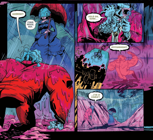
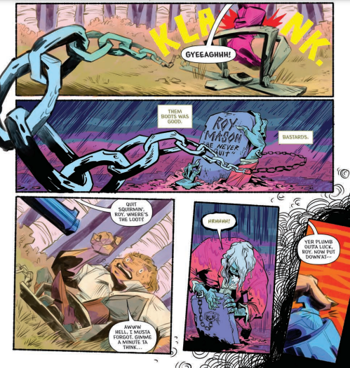
Eschenbach and Level’s tale starts with the resurrection of the protagonist, Roy Mason, and his confused journey home. Although the victim of a cruel shooting, Mason is not innocent and his own misdeeds have led him to the grave. The moment of death is presented by Eschenbach and Level through flashbacks like the wild flashes of lightning that accompanied Mason’s return to the living world. The remainder of Mason’s recent past is left for him to reveal to his children in a touching moment of family bonding. The writers allow the character to tell his own spin on events as a way to give the readers insights into the plot and also into Mason’s personality. He is fanciful and elaborate with a clear love for his family that comes across in the interactions that Eschenbach/Level portray in the script.

Sub plots spin out from the central premise as the readers are introduced to a number of characters. Some are clearly villains and some heroes but it wouldn’t be a western without a fair share of dubious figures whose intentions are suspect. The cliche of the genre is woven into the plot with humour and the narrative flow from page to page is brisk. This leaves the reader just enough time to question the links between the characters but not linger on the details.

At each beat of the story the writers twist your expectations, surprising you with a plot reveal or character trait. One thing that you can’t say about Chained To The Grave is that it’s predictable. From the opening page onwards you are never quite sure where the tale will take you but the journey is so wild that it doesn’t matter.

Chained to the Grave
Chained to the Grave #1 Credit: IDW Publishing

Visually Outlandish

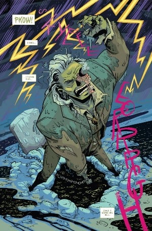
For people used to classic Sergio Leone westerns or the Marvel Old West characters like Rawhide Kid and Kid Colt, the most shocking part of Chained To The Grave will be the visuals. Kate Sherron isn’t shy about using color and the standard sandy yellows and tan browns of traditional western settings are eschewed for a more psychedelic color palette. Bright yellows and greens fill the day scenes while deep reds and lush purples reign at night. Sherron’s colors breathe fresh life into both the western and the horror elements which are at the heart of this comic. On some level it doesn’t feel fitting and yet Sherron makes it work.

Part of the charm are Sherron’s figures with their bulky bodies and thin extremities. There is no pretense of reality, instead a pure enjoyment of caricature which in turn allows the colors to shine. The artwork is about expression and creating a mood, which is successfully achieved throughout. The design work gives the reader a sense of character and the locations reflect genre tropes. The scene in the graveyard is enjoyably gothic, with Mason’s wife dressed in all her splendor as she patiently waits for her husband’s return. As the setting shifts to the villain of the piece, the interior of the tent is dressed in spiritual paraphernalia, producing a different magical vibe.

Sherron creates an impressive dynamism across the pages by bringing the images out of the panels to cross the gutters. Sweeping chains and lurking figures break the constraints of the layout, opening up the world and allowing the reader to become immersed in the scene. Micah Myers’ lettering is a big part of this. Through the use of different fonts for certain characters and a constant shift in size and boldness, Myers captures the essence of the speech and the personalities behind the words. The tone that the lettering brings to the page enhances the humour and enriches the narrative.

Chained to the grave
Chained to the Grave #1 Credit: IDW Publishing

Conclusion

The full throttle plot and range of characters only work together because of the strength and commitment by the artist to her style. The visuals may take some getting used to, especially if you came looking for a Clint Eastwood western. Instead Chained To The Grave looks more like Image Comics Head Lopper or the work of Phil Hester for Aftershock’s Shipwreck. It’s brash and bold, and contains an exciting visual that challenges genre convention.

The plot is intriguing, although the supernatural element does overshadow much of the story and on occasion detracts away from the character building. On the whole the visual storytelling is strong enough to pull you through the pages, making you engrossed in the moment so that you don’t stop and think too hard about what is actually going on. If you want a pure genre story you’ll not find it here but that’s okay, Chained To The Grave is a comic to be experienced and enjoyed like a good B-Movie.

Monkeys Fighting Robots Youtube

Review: FAR SECTOR # 10 – The Plot Freaking Explodes

Ever since the first issue hit shelves, writer N.K. Jemisin and artist Jamal Campbell’s Far Sector has been a consistently brilliant and thoughtful read for each and every chapter. With this 10th issue, the steadily building political subplot that has been cleverly intertwined with Mullein’s murder investigation emerges into the forefront with explosive force, in a manner that is (like every issue thus far) disturbingly relevant to our current political situation. With another hyper-intelligent script and more staggering visual work, this may be the most exciting issue of this outstanding series yet.

“Since arriving at the City Enduring, Sojourner “Jo” Mullein has confronted an insidious conspiracy of murder and mayhem, but even this most resilient Green Lantern reaches her breaking point when she uncovers an “emotional sweatshop” producing black-market feelings for a world without them. But Jo is only too human…”

Writing & Plot

N.K. Jemisin has been taking her skills as an accomplished novelist and adapting to the comic medium with a natural ease many pros ought to be envious of. Each issue of Far Sector has been packed to the brim with discoveries, revelations, backstory, and random events both big and small that end up becoming major pieces of the plot. Far Sector #10 feels like the culmination of all these issues of work, with massive payoffs by way of a well-earned plot twist that honestly blew my damn mind. In terms of setting, this may be the most focused issue in the series thus far, as the entire comic takes place in only a couple of rooms in a police station. As a matter of fact, almost all of the dialogue is presented as sort of expository dialogue, with characters explaining their positions and discussing their discoveries they’ve made up to this point. One of the elements that makes Jemisin’s writing so impressive is that every line of dialogue and narrative packs a massive amount of weight to both the characters and the story at large. Every piece of discussion is vitally important here, and Jemisin deliberately keeps the focus small and cut off from the rest of the world so that when the issue’s big climax hits, it literally blindsides both the characters and the reader. Jemisin has also weaved a clever commentary on internet culture into this story that becomes disturbingly relevant and ominous in this chapter. I’ve been a bit critical of her use of internet memes as a plot device up to this point, but seeing how she uses them here absolves those issues. Now as far as the relevance of the big plot twist to our current political era, it’s actually a bit frightening how spot-on Jemisin’s appraisal of our political situation was in her take on the City Enduring. I can’t discuss it obviously because it’s a major spoiler, but I’ll just say that the discussion of the political events leading up the the major twist at the end of this book is topical to the point of prophecy. This is a masterfully written comic, and a stellar piece of science-fiction writing.

Art Direction

I can never have enough praise for Jamal Campbell’s art, but I honestly feel that his work here on Far Sector #10 may be his best yet. Instead of the sprawling vistas of a giant alien city, the scenery in this chapter is of almost nothing but the low blue lights and sterile whites of a police station interrogation room. What makes the visuals here so special however are the express attention paid to the characters’ facial animations. Now Campbell has knocked this element out of the park on every issue of Far Sector, it’s just doubly important this time around because of the story’s focus on character interactions and studying the emotions and reactions of every person in the room. The direction as well isn’t anything we haven’t seen before in terms of framing and panel construction, it’s just handled with such an expert level of finesse that it disappears into the story, and that’s the exact intention here. Both Campbell’s absurdly smooth penciling and his vibrant digital colors are put through a wringer of subtlety in this issue more than the usual grand sci-fi visuals and intense fight scenes, and he sticks the landing in a way that is unsurprising given his talents while still an incredible sight to behold. The lettering from Deron Bennett is once again solid and easily readable, reflecting the visual direction in how it expertly stays out of the way of the story’s seamlessness. Overall, this is another brilliantly drawn and constructed comic from some of the best creators in the business right now.

Far Sector #10 is the culmination of all of this comic’s careful planning thus far. Jemisin’s script is a string of intricate and vitally important conversations and narrative, delivered with tight pacing that swings a hefty right hook when it comes to the final page twist. Her use of internet culture collides with a searing indictment of our contemporary politics and late-era capitalist gig-economy. Jamal Campbell’s visual work is a series of focused character animations that perfectly frame the emotional journeys each character goes through in this chapter. This may be the best issue of Far Sector thus far, so be sure to grab a copy when it hits shelves on 2/2!

Monkeys Fighting Robots Youtube

Review: Making Deals With Eldritch Folk In THE DREAMING: THE WAKING HOURS #7

Writer G. Willow Wilson and artist Javier Rodriguez return for yet another chapter of their brilliant Sandman Universe series with The Dreaming: The Waking Hours #7. This issue, while still wholly entertaining, serves more as a transition point between two places in the story rather than a major event in and of itself. However, it still offers great moments of emotional character writing and plenty of well-earned appearances by classic Sandman characters. With this sharp writing and yet again solid (although a tad inconsistent) visual work, this is yet another great chapter in this part of the Sandman mythology.

“Bleeding out in a hospital bed from a magic wound that will not heal, sorceress Heather After must swing open the gates of reality to find herself a protector…but is she prepared for the deal she’ll have to strike once she finds a champion with the dangerous power she needs? And speaking of dangerous power…what happens when Matthew the Raven catches a glimpse of one of the artifacts Heather’s been hiding away?”

Writing & Plot

G. Willow Wilson has a mastery when it comes to the pacing of this story, so The Waking Hours #7 feeling a bit more like a catching-up chapter rather than a major event feels like a genuine step rather than a misfire. Heather After is recovering from her injury at the hands of Puck and weighing her options, while also dealing with the fact that she unintentionally summoned a talking raven and a baby gargoyle to help her out of her crisis. There are still hugely important moments in this issue (including the summoning of another very important figure from the land of Faerie), as well as more sweet and heartfelt character writing. Heather’s lovable and caring himbo boyfriend is quickly becoming one of my favorite characters in this series. Wilson’s sense of dialogue and narrative is once again a brilliant mix of naturalistic and poetic. There are moments of dialogue that had me chuckling with great character quips, and plenty of scenes that kept me wholly invested in the story and all of the rising stakes in this story. This chapter clearly is setting up where we are headed in this tale of dreams and magic, and I’m sure it will be a journey worth taking.

Art Direction

I was pleasantly surprised and more than a little relieved when I saw that new The Waking Hours artist Javier Rodriguez was up to the task of taking over Nick Robles’s spot in the last issue. While his pencils here on issue #7 are still mostly very good, it’s hard not to notice that there are points where the visuals seem a bit rushed. For the most part, Rodriguez’s pencils are alive with detail and fluid animation. Every room and piece of ethereal architecture, and every mythical monster are all drawn with a stunning eye for detail and imagination. Every page of this comic looks like a true Sandman comic, with people and things that are impossible to think of come to exist in the pages in grand fashion. The general high quality of work makes it all the more noticeable when the pencils miss the mark by just a hair. There are some images that look to be of notably lesser quality, with wonky character features making themselves distractingly obvious. Much of the visual integrity and wonder is due to the colors of Mat Lopes, who has been offering his talents since the Si Spurrier Dreaming series that preceded this run. His work here and as it always has been is wildly vivid, with a massive variety of tones and shades. The deep purples and blacks of nightmarish sequences will quickly turn to bright neon blues and pinks, followed by the luminescent gold of looking upon a fallen angel’s true form. The letters from Simon Bowland once again nail the Sandman aesthetic of shifting fonts for the myriad characters while staying unobtrusive and easily readable. An overall solid, if not slightly inconsistent effort from the visual team.

The Dreaming: The Waking Hours #7 is a completely entertaining comic with its own set of twists and character reintroductions that is mainly concerned with pointing the reader in the direction of the future. G. Willow Wilson’s script of sharply paced and lined with great humor, stellar character writing, and meaningful plot-directing. The visuals from penciler Javier Rodriguez and colorist Mat Lopes are almost entirely fantastic despite what appears to be a bit of rushed penciling at points. This is another excellent chapter in the Sandman Universe, and I highly recommend you pick this one up when it hits shelves on 2-2!

Monkeys Fighting Robots Youtube

Review: The Legends and Myths of FUTURE STATE: SWAMP THING #2

Swamp Thing V DC Comics

Future State: Swamp Thing may be a small part of the DC Universe, but it dares to be a world of its own. Writer Ram V, artist Mike Perkins, colorist June Chung and letterer Aditya Bidikar lay the foundations for their own universe. As this creative team births a new world into existence, we see the myths and legends that are its makeup.

Writing

Future State: Swamp Thing reads more like The Epic of Gilgamesh than it does a comic book. V uses poetic language to create a sense of mysticism. We’re seeing worlds end and realities born. V has amped up the stakes to impossible heights, but keeps us grounded with the questions of children and the curses of old men. It’s an epic that’s deeply connected to its characters. We’re constantly checking in with them to see how these life-altering moments are affecting them. And their reactions are an array of human emotions. One character weeps, disappointed in her master. A little girl asks, wide-eyed, what’s really going on as an old man screams and roars at what’s happening. Except for one scene, where some villains speak in a way that’s stilted and expositional, V doesn’t allow his epic language to get in the way of the human pulse beneath everything.

Swamp Thing V DC Comics

Art

It’s interesting to see Swamp Thing relate to his “children.” When the old man Indigo laughs, Swamp Thing hides his face. Perkins shows us just enough to sense the emptiness in Swamp Thing’s eyes. And when Heather asks about why she’s been created, in a fury, Perkins reminds us just who she’s talking to. Her lips, parted to show gritted teeth, are pictured above a diagram of her anatomy. The bones, muscles and organs, looking like a page out of a biology book, are shown next to images of her railing against her creator. But once Swamp Thing has connected to each of his “children,” each moment beautifully portrayed, we see him standing amongst the humans. Perkins shows the shift in him. After years of being surrounded by those like him, Swamp Thing reconnects to his human side.

Coloring

Chung continues, like in the first issue, to play on shades of green and red. Green, the color of trees, is interrupted by tiny moments of red, the color of blood and humanity. We see it in Swamp Thing’s irises. They’re not the green or black that we might have expected. It reminds us of the man behind the bark, so to speak. When Heather speaks out to her creator, angrily, the background of the panel is red. She may be a plant, but her anger is human. But much of the other instances of red are strange. We see Woodrue, our sickly villain, covered in a red robe. Moments of violence and carnage have splashes of red in the midst of yellow flames. We can’t help but wonder, why does Swamp Thing give a damn about humanity? The violence and villainy shows humanity to be an ungrateful and cowardly lot. But that’s exactly it. Chung shows us these aren’t people who deserve mercy. But mercy is never deserved.

Swamp Thing V DC Comics

Lettering

The most noticeable thing about Bidikar’s lettering is Swamp Thing’s kinship with Woodrue. They sound the same. They speak through colored word balloons that have flattened edges. Yet it’s the coloring that makes the difference. While Swamp Thing’s dialogue is colored in a dark orange, Woodrue’s is a light green. Bidikar is showing that Woodrue may think he’s like Swamp Thing, but he’s really a pale imitation.

Bidikar’s best use of lettering happens between Heather and Swamp Thing. “NO!” Heather yells. Heather speaks in bolded letters and the word balloon has a thick green edge around it. “NO!” she says again. This time, the letters are italicized, bigger but thinner, and the word balloon has a jagged edge. “No…” she says finally, in small letters. It’s a gorgeous representation of fighting against impossible odds. She screams, she panics, and finally, she collapses in quiet grief. Bidikar turns what could be a forgettable page into an instance of raw, unadulterated emotion.


Future State: Swamp Thing #2 is huge. It’s an epic, rewriting the rules of the DC universe and daring to dream big. But V, Perkins, Chung and Bidikar never lose the human heart at the center. Even if its veins are full of chlorophyll. Pick up Future State: Swamp Thing #2, out from DC Comics February 2nd, at a comic shop near you!


Monkeys Fighting Robots Youtube

Review: CODDLESWORTH’S CLOCKWORK CIRCUS #1 Sets Up A Fantasy Adventure

coddlesworths clockwork circus cover

You gotta love a good fantasy saga like Coddlesworth’s Clockwork Circus, hitting Kickstarter February 2nd. I’m talking about one of those meaty, sprawling epics that takes its time to delve into background and mythology. A slow burn that takes up as much real estate (if not more) for worldbuilding as it does for character development. That’s what you get in the first issue of this fantasy steampunk adventure – a solid setup for what is sure to be a grand story.

Coddlesworth’s Clockwork Circus, written by Danny Oliver, with pencils/ink by Slobodan Jovanovich, and colors by Kurt Michael Russell, is funding its first issue on Kickstarter from February 2nd through March 4th 2021.

Story

A flood of magic rushes into a steampunk world and two halflings with sorcerous powers join an eclectic troupe of circus performers in order to save the planet from destruction. The first issue sees the arrival of our halfling protagonists in a busy port city before meeting the first members of the troupe.

coddlesworths clockwork circus page

Writing

Writer Danny Oliver’s first words really help to set the tone in Coddlesworth’s Clockwork Circus. He starts the story with that classic narration in the vein of Galadriel at the beginning of The Lord of the Rings. It’s ominous and otherworldly, and even poetic. The reader gets a good setup to the story and characters. The writing helps transport you to this strange, new world of fantasy and magic. 

By the end of the issue, we don’t know too much about the protagonists, nor their intentions. But it is definitely enough to keep you intrigued and wanting to read the next issue. This first issue has clearly only scratched the surface of the world and story. Oliver is building something big and interesting here, and you should be on board for it.

Art

Artist Slobodan Jovanovich’s line work in Coddlesworth’s Clockwork Circus can be described as highly meticulous. The shipping pier has so much detail, from the cobblestone path to the people walking atop it. You can almost hear the waves crashing and the chatter amongst the patrons. And it goes on from there, as the protagonists make their way through the city, you will find more line work detail to admire.

Colorist Kurt Michael Russell offers a vibrant, warm palette that compliments the ink and pencils. The yellow-tinted backdrop makes the colors in the forefront – such as the clothing – pop tremendously.

Conclusion

An admirable setup to a seemingly interesting concept, packed with compelling narration and artwork that displays a great attention to detail, Coddlesworth’s Clockwork Circus is perfect for those who love to be transported to fantastical lands and epic storylines.

You can support Coddlesworth’s Clockwork Circus by funding its Kickstarter. Be sure to also follow Rem Alternis Productions on their website, or on Twitter, Facebook, Instagram, YouTube, Twitch, and Patreon.

Do you have a book on Kickstarter like Coddlesworth’s Clockwork Circus or Unicorn: Vampire Hunter that you would like reviewed/promoted? Send an email to info@monkeysfightingrobots.com!

Monkeys Fighting Robots Youtube

Advance Review: BLOODSHOT #11 – Old Enemies, Familiar Concept, New Aesthetics

Bloodshot #11 Cover

Bloodshot #11 hits your local comic book shop on February 24 from Valiant Entertainment for a plot reintroducing past enemies. Writer Tim Seeley in this “One Last Shot” segment, uses several elements of Jeff Lemire’s run like Rampage. Artist Pedro Andreo showcases cinematic movement and anticipation worthy of action movies. Along with them are colorist Andrew Dalhouse, who makes characters stand out, and letterer Dave Sharpe keeps the action flow going.

Background

After defeating the Burned and evading Black Bar, Bloodshot was ready to hang up his guns. That is until his former handlers, Project Rising Spirit, return. Now, Bloodshot is with new allies to stop PRS before they cause more incidents.

Bloodshot #11 In Relevancy

Bloodshot #11 stands out from previous issues by going straight into social commentary. Seeley reintroduces the Bloodshot Salvation villain Rampage/Danny and the Bloodshot U.S.A. concept. It is nice to see Seeley find synergy with the redneck foil of Bloodshot and the modern political divide. He takes old concepts and makes them relevant by attacking people’s need for harmony. Any specific details will be a potential spoiler, but let’s just say that instead of turning the public into Bloodshot weapons like before, it’s more about control.

Action Movie Cuts

Andreo takes over as lead artist after a hiatus. Bloodshot #11 retains Andreo’s action movie aesthetic with how it emulates jump cuts and camera angles. One panel can feature a character on a surface until a cut features them in the water. It’s a good use of reader interpretation and implication without wasting time and space. In some sequences, a decent amount of anticipation comes from characters in the shadows. Danny, who has a decent buildup through imagery, stands out well.

And Some Attention Grabbers

Dalhouse highlights each character in Bloodshot #11 with outlines in cool colors. This presents their importance to the plot while giving them an aura that showcases their mood. Bloodshot gets a brighter and bolder one during a conflict that presents itself as a moral dilemma. It’s a feeling so powerful that this aura takes up an entire panel. Fortunately, Bloodshot’s co-stars with their more stable outlines are a display of keeping everything together.

Letterer, Sharpe showcases fonts to describe points of conflict. Zealot speaks in a robotic font that displays his new status. It’s what makes the one audio clip of his human screams so notable. With some juxtaposition, that robotic voice next to a newscast with electronic voices can look frightening. Especially considering the newscast displaying the original Bloodshot U.S.A. and a later newscast imply technology dominating minds.

Bloodshot #11: The Sequel

Bloodshot #11 has all of the hallmarks of an action sequel. It has a familiar plot, elements from past successes, and visual factors that showcase the characters’ specific traits. Andreo is the stand out of the issue elevating Seeley, with great visual storytelling.

Monkeys Fighting Robots Youtube

WANDAVISION – We Interrupt This Program | TV Review

After three episodes sitcom-focused episodes the episode “We Interrupt This Program” shows S.W.O.R.D.’s reaction to the disappearance of Westview.

Monica Rambeau (Teyonah Parris) has returned from the Blip, not realizing she has disappeared for five years. She returns to working for S.W.O.R.D. and gets assigned a mission to help the FBI with a missing persons case. It turns out that the mystery was much bigger because it involved a missing town with a static field around it resulting in S.W.O.R.D. bringing in scientists to help with their investigation, including astrophysicist Darcy Lewis (Kat Dennings).

“We Interrupt This Program” aimed to show what was going on outside of Wanda’s sitcom. It answered some of the questions that were asked in the previous episode, like who was watching the TV, who was the beekeeper, who the citizens of Westview were, and how Jimmy Woo (Randall Park) was able to send a radio message to Wanda. It also asks some new questions – the big one being is Vision alive? Other questions were why did the show keep leaping ahead a decade and why the static field had hexagon shapes? A question that hasn’t been asked but will properly become important is the role of Agnes, the noisy neighbor because her real identity wasn’t revealed. She could be an agent who keeps Wanda’s world alive.

WandaVision has been disliked by a vocal minority because of its retro styling and being a homage to sitcoms. “We Interrupt This Program” was more in line with the rest of the MCU. It looked more like a mini-movie and the tone was more serious with a few MCU-style quips thrown in. Due to the focus on S.W.O.R.D.’s investigation, this episode felt like an Agents of S.H.I.E.L.D. story.

This episode brought back Agent Woo and Darcy who previously appeared in Ant-Man and the Wasp and Thor: The Dark World. There were comic relief characters in the films, yet they come into their own in this episode, especially Darcy. I was not a fan of Darcy in the Thor films but she has improved a lot because she now has her Ph.D. and Darcy shows she’s a perfectly capable scientist. She learned a lot from Jane Foster and Selvig. Darcy and Woo worked well together.

“We Interrupt This Program” introduces new elements that will become even more important in the wider MCU. This episode finally reveals Geraldine’s real identity as Monica Rambeau, the daughter of Maria from Captain Marvel. Monica was shown to be an important agent of S.W.O.R.D. and the character is already set to appear in Captain Marvel 2. S.W.O.R.D. will have an important role in the future because they investigate the paranormal, scientific, or extra-territorial phenomenon. Phase Four is set to have stories revolving around the Multiverse they will properly become a recurring force in the MCU.

Due to the episode focusing on S.W.O.R.D.’s perspectives. they didn’t show much of the title characters. Most of their scenes were clips from the previous episodes. The only original scene was showing what happened after Wanda banished Geraldine from Westview. Wanda repaired the damage she caused and tried to pretend everything’s normal. But Wanda suffers from a vision of her husband as a living corpse, breaking her reality for a brief moment.

A moment I really liked in the episode was showing the Beekeeper’s entry into Westview because the world turned from color to black-and-white.

“We Interrupt This Broadcast” was more in keeping with the MCU style that mainstream audiences are used to. It made for a great alternative look to events we have already seen.

Monkeys Fighting Robots Youtube

Review: MEGA MAN: FULLY CHARGED #6 – Wish It’d Never End

Mega Man: Fully Charged #6 Cover

Mega Man: Fully Charged #6, out now from BOOM! Studios, brings the miniseries to its conclusion with epic battles, emotional moments, and jaw-dropping art.

Mega Man: Fully Charged Art Example

A.J Marchisello and Marcus Rinehart close their thrilling series in Mega Man: Fully Charged #6 with an ending that leaves you wanting more. While the issue’s writing has its flaws — the cliffhanger from the previous issue has little payoff and the final plot points seem a little too condensed — Marchisello and Rinehart do a marvelous job of ending the series. It leaves room to tell more stories in the world but provides the reader with enough closure that the ending is still satisfying.

Stefano Simeone’s art in Mega Man: Fully Charged #6 is gorgeous, as always. His forms are unbelievably dynamic, and many of the panels of the issue are framed in a very cinematic way. Simeone also clearly put lots of effort into creating panels where Silicon City is in the background, as his buildings are highly detailed and often features some impressive perspective. I can not praise his work highly enough in this issue or throughout the series.

Mega Man: Fully Charged #6 Art Color Example

Igor Monti has quickly become one of my favorite colorists through this series, and his talents don’t slack in Mega Man: Fully Charged #6. Monti, with assistance from Sabrina Del Grosso, turns the art into something genuinely jaw-dropping. The gradient backgrounds are gorgeous. Monti and Grosso’s choice to distinctly change the palette to pinks and grays when showing scenes from the Hard Age gives a unique style to this point in time and makes it distinct, so the reader is never confused. Monti and Grosso also use harsh lighting whenever Mega Man’s busters fire. It illuminates nearby objects and speaks volumes for its firepower.

Mega Man: Fully Charged #6 Lettering Example

Ed Dukeshire’s lettering in Mega Man: Fully Charged #6 does a brilliant job of allowing the story and dialogue to flow uninterrupted. Dukeshire also had the task of handling captions from different characters on the panel at once, which he resolved through distinct captions styles that make sure no reader is confused.

This series was a delight, and I’m sure many readers are sad to see it go. It took a show that had a lackluster reception and told an engaging story with gorgeous art to support it. Fans of the show should be pleased to see they get another story in this world, and people unfamiliar with the show can still jump on and experience this dramatic tale.

Monkeys Fighting Robots Youtube

Review: NOBODY LIKES YOU, GRETA GRUMP!- An All-ages Masterpiece

NOBODY LIKES YOU, GRETA GRUMP!, out on February 23rd from Fantagraphics, is a middle-grade graphic novel by cartoonist Cathy Malkasian. It is a beautiful, incredibly sweet graphic novel. I recommend it to anyone in any age group, especially for those looking to fall in love with new characters and tear up in the process.

Story

Malkasian’s writing is really interesting to pick apart. You would think that, as a book aimed at children, the language wouldn’t be too complicated for anyone to understand. But Malkasian gives one of the main characters in this book a “posh” personality. It’s a pet turtle talking in a way that resembles old English mixed with dialects from well-known fantasy books you probably read as a kid. Already, what’s there not to love? But worry not, because every time the turtle says a word Greta hasn’t heard yet, he explains the word to her beautifully and simplistically in a way that makes sense to young kids and plays on adults’ heartstrings due to the ingenious, fabulous ways those words we’ve taken for granted for so long are explained and dissected.

Malkasian takes each main character (and even each supporting character) on an emotional arc that never ceases to amaze in its honesty. Especially the main character, Greta Grump, goes through an arc I never thought I would be able to relate to. Malkasian introduces Greta to the readers as her “last” name suggests- as a grumpy, annoying bully. But as the story progresses, we learn to fall in love with Greta and learn about her past and what makes her act the way she acts. You just start melting and crying as you witness her transformation from a bully to a kind, brave kid. Absolutely top-notch work from Malkasian. It made me an instant fan of her storytelling.

Art

At some important moments in this book which I will not spoil, the art was so honest and true to the moment and feeling Malkasian was trying to convey, I cried (!). Multiple times. The faces and the way Malkasian draws the characters and the world makes it clear that it’s a book for youngsters. The art’s feel and look is very kid-friendly. But for the adults reading this book, if you look close enough you could find (I kid you not) trippy elements to the art.

Most importantly though, the acting in this book is what truly steals the show. Instead of changing angles and shot types from panel to panel, Malkasian sometimes lingers on the moment a little longer to see how her characters act and move from one beat to another. Sometimes, this alone tells us all we need to know about the characters and their personality.

If none of this convinces you to give this book a shot, I want to leave you with this one last attempt. The last two pages in this book are the most beautiful, fulfilling pages I’ve seen from a comic’s ending in probably forever. And you’ll only be able to appreciate it and enjoy it if you read this book. So, what do you have to lose? It’s only 120 pages!

Conclusion

As a first time reader of middle-grade graphic novels, I’ll be the first to admit I went in skeptical. I wasn’t able to imagine enjoying a graphic novel aimed at children. I thought this graphic novel was probably going to deal with way less complicated matters and that I wouldn’t be able to relate to it in any way emotionally. But boy oh boy, I am so glad I was foolishly wrong.

NoBody Likes You, Greta Grump! came at exactly the right time for me. It dealt with things I haven’t even encountered before in such a gorgeous, direct way. I couldn’t help but fall in love with this book.

Monkeys Fighting Robots Youtube

Review: THE AMAZING SPIDER-MAN #58 – A Heartbreaking Moment

The Amazing Spider-Man #58 Cover

 The Amazing Spider-Man #58, out now from Marvel Comics, is a heartbreaking issue where the damage caused by revelations of the “Last Remains” arc needs to be dealt with.

The Amazing Spider-Man #58 Story Example

The previous arc showed Spider-Man pushed to his breaking point. Nick Spencer does a perfect job of showcasing a more impatient version of the character in The Amazing Spider-Man #58. The issue features some heartbreaking moments, as the revelation of the previous arc takes its toll on people not involved in super-heroics. The dialogue is particularly noticeable, as it effortlessly tugs on your heartstrings. The story also returns to characters that haven’t appeared for a while. It’s nice to see after so many issues dedicated to the interaction between Kindred and Spider-Man.

Marcelo Ferreira’s pencils and Wayne Faucher’s inks turn The Amazing Spider-Man #58 into an astounding issue. Not only do they provide for some brilliant dynamic forms and action, but the issue also contains gorgeous panel framing. Several moments in the issue are unquestionably breathtaking, such as when Spider-Man swings across the city in a highly detailed panel. Realistic backgrounds, such as a cityscape, do wonders to awe the reader.

The Amazing Spider-Man #58 Art Example

The coloring of The Amazing Spider-Man #58 does a phenomenal job of reflecting the tone. Morry Hollowell uses darker tones to reflect the grim nature of the story but isn’t afraid to throw in bright reds to add energy into a scene. He does this before Spider-Man enters combat, which causes the moment to feel much more intense. Not to mention Hollowell’s shading abilities, which allow the faces of characters to seem alive.

VC’s Joe Caramagna does a fantastic job of lettering The Amazing Spider-Man #58. He provides a wide diversity of styles for his sound effects. Each one perfectly accompanies the action it goes with. Caramagna also gives speech bubbles a red border or a thicker border to signify yelling, which is a highly effective technique that allows the dialogue to match the intensity of body language in some panels.

The Amazing Spider-Man #58 Colors Example

The Amazing Spider-Man #58 is an entertaining issue through and through. This rage-filled version of Peter is an exciting side of the character that we rarely get to see. The art and paneling of the issue add lots of drama to each scene, and the colors reflect the grim tone. Caramagna’s lettering is the needed cherry on top that makes the issue such a great beginning to a new arc.

Monkeys Fighting Robots Youtube