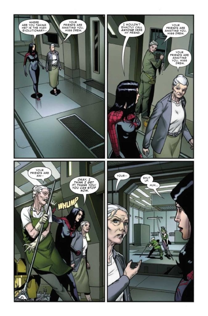
Iron Fist Heart of the Dragon #2 continues Marvel’s martial arts epic on February 17. Larry Hama continues to write about the martial arts world of Iron Fist converging with the greater Marvel universe. With how artist Dave Watcher depicts each new character joining the fray, the tension and excitement builds. Colorist Neeraj Menon enhances the mythic scale by showcasing how the settings envelop the characters; all while the lettering by Travis Lanham showcases the cheesy dialogue of some of these characters.
Iron Fist Heart of the Dragon #2: Crossover Catalyst
Hama shows that the greater martial arts world is ready to become something more than a Marvel niche. With this series, as well as Shang-Chi, getting more exposure, it’s good to see some in-universe recognition. Due to the actions of an enigmatic antagonist, the greater Marvel world can’t ignore this series any longer. While it is nice to see this less represented mystical part of Marvel, there are some concerns.
Luke Cage, being only casually invested thanks to his friendship with Iron Fist, notes that even with a new threat, characters from the greater world of Marvel don’t exactly have any personal stakes. World-ending threats are so common, it’s too hard for Marvel’s superheroes to take these things seriously. It’s nice to see Iron Fist Heart of the Dragon #2 having a sense of self-awareness.
That’s not to say that some parts of Marvel don’t mix with this wuxia style world. Black Panther‘s Okoye looks ready to join the battle. With how many appearances she makes outside Wakanda, it’s nice to see her brought into different a new niche.
Art of the Hidden Dragon
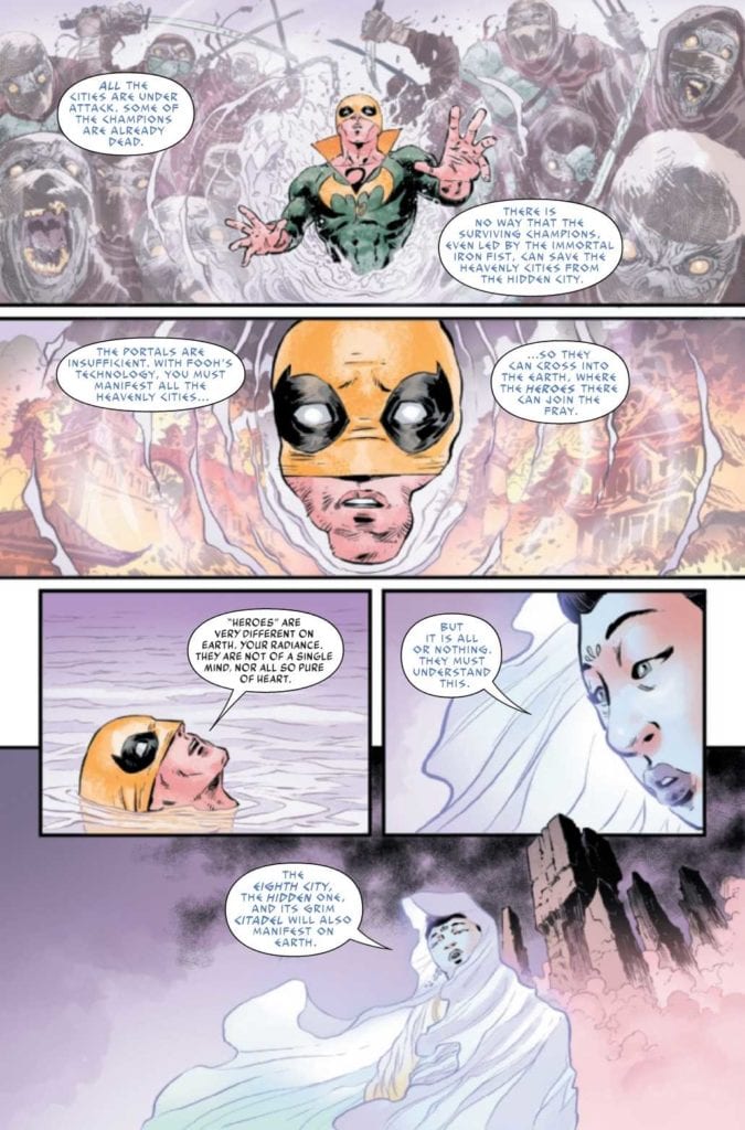
Iron Fist Heart of the Dragon #2 features mythic backgrounds by Watcher. The architecture of the Under Heaven cities can look genuinely divine as they materialize in places like a Wakandan jungle. The very presence of the dragons in these cities make even the run down Bao Fu look otherworldly. Then there are the Immortal Weapons who jump out of their debuting panels and converge on a conjoined ground. It’s a sense of narrative weight so strong, it brings three seemingly separate panels together.
Menon makes the otherworldly presence all the more obvious. When Iron Fist speaks with an actual goddess, the surrounding cool colors, in juxtaposition with his costume, make Iron Fist feel small. Then there’s the darker settings of Bao Fu where Iron Fist’s colorful costume (regalia) feels empowering. It’s like a light through the dark city.
Then there’s the lettering by VC’s Lanham. The goddess Guan Yin speaks in a light blue colored and archaic looking font. This makes her appear more divine and presents her as a benevolent force. Otherwise, the way Lanham presents the Immortal Weapons is like watching an old dubbed wuxia movie. In a few panels, the Immortal Weapons practically speak in sequence, like they rehearsed their lines. The lettering flow certainly brings that sentiment through how many words they speak in one breath.
Continue The Journey In Iron Fist Heart of the Dragon #2
Iron Fist Heart of the Dragon #2 will certainly strike some readers’ fancy, especially those willing to take a break from A-Listers and tie-ins. The wuxia styled world of Marvel is ready to make itself known. The series is really shaping up by displaying its mythic glory. I’m certainly looking forward to more developments.
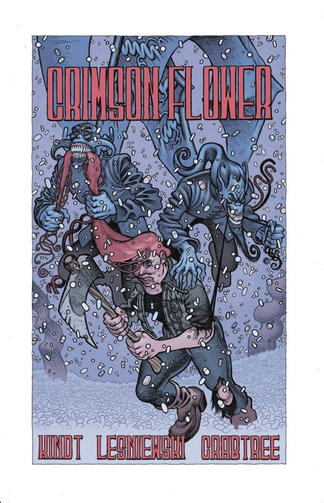
CRIMSON FLOWER #2, available February 24th from Dark Horse Comics, continues the tale of one young woman, and her bloody path towards revenge. It’s a dark story, one seeded with folklore and surprises.
The hunt continues in Crimson Flower #2.
Crimson Flower is one of those series that demands attention. The style and aesthetic alone are eye-catching, especially when in combination with the heavy use of Russian folk tales. It is reminiscent of a fractured fairy tale, but with a few unique twists.
This is not one of those happy fairytale retellings. This is the story of a young woman who watched her father get brutally murdered. Now, she’s using her love of those very tales to shield her mind as she hunts down his killer.
While not a happy tale, it does fit in rather nicely with some of the more classic fairytales out there. The original versions that is, not the versions we so commonly see these days. This is the setting from which Crimson Flower #2 springs out.
The Writing
Crimson Flower #2 is every bit as dark and twisted as its predecessor, if not more so. The hunt continues, and thus we’re about to see another round of desperation and violence, as more killers enter the fray.
Matt Kindt really does an excellent job of using folklore as a lens here. It translates all the horror and pain one character is experiencing and turns it into something else entirely. It’s fascinating, and more than a little bit horrifying.
Which makes it a great read, when you think about it. Now that we’re done learning the backstory of this character (and her late father), there’s more room to focus on the here and now. Mostly, it’s starting to look like a series of increasingly dangerous situations for her.
There are a lot of interesting questions and debates raised by this issue, and arguably the series as a whole. Discussions about loss and grief, and how toxic it can become. Not to mention a dozen other concerns that have already been raised as well.
The Art
Crimson Flower #2 is the second most visually unique comic I’ve read this year. The first being Crimson Flower #1, in case that wasn’t obvious. The artwork itself tells its own story, one that is likewise steeped in the tales of old.
Matt Lesniewski (art) and Bill Crabtree (colors) really brought something new to the table here. The intentional plays with proportions are fascinating, giving the series such a unique look. Because of this, the series gets away with many stylistic decisions that wouldn’t work anywhere else.
The end result? A striking collection of panels that somehow manage to feel brand new and ancient all at once. Then there’s the addition of texture, which brings the imagery to a whole new level, making it feel like something you could run you could reach out and physically touch.
Conclusion
Crimson Flower #2 is another dark addition to this series, one that dove headfirst into the hunt – and horrors. It’s been a fascinating read, one that isn’t afraid to combine the past with the present in such a twisted way.
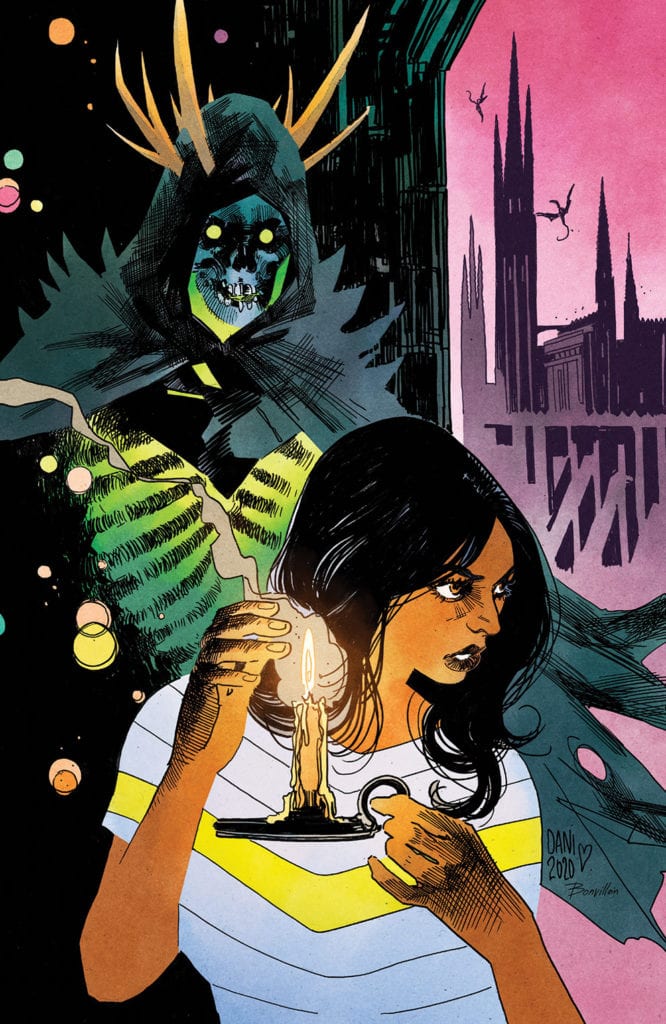
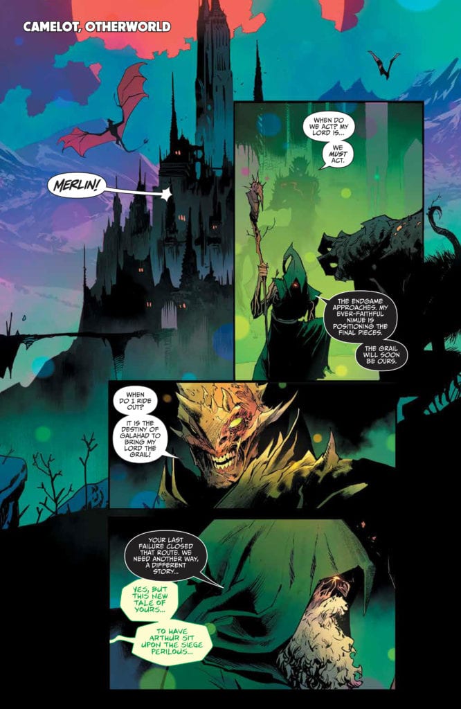
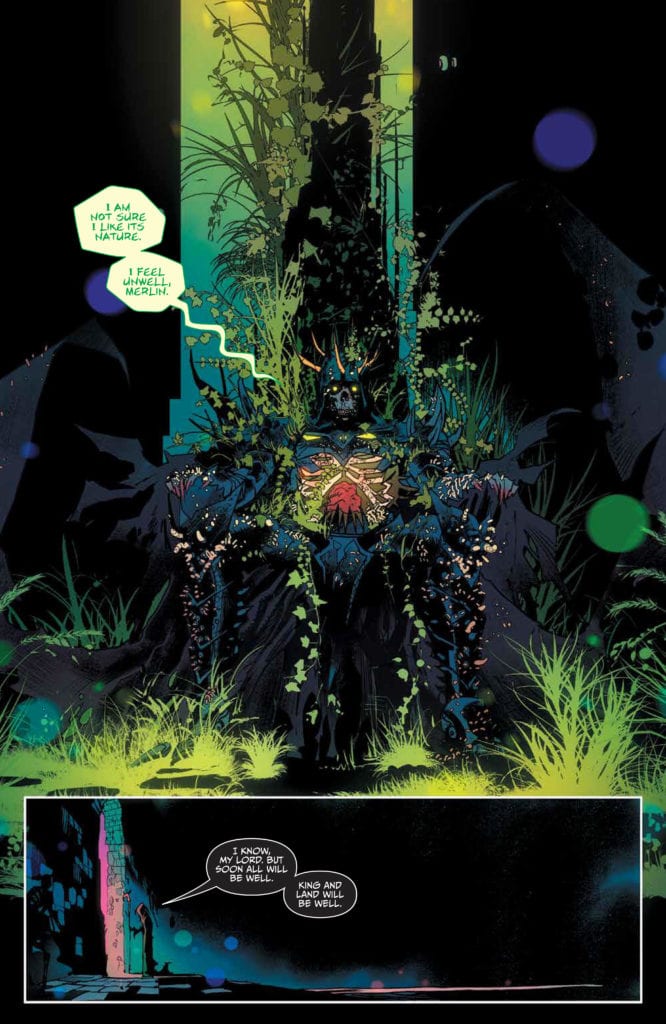
ONCE & FUTURE #16, available now from BOOM! Studios, throws Duncan and allies back into the fray, as the tales of old continue to warp and complicate an already wrought situation. For these are beings that do not belong in the world of men, as they say.
Two forces on the verge of a collision on this variant cover of Once & Future #16.
It’s hard to believe that it was only fifteen issues ago that Duncan first learned the truth about his family history. Well, some of the truth. I personally have no doubt that there is a lot that has been kept from him, even now.
The fact remains that it was just a short time ago that he went from being an ordinary guy to a guy that battles monsters in the dark. Normally family secrets aren’t quite so dangerous, not in the literal sense.
Ever since that moment, Duncan (with the help of others) has been battling. The legends of old are waking up, and they aren’t intending to treat the human world with any level of kindness. And thus, that is where Once & Future #16 begins.
Enter Camelot in the Otherworld, where legends of old are scheming.
The Writing
The plot of Once & Future has been steadily getting more complex, introducing new characters, legends, and monsters with every passing issue. All of it building towards an inevitable confrontation, one that sincerely could go either way.
Once & Future #16, written by Kieron Gillen, continues to build that tension and anticipation. The last issue introduced more complications than most, and this issue did an excellent job of running with what was handed to it.
That isn’t to say that it didn’t introduce its own complications (it did), but it didn’t drop any of the threads that were formed in the last issue either, which I have to appreciate. Mostly because I (along with many other readers, I’m certain) am desperate to get answers for some of what is happening.
There is a strong sense of irony in this issue. Things coming back to bite (or potentially bite) characters for their previous actions or decisions. It’s tempting to say that this is highly satisfying, but well…it is happening on both sides, so not exactly ideal.
Though what is satisfying is seeing how it is all weaving together. We’re still missing out on several pieces, that much is obvious. But the larger picture is starting to come into focus. Further proof of all the careful planning that went into the writing for this entire series.
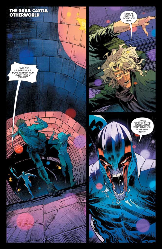
Uh, King Arthur is looking a little different than his legend would have had us believe…
The Art
Once & Future #16 has yet more striking imagery to add to the series. Once again, I find myself wishing that there were prints available for some of these pages (namely page 8). They’re terrifying, bewitching, and striking all at once.
Dan Mora’s art style is so perfect for this world that is both real and fantasy. The monsters he draws are horrifying and beautiful in a combination that shouldn’t work – but really does. They’re larger than life in all the best ways, and all have a personality to their designs.
Admittedly, Tamra Bonvillain’s colors have a lot to do with all of that. Her colors are bright and amazing, adding a strong sense of fantasy to everything. Her blues and greens are divine, especially in this issue.
Ed Dukeshire’s lettering showcases the myriad of emotional and vocal responses available within this single issue. That and many other details really bring it all home in such a haunting manner.
Meanwhile, our heroes run from an angry knight.
Conclusion
Once & Future #16 is a bright and intense issue, bringing many plot arcs together for one dramatic issue. The best part? It looks like that dramatic element is going to continue building in the next issue, so there’s more to look forward to here.
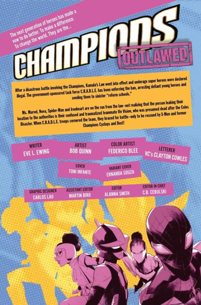
CHAMPIONS #4, available now from Marvel Comics, brings the Champions, Cyclops, and the Marauders together, even for a brief moment. All while the Champions, and any underage hero, are dealing with the consequences of Outlawed.
Things are getting complication in Champions #4.
For those that haven’t been following along, or who have been distracted by other events (ie: The King in Black), Marvel is once again facing an event that aims to control the actions of superheroes.
This time around, the focus is specifically on all those heroes that are deemed underage. Ignoring the fact that it is probably not easy to tell the ages of those that haven’t revealed their identities, this resulted in a new law coming into place: Kamala’s Law. It gives agencies like C.R.A.D.L.E. The authority to essentially hunt and track down those that disobey.
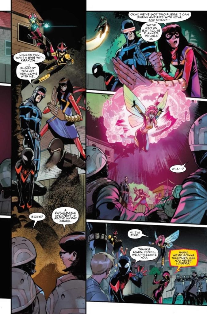
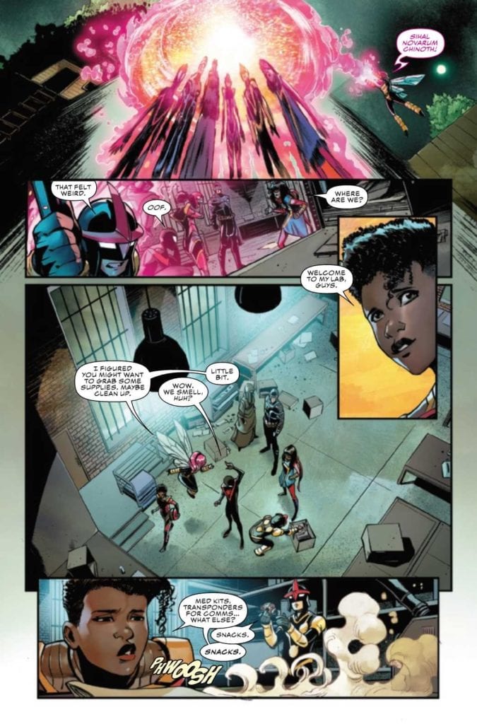
Those like the Champions, because naturally, they’re not going to step down, even if it was their actions that were the cause of this law, to begin with. Thus, half of the Champions (and dozens of other young heroes) have been captured, and the rest are on the run. That is where Champions #4 picks up.
Now seems like a good time for an escape.
The Writing
The last issue left fans on a bit of a high note, giving us reason to hope that there will be change (or at least help) on the horizon. Naturally, that meant we were fairly excited to see what happened next in Champions #4.
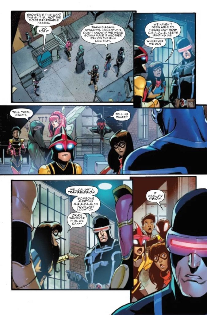
Written by Eve L. Ewing, this is an issue that gave the perfect excuse for the Champions, Cyclops (previously a member of the Champions, if you recall), and the Marauders to interact. Our young heroes are hurting, exhausted, and tired of having to be on the run all the time.
Yet this issue continues to remind us of all the reasons why the remaining Champions can’t just turn themselves in and hope for the best. As we’ve been shown, the ‘best’ is really not ideal, and instead is reminiscent of horrible times in history. Both in comics, and in real life, as Marvel always tends to mirror real life.
Naturally, this issue had its ups and downs. It had some high moments, and it also highlighted (once again) the stakes at hand. Seeing other heroes are reacting to this law is always refreshing, especially those that have found a way around it.
Now the appearance of the Marauders makes sense.
The Art
Champions #4 is a visually complex issue, one that portrays multiple scenes and even more characters. In terms of what there is to see, this issue has a little bit of everything. It has some action, some grandstanding, character development, and obviously the opportunity for characters to show and express how they’re holding up.
Bob Quinn’s art really is perfect for this series, matching the style of the Champions, while also including several other well-known characters. The artwork is bright and the action is fun and easy to read – always a highlight for this crew.
The colors, provided by Federico Blee, bring that whole feeling even further. While many of the locations should feel dull and muted, there’s something about the colors that makes them feel more alive. Especially when there’s a hero standing in the middle of the room.
VC’s Clayton Cowles’s letters are the final touch that this issue needed. The Champions really do feel torn apart and tired, thanks to the subtle detail work provided by Cowles. Likewise, his work carries readers in a flowing motion, carrying the narration ever onward.
Unfortunately, their troubles are far from over.
Conclusion
Champions #4 hits hard, as does the whole of this series thus far. There’s no avoiding the implications of this new law, not when we’re directly seeing the impact of it all. It hits close to home in many ways, as this compelling story continues to unfold.
SPIDER-WOMAN #9, available now from Marvel Comics, continues Jessica Drew’s desperate hunt for a cure. Once again she’s in a surprising situation, as she finds herself in the home of several distracting surprises and revelations.
Talk about a startling introduction to this issue!
So far, Spider-Woman‘s latest series has forced Jessica Drew through quite a lot. She learned more about her family than she probably ever wanted (which is saying something), she is sick, and now fears for her son. That was all before Knull invaded, changing the world around her even as she continued to fight for a cure.
Oh! And don’t forget Spider-Woman’s current ally, who feels like a risky decision at best. Especially for any fan who is up to date in Spider-Verse and the various characters that it introduced.
Spider-Woman #9 continues from that point, throwing Jess into yet another chaotic and dangerous situation. It seems that she still can’t catch a break, though she is apparently getting closer to her goals, so there’s that.
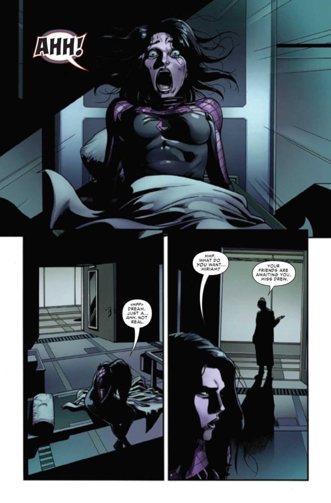
Thankfully, it appears that it was all a dream. Well, perhaps not all of it…
The Writing
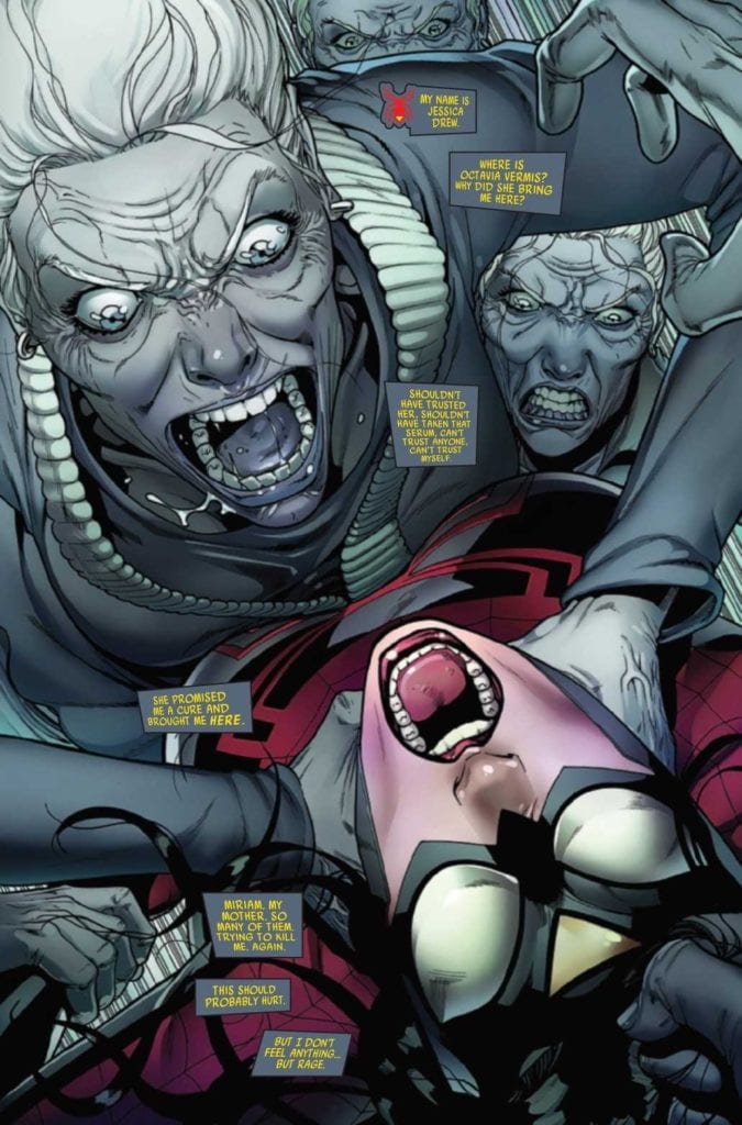
Spider-Woman #9, written by Karla Pacheco, really does nail that whole family drama vibe. But with a Spider-Woman twist, naturally. After all, it isn’t every day that you come across a woman interacting with a room full of clones of her own mother. No, that’s the sort of luck that only Jessica Drew (and probably Peter Parker, if we’re being honest) could come up with.
All things considered, Spider-Woman #9 is a fascinating issue. One that drops a whole lot of information, without falling into the sins of show/tell issues. A liberal use of flashbacks helps to explain the situation, while also raising many more questions along the way.
On the bright side, it does answer a few longer running questions in the process, so we’re not going to go and complain about it. Yet even with that in mind, there is a lingering sense of dread that grows as each page passes.
That probably has something to do with a gut feeling for how this is all going to play out. There are many elements that feel achingly familiar here, for Spider-Man fans. That isn’t to say that the plot is derivative, more like it’s taking advantage of our knowledge and understanding to create something subtly haunting.
There are a lot of…familiar faces around here.
The Art
Spider-Woman #9 has some of the best cut scene/flashback art I’ve seen in quite some time. It quickly runs the readers through years of backstory, and it does so quickly and smoothly. These small vignettes easily layout the lives before us, while still leaving some room for imagination to fill in the gaps.
That isn’t the only highlight from this issue, naturally. With Pere Perez as the lead artist, this is an issue full of visual twists and turns. Most of them being memorable ones at that. The overall layout for this issue is remarkable, literally. As are the character designs, cameos, and fight scenes.
Frank D’Armata’s do help to enhance the scenes, naturally. There’s heavy use of negative space for the layouts, leaving plenty of white on the pages. Meaning that the colors really pop, especially those familiar greens and purples.
The lettering, provided by VC’s Travis Lanham, really gives a sense of impact, especially during the fight scenes. There’s nothing quite so satisfying as knowing that a hit landed, or that somebody undoubtedly received a solid zap.
Meanwhile, a sparring match is going on.
Conclusion
Spider-Woman #9 is one of the most visually compelling issues I’ve read in recent times, and coupled with the clever writing, it leaves a strong impression. A positive one, to be clear. Naturally, we’re all left wondering how that cliffhanger is going to get resolved.
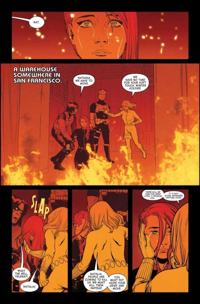
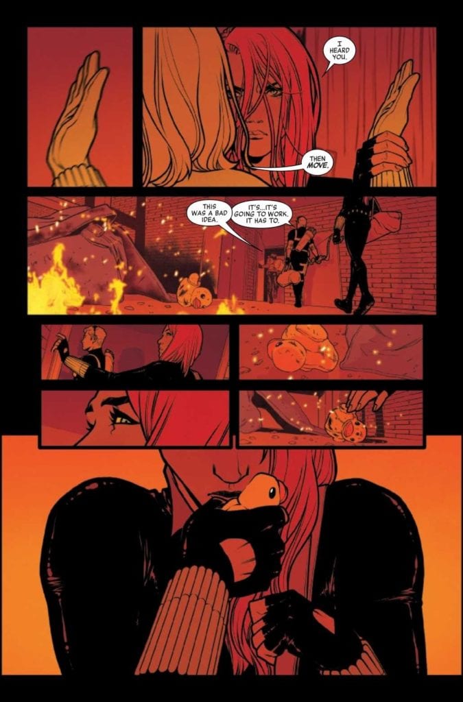
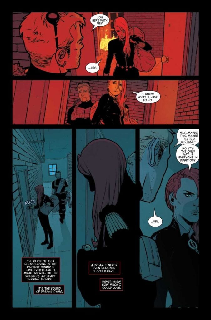
BLACK WIDOW #5, available now from Marvel Comics, concludes the first plot arc of the series, ‘The Ties That Bind.’ In doing so, it brings both an ending and a beginning to Natasha Romanoff, aka Black Widow.
What a different life she could have had.
The latest run of Black Widow has been getting a lot of ink and attention – and with good reason. Her narrative has always had so much potential, and now it has become truly groundbreaking. Her story has changed in unexpected ways, reacting to the risks that have been written into her world.
To put it simply, it has been fascinating to see this different version of Natasha. Even now, when she’s back to a state fans are more familiar with, she’s still changed. She will likely always be changed, thanks to what she has already gone through.
Black Widow #5 is an issue that we’ve all been waiting for, thanks heavily to the way the previous issue wrapped up. To say that it’s been a tense month would be a bit of an understatement, and now it’s time to see how it all plays out.
Meanwhile, back in the present, where her worst nightmare has just occurred.
The Writing
Over the course of five issues, Kelly Thompson has taken Natasha’s life and turned it upside down. She’s done so in brilliant fashion, creating a storyline that most of us will remember for a long time to come. That includes the character affected, of that I have no doubt.
Black Widow #5 is an emotionally tense read, as Black Widow seeks to find a balance between her new life and her old one. She’s dealing with grief so raw and new she can barely contain it, yet she has little choice on the matter.
It’s safe to say that this is quite possibly the most human we’ve seen her, at least in quite some time. But don’t worry, there’s also plenty of action to be had – after all, there is still a hunt going on, even if Black Widow really could use the time to absorb all of what she’s been through.
There’s a lot to love about this issue, frankly. The fact that it openly discusses the elephant in the room cannot be ignored, nor can we ignore how clever the ending itself is. Throw in that raw pain, and how human Natasha comes off, and it makes for a memorable conclusion to this arc.
Side note: bonus points for the inclusion of an adorable black cat (Logan), and the confirmation that he is fine. So fear not animal lovers of the comic book world!
She’s present, and ready to fight – but that doesn’t mean she’s happy about any of this.
The Art
As it turns out, both the writing and artwork for Black Widow #5 are evocative and memorable. Given how the previous few issues have been, that is also not a surprise. It is however highly appreciated.
Visually, there’s so much going on within these pages. From flashbacks to what could have been, and everything in between. Including what is real: a raging fire and battle surrounding everyone. It’s just one of many dramatic scenes, providing tension and vibrance all in one go.
Elena Casagrande and Rafael de Latorre did a brilliant job of portraying all of this, and so much more. Black Widow’s series have always had a sense of style. Especially when it comes to combat, and that shines through beautifully here.
Jordie Bellaire’s colors are exquisite, and they truly are a sight to behold. They adapt flawlessly to the setting. Becoming muted during night battles, and as vibrant as the fire they represent in other cases. The end result is a visually stunning masterpiece.
Finally, VC’s Cory Petit letters are exactly what this issue needed. The details are just one of the ways in which the lettering stands out, creating a sense of cohesion to go with all the organized chaos.
Black Widow always knows what she has to do.
Conclusion
Black Widow #5 marks the conclusion of the series first plot arc, and it is impressively done. Personally, I’m thrilled that the series doesn’t end here. As I am not emotionally prepared to let it go. And can’t wait to see what Natasha gets up to next. Especially with this creative team at the helm.
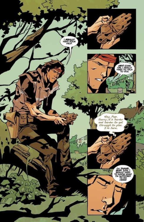
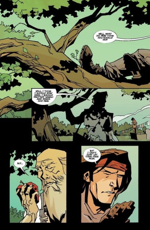
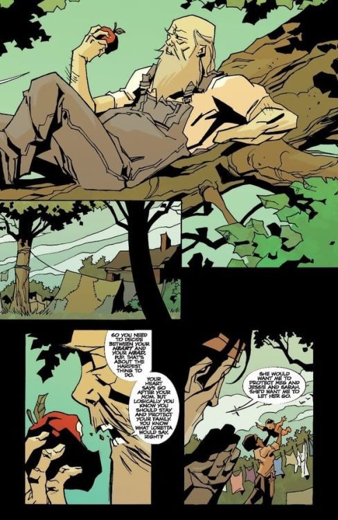
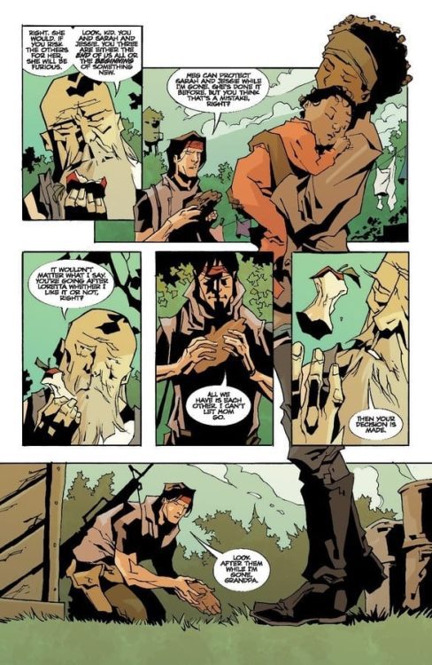
FAMILY TREE #11, available now from Image Comics, brings with it more change in an already horrifying tale. All as one family fights with everything they have to stay together, even against all odds.
He’s grown so much, and yet still needs his grandfather’s advice.
This is a family who has seen more than their fair share of loss, and from the look and feel of things, that part of their story is far from over. Family Tree #11 is a dark addition to this journey, one that branches into a future we can only imagine.
Created by Jeff Lemire, Phil Hester, Eric Gapstur, and Ryan Cody, this is a series that blends horror and family drama together in a way that I have never seen before. Though admittedly it’s been heavier on the horror as of late, shifting the scales ever so slightly.
Decisions, decisions.
The Writing
Family Tree #11 is an issue full to the brim of risks, challenges, and changes. That in itself isn’t really a surprise. After all, there’s just one issue left to this dynamic series, meaning that everything is officially on the line.
I always knew that this series would get darker before it concluded. Even from the very first issue, they never really made any effort to hide that fact. Still, there’s knowing it, and then there’s seeing it.
This is one of those issues that will punch you in the gut, emotionally speaking. It also once again grabs onto the curiosity that resides within us all, as we try and figure out how everything pieces together. And more importantly, how it will all conclude.
The writing itself flows smoothly, bouncing back and forth between the past and the future with ease. One explains how the family got to this point, while the other continues to increase in tension. It’s a delightful balance, one that has kept us guessing this whole time.
Time to decide between the head and the heart.
The Art
Family Tree #11 is full of that iconic look readers have come to know and expect. It’s this brilliant blend of styles that feel rough and organic all at the same time. Granted, the subject matter frequently being trees doesn’t hurt that aesthetic any.
There was a lot going on within these pages, with jumps between the two points in time, and so much more. It felt like every page was showing some form of change, which can be both beautiful and horrifying, depending on how you want to look at it.
The colors help to tie everything together, with a natural and heavy use of green, as well as plenty of other bold colors. As always, the colors also help to establish a transition between timelines, which is always appreciated. All of it feels so cohesive and really does perfectly fit the tone of this series.
He knows which option he’ll go with, every time.
Conclusion
Family Tree #11 brings us ever closer to the end of the series, and naturally had a lot of setting up to do. The ending is as close to a cliffhanger as we’re ever going to get, leaving us all desperate to see what happens next. To see how this one family will continue their fight, no matter what.
The Picture of Everything Else #2, out today from Vault Comics, pulls the reader in and asks the question: can old friends still be trusted?
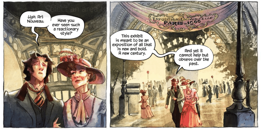
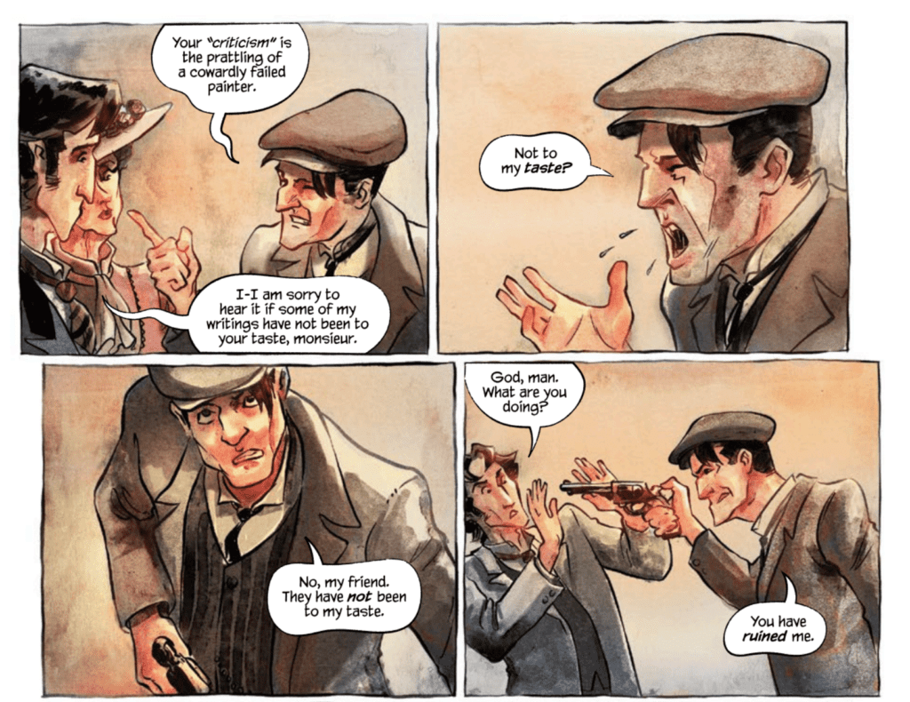
The Picture of Everything Else #2 continues to follow Marcel as he is haunted by his previous encounter with the monstrous painter Basil Hallward: a name fans of Oscar Wilde’s novel The Picture of Dorian Gray should recognize. Dan Watters’ writing utilizes many techniques that make the issue a thoroughly entertaining read. The first is the introduction of characters the reader is most likely familiar with. The first issue introduced us to Basil Hallward, and this issue introduces another character that is sure to pique readers’ interests. The dialogue also flows smoothly throughout the issue, and the elevated manner of speaking that many of the characters possess gives an almost lyrical quality to the writing.
Kishore Mohan’s art and colors of The Picture of Everything Else #2 are gorgeous. The stylized way Mohan draws the issue fits so wonderfully with the story, and the choice of having the borders of panels being hand-drawn lines rather than perfectly straight makes the entire issue feel more organic. The colors of the issue shift to a bright red when violence occurs, which stands out against the rest of the color palette and makes the moment horrifying. Mohan also creates many scenes with dramatic lighting, which gives them a stunning aesthetic.
The Picture of Everything Else #2 features one of the most impressive caption placement uses that I have seen in a long time. Lettered by Aditya Bidikar, the issue’s speech bubbles and captions direct the reader’s line of sight without trouble. There is never any confusion on order, and it works with the art spectacularly. The most stunning case of this is a single page featuring several tall panels stretching the page’s length. The panels depict an artist chiseling away oil from the surface of a painting and the chips of oil fluttering to the ground. The captions on the page are diagonal across the page, so as you read left to right, your eyes fall down the page, just like how the oil chips fall down the page. It is a subtle yet effective technique that turns the stagnant panels into a moving moment that submerges the reader in the scene and makes the caption’s words seem more dramatic.
The Picture of Everything #2 is an issue you will not want to put down after picking up. The story is always twisting and introducing new characters and events to hook the reader, the art is utterly magnificent, and the lettering takes steps to enhance the read. There are so many reasons to love this issue and so few reasons not. The series is one I would definitely recommend putting on your pull list.
Deep Beyond #1, out now from Image Comics, scrapes the surface of a vast and imaginative world full of horrors and excitement.
Written by Mirka Andolfo and David Goy, Deep Beyond #1 starts the series off strong. One of the most notable scenes of the issue is its opening, which quickly establishes the dangers of this new world Andolfo and Goy have created. The scene raises the issue’s energy as we witness a woman clinging to life and facing a monstrous horror.
Andrea Broccardo’s art brings the extraordinary vision of Andolfo and Goy to life in a fantastic way. The glimpse we have into this expansive world that the main character is pushed into is incredibly imaginative and is sure to capture the reader’s interest. Character’s facial expressions are easy to read and perfectly get across the intended emotions, whether it be classic fear or harder to portray emotions such as dread. The emotive expressions of Broccardo’s characters, as well as her fascinating creatures, make for a gripping read.
Barbara Nosenzo’s coloring in Deep Beyond #1 does a brilliant job reflecting the moods of scenes. Her work makes the frightening moments mortifying and the sad moments heartbreaking. This link between palette and tone is especially useful when there is an abrupt shift in tone. The quick change from bright and warm colors to cold, dark colors causes this change in mood to be more impactful and makes for an exciting sequence. Nosenzo also utilizes the technique of single-colored backgrounds for certain panels. This is done when the characters are surprised or shocked and draws your attention to the people and items involved in the panel rather than the setting. It is a highly effective way to direct readers’ attention.
Deep Beyond #1 has an exceptional diversity of lettering styles, ad it showcases many of them within the first few pages. Fabio Amelia uses a different style for nearly every sound effect in the issue, which gives each of them their own place and prevents them from blending together in the reader’s mind. Each sound effect is distinct, and Amelia treats it as such. The only complaint I have is one instance where multiple captions of the same style contained dialogue from two different characters, making it difficult to differentiate who is speaking.
Deep Beyond #1 is a strong start to the limited series. It has frights, action, and it gives us a glimpse at the vast world ahead of us. While much of the issue is set up for what is to come, there is plenty to keep readers engaged and have them desperately waiting for the next issue.
So we are breaking format here on I’d Buy That For A Dollar. Instead of talking about a great bin find, I will be talking to one of the best, if not the best, when it comes to dollar bin diving; the one and only crew known as POWER COMICS. Spread across various media outlets, the guys in Power Comics do extremely researched and passionate dives into the most obscure and unique indie comics from the ’80s and ’90s. These are the kind of fans that transcend into historians, and end up being as important to the medium as the creators. I wouldn’t be doing this column without finding Power Comics first. I reached out to them and heard back from Evan Husney, the Power Comics O.G. Check out my chat with Evan below, and then head over to one of Power Comics outlets and start that deep dive. You will find all their links here: https://linktr.ee/powercomics.
Monkeys Fighting Robots: Hey there Evan, first of all, thanks for taking the time to talk to us at Monkeys Fighting Robots. What you do is so unique, can you give our readers the rundown on what you do with Power Comics.
Evan Husney: The main objective with Power Comics is to identify, archive and canonize the weirdest and wildest small press comics from the ’80s and ’90s to show the universe that these forgotten works have now perfectly aged into the fine wine of outsider art. This particular era of comics produced so many hastily attempted indie ventures by singular basement dwellers, which at the time of their release were not celebrated at all – in fact, most of the comics from the DIY boom were heavily maligned by the greater comic community. To us, these comics are far more interesting than most work from the mainstream, and their purity would be impossible to replicate in today’s modern internet era of self-awareness and ironic style humor. Our staff and I spend way too much time and money digging through dusty quarter bins to unearth these forgotten dreams and to resurrect the unfulfilled artists of the past. The best way to describe and/or identify a “Power Comic” is via our motto: “where enthusiasm meets frustration”. If the art and writing appear to be made under those circumstances, it’s likely a Power Comic.
MFR: Is it a solo venture?
EH: Thank heavens no! Power Comics began as a tag team duo of myself and my dear friend Zack Carlson, the author of DESTROY ALL MOVIES!!!, and also a legendary film curator from Austin, TX. Then, a few years into the venture, we added another super close friend of ours Gabe Dikel into the mix, who also possesses the Power Comic obsession, keen eye and hunger for awkwardly drawn muscles.
MFR: How long has Power Comics been going?
EH: I believe that Power Comics will be turning 10 this year! We started back in late 2011. Hard to believe!
MFR: So how do you find these hidden gems? What’s the research/searching process like?
EH: Digging through any quarter bins we can find is our preferred method, but there’s also a lot of painstaking hours scouring online comic retailers like Mile High Comics, Atomic Avenue, mycomicshop.com, etc, going through EACH and every publisher from A-Z to make sure NOTHING has been missed. Tons and tons and tons of hours. When you find one comic you like, that takes you on a whole separate journey to see if the same artist, publisher, writer, etc did anything else that is as remotely untarnished as the other issue you found. Rabbit holes within rabbit holes. Can’t tell you how many comics we’ve blind purchased online only to find out that when we finally get to thumb through them in the flesh, they are either “too good” or “too self-aware.” Can be majorly discouraging.
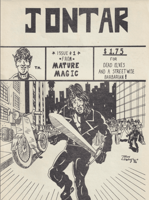
An example of a ‘power comic’- Jontar #1 by Bill W. Miller & Tony Lorenz
MFR: Do you mostly find scans/pdfs, or are you finding and receiving more actual physical books? And do you have a preference?
EH: Physical books only. We have to touch them.
MFR: How many media platforms are you guys spread on? And where can comic fans get the most out of what you do?
EH: The main dig is Instagram. We recently launched a YouTube channel (www.youtube.com/powercomics) where we plan to do tons of in-depth reviews, interviews with Power Comic creators, and we just kicked off a Power Comic book club with Benjamin Marra. Our most exciting new venture though is our Patreon (www.patreon.com/powercomics) where for just $5/month we grant folks access to our growing digital library where they can read through the most fascinating, rare comics we’ve discovered.
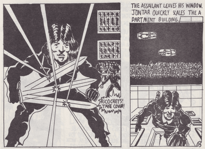
Jontar art by Tony Lorenz
MFR: When did your interest in these kinds of comics start? Did a specific book get you going?
EH: It pretty much all started when Zack Carlson exposed me to Ken Landgraf and Bob Huszar’s New York City Outlaws back in 2009/2010, which is an amazing DIY/heavy metal take on The Warriors. It was that moment when a huge door opened, and I realized that there was this whole hidden underground world of small press ’80s comics, and it grew into a total obsession to find more like NY Outlaws. At the time, none of these comics were worth ANYTHING. So I would spend hours on MileHighComics.com just going through all the publishers and searching various things and would order a HUGE box of like 200 comics shipped to my house for $40. All gems. And it was this awesome feeling of being on to something, and collecting something special that no one else had yet caught on to – not sure if that was true or not, but that is how it felt at the time.
MFR: How did you come to the term ‘Power Comics’?
EH: I honestly can’t remember exactly, but we wanted to launch a Tumblr back in 2011 to showcase these discoveries and we needed a name for the site as we wanted to create a portal where all of these odd duck comics could be united and live together. The innocuously simple, but very fitting title POWER COMICS was chosen.
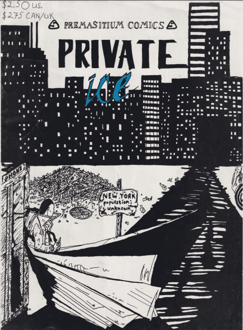
Cover to power comic ‘Private Ice’ #1.
MFR: Do you have a particular favorite discovery?
EH: My favorite discovery is actually a ’70s large-format comic zine called Mistique from the UK. We posted on Instagram, but I’ve never seen ANYWHERE else, and can’t find any information about it. The art is so amazing, I want to make 30 different t-shirt designs from it ASAP. But my favorite Power Comic is Dream Weaver issue #2. I believe it to be the perfect Power Comic specimen, and it even reaches transcendent levels of poetic brilliance.
MFR: Is there a book you are still looking for? Is there a Power Comics Holly Grail find out there?
EH: There’s MANY. The one that’s high on the MOST WANTED list at this present moment is a title called Baneful Ground. If you got it, get in touch.
MFR: Why do you think these comics are important to shed a light on? What can they showcase about our beloved medium?
EH: Similar to how the film world has its most devoted fans of ultra-low-budget action film discoveries, and/or shot-on-video horror films of the ’80s, or like how rare record heads in the music world obsesses over obscure, private press basement demos, power comics is just that for the world of comics. Power comics is the outsider reflection of this medium’s mainstream.
MFR:On top of highlighting comics, you guys have also recently interviewed a few creators. What kind of response have you gotten from some of the creators whose books you have highlighted?
EH: It’s been a trip. The response to the creators we’ve spoken to thus far has been mostly shock. Most can’t believe we’ve tracked them down, that anybody cared, or even likes the comic they created 30+ years ago. At first, I wasn’t sure if I wanted to peek behind the curtain to find out the real truths behind some of my favorite Power Comics as that could spoil the mystique, but so far it’s been super rewarding talking to some of these creators and also finding out the things you always suspected regarding the creation, limitations and dreams they originally had, were true.
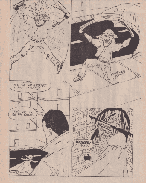
Interior art from ‘Private Ice’ #1, another ‘power comics’ gem.
MFR: Do you make any comics of your own?
EH: I don’t – I’m just a fan and an admirer of comics.
MFR: Where do you want to take ‘Power Comics’ in 2021? Anything new on the horizon?
EH: We want to grow our following on IG, YouTube and Patreon the most we can! We have some killer things and hugely AMBITIOUS goals planned, but they may only work if we can grow our audience x4 this year!
MFR: Any parting comments for our readers?
EH: YES. If you have any “Power Comics” that we don’t or noticed we haven’t posted yet, please assume we don’t have them/it, and definitely make sure to send us a message on IG, Patreon, or YouTube with any tips on new Power Comic discoveries! We’re ALWAYS on the hunt!!