Home Blog Page 184

Review: KILL LOCK: The Tragedy Of The Prisoners’ Dilemma

Kill Lock Cover

Kill Lock is one of the most eye-catching and well written stories to have come out of IDW. It was released on September 9th, 2020. Creator Livio Ramondelli works as both writer and artist to a beautiful universe with a robot society. Joining him is letterer Tom B. Long to display the unique voices of each character.

Kill Lock: Robot Faction Building

The World of Kill LockRamondelli writes Kill Lock with multiple layers of both world and character. In a space age where robots practically run the universe, the reader views the world through four distinct personalities.

Our hero everybody
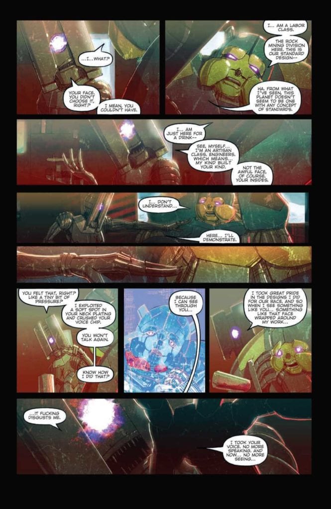
The protagonist, Artisan, reflects the greater society’s status quo to purge weakness. Any flaw is something to eliminate, even if it’s not that robot’s fault. Imagine this being like the concept of needing to replace a still working computer with the latest model and now apply that to a disabled person. Real dictatorships come from this kind of thinking, one in particular that still echoes throughout history.

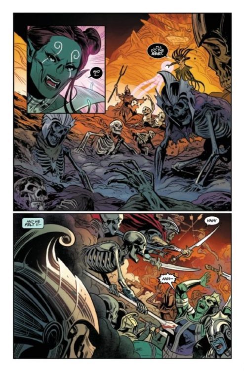
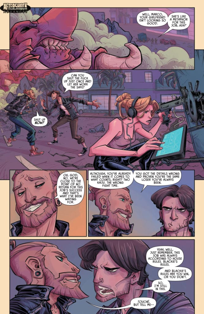
But what makes Kill Lock unique is the titular jail sentence. It’s a form of exile where four undesirables are forced to work together. Because, if one of them dies, they all die. The Artisan is by no means sympathetic, he’s as much an antagonist as he is a protagonist. The other characters meanwhile deserve a little love and empathy.

The Labor Class’s attitude is like any blue-collar worker who got into a bad situation. He’s the kind of character people would relate and give sympathy to the most because of how close to life he feels. The Wraith Legionnaire is a heroic figure who, through subtle visual storytelling, goes through the most development. These two are the muscle to protect the heart of their group, the Unfinished. He looks and acts like an innocent child, the kind that changes the sympathetic connection the Laborer and Legionnaire to empathy. Because wanting to protect someone from a cold cruel world when they don’t have the power was something the artisan was counting on for his master plan. No spoilers, but with how empathetic these three become, the audience have become unwilling accomplices of the Artisan.

Robots In Distress

Ramondelli’s artwork has plenty of similarities with his time on Transformers. The hyper detailed orientation and coloring give a photorealistic design to everything. Each robot body’s appearance gives the reader an idea on how they look and function. The bulky bodies of the Laborer and Wraith look tough enough to survive what can be thrown at them while the Artisan and Unfinished look frail.

The facial features also help in displaying the emotions of the relatable characters. Surprisingly, even the Wraith’s glowing symbol face gets expressive, to show he isn’t as stoic as he might suggest. All of these things make the reader want to connect to these characters, except for the foreboding Artisan.

Long, as letterer, brings arguably the most subtle details to Kill Lock. Robots who live in general society all have a mechanical font, unlike the more natural font of outcasts. This gives the reader a sense of awe at how the robot society treats its citizens with complete indifference. With the Kill Lock cast’s natural speech, readers get the impression that they are more “human”. They recognize their flaws but are okay with it, unlike the rest of society that only see them as mistakes.

Kill Lock Commence!

This short but sweet series collects a story that looks into a society of robots. One where the concept of a humanistic outlook by both characters and readers leads to tragedy. The reader finds themselves attaching to certain characters they genuinely come to love, only for everyone to realize that they were led astray. It’s these feelings, feelings of love and disillusionment, that allow for a great story to come out in Kill Lock.

Monkeys Fighting Robots Youtube

BOOM! Studios Exclusive First Look: ABBOTT: 1973 #3

boom! studios exclusive preview ABBOTT 1973

ABBOTT: 1973 #3 hits your local comic book store March 17th, but thanks to BOOM! Studios, Monkeys Fighting Robots has an exclusive five-page preview for you.

About the issue:
The dark forces terrorizing Detroit have struck Elena Abbott where it hurts most…and
she’s going to strike back. But even after pulling together an uneasy alliance with the
last people she expected, Abbott is about to learn her enemies are one step ahead of
her… and it might cost her the person she loves most.

ABBOTT: 1973 #3 is by writer Saladin Ahmed and artist Sami Kivelä, with colors by Mattia Iacono, and letters by Jim Campbell.

The five-issue series is a follow-up to 2018’s ABBOTT, which took place in 1972.

Check out the ABBOTT: 1973 #3 preview below:

boom! studios exclusive preview ABBOTT 1973

boom! studios exclusive preview ABBOTT 1973

boom! studios exclusive preview ABBOTT 1973

boom! studios exclusive preview ABBOTT 1973

boom! studios exclusive preview ABBOTT 1973

boom! studios exclusive preview ABBOTT 1973

boom! studios exclusive preview ABBOTT 1973

boom! studios exclusive preview ABBOTT 1973


Are you reading ABBOTT? Sound off in the comments!

“Readers can find ABBOTT VOL 1 available everywhere books are sold. In the uncertain social and political climate of 1972 Detroit, hard-nosed, chain-smoking tabloid reporter Elena Abbott investigates a series of grisly crimes that the police have ignored. Crimes she knows to be the work of dark occult forces. Forces that took her husband from her. Forces she has sworn to destroy.”

Monkeys Fighting Robots Youtube

Review: HOLLOW HEART #1 – Sci-Fi & Romance Like No Other

From writer Paul Allor and artist Paul Tucker comes a deeply personal and focused start to a romantic science fiction comic in the form of “Hollow Heart” #1, published by Vault Comics. This oddly sweet and fascinating comic is a completely new experience even for diehard fans of the genre, wrapping personal philosophy, human relationships, and good ol’ sci-fi up in a brilliant comic book package. With beautiful narrative work and stellar visuals, this is going to be a must read first issue, I can feel it.

“EL used to be human. Now he’s a jumble of organs in a bio-suit. EL is also in tremendous pain and has been for a very long time. Hope arrives in the form of Mateo, a mechanic brought in to work on EL’s suit. Mateo sees LK in a way no one ever has. And what’s more: Mateo offers EL an escape.”

Writing & Plot

The most striking element in Paul Allor’s script for “Hollow Heart” #1 is how he pulls off a bit of a no-no in the comics medium, and nails the hell out of it. Allor utilizes a narrative voice outside of the dialogue for nearly every page of the comic – something generally considered a faux pas in a visual medium. However, instead of using that voice to describe images that can be seen on the panel (which is why this practice is widely discouraged), he uses this technique to weave a narrative inside the heads of his characters that adds a whole new dimension of complexity to the cast and story. What’s more is that we need this kind of perspective to be able to understand who El really is and how he feels. He is, after all, basically just a pink skull in a glass helmet, Being able to understand El’s pain and conflicted emotions in a manner that gives us just enough to understand him, but never overtakes the page, is a huge win on part of this comic. The prose work here is full of insight, while also on a stylistic level is enrapturing. There is some beautiful, near Gaiman-level narrative work going on here, and it makes this comic unique and poetic. The story itself is delivered with a purposeful sense of mystery. We don’t really get much of introduction to El or Mateo and the universe they live in. Instead, this comic focuses on their actions here and now to tell this story. This distills the often highly-conceptual nature of sci-f- stories into a purely character-centric chapter, getting us to intimately knw these two people. This is a comic written with a passion that rarely comes out in any medium, and I’m beyond engaged with this story and whatever Allor plans to write in its future.

Art Direction

This comic’s striking visual style is brought to life by artist Paul Tucker, who builds this world – much like the writing – off of its characters. First and foremost we have to talk about El’s design and how he’s presented here. There’s something instantly engaging about this sorrowful pick skull floating in liquid whilst running around in a giant bio-mechanical suit reminiscent of something from Forbidden Planet. Tucker’s frequent close ups on El’s visage allow us to gauge how this character is feeling even when the narration has stopped. This is a huge credit to Tucker, since he’s able to accomplish this with a character that can’t really emote because of his physical situation. I mean, the guy is a skull in a bowl of liquid. Tucker manages to make him emote with how his eyes move, and also with how he is angles in-panel. Certain perspectives make us able to see what’s on El’s face better than other, so Tucker’s astute visual direction works wonder for getting the reader into the head of this character. The environmental artwork is brilliant as well, offering a variety of sets that range from a dingy bar akin to something in Blade Runner to a sterile laboratory. Every panel, even the lab, feels lived in and realistic, making this sci-fi story feel more feasible than fantastic. Tucker’s colors are a stellar visual feast as well, setting the perfect tone for every scene. The most striking use of this color is, obviously, El’s pink glowing skull in the backdrop of black liquid; an image that is indelible in my mind now that I’m writing this. The character animations and designs for the regular human cast is, admittedly, a tad rough at points, but the direction and detail in other spots more than makes up for this. The sense of visual storytelling that weaves along with the narrative is one that could be used as a textbook example of how comics work as a written and visual medium, and it’s one of the most excellently directed books I’ve read recently.

Another little note I have to make about something I really like about this comic is the breakdown of the lettering for the narrative bits. Allor, the writer, is also the letterer for this issue, and in being so I imagine that gave him license to play with his sentence structure in the text boxes. The sentences in his detached narration are broken up from box to box; so he’ll start a sentence in one textbox only to have it end suddenly and pick it right back up in the following box. It’s a neat trick that actually works really well and I’ve never seen it done in a comic before. He also uses a font for El’s artificial cyborg-ian voice I don’t think I’ve ever seen in a comic, but it illustrates how the character sounds perfectly.

“Hollow Heart” #1 is a beautiful and deeply personal start to this romantic sci-fi comic starring a depressed monster in a space suit. The scripting and lettering from Paul Allor make for one of the most insightful and engrossing reads I’ve taken in thus far in 2021. The visual work of Paul Tucker is well-detailed (if sometimes a bit sloppy) and brilliantly directed. Please check this issue out when it hits shelves on 2-17!

Monkeys Fighting Robots Youtube

AfterShock Comics Exclusive Preview: KAIJU SCORE #4

aftershock exclusive preview kaiju score

KAIJU SCORE #4 hits your local comic book store February 24th, but thanks to AfterShock Comics, Monkeys Fighting Robots has an exclusive four-page preview for you.

About the issue:
MORE STORY! MORE ART! MORE KAIJU!

The good news is that the crew for the Kaiju Score is very close to pulling off a heist that will set them up for the rest of their lives. The bad news is that two kaiju are tearing the city apart as they try to finish the job. It’s all on the line now: tens of millions in art, their very lives, and even their souls. It’s going to end one way or another, and not everyone is going to make it out alive.

The final chapter in the first story arc of this exciting franchise being developed as a film by Sony Pictures!

KAIJU SCORE #4 is by writer James Patrick and artist Rem Broo, with letters by Dave Sharpe.

Check out the KAIJU SCORE #4 preview below:

aftershock exclusive preview kaiju score

aftershock exclusive preview kaiju score

aftershock exclusive preview kaiju score

aftershock exclusive preview kaiju score

aftershock exclusive preview kaiju score

aftershock exclusive preview kaiju score


Are you reading KAIJU SCORE? Sound off in the comments!

Monkeys Fighting Robots Youtube

Review: WELLINGTON: A Humorously Unpredictable Series

Wellington Cover

Wellington is an entertaining series from IDW. It came out on December 9th of 2020. Podcaster Aaron Mahnke writes this series, alongside Delilah S. Thompson, for a different take on Britain’s supernatural side. Artist Piotr Kowalski provides some eerie artwork for atmospheric effects which Brad Simpson makes more suspenseful. The lettering duties between Christa Miesner and Valeria Lopez add a level of unpredictability to the story.

Wellington: Anything But Ordinary

Meet our heroMahnke, of the Lore podcast, gives Wellington a familiar monster hunter premise that turns on its head. With the Barghest monster serving as the antagonist, there are many elements displaying how such a life affects those around them. The titular character is certainly a man of duty, willing to share his experiences for the greater good. It’s the ones closest to him that get the brunt of his negative traits, like his right-hand man.

Let it be said that this is not a traditional monster story that’s governed by logic. Monsters, like the Barghest, don’t really seem to follow any rules of that sort. Some of its abilities can even look quite humorous, like when it turns into a white rabbit.

Monsters like the Barghest easily throw off the Wellington, who pursues the monster out of duty. Given how Wellington likes to be in control of things, how he interacts with unusual things like a German speaking crow can be rather amusing. The only issue comes from how such comedic undertones clash with the supernatural horror.

Timely Illustrations

Wellington First ImpressionKowalski illustrates Wellington with a style reminiscent of 19th century drawings. This makes the series feel timely. The scale of some of the architecture can be overwhelming. Right from the opening pages, we see huge pictures of Wellington’s home.

With how the Duke shows his utter shock at the events as they play out from his narrations, it’s as if he shows everyone what he’s been through. The scenes in the cave, which are an extension of the Barghest, by contrast are ever changing and impossible to make sense of.

Simpson enhances the above feelings through his coloring. Most scenes featuring the Duke often accompany some light orange colors, as if to show a passionate man. The antagonistic side of Wellington meanwhile often accompanies ghoulish greens.

To further illustrate this connection, some of the captions and word balloons from Miesner and Lopez match with the characters. Alongside these, are sound effects that ,depending on the intensity, get bigger or smaller to reflect the mood.

Give Wellington A Try

Wellington is an enjoyable romp with a plot that will keep readers on board. The juxtaposition from the illustrations and aesthetics can certainly drive the plot forward. When viewing all of this through a plot that keeps people guessing on what will happen next, it’s definitely worth reading.

Monkeys Fighting Robots Youtube

4-Page Preview: KING IN BLACK NAMOR #4 (OF 5)

Preview: KING IN BLACK NAMOR #4 (OF 5)

Preview: KING IN BLACK NAMOR #4 (OF 5) hits your local comic book shop next week, but thanks to Marvel Comics, Monkeys Fighting Robots has a four-page preview for our readers.

About the issue:
The Black Tide’s wave of devastation now threatens Atlantis itself. Namor, Dorma, and Attuma may be the undersea world’s only hope, but unless they can shake off their utter defeat from the last issue, they don’t even stand a chance. And worse, the one possible weapon they could wield against the Black Tide is in Murmansk, thousands of miles away. It’s Atlantis’s darkest hour…

KING IN BLACK NAMOR #4 is written by Kurt Busiek, with art by Ben Dewey, Jonas Scharf is the “present-day sequence artist,” Tríona Farrell added the color, and you will read Joe Caramagna’s letter work. Leinil Francis Yu and Sunny Gho worked on the cover.

Enjoy the preview below:

Monkeys Fighting Robots Youtube

INTERVIEW: Composer René G. Boscio Scores Latino-Infused Romeo And Juliet

Romeo and Juliet turns 424 years old this year, and in 2021 composer René G. Boscio became part of a new film to infuse the centuries-old play with some Latin flavor.

You know the story. Two young members of unfriendly factions, Romeo and Juliet, fall in love causing an uproar. But the pair can’t bear to be apart, which ultimately leads to their demise. In this new version, which premiered at Sundance in January, the cast is primarily black and Latino, and the story comes to viewers through smartphones and social media’s unique perspective.

PopAxiom spoke with René about his road from Puerto Rico to LA and making music for Romeo and Juliet.

The Start

“I began playing drums when I was around 11,” he says about the start of his musical journey. “I used to skateboard and play video games and play video games about skateboarding — Tony Hawk. The soundtrack was all these punk bands, and I got very into Blink 182. I wanted to be like Travis Barker.”

René “switched over to guitar, and I spent most of my teens playing in rock bands. I would have these little ambient, electronic side projects.”

The time came for college. “I knew I wanted to make music, but I didn’t exactly know how. I was interested in Berklee, but it didn’t quite work out financially. So I went to the conservatory in Puerto Rico.”

René completed a bachelor’s degree in classical composition. The process was his “introduction to the orchestral world. My family is very much into the rock and pop world. This was my first time being in front of all these orchestral instruments. It opened up a different world of musical exploration for me.”

“At that point, I started noticing music in movies,” he states before pointing out a particular movie, “The Holiday.”

The Holiday is a 2006 romantic-comedy by director Nancy Meyers. Unlike most romantic comedies, however, the score for this film came from Hans Zimmer. “That score was the first that popped out to me because it was pop-y and jazzy with an orchestra and guitars.”

René said to himself, “This is what I’d love to be doing, a combination of those styles.”

A flame lit up in René. “I started reaching out to film students and begging them to let me score their shorts. That’s how I got started, by doing these short films while finishing my bachelor’s.”

René G. Boscio-interview-romeo and juliet

Unique Sound

After graduation, René attended a two-day workshop for composers. At the center of this event was one of the most prolific composers of today. “I met Blake Neely at a workshop, and he ended up changing my whole world.”

During the workshop, “Blake gave us homework to score a scene,” he says. René caught Blake’s attention. “For a couple of weeks, he and I emailed each other back and forth. Eventually, he offered me an internship.”

René flew out to LA and spent a week with Blake in the studio. “At this point, I didn’t even know composers had teams. That’s how far removed from how things work in Hollywood I was. When I got here, it was him and Nathan Blume. I spent that week seeing how everything worked. It was all very eye-opening to me. By the end of the week, he offered me an assistant position.”

Working for Blake “was amazing,” he says, “It was like a master’s program in real-time. At first, it was mostly assistant tasks like cataloging music or doing tech work. Slowly, he started giving me more opportunities to arrange cues, all the way to writing music for the many shows he works on.”

First-hand experience from a veteran like Blake is priceless. What’s one lesson René took from his time? “How important it is to craft your sound and not use stuff out of the box. Often, when you’re working with virtual instruments, you’re able to pull up a preset. With some instruments, you just push a button, and it writes the cue for you.”

“It was always essential for Blake to take anything pre-made and tweak them to a point they became a unique sound.”

About Romeo & Juliet

“It’s my first feature film, and it’s at Sundance,” René says of Romeo & Juliet. “It was on my five-year list of goals when I started freelancing a few years ago. It happened! I’m very excited.”

“The filmmakers took on-screen representation to heart with a talented cast of black and Latino youth,” he says, but adds, “But we didn’t want the music to be too on-the-nose.”

René plucks on an instrument. “I take something simple and sample it. Then I create my virtual instrument and add different layers and textures, which will help create the score’s unique sound.”

Romeo and Juliet’s score is “not entirely orchestral,” he says, “but it’s not wholly electronic.”

The mix of Latino instruments, traditional instruments, and electronic music creates a sonic blend throughout the film. “It’s also one of those things,” he says, “that if I didn’t point it out, you might not even know they’re Latino instruments I’m using.”

Wrapping Up

René reveals “Trent Reznor and Atticus Ross” as having had “a huge impact as far back as Nine Inch Nails.”

“David Fincher films were always …” René makes a sound as if his mind were being blown.

More influences include “Sigur Ros and Alex Somers. Gustavo Santaolalla from the Latino side has influenced a lot of what I think of as Latino cinematic sounds.”

René’s got a dream project in mind that he hopes to one day make. “Think of Hocus Pocus from the Latino perspective, exploring the Brujeria side of things. When you think of something like Sabrina, that kind of dark, coming age thriller-horror story but with a Latin angle, I would love.”

“I’m currently wrapping up a feature called 7th and Union,” René answers when asked what’s coming next. “It’s directed by Anthony Nardolillo. I don’t know how much I can say, but it’s a drama.”

Is Carey Williams’ Latin-infused Romeo & Juliet on your watch list?

Thanks to René G. Boscio and Lumos PR
for making this interview possible.

Read more interviews from Ruben R. Diaz!

Monkeys Fighting Robots Youtube

Review: ARIA HEAVENLY CREATURES: The Magic Reappears

Aria Heavenly Creatures Cover

Aria Heavenly Creatures releases February 17 from Image Comics’ Shadowline imprint. Co-creator/writer Brian Holguin revisits his cult classic series from 90s Image with this one-shot. In order to bring it to a modern audience, Anomaly Press members bring their gothic atmosphere stylizations.

Background

Originally releasing on the turn of the century, the Aria franchise follows Kildare, a fae living in the mundane world. Working as an occult detective, Kildare goes out of her way to help the denizens of a hidden magical world. The series lasted 5 years, including a crossover with former Spawn character Angela… which is the topic of this one-shot.

Aria Heavenly Creatures Is A Retcon

Full disclosure, Aria Heavenly Creatures is actually a retroactive version of the Aria/Angela crossover from 2000. Due to Angela’s copyright issues further rereleases were stuck in a legal limbo. So in order to republish the story for a modern audience, Holguin tweaks some details by replacing Angela with a nameless angel. Other than that, it’s pretty much the same story, featuring tropes from the 2000s including monologuing narrators. This retains the feeling of mystery surrounding the setting of the one-shot. It’s gloomy and foreboding. Otherwise, some conversations last for longer than they should and can seem rather boring.

A Gothic Makeover

Aria Heavenly Creatures retains the penciling by artist Jay Anacleto, save for the angel’s redesign. Because some elements, like Angela’s headdress, have to be removed, there are noticeable empty spaces that take away the angel’s presence. As a result the angel feels smaller despite retaining a fierce aura.

Brian Haberline pulls a double duty as one of the co-artists and the colorist. Much like his other series Marked, there is a foreboding atmosphere from just the architecture and skyline. The early 18th century London is a place of marvel, in wealth as well as decay. This actually serves as decent foreshadowing. Despite how good the city can look, there are plenty of parts that are just ugly, like dominating parts of the world. The Angel, held prisoner by a freak show host, is the most prominent example.

The rest of Haberline’s Anomaly Productions, like Drew Posada and Raymond Lee, colors Aria Heavenly Creatures in preservation of the original. With how comic book ink can fade, a fresher paint job can give new life to a story’s theme. Like a freak show audience member’s lack of coloring that makes him look ghastly. London claims a victim here and the Angel could very well have been next.

Lettering An Era

Francis Takenaga as letterer gives Aria Heavenly Creatures captions worthy of 18th century London. The scroll-like captions as well as the fancy opening letter are all hallmarks of classical writing. It gives a sense of regal appearances where reputation matters. Unlike the SFX such as a werewolf’s snarling or an ominous laugh that reveal a magical creature’s inner nature. That’s all in contrast to the wealthy partygoers in the one-shot’s beginning. Despite society openly being against acts of social deviancy like bong smoking, the word balloons express how people of high status enjoy it all in seclusion. For the antagonists and setting, domination to fulfill perverse desires in secret are an ever present threat.

Give Aria Heavenly Creatures A Try

Aria Heavenly Creatures is a piece for older fans to collect while telling new fans that a classic is making a comeback. Sure, historians will appreciate the history behind this one-shot more, but that doesn’t mean it’s exclusive to them. It can serve as an introduction for new fans to dive into a cult classic. Just look at how the creative team took efforts to restore a piece of their history.


Are any of you going to give this one-shot a try? Or have the stylizations in storytelling aged poorly? Leave your thoughts in the comments.

Monkeys Fighting Robots Youtube

Review: RECOUNT #2: The Routine Challenge Of Electoral College Outrage

Recount #2 Cover

Recount #2 is a socially relevant political thriller, releasing on February 17, from Scout Comics. Writer Jonathan Hedrick examines the fallout of an election where people try to steal away control. The art, by Gabriel Ibarra-Nunez, brings a strong sense of kinetic scale in the series’ threats. The coloring by Sunil Ghagre enhances these threats with shading as these threats thrive in the shadows. Finally, the lettering by Cristian Docolomansky gives impact to every action, no matter how small.

Background

Recount follows a post-election/presidential assassination story about the United States, as they’re gearing up to enter a civil war. After a militia kills the president elect, his vice president Meredith McDearmon comes into power to try and get some control. Unfortunately, when the changes in militia encourages regular people to attack supporters of the late president; what control is left?

Recount #2 For The Times

Recount #2 and the series as a whole releases at a time when political tensions continue. With voter suppression and conspiracies running rampant after the 2020 elections, nobody knows who to trust. Politicians will always promise to make the country better, but they often don’t have the power to. These more often turn out to be lies to appease the public.

Within the series, Hedrick makes it plain as day that the lies these politicians tell their supporters make them like a cult. Meredith finds that her late boss made deals that turned people against their loved ones, with no hope of turning their lives around. To the militia, as well as the public attacking electoral college members, this is enabling corruption. Even then, retaliation is just more cult behavior akin to the Capitol riot. It’s all rather scary how much this issue seems closer to life and keeps the reader guessing at what happens next.

Art Of Guerrillas

Recount #2 features the art of Ibarra-Nunez making gritty shading as well as small but powerful movements. In the six and nine panel grid pages, there is a sense of control only for it all to fall apart. A 6-panel conversation between Meredith and Secret Service Agent Barto has Barto taking command of the situation by deconstructing Meredith’s defensive attitude. Barto exerts a constant in control posture, unlike Meredith who relaxes in each panel appearance. Compare this to the 9-panels where in three instances, electoral college members are killed while going about their day. Somebody needs to be in charge, and fast.

The coloring by Ghagre is utilized for dramatic effect. A number of panels in pages that happen in broad daylight have blank backgrounds. These reflect the angry civilians who are going out killing the electoral college. After building up their rage, the actions that take place are plain as day; nothing else matters to them but those moments.

It’s all contrasted against dark rooms where the influence of assassination militia reaches the most. When Meredith and Barto meet with an electoral college member, the only light comes from a desk lamp. In this area, the man feels the weight of all his actions as he reflects over everything. The light from the doorway Meredith and Barto came from might’ve been a way out, but the militia’s influence lingers on.

Impactful Lettering

The lettering by Docolomansky is often an extension of what’s occurring in the moment. When Meredith is trying to steer a car, while she and Barto are being shot at, the cussing in different font feels heavy with the lack of control. Of course each SFX can say just as much about a lack of control. Unlike when people speak in regular word balloons, a hand drawn scream brings about a feeling of chaos. Seeing somebody get shot and the gunshot hitting somebody certainly can do that. Compare that to the SFX made from a computer, these are extensions of mechanical devices like a car or doorbell. Their functions are simple and don’t interfere with anything, they are more easily controlled.

Demand Recount #2 For Some Control

Recount #2 is shaping up a very relevant political thriller. By channeling today’s political outrage into a speculative field, the comic delves into a need for order. It’s a feeling that’s all the more powerful thanks to how the art presents it. Panels and colors shift in response to the threat of a militia ready to throw everything into chaos.


What do you all think? Is this series worth continuing for its own sake? Or is it getting so much like the real world that it’s uncomfortable?

Monkeys Fighting Robots Youtube

Review: KING IN BLACK: PLANET OF THE SYMBIOTES #2 and Nostalgia

King In Black: Planet of the Symbiotes #2 Cover

King In Black: Planet of the Symbiotes #2 features two C-List Marvel character stories, on February 17. Tying American Kaiju and Hornet together are two complementary stories about nostalgia. American Kaiju explores how the inspirations that propel people to action must come from an awareness of toxicity. Hornet meanwhile is about details how while inspirations have their downsides, they can still propel people to do good.

American Kaiju: Nostalgia vs Reality

Opening with American Kaiju, writer Marc Bernardin dives right into the title of this section of Planet of the Symbiotes #2. The American Kaiju, Corporal Todd Ziller, lives the ultimate fantasy of a Marvel fan. The serum that makes him the American Kaiju is made up of several Marvel Universe elements like the Hulk, Ant-Man, and Captain America. Since a number of military soldiers, like Super Soldiers author Jason Inman are comic book fans, Ziller is able to connect with some real world fans more than others. Nothing beats actually sharing experiences with these heroes.Planet of the Symbiotes #2 Cover Star

So what happens when fans, like Ziller, catch onto the downsides of superhero life when they live it? Artist Kyle Holtz and colorist Rachelle Rosenberg showcase a large grand design of American Kaiju, as a force of nature rampaging through the city. A buff giant green lizard with the American Flag on his chest practically screams Ziller’s sense of patriotism as much as his roaring of “USA!” But they also show in his fight with a giant symbiote dragon how he trashes the city, like using a public train as a weapon. Sure it looks cool but after this, the city folk will need some transportation when this is all over.

Hornet: How Nostalgia Inspires

Meanwhile, in the other half of King In Black: Planet of the Symbiotes #2, there is a more positive story about nostalgia. Former Prowler Hobie Brown is called into action after leaving the superhero life behind. In contrast with the above story, writer Geoffry Thorne goes into the process of how nostalgia is still a process of inspiration. Hobie hasn’t quite given up the superhero attitude like the Prowler suit. Thing is, despite his girlfriend wanting Hobie out of that costume, she appreciates how he’s able to take charge in emergencies.Why did this part of the series get obscured?

It’s this attachment to the past that can inspire people like Hobie to understand what they like and apply it in the rest of the world. It’s why artist Jan Bazada designs Hobie’s costume with the Prowler mask. Aside from good color balance provided by Rosenberg, it’s a period of transition that shows Hobie off with one last bit of glory. His technological expertise is on full display when he fights against the symbiotes, with cell phones no less! While Hobie is taking on one of Spider-Man’s other alter-egos, his actions here display how he earns the mantle of Hornet.

King In Black: Planet Of The Symbiotes #2 – Lettering

Tying King In Black: Planet of the Symbiotes #2 together is letterer Cory Petit of VC, giving characters distinctive voices. The limited speech of American Kaiju has its own coloration, coupled with loud SFX to evoke a sense of loud patriotism. That’s in juxtaposition to the green captions that express Ziller’s awareness of the situation and his own self-loathing.

The Hornet section, meanwhile, serves as a complete extension of Hobie in action. The word balloons help guide the reader throughout all the movements. The light purple SFX also tend to accompany every hit and tap on a phone. It’s what makes the reader naturally progress from action to reaction throughout the story.

Get King In Black: Planet Of The Symbiotes #2

King In Black: Planet of the Symbiotes #2 is an ideal tie-in for several reasons. By forgoing tying directly into the main plot of the crossover event and not interrupting currently running series, C and D-list characters get the chance to be seen. The efforts creators put into developing these characters internally and externally means more arcs need to follow. It’s what put this issue in the same ranks as the Black Knight tie-in.

Monkeys Fighting Robots Youtube