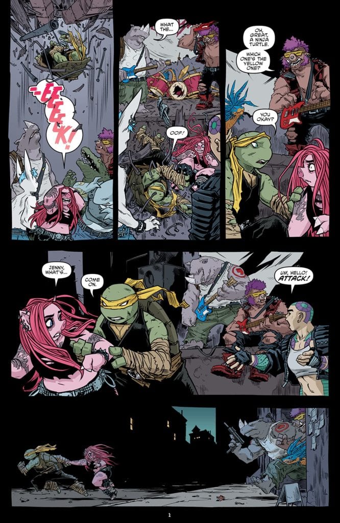
TEENAGE MUTANT NINJA TURTLES #115 hits stores on Wednesday, March 17th, promising a showdown between the Turtles, Karai’s henchmen Bebop and Rocksteady, and the mutant “babies” Tokka and Razhar. After failing to settle the mutants, our protagonists are forced to come up with a new strategy. Unfortunately for them, Rocksteady and Bebop have some plans of their own.
Story
After failing to subdue Tokka and Razhar, Jennika “drops in” on Bebop and Rocksteady’s mayhem. Taking a note of the surrounding chaos, she quickly leads her friend away. But Karai’s henchmen don’t take kindly to this choice.
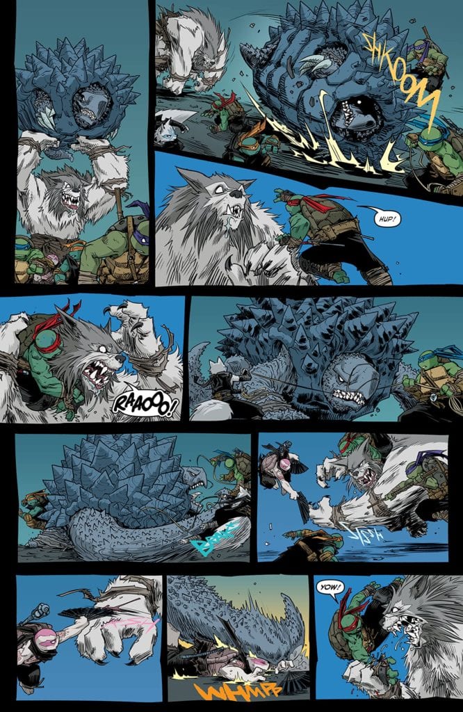
Everything the Turtles have attempted so far has amounted to zilch. Even with the future version of Lita’s help, the ninjas can’t seem to make one ounce of a difference.
It’s not until Donatello comes up with an ingenious idea: put the babies “mom” on speakerphone. The hope is that her voice will calm them down. But on a grander scale, this act represents a shift in our heroes’ consciousnesses. Writer Sophie Campbell shows how these characters must work with those they despise in order to prevent greater disasters. The future literally depends on all of them.
Artwork
Campbell’s penciling and ink work, combined with Ronda Pattison’s coloring, offered brilliant displays of action throughout this issue. The Turtles and their allies’ bright colors stood out from the dark backgrounds of Mutant Town. This helps readers follow their movements. Shawn Lee’s lettering also adds to the action with a great use of onomatopoeia fonts that follow each character.
Conclusion
TEENAGE MUTANT NINJA TURTLES #115 is a thrill and a half. We loved both the epic fights and the heartfelt message encouraging everyone to come together.
Do you think these groups can put aside their differences? Let us know in the comments below!
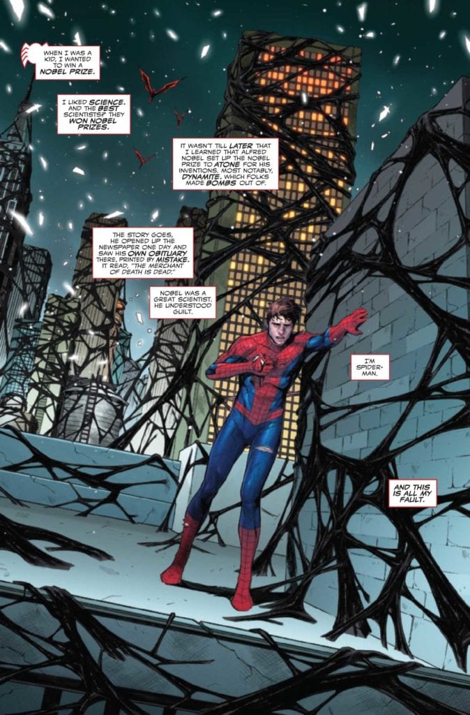
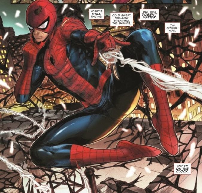
KING IN BLACK: SPIDER-MAN #1, available in comic book stores on Wednesday, March 17th, hones in on Peter Parker’s experience amidst Knull’s invasion. Our hero believes himself to be a failure after witnessing Eddie Brock’s death and Dylan’s capture. The story that follows gives readers a look at the struggle many face when striving to rise above their guilt and fear.
Story
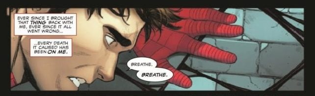
Feeling defeated, Peter wanders the streets of New York in a dazed stupor. The weight of the symbiotes’ attack is almost too much for him to bear. Though he didn’t release Knull upon Earth, Peter feels it was his fault symbiotes found their planet in the first place. His bonding with the Venom symbiote all those years ago still haunts him.
One of the beautiful aspects of Jed MacKay’s main narrative is the arc Peter goes through. Instead of succumbing to the effects of his very real anxiety, the hero moves forward. Readers can identify with this feeling, when something stronger than ourselves encourages us to act in spite of great emotional turmoil.
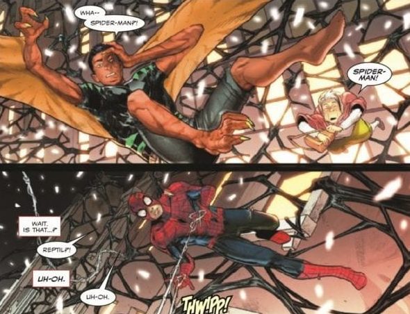
Unfortunately, Peter’s first attack hits Humberto Lopez a.k.a. Reptil, mistaking him for a symbiote dragon. But instead of creating conflict, the heroes bond over their shared sense of responsibility for the people of New York.
We see this movement from guilt-ridden despair to hope-filled action play out in MacKay’s backup story as well. Now partnered with Peter, Humberto embraces a call to protect the city. Despite his grandfather’s concerns for his safety, he stays to save more people.
The inspiring nature of both of these stories makes this issue one for the history books.
Artwork
Main Story
Michele Bandini’s penciling and ink work, along with Elisabetta D’amico’s inking, presents us with some of the most realistic depictions of Peter we’ve seen in comics. These illustrations pair well with Erick Arciniega’s coloring, which employs a mix of the hero’s standard red and blue set against harsher backgrounds.
Backup Story
Artist Alberto Alburquerque and colorist Rachelle Rosenberg craft illustrations full of fast-paced action. While focusing less on realistic details, this team uses their creative talent to depict Peter and Humberto fighting in stunning action sequences. The sweeping lines and swirling colors generate a sense of high speed movement, reinforcing the idea that the two are fighting to save as many people as possible.
Throughout both stories, VC’s Joe Caramagna’s lettering does a great job of emphasizing the most important statements in the characters’ dialogue.
Conclusion
KING IN BLACK: SPIDER-MAN #1 reminds us why we love Spider-Man. Watching the hero take on a huge responsibility with the enthusiastic Humberto is an inspiring sight.
Do you want to see these two team up more often? Let us know in the comments below!
After many long and dramatic issues dealing with Peter’s emotional turmoil, The Amazing Spider-Man #61 — out now from Marvel Comics — takes a sharp turn with the series and brings us back to the Spidey fun we know and love.
If you were to read The Amazing Spider-Man #61 and the previous issue back-to-back, it would be hard to believe they were both from the same series. The tone shifts so dramatically that it is slightly jarring, and it is impressive that Nick Spencer can write both styles so well. This issue is fun, action-packed, and quite funny. I wish the transition between the issues were smoother, but it is lovely to see Peter stop worrying about Kindred for a little while and refocus on worrying about finances. The Amazing Spider-Man #61 also revisits characters and storylines that haven’t been touched upon in a while. Spencer reintroduces all of these elements through captions that do a phenomenal job of welcoming new readers. If you were looking for an issue of the series to jump on, this is an excellent opportunity that won’t leave you confused by arcs you didn’t get to read.
Patrick Gleason employs many tactics to make the action in The Amazing Spider-Man #61 as thrilling and possible. Characters frequently jut out past the panels’ borders, and when the action picks up, unique panel shapes help the combat be more dynamic. The camera angles shift dramatically and provide for an energetic and exciting sequence. Sometimes, Gleason will portray characters through their silhouettes alone so that it is evident what the reader’s focus should be on. The character’s faces and body language also allow every comedic moment that Spencer establishes land and makes the issue a non-stop thrill.
Edgar Delgado has an astounding ability to make his color palettes reflect the tone of a story, and that can be seen blatantly clear in The Amazing Spider-Man #61. The issue begins with a short flashback to the heavily dramatic events that have occurred in recent issues, and Delgado’s palette choice reflects that. All the colors are dark and blend to make a grim tone. This is immediately followed by a stunning full-page splash with vibrant colors that show that the issue’s mood is back to the fun-loving Spider-Man that fans are accustomed to.
The Amazing Spider-Man #61 features the fantastic lettering abilities of VC’s Joe Caramagna, who always allows the dialogue to flow easily and provides a thrilling variety of sound effect designs that enhance the action of an issue. The lettering allows the story to progress naturally.
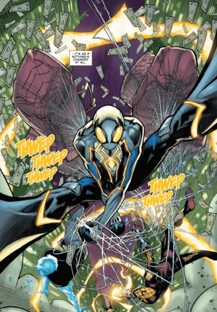
The Amazing Spider-Man #61 is a sudden turn but a welcome one. I’m curious to see how long this happier tone lasts, with Kindred destined to reenter the narrative at some point. The issue is fun, action-packed, and shows us a new high-tech Spider-Man costume.
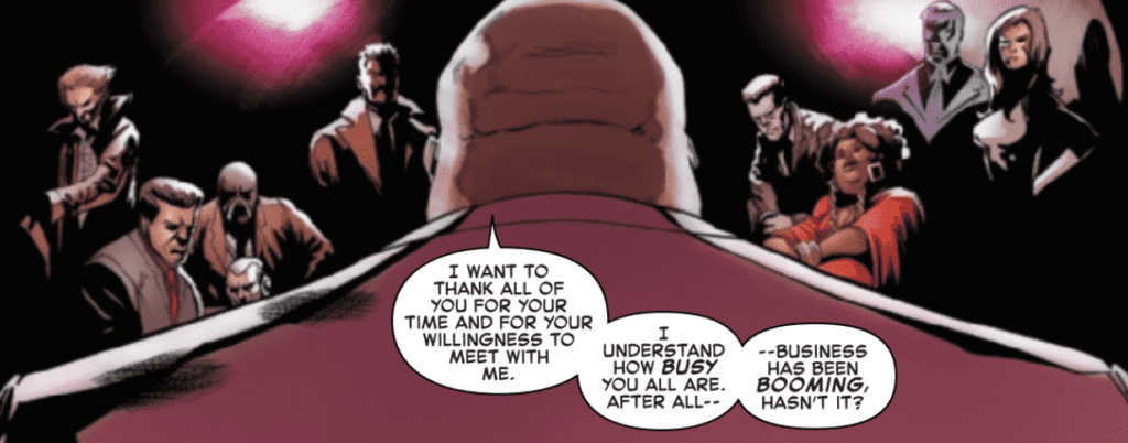
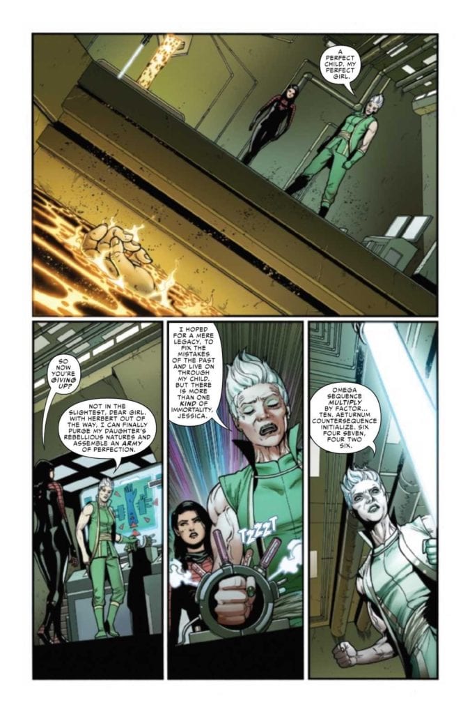
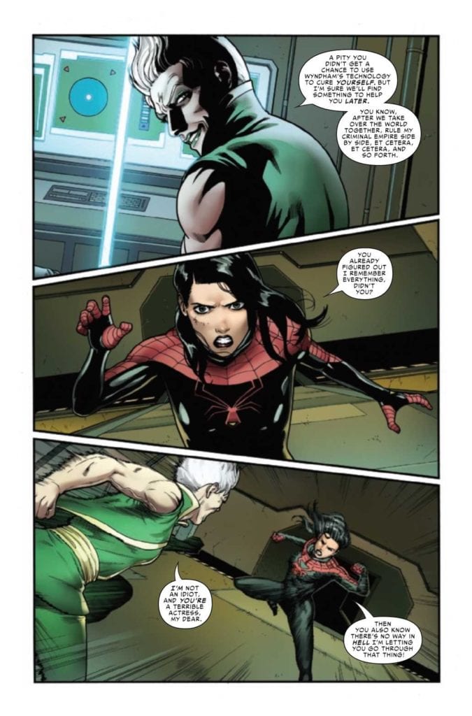
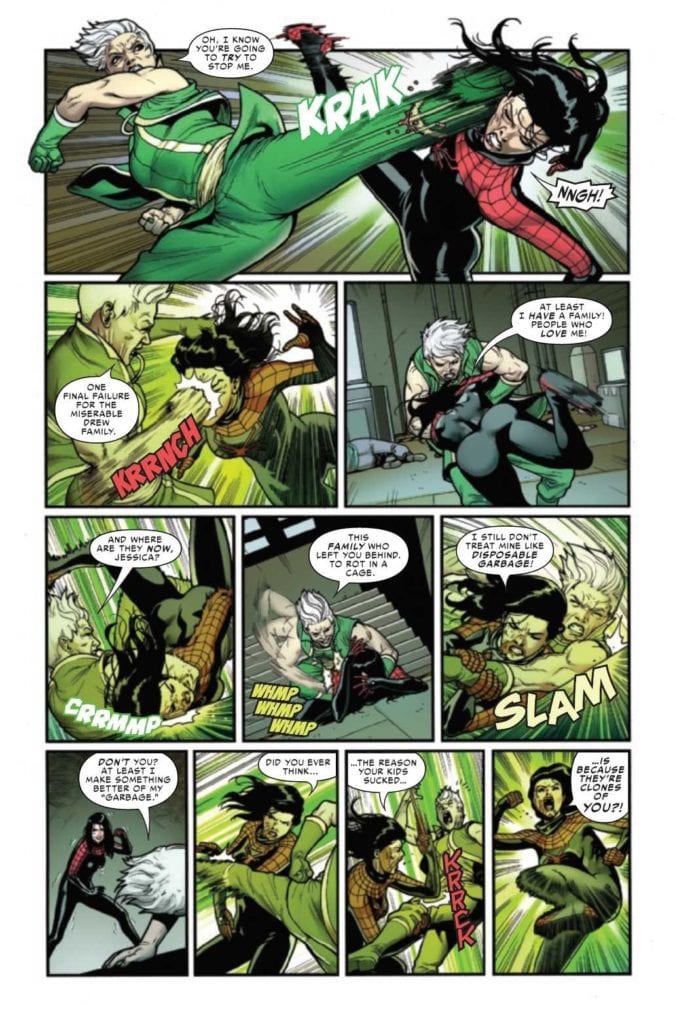
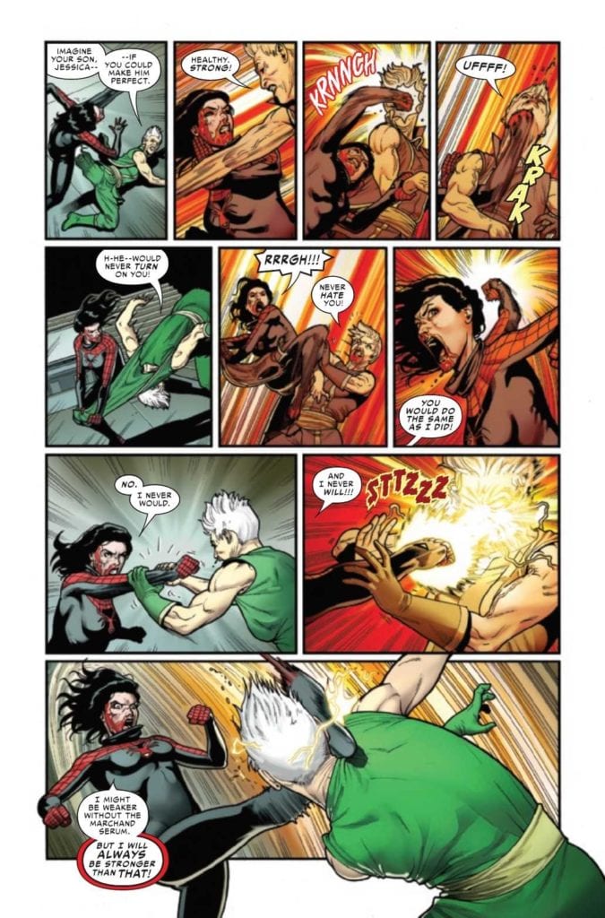
Marvel’s SPIDER-WOMAN #10, available now, brings us back to a very desperate Jessica Drew. She’s more determined than ever to solve her current dilemma and get back home. Written by Karla Pacheco, with artwork from Pere Perez, Frank D’Armata, and VC’s Travis Lanham, this is the issue many fans have been waiting for.
Looks like we’re about to enter the monologue stage for Octavia.
From the very start, this whole series has been about Jessica Drew and her quest for a cure. Not just for herself, but for her son – and others. Along the way, she learned that her family was larger than she thought. Given her history with family, it’s safe to assume that they brought with them even more complications.
The temporary fix that Spider-Woman has found leaves her more unstable – and more dangerous – than ever, which brings us to Spider-Woman #10. She’s teamed up with an unlikely ally, and we all saw how wonderfully that went (please note the sarcasm).
Spider-Woman is not the sort of woman you want to make angry, just saying.
The Writing
Spider-Woman #10, written by Karla Pacheco, explains so much about what has happened in the last few issues. It’s also thrilling and satisfying, but for very different reasons. In many ways, this feels like the explosive revelation and conclusion that we’ve all been waiting for.
The way Pacheco explained what Octavia had been up to was clever, running readers through a backstory with none of that dryness that comes from too much exposition. The fact that it all kicked off in such a brutal fashion (see the last issue) doesn’t hurt.
Since this is Jessica Drew we’re talking about, there’s plenty of action to be found within these pages. They’re balanced by a moment of catharsis, as she’s given the opportunity to face the ugliness of her past—both from of her family and of her own making.
Wrapping up the issue are a few lighter moments, including a bit of humor and a lot of emotion. It’s safe to say that Pacheco made Spider-Woman run the emotional gambit here, as she had to go through so much these past ten issues. This is the wrap-up that her character, and the plot arc, deserved.
This is going to be one fight to remember!
The Art
Given everything that happens in Spider-Woman #10, there is quite a lot for the artistic team to keep up with here. Yet, they do so with style. One moment Spider-Woman looks like she’s about to rip off the heads of her enemies, the next moment, she’s reminding readers of her quirky and lovable side.
Pere Perez’s characters are absolutely a highlight of the issue, with Jessica’s expressions plain to see from one moment to the next. She’s an open book, even when she thinks she isn’t. It makes her fight scenes all the more dramatic – there’s no denying when she’s taken a hit. Or when she really wants to punch back.
The colors, provided by Frank D’Armata, help to further enhance the tension in this issue. There’s this sickly green that seems to creep up whenever Octavia is center-stage. It’s off-putting in all the best ways and makes for a notable contrast when it’s absent.
Naturally, VC’s Travis Lanham’s letters are on point, as always. Spider-Woman’s fight scenes wouldn’t be the same without that sense of impact. You can practically hear fist meeting flesh or the frustration in her voice at times.
The hits keep coming – literally.
Conclusion
Spider-Woman #10 wraps up Jessica Drew’s quest for a cure, and it does so in a satisfying fashion. It addresses all of the major plot points, and several of the minor ones. All while leaving the door open for her next adventure, which I know I will be looking forward to. Who can say no to more Spider-Woman?
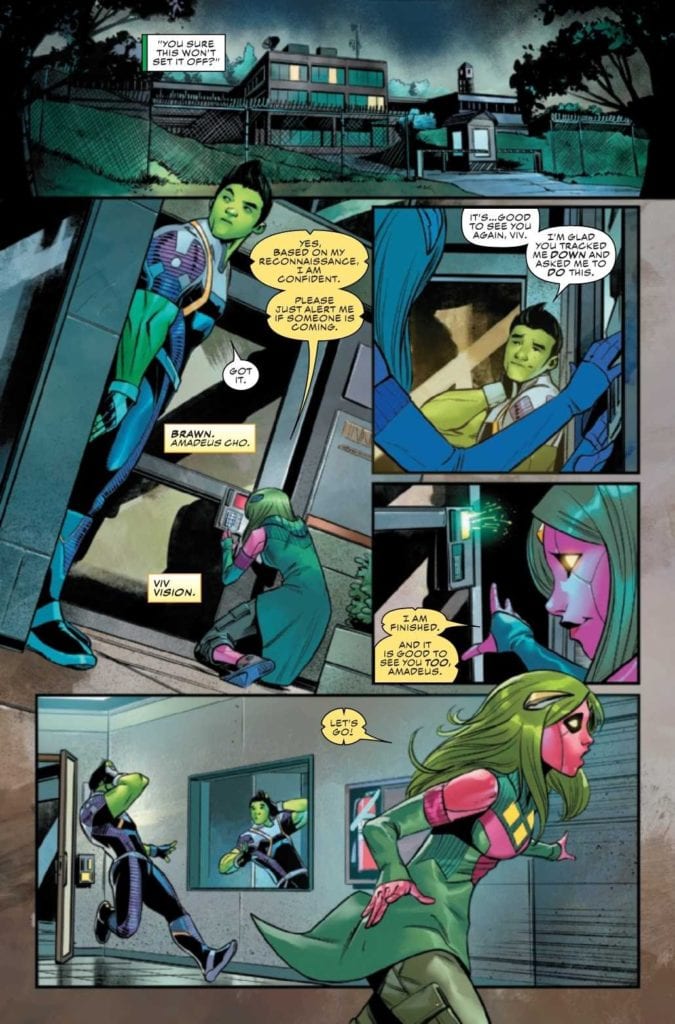
Marvel’s CHAMPIONS #5, available today, brings us back to a battle for what is right, as the Champions take on C.R.A.D.L.E. Written by Eve L. Ewing, and with art from Bob Quinn, Federico Blee, and VC’s Clayton Cowles, this issue packs a punch.
Brawn and Viv Vision are here to save the day!
The Champions‘ last four issues have shown us a battle that feels like we’re once again seeing history repeat itself. Kamala’s Law feels far too similar to the Super-human Registration Act – a law that required the registration of all those with superpowers.
Only this time around, the target is ‘merely’ those that are underage. Never mind how one can tell the age of a hero when they aren’t public about their identity in the first place. But that’s hardly the point right now, is it?
With the creation of this law and a new task force (C.R.A.D.L.E.), the Champions have been split apart. One wracked with guilt, several captured and imprisoned (sorry, ‘schools’), and the rest on the run. And that is where Champions #5 picks up.
Viv Vision has her own way of dealing with compliations.
The Writing
Champions #5 is the issue we’ve all been waiting for. Written by Eve L. Ewing, this is the issue that finally begins to piece everything together. What inspired the law in the first place, how it happened, and how it got so dark so quickly. (We all know that there was something dark lurking behind this law, right?).
It’s a high-impact issue, with lots of breathtaking speeches one can only expect from Marvel. Even knowing that they’re coming, it’s hard to prepare for how close some of them hit home. It’s a poignant reminder of how human these characters are – and how young the Champions are. It’s also a reminder, once again, of their potential.
The issue seems to be split into three distinct parts. Which makes sense, given the three ways members of Champions have gone. There is a lot to wrap up here and only so much time to do so. Yet, the delivery (and answers) are satisfying, even if they raise more questions along the way.
The ‘big bad’ revealed is a total forehead-slapping moment. Of course! We should have known I all along – even though their names never passed our lips. Eve L. Ewing has dug up the perfect villain to explain everything away, and she did it right under our noses.
It’s a relief knowing that this issue does not bring with it the end of the Champions series. However, it is the start of a new plot arc. One that ironically does tie into some of the events which just transpired, the real question is, how far down the rabbit hole is this going to go?
While Brawn has a different method of handling obstacles.
The Art
As you might imagine, a lot is going on visually within Champions #5. Inside are dozens of characters (many of them Champions), several scene changes, and one intentionally jarring transition. Just to name some of the highlights of this issue.
Bob Quinn’s artwork is well-suited to portraying these many heroes all in one place. Each Champion has their iconic look, and it’s easy to tell what they’re thinking – even when they only appear in the background.
The more emotional scenes in this issue (where the speeches come into play, naturally) are visually stunning. But more than that, they feel human – portraying two polarizing scenes (one an intimate family moment, the other a street full of people all living for the same idea – justice).
Federico Blee’s colors are vibrant – something we’ve come to expect from the Champions at this point. Individual characters and abilities practically jump away from the background, thanks to the color palette. Plus, those final two pages are made all the more jarring (intentionally so) thanks to the colors that Blee decided to go with.
The letters, provided by VC’s Clayton Cowles, help to establish a sense of scale. That’s not all that they do, but that is one of the more important parts of this issue. That and giving the Champions a platform for their moments of justice.
Thankfully, it looks like many of the Champions are about to be reunited.
Conclusion
Champions #5 is a high-impact issue, one that has major revelations, as well as a few truly standout moments. These are the moments that Marvel fans live for, and it was worth all of that building up and tension. Now to see what the Champions are planning with their next mission.
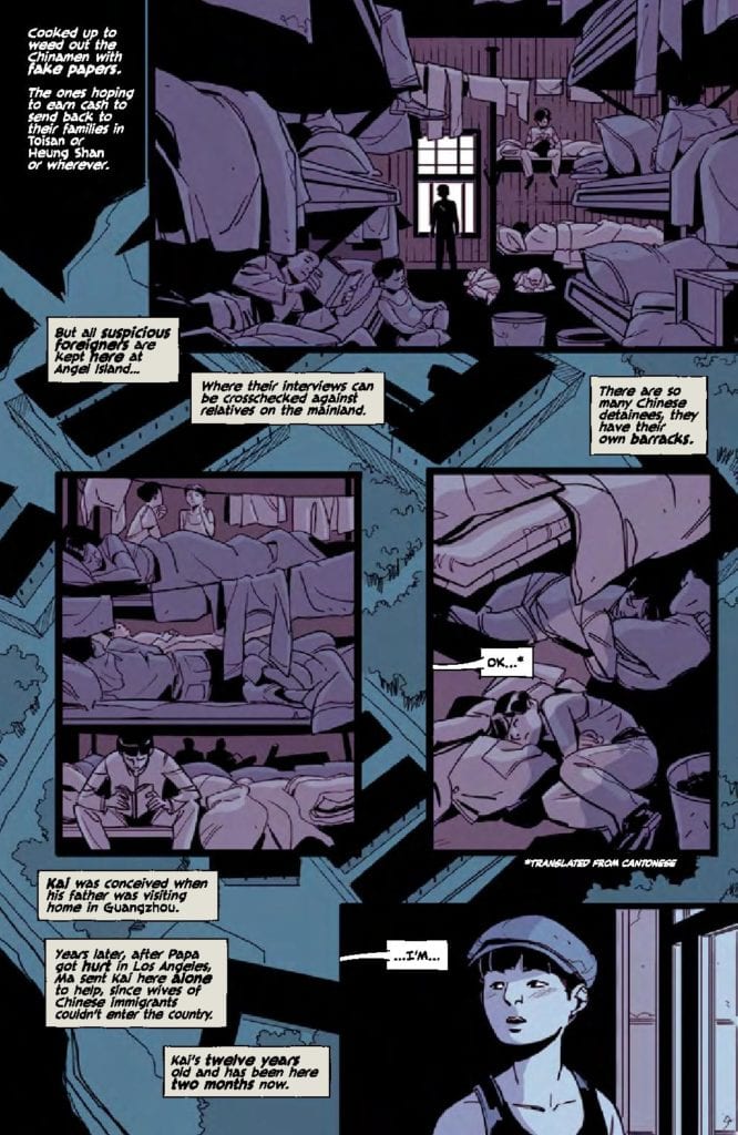
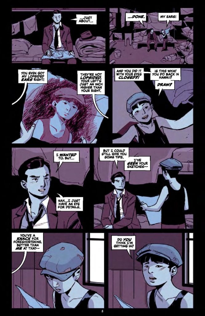
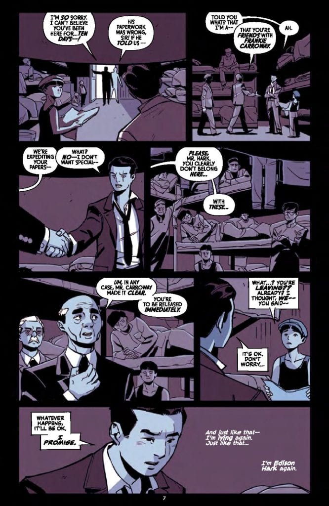
The Good Asian #1 arrives on shelves on May 5th from Image Comics. The story follows Edison Hark, a Chinese-American detective as he works to hunt a killer during the time of the Chinese Exclusion Act. This intense and gripping drama comes from the creative team of Pornsak Pichotshote (writer), Alexandre Tefenkgi (artist), Lee Loughridge (colorer), and Jeff Powell (letterer).
THE GOOD ASIAN is a Chinatown noir starring the first generation of Americans to come of age under an immigration ban, the Chinese, as they’re besieged by rampant murders, abusive police, and a world that seemingly never changes
Writing
The Good Asian is not a book for the faint of heart. It is brutal, harsh, and uncomfortable, but in a very engrossing way. Edison is an intriguing character, quickly shown to be incredibly skilled as a detective thanks to a photographic memory and high attention to detail. He just wants to solve a missing person’s case without getting involved with the bigger issues around him. Sadly, it won’t be so easy for Edison, as he finds everyone he meets carrying some kind of prejudice.
Pornsak Pichotshote is able to capture the audience with the first two pages and keep them invested with each turn of the page. Much like how his previous book, Infidel, captured the feel of a horror film, The Good Asian makes the reader experience a classic detective story as Edison gathers clues and faces consequences for every choice he makes.
Artwork
The artwork by Alexandre Tefenkgi offers great attention to body language and an insight into what the characters are going through in a particular scene. Looks of disgust, fear, and anger are palpable from frame to frame. The use of the square boxes to show clues is a fascinating touch to aid the visual storytelling.
The colorwork by Lee Loughridge makes the square boxes showing the detective clues more noticeable and defined. The colors also help deliver the story’s emotional impact in a big way. Scenes conveying energy and optimism are distinct, while the moments which are supposed to be hopeless and dirty come through perfectly thanks to Loughridge’s precise use of color on top of Tefenkgi’s thoughtful line art.
Jeff Powell’s letter work offers a great sense of flow and urgency to the issue. Edison’s internal monologue comes through so the reader can hear the detective’s train of thought in an engrossing way. And looking through the panels, it’s surprising and refreshing how often a character’s reaction, like a grunt, is used to convey the impact of each scene instead of through big sound effects.
Conclusion
The Good Asian #1 is the start of a gritty, intense, and engaging comic series. This is a book every fan of mystery and intrigue needs to read — not only because it is a good detective story, but also because it conveys a deep look at humanity beneath it all. It’s the start of something big, and everyone needs to pick up the issue so they can enjoy the ride.
Wild Indian is a film written and directed by Lyle Mitchell Corbine that stars Michael Greyeyes (Fear The Walking Dead) and Chaske Spencer (Banshee) in a dark thriller supported by the Sundance Institute through the Writers and Directors Labs. Gavin Brivik navigated the process to create an immersive sonic experience.
Michael Greyeyes is Makwa, and Chaske Spencer plays Teddo, two childhood friends. During their formative years, the pair covered up the savage murder of a schoolmate. Now, adults, the men, find themselves in radically different places in life. However, they’re both haunted by the past. It’s now time to confront the tragic secret and the trauma that helped shape their lives.
PopAxiom spoke with Gavin Brivik about his rock and roll dreams, falling in love with Jazz, and the evolution of the Wild Indian score.
Away From Film
Gavin’s musical journey began as “a guitarist. I didn’t compose music for a while. I wanted to do the whole being in a band and touring thing.”
“I grew up loving classic rock,” he says, “so my biggest influences were like Pink Floyd, Cream, and Hendrix. I was obsessed with those bands, and I sometimes thought I was born in the wrong era.”
As a guitarist, Gavin “studied a lot of blues and jazz guitar,” he says. “I would love to have been in a jazz quartet.”
However, Gavin didn’t take to jazz immediately. “I didn’t even like it in high school. My teacher emailed my parents to urge me to join the jazz band because they needed a guitarist. I remember thinking, ‘Jazz music, that’s lame. I’m a rock musician!’ But I grew to love it.”
“I think it takes that sort of commitment where you are either exposed to it, or you are open to learning about it,” he says about Jazz. “Jazz is musician’s music. It’s very complicated music to understand.”
Gavin, the guitarist, ended up injuring his wrist. “I wasn’t able to play guitar for a few years. I was devastated. I was trying to find another path in music. I signed up for a composition class in school and loved it. I stopped pursuing a career as a performer and focused on writing music.”
“I spent six years writing music away from film,” he says of going from guitarist to composer. “In the back of my head, cinema was a passion of mine. In school, one of the teachers offered a course in film scoring, and I felt like I understood how to write music for film.”
About Wild Indian
Some projects happen via word of mouth, and others come through agents. Gavin’s involvement with Wild Indian came via “mutual friends with Lyle on Facebook.”
“A few years ago,” he explains, “some of our friends were posting about him at the Sundance Labs program. I started seeing him showing up on my Facebook news feed. I ended up messaging him and asking if he had a composer.”
Gavin says that Lyle “did have somebody in mind, but they could not write the score due to a scheduling conflict. Lyle ended up sending me the script, and I wrote some music based on the script.”
“I was so inspired by his writing,” he says about the script. “I ended up writing ten tracks. He listened to them, and he wanted to work with me.”
Did those tracks change over time? “They changed quite a lot,” he answers. “Initially, as you might know, a lot of films use temp scores. We didn’t use any temp scores. We only used those tracks I wrote from the script. Some of it was working, some of it wasn’t. A lot of those tracks more demonstrated my style.”
As the process for putting the film together wore on, “I wrote some new tracks, and those weren’t working either. They were too dark. We needed to highlight the emotions of the character and do less painting of this dark atmosphere.”
“The music was just too dark,” he continues, “and we weren’t empathizing with the characters.”
Gavin and Lyle “wanted to elevate the film with a more melodic and orchestral score.” But this shift was a surprise to both men. “It’s something we did not anticipate doing. The score became more character-driven, less atmospheric, more melodic, and emotional.”
“It allowed the viewers to feel the pain and struggle of the characters,” he says, “instead of wallowing in this dark, moody stew the entire movie.”
Process
“Lyle had been working on the film for six years,” he says. “I’ve been with it for two years. Over that time, you’re having discussions and constantly revisiting the work. We had so much time to work on it that we could tweak and work on stuff.”
Wild Indian is a gritty film with some heavy themes. “It’s taxing to spend a lot of time in a dark place,” he says. “You take an actor; they do these grizzly scenes over and over. So many actors struggle emotionally sometimes after roles like that. As a composer, we’re watching these scenes, and we have to write music to draw out even more of that darkness.”
Gavin goes from scary to funny and back. “When you watch a scary movie, you follow it up with a sitcom. I might spend a day writing some dark music and then find time to switch gears and watch some light-hearted stuff, chat with some friends, or play video games. Anything to escape a little bit of the darkness.”
Wrapping Up
Gavin draws inspiration from a wide range of musical wells. But we discuss a few in particular who went from rock musicians to composers. “Trent Reznor and Atticus Ross are some of my most highly regarded composers and musicians. I love Johnny Greenwood. His scores are some of the most creative and unique. He writes a lot of concert music. I find that he elevates everything he’s a part of from Radiohead to all the other stuff he does.”
What remake, reboot, or reimagining would Gavin love to score? “Maybe a Hitchcock film? I love Bernard Herman. But I’d also be down to do a James Bond film or a remake of a classic horror film like how they did the recent remake of Suspiria.”
Wild Indianpremiered at Sundance in Jaunary 2021 and will be streaming soon. So, what’s next for Gavin? “My first solo project will be coming out. It’s called Realms and Forms. It’s an instrumental, experimental ambient album. It’ll be coming out through Bitbird”
Is Wild Indian on your watch list?
Thanks to Gavin Brivik and Rhapsody PR
for making this interview possible.
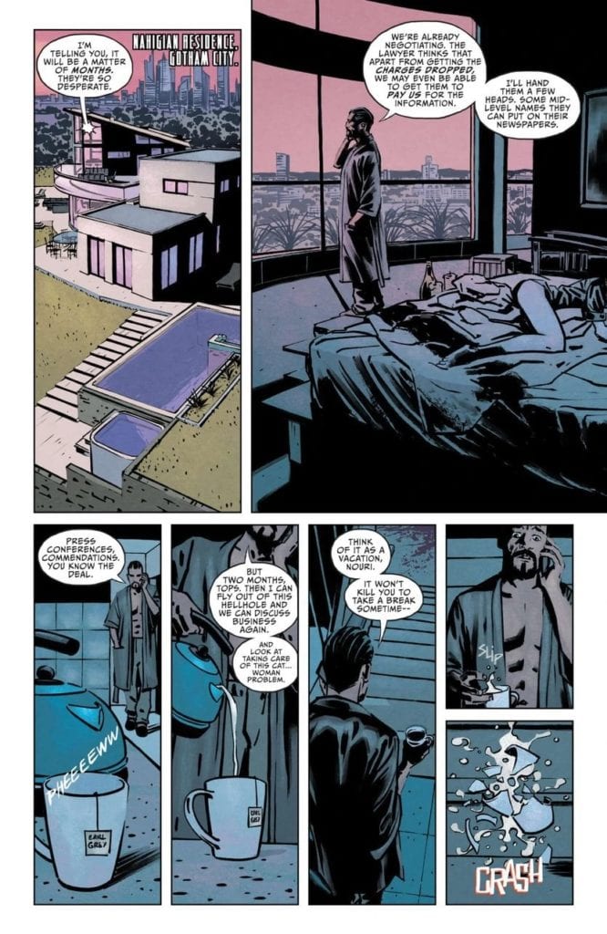
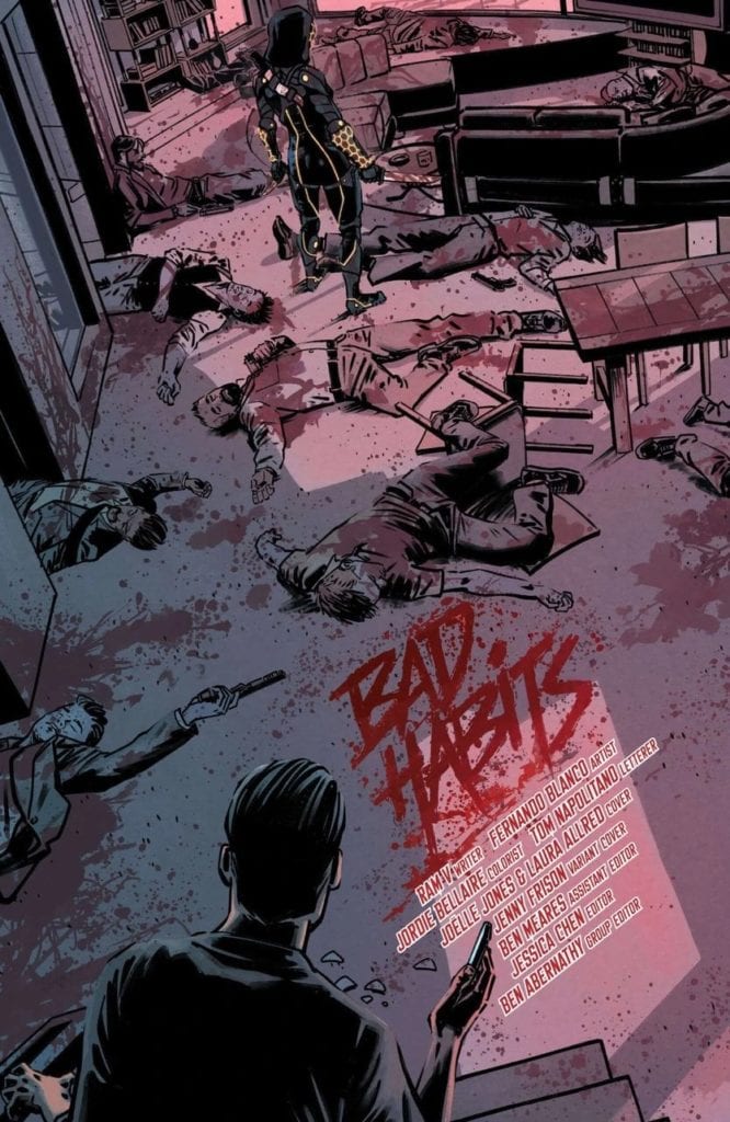
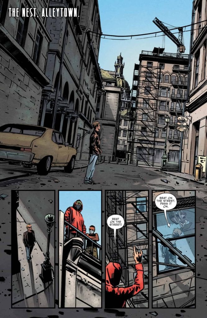
DC Comics‘ CATWOMAN #29, on sale now, sends us back to Alleytown, where Selina is fighting to take back her turf and set her own rules. Written by Ram V, with art by Fernando Blanco, Jordie Bellaire, and Tom Napolitano, Catwoman is about to take on a whole new set of enemies.
This does not bode well.
Only a short time has passed since Selina was given an ultimatum. Take a year, work on taking care of the long list of enemies she gained during the Joker War. It’s a grand goal, and one that she hasn’t really set down to deal with. Not yet, at any rate. Instead, she’s been focusing on herself and Alleytown.
Catwoman #29 brings us back to the Alleytown, a place she once called home. Once she returns to her old stomping ground, Selina realizes that it’s a haven for the area’s young thieves. She may think that she can stay out of trouble (hint: she can’t) and avoid the temptations of an interesting case, but you know how that saying goes about curiosity and cats. At least satisfaction brought it back.
Yep, called it. That is quite the blood bath.
The Writing
If you’re looking for a fast-paced read, one that involves the best thief around and several other known criminals to boot, then Catwoman #29 is the issue for you. Selina Kyle may have gone to ground, but that doesn’t mean that she’s staying out of trouble.
In fact, I’m fairly certain that writer Ram V is trying to assert the opposite. The end result is an issue that is full of hints, revelations, and surprises. New and old enemies pop up all around, and it’s hard to predict how they’re all going to interact with one another. Likewise, it’s unclear how Selina will deal with these threats.
On the other hand, our lovely Catwoman finds several potential allies. Unfortunately, more often than not, it feels like these characters need her help, so they could be liabilities. At least, that’s what Selina would have us think.
As hinted at above, there are a few cameos to be found within this issue. I won’t spoil them by going into detail. But be aware that some of them are more surprising than others. One of which is mildly horrifying and concerning, even if we all assume that it will somehow work out perfectly in the end. The implications alone are still haunting.
A new antagonist has entered the fray!
The Art
The artwork for Catwoman #29 is as varied and wild as the cast is, and that’s saying something. There’s action, surreal science fiction moments, flash and pomp, and crime aesthetics that would only ever feel at home in Gotham.
Fernando Blanco’s artwork is a sight to behold. There are times it feels like the series has been transported to a world that feels utterly bizarre at times. Bellaire compliments this progression by using the bright hues that one pictures in a futuristic world.
The design of her new enemy is fascinating. This new character (see above) is reminiscent of a few other supervillain characters, but she has her own flair. Though many questions surround her, one thing is certain: she’s got style.
Jordie Bellaire’s colors are fantastic in this issue. They dive into the bright and surreal side of the spectrum, but this visual tone matches what Ram V is trying to create here. It also matches the color palettes of the characters involved and the overall city aesthetics. The plot feels so much larger than life, and thus, so does the artwork.
Tom Napolitano’s letters are another high point for this issue. While they certainly makes the bangs and explosions more fun, that is not my favorite part. No, that award goes to another moment in the series. One where you can practically hear the change in voice as a character plummets.
Meanwhile, back in Alleytown.
Conclusion
Catwoman #29 brings Selina and crew back home, but they’re not taking a break. This issue sets up several new conflicts and takes some time to have fun. While there’s a lot of casual action in this issue, it does feel like we’re being set up for an even larger confrontation that’s sure to play out at some point in the future.
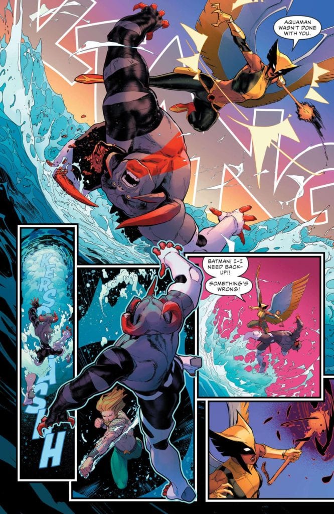
Infinite Frontier has launched the DC Universe into a bold new era, and writer Brian Michael Bendis is leading the way with Justice League #59, on sale now. Along with David Marquez, color artist Tamra Bonvillain, and letterer Josh Reed, Bendis takes the team in an exciting new direction and launches a fascinating exploration into the superhero’s complex place in the world.
WRITING
The most compelling aspect of Justice League #59 comes on the first page. While Bendis and Marquez offer a fun, albeit predictable, fight between a mysterious threat and the team’s new line-up, the story hooks the reader on this opening page by diving right into the heart of the matter. Bendis makes it quite clear that his run on this book, at least in the early going, will question what it means to be a superhero.
One could say that this analysis sounds like a tired path to follow, but Bendis offers a fresh twist by contextualizing this examination within the popular understanding of the DCU. However you feel about Zack Snyder’s depiction, he seemingly presented the iconic heroes as genuine gods among men. This presentation also seems to be the foundation for Bendis’ depiction of the Justice League.
On the first page, an unseen narrator (who turns out to be Green Arrow) explains the team’s shortcomings. He states that regular people see heroes as symbols rather than individuals. Queen then argues that Superman’s decision to share his identity to the world made him more relatable and more inherently human.
This theme of relatability is also at the forefront of the book’s first scene. There, Black Adam sympathizes with a young boy whose mother has passed away. On paper, the two characters are drastically different; one is the almighty ruler of Kahndaq, the other is an ordinary child. But Bendis shows how they still manage to connect with each other over a shared experience, as Black Adam is honoring the anniversary of his beloved’s death just as the boy is grieving his own loss.
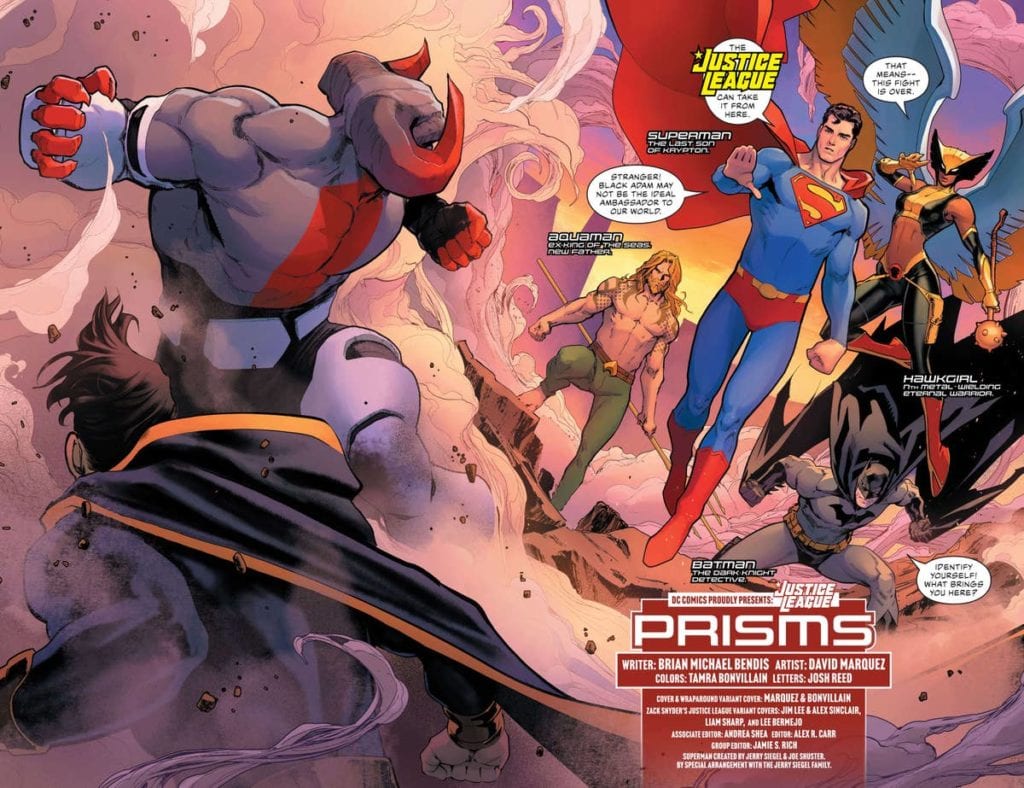
Black Adam finds himself at the heart of the story in Justice League #59
Bendis captures the striking bond between Black Adam and the child, and it feels like this moment is a small, yet powerful, taste of the question this book will explore: what, if anything, truly separates superheroes from regular people? Based on this first intriguing scene, Bendis is beginning this consideration from a solid position that only stands to improve from here on out.
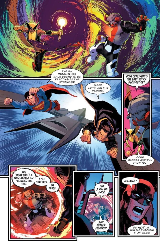
Don’t worry, there’s still plenty of traditional caped crusader goodness packed into the book. The reader gets to meet the core of the new team — Superman, Aquaman, Batman, and Hawkgirl — before the rest of the group is introduced later on. This quartet, alongside Black Adam, must battle an unstoppable monster, who calls itself Brutus, but what should be a fairly easy fight devolves into a near disaster.
In JUSTICE LEAGUE #59, the new line-up has to confront a mysterious threat they’ve never seen before.
From Hawkgirl’s malfunctioning mace to Aquaman’s inability to match up with the beast, everything goes wrong during the team’s clash with Brutus. The new Justice League is quickly put to the test, and after the fight, the members are left to collectively lick their wounds and ponder the group’s next move. A surprising reveal on the last page also sets up the next step in this story, in which Bendis will bring in one of his original creations from a previous series.
ART
From the start, Marquez and Bonvillain compliment Bendis’ script perfectly. On the first page, Queen’s aforementioned narration is set against the image of the team members combined symbols. Bonvillain uses a gradient for these interconnected icons, from The Flash’s lightning bolt to Superman’s “S”. The top of the page is colored with a shiny gold that captures the flawlessness that’s often associated with superheroes.
But this shiny hue increasingly fades to a dim, subdued orange-bronze at the bottom. This subtle touch hints at the failure that Queen speaks to; the shift in color appropriately begins right when Green Arrow explains that mankind’s inability to understand typical heroes is one of the reasons why the Justice League doesn’t always work. This clear synergy between the art team and the writer is remarkable.
The new team nearly bites off more than it can chew in Justice League #59.
Likewise, Marquez and Bonvillain beautifully depict Kahndaq like a hybrid of Rome and a mythical kingdom. The former utilizes what looks like classical architecture to fuel that comparison to legendary city, while the latter gives the scene a breathtaking purple-orange background that’s right out of a fairytale. This otherworldly tone lines up with the story that’s unfolding on the page, as Black Adam comes across like a magnificent king that one would expect to see in a storybook. The unspoken comparison between superheroes and fairytale characters adds another layer of insight to an already dynamic story.
Brutus’ arrival shatters the innocent tone featured in the first scene. Thanks to the art team, the fearsome beast comes complete with demonic horns and both hellfire and brimstone. It arrives in a burst of flames that disrupts that lovely purple background, creating a strong juxtaposition in the process. For his part, Reed’s letters add to the sense that Brutus isn’t from this world. Unlike every other character, his speech bubbles have a sketchy, rough border, and his text is Bizarro-like because it’s slightly crooked. The eventual confirmation that Brutus comes from an entirely different dimension makes the battle scene even more effective. For the beloved heroes, it’s painfully clear that Brutus is a menace unlike any other.
At this point, Justice League #59 is just the appetizer for Bendis’ work on the book. Fans may be divided over his place as the series’ writer, given his sometimes polarizing work at Marvel. But based on this first outing with these assembled heroes, Bendis has a firm grasp on DC’s most esteemed characters, and he has laid out a fascinating path for them. Plus, having art as beautiful as the combination of Marquez and Bonvillain is a wonderful cherry on top. Any and all Justice League fans should get in on the ground floor of what’s sure to be a memorable run.
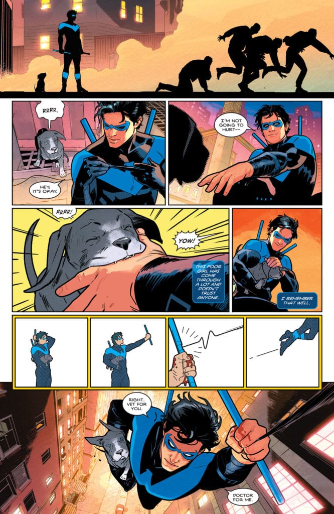
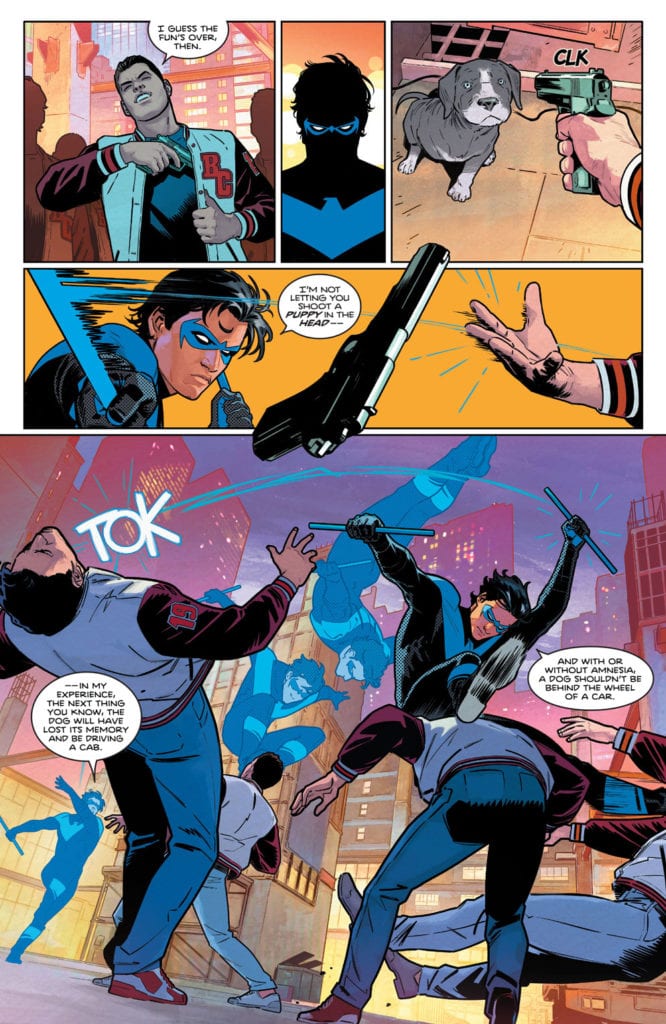
Writer Tom Taylor, artist Bruno Redondo, colorist Adriano Lucas, and letterer Wes Abbott are back! After their brilliant work on DC Comics’ Suicide Squad, they’ve set their sights on Dick Grayson. With DC Comics’ Nightwing #78, they kick off a new era for the spandex-clad acrobat. And if this first issue is any sign of what’s ahead, this is going to be a fun ride.
Writing
Taylor wastes no time in pulling on your heartstrings. It’s not abnormal to cry while reading a Tom Taylor comic. In fact, that’s a response he often hopes for. But to cry during the first issue of a run? I mean… I’m not saying I cried but… Shut up! You’re crying! *Ahem* Moving on…
Taylor shows us a brief moment in Dick’s past. It’s a memory that seems kind of forgettable. He stands up for someone who’s being bullied at school and, when he gets home, he and Alfred debrief. But Taylor’s understated writing makes this small moment shine. It’s a memory that makes Nightwing who he is. But as the story continues, we see that this run won’t just be about small character moments. Heads are crushed, apartments are invaded, and deadly plans are made. Taylor shows us that this is going to be an eventful series that’s joyfully all over the place. He’s just as comfortable writing action as he is writing heartfelt conversations.
Art
Redondo is equally versatile. There’s so much movement to this comic. In one panel, we see Nightwing jump over some goons he’s beating up. Redondo doesn’t show the jump as several different panels. Instead, he shows each turn and twist in the same panel. This makes Nightwing look lightning fast. But later, when Nightwing is shooting his grappling hook off into the sky, Redondo shows us each tiny beat. We see Nightwing pull it out, aim, shoot, and zoom off. It feels like a laid back moment that adds a little fun to the read. Redondo is a master of time on the page, and he’s constantly switching up the pacing to create a rhythm to the plot.
Coloring
Lucas does a beautiful job of setting a scene. When we see Nightwing’s memory, each panel looks like it’s in a pale blue haze. It’s the feeling of a bright morning. And even though the scene progresses throughout the day, the memory maintains that feel. When we cut to a modern day Nightwing, Lucas changes the colors. The pinks and yellows of every scene make it feel more like a sunset than a morning. Maybe it’s just a nod to the passage of time, or maybe there’s a dark night ahead for Nightwing. (“Leaping into the Light” would be an ironic title for this first arc, if that’s the case.) Either way, Lucas’s colors are a stunning visual cue of time passing.
Lettering
Abbott’s lettering is tons of fun. We see the familiarity between Dick and Barbara when they talk. As kids, Barbara has huge gaps between his lines of dialogue where Dick interjects. She seems enthusiastic about talking to him, but worried she’s not giving him room to talk. When they grow up, the gap shrinks. These are now two people who know each other well. They know the pauses that they need to leave for the other to interject. They’re relaxed and at home around each other.
But lots of the fun in this comic comes from Abbott’s sound effects. Every sound has its own unique font. The “CRK” of Dick headbutting someone in the jaw is as thin as the hairline fracture he undoubtedly caused. The click of a gun being cocked is barely noticeable compared to the big “TOK” of Nightwing punching someone in the face. But it’s the action lines around these moments that make them feel fun. They’re part of the scene, involved in the movement of the characters. Abbott makes each sound feel alive.
It’s good to have this creative team back. Nightwing is going to be a fantastic ride and DC Comics’ Nightwing #78 is a brilliant start. Expect lots of heartfelt drama, a healthy dose of laughs, and some incredible action. At least for this first issue, you definitely won’t be disappointed. Pick up Nightwing #78, out from DC Comics March 16th, at a comic shop near you!


 If you were to read The Amazing Spider-Man #61 and the previous issue back-to-back, it would be hard to believe they were both from the same series. The tone shifts so dramatically that it is slightly jarring, and it is impressive that Nick Spencer can write both styles so well. This issue is fun, action-packed, and quite funny. I wish the transition between the issues were smoother, but it is lovely to see Peter stop worrying about Kindred for a little while and refocus on worrying about finances. The Amazing Spider-Man #61 also revisits characters and storylines that haven’t been touched upon in a while. Spencer reintroduces all of these elements through captions that do a phenomenal job of welcoming new readers. If you were looking for an issue of the series to jump on, this is an excellent opportunity that won’t leave you confused by arcs you didn’t get to read.