Home Blog Page 174

HARLEY QUINN #1 – Stephanie Phillips Takes Our “Hero” In A New Direction

Harley Quinn 1 cover

In DC Comics’ Harley Quinn #1, on sale March 23, The Mistress of Mayhem officially joins the Infinite Frontier initiative with a launch that should interest casual and hardcore fans alike. Writer Stephanie Phillips takes Harley in a direction that echoes the character’s recent exploits in her movie and her animated series by capturing her struggle to be a hero. Riley Rossmo’s art takes some getting used to, as it’s rough around the edges, but it thematically fits Harley’s imperfect beginning as a crimefighter. Colorist Ivan Plascencia compliments the book’s cartoonish aesthetic by utilizing vibrant colors when the situation calls for it, and letter Deron Bennett brings a few fitting tricks to the table, like unconventional sound effects, to bring even more pizzazz to the story.

Harley Cake
Even on the first page, it’s clear that Harley Quinn is in for a rough day.

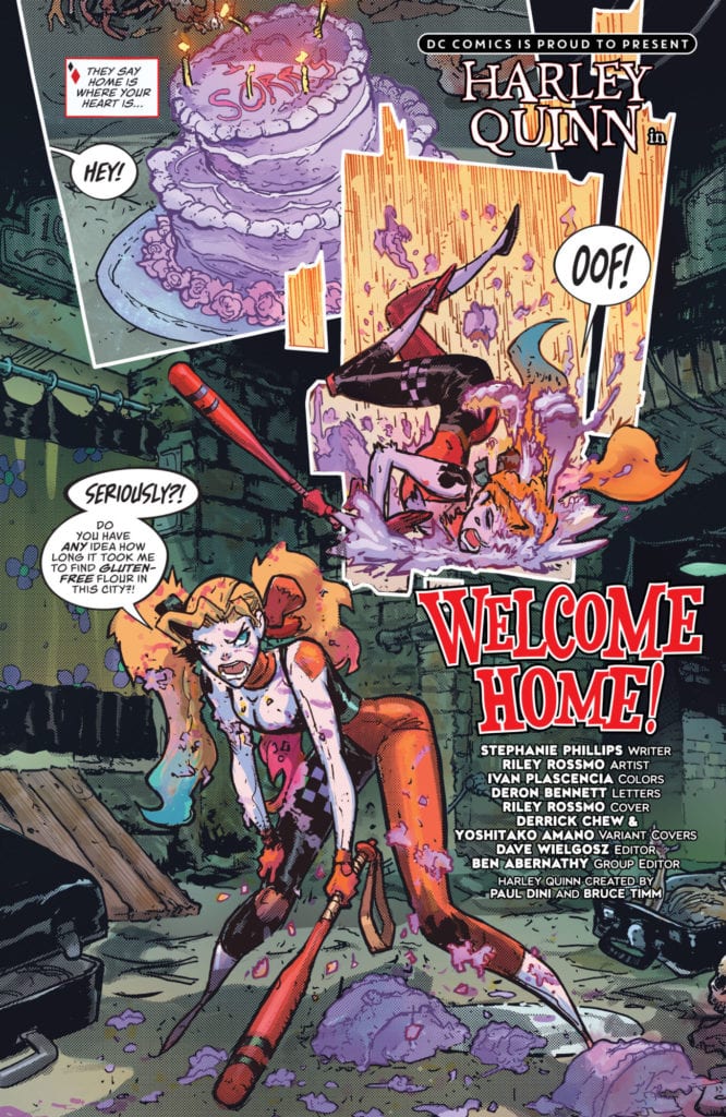
With Harley’s newest solo adventure, Phillips picks up where the Cupid of Crime left off at the end of “Joker War.” Based out of her new apartment in Little Santa Prisca, a corner of Gotham named after Bane, Harley is determined to prove that she’s one of the good guys, but this quest is already proving to be quite difficult. The public doesn’t trust her, and it’s hard to blame these people; after all, Harley used to pal around with the Joker. Plus, even though Batman is giving her a chance, the Dark Knight quickly clarifies that he’s watching Harley like a hawk. Clearly, the former Suicide Squad star has her work cut out for her.

From the start, Phillips makes it clear that Harley is struggling to escape her past. Perhaps the most compelling device used to convey this conflict comes with the usage of appears to be Harley’s ghost, or at least her past self. During a confrontation with a harsh citizen who calls her a clown, Phillips shows the reader how the Harley of old would have reacted; she would have simultaneously quipped and smashed the bully with a hammer. But the new Harley internally watches this violence unfold and takes a passive approach to the situation. Instead of escalating the conflict, she removes herself from it by departing the scene. It’s also clear that she’s saddened by this mistreatment, which makes Harley even more sympathetic right away.

Harley vs. self
In Harley Quinn #1, The Cupid of Crime battles the person she used to be.

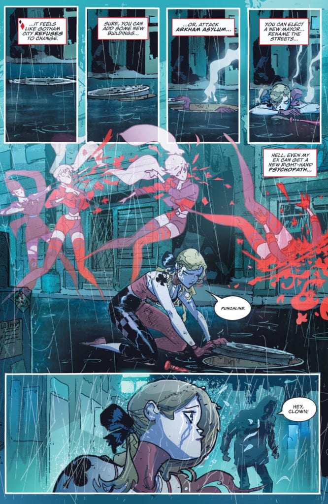
Rossmo and Plascencia beautifully capture this tale of two Harleys. The current-day version is drawn with her modern costume and subdued colors that fit nicely in the midst of the pouring rain. Meanwhile, the classic Harley, old costume and all, pops off the page with brilliant red tones, representing the character’s inner anger and her temptation to revert to this reckless version of herself. Harley overcomes her instinct to lash out at her critic, but this clash of her two selves makes this moment one of the book’s most powerful.

Bennett’s lettering works well with the story from start to finish. In one particular instance, he subtly adds to the narrative that’s unfolding on the page. He compliments the thunderstorm setting by utilizing a character-themed sound effect. Rather than using a traditional yellow for the electric lightning, Bennett instead incorporates a purple background to this sound, which naturally makes the reader think of the Joker because, after all, it’s his color. This choice connects with the theme that Harley can’t quite put her past behind her, as the Joker’s ghost is still right there, nipping at her heels. This book is Harley’s chance to stand on her own two feet, but she can’t escape the Joker that easily.

Harley Quinn #1 is an intriguing beginning to a new chapter for one of DC’s most popular characters. Phillips borrows some narrative elements from Harley’s recent ventures away from the page and offers a few distinct variations, such as the scene where a bully reduces her to tears. This issue may not be an explosive beginning to this fresh direction, but it certainly hooks fans by offering a few compelling teases of what’s to come.

Monkeys Fighting Robots Youtube

BATMAN/SUPERMAN #16: The Finest Of Their Worlds Collide

Batman/Superman #16 Cover

Batman/Superman #16 from DC Comics begins an invigorating take on the World’s Finest. Writer Gene Luen Yang depicts a Batman on one Earth and a Superman on another as a big mystery unfolds beyond them. Artist Ivan Reis presents this grand plot in a unique method of parallel storytelling via simultaneous film reels. Colorist Danny Miki ties it all together by decorating the worlds in appropriate tones for Superman’s optimism and Batman’s gothic landscape. Finally, letterer Saida Temofonte gives each moment of intensity a chance to firmly connect these two disparate worlds.

Batman/Superman #16: Finest On Two Worlds

Batman/Superman plots in parallelYang takes Batman/Superman #16 away from DC’s present time for a standalone tale of two worlds where Superman and Batman don’t coexist. The lack of one and the other affects each world for the worse. Without Batman, Superman has little reason to suspect the seedy Wayne Family under Martha Wayne. On the other hand, the lack of Superman makes the already gloomy state of Gotham feel outright dreadful. The image of the Joker being unable to contain his laughter comes across as sad, rather than frightening, given this dismal context.

That’s not to say either hero is entirely at the mercy of his dreary world. Superman has Lois Lane and Jimmy Olsen to steer him in the direction of trouble he might miss. Meanwhile, Robin’s lines bring quite a lot of levity to the grimness of Gotham City. The use “Holy (X)” even serves as a tribute to the iconic Robin depiction by Burt Ward from the Adam West Batman show.

The Classics Reborn

Read the way you want
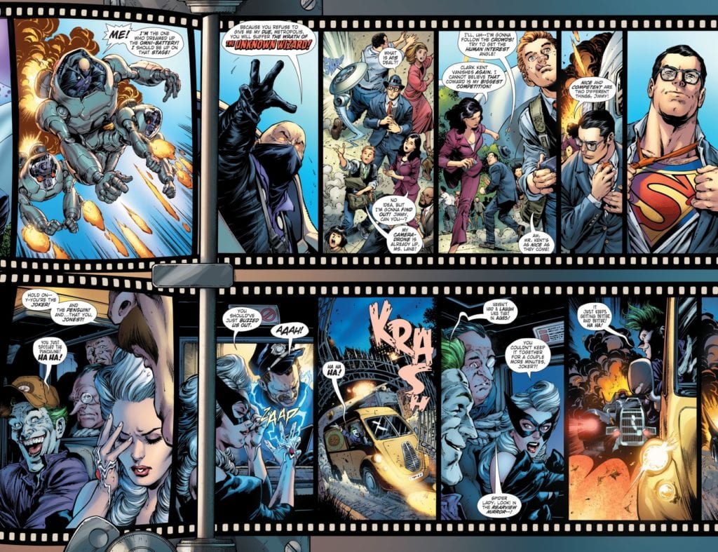
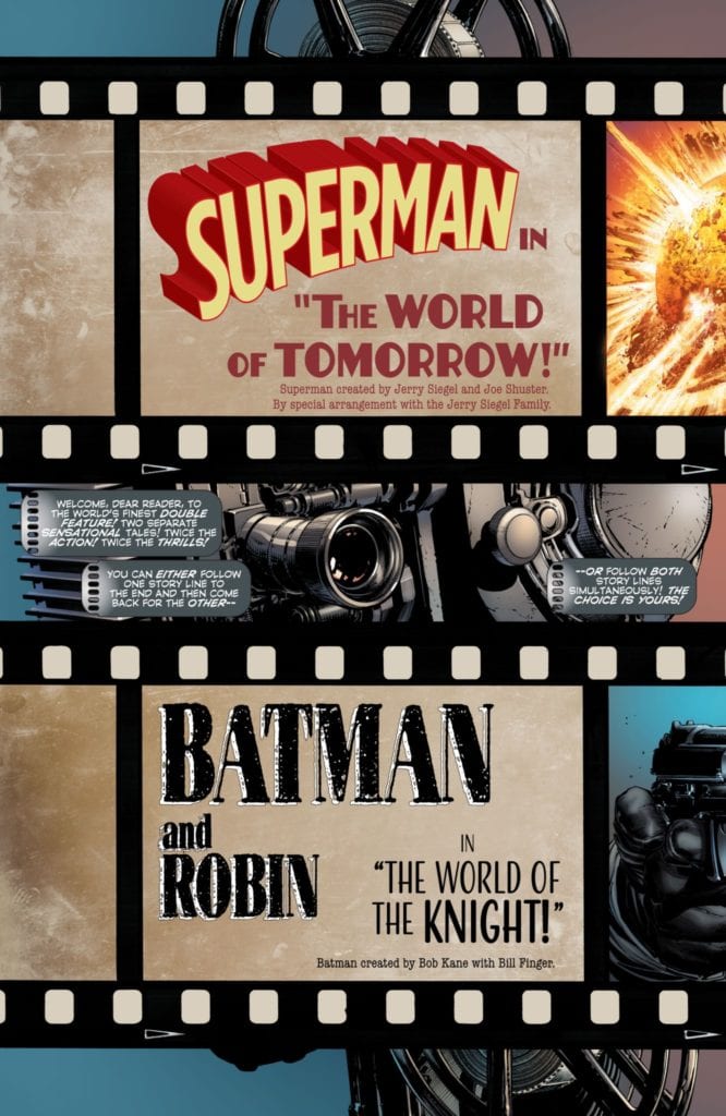
Artist Ivan Reis gives Batman/Superman #16 a choice as to where the reader can look at the story. On the Superman side of things, there’s a bright outlook, complete with The Man of Steel’s costume that’s reminiscent of its Golden Age design. As for Batman, his design also resembles his Golden Age costume, but it lacks the yellow elements. This artistic choice by Miki makes Robin’s brighter colored costume stand out even more; he literally lights up the page.

The lettering by Temofonte make fitting use with its stylizations. The opening captions match up with the film reels, as if the narrative is speaking directly to the reader. As for the basic word balloons, they’re all in a contained space, save for large sound effect stylizations. They’re so loud and powerful that a scream from Lois connects to the Batman reel that draws the dynamic duo’s attention towards her.

Batman/Superman #16: Miss And You Will Feel A Void

Batman/Superman #16 is a can’t-miss book. With a grander narrative that links two of DC’s finest heroes, the art makes sure readers can fit the experience to their preference. Remember that this issue is just the beginning. There’s much more to come, so fans of both characters should stay tuned for the next few issues to see how this story unfolds.

Monkeys Fighting Robots Youtube

Review: LADY BALTIMORE #1 Is An Adventurous Witch Hunt

From the legendary Mike Mignola and writer Christopher Golden, as well as artists Bridgit Connell and colorist Michelle Madsen, comes a monster-filled occult adventure and sequel series in the form of “Lady Baltimore ” #1. This follow up to the original Baltimore offers the exact sort of demonic and monstrosity-laden hijinks we’d expect from a Mignola offering, and the team here manages an exciting (if not a bit overwhelming) blend of action set pieces and outstanding visual work.

“Once she was Sofia Valk, living in a village overrun by evil. In time she became Lord Baltimore’s most trusted ally. Now, more than a decade after his death, Europe has erupted with the early battles of World War 2 and dark forces are rising again. With witches, vampires, and Nazis on the march, Sofia must embrace the title of Lady Baltimore!  But can she fight monsters without becoming a monster herself?”

Writing & Plot

Much like its predecessor, “Lady Baltimore” #1 feels very much like a Mignola comic while also managing to still feel fresh. Lady Baltimore, Baltimore, and Joe Golem all three make a new connected “Mignola-verse” that is not connected to the Hellboy Universe (I hear that question a lot, so I feel I have to clear it up). The script from Christopher Golden is yet another occult adventure with plenty of occult-babble and magic, but still diffused with the  character-centric moments we expect from these books. The pacing of this issue is super-tight, with every page feeling like it matters. The dialogue is varied from character to character, with each cast member having their own personality. Sofia Valk herself is an entertaining protagonist, while the rest of the cast likely just needs a bit more time to settle in to the story. One issue I had with this comic is that is sort of has the feeling where you feel like you’re walking into a conversation when it’s already halfway over. Yes, I know that this is a sequel-series, but one of the strongest elements of shared-universe comics such as this is that a new number 1 issue should function as a solid starting point for new readers. It isn’t unnavigable or anything, and Golden does provide some level of context and background for these characters’ relationships, but it still feels like you’re coming in late to the party. If you haven’t read the original Baltimore though, I’d highly recommend it because it’s really quite good. In any case, this pre-WWII era occult adventure is still a really fun start to this sequel-series, and it’s held aloft by its sense of adventure and well-written chemistry among the cast.

Art Direction

Like with any Mignola comic, “Lady Baltimore” #1 has the perfectly put-together dark and historical mixed with bloody and spooky aesthetic that is perfect for the story. We have the talents of penciller Bridgit Connell and colorist Michelle Madsen for this. There’s a phenomenal amount of detail from Connell’s pencils, both in the character animations and set pieces. The architecture of late 1930’s Europe comes alive with cobblestone and worn brick architecture. The facial animations and designs for each cast member are unique and present the characters’ personalities in a way that makes them easily relatable to the audience. The monster designs and occult symbols are all perfect Mignola-style offerings, with tendril-filled grotesques and floating eyeballs crawling and exploding with gunfire in slimy brilliantly gross fashion. The panel direction flows with a careful eye for both action sequences and character focus. Every page feels like its part of a larger set piece with narrative function, and all of the visual elements flow together in top form. Madsen’s colors are all covered in darkness, bathed in fire and moonlight and it all look outstanding. The atmosphere she gives this book is spot-on and fits perfectly into the world of Baltimore and the Mignola portfolio as a whole.

“Lady Baltimore” #1 is a tightly paced and monster-filled jumpstart to this new adventure in the world of Baltimore. While the script can feel a bit overbearing in terms of its information, its still a carefully written blend of revealing character moments and occult action. The visuals from Bridgit Connell and Michelle Madsen are dark and detailed, blending perfectly into the larger world of this series and as pieces of the Mignola library as a whole. Be sure to grab this first issue when it hits stands on 3-24!


Monkeys Fighting Robots Youtube

THE FALCON AND THE WINTER SOLDIER – New World Order | TV Review

The Falcon and the Winter Soldier is the second Marvel show to be released on Disney+. After WandaVision’s exploration of grief, The Falcon and the Winter Soldier offers a more traditional Marvel experience.

After the events of Avengers: Endgame, Sam Wilson has returned to government service and sets out to help his sister who has taken over the family business. He learns about how much the world has changed due to The Blip. Bucky has been pardoned by the US government but he has to attend therapy. He is also suffering from guilt due to his actions as a HYDRA assassin and tries to make amends by working as an independent operative taking down former HYDRA agents and befriends family members of his victims.

The Falcon and The Winter Soldier have been characters who have lived in the shadow of Captain America and the series uses that as a theme. At the end of Avengers: Endgame an elderly Steve Rogers gave Sam his shield and both Sam and Bucky were in prime contention to take the Captain America mantle.

Both characters were in a similar position to Cap was in Captain America: The Winter Soldier. Sam was working for the government and Bucky was a man out of time. It’s the first time Bucky has been able to live a normal life since the 1940s because he was a brainwashed assassin and was on the run since Captain America: Civil War. Both characters were also blipped so have disappeared for five years.

The first episode of The Falcon and the Winter Soldier makes the series look like a spy-thriller, like Captain America: The Winter Soldier. Seeing that Captain America: The Winter Soldier is one of the best films from the MCU it serves as a good basis for The Falcon and the Winter Soldier and since I enjoy espionage fiction the series has a lot of appeal to me. The episode was 42 minutes long (excluding credits) which was a similar length to spy-fi shows like Agents of S.H.I.E.L.D. and Alias.

The trailer for The Falcon and the Winter Soldier made the series look like a joke-filled buddy-comedy. However, the first episode was more strait-laced. Sam had family issues and the weight of Captain America’s legacy.  Whilst Bucky had even bigger issues because he was unable to move on from his guilt, leading to him being unable to make any friendships. Even when Bucky does have a personal connection with an old Japanese man, his past still hangs over him.

WandaVision’s great strengths as a series was its exploration of grief and showing the personal impact of The Blip on some of the characters. The Falcon and the Winter Soldier’s first episode is showing the wider impact of The Blip, both political and societal. To Sam the post-Blip world is new: he’s told of a terrorist organization who believe that the world was better off during The Blip and the rules the world he knew have changed.

Most of the episode was actually more focused on personal drama than I was expecting. Falcon’s big action scene takes place right at the beginning. The other two action scenes were a brief flashback and a bank robbery which was small scale. Despite Sam being in six MCU movies his character was barely explored, and the TV series finally shows there’s more to him than being Captain America’s best friend. It helps to ground the character and his personal issues were perfectly relatable.

“New World Order” was a solid start to the series that gives audiences an understanding of the main two characters and their reasoning. Now the series needs to focus on its story.


Monkeys Fighting Robots Youtube

INTERVIEW: Composer Bo Boddie Bolsters Emotions In NBC’s Zoey’s Extraordinary Playlist

Zoey’s Extraordinary Playlist is a unique musical-comedy airing on NBC and Peacock about a software developer who can hear people’s innermost thoughts in the form of songs, and between the musical numbers is the work of composer Bo Boddie.

Jane Levy (Don’t Breathe, Evil Dead) stars as Zoey Clark, who discovers the incredible ability to translate others’ emotions into song. This remarkable power develops from an MRI happening during an earthquake that downloads a library of music into Zoey’s brain. Zoey’s newfound power leads to revelations from the people around her that create hilarious and heartwarming entertainment.

PopAxiom and composer Bo Boddie spoke about the road to becoming a composer for a hit network television, 80s music, and making music for Zoey’s Extraordinary Playlist.

Connection

“I started taking piano lessons when I was five; classical piano,” Bo begins his story. “I studied that through college.”

Bo’s parents were fans of music. “I started discovering music for myself when I got a stereo tape deck for Christmas one year. I got to pick what I wanted to listen to. My parents were predominantly classical music fans. So, I spent a lot of time sitting in my room listening to music.”

Bo spent time in choirs but at the age of 12 “started learning guitar. “That was the first real instrument that I felt was my own. I could not only perform music that people had written but that I could make my music. That opened up a lot of doors to me in the world of writing and improvisation.”

“In college, I continued to study music though I wasn’t a music major,” the art history graduate says. Bo’s musical education continued with hands-on experience: “I played in a lot of bands.”

As much as he loved music, Bo says, “I didn’t think that I was going to have a music career. I moved to NYC after college and worked at Citibank for a while. It took about a year of that before I realized I needed to be involved in music in some way.”

Bo returned to school. “I went to graduate school at NYU and got a music degree. I started working in the studio business as I was interested in producing records, engineering, and mixing. At that time, pre-YouTube, on the cusp of the information age, and the only way of learning that was in the studio.”

“I went through an internship and assistant-ship and that process,” he says. “I did that professionally until about 2010, but I had a kid and wanted to spend more time at home.”

“I’d written some music for a VH1 documentary; library music stuff. So, I moved out to LA, where I had to start over. I utilized every connection I had to write more music for pictures.”

Bo wasn’t the only one moving to LA at that time. “It happens a friend of mine moved out to LA at the same time, composer Craig Wedren. His career was exploding, and he needed help. I started working with him, writing music for pretty much everything that came through the door. That’s how I got into it.”

bo boddie-composer-interview

About Zoey’s Extraordinary Playlist

Bo’s involvement with Zoey was the next step in his partnership with Wedren. “Craig called me up one day and asked me if I wanted to do it.”

Bo and Wedren took the reigns from previous composers Mateo Messina and Gabriel Mann, who worked on the first four of now eighteen episodes. “It’s a great project to be working on, especially during the pandemic. It’s such an emotional show. It was a comfort to be able to work on it at that time.”

“Our showrunner, [creator] Austin Winsberg had a very specific idea about what kind of scoring he wanted,” he says. “We pretty much adhered to that.”

Bo’s work on the show flows between “The song and dance numbers” in the series. Bo says those “are the wild splashes of musical color.”

“There’s action and comedy style cues that are used; acoustic percussion principally,” he says about the sonic world bringing the comedy, drama, and surrealism together. “Different drum kits and hand percussion. The more emotional scenes use a lot of strings, synthesizers, and piano.”

Bo explains the interplay going on behind-the-scenes between the layers of music. “The score is there to help out what’s happening on the screen without getting in the way. It bolsters whatever emotion is happening on the screen but does its best not to guide it.”

Process

Bo’s work as a composer dives headfirst into a genre of any kind. “Broadly speaking, there’s motifs and instruments that you would use specifically for horror versus comedy.”

“I find that in a lot of mainstream comedy,” he explains, “there’s always a call for a lot of different genres. So, it’s great to be flexible in your ability to accomplish different projects.”

Bo’s working on a horror film, a genre he says, “there’s always a lot of give and take on how ‘horror-like’ it should be.”

Bo composes music at all times. “I do a lot of thinking about it when I’m not doing it. Once you have the picture up in front of you, for myself, that helps a lot.”

“When I see what’s happening on screen and see the emotion, the performance, the narrative,” he says, “then I can find it. That tells me what I should be doing.”

“Once you get past that first step, you can build from there. You start to know what it is.”

Wrapping Up

“My early DNA would be Bach and Mozart,” he says about the artists who make up his creative DNA. “The stuff that you learn as a young kid. That stuff informs you, and you constantly rediscover the genius in that work.”

“I love Van Halen,” he laughs after going from classical composers to bombastic rock. “I was a guitar player, so any kind of classic rock like Led Zeppelin and all that stuff. I loved 80s pop music. It was the music of my youth and something that I still adore.”

Bo recalls the early scores that caught his attention. “The first music for picture that I noticed other than John Williams … Star Wars and Indiana Jones and that sort of thing was 80s television. Knight Rider and Miami Vice with Jan Hammer. Harold Faltermeyer, who did Fletch. Those synthesizer scores from the 80s, I love those. I’m a huge fan of Wendy Carlos.”

“Glow represented the opportunity to play in that era,” he says. “It was a show firmly with its feet in that era. It was a fun post-modern look at the 80s.”

Zoey’s Extraordinary Playlist is available on NBC’s streaming service, Peacock. So, what’s next for Bo? “Over the summer, I worked on a comedy called Lady in the Manor. It was co-written and co-directed by Christian Long and Justin Long. I’m working on a horror movie now.”

Is Zoey’s Extraordinary Playlist on your watch list?

Thanks to Bo Boddie and Impact24 PR
for making this interview possible.

Want more interviews? CLICK HERE

Monkeys Fighting Robots Youtube

Review: ALIEN #1 And The (Lacking) Marvels of Xenomorphs

Alien #1 Cover
Alien #1 Cover Art Credit: Marvel Comics

You can’t keep a good Xenomorph down and when the license for the Alien franchise moved from 20th Century Fox to Disney/Marvel, you knew a new comic release was on the horizon. There were initial announcements that Marvel would release an Omnibus of Dark Horse’s original serials but attention soon turned to the all-new Alien title written by Phillip Kennedy Johnson, with art by Salvador Larroca.

Both creators are excited to be working on the project, with Johnson exclaiming, “Ever since seeing Ridley Scott’s Alien at way too young an age, I’ve been OBSESSED with the xenomorph, the single most iconic representation of terror on film.” There is a lot of expectation from this comic and a long legacy to live up to. The question is, does this first all-new issue get to the core of the terror or leave the readers unperturbed?

Alien #1 Credit: Marvel Comics

In Space..

Johnson’s opening story is a simple one. Set 21 years after the events on LV-426, as shown in the Aliens movie, the plot follows Gabriel Cruz and his move back to Earth. He is a retiring mercenary who worked with the infamous Weyland-Yutani company and has disturbing memories of violent encounters with the Xenomorphs. The main focus of the story is Cruz’s rehabilitation back into society, and his attempts to reconnect with his estranged son. There is a subplot that brings a more obvious conflict into the narrative and will, no doubt, facilitate the introduction of the alien antagonists.

With the plot focused heavily on Cruz and the memory of his harrowing experiences, Johnson is able to examine post-traumatic stress disorder from a soldier’s point of view. The reader is shown the glimpses of Cruz’s disturbing memories but also the emotional strain these memories cause. It is clear that this man is adrift in civilian life and this echoes Ripley’s uncomfortable transition, at the start of the second movie. Johnson is reminding readers that interaction with the Xenomorphs changes your life, in much the same way the writer’s own life was touched when he saw the original movie.

Alien #1 interior art
Alien #1 Credit: Marvel Comics

Hiding in the most terrifying place of all

The inclusion of elements from the franchise, such as references to the Nostromo, Hadley’s Hope, and using the artificial Bishop as a central character, helps to cement the canonical aspects of the story; this isn’t a new world, completely wiped clear. But at the same time, it avoids referencing the previous comic book series. When Dark Horse originally began production of the Aliens comic there was a decision from the beginning not to have an ongoing title but instead to produce several mini-series allowing the creators freedom to play in the Xenomorph’s world. It would appear that Marvel may be attempting something similar, which will allow them to pick and choose aspects from the extensive back catalogue.

It is also telling that Marvel intends to produce an Omnibus containing a large selection of the Dark Horse’s publications. The book, priced at over $100, is clearly aimed at collectors and not meant for fans needing to catch up with the story. From this opening issue, it would appear that Marvel are forging their own world off the back of the original movies.

Alien
Alien #1 Character Rendition Credit: Marvel Comics

Witness the Resurrection

One of the most striking elements of Alien #1 is the lettering by VC’s Clayton Cowles. The placement of the word balloons and caption boxes not only lead the reader across the page but, by jutting up against the panel borders and crossing over each other, they provide a sense of diminished space. In a story where large vistas of the galaxy are visible on the page, it is impressive that Cowles is able to bring the reader into a closed environment, reminding them of the limitations of the technology and, it would appear, the human spirit. The lettering in the dream sequences are especially effective because Cowles has inverted the standard black on white. It may not be a new trick in comics, but Cowles uses it well. The overriding darkness of the word balloons forces the reader into the pages and into the disturbing memories of the central character.

These dream sequences are the most effective element of the comic. They tie directly into the tropes of the franchise and introduce the horror aspect in an expressive way. By using dreams, the creators can use exaggerations and distortions to emphasize the horror, without having to break any real world rules. Everything becomes about the perspective of the narrator and Johnson can lead the reader via the eyes of the protagonist.

Unfortunately, outside of the dream sequences the visual tone does not provide an immersive reading experience. When the original Aliens strip was released in 1988, written by Mark Verheiden and drawn by Mark Nelson, it was in black and white. The story started in a similar vein to Johnson’s story here, with a psychological examination of a traumatised patient, but the visual element was more unnerving. It gave the impression of a darkness being all around, slowly closing in. The stark contrast between the white, the grey, and the black created a harsh reality for the characters to live in. This original series has been colored since publication and there have been numerous color Aliens comics since, but the best, most striking, of these retain the stark contrast between light and dark. The movement away from a realistic image serves the horror of the story better.

In this new Alien comic, Larroca’s art style is smooth and leans towards an element of realism. Ironically, this leaves the characters emotionless and flat for many of the scenes as it becomes impossible to distinguish from the artificial Bishop and the traumatised Cruz. The detailed scenery helps to create a sense of location but the minute that a character is dropped into the panel it becomes overcrowded. There is always something going on in the foreground and the background with a marked separation between the two. The effect is of actors on a stage.

This unnatural visual doesn’t allow the tension to build through the story and any jump scare moments are signaled too early. With the black and white of Nelson’s artwork each panel is all consuming and draws the reader into the melee. Larroca’s style pushes the reader away from the action, making them a spectator and therefore distant to the atmosphere Johnson is trying to create.

Aliens #1 Creates Atmosphere in Black and White Credit: Dark Horse Comics

Conclusion

Alien #1 introduces the Xenomorph, creates a reason for the protagonist to get involved, and hints at larger conspiracies behind the scene. From this point of view it sets up the series very well. The Alien threat isn’t shied away from or played as a tease, it uses the Hollywood Blockbuster approach of getting straight to the point in the opening act so that it can follow a line of non-stop carnage from here on. The few characters that are introduced have just enough personality that the readers can understand their actions but the differentiation between synthetic and human is difficult to notice.

Unfortunately, it is the artwork that stops this comic from becoming engaging. Larroca is a good artist and works in a realistic style that is just not suited to this story or this franchise. The best of the Aliens comics that have been released over the years have included experimental, expressionistic art work. Even the original, which is more like Larroca’s overall visual, is able to create an unwelcoming atmosphere through the visual choices that were made, i.e. no color. After the initial opening dream sequence, the art and color seems to boast of it’s realism but then lacks narrative creativity. Ultimately, the artwork shows us the narrative but it does not tell us the story.

Over time,  the art style may settle down or readers may become used to this form of storytelling. In the first issue, however, the visual decisions make the comic difficult to read and highlight the lack of dimension in the characters and the plot. There is a lot of scope within this franchise, as has been proven in the past, and it’s a shame that this first offering from Marvel feels held back.

Monkeys Fighting Robots Youtube

BOOM! Studios Exclusive First Look: THE LAST WITCH #4

last witch BOOM! studios exclusive preview

THE LAST WITCH #4 hits your local comic book store April 7th, but thanks to BOOM! Studios, Monkeys Fighting Robots has an exclusive five-page preview for you.

About the issue:
Saoirse, Brahm, and Nan are on the trail of the third sister and wind witch, Badb. But a chance encounter with a mischievous and charming boy named Hugh is about to change their lives forever. And Saoirse may be more powerful than anyone imagined…

THE LAST WITCH #4 is by writer Conor McCreery and artist V.V. Glass, with colors by Natalia Nesterenko, and letters by Jim Campbell. The main cover is by Glass, with a variant by Jorge Corona and Sarah Stern.

MFR reviewer Cat Wyatt calls THE LAST WITCHenchanting…full of daring characters, creative storytelling devices, and magnificent artwork.

Check out the THE LAST WITCH #4 preview below:

last witch BOOM! studios exclusive preview

last witch BOOM! studios exclusive preview

last witch BOOM! studios exclusive preview

last witch BOOM! studios exclusive preview

last witch BOOM! studios exclusive preview

last witch BOOM! studios exclusive preview

last witch BOOM! studios exclusive preview


Are you reading THE LAST WITCH? Sound off in the comments!

Monkeys Fighting Robots Youtube

ZACK SNYDER’S JUSTICE LEAGUE | Movie Review

The release of Zack Snyder’s version of Justice League has finally been released as a tentpole release for HBO Max. It was an improvement to the version that was released in 2017.

The death of Superman has sent ripples across the universe. These ripples are heard by Steppenwolf (Ciarán Hinds), a disgraced follower of Darkseid who’s seeking redemption by conquering Earth. Bruce Wayne (Ben Affleck) can see this threat coming from beyond the stars and sets out to form a team of superpowered beings for the upcoming fight.

The production of 2017’s Justice League was a troubled one. After the disappointing reception of Batman v Superman: Dawn of Justice Warner Brothers decided to course correct. AquamanShazam!, and Wonder Woman 1984 were all lighter in looks and tone. But to get there Justice League had to be reworked with Warner Brothers replacing Snyder with The Avengers’ director Joss Whedon, and demanded the film be less than two hours. This led to a film that was a mishmash in tone and had to skip over a lot of details. Because of this 2017’s Justice League was lambasted by critics with fans putting the blame on Whedon when in reality it was the executives who were at fault.

Comparing The Snyder Cut and the theatrical cut serves as a great lesson in filmmaking and editing and sees how much films can change. Most of the action scenes remained intact everything else has changed. The theatrical cut saw The Flash (Ezra Miller), Cyborg (Ray Fisher), and Steppenwolf were given short shrift. The Flash was given a flashy introduction with him saving Iris West (Kiersey Clemons) from a car accident, and Steppenwolf was turned from a generic alien leader to someone who wanted to atone for his past actions and seek forgiveness from his master.

Cyborg was improved greatly in this version of the film. Most of his backstory and character development was removed from the theatrical version. The Snyder Cut showed Cyborg’s issues with his dad. In this version of the film Cyborg wasn’t just resentful towards his father because he turned him into a living machine, he also blamed his father for his mother’s death. This gave the film an emotional core. Snyder’s version of the film was better at explaining Cyborg’s powers: he was more than just a man with robot parts, he was also a living computer who was able to hack any computer system. There was a sequence where the film showed Cyborg’s empathy when he views the tragic life of a poverty-stricken woman and decides to help out.

Superman’s story also had more emotion. After Superman gets resurrected, he has to accept why the Justice League did it. There has already been two films of emotional investment and Justice League called back to Man of Steel with the use of Kevin Costner’s and Russell Crowe’s voiceovers and the familiar theme music the DCEU used.

Batman was less guilt-ridden than he was in the theatrical cut. It was clear that Affleck had to come back for reshoots because he was unfit and was suffering from personal issues. In the Snyder Cut Bruce Wayne/Batman was more focused and needed to stop the alien invasion.

One of the biggest criticisms that was laid upon Batman v Superman was it was too dark and violent. This was toned down for Justice League. There is violence and swearing, it’s still a Zack Snyder film, but it felt less sadistic – Batman wasn’t the psychopathic killer he was in the 2016 film. The violence pleased my primal senses but the swearing (especially use of the f word) came across as a 13-year-old trying to be edgy. The worst example of this came with the final scene of the film involving a character who’s return was teased by the marketing.

The Snyder Cut had a lot more connective tissue, like the Amazonians sending a signal to Diana. Other scenes were clearly added to set up future installments. This was evident with scenes involving Aquaman with Atlantean characters who tell him to fulfill his destiny and become the King of Atlantis – and we got to see that story in 2018. Other storylines being set up involved Darkseid’s plans for conquest, mentions of the multiverse, and showing more scenes featuring the dark future. However, the question is what’s the future for the DCEU? Will the franchise return to the Snyderverse, or will it continue down the lighter path? The DCEU’s continuity is one of the most confusing.

Justice League is the longest film in the franchise, the story was a lot more straight-forward than Batman v Superman. The story was simply the Justice League getting formed and stopping an alien invasion. It was the same basic premise as The Avengers and the villain wanted to terraform Earth – that’s what General Zod tried to do in Man of Steel.

Zack Snyder’s Justice League has been declared a masterpiece by some people and it holds a high IMDB rating. But it has been overhyped. It’s solid but Snyder can be an over-indulgent director. The first 90 minutes was a slog and the same can be said about the ending. Despite the length already there the first 90 minutes would have done with an extra action sequence to help break things up. The film was split into parts that had title cards like it was a Tarantino film. Despite the extra money that was invested in this version of the film the CGI effects were not much of an upgrade to the theatrical cut. It’s a real shame because Man of Steel and Batman v Superman had CGI effects. The filmmakers decided to show the film in the 4:3 aspect ratio. You will get use to it but it leads to the question, why was it done?

The other issue affecting Justice League is not really its fault. That is comparisons between Marvel and The Avengers. The planned overarching plot was similar to what Marvel did with the MCU. Thanos and Darkseid were big, powerful bad guys with a bunch of lieutenants who set out to conquer. The basic setup of the film was similar to The Avengers and the wider story reminded me a lot of Avengers: Infinity Wars. If Zack Snyder’s Justice League was released as it was originally intended this issue would have been muted.

Zack Snyder’s Justice League is an interesting curiosity for movies and it provides lot of superhero entertainment. But it is not the best film in the DCEU, let alone one of the best superhero films.

Monkeys Fighting Robots Youtube

INTERVIEW: Composer KOVAS & Music Supervisor Joe O’Riordan Join Forces For COST OF WINNING On HBO

The Cost of Winning is an HBO docuseries about the St. Frances Academy football team as they reach great heights of success thanks, in part, to a unique coach. Composer Kovas and music supervisor Joe O’Riordan painted the sonic picture that elevates the narrative.

In the Cost of Winning, the St. Frances Academy struggles from a lack of financial support. It’s located in a dilapidated area of Baltimore, lacks funding, and needs desperate repair. However, things change with the arrival of a new head coach, Biff Poggi, who helps bring a wave of change that propels the school to football dominance in Baltimore and beyond.

PopAxiom discussed making music for film and TV and the Cost of Winning with KOVAS and Joe.

cost of winning-hbo-documentary

In The Beginning

“When I was a kid writing songs and making music,” Kovas says, “I didn’t think at all I would be a composer.”

For Joe, becoming a music supervisor “wasn’t what I set out to do. I grew up playing in punk bands. My band broke up. I was dating a girl who got an internship working for the Jackass guys. My choice was either stay in Columbus as a broke musician or move to LA.”

Joe’s decision quickly led to a “job at Dickhouse Productions logging film and Fantasy Factory episodes. I became friends with the music supervisor. With my background in music, I knew a bunch of artists and people. I eventually got a coordinator gig, and now I’ve been music supervising for about ten years.”

“We started working formally with each other on On My Block,” Kovas explains, “but we’ve been intertwined for a long time. I was producing and doing remixes of songs … a bunch of stuff at the Fantasy Factory.”

Officially, Kovas explains, “the first project we worked on was a Netflix series called The Comedy Lineup.”

“We work great together,” he continues, “Joe’s able to put in such great music, and I can complement that with the score.”

Joe explains why he and Kovas click. “I pride myself on being an encyclopedia of music. I can talk about Baltimore club music, and he knows the difference between that and Washington DC go-go music. I don’t know a whole lot of people that know that type of stuff.”

“I DJ as well,” Kovas expands on their shared comprehensive understanding of music, “so I have that deep knowledge of both punk bands and the hottest rappers. I started in hip-hop, and to do that, you’re sometimes referencing the entire library of music.”

Joe credits family for part of the reason he knows so much music. “I’m 35, but my grandparents raised me, so my music knowledge goes pretty far back. I think having access to that toolbox is something that Kovas has too. I know a lot of younger composers who’ve never heard something like Abby Road, and I’m like ‘Whaaat?'”

Kovas shares his philosophy on excelling at whatever it is you like to do. “I feel like when you want to be a great music supervisor or composer, you want to know what existed beforehand. When I think about music, there are only 12 notes, but I want to study what everyone’s done with those notes.”

cost of winning-hbo-interview-composer

About Cost Of Winning

Filmmakers Rob Ford (Shut Up and Dribble) and Maurice Holden (Tiger at 30) followed the St. Frances steam in the fall of 2018 and created a four-part series that’s now living on HBO. “I was brought in when it was an indie project, and they hoped it would stream in places, but we weren’t sure. As the pandemic started, HBO was busy gathering up a bunch of sports films. We were beneficiaries of that.”

“I did Baltimore bass beats in the series,” Kovas says, “that’s authentic to the sounds of that city. So, I hope when people from Baltimore hear that music, they’ll recognize it as their own and not some cheap music library music that sounds like hip-hop from 2011.”

The film business requires a lot of give and take. But Joe says he was “very adamant that this film is about Baltimore and it’s important to Baltimore, so it was important to me that any music that didn’t come from a composer would be Baltimore music.”

“When they’re listening to Talib Kwali in the projects on The Wire,” Joe shares a pet peeve, “I’m like ‘c’mon man, they won’t be listening to that!’ It’s important to me that it’s true. That was my initial pitch for The Cost of Winning.”

Kovas laughs. “It’s like putting a 1950s car in Blade Runner. What are you doing?” He further cements their goal of staying true to the music of the area. “As a composer, I try to make it authentic as possible down to figuring out what software they were using mostly at that time or whether it was this drum machine or that drum machine. I try to make it sound authentic down to the equipment.”

“Kovas said to me, ‘let me sketch you out something,'” Joe says of the early days of the process. “He sketched the opening scene, and the producers said to me ‘don’t even bother with anyone else.'”

Kovas received good and bad news soon into the process for creating the Cost of Winning score. “At the early stage when they hired me, they said, ‘Good news is we want you, the bad news is that you’ve only got about two-and-a-half weeks to get it done.”

Wrapping Up

As a musical encyclopedia, asking Joe for some of his favorite influences is a slippery slow. “I’m inclined to list off all four members of the Beatles,” he says, “I mean, seriously, aren’t we all just trying to be the Beatles? I love Daniel Johnson so much, Andy Kaufman, and Hunter S. Thompson. Anyone who is doing real sh*t and not because of the tides of the time.”

“I think of music as art,” Kovas says and shares that he experiences synesthesia. “Music is a painting to me. People like Basquiat inspire me. You could send me a photograph, and I’ll compose music based on the work’s composition and colors. To me, Quincy Jones and the breadth of his work. From working with Miles Davis to Frank Sinatra to producing Thriller and Fresh Prince of Bel-Air. I’ve always wanted to be multi-dimensional in my creative output. I also love the Beatles,” he laughs. “I have to acknowledge Frank Lloyd Wright. Music is sonic architecture, and architecture was my first love as a kid.”

Joe’s time in punk bands was spent as a bass guitarist. Kovas plays “five instruments” but shares the truth about what his go-to instrument is today “my main instrument is the computer.”

If Kovas could compose the score for a remake, reimagining, or reboot of a movie he loves, he’d pick “Citizen Kane.”

“My gut says Goodfellas, but that’s like perfect. I couldn’t do it better,” Joe says, then shares a unique answer that for those who are in the know, it’s a great answer. “I would want NBC to get the rights to the NBA back so I can have a stab at re-creating John Tesh’s NBA theme. One of the most iconic pieces of music ever, the NBA on NBC.”

Cost of Winning is available on HBO. So, what’s next for Joe? “I’m working on Ridiculousness on MTV. A show on Starz called Men In Kilts. It’s the two guys from Outlander doing a travel show based in the Scottish Highlands. I got really into learning about Scottish music. Also, a couple of spinoffs of Ridiculousness, like Deliciousness, are coming out. On My Block season four, which I hope to get my hands dirty with that real soon.”

“Season four of On My Block, we’re coming out with a bang,” Kovas says. “An artist from Montreal called Empire-I, I just produced her new album. I have a new album that I’m working on with James McCallister.”

Is Cost Of Winning on your watch list?

Thanks to KOVAS, Joe O’Riordan, and Rhapsody PR
for making this interview possible.

Read more interviews from Ruben R. Diaz!

Monkeys Fighting Robots Youtube

ORPHAN AND THE FIVE BEASTS #1: Tribute To Kung Fu Flicks

Orphan and the Five Beasts 1 Cover

Dark Horse’s Orphan and the Five Beasts #1 begins creator James Stokoe’s tribute to Hong Kong cinema. With all of the rip-roaring energy and absurdity of the wuxia genre, this series blasts onto shelves on March 17th.

That Title Sounds Familiar…

Orphan and the Five Beasts #1, in its first half, wears its influences on its sleeve. James Stokoe tributes the cult movie Five Deadly Venoms by sharing the film’s general outline. We follow the last student of a dying kung fu master, Orphan Mo, in her quest to slay her predecessors. But there’s a complimentary twist to the kung fu plot formula.

Prequel to this movieA common trope to this genre is that after the villain is defeated, the movie ends. Mo’s predecessors, the Five Beasts, were once heroes of their own story, fighting against an evil warlord. This series delves into what happens after that story ends and it’s not good. The Five Beasts’ lack of discipline caused them to become corrupt and supersede the warlord. Mo’s quest is not simply about defeating an enemy like the Beasts, but reclaiming her master’s honor. It’s a basic, yet intriguing, plot about a film genre.

Orphan and the Five Beasts #1: In HD!

Orphan and the Five Beasts #1 Page
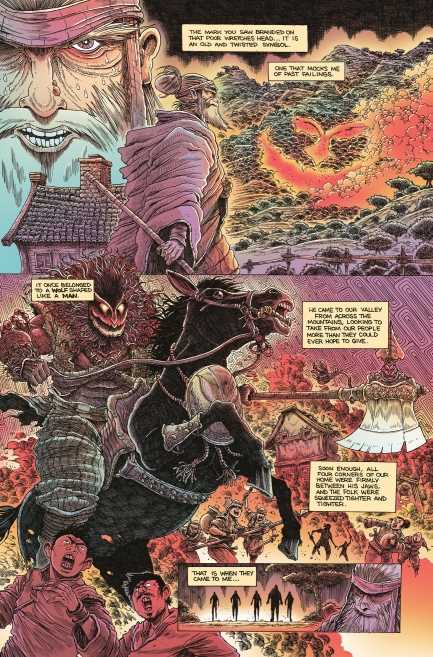
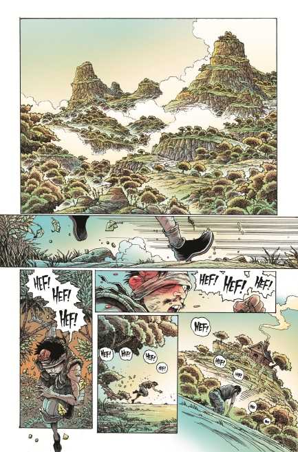
Stokoe gives Orphan and the Five Beasts #1 the majesty and absurd energy of a kung fu movie. The mountainous regions look absolutely mythical, extending into the clouds. The green landscapes look so peaceful, yet a person’s look of panic manages to disrupt the peace with its red accents. The fight scenes look finely stylized and cartoony. Mo is able to defeat thugs easily with a showy attack on her attacker’s crotch. It shows the reader that the hero can handle herself just fine. Which is good because her first major opponent is so absurdly powerful, with the issue’s deadly cliffhanger. The guy crushes horses he’s riding with his thighs!

The lettering has a large amount of uses aside from simple word balloons. The standard word balloons display someone in good health and emotional stability, unlike the word balloons of the sick master which crumple and emotional outbursts that have jagged edges and stylized words. Plenty of showy sound effects decorate actions like the noise generated by thunder thigh’s leg muscles. It’s all so eye-catching it’s impossible to look away.

Orphan and the Five Beasts #1: Kung-Fu Worship

Orphan and the Five Beasts #1 excitedly bursts right out of the pages. Loud and stylized sequences decorate the pages for some hard core action thrills. And it’s now available wherever comics are sold.

Monkeys Fighting Robots Youtube