Home Blog Page 171

Blue Wraith’s War In DRAGON AGE: DARK FORTRESS #1

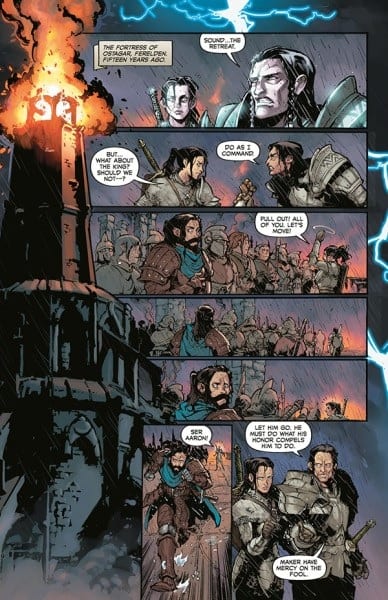
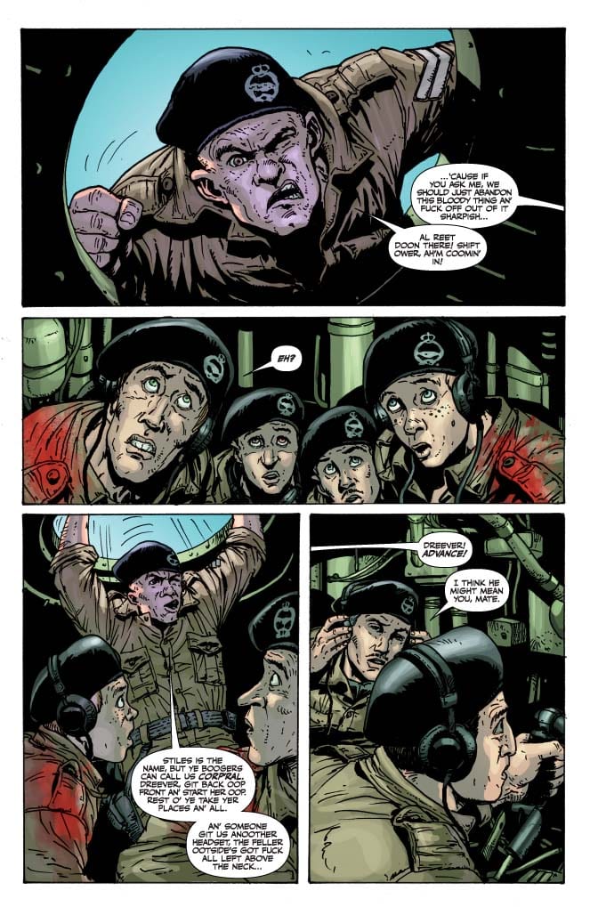
Dark Horse’s DRAGON AGE: DARK FORTRESS #1, available Wednesday, March 31, is the start of a new Dragon Age adventure. Written by Nunzio DeFilippis and Christina Weir, with artwork by Fernando Heinz Furukawa, Sebastian Heinz, and Michael Atiyeh, this series is ideal for fans of the BioWare game.

A flashback to set the scene, and start the series off right.

While Dragon Age: Dark Fortress #1 is the start of a new series, it does bring back many familiar faces. The games introduced characters like Blue Wraith into the mix, while the comics carried their stories onward.

Dark Fortress may be the most recent Dragon Age comic series – but it is not the first. It’s not even the first one including the same characters. Fans could pick up the story here, but the story will make more sense if they have read Dragon Age: Blue Wraith at the very least.

This is the first issue in a three-part miniseries, so buckle up and get ready for a whirlwind adventure. There won’t be a lot of time for hand-holding, but there will be plenty of action – we can safely assume that much based on the previous series.

That would be nightmare-inducing – literally.

The Writing

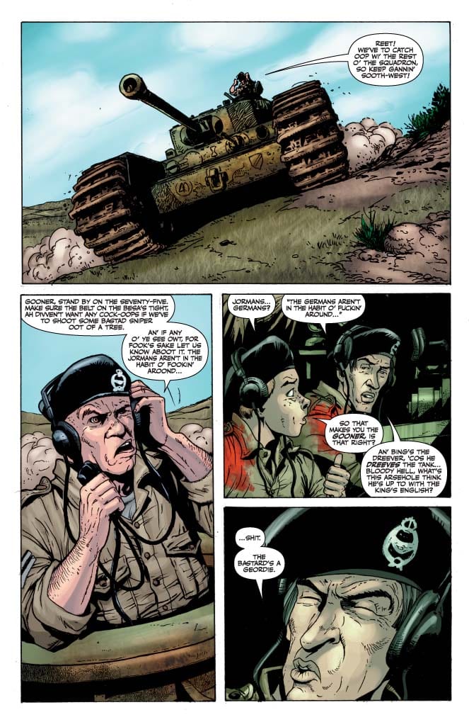
Dragon Age: Dark Fortress #1 is the start of yet another venture to save Thedas. It’s a plot that Dragon Age fans are familiar with. But probably not a plot we’ll grow tired of anytime soon. Written by Nunzio DeFilippis and Christina Weir, Dark Fortress #1 wastes no time, throwing readers right into the thick of things.

For that reason, I feel like readers would do better having read some of the previous series beforehand. Many of the characters, their history, and their motivations might not make as much sense without that context. Though gamers will naturally recognize certain characters, so that is a plus. Everything else in the book can be inferred – it just takes more work.

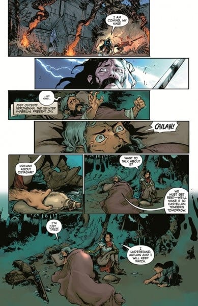
Interestingly, while the series does kick off with a point of action, it is also an emotionally charged scene. One that provides a stronger connection to Ser Aaron. Does that imply that his role (or history) will be pivotal in what is to come? Only time will tell.

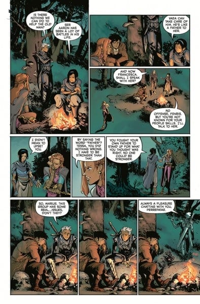
The issue also works to get readers caught up in some of the motivations for the other characters. Though naturally, there isn’t all that much time to do so. Some characters get left by the wayside, while the more relevant (and intense) emotions take center stage.

Meanwhile, other characters are struggling to deal with more recent events.

The Art

Dragon Age: Dark Fortress #1 is a stunning piece of work. Fernando Heinz Furukawa, Sebastian Heinz, Michael Atiyeh, and Nate Piekos of Blambot did a fantastic job of capturing that iconic Dragon Age look.

Granted, there are some changes – there always are when changing from one medium to another. The characters all match the style—especially those that made an appearance in any of the games (for obvious reasons).

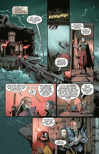
In this instance, they all seem to look especially tired, worn out, or in some cases, emotionally compromised. The artistic team did an excellent job of portraying all of that, despite the variety of causes.

The colors and backgrounds found within Dark Fortress #1 are breathtaking. They are always in bold contrast with the characters. There are many shifts in perspectives and scenes within this issue. And the backgrounds are one of the easiest ways to tell when that has occurred.

What new revelations await?

Conclusion

Dragon Age: Dark Fortress #1 is a tense and thrilling start to a new adventure. It’s perfect for fans of both the games and the comics. It has been fascinating to see how the story progresses with each series, and this time will be no exception.

Monkeys Fighting Robots Youtube

Review: STRANGE ADVENTURES #9 and the Man of Two Worlds

Strange Adventures DC Comics King

Strange Adventures has given us all the answers. Well, all except one. With the revelations of the last issue, we’re seeing Adam Strange in a new light. His trauma, his cruelty, and his brutality are all bubbling to the surface. But Strange refuses to be kept in a box. With Strange Adventures #9, we’re still left wondering how we feel about Adam. Writer Tom King, artists Mitch Gerads and Evan “Doc” Shaner, and letterer Clayton Cowles delve into Adam’s troubled mind in this issue. When we come out the other side, we’re not sure whether to hate him or hope for him.

Writing

One of the biggest themes King plays on in this chapter is the idea of Adam being a “Man of Two Worlds.” It’s an odd thing, having two homes. Adam, in some ways, is luckier than most. Most people just have the one home. But, in other ways, Adam is more confused than other people. We follow him as he fights on Rann. The warrior within him takes over. He’s calm and collected in the face of great danger. But it’s as though happiness dries up around “Adam the Soldier.” When he’s playing the role of a warrior, he feels empty inside. And so, King shows Adam come up with a simple plan: he’s going to bring Alanna with him back to Earth. But, as we’ve seen, Adam doesn’t fully feel welcome on Earth either. His actions are being dissected by the Justice League and the Pyykt have followed him there. King shows just how isolating it can feel to belong in two places and nowhere all at once.

Art

The beat-by-beat nature of Shaner’s art makes many of his scenes feel kind of playful. Which is ironic, because Shaner is depicting Strange’s time in the Pyykt/Rann War. Images of Pyykt standing guard, being shot through the head, and then collapsing out of sight are delivered in ways that almost get a chuckle. Through this, Shaner shows just how much this has become a part of Adam’s day-to-day. Killing the Pyykt is right under “do laundry” on Adam’s to do list. And Shaner’s art matches the dialogue. Strange, as he’s sneaking through Pyykt camps, is making dark jokes. He’s unfazed by their deaths. His brow is set, his eyes are full of rage. He isn’t haunted or scared, he’s angry.

Gerads’ Adam Strange feels less sure of himself. Gerads makes it look like there may be anger on the surface, but there’s pain deeper down. This Adam is haunted by Shaner’s Adam. He wants to be the man who fought in the Pyykt/Rann War, but the trauma is catching up with him. Gerads almost makes this Adam seem ashamed. He obscures Adam’s face often. At one point, Adam’s gun is covering his face as he aims at a Pyykt ship. We only see his eye peaking over the gun. Later, this happens again, but it’s the rays of light coming from his gun that get in the way of his expression. This makes it feel like Adam wants to hide behind something. It makes him seem like he’s not happy with the violent man he’s become.

Strange Adventures DC Comics King

Coloring

Nearly all of the color has drained from Shaner’s panels. With the war raging on, nothing seems to hold much weight in Adam’s life. Except for poisonous gases and Pyykt robes. These are shown in brilliant green and red. They’re the only moments that mean anything to Adam now. Gerads juxtaposes the bleak atmosphere of war with the warm interior of a bar. We go back and forth between Mr. Terrific watching the news and Adam fighting the Pyykt. Gerads helps us relate to Adam. He might have made some mistakes, but he’s still out there fighting. Meanwhile, the man who holds Adam’s life in his hands is having a beer. We see things from Adam’s perspective for a second. We see how unfair it feels to him to be stuck in the cold, blue setting of war, while others can curl up in a warm, orange bar.

Lettering

We begin to bridge the gap between Shaner and Gerads’ stories in this issue. Cowles, rather than using large sound effects in the Shaner pages and small, quiet sounds in Gerads’, gives the same treatment to every page. This is war and it’s the same today as it was yesterday. So, the “PEW” noises of Adam’s gun look the same. The sound of explosions, the stomping of feet, the smash of a bottle, it’s all big and bold. And as Adam screams at Superman, with his words in large red font in a word balloon that has a thick, jagged outline, we see just how much war pushes people. In Gerads’ scenes, Adam has always been subdued and put together. As the war rages on, we’re seeing him turn into the cartoony man of his memoir. His dialogue and sound effects are proof of that.

Strange Adventures DC Comics King


DC Comics’ Strange Adventures might have answered lots of questions, but it hasn’t sacrificed any of its mystery. It continues to be a title full of intrigue and action. This creative team is still doing some of the best work in the industry. Pick up Strange Adventures #9, out from DC Comics March 30th, at a comic shop near you!


Monkeys Fighting Robots Youtube

Review: Anything Can Happen in BATMAN CATWOMAN #4

King Batman Catwoman DC Comics

It’s hard to believe we’re only a third of the way through Batman Catwoman. That’s because writer Tom King, artist Clay Mann, colorist Tomeu Morey, and letterer Clayton Cowles aren’t spinning their wheels. They’re creating a series that’s going places. Often, those places feel dangerous. DC Comics’ Batman Catwoman #4 is no exception.

Writing

King has somehow set up a plot, with three separate timelines, that still has a sense of stakes. Though we see Selina in the future, we still worry for her safety in the present. This is a nearly impossible feat of writing. Just as Romeo & Juliet gets us to hope against hope that they’ll come through all of this, even though the Chorus assures us from page one that they will not, Batman Catwoman makes us fear despite our assurance of safety. Selina will live on to a ripe old age. She and Bruce will be happily married for years. But Selina digs herself deeper and deeper into a hole. And with every passing moment, we feel that the future might not come to pass. King uses our knowledge against us, almost. He leaves us wondering “How will they get through this?”

Art

Mann’s layouts create a real sense of calm for much of the issue. Even when Batwoman, the futuristic Helena Wayne, is fighting goons, the page looks peaceful. Just as when Selina and Bruce are having a tense conversation. Each of these moments feels ordered and simple. Mann’s art style is gentle and soothing, but his panels are also neat and tidy. It makes these scenes, especially those that do have fights or danger, feel familiar. Sure, danger lurks behind every corner, but it’s a danger we know well. We’ve seen Batman punching Penguin goons, Batwoman doing the same feels comfortable and on-brand. But then we get panels that tilt and twist. We see the frenzied last few seconds of Batman defusing a bomb. These moments stand out and shock the reader just as they twist out of sync with the rest of the page.

King Batman Catwoman DC Comics

Coloring

It’s in the Iceberg Lounge that we discover a new element to this story. Morey shows Batwoman arriving. She’s doing research into a murder. And though this is a bleak venue, there are specks of brilliant color on these pages. We see her yellow gloves and the orange of Penguin’s outfit. As simple as the scene is, there’s a sense of brightness. Helena seems like her father, suddenly. A much younger version of Bruce, still learning the ropes and still bright eyed and bushy tailed. At the end of the issue, we return to the Iceberg Lounge. This time, we’re following Selina there. The page is almost identical in how it depicts the setting, except in its coloring. The page is bland. The colors that are present are muted and soft. Morey shows us how a mother and daughter see the world quite differently. Helena’s bright days are still ahead, Selina’s have faded into the past.

King Batman Catwoman DC Comics

Lettering

Cowles shows us the complicated nature of these characters. When we first see Helena fighting the Penguin’s goons, the “CLNK” of her batarangs knocking away their guns is small. It’s a quite noise, a subtle noise. But when she’s in the thick of battle, she whacks one goon upside the head. The massive “POW” is followed by a small speech bubble. “I’m aware,” she says simply, in answer to one of Cobblepot’s claims. The juxtaposition between those two moments, right next to each other on the page, shows that Helena really is the daughter of both her parents. She’s the subtle, quiet, and assured daughter of Catwoman, with all the bombastic punchiness of her father. Cowles continues to do this throughout the issue, showing Clayface’s elegant speech in scratchy green letters, and Phantasm’s cool logic in dark, twisting, black word balloons. Under Cowles’ pen, every character is a layered enigma.


DC Comics’ Batman Catwoman continues to deliver. It’s a story that feels dangerous. Even some of its own elements seem to threaten one another. But that’s because this creative team has imbued this story with a tremendous feeling of stakes. Every scene feels like it could go anywhere, even when future scenes tell us otherwise. Pick up the next issue to this fantastic series, out from DC Comics March 30th, at a comic shop near you!

Monkeys Fighting Robots Youtube

Kickstarter Spotlight: INFERNO GIRL RED – Check Out These Artist Prints And Variant Cover

ULTRAMAN Comics Co-Writer Mat Groom and CAPTAIN MARVEL Artist Erica D’Urso Launch INFERNO GIRL RED On Kickstarter

Writer Mat Groom and artist Erica D’Urso launch INFERNO GIRL RED On Kickstarter tomorrow morning at 9 AM PT, but Monkeys Fighting Robots has a sneak peek at a few artist prints and variant cover to the 100-page, hardcover graphic novel. Artwork below by Francesco Manna, Dash O’Brien-Georgeson, Tiffany Turrill, Federico Sabbatini, and Kath Lobo. Check out the press release after the prints for full details on the Kickstarter Campaign.

Francesco Manna

ULTRAMAN Comics Co-Writer Mat Groom and CAPTAIN MARVEL Artist Erica D’Urso Launch INFERNO GIRL RED On Kickstarter

Dash O’Brien-Georgeson

ULTRAMAN Comics Co-Writer Mat Groom and CAPTAIN MARVEL Artist Erica D’Urso Launch INFERNO GIRL RED On Kickstarter

Tiffany Turrill

ULTRAMAN Comics Co-Writer Mat Groom and CAPTAIN MARVEL Artist Erica D’Urso Launch INFERNO GIRL RED On Kickstarter

Federico Sabbatini

Federico Sabbatini

Kath Lobo


ULTRAMAN Comics Co-Writer Mat Groom and CAPTAIN MARVEL Artist Erica D’Urso Launch INFERNO GIRL RED On Kickstarter

From Mat Groom, the co-writer of Marvel Comics’ hit ULTRAMAN comics, and rising star artist Erica D’Urso (CAPTAIN MARVEL and XENA: WARRIOR PRINCESS) comes INFERNO GIRL RED, an all-new original graphic novel that combines the high school super-heroic drama of INTO THE SPIDER-VERSE with the dynamic storytelling and world-building of Japanese tokusatsu superheroes, and the intrigue and relationship drama of British boarding school fiction. A Kickstarter campaign to crowdfund this all new 100-page, hardcover superhero graphic novel by Groom, D’Urso, colorist Igor Monti, letterer Becca Carey, editor Kyle Higgins, and design group For The People,  will launch later this month and run through May 5th, 2021.

We all need something to believe in. Especially Cássia Costa. An ancient cult and their army of demons have stolen Cássia’s home, Apex City.  When a magical dragon bracelet rockets into her life and affixes itself to her arm, Cássia’s the only person equipped to stop the cult from offering the entire city to their dark lord. There’s just one catch…

The magical bracelet is powered by belief, and Cássia — an intensely pragmatic, rational girl – doesn’t have much to spare. She’ll have to find something to kindle her faith, though, and fast —because she has a secret legacy to live up to. Because her mother’s life is on the line. And because Apex City needs Inferno Girl Red.

“I’ve been working on this story for about three years now,” said writer and co-creator Mat Groom. “I’ve always thought it was worthwhile, but I was never certain it would work… until I met Erica D’Urso. Erica is just wickedly talented. You can see that in her work on JAMES BOND, CAPTAIN MARVEL and XENA: WARRIOR PRINCESS. But it was her energy, her tremendous passion, that made me believe. Erica loves Cássia, and Cássia’s world… and that love infuses every part of this project. There’s nobody I would rather be co-creating this world with.”

The graphic novel is edited by Kyle Higgins, Mat Groom’s co-writer on Marvel’s hit ULTRAMAN Comics, and co-creator of the recent Image Comics’ smash hit, RADIANT BLACK. “Kyle and I share a passion for the Japanese tokusatsu genre, which is a big influence on INFERNO GIRL RED, along with British boarding school dramas and American superhero comics. There’s little coincidence that Cássia was first introduced to the world in the back of the first issue of Kyle’s series, RADIANT BLACK. In fact, the connections between RADIANT BLACK and INFERNO GIRL RED may run deeper than you think…”

In INFERNO GIRL RED, Cássia’s not shy– but bouncing around from city-to-city as her Mom bounced from job-to-job meant it was hard to make friends… and any friends she did make disappeared pretty quickly once they found out who Cássia’s mother was. So instead of socialising, she focused on learning– showing a particular aptitude for science. Now Cássia has a chance for a fresh start in Apex City. Her impressive test scores have earned her an invitation to the world-famous entrepreneur Doctor Janine Caro’s prestigious boarding school for promising young minds. There, Cássia starts to settle in. She starts to make friends. She starts to see a future for herself.

But when a magical bracelet blasts through a window while Cássia is studying late one night, everything changes. Cássia’s quickly drawn into a strange war that she previously only heard about from her mother…

The INFERNO GIRL RED Kickstarter campaign features the oversized, deluxe format hardcover (7 x 11 inches) with an exclusive, Kickstarter-only cover and Kickstarter-edition-exclusive concept art, as well as a RADIANT BLACK/ INFERNO GIRL RED team-up print by RADIANT BLACK artist Marcelo Costa and INFERNO GIRL RED artist Erica D’Urso and fourteen collectible INFERNO GIRL RED giclee art prints by Darko Lafuente, Doaly, Francesco Manna, Eduardo Ferigato, Dash O’Brien–Georgeson, Federico Sabbatini (with Martina Fari), Wil Sur, Kath Lobo, Serg Acūna, Eleonora Carlini, Tiffany Turrill, Nicola Scott, Nicole Goux and Valeria Favoccia!

The INFERNO GIRL RED campaign concludes May 5, 2021, 2021. For updates, follow INFERNO GIRL RED on Twitter.

To support the campaign, visit Kickstarter: https://www.kickstarter.com/projects/matgroom/inferno-girl-red-by-mat-groom-and-erica-durso


Monkeys Fighting Robots Youtube

Cullen Bunn Talks All Things SHADOWMAN With New Book On The Horizon

Cullen Bunn Talks All Things SHADOWMAN With New Book On The Horizon

Cullen Bunn is a master of horror in comics, and it would only make sense that Valiant Entertainment would tap him to write the new Shadowman book coming out in April. Monkeys Fighting Robots got a chance to chat with him about the new series.


SHADOWMAN #1 from Valiant Entertainment hits your local comic book shop on April 28, with a pre-order deadline of April 5. The book is written by Bunn, with art by Jon Davis-Hunt, colors by Jordie Bellaire, and you will read Clayton Cowles’ letter work.

About SHADOWMAN #1:
From the bestselling master of horror Cullen Bunn and bone-chilling artist, Jon Davis-Hunt comes a shocking supernatural odyssey. Jack Boniface is SHADOWMAN, a powerful protector who keeps humanity safe from the demons that claw at the fabric of our reality. The forces of darkness are awakening and they are hungry for life. Will Shadowman be able to save us all, or will the darkness devour the world as we know it?


Cullen Bunn Interview

MFR: One year ago, the world was shut down by the pandemic. How’s it feel to be doing the press rounds for Shadowman #1?

CULLEN: Thank you! I’m thrilled to be talking about this book in more detail! Back when we announced the title, I talked a bit about it, but those conversations fizzled as the pandemic took hold on the world. So… yes! So happy to be talking about it again. Even more happy that readers will finally be able to get their hands on it!

MFR: For new readers, what are the core elements that make up Shadowman (aka Jack Boniface)?

CULLEN: Jack is a hero who draws power from a Shadow Loa that is bound to his soul. The Shadow Loa makes him strong. It makes him fast. It deadens his sense of fear. And it gives him some control over shadows themselves. He is tasked with protecting our world from the Deadside, the flipside dimension where all dead things go. He is a normal guy who just wants to play his saxophone in local clubs… but instead he has to punch demons.

Cullen Bunn Talks All Things SHADOWMAN With New Book On The Horizon

MFR: Page 2 and 3 are a splash-page with 12 panels. Can you walk us through what you were trying to accomplish with these two pages?

CULLEN: I wanted to show off Shadowman’s lot in life… duking it out with monsters… and give a hint of some of his new powers… After the heaviness of Page 1, I thought we needed to see action. At the same time, though, I never wanted to let up on the creepiness factor.

MFR: When I read a comic book, I give the characters voices. I had a hard time finding a good voice for The King of Death; what voice did you give him?

CULLEN: Hmm. I often speak in the voices of the characters when I write! I don’t have an actor’s voice in mind for Baron Samedi. Something a little scratchy, raspy, full of mirth. Starscream from Transformers if he was super charming and funny.

Cullen Bunn Talks All Things SHADOWMAN With New Book On The Horizon

MFR: With a book like Shadowman, you have the chance to create insane monsters. Did you and artist Jon Davis-Hunt have a monster brainstorm session, if not, how did you build collaborative chemistry?

CULLEN: We didn’t have a monster brainstorming session before starting the book. I will, however, now be adding “monster brainstorming session” to the planning stage of every title I do. So… in my scripts, I tend to write enough description to give Jon a direction to go, but not so much that I stifle his creativity. It’s much more important to capture the essence of the monster than an exact picture I have in my head. And Jon goes forth and designs the craziest beasts you’ve ever seen! If he has questions or suggestions to discuss, he does, but often I see them for the first time on the page, and I love it! That goes a long way to build chemistry—the excitement to see what your collaborator will do next!

Questions From Social Media:

@fuzzypress – How does this Shadowman differ from the 90s version?

CULLEN: I think the biggest changes will be in terms of tone and mood and pacing. Yes, this version of the character has a few different abilities, which will be a bit different, and he’ll be jumping around the world, but I think this book simply feels different from what you saw in the 90s. It’s still a superhero book, but it definitely goes to some dark places.

@Mozz81 – Two things I want to know. I get it’s a fresh start, but will we see characters from the previous runs (Alyssa, Darque), and are we in for (hopefully) many arcs?

CULLEN: You won’t see many characters from previous runs in the initial couple of arcs. But I’m absolutely planning on weaving them in as the book goes on. As for how many arcs… it all depends on how readers respond to the book. I’d love to write these stories for a long while.

@AMaverickComic1 – How many Valiant heroes will guest star? Any ideas to bring Shadowman a sidekick? Is the big bad someone you came up with, or is he or she from a different mythology? Who do you consider the big three in Valiant? Any plans for a teen unity team? Who would you pick on the team if you could?

CULLEN: Ok… Deep breath! There won’t be a lot of guest stars initially, but I certainly want to see some. Shadowman kind of has a sidekick in this story—Baron Samedi! The big bad is a new character I developed. This character is tied closely to Shadowman. Big three for Valiant would be Punk Mambo, Roku, and Shadowman. Kidding! Maybe X-O, Bloodshot, and Shadowman. No plans for a teen team from me… though if Valiant wants to talk… I’m around. My new Unity team? Punk Mambo, Roku, Shadowman. Kidding!

MFR: Cullen, thank you for your time, and best of luck with SHADOWMAN!

CULLEN: Thanks for talking with me! I hope people have a blast with this book!


FYI – Let your local comic book store know if you want a copy of SHADOWMAN #1 this week.

Monkeys Fighting Robots Youtube

Review: Garth Ennis Doing What He Does Best In BATTLEFIELDS: THE TANKIES

Legendary comics writer Garth Ennis and the late artist Carlos Ezquerra, along with inker Hector Ezquerra, colorist Tony Avina, and letterer Simon Bowland, bring us one of the most genuine and compelling war graphic novels in recent memory with Battlefields: The Tankies from publisher Dead Reckoning. This story following the experiences of one particular tank crew sergeant and his men from D-Day to the Korean War is a prime example of intense research and the fantastic character writing we expect from Ennis’s work. With visual work that places us right on the front with these men on the German and Korean fronts, this is an absolute must for readers of great tributes to the people who experienced the hell of combat.

“From the bloody battle for Normandy to the Nazi heartland, from war’s end to the killing fields of Korea, the men of the British Army’s Royal Tank Regiment fight battle after battle against terrible odds. Whether outnumbered or outgunned, the Tankies soldier on—as their motto would have it, “From Mud, Through Blood, to the Green Fields Beyond.”

Writing & Plot

If you have any knowledge of Garth Ennis’s body of work, from his work on Punisher and Fury: My War Gone By to his recent mini-series Sara, you know that he has a mastery of writing from the perspective of soldiers. This carries over to his work here on The Tankies. What makes this graphic novel such a special read is how Ennis is able to nail the personalities and tribulations of these tank crewman, as well as the immaculate research that obviously went into the creation of this story. The main character, a Corporal Stiles who is placed in charge of the crew we follow, is a rugged, experienced, no-bullcrap kind of man who is fascinating and fun to read because of how Ennis brings him to life. He feels like a real human being in a way that is nearly unmatched in all of comics or prose writing. The same goes for nearly every character we meet. Ennis is able to craft these men in a way that makes them animated and realistic in a manner that holds up the story almost entirely on its own. His sense of dialogue is pulled right from the mouths of the British soldiers who this story tributes, with military terminology, slang, jokes, and general conversation being so genuine I’d almost believe Ennis was there himself.

The afterword in this collection has Ennis explaining exactly what research he did and where his inspiration for this tale came from, and it’s a fascinating read for those curious about the men and the circumstances that make up this story. This is Garth Ennis doing precisely what he is best at, and I wouldn’t change a thing about it.

Art Direction

The visual work in The Tankies is thoughtfully crafted by the late and great Carlos Ezquerra’s pencils, Hector Ezquerra’s inks, and the colors of Tony Avina. Carlos’s pencils build a realistic artistic vision of the armaments and terrain of the German countryside and the Korean fronts in these respective wars. Tanks and guns are drawn with a well-researched eye, with the often-talked about differences between the tanks being blatantly obvious. Hell, after reading this I’d say anyone who was paying attention will be able to easily identify the difference between a Panzer, a Tiger, and an Allied Churchill with a moment’s glance. The real highlight of Carlos and Hector Ezquerra’s work here though is the character art. Not only does each man look completely different, but the creases and wear on their faces paints their personalities and toil upon their visage in a way that is rare even in this medium. The inks give those details the depth and dimension that really sells the wear on both the faces of the men and the equipment they use. The colors from Tony Avina are dense and varied, looking again like a well-researched representation of the real setting this book takes place in. Dense green foliage is disturbed by the mottled camouflage of German tanks, and the olive drab of Allied Tanks juts out against the war torn countryside. The letters from Simon Bowland are made up by a consistent and clean font that varied perfectly based on character and tone, the exact kind of stellar work we expect from a pro. Visually, this is a comic story firing on all cylinders and recrerates the very real settings near perfectly.

Battlefields: The Tankies is a brilliantly well-written and thoroughly researched tribute to the tank crewman who fought and struggled during the late stages of World War II and the Korean conflict. Garth Ennis does what he does best by presenting a spot-on representation of battlefield conditions and some of his best character writing to date. The visual work of Carlos and Hector Ezquerra and Tony Avina crafts both believable character art and a realistic setting. Be sure to grab this outstanding collection from your local comic shop today!

Monkeys Fighting Robots Youtube

AVENGERS: CURSE OF THE MAN-THING #1 – Confronting Fears

Avengers: Curse of the Man-Thing #1 Cover

Avengers: Curse of the Man-Thing #1 begins a unique Marvel crossover event on March 31 written by Steve Orlando, with art by Francisco Mobili (and chapter page artist Carlos Lao), Guru-eFX drops the color, and you will read VC’s Clayton Cowles letter work. Avengers: Curse of the Man-Thing #1 is going to be a story to remember.

Avengers Headline Curse of the Man-Thing

The Avengers may be in the title, but the truth is, they’re not really the focus. Orlando instead focuses on the character and legacy of Man-Thing. Orlando shows off the unique storytelling potential by diving into Man-Thing’s horror origins.

Avengers: Curse of the Man-Thing separates this issue’s story into three chapters that set-up the conflicts, the inciting incident, and the conflicts’ internal crisis. The set-up explores a dark counterpart to Man-Thing in series antagonist Harrower and how she perverts Ted Sallis’s legacy. The combination between science and magic she uses sweeps the world under its feet. The kind of world that shares its audience’s awareness of superhero events, only for the heroes and reader to be collectively caught off guard by Harrower’s plot.

The end of the issue highlights just how little the heroes and reader actually know. What little hope comes from the appearance of Ted Sallis quickly diminishes after a spoiler-filled revelation.

Art Has More Magic Than Science

Avengers: Curse of the Man-Thing makes heavy use of enriching details in the art to tell the story. Not only by Mobili but every artist involved in this issue. A special mention goes to Lao, where the eyes of Man-Thing showcase the Bog Beast’s status. A wide-open eye closes in the next chapter page to display Man-Thing’s inactive status.

Avengers: Curse of the Man-Thing conflict
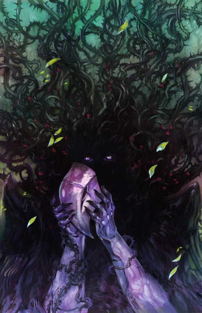
As for Mobili himself, the amount of atmospheric shading and backgrounds brings about an intimidating intensity. In just about all panels, there’s a sense of life happening in the background, in the form of plants or buildings. So when the backgrounds fade out, that sense of life practically disappears. Something that the coloring by Guru-eFX enhances with ghastly greens and blues. That is until more intense colors like bright red and yellow reacting to characters becoming afraid.The threat of the antagonist

Cowles is certainly no slouch in the horror department with his lettering. Most of the dialogue spoken by characters is in your standard word balloons until fear makes them scream out in sound effect forms. Even heroes as mighty as Captain Marvel feel fear in these times as she watches people burn. Then there are the sound effects unique to Man-Thing that look tailor-made for tasks like growing dandelion seeds. The “Glerdt” sounds feel like an act of desperation.

Anticipate Avengers: Curse of the Man-Thing

Avengers: Curse of the Man-Thing will go down in Marvel’s history as a character-defining event. By taking advantage of an obscure character’s great potential, Marvel has the potential to start something new. With all of the horror elements at play, readers should pay close attention to the other issues in the coming months.

Monkeys Fighting Robots Youtube

Review: THE AMAZING SPIDER-MAN #62 – Gog at Gunpoint

The Amazing Spider-Man #62 Cover

The fun and light-hearted The Amazing Spider-Man #62, out now from Marvel Comics, still has its intense moments, as Spider-Man and Boomerang’s pet becomes a target.

The Amazing Spider-Man #62 - Coloring Example
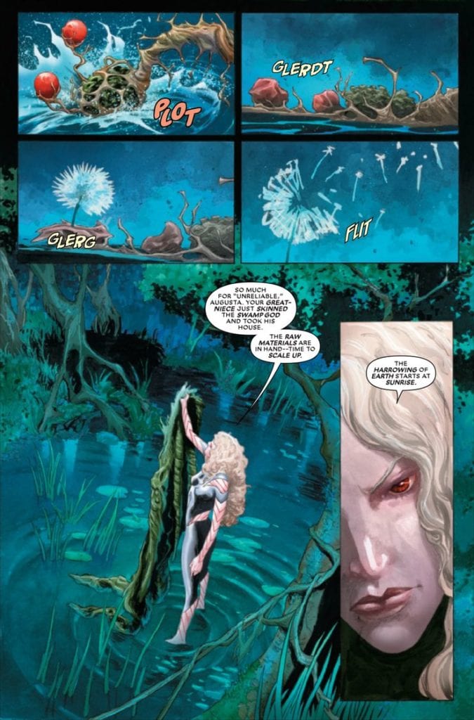
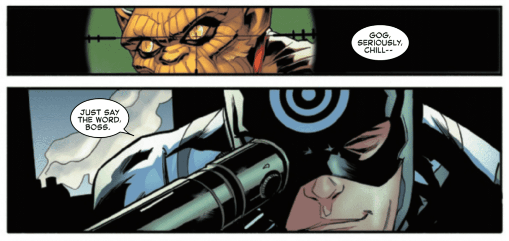
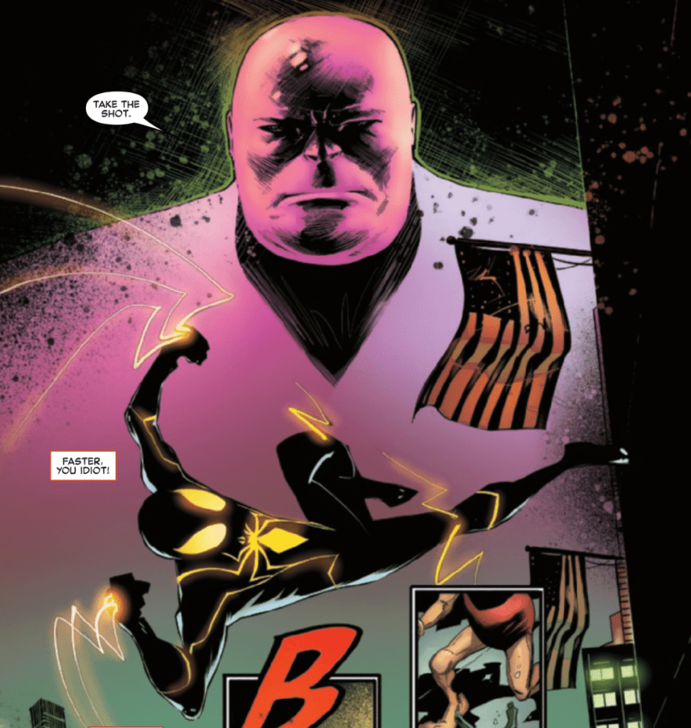
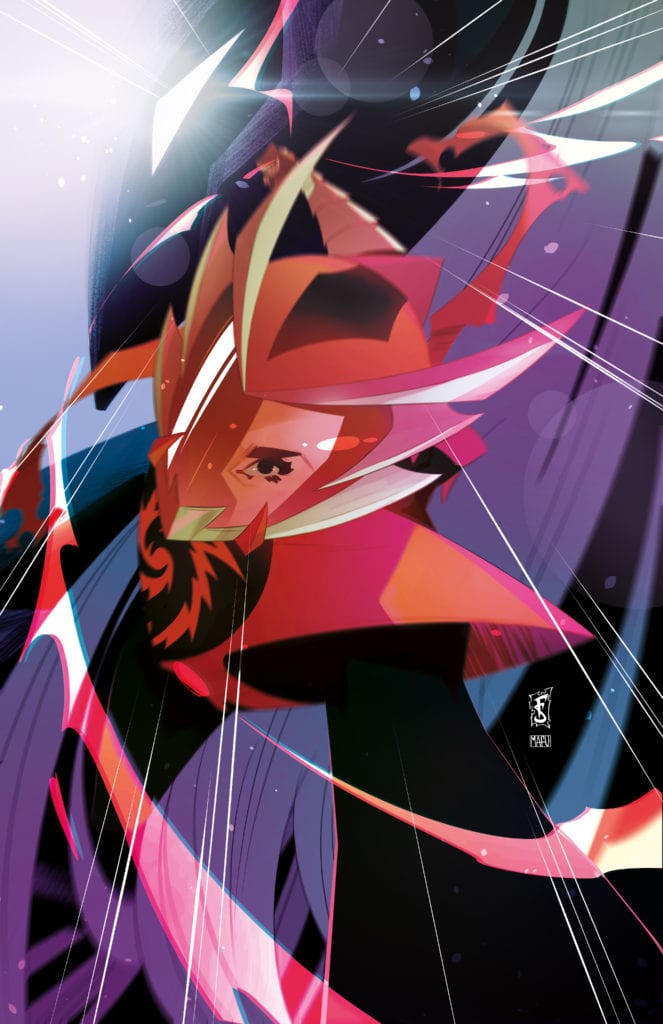
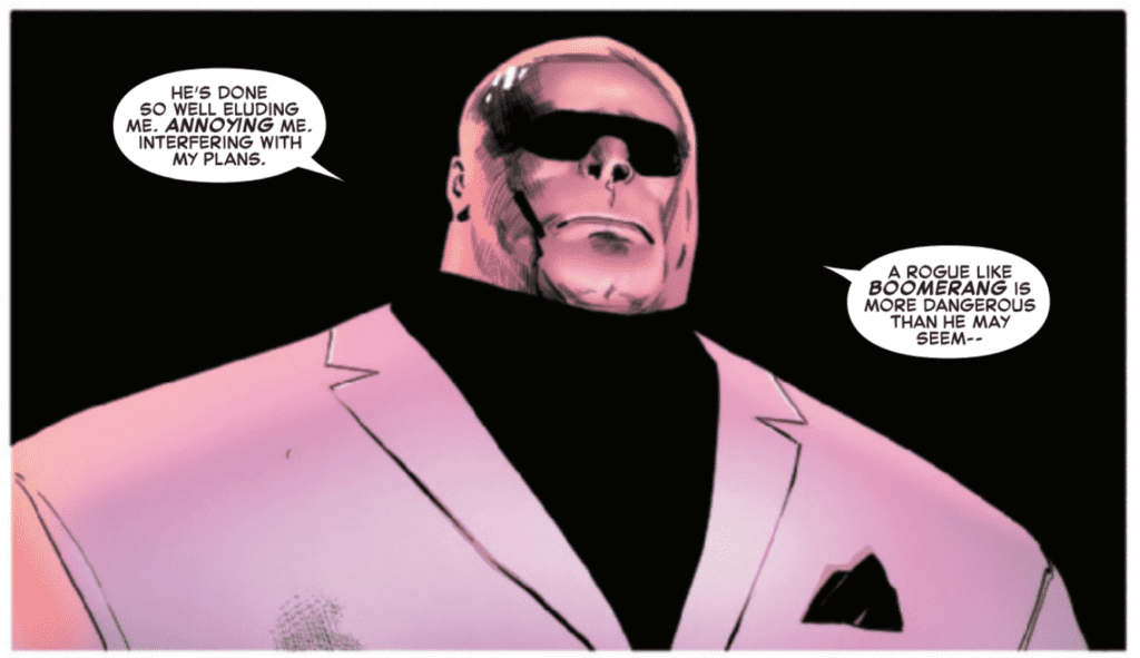
After the previous issue changed the series’ tone back to some more light-hearted plots, The Amazing Spider-Man #62 comes out swinging with a bombastic issue that never gets too serious. Nick Spencer’s writing ensures that it’s an enjoyable ride throughout the entire issue and focuses heavily on Spider-Man and Boomerang’s adorable pet, Gog. Action scenes are larger than life and help cement a classic Spider-Man feel to the issue. Spencer also — in his classic fashion — chooses to end the issue on a gripping cliffhanger, exciting readers to get their hands on the next issue.

The Amazing Spider-Man #62 Story Example

There is lots to be said about Patrick Gleason’s stunning art in The Amazing Spider-Man #62, but one of my personal favorites is how adorably he portrays Gog. The small reptilian monster is so cute, and there are panels with memories of Peter raising Gog that are so sweet they have no difficulty pulling on the reader’s heartstrings. Gleason’s characters also have wonderfully expressive faces, which works perfectly for both dramatic and comedic scenes. The panel layout for The Amazing Spider-Man #62 is incredibly creative, especially when separate scenes overlap in the same panel, such as when Kingpin gives an order for something that Spider-Man is seen rushing to prevent.

Edgar Delgado’s coloring in The Amazing Spider-Man #62 does a brilliant job matching the issue’s tone. The issue is almost is mostly humorous — for which Delgado chooses vivid colors — but in the brief moments where it lapses into serious matters, Delgado’s palette changes with the tone.

The Amazing Spider-Man #62 Art Example

Through various techniques, VC’s Joe Caramagna makes The Amazing Spider-Man #62‘s moments more immersive. Whether that be through bold fonts, extending dialogue past the borders of speech bubbles, or both. The exaggerated fonts that Caramagna implements in some of the speech bubbles pair wonderfully with the characters’ exaggerated expressions and assist the art in making the comedic intentions of the panel land. The fonts used for sound effects also help make the action scenes seem more intense, and overall the lettering of the issue is a superb complement to the art and story.

The Amazing Spider-Man #62 is like Spider-Man comfort food. It’s funny, has spectacular action, and has a more upbeat tone throughout. It feels like classic Spider-Man, and the issue is sure to be an entertaining experience for fans of the character.

Monkeys Fighting Robots Youtube

Exclusive: See How Sally Cantirino’s FINAL GIRLS #1 Cover Came To Life

final girls comixology originals cover art process exclusive

THE FINAL GIRLS hits comiXology tomorrow (March 30th), and Monkeys Fighting Robots got an exclusive peek at how artist Sally Cantirino crafted the cover for issue #1.

The series is a comiXology Original by Cantirino and writer Cara Ellison (making her creator-owned comic book writing debut), with colors by Gab Contreras, and letters by Joamette Gil. It’s a five-issue series, and all five issues will be available to binge read tomorrow.

About the series:
The world’s most popular superheroes have come and gone. The year is 2030 and most of the glamorous American superheroes of the last era have been wiped out, leaving only a handful to deal with the world’s crises. Welcome to The Final Girls.

Part dark comedic superhero drama, part dystopian political thriller, The Final Girls is set six years after the hero collective the Scottish tabloids named “The Final Girls” —Kogarashi, Bavanshee, Selkie, and Ash—left civil service and disappeared into the less fraught alleyways of Scotland. When Scathach, the world’s most powerful working hero, asks her retired peers for help, they secretly agree to deal out punishment on another hero in the public eye. When the weapon of publicity is wielded, it threatens to kick up all of their personal traumas, past and present. What does justice look like when violence isn’t enough?

Cantirino calls THE FINAL GIRLS “a comic about what abuse of power, reparative justice, and real change might look like.

“Inside every superhuman, there’s still a human,” said Ellison. “And the human needs to eat, pay the bills, have relationships, and send invoices. But what happens when superhumans realise that all the fragile systems of society and economy and politics are going to kill them, just like everyone else? What use is smashing someone through a window when the system that created them still exists?”

On working with Cantirino, Ellison continues, “[Sally] brings punk aesthetics and a scratchy horror vibe to the mood of THE FINAL GIRLS. [She] has a really good sense of how powerful women posture and how angry they can be.”

Read what Cantirino has to say about her art process:

On covers:

“We wanted something involving a picture or selfie of the group and it took us a few rounds to get there. I wanted to evoke the way that you take a picture with your girlfriends when you’re out drinking in the bar or club bathroom, while also referencing the kind of collateral damage that happens in a superhero fight in TV and movies. Looking back on the cover now, the series deals with the collateral damage and fall-out that people leave in the wake of their actions.”

On interiors:

“When I get a script, I start by breaking it down with a pack of highlighters and different colors of pens— one color for dialogue, one for captions, one for SFX, I make lists of everything I will need to establish a design for or find reference for. I figure out very loosely what the panel count and page configuration will be, to account for what shots need to be big exposition or establishing shots, what panels need to accommodate lots of dialogue or captions. I figure out where all the captions and balloons go at this point too.

“After that, I do most of my work on my iPad Pro and Clip Studio Paint— I draw my layouts at about half-letter size, then scale them up in very light blue on my template for my pencils. It gives me a rough underdrawing to build from, so I try to be pretty thorough in my drawing at the layout level before I even start pencils.

“I still ink using analog tools. I have a large format printer/scanner which allows me to print my panel borders in black and very light pencil lines in blue onto 11 x 17 Bristol board. For a long time I used Raphael 8404 brushes and sumi ink, but switched to using brush pens during this book due to shipping/supply issues during the pandemic. I’ve been using Pentel Pigment brush pens with Platinum Carbon ink ever since. After scanning, I do a little clean up and formatting in Photoshop before it goes off to Gab Contreras for colors and Joamette Gil for letters.”

See Cantirino’s full process behind the first cover:

Thumbnails (First Round):

final girls comixology originals cover art process exclusive

Thumbnail (Final):

final girls comixology originals cover art process exclusive

Pencils:

final girls comixology originals cover art process exclusive

Inks:

final girls comixology originals cover art process exclusive

Final Cover:

final girls comixology originals cover art process exclusive


THE FINAL GIRLS drops on comiXology tomorrow. Thanks again to Sally Cantirino for sharing her process with us!

Monkeys Fighting Robots Youtube

SILK #1 Review: Cindy Moon Does Whatever A Spider Can

Silk #1 Cover

In Marvel Comics’ Silk #1, on sale March 31, Cindy Moon proudly steps into the spotlight. With writer Maurene Goo and artist Takeshi Miyazawa at the helm, an underrated Spider-Verse member is poised to become a breakout star after this captivating launch. Goo gives Moon a personality that packs as much wit as you’d expect from Spider-Man himself. Plus, Miyazawa and color artist Ian Herring’s cinematic action shots turn this issue into a strong introduction for what should become a can’t-miss series. Finally, letterer Ariana Maher subtly brings each character’s voice to life, making every scene feel dynamic and life-like.

If you’re unfamiliar with Cindy, you’ll fall in love with her by the end of this first issue. She’s wonderfully sassy, and Goo’s script gives her several Peter Parker-like quips that hit home. Cindy’s spunk is immediately evident in the opening scene as, much like Spider-Man, she delivers some zingers while she stops a bank robbery. In one line, she hits a home run by telling one of the would-be crooks that she’s a disappointment to her parents. Goo captures the essence of Spidey and twists it so that Cindy’s character stands on its own.

Silk #1 action
In Silk #1, Cindy Moon delivers several zingers that make it impossible not to smile.

As fun as the opening scene is, the heart of the issue comes at Cindy’s day job, where she’s a budding journalist working under J. Jonah Jameson’s tutelage at Threats & Menaces. Jameson’s presence firmly ties the book to the Spider-Man mythos, giving casual fans something to latch onto, but his relationship with Cindy becomes a vital part of the story. Goo smoothly establishes a cute dynamic between the two, as the senior Jonah bonds with Cindy over their affinity for antiquated technology and good old-fashioned journalism. It’ll be fascinating to see how this relationship progresses throughout the series, especially if/when Jonah finds out about Cindy’s crime-fighting exploits.

Like you might expect in any story that involves a reporter, Silk #1 centers around a mysterious crime. In this case, it’s a gangland killing that leaves Cindy half-joking that werewolves might be involved. Miyazawa and Herring depict the scene of the carnage by leaning into the horror, with blood splattered all over the wall and gory shots of the victims themselves. This scene illustrates the brutality of the crime, but one small yet crucial detail comes when Cindy returns to her office.

Silk action shot
Cindy Moon swings into action in Silk #1

Though it might sound obvious, Goo and the art team make Cindy feel like an actual journalist. But when Miyazawa actually shows Cindy drafting up an article, this story clarifies that the character’s day job is just as important as her status as a superhero. The action shots of Silk slinging into action in full-page spreads are nice, but this little detail hammers in the fact that Cindy, much like the original Spider-Man, is essentially an everyman who’s trying to do the right thing.

Likewise, the creative team makes Cindy feel relatable when she makes a mistake. Maher’s lettering shows her inner monologue criticizing her carelessness in one seemingly harmless moment that sets off a dramatic chain reaction. In a nutshell, the whole team works together to make Cindy likable and remarkably human.

Silk #1 is the perfect jumping-on point because it establishes Cindy’s character, offers some typical superhero crime-fighting, and drops a few breadcrumbs for a compelling mystery. Hardcore Spider-Man readers and casual Marvel fans alike should check out this issue.

Monkeys Fighting Robots Youtube