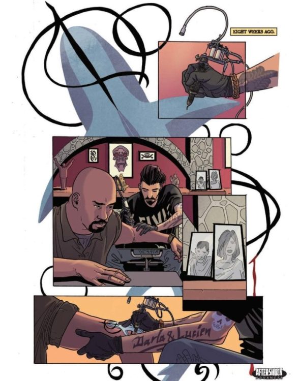
Stop what you are doing and check out this exclusive preview of EDEN from AfterShock Comics! The prestige format one-shot is written by Cullen Bunn, with art by Dalibor Talajić, colorwork by Valentina Briški, Marshall Dillon letters the issue, and Dalibor Talajić created the cover. Incentive cover by Tony Harris. The book hits your local comic book shop on May 5.
About EDEN:
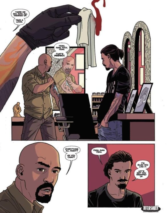
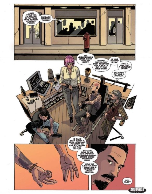
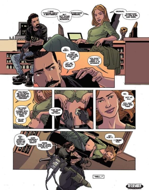
Tattoo artist Niles lives his life in a kind of daze. Minute after minute, he muddles through the repetitive moments of his job, his life, and his guilt. All that changes when Eden walks through the doors of the tattoo shop. She’s looking for something…different…and she finds it with Niles. But Eden is a woman surrounded by deep mysteries…not the least of which is how and why her new tattoos vanish after only a few days. As Niles learns more about Eden, he is driven to fathomless depths of both love and horror. Be prepared to accompany the notions of love, creation, and heartbreak to terrifying places.
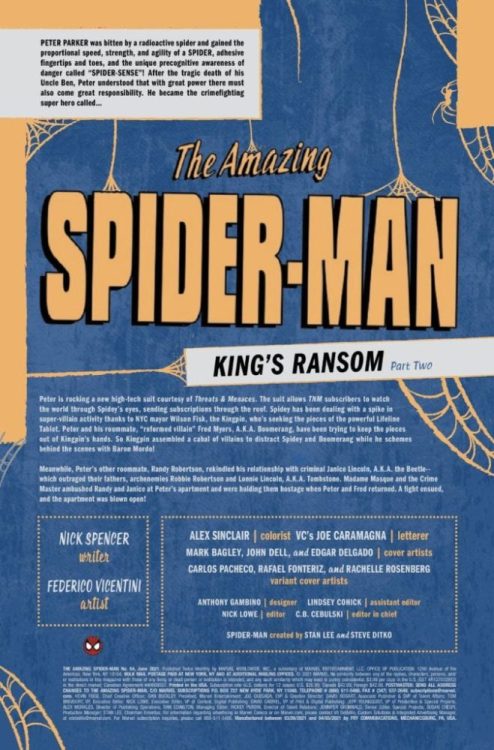
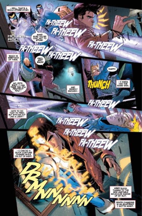
Listen up, True Believers! AMAZING SPIDER-MAN #64 hits your local comic book store next week, but thanks to Marvel Comics, Monkeys Fighting Robots has an exclusive preview for our readers.
“King’s Ransom Part Two” is written by Nick Spencer. With sick artwork by Federico Vicentini, Alex Sinclair drops the colors. You will read Joe Caramagna’s letter work, and Mark Bagley created the cover.
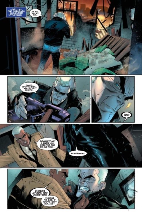
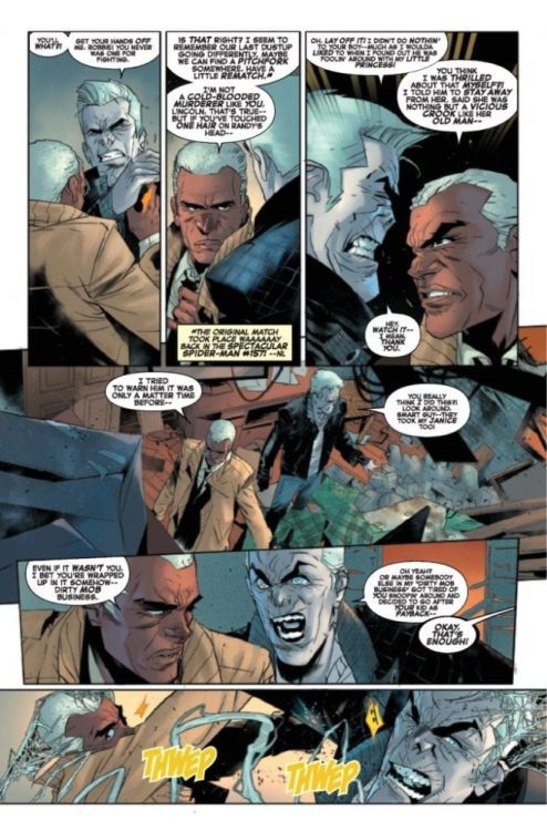
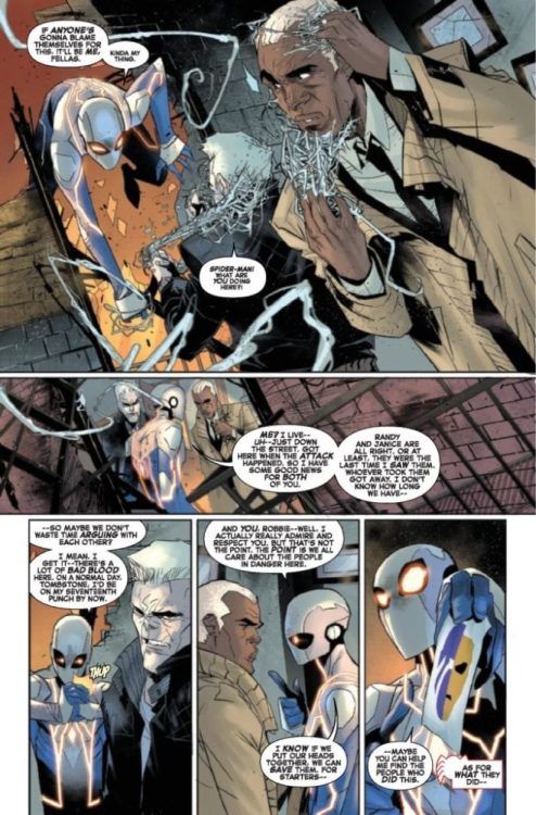
About the book: Tombstone and Robbie are at each other’s throats, and much of Spider-Man’s life is collateral damage. Does this have anything to do with Mayor Kingpin’s moves of late? Short answer – yes.
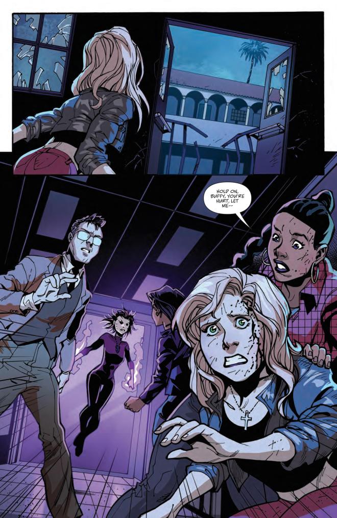
Until now, the Scooby Gang never thought that the greatest force they’d have to face would come from their own ranks. In Buffy the Vampire Slayer #24, the Gang takes on a darkness out of their control. This issue is written and illustrated by long-time contributors Jeremy Lambert and Ramon Bachs, respectively. Also returning are colorist Raul Angulo and letterer Ed Dukeshire.
#24 picks up right where the previous issue left off: the Scooby Gang all engaged in a battle against two of their own. While Buffy’s knocked out on the ground of Sunnydale High, new slayer Faith kills a beloved member of the Scooby Gang in self-defense. Or did she?
With the help of a magic portal, the Gang fall into the astral realm, hoping to save the soul of their friend. Robin and Faith are the only two left behind. And so it seems we’re heading into a new chapter: out of the Ring of Fire and into the darkness.
Not With A Bang…
Given the climactic nature of the issue, Lambert uses minimal dialogue in service to the action. Nonetheless, what little is said packs an emotional punch. No panel feels out of place either, as Lambert gives Bachs ample space to hone in on character expressions. The reader sees each character’s pain, blood and tears.
BUFFY WORRIES FOR XANDER.
Another noteworthy aspect of Lambert’s writing is that he’s actually adapting a plot point from the TV series. Without getting into spoilers, the character who dies has a similar arc to one of Buffy’s love interests in the show. Yes, some might find the use of a familiar storyline frustrating or limiting to the comic book series. But Lambert changes enough character motivations and emotional beats for this to stand on its own.
Moreover, Bachs’ extra scratchy cross-hatching and deep black shadows cement the tragic mood of the whole issue. Each action is also accented with lines that match the scratches on Buffy’s body as she takes a hit from Dark Willow. This dramatic choice both contrasts and complements Bachs’ typical Archie-meets-pop-art style. Bachs’ harsh lines and shadows, against cartoonish character designs, represent the impact of adult tragedy on such a young group.
But A Whisper
Meanwhile, Angulo’s contrasting cold blue and grey against warm purple and red emphasize the Gang’s feelings of shock and sadness. The purple also represents Willow’s immense power and dominance over the situation. Despite the utter tragedy on display, the colors and illustration are aesthetically pleasing as much as they are affecting.
Dukeshire’s lettering parallels Lambert’s minimal dialogue. All the dialogue is in small font, as if the character’s are whispering the entire time. Most of the bubbles are also centralized, which allows room for the action to speak for itself. Unique to this issue, Dukeshire does not include any sound effects, another choice that makes space for action. Thus, each panel flows smoothly from one intensely emotional beat to the next.
Thanks to its emotionality and artistic agility, Buffy the Vampire Slayer #24 might be my favorite issue so far. Wherever it leads them, I’m ready to follow the Scooby Gang down this dark path.
Jenny Zero #1 from Dark Horse Comics comes to your local comic shop on May 5. Co-writer/letterer Dave Dwonch and co-writer Brockton McKinney depict a hard-drinking kaiju fighter in a parody of Ultraman. The art by Magenta King looks absolutely hallucinogenic with coloring by Megan Huang adding to the surrealism.
Jenny Zero #1: Multiple Directions
Dwonch and McKinney introduce the reader to Jenny Tetsuo, a directionless alcoholic with a lot of troubles. Jenny feels human in how she portrays an adult disconnected from everything that once gave her life meaning. With her father dead and the job of an Ultraman style science officer she inherits from him ringing hollow, Jenny tries to drown herself out in hedonism. By the time she rolls into action, Jenny is half-drunk and playing music while shooting monsters dead. While capable, the fact that Jenny is back on the job despite psychological problems gives readers an idea of her workplace relationship. In short, rather exploitive and unwilling to invest in alternatives.
Take A Trip!
Between Magenta King’s illustrations and Huang’s colors, Jenny Zero #1 looks like the reader is inside Jenny’s high. The fact that Jenny’s equipment grotesquely attaches to her makes the reader question if they’re even looking at the real world. In a way, the drugs Jenny takes before putting her gun on is for the reader to suspend their disbelief. That is after they see Dwonch’s lettering as it expresses the feeling of waking up to a radio alarm clock announcement in sound effect form.
For Jenny, this kind of life is as mundane as her civilian life, where she goes to clubs. The only real difference comes from how the colors of her surroundings evoke feelings. At the club are a myriad of cool colors for comfort. It’s why Jenny’s room has similar if plainer colors to rest after partying in safety. Unlike the bright orange and yellow colors accompanying kaiju attacks.
Jenny Zero #1: First Shot To A Wild Ride
Jenny Zero #1 hooks readers in with an all too human story about workplace troubles. Because with a job as stressful as Jenny’s, looking at it while intoxicated might make it easier.
What do you all think? Does the activities of Ultraman’s science teams look too absurd for a mundane person? Do you identify with somebody who doesn’t enjoy her job? Leave your thoughts in the comments.
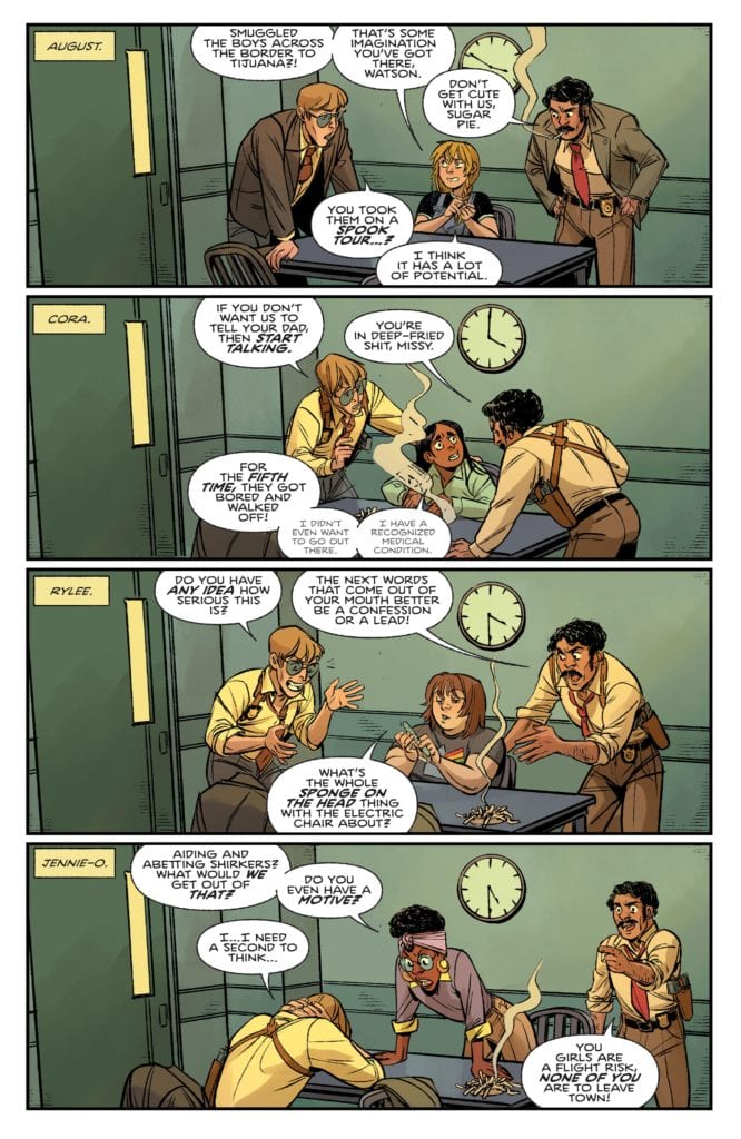
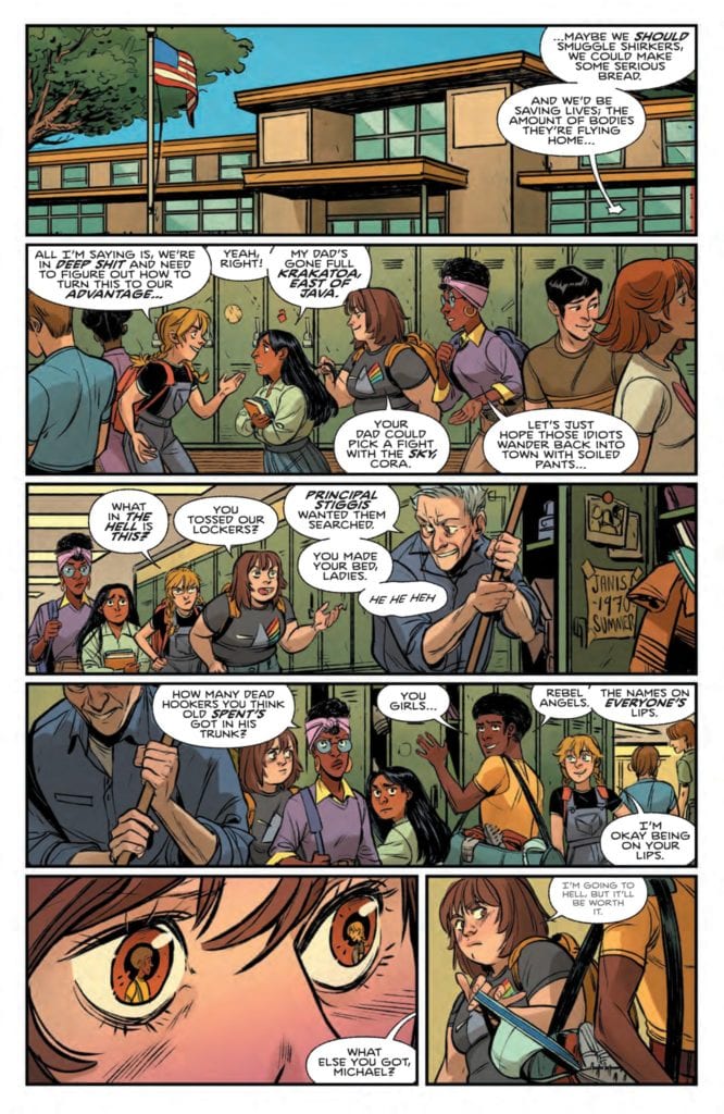
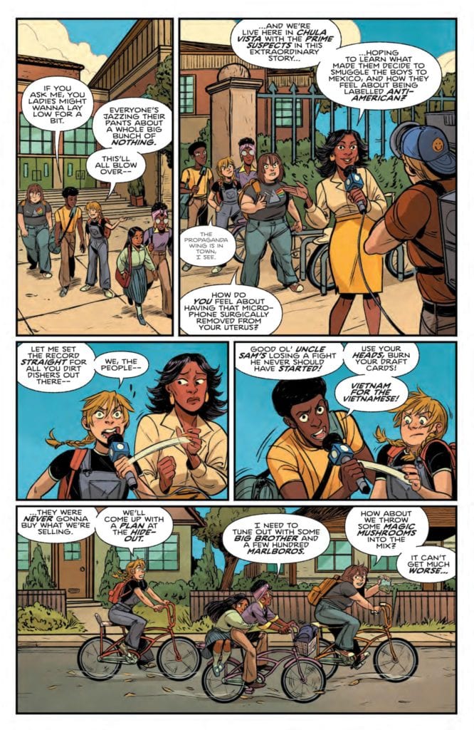
From comics icon Grant Morrison and writer Alex Child, with artist Naomi Franquiz and colorist Tamra Bonvillain, comes the second chapter of a politically-tuned and teen rebellion-driven supernatural horror-comedy. “Proctor Valley Road” #2 is a knife-sharp and wickedly funny comic full of period-accurate political focuses and a group of kick-ass teenage girls who are all their own unique characters. With a killer script and stellar visuals, this 2nd chapter has be hooked on this new series.
“August, Rylee, Cora & Jennie are the prime suspects in the disappearance of the missing boys, but the authorities have no idea what monsters roam the Proctor Valley Road. As the town – and even their families – closes in on the girls, August makes a choice to visit that haunted road one last time. And even if she survives, an even greater threat may have its eyes on these four friends..”
Writing & Plot
What makes Grant Morrison and Alex Childs’s script for “Proctor Valley Road” #2 so much fun is the mixture of realistic-feeling teenage characters enduring the turbulence of the late 60’s/early 70’s with the mixture of some good ol’ supernatural horror. The main cast consisting of high school girls August, Rylee, Cora, and Jennie are all written spectacularly well, with each of them carrying a completely different personality and set of interests while still making it apparent that their friendship works. Much like the comic’s obvious influences (The Goonies, Stranger Things, etc.), the group are all social outcasts with individually turbulent home lives. Their families don’t really know how to handle them, so they often find their own ways through living in their town – which is what lands them in trouble in the first place. The angle at which the socio-political climate is addressed as well is clever. From the perspectives of the teens, the issues being discussed here are obviously relevant to the time (the Vietnam war, lingering post-segregation racism), they are handles in such a way that makes them feel relevant to current issues without beating you over the head. The horror elements take a bit of a back seat to the interpersonal and political goings-on in this comic, but there’s a cleverness even to that. The story is structured like a horror film from this time period, with suspenseful bits leading up to the big horrifying reveal (there are some horrifying reveals here but not *the* reveal). This allows the characters and world to take shape and flourish while the supernatural threat takes shape in the background. The other big clever bit to the comic’s backseat approach to the horror: the protagonists are basically kids. The weight of mortality and the incursion of reason that adults have hasn’t really hit these girls yet, which is why when the big spooky stuff comes along it’s a big deal – but it isn’t exactly earth-shattering. This is a brilliant script that makes me immensely excited to see where this comic takes me.
Art Direction
I was a huge fan of Naomi Franquiz’s artwork when I first happened upon it in Tales From Harrow County, so I knew I was in for another treat upon seeing more of her work on “Proctor Valley Road” #2. Her eye for character animation and detail makes this cast of characters immediately likeable and relatable to the reader, with their personalities painted across their faces in each and every panel. Their attire is smartly put together too, as it’s attuned to their personalities as well as their age. Franquiz builds a fantastic view of a quiet desert town in 60’s/70’s California as well; the sand-worn houses and period correct cars all function as dead giveaways to the story’s setting but manage not to date it in any negative fashion. The colors from Tamra Bonvillain are the real key to this book’s aesthetic though. The mottled reds of the desert sun that paints the town during the day fades into a headlight and bonfire colored night in the sandy desert, dotted by strikingly eerie neons when the spooky stuff starts. The panel direction isn’t anything particularly outstanding, mostly made up of 3 to 4 large panels per page in a manner that quickly progresses the story. This is a sensible choice though, as the story is so focused on the interactions of multiple characters and these large panels fit multiple people and their body language efficiently. The letters from Jim Campbell are widely fluid and dynamic, often changing size and clarity seamlessly to denote the tone or volume of a character’s words. This comic has the perfect aesthetic and design for the story being told here.
“Proctor Valley Road” #2 is a complete blast of an adolescent horror comic. Morrison and Child’s script is packed with personality, cultural insight, and cleverly laid building blocks getting to the horror elements in the story. The visuals from Franquiz and Bonvillain are a mixture of lively characterization and eerie environmental design. This issue has sold me on wherever this comic is headed, so be sure to grab a copy when it hits shelves on 4-14!
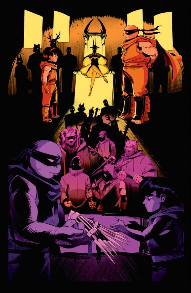
TEENAGE MUTANT NINJA TURTLES: JENNIKA II #6, available on Wednesday, April 13th, is the concluding issue of Ronda Pattion, Jodie Nishijima, and Shawn Lee’s story of Jennika’s personal life. Readers have followed the ninja through her personal transformation while interacting with fellow people in Mutant Town. And things have been tough. But this issue concludes one of the most impactful redemption arcs in a TMNT series.
Story
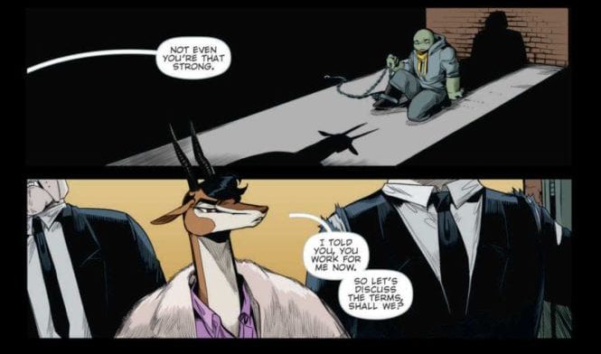
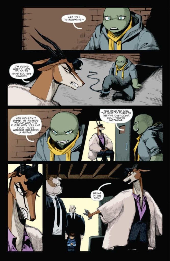
Last issue, Jennika was captured by Lucia Rosetti and her henchmen after refusing to serve as her personal assassin. The nefarious gazelle isn’t ready to give up, opting to further torture the ninja by playing on her past life as a killer.
Refusing to bend to Rosetti’s will, Jennika invokes the names of her found family, reminding the crime lord what a powerful force they are. But the villain’s cruelty knows no bounds. Readers will be shocked to find that Rosetti stoops to harming her own child in order to reach her goals.
Pattison’s narrative accomplishes two important tasks—it allows Jennika to confront her past life as a criminal and forgive herself for those very actions. We see the culmination of an issues-long transformation of the ninja as she seeks to save a boy whose life hangs in the balance.
Artwork
This issue’s illustrations fit perfectly with the story’s mob movie themes. Nishijima’s illustrations, combined with Pattison’s coloring, set Jennika and Junior’s forms against dark shadows to represent her assailants’ forms. Readers can feel the pressures faced by the duo, especially the shock Rossetti’s attack. Lee’s lettering also worked well with these depictions of our protagonists by increasing font sizes for their exclamations.
Conclusion
TEENAGE MUTANT NINJA TURTLES: JENNIKA II #6 wraps up this six-part series with the perfect balance of heart, redemption, and action. We hope to see a lot more of Jennika in future stories.
Were you happy with the conclusion to this series? Let us know in the comments below!
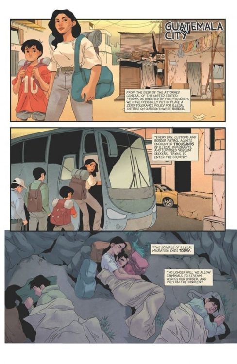
HOME #1, available in comic book stores on Wednesday, April 14th, is the first installment of a brilliant new series honing in on the injustices facing immigrants. Readers will join in the travels of people fleeing for their lives. The American Dream purports to offer opportunity for everyone, but this groundbreaking issue reveals a harsh truth most of us already know: some people are barred from our country’s promises.
Story
The story introduces us to an unnamed mother and child making their way to what’s presumed to be the United States. We see them catching bus rides and sleeping outside in the hopes of finding a better life.
Rather than detailing the characters’ dialogue, the story relays what appears to be a speech from an official of the former President’s administration. The language is thoroughly xenophobic, filled with a hatred and fear of immigrants. This contrasts with the images of the refugees simply seeking safety.
The most scathing indictment of the administration’s attitude toward immigrants and refugees comes from the former President’s words himself.
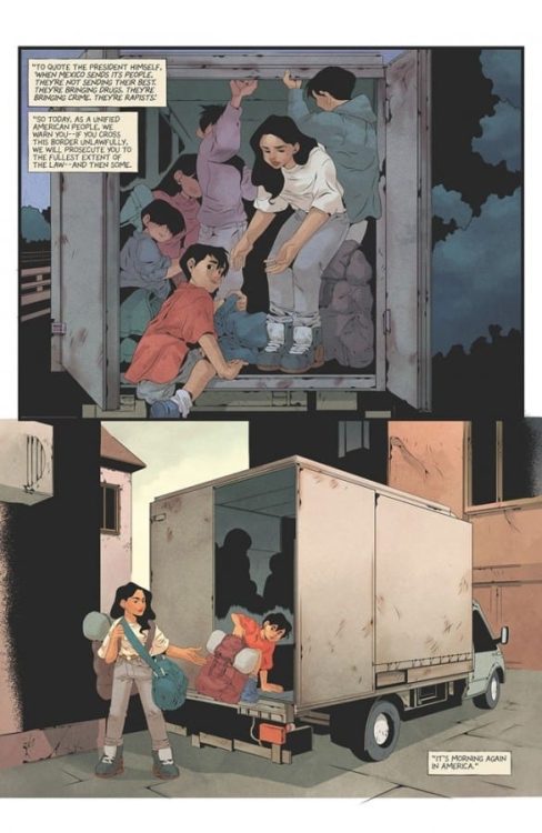
The family eventually arrives at the border to the U.S. where they prepare to meet with border police officers. What ensues is a horrific process of separation that will change the young family’s life forever.
Julio Anta’s powerful story weaves together elements of hope and terrible circumstances. His ability to depict the harsh realities faced by immigrants is eye-opening—even for those who claim they’re aware of these human rights violations.
Artwork
The illustrations within this issue tell a story of hope and heartbreak—arguably more so than the written narrative. Anna Wieszczyk’s penciling and ink work detail the traumatic experiences of the protagonists. Fleshed out with Bryan Valenza’s coloring, the reader sees the red flushes on their weary faces to represent the hardships experienced. In addition, Hassan Otsmane-Elhaou’s lettering does a brilliant job of differentiating between the Spanish and English dialogue using alternating red and black fonts.
Conclusion
HOME #1 is the story we need right now. It’s great to see a tale told from a marginalized group’s perspective in the comic book medium.
Do you think more real world traumatic events will be featured in subsequent issues? Let us know in the comments below!
Scout’s Honor #4 from AfterShock Comics comes out to comic stores on April 14. Writer David Pepose brings this mini-series to its climax. With art by Luca Casalanguida, colors by Matt Milla, and lettering by Carlos M. Mangual, readers experience the protagonist’s mind going through a crisis.
Scout’s Honor #4 And Lack Thereof
Pepose has Kit feel the weight of her decisions and revelations in Scout’s Honor #4. Calling back to previous issues, Kit now faces everything she believed in turned upside down. The reader experiences Kit’s helplessness as despite knowing the risks towards herself, they learn from Kit the empowerment of being a scout. Kit’s disillusionment is all the more worse, considering how it parallels with real-life cases of abuse in scout troops.
It’s a good thing something else builds from previous issues; despite the foundations of the scouts, the inspiration still exists. Kit has always been a survivor, Scout’s Honor #4 is where she displays that in full. With one more issue to go, the reader will eagerly await Kit’s final stand.
Striking Art
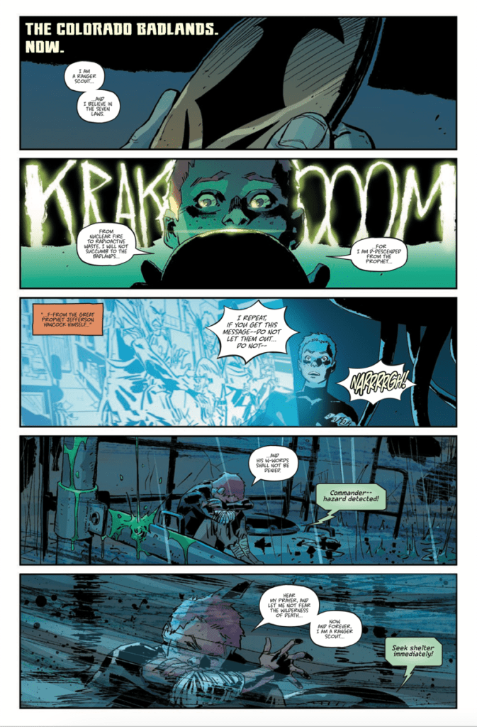
Casalanguida continues to give the art a strong sense of grittiness. A large amount of shading displays how much the Ranger Scouts operate, as ruthless as the stormy post-apocalyptic wilderness. Kit’s reactions both in and out of shelter with how she curls up in a helpless position explain her situation.
Milla’s coloring adds to Kit’s sense of helplessness in Scout’s Honor #4. Her red hair is almost muted out in the dark corners she finds herself in. Also, with a sulfur storm featuring a green aesthetic coming in, the danger intensifies. In contrast, the warm orange color brings back some brightness to Kit’s appearance.
The lettering from Mangual gives these situations a more intense resonance. The thundering sound effects look engineered for these specific instances. Not only does the hand-drawn look eye-catching, but they are in juxtaposition with Kit’s mindset. In one instance where the thundering sound effect lights up, she’s reciting an oath for clarity.
Prepare For Scout’s Honor #4
Scout’s Honor #4 is where this series becomes a must-read. With a protagonist the reader comes to love reaffirming herself against her darkest hour, the readers are ready for one last stretch.
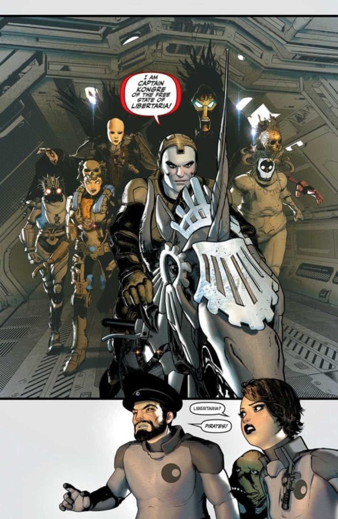
Image Comics’ JULES VERNE’S LIGHTHOUSE #1, available April 14th, is an adaptation of a classic piece of fiction history. Far out on the edges of the galaxy exist a crew. Their purpose is to maintain a supercomputer that helps navigate ships through wormholes.
Space pirates! Not the sort of people I would want to fight.
Jules Verne’s The Lighthouse at the End of the World was originally published back in 1905. Though ironically, the piece was not published until after he had passed. Much of the story itself is based on real events (piracy in the South Atlantic), though the adaptation takes this theme a few steps further.
Jules Verne’s Lighthouse is not set in the South Atlantic. It’s not even set on earth. Instead, it is set at the edge of the galaxy. Here a crew of people (not all entirely human) works to maintain a supercomputer designed to help spaceships through wormholes.
It’s safe to say that the core of the premise is the same, just taken to a new extreme. Science fiction helps to add tension and interest in Jules Verne’s Lighthouse #1. All while leaving plenty of room for the famous thriller elements.
Unicorns, pirates, and betrayal – what next?
Writing
Jules Verne’s Lighthouse #1 is the first of a five-part miniseries written by David Hine and Brian Haberlin. If you read The Marked or Sonata, those names will likely sound familiar right about now.
Space pirates have been a concept for about as long as real pirates have been around. When humans dream of space, we just can’t help but imagine all of the horrible events that could occur way out in the galaxy.
It’s what makes this adaptation feel so organic, despite the heavy science fiction inclusion. It doesn’t take long for this story to kick-off, throwing the characters into a battle for their lives as a pirate crew invades.
In fact, the story actually begins before readers really get much of a chance to get to know the characters involved. However, the relevant backstories do come out over the course of the first issue, with hints of more to come.
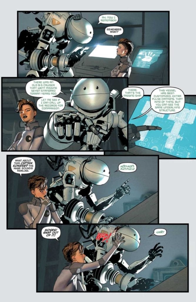
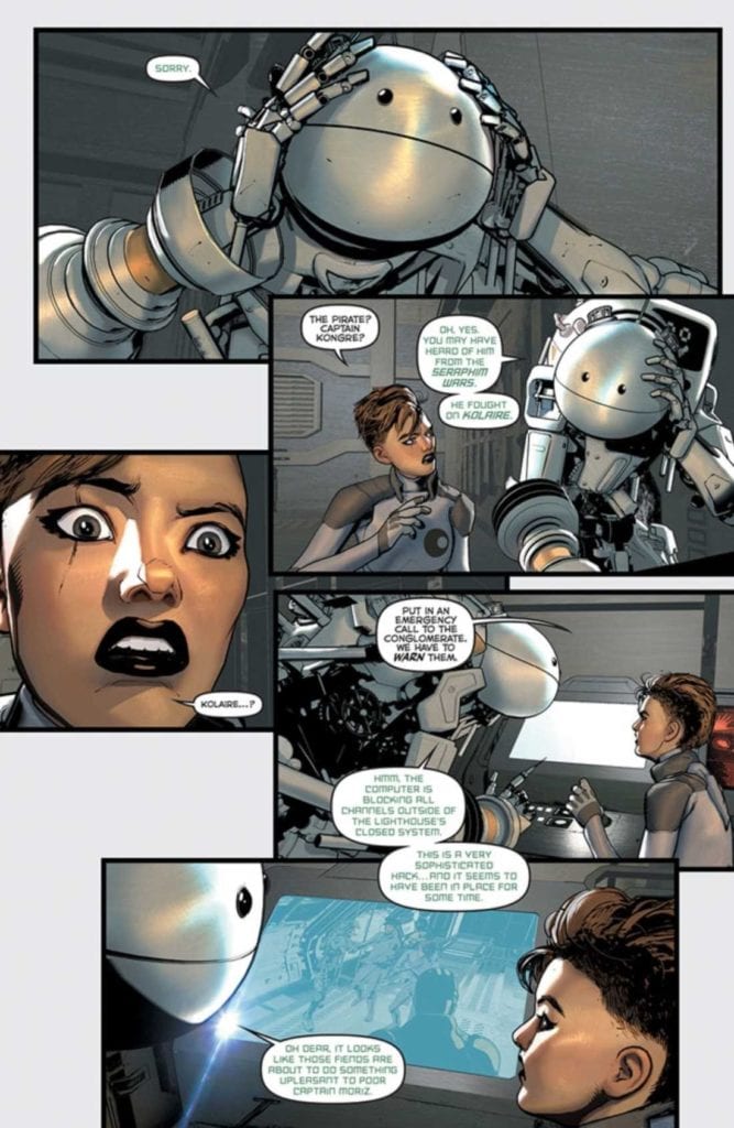
Ironically, one of the more humanized characters isn’t even a human. They’re not even organic – they’re a nanny bot, but their motivations are clear. Their presence has already helped to drive the story forward, and I look forward to seeing what they’ll do next.
Good to know that at least Moses has a plan.
Artwork
Jules Verne’s Lighthouse #1 is full of that trademark style that Brian Haberlin is so well known for. The backgrounds are stunning, naturally – full of images of space, stars, and other eye-catching details.
Meanwhile, the characters have a detailed yet harsher design to them. One that fits in nicely in a world of science fiction. The tech around them feels appropriately futuristic while still giving off the impression that it could all use a good tuneup. Out of all the characters, the nanny bot stands out the most, and I imagine many Hitchhiker’s Guide fans will appreciate the overall design there.
Geirrod Van Dyke’s colors are a fascinating combination of bold and muted. When light pops into a scene, it’s dazzling. Yet, there are many panels that feel like they lack light, implying a darker setting and tone. It helps to set the scene and makes those stunning backdrops all the more memorable.
Francis Takenaga’s lettering shines in this first issue. Moses’ (the nanny bot) voice is distinct from the rest – but it’s more than that as well. Moments of dissonance are made painfully clear through subtle tweaking of the letters.
Things do not look good for the rest of the crew.
Conclusion
Jules Verne’s Lighthouse #1 is a daring start to this adaptation. In some ways, it feels so very different from the source material. That’s not a bad thing. The creative team has successfully added new life to a classic tale.
IDW’s STAR TREK: THE NEXT GENERATION ‘THE GIFT,’ available April 13th, is a reprinting of a classic Star Trek story. One that feels more relevant than ever, with the promise of a fan-favorite returning to Star Trek: Picard.
It’s important to note that Star Trek: The Next Generation ‘The Gift’ was originally published in the 1990s. What we’re getting here is a reprinting, albeit a reprinting alongside a stunning new cover (thank you, J.K. Woodward).
The Gift was written by John de Lancie, which is ironic, given his role as Q in the show. Additional dialogue was provided by Michael Jan Friedman, with artwork from Gordon Purcell, Pablo Marcos, Julianna Ferriter, and Bob Pinaha.
The reason I mentioned the irony is fairly straightforward. The Gift is a Q heavy plotline, as he gives Picard a chance to right a wrong of his past, but as always: one should be careful what they wish for.
Writing
The Gift is a story that feels right at home with The Next Generation’s earlier seasons (between seasons three and four, if you want to get specific). As far as when it fits in the timeline, it’s shortly following Deja Q’s events – which makes sense, given everything that is about to happen.
This is a thrilling romp through Star Wars history, one that is very much on point with the adventures that Q tends to bring with him. It’s also a shockingly tense read, as it deals with one of the worst memories from Picard’s history – that alone should be saying something.
It’s always refreshing to see a character drive plot – but The Gift takes that a step or two further. After all, it’s written by one of the characters driving the story. Okay, not quite so literally, but about as close as we can get.
Honestly, it’s almost difficult to believe that they were able to fit so much into what is only sixty-four pages. It ends up feeling more like reading a novel – and I mean that in a good way, of course.
Artwork
Here’s where it is important to remember that The Gift was originally published back in 1990. The artwork is not what is typically published these days. Though the cover is new and stunning – once again, thanks to J.K. Woodward.
Naturally, the artwork inside doesn’t match the cover. The colors are extremely bold and bright, as was typical of the time period. The red and yellow shirts pop off the page in a way that feels so familiar to the show itself.
There’s little in terms of lighting or shading, but again, that was the style. Meanwhile, each and every character truly does look like their television versions. Though perhaps with a little bit of that comic flair here and there.
The lettering went above and beyond when it comes to making sounds and impacts clear. There’s no hiding from traumatic events here. Their sounds carry, hitting all the harder because it relates to a beloved character.
Conclusion
Star Trek: The Next Generation ‘The Gift’ is a fun, and thrilling read worth read. It doesn’t matter if you’re a new fan or an old one; the odds are good that you’ll find something to appreciate here. And of course, let us not forget how this helps to set the scene for what will surely happen in Star Trek: Picard.


 Casalanguida continues to give the art a strong sense of grittiness. A large amount of shading displays how much the Ranger Scouts operate, as ruthless as the stormy post-apocalyptic wilderness. Kit’s reactions both in and out of shelter with how she curls up in a helpless position explain her situation.