CRITICAL ROLE: VOX MACHINA ORIGINS III #2, available in comic book stores on Wednesday, April 28th, features the final battles in Vox Machina’s underground tournament. What first began as a simple means of gaining coin soon evolved into the perfect team building activity. But working together is easier said than done.
From the creative minds of Matt Mercer and the rest of the team at Critical Role comes a story full of characters who must learn how to fight for a common goal.
Story
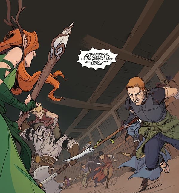
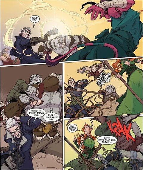
Readers will remember Vox entering a slightly sketchy tournament of fighters last issue. This story picks up right after the combat begins, thrusting us into the action immediately.
With such a strong set of personalities and unique skillsets, it’s no wonder Vox’s cooperation in battle is horrendous. Their team is mighty, yes, but the complications that arise could cost them the championship.
Jody Houser’s script captures the essence of true team building. Despite having traveled together for some time now, Vox clearly has some work to do in terms of cooperation. But the progression of Vox from a disorganized group to a synergistic team throughout this story offers readers hope for their potential success.
Artwork
With the heavy focus on action in this issue, it was great having an assortment of talented artists. Olivia Samson’s penciling and ink work crafted dynamic characters with detailed muscles and joints, generating an effective sense of movement. Diana Sousa’s coloring helps them stand out with vibrant shades for our protagonists set against duller backgrounds. In addition, Ariana Maher’s lettering helps add to the panels’ energy by adding spiked outlines to the word balloons, referencing the announcer’s booming voice.
Conclusion
CRITICAL ROLE: VOX MACHINA ORIGINS III #2 is an exciting installment to this fan favorite series. We hope to see more team dynamics play out in future issues.
Do you want to see Vox compete in more tournaments? Let us know in the comments below!
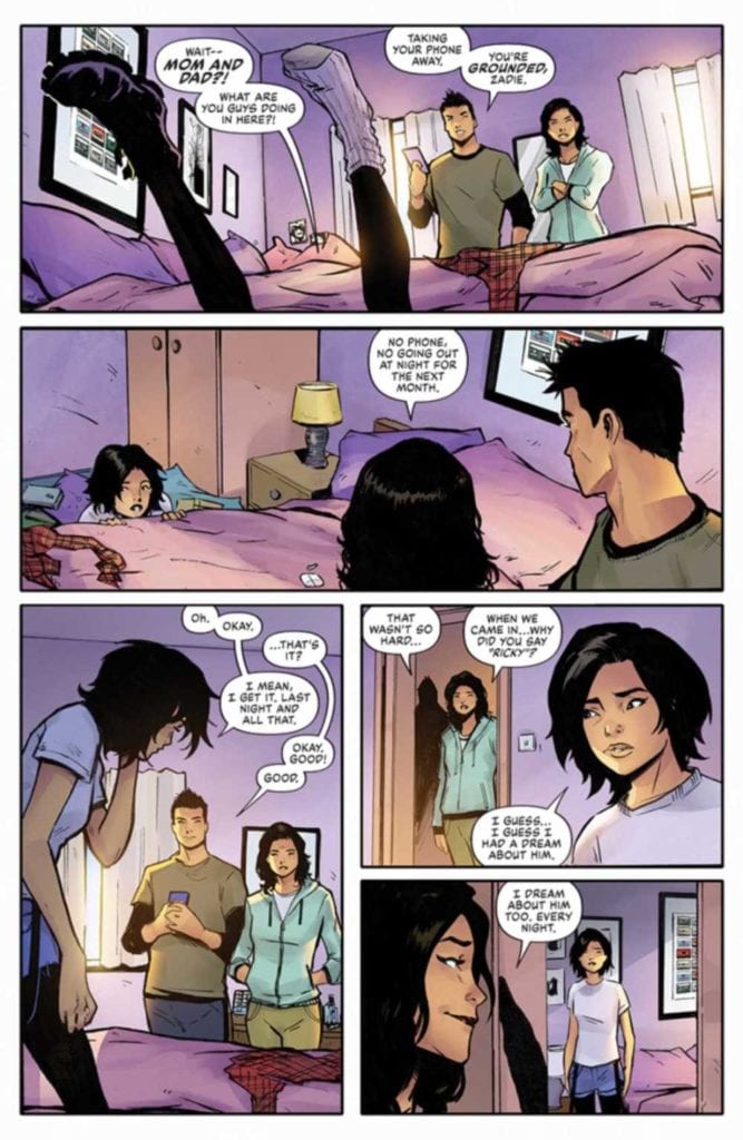
SHADECRAFT #2 hits comic book stores on Wednesday, April 28th, diving deeper into the mystery of the shadows plaguing Zadie Chu. Readers will remember the teenager encountered these living constructs in the woods last issue, almost succumbing to them if not for her brother Ricky. Now that he’s become a shadow himself, the duo will need to investigate the weird happenings and find a way to get him back to his body.
Story
After the craziness of last issue’s escapades, Zadie finds herself waking up at home the next morning. She literally falls out of bed thinking the shadows attacked her. Fortunately (or unfortunately), it turns out to be her parents. And they’re letting her know she’s grounded.
Her parents are surprised to see Zadie is fine with her punishment. But readers will know how anxious she is to spend more time with her brother, desperately searching for a way to solve the shadow mystery.
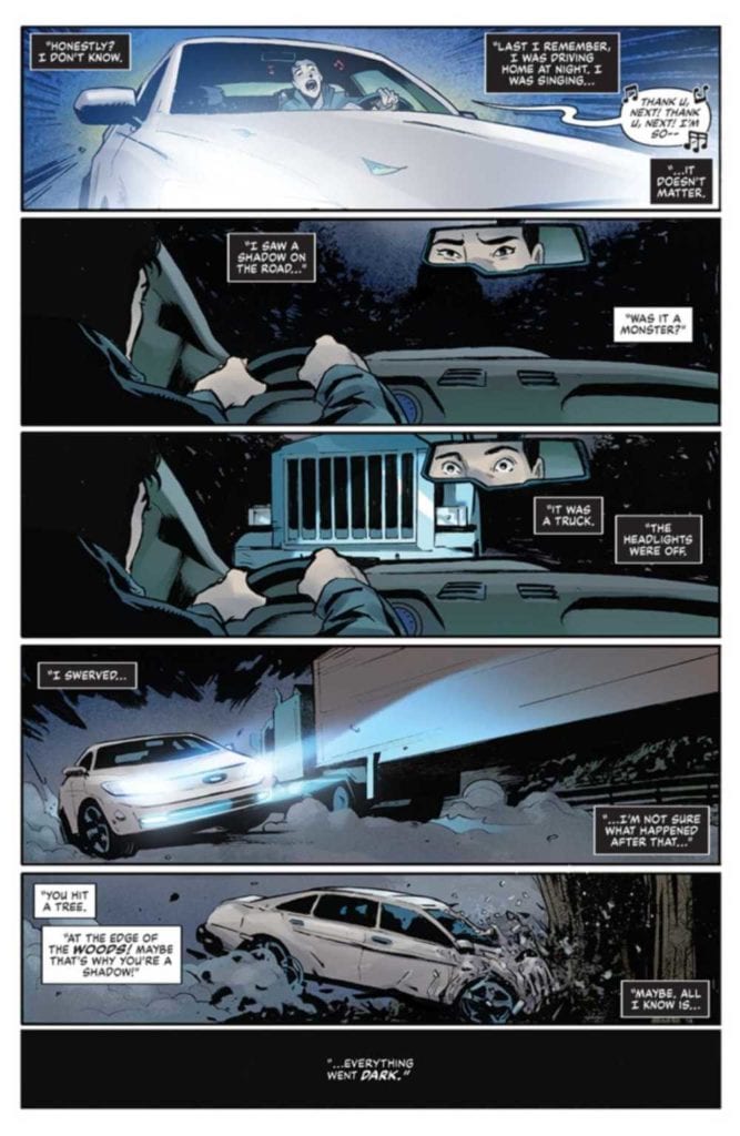
It is here where readers finally get some answers regarding Ricky’s coma. Readers bear witness to a flashback of a car wreck, leaving Zadie’s brother in his comatose state. A truck with it headlights turned off causes him to swerve and crash into a tree.
Connecting over their shared trauma—Ricky’s physical hurt and Zadie’s emotional pain—draws these two together like metal and a magnet.
What proceeds is a deeper development of Zadie and Ricky’s estranged relationship. Writer Joe Henderson shows what it looks like for two siblings to recognize what moments they’ve missed together. It’s sad, but offers a glimmer of hope via their budding relationship building.
Artwork
The illustrations within this issue captured the essence of the typical high school experience for an outcast. Lee Garbett’s penciling and ink work does a brilliant job of highlighting Zadie’s feelings of distress amongst her peers and crush, Josh. Antonio Fabela’s coloring fills her face out with varying shades of red to emphasize her embarrassment. Simon Bowland’s lettering also did a great job of showcasing the ebb and flow of the story’s drama, alternating between panels with many word balloons and those with much fewer.
Conclusion
SHADECRAFT #2 expands this new universe with the perfect balance of mystery and drama. We’re excited to see what develops in Zadie and Ricky’s relationship going forward.
What connection do you think Zadie has to the menacing shadows? Let us know in the comments below!
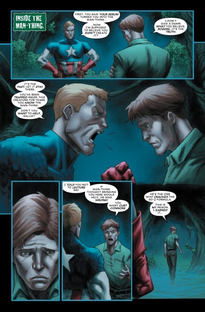
Amazing Spider-Man: Curse of the Man-Thing #1 from Marvel Comics comes to comic stores on April 28. Writer Steve Orlando continues the journey of protagonist Ted Sallis through Spider-Man and his rogue, The Lizard. Artist Marco Failla with assistance from Minkyu Jung, put the atmospheric tensions between the two main settings in juxtaposition. That feeling enhances with the coloring by Guru-eFX, and letterer Clayton Cowles gives weight to every conversation in the issue.
Amazing Spider-Man: Curse of the Man-Thing Plot
Orlando’s creative decisions in Spider-Man: Curse of the Man-Thing are insightful. The inclusion of Curt Conners (The Lizard) fits well with his and Ted Sallis’ Florida eco-horror origins. But what really brings these two and Spider-Man together is Ted’s arc with his monstrous side, Man-Thing.
What makes Ted interesting is how he fumbles for a solution he believes he can’t find. So he’s trying to find people who can put an end to his misery. But while Lizard and Spider-Man aren’t the people he’s looking for, Man-Thing knows that they’re the people Ted needs. It’s a clever reference to all of the progress Lizard and Spider-Man have made. All that’s left is for Ted and the Man-Thing to come to an understanding for the final act.
The only problem comes from how awkward some of the transitions to Ted Sallis can get. For example, Spider-Man’s journey to Ted’s plot doesn’t feel organic; it’s random happenstance. This makes Spider-Man and series villain Harrower feel more like plot elements than actual characters.
Art
Between Failla and Jung, they give Spider-Man: Curse of the Man-Thing atmospheric tension. The use of two-page spreads and dynamic panel layouts present a strong sense of an urgent emergency. If that didn’t tell the reader how dire the situation is, characters scrambling about from Guru-eFX’s bright fires might. As for the inner turmoil by Ted, the dark and practically empty world of Man-Thing’s subconscious says it all. Ted is directionless and feels like he is in a purgatorial state. His green and brown clothing practically matches with the swampy landscape.
If all of the details in the above paragraph weren’t enough, the conversations by VC’s Cowles bring more weight. The bigger open spaces fill with word balloons that bring narrative urgency to Spider-Man: Curse of the Man-Thing. From Ted, these words feel like a confession of his sins. On the other hand, Lizard and Spider-Man express feelings of empathy that share Ted’s woes. They have an idea of his plight, which allows them to connect to Ted.
Try Spider-Man: Curse of the Man-Thing
Spider-Man: Curse of the Man-Thing is a decent follow-up to the last chapter. Ted Sallis’ plight allows him to meet with people who can show him a better way forward. The art perfectly displays the joint conflict between outer and inner turmoil. Now all that’s left is to see it to the end.
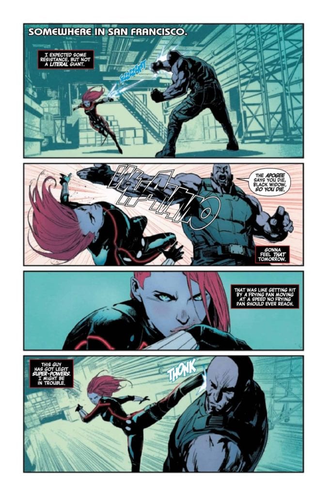
Marvel’s BLACK WIDOW #6, available now, is about to throw the brokenhearted super-spy back into the thick of things as she works to build a new life for herself. Or rather, a new cover. A balance must be found, and she has an ally willing to help.
Annnd she’s already in a fight! Who’s surprised?
Last we saw, Natasha Romanoff had been through hell and back. Not literally (that’s Hellcat’s territory), but it certainly feels that way. Natasha had a family – a wonderful husband and a beautiful baby boy, but only for just a brief moment.
That’s all gone now. She had to send them away for their own safety. She is Black Widow, after all. And that means that they could never be safe, not while still being in her life. While it is for the best, the decision still hurts.
That is where Black Widow #6 picks up – with Black Widow setting new roots in San Francisco, with the help of the one and only Yelena Belova. Okay, she might end up bringing more complications with her, but sometimes it’s good to have friends around, no matter what sort of mess they bring with them.
That guy is having a bad day, but then again, he started the fight.
Writing
Over the last few months, Black Widow’s life has been turned upside down. Now, in Black Widow #6, we’re about to see her prepare to take on the world. Or at least the city – to start with. Written by Kelly Thompson, this is already proving to be a creative twist of events.
This issue uses different storytelling methods to obfuscate what Natasha is up to, all while developing a compelling narrative for readers to follow. It starts with a fair bit of action – in true Black Widow fashion – but it doesn’t take long for us to dive beneath that surface.
The flashbacks included within this issue help set the scene and properly explain what is going on here. Though there are still many questions left to be answered, though I’m sure those will come with time.
The character interactions are an absolute highlight in this issue, hovering between tense and humorous, depending on what was happening. Though interestingly enough, it isn’t Yelena who is stealing the show, well, not at the moment.
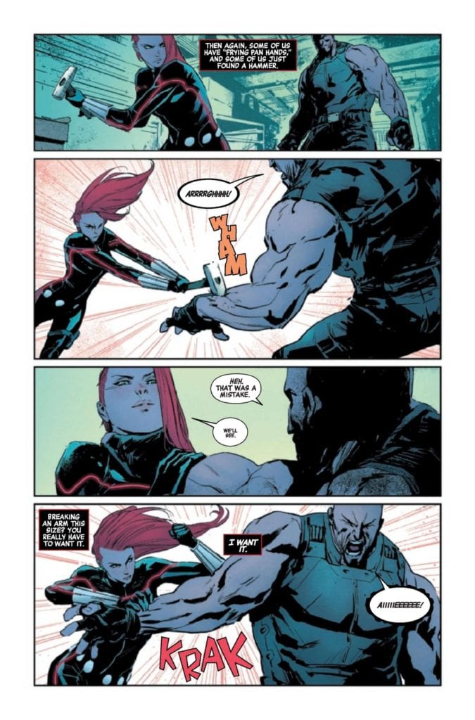
Yeah, while she didn’t start the fight, she’s clearly capable of finishing it.
Artwork
Black Widow #6 continues the trend of providing brilliant scenes for Natasha to shine in. Naturally, that means that her fights take center stage, showing all of the clever ways one woman can take on her enemies.
Rafael de Latorre’s artwork is perfect for the plot unfolding here. Natasha looks conflicted and hurt – while still giving fans that tougher character we all know and love. Her fight scenes as memorable as we could have hoped – if not more so. And, of course, there’s one fight in particular that will make her story stand out among the rest. It feels like a tradition at this point.
Jordie Bellaire’s colors enhance those scenes even further. The use of bold and vibrant reds adds so much to the combat. Plus, there’s an obvious connection to the character herself here. The monochromatic backdrops help to make the forefront and characters pop all the more – while still being interesting.
VC’s Cory Petit is the artist responsible for the lettering, and they are perfection. There’s a real sense of motion and impact here. No, that doesn’t do it justice. You can practically feel the cracking of fists on flesh, or the snapping of bones, thanks to the lettering. It’s a harsh reminder of how dangerous Black Widow is.
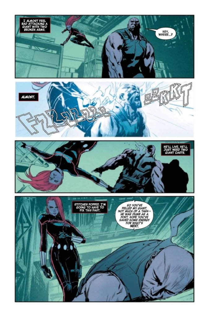
A quick flashback to remind everyone of the trauma she’s working through.
Conclusion
Black Widow #6 quickly proves that the intensity delivered in the first plot arc is far from over. This is going to be a series worth following, for fans old and new. In the meantime, it’s going to be fun guessing how things unfold from here.
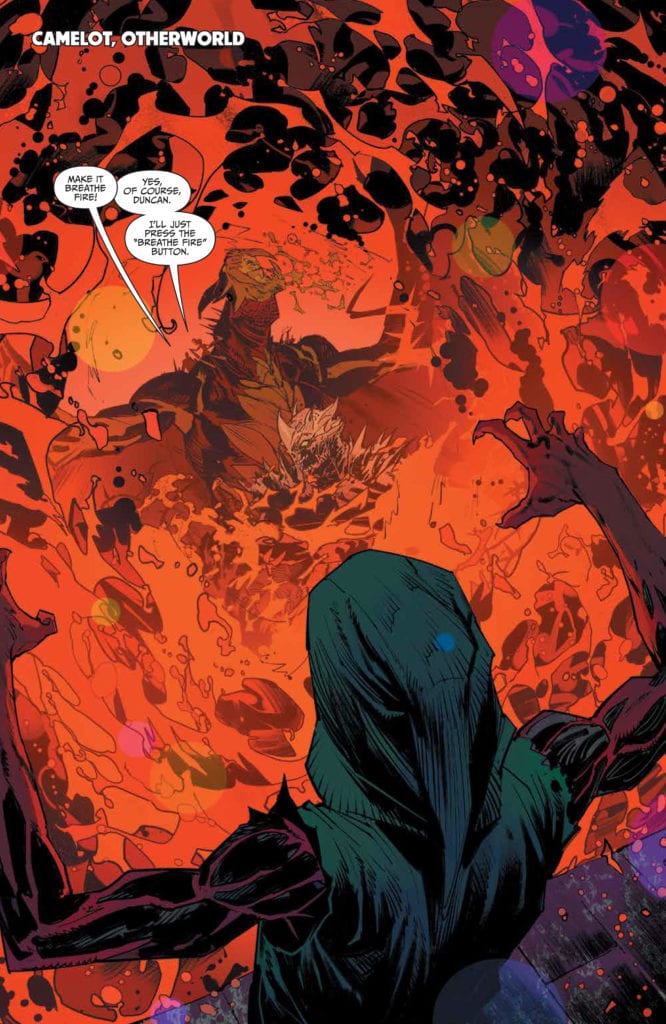
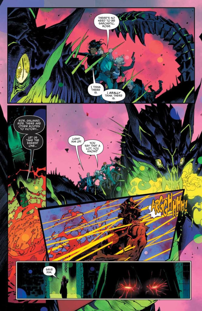
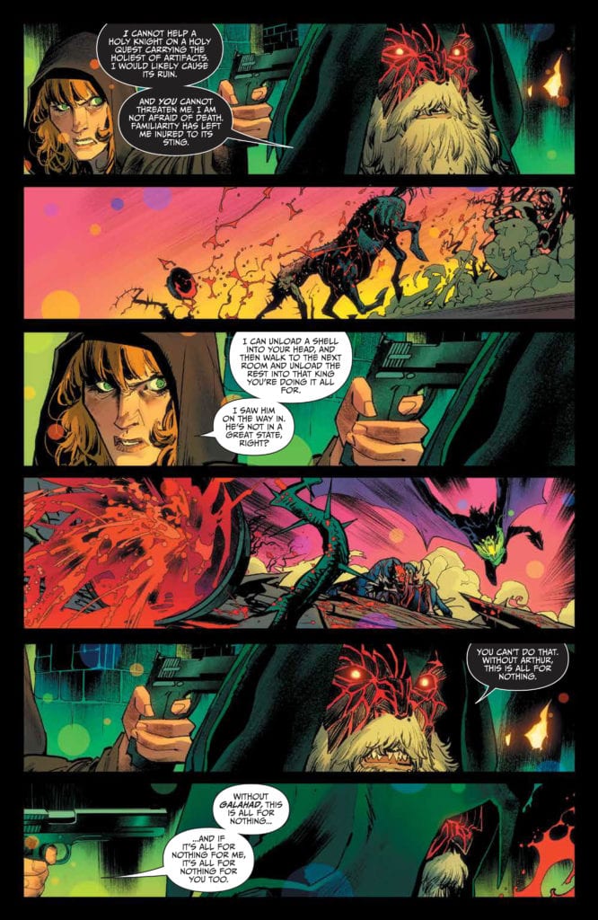
Image Comics’ ONCE & FUTURE #18, available now, is about to wrap up the current plot arc in the most dramatic of ways – with a hint of impending doom. To be fair, that is par for the course as far as this series is concerned. What with legends of old coming to life to terrorize the people of Britain.
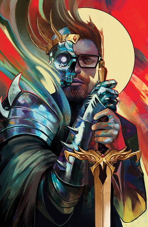
A dramatic statement for this variant cover of Once & Future #18.
It’s hard to believe that it has officially been 18 issues since Duncan was beautifully naive of the dangers around him. Now, he’s faced off against certain death on more than one occasion. Though nothing will challenge him like the next plot arc, from the looks of things.
Once & Future #18 wraps up the current plot arc, with Duncan, Bridgette, and Rose running through the Otherworld and trying to save the day. Again. It’s become a bit of a routine for them, which is perhaps the reason why it isn’t as shocking as it should be.
Now it’s time to see how the creative team for Once & Future (Gillen, Mora, Bonvillain, and Dukeshire) will manage to up the ante this time. The world is already darker and more intense than we could have ever imagined. At least, I certainly hadn’t been expecting to see a twisted version of King Arthur all those issues ago…
A fight is brewing in Once & Future #18.
Writing
Hands down, Once & Future #18 is the most complex addition to this tale so far. Once again, Kieron Gillen is weaving a complicated and disturbing web. It’s what makes this series so successful – and just a little bit terrifying.
Needless to say, there’s quite a lot going on within this issue. At this point, the number of players on the board is quite large and getting larger by the day. That may not sound like a problem, but when each one of them has their own goals and is hoping to manipulate the legends of old…well, things get deadly.
It’s still fascinating to see how the real world and the Otherworld interact with one another. In fact, that intrigue has raised considerable, now that we’ve seen mortals cross that barrier. Gillen didn’t stop there, however. Now there’s a level of politics in this horror fantasy, and in a way that frightens me more than anything else he could have included.
All things considered, this was an excellent wrap-up for the current plot arc. It should be more than enough to get people returning when the next issue drops – in August. So not too much longer to wait.
Dragons, monsters, and humans clash in Once & Future #18.
Artwork
Once & Future #18 is a visually dramatic issue, to say the least. Think about all of the art and drama from the last 17 issues, and then combine that into one. That’s what it feels like when reading the latest installment.
Dan Mora’s art style is perfect for this series as a whole and for the specific events that unfold here. The sense of movement and drama adds tension, and the particular way that Mora draws magic is so captivating. It makes for a series of dynamic pages.
Admittedly, Tamra Bonvillain’s colors work hard to make those pages feel all the more vibrant. Her colors have taken this series to an all-new level, and that’s no exception here. The first five pages, in particular, are pretty remarkable, as are the color palettes of a specific character (you’ll know the one when you read it).
Ed Dukeshire’s lettering helps to seal the deal, so to speak. You can really feel the sinister nature of the characters – human and monster alike. More importantly, the lettering flows so smoothly, even when there’s so much happening within a panel.
A mother does what she must to protect her son/monster. Well…one of her sons.
Conclusion
Once & Future #18 is a memorable and dramatic conclusion to the latest plot arc in this series. I still can’t believe that once again they have managed to up the ante, but that is exactly what was done here. Now to wait a few months and see what happens next.
The Many Deaths of Laila Starr No. 1 is the first in a five-issue miniseries from Boom! Studios, written by Ram V and drawn by Filipe Andrade, that provides a trope-busting look at reincarnation, thanks to the goddess of death. With a vibe that calls back to one of my favorite novels, Good Omens by Neil Gaiman and Terry Pratchett, Laila Starr combines dry wit and the absurd with a touch of humanity and the fantastic.
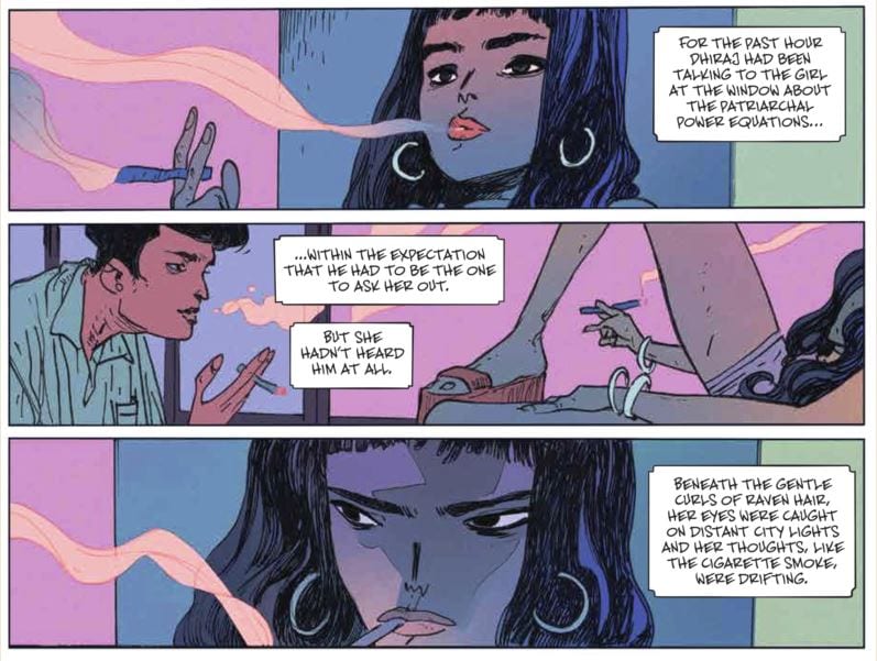
On the busy streets of Mumbai at rush hour, the story begins with a woman in labor, along with her harried husband, being rushed to the hospital with all the unintentional real-life hilarity accompanying such events. While the expectant parents are weaving through the traffic of India’s largest city, our titular Ms. Starr is at a party, filled with the kind of people Laila clearly finds uninteresting.
(Read the room, Dhiraj.)
As all this is happening upon the mortal plane, the corporate office for what appears to be the Hindu pantheon of gods is bustling. The Goddess of Death, Kali (not named, but the blue skins, six arms, and job description seems to confirm her identity), is rushing to the office of the three-faced “purveyor of all goodness” who can be assumed to be Brahma the Creator. Brahma is the nervous bearer of bad news, as it’s revealed the child rushing to be born in a Mumbai cab eventually discovers the key to immortality, removing death as a threat to mortals.
And also removing Death from a job.
After some dealings and machinations, she manages to place herself directly into the lives of the infant and Laila. After a twist both hilarious and disturbing, Death is forced to rework her plans. The goal is to get her job back. How she intends to do it, though; that’s the rub.
(Just an example of how even the dream jobs have negatives.)
Ram V’s story is quirky in that way real life feels quirky sometimes. There are areas where he could have fallen within an awaiting trope, be it reincarnation, the meddling of gods in the affairs of humans, trying to change the future, etc. Ram expertly moved past them all by avoiding the well-known and well-used Greek and Norse gods and instead, focusing on Hindu mythology. The principals of the pantheon are treated with respect, while providing them with 21st century anxiety and neurosis.
The characters feel real. We understand Laila’s ennui at the party, we understand Death’s shock at being fired at the job she was literally created to do. The greatest villains are the ones who create conflict within us. Thanos, for his seemingly murderous plans, believed he was on the righteous path. Darth Vader, twisted and evil, became that way because of his very-human flaws. Death’s hesitation at a crucial moment creates a moment of humanity, one that follows her throughout the series, creating conflict for the reader. Does Death overcome her need for revenge? How does the baby fit into her plans? These and more questions, all born from that moment of doubt.
Andrade’s art is perfect for this story. This isn’t a series needing the hyper-realism of Jim Lee and the like. So many of the emotions exhibited by the story’s characters are abstract and are reflected by the art. The overblown pain and mystery of childbirth is etched on the faces of the soon-to-be parents. How do you properly convey panic from a god forced to give the walking papers to another, very angry god? Andrade captures it with both humor and a pen capable of adding the little touches that make the scene believable.
The book’s colors, featuring assistance from Ines Amaro, blast off the page. A seeming car crash of dark shades, pastels, and heavy inks, it works splendidly within the story, the atmosphere tinted by the feelings emoted by Ram’s chracters. Deron Bennett of AndWorld Designs provided the words and his jaunty slash marks fit the story, adding to the mixture of the surreal, the paranormal, and the day-to-day. A great letterer does their job without distracting, but a great letterer also knows when it’s time to add flair and a little panache. This is one of those times and it helped tell the story beautifully.
The Many Deaths of Laila Starr was sold out before it shipped and is already being reprinted, for good reason. This book feels like one of those special gifts, the kind of comic sitting outside the norms of the genre while reminding us why we love comics in the first place.
Detective Comics #1034 was brilliant, but it was also a rather straightforward issue. We met some new characters, were introduced to Bruce’s new norm, and were left with a final cliffhanger. But DC Comic’s Detective Comics #1035 is a different story. It takes all of the same characters we saw in the previous issue and shows that there’s a life to each of them. Writer Mariko Tamaki, artist Dan Mora, colorist Jordie Bellaire, and letterer Aditya Bidikar aren’t just writing a story, they’re building a world.
Writing
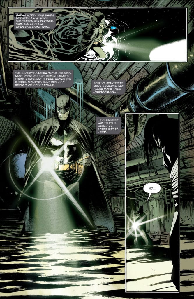
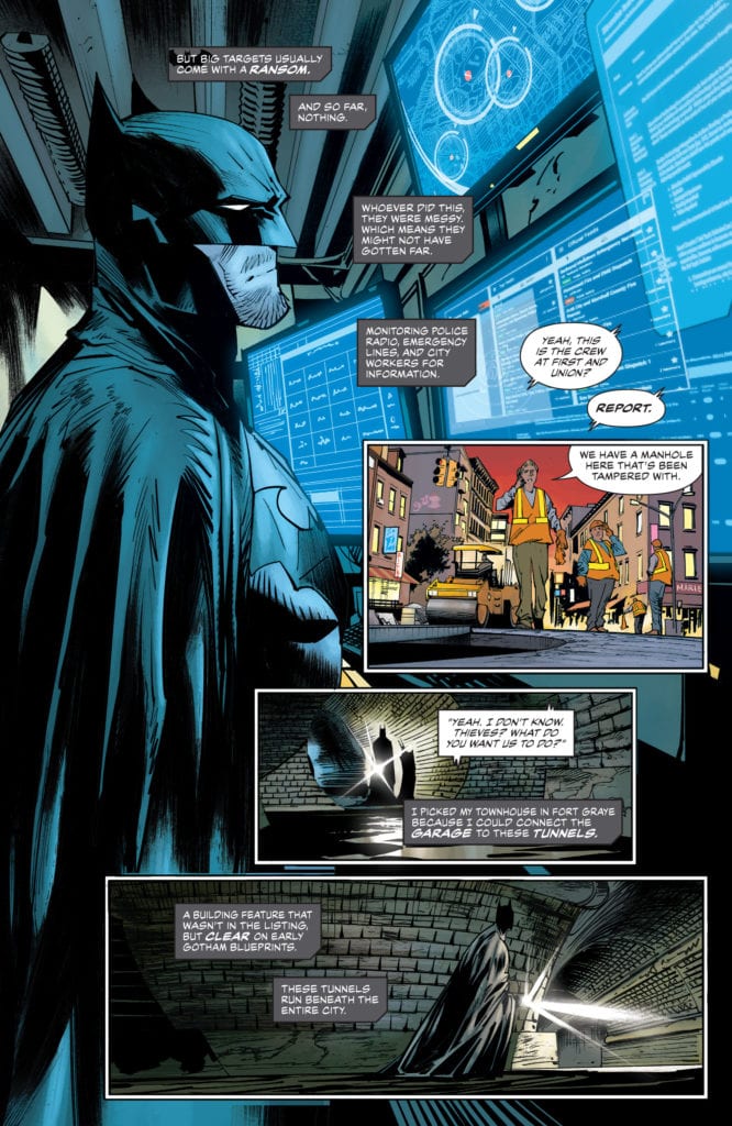
In Detective Comics #1035, we see the basic premise of Tamaki’s run begin to fracture into more threads. It’s no longer one story, but the start of many. With the inciting incident of Sarah Worth’s murder, Tamaki brings in all kinds of new plotlines. Tamaki also promises, for each plotline we thought we knew, that there is something deeper. We meet Mr. Worth, Sarah’s father. He immediately seems like a man with a dark past, who now has a huge grudge. We, as readers, also seem to know who killed Sarah. At least, we have some strong suspicions. But even in that, Tamaki has us drawn deeper into guessing at the reasons why. And with one final cliffhanger, everything we know gets thrown into question. Tamaki is brilliantly setting up question after question, building up the mystery of what’s turning into a fantastic crime-thriller.
Art
Mora’s pacing is magnificent. His page layouts often involve overlapping panels, moments that seem to happen all at once. But in one particular page, he slows everything down. We follow Neil, a mysterious new character who is also our prime suspect. On one page, he’s speaking to the mayor, getting out some pills. The page is crisp, clean, and completely traditional: 5 panels with a thin, white gutter between each. In the context of the rest of this issue, the page is almost boring. But then Neil drops his pills on the floor, and all Hell breaks loose. The next page shows panels twisting and tumbling down the page, some morphing into a completely different shape, with characters barely inside them. Mora sets this up by having a normal, traditional page ahead of it: the calm before the storm. For that reason, this wild page packs so much punch.
Coloring
Bellaire’s coloring, as is common in Batman comics, is quite muted in this issue. We see Batman running through sewers or people having board meetings in dimly lit rooms. Everyone is either shown in the dark, or the colors of their face are muddled by the lights of screens and billboards. But there’s one scene where the coloring is warm and full of flesh tones. That’s the scene of Mr. Worth talking about the death of his daughter. This is fantastic because it makes Mr. Worth’s pain feel real and human. He’s just himself in that moment. There’s no façade, no putting on of airs to the scene. It stops the reader because it stands out. We can’t help but feel and connect to Mr. Worth’s pain, a colorful moment in a bleak world, even if feeling his pain is hard to do. It’s a fantastic choice that forces the reader to not just read this comic, but to feel it too.
Lettering
Bidikar’s lettering is always fun to read. There are brilliant little moments, like a bullet speeding through the noise it’s making, or the lettering of a “WHIIIIIIP” noise actually whipping around on the page. But Bidikar also underplays a lot of moments. They don’t overdo sound effects or dialogue, so that they can pick their big moments carefully. And their big moment in this issue is the same as Bellaire’s. It’s Mr. Worth’s dialogue that jumps off the page. “My daughter is gone. And nothing is right until I have justice.” The lettering is huge, scrambled, and desperate. “Gone” is written in larger font to emphasize it, while “justice” is written in giant, red block letters. Mr. Worth is the new driving force of this series and Bidikar won’t let us miss why he’s shown up.
Tamaki, Mora, Bellaire, and Bidikar are doing beautiful work. They’re showing us that every character they’re introducing is there for a reason. And as we learn about their lives, the plot continues to spread out into this vast world they’re creating. Pick up Detective Comics #1035, out from DC Comics April 27th, at a comic shop near you!
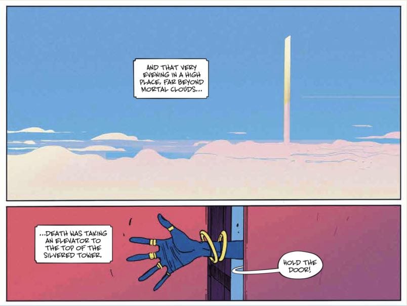
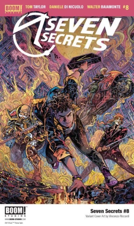
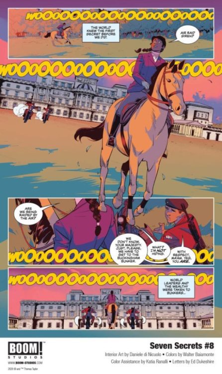
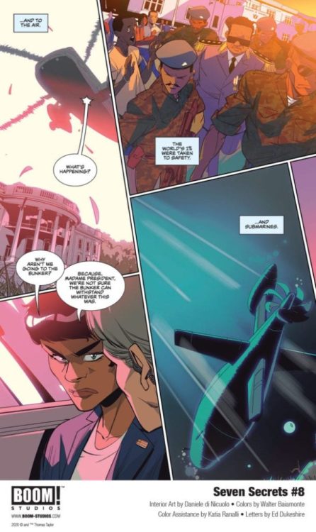
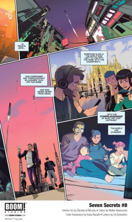
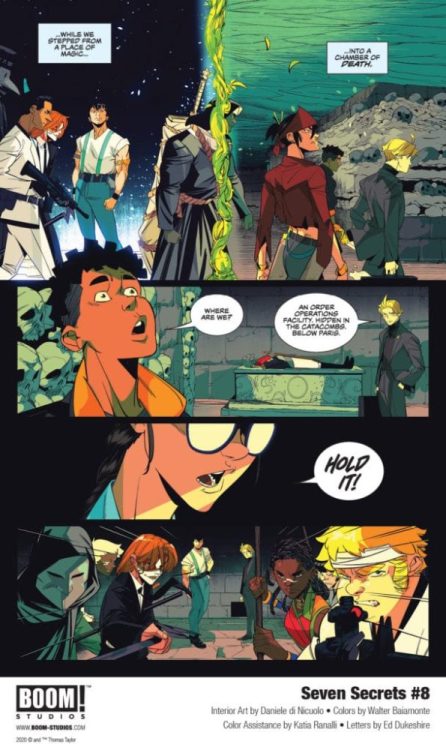
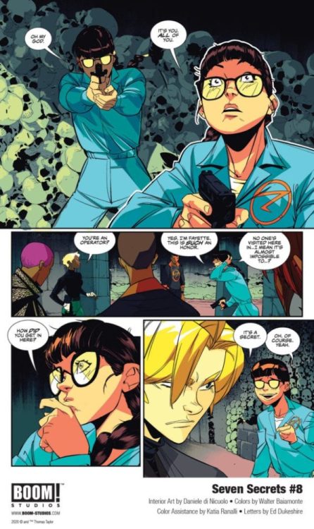
SEVEN SECRETS #8 hist your local comic book shop on May 12, but thanks to BOOM! Studios, Monkeys Fighting Robots has the first five pages for our readers. The book is written by Tom Taylor, with artist Daniele Di Nicuolo, colorist Walter Baiamonte, and letterer Ed Dukeshire.
About the issue: The Order has managed to find their way through the land of Faerie, but danger awaits them on the other side. After experiencing a devastating loss of friends and a Secret, can Caspar continue to keep his vow as a Holder to protect the Secrets before all else?
SEVEN SECRETS #8 features main cover art by series artist Daniele di Nicuolo and variant cover art by acclaimed artists Vincenzo Riccardi and Miguel Mercado.
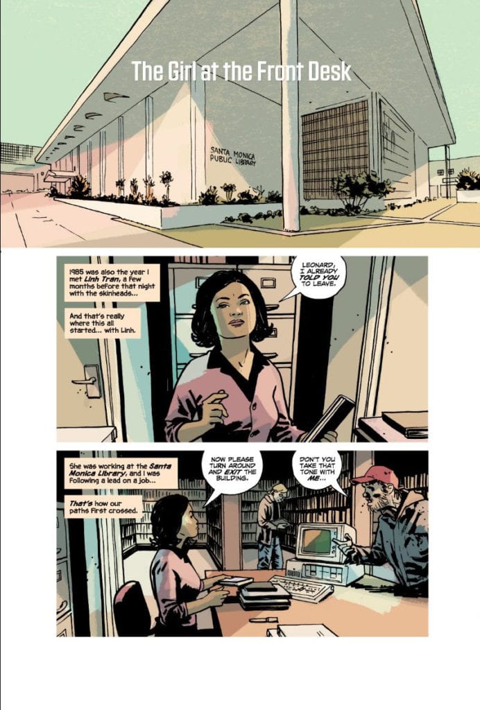
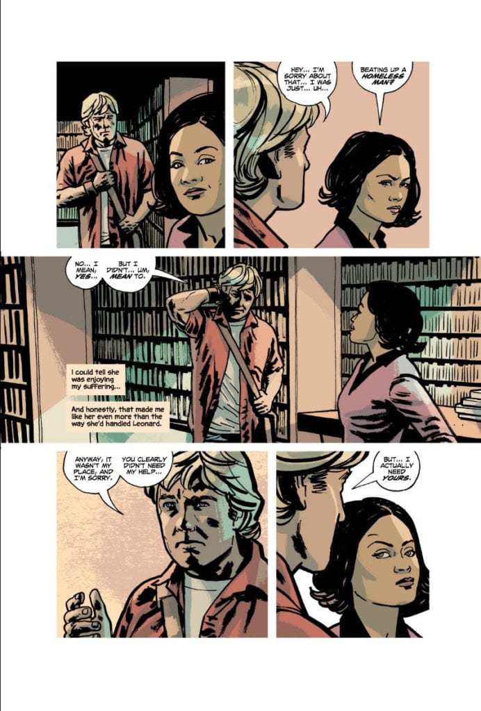
Welcome back to the world of Reckless. Writer Ed Brubaker, artist and letterer Sean Phillips, and colorist Jacob Phillips’ second installment in their Reckless series, Friend of the Devil, is as fantastic as their first.
Writing
Brubaker didn’t have a home growing up. Well, he did. But his afterword in this graphic novel describes his upbringing as a little different from most people’s. He was a military brat, which meant he wasn’t in one place for very long. Growing up all over the world can make you feel all sorts of ways. You can feel like you don’t have a home, because you’ve never been anywhere long enough to really connect to it. Sometimes, people look at you and think you’re just the same as them. You look like them, you must be like them. But under the skin, you feel totally different. Other times, you might live somewhere where you stick out like a sore thumb. But beneath it all, whether you look like you’re from that place or not, it’s the closest thing you have to a home.
Brubaker shows us both of these extremes in Friend of the Devil. Ethan Reckless looks just like everybody else, but he isn’t even at home in his own skin, let alone his time or place. Linh, the woman Reckless meets in this chapter, is a Vietnamese immigrant. Reckless assumes a couple things about how she would have felt growing up in America. But it turns out he’s wrong, she feels connected to where she lives. She’s as American as anyone else. Brubaker sets Reckless’ narrations in the future. It’s Ethan looking back on events. It makes him feel disconnected from the now, dreaming of the past just like he’s doing in his own narration. And Linh avoids talking about her past at all. Her identity is a touchy subject. It’s with this simple narrative distancing and omissions of backstory that Brubaker helps us to see the DNA of these characters.
Art
Sean Phillips pulls back on the details of a lot of his settings. He focuses us in on the characters and the action, the driving forces of the plot. Even some of the more detailed background have a sense of repetition to them: booths in a diner, chairs in a theatre. But all the settings that feel particularly detailed are nostalgic. At one point, Reckless is shown into a room with a bunch of old movie reels. We can see details on the posters, the rows and rows of reels, each individually drawn. When Reckless interviews someone and they talk about an old cult, we see the 70’s in all of its glory. People crowd the sidewalks, the writing on flyers being handed out is visible, and you can see cars driving through the streets. Phillips shows us how Reckless feels more welcomed in the past than in the present.
Coloring
This whole graphic novel is mostly colored in blues, yellows and pinks. Jacob Phillips uses yellow to show the bright days in LA. But it also washes everything out a little. The sun gives everything a similar hue. At night, the scenes look intoxicating and bright blue. Phillips connects us to Reckless’ loneliness in a way that feels frighteningly comfortable. It’s as though this blue feeling that Reckless gets at night is familiar. He’s lived his life alone, this is how he operates. When Reckless and Linh go for nighttime strolls on the beach, we see how at home she is in his blueness. Their melancholy is complementary. Phillips also shows us scenes of the 70’s in bright, neon pink. Phillips’ coloring makes everything feel like one big drug trip. We can sense Reckless’ longing for those times in how he envisions those days, even if he seems rather stoic at the moment.
Lettering
Sean Phillips’ lettering is pretty straightforward. But it’s in the small things that we see his brilliance. When one of the bad guys sees Reckless coming at him, he says “Fuck.” It’s a large word balloon with tiny font at its center. We can hear the character, almost too scared to speak. Later, as one of the others is monologuing at Reckless, the captions begin to overlap his dialogue. We see that Reckless isn’t listening anymore. He’s lost in his own thoughts. At one point, we see Reckless get confused. “??” is written into his word balloon. The font for the question marks looks a little odd, when placed on their own. At first glance, they look like Z’s. But that’s a small, easy to miss problem in what is an otherwise fantastic work of lettering.
Reckless: Friend of the Devil is a beautiful graphic novel. The masters of crime comics, Ed Brubaker, Sean Phillips, and Jacob Phillips, are showing that they’ve still got it. Pick it up, out from Image Comics on April 28th, at a comic shop near you!
The Falcon and The Winter Soldier has come to its conclusion with an action-packed finale.
The Flag Smashers have attacked the GRC meeting in New York to stop their vote on the forced relocation. This brings Sam and Bucky into action with Sam now wearing a new costume and in procession with Captain America’s shield.
“One World, One People” was like the season finale of WandaVisionwhere all the characters and their plotlines were tied together. To put it another way, it was the final act of a Marvel movie. It was fun to see Sam finally become the new Captain America. He got to wear a new costume and he was able to combine his flight suit and the shield. It was triumphant to see Sam fly in, smash through a window and use the shield.
Sam had the best action scenes in the episode, like when he had to fight Karli. The rest of the action sequences were less impressive. It’s made even worse when you consider the series having some strong fight and action sequences in the previous episodes. The worst part of “One World, One People’s” action scenes was when Bucky and John Walker were fighting the Flag Smashers on the streets and the editing was so choppy it became hard to follow the action.
As The Falcon and The Winter Soldier progressed it had become more and more frustrating. The series had issues with its characterization, dialogue, lingering plotlines, and political messaging and the finale had all of these. John Walker has been an inconsistent character. Initially he was portrayed sympathetically because he had the weight of being Captain America on his shoulders and then showing his temper in later episodes. The final episode had Walker going on a vengeance mission against Karli before having a sudden redemption. The expository dialogue came when the identity of the Power Broker was revealed and it was incredibly chunky.
The series did attempt to have a social-political message. This was done in two ways – the first was the impact of reversing the Blip which drove Karli’s ideology. The second involved the theme of race and raises the question about how America would react if a black man became Captain America. These two themes merged when Sam comes down the street like an angel carrying Karli and talks to the media about being a black man dressed in the iconography of America and saying that Karli did have a legitimate cause even if her methods were extreme. It was a ham-fisted way of getting this message across. This episode and TV series as a whole was just an excuse for the MCU to have Sam as Captain America. However, audiences who watched Endgame knew this was going to come anyway. Captain America 4 has already been announced.
At the time of writing “One World, One People” only has a 59% rating on Rotten Tomatoes which is really low for a TV episode. It’s fitting for a series that has sadly underwhelmed and one of the weakest MCU projects.


 Orlando’s creative decisions in Spider-Man: Curse of the Man-Thing are insightful. The inclusion of Curt Conners (The Lizard) fits well with his and Ted Sallis’ Florida eco-horror origins. But what really brings these two and Spider-Man together is Ted’s arc with his monstrous side, Man-Thing.