Home Blog Page 155

Review: THE CONJURING 3 Summons Refreshing But Anticlimactic Entry

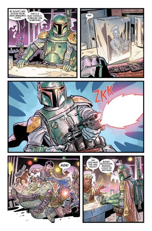
The Conjuring: The Devil Made Me Do It proves Ed and Lorraine Warren can make up for an uneven new chapter in this universe. The eighth entry in The Conjuring Universe decently abandons the haunted house formula but forgets to build on any characters that aren’t our paranormal investigators. Lacking the earned scares the previous two had, The Conjuring: The Devil Made Me Do It opts for cheap scares and suffers from pacing issues. This third entry may not deliver the chills from the previous two but still showcases why The Conjuring films are the strongest in this universe.

James Wan’s absence was the biggest concern for this third outing, luckily his departure as the director isn’t a massive issue. Based on the true story that shocked America, The Conjuring: The Devil Made Me Do It combines true elements with its own satanic story. It creates ties to the original film as well as the Annabelle trilogy. Directed by Michael Chaves, and written by David Leslie and Johnson-McGoldrick. The Conjuring: The Devil Made Me Do It stars Patrick Wilson, Vera Farmiga, Sarah Catherine Hook, Julian Hilliard, Ruairi O’Connor, and Eugenie Bondurant. The film centers on Arne Johnson (O’Connor), a man put on trial after being accused of murder. Claiming demonic possession as his defense, The Warrens (Wilson and Farmiga) go on a supernatural investigation to prove his innocence, but they soon learn the only thing scarier than demons are the humans that conjure them.

(L-r) VERA FARMIGA as Lorraine Warren and PATRICK WILSON as Ed Warren in New Line Cinema’s horror film “THE CONJURING: THE DEVIL MADE ME DO IT,” a Warner Bros. Pictures release.

Our pair of paranormal investigators are the heart and soul driving this third outing. Having watched Ed and Lorraine save two families, express endless love for each other, and face unspeakable evil, The Conjuring: The Devil Made Me Do It understands that bond and puts it into focus from start to finish. However, in the previous films, The Warrens didn’t take up so much screen time to the point that those they are helping become irrelevant. The script is compelling in many ways, but the lack of attention on Arne Johnson makes this story uneven compared to its predecessors. Arne and his family are introduced in what many will consider the best opening sequence in the trilogy but after a semi-successful exorcism, they take a backseat. This is very much Ed and Lorraine Warren’s story, which works because you get to spend more time with the two heroes who are likable characters.

Still, Arne Johnson, his girlfriend Debbie Glatzel (Hook), and David Glatzel (Hilliard) deserved more focus. Since The Warrens are characters fans of this franchise are already interested in, this search to prove Arne’s innocence isn’t a dull watch, but you’re mostly hoping they are successful in their hunt. The lack of focus on Arne leaves little room to care what happens to him or his loved ones, which isn’t how the last two films were handled. The verdict that comes isn’t going to evoke an emotional response at all because the character is left in the shadows too often. Also the scares this time are not built up, they are spaced-out jump scares that feel hollow. Thankfully the co-writers take pleasure in showcasing The Warren’s love, paying homage to classic horror films like The Exorcist, The Shining, and even Nightmare on Elm Street 4.

PATRICK WILSON as Ed Warren in New Line Cinema’s horror film “THE CONJURING: THE DEVIL MADE ME DO IT,” a Warner Bros. Pictures release.

Wilson and Farmiga once again shine in their roles as Ed and Lorraine Warren. There is undeniable chemistry between the two that gets better in each film. Farmiga seems determined to outshine Wilson, which she had done in the previous two films as well. Wilson’s portrayal as Ed will have viewers on the edge. The Conjuring: The Devil Made Me Do It places him in a health predicament that will cause concern in every unsettling situation he finds himself in. O’Connor’s performance as Arne is fine for what it is, despite his character feeling irrelevant at times he will make audiences understand the confusion and fear racing through Arne’s mind. Chaves makes up for his shortcoming with The Curse of La Llorona, filling in Wan’s position as the director didn’t turn out to be a complete mess. While there are some pacing issues, Chaves keeps the film engaging, and delivers some great shots.

The Conjuring: The Devil Made Me Do It is the weakest entry in The Conjuring trilogy, but it’s still a fun watch that fans of this universe will appreciate. It offers the scares, heart, and intriguing satanic activity that you’ve come to expect. While The Warren’s focus may have been a bit too much, this latest entry shows that Wilson and Farmiga’s on-screen chemistry will always make up for the narrative shortcomings.

Monkeys Fighting Robots Youtube

Review: The Hunt For A Frozen Nerfherder In STAR WARS: WAR OF THE BOUNTY HUNTERS #1

Writer Charles Soule and artist Luke Ross, with colorist Neeraj Menon, and letterer Travis Lanham, bring us a new tale from the Galaxy Far, Far Away with badass action and surprising character twists in “Star Wars: War of the Bounty Hunters” #1. Soule and the art team craft an opening issue that fuses the audience’s love for nostalgia with genuinely excellent storytelling and visual work that plants us firmly in the copilot seat for this deadly adventure – and brings back some almost forgotten characters in brilliant and surprising fashion.

“The notorious bounty hunter BOBA FETT has finally landed his greatest prize – HAN SOLO, frozen in carbonite for easy transport. Fett will bring the smuggler to TATOOINE to collect the massive bounty placed on Solo’s head by the fearsome crime lord JABBA THE HUTT. Sounds easy. What could go wrong?”

Writing & Plot

In all of his work on Star Wars, Charles Soule has demonstrated a practiced handle on being able to take known concepts and characters in this universe and being able to expand upon them with new yet familiar material that always feels like it belongs. The same goes for “War of the Bounty Hunters” #1. Taking place right where we last left the legendary Boba Fett after the “War of the Bounty Hunters Alpha” prelude, this issue continues fleshing out the tumultuous story of our favorite Beskar-clad bounty hunter trying to bring the newly-frozen Han Solo back to Jabba the Hutt. Where on the one hand I do get a bit tired of seeing creators constantly just filling in gaps in the already hugely popular timeline of the main film saga (which is why The High Republic is such a blessing), when Soule writes these tales, it still feels as fresh and adventurous as the first time I sat down and watched those first films. Soule neatly lines up new and classic characters in ways that please fans, but manages to keep the stories fresh by way of the machinations in the plot itself. Soule treats Star Wars like an infinite box of Legos, taking the same pieces and rebuilding them into forms we haven’t seen before. I obviously can’t get into spoilers, but the big reveal at the end of the issue for who was responsible for hijacking Solo’s frozen body left me stunned and intrigued. Soule once again nails the gig, with an opening chapter that is engaging, mysterious, and wonderfully badass.

Art Direction

Marvel’s Star Wars comics have had a reputation these past few years for detailed and gorgeous visual work. As one might guess, “War of the Bounty Hunters” #1 is no different. Luke Ross provides pencils that offer great fluid animation and character detail to keep the reader planted in the story. The visual pacing he provides sweeps us along for the duration of the story with a straightforward but exciting direction that channels the suspense and action in this comic superbly. The thin pencils allot for considerable complexities in facial features and architectural detail, even if this same style can occasionally cause some images to be a bit faint. This is backed up however by the colors of Neeraj Menon, whose light but massive palette brings this comic to interstellar life. The more understated, lighter tones aren’t quite as vivid as those seen in many other Star Wars comics, but they work perfectly well for this underworld-focused tale. Travis Lanham’s letters are solid and focused, using a slightly stylized font and great special effect work to craft this comic’s reading experience. This is a sharp looking star wars book, with a style that fits the characters and story it follows.

“Star Wars: War of the Bounty Hunters” #1 is an exciting blast of an opening chapter, chock full of double-crosses and genuine surprises that will be sure to please any fan of the franchise. Charles Soule’s script takes the ingredients we are all familiar with and mixes them into a configuration that is undoubtedly Star Wars but still gives us something new and fresh to chew on. The visual work of Luke Ross and Neeraj Menon is a bit understated, but works damn well for this comic. Be sure to grab this issue when it hits shelves on 6/2!

Monkeys Fighting Robots Youtube

FRIENDS: THE REUNION | TV Review

Friends was one of the most popular sitcoms ever made. It was a touchstone of ‘90s and early noughties culture. To celebrate the show being available on HBO Max the streaming service has made a special which brought back the important players from Friends.

The special was divided into five parts: the main cast doing a table read of classic scenes, the main cast having a quiz, a talk show format hosted by James Corden, the producers/showrunners talking about the production of the show, and celebrities and fans being interviewed about why the show was so special.

Friends: The Reunion was a self-indolent love-fest. This was to be expected since the special was made to promote Friends being on HBO Max and please long-time fans of the show. The risk was the special it could have been like The Inbetweeners special “Fwends Reunited.” The signs weren’t good because both specials used a talk show format with a divisive comedian hosting. Fortunately, Friends: The Reunion avoided most of the pitfalls that affected The Inbetweeners special.

The best part of the special was the pre-recorded section where the cast got to re-enact the quiz from the episode “The One with the Embryos.” This was based on one of Friends’ funniest segments, so it was a high risk with a high reward. The quiz retold some classic jokes, and the actors were able to recreate the humor with ease. The quiz section was more than just a redo of a classic scene, it also had questions about the show and brought had some special guest appearances. It was a delight to see minor characters come back and play a role in the special.

The table read did show that even after 17 years away the actors were able to return to their characters. David Schwimmer and Lisa Kudrow especially were delights as they became Ross and Phoebe again.

The interviews with Kevin S. Bright, David Crane, and Marta Kauffman did have a generic quality to them. They talk about the creation of the show and the casting. They end up going over information that fans would already know like Courtney Cox being approached to play Rachel but she wanted to play Monica. It was still fun to see footage that fans may not have seen like failed pilots, bloopers, and the moment when Matt Le Blanc dislocated his shoulder when filming an episode.

The section with James Corden allowed for more trips down memory lane because previous cast members appeared, as well as and a few celebrity guests. The memorable moment was the fashion show and the actors clearly still had chemistry together. A fun little moment was when the actors talk about where the characters would be now. It will be the closest we will ever get to a follow-up series.

Friends: The Reunion was able to get some big guests for the special for pre-recorded segments. This included David Beckham, the Korean boy band BTS, Mindy Kaling, and Malala Yousafzai. It was an eclectic mix and some seemed a better fit than others. They all had a personal connection to the series and they shared their favorite moments and episodes. The fans that were a part of the special were there to show how popular Friends was internationally. Some of these fans were gay and it was clearly an attempt by the producers to show that Friends had a gay audience.

On a final note, it was fun to see Lady Gaga performing “Smelly Cat” with Kudrow. However, this segment felt like a sketch from Saturday Night Live.

Friends: The Reunion was made for the fans, a final nostalgic trip with a cast and characters they love. But only the fans will be interested in the special and they find it the most rewarding.

Monkeys Fighting Robots Youtube

Self-Published Spotlight: A GAME OF DOUBLES

Welcome to Self-Published Spotlight, a regular interview column where I will be highlighting self-published comics and the creators and small print publishers who make them.


Ryan Tavarez is the artist on the upcoming A Game of Doubles, the new comic written by Jonathan Thompson (Jonathan has been writing some of the best indie comics in the past year or so; Tales Of The Dead Astronaut was a surreal sci-fi anthology; Burn Residue is one of the grittiest crime comics I have ever read. Check them out). A Game of Doubles is the story of twin brothers, one of whom is a former tennis prodigy, who run into some serious trouble on their 50th birthday.  Ryan took some time to field and volley some questions with me. So check it out and make sure to support and check out A Game of Doubles.


MFR: Ryan, what was your initial reaction to A Game of Doubles. What attracted you to the project?
Ryan Tavarez:  This all starts with Jonathan’s short series: Burn Residue. I remember backing it thinking of it as being a cool slasher comic with the melted gas stations attendant. Thinking: “Cool! I love horror, I love slashers. I’m in!” And once I got the book and started to read it, I realized it was much more than that. And the twist hit me unexpectedly. And it was refreshing. When Jonathan reached out to see if I wanted to collaborate, I was in! And the script he delivered got me again! As I was reading his synopsis and the script I was like “…hmm a tennis comic? I’m not so sure.” But again, he pulled a swerve and it turned out to be a much darker story. Using Hitchcock as a foundation, and using the pace of a past tennis match to frame the story. Brilliant.

MFR: I love your style. There is a lot of weight and movement in the images I have seen. Did you approach this project with these elements for a reason?
RT: Thank you! I like to think I come from the school of Kirby. Dynamism and movement is a major focus for me, even in still moments. I also like to think about how a character carries themselves in a conversation. I love to think about how people, in real life, change their posture depending on how they feel about whoever they are talking to; eye contact, where someone holds their hands, tone of voice. And then trying to capture that in comics.
I think both a conversation and a tennis match can be just as intense if framed properly, and that was the goal. Line up the intensity of the past tennis match, with the conflict in the present. 

MFR: What was your process like? What tools and processes did you use to create the pages?
RT: I work with a hybrid system of digital and traditional! There are multiple parts to this. And it might get a little long, please feel free to condense this anyway you see fit.

1. Research – The first part was research. To begin, Jonathan gave me the script and two references: Stray Bullets and a documentary called John McEnroe: In The Realm Of Perfection. I read and watched the influences to get a good idea of where Jonathan was coming from. Then read his script. I read the script multiple times imagining the panels.
I then took some time to think of the angle I wanted to approach with the art. I decided on Alex Toth and the series Ping Pong. 2 very different things that I love.
2. Character – Then I had to cast the comic. And I spent a few days sketching what the brothers might look like. Once I had something that I was happy with I got it over to Jonathan for approval.
3. Thumbnailing – Then I went back to script and took it panel by panel. Jonathan specifically wrote with the 2×4 grid in mind a la Stray Bullets. So it was already all broken up. I do this part digitally.
4. Pencils – I enlarge my thumbs to 11×17 and print them in a really light red color. Then clean them up with a red pencil. Some people use a non-photo blue. But I find it’s easier to target and drop the reds out digitally when I scan the inks in.
5. Inking – I rule out my panels with a 1pt size Micron. Then hit any sound effects with the same pen. From there I ink it panel by panel. I’ll ink the faces first using a really fine brush pen. Currently using a Tombo Fudenosuke. Then I hit the lines with a Raphael number 4. Using the same brush to fill my solids. And using the Tombo to do my hatching.
6. Scan and Cleanup – 11×17 flatbed Epson scanner – 300dpi. Then in photoshop I drop the reds, darken the blacks, and clean up any smidges and smudges.
7. Screentone – I lay in screentones that I scanned from Deleter originals.

8. Lettering – Done digitally, word balloons are made with the pen tool.

MFR: Would you cite any specific artist or work as having an influence on A Game of Doubles?
RT:  I spent time researching and taking cues from Alex Toth. While my style of drawing is not anywhere near the beauty of Toth, I really took to heart how he composed panels. Using blocks of black to help add to the weight and movement in some of the more stationary panels. Something as simple as a diagonal line goes a long way in spicing up a composition. And for the tennis match, Ping Pong by Taiyo Matsumoto was the main study. I knew the intensity of those matches would fit perfectly for the flashbacks, and really Ping Pong was my best point of reference for a sports manga to date.

MFR:  How about you, was tennis something you knew anything about beforehand?
RT: I’m not a big sports fan. And the sport I do like is baseball. So tennis was definitely alien to me. But it was a great opportunity to learn about the sport and also went into why I was interested in working on the book. Jonathan also provided a really great documentary that did a good job of covering the basics.

MFR: Did you have to reference tennis games? Other than sports manga, comics don’t get too many sports scenes. Was this a challenge in any way?
RT: A lot of google searching was done. But really just focusing on why I loved Ping Pong so much. That really was the first time a sports manga ever got my attention. Challenging, absolutely. I am nowhere near the talent of Matsumoto. But I did my best to learn from him. 

MFR: Did you have a favorite sequence to work on?
RT: Specifically, pages 3 and 6 are my favorite. The original reveal of intent with Jackson. And that all-out splash page to really tell you what kind of person he is.

MFR: Anything final you would like to add?
RT: I’d like to thank the folks out there who give this short a shot, don’t let the tennis deter you from checking this out if it’s not your thing. There’s a suspensefully twisted tale under the hood here that should tickle fans of horror comics and Hitchcock. Give A Game Of Doubles a shot! Lastly, check out my series Nomads if you’re into barbarian post-apocalyptic action. Volume One is 120 pages collecting the first 4 issues, with Volume 2 due sometime this winter. You can find that and more here: www.tavarezart.com.

MFR Thanks again for taking the time!
RT: Thank YOU for the opportunity! Salude! 

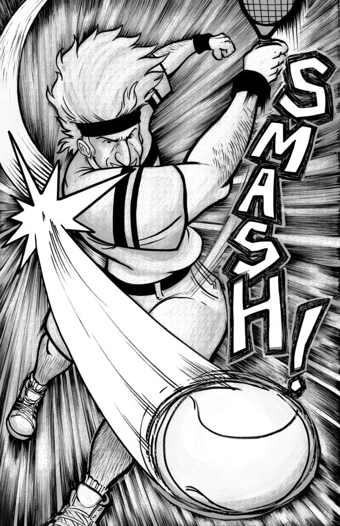
You can support the A Game of Doubles Kickstarter here.


Monkeys Fighting Robots Youtube

Review: THE ORVILLE #2: DIGRESSIONS (PART 2 OF 2) Shows Why Each Member Of A Team Matters

THE ORVILLE #2: DIGRESSIONS is available in comic book stores on Wednesday, June 2nd, wrapping up the two-part Digressions storyline. Readers will remember the startling changes to the status quo last issue when the crew (and the world itself) was thrust into an alternate timeline.

In this universe, Kelly Grayson never ended up marrying Ed Mercer, which in turn prevented the events that led to the Orville’s team formation. What’s more, Kelly learns getting the team together is the only way to prevent the coming attack from the Kaylon.

Story

Kelly finds herself in a desperate situation. Being the only person who knows what will happen in the future leaves her with a huge responsibility. We can practically feel the urgency emanating from the page.

This story diverges from many of the previous plotlines in its focus on Kelly and Dr. Claire Finn rather than Ed. This issue shows the former leader not in any position to prevent an alien invasion. In fact, he’s not even aware of a coming crisis.

David A. Goodman’s script, while providing readers with an intriguing take on theories of time travel, does a brilliant job of highlighting the supporting members of The Orville’s former team. If it wasn’t clear before, we see how these “secondary” characters are actually more integral to the fate of the world than Ed himself.

Artwork

David Cabeza’s penciling and ink work offers readers realistic depictions of their favorite characters from the hit TV show. The characters’ expressions mirror those of their real life counterparts, drawing readers into their experiences. Michael Atiyeh’s coloring used a wide array of hues ranging from bright cool colors to darker shades to reflect the mixture of hope and despair in the story. And Richard Starkings & Comicraft’s Jimmy Betancourt’s lettering is differentiated well so as not to confuse readers.

Conclusion

THE ORVILLE #2: DIGRESSIONS culminates in perfect fashion after such a wild ride in previous issues. It also gives the incredible character of Kelly an opportunity to shine.

What other stories do you want to see played out in this series? Let us know in the comments below!

Monkeys Fighting Robots Youtube

THE VISITOR #5: All Of The Answers Arrive With A Lynchpin

The Visitor #5 Cover

The Visitor #5 comes to comic stores from Valiant Entertainment on June 2. After a long hiatus, writer Paul Levitz provides the context for this series’ conflict. Artist Soo Lee and colorist Ulises Arreola provide dynamic action alongside rising tensions. Thanks to the lettering by Simon Bowland, the reader can genuinely experience this thrilling climax.

Background

The Visitor #5 Recap
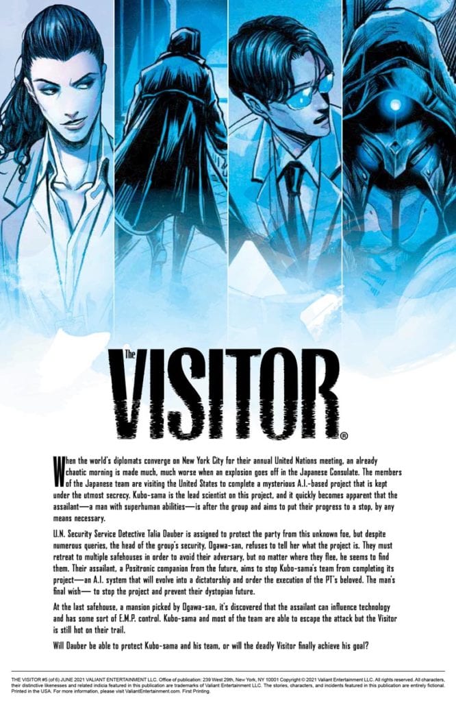
To catch readers up pre-hiatus, The Visitor focuses on the titular cyborg time traveler and his mission to prevent an A.I. project from activating. Considering the murderous people behind it, he has every right.

The Visitor #5: Finally Some Context

The Visitor #5 is where Levitz can give readers some answers after so long. The satisfaction will vary by how much they will like the connection to Rai’s setting. Some readers may find it clever after so much buildup from previous issues. Otherwise, it might come off as annoying that this series is an extension of another franchise. Because the way Levitz handles the pacing in this issue is some of the best so far. From how the Visitor’s thoughts weigh on his mind to how the characters interact, there’s a genuine thrill to it all.

Connective Energy

Decent first impression Visitor
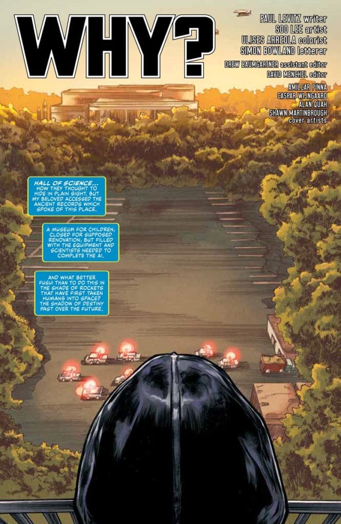
Lee’s illustrations possess a great degree of actions in flux with The Visitor #5. With pages and panels reflecting specific moments of time for the Visitor to appear, they all have a certain weight. A splash page, for example, is a good way for both the reader and Visitor to assess the situation.

Here's another work in action.

Later pages give the actions a degree of movement and greater intensity. Sometimes a single action across multiple panels can describe the situation. The Visitor #5 goes to lengths to show how one misstep can lead to a downfall. There’s no greater metaphor than a tree branch not being strong enough to hold the Visitor’s weight. With some parts of the plot happening simultaneously, the struggles feel very apparent to the reader.

It helps that coloring by Arreola adds to the anticipation. The Visitor’s bright blue electric powers are not just eye-catching. They also steal power from a secret group of villains. It brings a real sense of power balance to the narrative, as does the lettering of Bowland that louden actions like the Visitor communicating with supporting character, Daubner even if some SFX can seem dull in comparison like using plain white words for gunshots that look quieter than they should be.

Want To Try The Visitor #5?

The Visitor #5 is an interesting and thrilling return for a series back from hiatus. Now that the characters are open about their motivations, the stakes can connect to readers easier. While readers might or might not like how the narrative is going, they’re sure to be entertained.

Monkeys Fighting Robots Youtube

MAN-BAT #5: The Completion Of A Metamorphosis

Man-Bat #5 Cover

Man-Bat #5 ends this DC Comics miniseries on a high note on June 1. Writer Dave Wielgosz completes the titular character’s journey into self-actualization. It’s something artist Sumit Kumar displays through the life cycle of Kirk Langstorm with colors by Romulo Fajardo Jr., all while letterer Tom Napolitano showcases the weight of every action.

Man-Bat #5: Shedding For Honesty

Wielgosz commits the series towards a resolution focusing on Kirk’s recruitment into Justice League Dark. Man-Bat #5 is where everything comes together satisfyingly. Firstly there’s Kirk’s affliction symbolizing his conflict with his inner self. Then there’s how his attempts at fixing everything causing rifts between everyone he cares about. Ultimately, this issue confronts how Kirk’s desire to fix everything is what’s holding him back. So the issue ends on a positive if the uncertain note on Kirk’s future after finally letting go of his delusions.

Stages of Change

Man-Bat #5 page
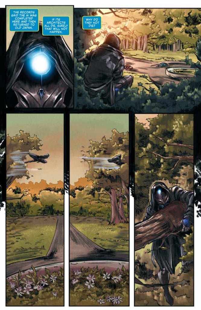
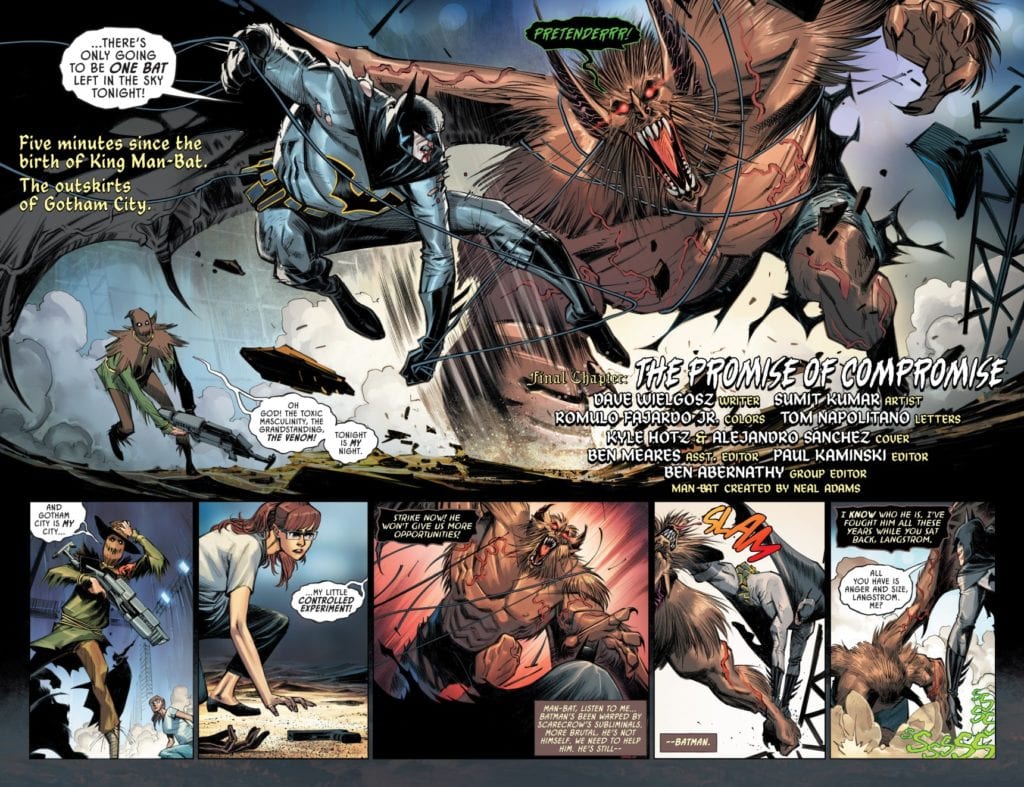
Kumar shows Kirk’s arcs in a physical sense through his illustrations. Man-Bat #5 begins with a swole King Man-Bat; it shows Kirk in a state of power but unstable mind, which is why some of the bigger plot points happen within Man-Bat’s mind where he and Kirk merge. With the end result being a Man-Bat with more human-esque facial features. This allows him to communicate with others without any more limitations.

The background colors by Fajardo display probably the high points of the characters’ inner conflicts. The cool night colors become more intense when Scarecrow uses his fear-inducing sonic weapon. Or how Man-Bat’s battle with Batman often has red backgrounds to display the heightened hostility between them.

Napolitano’s lettering brings more nuance to the conflicts of Man-Bat #5. Batman’s word balloons being slightly distorted shows how he’s under the influence of Scarecrow. Man-Bat, in the meantime, has a black word balloon with green outlines and fonts to show off his Venom augmentations. They are very similar to his captions, almost as if Man-Bat is powering his way through Langstrom’s influence. At least until the end, where their saturated captions show a compromise between them.

Complete Man-Bat #5

Man-Bat #5 ends this mini-series on a compelling note. After viewing Kirk Langstrom’s journey, readers can’t help but want to see more of him. Because while this stage of his life is complete, Man-Bat’s story isn’t quite over yet.

Monkeys Fighting Robots Youtube

ONION SKIN: The Many Layers Of Being An Aimless Adult

Onion Skin Cover

Onion Skin comes to comic stores from IDW’s Top Shelf imprint on May 26. Created by Edgar Camacho, this award-winning graphic novel reflects the lives of aimless adults.

Onion Skin Has Many Layers

What makes Onion Skin an award winner are its captivating characters and rich narrative. The protagonists, Rolando and Nera, both experience a sense of aimlessness common in twenty-somethings. It’s a familiar feeling of wanting to do something with life, but feeling stuck after numerous disappointments. Rolando certainly fits this mold after working an unfulfilling job to the point of a breakdown. Nera, meanwhile, is a free spirit enjoying life on the lamb but wants companionship. Their chance encounter is what pushes them out of their respective malaises. It’s a common, if relatable, feeling of taking a risk in life.

But what really stands out is how Camacho arranges the narrative to evoke aimlessness. The non-linear fashion of Onion Skin isn’t merely a design choice; it plays a role in-story. Throughout two timelines, it’s difficult to tell if these events happen in the past, future, or if everything’s just a dream. Rolando finds Nera familiar, and Nera has the food truck as if waiting for Rolando. But it feels like this is the first time they met. For all the reader knows, it’s alternate realities at play or a stress fantasy. The complete ambiguity of it all is a perfect rendition of being wayward.

Complementary Seasonings

Camacho decorates the two timelines with different saturations of color. Most of Rolando and Nera’s time with their food truck is clearer and brighter for objects to stand out. On the other hand, their time getting together permeates muted colors. These saturations complement the simpler illustrations to evoke joy or confusion, respectively. It’s almost like after a journey, Rolando and Nera get what they earn. That is until some of the muted atmosphere appears in the food truck timeline like they’re in danger of going back to being wayward. But it’s the lettering of Onion Skin with sound effects or word balloons that ties everything together.

Order Onion Skin

Onion Skin is a must-read story of being an aimless adult, not just in its characters but in how it can happen in any place or time. It’s certainly great enough to warrant rereads to try and make discussions about it.

Monkeys Fighting Robots Youtube

Review: SPIRIT UNTAMED Struggles To Ride Into The Sunset

Spirit Untamed is just another botched effort that insults the original Spirit: Stallion of the Cimarron. Spirit Untamed showcases another low point for DreamWorks, as this film struggles to find a reason to exist. The film manages to make the Netflix series, Spirit Riding Free, come off better than it is. Having only been to theaters once, nearly twenty years ago at that. Spirit’s return to theaters should be ignored because Spirit Untamed offers nothing to justify its 87-minute runtime.

A bland story carried by uninteresting characters is sure to deter audiences from returning to theaters. Spirit Untamed’s synopsis does tease a solid story to build on, but the execution is underwhelming. Children probably won’t have gripes with this film, and that’s ok because placing young girls at the center of the story should send a positive message that young moviegoers can appreciate. Directed by Elaine Bogan and Ennio Torresan Jr, the film is written by Aury Wallington and Kristin Hahn. Spirit Untamed stars Isabela Merced, Jake Gyllenhaal, Marsai Martin, Grace Moore, Eiza Gonzalez, and Mckenna Grace. It centers on a young girl named Lucky (Merced), who moves to a small town and bonds with a Kiger mustang named Spirit.

Isabela Merced as Lucky in DreamWork’s Spirit Untamed

Wallington and Hahn’s script sets a solid foundation, but fizzles out and becomes trite. Lucky is introduced as the daughter of a horse-riding stunt performer (Gonzalez), something that has been hidden from her. An accident leads to her mother’s demise, and Lucky has been raised by her Aunt Cora (Moore), who worries that Lucky’s lack of care for rules and restrictions will cause trouble for her. The script establishes that Lucky is very much like her mother in that regard, so her loved ones want to keep her safe since it’s believed that’s what got Lucky’s mom hurt. After arriving in town, Lucky’s initial disinterest is changed after meeting Spirit. When Spirit’s livelihood is put at risk, Lucky sets out to help her new best friend. The strongest aspect of Spirit Untamed is the relationship between Lucky and Spirt, the horse unlocks her confidence in the qualities her Aunt Cora is trying to deny her.

Sadly, the other characters are so uninteresting, Lucky isn’t that compelling either. The self-discovery she makes along the way sends a strong message to younger viewers but Spirit Untamed offers such a lackluster adventure in the process. Still, the script isn’t a jumbled mess, or incoherent, the characters are just dull, which brings the film down. Merced’s performance as Lucky makes the character’s growth pleasing to watch and lends to the self-discovery angle. The performances draw some interest, but the one-dimensional characters can’t be saved by it. Spirit Untamed’s animation isn’t very smooth either in comparison to the original 2002 film. If the characters don’t take audiences out of the film, the animation should get the job done with no issue. Bogan and Torresan’s directional debut isn’t a strong outing, Spirit Untamed doesn’t capture the emotional weight it’s searching for but it does offer great action and heartfelt moments for kids. There are some pacing issues along the way, which is what makes the film seem longer than what it is.

Eiza Gonzalez as Milagro Navarro

Spirit Untamed should go unnoticed because there are far better family outings for everyone to enjoy. The glimpses of hope the film shows aren’t enough to keep it engaging from start to finish. A movie for kids doesn’t have to suffer from weak scripts, animation hiccups, and a nonfulfilling story. Spirit Untamed won’t impress fans that grew up with the original film, or those that have an interest in Netflix’s series. This story about a girl and her horse does not deserve any attention.


Monkeys Fighting Robots Youtube

THE PURSUIT OF LOVE | TV Review

Based on a novel by Nancy Mitford, The Pursuit of Love was a lavish period miniseries from the BBC and Amazon Studios as it explores the lives of two young women during the Interwar period.

Linda Radlett (Lily James) and Fanny Logan (Emily Beecham) are cousins and best friends. Linda is a romantic who has a troubled love life. She gets married, has affairs, and enters politics during this turbulent time. Fanny is a well-read young woman who ends up marrying and settling down. Their relationship becomes strained during this period.

The Pursuit of Love was an ambitious series from the BBC and Amazon. It had an all-star cast and served as Emily Mortimer’s directing debut. What was delivered was a light and breezy series that also touched on some serious subject matter.

Mortimer was influenced by the works of Wes Anderson, using many of his techniques. The series was told from Fanny’s perspective. The narration was used to tell the backstories of characters and their current situation. This could have been dry and boring, but the writing and direction ensured that there was plenty of humor through the dialogue and framing. It made The Pursuit of Love an entertaining watch.

The use of the Anderson styling declined as the series progressed. This was due to the series becoming more focused. The aim of the first episode was to introduce the characters, the second looked at Linda’s failing marriage and her relationship with a communist, and the final episode was about her relationship with a French aristocrat and her second pregnancy just as the Second World War starts. However, the source novel was only 247 pages and at times it felt like the series was stretching itself thin. Yet it was still better than the last time I saw the BBC adapt a short novel into a three-part series (i.e. War of the Worlds).

The heart of the series was the relationship between Linda and Fanny and how they drift apart. As teens they were close, almost like sisters. But as they got older the relationship becomes strained because Linda flaked on her responsibilities. Fanny has to settle down and start a family whilst Linda leaves her. To Fanny, Linda reminded her of her mother, a woman that constantly left Fanny. Despite their issues they were still family.

The series also looks at wider issues because of the time it took place. This was a period where society was rapidly changing. This was a time where World War One was fresh in people’s mind, fascism and communism was on the rise, and the Great Depression afflicted the world. The series touches on a lot of this. Linda’s father was a War Veteran who hated foreigners and believed in status and that women are just meant to be wives and mothers. This runs into conflict with Fanny who was educated and his children rebelling in their own way, like going to Hollywood or fighting for the Republicans in the Spanish Civil War.

Linda’s relationships reflected different political views and social statuses. Linda’s husband, Tony (Freddie Fox) was an upper-middle-class banker and was a Conservative MP. Some of his family members were sympathetic to the Nazis. Christian (James Frecheville) was the Communist who offered Linda intellect, but she was out of her depth when she had to partake in humanitarian work. Fabrice (Assaad Bouab) was the French aristocrat that was able to give Linda passion and luxury just as World War Two was about to start.

The series did have a great cast. Whilst Lily James and Emily Beachem were fine leads, the scene stealers were Dominic West and Andrew Scott. They had some of the funniest lines and played some of the colorful characters in the series. Mortimer was also a delight in her small role as The Bolter, Fanny’s mother. She was so selfish that she will be a character audiences will love to hate.

The Pursuit of Love was a jolly series that fans of British period dramas will be satisfied with. It stands out because of its humor and visual style which helped make the series seem like an indie film.

Monkeys Fighting Robots Youtube