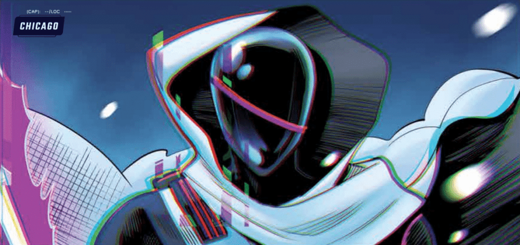
Radiant Black #7, out today from Image Comics, marks the beginning of the series’ second arc and begins to show us what this series is all about.
Kyle Higgins made the first arc of the series’ an unforgettable beginning, and he’s on track to make this second arc just as high-quality. Radiant Black #7 shares many aspects that made the previous issues so great, such as light-hearted dialogue and glimpses of the larger world we have yet to explore. The dialogue becomes especially important as we meet new characters, and the jokes and quirky things they say both humanize and endear them to the reader. This issue introduces us to new elements of the world but brushes them aside as they are not vital to the immediate story. This keeps readers engaged as they wonder when all these questions that are arising will be resolved.
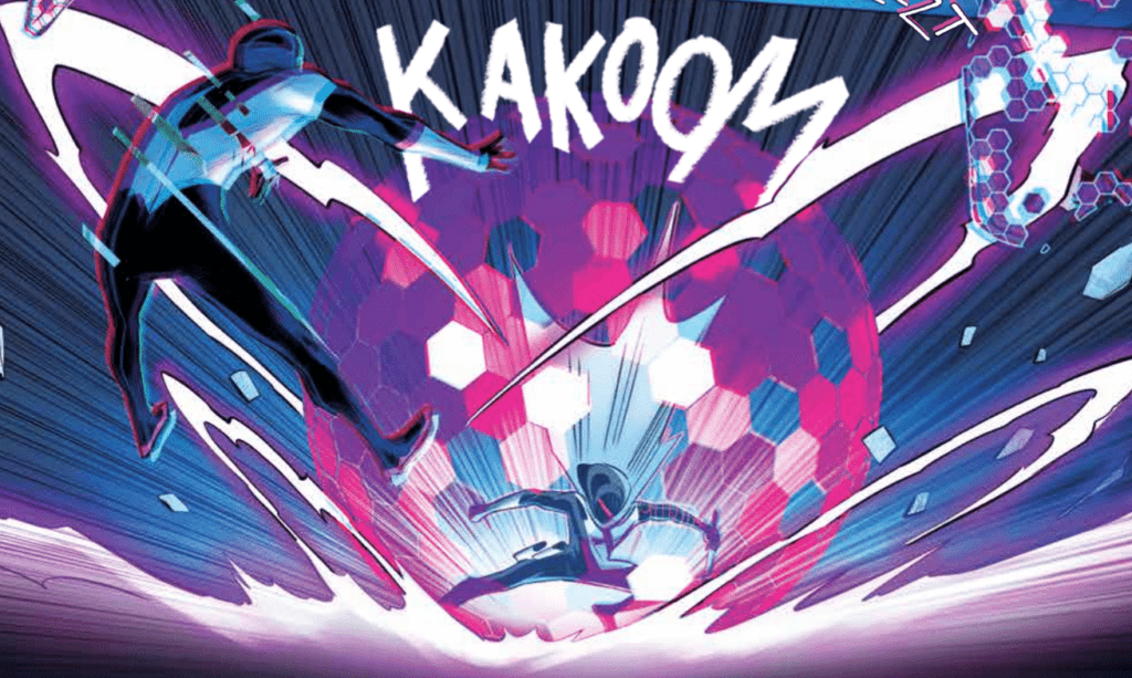
Radiant Black #7 is full of fast-paced action, which allows Marcelo Costa to show off. The issue is full of breathtaking spreads that highlight Costa’s incredible abilities. He utilizes techniques such as action lines and blurring a figure to show the intense speed and energy of the fights in the issue. This is all without talking about the incredible designs of the newly introduced characters, which are all as iconic as superheroes that have stuck around since the Silver Age.
Natália Marques does a fantastic job of making the fights stand out in Radiant Black #7. The issue’s color palette is also extremely broad and bright, making the reading experience seem more fun than dramatic, which is a nice change of pace since this is the first issue that isn’t addressing intense emotional conflicts. Marques also does a phenomenal job of coloring space when it’s a backdrop. Space in the issue is much more than a black void, and is full of the greens and blues that you would see if you were looking at images from a satellite.
Radiant Black #7 features some fantastic lettering that provides in-depth detail into how the characters speak. Becca Carey will make a word bold or give a red outline on a speech bubble to add emphasis to specific phrases, but she will also use less common techniques such as changing the shape of part of a speech bubble to show a change in the line delivery. The font choices for the sound effects do a splendid job of capturing the intensity of the battle, and Carey provides excellent lettering all around for the issue.
Radiant Black #7 is a start to the new arc that will not disappoint and retains the fun and engaging feel that has made the series so enjoyable to read in the first place. If you enjoyed the first arc, you will not want to miss this issue, where the series begins to come together into the Power-Rangers-like experience we were promised. Pick up Radiant Black #7, out from Image Comics August 18th, at a comic shop near you!
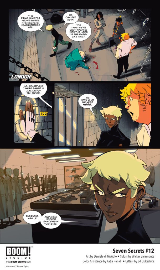
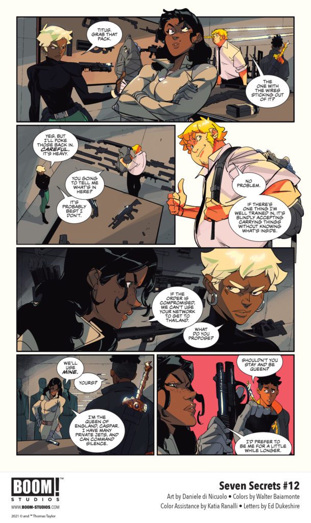
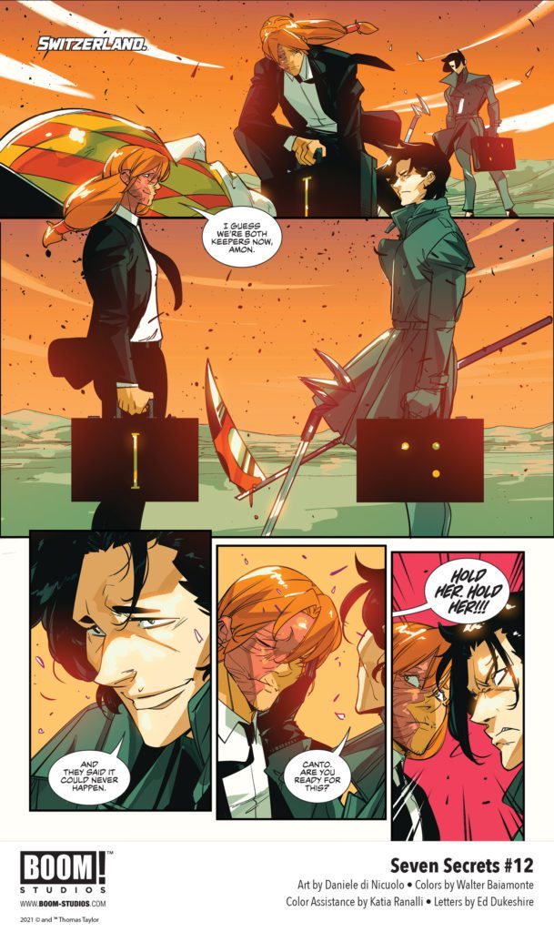
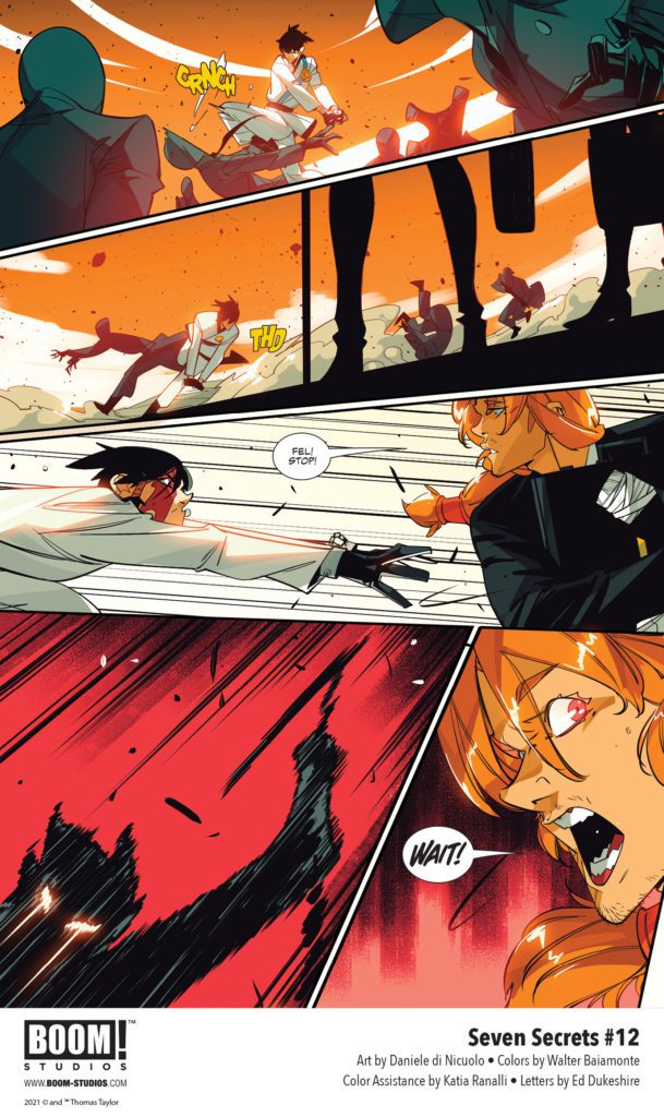
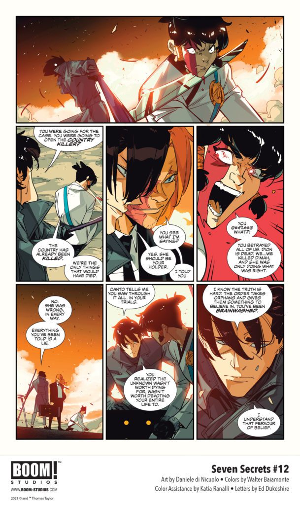
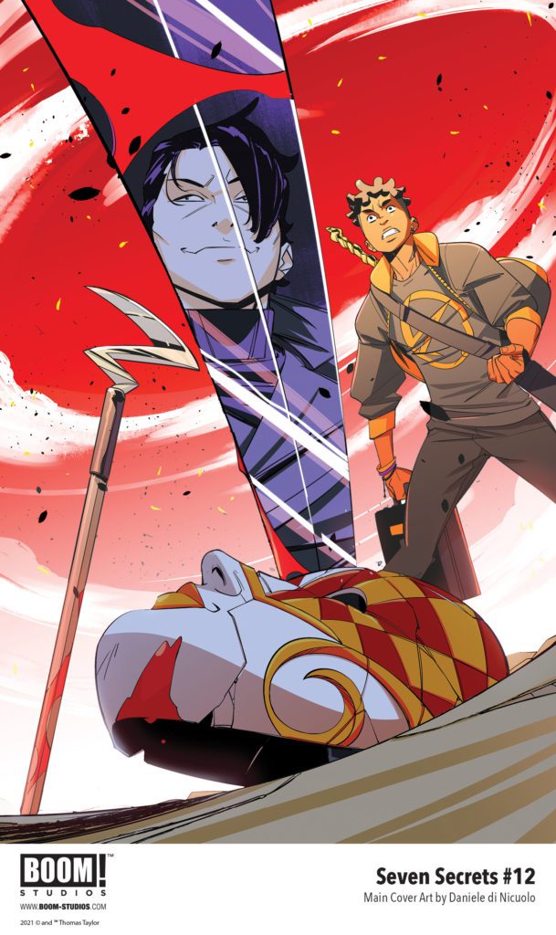
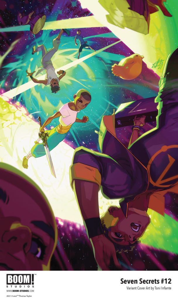
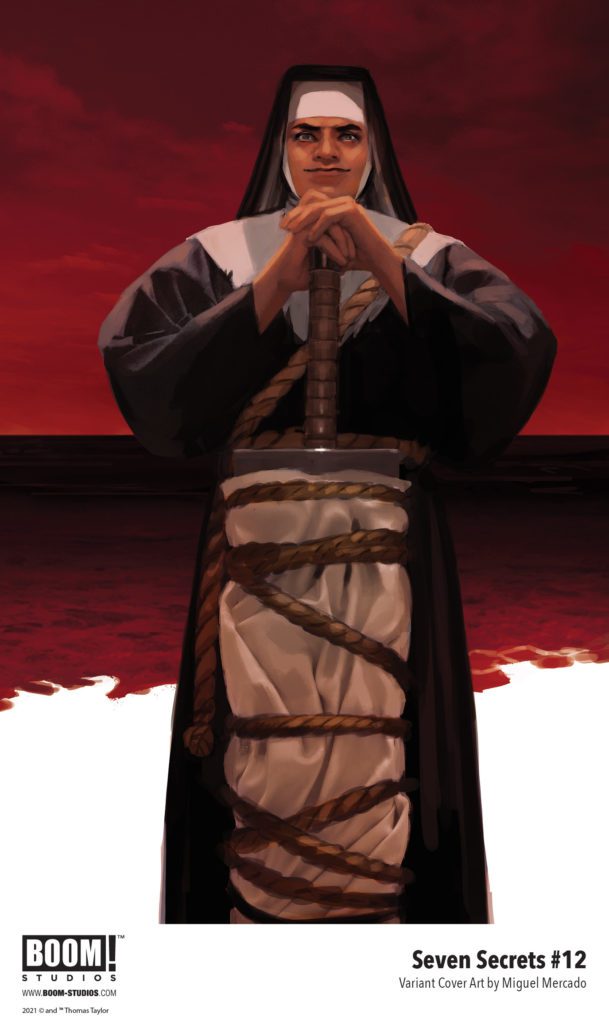
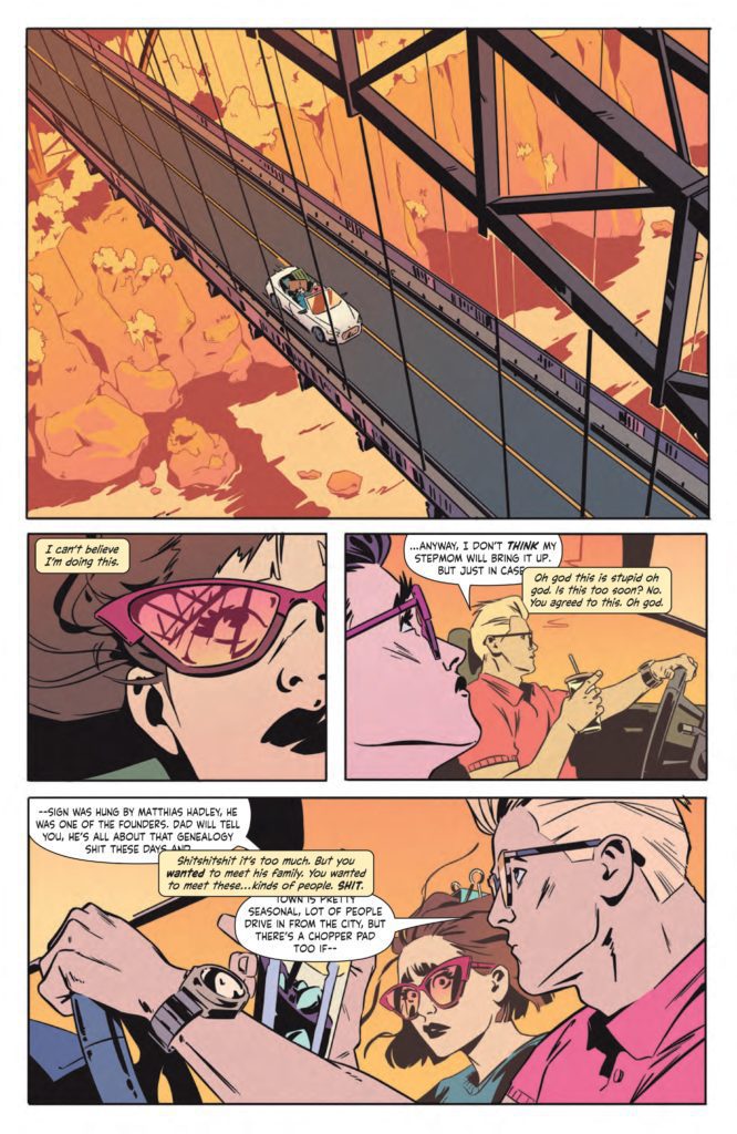
SEVEN SECRETS #12 hits your local comic book store September 15th, but thanks to BOOM! Studios, Monkeys Fighting Robots has an exclusive five-page preview for you.
About the issue: A dangerously close encounter with Amon leaves Caspar shaken to the core. With the Order divided and at a disadvantage, will the traitor finally accomplish their mission from within? One thing is for certain, it will bring them one step closer to exposing the remaining Secrets and nothing will ever be the same…
SEVEN SECRETS #12 is by writer Tom Taylor and artist Daniele di
Nicuolo, with colors by Walter Baiamonte (with assistance by Katia Ranalli), and letters by Ed Dukeshire. The main cover is by di Nicuolo, with variant covers by Toni Infante and Miguel Mercado.
Check out the SEVEN SECRETS #12 preview below:
Are you reading SEVEN SECRETS? Sound off in the comments!
The Night House is a psychological horror film on the surface, but underneath lies a chilling love story. Its examination of the grief process, which is heightened by a tremendous lead performance, is done to near perfection. Ghost stories still have a place in the horror genre, and The Night House is a great example of that. As it plays out, audiences will be expected to piece together the puzzle behind this mystery.
Becoming immersed in this narrative is unavoidable. The Night House isn’t a complete original tale, but constantly subverts expectations. The film was a hit at the Sundance Film Festival last year. After being delayed, it will arrive in theaters this Friday. Directed by David Bruckner and written by Ben Collins and Luke Piotrowski. The Night House stars Sarah Godlberg, Stacy Martin, Vondie Curtis-Hall, Evan Jonigkeit, and Rebecca Hall. The film follows Beth (Hall), newly widowed after her husband Owen (Jonigkeit) shot himself. Determined to understand why he did this, Beth unravels a darker explanation.
Meticulously told through dialogue riddled with clues and foreshadowing, The Night House is an impressive screenplay. Beginning after an apparent funeral for Owen, we are introduced to Beth, his highly depressed and heartbroken wife. School teacher by day, grief stricken mess by night, it becomes clear her depression has been a problem for a while. The Night House relies heavily on attentiveness from its audience. Its ambiguous ending is supported throughout the screenplay, but it still feels like it’s lacking. Up until its end, audiences are taken on an exhilarating ride while Beth unravels Owen’s secrets. Beth died for a few minutes as a teen, so her outlook on life hasn’t been the same since. The knowledge of this event rationalizes her jokes about death when she’s with her friends. She’s spiraling, and it’s only exacerbated by random sleep walking experiences involving an unseen force.
The Night House portrays Beth as a sympathetic widow who anyone can relate to. Her descent into madness over Owen is unnerving to watch. Her sanity is slowly declining, until this concerning behavior becomes justified. Owen did have many secrets, but they were kept hidden for a reason Beth thought she had put behind her. Luke and Piotrowski have put together a hauntingly beautiful story rooted in paranoia, love and heartbreak. The blend between horror and drama is at its best during Beth’s sleep walking. A lengthy jump scare sequence keeps the anxiety high during her ominous late night adventures. A rare instance where the jump scares are not ill-timed, or without reason.
Hall is breathtaking as Beth, she skillfully portrays a woman trying to navigate life after losing her husband. With each new piece of information related to Owen’s life, Hall channels the emotions with ease. Heartbreak grows to confusion, confusion leads to anger, and Hall’s gripping performance makes you feel just like Beth as these mood changes occur. Bruckner uses the environment to create this lingering feeling of dread that grows with each new revelation. The use of lighting and shadows to keep audiences engaged is handled masterfully.
Paced very methodically, this choice never becomes a problem for The Night House. The score rings throughout the house, as if it were part of the structure. Keeping the suspense high and becoming one with certain creaks in the house itself. Elisha Christian’s cinematography provides beautifully haunting visuals drenched in a remarkable color pallette. Specifically towards the end, the use of red lighting gives great aesthetic pleasure as the mystery comes full circle.
The Night House contradicts itself on purpose and while the ending may not live up to what came before, it’s still executed so well. Hall’s performance carries the narrative and audiences will get lost in her downward spiral. Ghost stories done in this manner, deserve every bit of praise. The Night House is a spectacular film that will make you reevaluate your life.
From writer Sarah Gailey and artist Pius Bak comes a brilliant and incisive comic book that mixes ominous horror with sharp commentary. Colored by Roman Titov with letters from Cardinal Rae, Eat The Rich #1 is a phenomenal book that excels at every objective a comic can try to accomplish. With a wickedly smart script and outstanding visual work, this could very well be the best comic of its kind.
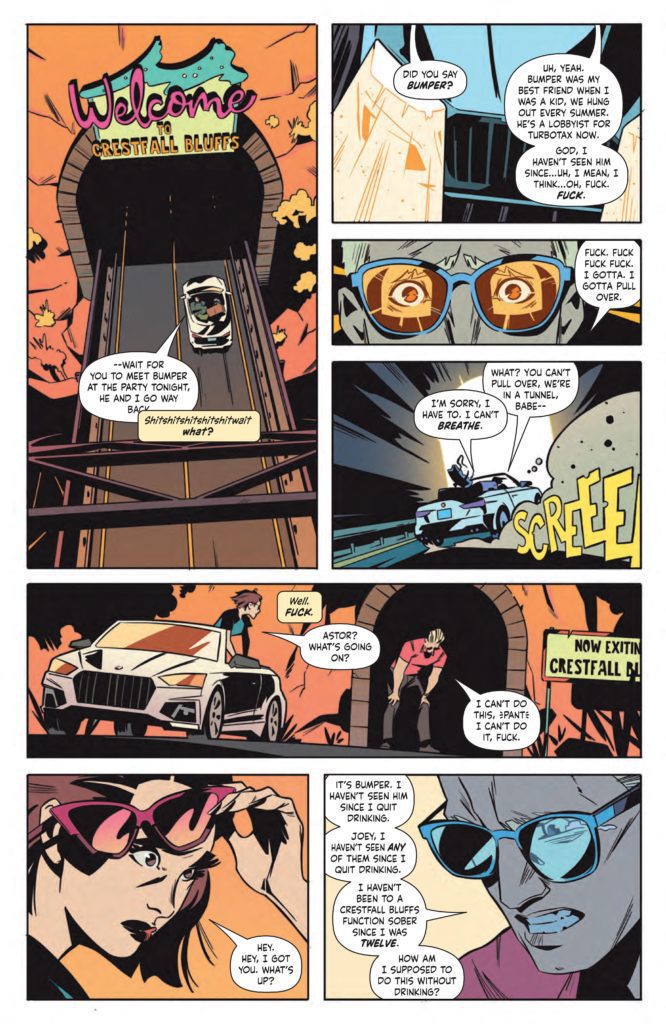
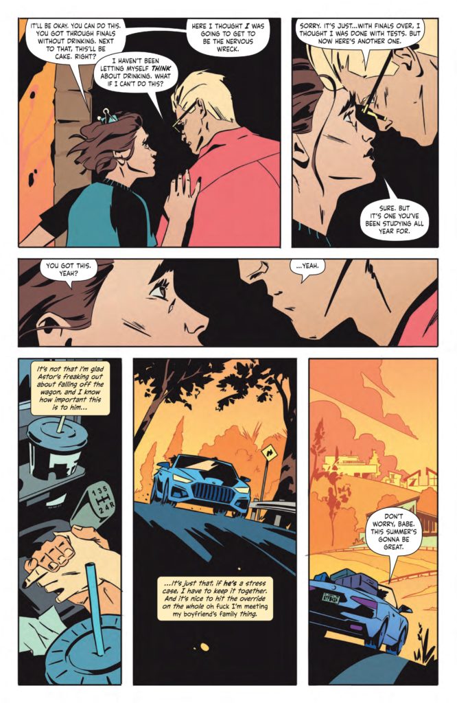
“Welcome to Crestfall Bluffs! With law school and her whole life ahead of her, Joey plans to spend the summer with her boyfriend Astor in his seemingly perfect hometown. It’s a chance to finally meet his family and childhood friends, all while enjoying a vacation where every need is attended to. But beneath the affluent perfection lies a dark, deadly rot… will Joey discover the truth before it’s too late, and even if she does, can she survive to tell the tale?”
Writing & Plot
Sarah Gailey‘s script for Eat The Rich #1 is a multi-layered work of comics magic. Gailey makes compelling terror through the eyes of a brilliantly characterized protagonist. Joey’s nervousness as the outsider to the wealthy society she is trying to blend in with is written perfectly. Her nervous tics in her speech and constant mental self-assurances all feel real. The way she deals with her boyfriend Astor and his personal issues makes her endearing and personable. Her status as an outsider to this alien social circle she’s stepping into is something the majority of us can surely relate to. Gailey’s dialogue is snappy and naturalistic, and their internal narration is just as great. From a stylistic and character standpoint, this script is an absolute gem.
The real genius and substance in this first issue is how Gailey actually approaches this strange, secretive society of one-percenters. The impenetrable societal norms of people with so much wealth and power they are almost inhuman is both a great plot device for the horror, but also an incredibly timely allegory. Gailey makes it clear that Joey’s quest is going to be harder than she could ever imagine it. This isn’t just because of what the wealthy do behind closed doors, but because they simply don’t partake in reality the way normal people do. Saying anything more would be spoiling the experience, but Gailey takes a very real concern and addresses it in a sharp and entertaining manner.
Art Direction
The visual end of Eat The Rich #1 is absolutely stunning, thanks to artists Pius Bak and Roman Titov. Bak’s pencils and inks are expressive and detailed with the intent of crafting atmosphere. His characters are all unique and he creates expressions with a natural ease. From Joey’s flabbergasted face to the facades of wealthy family members, everyone looks unique and easy to read. Bak’s heavy inks create much of the ominous atmosphere throughout the panels. Character’s faces are often obscured in shadow at prescient moments. Set pieces, like the house or certain rooms, are shrouded in black and cast deep shadows. Bak sells the fact that there is something wrong with how unsettling and dark his pencils and inks are here.
Roman Titov’s colors highlight the uneasy atmosphere with an eye-popping contrast-filled palette. Much of the Crestfall Bluffs scenery is bathed in peach and pink hues. Titov crafts a distinct sort of pop-art vapor wave aesthetic in many of the panels. However, there’s an almost Lynchian uneasiness to the whole experience. Much like with Bak’s pencils, Titov creates contrast within the details. He colors specific little details within the panel to sort of throw off the false-prettiness of Joey’s view of Crestfall. They serve to throw the reader off as well, making you wonder what the hell is happening here before the carnage is revealed.
Cardinal Rae’s lettering switches font styles between dialogue and narration, and it works spectacularly well. Her style all-around is very modern, with thin, almost handwriting-esque letters contrasted with a similar italicized font for internal narrating. Her tonal shifts are seamless, and I can hear the characters voices perfectly through how she presents her boxes and bubbles. This first issue is front-to-back perfection in terms of visual direction and stylistic achievement.
Verdict
Eat The Rich #1 is a perfect mixture of insight, entertainment, and artistry. Sarah Gailey’s script is almost too smart for its own good. They mix brilliant character writing, intelligent commentary, and take an almost cliched premise and make it genuinely frightening. Pius Bak and Roman Titov’s visuals are both gorgeous and eerie, creating a perfectly contrasting atmosphere for this comic book. Be sure to pick up this incredible first issue when it hits shelves on 8/18!
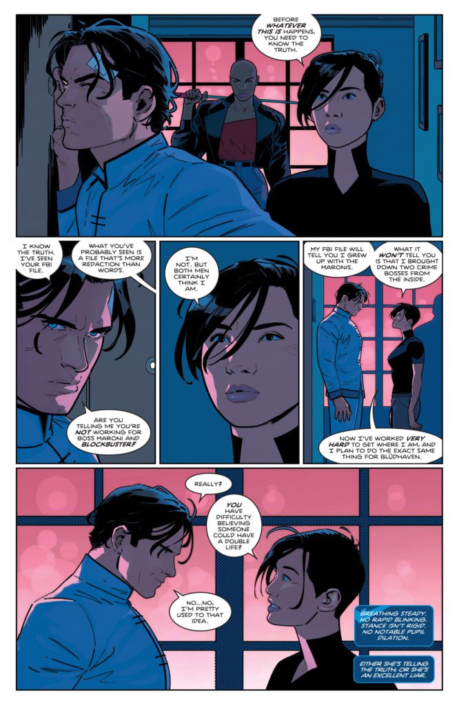
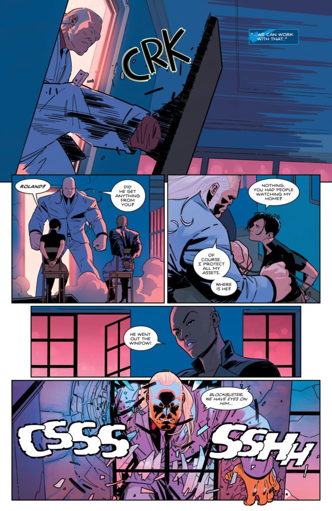
Fans of Dick Grayson are going to love this issue. DC Comics’ Nightwing #83 is all about the good Dick has done over the years. And it’s about the good he plans to do in the future. But all of it is spurred on, and ultimately for, Alfred Pennyworth. Writer Tom Taylor, artist Bruno Redondo, colorist Adriano Lucas, and letterer Wes Abbott are creating a tribute to the man behind the Bat family with this series.
Writing
Taylor gives us a tour of Dick Grayson’s life in this issue. We see him interacting with the Teen Titans, the Bat family, and even a Justice Leaguer or two. In many ways, Taylor makes this feel like the breath before diving in. He teases dark new chapters. He even points out how difficult Nightwing’s projects for Blüdhaven are going to be. But Taylor still takes the time to let Nightwing take stock. We not only see the ways that Dick Grayson has touched the lives of so many, but we so did Alfred. Alfred was a man who meant so much to the DCU at large, not just the Bat family. With some jokes and some danger thrown into the mix, this issue is fun and moving.
Art
There are a lot of bright moments to Redondo’s art in this issue. His action scenes are dynamic and brilliantly done. As Nightwing runs towards a helicopter that’s shooting at him, Redondo makes it so that the shots are coming at the reader. We feel like we’re right there with Dick, being shot at. And when Nightwing swings from the helicopter, we see multiple instances of him in one panel, marking his trajectory through the air. But it’s when he gets home that we see the beauty of Redondo’s art really shine. Dick lies down in bed, after a long couple days. His brow is knitted together and he seems troubled, but his eyes are closed. Then his face relaxes and he’s asleep. It’s a small moment in a rather action-packed issue, but it’s beautifully done.
Coloring
There’s an overall arc for the color palettes in this issue. When we begin the issue, Nightwing is in danger. The colors are dark blues and reds. But as Nightwing starts making plans for Blüdhaven, the colors brighten. Lucas shows that Dick is doing what he’s supposed to be doing. He’s laying claim to his destiny. Then, as the villains of the story react to the news, the colors return to the danger filled pages of red and blue. Nightwing might be making bright plans, but there’s going to be some resistance.
Lettering
Abbott continues to use spacing to show levels of intimacy between characters. When Nightwing’s word balloons are overlapping or being overlapped by someone else’s lines, it’s a sign that he feels a closeness to them. We can hear the warmth in their voices. But sometimes, the same effect is used to show a familiarity of circumstances. When Nightwing has to cut off one of Blockbuster’s rants, their lines collide in the air. Dick has done this 100 times before, so he knows when it’s his cue. But in each of these moments, Abbott creates a visual rhythm. We can hear the pauses and the banter.
DC Comics’ Nightwing #83 is a really wonderful issue. It takes a tour through the life of Dick Grayson, pointing to all of the things that have made him great. Pick up Nightwing #83, out from DC Comics August 17th, at a comic shop near you!
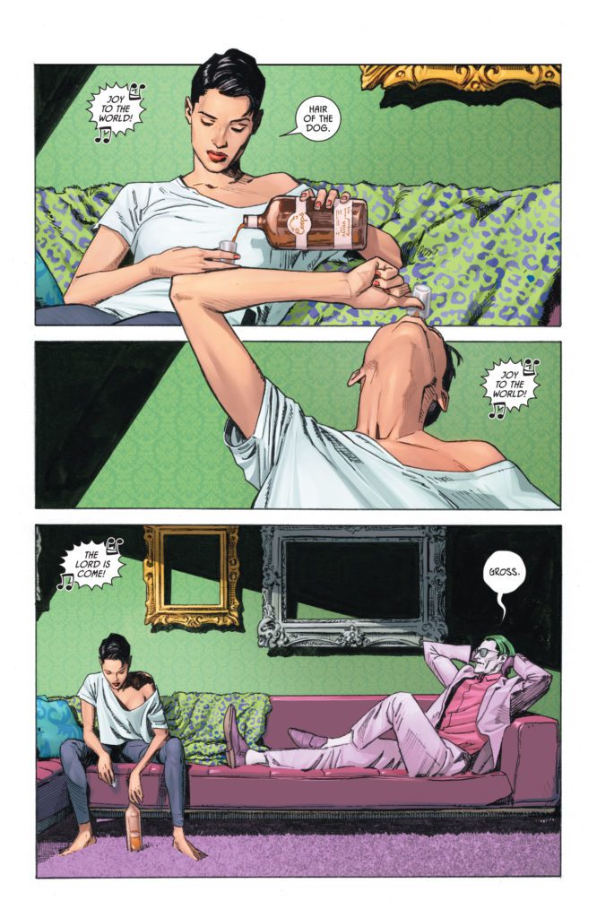
DC Comic’s Batman/Catwoman is a quieter look at the superhero genre. It doesn’t concern itself with moral blacks and whites. This is a series that is written entirely in greys. But it also wants to look at the “blacks and whites” of this genre and see how they hold up in a messy world that colors outside the lines. Writer Tom King, artist Clay Mann, colorist Tomeu Morey, and letterer Clayton Cowles use Batman/Catwoman #6to discuss Selina Kyle’s complicated journey through life.
Writing
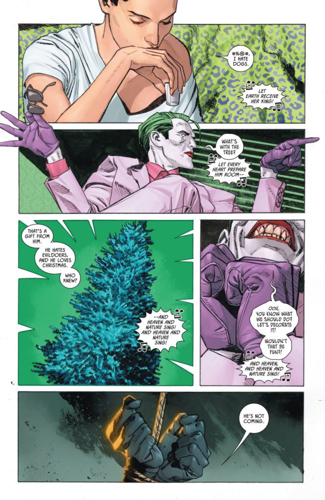
When we first see Selina, she’s hanging out with Joker like he’s an old friend. King always brings us back to this relationship. At first, it seemed like Selina and Joker got each other. They were on each other’s level and they didn’t have to pretend around one another. But King juxtaposes this Selina with the older Selina from the future. Old Selina is impulsive, proud, and incredibly sure of herself. Some wrinkles and a little bit of grey hair won’t stop her from jumping right back into her old Catwoman outfit, jumping around on rooftops like she’s not a day over 25.
But when we really focus in on the younger Selina, she’s not this bold. Her lines may read as a casual exchange with her friend, or they’re part of a nervous dance. She doesn’t know what the Joker will find funny or infuriating. And how is he planning on getting under her skin this time? At one point, when they decide to decorate a Christmas tree together, she gets out her box of ornaments. Before Joker can say anything, Selina takes the lead: “Jesus &#$%@. These are all cats. I’m a cliché of myself.” It feels like she’s beating Joker to the punchline. She isn’t confident in front of him. In fact, she’s a ball of insecurities. But if she can criticize herself before he has the chance, this cool, calm, and collected charade can go on.
Art
More than ever, in this series, the past and the future are interacting. Mann, on several occasions, will show a page set in the past, with one panel at the beginning that is set in the future, or vice versa. These timelines are inextricably related, and Mann wants to remind us of that. They exist because of each other.
But there’s an even more subtle moment of Mann’s art that really shines in this issue. When Helena is questioning Selina at the dinner table about the murder of the Joker, a mouse appears in the page gutters. It sticks its head into the first panel, hovering over Selina. As readers, we subconsciously make the connection that Selina must be the mouse. But then it scurries over to Helena’s side of the page, just as the dynamic of the scene is being flipped on Helena. And then we see the paws of a cat, running from Selina’s half of the page over to the mouse. Mann is telling us that this mother and daughter are playing a game of cat and mouse. But while Helena may think she holds all the cards, her mother can turn things on her in mere seconds.
Coloring
There is a ton of color in this issue. Morey emphasizes the sheer joy of certain scenes, and the foreboding danger of others. In a brilliant splash page of Helena and Selina fighting crime — with great new characters like Dragoon, Four-Face, and Polymath — Morey gives us brilliant purples, yellows and greens. Not only does it look like something out of an old pulpy comic and make the scene fun, it covers the page in the colors of Catwoman. She’s literally wearing her old purple and green costume as she kicks butt, blending in to the lightning bolts of green and purple all over the page. The colors make it clear that this is Selina in her element.
Lettering
Cowles does a great job of creating dynamics in a room. When Commissioner Dick Grayson speaks to the older Selina, the tail for his word balloon is long. When she responds, it’s with a word balloon that’s right next to her face, so the tail is short. These small visual elements make it feel like Dick chooses his words with Selina. He respects her, he pauses and thinks before speaking. But Selina is the queen of this crimefighting world and she always knows what to say before anyone else is even done talking. She’s quick, confident, and to the point.
DC Comics’ Batman/Catwoman series is showing us the complicated nature of Selina Kyle. She’s a hero, she’s a villain, she’s lonely, she’s surrounded by those who love her. But above all, she’s an interesting, three dimensional, human character. This creative team is masterfully turning this woman of many contradictions into the star of the show. Pick up Batman/Catwoman #6, out from DC Comics August 17th, at a comic shop near you!
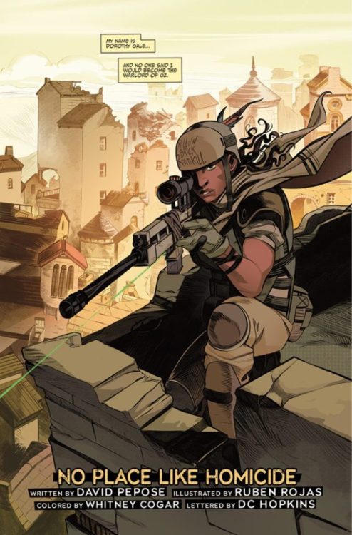
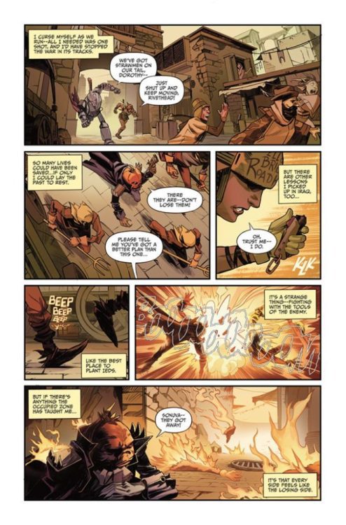
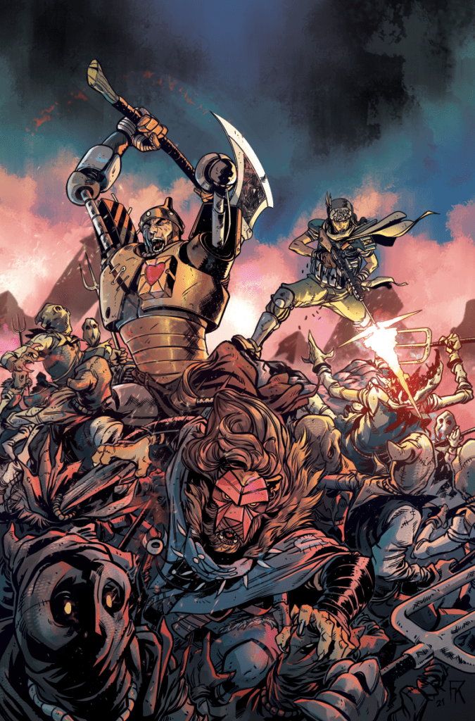
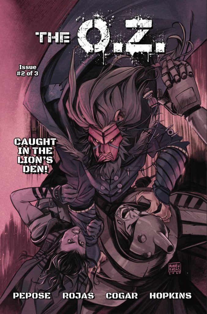
THE O.Z.‘s second Kickstarter launches today, and we spoke with writer David Pepose about the book, as well as his advice for aspiring comics creators. Plus: an exclusive reveal of Farid Karami’s epic variant cover!
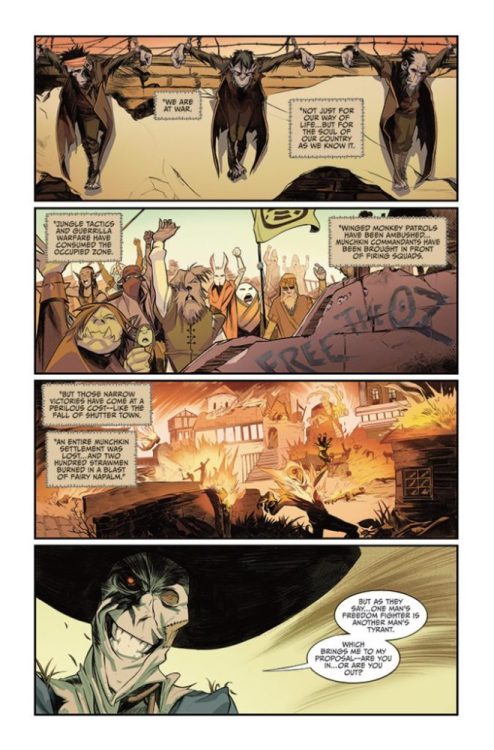
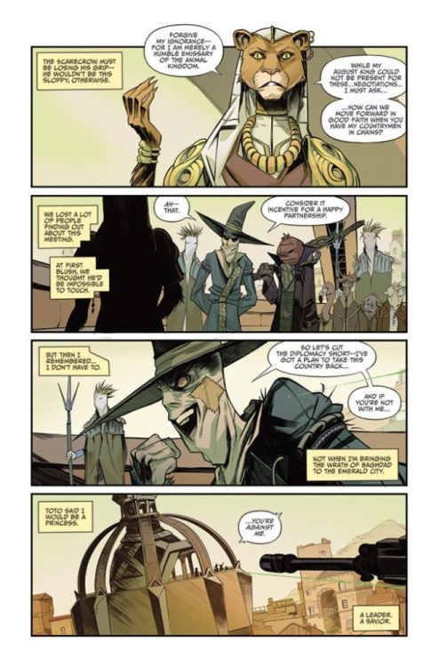
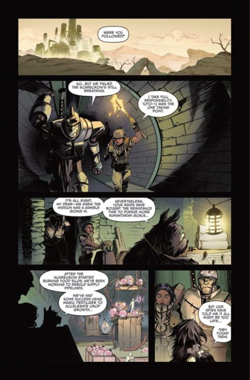
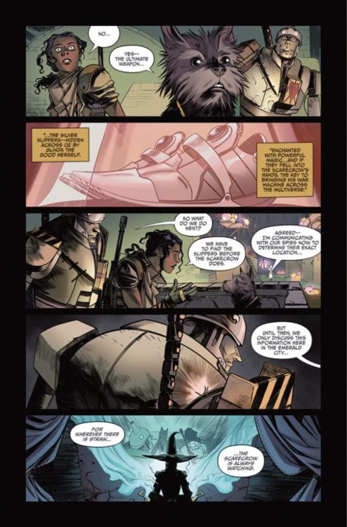
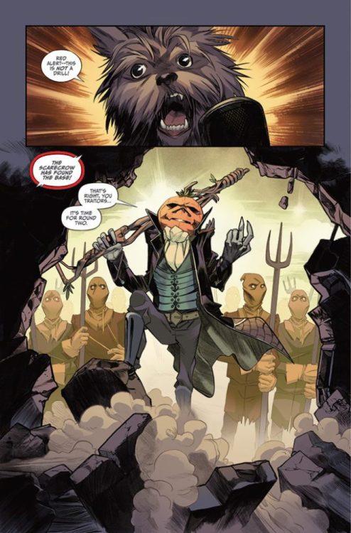
What is THE O.Z.? THE O.Z. is what you get when you mix The Wizard of Oz and The Hurt Locker. Years after Dorothy and her friends defeated the Wicked Witch of the West, Oz is in civil war. Dorothy’s granddaughter, a disillusioned Iraq War veteran, has to try and bring peace to the magical land.
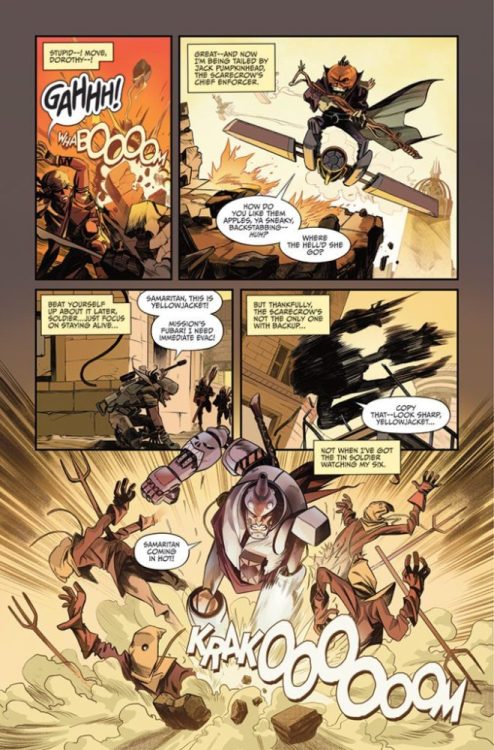
About this issue: Now leading the Resistance against the Scarecrow’s regime, Dorothy must join forces with the Tin Soldier, the Prince of Lions and Jack Pumpkinhead if she hopes to locate the all-powerful Silver Slippers and bring peace to the Occupied Zone… or as the locals call it, The O.Z.
The first issue of THE O.Z. was a brilliant re-introduction to Oz, full of familiar references and new, fresh emotional stakes. Issue #2 looks like it’s upping the ante on all counts.
You can read the first 11 pages of THE O.Z. #2 right here:
THE O.Z. #2 Preview
1 of 12
Exclusive Reveal: Farid Karami’s Variant Cover
And read on for our full interview with Pepose:
Monkeys Fighting Robots: Issue #1 was a pretty explosive introduction to The O.Z. — how are you raising the stakes for issue #2?
David Pepose: Thank you! We’re raising the stakes in a big way in The O.Z. #2 — now that we’ve fully established Dorothy and a brief history of the Occupied Zone, we’re able to explore some dangerous new territory across the war-torn land of Oz. Dorothy’s managed to gain some ground for the Resistance, but as you’ll see in our Kickstarter preview, that reprieve is going to be short-lived — the location of the Silver Slippers has been revealed, and the Scarecrow aims to use them to invade the Multiverse. With Dorothy outnumbered and outgunned, she’s going to need reinforcements in a major way.
MFR: You’re adding some new players to the mix with this issue. What can you tell us about the Prince of Lions?
Pepose: I don’t want to spoil too much about him, but suffice to say, our take on the Courageous Lion is going to turn some heads. I’ll start by saying he’s Ruben’s favorite character to draw in the entire series, and will serve as sort of the rogue/stealth fighter of the book. For me, he was influenced a lot by Chadwick Boseman’s Black Panther, primarily in terms of the heaviness of the crown — it’s one thing to be brave when you’re fighting just for yourself. But how does the calculus of courage change when you’re the ruler of the Animal Kingdom? In that regard, I think the Lion and Dorothy have a lot in common — their stories are each about proving themselves in the face of an impossible legacy, which I think will make them click together nicely.
MFR: Are you and your collaborators going after a different tone with this issue compared to the first? Are you looking to make it darker, or scarier, anything like that?
Pepose: I’d say we’re aiming for more intensity for this second installment, for sure. The first issue was all about setting up Dorothy and the world around her, but now that we’ve wrapped up our exposition, we’re able to really put the pedal to the metal with our action. Dorothy scored some victories in our previous issue, but I wouldn’t count on her winning streak lasting forever — she’s going to sustain some losses in this issue that are going to really keep her on the backfoot. But when you’re as desperate for redemption as Dorothy is, a good offense might be the best defense…
MFR: What did you learn from your first Kickstarter that you’re carrying into your second?
Pepose: Getting a sense of scale. When I started my last Kickstarter, I had no idea we would fund as quickly as we did, and the rest of the campaign was me coming up with stretch goals on the fly to keep our readers invested and to bring new backers to the scene. While I’m not trying to bring any expectations to the table this go-round — after all, there’s a pandemic going on — we’ve been hard at work to prepare ourselves for good news as well as bad. If you liked any of our stickers, enamel pins, or prints from our last campaign, you’ll want to tell your friends to back and share our campaign.
MFR: Now that you’ve had experience with both Kickstarter and traditional publishers, would you guide up-and-coming creators to pursue one over the other to publish their first work?
Pepose: I don’t think there’s necessarily a wrong answer here — there are pros and cons for both approaches, but I think that it’s mainly what speaks to a creator more. Working with a publisher means you’ll get more infrastructure behind you — particularly with printing and distribution — but the finances will be much less lucrative, because you have to cut in your publisher, distributor, and retailers.
Conversely, if you do Kickstarter, you’ll be learning everything from the ground up. But without having to cut in other parties, you’ll likely make it back into the black faster… it just might take a little longer to build up a bigger readership if you don’t have any ties to the Direct Market. Honestly, I see the Direct Market and crowdfunding to be two sides of the same pendulum, the same way that people look at creator-owned books versus licensed books. It ultimately doesn’t matter which one you start out with, because you’ll eventually want to be doing all of it.
MFR: Do you have any advice for writers in regards to overcoming creative block? Asking for a friend (who is me).
Pepose: For creative block, I usually have three recommendations. The first is to skip whatever scenes are giving you hassle, and just write the scenes you’re interested in — it’s much less daunting to write out of order, because you won’t have the blank page staring at you. Alternatively, you can switch gears to writing something else, just to get the gears turning — it doesn’t even have to be an assignment, it can be a conversation between characters, or even fan fiction. Lastly, though, is just unplugging — sometimes it’s watching a good movie, or listening to some music, or going out for a walk, or taking a nap. If you can’t figure out how to change the writing, changing your location or mindset can be just as helpful.
MFR: Who of The O.Z. cast has been your favorite to write so far, and why?
Pepose: Dorothy is probably the cop-out answer, since her voice really anchors the entire series — I can’t help it, she’s really a spiritual cousin to Detective Locke from my breakout series Spencer & Locke, so it’s hard for me not to love her. But beyond Dorothy, I think it’s a tossup between Toto and Jack Pumpkinhead. Toto is just the funniest way to deliver exposition in a book like this, but his role also got expanded in honor of our terrier Holly, who passed away just before the pandemic shutdowns. Jack Pumpkinhead, meanwhile, reminds me a lot of the comics version of Taskmaster — he’s just a blue-collar mercenary with a sense of humor and a job to do. Even before artwork started coming in, Jack’s lines always popped off the pages in my scripts, so he’s been a lot of fun to tackle.
MFR: What have you been reading/watching lately that’s helped fuel your creative juices?
Pepose: Tons of stuff lately. I’ve been on an ’80s sci-fi kick lately, with Terminator, Robocop, Predator, Total Recall… I saw James Gunn’s Suicide Squad recently, and the stellar team dynamics on that movie have been lingering with me for the past few days. When I want to switch gears, I’ll pop in something from Will Ferrell or Seth Rogen, who I think each have very fine-tuned voices for their work.
For TV, I’ve been catching up on Motherland: Fort Salem and Ted Lasso. On the comics side, I’ve been reading anything that Hickman and Ewing are doing — they are so next-level, it’s both inspiring and infuriating. James Tynion’s been doing some super-cool stuff lately, too, between the experimentation of Department of Truth, the wild structure of Nice House on the Lake, and the sheer additive streak of his Batman run. I’ve also really been digging Mark Russell’s Fantastic Four: Life Story, and Ram V’s Many Deaths of Laila Starr is just a masterpiece and a half.
But beyond that, honestly, I’ve been going back and reading the ’90s-era Spawn, Spider-Man, and X-Men, just to remind myself of why I fell in love with this industry in the first place — it’s so easy to see the work you have in front of you, that you don’t appreciate just how far you’ve come. I’ve been really lucky to have books like The O.Z. succeed, and it’s nice to pay homage to the trailblazers who helped get us there.
Don’t Breathe 2 is an unpredictable sequel that fails to justify why it was necessary to be made. The story of home invaders biting off more than they could handle was a surprise hit in 2016. Its conclusion left room for a potential follow-up, but Don’t Breathe 2 isn’t the continuation many fans of the original would have hoped for. Held back by its questionable script, Don’t Breathe 2 is a disappointing sequel to one of the best home invasion films of the last decade.
Norman Nordstrom, the blind man featured in both films, returns for more twisted justice. He isn’t catching up with Rocky though, this time Norman has secured the daughter he desperately wanted again. In the original, three teens break into Norman’s home and discover that he had taken a woman hostage in order for her to forcefully give him another child. His plans were ruined, but now he has achieved his goal. Directed and co-written by Rodo Sayagues, the film stars Stephen Lang, Bobby Schofield, Christian Zagia, Brendan Sexton III, Steffan Rhodri, and Madelyn Grace. Don’t Breathe 2 follows Norman (Lang), who has saved a young girl named Phoenix (Grace) from a house and raised her as his own. One night, a group of gunmen break into their house and take Phoenix, which forces Norman to tap into his military background to save his “daughter”.
Stephen Lang stars in Screen Gems DON’T BREATHE 2.
Fede Alvarez helmed the previous installment and returns to co-write the screenplay for Don’t Breathe 2. The film suffers from poor dialogue, some of which could spark unintentional laughter from audiences. It doesn’t attempt to address the issues left by the ending of Don’t Breathe, such as Norman not being in prison for his crimes. Along with that, Norman was set up as a sympathetic war veteran acting in self-defense, but then it’s revealed that he has forced a woman to bear his child. His actions in the original film suggest he found pleasure in harming Rocky and her friends. This prior knowledge makes it difficult to consider Norman likable as a character to follow. Don’t Breathe 2 establishes that he has sheltered Phoenix from a proper childhood out of heartbreak and selfishness. He’s lied to her, but she is innocent in all of this, so Phoenix is the character audiences can at least grow attached to.
Sayagues and Alvarez have put together a screenplay of so many unlikeable characters. At one point, after Phoenix is abducted it seems like her kidnappers will be the heroes of this story, but there are no heroes in Don’t Breathe 2. The previous film didn’t provide overly sympathetic characters in the teen robbers, but certain scenes were present to help the audience understand their difficult life situations. These gunmen, don’t have sympathetic backstories, it just grows into more unlikeable traits. Redemption arcs are fine to explore, but Don’t Breathe 2 depicts Norman’s in a less than acceptable manner. The life he’s created for Phoenix demonstrates that he’s only gotten worse, and still hasn’t come to terms with being a monster. However, by the end of the film, he has made a difference in her life, but it’s up to audiences to decide if that makes him redeemed now.
Stephen Lang (right) and Adam Young in Screen Gems DON’T BREATHE 2.
Don’t Breathe 2 is riddled with foreshadowing, making this screenplay decent on some level. Sayagues captures the tension, just not on the same level as the original. The tracking shots during the initial break-in to Norman’s house will keep viewers anxious and on the edge. Paced rather quickly, Don’t Breathe 2 is a fun watch for its technical strengths and gory action sequences. Lang impresses once again as this battered war veteran who isn’t to be taken lightly just because he can’t see. Norman is unlikeable, but Lang captures the obvious inner turmoil within Norman quite well through his facial expressions. Grace’s portrayal of Phoenix is the heart of Don’t Breathe 2, she embodies the childlike innocence perfectly for audiences to want to see her get away from Norman and the gunmen he saves her from. Roque Banos’s score keeps your heart racing and adds extra stress during the near-death moments for Phoenix.
Stephen Lang (left) and Adam Young in Screen Gems DON’T BREATHE 2.
Don’t Breathe 2 has no reason to exist, despite talks that this was a good idea for a sequel to the original film. Perhaps that idea was scrapped last minute and fans have to accept this mess instead. Not nearly as neat as its predecessor, Don’t Breathe 2 should be the end of this series if this type of narrative is what’s considered worthy for a sequel that could have been much better.
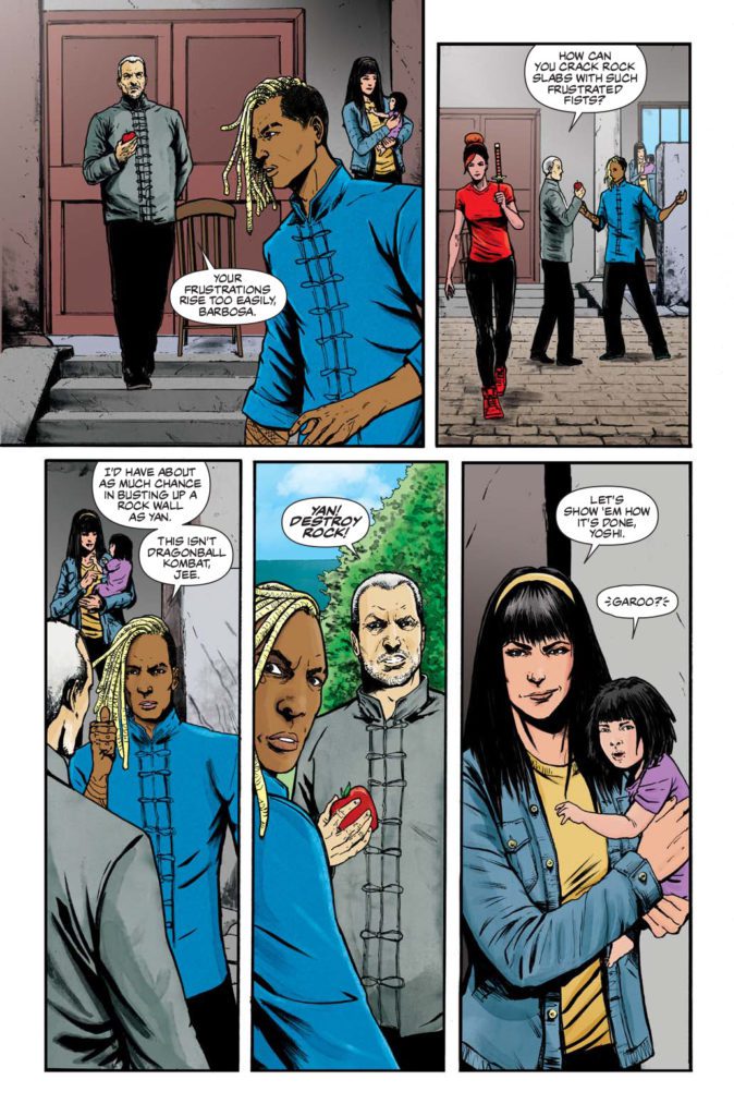
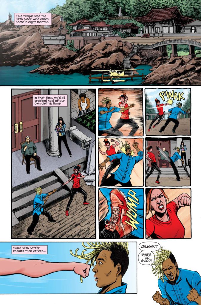
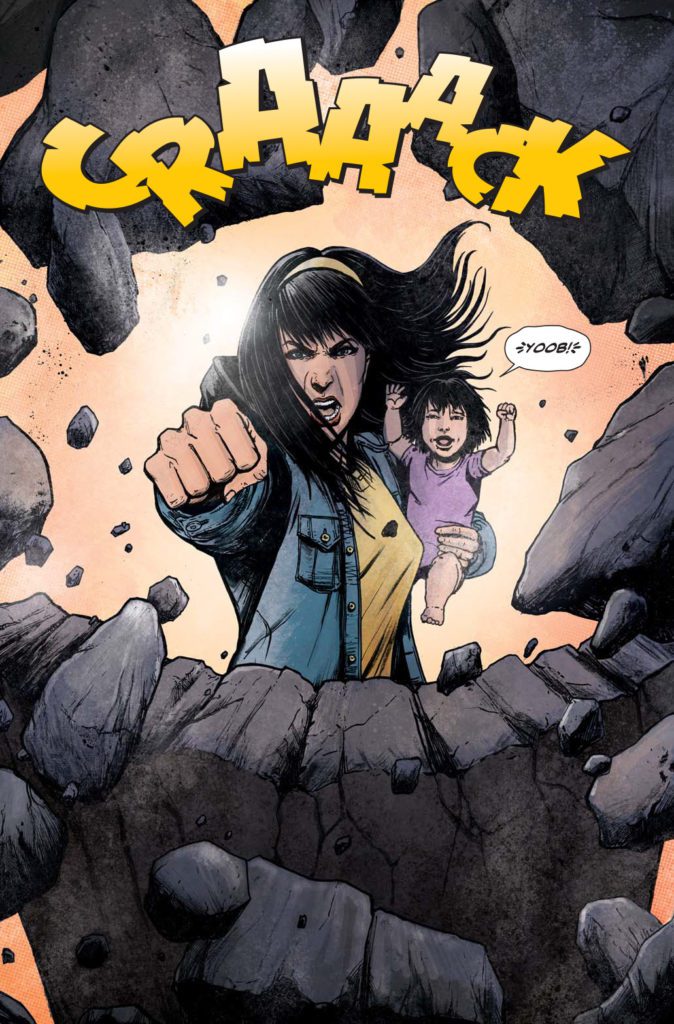
Published by A Wave Blue World, the DEAD LEGENDS saga unleashes a new fury of fists and feet with DEAD LEGENDS II #1 on August 11th, escalating the action established in the preceding 5-issue miniseries. Writer James Maddox reunites with artist Gavin Smith, letterer Ryan Ferrier, and color assistant Milena Deneno for a new descent into epic storytelling that embraces the legacy of Kung Fu and Wuxia cinema history.
I was fortunate enough to get to talk to James about this new volume and his influences, the process, and his experiences working with the amazing art team on this ass-kicking adrenaline shot of a comic book.
MFR: This series wears its influences on its sleeve, ranging from Bruce Lee’s films to The Raid, and of course some classic comics like Shang-Chi and The Deadly Hands of Kung Fu. As a writer, how did you manage to maintain the line between homage and outright copy?
JM: In a genre that has a lot of history and influential titles, I found it was best to be aware (as much as is possible) of the ground that’s covered by other creators. Then draw a focus on the aspects, details and character traits that would make DL stand out as a unique experience. Sure, there’s going to be nods and overlap, but after doing our best to understand the works that laid the foundation of this genre, the main through-lines of Dead Legends are all me and Gavin.
MFR: We find ourselves in a Golden Age of kickass, unique women protagonists in comics and other mediums. Where did the idea for Yan and Red Death as the two leads in Dead Legends come to you?
JM: From day one, Gavin had the design made for Red Death as a staple character in the series, but it took some time and planning for us to come up with Yan. Once the groundwork for Yan was set, she took the spotlight and ran with it. And even though I’d like to think Dead Legends embodies an ensemble cast, the standouts from that crew have always been Yan and Red Death. Partly because of the history that brought them to this tournament, and partly for the brutality they employ to reach their goals.
MFR: Something folks may not realize is how insanely difficult writing and scripting a fight scene can be – much less dozens of them. What was your process like for coming up with all of the fight sequences through this series?
JM: Mainly, I wanted to balance the pages devoted to character drama and those dedicated to combat. To do that, Gavin and I worked out a system that essentially let us put our individual focuses on the page. I was more into the difficult choices facing these characters, while Gavin was able to use the allocated space to choreograph some brutal fights. Finding the balance to those two aspects takes some back and forth, but the collaboration has helped bring out the best of both approaches to this series.
MFR: The main cast is wildly diverse, both in terms of representation and personalities. How did you come up with the cast, and how did their voices develop as you wrote them?
JM: I approached the series with certain characters locked in. Red Death, Damon, Stalk and a handful of others had their design and voices from the start, but others found their way after the first pass of the issue 1 script. By the time I sent off the final draft, I felt the foundations for each of them were set and made moving forward to later scripts that much easier.
MFR: Gavin Smith draws the hell out of every page in Dead Legends, and Ryan Ferrie’s lettering is super clean. How did you all start working together, and what was your combined process like for this series?
JM: Gavin and I have been friends for years, and we’d always talked about collaborating on a project together. When a spot opened up in his schedule, I asked him what he wanted to draw most in a series, and he said a martial arts book and even showed me some of the characters that he’d want to use for the series (Blind Tiger was one of these characters). Things worked out, and here we are. Ryan and I have been con buds for a while, and he came on board because he liked the concept, and even though he was phasing out of lettering work to focus on writing, he did us the favor of taking on Dead Legends.
MFR: How did publisher A Wave Blue World contribute to the process behind this book? What kinds of tips and encouragement did they give to help achieve this vision of tightly-woven ass-kickery?
JM: Tyler and Wendy Chin-Tanner (the co-publishers of AWBW) have been a driving factor in getting this series into the hands of readers. Before he departed AWBW, Joe Illidge was on point in his role as editor and he strengthened the story for both volume one and two with his suggestions and critiques. But throughout the journey of this series, Tyler has pushed us to tell the kind of story we think is both fun and important, trusted us with constructing the vision, and provided us with the support to make it happen.
Writer James Maddox, artist Gavin Smith, letterer Ryan Ferrier & color assistant Milena Deneno continue their grindhouse epic in the wake of volume one’s catastrophic tournament!
“This comic is ultimately a challenge in balancing emotional storytelling with the action of classic martial arts movies and Kung Fu comics,” writer James Maddox explains. “The resulting approach offers relentless action that punctuates a story of loss, perseverance, and found families.”
The continuing story follows the trials of Yan, a young woman trained by her grandfather, Jee Sin—one of the most deadly and experienced martial arts experts in existence. After winning the last Dead Legends tournament and taking lethal revenge on her husband’s killer, Yan flees the competition’s self-destructive overseer and his army of merciless followers. Luckily, she has friends like Red Death and Stalk to aid her and the child. But new adversaries, including the unhinged Tigress, will resort to sinister tactics that Yan and her fellow refugees couldn’t fathom.
The resulting comic should resonate with fans of iconic cinematic martial arts film, including Riki-O: The Story of Riki, Ong-Bak: The Thai Warrior, Bloodsport, The Raid: Redemption, Kill Bill, and the seminal oeuvre of Bruce Lee.
“This second outing allows me to dive deeper into both the technical roots of martial arts, as well as its more fantastic extrapolations,” artist Gavin Smith—who holds a black belt in Tae Kwon Do��elaborates. “I can’t wait to show off the intricate web of issue four and some of Red Death’s most savage fight scenes. James and I were able to amplify the sheer chaos and brutality of the first volume.
Be sure to check out the first and this second volume of Dead Legends from publisher A Wave Blue World, available now!
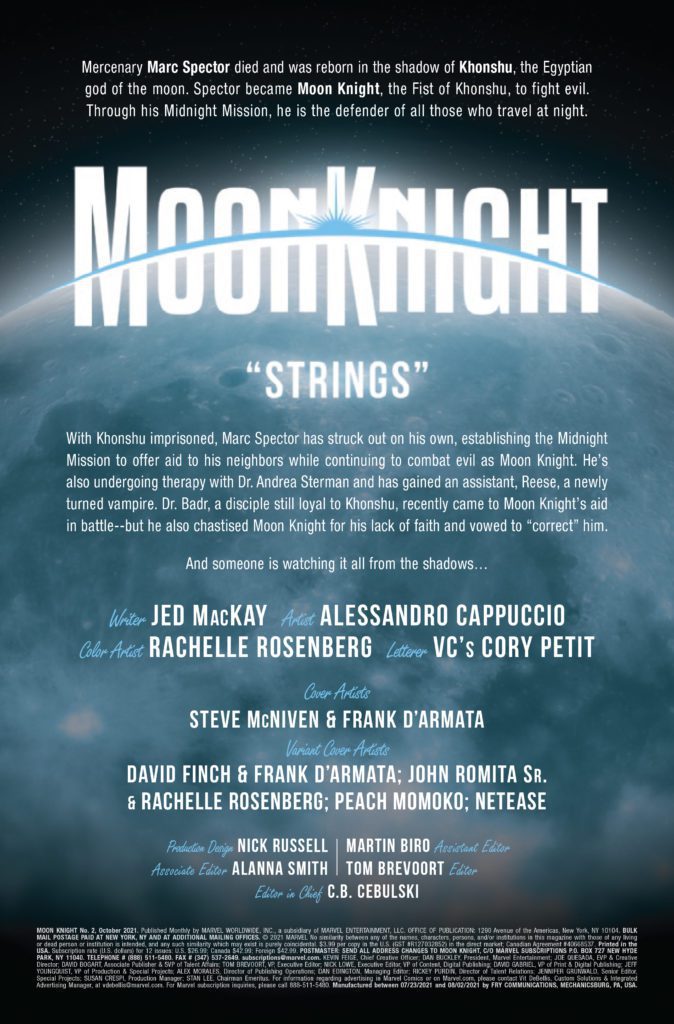
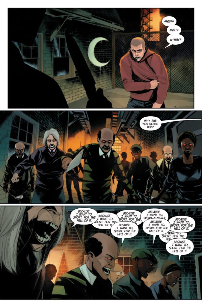
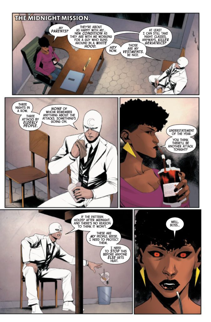
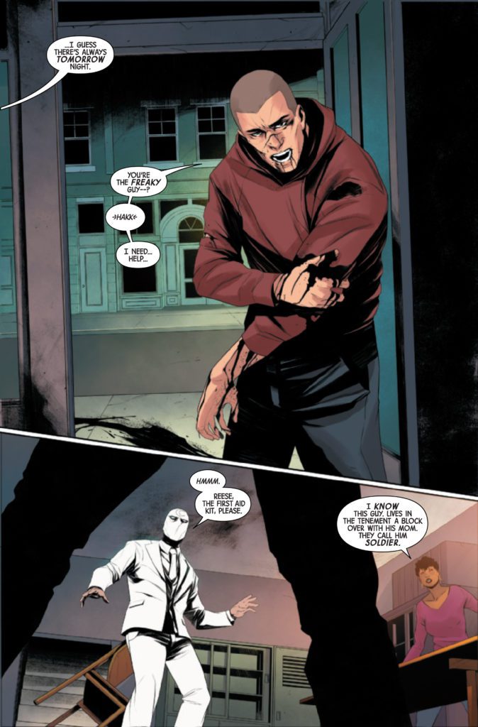
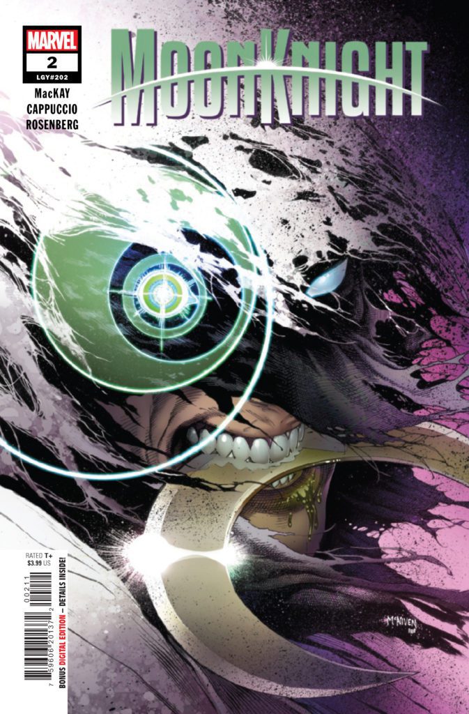
MOON KNIGHT #2 hits your local comic book store August 18th, but thanks to Marvel Comics, Monkeys Fighting Robots has an exclusive four-page preview for you.
About the issue: Moon Knight has established his territory, and the people within it are under the protection of his Midnight Mission. But what happens when those very people are turned into weapons against him? When gangs of elderly residents leave a trail of bizarre violence, Moon Knight must put his body, mind and very soul on the line to get to the bottom of it.
The issue is by writer Jed MacKay and artist Alessandro Cappuccio, with colors by Rachelle Rosenberg, and letters by Cory Petit. The main cover is by Steve McNiven and Frank D’Armata.
MOON KNIGHT is currently being developed as a TV series for Disney+, starring Oscar Isaac as Marc Spector. It will be part of Phase Four of the MCU.
Check out the MOON KNIGHT #2 preview below:
Are you digging the new MOON KNIGHT run? Sound off in the comments!


 Kyle Higgins made the first arc of the series’ an unforgettable beginning, and he’s on track to make this second arc just as high-quality. Radiant Black #7 shares many aspects that made the previous issues so great, such as light-hearted dialogue and glimpses of the larger world we have yet to explore. The dialogue becomes especially important as we meet new characters, and the jokes and quirky things they say both humanize and endear them to the reader. This issue introduces us to new elements of the world but brushes them aside as they are not vital to the immediate story. This keeps readers engaged as they wonder when all these questions that are arising will be resolved.
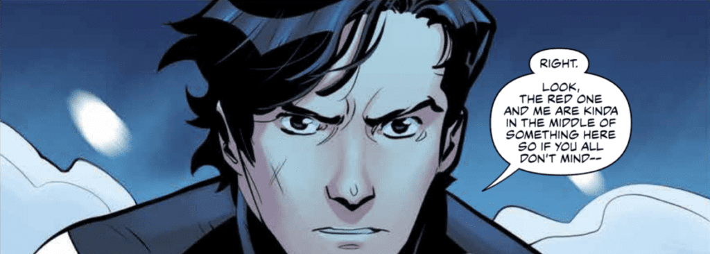


")