Home Blog Page 140

Kickstarter Advance Review: Massive Mythology & Sci-Fi Action In JACIN AND THE OLYMPIANS

From writer Shayne Berryhill (Chance Fortune and the Outlaws) and artist Mattia Monaco, and co-created by Alex Ogle and colorist Maja Opac, comes an all-audiences friendly Kickstarter graphic novel of massive proportions. Jacin And The Olympians is an immensely ambitious and entertaining read with tons of lore and infectious energy. With outstanding visuals and an intriguing setup, Jacin and the Olympians will be the Kickstarter to back before its release.

“In the near future, the titans of myth return, revealing the dark, alien truth behind their legend. The remnants of humanity escape aboard the Olympia, a spacefaring ark. Now, teen prodigy Jacin Mukai and her fellow Olympians search for a way to activate the robot Colossi, hoping to unite them to create their one hope for survival against the titan menace–the giant robot protector, Talos.”

*Critic’s Note*

I received a preview version of Jacin from the author. While it is a solid representation of what the graphic novel will be, it is not a finished product. I intend to appraise this book based on what I’ve seen and give my opinion on its current quality and how entertaining the finished product will be.

Writing & Plot

What Shayne Berryhill and Alex Ogle have created here feels like a mixture of a YA novel and a Toonami-era anime. Jacin and the Olympians’s opening sequence is exhilarating and is a familiar yet engaging introduction to the world and stakes. The fusion of Greek mythology and sci-fi/space opera is a delightful new experience. Jacin herself is a great young protagonist. Berryhill takes many of the gifted child tropes and throws them in a blender to craft a driven mad-genius of a teenage hero.

The Percy Jackson meets Star Wars meets Voltron feel emanates through every aspect of this book’s writing. This creates a couple of problems. First, there is a massive amount of lore and backstory that the reader is just thrown into. Second, each segment of the book was separated by an unspecified time jump that introduces new characters and concepts with no introduction. Again though, I received an unfinished preview version. This could easily just be an issue only I ever see. Regardless, the unique blending of mediums and styles keep this a delightful read on the storytelling side.

Art Direction

The most obvious draw upon first glance at Jacin And The Olympians is the incredible artwork. Mattia Monaco and Maja Opac create a visual experience that is stunningly detailed and energetic. Monaco’s pencils are reminiscent of the likes of James Stokoe or Daniel Warren Johnson. There’s an obvious manga/anime influence in his work. This makes itself especially apparent in his character and environmental designs. Every surface is laden with crosshatching, which gives it that 80’s worn future aesthetic. This is not to say that Monaco’s work is purely manga inspired. On the contrary, it’s a perfect fusion of eastern influences and western art direction.

Monaco’s character designs are intricately drawn love-letters to this comic’s named influences while still staying unique to this story. The massive blend of mythologic and space opera visuals are neatly tied together by the artistic vision. Monaco fuses 80’s-esque geometric designs with elements indescribably alien. His characters are expressive and all uniquely drawn in a way that will make them instantly recognizable in a crowded panel.

While much of the preview I received wasn’t colored yet, there was enough work completed that I can honestly say Maja Opac’s work here is equally spectacular. She matches Monaco’s aesthetic language by utilizing a dark vaporwave styles color palette. There are dark pinks and purples on almost every panel, punctuated by darkness. This creates the almost inescapable feeling of claustrophobia when living on a spaceship. This is interrupted however by the brightness the characters bring. Jacin herself is a sort of unspoken beacon of hope and progress. She lights up every panel she’s in. This could be a totally accidental effect, but regardless it is a delightful detail. This graphic novel has an infectious visual energy that is worth the price of admission on its own.

Verdict

Jacin And The Olympians is a unique and immensely enjoyable graphic novel. Shayne Berryhill and Alex Ogle have crafted a story that anyone can enjoy. This comic takes concepts from mythology and timeless space operas, wraps them in a Saturday morning cartoon and manga wrapper and succeeds in spades. The visuals from Mattia Monaco and Maja Opac are full of thoughtful detail and booming energy. This is a Kickstarter well worth backing, so make a pledge by September 12 to reserve a copy!

Monkeys Fighting Robots Youtube

Best Fictional Gambling Games from Film and TV

Sabacc in Star Wars

Gambling has been a popular source of entertainment in the real world for years, with fans enjoying everything from Canada casino games to wagering on sports. The industry has also managed to make its way into fiction through numerous TV shows and films, which have also inspired more interesting titles. Here are some great fictional gambling games that you might see in different films and television shows.

Triad in Battlestar Galactica

Battlestar Galactica is among the best sci-fi TV shows of all time. The show is about a battleship “the Battlestar Galactica” and a spacecraft carrier searching for a new home for the last 50,000 humans surviving after a devastating nuclear attack from a cybernetic race known as Cyclones.

Triad is the game played by the Battlestar crew and the other survivors on the ship. The game features a 52-card deck with numbers and suits, which makes it similar to poker. However, the highest winning hand in Triad is “Full Colours” and it uses hexagonal cards.

Poker in In Time

“In Time” is another interesting sci-fi movie, where time is used as the currency and everyone has an individual clock to count to their death. In this film, Justin Timberlake (Will Salas) visits a casino where he wins a millennium in time, greatly extending his life. The movie only shows the part where Will plays against the ultra-rich Philippe Weiss, although the hand is a bit preposterous – even by movie standards.

Sabacc in Star Wars

When it comes to popular sci-fi gambling games, Sabacc remains largely unmatched. The game is widely referred to in the Star Wars franchise and it’s thanks to this epic game that Han Solo managed to get the Millenium Falcon when playing against Lando Calrissian.

Looking at how the game works, you can tell that sabacc is incredibly similar to blackjack. The game features 76 cards, with 60 distributed evenly across four suits and 16 special cards, each with numerical values. To win, the player must get a total of 23, when the value of their cards is added up or be as close as possible with exceeding the number.

Dabo in Star Trek

To date, Star Trek remains among the most popular science fiction TV shows, expanding to other media, including video games, films, comics and more. Dabo is quite popular in the Star Trek universe and it’s evident that the game is highly inspired by roulette. The game features multiple reels with various slots and the winner has to shout “Dabo!”.

Hunger Games Sports Betting

While it’s quite normal for people to bet on boxing, martial arts, football and other sports, the “Hunger Games” movie features another type of betting. This action-packed movie features a scene where the viewers of the “Hunger Games” wager on the death or survival of the participants. However, the implementation of this gambling scene in the movie has great attention to detail.

Conclusion

Mixing gambling and movies is an extremely popular crossover that has worked many times, helping to achieve huge success in the entertainment sector. The awesome environment and the thrill of casinos is a great opportunity for movie producers to add while creating films, whether it’s sci-fi, action or romances.

Monkeys Fighting Robots Youtube

Marvel Comics Exclusive Preview: UNITED STATES OF CAPTAIN AMERICA #3

marvel comics exclusive preview united states of captain america #3

THE UNITED STATES OF CAPTAIN AMERICA #3 hits your local comic book store August 25th, but thanks to Marvel Comics, Monkeys Fighting Robots has an exclusive four-page preview for you.

About the issue:
The shield thief targets a cultural landmark in Kansas, hoping to put a permanent stain on Captain America’s image. Sam and Steve are hot on his trail — and aided by Joe Gomez, the Kickapoo Tribe’s own Captain America! But there’s more to the thief’s agenda than meets the eye. Are the three Caps headed straight into a trap? And do they have any other choice?

The issue has two stories in it: The first story is by writer Christopher Cantwell and artist Dale Eaglesham, while the second story is by writer Darcie Little Badger, penciller David Cutler, and inker Roberto Poggi. Both stories are colored by Matt Milla and lettered by Joe Caramagna. The cover is by Alex Ross.

Marvel is celebrating Captain America’s 80th anniversary with this series, showcasing Steve Rodgers, Sam Wilson, and five new characters who have taken up the Cap mantle to protect their communities. Cantwell and Eaglesham take the lead on the series, while a rotating team of creators is telling the stories of the new Captains.

Check out the THE UNITED STATES OF CAPTAIN AMERICA #3 preview below:

marvel comics exclusive preview united states of captain america #3

marvel comics exclusive preview united states of captain america #3

marvel comics exclusive preview united states of captain america #3

marvel comics exclusive preview united states of captain america #3

marvel comics exclusive preview united states of captain america #3

marvel comics exclusive preview united states of captain america #3


Are you reading THE UNITED STATES OF CAPTAIN AMERICA? Sound off in the comments!

Monkeys Fighting Robots Youtube

AfterShock Comics Exclusive Preview: GIRLS OF DIMENSION 13 #5

aftershock comics exclusive preview girls of dimension 13

GIRLS OF DIMENSION 13 #5 hits your local comic book store August 25th, but thanks to AfterShock Comics, Monkeys Fighting Robots has an exclusive four-page preview for you.

About the issue:
The dimensional war comes to a head as Abby and the girls face off against Abraxis and his army of demons, with 13 universes in the balance! Can the girls prevail against these odds? Perhaps with a little help from their friends…

The series is by writer Graham Nolan and artist Bret Blevins, with colors by Gregory Wright, and letters by Carlos M. Mangual. The cover is by Blevins and Wright.

Check out the GIRLS OF DIMENSION 13 #5 preview below:

aftershock comics exclusive preview girls of dimension 13

aftershock comics exclusive preview girls of dimension 13

aftershock comics exclusive preview girls of dimension 13

aftershock comics exclusive preview girls of dimension 13

aftershock comics exclusive preview girls of dimension 13

aftershock comics exclusive preview girls of dimension 13


Are you reading GIRLS OF DIMENSION 13? Sound off in the comments!

Monkeys Fighting Robots Youtube

Review: Visually Stunning Neo-Noir In SECOND CHANCES #1

Writer Ricky Mammone and artist Max Bertolini team up for a heavy dose of neo-noir action in Second Chances #1. With DC Hopkins on letters, this first issue debuts a generic but entertaining plot and bolsters it through sheer stylistic drive. With solid narration and outstanding visuals, Second Chances is off to a damn good start.

“Second Chances Hotline—call now and get a new identity! All you need is some cash, a proper referral, and a very good reason to start over. When Leblanc, the man behind the hotline, is approached by a shady figure from his past, he’s forced to accept a new client who doesn’t meet any of the requirements—a client with chemically induced amnesia in desperate need of protection.”

Writing & Plot

The script for Second Chances #1 is a good example of taking a well-worn concept and dusting it off well enough to keep it engaging. Ricky Mammone’s script isn’t going to surprise any neo-noir fans. The entire “second chance at life” fixer angle in a crime story isn’t new. However, there are some refreshing elements that keep this story exciting. Mammone glosses over Leblanc’s life and past, making for true noir goodness. His story interweaves with the b-plot following our main secondary character (no spoilers). The overall plot development is well-conducted and makes the audience do a bit of headwork to make sense of events.

Mammone manages to take predictable plot beats and make them engaging enough to stay intrigued. Stylistically, he knows how to let the art speak. There are numerous moments where the script just lets the visuals do the storytelling via good direction. Mammone’s external and internal dialogue uses just the right amount of genre-influenced and stylized cheese to really sell the noir experience. This script won’t be breaking any boundaries in the genre but it’s a fun enough ride to keep things interesting.

Art Direction

The real selling point for Second Chances #1 is the astounding visual work from Max Bertolini. The artist’s heavily inked black and white panels are stunning and atmospheric, making for the perfect setting to place this noir tale in. Bertolini immaculately crafts details with almost labyrinthine precision. You can get lost in the penciling and inking done on every page. Character designs and animations are all unique and instantly recognizable. Each person is designed with striking features, such as Leblanc’s hair or some mysterious hitwoman’s tattoos.

The city environments look incredible and threatening. Bertolini takes a classic noir design mechanic by making the urban environment look actively menacing. The action sequences are phenomenal as well, with character movement and gunfire exploding through the panels with kinetic force. The lettering from DC Hopkins fit the noir atmosphere perfectly as well. His italicized, rough font reads like you would imagine noir dialogue to sound, like it’s coming from a 1940 microphone. The entire visual experience of this comic is outstanding.

Verdict

Second Chances #1 is written well and beautifully drawn. Ricky Mammone’s script is entertaining and well paced, doing just enough to keep itself separated from the neo-noir genre. Max Bertolini’s visuals are gorgeous, with some of the most striking art seen in any comic this year. Be sure to pick up this comic when it hits shelves on 8/18!

Monkeys Fighting Robots Youtube

Review: BLACK HAMMER: VISIONS #7 Struggles to Make Sense

Black Hammer Castellucci Dark Horse

Dark Horse’s Black Hammer: Visions #7 has a brilliant message at its core. Unfortunately, the whole issue gets muddied by a lot of confusing meta devices, and ends up not making a ton of sense. That said, it’s hard to fault writer Cecil Castellucci, artist Melissa Duffy, colorist Bill Crabtree, and letterer Nate Piekos for this issue falling flat. That’s because this issue revisits one of the very few moments from Black Hammer that just didn’t work. So, to really talk about why this issue struggles to deliver, we need to take a little detour and talk about why it didn’t work the first time, in Black Hammer: Age of Doom #6 & 7, a two-parter I’ve come to refer to as Black Hammer‘s “Limbo arc.”

All the Way Back in Black Hammer: Age of Doom #6 & 7…

There was a lot to love about the “Limbo arc” in Black Hammer: Age of Doom. Not only did writer Jeff Lemire, and guest artist Rich Tommaso, create a brilliant cast of “forgotten characters,” but they got to joyfully employ old, cheesy narrative devices. It was a taste of retro comics with a twist. A huge influence on the arc, it seems, was Grant Morrison’s Animal Man. But unlike the jaw-dropping finale to Animal Man, the “Limbo arc” ended on a note that was just… silly.

Black Hammer Castellucci Dark Horse
From BLACK HAMMER: AGE OF DOOM #7. A meta device ought to add to the story being told in one of two ways: it should bring real life into the comic book world in a literal or figurative way.

Escaping Limbo finally, Colonel Weird, Inspector Insector, and Golden Goose climb out of Jeff Lemire’s ear. Lemire, as a character in the issue, stands on a barren landscape. Pink clouds cover his face and he’s standing shoulder to shoulder with a whole slew of other writers/artists. It seems that Lemire wanted the meta twist that happened in Animal Man for Black Hammer. But unlike Animal Man, the seeds had not been sown. This twist came out of left field. And even worse, it wasn’t actually very meta. Lemire didn’t write himself into the comic as he actually is. He was a statue, there as some confusing plot device but nothing more. The meta commentary was lost in the details. Lemire appeared as the silent “Creator” and had nothing else to offer the story.

The very purpose of a meta device is to say something about reality. That’s what makes something meta in the first place. But this issue had nothing to say in a literal sense — the appearance of the creators wasn’t realistic enough to — and it has nothing metaphorical to say beyond “creators create.”

Black Hammer Castellucci Dark Horse
From BLACK HAMMER: AGE OF DOOM #7. Not only is this scene too strange to take literally — clearly creators don’t stand around in clouds like this — but it has nothing figurative to offer the story beyond “creators create art.” Seems like an obvious point.

Writing

Black Hammer: Visions #7 inherits all the weaknesses of its predecessor. The meta commentary is garbled and confusing. Not only does Castellucci employ far too many “meta” devices — characters refer to “call sheets” and “communicators” through which they’ll be “called up to the main story,” characters rip through pages and dodge pens, writers and artists show up among the characters with inkblots for faces, the giant eyes of creators look through windows — but the devices used often don’t feel like they have a literal or figurative meaning. It also complicates some of the existing stories we already know. Golden Gail is seen pulling back a page and addressing a writer, yet nothing about her character in any other appearance suggests she knows she’s a comic book character.

That said, Castellucci still manages to make a point with this issue. Black Hammer: Visions #7 is about being underestimated. It’s about what someone is capable of when no one else believes in them. It even seems to be about glass ceilings and misogyny. Though the vast majority of the characters in this issue are women, it’s hard not to notice that our main character, Ms. Moonbeam, is a woman who is punished for her ambition. She’s created to be a refrigerator woman. It’s a brilliant commentary that’s hidden in what is unfortunately an overstuffed and confusing script. But much of that was simply inherited.

Black Hammer Castellucci Dark Horse

Art

Duffy’s art style often feels messy and scribbled onto the page. Sometimes, this effect works perfectly. When a giant being comes out of a portal to Hell, Duffy’s design is exactly what is called for. But in characters like Grizzly and Golden Gail, their style sometimes feels like a couple drafts from being complete. It’s entirely possible, though, that that is part of the point. For one thing, this is an issue about early drafts of comics. And Duffy’s art evolves in this issue. They begin by showing Ms. Moonbeam in panel that looks a little rushed. But by the end of the issue, she looks fully formed. Moonbeam’s outlines are neat, her proportions are right. She becomes a real comic book character.

Coloring

It’s not surprising that a comic with a character like Ms. Moonbeam would be so colorful. But Crabtree really plays with that concept. For one thing, when we first see Moonbeam, she’s experiencing the most relevant moment of her life. Colors swirl around her and she looks alive. Then, as she and the other inhabitants of limbo discuss it for years and years, trying to hold onto the relevance they felt, the table and walls around them fade more and more. Moonbeam’s life becomes rather monochromatic, until her explosive return to reality.

Lettering

Piekos’ letters are brilliantly done. As Inspector Insector and Ms. Moonbeam discuss their time with Colonel Weird, something occurs to Moonbeam. Insector describes what a big part he played and how he’ll surely be part of the main story soon. But, in small lettering, Moonbeam simply says “It was a cameo.” The font size tells us she says it more to herself than anything else, telling us so much about her self-worth in that moment. And later, when she auditions for a group of creators, Piekos lays out the steps across the page. The little labels for each of them look like they’re written on a typewriter, reminding us again that Moonbeam is a comic book character and nothing more.

Black Hammer Castellucci Dark Horse


Dark Horse’s Black Hammer: Visions #7 is a difficult read. It retreads the rockiest part of Black Hammer‘s history, and has no more luck making any sense of it. Despite all of this, this creative team does manage to say something worthwhile with this issue. Their meditation on glass ceilings and refrigerator women hits its mark. Unfortunately, it has to dodge a lot of clunky “meta” devices in order to get there. Pick up Black Hammer: Visions #7, out from Dark Horse August 18th, at a comic shop near you!

Monkeys Fighting Robots Youtube

Review: X-O MANOWAR #5 – The Quiet Start of Something New

X-O Manowar #5 Cover

X-O Manowar #5, from Valiant Entertainment, comes to comic stores on August 18th. Writer Dennis Hopeless begins a new story arc after lots of build up in previous issues. Penciler Emilio Laiso continues to provide out of this world imagery. Most of which would go unnoticed if not for inker Raffaele Forte. Colorist Ruth Redmond, meanwhile, provides the atmospheric mood. Finally, letterer Hassan Otsmane-Elhaou showcases sound effects in dedication to every action.

Background

X-O Manowar #5 recap page
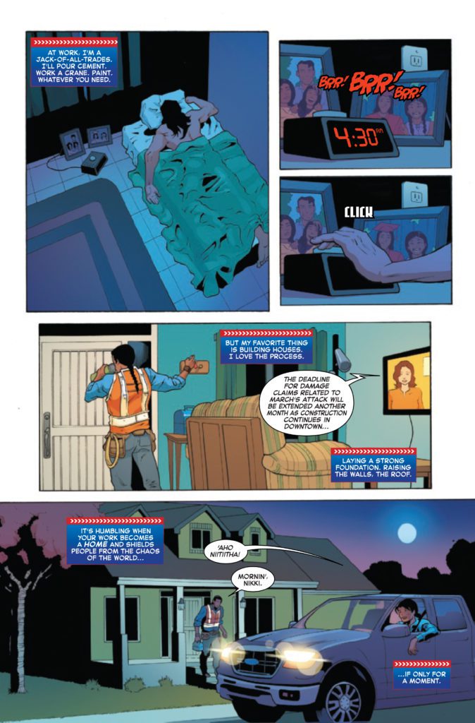
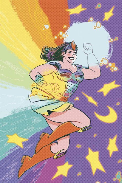
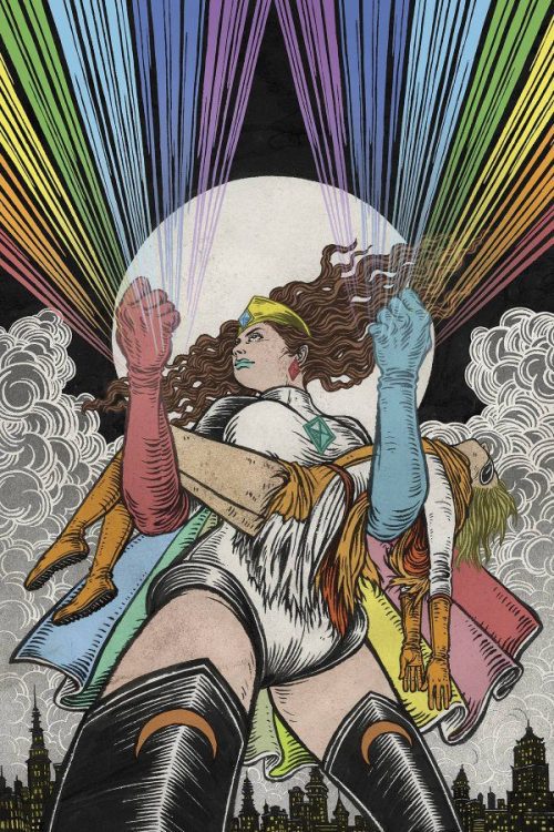
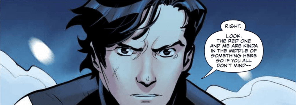
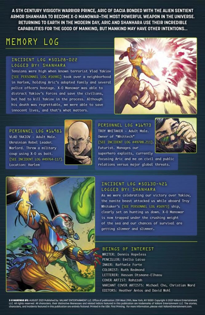
Aric of Dacia (a.k.a. X-O Manowar) works alongside tech billionaire Troy Whitaker to keep his image positive. While Aric can handle warlords, he struggles against the press and hyper intelligent nanites.

X-O Manowar #5: Keeping The Suspense Constant

After such a long hiatus, Hopeless opens X-O Manowar #5 with all the suspense from the last issue. Aric is vulnerable with his armor, Shanhara, stuck in hibernation. So, Troy has to fill in the role of Aric’s guide. Thankfully, Troy opens up a little more as a character. He becomes more than just the eccentric billionaire archetype. Troy believes in Aric and Shanhara’s potential as heroes to overcome the nanite goop that’s been attacking them all. Because, apparently, Shanhara is the only threat to this technological singularity.Aric getting close to Hopeless

Sliding Scales Of Anticipation

Every artist in X-O Manowar #5 adds a significant layer of scale to the plot. The pencils by Laiso create scenarios where characters like Aric look so small, the weight of the situation could crush him. If not for the inking by Forte outlining Aric’s hand, readers might not even notice his vulnerable position under the nanite swarm. That includes the coloring by Redmond where the blue elements of Aric’s costume blend together with the background, except for the yellow pieces that help highlight his outline.

X-O Manowar #5 best lettering
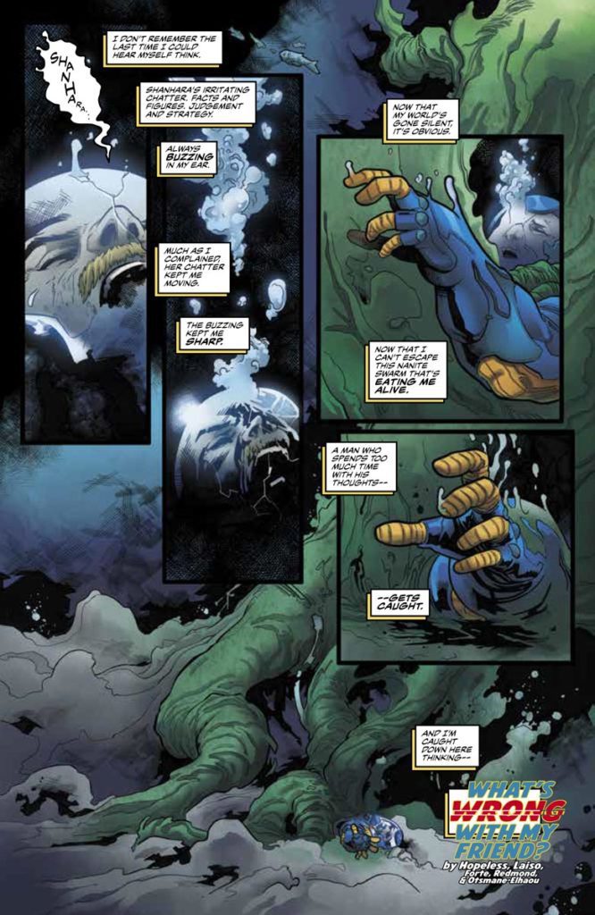
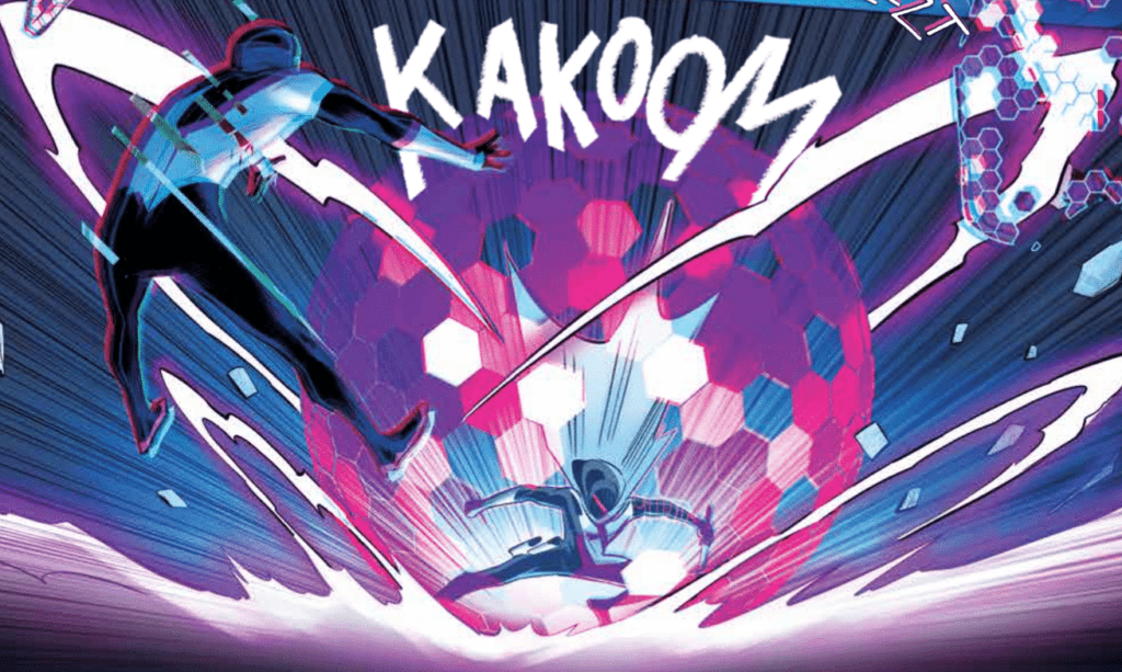
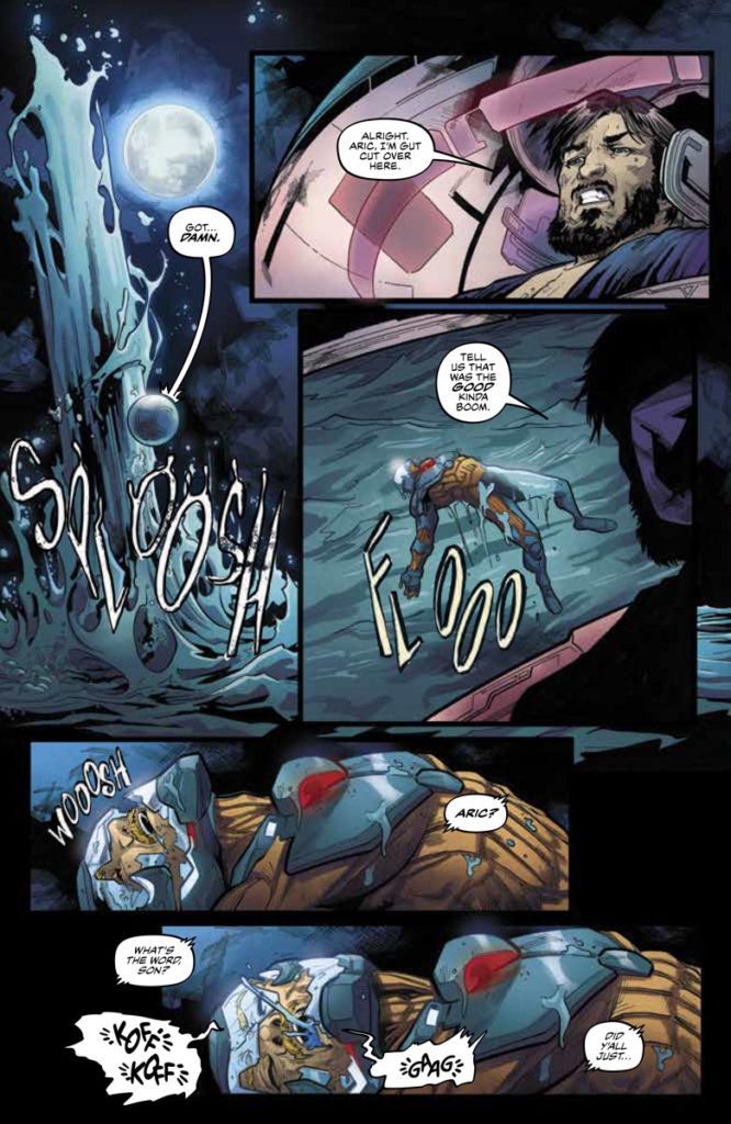
As for Otsmane-Elhaou’s lettering in X-O Manowar #5 gives every action twice as much life. Otsmane-Elhaou designs the word balloons with effects where regular talk features the standard round shapes, with occasional decorations like electric ripples. Other times, more chaotic sounds like coughing are shown in distorted word balloons with fonts and words out of place. But even these pale in comparison to the tailored illustrations of sound effects with exaggerated lengths and size. All of which emphasize the actions taking place to an absurd degree.

Check Back In For X-O Manowar #5

X-O Manowar #5 sets the stage for a science-fiction epic with artistic suspense. Each bit of art adds levels of excitement ready to engage readers for issues to come. In all consideration, it was well worth the wait for this new chapter.

Monkeys Fighting Robots Youtube

Review: BERMUDA #2 – The Colorfully Detailed World Of Pirates

Bermuda #2 Cover

Bermuda #2, from IDW Publishing, comes to comic stores on August 18th. Writer and letterer John Layman slows the pace of the plot to allow the reader to experience Bermuda’s setting. With artist Nick Bradshaw, every page is filled with lively images that tell their own stories. All while colorist Len O’Grady makes a few plot-related elements stand out.

Background

Bermuda tells the story of the titular adventurer, named after the very region she lives in. Exotic things like giant ridable lizards are normal for her; but an actual adventure to rescue a castaway’s sister is something she wants no part of.

Bermuda #2 Swashbucklers Galore

Bermuda #2 puts a little more focus on Layman’s world. The opening gives readers an idea of the setting. The island in the Bermuda Triangle holds the potential for adventure all around. There’s even an ensemble of pirates in a very long rivalry with another crew, a rivalry about who can make better alcohol. But with not enough time to enjoy this part of the triangle, the issue takes the time to capture imaginations with the next issue’s antagonists. Because not even the cutthroats want to mess with some magic fish people who possess a language Layman decorates with special symbols and black word balloons.

Bermuda IDW

Mapping The Triangle

Bermuda #2 has Bradshaw showcase some campy characteristics for memorable moments. All of the elements of a pirate fantasy are on display: peg legs, a town made of recycled pirate ships, and even some trained monkeys. For such a short appearance, everything in this issue will not be so easily forgotten.

With all of the activity going on in Bermuda #2, both Bradshaw and O’Grady take measures to keep the reader’s attention. Bradshaw employs bolder outlines around characters who move the plot forward. But perhaps it is O’Grady’s use of the color red that makes the most progress. Most of the pirates who wear a darker red push the plot around, with the brighter red colors making the most significant contributions. That’s why the brightly red-haired Bermuda is able to overcome them in plot relevance.


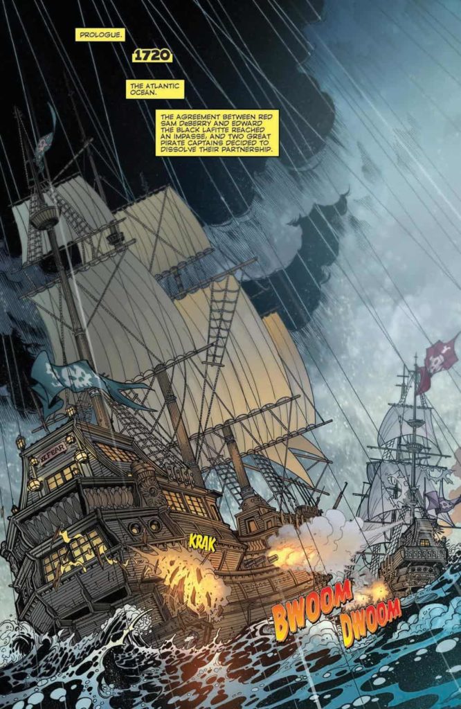
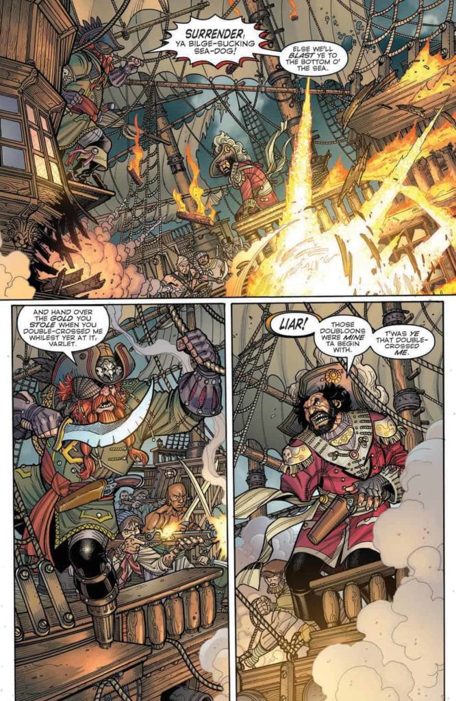
Have A Taste of Bermuda #2

Bermuda #2 gives readers a glimpse into a larger world, enough for readers to become more curious. No space is wasted in getting the reader’s attention with a sense of culture and adventure. With more to come, readers are sure to want the next issue even more.

Monkeys Fighting Robots Youtube

Review: RADIANT BLACK #7 – Everything is Coming Together

Radiant Black #7 Cover

Radiant Black #7, out today from Image Comics, marks the beginning of the series’ second arc and begins to show us what this series is all about.

Radiant Black #7 Art ExampleKyle Higgins made the first arc of the series’ an unforgettable beginning, and he’s on track to make this second arc just as high-quality. Radiant Black #7 shares many aspects that made the previous issues so great, such as light-hearted dialogue and glimpses of the larger world we have yet to explore. The dialogue becomes especially important as we meet new characters, and the jokes and quirky things they say both humanize and endear them to the reader. This issue introduces us to new elements of the world but brushes them aside as they are not vital to the immediate story. This keeps readers engaged as they wonder when all these questions that are arising will be resolved.

Radiant Black #7 Story Example

Radiant Black #7 is full of fast-paced action, which allows Marcelo Costa to show off. The issue is full of breathtaking spreads that highlight Costa’s incredible abilities. He utilizes techniques such as action lines and blurring a figure to show the intense speed and energy of the fights in the issue. This is all without talking about the incredible designs of the newly introduced characters, which are all as iconic as superheroes that have stuck around since the Silver Age.

Natália Marques does a fantastic job of making the fights stand out in Radiant Black #7. The issue’s color palette is also extremely broad and bright, making the reading experience seem more fun than dramatic, which is a nice change of pace since this is the first issue that isn’t addressing intense emotional conflicts. Marques also does a phenomenal job of coloring space when it’s a backdrop. Space in the issue is much more than a black void, and is full of the greens and blues that you would see if you were looking at images from a satellite.

Radiant Black #7 Color and Lettering Example

Radiant Black #7 features some fantastic lettering that provides in-depth detail into how the characters speak. Becca Carey will make a word bold or give a red outline on a speech bubble to add emphasis to specific phrases, but she will also use less common techniques such as changing the shape of part of a speech bubble to show a change in the line delivery. The font choices for the sound effects do a splendid job of capturing the intensity of the battle, and Carey provides excellent lettering all around for the issue.

Radiant Black #7 is a start to the new arc that will not disappoint and retains the fun and engaging feel that has made the series so enjoyable to read in the first place. If you enjoyed the first arc, you will not want to miss this issue, where the series begins to come together into the Power-Rangers-like experience we were promised. Pick up Radiant Black #7, out from Image Comics August 18th, at a comic shop near you!

Monkeys Fighting Robots Youtube

BOOM! Studios Exclusive First Look: SEVEN SECRETS #12

boom! studios exclusive preview comics seven secrets

SEVEN SECRETS #12 hits your local comic book store September 15th, but thanks to BOOM! Studios, Monkeys Fighting Robots has an exclusive five-page preview for you.

About the issue:
A dangerously close encounter with Amon leaves Caspar shaken to the core. With the
Order divided and at a disadvantage, will the traitor finally accomplish their mission from
within? One thing is for certain, it will bring them one step closer to exposing the
remaining Secrets and nothing will ever be the same…

SEVEN SECRETS #12 is by writer Tom Taylor and artist Daniele di
Nicuolo, with colors by Walter Baiamonte (with assistance by Katia Ranalli), and letters by Ed Dukeshire. The main cover is by di Nicuolo, with variant covers by Toni Infante and Miguel Mercado.

Check out the SEVEN SECRETS #12 preview below:

boom! studios exclusive preview comics seven secrets

boom! studios exclusive preview comics seven secrets

boom! studios exclusive preview comics seven secrets

boom! studios exclusive preview comics seven secrets

boom! studios exclusive preview comics seven secrets

boom! studios exclusive preview comics seven secrets

boom! studios exclusive preview comics seven secrets

boom! studios exclusive preview comics seven secrets


Are you reading SEVEN SECRETS? Sound off in the comments!

Monkeys Fighting Robots Youtube