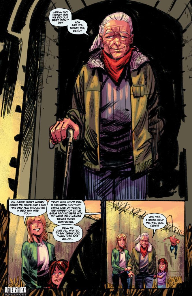
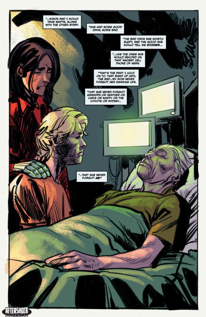
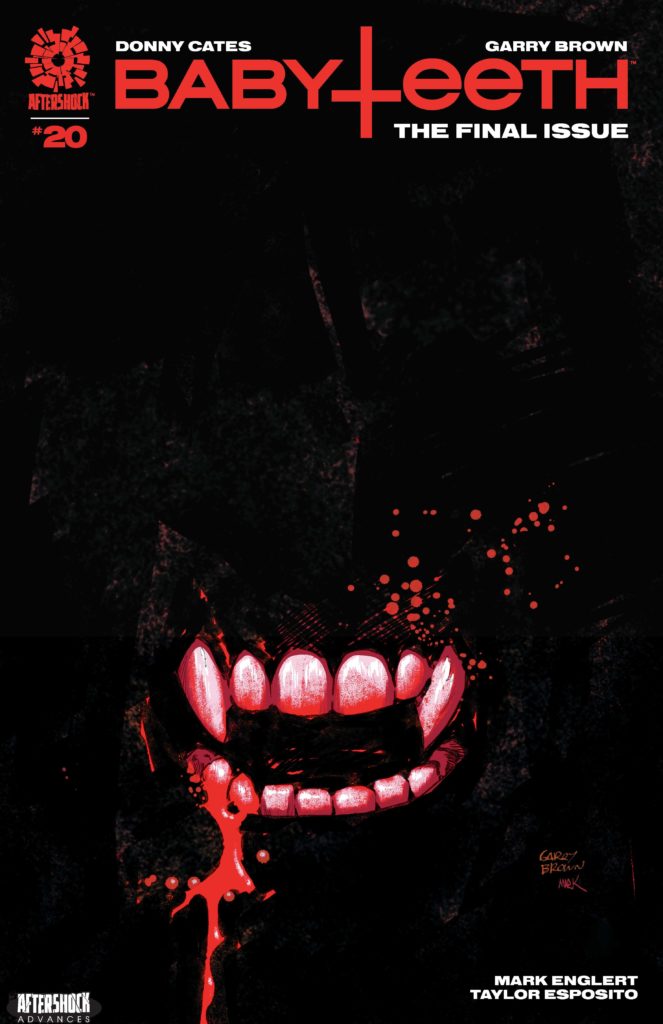
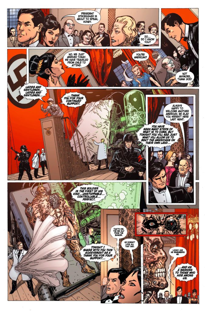
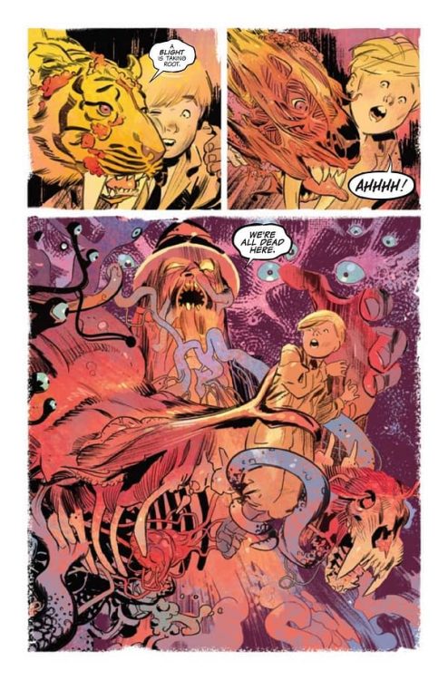
BABYTEETH #20 hits your local comic book store September 22nd, but thanks to AfterShock Comics, Monkeys Fighting Robots has an exclusive four-page preview for you.
About the issue: Everything ends. Sadie prepares her son to meet his maker. Can the apocalypse be called off?
Stay tuned for the exciting climax to BABYTEETH!
The series is by writer Donny Cates and artist Garry Brown, with colors by Mark Englert, and letters by Taylor Esposito. The cover is by Brown and Englert.
Issue #20 marks the series finale of BABYTEETH, which launched in 2017. It’s the story of Sadie Ritter, a teenage mother whose baby turns out to be the antichrist. Their journey is an epic quest full of action, hellfire, and demon raccoons. If you haven’t read it yet, we highly recommend you pick it up and read it in its entirety now that it’s concluding.
Check out the BABYTEETH #20 preview below:
Have you been reading BABYTEETH from the start? Sound off in the comments!
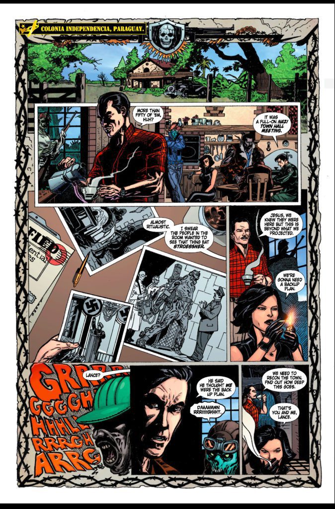
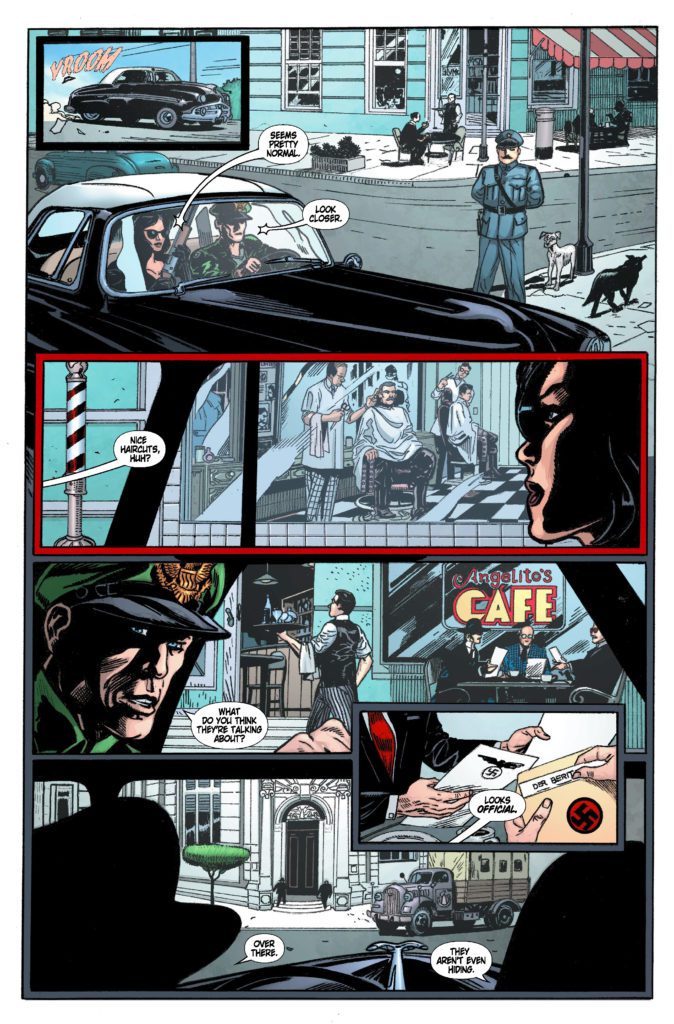
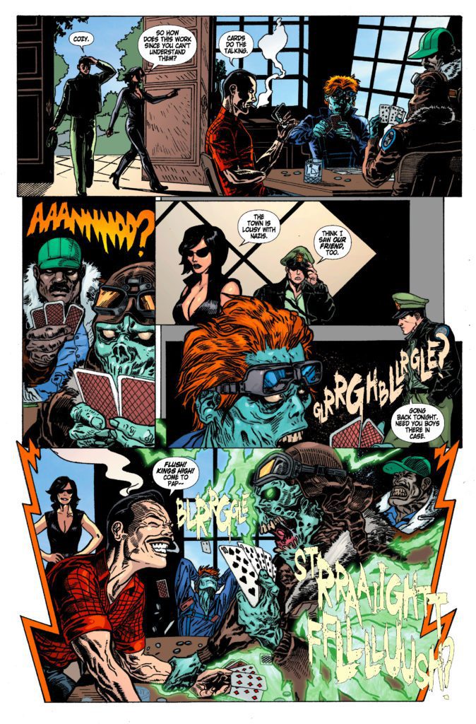
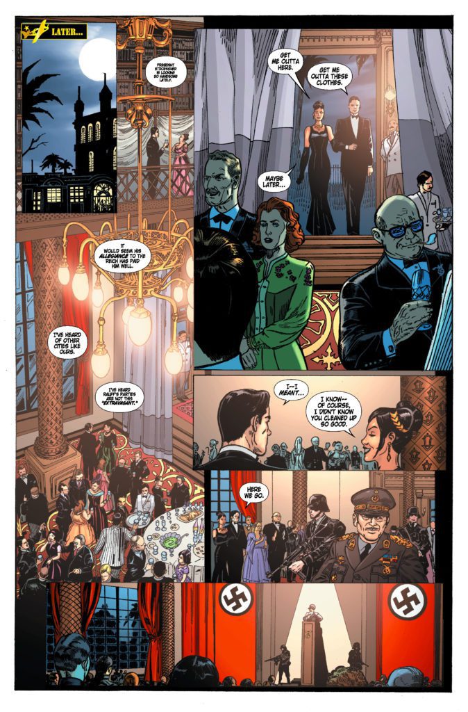
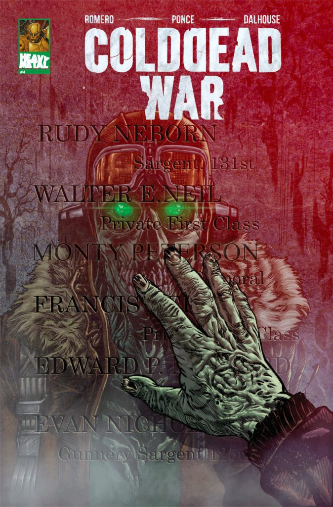
COLD DEAD WAR #4 is out September 22nd at your local comic shop, but thanks to Heavy Metal, Monkeys Fighting Robots has an exclusive six-page preview for you!
About the issue: It’s the last stand of The Cold Dead—America’s covert zombie pilot squad—as a mission to infiltrate a Nazi stronghold goes sideways, and nothing less than worldwide freedom and liberty are at stake. Live forever! Never say die!
COLD DEAD WAR #4 is written by filmmaker George C. Romero, with pencils by artist German Ponce, inks by Gabriel Rearte, colors by Andrew Dalhouse, and letters by Saida Temofonte. Romero is the son of George A. Romero, creator of Night of the Living Dead.
Check out the COLD DEAD WAR #4 preview below:
Are you reading COLD DEAD WAR? Sound off in the comments!
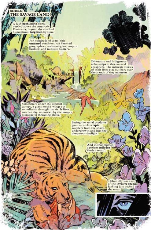
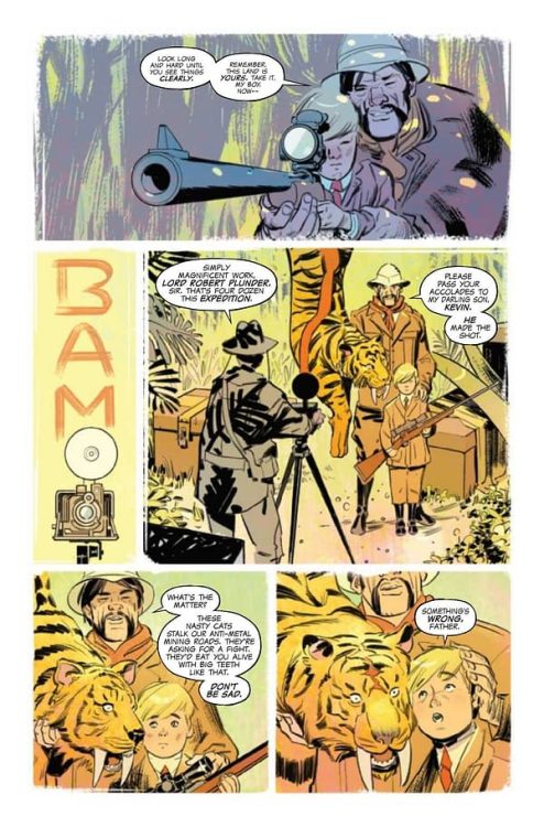
From writer Zac Thompson (Yondu, Undone By Blood) and artist German Garcia comes a return to Marvel’s land lost in time with Ka-Zar: Lord Of The Savage Land #1. This opening chapter reintroduces us to the lore and characters within this classic setting while mixing in some welcome new additions. With compelling character conflicts, phenomenal action, and stunning visuals, this will be the next Marvel series to keep an eye on.
“KA-ZAR IS BACK FROM THE DEAD — WITH A WHOLE NEW TERRIFYING SET OF POWERS! The alien Cotati murdered him. The Savage Land brought him back. Lord Plunder has returned — with a vastly new perspective! Now united with Shanna the She-Devil in a mystical merging of life energies, Ka-Zar has new abilities, new needs…and new enemies. An ancient evil has surfaced in the Savage Land — one that is rapidly reshaping the forgotten world and its inhabitants. Ka-Zar and Shanna must fight together to protect their home and family! But their son Matthew has plans of his own…”
Writing & Plot
Writer Zac Thompson presents us with this present-day prehistoric tale in smart fashion in Ka-Zar: Lord Of The Savage Land #1. Our titular character – a.k.a. Kevin Plunder, has recently returned from the dead and is rediscovering himself and his connection to the Savage Land. This is a smart move for those unfamiliar with the Ka-Zar character and this classic setting. Thompson maintains the classic Lee and Kirby sense of discovery and adventure alive, while introducing more contemporary writing elements.
This comic still retains some elements of the 30’s pulp adventures that Lee and Kirby were no doubt emulating. However, Thompson’s presentation of Ka-Zar and his new connection with the island is highly reminiscent of Swamp Thing’s self-discovery in those comics. This isn’t a negative, though. In fact it works well in placing ourselves in Ka-Zar’s perspective with how he’s discovering his abilities, and how he perceives the island and its inhabitants. It’s like having the audience character and the big hero in the same person – so you know, a Marvel comic. We even have the level-headed “mentor-esque” character in Plunder’s wife, Shanna the She-Devil.
The real point of conflict here – aside form the odd T-Rex attack – is Plunder’s relationship with his and Shanna’s son, Matthew. After all, injecting teenage angst into the mix makes for relatable plotlines in your prehistoric adventure story. The tension this particular problem builds will be exciting to watch unfold as the series progresses.
Art Direction
A comic taking place on a lush jungle island is going to need some heavyweight artistic talent to pull off the setting. Fortunately, German Garcia is up to the task for Ka-Zar: Lord Of The Savage Land #1. His soft yet expressive pencils provide immense detail for the sprawling landscape of this island that time forgot. His renderings of prehistoric animals from Smilodons to T-Rexes are unique and are sure to create a lasting impression. The way Garcia draws the main cast is noticeably distinct, and not just in basic design. Ka-Zar remains stern, yet noticeably distracted by his new abilities. Shanna appears constantly at-ease and comfortable in her understanding of the island. Matthew, in true moody teen fashion, appears consistently annoyed or wistful. There’s a classical pulpy feel to Garcia’s work that is unmistakable, and works perfectly for this comic.
Colors
Mat Lopes, one of the best colorists working today, blesses these pages with his work. As such, every panel is flush with life and vigor. He uses a less dense color palette than what you see from his work in The Dreaming. As such, there’s almost a hazy dreamlike quality to the beauty on the panels. The jungles and plains are filled with lush plant life and animals of all kinds. The greens and other, wilder colors make the backdrop of much of this comic. Lopes also utilizes the sky for much of his color work, with sunrises and starry nights providing reflective and tonally rich backdrops.
The lettering from Joe Caramagna is energetic and provides a major lift to the reading experience. His fonts are constantly shifting with the tone and action on the pages. His SFX lettering is fantastic as well, exploding off of the page with the rest of the action. This is a amazing looking comic book that lives up to the Jack Kirby legacy.
Verdict
Ka-Zar: Lord Of The Savage Land #1 is a triumphant return for this classic character. Writer Zac Thompson borrows ideas from in and out of the Marvel universe to tell a compelling and action-packed chapter of self-rediscovery and tension. The visuals from German Garcia and Mat Lopes are stunning and full of life and energy – much of which is trying to eat you. Be sure to grab this issue when it hits shelves on 9/8!
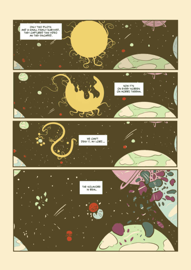
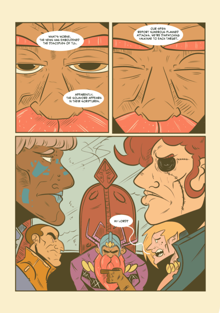
Writer Grant DeArmitt and artist/colorist/letterer Lane Lloyd’s story of cosmic horror, Hunt for the Solavore, is a brilliant mix of the subtle and the bombastic. With a script that keeps cards close to the vest, and a crazy no-holds-barred art style, this is a comic you won’t soon forget.
About Hunt for the Solavore:
A 42-page sci-fi saga about a beast that devours suns… and the king who dares to defy it.
Writing
DeArmitt wastes no time throwing us into the action. From page one, we are immediately following a family, running from something that is destroying their planet. Danger is everywhere and the stakes are high. But then, DeArmitt brings the pace to a sudden stop. We go from planets ending to a tired, old king. It’s a jarring transition, and deliberately so. DeArmitt keeps the reader’s attention, by shifting gears so suddenly, yet so seamlessly. And the script remains just as entrancing. DeArmitt speaks through the silences almost more than he speaks through the dialogue. It’s what is left unsaid that tells us everything we need to know about the characters and what they fear.
Really, this script has everything you could want. We get large, sci-fi level stakes, subtle human moments, and scenes of terrifying horror. DeArmitt manages to take all of these ingredients, and a truckload of some of the best world-building you’ll see, and squeezes them into a sleek 42 pages. Yet none of it feels rushed or busy. That’s because DeArmitt trusts his audience with a minimalistic script, with rarely more than a single word balloon per panel. DeArmitt is a writer who tells his stories in the margins and pauses of a comic.
Art & Coloring
Where DeArmitt’s approach to this story is subtle and simplified, Lloyd’s is vibrant and full of cartoony flare. At first glance, it seems like it’s the big action sequences in which Lloyd is in their element. They brilliantly show planets exploding and soldiers gearing up for war. But it’s in the smaller moments where Lloyd’s work really shines. These moments stand in such contrast to Lloyd’s wild art style, that they stand out as the quiet, beautiful moments that they are. When King Theosis, our protagonist, is closing his eyes at the sound of bad news, or when he stares back at his home planet and we can see his worried look in the reflection on the window, these are the moments that stick with you. But so does the horror of the Solavore. Its twisted body and its playful attitude when it comes to carnage, shown in how it looks almost as though it is celebrating through the battle, will keep you up at night.
Lloyd’s color palette is quite simple. They stick to reds, blues, purples and browns, giving the whole comic a uniform feel. But it’s in the woods, with a darker shade to the color palette, that the Solavore’s brilliant red eyes pierce through the night. Lloyd uses simple choices and a minimalist color scheme to devastating effect.
Hunt for the Solavore is a dance of subtle writing and crazy visuals. Hopefully, we’ll see lots more of Grant DeArmitt and Lane Lloyd’s work. For now, Hunt for the Solavore has gone out in digital format to backers of their Kickstarter and will be sent out in print in the following months. You can still get your copies at Lane Lloyd’s Gumroad. Follow Grant and Lane’s work on Twitter to support them, and check out MFR’s interview with them, back when they were just starting work on Hunt for the Solavore.
Robert Myer Burnett is an editor, producer, writer, and YouTube host of The Burnettwork where he has a lot to say about Star Trek, Star Wars, the MCU, and all things pop culture.
Robert delivers new episodes of his show every week. On it, he’ll cover the latest releases from Marvel, Disney, Warner Brothers, and the rest of mainstream Hollywood. Like many YouTubers commenting on film and television franchises with a big fanbase, Robert can be polarizing to some and insightful to others. He’s a man who’s a lifelong fan of things like Star Trek and Star Wars but also one who’s worked for decades behind-the-scenes on films like Lord of the Rings or Superman Returns and directed a movie with a guest appearance by William Shatner.
PopAxiom and Robert Myer Burnett, the tongue-in-cheek self-professed viceroy of verisimilitude and imagination connoisseur, spoke about going from fan to filmmaker and his upcoming movie Tango Shalom.
Loved Everything
“I wanted to make movies my whole life,” Robert begins the story of his connection to filmed storytelling. “The original Star Trek is the first thing I remember watching as a kid. I was enamored. Because of that, I watched anything to do with science fiction, fantasy, and horror.”
Robert grew up in Seattle, and “there was ‘Sci-Fi Theater’ on Sundays on Channel 11. I would come back from Sunday School and watch whatever was on. When I was five years old, I watched War of the Worlds for the first time. That was it, man. After I saw that, I loved movies.”
“Twilight Zone, Outer Limits, Star Trek, Hammer movies, all the 50s sci-fi, and Ray Harryhausen” are some of the early influences on Robert. “I wanted to do that, but I didn’t know it was possible to get into as a job.”
Now ten years old, things changed with the release of Star Wars “and everything in the wake of Star Wars, all the books on making the film, the documentary on the making. Suddenly, I’m seeing all this material being made about how movies are being made. I started reading Star Log magazine and Fangoria. Cinefantastique and in 1980, CineFX magazine came out which talked about visual effects. Starlog had a sister publication called CineMagic about movie-making. I was gone after that. By the time I was 11 or 12, I wanted to make movies.”
“At the same time,” he continues, “home video started to take off. For the very first time, you could own movies. I worked in one of the first video stores in Seattle. At that time, you could rent a movie for a month. Then, you would take it home, keep it for a month, and then buy the movie if you wanted for like fifty or sixty bucks.”
Between getting cable and having a VCR, Robert could “start studying movies. So, that’s what I did. I became completely enamored of movie-making. I worked in home video from the time I was 13 in 1980 to 1988. I loved everything about it.”
Special Features
The movie business includes many jobs, including entire companies devoted to working on special features for films released on laserdisc and DVD. “A friend of mine started a company called Kurtti-Pellerin producing laserdisc content,” Robert explains, “The laserdisc format starting in 84 with Criterion, their first releases were King Kong and Citizen Kane, they were the first laserdiscs that had special features. Throughout the 80s and 90s, special features were on laserdisc.”
In the 90s, Robert says he “moved to LA, I’d gone to film school, and I was working on low-budget movies. I started as the art department production assistant on Texas Chainsaw Massacre 3. In 99, I wrote and directed my first film, Free Enterprise. Pioneer Entertainment acquired our film for home video, for laserdisc, and then DVD. So, I made my first documentary for laserdisc. I’d done a few while I worked at a company called Full Moon as an editor. I’d done some special features for their videotapes and laser discs.”
“The company began exclusively working for Disney,” he continues, “In the early 00s, we were working on these extensive DVD special editions, which was the natural progression of the laserdisc stuff we were doing, and then we were awarded Lord of the Rings.”
The rise of DVD and BluRay created a healthy market for special features. “An MGM executive called me up one day asking if I’d produce the DVD for The Usual Suspects. I took it to Michael Pellerin, and he suggested I do it on my own. So, I started my own company Ludivico Technique, and we started doing DVD special editions. We did The Usual Suspects, X-Men 1 & 2, Valley Girl, and at the same time, I was working on things like Lord of the Rings and Tron.”
Embedded
Producing content for special features had Robert “traveling worldwide to shoot behind the scenes stuff.”
“One of the things I was able to do with my DVD or BluRay producing,” he says, “was that I would get embedded with productions. When I worked on The Lion, The Witch, and The Wardrobe, which shot in New Zealand, I was there for fourteen months.”
From the world of Narnia, Robert hopped over to Australia for Superman Returns. “I made a three-hour documentary on the making of that film. I was in Australia for 11 months. I was on set every day watching these movies getting made.”
About Tango Shalom
Robert’s latest film project is Tango Shalom which he helped produce, edit, and was VFX and post-production supervisor. “I was waiting for my car at the Rosevelt Hotel in Hollywood,” he begins the story of how he became part of the Tango Shalom team. “There was an AFM, American Film Market event where people come together to sell films to distributors.”
“A woman was waiting for her car,” he continues, “and we struck up a conversation. She was a producer on this movie, and they didn’t have an editor. She’s had it sitting on the shelf for almost a year. I said, ‘I’m a film editor.’ She gave me the director’s name, and suddenly I’m working on this movie.”
Making movies is not an exact science, especially when working in the independent realm. “As happens with independent film, you have to raise money and do what you can and then raise more money. So, we put it on the festival circuit. It had its world premiere in Jaipur, India, where it won some awards; it’s played in Turkey and Morocco. Now, it’s come to America. It’s been picked up for distribution by Vision Films, and it’s been great.”
So what is Tango Shalom? “It’s a low-budget movie, and it’s the story of a married Hasidic rabbi who believes he’s heard the word of God and God has told him to alleviate his financial difficulties and learn to dance the tango. Being that he’s a Hasidic rabbi, he’s not allowed to touch another woman other than his wife, but she doesn’t know how to tango.”
“He ends up coming across a young, sexy tango instructor,” Robert explains. “He has to figure out a way that she can help him achieve his goal of learning the tango and perhaps using that to alleviate his financial problems.:
“Tango Shalom gets a limited theatrical release on September 3rd in New York and LA; hopefully, it’ll expand, and then it goes to VOD at the end of October.”
YouTube
Three decades of working in the film and television industry and counting, how did YouTube become part of Robert’s creative endeavors? “In 2015, a friend of mine named John Schnepp, who passed away three years ago, was doing a show with John Campea on AMC, and then it moved to Collider. He asked me if I wanted to be a guest one day. Then, he kept inviting me back, and I became a series regular. We did it for three and a half years until he passed away. He was always telling me, ‘You should start your own channel.’
Robert had doubts about doing it on his own. “I said, ‘really?’ I’m kind of old, and do I want to get in on YouTube? He said, ‘You’ve already been doing it for three years.’ My girlfriend bought me a microphone and said, ‘It’s time.'”
“I didn’t know what I was going to do,” he explains of his approaching streaming life. “So, I talked about my industry experience and not review movies but talk about them and what I liked. I started regularly in late 2018 and all through the pandemic, and here I am, over a thousand episodes.”
Robert credits YouTube with doing something quite profound. “YouTube got me more in touch with my filmmaking and the audience. It re-ignited my passion for filmmaking because so many times you can get beat down by the industry.”
“Usually, since I do a morning show with John Campea about news, doing that and opining on the news of the day is not what I want to discuss,” he says about his approach to his show. “I like to talk about things philosophically and from a business perspective about what it all means. That’s kind of where I’m always coming from. We like all this stuff, but what does it mean in the larger context?”
Robert never thought he’d be discussing the industry on YouTube. “But I like the industry, I like the way that it works, and I like making films. I’m a big fan of all this stuff, so the YouTube channel was a natural extension.”
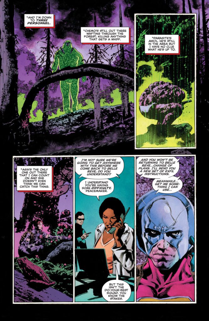
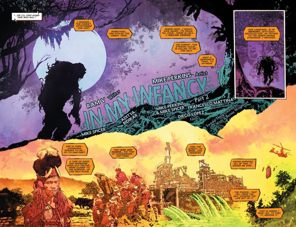
The Swamp Thing is, ironically, one of DC Comics’ most human titles. Writer Ram V, artist Mike Perkins, colorist Mike Spicer, and letterer Aditya Bidikar use the big, green plant guy to talk about things that plague everyday people. The Swamp Thing #7is all about the burdens we carry and the scars of our past.
Writing
V’s writing in this issue is rhythmic and poetic. He interlaces scenes of the Suicide Squad hunting Swamp Thing with scenes of Levi Kamei visiting the Kaziranga Forest in the past. V subtly coaxes deeper messages out of his story. As Levi is talking with his father, he is told an old Indian folk tale. It seems to have nothing to do with the rest of the plot and his father walks on, disappointed that Levi got nothing out of it. But later, the pieces all fit. V brings the story back in as the issue closes, and hands us the key to understanding it. It’s a satisfying way of tying the whole issue together and V does it brilliantly.
Art
Perkins’ art is stunning as usual. But in this issue, his ability to characterize the Swamp Thing is really on display. When we first see Swamp Thing, he’s lumbering through the woods. His silhouette looks like something out of a Boris Karloff monster movie. But, later in the issue, Perkins focuses us in on Swamp Thing’s expressions. He’s human. We can see the fear, joy and love, written on his face.
Perkins’ depictions of Kaziranga and Levi’s time at home feels like something out of a storybook. Each scene is picturesque and beautiful. When Levi’s father tells the Indian folk tale, Perkins places two images in between the panels, drawn in the same style as a lot of Hindi art. It adds the subtle touch of India to the page, reminding us how much this series ties back to Levi’s homeland.
Coloring
Spicer’s coloring helps the reader place where each scene is occurring. The modern day scenes, of Swamp Thing being hunted through the woods, are show in dark purples and neon greens. We can practically see the glow of Chemo coming to kill Swamp Thing. The scenes of Levi’s trip home to India are shown in a warm color palette. But as Levi’s memories turn darker, the color palette shifts too. We see some of the purple of Levi’s present start to mix in with the warm orange of his past. Spicer shows us how Levi’s memories are souring on him. They aren’t the warm, cozy memories of home he wishes they were.
Lettering
Bidikar’s lettering is full of surprises. Every sound leaps off the page. From the “AAAGH!” of Swamp Thing being attacked, shown in rough orange and black lettering, to the almost invisible “RRRMMMBLL” of Chemo approaching. But one really interesting moment in the lettering happens in Swamp Thing/Levi’s caption boxes. At first, they show up as the rough orange and black lettering. It’s just like Swamp Thing’s dialogue. But as Swamp Thing thinks back to his visit to India, the captions change. They become a light green color with neat lettering. It’s as though Swamp Thing is reconnecting with his humanity. He’s forgetting that he’s a monster and just thinking about what it’s like to be Levi.
DC Comics’ The Swamp Thing is a beautiful series, intent on being bravely human. This creative team uses this big, green monster to help us examine our own burdens and scars. Yet, they’re never preachy or heavy-handed. Everything is done with subtlety and finesse. Pick up The Swamp Thing #7, out from DC Comics September 7th, at a comic shop near you!
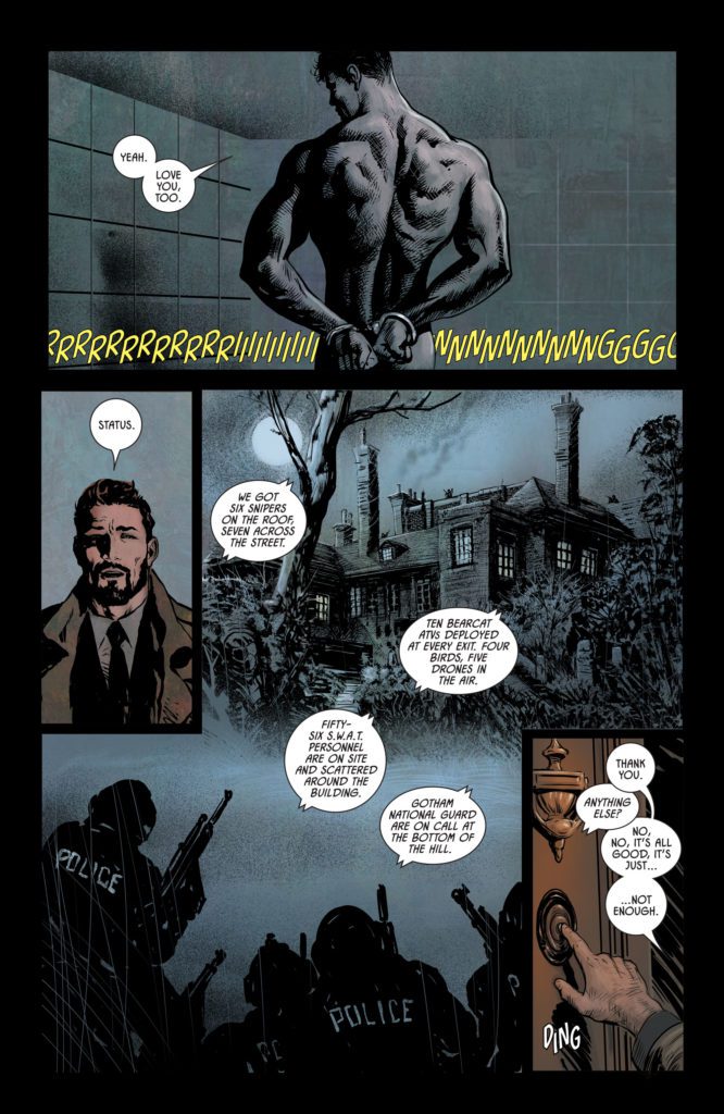
DC Comics’ Batman/Catwoman #7sees a few changes to the series. In place of artist Clay Mann and colorist Tomeu Morey, the brilliant Liam Sharp provides art and colors. Tom King pens a complicated but riveting script, Sharp delivers mesmerizing visuals, and Clayton Cowles ties everything together with his brilliant lettering.
Writing
There’s an intensity to this issue that we haven’t yet seen in Batman/Catwoman. It’s almost as though King specifically wrote the issue with Sharp’s gritty style in mind. At times, the script feels a little confusing. King jumps between timelines often. And while the distant future, with an older Catwoman and an adult Helena Wayne, has clear distinguishing factors, others appear quite similar. Yet, the whole issue is tied together by violence. Even when Bruce and Selina make love, it’s with violent passion. King is sowing the seeds for darker times in this series, and it’s the perfect time for Sharp to jump on board.
Art & Colors
One major thing feels missing in this issue, and that’s the visual rhythm. Though Sharp is a fantastic artist — every panel is breathtaking — readers have gotten used to the subtle visual cues of Mann and Morey. Whether it was Selina’s haircut, or the slight tints Morey assigned to each timeline, readers could tell from a glance what time period a panel was happening in. Batman/Catwoman #7 requires a more careful reading. Not to say that there isn’t Sharp’s own visual rhythm, but that it’s different and new to readers.
Yet all of this is actually a result of something quite exciting. Sharp makes no effort to copy Mann or Morey’s style. No, this issue is unmistakably the work of Liam Sharp. His gritty style and his colors that almost seem to glow are all welcome additions to this series. And we get a different side to the characters. Where Mann’s old lady Selina was regal and refined, Sharp’s feels like the danger is bubbling just beneath the surface. And so, even the weaknesses to this comic’s visual storytelling are its strengths. Readers may take a while to get used to Sharp’s subtle cues, but once we do, we’ll have two of the best artists in the industry, each telling this story in their own uninhibited style.
Lettering
Cowles’ lettering is simple but brilliant. He pushes word balloons into the far corners of each panel, not only giving room for Sharp’s figures but for his atmosphere as well. It makes the characters seem powerful. There’s a margin around them, nothing dares go near them. But it also makes them seem lonely. Even as Bruce and Selina grab ahold of one another, the dialogue in the scene keeps its distance, making an intimate scene also feel like a desperate grab for attachment from two lonely people.
In one scene, Gordon describes a grisly crime scene that involves a chimney. Brilliantly, Cowles stacks each word balloon, one on top of the other. It makes Gordon’s dialogue look like a chimney too.
While Batman/Catwoman #7 does feel like a bump in the road in some ways, it’s also an exciting new chapter for the series. This issue suffers from some of the normal growing pains of a series taking on another artist. Yet, many of these issues are also a result of Sharp working unapologetically in his own style. Which, for everyone reading this series, is very exciting news! Batman/Catwoman #7 is out from DC Comics September 7th at a comic shop near you!
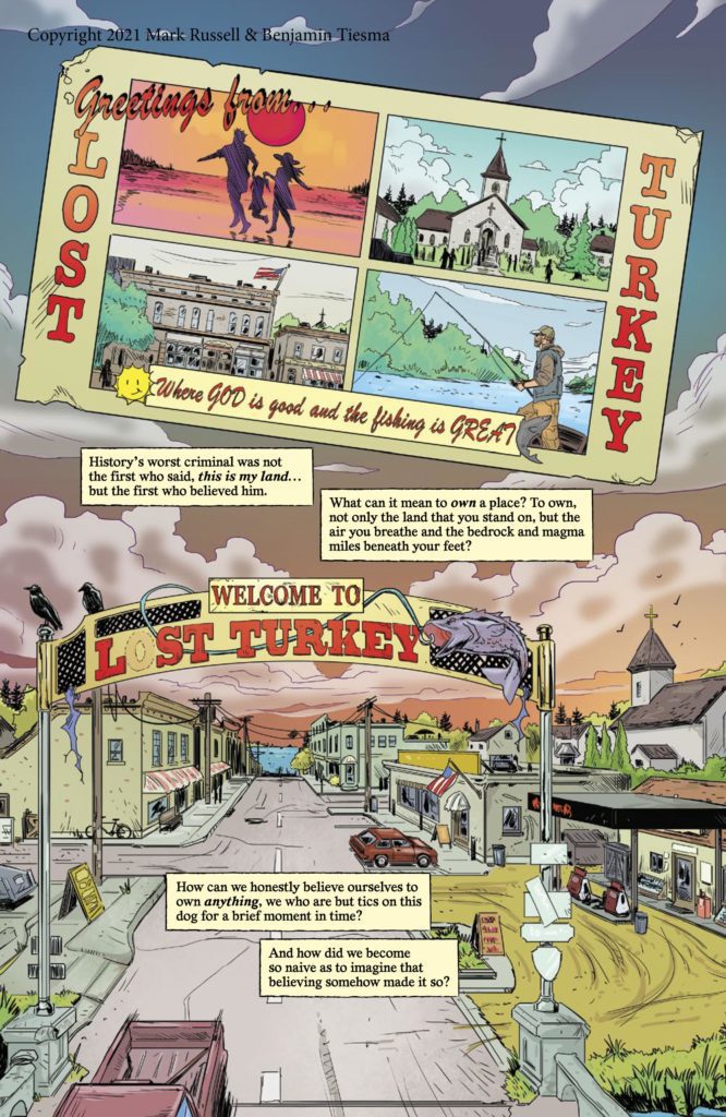
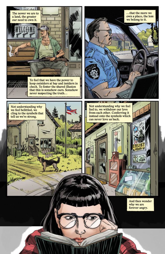
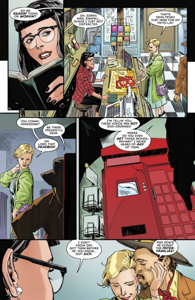
From the brilliant Mark Russell (Snagglepuss: Exit Stage Left; The Flintstones) and artist Benjamin Tiesma comes a deeply incisive and mysterious first issue in Deadbox #1. Along with colorist Vladimir Popov and letters from Andworld Design, this comic takes what seems like a ridiculous premise and ties it into a dark and depressingly relevant examination of small-town America. With a stellar script and expressive visuals, this is one of the most promising first issues of the year.
“Welcome to the town of Lost Turkey, where the main source of entertainment is a cursed DVD machine that seems to know more about the fate of its citizens than they do.”
Writing & Plot
Writer Mark Russell takes the first issue of Deadbox to let readers know where he and this story are coming from. This comic’s unusual premise is put on the backburner for now in favor of a sort of sociological dissection. Russell states that his main motivation for writing this comic is to detail what living in a small, close-minded town and desperately needing to escape is like. Deadbox is a deeply political comic book, make no mistake. However instead of beating readers over the head with jargon, it instead begs perspective. This comic definitely takes a stance, but in the form of scathing truth over all else. Russell’s evocative narration reads like the voice of an imposing harbinger of societal damnation. His poetic and cutting words sting with the pain of uncomfortable relevance. It’s easy to forget that there’s a supernatural horror comic underneath all of this.
Russell keeps the true main plot of the comic pretty close to the chest. There are distinct moments where there’s a sudden tonal shift due to something on the page, but this issue never chases the thread. The first hint we get is in this issue’s internal parallel story in the form of a movie. I can’t go into anymore detail, but I’ll just say Russell is making the reader do their own headwork here. Luckily, that’s the exact kind of script I like. The way Russell intertwines political observation, unnatural suspense, and personal storytelling is outstanding. I won’t get into spoilers, but this silly-sounding “evil Redbox” idea is so well presented here that I am hooked on whatever is next.
Art Direction
Deadbox #1’s shifting tones and wildly different setting are brought to life by artist Benjamin Tiesma. His pencils craft an accurate snapshot of insular small-town America. The exact kind of small town you may stop to get gas in on a road trip, then get the hell out of as fast as possible. Tiesma draws with immense detail here, and continues to do so when the setting drastically changes. Again I can’t get into spoilers, but the in-story film has near-opposite aesthetic to Lost Turkey. Tiesma draws this new setting as if it were where the main story was actually taking place.
His characterization is fantastic as well. Each person looks wholly unique, and their emotion is played out in subtleties across their faces. This is especially true of our protagonist. The complex combination of desperation to leave Lost Turkey and worry for the reason she has to stay is effectively displayed in how she’s drawn.
Vladimir Popov’s colors are just as dynamic as the pencils. They present Lost Turkey in the drab hues of rust and decay, lit by flickering fluorescent lights and tube televisions. Then the colors are juxtaposed with the setting in the film (again, no spoilers). Popov displays lighting effects remarkably well. Every surface in a setting directly reflects the light (or lack thereof) and sets the tone for an entire sequence. Andworld Design’s lettering subdued but effectively varied. They use an almost classic-styled font with just the right font and italic shifts to get the tone right. SFX lettering is minimal, but also kind of effectively subdues. This comic is gifted with effective and atmospheric visuals on all fronts.
Verdict
Deadbox #1 is a powerful and delightfully intriguing opening issue to this supernatural comic story. Mark Russell crafts a personal script with cutting societal insight and a clever supernatural concept that he still keeps close to the chest. Benjamin Tiesma and Vladimir Popov create an atmospheric and detailed portrait of small-town America that changes on a dime to vastly different settings. This is one of the most intriguing first issues of 2021. Be sure to grab a copy when it hits shelves on 9-8!
Cover to Comics An Introduction by Harriet E.H. Earle, published by Routledge
People consume comics for different reasons. There are those who enjoy the non-stop action of superhero comics, those who like to escape into a detailed fantasy world, and those who read literal stacks of comics to experience the form in as many ways as possible. Over recent years there has been a growing audience of readers whose desire is to study the comic in the same way that, for decades, people have studied literature and film. This has led to a growth spurt in the publishing of books about comics and the many aspects and themes that comics represent and embrace.
However, everyone has to start somewhere, whether it’s finding your first comic strip as a child or first independent comic book as a teenager, and for those interested in studying comics there isn’t a massive selection of books that can get you comfortably onto the first step. It goes without saying that Scott McCloud’s work is an easy recommendation, but his are not the only books out there. In 2021 there have already been a number of handy guides or introductory books released about comics and one of the best is Comics: An Introduction by Harriet E.H. Earle.
A New Guide
Comics: An Introduction is a small, handy sized, book published by Routledge and boasts a ‘clear and detailed introduction to the Comics form.’ Harriet Earle is a lecturer in English at a UK University and she has written about comics numerous times, often in relation to War and trauma. But in this latest book, she has widened her scope to focus on the history and definitions of the comic format. This is no simple task, as anyone who has studied comics will attest, but Earle manages to simplify the complicated history into bite sized chunks of information and present them in a meaningful way. The book is broken into chapters that feed off each other and create a linear reading out of a complex history of ideas and creative experiments. The growth of comics is very often not linear and different influences occur in different cultures which then seep into other aspects of comics. Earle keeps her focus on the book and holds your attention with straightforward explanations of terms and concepts so that even uninitiated readers won’t get lost in technical terms.
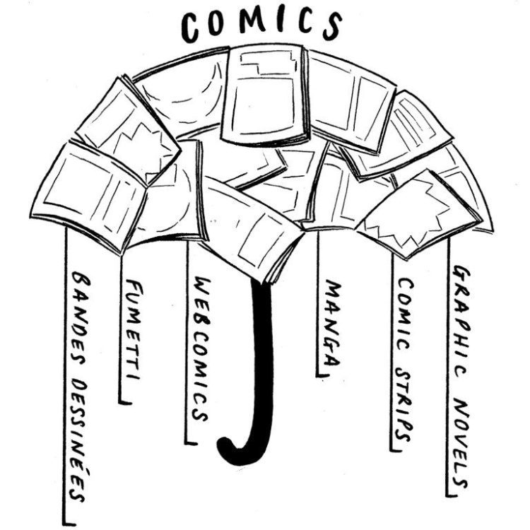
‘Umbrella’ by Rozi Hathaway, an example of the artwork used in the book
The first half of Comics: An Introduction is a useful exploration of the form, as the titles of the early chapters indicate: Histories, Going global: comics on the world stage, and Cultures and commodities. Earle covers a lot of the ground found in other titles but does so in a more condensed and educational way. This is a sophisticated, well thought out “Comics 101.” Where some books are daunting, especially to readers just getting into Comics Studies, Comics: An Introduction is welcoming and easily digestible. After the broad introduction, the chapters are broken down into short sections for easy reading and later reference. Returning to this book after the first read is a delight because it is so easy to find what you are looking for. If you want to refer to Proto-comics, for example, a quick flick through will allow you to find the short section without having to plough through paragraphs of dense text.
But the book isn’t just a beginners guide to comics. Earle dedicates two chapters to more focused studies of particular kinds of comics. One chapter is on Journalism and the other on autobiographical works. These focused chapters are a gateway to more complex studies and they lean towards Earle’s personal study interests. They are literary heavy chapters reflecting the author’s background, but Earle does not dismiss comics as a whole by focusing only on a few worthy examples, as other writers have done. Instead, the book is inclusive and draws on all aspects of the form. This is clear from the range of topics and themes that are covered across the chapters. There are sections relating to cultural practices, geographical differences, historical significance, and even the audience itself by the way of fans and conventions. In some ways the size of the book is deceiving as Earle packs a massive amount of information into the modest page count.
Conclusion
Where McCloud’s Understanding Comics is a visual dive into the production and mechanics of comics, Comics: An Introduction is more of an academic overview with delightful hints at the possibilities that the form contains. It is an easy and enlightening read aimed more at people starting on their Comics Studies journey, but contains enough gems of information to make it worth reading for anyone in the field. There are more focused books out there, for example Comics Studies: A Guidebook or the new to 2021 Keywords for Comic Studies, each containing essays from a range of scholars and creatives. However, Comics: An Introduction offers a single coherent voice that guides you through the often difficult field of study that is Comics Studies.
Also available by Harriet Earle: Comics, Trauma, and the New Art of War published by the University Press of Mississippi
Yoe Books, IDW Publishing, and Steven Brower have brought together a collection of crime comics that, unless you are already a dedicated fan of the genre, you probably won’t have seen before. Focusing on the 1950’s, but avoiding the obvious choices from EC Comics, Crime Comics Confidential touches on a period of comics history that was as volatile as the lives the comics depicted. Dr. Fredric Wertham was stirring the pot, encouraging a number of parent organizations, churches, and community groups to stand up against the evil of comics and the Senate Subcommittee on Juvenile Delinquency was held in the center of the decade that this book covers.
Featuring a number of recognizable names within the narratives as well as in the bylines, Crime Comics Confidential is a window into a different time, mixing history and creativity like an episode of a science fiction time travelling show.
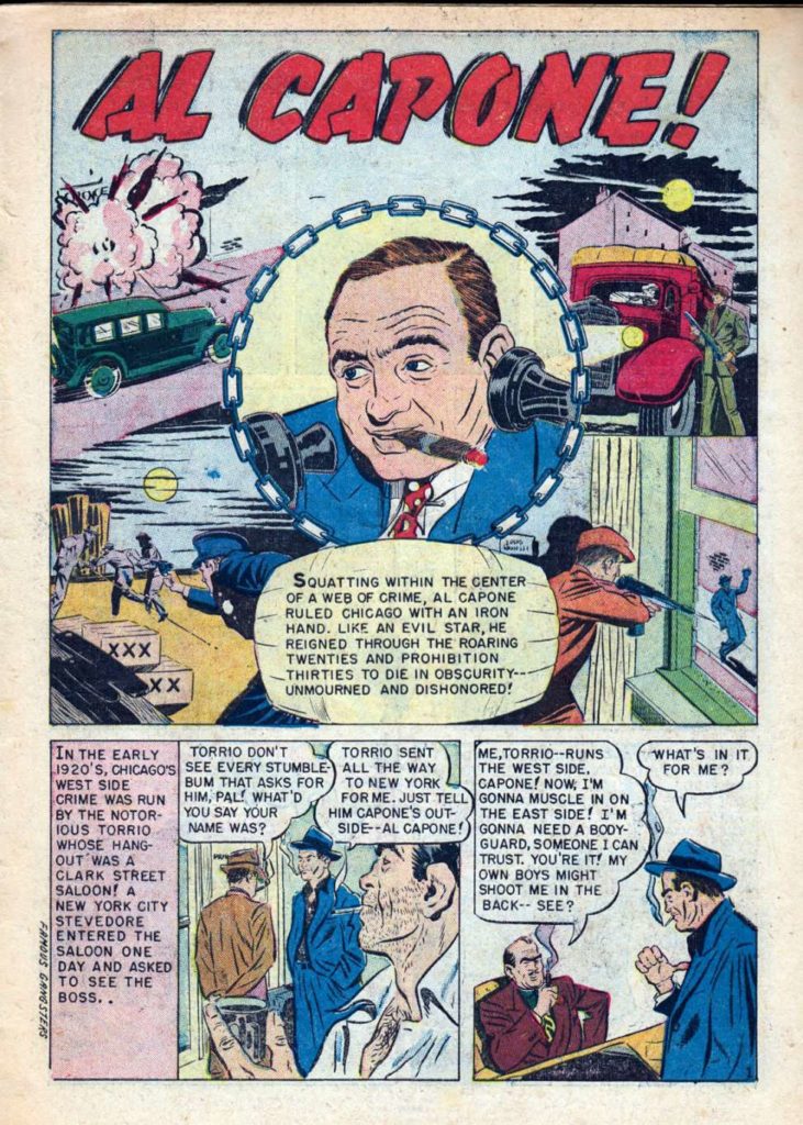
First page from Al Capone, published in Famous Gangsters #1 1951
Opening the Case
Crime Comics Confidential opens with a detailed essay written by editor Steven Brower. This is one of the highlights of the book and provides a mix of historical background and intriguing critique. Obvious elements of this introduction are followed up in the strips selected for the collection, in particular the biographies of such famous mobsters as Al Capone, Lucky Luciano, and John Dillinger. In an age where the lives of these criminals have been regurgitated several times on television and in the movies, mixing fact with cinematic license, it’s surprising that these strips still have anything to offer. And yet they do. The art direction and comic design is reflective of the period and the stories take a backseat to the more interesting study of the comic format itself.
The comics have been grouped in the book in such a way that as a reader you can compare and contrast specific narrative types, flicking back only a few pages to see how different writers and artists have dealt with a specific trope of the genre. The string of biographies that open the book are particularly interesting as they highlight the approaches that the creators took to representing fact as entertainment. Several of the narratives are a touch dry and heavy on text that could be read as preaching to the young audience the comics were aimed at, while others have the elements of danger and glorification that formed the heart of the moral crusade against comics at the time.
Re-reading these comics today, they seem tame in comparison to the current offerings from independent publishers and even the larger companies. But with the context given from Brower’s introduction it is possible to see how they could have been interpreted in a different manner. At the annual meeting of the Association for Education in Journalism and Mass Culture in Washington DC in 1995, Linda Adler-Kassner presented a paper highlighting the differences in attitudes towards comic consumption between adults and children, both in the 1950s and the present day.
The stories that were told in genre comics, such as crime and horror, were seen by those in authority as damaging to the youth, and glorifying the criminal aspects of society. However, one thing that is clear from each of the comics selected for this book is that crime never pays. There is a price for the lives the criminals lead and they always get their comeuppance before the final panel. There is very little shocking material from a visual point of view in these comics and, as Brower points out, the hero worship of the underdog villain is nothing new, even in the 1950s. Instead of a series of grotesque or violent tales, what this book contains is a selection of intriguing, well constructed short stories told by some of the biggest names in the industry at the time.
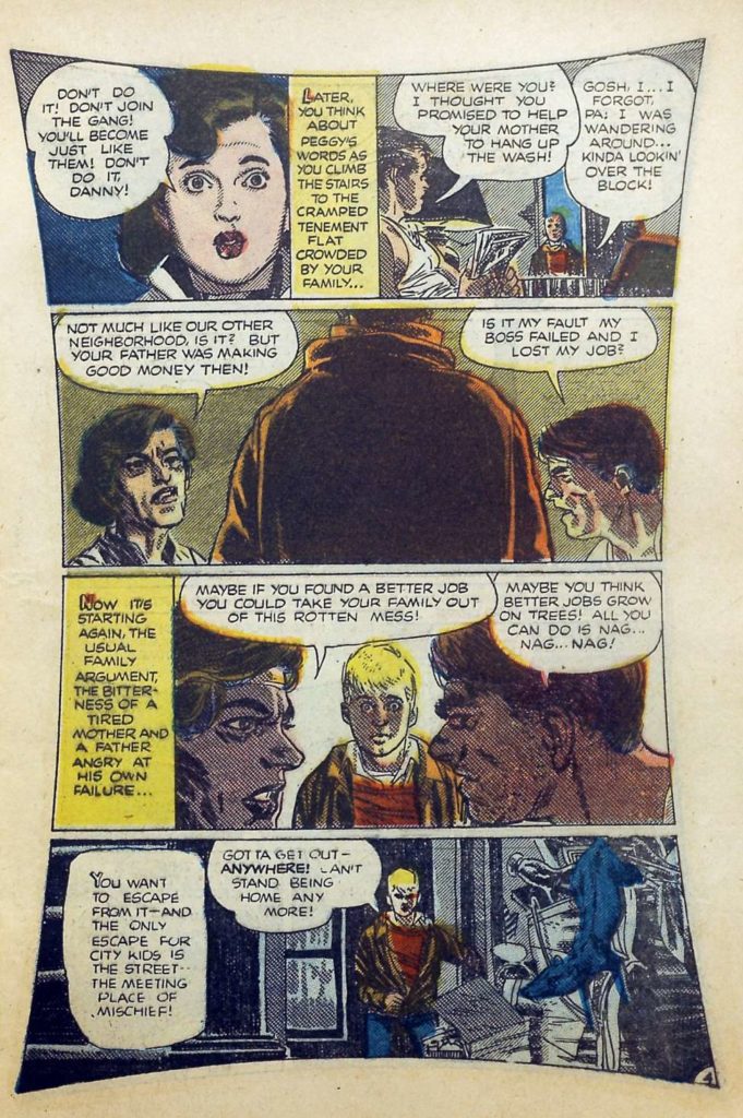
A page from War on the Streets by Alex Toth, published in Crime and Punishment #66 1954
Artist recognition
Bernie Krigstein, Dick Briefer, Alex Toth, and John Buscema all have stories featured in this book. One of the most outstanding, visually as well as narratively, is Alex Toth’s War on the Streets. A story that deals with juvenile delinquency head on with no metaphors or cloaked superhero analogies, War on the Streets is a magnificent tale of a boy becoming embroiled in a gang. Toth highlights not only the dangers of being in a gang but also demonstrates the social mechanisms behind the decisions that the boy makes: bullying, coercion, and family neglect are all to blame for the path the boy follows. It is possible to see why such a story would be deemed unsuitable by parents or community organizations in 1950, because this is placing a lot of the blame at their doorsteps.
Crime Comics Confidential‘s strength is that it presents the collection as something of historical interest, rather than pure entertainment. It would be easy to select the most famous crime comics and reprint them in a new collection, but there is a more curated feel to this book. Contained within is an evolving thematic thread running through the comic strips as if they themselves have a deeper narrative beyond the surface readings. Brower places the comics in an order that makes you question aspects of the stories, such as the authenticity of the biographies, the moral aspect of the narrative, and even the culture in which these comics were born.
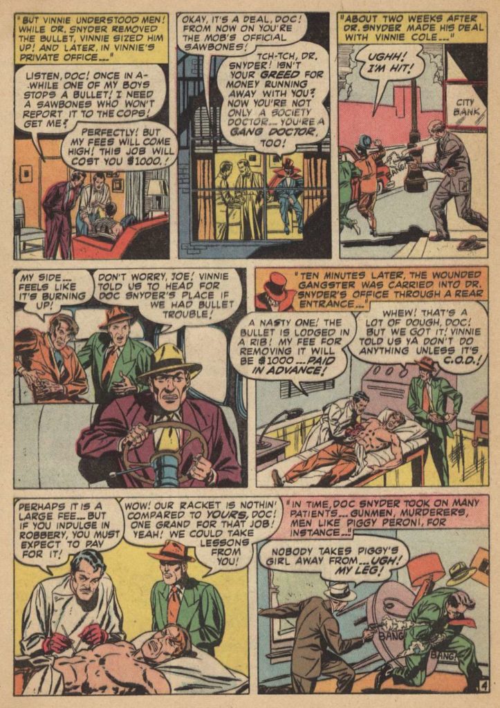
Example of John Buscema artwork from Gang Doctor published in Wanted #32 1950
Conclusion
These crime comics are from the end of the Golden Age of comics which saw the horror genre explode across America and beyond. Crime was central to that explosion and the two genres are often featured together in anthology comics. It is not surprising that communities were easily turned against these forms of youthful entertainment, especially when you look at some of the stories portrayed in this book. Reprints for comics such as Crime and Punishment, Famous Gangsters, and Wanted Comics, may seem tame by today’s standards, but 70 years ago, these stories would have been shocking and exactly what the young audience was looking for.
This book offers a glimpse into what was available to readers in tumultuous times of mass distribution, newspaper racks, senate hearings, and witch hunts against the peddlers of filth. Crime Comics Confidential is a perfect book for the shelf of anyone interested in this period of comic history and a great collection of stories that deserve a new audience.