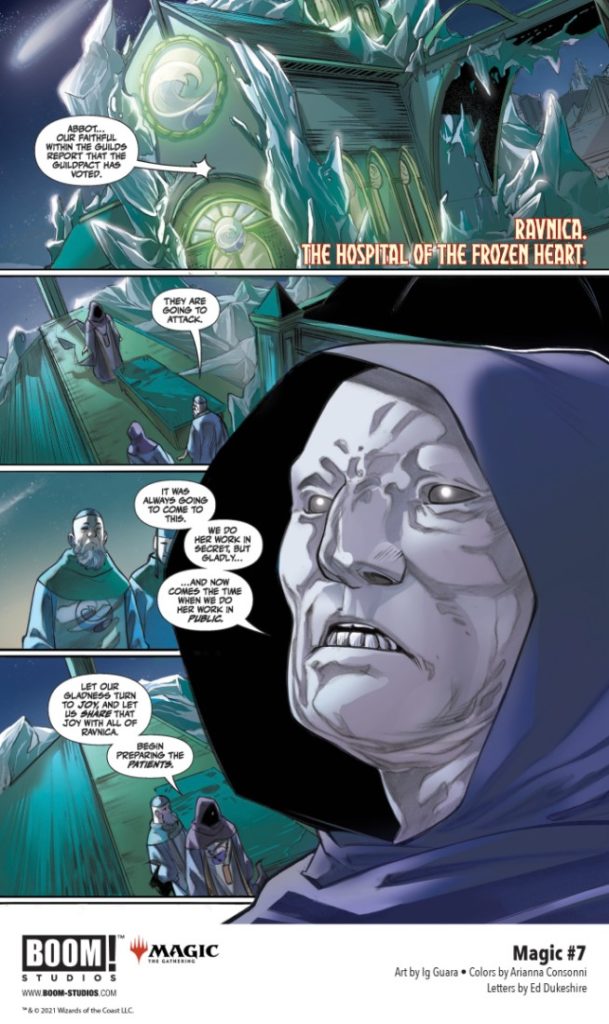
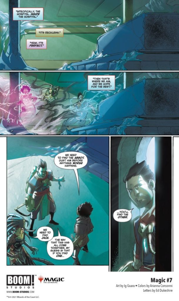
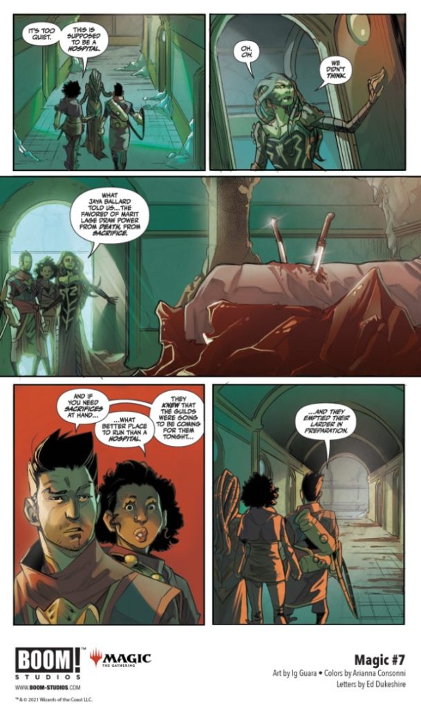
MAGIC #7 hits your local comic book store October 6th, but thanks to BOOM! Studios, Monkeys Fighting Robots has an exclusive five-page preview for you.
About the issue: Ravnica united! The Guilds have aligned just in time to find their sprawling city transformed into a battlefield! Their enemies are mutant horrors: citizens changed by their cultish devotion to an entity that threatens all life across the multiverse. Though our planeswalkers are now aided by guild warriors from Boros angels to Simic super soldiers, can Kaya, Vraska, and Ral Zarek reach Jace Beleren before the herald of [REDACTED] does?
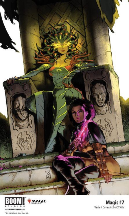
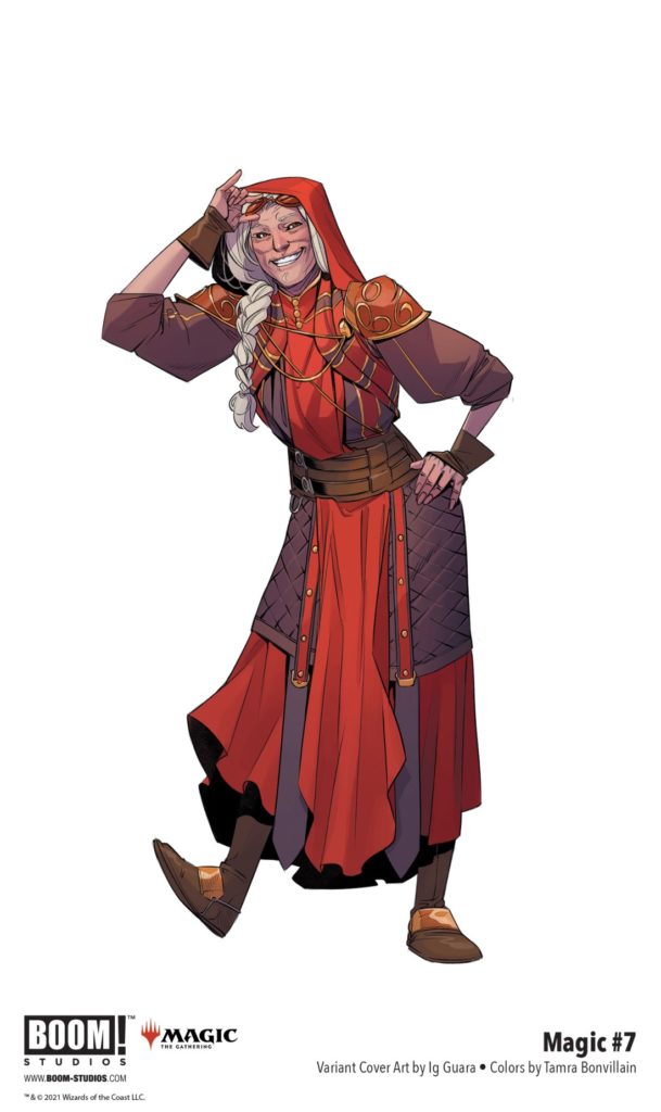
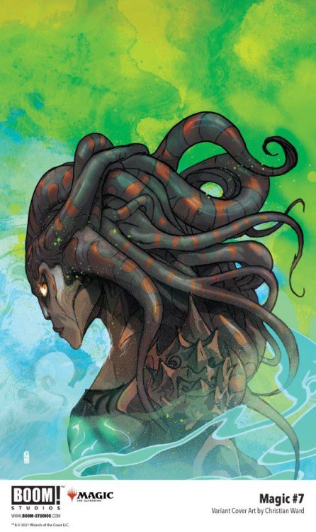
The series is by writer Jed MacKay and artist Ig Guara, with colors by Arianna Consonni, and letters by Ed Dukeshire. The main cover is by Qistina Khalidah, with variants by Guara, CF Villa, Jakub Rebelka, and Christian Ward.
MAGIC is based on the pop culture sensation Magic: The Gathering, one of the most popular trading card games of all time, boasting millions of players around the world.
Check out the MAGIC #7 preview below:
Are you reading MAGIC? Do you play Magic: The Gathering? Sound off in the comments!
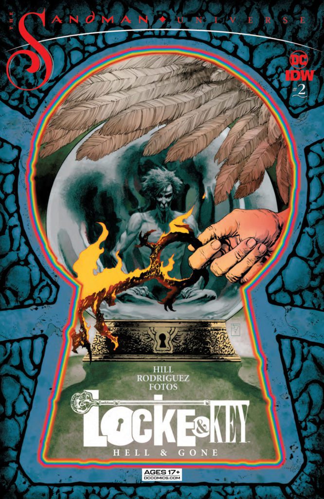
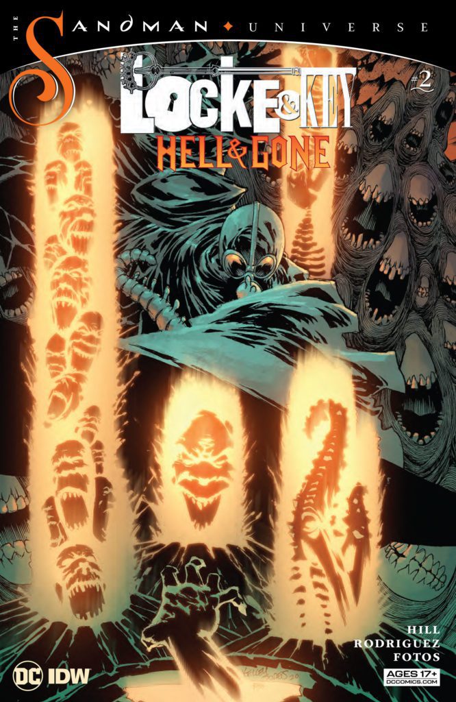
Anyone who has read Sandman and Locke & Key would know that a crossover of the two is a match made in Heaven… well, maybe not “Heaven.” But the two series have many of the same themes and stylings. So, when IDW Publishing and DC Comics’ Locke & Key/Sandman: Hell & Gone #1came out in April, some fans were a little underwhelmed. But writer Joe Hill, artist Gabriel Rodriguez, colorist Jay Fotos, and letterer Shawn Lee show us in Locke & Key/Sandman: Hell & Gone #2that that was because they were merely setting the stage for their epic. This issue brings this crossover to its full, bombastic potential!
Writing
Hill channels Gaiman flawlessly in this chapter. His writing for Fiddler Green, the Corinthian, and Lucien all feel really true to their characters. But they also feel like characters that could have shown up in one of Hill’s stories. Hill seems to love to explore the ways that his and Gaiman’s voice can sometimes sound so similar. And all of the dialogue just feels so damn smooth. Every line has subtext. Our protagonist, Mary Locke, says “I get it. I’m not really much of a morning person myself. But sooner or later we all got to wake up.” Hill highlights with lines like these that his script is about more than just what is happening on the surface. Dreams, to Mary, are childish and silly. Though the citizens of the Dreaming may change her mind about that.
While this issue is incredibly dark at times, it can turn on a dime. Hill can move from disturbing images of hellish torture to moments of hilarity without skipping a beat. It’s shocking and hysterical. These 50 pages really do feel like they contain a rollercoaster of emotions. Yet each moment feels earned, each transition feels smooth. And the finale will leave you wishing you had 50 pages more!
Art
To say that Rodriguez delivers on this issue is selling these beautiful pages short. Rodriguez has a stunning quietness to his art, in the midst of all of the chaos. This quietness makes the preposterous feel human and balances the impossible scenes with gentle glimpses of reality. We see anguish, fear, and fury on characters’ faces. But these looks are subdued, buried beneath a tough exterior, rarely breaking out. Every truly emotional moment feels completely earned, as Rodriguez uses intense expressions sparingly. In the heat of the battle, it’s not Lucifer’s pitchfork or fiery power that we hone in on. It’s the look on his face. He looks furious and hurt, betrayed and vengeful. Rodriguez makes us empathize with characters that ought to seem totally unrelatable.
Coloring
If you were to flip through this comic and stop at random page, you’d probably be able to tell where the scene is taking place. That’s because Fotos gives each setting – The Dreaming, Earth, and Hell – its own color palette. The Dreaming has deep colors in it. We see the green of Fiddler Green’s plant life, the purple of Lucien’s suit. Earth is much more muted. Hell is almost monochromatic. It’s dark reds and oranges, except for the bright red of Lucifer and Etrigan’s outfits, and the occasional bright yellow of hellfire. But Fotos gives each of these settings their own voice. Fotos almost makes them feel like they’re characters in the story as well.
Lettering
Lee doesn’t change the lettering up a whole lot. The dialogue remains mostly the same, with the letters rarely changing size or shape. But this means that when there are differentiations, they really change the reading of the page. Lee even uses bold sparingly. On one particular page, though, Lee uses bold a lot. “Do you really think you can open the Gates of Hell?” Fiddler Green asks. “I’m not worried you can’t do it,” he continues. “I’m worried you can.” This whole page is given such a sense of rhythm because we haven’t seen many words bolded up until this point.
And as the issue progresses Lee does change things up a little. We see some characters that talk with different fonts. This becomes more common once we get into Hell. And the sound effects also come out to play. At one point, Lee does one of the best things I’ve seen done in lettering. It’s fun, hilarious, and badass. It’s the kind of thing that you’ll know the moment you see it and to talk about it anymore would spoil some of the joy of seeing it for yourself.
Locke & Key/Sandman: Hell & Gone #2 is a ton of fun. This creative team absolutely sticks the landing and they give us everything we could want in a Locke & Key/Sandman crossover. You’ll laugh, you’ll cheer, you’ll cry. But most of all, when the last page comes, you’ll beg for it not to be over. Pick up Locke & Key/Sandman: Hell & Gone #2, out from DC Comics/IDW Publishing, at a comic shop near you!
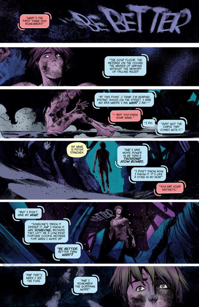
The Harbinger #1 from Valiant Entertainment comes to comic stores on October 27. This soft reboot begins a new status quo for its main character, Peter Stanchek. In this new reader-friendly story, audiences experience a sense of liberation through Peter rediscovering himself. But just like Peter, new readers have no clue what has happened before this issue.
Background
Peter Stanchek is one of the most powerful psiots (espers) in the Valiant Universe. He along with other young psiots, the Harbinger Renegades, stood against the likes of the Harbinger Foundation and nefarious government organizations. But in the crossover event Harbinger Wars 2, Peter and the rest of the Harbingers (save Faith Herbert a.k.a. Zephyr) apparently fell in battle.
The Harbinger #1: The All-Different Peter Stanchek
Reinvention is at the heart of The Harbinger #1. Colin Kelly and Jackson Lanzing literally open the issue with the phrase “be better”. For readers returning from older Stanchek adventures, this is an acknowledgment of the Harbingers’ problematic legacy. As the issue’s setting displays, the Renegades’ reactionary stances haven’t made improvements. Without a positive role model or a way to show the public that psiot’s aren’t all threats; the foundation’s scraps have been relegated to a Chicago district where they are oppressed. It gives Peter something to strive for.
New readers can empathize with the amnesiac Peter. Much like the Generation Y and Z audiences this series aims at, Peter comes into a world he didn’t ask for. But he’s still ecstatic at experiencing his powers for the first time in The Harbinger #1. The readers experience these sublime moments with Peter, ready to embrace the world even if it is bleak.
Sublime Art
Robbi Rodriguez illustrates The Harbinger #1 with a larger-than-life atmosphere. Peter looks small and vulnerable in a few panels. The world around him is vast, bright, but also covered in shadows. The city of Chicago doesn’t feel too welcoming towards Peter as he stands on a building. But the way Peter’s telekinesis is able to bend buildings to his whim shows how much he can change this gloomy city.
Rico Renzi’s coloring adds to the atmosphere through the moods they convey. Alongside the brightly lit Chicago is the district of Psiot City that’s shrouded in black. In this dark canvas, the psychic powers of the psiots give this obscure area personality. To that effect, it reflects the psychedelic images Peter sees in his mind when he uses his powers. There’s potential for the psiots to be something more, but Peter and the rest of the psiots have a long way to go before they can integrate back into society.
Hassan Otsmane-Elhaou uses his lettering as a powerful way of characters’ expressing their voices. Just about every powerful character has an outline around their caption or word balloon that make them sound louder. Then there are Peter’s internal thoughts that are highlighted by light blue captions that showcase his easygoing personality. But alongside this are echoes Peter hears in the form of thought balloons that aren’t connected to their outlines; it says a lot about Peter’s internal struggle to reinvent himself. That’s what the aggressive red captions Peter converses with suggest anyway.
The Coming of The Harbinger #1
The Harbinger #1 marks the reintroduction of a character ready to start a new chapter of his life. In a world that is ready to fear him, Peter Stanchek is in the process of rediscovering himself in the sublime psychedelic sensibility this series offers. Best of all, new readers don’t need to read previous Harbinger series to enjoy it.
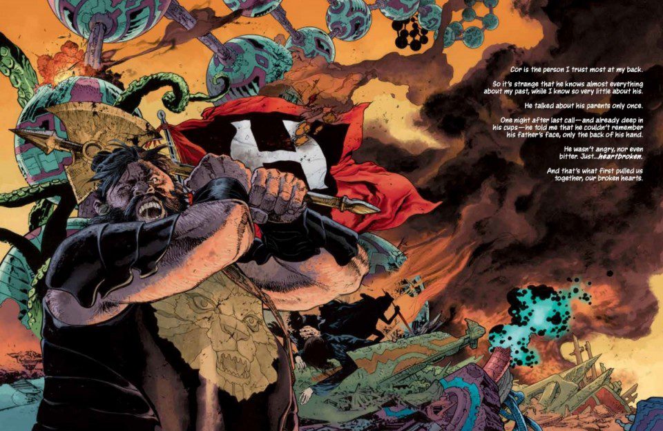
Creators J.H. Williams III (Promethea, Sandman: Overture) and W. Haden Blackman return to their awe-inspiring world in Echolands #2. With Dave Stewart on colors and Todd Klein on letters, this issue continues this genre-blending epic’s forward bold march. With an intriguing plot that leaves much to mystery and medium-breaking visuals, this chapter proves the first issue was no fluke – this is a potential masterpiece in the making.
“Hope Redhood and her companions, Cor, Caniff, Castrum, Dena, Rabbit, and Rosa, are on the run from the Wizard, Teros Demond, and his terrifying daughter. Why is the Wizard willing to kill to regain his stolen gem? Can Hope and her crew escape the strange robots lurking in the tunnels beneath San Francisco? And will they survive a betrayal by the pirate captain, Bloody Gums?”
Writing & Plot
What W. Haden Blackman and J.H. Williams III have done with this series is craft a seamless blend of science-fiction and fantasy genres. Echolands #2 further showcases this with how its characters and lore details string together. A crew including not just our magic-wielding protagonist and her burly companion but also a vampire and a non-binary elf (and numerous other beings) are at the front of the story. Our main antagonists include a masked woman made of flesh and foliage and her arch-wizard father. Meanwhile, robots lurk under city streets and the villains use surveillance drones to track people down. All of this is tucked into a story that feels natural because of how Blackman and Williams present the world.
There is no real exposition, instead the writers just decide to throw us in without a life preserver. This is in my mind the best way to experience this kind of story. The newness of everything makes us readers passengers and discoverers in a new world. We are strangers in a strange land, newcomers to a world we will gain an understanding of only if we stick to this cast of characters. The final pages of this book are made up of a prose interview with the comic’s shadowy antagonist. This may be my favorite part of the comic even though it stops being a comic book here. The amount of atmosphere, lore, and foreboding this segment gives makes me voracious for the next chapter.
Art Direction
J.H. Williams III also draws Echolands #2. This should tell you everything you need to know about the art. His style-blending on every page never ceases to be astounding. Every character appears to be drawn with a different approach and technique. One character could be heavily shaded and cross-hatched while the character standing next to them is drawn with open linework, akin almost to Frank Quietly’s approach. This style, which is common in Williams’s work, adds to the idea of this comic’s mythological melting pot. His intricate detailing of every surface of character and environment is impossible to to see. It’s the sort of work that will have you staring at the page for moments on end before moving on.
All of his creative designs in terms of both the world and characters are memorable and distinct – especially our masked villain. The panel direction is just as artistically charged as you could imagine a Williams would be. One page will have a relatively standard top-to-bottom panel progression. Then the following page will have no panels whatsoever and be broken up by the art itself. Williams has always favored the progression of his comic stories in this manner, and it’s always an absolute thrill to see.
Colors & Lettering
Dave Stewart is on hand to fill in Williams’ work with. It should go without saying that he does incredible work here as well. The veteran colorist utilizes a style that is just as shifting and varied as Williams’ own, with every character and surface seeming to have a different approach taken to it. The density to Stewart’s work pulls off an artistically rich and high-fidelity look to the visuals. Much like the penciller, the color palette can shift into oddity and almost psychedelia on a dime and look completely natural in this aesthetic. Coming from the same colorist that filled in Williams’ work on Sandman: Overture, I expect nothing less.
The lettering comes from another comics heavyweight in Todd Klein, and it’s just as brilliant as you might imagine. His fonts range wildly from character to character, with an extensive variety of dynamic changes. A real highlight is the masked protagonist’s dialogue lettering, which appears in a sort of Greek alphabet-esque font. Every aspect of the visuals in this comic are absolutely stunning and a high point in the entire medium.
Verdict
Echolands #2 is a fast-paced and wholly imaginative second chapter to this genre-blending storm of creativity. W. Haden Blackman and J.H. Williams craft a script that fleshes out the world solely through character interaction and makes all of this story’s many gears mesh together perfectly. Williams’ pencils together with Dave Stewart’s colors are reminiscent of a Baroness album cover in motion, but with infinitely more variety. Be sure to grab this newest issue and keep up with this series when it hits shelves on 9/29!
Marvel Comics’ Reptil #4 closes out the miniseries on a high note. Between a climatic battle against the series’ main villain and the title character’s concerns about his self control, there’s a strong sense of familial comfort in Mexican pride.
Background
Humberto Lopez (a.k.a. Reptil) just wanted to keep his head down after events like King In Black. Only for a new villain, Megalith, to hold what’s left of Reptil’s parents hostage for the source of his dinosaur shapeshifting power.
Reptil #4: Viva La Familia
Writer Terry Blas keeps Reptil #4 dedicated to the idea of a greater family as a form of empowerment. Seeing Berto with his family and community feels absolutely serene. So when Megalith arrives for Berto, there’s a genuine sense of intrusion. Having the entire Latin community stand with Reptil feels like authentic support.
This issue builds on everything in the previous three issues for a grand finale. Seeing Reptil assume the form of a Quetzalcoatlus isn’t just a resolution on his arc for self control, it’s a callback to earlier in the series with Berto’s parents. It feels like the end of one journey so a new one can begin.
Strike With Art
All of the artists of Reptil #4 play their parts in bringing out the very best in this series. Enid Balam’s pencils make the costumes, dinosaurs, and monster forms notable enough to remember. It certainly helps that every major character in this issue stands out further with bolder lines from Victor Olazaba’s inking. Not to mention the eye-catching colors of Reptil’s dinosaur forms and Megalith’s golems from Carlos Lopez.
Joe Sabino gives each line of dialogue a great bit of importance in Reptil #4 through fonts. Like when Berto speaks Spanish, the italics and lack of translation caption gives the impression of the community coming together against Megalith’s assault. That’s not even including how a stylized sound effect from Reptil’s Parasaurolophus form communicates with dinosaurs.
Take A Gander At Reptil #4
Reptil #4 completes a heartwarming empowerment story via a greater family. The way the title character communicates with others speaks volumes on aspirational identity. Through the efforts of the creatives, there’s a strong sense of artistic expression. Building upon everything that comes before in this series also leads to a grand finale.
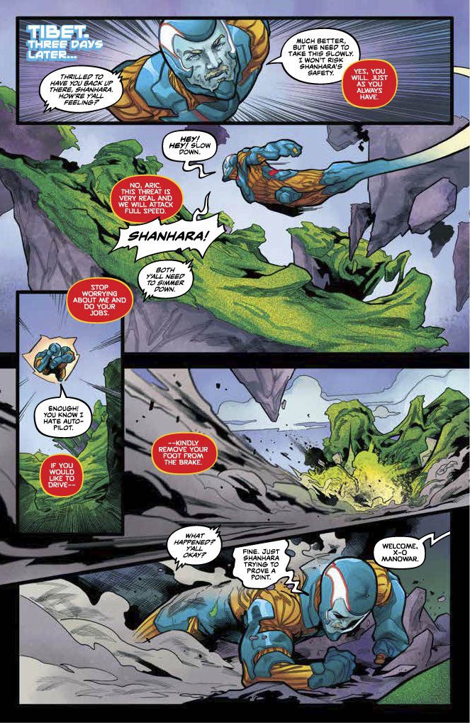
X-O Manowar #6 from Valiant Entertainment is out in comic stores now. Since issue 3, a plot has been developing that threatens the mundane life of Aric via his suit Shanhara. The revelation that something’s wrong boils to the surface with carefully paced reactions the reader catches onto.
Background
Aric of Dacia (a.k.a. X-O Manowar) works with billionaire Troy Whitaker to combat a nanite swarm. But after a near-death scenario, Aric’s suit Shanhara is in need of rest.
X-O Manowar #6: An Uneasy Recovery
Dennis Hopeless continues the quietness of last issue into X-O Manowar #6 before moving into a major twist. At first, things seem still with Shanhara’s recovery, even dedicating a few pages to her and Aric taking downtime by rebuilding damage from issues back. Seeing the alien armor back in action feels genuinely rewarding. That is until the reader notices how Shanhara’s personality change since issue 4 affects the people around her. Seeing how dominating she gets with Aric to confront the nanite swarm feels disarming.
Check Out The Details
The art of X-O Manowar #6 tells most of the issue’s story. Emilio Laiso seems to having fun with the illustrations, like when Shanhara covers Aric’s head with a large ball. The way characters react to this funny moment is fitting after a moment of fear. Raffaele Forte’s inking emboldens theses reactions to add depth and impact to these moments and drive them home.
As for the issue’s direction, Ruth Redmond’s coloring and Hassan Otsmane-Elhaou’s lettering does most of the work. The background coloring sets up most of the atmosphere with floating mountains covered in moss-like nanites catching the readers attention. The lettering then smoothly guides the reader as characters exchange dialogue. Perhaps the most notable contribution however is how Shanhara’s voice is presented. Her red word balloons make her sound assertive and vindictive, unlike the return of her blue word balloon that’s full of concern.
Prepare Yourself With X-O Manowar #6
X-O Manowar #6 is getting into the real crux of the series’ run. There’s a well balanced plot in terms of pacing, with an even more impressive payoff. Through juxtaposition and eye-catchingly evocative artwork it sucks the readers in with a great plot. It all but doubles the anticipation for next issue.
Welcome to Self-Published Spotlight, a regular interview column where I will be highlighting self-published comics and the creators and small print publishers who make them.
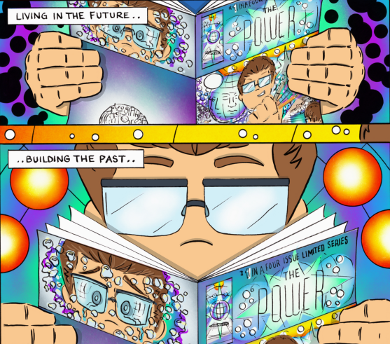
When I laid eyes on the artwork of Rick Lopez’s comic, The Power, I was immediately blown away. My reaction was so visceral I knew it was a book and artist I had to follow. I reached out to Rick and we started communicating about comics, his work, and art in general. It was only a matter of time before I featured Rick in this column. So check out our chat and definitely head over to Rick’s online shop and pick up The Power!
Monkeys Fighting Robots: Rick, first off I know how busy you get, so thanks for taking the time to chat!
Rick Lopez: Absolutely! No problem at all, thanks for having me!
MFR: So what’s your comics’ secret origin? How did you get into the medium?
RL: Honestly, they were always around. I had a stack of Disney comics as a kid I loved, the hero comics were a bit harder to come by for me amidst the speculator boom though. Barnes and Noble was my LCS long before we got a legitimate shop in my area.
MFR: And when did you decide to start creating your own comics?
RL: For a few years I thought I’d just be writing comics and other people would draw my books. I had someone in line to draw The Power and it fell through. I did the script and thumbnails already so I just started it myself in early 2019 and learned a lot, Image Grand Design really changed the game for me though.
MFR: Let’s jump right into The Power. Can you give our readers a synopsis?
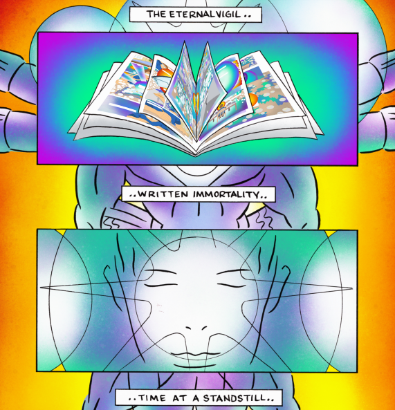
RL: The Power is a four-issue limited series about a boy creating a comic, only to discover a realm beyond space and time.. within his own mind! So it’s focused around the creation process and while we work we drift off to another more ethereal plane in our minds.
MFR: The art in The Power blew me away. Specifically, the colors and layouts, which seem to be a huge focus for you. What is it about these two elements that draws you to focus so much on them?
RL: Thank you, I really appreciate that! I think specifically with The PowerI’m trying to represent (the best that I can) those inner planes of the mind and the meta capabilities of the medium through the layouts and the colors so that in and of itself makes them so important.
MFR: Did you have any specific influences on The Power? What artists/books did you look at for inspiration?
RL: Grant Morrison is a huge inspiration to me in general, I would definitely say Morrison’s run on Animal Man and the Flex Mentallo mini-series are inherent influences on The Power.
MFR: I freaking love your homage covers. You’ve done Infinity Gauntlet #1 for issue one and the classic Miller Wolverine #1 for issue two. Why did you decide to do these homage covers and did you have others in mind? What other homage covers can we expect if you care to tease?
RL: The homages are a lot of fun to do but I also think it adds a bit of recognition to the book even just at a cover glance. I wanted to use as much from comics as I could really. Initially had planned on using a New Gods cover for #3 but opted for a Green Lantern Darryl Banks cover that I felt lent itself better for my book. That being said I have two Kirby covers planned four-issue 4 and the trade is still to come.
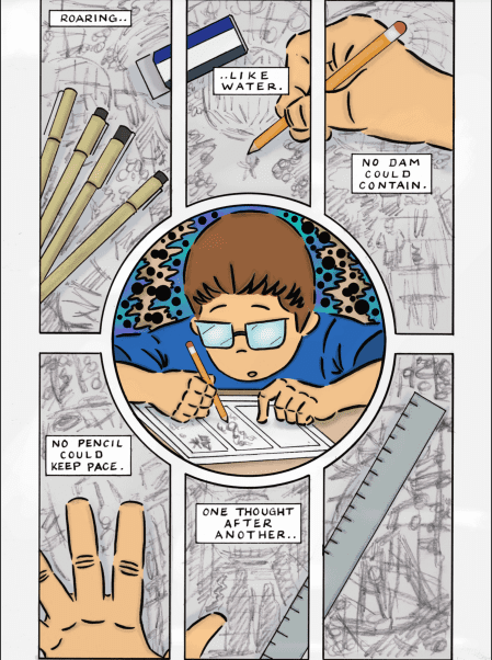
MFR: What’s your progression and creative process like? What’s the first thing you do when you decide to put pencil/pen to paper? What tools do you use?
RL: Usually I’ll thumbnail my ideas pretty small on scratch paper, scan those in, blown them up/move things around on Procreate, print onto 11×17 Bristol board, clean the pencils up a bit then I’ll use my light pad with another bristol to ink/tone the pages and scan them back onto procreate for colors and clean up. I think using both [digital and analog] is the key, I know a lot of people are going full digital but I can’t give up that human look and the original art that you get from inking traditionally. There are these Pilot double brush pens that I’m obsessed with and recommend a lot and the Uniball white signo pen is another amazing tool I use with every piece. Then of course Ticonderoga and Staedtler pencils, mechanical pencil, microns, deleter screentones, Ames lettering guide and procreate are all staples at the desk as well.
MFR: Was self-publishing always the route you were going with? Or did you have other publishing methods in mind?
RL: I think self-publishing was always the option, I kind of thought I would release everything all at once with The Power and got really far with layouts and pencils but ultimately I don’t think that was the best idea.
MFR: Self-Publishing, in general, is on a huge upswing. Patreon, Kickstarter and now Substack. As a creator, why do you think self-publishing is growing?
RL: I think a lot of creators are tired of giving away their best ideas to companies for them to own. We have all these apps at our fingertips to grow our own audience and reader base. We can make our Patreon, Kickstart our books and get the net big enough to live off of our own ideas without compromising to a corporation. Image Comics showed us this 30 years ago.
MFR: Besides The Power, what else have you worked on? And what else are you hoping to work on?
RL: My first works were 14 pages in Image Grand Design, I did a page in the Weapon Ecch book and another page for the upcoming BMN Year Wha book (that I need to finish), as well as 4 pages coming up in Wizerd #2 from Cosmic Lion Eli Schwab later this year. Craig CK and myself co-founded Next Panel Press, which is a bi-weekly collective of strips from a group of artists across the globe. My strip Cosmicat, is about a joint smoking feline outlaw making his way across the galaxy, as past, present, and future all begin to unfold around him! The 17th strip is about to drop this weekend so nearly enough to collect into a single issue. I collected the first seven into mini-comics I’ve been giving out with book orders though.
MFR: Where can our readers find you and your work?
RL:
There’s Someone Inside Your House is a fun yet all too familiar teen slasher film. It premiered this week at Fantastic Fest and while there’s more that worked, versus what didn’t, this movie is not breaking any new ground. Horror fans are getting spoiled this year with slashers films, and now another solid effort has joined in. There’s Someone Inside Your House might not make a lasting impression but it’s a solid horror film with a strong lead performance.
The late ’90s certainly sparked a slasher film craze with classics like Urban Legend and I Know What You Did Last Summer. More recently, slashers have been making a comeback. There’s Someone Inside Your House is the latest gem horror fans should love watching this Halloween season. Directed by Patrick Brice and written by Henry Gayden. The film stars Sydney Park, Theodore Pellerin, Asjha Cooper, Burkely Duffield, Dale Whibley, Diego Josef, and Jessie LaTourette.
There’s Someone Inside Your House follows Makani Young (Park), a senior in high school with a secret she’s ashamed of. Makani’s efforts to hide that secret are put in jeopardy when a killer terrorizes the town of Osborne, Nebraska. Her classmates are picked off one by one and the killer is determined to expose their victim’s secrets along the way. The killer doesn’t want a confession from anyone, they just want to brutalize and expose. Gayden probably relies too much on nostalgia, which could ruin the film for some. But this diverse group of teens makes for a gory good time.
Sydney moved to Nebraska to finish out high school after a traumatic experience at her old school. Now living with her grandmother, she hopes to shed her past and have a fun senior year with friends. Gayden’s screenplay provides audiences with a shy, reserved, yet smart final girl to invest in. Her group of friends each adds their charm to the overall experience. There’s Someone Inside Your House throws in several horror cliches. A popular student is killed at the start. The aftermath results in a town curfew, and an obvious red herring who won’t be the killer. Makani’s keeping more than one secret from her friends.
During the summer break, she was seeing Oliver (Pellerin), a local teen who is ridiculed at school. Since their split, he can’t seem to let her go. His behavior will tip-off horror audiences as the obvious red herring. Instantly filling out Billy Loomis criteria usually means his sketchy behavior rules him out as a suspect. Gory would be an understatement when describing the kills, but most are pretty bland. Nothing horror enthusiasts haven’t already seen before. Adapted from Stephanie Perkin’s novel, There’s Someone Inside Your House isn’t treading new territory. But the inclusion of social media shakes it up enough for a new generation of horror fans.
Unfortunately, the fun doesn’t get wrapped up satisfyingly and had the film’s finale played out differently, it could have been saved. Parks is incredible as Makani and the character’s growth is great to witness. Pellerin’s performance as Oliver is solid, but his red herring status is too obvious. Although he does capture the off-putting nature of Oliver adequately enough. Brice’s direction, while effective, provides no moments of tension. There are some wonderfully captured kills, but a sense of danger never kicks in. Its pacing is flawless though and there’s never a dull moment.
There’s Someone Inside Your House is an entertaining teen slasher film for today’s generation. Capturing the vibe of ’90s horror might be enough for older audiences to have fun with it. It’s an engaging horror film with a strong cast that keeps the film exciting during all the bloodshed in between. The film might be forgotten in a couple of years, but some horror fans might add it to their yearly watch list.
There’s Someone Inside Your House releases on Netflix on October 6, 2021.
Writer Cullen Bunn (Harrow County, Dark Ark) and artist Andrea Mutti finish their dream-walking miniseries with Parasomnia #4. Though still unclear as to what’s truly happening here, this finale is less frustratingly vague about its plot and brings itself to a semi-ending that teases more to come. With a tightly paced script and atmospheric visuals, this issue seals Parasomnia as a wholly unique horror read that hopefully recerives a proper conclusion soon.
“As the nameless stranger battles nightmares in a dream world on his hunt for his missing son–his life and his family’s in the real world continue to fall apart in this chilling conclusion to this supernatural and melancholy tale.”
Writing & Plot
Cullen Bunn’s script for Parasomnia #4 succeeds partially for being more focused than its predecessors. There is a tighter focus on the parallels between the real world and the dream – and the lack of distance between them. This discrepancy has always been a part of this comic, but it’s always felt too clouded to be fully engaging. Issue #4 takes these points in the narrative and sharpens them to a climactic point. The story of our mask and tri-horned hat-donning protagonist is still a mystery, but his connection with reality is becoming clearer. Bunn’s pacing is consistently tense and pulls the reader along at a brisk, exciting speed.
The dialogue writing is at the perfect amount, just enough to get a feel for the characters but not enough to bog down the story. There’s a mythic intensity to how Bunn presents the dialogue of protagonist and his (presumably) Native American ally. This comic feels like a mix between a lone hero story along the lines of Conan or Berserk. However, it’s treated obviously mixed in with a supernatural thriller and familial horror story. The fact that this is the final issue of this specific series is both bold and odd. Without getting into spoilers, don’t expect any sense of finality when you finish this comic. I hope whatever Bunn has planned next arrives hot on the heels of this miniseries.
Art Direction
The most alluring aspect of Parasomnia has always been Andrea Mutti’s visuals. Here on this final issue, this fact remains. Mutti’s pencils and colors create a brilliant atmosphere and tone for this dream-walking thriller series. His thin penciling allows for fine character detail, shown in careful creases and expressions on every panel. The environments appear deceptively empty, but this is due to how Mutti creates the world here. His colors are made of hazy clouds of single hues that dominate entire sequences. Pages will turn from light greens to rustic browns then to purple without warning. This is a delightfully creative way to create the dreamscape feeling this comic needs. The lettering from Simon Bowland, who lends his incredible talent to The Dreaming, seems to have an easier job here. His contemporary fonts alter just enough to capture tone, but there’s nothing drastic here. Overall, this remains a tonally rich comic that other horror comic artists may want to take note of.
Verdict
Parasomnia #4 is a good comic but a bad ending. Bunn writes the most well-paced and entertaining script of this miniseries, but offers a conclusion with no finality. The moody and atmospheric visual work of Andrea Mutti continue to please and make for this comic’s best selling point. If there is truly more to come from this story, I hope it arrives soon. Be sure to grab this finale when it hits shelves on 9/29.
Dear Evan Hansen mixes strong performances with a questionable story addressing mental health issues. Based on the popular stage musical, this film adaptation provides an interesting protagonist whose motivations make it difficult to feel towards him. While the musical aspect is executed tremendously, certain moments of singing feel ill-timed. Dear Evan Hansen was a huge hit back in 2015, but this movie is destined to leave audiences divided because of how it handles the subject matter.
Mental health issues plague many people day in and day out and for Evan, it’s his social anxiety. What begins as a dramatic story about a teenager struggling to fit in becomes a manipulative game. Sure, the film will have audiences contemplating tough subjects. But Evan’s character progresses into an unlikeable person to have the film centered on. Directed by Stephen Chbosky and written by Steven Levenson, Dear Evan Hansen stars Ben Platt, Amy Adams, Julianne Moore, Kaitlyn Dever, Amandla Stenberg, and Colton Ryan.
The film follows Evan Hansen (Platt), a teen trying to cope with social anxiety by writing letters to himself after his therapist recommends it. Evan’s letter ends up in the hands of Connor (Ryan), a classmate who commits suicide. This event takes Evan on a journey that allows him to finally be accepted by his peers. Details disclosed about Evan throughout this film are in great supply, and that’s not an exaggeration. Evan is in high school, has social anxiety, goes to therapy, and might be a sociopath. His relationship with his mother (Moore) is almost nonexistent because he believes himself to be a bad son.
Dear Evan Hansen wants to take audiences on this self-discovery mission with Evan, but how it unfolds will make it a hard watch for some. The character of Evan is well developed, and there is a lesson he learns from this. However, Evan’s likable qualities are undone by his manipulative behavior in an attempt to finally be accepted. It does speak to how troubled he is, which should make him likable, but the lives he’s playing with are what creates an issue. Connor’s family is played like fools while Evan propels himself to social acceptance. Levenson’s screenplay is equally frustrating and thought-provoking, so it doesn’t translate into an enjoyable watch.
It’s not a poorly made movie, but its message is lost in the events that unfold on screen. Platt reprises his role as Evan Hansen and fans of the play should enjoy this aspect. He delivers a great performance as Evan and the singing along the way keeps you invested in the progression of this character. The performances are incredible to watch on screen. Platt’s age might be an issue for some, but he’s believable in this role. Chobsky’s direction keeps emotions high throughout most of this two-hour-long film. But when the vocals kick in, audiences might find it difficult to grow attached to any of these characters.
When the vocals kick in, all eyes and ears will be locked into each word. Some moments, such as when Evan’s lies are exposed, make the exceptional vocals feel out of place and unnecessary. It could be argued that the musical aspect should have been abandoned, but that could have been too big of a departure from the source material. Dear Evan Hansen impresses and then it disappoints, sometimes all at once during certain scenes. A compelling film that could have addressed mental health in a better way.
Dear Evan Hansen will leave audiences divided and that will at least spark important conversations. Strong performances keep you engaged, but the character of Evan isn’t going to sit right with many viewers. The success that the coming-of-age stage musical had won’t translate the same for this film adaptation. Dear Evan Hansen is a mixed bag that will have audiences talking.


 Reinvention is at the heart of The Harbinger #1. Colin Kelly and Jackson Lanzing literally open the issue with the phrase “be better”. For readers returning from older Stanchek adventures, this is an acknowledgment of the Harbingers’ problematic legacy. As the issue’s setting displays, the Renegades’ reactionary stances haven’t made improvements. Without a positive role model or a way to show the public that psiot’s aren’t all threats; the foundation’s scraps have been relegated to a Chicago district where they are oppressed. It gives Peter something to strive for.
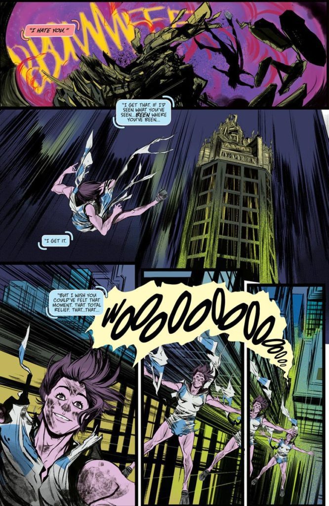 New readers can empathize with the amnesiac Peter. Much like the Generation Y and Z audiences this series aims at, Peter comes into a world he didn’t ask for. But he’s still ecstatic at experiencing his powers for the first time in The Harbinger #1. The readers experience these sublime moments with Peter, ready to embrace the world even if it is bleak.
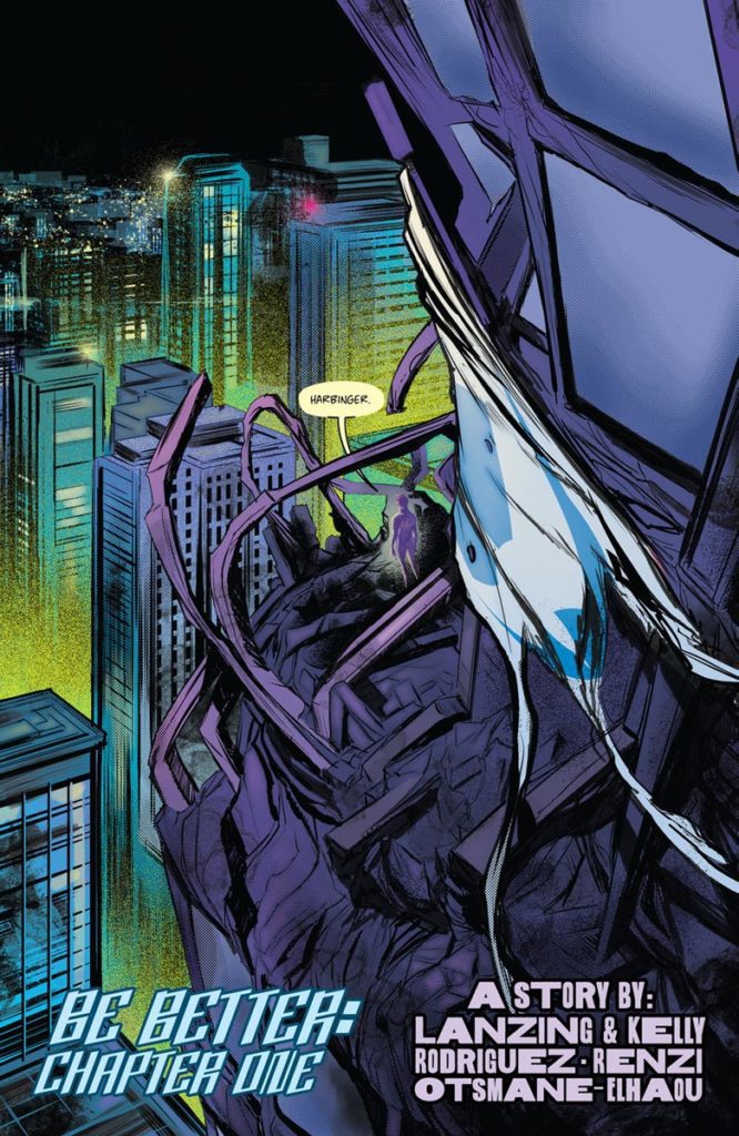 Robbi Rodriguez illustrates The Harbinger #1 with a larger-than-life atmosphere. Peter looks small and vulnerable in a few panels. The world around him is vast, bright, but also covered in shadows. The city of Chicago doesn’t feel too welcoming towards Peter as he stands on a building. But the way Peter’s telekinesis is able to bend buildings to his whim shows how much he can change this gloomy city.
 Rico Renzi’s coloring adds to the atmosphere through the moods they convey. Alongside the brightly lit Chicago is the district of Psiot City that’s shrouded in black. In this dark canvas, the psychic powers of the psiots give this obscure area personality. To that effect, it reflects the psychedelic images Peter sees in his mind when he uses his powers. There’s potential for the psiots to be something more, but Peter and the rest of the psiots have a long way to go before they can integrate back into society.
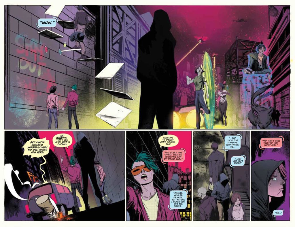


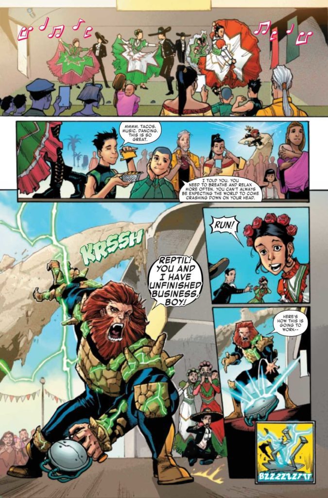 Writer Terry Blas keeps Reptil #4 dedicated to the idea of a greater family as a form of empowerment. Seeing Berto with his family and community feels absolutely serene. So when Megalith arrives for Berto, there’s a genuine sense of intrusion. Having the entire Latin community stand with Reptil feels like authentic support.
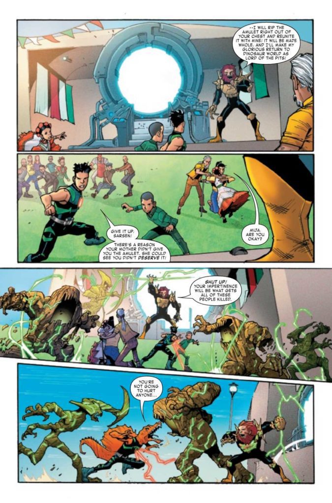 All of the artists of Reptil #4 play their parts in bringing out the very best in this series. Enid Balam’s pencils make the costumes, dinosaurs, and monster forms notable enough to remember. It certainly helps that every major character in this issue stands out further with bolder lines from Victor Olazaba’s inking. Not to mention the eye-catching colors of Reptil’s dinosaur forms and Megalith’s golems from Carlos Lopez.