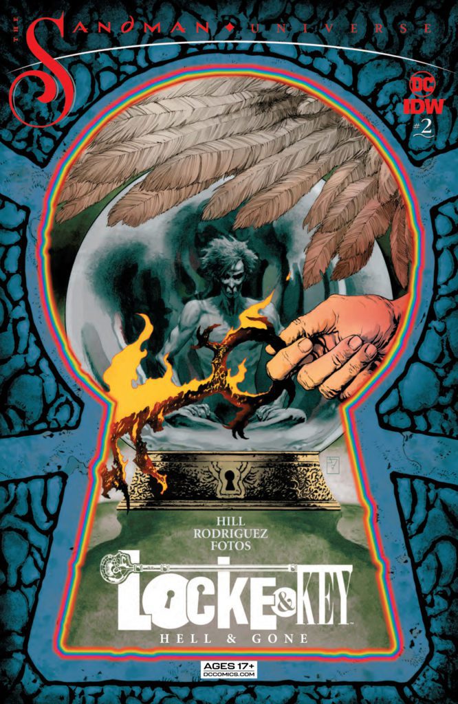
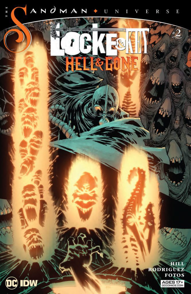
Anyone who has read Sandman and Locke & Key would know that a crossover of the two is a match made in Heaven… well, maybe not “Heaven.” But the two series have many of the same themes and stylings. So, when IDW Publishing and DC Comics’ Locke & Key/Sandman: Hell & Gone #1 came out in April, some fans were a little underwhelmed. But writer Joe Hill, artist Gabriel Rodriguez, colorist Jay Fotos, and letterer Shawn Lee show us in Locke & Key/Sandman: Hell & Gone #2 that that was because they were merely setting the stage for their epic. This issue brings this crossover to its full, bombastic potential!
Writing
Hill channels Gaiman flawlessly in this chapter. His writing for Fiddler Green, the Corinthian, and Lucien all feel really true to their characters. But they also feel like characters that could have shown up in one of Hill’s stories. Hill seems to love to explore the ways that his and Gaiman’s voice can sometimes sound so similar. And all of the dialogue just feels so damn smooth. Every line has subtext. Our protagonist, Mary Locke, says “I get it. I’m not really much of a morning person myself. But sooner or later we all got to wake up.” Hill highlights with lines like these that his script is about more than just what is happening on the surface. Dreams, to Mary, are childish and silly. Though the citizens of the Dreaming may change her mind about that.
While this issue is incredibly dark at times, it can turn on a dime. Hill can move from disturbing images of hellish torture to moments of hilarity without skipping a beat. It’s shocking and hysterical. These 50 pages really do feel like they contain a rollercoaster of emotions. Yet each moment feels earned, each transition feels smooth. And the finale will leave you wishing you had 50 pages more!

Art
To say that Rodriguez delivers on this issue is selling these beautiful pages short. Rodriguez has a stunning quietness to his art, in the midst of all of the chaos. This quietness makes the preposterous feel human and balances the impossible scenes with gentle glimpses of reality. We see anguish, fear, and fury on characters’ faces. But these looks are subdued, buried beneath a tough exterior, rarely breaking out. Every truly emotional moment feels completely earned, as Rodriguez uses intense expressions sparingly. In the heat of the battle, it’s not Lucifer’s pitchfork or fiery power that we hone in on. It’s the look on his face. He looks furious and hurt, betrayed and vengeful. Rodriguez makes us empathize with characters that ought to seem totally unrelatable.
Coloring
If you were to flip through this comic and stop at random page, you’d probably be able to tell where the scene is taking place. That’s because Fotos gives each setting – The Dreaming, Earth, and Hell – its own color palette. The Dreaming has deep colors in it. We see the green of Fiddler Green’s plant life, the purple of Lucien’s suit. Earth is much more muted. Hell is almost monochromatic. It’s dark reds and oranges, except for the bright red of Lucifer and Etrigan’s outfits, and the occasional bright yellow of hellfire. But Fotos gives each of these settings their own voice. Fotos almost makes them feel like they’re characters in the story as well.

Lettering
Lee doesn’t change the lettering up a whole lot. The dialogue remains mostly the same, with the letters rarely changing size or shape. But this means that when there are differentiations, they really change the reading of the page. Lee even uses bold sparingly. On one particular page, though, Lee uses bold a lot. “Do you really think you can open the Gates of Hell?” Fiddler Green asks. “I’m not worried you can’t do it,” he continues. “I’m worried you can.” This whole page is given such a sense of rhythm because we haven’t seen many words bolded up until this point.
And as the issue progresses Lee does change things up a little. We see some characters that talk with different fonts. This becomes more common once we get into Hell. And the sound effects also come out to play. At one point, Lee does one of the best things I’ve seen done in lettering. It’s fun, hilarious, and badass. It’s the kind of thing that you’ll know the moment you see it and to talk about it anymore would spoil some of the joy of seeing it for yourself.
Locke & Key/Sandman: Hell & Gone #2 is a ton of fun. This creative team absolutely sticks the landing and they give us everything we could want in a Locke & Key/Sandman crossover. You’ll laugh, you’ll cheer, you’ll cry. But most of all, when the last page comes, you’ll beg for it not to be over. Pick up Locke & Key/Sandman: Hell & Gone #2, out from DC Comics/IDW Publishing, at a comic shop near you!

