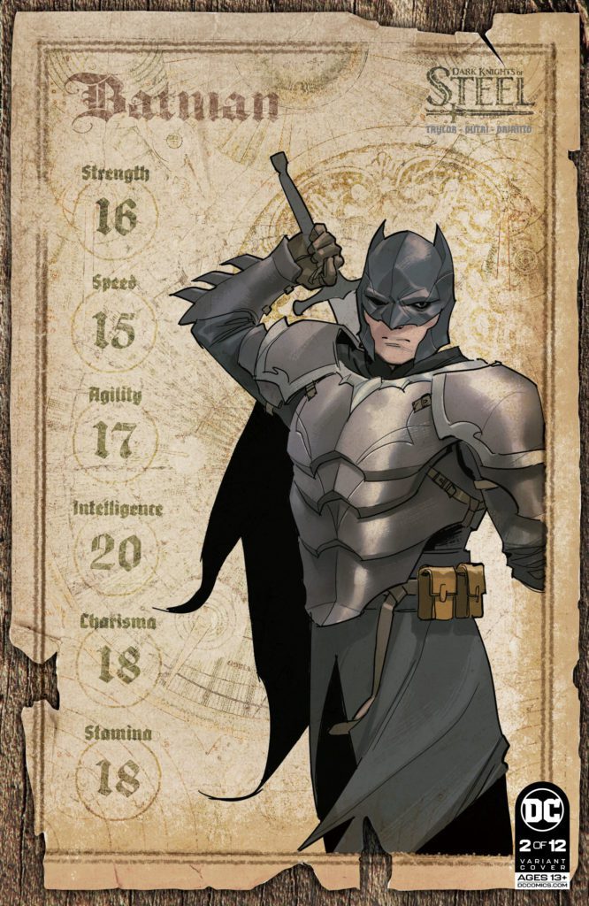
DC Comics’ Dark Knights of Steel #2begins with a scream and ends with a whimper. Writer Tom Taylor, artist Yasmine Putri, colorist Arif Prianto, and letterer Wes Abbott set the stage for the chaos that’s coming. But before all hell breaks loose, we witness the quiet, personal attacks that are going to set off the powder keg.
Writing
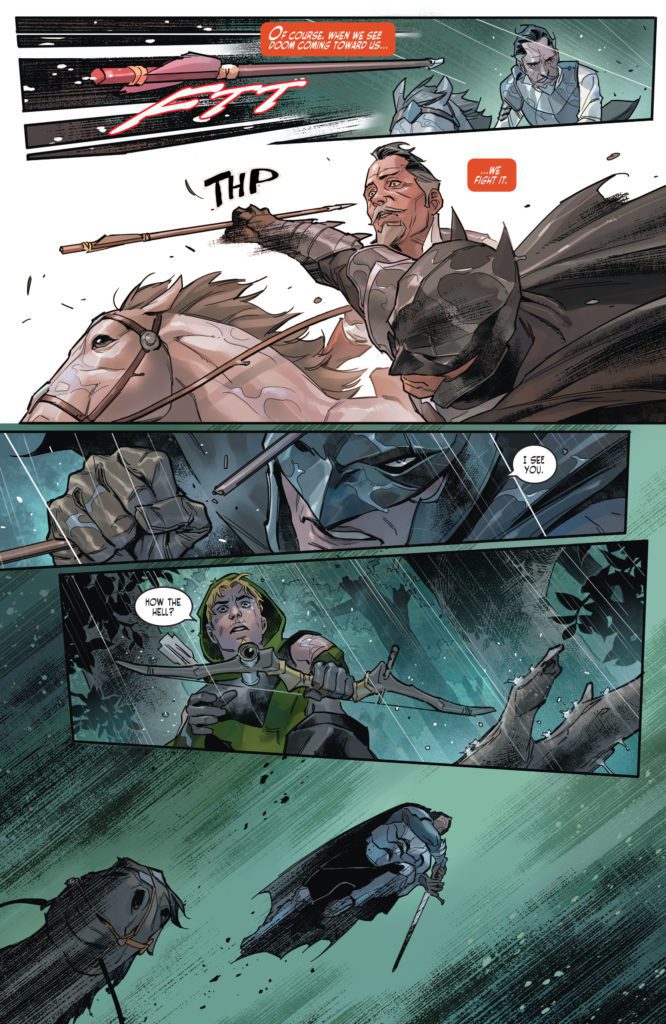
Issue #1 of Dark Knights of Steel showed us the idyllic, if tense, world of a medieval DC Universe. But issue #2 makes a point of kicking this story into gear. Taylor begins with the final, violent scene of the first issue. But it’s not the violence that makes this story so terrifying. In fact, the rest of the issue feels relatively calm. The House of El mourns their loss, but they also very matter-of-factly discuss retaliation. It’s in that that Taylor finds the true tension of this story. The bureaucratic discussion of war and peace is far more chilling than impassioned duels could ever be. And Taylor also fills this chapter with a general sense of doom. Each character almost seems resigned to the imminent war. They don’t want rampant death, they just know they can’t avoid it. It feels like an all too realistic response to an act of war.
Art
This issue begins in quite an emotional place. But quickly, Putri pushes those emotions to the sidelines. After their initial release of fury and sadness, we see that few characters show how they’re feeling. Instead, Putri shows them with looks of concentration and knitted brows. Clark is one of the few who allows himself to look angry. With this, Putri lends her version of Clark a wide eyed innocence, a youthful energy. He hasn’t become jaded. He’s open and trusting, allowing people to see how he feels. The same can be said of Zala, this world’s version of Supergirl. Putri shows that there’s something different about how the Els grew up. They’ve always been so untouchable that they never learned to guard themselves when danger comes a-knocking. This isn’t to say that the other characters Putri presents aren’t emotive. But they express everything subtly, holding back the true passion of what they’re feeling.
Coloring
Prianto’s scenes, on the other hand, have a very emotive quality to them. It’s part of what tells us what’s brewing under the surface of our more stoic characters’ faces. When Bruce and Clark go into the castle’s dungeons, the scene is lit by the fire of torches. The reddish light gives us a hint of the fury Bruce is feeling. When Zala spars out in the sunlight, the warm yellow glow of the setting matches her face, which is brimming with joy. And when we reach the heartbreaking conclusion of this chapter, the night is cast in a cold blue light. Prianto displays every moment of this comic as a kind of litmus test for each character. Prianto doesn’t just paint with reds, blues, and yellows. He paints with joy, anger, and sorrow.
Lettering
There is a lot of movement in Abbott’s lettering of Dark Knights of Steel #2. The “SHLK” noise of someone’s limb being chopped off actually slices through the air in a jagged, haphazard trajectory. It almost seems to separate the limb from the rest of the body. When the rain douses someone’s pipe, Abbott writes the “TSSSS” noise in the shape of smoke, slowly rising and growing in its font. The “FTT” sound of a flying arrow cuts through the air, and the “THP” of someone catching it feels stationary, like screeching to a halt. Abbott explores how his sound effects can create motion in this comic. His lettering gives so much life and energy to every page.
DC Comics’ Dark Knights of Steel #2 starts setting everything in motion. This creative team hints at some of the doom that’s on its way, like an oncoming storm. But we’ll have to wait and see what the House of El and the Kingdom of Storms next moves will be. Pick up Dark Knights of Steel #2, out from DC Comics December 7th, at a comic shop near you!
There’s one thing that makes DC Comics’ The Swamp Thing such a mesmerizing series. It’s a horror series, but it’s full of beauty and joy. Writer Ram V, artist Mike Perkins, colorist Mike Spicer, and letterer Aditya Bidikar know that without joy and light, the darkness has no real effect. The Swamp Thing #10is a textbook example of this approach. You won’t have any confusion around why this brilliant series got extended.
Writing
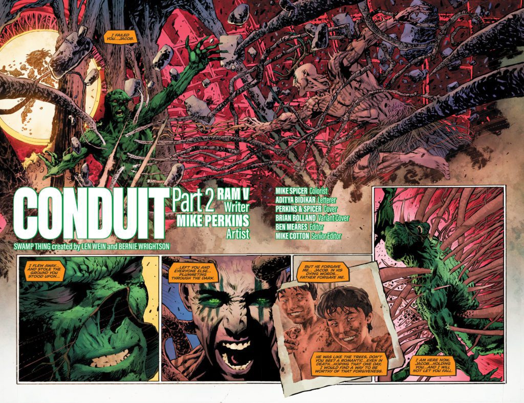
This is one of the darker chapters of The Swamp Thing. After the final pages of our last issue, it would seem that everything is going to fall apart. Yet V still fills these pages with so much optimism and magic. Even as Levi faces his brother, who is hell-bent on killing him, he isn’t full of rage or revenge. He’s thinking back on the times they spent together as children. And when we get to the twisted ending of this chapter, we see the bad guys still have a few cards up their sleeves. But so do our heroes. For every moment of horror and doom, V adds in a scene of happiness and hope. It’s a beautiful balance that helps readers really feel the stakes of this series.
Art
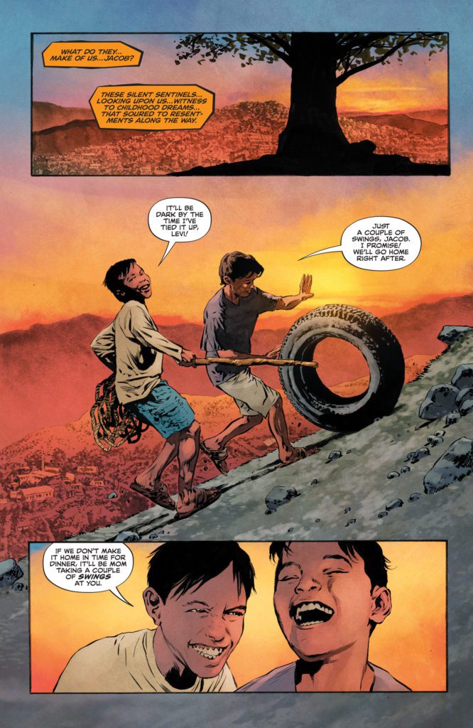
The exact same thing can be said of Perkins’ stunning artwork. When his characters feel happy, you can’t help but feel it with them. When they feel terrified or furious, the intensity of their emotions gushes off of the page. But it’s in the marriage of these two extremes that Perkins’ art really shines. On one page, we see the quiet, simple scene of Levi and Jacob on a tire swing. We see Levi’s laughing face as he swings out, into the air. But overlaid on the page are three panels of death and destruction. One man stares at the reader, a mix of fear and fury in his eyes. And then we’re back to the boys and their tire swing, now seen as a silhouette against a gorgeous sunset.
Later, amidst the chaos of Mr. Pilgrim escaping the Swamp Thing, we see Pilgrim’s face briefly. He’s a villain. Perkins has previously depicted him as the kind of guy who could get away with wearing a flowing cape, dramatically playing an organ. He’s rotten, and we’ve seen the joy on his face when he’s made other people suffer. But now, he looks quietly terrified. Perkins is empathetic to this character. Instead of a villainous trope, Perkins presents us with a human being. Despite everything he’s done, you can’t help but feel for him. Even if it’s just for a second.
Coloring
Spicer’s pages are truly breathtaking. And he absolutely dives into the double nature of some of his colors. At first, we see his dazzling oranges used as the backdrop to a charming scene of childhood innocence. The orange sunset paints everything in its wake, giving these scenes a golden hue. Later, the same colors are used to show the fires of destruction. And it’s in The Swamp Thing #10‘s bleakest scene that we really see Spicer’s work in its full glory. He strips back the scene, making everything look grey and lifeless. And as hope slowly finds its way back in, so do Spicer’s colors. Spicer has the ability to make everything look gorgeous, while also giving every shade and tint a deeper meaning.
Lettering
Bidikar’s lettering is really something to behold. We see the calm, casual cadence of Jacob talking to the Swamp Thing, in the midst of battle. His font stays the same size, his words are rarely even bolded. He isn’t frightened or desperate. Later, when we see Jennifer Reece yelling at Mr. Pilgrim, her word balloon is surrounded by a thick red border. “You won’t get away with this!” she yells in bold. But her font isn’t huge, her words don’t try and break past the border of her word balloon. Bidikar hints that even as she says it, Reece knows her words are pointless. And later, Bidikar shows us what true desperation looks like. The Swamp Thing gasps for breath, he screams, and the “GNAAAH!” sound he makes barely sits in his word balloon at all. It reaches out far, just as he urgently reaches out for life.
DC Comics’ The Swamp Thing continues to be a beautiful and compelling series. Part of the magic of it comes from this creative team refusing to create something that’s monotonal and bleak. Instead, they have created a series that has just as much hope as it has terror. The result is a balanced, poetic, moving series that thankfully is getting a well-earned extension. Pick up The Swamp Thing #10, out from DC Comics December 7th, at a comic shop near you!
Oh My Ghost is a comic from Web Toons with over 48,000 subscribers. The highly-rated series features the story of Loi, a boy who finds out his new home is haunted by Maya, a ghost with a penchant for snacking. Now the series creator, GhostMaya has launched a Kickstarter to offer the first physical collection of the comics. GhostMaya was kind enough to sit down and tell Monkeys Fighting Robots a little about the project.
For those who have never read your series before, what is Oh My Ghost about?
Oh My Ghost is a webtoon or webcomic series about the story of Loi who is broke and desperate to find a place to stay. So he decides to rent a very cheap haunted house where he will meet Maya, the ghost, who has no memories of her past and who is afraid of scary stuff, including ghosts. Also, Maya loves to eat and her favorites are ice cream and cake. Yup, you heard it right, this Ghost can eat because logic is useless in my series.
By the way, Oh My Ghost already has 7 seasons and 700+ episodes.
What series influenced you to create Oh My Ghost?
The early seasons of Oh My Ghost were inspired by the series of 90’s – 2000’s anime era, like Chobits, Sailor Moon, Ranma ½, Dragon Ball Z, Card Captor Sakura, and Revolutionary Girl Utena. Later on, in season 5 and especially in season 6, most of my story was inspired by Bleach and Jojo Bizarre Adventure, Hunter x Hunter, and Gintama. There’s been a shift of genre since season 5, since I like to try action scenes and improve my story as well. Just think of my series as like Dragon Ball becoming Dragon Ball Z and Jojo’s Hamon becoming Jojo’s Stand. Yeah, you can clearly tell that I was influenced by Anime.
I still remember when I was 5 years old, every day at 5 pm, I would peek into my neighbor’s window just to watch anime since my family was very poor and we lived in a slum area here in the Philippines. Since we were poor we couldn’t afford to buy western comics.
What is the favorite storyline you have written for the series?
I like the season 1 storyline because it has a romantic comedy theme, but my favorite is season 6. The tone of the story becomes darker since there’s a mystery, and murder theme involved. I actually did a lot of research about psychopathy and some real crime cases about murder since the main villain of season 6 has the fetish to kill beautiful high school girls.
The Villain’s character was influenced by Kira Yoshikage from Jojo Bizarre Adventure, Patrick Bateman from American Psycho, and the song “Polly” by Nirvana. Most of my fans and readers didn’t expect who the villain was. Can’t spoil it, better to read season 6 (Season 6 starts at episode 343).
Your stories have featured both comedy and fight scenes. Which do you find easier to create?
To be honest, it really depends on my mood and inspiration. If I get tired of wholesome romance scenes, I will create a comedy episode. Then if I get tired of comedy scenes, I will create an action and fighting episode.
I think all of them are easy to make, as long as you have an inspiration or an idea. Like when you watch a movie/series then you ask yourself “What if the ending is like this?” or “What if the characters are like that?” or when you listen to music you can relate to. When you walk to a mall and you see a scenario. Sometimes my stories are based on real-life experiences. Also, my mind is full of stories, that’s why my series ended up having 700+ episodes.
5. Why did you decide to go with crowdfunding for the project?
I decided to go with crowdfunding for Oh My Ghost because it is similar to the interview with Rick Lopez (The Power). Lots of creators are tired of giving away their best ideas to companies and I’ve been a Webtoon Canvas Creator for 5 years and hoping to become one of the Webtoon Originals. But I started to lose hope and I feel that I’m not growing anymore and it felt stagnant. So I decided to try self-publishing instead and hope to gain experience as a comic artist. I’ve always dreamt of making my passion for comics my actual job, and with crowdfunding, I was hoping it will fulfill my dream.
Your series is already up to 700+ strips. Do you have an ending in mind?
Since Episode 1, I’ve already had in my mind the perfect ending of Oh My Ghost. Spoiler Alert! It would be a tear-jerking ending. Muahaha *evil laugh* but of course, my fans and readers know that I’m unpredictable, so who knows.
What can fans expect in the upcoming season 8 of Oh My Ghost?
More Adventure, more hints at Maya’s past, more lore, more wholesome stories, and more characters to be introduced. And of course, more stories to tell.
Are you a fan of Oh My Ghost or just hearing about it for the first time? Leave a comment below and let us know. Also, click here to check out the Kickstarter.
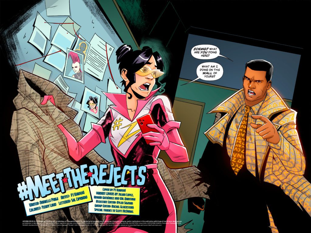
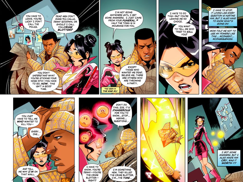
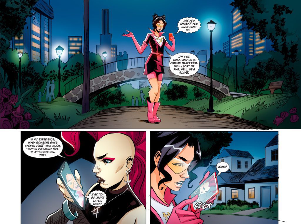
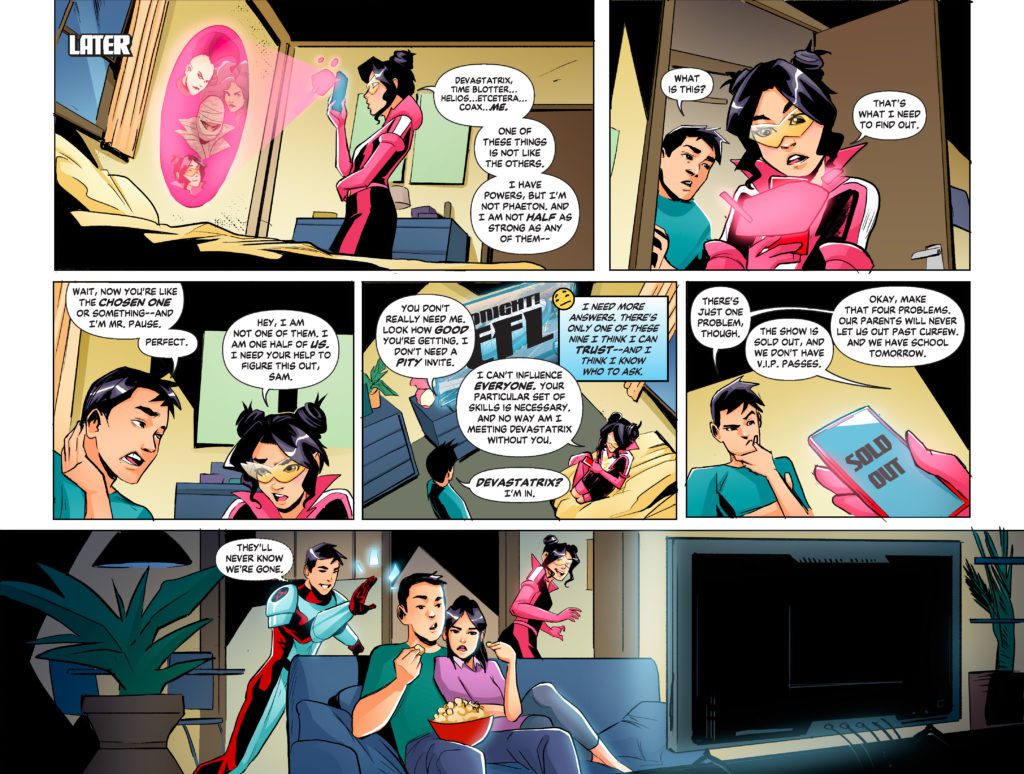
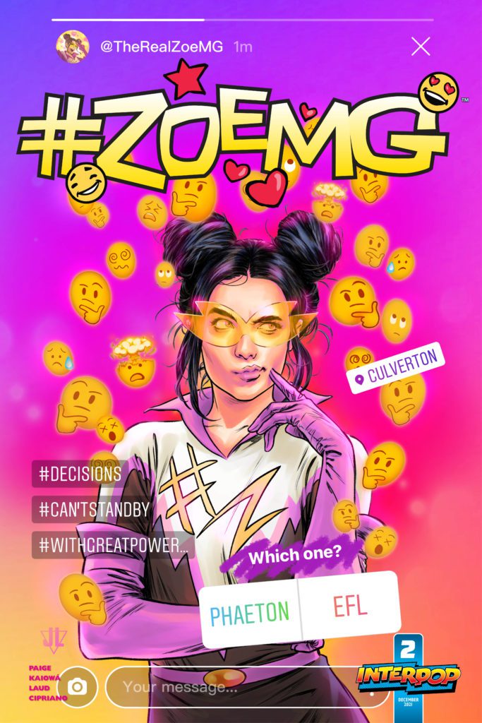
#ZoeMG #2 is out now, and Monkeys Fighting Robots has an exclusive four-page preview of the debut issue, courtesy of InterPop!
About the book: #ZoeMG #2 kicks off immediately after Zoe’s startling discovery in Denny Goodwin’s apartment. Just why is Zoe’s face among the Nine? Zoe’s search for answers involves a team-up with her brother to break into the EFL, where a flying new Emergent, Kindler, tempts the Ng siblings to join an underground super-powered group called the “Rejects.” As Zoe gets closer to the mystery of the Nine and the shocking events at the conclusion of The Nine #3, she’ll uncover more than she bargained for.
The series is by writer Danielle Paige, artist PJ Kaiowá, colorist Yenny Laud, and letterer Sal Cipriano. The main cover is by Kaiowá, with the first variant by Julian Lopez dropping next week, and the second variant by Adrián Gutiérrez following after.
Issue #2 went on sale digitally this week as a limited edition NFT*. Purchasing this edition will enable you to participate in the latest vote to determine the future of the storyline. There are 500 limited edition copies available, and ten editions of each variant cover.
Check out our preview of #ZoeMG #2 right here:
You can read #ZoeMG Issue #1 for FREE here if you need to catch up!
*InterPop sells their Emergents Universe comics (and limited variant covers) as NFTs, and also offers free-to-read versions of the stories that are accessible to anyone and don’t require any purchase. Issues will first be sold as NFTs and then in the following weeks will be released in segments as free-to-read stories. All of InterPop’s comics are available to purchase and read on https://interpopcomics.com/home.
InterPop is part of the Tezos network, which is a Proof of Stake network that consumes over two million times less energy than Proof of Work networks and is constantly updating to lower its carbon footprint.
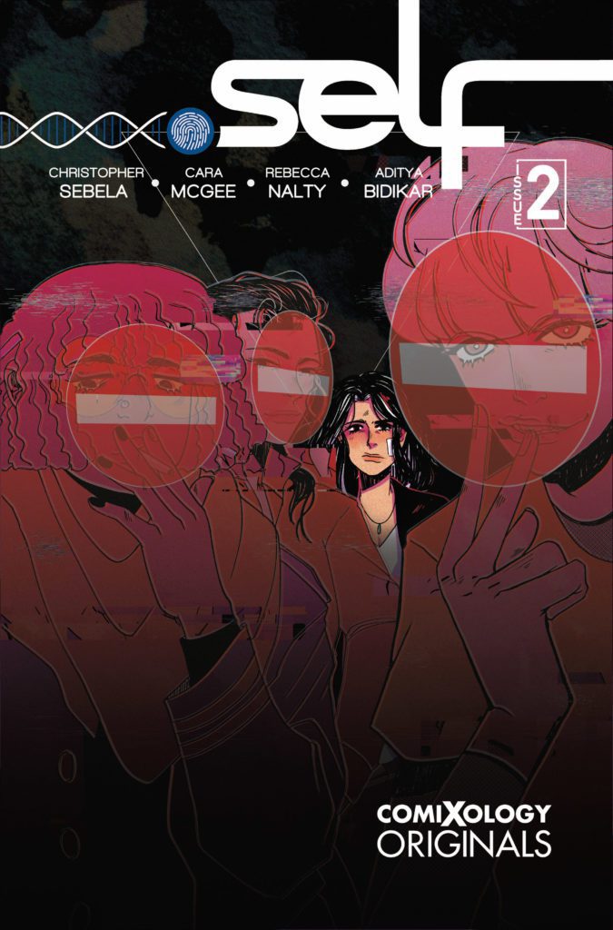
.SELF #2 hits the internet December 7th, but thanks to comiXology, Monkeys Fighting Robots has an exclusive six-page preview for you.
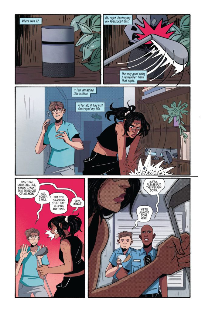
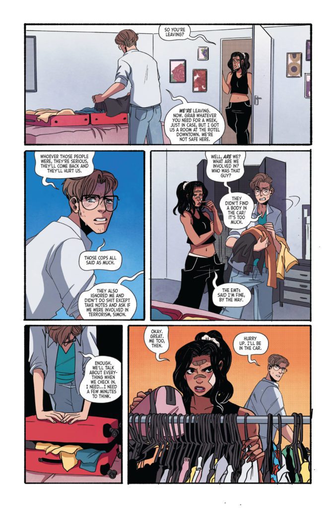
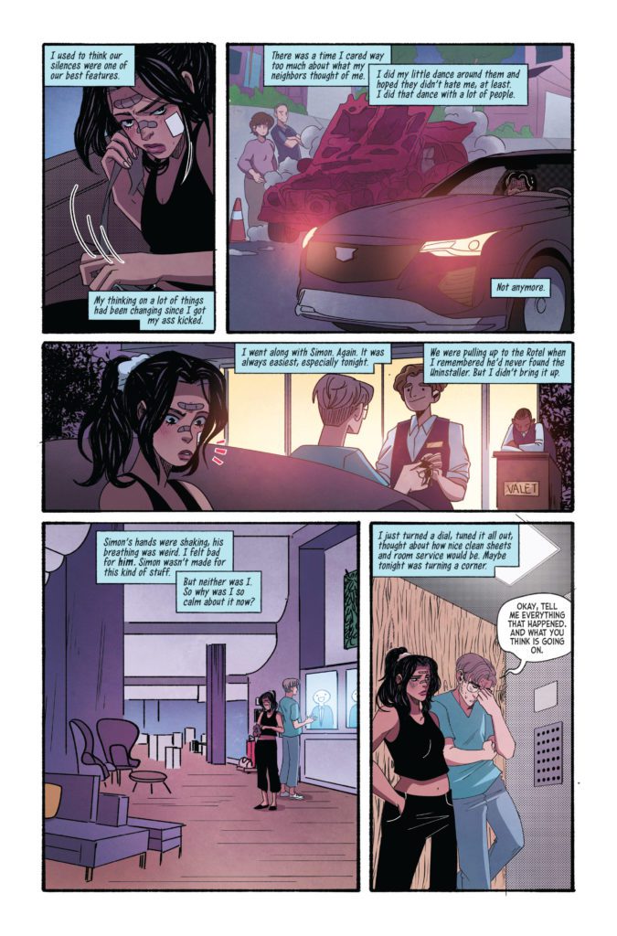
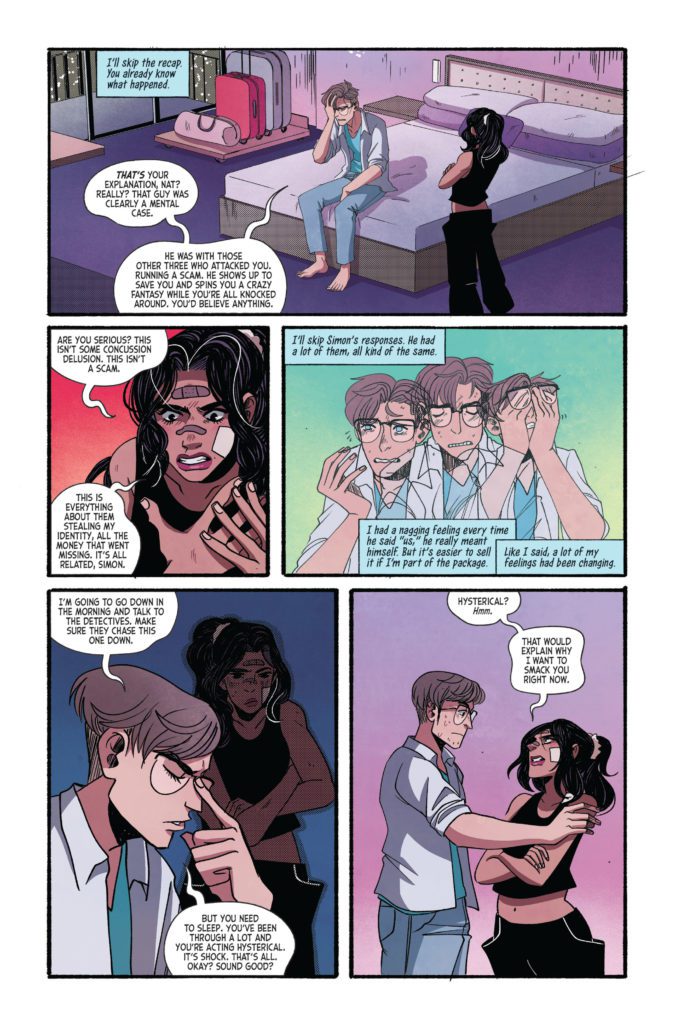
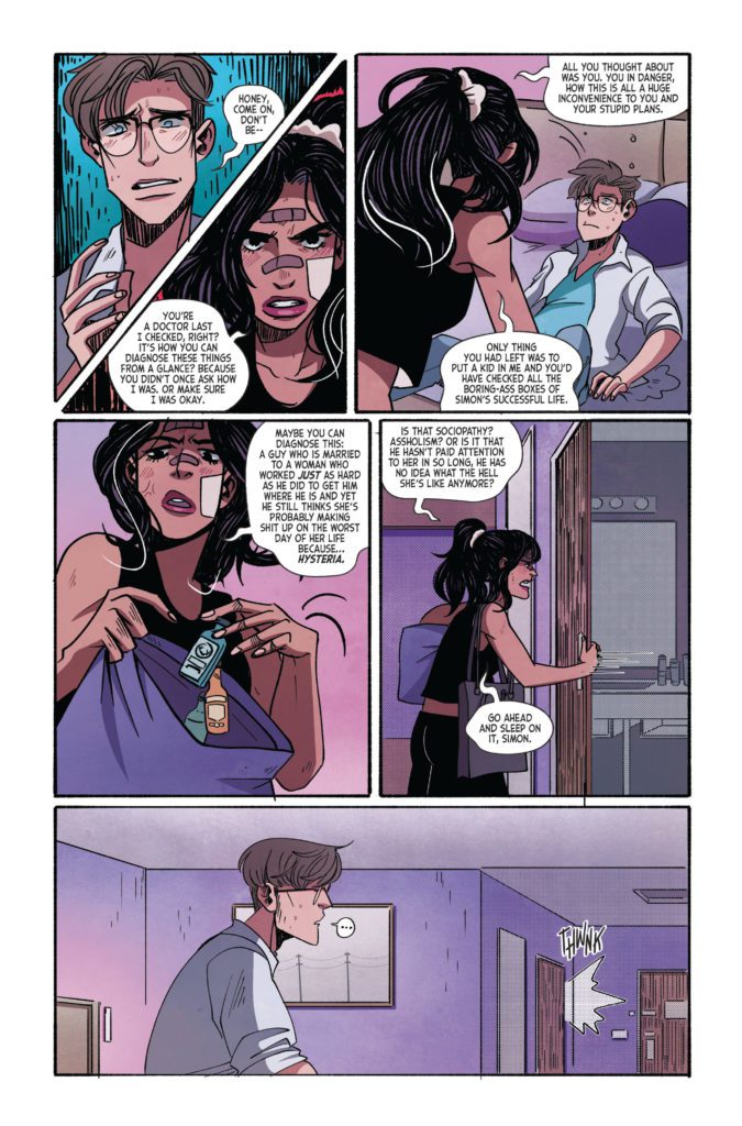
About the series: Nat’s been stolen from, harassed, gotten beat up on her front lawn and had her car blown up with a mysterious stranger inside it. And things are about to get even worse. As the fallout from having the digital backup of herself stolen and spread around the world begins to chase her down, Nat will deal with corporate customer service and come face to face with the copies of herself to try and salvage what’s left in the dumpster fire that is her life.
.SELF is by writer Christopher Sebela, artist Cara McGee, colorist Rebecca Nalty, and letterer Aditya Bidikar. The cover is by McGee.
Check out the .SELF #2 preview below:
What did you think of the first issue of .SELF? Sound off in the comments!
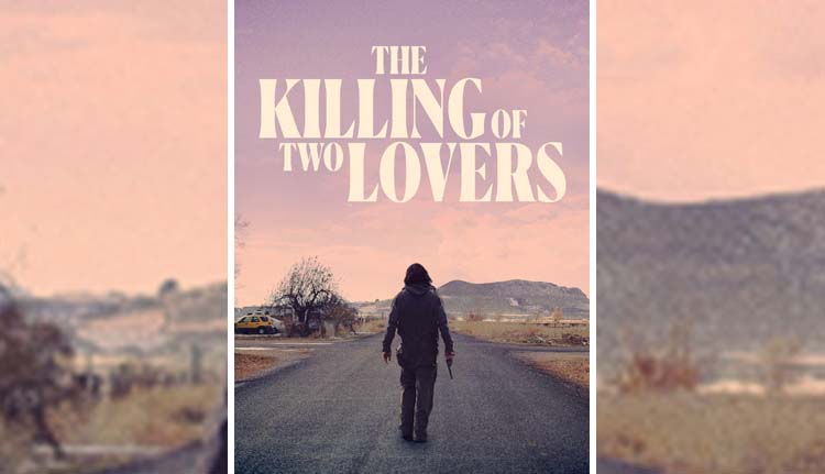
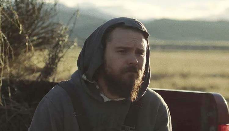
The Killing of Two Lovers is a film by writer/director Robert Machoian (God Bless the Child), which unveils the story of David played by Clayne Crawford (Lethal Weapon series), his estranged wife Nikki (Sepideh Moafi), and a darkness that consumes one while nearly destroying the other. Sound designer Peter Albrechtsen and mixer David Barber created a rhythm of sounds that pulls viewers deeper into this story.
David and Nikki are high school sweethearts who married soon after graduation and started a family. Now with four children, David’s music career never took off, and tensions between the couple have led them to a trial separation. Nikki continues to live in the house with the kids while David moves in with his father. David’s in a place he doesn’t understand, and as the confusion and pressure increase, he succumbs to dark intents. The Killing of Two Lovers presents a dark journey into a man torn apart by circumstances he doesn’t understand.
PopAxiom spoke with Peter and David about creating the soundscapes that would express the feelings within David and Nikki.
How did your journey into sound begin?
PETER: I grew up in a household where my dad constantly listened to music. A lot of experimental stuff, classical music, and a lot of Beatles. When I learned to switch on the TV, I started watching many movies. One of the first films that made me think of sound and music in the film was Hitchcock’s Psycho. He was one of my favorite directors who loved to work with sound.
In 1995, I went to the European Film College, a sort of pre-film school based in Denmark. That’s where I realized that I could take everything that I love from music and movies and make sound for movies. Since then, I haven’t stopped. I found out it’s a giant playground for movie magic and storytelling. It’s been 20 years, and it still feels like I’m on the same playground or like a kid at the candy store. But it’s incredibly creative and playful.
DAVID: As a seven-year-old kid, the first time that ship in Star Wars came over my head, that was it. Cinema was a miraculous thing that I wanted to enjoy. At the time, I wanted to be a model-maker.
I was supposed to attend a model-making summer camp, but Prop 13 passed in California, and the funding went away. So, I never go to do that, and the desire to do it fizzled.
But I was always musical. I started with child piano lessons; then, I played saxophone all through high school that migrated into playing bass when we lost our bass player in a jazz band. Music became the thing through college and continued as the nighttime, weekend thing, but then Monday it was back to the day job.
I was in this quandary, and then Lord of the Rings came out. I can even pinpoint the sound when they cut off the hand of Sauron in the opening scene of Fellowship, and the blast goes out over the valley. The sound that went with it took my breath away. Then, the DVDs came out, and they had these brilliant behind-the-sounds things. I became fascinated with what they recorded, how they created the sounds, and how it all came together.
In my music days in LA, I’d worked at Saban Entertainment and met some great people. One of them said I should see a friend who works in audio post. So I took out a sizable loan to buy a Pro Tools system and gave myself a year to see if I could make it work.
How did the two become part of The Killing of Two Lovers team?
PETER: I’d met Robert Machoian on his previous film When She Runs. He told me he couldn’t do this movie without me, which was a lot of pressure, but it shows how much Robert thinks about sound.
I’m in Copenhagen, but I’ve worked on many American indies. I was looking for a sound mixer in LA; that’s where actor and producer Clayne Crawford was based. Someone recommended David and reached out to him. We hit it off.
DAVID: Ryan Coda was the conduit that connected us. Peter and I met a few times at awards shows. But if you’ve ever been to those, it’s like 900 people in a lobby say ‘Hey! Hi! I’m so and so.’
Clayne Crawford in The Killing of Two Lovers
How does Robert approach sound?
PETER: It’s an integral part of how he loves to tell stories. He wanted sound, more than music, to drive the story. The Killing of Two Lovers is essentially a family drama, and you don’t see a lot of those without violin and some music. But Robert didn’t want that. He wanted the sound to tell the inner story of the characters. That was incredible.
Robert’s creative process doesn’t use temp stuff. Instead, he involves the sound early while he’s cutting the film. So he sent me a rough cut of The Killing of Two Lovers and let me try out things and experiment.
There’s a character running down the street in the film, and there’s this symphony of car sounds. Robert wanted the sound to be rhythmical and musical. So, I thought, ‘well, half the movie, the character’s in a car, so let’s use the car as his inner voice.’ So I built a sound collage and sent it over to Robert. It’s a crazy experiment, and I thought, ‘I’m going to get fired.’ I didn’t hear from him the next day or the day after. Five days went by, and I was getting more and more nervous until he wrote me this email saying, ‘Peter, this is amazing! I made a new cut of the film.’ So, what he did was take the sound I created for the opening and shape the film around these sounds, and it sort of became the vocabulary of the film.
It was a bold way to use sound design as something that’s integrated early on with the picture. Robert’s leaving a lot of room for interpretation and creativity. He’s so dedicated and inspiring in the way he directs us. He talks about the emotions of every scene. It’s an inspiring way to interpret those emotions and create a sonic universe that fits with that. It’s a different way of approaching the creative process.
What was the process like of working together?
DAVID: Our collaboration was almost like jazz. It was this feeling that you get together with a band and play music together, not only by how you play on your instruments but how you think about things and creatively do things. You do crazy, creative experiments that work because the band is there.
PETER: David, Robert, Clay, and I were working together to make the sound for this movie about a broken family, and we became a sort of family in the process.
DAVID: We had a great back and forth of complementary ideas — escalating complimentary ideas. That continued through the final day of the mix. It wasn’t that all of the elements came to the mix stage in their space and just needed balancing levels. We were in there thinking, ‘What if we put this here? Oh, if that’s there, then we can put this here.’ I liken it to classical terms where the scenes were movements of a symphony. We did a pass-through quickly to get the pieces in play, but we continued to explore the dynamics.
What’s a dream project for Peter and David?
PETER: What you realize when you’ve done a lot of movies, it’s more about the filmmaker and their vision. How much interest does the filmmaker have in sound? That’s what sets the bar of how creative you can be when you do the sound design. I think a filmmaker like Robert who invites the team into the process is special. The more that the director is open to that collaborative spirit, the more it can move mountains. It can make the sound design process exciting.
DAVID: I echo Peter’s sentiment. The trifecta for me is working on a great project with great people that had ample compensation. So I will take two of the three, and the two will always be great people on a great project.
The Killing of Two Lovers is available on Amazon Prime and Hulu.
Thanks to Peter Albrechtsen, David Barber, and Impact24 PR
for making this interview possible.
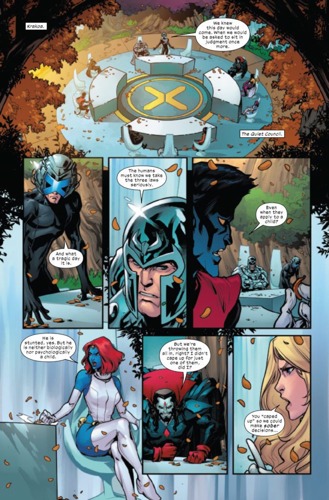
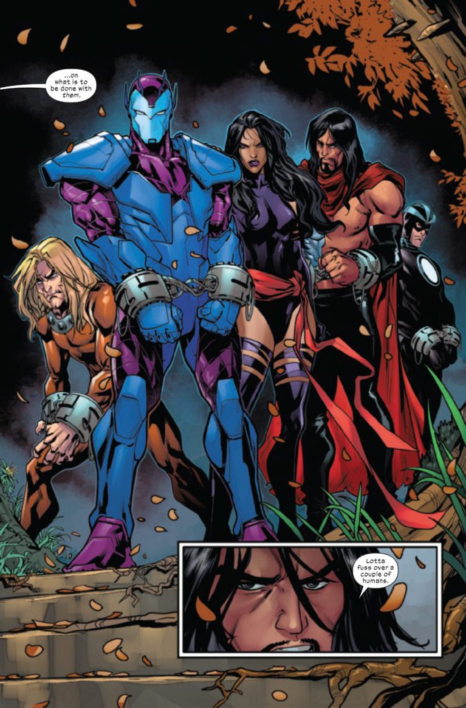
HELLIONS #18 hits your local comic book store December 8th, but thanks to Marvel Comics, Monkeys Fighting Robots has an exclusive two-page preview for you.
About the issue: HELLIONS NO MORE!
ORPHAN-MAKER has committed a horrible crime. As he faces the ultimate penalty, the cracks in the HELLIONS team are on full display. Secrets, betrayals, alliances and loss all come to the surface as the fallout of Orphan-Maker’s actions threatens to end all the Hellions have worked toward!
Plus: The return of a fan-favorite X-character in a decision that will rock the foundation of Krakoa!
The issue is by writer Zeb Wells and artists Zé Carlos & Stephen Segovia, with colors by Rain Beredo, and letters/production by Ariana Maher. The main cover is by Segovia and Beredo. Tom Muller is the designer.
Check out the HELLIONS #18 preview below:
Have you been reading HELLIONS? Sound off in the comments!
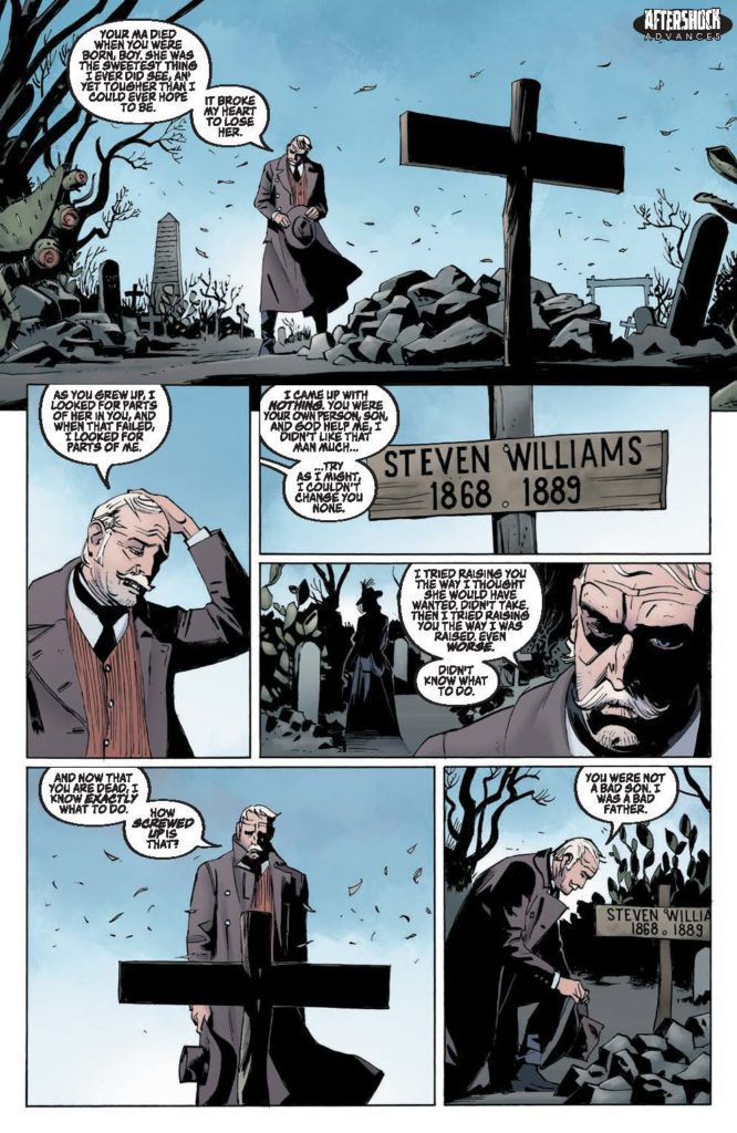
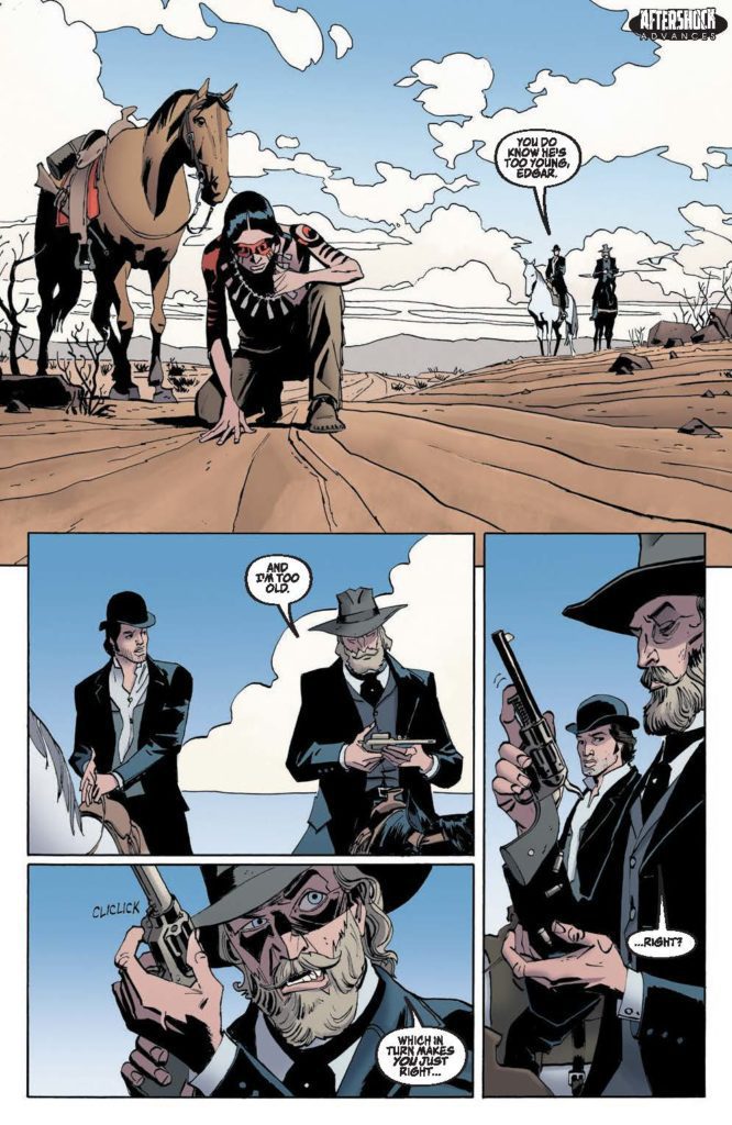
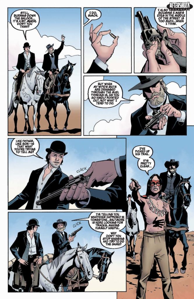
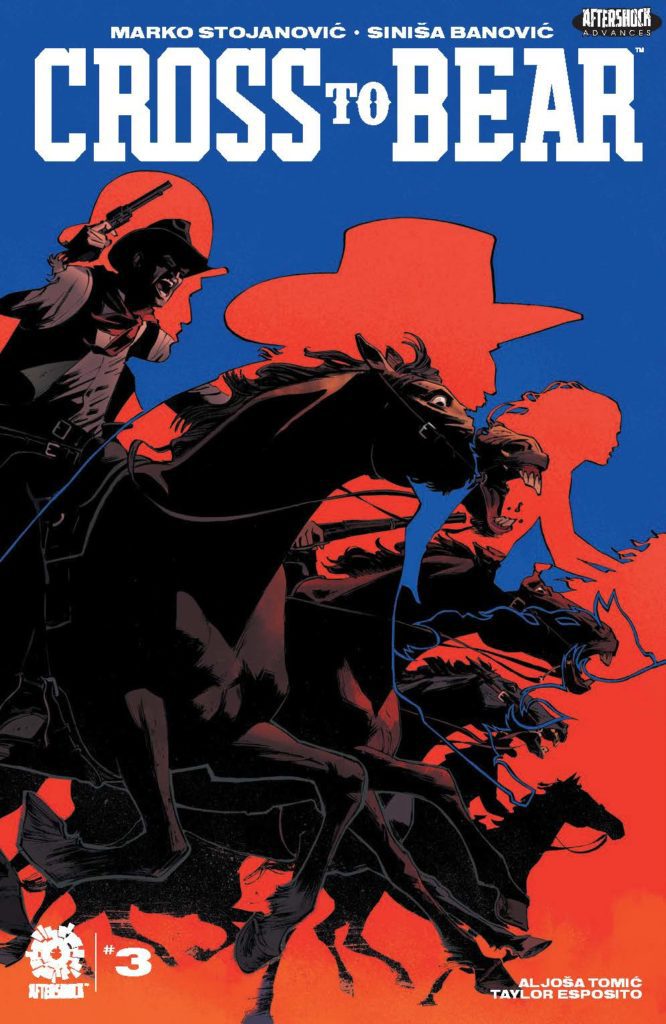
CROSS TO BEAR #3 hits your local comic book store December 29th, but thanks to AfterShock Comics, Monkeys Fighting Robots has an exclusive four-page preview for you.
About the issue: Edgar, now firmly determined to track down Jack the Ripper, sets out in pursuit of his prey. But the Ripper isn’t the only one they have to worry about as a grieving Josiah mounts a posse to strike revenge against the men who killed his son…
The series is by writer Marko Stojanović and artist Siniša Banović, with colors by Aljoša Tomić, and letters by Taylor Esposito. The cover is by Banović.
Check out the CROSS TO BEAR #3 preview below:
What is your favorite AfterShock title? Sound off in the comments!
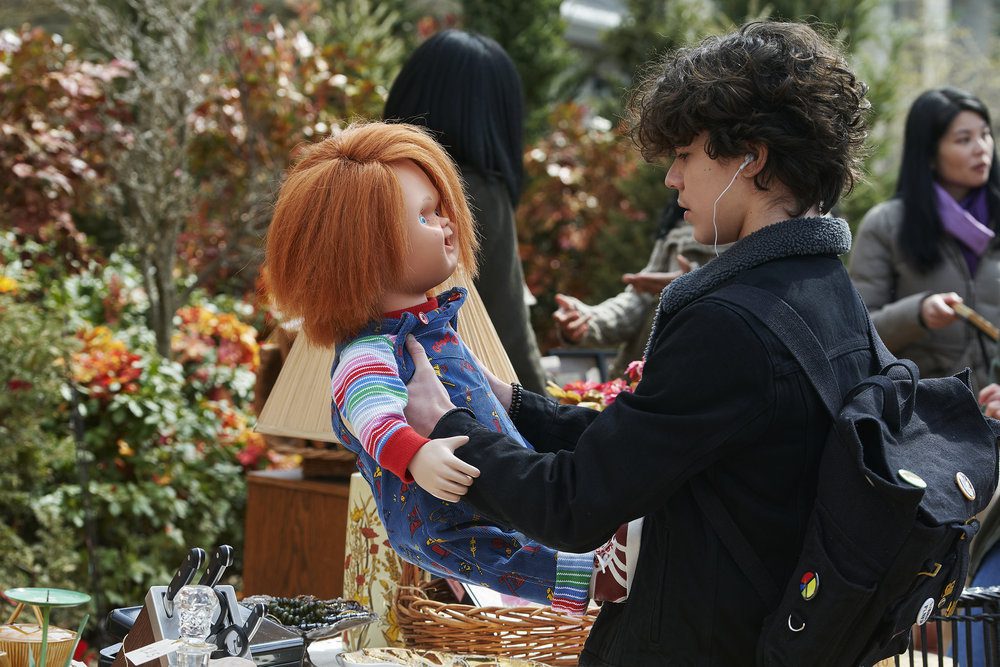
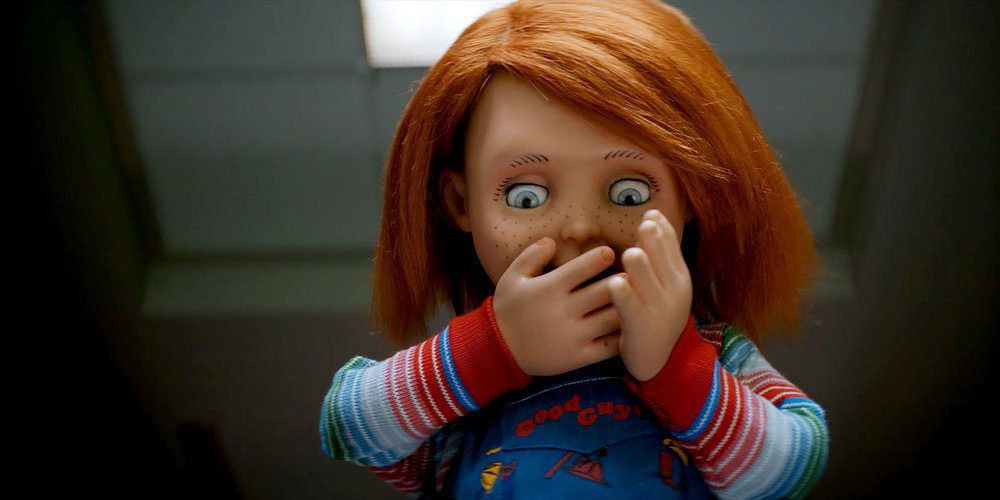
Don Mancini’s Child’s Play franchise has made its way to cable television with Chucky. A series based on the hit slasher franchise that has been growing strong for the past 30 years. In the words of Charles Lee Ray, “You just can’t keep a Good Guy down.” Chucky effectively carves a fresh path into the legacy of this iconic slasher.
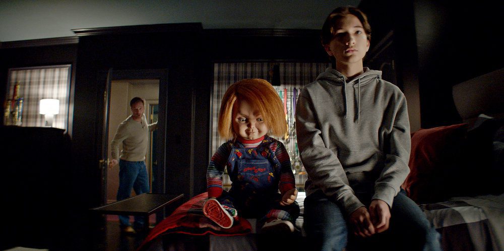
The pint-sized killer doll returns with an eight-episode series, which recently got renewed for a second season. Airing weekly on the USA and Syfy networks, Chucky has surpassed my expectations and shows no signs of slowing down. Taking place a few weeks after Cult of Chucky, Charles Lee Ray has made his way home to Hackensack, New Jersey. Chucky centers on Jake Wheeler (Zackary Arthur), a young teen who recently lost his mother and lives with Logan (Devon Sawa), his alcoholic father. After purchasing a Good Guy doll at a yard sale, Jake’s life becomes a blood-drenched nightmare. Each episode builds on what came before, which keeps the series intriguing.
Brad Dourif returns to voice Chucky and the foul-mouthed one-liners are better than ever. Placing this doll with Jake allows an enticing game of emotional manipulation to play out. When his dad isn’t harassing him, Jake is bullied by his peers at school. Junior Wheeler (Teo Briones) and Lexy Cross (Alyvia Alyn Lind) spend their days mocking Jake. Junior is Jake’s cousin and they don’t get along. Lexy is Junior’s girlfriend and represents the typical mean girl. Devon Evans (Bjorgvin Arnarson) is Jake’s crush, and Jake struggles to come out to him.
Mancini and his team, don’t hold back in terms of the gore and bloodshed. Chucky explores multiple avenues that allow for a kill per episode. In fact, the series taps into the upbringing of Charles Lee Ray for the first time. The Lakeshore strangler didn’t have a specific tragedy that made him snap though, he’s always been insane and deranged. In between the bloodshed, Chucky can feel rushed at times, and certain elements may have needed more time to breathe. For instance, Lexy starts off as an entitled rich girl who bullies Jake for being less fortunate.
However, by the end of the season, she’s redeemed and achieves final girl status. Lind’s performance makes Lexy’s progression a highlight of the series, but her redemption arc deserved better. There are some homages to kills done throughout the film franchise that fans should enjoy. Chucky recreating Maggie’s death from Child’s Play was my personal favorite. The use of practical effects was great to witness, but some of the puppetry was poor at times. In regards to performances, the young cast impresses in more ways than one.
Lind and Arthur were the standouts, displaying a lot of depth and range as the series progressed. Franchise veterans joined the young cast as well to assist in taking down Chucky. Alex Vincent and Christine Elise return as Andy Barclay (Vincent) and Kyle (Elise). Their presence is mostly underwhelming since they aren’t used till midway through the season. Building up Jake and his friends was for the best, but Andy and Kyle’s presence certainly could have been more impactful. Fiona Dourif returns as Nica Pierce, still possessed by Chucky following the last film.
Jennifer Tilly has returned as Tiffany Valentine, Chucky’s lover who has been around since Bride of Chucky. Nica spends most of the series being tormented by Tiffany and adding to the body count when Chucky is in control. Her progression might be the most disappointing for some fans, as seen by reactions to the finale. While Chucky has more pros than cons, certain narrative choices are jarring. The production design was immaculate, especially during the Halloween-themed episode. I’d say the series understands how to keep viewers invested.
An important event occurs at the end of several episodes to keep you on the edge for next week. While Chucky is rooted in horror, the balance of humor and terror is handled tremendously. Humor has been present in this franchise for a while, but Chucky does it better than a few past entries. Mancini was allowed to explore his own upbringing through the character of Jake and delivered a clever slasher series that builds on Chucky’s legacy. Also, the series does include a few surprises along the way for fans to get excited about the upcoming second season.
The inaugural season of Chucky was a delight and proved this series has a few more tricks up its sleeve. This Good Guy definitely hasn’t gone out of style and perhaps Chucky is here to stay for many more years. Chucky accomplishes so much by serving as a direct follow-up and brilliant jump to television. The events of the finale raise several questions for Chucky and the victims he left behind in Hackensack, but the upcoming second season should provide even more chaos along with the appropriate answers.
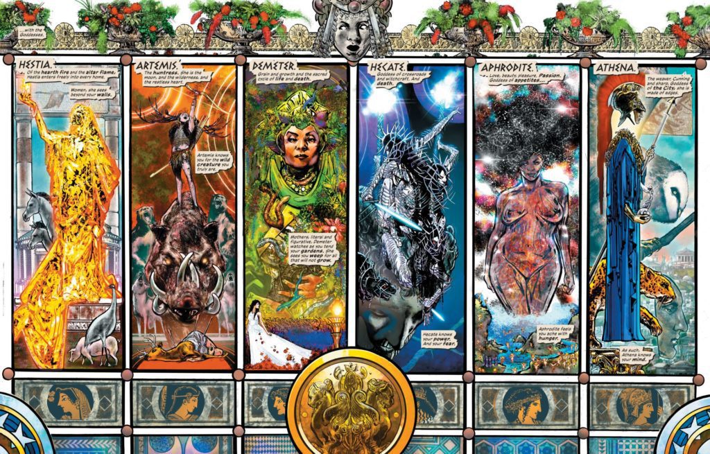
Writer Kelly Sue DeConnick (Captain Marvel, Bitch Planet) and artist Phil Jimenez (Wonder Woman, The Invisibles) have come together to weave and uncover a new mythology in Wonder Woman Historia #1. With colors from Hi-Fi, Arif Prianto, and Romula Fajardo Jr. and letters from Clayton Cowles, this first chapter eschews the known history of the famous Amazon and digs deep into malleable nature of Greek mythology itself. As such, DeConnick and Jimenez have created something that surpasses the world of superhero storytelling and lands squarely in the realm of legend. With pointed, timeless writing and medium-breaking art, this comic could be the start of a new absolute essential read for the DC stable.
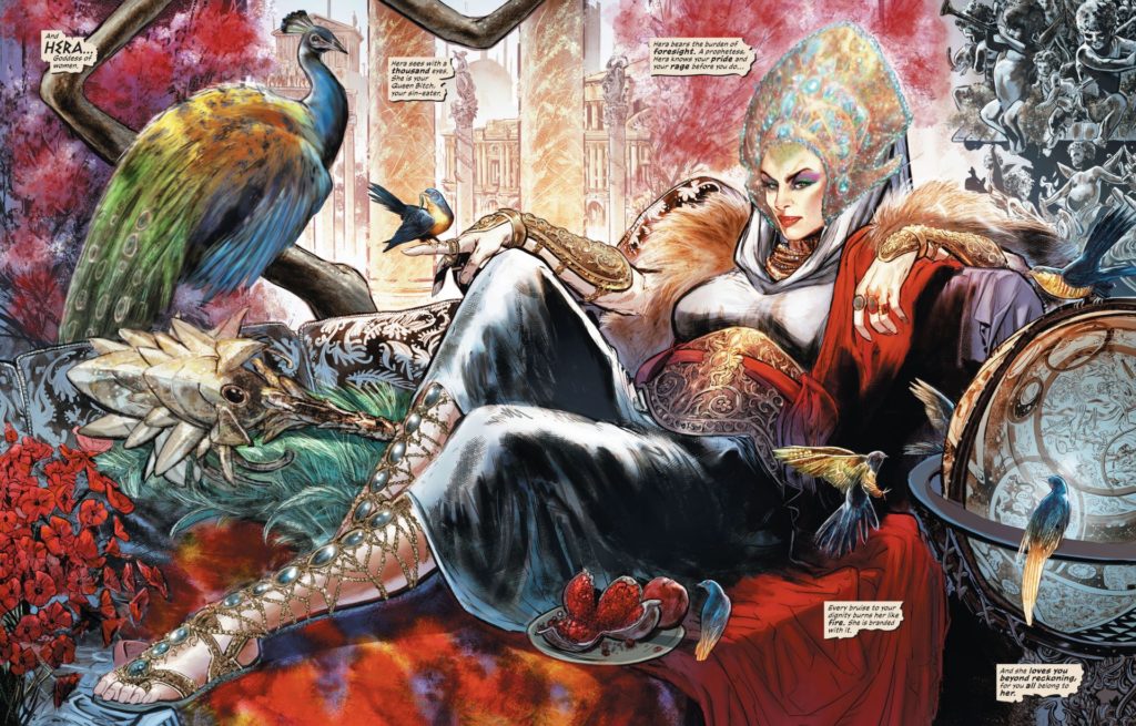
“The wait is over, and the entire story of the Amazons can finally be told! Millennia ago, Queen Hera and the goddesses of the Olympian pantheon grew greatly dissatisfied with their male counterparts…and far from their sight, they put a plan into action. A new society was born, one never before seen on Earth, capable of wondrous and terrible things…but their existence could not stay secret for long. When a despairing woman named Hippolyta crossed the Amazons’ path, a series of events was set in motion that would lead to an outright war in heaven—and the creation of the Earth’s greatest guardian!”
Writing & Plot
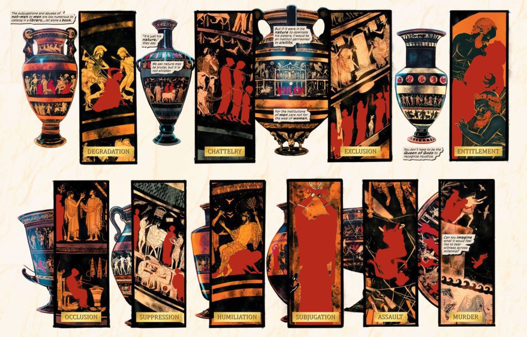
Kelly Sue DeConnick creates possibly the most effective script of her career in Wonder Woman Historia #1. Removed from the expectations of modern superheroes or current speculative fiction, the Bitch Planet writer settles on a brutal yet inspiring mythological tale in DC’s universe. Make no mistake, this comic can be both physically and emotionally jarring. Exploring the construction of the Amazons as a reaction to the treatment of women by a male-led society isn’t new by itself. Doing so with near-complete creative control, out of continuity, in a mature-readers book, is. DeConnick does not hide the reasons for Hera and the other goddess’s fury – nor the indifference of men. This topical treatment of mythological beings weaves in beautifully with elements of the known Wonder Woman story, while leaving mystery for the chapters to come.
Style
DeConnick adopts a narrative style that reads as a perfect mix of modern and timeless poetic writing. Her syntax and diction is reminiscent of Gaiman’s Sandman, but with her distinct voice making it markedly unique. DeConnick’s voices for each goddess is perfectly reflective of each being. Hera is measured yet stern, and speaks with the weight of knowing more than she lets on. Athena is matter-of-fact, with words of logic rather than just wisdom. Artemis is full of youthful anger and speaks mostly in quips and threats. Each of these characters are written so distinctly that we could pick out who was talking by just reading an out-of-context sentence.
I should perhaps warn that this is not a light comic. DeConnick’s portrayal of the pain women experience in the patriarchal world is unflinching and never steps away from its truth. In this fountain of emotional and poetic writing however, it will be easy for most readers to see the new/old mythology DeConnick is weaving for this series.
Art Direction
Holy crap, Phil Jimenez. When the first shots of art from Wonder Woman Historia #1 hit the internet, this quickly became one of the most anticipated comics of the past couple years. While DeConnick’s script is incredible, it’s Jimenez’s work that really makes this book a must-read. The modern icon steps outside of the style we’ve largely seen his use and into something almost monolithic. Much of the work here appears more like gallery work than something found in a comic book. Jimenez’s designs for the Greek gods and goddesses are both familiar and unique. The grace and power that Hera, Hestia, and Aphrodite are presented with is beautifully singular. The one that sticks out in my mind the most is Jimenez’s design for Hecate. The dark goddess is presented as multiple bodies all wrapped in barbed wire, and with different heads that take turns speaking.
Design
What’s so different about Jimenez’s renditions versus other artists for these goddesses is how ethereal they are. These beings feel like gods. The classic fallible nature in classic Greek mythology has led many artists to render them as appearing almost entirely human. Jimenez offers designs that, for some of them such as Hera and Demeter, are obviously human but still ethereal. However, with the likes of Athena’s bodiless form and Aphrodite’s starry, shimmering skin, the sense that these are cosmically powerful entities really sticks. It doesn’t hurt that the settings of Olympus and the Underworld also appear as nebulous voids of beauty and despair. Jimenez’s design language for the gods gives J.H. Williams III best work a run for its money.
Another smart feat of Jimenez’s here is how he morphs styles for scenes that take place on Earth. Here he switches to an approach that’s more like what we’ve seen from him in his other mainstream comics works. He adopts a more conventional panel style to tell a story from the perspective of the mortals who will late become very important to this history. I won’t spoil anything, but Jimenez’s art here is as stellar as always.
Color
A massive part of what makes the visuals so successful here is the coloring of Hi-Fi, Arif Prianto, and Romula Fajardo Jr. The barrage of tonal blends in the palette for the goddesses and their heavenly abode has that “reach your hand in” quality. The accented details for the characters themselves adds elements to their personality that are only outlined by Jimenez’s pencils. I get the sense that they were effectively allowed to run wild with their work here, and it pays off in spades. The letters from Clayton Cowles are varied and cleverly tonal, with just enough variance to convey scenes spectacularly well. Every visual aspect of this comic is absolutely stunning.
Verdict
Wonder Woman Historia: The Amazons #1 is a poignant and beautiful triumph of a comic. Kelly Sue DeConnick and Phil Jimenez craft what may be the best work of their careers in this mythic piece of storytelling. DeConnick’s topical and powerful script reads like a piece of timeless mythology that sets up later chapters while still feeling like a story in itself. Jimenez and the colorists craft a comic that transcends the rules of comic book direction to make something indescribably mesmerizing. This is an absolute triumph of a comic, so be sure to grab it when it hits shelves on 11/30!