Dick Grayson is back! With more resources than ever, he’s hell-bent on whipping Bludhaven into shape. But fate has other plans. As Blockbuster pulls the strings of the Bludhaven elite, Dick learns a startling secret from his past, and must face off against a serial killer who’s in the habit of collecting people’s hearts. Nightwing Vol 1: Leaping into the Lightis the first collection of this run by writer Tom Taylor, artist Bruno Redondo, colorist Adiano Lucas, and letterer Wes Abbott. It collects the heartfelt stories found in Nightwing #78–83.
Writing
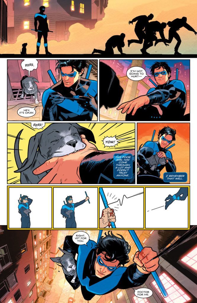
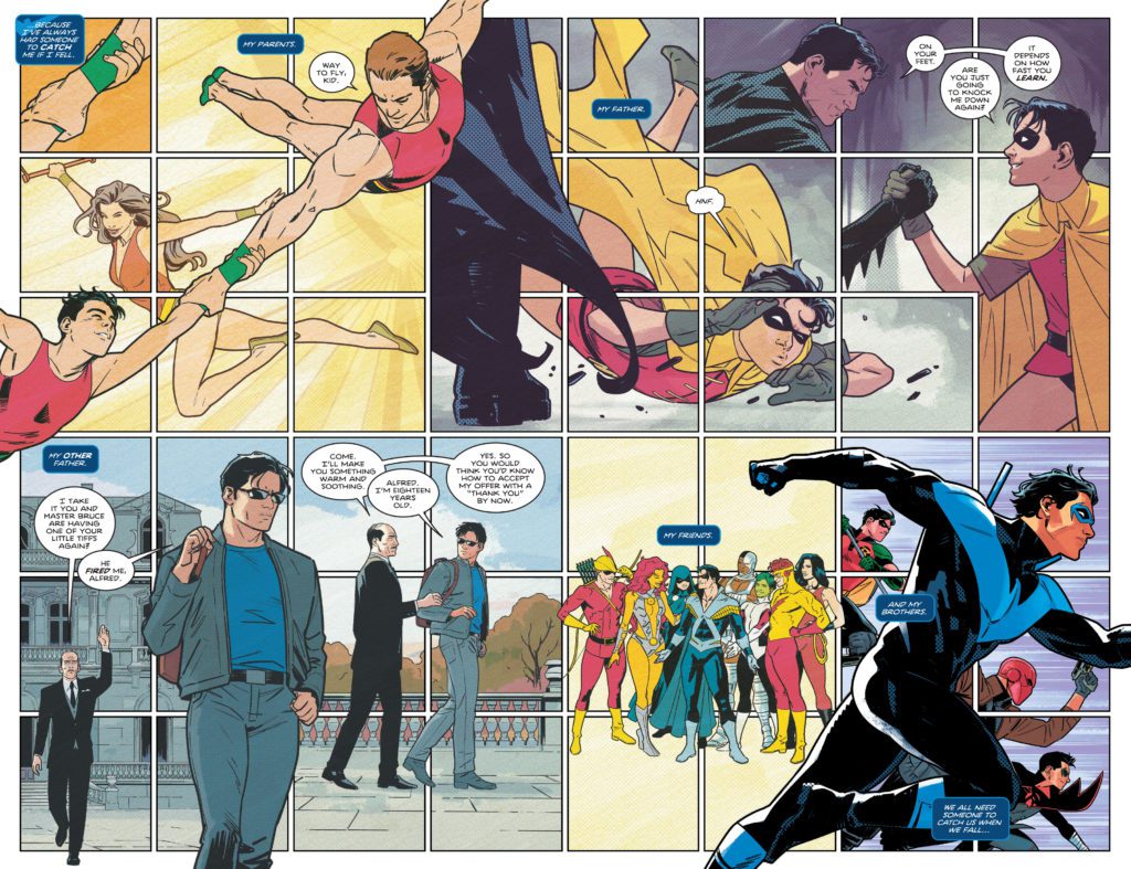
Taylor’s script is just magic. He brilliantly balances hope and fear, joy and despair. Instead of throwing readers right into the madness, Taylor gives us a joyful first issue. We see hints of the danger that’s nipping at Nightwing’s heels, but we also see him enjoying being alive. So when things get darker in this series, readers are left with something to hope for. And even when this series does get dark, Taylor still fills these pages with little moments of light. Whether it’s a new pet, a moving letter from an old friend, or even just a great joke, Taylor gives us something to smile about.
Art
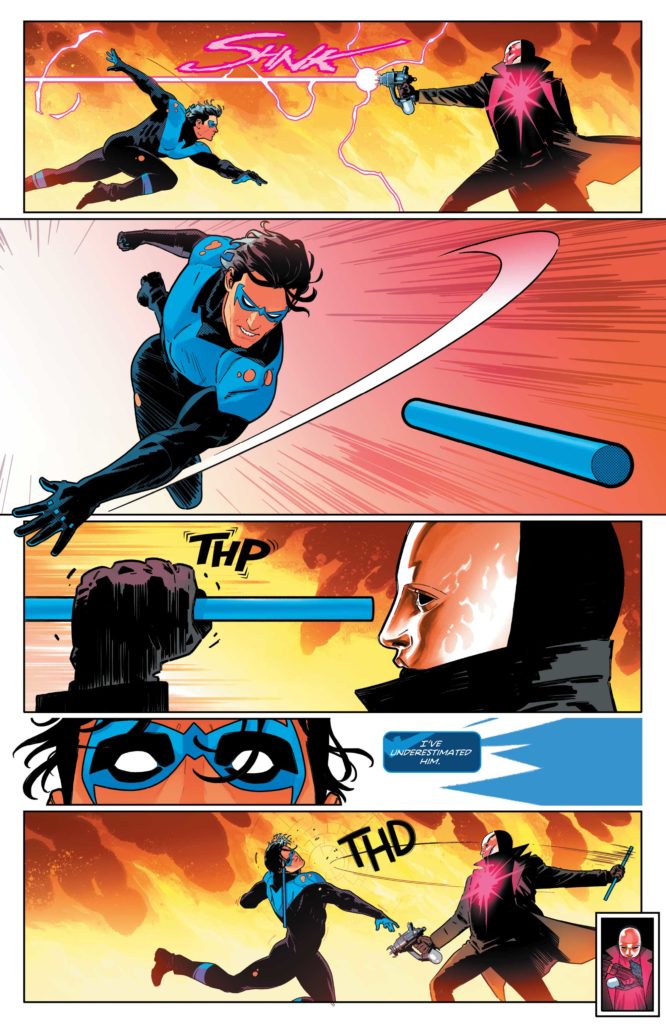
Speaking of things to smile about, Redondo’s art is outright grin-inducing. And he’s never been as versatile or experimental as he is in this series. We see hilarious play-by-plays of a characters’ faces, watching their reaction to something slowly unveil itself. We see Nightwing somersault through the air, each twist and turn shown in the panel to mark his trajectory. And we see instructional images of Nightwing putting his baton together, like something out of the information booklet on a plane. Redondo shows characters through a doorway peephole in a round panel, their image warped by the magnification. He does a tour through Nightwing’s history, mimicking the Ben Day dots of each era as he does so. There are just too many examples to give of Redondo’s brilliance. He is constantly changing up his page layouts and his visual language, yet he’s always serving the story. It’s incredibly entertaining and more than a little bit breathtaking.
Guest artists in this volume include pencillers Rick Leonardi and Neil Edwards along with inkers Andy Lanning and Scott Hanna. Leonardi, Edwards, Lanning and Hanna do a great job of bridging the gap between Redondo’s incredible style and the more traditional approach of golden age comics (which is where their segment is set.) They celebrate that era of comics, while imbuing it with a modern flare.
Colors
Lucas makes you feel as though you’ve lived through these scenes with the characters. He gives each moment a real sense of time. So, when we see the bright rays of the early morning sun seamlessly transition into the soft coloring of a late afternoon, we feel like we’re there. You’ll experience full days with Nightwing, feeling like you’re perched on the rooftop next to him in the night, tinted pink by the lights of the city. And when the storyline briefly detours to the past, Lucas’ color palette becomes totally flat. Every shape is colored in a single tone. It immediately feels like a story from an old comic, because Lucas makes it look like one. Lucas makes every panel both beautiful and immersive.
Lettering
Abbott’s lettering is playful, even hilarious at times. He uses his letters to guide us through the page, like any good letterer, but he also helps us feel the impact of every sound. When Nightwing swings his baton at someone’s head it makes a “TOK” sound in thin white letters. The letters almost seem to explode in the character’s face, knocking him over. And later, when the same thing happens with a bigger character, we see those letters used in a very different way. “TOK” shows up in the background, in huge yellow font. You can almost feel the knock on the head and the buzzing in your ears. Abbott is having a ton of fun. His letters practically chase the characters across each page, playing an equal part in the joyful mayhem.
Nightwing Vol 1: Leaping into the Light is a love letter to Nightwing fans. It takes stock of Dick Grayson’s past, touring through his many years on the page. But it also takes this character to exciting, new places. Pick up the first volume of this fantastic series, out from DC Comics December 14th, at a comic shop near you!
Johnathan Hickman’s swan song to his X-Men run, Inferno, hits its penultimate issue with book #3. Joined by R.B. Silva, Stefano Caselli, Valerio Schiti on pencils, colorist David Curiel and Joe Sabino on letters, we see the cracks begin to form among some of the closest friends.
WRITING
Last issue, Xavier and Magneto let Emma Frost in on what has been going on with Krakoa. As a result, Emma has become a significant player in this issue, and as a reader, we don’t know what side she’s on. Hickman is in a class all alone when it comes to writing the X-Men. His characterization and storytelling are incredibly compelling, and he leaves us wanting more. Mystique and Destiny shine in this issue as Hickman writes sharp dialogue and good exposition between them and Emma Frost. Unfortunately, Hickman shows us what Mystique and her lover have cooked up for Xavier and Magneto, and it isn’t pleasant.
ART
There were several artists on this issue, Silva, Caselli, and Schiti. The trio of artists does a fantastic job depicting the severity of the situation between the mutants and the Orchis. As Professor X gets a cry for help from Moira Mctaggart, we see the excruciating look on both of their faces. Another small detail the artists give us is during a conversation between Magneto and Xavier. The facial expressions and looks on Magneto’s face may lead you to believe he’s turning back to the dark side. The background panels of Moira in Paris highlight the amount of talent that worked on this phenomenal issue.
COLORING
Curiel is one of the best in the business when it comes to colors. Every book that he applies colors to is enhanced by his style and professionalism. In this issue, from the first panel, we get a gorgeously colored view of Krakoa. The first panel is the calm before the storm. Curiel really shines on pages where Omega Sentinel and Nimrod are talking. He uses vibrant oranges for the background as the two villains discuss their next move. These backgrounds are, so eye-catching that you are drawn to them repeatedly. Curiel uses dark colors to depict the mood of the page too. As some of our heroes enter a trap, it’s not a coincidence that the colors get darker too.
LETTERING
With any X-Men title, lettering is huge because of all the telepathy. There actually isn’t any telepathic lettering in this issue, but Sabino makes his money in panels where Nimrod talks. The word boxes are altered to signify a robot is talking. This is a necessary change in the way word bubbles appear. Sabino gives us a spot on teleportation sound too. We can almost hear the noise “ZZOOOMFF” in our heads as we read the words on the page.
Conclusion
Inferno #3 is everything you would want from a high-stakes comic book. Hickman gives us action, big revelations, and drama all in one big book. The art team makes sure that everything Hickman writes looks beautiful on the page and captures the reader visually. Pick up Inferno #3, out from Marvel comics on December 7th, at a comic shop near you!
Contemporary comics juggernaut Skottie (Middlewest, The Me You Love In The Dark) returns to his most infamous work of fairytale satire and debauchery with the return of I Hate Fairyland. The first issue of his follow-up series, featuring artist Brett Parson, doesn’t arrive until July of 2022. However, there is a surprise to keep us occupied in the meantime…
Some of Skottie’s friends, namely the incredible duo of Fabio Moon and Gabriel Ba for starters, are embarking on their own tales within this universe with The Unbelievable, Unfortunately Mostly Unreadable and Nearly Unpublishable Untold Tales of I Hate Fairyland. Their story just dropped today, with more stories from other creators dropping soon!
I got to talk to Skittoe about his return to Fairyland, his collaborators, and a few other topics.
MFR:Hi Skottie, thanks for letting me pick your brain about all the new stuff you have coming out.
MFR:What brings you back to I Hate Fairyland? Was returning to this goofy, insane world you created something you thought about after the original comic ended, or was it more spur of the moment?
SY: I’ve never had more fun making comics than I did while I was writing and drawing I Hate Fairyland. I knew I would be back at some point. In fact, some may remember in issue 20 (which was the surprise last issue), I wrote a goodbye in the back of the comic saying this was more of a pause than an end. The world is too fun to let it drift off into history. I did think the break would only be a year or so, but it ended up being like three, haha.
MFR:When I heard you were letting other creators tell their own stories in Fairyland, I honestly felt like it was a long time coming. This concept feels like it lends itself to having other artists and storytellers put their own weird stamps on it. Again, was this something you had considered for awhile or was it a lightbulb moment?
SY: Oh, it’s been a part of my plans from jump. I was already bringing in other artists to do special stories for the ongoing series. And I was planning to have people come in and work on shorts, but I needed a break. We had just moved to KC with our then 9- and 2-year-olds, and life was getting EXTRA. I just needed to pause, write a few other projects and get excited to come back and call in some pals and start playing pretend again.
MFR:First up for a chapter of The Unbelievable, Unfortunately Mostly Unreadable and Nearly Unpublishable Untold Tales of I Hate Fairyland are the ridiculously talented Fabio Moon and Gabriel Ba. How did you get involved with them and what was the process like seeing them play around in your world?
SY: Well, we’ve all been friends for many years now. About 10 years ago, we ran around Germany together and it was one of the funnest times. I had always loved their work, but spending time with them like that made me realize that we have so much in common. Over the years we’ve spent every SDCC hanging out, talking about life, love, and comics, all while sipping some adult beverages at the Hilton Bayfront or down by the Marina! So, when it was time to start asking friends to join the fun, they were first on the list.
The process was simple. I explained the concept of the short stories and said “Do whatever you want!” And then, you know, they made magic! It’s so amazing to see these two masters show me my own characters through their unique eyes!
MFR:The original I Hate Fairyland was all you in terms of writing and art. For its return you’ve teamed up with the ultra-talented Brett Parson (who could not be a more perfect fit). How did you get involved with him and how has your creative process together gone so far?
SY: I’ve been a fan of Brett’s work for a long time. We met in Chicago a number of years ago and got along pretty quickly. Sometime later at a different convention I was hanging around with him and Eric Powell and they told me Brett was coming on to do a run on THE GOON! Before I could stop myself I said “Fuck, i’m jealous! I want you to come draw a run on I Hate Fairyland!” Ha Ha! He said “That would be awesome!” Funny thing, though, I had already decided to end the series for a while so I knew it couldn’t really happen.
Flash forward to now and I decided to bring Gert and the Gang back…BUT I still want to draw a few other projects. Then I remembered Brett and talking and reached out and offered him the job! Luckily, he said yes and now i get to see his beautiful artwork bringing I Hate Fairyland back to life. It doesn’t get much better than that.
MFR: Obviously there was a huge amount of discussion surrounding Substack and creators jumping over to it a few months ago. How has that platform helped you sculpt Stupid Fresh Mess into what it is?
SY: I officially launched my company STUPID FRESH MESS two years ago with help from one of our closest friends, Megan Hodges, who now runs operations while I sit in my office and cook up new projects! We started the Stupid Fresh Mess newsletter to connect with our community and let them know when new books, prints, stickers, etc were coming out through our online store at SKOTTIEYOUNG.COM.
Then I started adding some more personal stories and things into the newsletter and the reactions were really great. The timing of that was wild, because all of the sudden, Substack came knocking and offered up a platform to keep doing exactly what we were doing, but with a little boost behind it.
We moved the newsletter to SubStack and have continued to grow our subscribers who make all of this possible! Their support helps us to hire editors, creators, designers, and producers to build more and more content that we then give back to our members! It’s been a really fun experiment so far and we have many more things in the works over there!
MFR: The comics people will most likely know you for (outside of your variant covers), Fairyland, Middlewest, and the currently ongoing The Me You Love In The Dark, are all tonally and thematically completely different kinds of stories. What kind of itch does jumping around genres and styles scratch as an artist and storyteller?
SY: I treat my job how I treat all my hobbies and life. I jump around genres of movies depending on what mood I’m in. It’s the same with music, restaurants, and reading. I feel the same with making comics. I’m changing all the time which means my tastes and interests are as well. My comics reflect that.
Keep an eye on Skottie Young’s Stupid Fresh Mess vis Substack, and be sure to read Untold Tales Of I Hate Fairyland before heading to your local comic shop to preorder Young and Parson’s return!
Here’s the official word on these new stories below:
Prepare for more fantasy-skewering ultra-violent hilarity, muffin huggers, at Young’s Stupid Fresh Mess Substack on 12/9
Kansas City, MO—Following his 20-issue run on I HATE FAIRYLANDat Image Comics, acclaimed Eisner-winning cartoonist Skottie Young is opening the borders of his whimsical fantasy universe for new writers and artists to wreak havoc. Fábio Moon and Gabriel Bá, the acclaimed fraternal artists behind The Umbrella Academy and the creative team of Daytripper and Two Brothers, join a line of creators with their new contribution, “I Hate Gert!”—a six-page descent into madness exploring some of the comic’s most quirky foes.
This chapter is just one of many guest-created comics in a new monthly series called The Unbelievable, Unfortunately Mostly Unreadable and Nearly Unpublishable Untold Tales of I Hate Fairyland—debuting exclusively for freeon Young’s Substack Newsletter, Stupid Fresh Mess. These mini-comics pave the road to Young’s relaunch of I HATE FAIRYLANDat Image Comics, debuting with a new first issue in July written by Young with art from Brett Parson.
These stories further explore the comically inept, bloody journey of Gert—a young girl sucked into a world of eccentric fairy tale conventions building on the legacies of L. Frank Baum, C.S. Lewis, Lewis Carroll, and beyond. Upon failing to reach home over more than two decades, Gert (stuck in her 6-year-old body) wages a one-child war on her new home with a very, very large axe, aided by her exhausted bug guide, Larry.
“After a few years away from Gert and the gang, I was starting to miss the energy ofI HATE FAIRYLANDand the stories I could tell only in that universe,” Young explains. “I thought it was time to bring it back, but not only continue Gert’s ongoing saga, but also introduce short stories that fill in the many gaps in all the years she’s been in Fairyland. So I decided to reach out to some of my awesome cartoonist pals and invite them to join in on the fun.”
“Reading I HATE FAIRYLAND, I felt like the kid who grew up reading Sergio Aragonés’ Groo and MAD Magazine‘s ‘Spy vs. Spy’ all over again,” Moon explains. “Gert is just the perfect character to surprise the reader with absurd stories, and the ever-growing cast of supporting characters inspired us to imagine a story in this universe.”
“There was something about the ‘everything goes’ fantasy setting of the story that we felt we could explore creatively in our work in ways that we usually can’t,” Bá continues. “We could swap roles and combine roles while doing this—ink each other’s pencils, or color each other’s pages, have fun while doing it, and create a story that’s the fusion of both our visual styles and different from everything we’ve done before.”
“Fabio and Gabriel are two of my favorite people on the planet, outside of their insane amount of talent. Now, not only do I get to call them friends, but collaborators. It really is surreal to think these two geniuses jumped into my I HATE FAIRYLAND sandbox and started causing havoc. I’m the luckiest cartoonist in the world,” Young says.
The Unbelievable, Unfortunately Mostly Unreadable and Nearly Unpublishable Untold Tales of I Hate Fairyland: I Hate Gertwill be available on the Stupid Fresh Mess Substack Newsletter on 12/9. The monthly subscription tier includes such rewards as digital art books, live stream access, art process videos, creator commentary, and access to giveaways and contests. The annual subscription tier include all monthly perks plus a physical copy of The Untold Tales of I Hate Fairyland, releasing in 2022.
About Skottie Young:
Skottie Young got his start at Marvel on titles like Spider-Man: Legend of the Spider Clan, Human Torch, and Venom. He soon began adapting the L. Frank Baum OZ novels at Marvel with Eric Shanower. After five years, four Eisner Awards and six OZ graphic novels, he began writing and drawing the hit series Rocket Raccoon, illustrating the children’s book Fortunately, The Milk by Neil Gaiman, and the Young Marvel variant covers. He then created, wrote and drew the series I Hate Fairyland at Image Comics. Skottie followed that with co-creating and writing Middlewest with artist Jorge Corona and Bully Wars with artist Aaron Conley. He wrote Deadpool for Marvel with artists Nic Klein and Scott Hepburn. Skottie is currently writing Strange Academy, a new Marvel series, for artist Humberto Ramos. His newest project with artist Jorge Corona, The Me You Love In The Dark, launched in August 2021.
About Fábio Moon & Gabriel Bá:
Multiple Eisner Award winners Fábio Moon and Gabriel Bá were born in Sao Paulo on June 5th, 1976 and have, in one way or another, been telling stories ever since. Now, they tell stories creating comic books and graphic novels (which are essentially the same thing). They are Brazil’s very own WONDER TWINS.
About I HATE FAIRYLAND:
The Adventure Time/Alice in Wonderland-style epic that smashes its cute little face against Tank Girl/Deadpool-esque violent madness has arrived. In an adventure that ain’t for the little kiddies, (unless you have super cool parents, then whatever), you’ll meet Gert—a 6-year-old girl who has been stuck in the magical world of Fairyland for 30 years and will hack and slash her way through anything to find her way back home. Join Gert and her giant battle-axe on a delightfully blood soaked journey to see who will survive the girl who HATES FAIRYLAND.
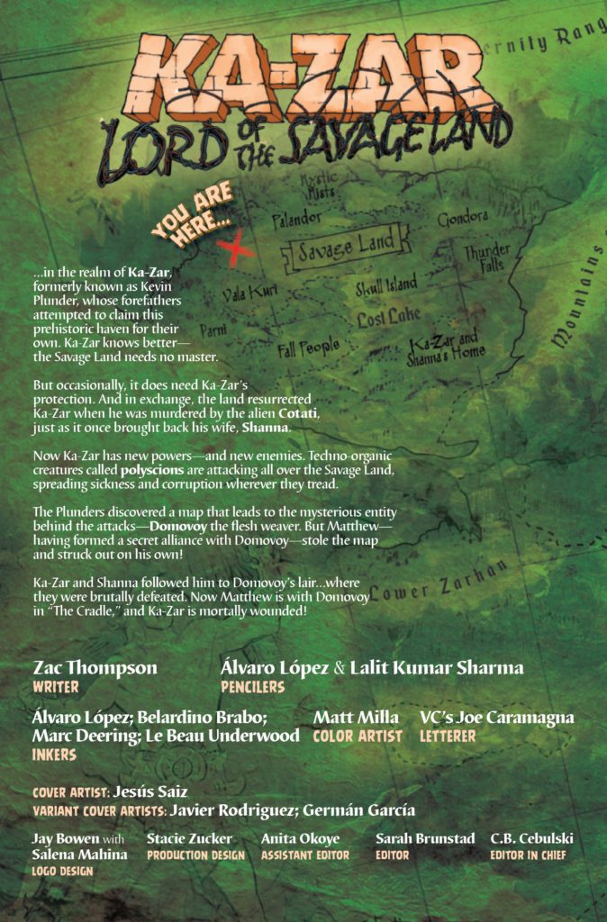
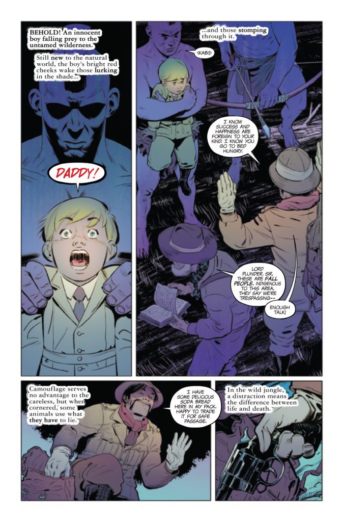
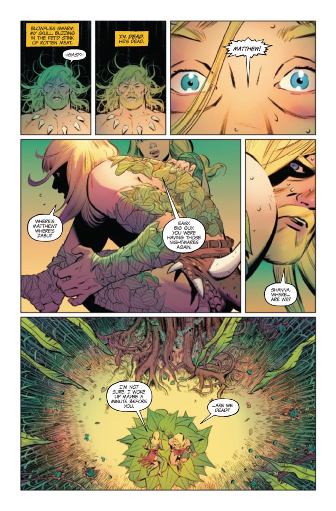
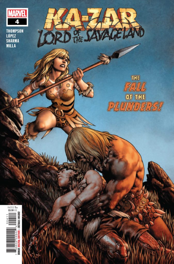
KA-ZAR LORD OF THE SAVAGE LAND #4 hits your local comic book store December 14th, but thanks to Marvel Comics, Monkeys Fighting Robots has an exclusive three-page preview for you.
About the issue: THE CHAMPION OF THE SAVAGE LAND IS NOT WHO YOU EXPECT!
For years, Ka-Zar has thought himself the master of the Savage Land. Turns out he’s only a tolerated guest…and not nearly as powerful as he believed. Domovoy’s power grows as the land decays! When the Plunders discover the mysterious subterranean Cradle, they think they’ve found the answer. But what’s born in the Cradle will bring only death…
The issue is by writer Zac Thompson and pencillers Álvaro López & Lalit Kumar Sharma, with inks by López, Belardino Brabo, Marc Deering, & Le Beau Underwood, colors by Matt Milla, and letters by Joe Caramagna.
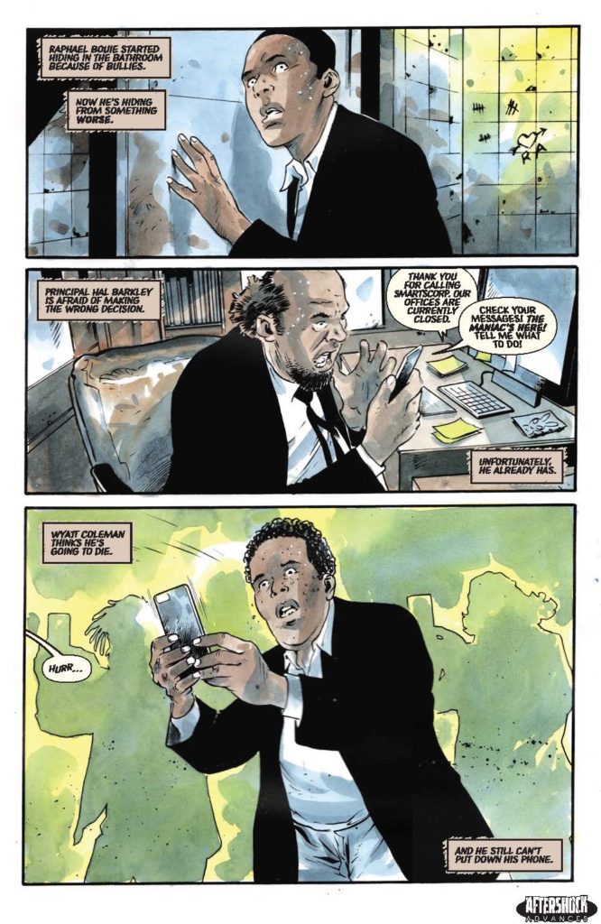
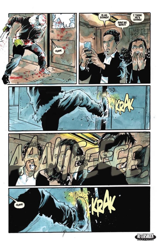
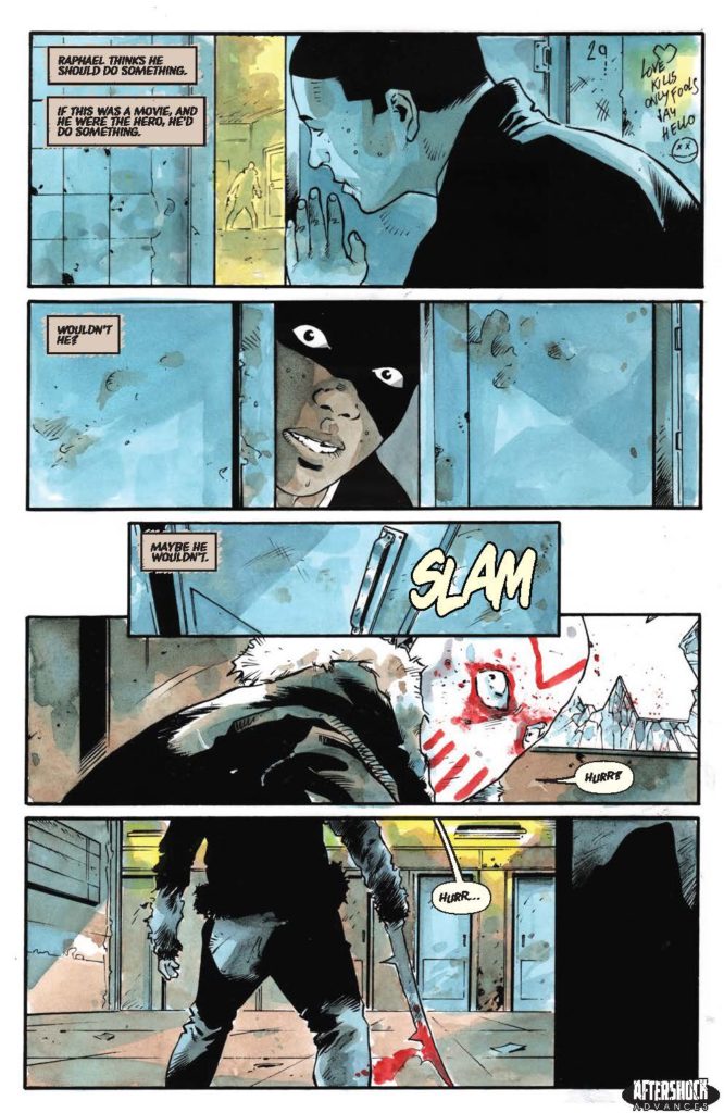
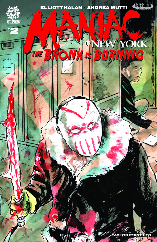
MANIAC OF NEW YORK: THE BRONX IS BURNING #2 hits your local comic book store January 12th, but thanks to AfterShock Comics, Monkeys Fighting Robots has an exclusive four-page preview for you.
About the issue: Maniac Harry is loose in a Bronx high school, and it’s not so he can finish his GED!
With video of Harry’s bloody rampage going viral, seemingly everyone is converging on Bright Future Academy: protestors, police, media and our heroes, Mayoral Aide Gina Greene and NYPD Detective Zelda Pettibone. Can the so-called grown-ups get out of each other’s way in time? And what happens when an ordinary student risks his life to save his classmates, only to be chased by the worst bully of them all: The Maniac?
The series is by writer Elliott Kalan and artist Andrea Mutti, with letters by Taylor Esposito. The main cover is by Mutti, and there is also a “Horror Fanatic” variant by David Lopez.
Check out the MANIAC OF NEW YORK: THE BRONX IS BURNING #2 preview below:
Are you reading MANIAC OF NEW YORK? Sound off in the comments!
Image Comics’ Stray Dogs is back for a short interlude in Stray Dogs: Dog Days #1. So if you’re in the mood for more stories (and heartbreak) from this crew, tune into this latest issue by Tony Fleecs and Trish Forstner, available December 29, 2021.
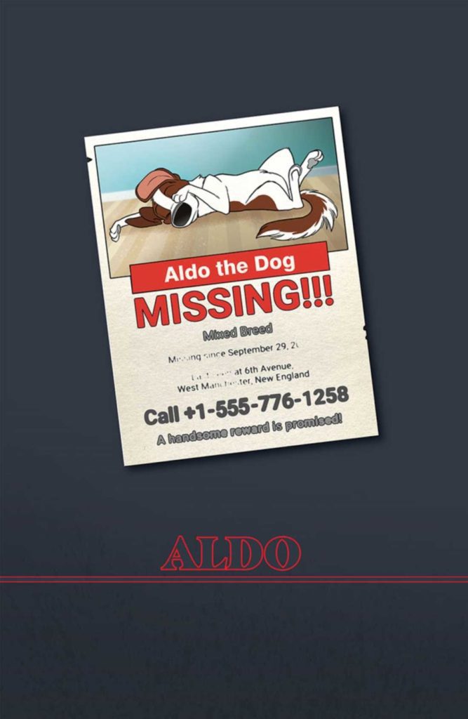
That missing poster though!
Stray Dogs: Dog Days #1brings readers back to the beloved dogs introduced during Stray Dogs. This miniseries (consisting of two issues) is a prequel, so all of it takes place before the events of the previous plot arc. Most of the stories involved take place before the dogs even find their…new home.
As one might imagine, that results in a very bittersweet series of stories. On the one hand, it is lovely to see many of these dogs happy and with their owners. On the other hand…not all stories end on a happy note. Not to mention, we all know how it is going to end.
On the bright side, if you have a favorite dog from this series, you’ll probably love their moment in the spotlight here. Each of the dogs introduced in the primary plot arc will get their own short story to tell throughout these two issues.
*Spoiler/content warning: Stray Dogs and Stray Dogs: Dog Days is essentially Silence of the Lambs merged with All Dogs Go to Heaven. It gets pretty heavy at times, especially for animal lovers in the audience. As the saying goes, viewer discretion is advised.
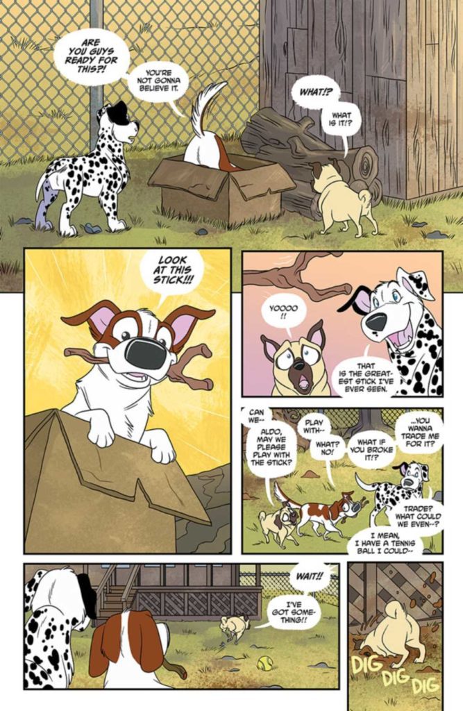
Aww, they’re looking to trade! But what is Killer going for?
Writing
If ever there was a series explicitly designed to tug at readers’ heartstrings, it would be Stray Dogs: Dog Days #1. Written by Tony Fleecs, this issue is everything it promised to be: vignettes from the lives of the leading characters.
However, there’s a darker twist in each of these stories. Take Killer’s story. His tale (pun intended) reveals the family he had once upon a time, including the friendly monster in his life. There’s this sense of unease that passes from one panel to the next. Likely because we’re all waiting to see how it’s all going to go wrong (hint: it goes horribly wrong, we already know this!).
Then there’s Gucci. Her story would be pretty cute if you were to remove a single panel. This short story is a perfect example of using imagery to tell a story. We can immediately tell Gucci’s loved and what sort of life she had. Likewise, it’s rather hard to miss that sense of foreshadowing snuck in.
Aldo’s story is the one that stands out from the rest. His story occurs when all the dogs are in their ‘new home,’ but before the story really takes place. It’s jarring and more than a little upsetting. But it also is a strong fit for the main series.
Not to be forgotten, Henry, Imogene, and Roxanne have shorts in this issue. Theirs are in a similar vein to the first couple described. However, their tales are also more graphic as far as timing is concerned.
All things told, there are six short stories in Stray Dogs: Dog Days #1, and I have no doubt that the rest of the pack will be following in the second issue. This is a read that weighs heavy on the heart. And yet, it’s so tough to look away from.
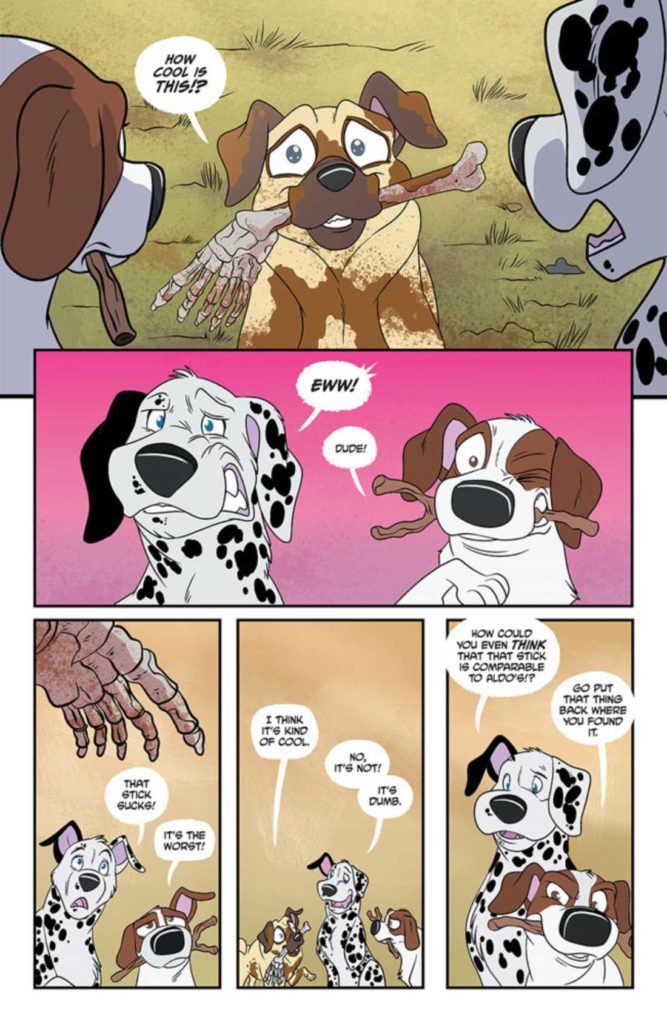
Oh. Uh. That’s not the best toy, buddy.
Artwork
The artwork in Stray Dogs: Dog Days #1 cannot be ignored. Trish Forstner was the lead artist, with Brad Simpson providing colors. Together they created an issue that rings true to the saying that a picture is worth a thousand words.
Much of the story relies on visual elements, especially Gucci’s story. There’s almost no need for words or explanations at any point. It’s brilliantly done. Naturally, this storytelling style is well suited to a story with dogs as the main characters.
As mentioned above, there are still some graphic scenes within these pages. On the whole, they do an excellent job of dancing around the worst of these elements – letting scenes slip out of the frame and the like.
The artwork shines when one looks closely at the animals’ expressions. You can almost feel what they’re going through – and it will make you want to hug each and every one of them. One scene in particular really struck me for the sheer amount of emotion packed into such a small amount of space. I’ll be curious to see if other readers react as strongly as I did.
Brad Simpson’s colors are vibrant and so very alive. It’s another intentionally jarring element to this series. Yet it also makes the connection to All Dogs Go to Heaven even stronger. Simpson knows how to make the forefront pop through the use of solid backgrounds as needed, and it is never overdone or overstated.
Another impressive feat is how loud this issue feels, despite the relatively low amount of actual conversations that occur within these pages. Every bang or bark practically makes you jump, and the lettering has a lot to do with that reaction. It all feels so real and raw.
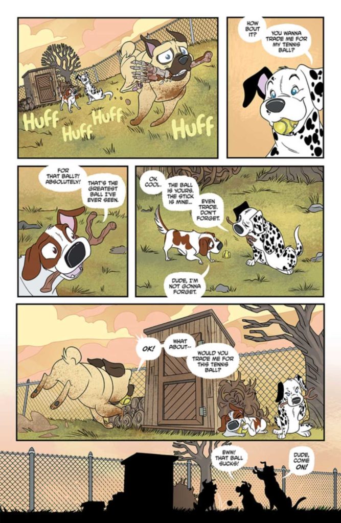
Back to trading!
Conclusion
I won’t say that Stray Dogs: Dog Days #1 is the closure fans have been needing (I feel like issue #5 of Stay Dogs handled that quite nicely). But I will say that there is something beautifully bittersweet about these tales and how they fit into the larger whole.
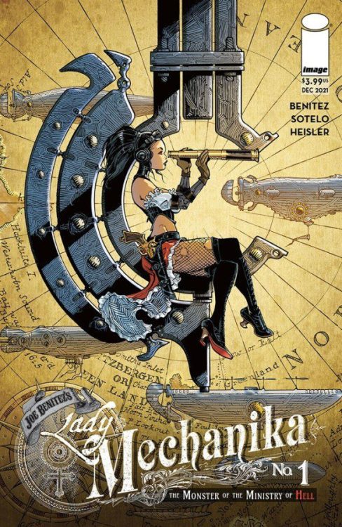
The beloved Lady Mechanika returns in Image Comics’ latest series, Lady Mechanika: The Monser of the Ministry of Hell #1. Written and illustrated by Joe Benitez, this is the beginning of an adventure we’ve all been waiting for.
A variant cover of Lady Mechanika The Monster of the Ministry of Hell #1
So in case my intro didn’t make it painfully clear: I am a huge Lady Mechanika fangirl. If you have not been lucky enough to read any of the previous series, I would strongly urge that you do so! Especially as this latest one relies very heavily on previous plots and character arcs.
As the title implies, Lady Mechanika: The Monster of the Ministry of Hell #1 is the first in a new miniseries focusing on the one and only – Lady Mechanika. Her fans have long gotten used to a volume popping up here and there.
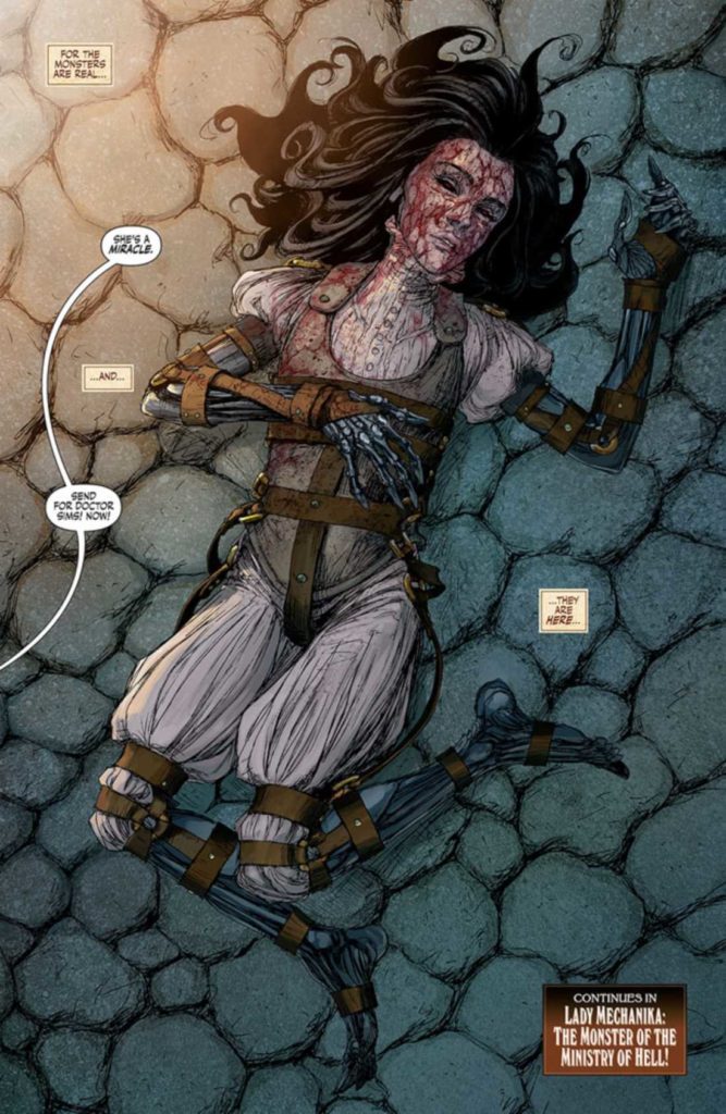
However, this series is a bit different. You see, we’re finally going to learn a bit more about Lady Mechanika’s past. Until now, much of it had been shrouded in mystery. The leading lady and readers don’t know how she came to be so altered, though that is likely to change soon.
As it turns out, the truth may be even darker than we could have anticipated. This is saying something, given the predilection of the series thus far. Time to dive on in and finally get some answers, yes?
Any guesses on who this mysterious monster is?
Writing
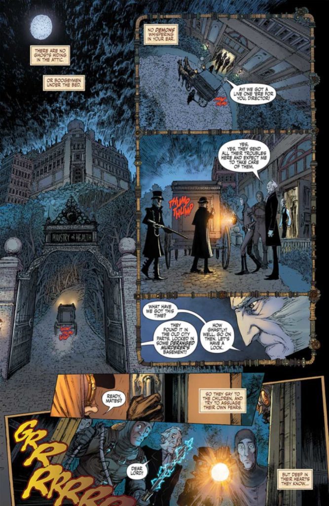
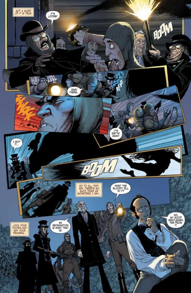
Lady Mechanika: The Monster of the Ministry of Hell #1 was written by Joe Benitez, with writing assistance from M.M. Chen. Much of the issue is split into two distinct points in time: the past and the present.
The past unfolds as if listening to a story, with Lady Mechanika taking up the narrative. It’s dark and gritty – even more so than I had anticipated. This part of the story is turning out to be surprisingly complex, and yet it still feels like we’ve only begun to scratch the surface.
In stark contrast to this would be the present, where Lady Mechanika is safely walking in the light of day. At a fair, of all things. This transition is jarring, intentionally so. It also serves as a reminder of how far she has come—and a reminder of her safety when we look back to darker times.
There are three more issues left to this series, and thus three more issues full of revelations and details. This is good, as I currently have even more questions than I did going into this issue. On the bright side, this is perfect proof that I’ve once again become invested in the tale. I’m certain I won’t be the only one feeling that way.
Whatever it is, it certainly is both fast and dangerous!
Artwork
As a whole, Lady Mechanika has always been a series known for its stunning artwork. Pick up any random issue, and you’ll know exactly what I mean. Each one is a masterpiece, especially the covers.
Lady Mechanika: The Monster of the Ministry of Hell #1 is a heady blend of steampunk aesthetic and horror. Likewise, it doesn’t shy away from the more gruesome imagery that comes alongside this plot – so do consider yourself warned.
Joe Benitez was the lead artist for this issue, with art assists from Martin Montiel. Benitez’s work is stunning as always. The sheer attention to detail on every page is borderline overwhelming, creating a feast for the eyes. What is most impressive, alongside the obvious, is how delicately Benitez handles the gore. While it is obviously present, it never crosses the line into grotesquery.
Beth Sotelo provided the colors, and wow, do they have an effect on the tone here! They are very much in line with a classic steampunk color palette, with a strong horror influence here and there. It’s a perfect balance.
Finally, there’s the lettering, crafted by Michael Heisler. I love Heisler’s style, as it makes heavy use of sound effects, colors, and the implication of texture to make the world (and words) come to life.
Well, that explains a thing or two. While raising many more questions.
Conclusion
Lady Mechanika: The Monster of the Ministry of Hell #1 brings fans back into the fold, yet it somehow has managed to up the ante. Readers are more excited than ever to learn of Lady Mechanika’s backstory. I, for one, will be counting down the days until the next release.
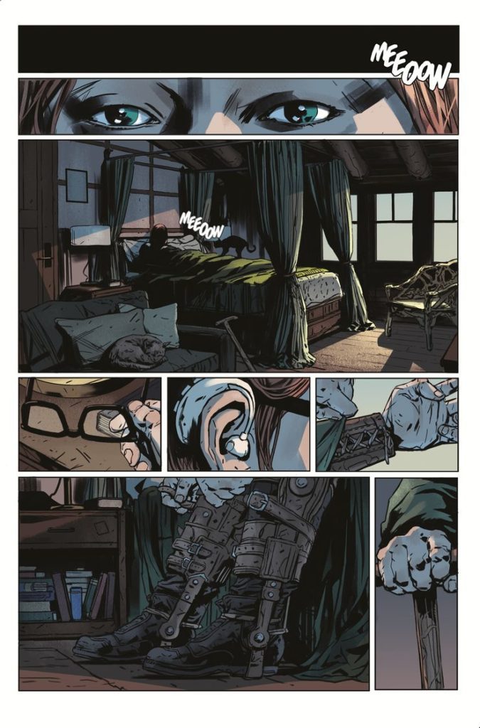
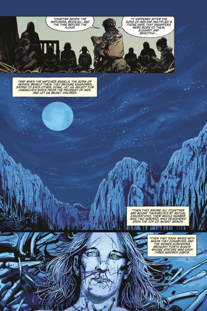
Writer and artist Colin Lorimer brings us an unsettling horror tale pulled from biblical origins in Daisy #1. This slow yet satisfying opening chapter delivers mystery and brilliant worldbuilding interweaved with disturbing and suspenseful horror undertones. With detailed atmospheric visual work to boot, this is one of the most enticing debut issues i’ve read this year.
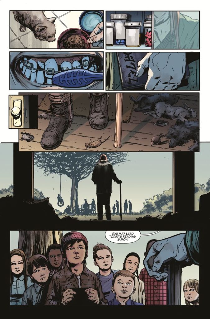
“A desperate mother’s five-year search for her missing son leads her to the small town of Brimount and to the mysterious Phillips family. Daisy Phillips, like many teenagers, has a hard time fitting in, but not for the usual reasons. She stands eight-and-a-half feet tall and is still growing, but her troubles with ill health, daily ridicule, and custom-made clothing are only the tip of the iceberg. Daisy may well be descended from a race of cannibalistic giants spawned from the outcasts of Heaven!”
Writing & Plot
Colin Lorimer spins a tale of murder mystery and religious mythology in Daisy #1. We meet the massive teenager as she leads a bible study group with small children. We understand almost immediately, due to the braces and cane she has to use, how different she is. This is increased when we read her dialogue – too solemn and pained with wisdom for a normal teenager. All of this falls in the background of the murder mystery happening at the same time. The mother looking for her long-missing son comes face to face with the massive Daisy – and the rest of this comic’s twists and turns occur. This comic’s plot goes in some delightfully unexpected directions. As a fan of creators taking liberties with mythologies and religions, I found this issue a lot of fun and immensely engaging.
Much of Lorimer’s script here is narrative being read from a book, or recanted from memory. The biblical recitations lend a solemn seriousness to the comic’s pages and perfectly reflects the increasingly dark goings-on. Daisy herself is a character we don’t get much of in this comic, outside a few lines and her – literally – massive introduction. I wish we could have seen more of her here (she is the title character after all), but the rest of the comic is interesting enough to make the wait acceptable.
Art Direction
Even more impressive than his writing is Colin Lorimer’s artwork in Daisy #1. His thoughtfully detailed and heavily inked style works well for crafting this world and creating atmosphere. Character details are intricately thought out and displayed. Daisy’s braces are a mass of delicately interwoven pencils. Every character’s clothing appears in various stages of wear, creating a sense of realistic place. The more unsettling imagery is disturbingly crafted and will likely stay in the reader’s mind for some time to come.
Lorimer’s character and environmental detail are put in place by his thoughtful storytelling direction. His panelling itself is nothing too out of the ordinary, but it’s how he uses it that impresses. Lorimer uses a lot of tightly focused panels to highlight relevant details before backing out into the larger world. This can come in multiple small panels on a page or panels inserted over a splash page. These scenes come on like a Chekov’s gun, with their relevance arriving in climactic surprise. It’s a huge part of what makes this book’s pacing so effective.
The colors from Joana Lafuente and Anita Vu are deep and tonally varied. Their work compliments Lorimer’s heavy inks by staying on the darker side of the color palette. Every choice made is influenced by shadow, overcast skies, or moonlight. The density of their work here really adds to this comic’s atmosphere, and perfectly this comic’s visual design overall.
Verdict
Daisy #1 is an unnerving, intriguing, and unique opening chapter for this horror-mystery comic. Colin Lorimer’s writing mixes tense, enticing pacing with fantastic allegory and scenes of shock and surprise. Colin’s art, along with Lafuente and Vu’s colors, is beautifully detailed and unnervingly atmospheric. If this sounds like your brand of unsettling, be sure to pick up this one-of-a-kind horror entry when it hits shelves on 12/8!
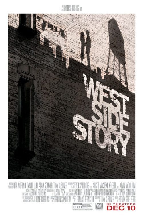
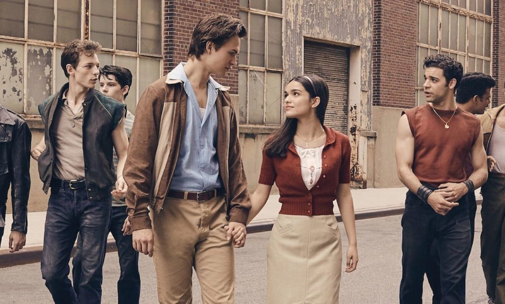
West Side Story shines as a heartwarming, brutal, and vibrant musical from Steven Spielberg. The musical numbers are handled with care, and a star is born in a breakout performance. Spielberg had no musicals in his resume, but West Side Story comes off as if he has done plenty. Spielberg’s take on the classic musical should open doors for an entire generation.
The original West Side Story is recognized as one of the best musical films. In this stunning remake, Spielberg delivers a spectacle that is right up there with the original. Acting as a sign of respect while carving its own path. West Side Story follows Tony (Ansel Elgort) and Maria (Rachel Zegler), two teens from rival New York gangs that fall in love. Honoring its source material, the film remains set in the ‘1950s.
Tony is affiliated with the Jets, and Maria is associated with the Sharks. This poignant love story grows into a hard-hitting film rooted in racial tension. Tony Kushner’s screenplay reimagines the musical for a new generation while staying close to home. Some moments are a bit jarring, and character decisions don’t make sense after certain events. For instance, a brawl between the Jets and the Sharks leads to a horrific end.
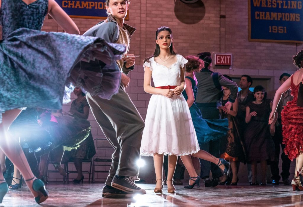
Maria proceeds to act as if all is forgiven and it doesn’t come across well due to the brawl happening minutes ago. The racial divide between the Sharks and the Jets feels appropriate like it did many decades ago. Zegler’s performance is breathtaking to witness. Her chemistry with Elgort amplifies the development between their two characters. This is one of the best debut performances I’ve seen this year. She displays emotional range, charisma, and conviction as Maria.
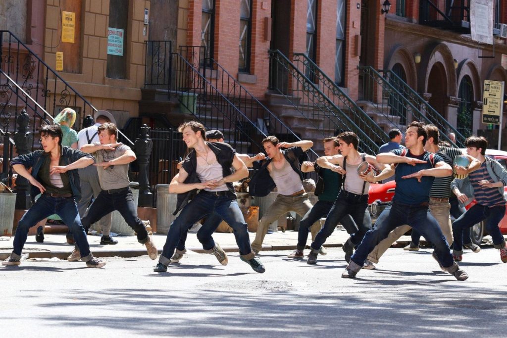
There’s so much to appreciate from West Side Story. The immaculate set design, stunning choreography, and brilliant direction make this a must-see event. It felt as though Spielberg had spent decades preparing for this moment. Tackling this genre without any prior experience and then having it turn out so well is incredible. The film’s energy is infectious and the lively performances will keep you invested.
I was apprehensive about this film being remade, but this exceeded every expectation while silencing my doubts. Kusher provides well-rounded characters to grow attached to and then shatters your heart when the conflict reaches its climax. While the first two acts are almost perfect, West Side Story rushes to the finish. It felt as though the fallout was lacking the same care that came before. Combine that with the jarring decisions from Maria and the film ends on a lukewarm note.
Spielberg’s visual spectacle doesn’t completely lose its footing, but the resolution is rushed. Everything before is meticulously crafted and handled with precision. Janusz Kaminski’s cinematography accompanied by Spielberg’s direction makes the choreography breathtaking as it unfolds. Elgort shines as Tony, the young man driven by guilt and love. His reserved, but boisterous behavior keeps Tony an interesting protagonist to follow. Every supporting character is brought to life by crowd-pleasing performances.
West Side Story’s runtime might be felt towards the third act, but it will all be worth it for this 2 hour-long spectacle. Zegler and Elgort’s impressive vocals will warm your heart, especially Zegler, who accomplishes a lot in this star-making debut. With West Side Story, Spielberg continues to prove why he is regarded as one of the best filmmakers in the industry. The original musical film still holds up, and now it has a proper remake that doesn’t stray too far. West Side Story is a glorious achievement and should be experienced on the biggest screen possible at least once.
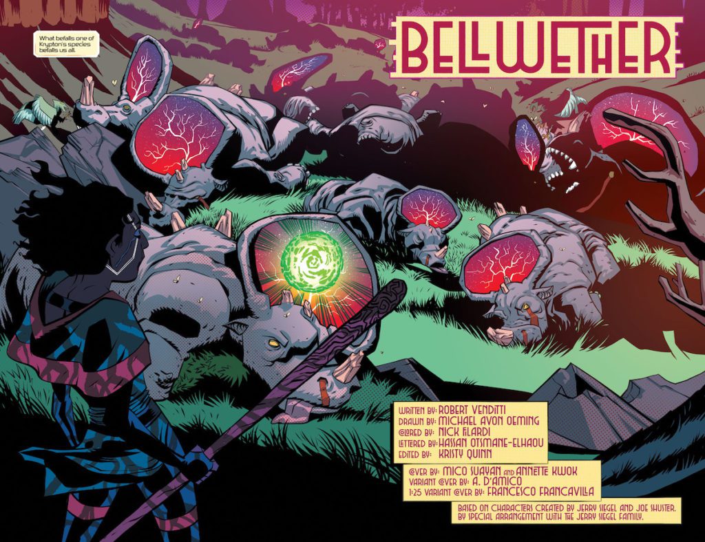
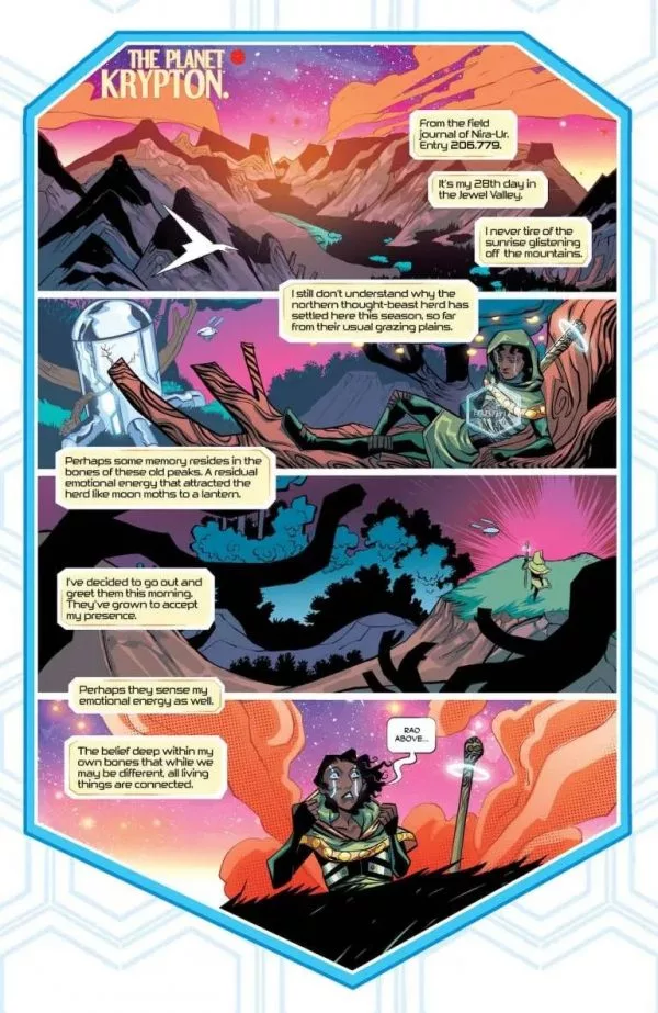
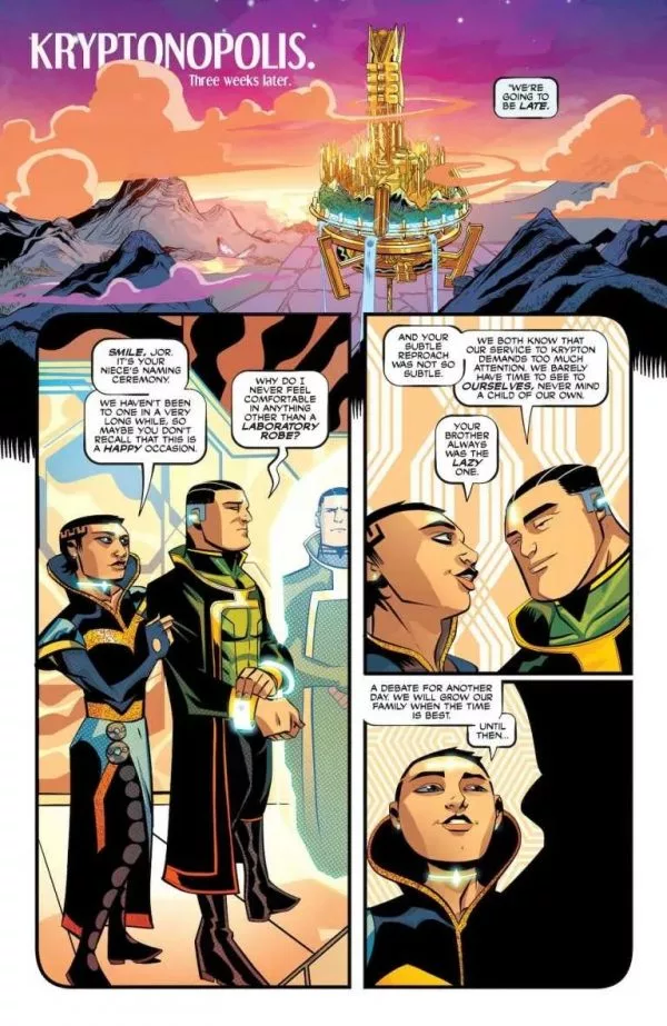
Writer Robert Venditti (Hawkman, The Surrogates) and artist Michael Avon Oeming (Cave Carson Has A Cybernetic Eye, Powers) come together to revisit events on a long-destroyed planet in World Of Krypton #1. With colors by Nick Filardi and letters from Hassan Otsmane-Elhaou, this opening issue reintroduces the iconic DC setting with settings and characters new and old and in a light we haven’t quite seen them in before. With a perfectly paced and sharply written script, as well as wholly unique visuals, this mini-series is off to a stellar start.
“Krypton is a utopia admired across the universe for its achievements in science and culture, but its shining towers and regal people conceal a planet rotting at its core. When a catastrophic event befalls Krypton’s natural world, it points toward a mass extinction in the making. Jor-El, head of Krypton’s revered Science Council, embarks on a mission to save a world that may already have passed the point of no return.”
Writing & Plot
Robert Venditti writes a tight and very compelling script for World Of Krypton #1. The characterizations, plot unraveling, and dialogue are all so stellar that they make one of the oldest stories in comics fresh for a new audience. Witnessing the beginning of the end for Superman’s home planet from the eyes of its inhabitants has scarcely been more engaging. Venditti wraps several interesting plot threads together. A xenobiological tragedy falls in the background of an important naming ceremony for a new family member of the El’s (who I can’t say). This then gets tied up in Kryptonian political and ideological conflicts and a Shakespearean betrayal that came even as a surprise to me.
Venditti goes about recanting Jor-El’s discovery of the oncoming destruction of Krypton by prioritizing worldbuilding and characterization. Longtime readers of DC comics, especially Superman-centric ones, will no doubt be familiar with Kryptonian customs. However, seeing them in practice in a modern style like Venditti writes makes the old feel new again. His dialogue writing here is fantastic as well. His naturalistic tone makes every scene compelling. Venditti also gives each character a unique voice makes each interaction memorable and stick out on its own. Making the old feel fresh and new is what this script needed to accomplish, and it has done so in spades.
Art Direction
When I saw Michael Avon Oeming’s name attached to World Of Krypton #1, I was both excited and a bit nervous. On the one hand, I adore Oeming’s work. His interiors on comics like the Young Animal Cave Carson series is delightful and brilliantly unique. On the other hand, that uniqueness to his style doesn’t always lend itself to certain comics – especially mainstream ones. Fortunately, Krypton really benefits from Oeming’s singular vision and artistic touch. His heavily inked and distinctly alien designs for the Kryptonian setting paints the long-destroyed world in a previously unseen light. The xeno-affluence in the house of El’s architecture and décor is a perfect atmospheric touch. This comic’s setting mostly being a cocktail party on another world is a great opportunity for Oeming to put his own spin on Kryptonian fashion and design.
Oeming’s character animations and style are great at portraying emotion and personality. His pencils may not be to everyone’s tastes, but it works tremendously well for this comic. Oeming’s work is colored by Nick Filardi, who delivers rich and off-kilter tones to every surface. His use of deep colors, especially the rich purples and golds in the party scene, perfectly compliment the alien setting. Hassan Otsmane-Elhaou’s lettering perfectly captures the dialogue tones and matches Oeming’s artistic sensibilities. Overall this is a fantastic looking comic.
Verdict
World Of Krypton #1 is a fascinating opening chapter to this reimagining of the beginning of the end for the doomed planet. Robert Venditti’s script is smart, tense, and full of fantastic dialogue. The visuals from Michael Avon Oeming and Nick Filardi bring Krypton to life in a style we’ve never gotten to see before, and it works brilliantly. Be sure to grab the beginning of this new mini-series when it hits shelves on 12/7!