Home Blog Page 113

Review: NEWBURN #3 – Blood, Bodies, and Black Castles

Newburn

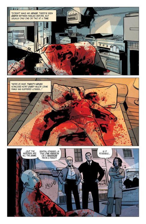
From page 1, you know that shit’s going to go down in Newburn #3. Or, more accurately, shit has already gone down. Writer Chip Zdarsky, and artist, colorist, and letterer Jacob Phillips open this issue on three dead bodies, lying in pools of their own blood. Image Comics’ Newburn has thus far been no stranger to death. But this issue, in particular, takes a turn for the gruesome and macabre. It’s disturbingly interesting.

Newburn

Writing

Zdarsky makes an interesting shift in this issue. For once, Newburn is facing something unlike anything he’s ever seen before. Zdarsky isn’t showing us the Columbo-esque confidence of someone who has figured out everything on page one. He’s showing us the step by step process of Newburn figuring something out from the ground up. We see Newburn talk more than usual. We see him listen more carefully. As such, there’s plenty of text in Newburn #3. Perhaps a bit more than in his first two outings. But Zdarsky brilliantly counteracts this by pulling back on the dialogue altogether near the end. Once Newburn has figured everything out, the pages become wordless. The silence rings in the air as you lean forward in your seat. Zdarsky creates a fantastic rhythm in his script, pulling you in for the big, satisfying finale.

Newburn
You kind of have to love that Image Comics missed the last “Holy Shit” on this page when blacking out swear words for their previews.

Art

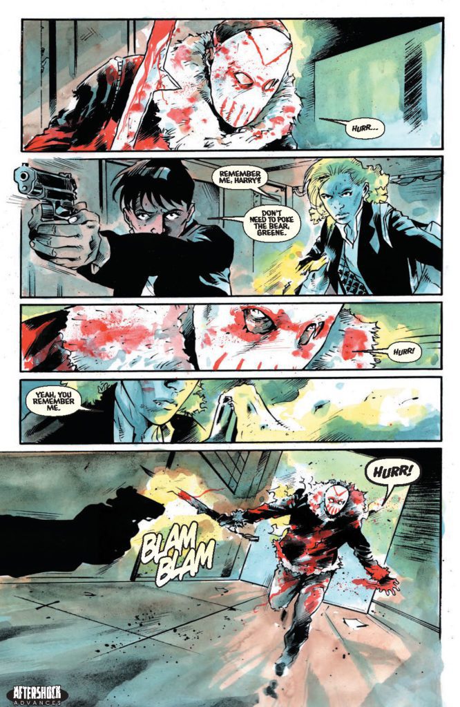
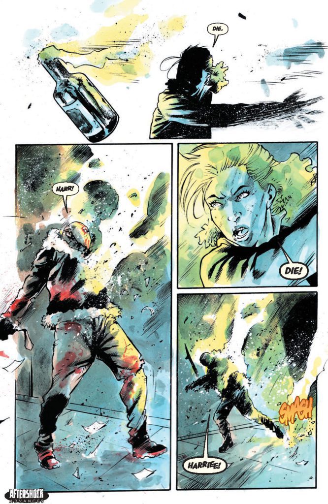
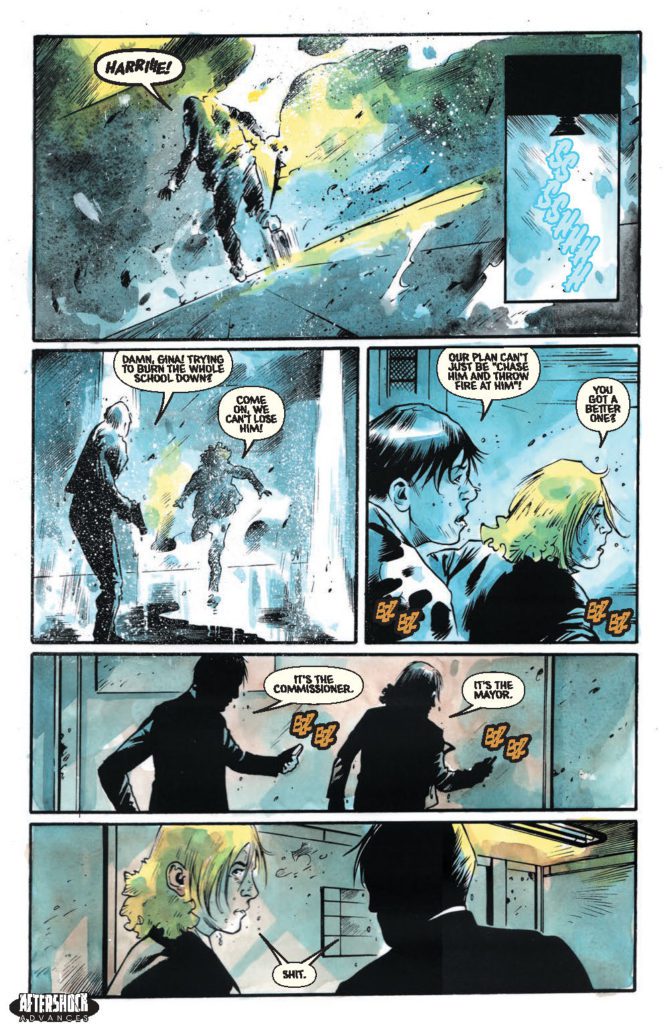
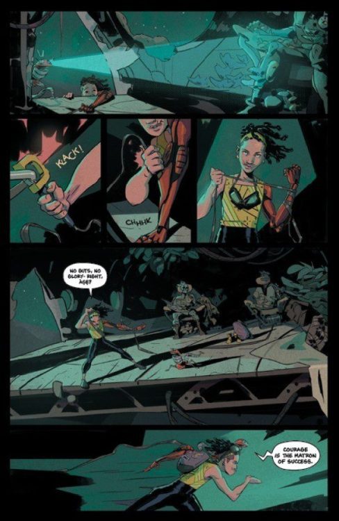
Once again, Phillips shows us what makes Newburn so different from everyone. In a world of snarls, grimaces, and the occasional smile, Newburn is a constant stoic. He’s a man who is always in control. And even Phillips’ page layouts show us this. They’re your typical, straight-edged, neatly placed panels. They echo the ordered, tidy life that Newburn lives. He may deal with all kinds of crazy people, but he won’t let their way of life effect his. Until, in the last couple pages of this issue, the layouts change. In place of all of the right angles, we see gutters that slant and cut through the air. Newburn is finally facing someone who’s just as chaotic as he is orderly. Phillips heightens this moment of the script by making these pages unlike anything we’ve seen yet.

Coloring

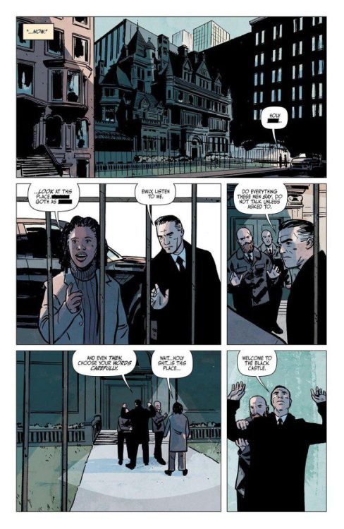
Phillips’ coloring is always a highlight in this series. Every scene feels like it has a specific hue to it. The first scene, out in the cold morning light, is cast in a soft blue tone. The scenes in the Black Castle have a menacing red glow to them. And one scene, set in a morgue, is shown in with a green tint to it. Each coloring choice adds to the ambience of every setting. But it also works to match the feeling of each beat of the narrative. Phillips choices are both stunning to the eye and thematically engaging, as usual.

Lettering

There’s a specificity to the size of Phillips’ lettering. As Newburn #3 reaches its big crescendo, the font of the dialogue gets bigger. Soon, the bolded and italicized lettering has these characters yelling at one another. Then, on the next page, Newburn is whispering to himself in a smaller font than usual. You can hear each character change their volume for emphasis. Phillips wants you to do more than just read this comic. He wants you to hear it.


Image Comics’ Newburn #3 is a gruesome good time. Zdarsky and Phillips are creating a brilliant series that has incredible range. In one issue, they can dive into the complexities of the human spirit. In the next, they’re talking serial killers and knife fights. I can’t wait to see what they’ve cooked up for us next. Newburn #3 is out from Image Comics at a comic shop near you!

Monkeys Fighting Robots Youtube

Marvel Comics Exclusive Preview: DEVIL’S REIGN #4

marvel comics exclusive preview daredevil devil's reign

DEVIL’S REIGN #4 hits your local comic book store February 9th, but thanks to Marvel Comics, Monkeys Fighting Robots has an exclusive three-page preview for you.

About the issue:
NEW YORK UNDER SEIGE! Wilson Fisk, duly elected Mayor of New York, has broken. Whatever shred of decency that may have been left of him is gone entirely and now, with an army of super villains at his command, THE KINGPIN has set his gaze upon everyone the heroes of the Marvel Universe hold dear – but even the Kingpin is unaware of the magnitude of danger he has put the city, its citizens and even himself with his war against the city’s super heroes!

The issue is by writer Chip Zdarsky and artist Marco Checchetto, with colors by Marcio Menyz, and letters by Clayton Cowles. The main cover is by Checchetto and Matthew Wilson.

Check out the DEVIL’S REIGN #4 preview below:

marvel comics exclusive preview daredevil devil's reign

marvel comics exclusive preview daredevil devil's reign

marvel comics exclusive preview daredevil devil's reign

marvel comics exclusive preview daredevil devil's reign

marvel comics exclusive preview daredevil devil's reign


How are you enjoying DEVIL’S REIGN so far? Sound off in the comments!

Monkeys Fighting Robots Youtube

AfterShock Comics Exclusive Preview: MANIAC OF NEW YORK: THE BRONX IS BURNING #3

aftershock comics exclusive preview maniac of new york bronx is burning

MANIAC OF NEW YORK: THE BRONX IS BURNING #3 hits your local comic book store February 16th, but thanks to AfterShock Comics, Monkeys Fighting Robots has an exclusive four-page preview for you.

About the issue:
Gina Greene and Zelda Pettibone are face-to-face with Maniac Harry once more, and theyre armed with enough Molotov cocktails to burn down the borough! But the Mayor of New York seems determined to get in their way. Can Gina and Zelda stop Harry before his body count rises?

SPOILER ALERT: They cant! Theres only one issue left after this one, and it just might be the biggest bloodbath yet!

The comic is by writer Elliott Kalan and artist Andrea Mutti, with letters by Taylor Esposito. The main cover is by Mutti, and the Horror Fanatic variant is by Robert Hack.

Check out the MANIAC OF NEW YORK: THE BRONX IS BURNING #3 preview below:

aftershock comics exclusive preview maniac of new york bronx is burning

aftershock comics exclusive preview maniac of new york bronx is burning

aftershock comics exclusive preview maniac of new york bronx is burning

aftershock comics exclusive preview maniac of new york bronx is burning

aftershock comics exclusive preview maniac of new york bronx is burning

aftershock comics exclusive preview maniac of new york bronx is burning


Are you caught up on MANIAC OF NEW YORK? Sound off in the comments!

Monkeys Fighting Robots Youtube

Review: A New Age Of Sci-Fi In NEW MASTERS #1

From Shobo and Shof Coker (Outcasts Of Jupiter) comes a smart and unique take on a familiar sci-fi concept with New Masters #1. This story of colonization in a distant future offers a perspective we don’t often see in out Western-dominated world of comics fiction. With a sharp, intriguing script and stunning visual work, this could prove to be the start of a new mega-hit over at Image Comics.

“In a striking vision of West Africa under the thumb of alien colonizers, a motley crew of outcasts find themselves caught up in a power struggle for control of an ancient artifact with immense power.”

Writing & Plot

Developing a brand new science fiction world is a daunting task from a scripting perspective. In order to keep the story engaging, the perfect blend of worldbuilding and characterization needs to take place. It’s fortunate then that Shobo Coker pens a script that effectively accomplishes both with New Masters #1. This far-future vison of an Earth colonized by advanced alien races from the perspective of West Africa is a fascinating hotbed for storytelling from a perspective we seldom get to see. Our main cast, including Ola, a scavenger, and Tosin Ojumah, the human governor of this new territory shared with other alien societies, are each survivors navigating a new brand of colonialism from different ends of the societal spectrum. Being West African himself, Shobo has a perspective on this kind of resource-based hostile control that we here in the “West” definitely do not. The class and labor elements in this story bring in some cyberpunk genre tropes to help craft something familiar, but still unique unto itself.

Shobo’s writing style carefully combines distinctive dialogue and necessary exposition to create something informative and compelling. Character speech is filled with personal colloquialisms that add a sense of place and realism to this society. The expository bits come out as characters speaking to each other about current events in-world. These sequences still have the flow of naturalistic dialogue, and as such aren’t a chore to get through. Every aspect of this comic’s writing feels deliberately constructed, but with a natural flow that makes for an engaging and relaxed read that the reader will feel drawn into, but not overworked by.

Art Direction

Science fiction comics introducing new visions of the future have to have immensely talented artists to bring these concepts to life. Fortunately, Shof Coker demonstrates he is more than capable of such in New Masters #1. Coker’s detailed and colorful art style brings this vivid vision of far-future West Africa as the Earth’s interplanetary hub to life with stunning energy. Every one of Shof’s character designs, human and alien, are distinct and memorable. Wardrobe design is a mix of futuristic-affluence and ever-present poverty. On one hand, people in upper-tiers of society wear ornate or sleek gowns and professional dress suits. On the other, people still living in the city’s poor outskirts and risk their lives to earn a pittance wear worn tank tops and ripped pants. Each denizen of this city has a different aesthetic to match their role in this society. Shof’s colors highlight this even more. His use of watercolor-esque styling and vibrant, varied tones craft a stunning and definitively futuristic look to the whole comic. I can’t help but compare Shof Coker’s work to to that of Mike Huddleston in Decorum or Nick Dragotta in East Of West. You know this book is doing something right if I’m comparing it to Hickman joints.

Verdict

New Masters #1 is an exciting and sharply crafted opening chapter for this sci-fi comic with a needed new perspective. Shobo Coker’s script expertly balances exciting action with worldbuilding, compelling exposition, and naturalistic dialogue. Shof Coker’s art is distinct, vivid, and stunning, crafting this futuristic vison of an alien-colonized West African metropolis with a flair both familiar and wholly unique. Be sure to grab this new release when it hits shelves on 2-2!


Monkeys Fighting Robots Youtube

Review: GRRL SCOUTS: STONE GHOST #3 — A Cosmo Stained in Ink

It’s very hard to mistake a Jim Mahfood comic. Much of his comics career has been dedicated to pushing his mixed-media, psychedelic style to further heights of insanity. Grrl Scouts has been with him for most of that career, which is why the series has gone from women smuggling weed to a full-blown space opera. But, when a comic’s this kinetic, and looks this damn good? You just have to get swept away in it. Swim against the current, and you might get hurt.

WRITING

Grrl Scouts: Stone Ghost continues to juggle a bunch of storylines while occasionally hinting at how this story might connect to ones before. The main plotline continues the story of shy newcomer Dio and her offbeat robot companion Natas as they travel the universe to recover the ashes of Dio’s boyfriend. Their search finds them kidnapping a gangster so that they can dream-jump inside his head to find the ultimate location of the ashes, all while Dio attempts to ignore dreams hinting that she might be a descendent of “The Butterfly,” first member and founder of the Grrl Scouts. But meanwhile, Dio’s ghost friend Gordi expresses regret over betraying Dio to a cult worshipping a dark god named “The Teeth,” whose cult leader sends a man with a kettle for a head to hunt down Dio, and… Well, there’s a lot going on. Self-indulgence continues to be the comic’s raison d’etre. The issue opens up with the characters declaring they’ve bought themselves comfortable sweaters off-panel. Why? Well, why not? This is a series, after all, that opened on a spread of band posters and Kevin Smith tapes waaaay back in 1999. Mahfood wants to make something entertaining above all else, and part of how he does that is by throwing all his influences into a blender and setting it to “liquify.”

Part of Mahfood throwing what’s on his mind into his comic, however, is a continuing plotline about the main character, Dio, grieving over her boyfriend’s death from brain cancer. Mahfood has been open about this being inspired by the death of a real-life friend, to the point where the character’s last moments with a George Harrison LP are said to mirror the real article. No one would mistake this for a fully somber comic, but death weighs a lot heavier on its mind than in previous outings. This too, is part of carrying the series through decades. While it may be as free-wheeling and kinetic as ever, this is no longer a comic by someone in their twenties.

ART

It’s hard to know where to start here. Just take a look at the example pages. Mahfood is a born stylist, and knows just how important presentation can be. What’s new for this comic, however, is that he’s coloring it himself. He goes with a more limited palette, dominated by primary reds, blues, and yellows. Flashbacks to Dio’s boyfriend are presented as scribbles on yellow notepad paper. It’s a book that’s willing to play with layouts, colors, character design… If there’s one thing that’s immediately obvious in this book, it’s that Jim Mahfood had fun drawing it. And that’s one of the biggest reasons this book is worth picking up. It’s a jam session.

VERDICT

Grrl Scouts: Stone Ghost continues the series tradition of each installment somehow looking better than the last, and opens up the series into a wild sci-fi world. Now, more than ever, it’s a vessel for Mahfood to do whatever the hell he wants. I wouldn’t have it any other way.

Monkeys Fighting Robots Youtube

Review: Pub Crawls and Pratfalls in HELLBOY: THE SILVER LANTERN CLUB #4

Hellboy has always, at heart, been a bit of a goof. For as skilled as Mike Mignola is at drawing shadows and quiet moments of contemplation, he’ll just as happily have Hellboy fall over himself, or maybe end up in a pink bathrobe. Which is why it’s nice to see one of the many Mignolaverse titles lean into comedy. For as much awe as the books can treat their own lore with, it’s fun to see Silver Lantern Club treat the supernatural the same way Hellboy himself does: cryptic, commonplace, and very annoying.

WRITING

The Mignolaverse’s backbone is built on simple folktales, and Mignola and Chris Roberson have been writing Hellboy stories for quite awhile. “Simple and breezy” is the name of the game here. Framed as a tale being told to Hellboy by former paranormal investigator Simon Bruttenholm, it recounts a time that Simon and fellow investigator Edward Grey were roped into a werewolf hunt. Edward’s friend and immortal werewolf hunter Yad Tovich drags them from pub to pub, insisting that there’s no time to spare in their supernatural hunt — except for one more drink, of course. But Simon and Edward quickly come to realize that the hunter Yad may be a bit more calculating than he lets on. The plot, then, is an opportunity for the characters to bounce off one another as they wander London’s bars at night. The supernatural itself even takes a backseat to the bar-hopping, much of it coming from half-remembered adventures the characters drunkenly explain to one another.

Yad Tovich has shown up in a previous Hellboy story as a more tragic character. But here he sets the tone for the issue, cast as a drink-loving, spirited old man, unreluctant to lead others into trouble. Werewolves have never fit into the Hellboy universe’s aesthetic of crumbling castles and Victorian fashion quite as well as vampires, but they certainly belong with Yad’s rugged, outdoorsman attitude. I have a feeling we’ll be seeing more of him.

ART

Ben Steinbeck and Christopher Mitten share art duties here, with Steinbeck drawing the modern day framing scenes, and Mitten working on the meat of the story. Mitten’s scratchy lines and exaggerated character acting both compliment the story’s chaos. Mitten is obviously having a lot of fun drawing drunk characters, as he makes them sway and stumble and grip streetlamps for support. Meanwhile, Steinbeck’s art, while still cartoony, feels more weighty and grounded. It works as a contrast to Mitten’s more impressionistic style, making the scenes where Simon talks to Hellboy feel more fixed in the present.

Befitting a story less focused on the supernatural, Michelle Madsen’s colors ground the story in earthy browns and greens. The werewolves of the issue fit right into this natural environment, the only supernatural tell being their small, bright-green eyes. It all makes for a believably dingy vision of Victorian London for the protagonists to stumble through.

As for letterer Clem Robins, he’s been working on Hellboy books for quite a while, and maintains his pleasant, handwritten look. It’s a style seen through most Mignolaverse titles, and helps keep all the books with different art styles and tones feel consistent with one another.

VERDICT

Hellboy: The Silver Lantern Club is a series that trades the Mignolaverse’s ghost stories for bar tales. Which means getting to see a more grounded, rowdy side of the universe. It’s a fun change of pace, and makes for a nice, comfortable read. After so many years, it’s nice to see these characters can still hold their liquor.

Monkeys Fighting Robots Youtube

Review: Connecting Dots in DARK KNIGHTS OF STEEL #4

Dark Knights of Steel

DC Comics’ Dark Knights of Steel #4 answers plenty of questions. Writer Tom Taylor, artist Bengal, colorist Arif Prianto, and letterer Wes Abbott give us a history lesson about this alternate version of the DC Universe. While this issue has plenty of action and drama, it’s the quiet, intimate moments that shine.

Writing

Taylor’s script fills in many of Dark Knights of Steel‘s blanks. But, in some cases, the mystery was more interesting than Taylor’s answers. Taylor takes us through the lives of the Els. With exploding volcanoes, twisted villains, and devastating heartbreak, there’s plenty to talk about in these pages. It often feels that it’s the flashiest moments, however, that fall flat. They blend into the usual chaos of comic book madness. Instead, it’s the details of the friendship between the Waynes and the Els that feel like a breath of fresh air. Taylor takes typical family drama tropes and turns them on their head in heartwarming ways. So while this issue’s action felt run of the mill, their were still stunning moments to witness, like pauses between crashing waves.

Dark Knights of Steel

Art

Bengal similarly struggles with this script. His art is stunning, but it’s jam-packed with emotional sequences. These moments feel melodramatic in a way that robs the story of stakes. When King Jefferson’s eyes crackle with power at the sound of bad news, it feels like too much. And when Jor-El screams at someone for looking to the stars for insight, the outburst is sudden and less terrifying than a calm delivery of the same line. But then, the same moments that work well in the writing work brilliantly in the art as well. When characters hide their faces, or turn away from the reader, it speaks to us more than any expression could. And when the characters are full of a simple happiness, a slight smile on their faces, you can’t help but smile along with them.

Coloring

There’s a wonderful thing that Prianto does with the color scheme of Dark Knights of Steel #4. It quickly becomes clear that certain colors mean specific things. Red is often associated with the power of the Els. Even the red glow of a volcano quickly provides an opportunity for the Els to show their might. Conversely, green is the color of encroaching evil. It’s the color of Kryptonite and death. Right after we see a character undergo a green tinted metamorphosis, we come back to a peaceful scene of celebration. But in the background, there’s a green tarp that’s held up by sticks. It feels as though Prianto is hinting that the danger hasn’t passed, it’s still hiding in the shadows. And with that, even joyful moments in garden paradises can become omens of oncoming doom.

Lettering

Abbott’s approach to lettering in Dark Knights of Steel #4 manages to be both straightforward and fun. His sound effects mimic what’s happening in the scene. The sound of a fist breaking a rock into bits looks cracked and like it’s splitting into pieces. The noise of heat vision piercing the air is written in a font that looks like it’s made up of lasers. The quiet snapping of wood is shown in small, jagged lettering. Abbott blends his letters into the story, but if you stop to notice them you see how they’re full of a playful flair.


DC Comics’ Dark Knights of Steel #4 is full of punchy action that ultimately feels quite forgettable. But in the margins of these scenes, in the respites from the chaos and drama, there are beautiful moments that will stick with you. Pick up Dark Knights of Steel #4, out from DC Comics February 1st, at a comic shop near you.

Monkeys Fighting Robots Youtube

Review: A Blast Of Chinese Mythology In MONKEY PRINCE #1

From writer Gene Luen Yang (Dragon Hoops, Superman Smashes The Klan) and artist Bernard Chang comes an ancient legend arriving in the DC universe with Monkey Prince #1. Featuring colors by Sebastian Cheng and letters from Janice Chiang, this opening issue is a gorgeous, wildly fun, and inventive take on one of the oldest stories in literature. While it does feel a tad rushed and throws a lot at the reader very quickly, this first chapter in an exciting ride I’m looking forward to seeing more of.

“Introducing the newest hero in the DCU, the great sage, equal to the heavens, better than his predecessor the legendary Monkey King, even better than the Justice League—and definitely the Teen Titans—(actually, all the heroes combined), everyone put your hands together for…the Monkey Prince! Marcus Sun moves around a lot because his adoptive parents are freelance henchpeople, so this month he finds himself as the new kid at Gotham City High School, where a mysterious man with pig features asks Marcus to walk through a water curtain to reveal himself as who Marcus really is…someone who has adventured through The Journey to the West, can transform into 72 different formations, can clone himself using his hairs, and is called…the Monkey Prince!”

Writing & Plot

Gene Luen Yang‘s script for Monkey Prince #1 is full of an infectious enthusiasm that’s hard not to love. There’s an almost Saturday morning cartoon type of energy to this comic, and I found myself smiling through much of the reading experience. We meet Marcus Sun as a high schooler traumatized by his first-hand experience with an angry superhero (due to the fact that his parents are for-hire goons). Rather suddenly, we then get dipped into the mythical and magical hijinks of him becoming the Monkey Prince, heir to the power of the Monkey King. Yes, that Monkey King. I won’t get into any more details at risk of spoilers, but if you’ve ever read or are familiar with Journey To The West (or ever watched Dragonball), then this issue will doubtless be a treat.

Yang’s utilization of the classic mythical property is inspired, and it never gets in the way of the main plot. There’s almost no exposition, so the pacing stays lightning-fast and new developments come very quickly. This method fits the tone comic very well, but it can cause a bit of whiplash. Quite a lot gets thrown at the reader very quickly, so it can sometimes take a moment to gather what exactly is happening. This issue is saved by just how much of a joy this comic is to read. The character reveals are surprising and emotionally satisfying (whether that emotion be fear or delight), and the plot is an absolute joy to behold. This is the most outright fun I’ve had with a DC comic in recent memory.

Art Direction

The amount of exuberant energy the script for Monkey Prince #1 requires would need an especially talented artist to pull it off. Fortunately, Bernard Chang is on hand to deliver. His immensely detailed pencils and tight direction create a reading experience that is wickedly exciting to follow, and easy for a reader to fall into. Chang’s designs for characters new and old are intricately designed and animated. The classics are easy to recognize, and the new ones are sure to stay in your mind. Every character has unique features and is easy to recognize instantaneously. The design for the Monkey Prince himself is outwardly simple, yet obvious that Chang put a ton of work into. The character’s costume design is a perfect blend of mythical royalty and a modern superhero. Chang puts a ton of effort into placing these mythical beings and settings into the DC universe and making it feel seamless.

As phenomenal as Bernard Chang’s work is, it wouldn’t be nearly as effective as it is without Sebastian Cheng’s colors. His vivid, hi-fidelity palette pulls the reader into this read with a style that matches the energy of the pencils and script. Every panel leaps off of the page thanks to Cheng’s work here. The lettering from Janice Chiang is sharp and well-designed, with expressive fonts and effective SFX lettering that makes itself known but still stays out of the way. This is a stunning comic book from front to back, with an absolutely killer visual team.

Verdict

Monkey Prince #1 is an immensely fun new take on an old mythology that blends seamlessly into the DC universe. Gene Luen Yang’s script, while a bit rushed-feeling, creatively introduces a cast of iconic characters and stories into another universe of storied characters and does it with a blast of narrative energy. The visuals from Bernard Chang and Sebastian Cheng are stunning and brilliantly directed, making this one of the most fun and gorgeous DC comics in recent memory. Be sure to grab this debut issue when it hits shelves on 2-1!

Monkeys Fighting Robots Youtube

Exclusive Preview: Jarod Roselló’s RED PANDA & MOON BEAR (BOOK TWO)

Red Panda & Moon Bear (Book Two): The Curse of the Evil Eye

Red Panda & Moon Bear (Book Two): The Curse of the Evil Eye hits your local book store on April 12, but thanks to Top Shelf Productions, Monkeys Fighting Robots has an exclusive preview for our readers.

About the book:
Super siblings save the world! In their second amazing graphic novel, these Cuban American kids are getting even better at using their powers to protect the community… but has their luck just run out? How do you stop a curse?!

When an evil curse descends upon the city of Martí, it’s up to Red Panda and Moon Bear to put a stop to it… but it won’t be easy! First, they’ll have to solve weird mysteries, fend off new monsters, and uncover the secret history of their neighborhood. With their trusty dog companions and some magical new friends by their side, Red Panda and Moon Bear must find a way to defeat Mal de Ojo — The Evil Eye — and keep it from ruining the lives of everyone they love! — a 216-page, full-color softcover graphic novel with 3” French flaps, 6” x 9”

Check out the preview below.

Red Panda & Moon Bear (Book Two): The Curse of the Evil Eye

Red Panda & Moon Bear (Book Two): The Curse of the Evil Eye

Red Panda & Moon Bear (Book Two): The Curse of the Evil Eye

Red Panda & Moon Bear (Book Two): The Curse of the Evil Eye

Red Panda & Moon Bear (Book Two): The Curse of the Evil Eye

Red Panda & Moon Bear (Book Two): The Curse of the Evil Eye


ABOUT JAROD ROSELLÓ:

Jarod Roselló is a Cuban American cartoonist, writer, and educational researcher from Miami, Florida. His debut graphic novel, The Well-Dressed Bear Will (Never) Be Found, was published in 2015 by Publishing Genius Press. His chapbook, The Star, was the winner of the 2015 Epiphany Literary Magazine Chapbook Contest. His short fiction and comics have been published in The Rumpus, Hobart, Hayden’s Ferry Review, Sonora Review, and The Collagist, among other places. His childhood and educational research has been published in Bank Street Occasional Papers, International Review of Qualitative Research, and Contemporary Issues in Early Childhood. He teaches comics and fiction in the creative writing program at the University of South Florida.


Monkeys Fighting Robots Youtube

Review: True Villainy in ONE-STAR SQUADRON #3

One-Star Squadron

One-Star Squadron is unlike any of DC Comics’ other projects. It has no villainous monologues or doomsday devices. Instead, One-Star Squadron is full of the real life weapons of our own destruction. Writer Mark Russell, artist Steve Lieber, colorist Dave Stewart, and letterer Dave Sharpe fill One-Star Squadron #3 with true villains: the puppeteers of capitalism.

Writing

I’ve read about Superman facing down Doomsday. He’s fought 5th dimensional imps and global terrorists. This is the first time I’ve seen Superman face a smarmy board of directors. And Russell immediately shows us how this fight for Superman isn’t as simple as all the others. The board of directors are polite, even jovial. Worst of all, they’re not threatened one bit. Russell shows us that these are dangerous people. The type of people that see nothing wrong with what they’re doing. They just smile and get their way. In making the villains of One-Star Squadron #3 your average corporate shark, Russell underlines the hopelessness in today’s zeitgeist. If these guys are so self-deceived they’d happily stare down the Man of Steel, what are we supposed to do?

One-Star Squadron

Art

So much of the casual feeling of our villains comes from Lieber’s art. He almost convinces you to like this board of directors. They’re charismatic and charming. Hell, they’re some of the only people to smile in these pages. But that’s also what makes them sinister. Lieber, in creating an entirely different mood, in the confines of the boardroom, shows how disconnected this board is from the grief their decisions bring about. They don’t want to know. They’re blissfully unaware. Every other character, under Lieber’s pen, is haggard and depressed. Red Tornado agonizes over how to keep his staff afloat, while they sneer at him with contempt. In previous issues, the melodrama of a character’s body language was often used comedically. But now, Lieber has seamlessly moved into the realm of heartbreak. The deeply expressive faces of these characters, juxtaposed against the toothy grins of the corporate elite, will make you want to cry.

Coloring

There’s a similar disconnect in Stewart’s coloring. The bright colors of superhero costumes, often symbols of hope, hang around the frames of disillusioned has-beens. And while these characters are shown in vibrant uniforms, their surroundings are grey and dull. Their costumes are an extension of the brave face they’re trying to put on. Meanwhile, the board of directors in their black turtlenecks, grey suits, and faded blue hoodies are brimming with joy. They have learned to blend in with their surroundings. They’ve figured out how the world works, and how to make it bend to their will.

One-Star Squadron

Lettering

Sharpe uses the spacing between word balloons to convey hesitation or confidence. When we open on the board of directors, Sharpe immediately shows us what a confident group of people this is. Their dialogue seems rehearsed, perfectly scripted. Their word balloons bump up against each other. There’s no air between each thing they’re saying, they’re ready to jump into the conversation the moment their colleague is finished with their “line.” They then ask Superman a rhetorical question. “It would be naïve to expect the world to work differently for heroes, wouldn’t it?” There’s a big gap between that line and Superman’s response: “Maybe.” Sharpe pulls you into every scene. The visual rhythm he creates tells us everything we need to know about the power dynamics at play.


DC Comics’ One-Star Squadron seamlessly moves from the hilarious to the flat-out sad. Russell, Lieber, Stewart, and Sharpe are creating an indictment of our throwaway culture. They lure us in with plenty of laughs, before giving us a poignant punch to the gut. I, for one, can’t wait to see where it takes us next. Pick up the stunning One-Star Squadron #3, out from DC Comics February 1st, at a comic shop near you!

Monkeys Fighting Robots Youtube