

Marvel Comics are masters at putting out Superhero comics packed with action and adventure. In today’s market, however, it seems that every comic has to distil the feeling of a multi-million dollar movie into 22 pages without losing the sense of grandeur, and excitement. With limited space to tell a strong narrative as well as pack in the excessive action, the creators at Marvel have to limit sequences to a handful of panels. This poses interesting dilemmas when it comes to portraying fight scenes, especially with highly choreographed fighting styles required for such titles as the new Shang-Chi.
In Brothers and Sisters part one, writer Gene Luen Yang and artists, Dike Ruan and Philip Tan, are tasked with launching a new title that will appeal to new and old readers alike. Whether or not they are successful or not remains to be seen but their approach to the storytelling is definitely an exciting one.
A number of different factors can limit storytelling in North American comics: page count and cost per comic are two main elements. It’s much harder to fill an entire chapter or issue of a comic with a single fight scene when that constitutes a fourth or fifth of your total page count. In order to capture the feel of those intense combat sequences from, for example, Manga books, artists Ruan and Tan use condensed imagery and clever panel layouts.
Spoiler Warning: The following breakdowns contain minor spoilers for Shang-Chi #1
Tan’s Flashback
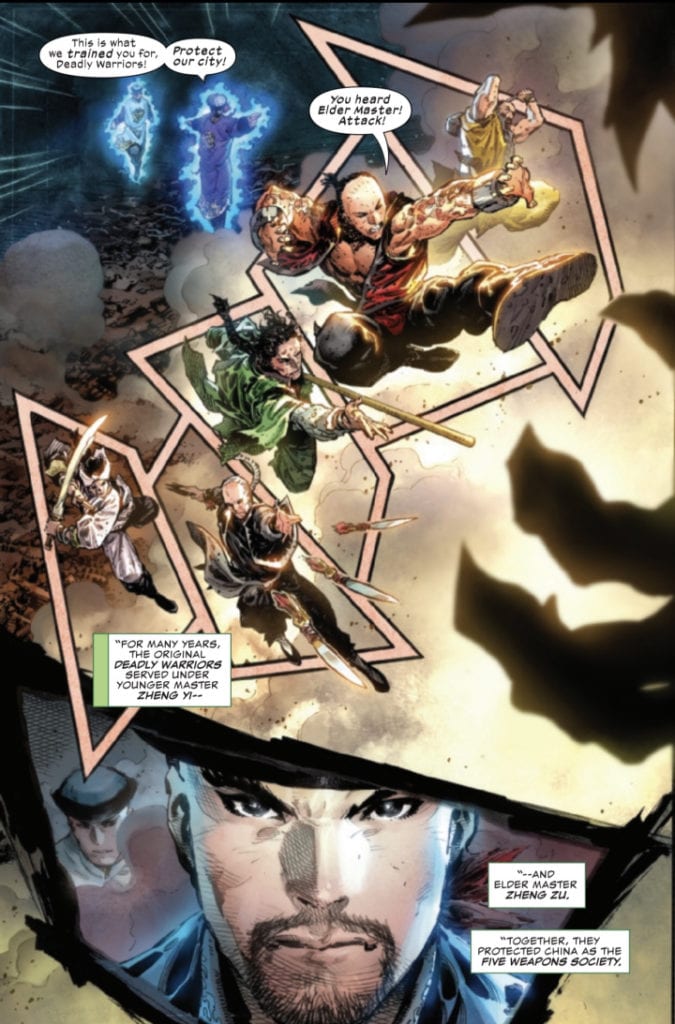
There are three different approaches to capturing the dynamic action in issue one of Shang-Chi. The first, used in the opening flashback sequence by Tan, is to break up a single image with a number of unusually shaped panels. Page four of the comic has the Elder Master send his Deadly Warriors to do battle with Fin Fang Foom. The page is designed like a full page spread, one moment in time with the Warriors leaping into battle, however Tan has broken the image up to create the impression of a string of panels thereby extending the time period within the page. Add to this an overly large insert panel, with a close up of the Elder Master, and Tan is able to create the sense of a long and difficult battle with, essentially, a single image.
There is a line of action on the page starting with Zheng Zu in the top corner. His sweeping arm leads the reader to follow the action diagonally up the page from left to right, following each of the Warriors in turn. You start at the bottom of the diagonal sweep and jump from character to character, reading as if it is a sequence of separate panels because Tan has placed borders behind them . There is no real narrative need for those borders, however from a visual point of view it focuses the audience’s attention and forces you to read each character one at a time. You can see the team but you also get a sense of the individual.
Tan has created a page grid that distorts the reader’s sense of time. You relate the characters to each other because they are part of a single image but you also see them independently. Each has an action, a skill unique to themselves and Tan highlights each of their actions in turn. There are no more pages to this fight scene, the villain turned up at the bottom of page three and the entire fight is contained within page four. However, by focusing on each character separately and as part of a whole, the audience pieces together a series of events and conjures up the entire fight in their mind. You turn the page believing you have witnessed a full and difficult battle.
One Image Or Many?
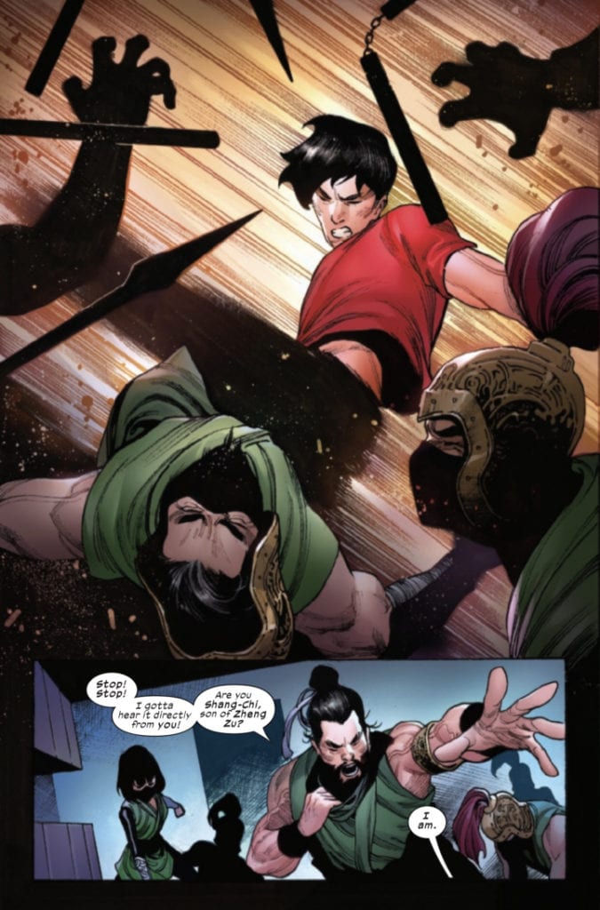
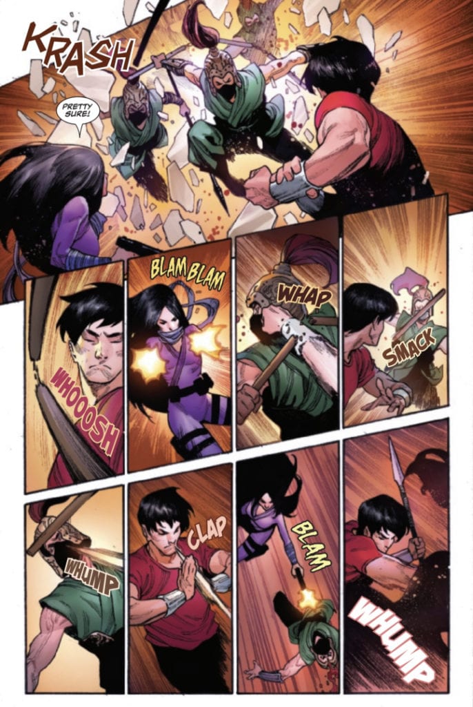
Ruan also uses a large single image to depict a moment of action but this is different in two respects. On page 17 the title character Shang-Chi is embroiled in a fight with a swarm of Warriors of the Deadly Staff. Two thirds of the page is taken up with Shang-Chi striking out with a roundhouse kick. In contrast to Tan’s earlier page, this image represents a single moment in the battle and instead of stretching the time out, Ruan shortens it to emphasise Shang-Chi’s deadly speed.
Much of the image is static: Shang-Chi’s torso and head, and the warriors that he is striking. His leg, however, becomes a blur, fading out towards his foot. Ruan is showing that Shang-Chi’s kick is moving faster than your eyes can see. The background is replaced by motion lines and a brightening light that is centred on Shang-Chi. Everything about the image is about speed and power. It is a snapshot of the fight and even then it is difficult to focus on Shang-Chi’s movement.
The rest of the fight follows a more standard Superhero comic layout. The start of the fight, on page 16, is broken down into panels with an obvious grid layout. The shock moment of the warriors breaking through the wall extends across the top of the page. It is the biggest, most dramatic moment on the page and therefore is given the most space to occupy. Afterwards the reader is treated to a series of snapshot actions, seemingly unrelated to each other. Shang-Chi avoids some nun-chucks, Leiko Wu shoots her guns, and various warriors get struck in the face. It is a series of events, small moments that add up to a greater whole.
Almost opposite to both previous examples, Ruan is showing staggered elements of the fight, insinuating outcomes although a closer examination shows that this is not a string of actions and consequences but simply standalone actions. There are no backgrounds as these have been replaced by movement lines which further distorts the sense of timing for the sequence. The layout may be different to Tan’s page but the outcome is the same. The reader is given an impression of the totality of the fight, filling in the gaps left by the gutters and the page turn.
Less Is More
Everyone loves a good action scene but, just like in cinema, some serve an artistic purpose beyond the narrative. Style and aesthetics are as important, if not more important, than the narrative function and if produced well can alter an audience’s view of the whole. Each of the three different approaches to displaying action takes a different route but their goal is the same. They illustrate the style and finesse of the fighters. In the scenes mentioned above the fight itself isn’t as important as what the fight says about the characters.
Tan’s flashback sequence has an element of Myth about it. It depicts a frozen moment in time while containing all the elements of a Legend. In contrast Ruan’s uses modern comic techniques to illustrate a modern fighter. A comparison between the two allows the reader to see where Shang-Chi has come from, where he currently is, and where his future lies.
Not only do the artists bring a sense of power and dynamism to the fights, equal to any live action movie, but they are also able to use the scenes to comment on character and narrative. This condensed storytelling frees up more space in the comic for the narrative to flow. It allows for more plot and more character to be included without losing the action and excitement that most readers will be expecting when they pick up Shang-Chi #1.