HEAVY METAL #316 is out now celebrating the publication’s 45th anniversary, and Monkeys Fighting Robots is lucky enough to show off an exclusive preview of the issue’s Taarna story.
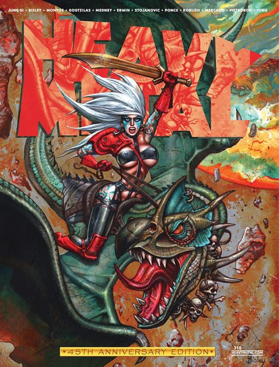
The story is called “Taarna: The Witness” and it’s by writer Helen Mullane and artist Montos (full name Osvaldo Pestana Montpeller). There is also a Taarna variant cover to the issue by Simon Bisley; the main cover is by Kim Jung Gi.
What the creators have to say about the story:
“For me, working at Heavy Metal has been an old dream come true. And the fact of breaking inside their pages with their mythical Taarna has been a source of double satisfaction. Joseph has been super respectful and has given me big wings to fly creatively in this story. Helen’s script was a shot of love at first sight. When I read it, I visualized it in all its cosmic aesthetics and I wanted to add a little Lovecraftian taste to it.” – Montos
“Like Montos said, for me, writing for Heavy Metal is a dream come true, and for a character as iconic as Taarna no less! Since I first saw her flying on her steed Avis in the Heavy Metal movie, she has been a part of my inner pantheon of legendary female heroes. I wanted to write a story that was cosmic in scale, go as full out Heavy Metal as possible, and I couldn’t think of a better artist to share this journey with than Montos. His incredible art takes us all the way there, a true visual feast. It was a pleasure working with Joe, a keenly creative editor who helped me bind the threads and themes together and didn’t hesitate to let us get weird.” – Mullane
Montos will also be the artist on ENTROPY, Heavy Metal’s event series that kicks off this July, written by Christopher Priest.
Check out our TAARNA: THE WITNESS preview below:
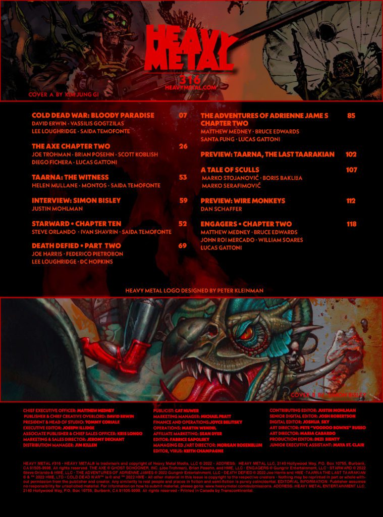
Taarna variant cover by Simon Bisley.Main cover by Kim Jung Gi.Credits page showcasing all the stories in this anniversary issue.
About HEAVY METAL #316:
The third of four INTERCONNECTED covers by the master illustrator KIM JUNG GI, an otherworldly TAARNA cover by the legendary SIMON BISLEY, and a blank sketch cover!
Heavy Metal’s flagship character TAARNA returns in an otherworldly story by writer Helen Mullane and artist Osvaldo Pestana!
The debut of the episodic technothriller WIREMONKEYS by creator/writer/artist Dan Schaeffer!
A new battle rages in Heavy Metal’s zombie saga COLD DEAD WAR by David Erwin and artist Vassilis Gogtzilas!
YA horror serial THE AXE continues by Fall Out Boy’s lead guitarist Joe Trohman and writer/actor Brian Posehn with Deadpool artist Scott Koblish!
Cyberpunk serial ENGAGERS by Beyond Kuiper author Matthew Medney, Bruce Edwards, and artist John Roi Mercado continues!
The strange history of DEATH DEFIED by Joe Harris and Federico Pietrobon continues to unfold!
Heavy Metal’s female space explorer returns in the newest chapter of THE ADVENTURES OF ADRIENNE JAMES by Bruce Edwards, Matthew Medney (Dark Wing) and artist Santa Fung
George C. Romero’s THE RISE begins its second half of the origin of the NIGHT OF THE LIVING DEAD with art by Diego Yapur!
Finally, an interview with Simon Bisley showing the process of creating his TAARNA cover for the magazine’s milestone issue!
It’s a massive celebration of 45 years publishing groundbreaking stories of science fiction, fantasy, and horror from The World’s Greatest Illustrated Magazine!
What’s your favorite Taarna story? Sound off in the comments!
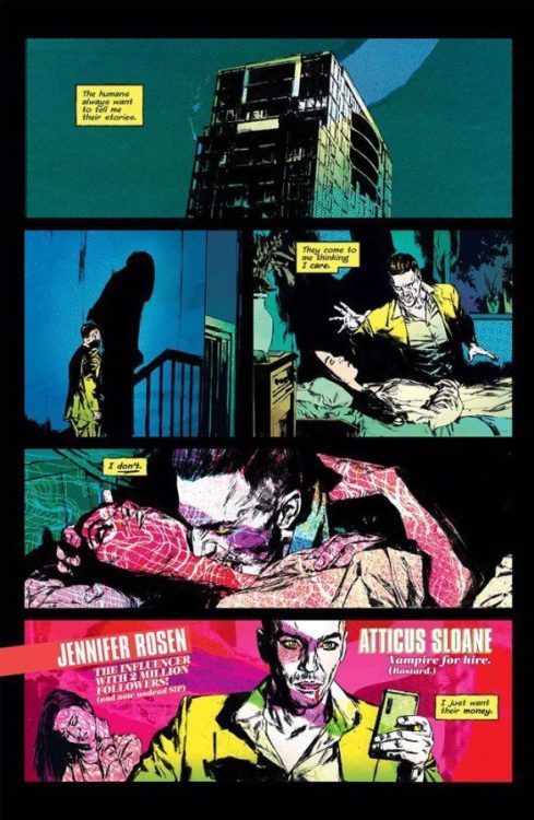
From writer Christian Ward (Machine Gun Wizards, artist on Invisible Kingdom) and artist Patric Reynolds (Hellboy & The B.P.R.D., Joe Golem) comes a ridiculously stylish blood & fangs comic made for the internet-capitalism age with Blood Stained Teeth #1. With colors by Heather Moore and lettering from Hassan Otsmane-Elhaou, this opening issue comes off as a bit scattered in terms of story, but makes up for it in pure flare. With a slightly dizzying but immediately entertaining script and dazzling art, this vampire comic will stick out in your mind and on the shelf for years to come.
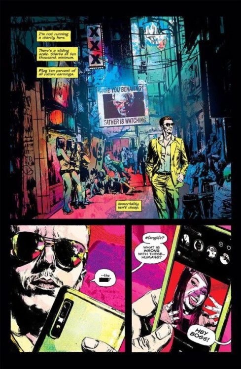
“Atticus Sloane—misanthrope, criminal, asshole, and vampire—lives in a world where blood isn’t the only thing vamps crave. And for the right price, he’ll make you a vampire too. After all, immortality isn’t cheap.”
Writing & Plot
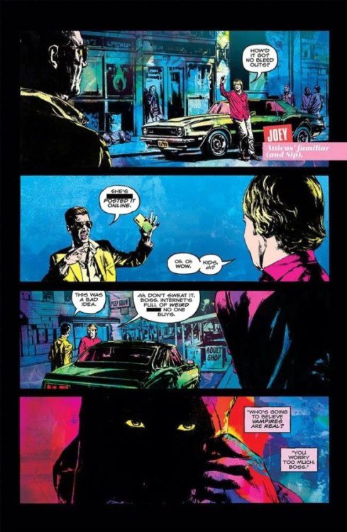
This all-nighter high roller party & fever dream of a script from Christian Ward really kicks off this vampire story with a bang in Blood Stained Teeth #1. Immediately we’re set upon by a sardonic, satirical narrative influenced by both a multitude of vampire tales and modern society. Ward pokes fun not just at internet culture, but a bit at how vampires are so loved by our generation despite them being monstrosities of old. Some of the satire points about influencers may be low hanging fruit, but the tone of the comic keeps it from coming off as annoying. Sloane endears himself as a lovable scummy bastard from the word “go.” His dismissive view of humanity, possession of a toadie cab driver (Hellblazer, anyone?), and sense of style all paint him as a guy you shouldn’t like but can’t help yourself. Ward setting him apart from the rest of the bloodsuckers by making him an honest SOB instead of a slimy one-percenter like the rest is one of this book’s great narrative decisions. This is the 2nd comic I’ve read this week where the ultra-rich were presented as vampiric A-Holes, and it’s a trope I’m all for. The bits of world building and lore Ward has laid down so far are intriguing, and I look forward to seeing how the rest of this world comes together. I won’t spoil anything, but there’s a particular inclusion of a real person in this comic that is hilariously brilliant, and will easily go down as one of the best uses of such a trick in a comic.
The only gripe I have with the writing here is how the plot is a bit too scattered for its own good. The scenes that we drift to from years past are well-crafted and engaging, but the where’s and why’s of them still come off as needlessly obfuscated. This could easily be the nature of this comic though. Regardless of this concern, the ideas and tone of this first issue have me very excited to see what Ward has planned next.
Art Direction
I knew this book was going to look good, but I was unprepared to be smacked in the face upon opening up Blood Stained Teeth #1. Patric Reynolds’ visual direction in this comic is stupidly impressive. His character animations are all super-stylish while also presenting realistic animations and details. The arrogant yet worn swagger of Atticus Sloane, the hapless contentment of his cabbie, and the sickening confidence of the “pure” vampires does all the storytelling for us in only a few panels. Reynolds’ facial drawings are absolutely stellar, with a lifelike detail rarely seen in the medium. Every panel is lit up with the intricacies of this comic’s world, with each page being packed with background details that draw the reader in even further. Reynolds captures what feels like every small microcosm of life that goes on around Atticus and other relevant characters, so it’s fortunate that his composition is so smooth yet creative to contain everything. Every page tends to utilize multiple panels that often crash into each other, which mimics the frantic style of the story bring told here. Reynolds uses that to accelerate the comic’s pace but still make events easy to follow. His works here really is staggeringly cool.
What ultimately makes this comic so striking is the coloring from Heather Moore. Her bright neon palette jumps at the reader as soon as you open the book. There’s an almost pop-art style effect at play here, with Moore’s hyperactive colors filling in Reynolds’s realistic penciling. However, Moore’s work is much more dynamic and creative then that impression might have you believe, and it truly is one of those works that has to be seen to understand. Finally, the lettering from Hassan Otsmane-Elhaou is tonally perfect and matches the reading experience to a T. There are sporadic details like sudden underlines and creative adjustments to the font that accentuate narrative and dialogue voice. I expect nothing less than greatness from Otsmane-Elhaou, and yet I’m still blown away. Visually, this entire comic is an absolute marvel.
Verdict
Blood Stained Teeth #1 is a fun and stupendously stylish first chapter in this new vampire series. Christian Ward’s script can feel a bit scattered at times, but his memorable characterizations and biting (haha) narrative make this an effortlessly enjoyable experience. The visuals from Patric Reynolds and Heather Moore are just stupidly impressive, with a style and swagger that has to be dove into to fully appreciate. Be sure to grab this fantastic first issue when it hits shelves on April 27th!
DC Comics’ The Swamp Thing has always been a verbose comic series. It tells its story in poetic verses and extended metaphors. That’s what sets this series apart. But at times, that’s also its greatest weakness. The Swamp Thing #12has some really mesmerizing moments, but these moments get lost in a sea of exposition and long-windedness.
Writing
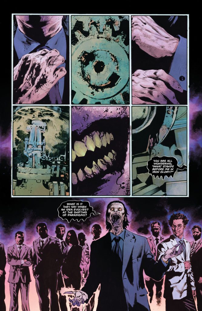
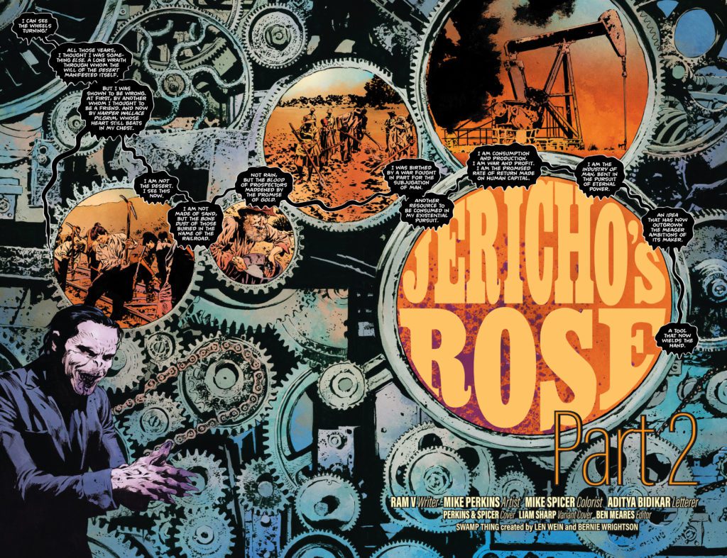
Writer Ram V knows how to craft a good monologue. His villains and heroes alike have a tendency to wax eloquent about their intentions and ideals. The Swamp Thing #12 opens with one such monologue. The Pale Wanderer (now sporting a brand new look and name to match) describes to his followers why his new form holds so much significance. His speech might go a little long, but it serves its villainous purpose of being a rallying cry for V’s many baddies. Unfortunately, the text-heaviness doesn’t end there. There are at least four more scenes, filled with caption boxes and word balloons, that leave very little up to the imagination for what may be driving our characters.
Many of the characters begin to sound alike, too. The Pale Wanderer, Levi Kamei, Tefe Holland, and a brand new character that’s introduced in the final pages of this issue, all think and speak in theatrical ways. You begin to become aware, as a reader, that one person is writing all of these words. The really frustrating thing, though, is that there really are some great moments in the writing. First of all, the ideas V is presenting are all interesting. This plot is taking incredible twists and turns. And V is articulate and moving in the soliloquys and monologues of some pages. But these pages are weighed down by the rest of the issue, which is chock full of exposition. This is not the first time this series has struggled to keep its subtext intact. However, in the past, it hasn’t stopped V from bouncing back with subtlety and nuance in the next installment.
Art
Part of what makes the writing of this issue disappointing comes from the fact that Mike Perkins’ art is already so effective. Perkins does mountains of storytelling, choosing all the right details to hone in on. Several moments in The Swamp Thing #12, we see panels that ought to be accompanied by nothing but silence. The body language, scenery, and placement of characters has done enough to tell us everything we need to know about what’s going on. The moments that shine the most in this issue are the times when it feels like V is really putting his trust in Perkins, pulling back on his script to make room for the paradoxically stunning and horrifying images in each panel.
And in this issue in particular, we get more than Perkins’ usual subtle visual language. We still have scenes with nuanced expressions between our characters. But Perkins also also lets loose. In one scene, featuring the 90’s Wildstorm character Jack Hawksmoor, we get a flashy fight sequence that’s brilliantly reminiscent of that period in comics. Elsewhere, Perkins leans fully into the poetic imagery of this series. He turns flower petals into panels and backdrops into rich tapestries. Every inch of this issue is beautifully detailed and precisely rendered.
Coloring
Mike Spicer gives each major character a color that pervades every scene they’re in. The Pale Wanderer’s (now the Pale Pilgrim) panels are drenched in an eerie purple. Later, when we see Jack Hawksmoor roaming the streets of Detroit, he can tell something is up. The whole scene is painted in the same purple color. Hawksmoor can feel the Pale Pilgrim’s influence at work. Swamp Thing’s scenes are all colored in shades of green. But Spicer also adds in layers of red and orange to each panel. We see the war that’s going on inside Levi Kamei. He’s caught between two worlds — the Red and the Green — and he’s unsure which side of him matters most. Spicer captures this internal struggle in a dazzling way.
Lettering
There are lots of great moments in Aditya Bidikar’s lettering. Right off the bat, when we see the Pale Pilgrim’s monologue, it’s against a backdrop of gears and cogs. The Pilgrim’s words are shown in dripping, black word balloons. Bidikar traces these word balloons around each cog. It immediately makes you think of Pilgrim greasing the wheels of his newfound revolution. Elsewhere, Jack Hawksmoor tries to talk with a dying robot. The robot’s dialogue shows up in square word balloons. Around the tail of each word balloon, Bidikar places small white rectangles. These look like false starts and other attempts at communication that don’t fully form. These details and more make Bidikar’s work a joy to pick apart.
Verdict
The Swamp Thing #12‘s script is a little crowded and heavy-handed. V doesn’t leave much information for the reader to piece together in this chapter. But the ideas presented in this issue, and the accompanying visuals, are as stunning as ever. Perkins, Spicer, and Bidikar create a beautifully detailed world that it’s hard not to get lost in. Pick up The Swamp Thing #12, out from DC Comics now, at a comic shop near you!
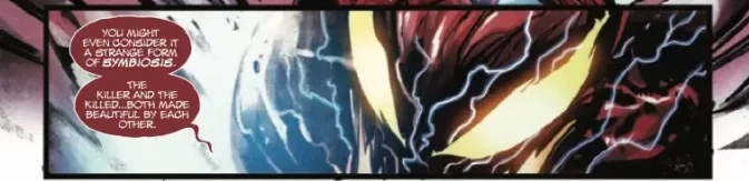
Carnage has never been very good at persuading people. All the character’s early appearances had him constantly spouting his lawless philosophy with phrases like “LAWS ARE AN ILLUSION!” or “I AM ULTIMATE FREEDOM!” Often with the unspoken assumption that he’d convince… well, at least someone. Instead, people mostly just greeted him with terror and scorn. But that was Cletus, and this is Carnage. The new Carnage. The symbiote on its own. And in Carnage #2, out today from Marvel Comics, the team of writer Ram V, artist Francesco Manna, colorist Diijo Lima, and letterer VC’s Joe Sabino present a symbiote who’s a bit more well-spoken. With a captive audience, to boot. Let’s hope they don’t listen too closely to what Carnage has to say.
WRITING
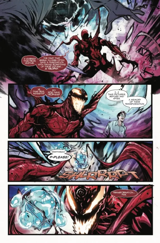
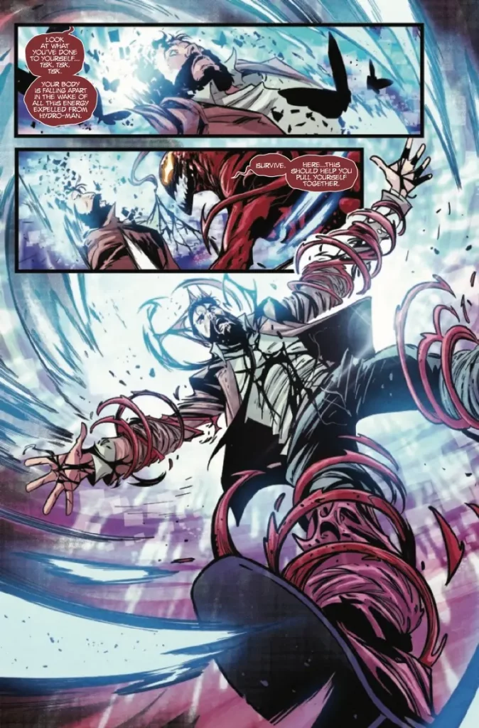
Ram V ended Carnage‘s first issue with the question of the titular character’s new motives. This installment opens with Carnage opining to a prolific serial killer “The Artist” on the relationship between a killer and their victim, on a desire to transform and be transformed in turn. All while they stand amid a reality-warping reaction Carnage created by mixing himself with Hydro-man. But Detective Jonathan Shayde has followed the killers and jumps into the reaction to follow them. Unfortunately, his body is immediately torn apart. Fascinated by the detective’s near-suicidal drive for justice, Carnage elects to put him back together. However, the process has a few side effects in store for the poor detective. In the aftermath, Carnage hopes to push his serial-killer companion into becoming someone worthy of the detective’s obsession.
After the first issue of the series, I’d assumed that Kenneth “The Artist” Neely wouldn’t stick around for long. His initial appearance felt more like a statement of intent, moving away from the classic serial killer archetype the old Carnage was associated with. But it looks like the guy is stuck as Carnage’s travel buddy. The dynamic that’s being set up is one where Carnage pushes both detective and killer to further extremes in their hunt for one another. One of the most famous Carnage comics had Cletus literally force his thoughts into someone else’s mind, so it makes sense to position the Carnage symbiote as a gleeful enabler. A character who hopes to inspire as much violence as he inflicts.
ART
Francesco Manna maintains the vibe of a crime serial by drawing the characters in many dingy, depressing environments. We’re talking drywall ceiling tiles and flowery, blood-stained wallpaper, rundown motels, and industrial buildings. His figures are grounded and weighty (damn, can the guy draw hands), and his paneling is often slow and deliberate. But the way he draws Carnage is around as cartoony as the character’s even been. Carnage is still a guy who skitters around on his long, spindly fingers and sports a glowing void for a mouth. It works exceptionally well for a symbiote who doesn’t have to worry about being wrapped around a human anymore. He’s a bizarre little chaos monster, walking about in the world of men.
Diijo Lima’s coloring relies on a lot of lurid reds and blues to reflect the characters’ emotions. The dingy industrial buildings are rendered in deep purple-grey, with an almost neon-blue night sky, and Detective Shayde’s breakdown is given a really neat off-register effect that nearly makes the art tremble. The combination with Manna’s gritty environments gives the comic an off-kilter, slightly sick vibe.
VC’s Joe Sabino breaks out some fun, shaky lettering when it comes to Shayde’s pained screams or the sound of Carnage removing Hydro-man’s core. They’re drawn in bright bubble letters with shaky, raw outlines. Carnage is the kind of comic with a lot of yelling throughout its run. So Sabino might as well have fun with it.
VERDICT
Carnage isn’t a series anyone will come out of looking like a good person. Not the killer, not the detective, and definitely not the blood monster. A monster who has more or less promised that everyone involved in this story will be transformed. Chances are, by the end, they’ll be looking a whole lot like him. So in short, the series continues to be a darkly compelling ride. Definitely pick up this issue if you have the chance. It’s out today at a comic retailer near you.
The pandemic years were a psychological crucible for most of us. Night’s End is a horror film by director Jennifer Reeder (Knives and Skin) that relates isolation and anxiety through colors and cinematography from Christopher Rejano (Knives and Skin).
Ken played by Geno Walker of Chicago Fire suffered through alcoholism before succumbing to a nervous breakdown. Ken’s since relocated to an old building in an unknown city. Ken’s so isolated, he’s the only tenant in his building. Any quality time with friends or loved ones involve his ex Kelsey (Kate Arrington) and old friend Terry (Felonious Monk) via video calls. Ken’s isolation includes a disturbing diet of tomato soup, coffee, and Pepto-Bismol. He also has no desire to change any of this viewing his lackluster YouTube career as his salvation. However, Ken’s strange normal starts to change with the rise of a spirit that seeks to torment him.
PopAxiom spoke with Chris about photography, colors, and getting the right look for Night’s End.
Trajectory
Christopher was around 13 when he gained an interest in photography. “My dad bought my first camera, and I taught myself how to use it. I had a friend who also got a camera around the same time, so we learned together. He pursued photography in college. I concentrated a photography, design, and fiction writing.”
“A teacher suggested I write screenplays. So I went to Chicago to study film. Screenwriting was my interest initially.” But once Chris got into film production classes, things changed. “I gravitated toward photography and became a cinematographer on many projects. I liked to be able to let the camera tell the story rather than a screenplay.”
Chris focused on cinematography and then worked as an intern at an equipment rental house. “I did a movie with László Kovács, which was my exposure to Hollywood productions. I also worked as a gaffer for many years while shooting things as a DP on the side.”
“Now I’ve stepped away from gaffing,” he says. “It’s been a traditional arc. But, it’s also been a fruitful journey along the way. I’ve learned so much.”
About Night’s End
Chris and Night’s End director Jennifer Reeder are longtime collaborators. “I worked with Jennifer Reeder on two features before this; Signature Moves and Knives and Skin. We’ve done seven, eight, maybe ten short films and been working together since about 2012.”
“Jennifer came to me in the summer of 2020, in the middle of the pandemic,” he says about the evolution of Night’s End. “In December of that year, we shot some tests, and by summer of 2021, we shot the film. Even though vaccines were available by then, we kept the crew small.”
Jennifer had a relationship with Shudder, who backed the production, “Everything fell into place, and we shot into July of 2021.”
Chris received the script for Night’s End but didn’t read it because soon after, “we did a table read. The writer Brett Neveu and Jennifer set up a read in Chicago with many actors, some from the Chicago Fire and PD. So that was my initial exposure to the film.”
“It’s a challenge, he says about the vast majority of the film taking place indoors. “The team scouted a couple of places. I was able to get in and look at the house a couple of weeks before shooting. So, there was a good lead time. Production design had things to do too. We filmed everything in the same location. In the story, everything’s communicated via webcam. So, behind them, it could be any number of things that we used to differentiate the characters.”
Chris reveals that behind the scenes, “We shot on primarily Arri Alexa Mini with Hawk Anamorphic C-Series lenses. We used my RED Komodo as the b-camera slash webcam look.”
Contrast
Night’s End has a very distinct look. “Jennifer has a unique style and vision for things. We did Knives and Skin and shot on some vintage anamorphic lenses. We introduced a lot more color into her films. We continued that in Night’s End. It’s something thematic in her film career. Color is so important to her, and I love color and contrast.”
“For this film,” he adds to the talk about the opposition of colors. “I mixed a magenta with a light green or amber. Again, something that creates more of a contrast; it’s a fun way to create that contrast for me.”
One of Jennifer’s first notes “was that she wanted the film to be dark. That was a challenge because we have an African-American lead, and if you play it too dark, you could lose his skin tone. So, we played with color to separate him.”
Represent
Night’s End‘s inception in script form came together during the pandemic, and that influence saturates the story. “It’s about a man who’s agoraphobic. He’s trapped in his house because he won’t leave. So he communicates with loved ones through a webcam. But he discovers that a spirit might inhabit his house.”
“We wanted to create a sense of isolation for Ken,” the film’s tormented protagonist. “So a lot of the framing is locked off, anamorphic frame. It’s static, or if it’s moving, it’s slight. We see him going mad alone in this space.”
Those feelings are common for people living through the pandemic. “It’s not an accident. As the film was being written, we were all in lock-down. I think it’s rooted in the idea that we can’t see our friends or families. It wasn’t uncommon to feel that isolation. At the premiere, many people said to me, ‘this is my pandemic experience.’ This never-ending day; same rooms, same coffee, same everything. So many people could relate.”
“It was a lot of repetition for many people, and I think we represented that very well,” he declares.
Wrapping Up
Chris draws influence from all sorts of creative places. “Cinematography-wise, I love Robby Müller and Harris Savides. I love bold 80s photographers like Andres Serrano. I love 90s American independent films like Gus Van Zant and Spike Lee. I love the revival of horror films recently and how they’ve stepped up.”
Night’s End is available on Shudder. So, what’s coming next from Chris? “I’m slated to shoot a feature called Homesick with director Jim Mendiola this summer. It’s a supernatural thriller. Also, a film called Nowhere with Rachel Leigh Cook and director Natasha Levy-Gunn.
Is Night’s End on your watch list?
Thanks to Christopher Rejano and Projection PR
for making this interview possible.
Doctor Who: Flux is the latest season of the BBC’s popular sci-fi series. Due to the pandemic, the series had to reduce its number of episodes to six and used this to tell one continuous story.
The universe is in danger. A giant cloud called The Flux travels around the galaxy and destroys any planets in its path. Unfortunately, one of these planets is Earth, and the Doctor must figure out who created the Flux and why they want to destroy the universe. She works with old and new allies and faces old and new enemies across time and space.
Since Chris Chibnall has become the showrunner of Doctor Who, the show has had a massive drop in quality. The show no longer felt fun like it used to, nor had the emotion and character development that fans loved about the Davies and Moffatt eras. Instead, Chibnall made the show boring because of his bland characters, overly expository dialogue, and overreliance on heavy-handed political commentary. Chibnall also annoyed fans because he seemed to misunderstand the series he’s working on. So, the only way to go was up.
Flux did see a lot of improvements, and Chibnall seemed to have listened to some of the criticisms. There was much less expository dialogue or just having characters standing and talking, and the political commentary was toned down. As a result, the show felt fun again. The first episode of the season was a confusing mess. Still, it had energy and urgency because the Doctor and Yaz had to escape from a seemingly impossible situation and had a fun, campy tone. Chibnall knew how to excite audiences with a cliffhanger at the end of each episode.
The fourth episode, “The Village of the Angels,” was easily the best episode of the Chibnall era, let alone in the season. It was the best Weeping Angels episode since the Series 5 two-parter “Time of the Angels”/”Flesh and Stone.” “The Village of the Angels” was a classic rural English countryside horror with a Doctor Who twist. In the episode, The Weeping Angels attack a village in 1967. It was a simple concept that made for a great horror episode. It showed Chibnall at his best because he had the ordinary collide with the extraordinary, like his hit crime show Broadchurch. And like Broadchurch, “The Village of the Angels” was set in Dorset.
The other great episode of the series is “War of the Sontarans.” In this episode, The Doctor discovered the Sontarans had traveled back in time to rewrite Earth’s history, causing the British to be at war with aliens during the Crimean War. It was a fun episode that showed an alternative history story. It’s hard to go wrong with 19th-century soldiers fighting laser-wielding aliens. Mary Seacole was a major character in the episode, and the episode managed to educate people on who she was while also being a satisfying sci-fi story. It didn’t feel like an episode like “Rosa,” where the Doctor and companions took a backseat to a history lesson.
Even though Flux had two excellent episodes, it didn’t work as a complete package. There were duff episodes and plotlines that went nowhere. The character’s role known as The Great Serpent (Craig Parkinson) was an example of this. The Great Serpent was a figure who could get into positions of power throughout the centuries, had psychic abilities, and killed off anyone who discovered his secret. But The Great Serpent’s motivations were vague.
All the new villains’ motivations were vague. Swarm (Sam Spruell) and Azure (Rochenda Sandall) were meant to be big bad guys of the series. There were ancient beings who could manipulate time and dissolve people with a touch and wanted to be able to control all of time. Yet they came across as nothing more than Saturday Morning Cartoon villains who were evil for the sake of being evil, or to put it another way; they were one-off Doctor Who monsters who got a much more important role than they deserved. They were underwhelming villains who got an equally underwhelming end in the final episode of the series.
As the series progressed, Chibnall became more interested in the Doctor’s mysterious past. There were questions about who The Division was and why The Doctor was a member, and her connections to characters like Swarm and Karvanista (Craige Els). The first issue was Chibnall was doubling down on the controversial Timeless Child reveal of Series 12, which retconned the Doctor’s origins story. Even if audience members accept The Timeless Child storyline, Flux left many questions unanswered. Unfortunately, it seems like Chibnall was leaving them open just so he could address them in Whittaker’s final specials.
Doctor Who: Flux was an improvement over Chibnall’s previous seasons, and “Village of the Angels” will be seen as a classic episode, and the series had more of a sense of fun. However, the series did succumb to some terrible writing from Chibnall, especially during the final two episodes.
Nicolas Cage is an actor who has a lot of goodwill from the public. His public persona and acting career are satirized in the action-comedy The Unbearable Weight of Massive Talent.
Nick Cage (Cage) has hit a rough patch. He’s unable to get roles, he’s in debt, and his relationship with his daughter (Lily Sheen) and ex-wife (Sharon Horgan) is rocky. After one blow too many, Nick agrees to attend a birthday party for a wealthy fan, Javi (Pedro Pascal), a Spanish Olive Tycoon. Unfortunately, as Nick gets close to Javi, he gets approached by the CIA, who tells the actor Javi is actually an arms dealer. They believe he has kidnapped the President of Catalonia’s daughter.
Nicolas Cage has had a varied career. He has won an Oscar, starred in hit action movies, worked with acclaimed directors, and appeared in a lot of straight-to-DVD crap. He has been the figure of memes because of his wild facial expressions, the one-liners he spouted, and some of the trash he has appeared in. Clips from The Wicker Man remake are often used for gifs and memes. He had been ridiculed for years because of his prolificity. However, in recent years, Cage has gone from a figure of mockery to being seen as cool again. He has had a career renaissance like Keanu Reeves has experienced.
Cage has always come across as someone who puts effort into his performances or at least tries to have fun in his roles. He doesn’t seem like he half-arsed it like other big-name actors who performed in straight-to-DVD/VOD films. This ensured Cage had a lot of goodwill from audiences.
The Unbearable Weight of Massive Talent was a self-aware film. It played on many aspects of Cage’s acting style. He got to do his intense voice for the over-blown dialogue, shouty Cage appeared, and Cage got to have some serious moments when his character reached a low. The Unbearable Weight of Massive Talent referred to Cage movies: there were clips of films like Con Air, and The Rock was shown, some dialogue scenes were shot like an action film, and one scene appeared like it was lifted from a Michael Bay film.
The Unbearable Weight of Massive Talent does touch on some aspects of Cage’s career and personal issues. In real life Cage was famously in debt, which led him to star in so many VOD films. The Unbearable Weight of Massive Talent plays on this because Cage says to his therapist that he is not satisfied with being prolific and agreed to attend the birthday party because he was desperate for the money.
Acting narcissism and insecurities were also a part of Nick’s character in the film. Nick Cage was occasionally visited by an alternative version of himself called Nicky. Nicky acted as a devil on Nick’s shoulder and was the voice of doubt at the same time. Nicky was telling Nick that the actor is a goddamn movie star and should be going for those roles. The relationship between them even had some overt homoeroticism which added to the ideas of narcissism and self-doubt.
The heart of the film was the relationship between Nick and Javi. Their friendship grows during the film. Nick goes from being a man in Spain out of obligation to finding a kindred spirit with the Spaniard because they were both cinema snobs and potential creative partners. Cage and Pascal had great chemistry together as they talked about their project, took LSD, and experienced the glory of Paddington 2. They made a great comedic duo and had the best bromance since Hot Fuzz.
The Unbearable Weight of Massive Talent became an action film in the third act. As an action film, it was perfectly decent. A lot of the fun of the film turning into actionfest was so it could parody and pay homage to the tropes of the genre, which was great fun for an action junkie. There was great enjoyment hearing Cage spout one-liners and over-written dialogue. Watching the film made me want to see Cage in an action flick directed by Chad Stahelski or David Leitch.
The Unbearable Weight of Massive Talent did boast a solid supporting cast. It featured the likes of Tiffany Haddish, Ike Barinholtz, and Neil Patrick Harris. Harris’ casting was particularly fitting because he played a fictionalized version of himself in the Harold and Kumar films. As a Brit, I appreciated Horgan’s casting as Cage’s fictional ex-wife. She acted like a rational, normal person in an extraordinary situation.
The Unbearable Weight of Massive Talent was a film made for Cage’s devoted fan base, and it delivered. It was hilarious, a self-aware film with a tremendous double act at its core.
From longtime X-writer Tini Howard (Excalibur, Catwoman) and artist Bob Quinn (Way Of X, Captain America) comes a tale of Krakoa’s mutants becoming stuck in a D&D campaign in Knights Of X #1. With Erick Arciniega on colors and letters from Ariana Maher, this issue offers a dense yet fresh opening for both up-to-date X-Fans and new readers alike. With an inventive script and on-brand brilliant visuals, this is the perfect comic for readers who like their mutant tales with a bit of RPG in them.
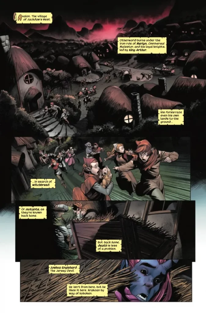
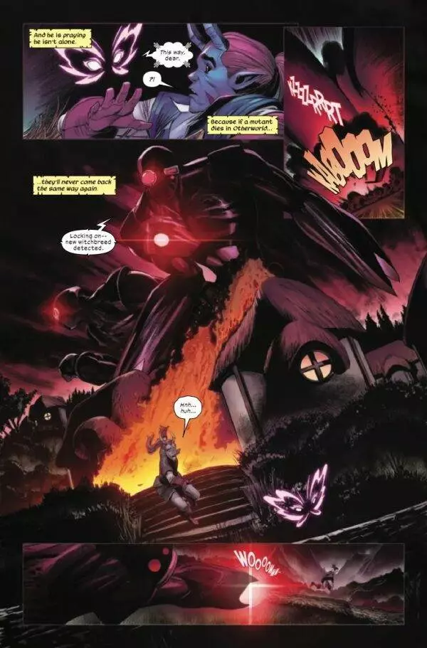
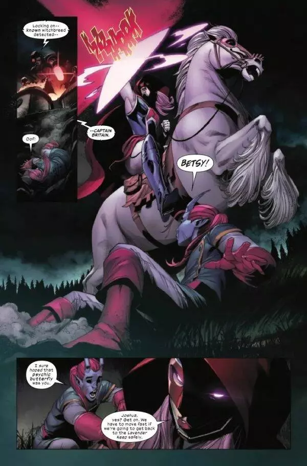
“THE QUEST BEGINS HERE, WHERE MUTANTS ARE HATED AND FEARED ONCE AGAIN! The gates to Otherworld are closed — and Captain Britain is trapped on the wrong side! Usurpers Merlyn and his right-hand man, King Arthur, are now in control of Lunatic Citadel. Furies the size of Sentinels raze villages to the ground in their hunt for the “witchbreed.” Cutoff from Krakoa, Betsy Braddock is Otherworld’s only hero — and to save her people, Betsy must recruit a round table of her own. The Knights of X gather to restore the rightful order and rescue desperate mutants — but their quest is about to get so much bigger than that. This is the era of destiny…and the fate of Otherworld lies at the center of mutantkind’s future.”
Writing & Plot
In many ways, Knights Of X #1 is a prime example of the kind of unbound creativity that can be found in comics. Tini Howard’s script combines the political and ethical ethos of the rest of the Krakoa era X-books but then combines them with the genre trappings of a fantasy RPG. Much like her run onExcalibur(this book’s predecessor), Knights is a thoughtful Marvel-flavored take on Arthurian legend. This time around though, the story takes the form of a party-based quest rather than a tournament of champions. It’s an X-Men title for readers who want a bit of a change in scenery and scope, with a concept and plot that is the perfect blend of tongue-in-cheek comic storytelling and genuine stakes. Howard perfectly blends the thematic weight of the X-Men saga with these mythical concepts and characters. We’ve returned to a setting where mutants are an abomination to be feared (branded as “witchbreed”), separating the plot both literally and thematically from the tenuous prosperity of the Krakoa era. I can’t help but sense a lot of similarity with Neil Gaiman and Andy Kubert’s Marvel 1602. Some of the ideas present in that series rear their head here, but obviously in completely different settings.
I’m pleased to report that you can jump right into this comic without reading Excalibur first. Howard does a great job of filling the reader in on the where’s, who’s, and why’s of Otherworld and the many details of events past. This makes for a very wordy comic with a lot of expository dialogue. What’s almost funny about this element though is just how well it works. Normally exposition in a comic is something to be sneered at, but in Knights it just feels right. This whole comic reads almost as if Howard herself is DM-ing an X-Men D&D game and reminding us veterans and newcomers what the score is. This all being said, you should definitely at least be caught up on some more mainline X-Men titles. Not knowing what Krakoa is or how mutants keep dying and being resurrected would really throw someone for a loop. In any case, Howard’s sense of pacing and storytelling personality make this comic a dense but thoroughly entertaining read.
Art Direction
Aside from their insane plot threads, the current era of X-books is best known for their consistently stunning visual style. Thanks to artist Bob Quinn, Knights Of X #1 is here to deliver more of just that. Just like the other X-books, Quinn’s work here is clean, crisp, and beautifully composed. His penciling is highly detailed, with characters and environments all matching the distinct design language of the current era of X-Men comics while still allowing Quinn’s own style to come through. He easily navigates the winding path between the more “conventional” (if there is such a thing) X-Men styling and the magic & fantasy elements on display in this comic. His conversation sequences and explosive actions scenes are equally complex and thoughtfully directed, with no detail getting lost in the shuffle. Note too that there is a LOT going on in this book at any given time, so the fact that Quinn juggles every element so gracefully is a true testament to his skill as a visual storyteller.
Erick Arciniega’s colors craft a dark, mysterious, and moody tone that really completes this particular magic-infused X-comic’s atmosphere. While our team of mutants and certain magical settings are their necessary bright selves, because of the medieval/fantasy dark age we get here, the shadowy tones are a great choice and really nail the feel of this comic. Lastly, Ariana Maher’s lettering is right on par with the solid readability of the rest of this era’s X-books. She uses the current house font to great effect with fluid, natural changes to tone of voice and highly effective SFX lettering. Overall, Knights is every bit as great looking a comic as you would expect from an X-comic from the Krakoa era.
Verdict
Knights Of X #1 is a dense yet but highly entertaining start to this book of mutants and magic. Tini Howard’s script has a lot going on, but her careful use of exposition and the personality that shows through her writing helps keep this comic stay engaging. The visuals from Bob Quinn and Erick Arciniega are every bit as gorgeous as you’d expect, with excellent composition and design that is right on par with the other great X-books of the era. If you loved Excalibur, be sure to grab this issue when it hits shelves on April 27th!
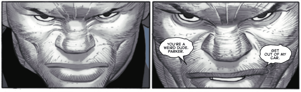
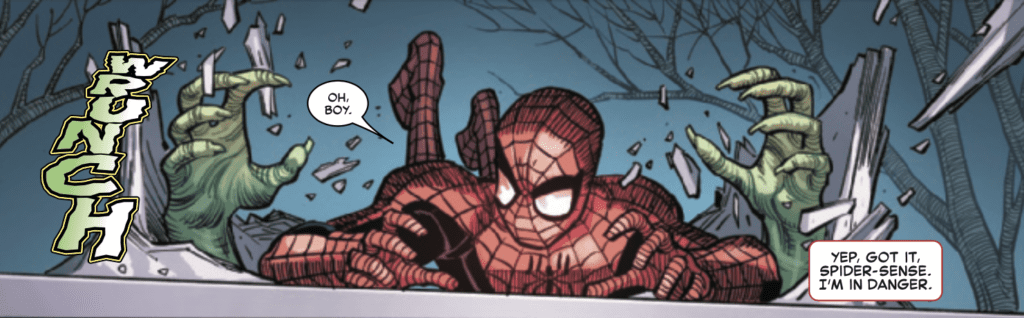
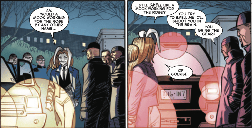
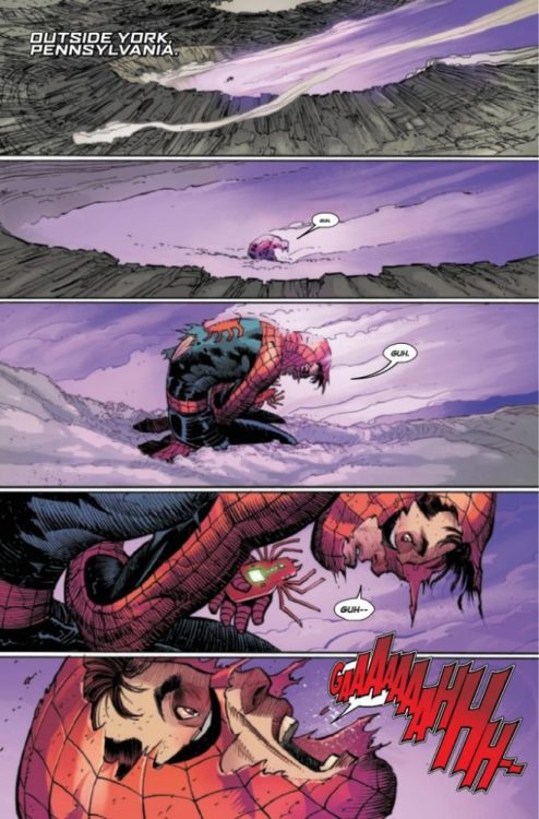
THE AMAZING SPIDER-MAN #1 hits your local comic book store from Marvel Comics this week, relaunching the series for Spidey’s 60th Anniversary. The book is written by Zeb Wells, with art by John Romita Jr., inks by Scott Hanna, colors by Marcio Menyz, and letters by Joe Caramagna. As a long-time reader of the series who had taken a break, I was excited about this relaunch and looked forward to a fresh start with the series.
About THE AMAZING SPIDER-MAN #1: WHAT DID SPIDER-MAN DO?! Peter’s on the outs with the FF. He’s on the outs with the Avengers. He’s on the outs with Aunt May! No one wants to see Spider-Man – except for Doctor Octopus. Ock’s on Spider-Man’s tail, and the Master Planner has something truly terrible planned for when he gets his tentacles on Spidey. All that, and what does Tombstone have planned? Just in time for Spider-Man’s 60th Anniversary, a new volume of AMAZING SPIDER-MAN begins, and 2022 is going to be the biggest year for Spider-Man EVER! Don’t believe us? We brought John Romita Jr. back JUST FOR THIS!
ASM #1 reminds me of the first time I picked up a Spider-Man comic book. I had no clue what was going on, but I loved the presence of Peter Parker and the wit of Spidey. Part of the fun of randomly jumping into a series is going back to read older issues so you can fill in the gaps in the story. Wells put enough in ASM #1 to intrigue me to want to go back and read more. On top of that, the last few pages make me want to read the next issue. ASM #1 is an excellent setup for a new season of adventures; all the plot threads are dangled, the conflict is building, and there are a few side mysteries to keep you guessing.
Romita’s art isn’t for everyone, but it is a style that grows on me the more I read. By the third time I read ASM #1, my brain had adjusted to Romita’s style, and I could feel the movement of the action. Romita does well with menacing characters, and Tombstone is an intimating beast. The way Romita draws Tombstone elevates the conflict and excites you for the first time Spidey and Lonnie face off.
I did notice some interesting ink work in Spider-Man’s costume from Hanna. It takes most of the blue out of the suit; a few panels reminded me of early 90s Erik Larsen, where the suit was black and red. My favorite panel of the issue is a combination of Romita, Hanna, and Menyz complimenting each other. The panel is a third of a page, and Spider-Man is dropping down onto a moving car filled with henchmen and the White Rabbit. The symmetry of the panel is perfect, and the motion of the colors works very well. The absence of an onomatopoeia adds to the stealth of the scene.
Menyz’s color work is all over the spectrum as ASM #1 covers so much ground. There are several pages where Menyz uses the colors to frame your focus on the story and direct your eye to the next panel (check out the two panels below). The opening page of purple and gray works very well to convey the moment’s desperation. This soft tone of colors is carried throughout the book and works well to complement Tombstone’s soft speech. The combination adds an underlined tension to the story.
There is a ton of action and explosions in ASM #1, and Caramagna handles the onomatopoeia workload solidly. The action words are bold and in your face. There are a couple of pages of great “Z” formation of word balloons, which help your eyes coast over the page and absorb the moment. There is one page, though, where Caramagna uses two different fonts for the “THWIP.” It took me out of the moment as I was trying to figure out if Spider-Man was doing something different with his webbing (overanalyze comics much?). But my favorite panel of Caramagna’s work is a half-page explosion, where the “BA-DOOM” covers the whole panel but still lets the art breathe.
Overall, THE AMAZING SPIDER-MAN #1 is a fun book with a solid creative team that may encourage new readers to dive into the back issues.
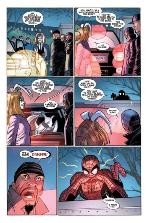
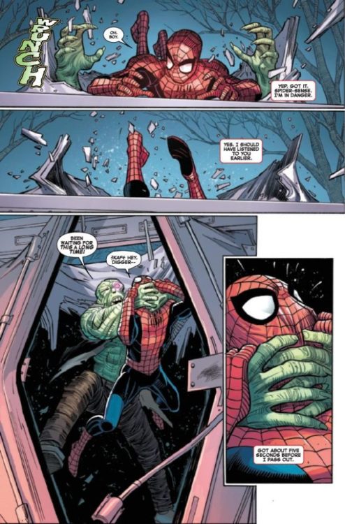
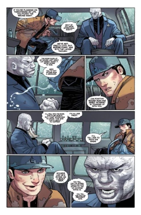
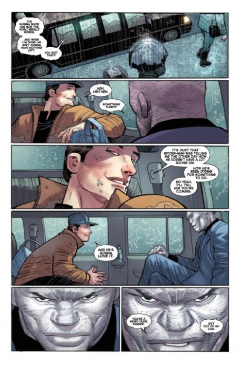
Check out a five-page preview of THE AMAZING SPIDER-MAN #1 below:
Though they may be set in the future, post-apocalypse stories are often fixated on the past. When everything’s crumbling, we might as well focus on what we’ve done and where we’ve been. Though most post-apocalypses don’t have the literal spirits of the dead quietly watch on as humanity’s collective work turns to dust. In Land of the Living Gods from Aftershock, Isaac Mogajane and Santtos have created a world where humanity has chosen to cope with its coming extinction through worship, pleading to their ancestors for strength. Too bad that none of those ancestors seem terribly impressed.
WRITING
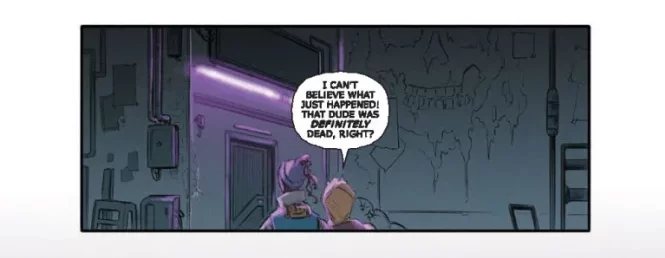
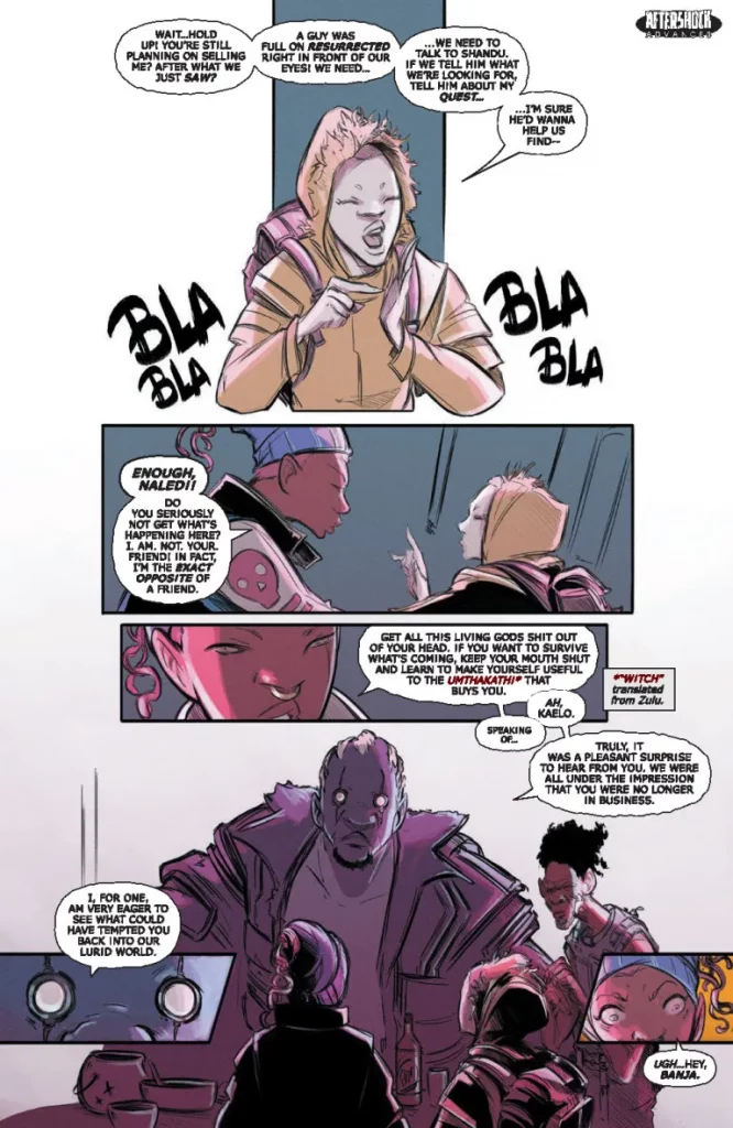
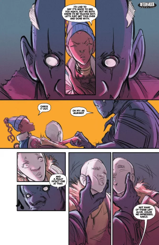
Mogajane continues the story of Naledi, an albino teenager in a post-apocalyptic South Africa who has found herself captured and sold by scavenger Kaelo. Because, as it turns out, witches will pay good money for albinos. But Kaelo quickly starts second-guessing her sale of the young girl. Meanwhile, Naledi is placed in the same prison cell as a young boy who was sacrificed and brought back to life by local King Shandu. And a conversation with that boy may just turn what we know about the series upside-down.
While the series has focused pretty squarely on Naledi up to this point, Mogajane sets some time aside in this issue for Kaelo. Initially introduced as fairly cynical and jaded, her conversations with lover Kheti show a side that hasn’t fully resigned itself to using people to get by. Her slow turn towards helping Naledi reaches its climax, however, in a moment of violence that’s less cathartic and more… concerning. Kaelo might not be choosing the best outlets for her anger. But, hey. Whatever gets Naledi out of captivity, right?
And speaking of Naledi, she continues to show her bright, youthful optimism, laughing at the idea of Kaelo selling her to organ traffickers after seeing the King’s minor miracle. She stops laughing when it actually happens. And moving forward, Naledi’s trust in the living gods is about to hit a major roadblock. So the poor girl’s outlook is being put through the wringer. Naledi’s always needed to mature a bit, but Mogajane hasn’t completely shown his hand as to what that will look like. It definitely won’t come in the form of Kaelo’s guarded cynicism, but Naledi is going to need to get past her self-doubt if she wants to find hope in the world outside of praying an outside force will fix it for her. I’m very interested in seeing what Naledi’s outlook will be by the end of the series.
ART
Santtos’ art in this series is both very expressive and stripped down. It’s impressive that the world feels so well realized, when after an establishing shot or two, the backgrounds tend to fall away to focus purely on the characters. This helps bring out the emotions of the scenes, but also adds to the bleak feeling of the world. Each backdrop the characters find themselves in has one or two primary colors associated with it, so you can tell where they are based on the color dominating the panel. But Santtos is all too willing to leave blank space on the page, often choosing to leave corners or margins pure, stark white. It accents his color choices and emphasizes the white gutters between panels, leading to a more contemplative, quiet feeling in the comic. Like the spaces between moments have stretched out to the corners of the page.
Dave Sharp’s lettering helps highlight the non-English words of the multicultural setting in scarlet, often given a translation in the bottom corner. He also has fun with hand-drawn sound-effects, drawing them with thick, visible brushstrokes.
VERDICT
Land of the Living Gods #3 focuses on fleshing out one of its main characters while setting up the direction for the remainder of the series. With its willingness to change direction and upend what’s come before, it’s hard to predict exactly where the series will go from here. But what’s here is strong enough that it’s earned trust in whatever that may be. It’s out today at most retailers, so make sure to check it out.


")