Religion, gender politics and Corporate Rule form the basis for Dark Horse Comics new title Invisible Kingdom. It combines the spirit of a larger than life sci-fi adventure story with a personal journey of discovery. Vast colorful vista’s and a variety of alien races fill the pages ready to transfix the reader.
Following on from her success at the Big Two Publishers, G Willow Wilson unleashes a new creator owned comic into the market. It combines elements of Firefly and Saga with rebellious characters desperate to survive in a world fuelled by hate and fear.

Writing/Story
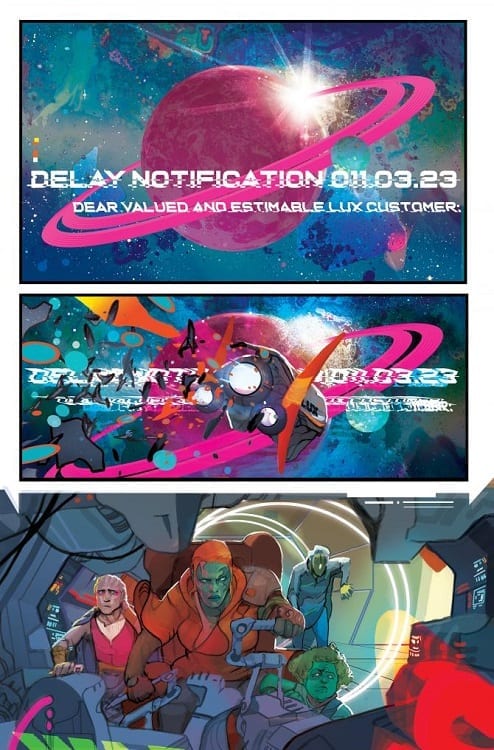
High above the planet Qari Captain Grix has a problem. Her ship is carrying precious cargo for the Lux corporation but it is losing power. She has to force a landing, save her crew, and keep the cargo intact.
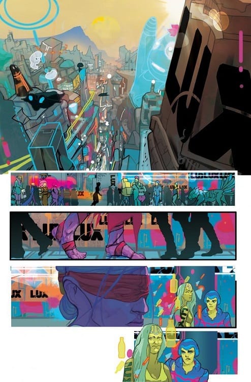
Meanwhile Vess seeks the Invisible Kingdom. Blindfolded and alone, the Roolian has to walk barefoot through the Capital City of Duni to reach the Monastery of Renunciation. Her faith is strong but not everyone she meets has the same respect for others as she does.
G Willow Wilson provides a juxtaposition between her two central characters in this opening issue of Invisible Kingdom. The first character the reader meets is a bold, forthright space captain in the vain of Han Solo from Star Wars or Alana from Saga. Captain Grix is shown to be pragmatic and protective of her crew. She is also rebellious towards the Lux Corporation despite working for them.
The second central character is Vess. By contrasting their stories, Vess appears timid and unsure of herself. She is searching for something, possibly escaping from who she is, and religion is where she has turned. Wilson uses her journey to the monastery to highlight the bigotry of the Duni world, not only in the advertising nightmare of the streets but also within the monastery itself. Vess is a member of a race, the Roolians, who are outcasts and treated badly by others. Their sexuality is a focal point and something for others to ridicule.
Wilson sets up a world rife with hatred and lacking understanding. The racism is evident in much of Vess’ story and no-where is a safe haven for her. Meanwhile, with Grix, Wilson is illustrating another problem within her world: corporate rule. She shows that Lux is more interested in its cargo, and saving money, than it is in its workers. Both of these are real world problems that readers will be able to identify with and only a fine veil separates Wilson’s Invisible Kingdom from the real world.

Art
The only way to describe Christian Ward’s artwork for Invisible Kingdom is stunning. His use of color to define depth and the application of soft, almost none existent, outlines create an out of this world atmosphere for the characters to inhabit. There is an obvious alien-ness to the space setting making the reader feel an outsider. The cityscape however is inspired by the gaudy corporate visions employed by the likes of Blade Runner, but with less of the industrial influence. Duni is all bright lights and neon colors, covering up the bleak, murky attitudes of the inhabitants.
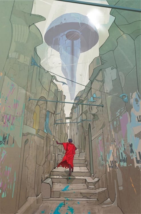
The colors used by Ward often contradict the narrative by Wilson. Everything has a garish brightness to it even in the worst situations. Only when the characters reach an area of desolation does the color drain from the page to be replaced with a worn, wash of browns and greys. This illustrates for the reader a transitional stage for the characters: in Vess’ case when she leaves the city and enters the monastery.
Although the color work is impressive, the design work is by far the most stunning element of the comic. Ward has created some outstanding visuals which he frames on the pages in a spectacular fashion. There is a fine purpose to the layouts which is as important to the story as Wilson’s script. The alien architecture is a constant reminder that there is more to the story than is shown directly on the pages. It is both impressive and oppressive; again this reflects the attitudes of the populace within the story.

Conclusion
Rife with adventure and social commentary, Invisible Kingdom is an impressive start to a new sci-fi saga. It sets up several characters and a whole world for them to play in. The creative team work together to produce a substantial opening that both looks impressive and engages the reader in the story.
Karen Berger has a reputation for delivering high standard, genre challenging books and the Berger Books range of comics from Dark Horse Comics is living up to that reputation. Invisible Kingdom is another addition to the catalogue and falls squarely under the ‘must read’ heading.

