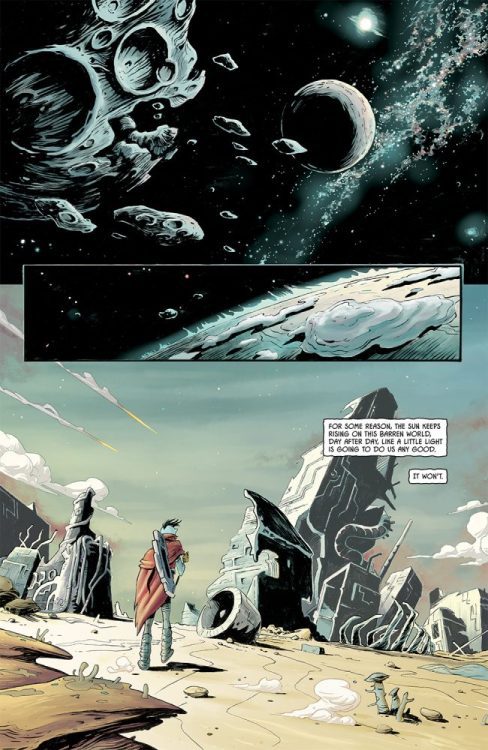
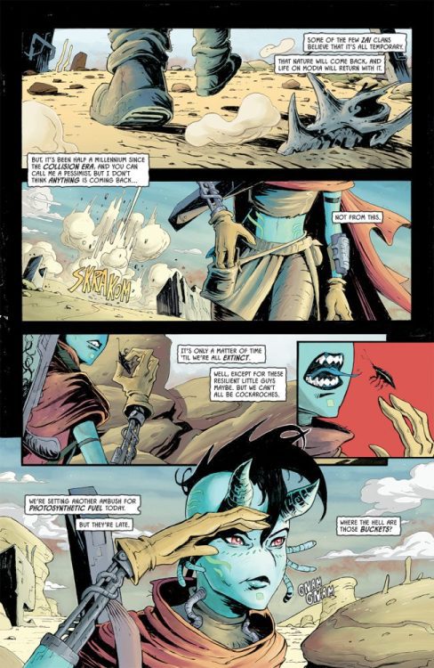
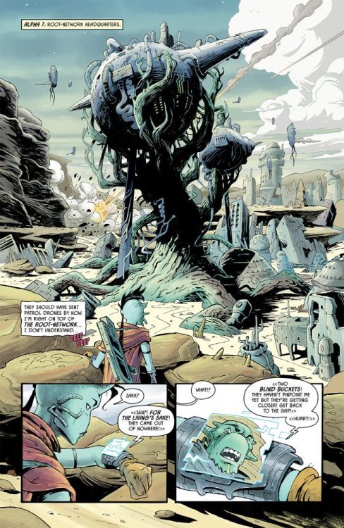
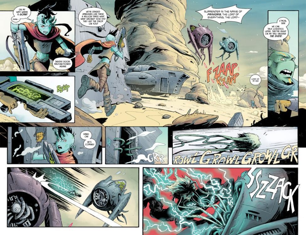
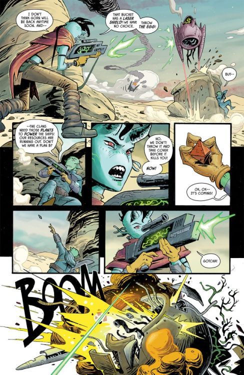
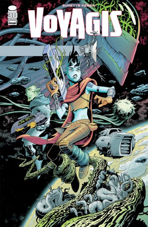
Sumeyye Kesgin’s VOYAGIS #1 hits your local comic book shop on November 16, but thanks to Image Comics, Monkeys Fighting Robots has a six-page preview for our readers.
About VOYAGIS #1: What if one of the VOYAGER probes was found by aliens on an uninhabitable planet laid waste by a wandering black hole? Their resources dwindling, and under the thumb of a relentless tyrant alien hero Sen’s discovery of the probe leads to adventure-and possible salvation-for her and her people. VOYAGIS is a five-issue miniseries and artist SUMEYYE KESGIN’s writing debut.
Enjoy the preview below.
What do you think? Are you going to add VOYAGIS #1 to your pull?
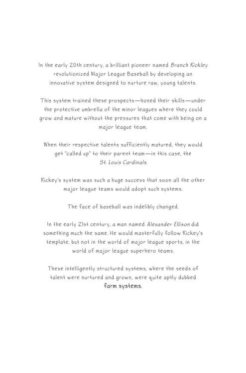
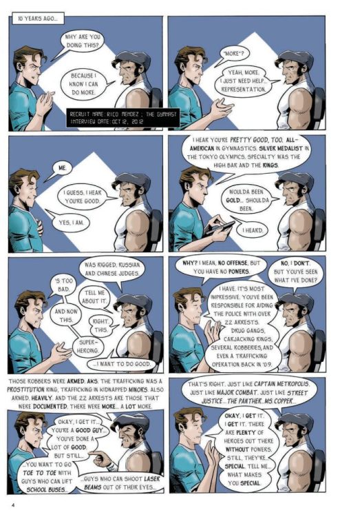
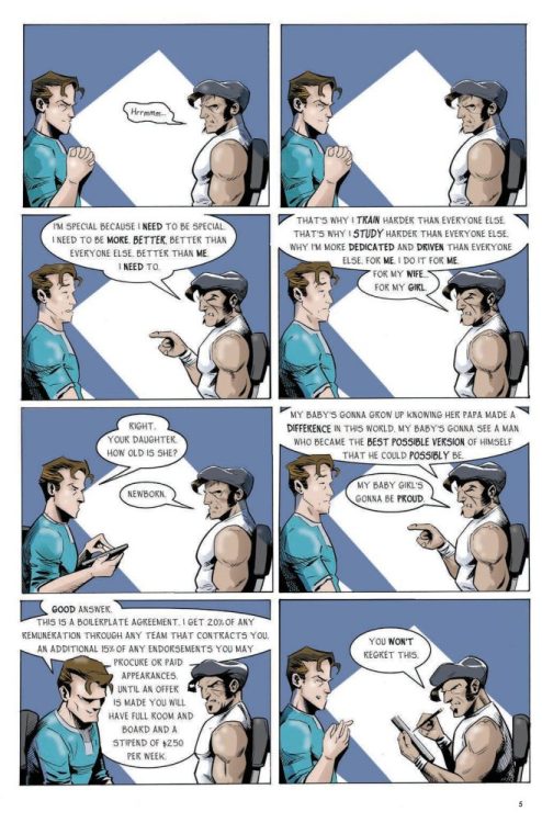
Rich Koslowski’s graphic novel F.A.R.M. SYSTEM hits your local bookstore on November 8th, but thanks to Top Shelf Productions, Monkeys Fighting Robots has a five-page preview for our readers.
About F.A.R.M. SYSTEM: For every hero who saves the galaxy and makes the front page, there are a dozen staffers working behind the scenes… and a hundred up-and-comers hoping to take their place. F.A.R.M. System is your ticket to the hidden world of super-powered individuals hoping to make the Big Leagues.
In the Farm System, having an incredible and unique power is only the first step. Guided by an army of agents, managers, and experts, recruits must undergo rigorous psychological evaluations, harassment and sensitivity seminars, marketing and endorsement workshops, and costume design meetings, all to boost their chances of recruitment into an A-list super-hero team.
Some recruits make “the Bigs.” Some have fleeting moments of glory, then lose it all. Some take “Blue Cowl” gigs as super-powered bodyguards for famous actors or powerful CEOs. Some flounder in the System for years, never getting “the call.” And some find success by joining teams of a… less reputable ilk.
Koslowski’s previous works include Three Geeks, The King, and Three Fingers. Enjoy the preview below.
Welcome to the Monkeys Fighting Robots Podcast, episode 182!
This week we have cartoonist Jamie Jones on the show to talk about his latest book – THE BABOON: TEMPLE OF ETERNAL LIFE. Head over to Crowdfundr to check it out. Jamie is a friend and a collaborator who loves to talk about the deeper aspects of a comic. So buckle up and enjoy the ride.
About the Monkeys Fighting Robots Podcast:
Never heard of Matt Sardo?
For starters, he made the Kessel Run in less than 11 parsecs. Prior to that, he gave Doc Brown the idea for the flux capacitor and led the Resistance to victory over SkyNet – all while sipping a finely crafted IPA. As a radio host, he’s interviewed celebrities, athletes, and everyone in between. He’s covered everything from the Super Bowl to Comic-Con.
You can reach me at matt @ monkeysfightingrobots dot com.
Thanks for checking out the podcast, have a great week, and read more comics!
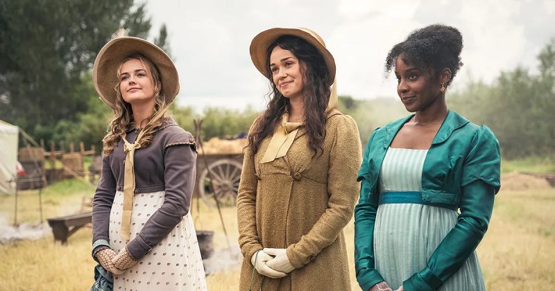
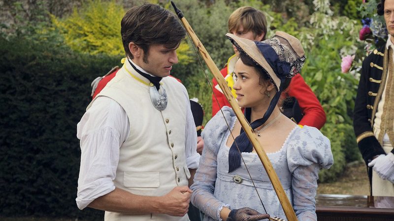
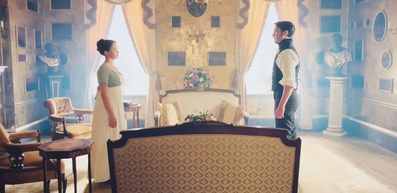
Sanditon has returned for a second season, the first of two being filmed back-to-back for PBS and Britbox. The new season sees many characters return to the sea town along with some new faces.
It has been a year since the events of Sanditon’s first season and Charlotte (Rose Williams) being rejected by Sidney (Theo James). Since that time, Charlotte has learned of Sidney’s death. She returns to Sanditon, takes a position as governess, and soon finds herself with two suitors, the reclusive Alexander Colbourne (Ben Lloyd-Hughes) and a senior army officer Colonel Francis Lennox (Tom Weston-Jones).
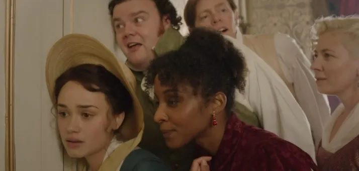
Other residents of Sanditon also have issues involving romance. Charlotte’s younger sister, Alison (Rosie Graham), falls for a young army officer, Captain William Carter (Maxim Ays), whilst Georgiana (Crystal Clarke) needs to fend off men who want to marry her for her money.
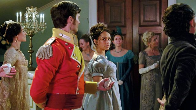
Tom Parker (Kris Marshall) believes there’s an opportunity to make money by making an arrangement with the army to set up a permanent garrison near Sanditon. Esther (Charlotte Spencer) returns to Sanditon after suffering a miscarriage and nearly dying because of it. She seeks a cure for her infertility whilst staying on the coast.
The first season of Sanditon was a bigger hit in the US than it was in the UK. PBS saved the show, and the second season was broadcast in the US before it was released in the UK. The first season of Sanditon obviously had an appeal, and PBS was going to capitalize on that.
Sanditon was based on Jane Austen’s unfinished novel. The series used what Austen wrote as a springboard to make their own story. The unique selling point of Sanditon was being a little more subversive than previous Austen adaptations. The first episode showed Charlotte seeing two people in the middle of a sex act, although Sanditon was nowhere near as raunchy as Bridgerton. The main couple of the first season did not end up together.
The second season saw some big changes. This season had a reduced episode count, it was down to six, and the darker edges of the first season, like Clara (Lily Sacofsky) being the victim of sexual abuse, were smoothed out. There were still some darker ideas that involved coercive behavior, but they don’t appear until the tail end of the season.
The second season can be best described as a consistent period drama. Fans of the regency-set dramas will get a fix from this season of Sanditon. It had the costumes, settings, and romantic drama the target audience would want.
ThedirectionofSanditon’s second season was more traditional for an Austen adaptation. The Heywood sisters were both in the middle of love triangles. Army officers were trying to court the sisters, but they were unaware of other men who were also interested. Georgiana also had a romantic story because she might have found a perfect match, Charles Lockhart (Alexander Vlahos), the local portrait artist who shared her interest in political activism, but he needed to earn her trust.
Charlotte and Georgiana have been shown to be strong-willed women. Georgiana’s wealth meant she had the luxury to choose her partner and led a sugar boycott so slavery could be abolished. Charlotte wasn’t rich, but she was willing to stand her ground when she became a governess. She wanted to give her charges a proper education and not be taught how to find a husband.
Alison differed from her friend and sister. She had a traditionalist outlook because she went to Sanditon to find her husband. Alison was a romantic and had an idealistic view of courtship. But the reality could be harsher.
Sanditon’s second season was filled with stories. Besides the romantic plots, there were tensions between the residents and the army. Tom wanted to make a deal with the army to set up barracks, believing it would be beneficial for the town. However, there was tension because Arthur (Turlough Convery) distrusted Lennox and their motivation. Lennox’s character and the army’s actions get revealed as the season progressed.
There was a lot of action within the Denham household, and they were interlinked. Esther was desperate and looking for a way to have a baby, and Edward was looking to become Lady Denham’s heir. He was willing to use underhand methods to achieve this, and Clara returned to Sanditon pregnant with Edward’s child. There was a lot of drama since the characters had a mutual distrust for each other.
The evolution of the relationship between Esther and Clara was the most interesting in the season. They were hostile in the previous season to the point they were politely bitchy to each other. Yet their relationship grows more complicated, and Esther’s position slowly softens during the season.
There were also smaller subplots in the season. Georgiana and Lady Denham were on the opposite side of the slavery debate, and it came to a head in the fourth episode of the season. The other small subplot involved Colbourne’s niece, Augusta (Eloise Webb), who wanted to be introduced to society. Webb showed herself as a promising young performer as she played a rebellious teen (or as rebellious as someone can be in Regency England). Augusta tried to drive Charlotte away from the governess’ job before revealing what drove the youngster to these actions.
Like many British period dramas, the second season of Sanditon was a relaxing watch. It was a handsome production, with a generally likable cast and interesting characters. It was fine comfort viewing.
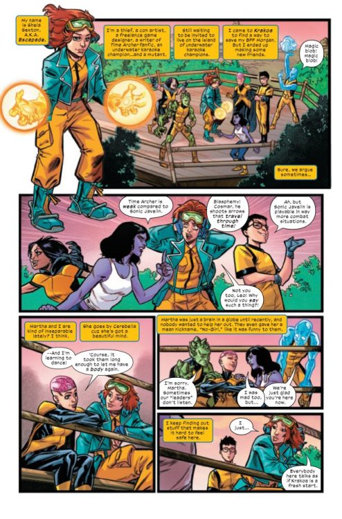
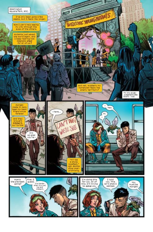
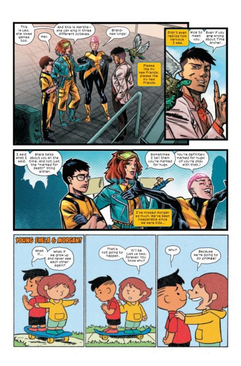
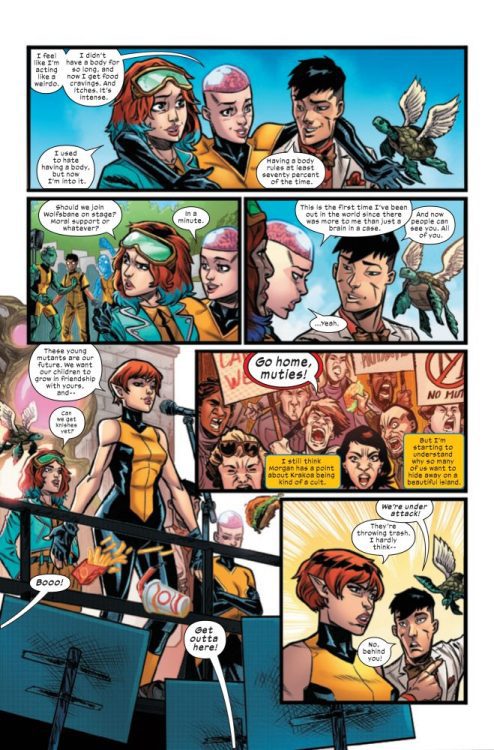
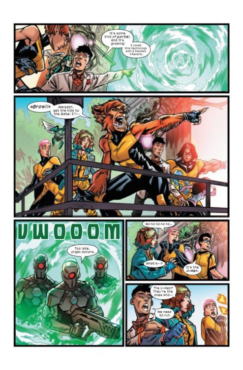
NEW MUTANTS #31 hits your local comic book store on October 26th, but thanks to Marvel Comics, Monkeys Fighting Robots has an exclusive five-page preview for you!
About the issue: Escapade Joins the New Mutants! Hugo and Nebula Award-winning author Charlie Jane Anders brings the breakout character of this year’s Marvel’s Voices: Pride anthology to one of the Marvel Universe’s most beloved teams! Personally recruited by Emma Frost herself, Shela Sexton reluctantly joins her fellow mutants on Krakoa in the hope that the X-Men can prevent the death of her best friend. But is Emma telling her the whole truth? Can Shela adjust to life on the island? Will the New Mutants accept her? Or is this crash course in Krakoan headed for a deadly pileup? Join Escapade and your favorite lovable mutant rapscallions in the start to a wild ride of a three-issue arc with artist Alberto Alburquerque and guest strips by Pride’s Ro Stein & Ted Brandt!
The issue is by writer Charlie Jane Anders and artists Alberto Alburquerque, Ro Stein, and Ted Brandt, with colors by Carlos Lopez and Tamra Bonvillain, and letters by Travis Lanham. The main cover is by Rafael De Latorre and David Curiel, and the book design is by Tom Muller and Jay Bowen.
Check out the NEW MUTANTS #31 preview below:
Are you reading NEW MUTANTS? Sound off in the comments!
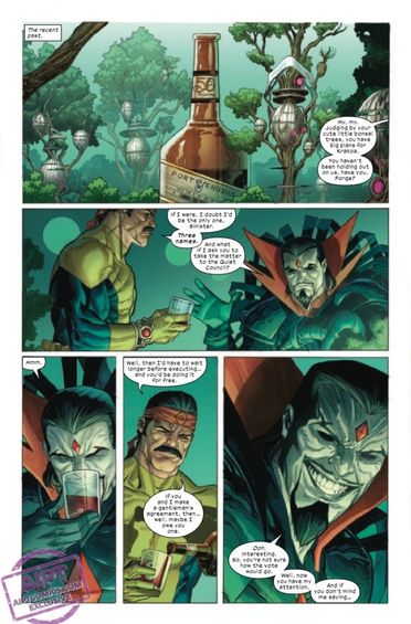
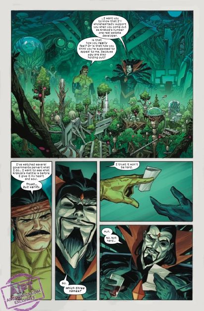
To say the X-Men have had a rough time lately is an understatement. The team has been dealing with a battle against the Eternals and being judged over in A.X.E. Judgement Day, and are also having problems gelling as a newly formed team. X-Men #16 brings the drama to a head as Forge dives into the Vault to rescue Darwin and the team battles it’s own demons. Gerry Duggan is the writer for this issue. He’s joined by Joshua Cassara on pencils, GURU-eFX on colors and Clayton Cowles on letters.
WRITING
Gerry Duggan has been giving readers quality X-Men issues since the Krakoa era began. This current issue revolves around Forge going into the Vault to rescue Darwin and the new dynamic between the team. Duggan makes it known that Forge will do what he needs to do to get what he wants. This is evident as he makes a deal with Mr. Sinister. As Forge makes his way further into the Vault, trouble brews outside. Duggan does a nice job of portraying the sibling rivalry between the Summers brothers. Scott tries to control the situation while Alex loses his temper and does something irrational. In this moment, after Havok unleashes trouble on them, Duggan show what the team is truly capable of. Cyclops and Havok work together. Magik saves Firestar. Iceman shows why he’s an omega mutant. Duggan allows the X-Men to execute their game plan on the fly and the team actually works well together. This is just the beginning of Duggan building this new X-Men team. The future seems like it will be dramatic, fun and full of great character moments.
ART
There aren’t many names in the artist circles that are hotter than Joshua Cassara right now. Cassara’s art is visually stunning and gives us images that seem life like. In the early pages of the issue, as Forge talks with Mr. Sinister, Cassara gives us one of the most realistic images of Mr. Sinister. The line work is great in these panels and Cassara draws Sinister with his iconic devilish grin. Another key part to the art this issue are the facial expressions. This is extremely important during the fight between Cyclops and Havok. Cassara uses his talent to show the anger on the Summers’ faces as they yell at each other. As Alex does something stupid and lashes out at Scott, Cassara shows his remorse after the fact.
The colors by GURU-eFX are amazing. He takes the pencils laid down by Cassara and allows them to leap off the page. This is clear as Forge navigates the Vault. As he floats above all the buildings, GURU e-FX uses a vibrant blue below that illuminates Forge as he floats. The neon looks gorgeous in the city. GURU e-FX also gives us good looking pastel backgrounds for certain panels. As Scott and Alex bicker, the light blue and red backgrounds make the characters pop out.
The letters this issue are handled by Clayton Cowles. One thing that Cowles has always been great at is his use of sound effects. As Havok punches Cyclops, Cowles put a large “KRAK” perfectly placed between Scott and Alex. Another great example is Perro attacking Iceman. As Perro attempt to escape Iceman’s ice wall, he smashes with a powerful “SKRABOOM.” This is placed in the upper corner of the panel and the letters are scattered unevenly to show destruction.
CONCLUSION
X-Men #16 is another thrilling entry into Duggan’s run. The writing is fun and fresh with a less than ideal team dynamic. Cassara’s art absolutely slays as he draws your favorite heroes in action. X-Men #16 is available at a comic shop near you!
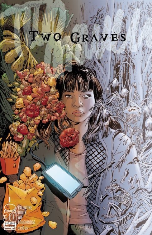
From writer Genevieve Valentine (Catwoman) and artists Annie Wu and Ming Doyle comes a mysterious road trip journey with a herald of death in Two Graves #1. While its storytelling style is sure to rub some the wrong way, this comic’s implicit trust in the audience to figure out what’s going on is its greatest strength. With intentionally obfuscated but lovely poeticism and an intriguing dual-artist approach, Two Graves is off to a divisive but utterly engaging start.
“Emilia and the man with the veil of smoke have set out for the ocean in a stolen truck. There’s a bloody handprint on his neck. She’s beginning to worry it’s hers. Death and the Maiden go on a road trip. Nobody gets out alive.”
Writing & Plot
Genevieve Valentine’s script for Two Graves #1 is fascinating and often beautiful, while maintaining a serious air of mystery. A woman is road-tripping through America with – what appears to be – Death (or at least someone who works for Death). Revealing anything else about the plot would be a spoiler as each individual element plays a major part in the story. The actual details of the plot come together slowly, as there are only hints provided by the character’s actions and words as to what is actually happening. This is definitely going to be a pain point for those who like their stories more obvious. However, those that appreciate an approach that goes after more of an atmospheric slow-burn will undoubtedly be charmed by what’s in this first issue. Valentine’s dialogue for Emilia feels natural and bounces perfectly off of her driver’s/helper’s more serious, deadpan delivery. It’s almost akin to the banter between Dream and Death in Sandman. Valentine then switches over to poetic narration at points, adding more to this comic’s sense of dark mystery. There’s an entire sequence where “Death” trails off recounting the myth of Persephone and, with Valentine’s gripping poeticism and the stunning visual work (more on that later), it becomes one of the most haunting and memorable scenes in a comic this year. This is a comic that demands its audience pay attention, and the more you notice the more you will get out of the story and be able to piece together what is actually happening here.
Art Direction
The dual artistic approach of Annie Wu and Ming Doyle adds additional layers to the complex narrative of Two Graves #1. Wu handles the “ordinary” aspects, like the roling countryside and small-town stops Emilia and her driver make. Emilia herself is also mostly handled by Wu, who gives her a vaguely ordinary but still recognizable design and animation style. Doyle juxtaposes this with her own darker, hatching-heavy style for our “Death” character, as well as the mythical sequence we discussed earlier. This dual-artist approach enhances the impression that something is out of place in this world, and that this mysterious smoky character doesn’t belong here. Despite this, both main characters are drawn with an equal sense of empathy. What’s tricky about this though is that “Death” doesn’t emote with his face, so Doyle relies on body language combined with Valentine’s narration to reveal his underlying emotional state. Death’s internal monologue about Persephone is handled by Doyle as a series of splash pages and almost museum-style paintings. The sequential direction stays relatively predictable but still effective throughout most of the comic, with great character-focused shots that pace out conversations between the cast brilliantly. Wu and Doyle maintain a constant sense of quiet unease between Emilia and Death that adds so much to each character. There’s an almost watercolor style to the colors in Two Graves. The palette stays generally pretty light, with even the darker scenes still using the brighter shades of respective colors (blacks appearing more purple, browns tan, etc.). This creates an almost dreamlike state throughout the comic, making the story feel all the more ethereal.
Verdict
Two Graves #1 is a wildly intriguing opening chapter for this mysterious new comic series. Genevieve Valentine creates a road trip tale buried in mythology and shrouded in foreshadowing that, while deeply compelling, is vague to the point of being slightly frustrating. It’s an issue that is absolutely playing the long game, but the crowd that will be interested in this sort of comic may be a bit small (and include me). The dueling visuals from Annie Wu and Ming Doyle are a great touch for delivering on the dual perspectives of the two lead characters, and their work adds infinitely more depth to this strange relationship. Be sure to grab this debut issue when it hits shelves on November 9th!
The SHE-HULK: ATTORNEY AT LAW season finale on Disney+ dropped on Thursday, and boy, was it something. I won’t spoil it for you if you haven’t watched it yet, but I did respect the creativity that went into the series. Translating a comic book into a show is tough, and when you break the fourth wall with the audience, you escalate the difficulty tremendously. The rules go out the window, making it hard to take anything seriously. In the end, I enjoyed Jen Walter’s journey, and I hope they make a second season.
Listen to my thoughts below, and let me know what you thought of SHE-HULK: ATTORNEY AT LAW season one.
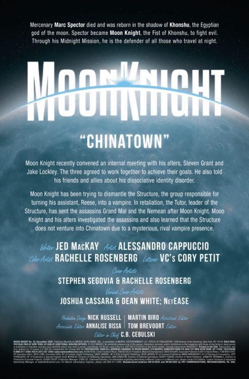
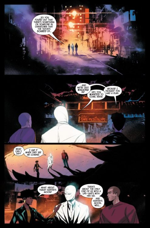
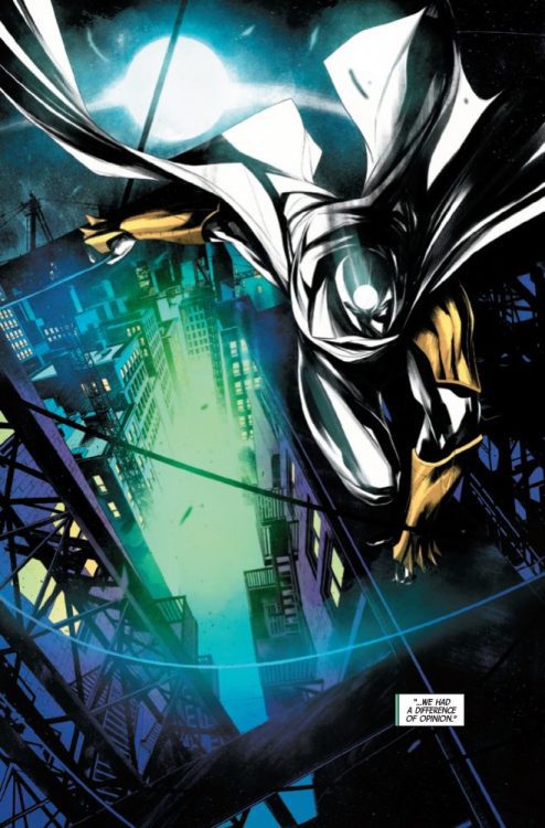
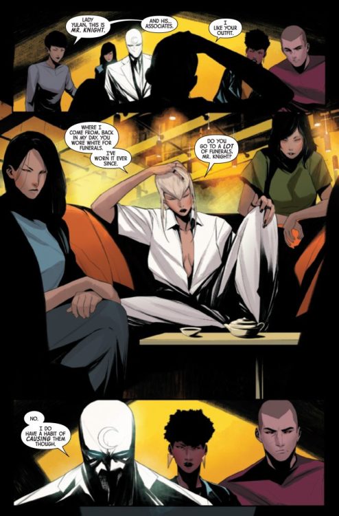
MOON KNIGHT #16 hits your local comic book store on October 19th, but thanks to Marvel Comics, Monkeys Fighting Robots has an exclusive four-page preview for you!
About the issue: While Moon Knight ventures into unknown territory to make a new friend of an ancient monster, Hunter’s Moon stalks the rooftops on his own, intent on his own definition of justice. Little does he know that he is far from the only one stalking the nighttime cityscape…
The issue is by writer Jed MacKay and artist Alessandro Cappuccio, with colors by Rachelle Rosenberg, and letters by Cory Petit. The main cover is by Stephen Segovia and Rachelle Rosenberg.
Check out the MOON KNIGHT #16 preview below:
Are you reading MOON KNIGHT? Sound off in the comments!
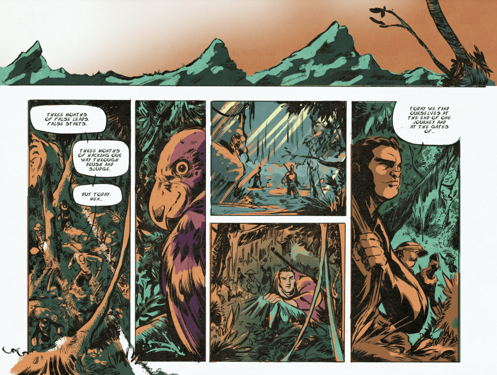
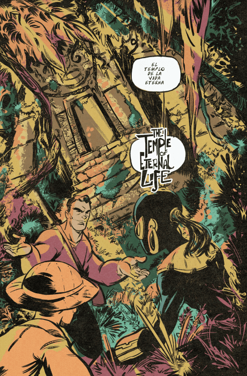
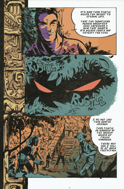
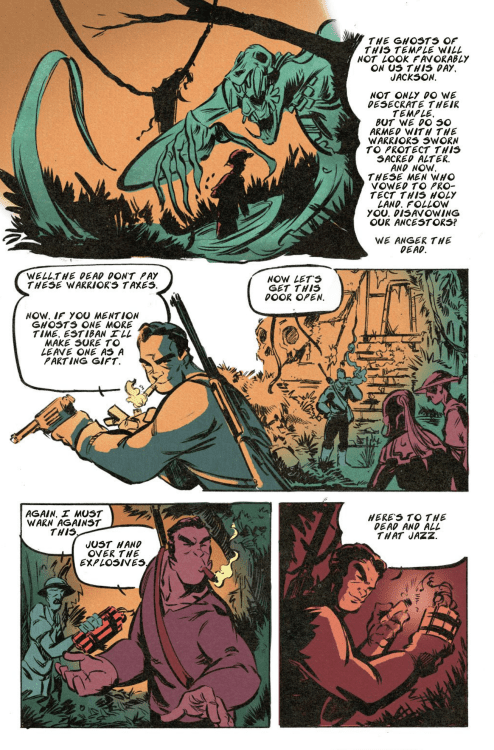
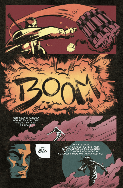
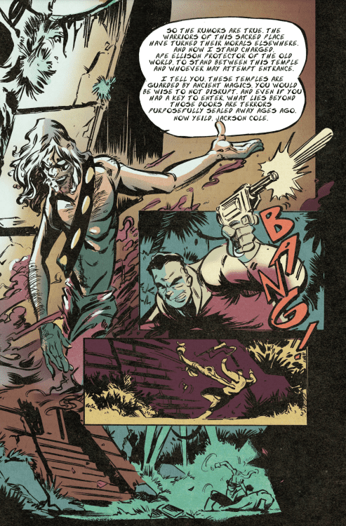
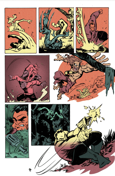
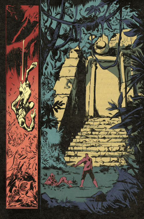
Cartoonist Jamie Jones launches a Crowdfundr campaign to fund the publishing of THE BABOON: TEMPLE OF ETERNAL LIFE n October 18th, but thanks to the creator, Monkeys Fighting Robots has an eight-page preview for our readers.
“I have been working on the Baboon for the past three years. I can’t stop thinking about him and the Baboon Crew. I keep coming up with stories faster than I can make the comics! These characters, this world is ever expanding in my head, and I can’t stop telling these stories,” said Jones.
About THE BABOON: TEMPLE OF ETERNAL LIFE: The secrets of life everlasting lie hidden deep within the jungles of South America. Magics guarded by traditions of long-forgotten cultures. Traditions that hold no meaning to the modern man. Old friends, Ancient warriors, and magics far beyond the mortal coil collide. To save the world, THE BABOON must battle the past to ensure his family’s future.
Enjoy the preview below, and check out the campaign here: BOW TIE PRESS
What do you think of Crowdfundr vs. Kickstarter? – drop us a line on social media.