Home Blog Page 80

INTERVIEW: Costume Designer Rafaella Rabinovich Made The Perfect Costumes For Netflix’s The Imperfects

Imperfects-netflix-interview

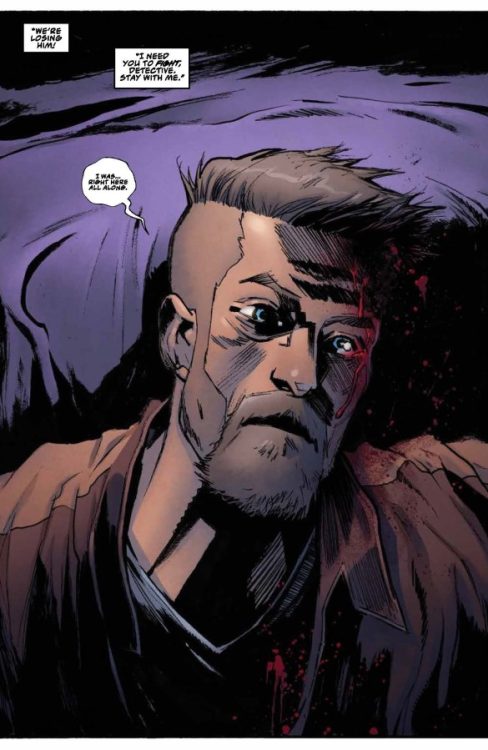
The Imperfects is a new series on Netflix which premiered in September. It’s the story of a disparate group of friends who develop superpowers. Rafaella Rabinovich helped tell the story through a varying sense of style.

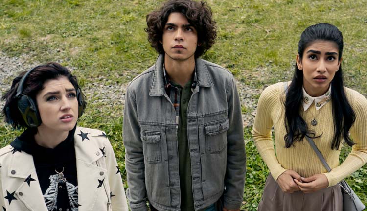
Abbi (Rhianna Jagpal), Tilda (Morgan Taylor Campbell), and Juan (Iñaki Godoy) are three young adults who share a common need to use a prescription drug provided by Dr. Alex Sarkov (Rhys Nicholson). But when their supply runs out, each character begins to experience strange side effects. Abbi, the brains of the bunch trying to get into Oxford, is a succubus who releases pheromones that make her irresistible. Juan, a comic book artist, turns into a chupacabra and becomes known as the Terror of Tacoma. Finally, Tilda, the resident rebel and rocker, develops the powers of a banshee to scream so loud that she can destroy objects. Together, these reluctant friends will learn the truth behind their condition and face enemies.

PopAxiom spoke with Rafaella about becoming a costume designer and the story within the story of the look and style of The Imperfects.

Lifetime

Rafaella’s creative journey began with a gift. “When I was 12 years old, I got a Canon AE1. It was a beautiful gift. I still use it 20-some years later. I was constantly taking pictures of everything and everybody.”

“I went to art school for what I thought was photography,” she says, “but I was exposed to all this other stuff.” Her time in school helped Rafaella realize that “what I loved to do was frame a stage which had a lot to do with photography. So, to study set design, I had to study costume design and eventually fell into costume design.”

The move from theater to film and television was a pragmatic choice. “Capitalism is a very real thing, and there are some places around the world where you can live a fruitful life in the theater. But I live in Vancouver, where it wasn’t sustainable for me. So I ended up working for Cirque de Solei; I worked on two different shows while on tour with them. Then, at the end of my contract, I was offered my first job as a costume designer on a Lifetime film.”

About The Imperfects

The Imperfects team is Nomadic, and I did the last season of The Detour a few years ago,” she says about her initial connection to The Imperfects through Nomadic, the company behind the series production. “I interviewed with Dennis Heaton, who is the showrunner and writer. He’s incredible.”

Rafaella “read the pilot” before the interview with Heaton. “So, in the interview, I brought various references. Things at the time I brought to the table became the baseline for the show. I put my boards forward, and it was a perfect match.”

The Imperfects features a stylized mix of modern elements that keeps things visually popping and interesting. “It was a mutual creative decision to put forward something stylized. We did a great job of doing that without making it completely stereotypical. It gives you more of a feeling that, whatever your style, ‘I want to wear that.'”

“We block shot two episodes at a time. It was a studio show, so that was available. Sometimes I’ve worked on shows where all ten episodes are shot together because of locations. So, in those cases, we must know a lot in advance. In this case, we analyzed the script, had multiple conversations about options and then created boards to show the filmmakers. There are a lot of moments where we took that extra step to offer something more elevated.”

The Imperfects also tells viewers more about the characters through their clothes. “We wanted to offer color and personality. We told a story with Tilda’s jackets where we pieced them together as armor. There are times she doesn’t wear them. It has to do with her childhood and being able to open up.”

Wrapping Up

Rafaella is a self-proclaimed “visual hoarder” who finds it hard to pinpoint just one influence. “There’s so much of what I love about what the visual arts offer us.”
“If I had to think of one person, it’s Marlene Dietrich,” she says. “Her gender-bending ability and her consistent boundary-pushing.”

But Rafaella thinks, “A lot of what lives in my DNA is cultural. Israel is a hub close to Europe, and I had a South American father, so there was always a lot to look at.”

What’s coming next? “Nothing that I can talk about yet. Hopefully, a second season.”

Is The Imperfects on your watch list?

Thanks to Rafaella Rabinovich and Impact24 PR
for making this interview possible.

Read more interviews from Ruben R. Diaz!

Monkeys Fighting Robots Youtube

Review: BATMAN INCORPORATED #1 – The New Batch

From writer Ed Brisson (Ghost Rider, Beyond the Breach) and artist John Timms (Superman of Metropolis) comes a new era and the return of one of the best bat-concepts from the last 20 years in Batman Incorporated #1. Featuring colors by Rex Lokus and lettering from Clayton Cowles, this international team-up comic offers an intriguing plot and entertaining character dynamics that I can’t wait to watch be fleshed out more. Backed up by some stellar visuals and sequential direction from the art team, Batman Incorporated is off to a strong start, but will have to build some serious momentum to compare to the now-classic Morrison-era.

“From the pages of Batman comes an all-new, all-exciting adventure for Ghost-Maker and his Batman Incorporated team! The team’s trust issues and detective skills are immediately put to the test when someone from Ghost-Maker and Batman’s recent past is brutally murdered…Is this an isolated event, sending a message to the two? Or is this the start of something darker and more sinister? (Hint—it’s sinister and dark!)”

Writing & Plot

Ed Brisson has the unenviable task of following up on the legacy created by industry icon Grant Morrison with his script for Batman Incorporated #1. Fortunately, this comic is clearly planted in the here and now rather than trying to capitalize on references to the now classic original series of the same name. Directly following recent events in the main Batman series, Ghost-Maker now leads the international cabal of masked crimefighters made up of members new and old. Batman of Japan, El Gaucho, Knight, Chief Man-Of-Bats and Red Raven, and more are joined by newcomers like Clownhunter and Grey Wolf for a team that’s as varied as they are interesting. What makes this idea so intriguing is seeing how these characters interact with each other and under the new command of the ice-cold Ghost-Maker. Batman’s newest ally and protégé is one of the best things to come out of the current era of Bat-comics, and Brisson nails his prickly nature perfectly. Every character feels different and reads with a different sort of inflection, allowing these many personalities to shine through. The core plot, while not very unique in the world of Batman, is still intriguing enough to keep readers glued to the page while following the clashing conversations. If there’s anything that could be improved upon in upcoming issues, it would be creating more moments for readers to familiarize themselves with the team and their relationships. Brisson is off to a solid start with this new iteration of Batman Inc., and it will be interesting to see where this series goes next.

Art Direction

Bat-books have received their fair share of high-quality stellar art in their pages. That trend continues with the work of John Timms for Batman Incorporated #1. Timms brings a visual style that combines modern superhero comics standards with some elements from the late 90’s. His lines and shapes are sharp and angular, with some heavy shading and moderate hatching for texture. His characters are obviously recognizable, but still have a slight spin on them due to Timms’s personal art style. As per usual with the bigger DC comics, there’s a very high-fidelity look here that Timms first nailed in his work on Superman of Metropolis, and he’s able to translate that over to a Bat-book with ease. His sequential direction is sharp and well-paced, with a great mix of overlaying panels and splash pages to highlight the big moments and keep the story’s momentum moving forward. The colors from Rex Lokus are vibrant and varied, with his work being much of the reason this comic matches the aesthetic built in other current Bat-comics. The palette Lokus uses is dense, with a high-fidelity appearance on every panel. The lettering from Clayton Cowles looks surprisingly hand-drawn for a mainstream superhero comic, while also having great font shifts and SFX work to keep the reading experience feeling natural. Overall, Batman Incorporated #1 is an outstanding looking comic thanks to a great visual team.

Verdict

Batman Incorporated #1 is a solid start to this reimagining of a modern classic. Ed Brisson’s script successfully juggles character interactions with an engaging plot to create a chapter that stays compelling from beginning to end. The visuals from John Timms and Rex Lokus offer high-fidelity and intense visuals with great pacing and action to pull readers into the DC universe with this team. Be sure to grab this debut issue when it hits shelves on October 11th!

Monkeys Fighting Robots Youtube

Exclusive Preview: InterPop’s THE ABYSS #4

interpop exclusive preview abyss

THE ABYSS #4 is out now at interpopcomics.com, and Monkeys Fighting Robots has an exclusive three-page preview of the debut issue, courtesy of InterPop!

About the book:
A corrupt king with devastating powers, sinister siblings from beyond the grave, and a criminal cult leader–all this and more await readers of THE ABYSS! The Red King will shock and terrify you as the origins of this fallen acolyte are revealed. Meet the team of mighty Emergents who first defeated him and his three deathly daughters! The Abyss used his infamous mind control to help seal away the Red King last time, but can he muster the strength to do it again? As robotic villain Daddy-2.0 threatens to resurrect the Red King and take over the masses, can the Abyss and his team protect Culverton from the combined power of these two evil forces? Heroes will clash and terrible sacrifices will be made in THE ABYSS #4!

The series is by writer John Rozum, artist Cliff Richards, colorist Chris Sotomayor, and letterer Carlos Mangual. The main cover is by Richards and Sotomayor; there is also a variant cover available by Miguel Sepulveda with Alex Sinclair.

Check out our preview of THE ABYSS #4 right here:

interpop exclusive preview abyss

interpop exclusive preview abyss

interpop exclusive preview abyss

interpop exclusive preview abyss

interpop exclusive preview abyss


Are you reading any of InterPop’s offerings? Sound off in the comments!

Monkeys Fighting Robots Youtube

Review: REVOLVERS #1 – Detroit & The Devil’s Sidearm

From writer John Zuur Platten and artist Christian Dibari comes a 90’s as hell tale of crooked cops and cursed firearms in Revolvers #1. Featuring colors from Simon Gough and lettering by Troy Peteri, this Top Cow comic book starts off in the land of familiar action and crime movie tropes but makes itself more enticing with its brutal visuals and teases of hellish lore in the final pages. With a derivative but entertaining script and some great visuals, Revolvers will not doubt be a hit with readers looking for something with a little blood spatter.

“Hampton Wales, a Detroit homicide detective, finds himself trapped in a mysterious and violent reality, only to find himself dead while attempting to solve a seemingly average and routine homicide. Confronted by an immortal tormenter known as La Piton (the Python), Hampton begins a dark and twisted quest to find out why and how he died. To do so, he must face off against a legion of gun-toting, deceased Revolvers within the Moratorium, a hellish version of Purgatory. Hampton will need to “kill or be killed” to have enough time to unravel his demise and discover it was by his own hand, someone else, or something more sinister.”

Writing & Plot

Revolvers #1 starts its story off as a formulaic R-rated detective story before diving more into its supernatural plotline. For the first two-thirds of the issue we follow depressed detective Hampton Wales as he recounts his day to a prostitute (he’s married, by the way). He’s gotten a man killed, his partner is bloodthirsty and corrupt, everyone on the force is on the take, etc. The majority of this comic is ripped right out of a 70’s or 80’s grindhouse police movie, and if you’re way into that then great! However, it’s so familiar that it would be easy to lose interest in the story before the comic reached its horror-style focus. Once the comic gets gory and starts dealing with the occult, it becomes a much more engaging read. The notion of a cursed, unnatural firearm isn’t new either, but it’s a cool enough plot device that, alongside the rest of the comic’s events leading up to Wales receiving the revolver, the end of the book makes up for much of the book’s prior flaws. The dialogue is a bit on the cornball side, and it honestly works perfectly for the book. As comic book plots go, this is a pretty safe bet for an Image book – especially for fans of the grindhouse-style edge of 90’s Image.

Art Direction

The dark city streets and nightmare underworld visions of Revolvers #1 are brought to life by artist Christian Dibari. His hatching-heavy, angular designs craft the exact aesthetic this comic deserves. Every panel is bathed in shadow, thanks to how Dibari shades surfaces and characters. There is a lot of effort put into making this vision of Detroit as run-down and crime-ridden as possible, and the art really does a great job of selling that oppressive and violent atmosphere. Character designs are pretty bog-standard, but that isn’t really important in a book like this. Where Dibari really gets to shine is with the bloody landscapes and twisted flesh when the supernatural stuff materializes. From freshly skinned bodies to towering spires of gore and eyes, Dibari does a stellar job of creating striking scenes that feel like something out of a video game. His sequencing is solid as well, with careful shot choices and panel variation carrying the reading experience along at a steady pace. Simon Gough’s colors do a solid job of cementing the book’s gritty aesthetic with a dark, almost muddy color aesthetic. Because of the book’s setting and overall vibe, he doesn’t have much to work with outside of blacks, browns, and reds, but it’s still impressive work that works in service of the story. Overall, Revolvers has the exact sort of visual experience this brutal, grimy, 90’s style throwback needs.

Verdict

Revolvers #1 is a solid first issue for fans of edgy Image comics. John Zuur Platten’s script starts off held back by overly formulaic tropes, but becomes much more engaging once the dark supernatural material kicks in. The visuals from Christian Dibari and Simon Gough are sharp, dark, and well-directed, making for a comics experience that will bring readers back to the 90’s and early 2000’s of brutal & hard-edged comic books. Be sure to grab this debut issue when it hits shelves on October 5th!

Monkeys Fighting Robots Youtube

AfterShock Comics Exclusive Preview: THERE’S SOMETHING WRONG WITH PATRICK TODD #4

aftershock comics exclusive preview there's something wrong with patrick todd

THERES SOMETHING WRONG WITH PATRICK TODD #4 hits your local comic book store October 19th, but thanks to AfterShock Comics, Monkeys Fighting Robots has an exclusive four-page preview for you.

About the issue:
As bodies fall and secrets are revealed, a three-way collision course between Zeus, Patrick Todd and Detective Brad Anderson threatens to upend Patrick’s life for good. Who…if anyone…will walk away?

The series is by writer Ed Brisson and artist Gavin Guidry, with colors by Chris O’Halloran, and letters by Hassan Otsmane-Elhaou. The main cover is by Guidry and O’Halloran.

Check out THERES SOMETHING WRONG WITH PATRICK TODD #4 preview below:

aftershock comics exclusive preview there's something wrong with patrick todd

aftershock comics exclusive preview there's something wrong with patrick todd

aftershock comics exclusive preview there's something wrong with patrick todd

aftershock comics exclusive preview there's something wrong with patrick todd

aftershock comics exclusive preview there's something wrong with patrick todd

aftershock comics exclusive preview there's something wrong with patrick todd


Are you reading THERE’S SOMETHING WRONG WITH PATRICK TODD? Sound off in the comments!

Monkeys Fighting Robots Youtube

Marvel Comics Exclusive Preview: WAKANDA #1 — Shuri and the History of the Black Panthers

marvel comics exclusive preview wakanda shuri black panther

WAKANDA #1 hits your local comic book store on October 12th, but thanks to Marvel Comics, Monkeys Fighting Robots has an exclusive five-page preview for you!

About the issue:
The Black Panther is no longer welcome in Wakanda! Who is this proud nation without its king? This exciting new miniseries answers that question as each issue spotlights a different fan-favorite Wakandan character.

First up: Shuri proves that being without the Black Panther doesn’t mean Wakanda is without heroes to protect it – and that there is a reason she too once wielded the power.

Plus, part one of the “History of the Black Panthers” backup story, providing for the first time anywhere a definitive overview of every Wakandan who has ever held the mantle of the Black Panther!

The issue features two stories: “Shuri” is written by Stephanie Williams, with pencils by Paco Medina, inks by Walden Wong and Elisabetta D’Amico, and colors by Bryan Valenza; “History of the Black Panthers” is written by Evan Narcisse, with art by Natacha Bustos, and colors by Jordie Bellaire. Joe Sabino letters both stories, and the main cover is by Mateus Manhanini.

Marvel Studios’ Black Panther: Wakanda Forever hits theaters next month on November 11th.

Check out the WAKANDA #1 preview below:

marvel comics exclusive preview wakanda shuri black panther

marvel comics exclusive preview wakanda shuri black panther

marvel comics exclusive preview wakanda shuri black panther

marvel comics exclusive preview wakanda shuri black panther

marvel comics exclusive preview wakanda shuri black panther

marvel comics exclusive preview wakanda shuri black panther

marvel comics exclusive preview wakanda shuri black panther


Are you picking up WAKANDA #1? Sound off in the comments!

Monkeys Fighting Robots Youtube

Review: Simple Chills in LEONIDE THE VAMPYR: MIRACLE AT THE CROW’S HEAD

Comics and the horror genre have had a long, fruitful partnership. In the United States at least, both modern incarnations have their roots in the pulps and penny dreadfuls of yesteryear: cheaply produced promises of chills and thrills often aimed at children or anyone else with a few nickels to spare. So it makes sense for a once-maligned genre and medium to stick together. Leonide the Vampyr: Miracle at the Crow’s Head from writer Mike Mignola, artist Rachele Aragno, colorist Dave Stewart, and letterer Clem Robbins calls back to the simpler gothic tales of the past with the story of a mysterious Vampire girl and the unsuspecting townsfolk that gather around her.

A long gloom has fallen over a crumbling little town by the sea. An innkeeper confesses to his wife that he longs for death. Barring that, he wishes for a single hour to relive his youth. Another townsman regrets a life spent without seeing the world. But while the two lament their fates, an old ship crashes near the town at midnight. No crew is found in the wreckage. Only a strange white coffin. The moment the casket is opened, a mysterious child springs to life from within. Impromptu celebration grips the town as they rejoice in the girl’s miraculous survival. Though her presence may come from forces more sinister than the town suspects…

Mignola writes Leonide the Vampyr as a simple, direct morality tale. Characters enter the story speaking aloud their fears and desires. Only Leonide herself remains elusive, talking in mysterious aphorisms like “Do not question when a fair wind blows…” But it’s the sparse, to-the-point prose that helps gives the story its power. The dialogue focuses mostly on grander, universal human wants and follies, while the quieter moments let the art bring out an individual sense of personality and atmosphere. Which isn’t to say the dialogue doesn’t offer character of its own. Leonide is often a source of dry wit. But it’s an impressive balancing act to tell a complete story in 22 pages that relies on quiet atmosphere and gives the art plenty of room to breathe.

It was Rachele Aragno’s sketch of a vampire girl that first provided the inspiration for this story, and it’s easy to see why. For as adept as Aragno is at illustrating the more horrific parts of the story, she never fully shows her hand when it comes to Leonide. The young vampire girl is playful, but not in the overtly creepy way often seen in horror stories about children. What’s off-putting about Leonide is how breezy and casual she feels. It’s a great contrast to the weary, put-upon world she inhabits. All the houses in the town feel crooked and twisted, brick often peeking out from behind peeling wallpaper.

Dave Stewart uses plenty of grey, beige, and dark blue throughout the issue, hammering home the dreary atmosphere of the small sea town. Leonide, in contrast, is a striking off-white with red hair and golden eyes. And when a party is thrown to celebrate her resurrection, the palette brightens to greens, purples, and a warm brown. Though the townsfolk to bear to listen to a monk who warns them of their mortality, a brown, emaciated walking corpse dressed in black and grey.

Clem Robbins letters the issue in clear, bold, capitalized letters. The sound effects are all fittingly simple, often going for thick bubble letters filled in a single, solid color. Though there are slight variations to bring out the texture of each sound. The gong of a bell gets elongated, squashed-together text, which a sudden thump gets slanted, jumbled letters.

VERDICT

Leonide the Vampyr: Miracle at the Crow’s Head is a simple, self-contained tale that makes an excellent read to welcome the Halloween season. It’s available from Dark Horse now, and well worth your time.

Monkeys Fighting Robots Youtube

Review: EARTHDIVERS #1 – Kill Columbus, Save the World

From writer Stephen Graham Jones (The Only Good Indians, My Heart Is A Chainsaw) and artist Davide Gianfelice (Northlanders) comes a story about saving the world by killing America with Earthdivers #1. Featuring colors from Joana Lafuente and lettering by Steve Wands, this debut issue offers up a brilliant premise from a perspective we desperately need more of in our fiction. With a compelling and tense script and beautifully detailed visuals, Earthdivers is off to a stellar start.

“The year is 2112, and it’s the apocalypse exactly as expected: rivers receding, oceans rising, civilization crumbling. Humanity has given up hope, except for a group of outcast Indigenous survivors who have discovered a time travel portal in a cave in the middle of the desert and figured out where the world took a sharp turn for the worst: America. Convinced that the only way to save the world is to rewrite its past, they send one of their own on a bloody, one-way mission back to 1492 to kill Christopher Columbus before he reaches the so-called New World. But taking down an icon is no easy task, and his actions could prove devastating for his friends in the future.”

Writing & Plot

Stephen Graham Jones, mostly known for his horror titles, jumps into the comics medium with an apocalyptic time-travel tale with a specific Native American perspective in Earthdivers #1. The plot’s main core – “kill Columbus, thereby preventing America, thereby saving the world,” is a unique premise made up of familiar tropes. What Jones is able to do in his script is implement very human character complexities we seldom get from time travel stories. The character who is selected to go back in time is sent because he knows the most languages and, supposedly, would be able to blend in the best. However, when planted on a sailing ship in 1492 with the job of blending in as a sailor, it’s amazing just how much can fall apart. Watching the lead character struggle and cave to baser instincts in order to stay on mission is like watching a fascinating and intense human experiment – which is exactly what great sci-fi often is.

Jones’s experience as a novelist makes itself known with this comic book debut. As comics go, this issue is on the wordier side – but no words feel wasted. Jones stuffs a lot of info and context into the pages of this comic, and while it may be dizzying for some readers not used to denser comics, it’s still a very well-constructed script. If there is a nitpick to be made, it’s that the in-story “present” plotline isn’t as interesting as what’s going on in 1492. Not that what’s going on with the supporting cast isn’t engaging – it is – but what’s going on in that apocalyptic era is clearly still developing and will no doubt become more interesting as the story progresses. Stephen Graham Jones nails his comics debut with a complex and intense script in this opening chapter.

Art Direction

Earthdivers #1 will immediately draw readers’ attention with the stunning detail and visual direction of artist Davide Gianfelice. His characters are full of expression and each person has their own unique design that makes them memorable. Both timelines have appropriately detailed sets, from the desolate rocky landscape of a dying Earth to the decks of Columbus’s ships, every set piece is detailed and draws readers into the world with ease. Gianfelice’s sequential direction comes off as natural despite being deceptively complex. Smaller panels are inlaid over larger ones to add context and extra details that improve the depth of the story. Conversations are carefully constructed to get the most out of character interactions. Gianfelice’s work here really makes the most of all the info given in Jones’s script. The colors from Joana Lafuente are deep and vivid, finishing off the comic’s stunning high-fidelity yet tonally complex aesthetic. The real gem in her work is how she uses sunlight. From the warm red sunset over barren rock in the “present” timeline to the glaring heat over the sea in the past, Lafuente utilizes sunlight (and moonlight) to noticeably influence the color palette and overall visual experience on every page. The lettering from Steve Wands has a distinct hand drawn style to it while still being very readable, making for the perfect punctuation point on this comic. Overall, Earthdivers is off to a strong start with an excellent visual presentation.

Verdict

Earthdivers #1 is a complex and unique piece of time travel sci-fi. Stephen Graham Jones enters the comics scene with a dense but fascinating and well-paced comic with tasty dash of political commentary, as every great science fiction story should have. The visuals from Davide Gianfelice and Joana Lafuente are well-directed and stunningly detailed, making for a wholly immersive reading experience. Be sure to grab this stellar debut issue when it hits shelves on October 5th!


Monkeys Fighting Robots Youtube

Review: PINK LEMONADE #1 — For the Love of Cartoons and Sugar

Pink Lemonade’s been on quite the journey over the past few years. Starting from a daily series of strips centered around an enthusiastic biker, it soon became clear that the character’s story had begun to outgrow the format. So, here we are with Pink Lemonade #1 from creator Nick Cagnetti and letterer François Vigneault, an issue that begins with an explosive, psychedelic action sequence the old format could only dream of. Pink Lemonade’s moved to bigger pages, and there’s no promise even that can contain her.

Hopeful drifter Pink Lemonade has been confused a lot, of late. For one thing, “Pink Lemonade” isn’t her real name, just a title given to her by a child running a lemonade stand. Her entire past is a blur. The only things she knows for sure are that she has a lust for adventure, a motorbike, and a taste for sweet drinks. Following a psychedelic dream sequence, she awakes on a park bench, greeted by the young girl that named her. Introducing herself as Pammy, the child has brought her mom to see the “cool motorcycle chick” that visited her lemonade stand. The mom, Linda, invites Pink Lemonade back to their house for a mac-n-cheese dinner. Linda makes her living drawing comics, and expresses a deep love for retro superhero OJ-Bot. Inspired by the hero’s example, Pink Lemonade decides later in the day to burst onto a movie set to save a child’s balloon. But despite her good intentions, Pink Lemonade’s impulsiveness might just land her in hot water.

She may have a mysterious past, scar, and a huge helmet that hides her face, but Pink Lemonade is a character who’s about as earnest as it gets. Mac-n-cheese is the best meal she’s ever had. Cartoons are wonderful. And she’ll greet an artist with “I like to color things with crayons!” It might make her stick out in the world at large, but for talking about cartoons? She’s got the right attitude. In fact, it’s her conversations with Linda over OJ-Bot that make up the core of the issue. Pink Lemonade is a walking, talking retro-comics throwback who can’t help gushing over why people liked those comics in the first place. Which means love for whimsy, puns, and a can-do-attitude.

Though, the comics couldn’t stay pure forever. Linda briefly goes into OJ-Bot’s descent into grim n’ gritty posturing, the character’s new direction shown through pastiches of usual suspects Watchmen and Dark Knight Returns. It’s no coincidence, then, that the first person to challenge Pink Lemonade’s attitude is a man drawn like he stepped out of a 90’s comic. There’s also a strange grim reaper wearing her face. following her; how real the figure is doesn’t matter at this point. We just need to know Pink Lemonade is running from something. So it comes down to whether her chipper, childlike attitude can survive run-ins with angrier outlooks, harsh reality, and her own past. That, and Hollywood. Hopefully some whimsy can make it out intact.

Nick Cagnetti’s art shows fondness for the American comics of yesteryear, clear meat-and-potatoes storytelling embellished with thick outlines, colorful costumes, and a touch of psychedelia. Pink Lemonade’s enthusiasm comes across through the exaggerated superhero storytelling used in scenes as mundane as eating mac-n-cheese. A yellow circle frames her, scarf blowing in the wind, as she browses a longbox. A handshake emphasized with a splash of bright orange. Not to mention the several changes in style Cagnetti uses to get across different comic eras. Stuntman Rick Radical is given harsh shading and bulging neck veins to evoke the 90’s, while OJ-Bot is a simple design straight out of a kid’s cartoon, a cylinder with limbs and friendly eyes.

The coloring is bright and flat, favoring solid blocks of color textured with Ben-Day dots. Dramatic moments turn the background bright red, or blue, and Pink Lemonade’s signature yellow and pink help her stick out in any given scene. Though her colors are also used in more subtle ways, like how a sunset where she faces the mysterious reaper turns the sky pink and orange.

Vigneault’s lettering is thick, blocky and all-caps, with occasional hand-drawn sound-effects and exclamations. A kid shouting “My balloon!” is drawn in red bubble letters, which wobble and spill into one another. Even the simple “Glug glug” of drinking pink lemonade is given poppy hand-lettering, colored a fitting bright pink.

VERDICT

Pink Lemonade #1 is about the simple joys of old-fashioned hero stories, starring someone who hopes to follow in their footsteps. Though reality threatens to creep in around the edges. The book is out now from Oni Press, so give it a try if you want something sweet.

Monkeys Fighting Robots Youtube

Read The First 3 Pages Of Donny Cates’ HULK PLANET! (HULK #9)

HULK #9 - HULK PLANET!

HULK #9 hits your local comic book store next week, but thanks to Marvel Comics, Monkeys Fighting Robots has an exclusive three-page preview for our readers. The book is written by Donny Cates, with art by Ryan Otley, Cliff Rathburn is the inker, with lots of color from Marte Gracia & Matt Hollingsworth, and Corey Petit is the letterer.

About HULK #9:
New Arc – HULK PLANET!
Thoroughly shaken by his battle with Thor and Titan’s impact on his friends, Bruce Banner decides that his best company is himself – and only himself. As he sets Starship Hulk on a far away course, he begins to reckon with what it means to be healthy – and encounters an alternative to isolation he’d never thought to dream of. But this alternative begs the question – who exactly is Monolith?

Enjoy the preview below.

Are you excited for HULK PLANET! – drop us a line on social media.

Monkeys Fighting Robots Youtube