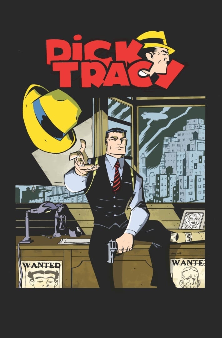
Dick Tracy became a household name decades ago. For people born in the ’70s and ’80s, like me, it’s easy enough to associate the name “Dick Tracy” with the 1990 Warren Beatty film, but it’s harder to conjure up an anecdote about the original source material. That’s no great failing on my generation’s part, though, considering the original Dick Tracy source material first saw publication nearly 90 years ago.
DICK TRACY – Looking Back
I’ve always enjoyed looking back at the creators and characters who helped form our contemporary understanding of comic strips and comic books, and you can’t get much more formative than Chester Gould’s work on DICK TRACY. Although, by his own admission, Gould’s initial work on DICK TRACY was not his best, the DICK TRACY strips from 1931–1933 are easily some of the most influential comics ever printed.
After Tracy’s appearance in the early ’30s, his signature fedora and trench-coat became common garb for nearly every hard-nosed detective to grace the silver screen or printed page. But it wasn’t just Tracy’s sense of style that would be imitated: Tracy’s origin story should sound familiar enough to seasoned readers of comic books.
The Original DICK TRACY – Vengeance, Best Served in A Fedora
Shortly after announcing to her parents Tracy’s intention to marry Tess Trueheart, armed thugs break into the Truehearts’ home. One of the mobsters demands the Truehearts’ life savings, but Emil Trueheart, Tess’s father, refuses and puts up a fight.
The mobsters blow the old man away, knock Dick out, and steal the Truehearts’ money. To add insult to injury, the bad guys also kidnap Tess. Upon awaking from his gun-butt-induced nap, Tracy swears a solemn oath: he will save Tess and avenge Emil Trueheart.
The Original DICK TRACY – Dick Spider-Punisher-Batman
This origin should sound pretty familiar, since Tracy shares its essential details with Spider-Man, Batman, the Punisher, the Rawhide Kid, Ka-Zar, and a host of other costumed vigilantes. Vengeance is a powerful motivator, especially when the bad guy has kidnapped your fiancée and killed her dad.
The Original DICK TRACY – Pushing the Envelope
Although, by today’s standards, the violence in DICK TRACY’s early strips is pretty tame, it was shocking to the strip’s original readership. On its second day of publication, PLAIN CLOTHES TRACY, DICK TRACY’s immediate predecessor, featured a thug using a blowtorch to torture a bound victim.
This particular method of interrogation may seem surprisingly gritty and realistic for the time, but this level of grit was exactly what readers were looking for. Although DICK TRACY is generally remembered for the strip’s grotesque villains, the first few years of publication saw few of these ugly and oddly named characters. Pruneface and other fan-favourite villains would appear later. During the first couple years of the original DICK TRACY comic strips, Dick’s de facto arch-nemesis was a heavy-set vagrant/conman simply named “Steve.”
The Original DICK TRACY – Dick Tracy or Dick Wolf?
Tracy’s enemies, including basically a carbon copy of Al Capone named “Big Boy,” weren’t the only elements that gave the original source material a sense of realism, though. DICK TRACY also served as one of the original procedural cop dramas, showing various forensic techniques that police of the day would use in the course of their duties.
Tracy didn’t just follow hunches, although he did every once in a while. For the most part, Tracy used ballistics tests, fingerprints, and other real-world investigative techniques to collar criminals.
The Original DICK TRACY – Did Someone Say “Boy Sidekick?”
Beating Batman to the punch by nearly a decade, Dick Tracy started endangering his ward’s life early. Dick Tracy Junior, under the care of Steve when he first appears, quickly develops a respectful relationship with Tracy, eventually becoming an honourary detective in Tracy’s precinct.
The Original DICK TRACY – Final Thoughts
I borrowed IDW’s THE COMPLETE CHESTER GOULD’S DICK TRACY DAILIES & SUNDAYS 1931–1933: VOLUME ONE from a friend of mine. The strips are excellent, if dated, and the supplemental material is a great addition to knowledge-hungry nerds like me. Volume One includes nearly 600 comic strips, but it also contains a great introduction by Max Allan Collins, who took over DICK TRACY writing duties when Gould retired at 77, as well as an interview that Gould gave to Collins and Matt Masterson.
Collins’s introduction provides some great contextual information for the creation of DICK TRACY, and the interview with Gould provides keen insights into Gould’s process and the struggle he endured in his journey to create one of the most influential comics characters of all time.
I have newfound respect for Gould and his legacy after reading this volume. And, unlike some other collections of Golden Age or pre-Golden Age material I’ve read, I’m actually considering buying Volume Two. After all, it’d be nice to meet a villain with a stranger name than “Steve.”
The Empty Man #4 continues to explore the horrors of a virus spreading fear and violence throughout America. While uncertainty grips the real world, this comic from BOOM! Studios gives fear a physical form and releases it upon the innocent and guilty alike. No-one is safe which is the major theme explored within this horror series.
Story/Writing
The Empty Man virus is spreading and taking new form.
This issue opens in a film studio where two young children are being interviewed for a news show. The reporter is curious about the children and their link to the Empty Man virus. As a contrast, the two children are dismissive of the reporter; they have a greater understanding of what is happening and display impatience for the uninitiated.
Cullen Bunn manages to kick this issue off with an extremely creepy sequence despite the fact it lacks the horror and the gore present in much of what follows. The intensiveness of the two children during the interview and their attitude towards the reporter is extremely unnerving. Bunn gives them voices more suited to a religious or cult leader. As a result their dialogue is uncomfortable to read. They have a steady and matter of fact tone. What they say isn’t just a story they have made up but a Truth that they believe in entirely and this comes across in the way that Bunn has scripted the scene.
After the opening scene the reader is thrown right back into the action from the previous issue where a family and their protectors are trying to escape the neighbour. So far it has played out like a scene from a Purge movie but for this issue Bunn throws a curveball into field: large spider like mutations which appear to be the next stage of the Empty Man virus. First infection, then invasion.
Bunn follows the corruption of the innocent with the fears of adulthood. He continues to punish the FBI agents and the family by making their night go from bad to worse. Even after their apparent escape Bunn reminds the reader of the cost so far and hints at the terrors that are to come.
There are elements of this comic which may not make sense at first as they relate to previous issues and even the previous Empty Man series. However, Bunn has woven a short flashback sequence into the narrative to bring everyone up to speed. The bonus of this two-page spread is that it fits snuggly within the story and doesn’t feel like an info-dump just for the sake of it. It is a moment that makes narrative sense within this issue of The Empty Man.
Art from The Empty Man #4 Credit: BOOM! Studios
Art
The difficult job of visualising the horrors in The Empty Man falls to Jesus Hervas. Luckily for all concerned Hervas can manipulate the images within the panel to create the necessary tone. Even in the opening sequence which is bathed in bright light and reassuring color, all provided by Niko Guardia, Hervas uses the facial expressions of the characters to reflect the deeper, unnerving elements of the script. The young boy and girl have an innocence about them which is somewhat belittled by their eyes and the words they are speaking. Hervas creates a contradiction between the art and the speech which results in the uncomfortable feeling emanating from the page.
To contrast this, Hervas draws the reporter with a straight face throughout. By the end he becomes a man out of his depth illustrated by the fact that the children begin to surround him in the panels; he becomes trapped. As this issue continues, that feeling of being trapped is returned to again and again, like a running theme for the central characters. Several pages have the characters imprisoned within the panels either surrounded by other characters or boxed in by scenery or the panel boarders themselves.
One of the highlights of The Empty Man is the lettering work by Ed Dukeshire. Not only can he reflect emotion through the speech balloons but his sound effects strike fear into the hearts of the reader. Whether it’s the chaotic gun shots or the screeching creatures, the sound effects seem to tear across the page and bleed out of the comic itself.
Interior Art from The Empty Man #4 Credit: BOOM! Studios
Conclusion
As The Empty Man progresses it becomes more unnerving and grotesque. The theme of entrapment, physical and emotional, which runs through this issue gives it an additional horrific edge. Bunn understands the horror genre and demonstrates that knowledge on every page of this comic.
In turn, the creative team of Hervas, Guardia and Dukeshire visualise the emotional terror of the characters through dark yet expressive panels. No two page is the same with the layouts changing to best express the elements on each particular page.
There are other horror comics on the shelf but with The Empty Man, BOOM! Studios have a visually disturbing and visceral tale of terror which is really beginning to pick up pace.
Reaching back into comics history once again, IDW Publishing has announced it’s bringing back Chester Gould’s famous detective in Dick Tracy Forever, to be written and illustrated by Michael Avon Oeming. The four issue mini-series will debut this April.
IDW’s official description reads as follows:
Dick Tracy is the proverbial Sisyphus, pushing the law boulder up the hill as he struggles for reason and order in a world with none. His attempts at delivering justice are met with crime and chaos in the form of unpredictable and absurd villains. But Dick Tracy will never give up trying, no matter the era or incarnation… even when his startling new case defies all notions of time and space!
Oeming adds:
“I’ve gotten to write and draw most of my bucket list characters, from The Spirit to Batman and more, but I never dreamed that Dick Tracy would even be a possibility. It feels completely natural and I cannot wait to show why he’s such a relevant character for all times.”
The first issue will have two covers by Oeming, as well as a variant by artist Kyle Baker. Fans may remember that Baker himself illustrated a run on Dick Tracy in the 1990s.
Written and drawn by Chester Gould, Tracy made his comic strip debut way back in 1931; the character is probably best known to the general public thanks to Warren Beatty’s 1990 movie adaptation. IDW’s last Tracy outing — Dick Tracy Dead or Alive — was released in 2018.
Are you looking forward to Oeming’s take on this classic comics character? Comment below!
The year continues to churn for Scout Comics as yet another series, which will arrive in 2019, was announced for release in The Wild Cosmos, from writer and artist Curtis Clow.
The series will take place in a future in which humanity can navigate the stars and inhabit multiple worlds, across an expanding universe. Cooper, a captain of a group of smugglers, leads his crew down a wrong path, and must now trade with murderous intergalactic pirates. Tasked with capturing a mysterious and dangerous girl, named Zara, who seeks revenge against the people who ruined her life, the crew must comply, to save the life of a captured crewmate.
“The Wild Cosmos is an action-packed space adventure that will have comic book fans completely hooked,” said Scout President James Haick. “We love the talent, creativity and complete uniqueness of the series and truly believe our Scout ‘Mavericks’ will be more than happy with this new series.”
For more information regarding this upcoming series or any other Scout titles, please contact Publisher James Pruett at: james.pruett@scoutcomics.com.
Check out the cover for the first issue, including interiors of the first few pages, below.
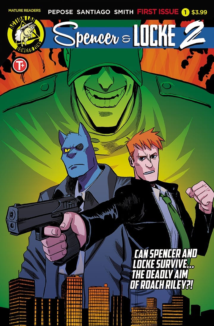
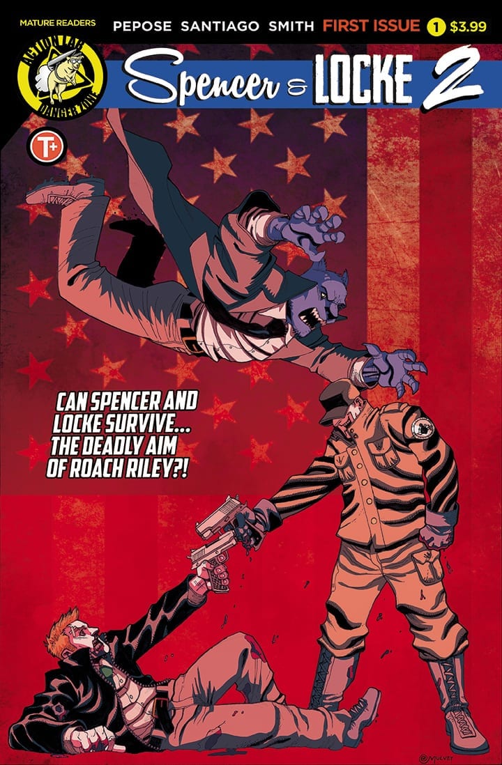
Spencer & Locke 2 is out April 24th, and Monkeys Fighting Robots sat down with writer David Pepose and artist Jorge Santiago, Jr. to talk about the series.
For the uninitiated, Spencer & Locke can be summed up in a few words: Calvin and Hobbes meets Sin City. Detective Locke fights crime with the help of his partner and childhood imaginary friend Spencer, a talking panther. It’s one of the most original and thoughtful series out today, tackling childhood trauma and PTSD, and balancing these heavy topics with smart humor, intrigue, and thrills. It’s also already been optioned for film by producer Adrian Askarieh and Prime Universe Films. Along with Pepose and Santiago, Jasen Smith is the series’ colorist, and Colin Bell the letterer.
Volume one was nominated for five Ringo Awards (Best Series, Best Writer, Best Cover Artist, Best Colorist, and Best Letterer), and volume two promises to up the ante in every way, with a new deadly villain for the titular duo to take on.
Read on to see what Pepose and Santiago have to say:
Monkeys Fighting Robots: David, Spencer & Locke 2 introduces a new hardcore villain; what can you tell us about Roach Riley?
David Pepose: For those who haven’t read our first series, SPENCER & LOCKE follows Detective Locke, a hard-boiled cop whose upbringing was so traumatic that he still partners with his childhood imaginary friend Spencer as an adult. So if Spencer and Locke are the products of a lifetime of horror, Roach Riley is what you’d get if you experienced all that pain and horror on a vastly accelerated timetable.
The sole survivor of his platoon overseas, we’ll see in SPENCER & LOCKE 2 that Roach’s survival came at a truly harrowing cost. But Roach has also come out of this gauntlet with a real sense of purpose, and a twisted sense of meaning for everything he’s endured — and as a highly trained and heavily armed soldier, he’s come back home to share these brutal lessons with the rest of the city. Roach is very much Spencer and Locke’s dark opposite, and there are some wrinkles to his story that only reinforce that dynamic further.
MFR: If Spencer and Locke are “Calvin and Hobbes meets Sin City,” then I feel like Roach is “Beetle Bailey meets the Punisher.” Is that a fair comparison? Did you have characters other than Frank Castle in mind when writing Roach?
Pepose: Definitely, I think the Frank Castle comparisons would be on the mark! For me, the big influences for Roach were Heath Ledger’s Joker, as well as the films Taxi Driver and The Deer Hunter. When artist Jorge Santiago, Jr. and I were first discussing Roach, it was trying to meld that lanky laziness of Mort Walker’s classic Beetle Bailey with the fact that this is also a guy who has seen some things and is really, really good at what he does — in this case, causing bloodshed on a massive scale.
But there’s also this bleakly hilarious sense of personality to Roach that was really fun to write, because just like Spencer and Locke, he has his own perspective and philosophy on the world. There’s a lot of fighting in this sequel, but at the end of the day, Locke and Roach’s real war is ideological. What do you do with the pain that life deals you? Can anyone come out of that psychological battleground unscathed?
Roach Riley by Jorge Santiago, Jr.
MFR: Jorge, when David first approached you with Spencer & Locke, what about the story jumped out at you that you had to work on it?
Jorge Santiago, Jr.: When David first contacted me about Spencer & Locke, I was deep in the study of noir films that I had never gotten a chance to see. I was watching the Godfather, the Departed, and other films hoping to find a way to tell a story with those conventions but also adding my own flair to the genre to subvert it and make it my own. Spencer and Locke was a step in that direction so I was interested in what we could say about crime stories, noir, and the people those stories are about.
MFR: And what kind of influences were Bill Watterson and Frank Miller on you, both as an artist and a reader?
Santiago: As a kid, most of my comic reading was done in the newspaper, so Calvin and Hobbes was a big joy in my life. The strip was the perfect middle ground of hilarious comedy and storytelling, so it never got old to me and even today, I can pick up a volume of the collected works and have a great time reading and studying from a master. I actually had not read any Frank Miller comics before entering grad school, so my study of his work was done as a student of comics; I didn’t grow up with his comics the way most comic fans did. I’ve mainly studied them for their techniques and seeing how I can apply them to my own comics.
MFR: What concepts or themes are you exploring in volume 2 that set it apart from volume 1?
Pepose: Our first arc was about scars, and now that we’ve established Spencer and Locke’s brutal upbringing, our sequel is going to be about consequences. What’s the price Locke has to pay for the way he fights crime? What’s the fallout he has to endure for holding onto his imaginary friend Spencer after all these years? And perhaps the central question of our series — can Spencer and Locke ever hope to transcend their own pasts, or will they always be defined by it? This sequel is going to really test Spencer and Locke’s dynamic, and explore what the limits of their partnership can be.
MFR: Just from the first issue of S&L2, I feel like you’re getting ready to push Locke to the edge. He seems to have a lot of deeply seeded anger that he’s working out through Spencer, and I’m worried that Roach Riley is going to bring that out of him. Haven’t you put the poor guy through enough already?
Pepose: I know, and after our first story was so innocent! (Laughs) But you’re right, that Locke is definitely not in a good place after the events of the last arc. Locke’s had some of his most deeply-held beliefs challenged, and moreover, he’s finally confronted the tormentors of his past… so why doesn’t he feel any better?
Ultimately, despite what action movies might tell you, you can’t shoot all your problems into submission — even worse, Spencer and Locke’s violent methods have placed them under investigation by Internal Affairs, putting Locke’s custody of his daughter Hero at risk. You put all that craziness together, and Spencer and Locke are not necessarily in the best of headspaces when Roach makes his bloody return home.
MFR: S&L is a series about trauma, PTSD, and how we deal with these things. Would you consider Spencer a healthy coping mechanism for Locke? And do you think Locke has a chance to put his past in the past and be happy, or is the best he can hope for is to embrace that pain as a part of him and turn it into something good?
Pepose: Clinically speaking, I’ve always thought of Locke as a high-functioning schizophrenic — but in our sequel, I wanted to make sure we weren’t romanticizing his mental illness and his own internal damage. Like you said, Spencer is Locke’s chosen coping mechanism, but is Spencer necessarily the best way for Locke to function in society? To pursue justice? To raise a child? To me, Locke’s overactive imagination has always been him holding onto sanity by the fingernails, and as he faces someone who revels in madness the way Roach does, Locke might find himself slipping off the edge.
MFR: Can you discuss what it’s like designing characters and a world that have to pay homage to such perennial classics, but at the same time feel fresh and original? I have to imagine this is particularly difficult when drawing the Watterson-esque flashbacks to Locke’s childhood.
Santiago: For the present day sequences, that is just my own art style with more of a hard edge to it. Like a lot of people, I think homage rides an incredibly fine line before it just feels like a rip off, so for the bulk of the comic I just drew what felt most natural but the cinematography and direction of the scenes is from the mindset of a noir filmmaker. My characters don’t look like they’re referencing any one style 100% of the time, but the framing and acting is all inspired by those movies that I was watching so those scenes were the easiest to do since it was just being myself.
The flashback scenes were tricky because of the reasons mentioned before, so I spent a lot of time studying Calvin and Hobbes and finding my own ways to interpret that style. What was important to me was finding a way to interpret these style choices into my art so that they never felt too disconnected; if the flashbacks felt like they were drawn by a different person, that would be bad. I think I succeeded in making this flashbacks coexist with the present day scenes, and that meant embracing the honest truth that I would never be able to draw like Bill Watterson, and I was happy with that.
MFR: Do you listen to music while you draw? What’s your soundtrack for Spencer & Locke?
Santiago: I listen to a LOT of music while I draw, music is what helps me stop overthinking my every stroke and start focusing on instinct. Without music, I don’t think I’d be able to work as much as I do. My soundtrack for Spencer and Locke is over 200 songs across genres and artists but I can include some songs for the main characters that helped me get into their mindsets for the comic. Some of these have swearing in them so listen at your own peril! In the first arc, I drew “War Children” on a wall as a nod to the Rolling Stones “Gimme Shelter,” and I think that song might be the theme to arc 2 as a whole, but there are other songs that could fit the theme as well.
Locke: Burn It Down by Linkin Park
Spencer: Kids with Guns by the Gorillaz
Hero: Fingers by Yoko Kanno and the Seatbelts
Roach: Qwerty by Mushroomhead
Melinda: UFOMG by Blockhead
MFR: David, what’s your favorite part of writing Spencer & Locke? I would think the Fight Club-esque scenes where Locke is talking to Spencer but everyone else just sees a plush panther are particularly fun.
Pepose: That’s a real toss-up for me — on the one hand, I really enjoy writing our action sequences, just to come up with new and exciting ways to put Spencer and Locke through the wringer. (Just wait till you get to the last issue — let’s just say that Locke and Roach have a particularly brutal showdown.)
But on the other hand, Jorge and I always seem to have the most fun when we’re writing our tear-jerker moments — we actually made our editor cry twice during the first arc! And I think there’s a real sense of vulnerability and heartache to Locke as a character that I think a lot of people resonate with, because everybody has been hurt at some point or another in their lives. So watching Spencer and Locke grapple with these very human situations and try to move past them are the kinds of moments that keep me invested in these characters over the long haul.
MFR: Similarly, what draws you to writing as a career? And what keeps you going on days when the creative juices just aren’t flowing?
Pepose: Definitely the money, sense of security, and how easily everything comes together! (Laughs) Kidding! Honestly, writing is the most challenging thing I’ve ever done, but it’s also the best job in the world — how many other gigs would encourage you to just put your headphones on, start daydreaming, and build any sort of world you could think of? So even on the hard days, I just remember how lucky I am to be doing this.
Do I have days where the juices aren’t flowing? Totally. What do I do in that situation? Sometimes I put on music until things start clicking. Sometimes I just write scenes out of order, just to get some progress made elsewhere. Sometimes I reach out to my friends, get their two cents on things. And sometimes you just type, knowing that even if none of what you’re writing makes the final cut, you’re still doing the work of churning through the crappy stuff until you start finding the gold again.
MFR: And you, Jorge? What’s been your favorite page or moment from S&L that you’ve drawn so far?
Santiago: I think issue 3 of our second arc has some of my favorite pages in it. Without giving too much away, I got to play with some horror elements and noir imagery that really appealed to my sensibilities. This is also an issue that focuses a lot on Hero and Melinda, who might be my favorite characters in the series. In the comics I write and draw, I tend to make the main characters women so drawing an issue where the ladies are getting stuff done was a joy.
MFR: On the flip side, what’s been the most difficult page or moment to draw so far, and why? Do you have any advice for artists on getting through those tough pages?
Santiago: It wasn’t a page or a moment, but I wanted to be sure that for all of the action and gunplay that the comic has, that Locke not lose his humanity or empathy as a character. My concern was that I didn’t want Locke to become our version of the Punisher, or any other number of gun-toting murderers who suffered a trauma and now everyone has to pay. At the core of Locke, divorced from the gunplay, the chase scenes, and the explosions, I wanted to depict a person in pain, someone who has suffered and continues to suffer from the ghosts of his past and is still trying to do right by the people he cares about. While this could have gotten lost with all of the action elements, I think we succeeded in creating a character that the reader wants to see in that happy ending, where they can accept their trauma and aim for a happier life than the one they lived to that point. I think that every creative person should try to put themselves in the shoes of others, because unless you’re writing stories only about yourself, you need to be able to empathize with other people’s struggles in order to convey them with respect and with understanding.
MFR: David, what’s the collaboration process like between you, Jorge, Jasen, and Colin, and how has it evolved from the start of the series to now? Are you very detailed in your scripts, or is there a lot of freedom for interpretation?
Pepose: With our first arc under our belts, Jorge and I’s discussions were really streamlined for SPENCER & LOCKE 2 — and honestly, Jorge has upped his game tremendously for this second arc, which has only inspired me (and the rest of our team) to follow suit. My scripts are generally pretty sparse, but Jorge and I are usually in close collaboration discussing layouts and thumbnails, just to ensure we establish all the plot points we need to and to get in a rhythm that makes the pages really pop.
My colorist Jasen Smith and I go really deep into the pages to make sure we’re capturing the right mood while still lending Jorge’s inks the right energy — meanwhile, my letterer Colin Bell is just a wizard with this stuff, always laying out our word balloons in a way that doesn’t crowd the art or make me seem too wordy. I also have to give a special shoutout to our variant cover artists Maan House and Joe Mulvey — I seriously cannot wait for people to see what they’ve been cooking, because between them and Jorge, I really do feel we have some of the best covers out there.
MFR: You teased “every classic comic strip from your childhood will be fair game for parody in our action-packed sequel” – any hints on who we might be seeing pop up?
Pepose: What can I say without giving too much away…?
We’ve got tons of side characters and Easter eggs in our sequel, some ranging from just a simple sight gag to analogues that will change the course of the entire series. Jorge has always been great about throwing in little details in our first arc — seriously, he gave us all stripper names in the background of one page, and I didn’t know after until after the trade came out — so this was the logical progression for us there.
Without naming too many names, we’ve got parody versions of Brenda Starr, Hi and Lois, Hagar the Horrible, Marmaduke, the Family Circus… plus a few more that we’re saving for good measure. But the idea of a shared universe among some version of these scattered newspaper icons just felt right to me, and really has given the world of SPENCER & LOCKE such a sense of depth for us to explore.
Also: Sluggo is lit.
MFR: Any update on the Spencer & Locke movie?
Pepose: I can’t disclose anything publicly about our movie plans just yet, but I can say is there’s been some very exciting developments on the Hollywood front in 2018.
MFR: Jorge, do you have any advice for up-and-coming writers who are looking for artists? What do you look for in a pitch or a collaborator?
Santiago: My advice would be to talk with your artists and see what kind of collaboration they’re interested in making with you. Artists are all different, we each go into creation wanting different things, so there is no one size fits all script that is going to jive with every artist and you have to understand that. I think also, every aspiring writer should take a script that they’ve written and try drawing it themselves, even if you’re not great at drawing. This will help you figure out if you’re writing too much or if your scenes don’t jive together the way you think they would. Also, be respectful of your artists time, because writing the script is very rarely going to take longer than drawing it, so be sure you’re considering what they’re bringing to the table and just work together as a team.
I personally look for a collaborator who wants to make something with emotion and story in it. The stories that resonated with me and set me down the path to becoming a comic creator were ones that stuck with me long after I put the book down. When I’m creating my own stories or working with someone else, I need to have that emotional core or else I can’t have fun while I’m drawing.
MFR: Finally, David, you’re a fellow comics journalist in addition to being a comics writer. I feel like 2018 showed the dark side of comic “criticism” (if you can call it that), especially on social media. Criticism is important, but there needs to be a line. Can you address that, and maybe discuss where that line is for you, as someone who’s both a legitimate journalist and a professional?
Pepose: Do you have a few hours for me to unpack all that…?
Putting yourself out there as any sort of creative professional, criticism is for sure part of the territory — but seeing certain bad actors online try to equate harassment campaigns under the guise of “critique” is particularly frustrating for me, as somebody with a decade’s worth of experience as an actual critic. To me, there’s a degree of moral calculus that goes into good criticism that sometimes flies out the window under the rapid-fire pace of social media — but first and foremost, you have to remember there’s a human being on the other side of your argument. You need to keep your comments about the work — not personal attacking the creators themselves.
There are some people out there who don’t like the state of the industry, or where they perceive it’s headed, or what have you. I get it — the whole reason I wrote SPENCER & LOCKE was because I wasn’t resonating with a lot of books at the time. But I think just because someone doesn’t like a particular book doesn’t mean they have the right to tweet their complaints at the creators involved — and certainly not to misgender them, or belittle their gender or orientation, or otherwise insult them. I promise, you can leave your mark on the industry without having to resort to cruelty — it isn’t easy, but I can assure you it’s definitely worth it.
Spencer & Locke 2 is out April 24th, but you can pre-order it at your comic shop right now using Diamond Codes FEB191309 for Jorge Santiago’s cover, FEB191310 for Maan House’s cover, or FEB191311 for Joe Mulvey’s cover, all shown again below with a preview of issue one.
Cover A by Jorge Santiago, Jr.Cover B by Maan HouseCover C by Joe Mulvey
To The Stars is a new film from director Martha Stephens and starring Malin Akerman that’s about a withdrawn farmer’s daughter who forges an intimate friendship with a reckless new girl in 1960s Oklahoma and designing the array of costumes from a bygone era is costume designer Kiersten Hargroder.
Kiersten Hargroder took some time out to speak to PopAxiom about her work on Supergirl, You on Netflix, and To The Stars.
Road To Costuming
Kiersten’s been making costumes for more than 10 years but where did it all begin? “I definitely grew up sewing and experimenting and cutting things up and putting them together in new ways.”
Being a costume designer still wasn’t on the radar but Kiersten “… Studied apparel design in college. I wasn’t really aware of the costume design route at the time.”
Early on, the super-stylist “… was working as a photographer and it just sort of started to meld together. The images, making things look good on camera.”
Making Superheroes
The superhero genre has seen it’s uglier days. But the modern comic book character looks great today. What changed? “Different types of fabrics and new technology. There’s so much we can do now.”
The versatility of technology opens the door to storytelling “It’s being able to shift sort of the little things that really add up to be that character.”
The amount of pre-production makes a difference too “We look at everything and see how costumes shift and move.”
Kiersten is responsible for many of the looks on Supergirl; specifically, she was responsible for bringing the iconic Superman suit to life. No pressure “You want to take into consideration the legacy of the character. I grew up with Christopher Reeve, and it’s an iconic character and look.”
However, this isn’t a show seeking to recreate a nostalgic look “…it was also important making it look right for our show. We kept the color family and merged it with the look of Supergirl.”
About To The Stars
From superheroes to the star. Kiersten comments on working on Supergirl versus To The Stars “Obviously, it’s a different kind of story. But in a lot of ways, it’s similar.”
Kiersten says “It’s about the coming of age of a girl. Supergirl is the same in that regard. But To The Stars, and the character of Iris, there’s a relate-ability to it. That age, junior high or trying to figure out yourself.”
In both cases, Kiersten’s goal is the same “It’s trying to do the story justice.”
The thought process for To The Stars involved getting into the character’s head “In To The Stars, we felt the main character doesn’t have a lot of money. So she’s finding ways to hide or express herself.”
Kiersten goes on to explain the connection between the character and the clothes “Her sleeves are long because she can curl up into it and sort of hide.”
Being A Costume Designer
For Kiersten, being a costume designer includes something essential “For me, it’s all additive growth, and you continue to learn and bring that to the next project.
It’s a balance of things “Of course, the end product matters. But the doing of the work and improving upon it every time and bringing new experience and gaining new experience. I love that.”
What sort of other details in clothing can bring out the psychology of the character? “It can be details like ‘this guy likes wearing a white undershirt all the time because he’s OCD and likes having this sort of piece between his other shirt and the outer world. Sort of like mental armor.’”
Kiersten continues to explain what many viewers may only experience subconsciously “It’s … almost unnoticeable and maybe you don’t put much meaning to it as a viewer, but it’s underlying in the character and starts to have some consistency with their behavior.”
On Supergirl, there was a conscious effort to affect the viewer “When I was on Supergirl, I tried not to have red anywhere on the show. I wanted the power of her cape to be subconsciously important.”
Wrapping Up
Kiersten shares her thoughts on the people in her industry who influence her as a creative “Oh goodness, there are so many costume designers doing amazing, beautiful work. I would say Colleen Atwood is someone I admired before getting into the business and getting to work with her was unbelievable. Her attention to detail really taught me a lot.”
Kiersten adds a few more to the impromptu listicle “Mary Zophres who does all the Coen Brother movies is great. Jenny Eagen who did Maniac and so many amazing movies are incredible. Trish Summerville who worked on Hunger Games, I’m in awe of her talent.”
The costume designer shares a little love with someone close to her “A good friend of mine is Jennifer Starzyk who does the Mindhunter series, she’s simply amazing.”
What’s next? “I’m working with the Berlanti Group on a TV show called You. The first season is on Netflix, and I’m working on season two. We start shooting soon.”
To The Stars made its world premiere at Sundance on January 25th, 2019
and hits theaters soon!
Thanks to Kiersten Hargroder and Impact24 PR for
making this interview possible.
Batman’s forced to run the gauntlet of escape artist tropes in Detective Comics #997. The monster hunting down Bruce Wayne’s mentors over the last several issues targets Thaddeus Brown, the master escape artist who taught Bruce and Scott Free everything they know.
The pair are trapped in a tank of hungry sharks without the benefit of Batman’s utility belt. Now, they must find a way to escape with their lives and uncover the monster’s origins before they become lunch.
The Writing
The writing in Detective Comics #997 is compelling and super-fun. The “escape from a shark tank” concept hearkens back to material you might see in a Golden Age Batman story. The modern framing and storytelling make it work, though, ultimately feeling fresh and exciting rather than goofy and anachronistic.
Beyond the fun of the individual story, development of Tomasi’s story arc commands central attention here. The monster taunts Bruce, claiming to know everything about him. The implication, of course, being it knows how to cause the most damage by striking those close to him. That was implicit in the last few issues, too. But, without giving away anything, we can say the anxiety takes on a much more literal form here.
Each issue of Tomasi’s run builds on the tension and momentum of the last in the lead up to #1,000. This one, however, stands out as a strong point from a storytelling perspective. The reader can appreciate that Detective Comics #997 provides a balance of engaging storytelling, fun action, and development of the larger narrative.
The Artwork
The events of the book take place over the course of, perhaps, five minutes, with all but the last two pages a part of one continuous action sequence. As a result, artist Doug Mahnke is unable to show-off as much of the eye-catching visuals featured in previous issues.
Mahnke manages to keep things interesting, though, with lots of tight, dynamic cuts between panels. The perspective shifts radically from one panel to the next but is always closely-focused on the figure in frame. The artwork in Detective Comics #997 doesn’t get as much time to shine, but it is super-effective at keeping the reader engaged and tuned-in to the story, which means it does its job.
Final Thoughts
Detective Comics #997 is a fun, action-packed chapter in the ongoing story. It keeps readers engaged and ratchets up the tension nicely. If you’re not already following Tomasi’s run, get caught up now.
Before the Silver Age of comics, which brought a resurgence of superheroes, newsstands showcased a wide variety of comic genres: western, romance, funny animals, crime, horror, and science fiction all competed for readers’ ten cents. One of these was the sci-fi/horror anthology Journey Into Unknown Worlds.
Journey… arrived in 1950, before Atlas Comics became Marvel. While other anthology books of the time — Strange Tales, Amazing Fantasy, Tales to Astonish — are better remembered today, this one did feature early work by future comic legends like Russ Heath, Gene Colan, and John Romita.
This week sees the launch of a new incarnation of Journey Into Unknown Worlds, as part of Marvel’s ongoing 80th Anniversary celebration. Writers Cullen Bunn and Clay McLeod Chapman, who each penned one story for the new issue, talked to Marvel.com about the undertaking.
On their familiarity with the original series:
Bunn: I love-love-love books like that — great, old, weird science fiction and horror stories. That’s one of the reasons this project interested me.
Chapman: The covers! Have you seen the covers? The covers are amazing!… “The Witch Woman!” “The Broth Needs Some Body!” “The Ice Monster Cometh!” The covers told stories in and of themselves. As a kid, I was too terrified to even open the comic up. I never got past the covers!
On whether they researched the old issues for new ideas:
Bunn: I have tons of books like this in my collection and on my shelves. I absolutely dug through a bunch of stories from that era, getting a feel for the kind of vibe I wanted to convey in this piece. That was a big part of the fun!
Chapman: I feel like you could spend hours, days, just flipping through these amazing stories… The DNA of these stories really embedded itself into the fabric of my imagination. Just the narrative framework alone — that Twilight Zone-style setup and punchline with a twist — is something that I still cop to today. If I had my way, I’d write stories in this style ’till the day I die.
On elements of the original stories they tried to recreate:
Bunn: More than anything, I wanted a sense of weirdness to permeate the story. It’s a strange, twisted tale, and the weirdness is there right from panel one. Then, of course, it kicks into high gear with the flip of a page. The weirdness and horror factor just keeps escalating until it reaches an awful breaking point.
Chapman: The way I view the experience is this: The original run is Howard Hawks’ The Thing from Another World. And then when we got our hands on it, we turned it into John Carpenter’s The Thing. I wanted to honor the source material, while bringing in the contemporary tools of the trade and maximizing them for an updated rendition of a classic story.
On their stories in the debut issue:
Bunn: “Bones of the Earth” is a story about a research team investigating what might be the site of first contact with an alien race. That’s pretty vague, but I really don’t want to ruin any surprises.
Chapman: It’s a coming-out tale. It’s a love letter to the kid who doesn’t quite fit in. Who’s different. Who gets picked on by all the other kids. Who’s waiting for that moment in their life to come into their own. To become something…out of this world.
You can read the entire interview here, and find Journey Into Unknown Worlds at your comic shop.
Does a new sci-fi/horror comic from Marvel sound like something you’ll check out? Comment below!
Continuing Marvel’s 80th anniversary celebration, Journey into Unknown Worlds #1 offers up two short-but-sweet sci-fi creepers.
In our first story, Bones of the Earth, a team of scientists sent to locate their lost comrades make a disturbing discovery that could spell doom for the entire planet. In Chrysalis, a camping trip takes a macabre turn after one boy sees a meteor crash in the woods. While compact, both are absolute gems.
The Writing
As with last week’s Crypt of Shadows #1, Journey into Unknown Worlds takes a classic Marvel title and updates it, while preserving the charm of the original.
Both stories in this volume are decidedly creepy, especially Cullen Bunn’s Bones of the Earth. This tale hinges on the time-tested formula of scientists making an inexplicable discovery, only for the madness to mount from there. The storytelling has a Lovecraftian style, building tension as it weaves toward the existential horror of the climax.
Chrysalis by Clay McLeod Chapman exists on a smaller thematic scale, but is a fun sci-fi thriller as well. This story has a timeless quality. It feels modern, but also like something you could find in a genuine Golden Age horror anthology.
It’s impressive what both writers manage to turn in with such a limited space. Journey into Unknown Worlds #1 demonstrates mastery of storytelling through economy.
The Artwork
With both stories featured in Journey into Unknown Worlds #1, the visuals are an absolute treat.
The artwork in Bones of the Earth is vital to selling the horror of the story. Guillermo Sanna’s art is brilliant from the beginning of the story, where our protagonist and his team discover a massive, warped human skeleton, all the way through the last panels. The creatures Sanna creates are twisted and grotesque like something out of John Carpenter’s The Thing.
Francesco Manna’s artwork in Chrysalis works great as well. The strength here is in giving the reader a seemingly-ordinary scenario that easily transitions into monstrosity once the story pivots. Manna manages to pull that off.
Lee Loughridge provides color work for Journey into Unknown Worlds #1. He displays a tremendous skill at matching the tone and palette of colors to the art style, providing an eye-catching mix of soft and vibrant colors in Bones of the Earth.
Final Thoughts
Journey into Unknown Worlds #1 is another excellent tribute to Marvel’s horror and sci-fi legacy. Definitely pick this one up.
The Flash has been trying to find allies in the new Force Avatars. After failing to win favor with Fuerza, Barry found his way to the Sage Force avatar, Psych. After a pretty decent casino heist against criminals, Psych sells Barry out to the thieving couple known as Gemini. The pair begins to drain Barry of his Speed before draining Psych of his powers. How will the Avatars of Speed and Sage overcome these pair of diabolical lovers?
**Some Spoilers Below**
Story:
As Gemini continues to absorb Flash and Psych’s forces, they begin to gain their powers. Iris runs in and knocks the pair off them. Before Gemini gets a chance to kill her, Flash and Psych put aside their differences and teams up to fight the couple. Unfortunately, Gemini drained them too much and defeated them easily. As they prepare to share a victory kiss, the Sage and Speed Forces within them send them flying apart. The male half alone, Psych uses this opportunity to use his powers to kill him. Flash berates Psych saying if they’re going to work together, he can’t go that far. That’s when Psych reveals the Force users aren’t meant to be a team but fight over a fifth force.
This issue bounces from meh to great several times. For every great moment, there was one that fell flat. While the twist of the Force users fighting is excellent, the reveal of the Gorillas hiding the truth is not. It’s plot points like this that drag this issue down. By the end of it, all the pieces are set for a Force War, but how they got there isn’t as exciting as we hope. While I’m excited for the next adventure of the Flash, this ending was subpar.
Art:
The artist this time around is Minkyu Jung, who grounds us for the final issue of the arc. In previous issues, the art has been ranging from good to strange, especially in the design of the Flash. However, for this finale, Jung keeps the designs simple enough to recognize but with cool action and use of powers. Psych killing the male half of Gemini is dark but cool. It’s a good art style, especially with the colors of Hi-Fi, I just wish it had a better issue to go with it.
Conclusion:
While I enjoyed the art of this story, this finale didn’t do much for me. There was some cool stand out parts in this issue, but the negatives weigh it down. There’s no doubt this will feel a bit better when the full story is complete. As it stands, however, The Force Quest of the Flash was just a disappointment.