Home Blog Page 461

Review: DETECTIVE COMICS #1003 Reveals Arkham Knight’s Identity

Monkeys Fighting Robots

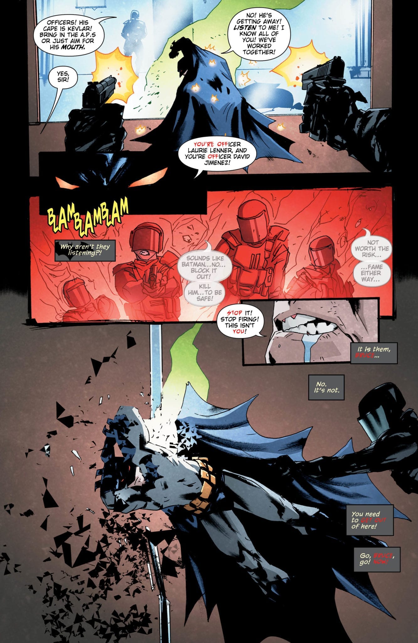
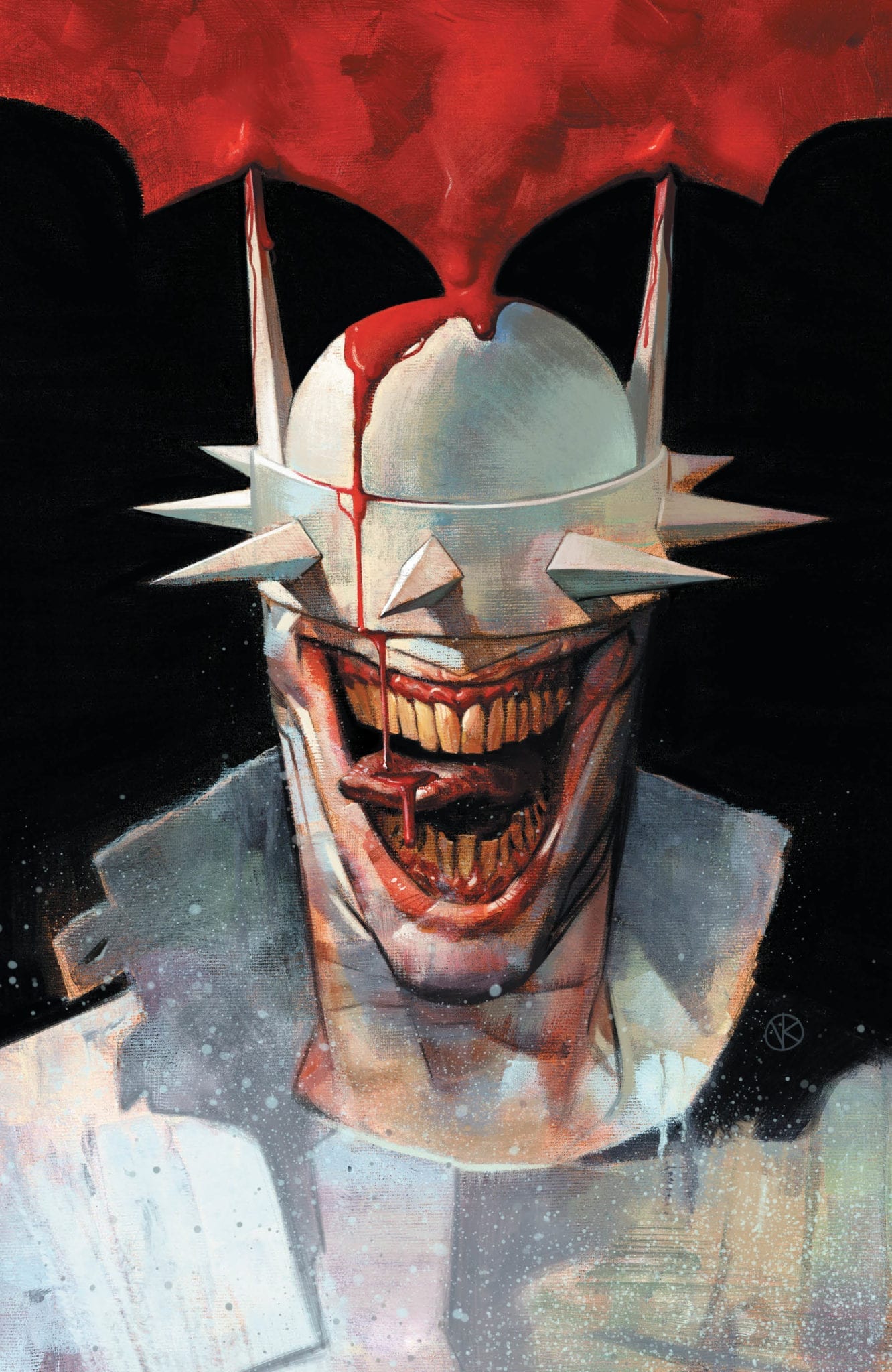
Damian is missing in action, leading Batman and Alfred to open Detective Comics #1003 with a citywide search operation. Meanwhile the Arkham Knight, holed up in her base beneath Arkham Asylum, reveals her identity to her captive. Only…Damian can’t seem to recognize her. This begs two questions: what is the Knight’s vendetta against Batman, and what is “The Eclipse” she keeps mentioning?

The Writing

The writing in this issue strikes a relative balance between action and exposition. After a brief standoff between her and Damian, the Arkham Knight promises him that Batman’s paths will cross hers again soon. This leaves the bulk of Detective Comics #1003 to the mission of cracking the Knight’s identity.

Although we know little about Arkham Knight, we actually learn a good amount about the character by what we see. The Knight has a code and keeps to it. This is her way of trying to establishing moral superiority in the conflict with Bruce. We also see the depths of the legion’s devotion to their leader. They willingly subject themselves to brutal punishment for defiance. All the while, they make cryptic references to a fanatical obsession with bringing “The Eclipse” to cleanse Gotham of Batman.

It’s clear that The Arkham Knight has the asylum under complete control, even recruiting inmates into her plan. She’s equal parts revolutionary, and doomsday cult leader.

Unfortunately, Detective Comics #1003 falls a bit flat in terms of story dynamics. While still compelling, the book’s emotional peak arrives around a quarter of the way through. Thus, the tension is not quite as high here as in previous issues, leaving this chapter feeling like a bit of an anticlimax.

Of course, Tomasi still manages to provide a hook on the last page, ratcheting the tension back up and ensuring you come back for the next issue.

Detective Comics #1003

The Artwork

Brad Walker’s artwork remains strong overall in Detective Comics #1003. His style is on point, and he hits the beats of the story nicely. I appreciate that he never rests on one image for too long. That said, there’s not as much striking imagery to sink our teeth into compared to other issues in this run. While imagery changes fast, there aren’t as many stand-out moments.

The comic doesn’t seem to flow as easily as other recent issues, either. Most of Walker’s illustrations are tightly-cropped and visually-similar. However, he repeatedly breaks the continuum of movement from one panel to the next. As a result, it can sometimes be difficult to follow along visually.

Fairbairn provides color duties for Detective Comics #1003. Like with our last issue, the palette he employs is an interesting choice, though it works well alongside Walker’s artwork.

Final Thoughts

While it doesn’t provide as much excitement as the last two issues, Detective Comics #1003 is still a very solid chapter in Tomasi’s ongoing story. It advances the narrative, keeps the reader’s interest, and makes you want to learn what will happen next.

Monkeys Fighting Robots Youtube

Review: BATMAN AND THE OUTSIDERS #1 is a Great Jumping on point!

Monkeys Fighting Robots

The Outsiders Take Center Stage!

The Outsiders have always been an odd group to me. Originally Batman formed the team when he no longer felt himself align with the league. The members consisted of heroes that were outside the norm. Heroes such as Metamorpho makes sense, as he’s more monstrous in appearance. Characters such as Katana and Black Lightning are characters that are definitely the norm and have even been apart of the Justice League. Years later I still don’t understand what they’re supposed to be other than just another superhero team. Now we have a new iteration of the group, consisting of older heroes and new ones. Will this new team change my opinion on them?

Batman and the Outsiders 1 cover

**Some Spoilers Below**


Story:

We open on two different views. The first involves a young woman, Sofia, who gets attacked by a mysterious Metahuman and is revealed to have superpowers of her own. The other is the actual Outsiders who are on a mission to stop a serial killer. While Orphan is still as calm and ninja-like as ever, Signal is on edge, demanding the senior members show up. Almost on cue, Black Lightning and Katana leap in and tear through this D-list villain. Lightning, who is playing the role of leader of the team, continues to question Batman’s reasons behind the team. Before he can turn his leadership mantle in, however, Bruce approaches the team with the next mission: find Sofia.

Batman and the Outsiders 1 p1

This first issue is a good one, especially for those who don’t know much of the team.  From the emotional baggage of Signal to Black Lightning’s leadership skills, any reader will be able to get a grasp of the characters that make up the Outsiders. One of my favorite moments in the issue is this interaction between Katana and Lightning on whether they should leave or not. It was a nice bit of dialogue and action that gave a look into their psyches.

There is one major problem to this issue, and it involves the title character. Despite the comic being labeled Batman and the Outsiders, there’s not much Batman in it. This could be seen as a benefit for the B-list heroes to get their time in the spotlight. The problem is Batman needs to have a more prominent presence than given here. This will probably change over time, but for this issue, it was off-putting.

Batman and the Outsiders 1 p2

Art:

The art for this issue is pretty good. The art team goes above and beyond to make the Outsiders look good both on and off the field. The action pops off the page thanks to impressive colorwork as well as capture genuine human emotions in the illustrations. If the team keeps up the good work, we’ll have a contender for best looking Bat-Family book.

Batman and the Outsiders 1 p3

Conclusion:

I was surprised at how well done the opening issue turned out. With few references to past arcs, a new reader can hop in without really needing too much context. The book also has the look to keep readers entertained thanks to the art team. If you’ve been wanting to get into the team, this is the perfect issue for you.

Monkeys Fighting Robots Youtube

Review: ICE CREAM MAN #12 Is The Noah’s Ark Of Space Horrors

Monkeys Fighting Robots

W. Maxwell Prince’s ICE CREAM MAN series knows how to throw curveballs to its readers, and issue #12 is no exception. The story is set in a post-apocalyptic future where humanity has annihilated itself through a combination of war, disease, and global warming. The only hope of a future lies in a pilot named Noah who searches the universe for a habitable “seed planet.” Will this re-telling of the Biblical Flood story end happily, or will the ever-elusive Ice Cream Man have something to say about it?

Story

The protagonist Noah serves as a modern-day archetype of humanity’s post-apocalyptic progenitor. Tasked with securing humanity’s future, it’s clear he’s using all his strength to withstand the tremendous pressure.

Noah searching the universe for a new earth

Unfortunately, it appears he rest of the universe may be unsuitable for life. But the last hope of the human race presses on. His desperation fuels an undying resolve to give humanity one last fighting chance. The unyielding faith in a brighter future is awe-inspiring.

The suspense starts to build when Noah’s A.I. “b0b” alerts him of hostile creatures in an upcoming asteroid belt. These are the Space Spiders of Gunz’llah, and they’re hungry for any ship metal they can sink their teeth into. These threats and a familiar face put Noah to the test as he races to find a suitable home for Earth’s fresh start before it’s too late.

Art

Martín Morazzo off-kilter drawing style does wonders for this issue’s storyline. His thin sketching captures the hopelessness within Noah’s expressions at the sight of the horrors he encounters traveling through space. Chris O’Halloran’s coloring helps Morazzo’s illustrative scenes transition easily with gradual transitions from the dark background of space to the brighter hues when the story calls for an action sequence.

Noah navigating space spiders and asteroids

Good Old Neon’s lettering does a great job a differentiating multiple lines of dialogue, including Noah’s, and even b0b’s. Each entity’s speech balloon is a different shape, with Noah’s being rounded to emphasize his organic composition and b0b’s being sharp like electricity to allude to his robotic nature. Even the narration/ship log has a unique dialogue box to draw the clearest distinction.

Morazzo and O’Halaloran’s main cover depicts Noah’s ship floating near Earth, which serves as a reminder of what the character is trying to rebuild. Tula Lotay’s variant cover gives us an up close and personal look at the nefarious Ice Cream Man. Streaked in a shade of orange eerily similar to the narration’s lettering boxes, one can’t help but suspect he might be pulling the strings.

Conclusion

ICE CREAM MAN#12 combines elements of horror, science fiction, and myth in a way that engages the reader throughout the whole story. It also serves as a sobering reflection of the destructive path our world is barreling down.

Did you think this issue captured the essence of sci-fi horror? Let us know in the comments below!

Monkeys Fighting Robots Youtube

Review: RONIN ISLAND #3 Takes The Byonin Head-On

Monkeys Fighting Robots

Weeks of battling the violent zombie-like Byonin has left Ronin Island devastated. But now that the situation appears to be under control, Hana ventures forth with General Sato in order to protect the rest of the region. The RONIN ISLAND saga reaches new heights with these events as Hana, Kenichi, and Master Ito leave their island and attempt to join forces with the region’s new shogun.

Story

Last issue Hana learned an important lesson while defending her island with Ito: One can’t claim to be “together in strength” if they’re not willing to look beyond their tribe. And seeing the nobility of Sato, however distorted through sheer haughtiness, motivates her to offer her samurai skills to his campaign against the Byonin.

Sato grants Hana his sword

In an astonishing act of good faith, Sato bequeaths an impressive samurai sword to Hana, claiming her own won’t be effective in the coming fight. This simple action speaks volumes; it shows how Sato values Hana’s abilities and tenacity above the superficial qualities of status and lineage Kenichi embodies. Greg Pak’s reversal of the stereotypical general image allows readers to sympathize with Sato, as well as Hana.

The anticipation of finally meeting the mysterious shogun will have readers gripping the edge of their seats. But will this ruler reward Hana in the same manner as Sato? And where will Kenichi play into all of this? These questions and more are set to be answered in this exciting issue.

Art

Giannis Milonogiannis’ pencils continue to astound readers with his depictions of the East Asian landscapes. Readers become fully immersed in the story’s coastlines, fields, and forests. In addition, Irma Kniivila’s transition from the quiet, cool colors of the island to the harsher, warm colors of the shogun’s encampment juxtaposes the safety of home and the riskiness of travel abroad.

Ronin Islanders leaving with Sato

Simon Bowland’s lettering completes the ensemble of inner artwork by using bold styling to place the focus on the story’s key words/phrases, such as “each other,” “whole world,” and “trust,” to name a few.

In addition, Milonogiannis and Msassyk’s main cover features Hana fending off a sword to show her fighting prowess and determination readers witness throughout the story. Ethan Young’s preorder cover takes another approach by featuring a detailed drawing Sato, who largely serves as a reflection of Hana’s own ideals. Kris Anka’s unlocked retailer variant cover emphasizes this notion further by using Sato’s image as a stand-in for Hana’s reflection.

Conclusion

RONIN ISLAND #3 gives readers a full-circle look at Sato’s character, showing his many similarities to Hana despite their superficial differences.

Where do you think Hana and Kenichi will fit into the new shogun’s regime? Let us know in the comments below!

Monkeys Fighting Robots Youtube

Review: THE BATMAN WHO LAUGHS #5 – Did Gotham Just Lose Its Soul?

Monkeys Fighting Robots

The Batman Who Laughs #5 hits your local comic book store this week, with Scott Synder, Jock, David Baron and Sal Cipriano pushing the Cape Crusader to the darkest corners of Bruce Wayne’s mythos.

Batman and the Batman Who Laughs continue to battle it out over the fifth issue of the mini-series, with the winner destroying or saving Gotham. Synder and Jock bring shock and awe to the pages of the comic as the series continues to get darker and darker. After re-reading issue one through issue five in a single sitting, the series is very dark and depressing in a lump sum (I had to get some ice cream before writing this review). The story is at that point of the “hero’s journey” where all hope is lost, and Snyder has me believing that there will be no happy ending for our hero.

The rain on the first page sets a tone that weighs you down and hits you on a deeper level. Snyder’s script is more like a eulogy than a table setter. Jock’s art is so raw that you feel every bullet that hits Batman’s cape. Five pages in, you are so emotionally exhausted by what just went down that you might need a week or two before you show another human being page six from The Batman Who Laughs #5.

The Batman Who Laughs #5 felt like Return of the Jedi at times. Snyder has turned into Emperor Palpatine, and he’s trying to persuade us to join the Dark Side. At this point, I can’t tell if Batman in this metaphor is Luke Skywalker or Darth Vader. Either way, Batman is as close as he’s ever been to embracing the Dark Side. Snyder’s tone for the Batman Who Laughs continues with a beat that is overpowering and smothers all light from a room. Thinking back on the issue, all I see is darkness and red letters.

Baron’s color palette makes The Batman Who Laughs #5 a gorgeous book with a vast spectrum of background color that invokes an emotional response. The green, yellow, and purple are powerful and elevate Jock’s storytelling. Cipriano’s letters are built upon the foundation of a mad man, multiple madmen at that, and everyone has a visually clear voice because of his work.

There are more profound concepts in the book about who Batman is and his relationship with Gotham, but Snyder and the rest of the creative team on the issue do such a fantastic job with the story, that I don’t think Gotham will survive. The Batman Who Laughs #5 pulls a Toy Story 3, in the fact that I thought the toys were going to die! This is how I feel about Gotham and Batman. Great storytelling is convincing readers of the emotional highs and lows of the series and The Batman Who Laughs accomplishes that feat.

Read the first five pages of The Batman Who Laughs #5 below.


Come back here after you read The Batman Who Laughs #5 and tell me what you think in the comments below.

Review: THE BATMAN WHO LAUGHS #5 - Did Gotham Just Lose Its Soul?

Review: THE BATMAN WHO LAUGHS #5 - Did Gotham Just Lose Its Soul?

Review: THE BATMAN WHO LAUGHS #5 - Did Gotham Just Lose Its Soul?

Review: THE BATMAN WHO LAUGHS #5 - Did Gotham Just Lose Its Soul?

Review: THE BATMAN WHO LAUGHS #5 - Did Gotham Just Lose Its Soul?

Review: THE BATMAN WHO LAUGHS #5 - Did Gotham Just Lose Its Soul?

Review: THE BATMAN WHO LAUGHS #5 - Did Gotham Just Lose Its Soul?

Review: THE BATMAN WHO LAUGHS #5 - Did Gotham Just Lose Its Soul?

Monkeys Fighting Robots Youtube

NEW AGENTS OF ATLAS Enter WAR OF THE REALMS

Monkeys Fighting Robots

Amidst all the chaos and insanity of War Of The Realms, a new team emerges. Greg Pak brings us the New Agents Of Atlas in the latest tie-in to Marvel’s extremely fun event.

NEW AGENTS OF ATLAS 1 CVR

***SPOILERS LIE AHEAD***


Our old friend Jimmy Woo is back within the pages of Marvel Comics to bring us the New Agents Of Atlas. This time he’s recruiting some of the up and coming heroes from the 616 before Malekith’s crusade forces them to band together.

War Of The Realms has been a wonderful crossover event hearkening back to when these huge stories were at their peak. It’s very fitting that now would be the time to resurrect a dormant title with an all-new team rising to face this universal threat.

The team’s lineup consists of a few faces you’ll recognize (Amadeus Cho, Cindy Moon, Shang-Chi) along with a handful of bad-ass women you may not be familiar with. War Of The Realms: New Agents Of Atlas #1 also marks the first appearance of Luna Show, a K-Pop superstar crime fighter. Crescent and Io make their comic book debut, coming over from the Marvel Future Fight mobile game.

Greg Pak is a veteran and absolute pro, this introductory issue is a very easy pill to swallow. We’re quickly introduced to a lot of characters but they all get their proper due enough to get the point across to the reader. There’s no fat in this issue, it’s straight to business and right into the action.

Gang-Hyuk-Lim also displays veteran talent, giving us an easily digestible and explosive first issue. Lim gives each new agent of Atlas distinctive characteristics and personality. The more this group develops into a team, there’s sure to be some wonderful looking action.

Colorist Federico Blee delivers a bright and upbeat display of color. Sindr and her forces specifically stand out with the color making the difference.

Kamala Khan is becoming like Spider-Man, appearing in title launches to get things off to a good start. Ms. Marvel is an absolute joy whenever she appears, her presence is the proper way to bridge the gap between Amadeus Cho’s tenure with the Champions into becoming an Agent of Atlas.

The only knock against the time each character gets is that we don’t get nearly enough Shang-Chi, but it’s for the purpose of getting a crash course in all the lesser known players. One of the biggest bad-asses in Marvel’s 616 is Shang-Chi, any time he gets a spotlight we’re likely in for a treat.

Shang-Chi’s relationship with Amadeus Cho could be an interesting one. After Cho’s recent Hulk rage episode he’s not as confident as we’ve come to know him. Shang-Chi telling him his worst nightmare is being charge makes for some juicy drama coming our way.

Pak chooses the forces of Sindr to square off against our Atlas heroes, a formidable foe. It’s revealed that Sindr actually tricked these elemental heroes into appearing in order to serve her evil agenda. The fact that this isn’t just a random collection of heroes facing a random horde of enemies bodes well for New Agents Of Atlas.

Cindy Moon (Silk) is an underrated character in her own right, it’s exciting to see Greg Pak plucking her from the unused character void and breathing new life into her. Silk has so much story left to tell after her brief involvement in both Dan Slott’s Amazing Spider-Man and Spider-Verse.

War Of The Realms: New Agents Of Atlas #1 properly resurrects and re-purposes a Marvel property that has been dormant too long. Greg Pak immediately proves he has a voice for a handful of underrated characters that deserve to be taken off the shelf (as well as some new ones).

Monkeys Fighting Robots Youtube

Review: MISKATONIC HIGH #2 is Scooby Doo Versus Lovecraftian Horrors

Monkeys Fighting Robots

Miskatonic High is a new, independently published, teen horror comic series by Mike Shea and Ryan Mendoza. For the uninitiated, the title is inspired by a fictional university (named after a fictional river) that frequently appears in the pieces of literature that make up H.P. Lovecraft’s Cthulhu Mythos.

In the first issue, Shea and Mendoza introduce readers to a small group of mismatched teens who attend the prestigious private school Miskatonic High. Members of the school’s community service club, the group takes a field trip to help clean an elderly woman’s basement. Shortly thereafter, they find themselves transported to ancient Egypt, where an evil sorcerer is attempting to unleash tentacled demons upon the world.

In this second issue of Miskatonic High, the group once again find themselves confronting a supernatural horror. Furthermore, a deep connection is made between one of the students and the terrors lurking beneath the surface.

** Some Spoilers Below **

Miskatonic High #2 Cover

Story

For Sarah Clarke, life at the affluent Miskatonic High had never been easy, being a poor, rural outcast. But when her friends come to help her on the family apple orchard, secrets better left unknown will be unearthed and she and her classmates will experience a terror in the dark.

It is apparent that writer Mike Shea was inspired by the hijinks of another group of supernatural mystery solvers when crafting Miskatonic High. The two published issues are episodic, with the stories more-or-less wrapped up by the final page. What Shea has done well thus far is slowly build upon the connection the group has with these Lovecraftian horrors coming to life, and the protectoral part that they will inevitably have to play. The most intriguing character is without a doubt Sarah, who is the social outcast among these misfits, and has a surprising link to the mole monsters the group encounters in the second issue.

Though the story draws inspiration from Lovecraft’s literary universe, that world’s air of dread and despair cannot be found in Miskatonic High. Instead, Shea opts for a fun and lighthearted tale. The characters are very upbeat, and deal with each situation with snark and a tongue-in-cheek attitude. Readers won’t be bogged down with too much exposition. Rather, you’ll be experiencing the scares and revelations alongside the “Mystery Incorporated” gang for the first time.

Miskatonic High #2 Page Sample

Art

Ryan Mendoza does a great job in balancing the light and darker aspects of Miskatonic High. His colors are slightly toned down, and he uses a muted golden overlay to light each panel with an otherworldly glow, as if something off-kilter is looming. He also makes great use of shadows to amplify the tension and potential terrors hiding around a corner.

Mendoza’s character designs are animated and expressive. He cuts into the tension created by the coloring with a style reminiscent of the wholesome, vintage Hanna-Barbera animation found in Scooby Doo and Super Friends.

Conclusion

Miskatonic High is a satisfying balance fun and frights, with snarky, nonplussed characters and exceptionally designed monsters. It’s for anyone who is a fan of Scooby Doo, and even modern incarnations of Archie and The Chilling Adventures of Sabrina. Come for the Lovecraftian horrors, stay for the fun characters and the dangerous mysteries to be solved.

The first issue of Miskatonic High is currently for sale on their official website. You can also support their already successful Kickstarter to get your hands on copies of the first two issues, as well as some other goodies.

Monkeys Fighting Robots Youtube

Review: Metal To The Extreme In The Finale Of MURDER FALCON

Monkeys Fighting Robots

After eight months of metal infused demon fighting, Murder Falcon from the Skybound imprint of Image Comics comes to a stage shattering end. Music and mayhem pack the pages with excitement but all good things must come to an end.

“It hurts to set you free

But you’ll never follow me

The end of laughter and soft lies

The end of nights we tried to die

This is the end”

The End by The Doors

With adrenaline pumping and a world breaking fight on their hands, it’s difficult to imagine  the members of Brooticus before they were heroes of the Earth. Their journey has been a long and difficult one and it has all been leading to this moment.

page art
Murder Falcon #8 Credit: Image Comics

Daniel Warren Johnson opens the final issue of Murder Falcon with a scene worthy of the best war movie, or possibly a Godzilla flick. The scale of the battle is illustrated on the second and third page by a momentous double page spread made even more impressive by the lack of dialogue and sound effect. This moment is just too big for words.

The scale of the battle is constantly referenced throughout making this a spectacular final issue. The pages of the comic are almost too small to hold the action and Johnson’s world shattering story. On a large number of the pages, the images simply bleed to the edge encompassing the reader in the vastness of the situation. Johnson tries at every stage to include the reader in the action, like a rock band encourages their audiences to sing along and dance. He wants this fight to be your fight as much as it is Brooticus’.

This engagement is important for the story because Johnson needs the reader to be emotionally committed to the characters. He has proven month after month that he can tug at the heart strings of his readers while surrounding them with the most outlandish of situations. This final issue is no different. As the reader becomes embroiled in the larger than life action, the type of End of the World battle that makes audiences shout out in support as seen in a number of the Marvel superhero movies, Johnson is laying the ground work for the emotional ending. And it is an outstanding piece of storytelling.

In such a short period, an eight issue run is not that long for a comic series, Johnson has made his characters so real and sympathetic that the fans are invested in band members. As such the final issue of Murder Falcon will make you physically gasp, shout out and cry.

interior art
Murder Falcon #8 Credit: Image Comics

The art work follows the tone of the story from page to page. The layouts are chaotic during the battle sequences but the panels become precise and contained for the emotional parts. It is the complex layouts that give the comic it’s clever pacing, pulling the reader along at such a speed that they are not ready for the emotional gut punches to come.

Mike Spicer follows Johnson’s lead by making the fight sequences full of vibrant colors. The lack of actual sound is replaced by the impression of music in the way that the color interacts with the surroundings. The backgrounds fluctuate and the panel boarders vibrate. Russ Wooton’s lettering weaves it’s way on and under the action, becoming one with the artwork. Even the speech balloons help with the storytelling, whether it’s using a tail to separate a character from a crowd or a small balloon lost in an oppressive image to emphasis a moment.

Murder Falcon has been a fresh and exciting comic from the moment the first issue hit the shelves. Johnson hasn’t held back and allowed his love of metal music to fuel his crazy story. But at every single step the characters have been the important aspect of his story: difficult to believe with a quick flick through but Jakes journey has been emotional and relatable. His fight against a natural disease over shadows all of the outlandish demons and mythical metal paraphernalia.

Murder Falcon has been about Jake facing up to the most difficult parts of his life. And the reader has been there every step of the way which is why this final issue is so spectacular and emotional.

Johnson and his team have created something exciting and different from anything else being released by the main comic publishers. The combination of music and mayhem gives this comic it’s edge but the heart is where the story is. Murder Falcon brought a tear to this reviewer’s eye and I expect that everyone who reads this comic will feel exactly the same.

Bravo, Murder Falcon, Bravo.

Now all that’s left are the cries for an encore!

cover art
Murder Falcon #8 Credit: Image Comics


Monkeys Fighting Robots Youtube

Review: INVISIBLE KINGDOM #3 Delivers A Sci-Fi Adventure With Hidden Depths

Monkeys Fighting Robots

A crew on the run and a lesson in religion greet readers in the third issue of the new sci-fi epic Invisible Kingdom from Dark Horse Comics. Combining an intriguing story with fantastic art work, can the Invisible Kingdom team maintain the high standard they’ve set in previous issues?

Writing/Story

With fuel running low and scout ships from the Lux company searching for them, Grix has to risk everything piggybacking on a passing comet. The situation becomes even more complicated when they receive the message from Vess who appears to have discovered the same ‘truth’ about the Lux company.

With two central characters questioning their life choices, G. Willow Wilson is able to shine a light into the darkness. By having the corruption within the system discovered from each side, both aspects of this sci-fi world can be examined from within, for better or worse. The reader is able to see how Wilson’s world functions and, in turn, question the real world in the same way.

Wilson isn’t making any grand statements in the Invisible Kingdom, but she is clearly demonstrating how easy it is to see only what those in charge want you to see. The leader of the religious organisation is manipulative and bully’s Vess while the Corporation can quietly eliminate those who stand against it.

The story in this issue is about bringing the central characters together. The staging is very straight forward: two set up sequences, one for each character, followed by the inevitable meeting. In a number of respects this issue of Invisible Kingdom reads like a chapter from a Firefly story. Grix and her crew have a definite Serenity vibe about them. However, Wilson is able to give her characters their own voices and establishes their characters very successfully. Both Grix and Vess are on difficult journeys and this comes across during the action.  The way they react to the situation that fate has put them in is very different but they ultimately want the same thing. Wilson clearly shows that the only way they can survive is by working together.

cover art
Invisible Kingdom #3 Credit: Dark Horse Comics

Art

The Invisible Kingdom offers Christian Ward the opportunity to draw outlandish space sequences and complex personal character moments; both of which he excels at. His style is bold and brash, especially with his chaotic colors splashing across the page, barely contained within the black panel boarders.

Ward chooses emotional representation rather than literal interpretation. In some panels the figures are merely shapes to represent their positions, with specific color patterns identifying which character is which. At other moments all other details fall away apart from the character in the foreground. This focuses the reader’s attention.

Ward isn’t afraid to create an alien landscape and this is achieved mostly through his colors. Standard bipeds are turned into alien creatures simply by the color choices Ward makes. This makes Invisible Kingdom stand out from the crowd. While others strive for a realism in their fantasy and science fiction, Ward and Wilson embrace the alien-ness of their world. It still contains echoes of the world around us but looks so different it becomes fascinating and intriguing.

Even Sal Cipriano adopts the out of this world approach when producing the lettering. The sound effects are rendered in a range of colors that pop from the page. In a number of cases they cross the panel boarders and the gutters, encroaching on the other panels around them.

It is interesting to note that for a comic with such a unique visual style, for the most part it is only the sound effects that break the conventions of the comic book structure. Most of the imagery is contained within the ridged format of the panels, boarders and gutter. In the world of the Invisible Kingdom it would appear that only sound has the power to break convention. The rigid structure is needed in this instance to contain Wards artwork. If the boarders were broken regularly the storytelling aspect of the comic would be lost. To compensate for this the sound effects have a life of their own, reminding the reader of two things: firstly that they are in fact reading a very structured comic and the implications of that; and secondly that the story is about breaking conventions in small, seemingly insignificant ways.

Conclusion

There are many layers in Wilson and Wade’s Invisible Kingdom. There is a space opera style story, which will be familiar to many fans of science fiction. The combination of religion and outlaws on the run forms the backbone of some of Sci-Fi’s greatest stories, just take a look at the Star Wars franchise and the exceptional manga series Akira.

To accompany this are the amazing visuals from Ward which dare to be something different to everything else on the self.

And underneath it all is a commentary on a range of topics such as the structure of society, the struggle against personal convictions, and even the formality of comic books themselves.

It is easy to compare Invisible Kingdom to other comics such as Saga or the Firefly series but this is very different to those series. Wilson and Wade are using their respective languages to create something different. It has a sublime beauty and a deeper meaning that stretches beyond simple entertainment. Each page is a work of Art: beautiful, engrossing and challenging.


Monkeys Fighting Robots Youtube

Review: A Satisfying Conclusion In ALIENS RESISTANCE #4

Monkeys Fighting Robots

The conclusion to Dark Horse ComicsAliens Resistance story line hits the shelves this week. It has merged the comic book world with the gaming world by uniting two central characters from each aspect of the franchise. Brian Wood’s reluctant hero Zula Hendricks has battled beside Amanda Ripley, the desperate heroine from the Alien Isolation video game.

What fate is in store for these two women and can Wood finally bring some Xenomorphs into his story?

Writing/Story

Trapped on the classified moon as the day ebbs away, Amanda and Zula have to protect each other, keep the young Alec alive and reach the extraction point while an army of Aliens close on their position.

It is all out action as Brian Wood finally gives the reader an alien threat worthy of the franchise. The character development comes via the reaction to the desperate situation and Wood uses the fight for survival to highlight the best qualities of both Amanda and Zola.

Over the course of this series Wood has broken the characters down for the reader, showing off their different qualities. In this, final, issue of Aliens Resistance Wood brings all of that previous work together to show the reader exactly who these women are. By the end you are rooting for them 100%.

This story hasn’t been about the xenomorphs, not directly. Their absence has been obvious at times, leaving the comic with an alien sized hole it just couldn’t fill. However, this final issue brings the series to a close wonderfully. It focuses on the characters and compares the survival instinct against the need for vengeance. Like most of the best Alien stories, Aliens Resistance is about the human factor.

Aliens Cover
Aliens Resistance #4 Credit: Dark Horse Comics

Art

As the action picks up so does the dynamism of the art work. Whereas some of the earlier issues have been a little static, this is not true here. Robert Carey creates engaging compositions for the panels. Combined with an ever changing layout, the pace is much faster than previous issues and the reader skips from page to page until one moment where the script and the art slows the momentum down.

Carey creates an impressive sense of space. The vastness of actual space and the isolation felt by the cast is depicted in a number of different ways, shifting from large, non-descript backdrops to imposing dark foregrounds. Even during the quitter moments of the plot, the human characters are over shadowed by the scale of the location.

The color work plays a great part in this. Dan Jackson employs the use of light to change the mood within a panel. For some of the obvious, informative, pages the colors are crisp and bright allowing the information to be relayed. Other scenes, however, are color washes playing on emotion rather than exposition. It is during these scenes where the reader truly connects with the characters. The horror of the chest-busters is visual but hard to identify with but the loneliness and isolation of the characters is something that the reader can empathise with. Jackson captures the isolation of the characters succinctly with a single color wash over the heavy black inks.

The lettering is just as succinct. There is a clear definition between the speech balloons, especially when the characters on the moon are speaking to Davis on the orbiting spacecraft. A simple break in the boarder of the speech balloons, which is carried over to the caption boxes on certain pages, make the conversations easy to follow.

Nate Piekos has also expertly positioned the speech within the pages to lead the reader from top to bottom. This makes it pleasurable to read, especially in the conversation heavy middle sequence. Despite the pace of the comic slowing considerable at one point Piekos keeps the reader’s attention by breaking the speech up into less overwhelming, bite sized chunks.

Alternative Aliens cover
Aliens Resistance #4 Credit: Dark Horse Comics

Conclusion

As a series, Aliens Resistance has had its highs and lows. The lack of actual xenomorphs throughout the four issues has been frustrating, especially as nothing has really replaced them to create the kind of tension you would expect from an Aliens comic. However, the ending is very satisfying as Wood brings everything he has set up with the characters to a head. This issue, even with the Alien threat ramped up, proves that Wood was only concerned with characters and not interested in writing an action comic.

Out of the four issues of Aliens Resistance, this final one is the most successful. The plot, the characters and the art have all finally come together as a whole making for a satisfying and enjoyable read.

Monkeys Fighting Robots Youtube