Home Blog Page 433

FUTURE FOUNDATION #1 – Powers Siblings Join The Team

Monkeys Fighting Robots

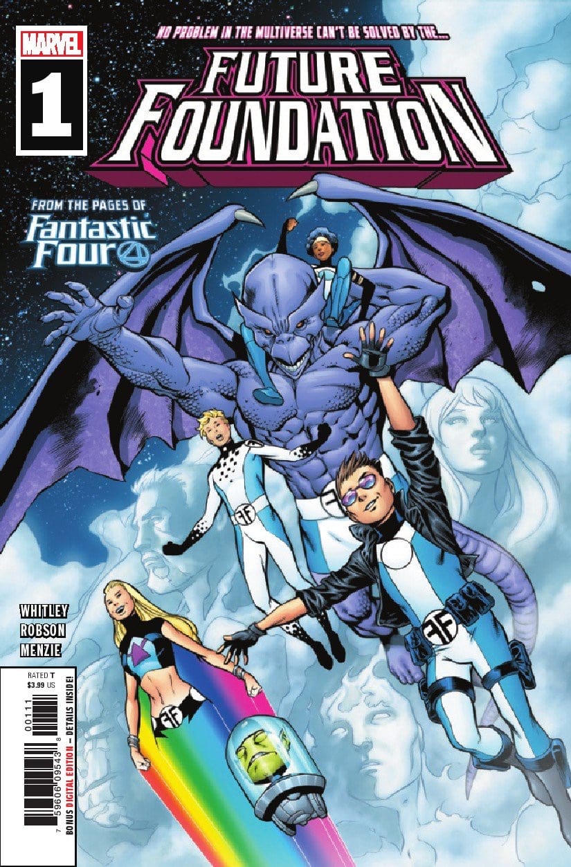
Spinning out of the pages of FANTASTIC FOUR this week is the newest incarnation of FUTURE FOUNDATION. There’s plenty of juicy sci-fi plotting in this debut issue, but not without some visual growing pains.

FF 1 CVR
NOW WITH RAINBOWS!

***SPOILERS LIE AHEAD***


Alex and Julie Powers (from Power Pack) join the Future Foundation in leadership roles. They, along with the usual suspects, are joined by Yondu to execute a prison break. The mission statement of Future Foundation is to scour the multiverse for pieces of their friend, Molecule Man.

Written by Jeremy Whitley, the plot of Future Foundation #1 has more in common with an issue of Guardians Of The Galaxy than the FF we’re used to–and not just because Yondu is hanging around. Not having the Richards kids along this time could’ve been a major detriment to the book but Whitley slots the Powers siblings in to soften the blow.

Bentley-23 stands out as the arrogant MVP of the group, carrying over from the time we spent with these characters before. Onome looks to be a match for Bentley in the area of scene stealing. Leech is adorable.

The Moloids and Dragon Man don’t get as much face time as the Powers siblings, which may not be appreciated by fans of the FF. Alex and Julie Powers are interesting characters, Whitley seems to have a handle on them both.

THE COSMIC AMAZING BAG MAN

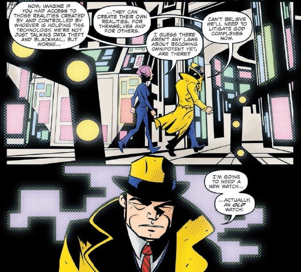
There’s a handful of fun sci-fi and engineering moments from this group of young geniuses, but not much on the action side. However, a case of mistaken identity leads the young heroes into the path of alternate dimension Reed Richards–which is a wonderful antagonist choice.

The Maker is one of Marvel’s most underrated villains. The evil Mr. Fantastic, leftover from the Ultimate Universe, elevates every story he’s used in. Facing off against a think tank handpicked by the 616’s Reed Richards is very exciting.

If a theme had to be plucked from Future Foundation #1, it would probably be that of growth. These are characters taking a step forward on their own. Both the new leadership and remaining undergrads from FF should be coming into their own without the Richards family holding their hands–further solidifying The Maker as the perfect adversary.

Will Robson is our illustrator (and 1/2 of ink duties), Greg Menzie our colorist, with Daniele Orlandini providing the other half of the inks.

While the cartoon approach to the art’s tone is accomplishing what it set out to, it definitely takes away any edge this sci-fi adventure could have. The light tone and bubble-gum appeal may work for some but also be a deterrent for those coming into Future Foundation from Fantastic Four.

IN SPACE, EVERYONE CAN SEE YOU HAVE HORSE HOOF FEET

The team’s costume designs are a bit busy. The sleek and simple design of the previous incarnation (Hickman’s FF), was iconic. Future Foundation‘s branding aesthetic takes a hit with the addition of the Powers siblings.

All of the aliens and creatures look stupendous, the art style suits them very well. Leech, the Moloids, and the Uhari are all both adorable and interesting. It’s the humans that readers may have a hard time adjusting to.

The Maker’s final page reveal doesn’t hit as hard as it should due to the art. The cartoon style sucks away the character’s menace and gives him too much of a youthful appearance.

All-in-all, Future Foundation #1 starts us off with a script worthy of exploration. Coming straight from Fantastic Four, readers will have some growing pains but should be able to enjoy themselves. The cliffhanger hook promises a showdown Fantastic Four fans aren’t going to want to miss.

Monkeys Fighting Robots Youtube

Review: DICK TRACY FOREVER #4 Storms Blindly Into The Future

Monkeys Fighting Robots

Crime still plagues the streets as Michael Avon Oeming takes readers into the future with IDW’s Dick Tracy Forever this week. Future Tech, classic crime fighting, and plot twists abound in this final issue of the great detective’s adventures.

The last issue of Dick Tracy Forever ended on a jaw dropping reveal: Tracy awoke from a Matrix like simulation to find himself in 2031, surrounded by a cast of familiar faces. This issue picks up directly from that reveal, after a brief recap of the main characters and how they have changed physically over time.

DICK TRACY FOREVER #4 Storms Blindly Into The Future
Dick Tracy Forever #4 Credit: IDW Publishing

Forcing Tracy Into The Future

Tracy is suffering from a form of technological jet lag which allows the rest of the cast to bring him up to speed on their current case. As the nature of the crime is revealed, so are the emotional lessons that Tracy has learned on his mind boggling journey.

Oeming’s script is heavy handed in the opening pages of this issue, hammering home Tracy’s views on family and the Law. Philosophical questions about the nature of life and God are raised but dealt with curtly by Tracy’s brisk manner. In some places it feels like these ideas are brushed away too quickly despite being the heart of the story Oeming is telling.

There is a feeling that the story is rushed with a desperate need to include all of the references that Oeming wants to get in before the end. He has to pay homage to so many characters and elements from the original comic strip that the narrative focus is lost. Jammed within the references and future technology are some wonderful scenes that are very Dick Tracy in style. These are the moments that shine in this comic and go to show what Oeming could achieve if given more time to establish his stories.

DICK TRACY FOREVER #4 Storms Blindly Into The Future
Dick Tracy Forever #4 Credit: IDW Publishing

Future Art

Just like Chester Gould’s original strip in the 1960’s, part of the charm of Dick Tracy is lost when too many science fiction elements are added. Gould began to lose his way with the introduction of Moon based continuities and the serial drifted away from the police investigation to Flash Gordon style adventure. In this issue of Dick Tracy Forever, the influence of alternative realities and super computers have diluted the interesting and unique features of a Tracy story. It is kind of fun, like a novelty, throw away comic, but is not as compelling as the first couple of issues, or the original strips.

Oeming’s artwork is still as bold and brash as previous issues. There are moments where he appears to be channelling Frank Miller’s Sin City in stlye with heavy black lines and panels drowned in shadows. At other times, the characters look like they have escaped from Futurarama. The mix of comedic and serious panels makes some of the transitions awkward and the panels appear cramped especially with the amount of speech Oeming gives the characters.

DICK TRACY FOREVER #4 Storms Blindly Into The Future
Dick Tracy Forever #4 Credit: IDW Publishing

Shawn Lee does an impressive job of placing the speech balloons around the action in the panels and manages to give the lettering some character. The use of different shaped speech balloon’s help greatly in this, unfortunately Lee cannot disguise the vast amount of text filling each page. Speech heavy scripts can work, and a character like Dick Tracy lends himself to such comics, however the contrast with the mad cap science fiction narrative is an uncomfortable juxtaposition in places.

The use of bold, flat colors is a prime example of something that works for part of the comic but causes problems at other times. Taki Soma’s blocks of color are striking on some pages, making the character’s pop from the page. But when the same approach is applied to the backgrounds, the overall effect is too much and the emphasis is not strong enough.

Conclusion

Dick Tracy Forever is a fun science fiction comic but the heavy handed script doesn’t allow the reader to become engrossed in the story. The constant references and busy panels act as a barrier for the reader so a lot of the beauty and commentary is lost. This final issue is a disappointment because Oeming has already proven he can tell a good Dick Tracy story.


Monkeys Fighting Robots Youtube

Review: ABSOLUTE CARNAGE #1 Raises The Bar For Crossover Events

Monkeys Fighting Robots

With the release of Absolute Carnage #1 (on sale August 7th,) Marvel Comics brilliantly dives into the deep end with the introduction to its latest expansive crossover. From the first page, the creative team of Donny Cates and Ryan Stegman exceed expectations in their delivery of an opening salvo to this ambitious comic event.

Absolute Carnage #1

Writer: Donny Cates

Penciler: Ryan Stegman

Inker: JP Mayer

Color Artist: Frank Martin

Letterer: VC’s Clayton Cowles

Absolute Carnage #1
Absolute Carnage #1 is a wild ride from the first line.

Not Your Typical Opener

Enough with the slow-burn mysteries. We’re all tired of those event stories that never take it to the next gear. But, other than War of the Realms, most recent crossovers have suffered from that flaw. Thankfully, whether you like the story itself or not, there arew few, if any, dull moments in Absolute Carnage #1. The issue is packed with plot development and, though chaos is sure to throw fans for a loop, there’s a clear narrative direction for the event by the end of the issue.

Naturally, some page space is devoted to exposition; expecting non-Venom readers to easily follow along with the character’s complex mythos would be a tall task, so writer Donny Cates succinctly summarizes some of the major plot points from Eddie Brock’s solo series. With a comic with over 60 pages of story, taking some time to provide readers with a crash course on the main protagonist benefits the overall plot because it offers us a chance to breathe.

Most crossovers wait until the third or fourth issue to hit the accelerator. Not Absolute Carnage.In this opening installment, Cates mixes together an army of symbiote-covered inmates, a substantial Spider-Man cameo, a maniacally homicidal Norman Osborn and more. Plus, the writer doesn’t pull any punches when he reveals that this story will impact the entire Marvel Universe. Brock reveals that Carnage is targeting anyone who has ever worn a symbiote. As Spidey wisely points out, “that’s a long list.” Cates recognizes the long line of Venom-based crossovers and symbiote-centric events and clearly hopes to surpass them all.

As Intricate As A Spider’s Web 

Absolute Carnage #1
Absolute Carnage #1 is an accessible crossover story but it also incorporates a number of elements from Cates’ Venom.

Though Absolute Carnage #1 works as a general Marvel story, it’s also the culmination of over a year’s worth of storytelling. The issue organically progresses Cates’ stories in Venom and other related miniseries because it ties in a number of important characters and plot points. First, the Maker, or Ultimate Reed Richards, plays an influential role in the story. Ironically, the Venom villain has the power to help the heroes win this war but it’s unclear whether he’ll help his foe in the long run. Then, Cates brings in the Grendel, the dragon that Brock fought earlier in his solo series. Combined with a brief mention of Rex Strickland and the inclusion of Brock’s complicated relationship with his son Dylan, these elements clearly showcase Cates’ fingerprints in the story. For fans who have been reading Venom from the beginning will likely appreciate these references while other readers might feel encouraged to start catching up on the series.

Those Facial Expressions Though

Absolute Carnage #1`
Ryan Stegman conveys powerful emotions in his facial expressions, which elevate the story to new heights.

Throughout Absolute Carnage #1, Ryan Stegman’s art makes the reader stop and stare. The setting of a fiery hellscape in a New York City subway station, the perspective of Carnage’s towering god-like frame over Venom or the gory horror movie-like bit where Norman Osborn rips his gooey chest open are just a few examples of Stegman’s art working wonderfully with the story. But above all else, Stegman’s facial expressions carry the issue.

Whether it’s Brock’s desperate hatred of Carnage, Cletus Kasady’s Joker-like grin or the depravity in Norman Osborn’s eyes, Stegman powerfully shows the reader what the characters are feeling. As a result, time and again, the heroes and the villains seem like real people despite the nightmarish plot elements.

Absolute Carnage #1
The impact of Stegman’s facial expressions can’t be overstated.

In most cases, JP Mayer’s inks and Frank Martin’s colors make the facial expressions, and the overall art, even more impressive. Their usage of dark red blurs the lines between blood and Carnage’s symbiote when Norman Osborn, infected with the vile goo, appears. When Eddie Brock tries to kill Carnage early on, Meyer and Martin subtly show tears brewing in Brock’s eyes. These skillful touches make the art even more eye-opening. Letter Clayton Cowles also complements the story; using distinct blacks, grays and reds, he gives each main symbiote (and host) an individual voice. This effect is particularly notable when Brock talks to his symbiote. These small artistic choices combine to breathe the story to life.

Absolute Carnage #1 knocked it out of the park. It’s hard to think of any hypothetical substantial improvements for this issue. It’s too early to give a definitive verdict on the series but, as of today, it’s clear Marvel’s newest event is another winner.

What’d you think of Absolute Carnage #1? Where do you hope to see the story go from here?

Monkeys Fighting Robots Youtube

Review: SPACE BANDITS #2 Offers Intensely-Entertaining Sci-Fi Prison Drama

Monkeys Fighting Robots

There’s no foundation for a friendship quite like a mutual desire for revenge.

In Space Bandits #2, we see Cody adjust to life on The Crustacean. Thena, for her part, offers advice to help her get by and stay out of trouble. Their relative adjustment doesn’t mean they’ve forgotten their mission, though. Cody seems convinced that the prize fight is her best way out, but Thena has another plan in mind.

The Writing

Our first issue was like the introduction to a classic western, providing the preamble and laying out the betrayals that motivate the plot. Here, the story develops into more of a prison yard drama-meets-jailbreak story.

It’s been two years since Thena was first sent to The Crust, and with her knowledge of the politics and manners of the place, she does her best to help Cody adjust. We don’t have much of a sense of genuine friendship between the two at this phase of the narrative, though. Instead, they feel like convenient allies, meaning there’s not much pathos built through their interactions. In truth, there’s more sentiment devoted to Thena’s relationship with Cosmo the lizard, than with Cody. Still, their interactions are humorous, and ultimately drive the narrative forward well. They bond over their shared desires for revenge, and that’s enough for now.

Speaking of driving the narrative, the story in Space Bandits #2 moves at lightning pace. Only ten pages elapse between the point at which we learn Thena may have a plan, and the point at which they execute it. The story carries momentum without feeling overly-rushed. What this issue may lack in character development, it largely makes up for with compelling action.

The only real complaint is that there is so much going on, some ideas seem to get a little buried. For instance, Millar notes that the governor streams the bloodsport in The Crustacean throughout the galaxy as a form of entertainment, making a fortune off the slaughter. This could be an interesting avenue for the plot, lending poignant critique of the prison-industrial complex, but it doesn’t seem to come up again. Similarly, the politics within the prison are alluded to, but are primarily used as a plot device to aid Thena and Cody in their escape attempt.

Regardless, the writing is snappy, engaging, and very satisfying.

Space Bandits #2

Space Bandits #2 Space Bandits #2

The Artwork

You could pull any panel from the book, blow it up and hang it on the wall as a piece of cyberpunk artwork. Great as it is in isolation, Artist Matteo Scalera doesn’t overlook the need to match the energy of the storytelling.

The visuals in Space Bandits #2 carry a tremendous amount of momentum from one panel to the next. The work is rich, stylized, and sizzles with energy. The final product remains very coherent, though; the reader never feels lost or unsure of what’s conveyed in any given panel.

Scalera has a real knack for visual narratives. It’s not easy to portray alien worlds in a compelling and unique way, while still remaining familiar enough to make the story coherent. His work in Space Bandits #2 achieves this delicate balance, though. Figures as abstract as a three-dimensional, sentient algorithm feel rooted in this world alongside their human parallels.

Scalera conveys a lot of context and meaning through facial expressions. A subtle raising or lowering of an eyebrow illustrates a complex set of emotions. To achieve such expression with such subtle shifts in expression is a sign of a highly-skilled artist at work.

Colorist Marcelo Maiolo’s work plays a key role as well. He employs a bright, ambitious color palette; lots of reds and oranges to match the emotional tone of the book.

Final Thoughts

Space Bandits #2 continues on the strong trajectory set by our first issue in the series. I expect great things yet to come from this book. Get it August 7 at your local comic book shop.

Monkeys Fighting Robots Youtube

Review: DESCENDENT #4 Successfully Melds Humour And Intrigue

Monkeys Fighting Robots

This week Stephanie Phillips breaks open the conspiracy at the heart of her comic from AfterShock Comics, Descendent, and introduces the horror behind the scenes.

This chapter of the story may be called ‘Worst. Stakeout.Ever’ but that does not ring true for the reader. Descendent issue 4 is packed with action and suspense, and as the narrative unravels the true horror shows it’s face.

DESCENDENT #4 Successfully Melds Humour And Intrigue
Descendent #4 Credit: AfterShock Comic

Descendent Story

Stephanie Phillips proves in this issue how clever she is at building stories. Not only does she start to tie together the various plot threads from previous issues into a coherent whole but the narrative structure in this single issue is captivating. She flicks between scenes and time periods in order to produce the greatest impact, building the tension on every page.

The opening leaves a cliff-hanger which gets resolved later on but that sense of dread prevails over everything else, even the comedic moments. And this is Phillips strength; she is able to keep the prevailing atmosphere alive while indulging in some character development. The growing relationship between David, Amanda, and Jo is a delight to read. Phillips has created three very different characters who have been forced to work together and the way they interact gives the comic it’s entertainment value.

Each of the central cast have very distinctive voices which can be heard through their speech. David provides the much needed comedy that holds the rest of the story together. By making the reader identify and become attached to David, and through him Amanda and Jo, Phillips is making it easier to introduce the more outlandish aspects of the plot. As a reader you are sold on the story through these great characters.

DESCENDENT #4 Successfully Melds Humour And Intrigue
Descendent #4 Credit: AfterShock Comic

Descendent Art

The plot moves at quite a pace in this issue. The conspiracy is opening up, David and Co have an idea of what is happening, and the villain behind it all has finally shown her face. To illustrate the fact that the plot is now moving at breakneck speed, Evgeniy Bornyakov has injected a healthy dose of energy into the artwork.

The opening scene is a wonderful establishing page. The fear and desperation of the running girl is clear and the panels build up on top of each other to highlight the growing urgency of the situation. Bornyakov zooms in on each panel, distorting the elapsed time and putting the reader into the centre of the action. He then continues to do this throughout this issue.

His composition and framing brings out the very best of the character’s interactions and the bound that is growing between them. In contrast the villains of the piece have a distance between them that is only crossed with acts of violence.

The contrast between the two sets of characters becomes more vivid thanks to Lauren Affe’s coloring. David and Co have a warm, light color pallet for their opening scene which makes it stand out from the surrounding action. There are cold blues and imposing shadows for Sarah Gedney’s introduction and striking reds and oranges added for the Cult’s meeting.  This juxtaposition of coloring tells the reader everything they need to know about these people and their situations.

The lettering provided by Troy Peteri helps to pace the story across the pages and acts as a focal point to lead the reader across the page. The small sound effects stand out from the action creating a definitive impression of sound. They add weight to the actions because of the stark contrast to the images behind them.

DESCENDENT #4 Successfully Melds Humour And Intrigue
Descendent #4 Credit: AfterShock Comic

Conclusion

There are some inconsistencies with the balloon placements, especially where they butt or break the boarders of the panels. There are also some questionable panels where the energy of the image isn’t quite captured by Bornyakov’s art. However, the strong narrative and superb character work rides over these small flaws to produce a more than satisfying chapter in the series.

Descendent #4 is an intelligent comic that stands as a single issue but also reflects on what has come before. The art work for the most part is captivating and draws the reader into the story. The cliff-hanger ending for this issue is a real show stealer and, no matter what faults you may have found earlier in the issue, the final splash page is a guarantee that you will be back next month.

Monkeys Fighting Robots Youtube

Advanced Review: A War On Magic Is Waged In TOMMY GUN WIZARDS #1

Monkeys Fighting Robots

On August 28th Dark Horse Comics invites you to the Windy City for a dance, a drink, and perhaps a magical battle with the local mobsters. This is Tommy Gun Wizards and it is about to rewrite everything you know about Elliot Ness and the Untouchables.

Chicago, 1931 and the speakeasies are packed with revellers out for some fun and maybe something extra: a touch of magic. In this alternative world, the 20th century party city is awash with a new drug that imbues the taker with magical abilities. In small doses it can help the user bulk up without the working out, spend an evening invisible, or just relax in a bath of infinitely warm water. However, like all drugs, addiction and overdose are real dangers and, take too much, the user can become a ‘boiler’: a danger to themselves and everyone around them.

This is the world created by Christian Ward who has passed over art duties to Sami Kivela so that he can concentrate purely on writing. Ward has drawn historical figures into an alternative reality where Magic has replaced Alcohol as the reason for prohibition in one of the most infamous periods of American history. The influence of great movies such as the 1987 classic The Untouchables is obvious but Ward has added a new spin to the gangster genre. He has moulded fantasy and science-fiction with history to produce something that is not only entertaining but also plausible: like George R R Martin’s superhero inspired Wild Card series of books.

A War On Magic Is Waged In TOMMY GUN WIZARDS #1
Tommy Gun Wizards #1 Credit: Dark Horse Comics

Creating The Chicago Scene

Chicago is a city of conflicting moods, a tone captured from the very beginning. Kivela’s art work focuses on one character as he walks through the street. This character is the readers entrance into Tommy Gun Wizards and we follow him through the streets of cold, huddled extras surrounded by news print posters of crime stories and murder. This walk through the rain is broken by panels of religious preaching, a cliché of gangster movies maybe but also an important aspect for the story.

The priest’s words set the scene, giving the reader a lot of information about the world that they are entering. The priests first words are “Ladies and gentlemen this is not our America,” the emphasis in the lettering by Hassan Otsmane-Elhaou is on the word ‘our’. This is a truth and is spoken directly to the reader. The world is familiar but also very different.

A War On Magic Is Waged In TOMMY GUN WIZARDS #1
Tommy Gun Wizards #1 Credit: Dark Horse Comics

Laying Out The Tommy Guns

Kivela’s art work is extremely detailed with panels of packed images. There are a number of crowd scenes populated with an array of extras which constantly reminds the reader about the size of the city and the scope of the story. However, Kivela also knows when to reign in the backgrounds, simplifying them or dropping them altogether to focus attention onto a single figure.

The layouts also emphasis the action within the panels either by bleeding to the edge of the page to have a more dramatic punch or by limiting the number of panels on the page and leaving large areas of white.

On one page, for example, the panels taper in size towards the bottom of the page, ending in a single square panel featuring a small glass and hand. The speech informs the reader that the glass contains ‘Lick’ the source of the magic in Tommy Gun Wizards. This is a pivotal point in the comic as it is the reader’s introduction to the magical element and the source of difference between the real world and Wards’ creation. To mark its importance, the page draws the reader directly to it and leaves it standing alone on a tier, surrounded by white space.

This is a prime example of the precision storytelling that is evident throughout Tommy Gun Wizards. Each of the creators works together to create the relevant ambience or focus for each page. The characters are built from the script and the acting that Kivela draws out of them. The mood is set by the composition and the coloring, here handled by Ward and Dee Cunniffe. The tone of a page is often set on the establishing first panel with the coloring of that panel feeding through the rest of the page. Action sequences are distinctively red where as heavy conversational, bureaucratic scenes have a much more subdued brown/yellow coloring.

A War On Magic Is Waged In TOMMY GUN WIZARDS #1
Tommy Gun Wizards #1 Credit: Dark Horse Comics

Speaking Easy

Just like Jonathan Ross’ first venture into comics with Turf in 2010, Tommy Gun Wizards packs a lot into a single issue. There is a lot of speech for Otsmane-Elhaou to fit into the panels but, as a master of balloon placement, this is not a problem for him. During a press conference the speech hangs heavy in the air as it is the most important aspect of the scene whereas in action sequences the speech draws the reader around the panels to allow for the most exciting reading.

There is even a back-up strip written and illustrated by Christian Ward. This will, over the coming months, give the reader some background to the magical element and why the world is so different. This part of the comic is more science-fiction. It looks and feels like a spin off from the Invisible Kingdom, another superb comic Ward works on. The backup story adds new elements to the overall story and gives it an extra edge.

Tommy Gun Wizards is a mix of genre, inspired by the very best gangster stories but pulling in so much more. It’s larger than life in places, especially as the story gets going, but the characters are rooted in a world the reader can understand and empathise with. And there are some great characters in this comic. The villainous Candice is a brilliant creation and beautifully designed.

This comic powers through the story barely allowing the reader to get adjusted to this reality but the strength of the storytelling grabs hold of you and doesn’t let go. This is without question a must for fans of gangster stories. It is also for fans of fantasy, science fiction, horror, and good all-round comic book storytelling.

A War On Magic Is Waged In TOMMY GUN WIZARDS #1
Tommy Gun Wizards #1 Alternative Cover by Declan Shalvey
Monkeys Fighting Robots Youtube

Review: SONS OF CHAOS Is An Epic Tale Of Revolution

Monkeys Fighting Robots

Sons of Chaos is out now from IDW, and it’s an epic, gritty tale of war, independence, and betrayal, all based on a true story.

The graphic novel is by writer Chris Jaymes and artist Ale Aragon. Hi-Fi Design did the colors, Pablo Ayala did the letters and the map, and Mariah Huehner edited the book. The cover is by Dave Palumbo. The story itself is credited to both Jaymes and Jordan Beckett.

Chaos is set largely in 1821 during the Greek War for Independence, “a conflict that quietly influenced the entire world.” It’s the story of Marcos Botsaris, the son of a Greek leader who was taken prisoner as a child by one of the Ottoman Empire’s most villainous pashas.

sons of chaos review

But before even discussing the story or the art, we have to praise the format of this book. It’s put out in this beautiful, oversized hardcover format. The panoramic format of the pages gives the story a wide-screen, cinematic feel. The layout allows you to take in every gory detail; it almost feels like you’re reading the storyboards for an epic film the likes of Ben-Hur or Gladiator. Much thought was clearly put into the presentation of this story, and it shows.

The story itself has already drawn comparisons to Game of Thrones, 300, and Les Miserables, and those are all apt comparisons, but Sons of Chaos also feels completely like its own thing unto itself. Jaymes has written a captivating story, with plenty of twists and turns to keep you reading, and enough tragedy to make Shakespeare gasp. These characters are put through hell.

Sons of Chaos is first and foremost a war comic, and a brutal one at that. Jaymes and Aragon do not shy away from showing how savage this conflict was. Aragon’s art has a sketchy, edgy style to it that’s perfect for this story. It’s raw and realistic; it feels historical. The pages literally look to be stained by blood. If you were asked to close your eyes and imagine what a comic of the Greek War of Independence would look like, Aragon’s art is what you would see. 

sons of chaos review

Ayala’s letters have the same effect. His caption boxes have uneven borders. The sound effects have rough edges, and the dialogue looks handwritten. Hi-Fi’s muted colors then have this gorgeous painted quality to them, which sometimes does make it look as if the art was colored with blood. It all comes together to create this bleak, intense atmosphere. You’ll lose hours just studying the intricacies and beauty of the art. 

Beneath all the blood and carnage, Sons of Chaos is actually a very personal story. It’s a coming-of-age tale. Readers watch Marcos grow up over the course of the war. Through the various tragedies he goes through, he learns to not only be a fighter, but a leader. It’s an inspiring transformation. Marcos is our window into this world, and Jaymes writes him as a very sympathetic character. We build a strong connection to him as readers, which makes his arc all the more fulfilling by the time we turn the final page.

sons of chaos review

It’s also a story of fathers and sons. Marcos has a tangled relationship with his father, something mirrored in the story of his rival, Muhktar, son of Ali Pasha. Then there’s Marcos’ own relationship with Ali, his captor. These men have certain expectations that their sons never seem to meet, and in Ali’s case, very serious control problems. These complicated relationships makes Chaos more than just a story about Greece fighting for its independence; it becomes a story about people fighting for their own personal independence. War stories aren’t popular because of the blood and guts and mayhem. That’s part of it, sure, but the most successful war stories have this human element to them.

Chris Jaymes, Ale Aragon, and their whole team have crafted something special with Sons of Chaos. It’s an epic story in the purest sense of the word, and you’ll even learn a little about a lesser known conflict that had major ramifications on the world. To quote another great piece of historical fiction that celebrates independence, “let’s raise a couple more to the revolution!”

Monkeys Fighting Robots Youtube

Review: PAPER GIRLS #30 and the Pain of Nostalgia

Monkeys Fighting Robots

Well, this is it. After nearly four years, Paper Girls #30 signals the end to the strange, time- and space-traversing adventures of four girls from the town of Stony Stream. It’s scantly the longest run in comic book history. Regardless, this story grew into an expansive, always surprising—and surprisingly touching—coming-of-age tale.

If you read the previous issue, then you’ve already seen the climax of the story. It’s now the morning after Halloween and the girls are back  home, as if nothing ever happened. Rather than the time-traveling action that became the series’ trademark, Paper Girls #30 chooses to end the story on a somewhat quieter note.

In an ordinary review, I’d break down the issue, examine what works and doesn’t work with the writing and craft, discuss the artwork and whether it illustrates the narrative well…and so on. This book somewhat resists that approach, though. Not least because it’s the final chapter in an ongoing story that, in universe, likely transpired over the course of a matter of hours (it’s hard to tell, time travel is like that, after all). Here, though, I think it’s best to take a different approach.

Paper Girls #30 is, on one hand, a departure from much of the series in terms of setting and concept. What it does instead is concisely tie together the themes present throughout the narrative in a surprisingly poignant manner.

Age and the passing of time are at the core of this series. The conflict between teens and the Old Timers; characters running into themselves at different chronological points and places; the idea of time itself as a fluid and ever-changing dimension; all meet at that key intersection.

The Pain of Homecoming

The word “nostalgia” is derived from two Greek words: nóstos, meaning “homecoming,” and álgos, meaning “pain” or “ache.” It’s literally the pain of returning to the past, knowing you can never really recapture it; you can never really be part of that world again.

Paper Girls plays with this idea, supposing a world in which you can revisit the past through time travel. Even then, the central thesis rings true. You can visit different times and experiences, but you can never really be who you were at the time again.

The characters themselves are on the cusp of leaving childhood behind. They find themselves caught between the security of childhood and the independence of being an adult. That’s an exciting—and terrifying—time in one’s life. You have the sensation of being caught between two different realities. You’re eager for the freedom of adulthood, but in exchange, must lose a different kind of freedom you can only really have as a child. The tragedy of it is that the latter is something you only really appreciate once it’s gone.

Throughout the series, the girls become unwitting observers to a generational war that plays out over eons. Until the climax, they never seem to really know who they can trust. Is it the coolly authoritative Old Timers? The passionate, rebellious youths? Through it all, their express intent is to make it home alive; to return to their own proverbial Kansas and security of Aunt Em and Uncle Henry’s farm. By the book’s end, though, they find the idea of going back impossible. They’ve been outside the cave, and what they found changed them so profoundly that they can’t imagine losing what they’ve gained.

The Kids are Alright

Even upon return to Stony Stream in 1988, despite not remembering their adventure…they can never really return to the people they were when they left. In Paper Girls #30, we see that Erin, KJ, Tiffany, and Mac have indeed changed from who they were at the series’ beginning. That’s not a bad thing; growth is a positive thing. It’s a matter of how we contextualize it that matters.

Each of the four paper girls begins this narrative in search of something. It might be identity, or purpose, or even acceptance of the inevitability of time itself. By the book’s end, each character’s arc is complete. Even if they don’t recall the events of the story, they’ve still undergone that journey and come out the other end different from the girls they were when we began.

The conclusion illustrated in Paper Girls #30, thus, suggests that their change was inevitable. If they don’t remember the events that transpired, then the development they experience occurs naturally, as time ceaselessly marches on.

 You Can Never Go Home Again

It’s easy to draw comparisons between a series like Paper Girls and, say, a show like Stranger Things. They’re both about a group of suburban kids in the 1980s who find themselves drawn into a supernatural adventure. The difference is that, in Stranger Things, it’s the adventure that molds the characters’ story arcs. In Paper Girls, though, the adventure molds how we, as readers, interpret the characters’ story arcs.

A large part of the series’ appeal is the sense of nostalgia it inspires. It’s not necessarily a specific nostalgia for the setting or the ‘80s gadgets; it’s a deeper, more permeating sense. It derives, I’d argue, from looking back at adolescence as we now think of it, as some bizarre and often horrible, yet irresistibly appealing adventure, rather than as the day-to-day tedium it seemed at the time we lived it. Like the characters here, we nonetheless come out of it very different from who we were when we started.

From the first issue through to Paper Girls #30, we get a lens through which we can observe the abstract notion that is growing up. It gives us the tools to examine, contextualize and understand a process that we never fully notice until it’s already passed. In that way, Paper Girls allows us to wrestle with nostalgia, without being subsumed by it. We have the rare treat to examine the past as a sweet memory, without overlooking the bad parts.

In the end, we know that regardless of what happens, whether we’re spirited away on a grand adventure or live out another boring day in the ‘burbs, change is inevitable. Try as we might to hang on, things are going to slip away. The best we can do is embrace that change, and keep going. We can move forward with the knowledge that, while the past is nice to visit, we can’t—and shouldn’t—long to stay.

Paper Girls #30 is now available at your local comic book shop.

Monkeys Fighting Robots Youtube

What is HIS DARK MATERIALS and Why You Should Be Excited

The His Dark Materials trilogy is one of my favorite series of novels – a fantasy that sprawls multiple worlds and focuses on a war for reality itself. It is being turned into a TV series for the BBC and HBO and the first full trailer was recently released. It already shows a lot of promise and could be a big-budget fantasy show for years to come. There is plenty of reasons why audiences should be excited.

The novels were the creation of Phillip Pullman, an Oxford-educated writer. He started his writing career as a children’s author. His most popular series before His Dark Materials was the Sally Lockhart novels which were adapted by the BBC and PBS. His Dark Materials was Pullman’s magnum opus. The series was well-received, it earned awards like the Carnegie Medal and Whitbread Book of the Year in 2001 and the British public voted it the third-best novel in the BBC’s Big Read in 2003.

Pullman had numerous influences when writing His Dark Materials. The biggest was Paradise Lost by John Milton. Paradise Lost was a 17th-century poem about the original sin and the fall of man and His Dark Materials acted as a retelling for modern audiences. Pullman was also influenced by the writing and art of William Blake, German writer Heinrich von Kleist and Renaissance artists. And Pullman used the novels as a way to express his atheist views.

Being a trilogy, His Dark Materials is comprised of three novels: The Golden Compass (Northern Lights in the UK), The Subtle Knife, and The Amber SpyglassThe Golden Compass is set in a steampunk world and follows a 12-year-old girl, Lyra Belacqua In this world everyone has a dæmon, a physical representation of someone’s soul. A dæmon can turn into any animal up until the age of 13 where it settles into its permanent form. A human and dæmon are the same person. In Britain children across have been disappearing, leading to Lyra and a group of water faring people to travel to the Arctic Circle to find them.

It’s a fantasy story that features witches, armored bears, prophecy, and technology like airships. It was also a dark story that had children being experimented on, losing their souls, and even dying.

The second novel sees Lyra enter our world and meets Will Parry, a boy on the run after accidentally killing a man. They end up in the possession of a knife that can cut open holes to other universes. Because of this many factions want this item: it is a weapon that could turn the tide of the upcoming war for reality. The final novel was the epic war story that was as long the previous two books combined. This was where the war between the forces of The Authority and Lord Asriel’s rebellion and the two Lyra and Will could play an important to defeat the forces of evil.

His Dark Materials has been adapted a few times already. BBC Radio 4 adapted as a three-part radio part with each episode lasting 2.5 hours and starred Terrance Stamp. The Royal National Theatre produced a two-part play in 2003/2004 which starred Timothy Dalton. The play was met with critical acclaim and won awards for its set design and lighting.

The most famous adaptation was the 2007 film adaptation. It was made after the success of Lord of the Rings where every studio was looking for the next fantasy franchise. The Golden Compass was made by New Line Cinema, the same studio that made Lord of the Rings and there were some good signs. It had a great cast, having actors like Daniel Craig, Nicole Kidman, and Eva Green in major roles. But it was a troubled production – it changed director numerous times, with Chris Weitz leaving and coming back. Weitz threw out a screenplay written by the acclaimed playwright Tom Stoppard and wrote it himself.

The biggest mistake the producers made with the film adaptation was straying too far from the source material. The books are known for being critical organized religion and the third even had the death of God. New Line Cinema was fearful of the reaction of the backlash from fundamentalist Christians so toned down the religious themes. This was the worst decision the producers could have made because they were trying to appease an audience that wouldn’t be interested in the film and upset fans of books. The decision was even more illogical because figures like Rowan Williams, the former Archbishop of Canterbury, defended the books and I personally have known people of faith who have enjoyed the trilogy as a fantasy story.

The film adaptation toned down darker and important moments from the novel. The biggest example was the ending where the film cut off early. It made the characters look like they’re going onwards to a whimsical adventure instead of there being a dark betrayal. It was made even worst because Chris Weitz did shoot an ending closer to the novel’s and even released it for the Director’s Cut. The film also ruined what happened to Tony Makarios – a child who was experimented on and lost his dæmon. The event was so traumatic that it killed him and adults feared him because a child literally lost his soul. The film changed the character to be someone who lived and his mother gives him hope by saying they will get his dæmon back. This undercut an important moment where that set up the stakes and it was incredibly tragic.

Due to The Golden Compass being a critical and commercial flop the proposed sequels were never commissioned and New Line Cinema was brought under direct Warner Brothers control.

At the tail end of 2015 the BBC announced they were going to adapt the novels with New Line and Bad Wolf Productions. Whilst there was a risk that being adapted by the BBC would mean the series would lack the funding it needed the involvement of Bad Wolf gave fans hope. Bad Wolf is a new company, formed by Jane Tranter and Julie Gardner. Tranter was a former controller of fiction at the BBC and head of BBC Worldwide. During her time at the BBC, the corporation made popular shows like Spooks and Waking the Dead and critically acclaimed miniseries such as Bleak House and State of Play. One of the most notable shows under reign was the revival of Doctor Who which Gardner produced. Bad Wolf is a reference to the story arc in the first season of the new-Doctor Who. Bad Wolf’s first TV show was A Discovery of Witches for Sky One in the UK which was met with positive reviews and nominated at the National Television Awards for the Best New Drama. These are people who know how to make entertaining genre television.

The production of the show moved forward quickly. Jack Thorne was hired to write. Thorne has worked as a screenwriter for film and TV and a playwright. His most famous work is probably the play Harry Potter and The Cursed Child and has won BAFTAs for his work on The Fades and This is England ’88. Most of Thorne’s work is critically acclaimed and he is an in-demand writer. Tom Hooper, the director of films like The King Speech and Les Misérables was brought in to act as a producer and has directed the first two episodes. Some of the cream of British film/TV industry is working on the show.

HBO had a first option deal with Bad Wolf which they used. HBO’s reputation is unassailable and their involvement means the show has money, expertise and prestige. The BBC and HBO are unafraid at tackling controversial subjects so should keep the anti-religious themes of the novel. The BBC and HBO have a good track working together, making shows like RomeYears and Years, and Gentleman Jack.

The cast also shows a great deal of ambition. Dafne Keen was cast as the Lyra. This is a huge coup for the show because this is her first role since appearing in Logan. The show has James McAvoy, Ruth Wilson, and Lin-Manuel Miranda as Lord Asriel, Mrs. Coulter and Lee Scoresby – three major characters in the novel. As a fan I did have my own casting choices for those roles but I am not going to complain about them. Plus some casting choices are utterly inspired – Anne-Marie Duff is an inspired choice as Ma Costa and Will Keen (Dafne’s father), has been cast as Hugh MacPhail who seems a lot more accurate to the books than Christopher Lee in the film. Even rising stars like Georgina Campbell (Black Mirror‘s “Hang the DJ,” Krypton) have been cast in relatively minor roles.

A teaser and a trailer have been released so far and the show already looks promising. The show is going for a darker, gothic look that is more in line with the novels and seemingly a faithful to the story. The CGI for the dæmons, Iorek Byrnison, and the airships was impressive in the trailer, so the signs are positive. As a fan of the novels there would have been some things I would have changed – I would have made Lyra blonde and there are some casting choices I would have done differently, but this is me just being a book purest – it doesn’t matter in the grand scheme of things. If the series is loyal to the tone and the story I will be happy.

The BBC and HBO already have high hopes for His Dark Materials because they have already renewed a second season before the first season has even aired. Young actor Amir Wilson has already been cast as Will Parry and it will only be a matter of time before more actors will be cast. HBO should be able to avoid the trouble they had making Game of Thrones because the His Dark Materials series has an ending, so the show only need three or four seasons.

On a final note, the show is being filmed at Pinewood Studios Wales. It is the biggest production to be filmed there and hopefully, the show could do for Wales what Game of Thrones did for Northern Ireland – build up the talent and facility which could benefit the whole film/TV industry.

Monkeys Fighting Robots Youtube

DC Comics Exclusive Preview: HARLEY QUINN #64 – Enter Apex Lex!

Monkeys Fighting Robots

Harley Quinn #64 hits your local comic book store August 7, but thanks to DC Comics, Monkeys Fighting Robots has a five-page preview of this very unique take on the event crossover.

The issue is written by Sam Humphries, who takes you on an emotional rollercoaster as Harley sits bedside with her mother on one panel, and the next panel she’s challenging the order of the universe with Apex Lex.

“That’s the thing about Harley — she’s a character who is allowed to air out her contradictions. That’s what makes her such a great candidate for the Lords of Chaos and Order. When you’re doing a big epic story like the Trials of Harley Quinn and then Year of the Villain comes knocking, you have to bend like bamboo, not break like a promise from Luthor. And that’s what allows us to attack a shared universe crossover event from a different perspective. This is a Year of the Villain tie-in unlike any other. Heck, it’s a tie-in unlike any you’ve ever seen before,” said Humphries.

About the issue:
Harley’s tried everything to avoid Lex Luthor and his stupid “Offer”—she’s destroyed half a dozen of Lex’s drones, she’s changed her name, her cell phone number—she even faked her own death! Why won’t this bald, pasty-faced weirdo take no for an answer? Harley Quinn takes on the crossover event of the summer in this comic-within-a-comic take on “DC’s Year of the Villain”!

Harley Quinn #64 is by Humphries and artist Sami Basri, with colors by Jessica Kholinne and Hi-Fi, and letters by Steve Wands. The main cover is by Guillem March and Arif Prianto; Frank Cho and Sabine Rich worked on the variant cover.

Check out the HARLEY QUINN #64 preview below:


Are you reading Humphries’ Harley Quinn? Comment below with your thoughts.

Monkeys Fighting Robots Youtube