Home Blog Page 356

Review: DOCTOR TOMORROW #1 – A Well Illustrated Hero’s Beginning

Doctor Tomorrow #1 Cover

Doctor Tomorrow #1 is yet another attempt by Valiant to bring back older characters like The Visitor. This time around, Valiant begins to embrace a superhero staple of parallel universes. But is it enough to keep people’s interests? Let’s find out.

The original Doctor Tomorrow was created by Mark Waid and Brian Augustyn for Valiant’s Acclaim Comics universe. The character is a tribute to Golden Age superheroes and their pulp science fiction influences. Using technology from the future, Bart Simms helped fight Nazis as Doctor Tomorrow, a self-proclaimed time traveler. Unfortunately, after the war things weren’t going so great; people around Bart died and his daughter hated him. So he tries to prevent his superhero origin.

Much like the new Visitor series, the current story changes the structure for a modern audience.

Doctor Tomorrow #1 Writing

That's one way to make an entrance in Doctor Tomorrow #1

In the new series, rather than Bart getting his tech from 20 minutes into the future, he gets it from an alternate future, one where Doctor Tomorrow is a respected astrophysicist and superhero that’s on good terms with the other Valiant heroes. But even that couldn’t stop his archenemy Hadrian. As the villain’s name suggests, his collision with the heroes ends up annihilating their world. So what hope does a fifteen year old have even with his older self? Probably completing the Hero’s Journey.

Bart’s call to adventure is twofold. Like most teens, he’s trying to find what he wants to be. But with his dad busy, he’s struggling to find meaning. Most people can relate to this kind of character as Bart’s losing his motivations in life. By the time he and his friend Gretchen meet Doctor Tomorrow, things are looking up. This supernatural aid and mentor allow Bart to live his comic book fantasies. Even if it does mean the fate of the universe rests on a kid who can’t control his emotions. It’s not a bad set-up, but it’s something that’s happened so many times that Alejandro Arbona needs to add more unique factors to keep the series interesting moving forward.

Doctor Tomorrow #1 Art

Doctor Tomorrow designsJim Towe’s penciling and inking are of high quality with designs that evoke golden age flare. Bart’s costume after meeting Doctor Tomorrow probably has the most obvious homage with its trunks. More than that though, Towe’s art follows a sequence of movement, cinematic placement, and subtle expressive moments. All of these assist in making the story easy to follow and exciting enough to finish.

Diego Rodriguez’s coloring certainly brings up the excitement with just the right amount of blends and contrast. The blends help build the anticipation to the big flashy moments. Something as simple as the background of a pitch transitions to a baseball in front of the sun. Other times the blends help illustrate the states of mixed emotions like Bart’s talk with his dad.

Lettering

Clayton Cowles uses lettering as a way of exposition and foreshadowing. With proper placement, the lettering serves as a means of transitioning from the doomed timeline to the current timeline. Cowles also excels at guiding the reader through the issue with his balloon placement. As for the onomatopoeia, most of them are color coded and display the appropriate volume of their acts. The alarms going off near the end of the issue are the perfect indicator that this series could be something great.

Take a Chance With Doctor Tomorrow #1

So while the set-up to this story is very similar to what’s come before in books like Marvel’s Sentry, it has potential. At the very least, the artists working on this are good enough for the reader to pick up the series. Because with the energy and emotion going through some of the panels, it’s hard not to look away. The readers who stick around might be in for a good surprise.

Monkeys Fighting Robots Youtube

Review: The Plot Picks Up (A Bit) In WITCHFINDER: THE REIGN OF DARKNESS #3

The third issue of “Witchfinder: Reign of Darkness” brings us the best issue in this mini-series yet. Unfortunately, that isn’t saying much. While this issue reunites the reader with another fan favorite from the Hellboy universe, as well as introduces more supernatural revelations, it’s still not so good as to make the series wholly recommendable.

After consulting Panya about the Ripper case and Asquith’s suspicious connections with the Heliopic Brotherhood of Ra, the Witchfinder sneaks into the Brotherhood’s temple. But he’s completely unprepared for the informant he finds there! Meanwhile, a turn in Sarah Jewell’s undercover operation in Proserpine Home suddenly makes her search for the truth much more urgent.

Writing & Plot

“Reign of Darkness” #3 has the most engaging script thus far in the series. This is all due to the issue’s full embracing of the supernatural elements of the universe it inhabits, as well as the introduction of everyone’s favorite Victorian mummy, Panya. The sinister nature of the Whitechapel murders and their supernatural connection is teased through twist encounters and a steadily intensifying B-plot. This is all a welcome change, even if it’s over halfway through this thus-far inconsistent series. The dialogue has improved slightly as well, as most revelations are given in plot events and not walls of text. Grey still mostly explains things at his contemporaries here which still can make it a bit dull, but overall this is a more well-written issue than the previous two.

Art Direction

The unusual art choices made in “Reign of Darkness” are still here in the third issue, although much like the writing it seems to have slightly improved. The penciling remains just descript enough to identify the main human characters, and actually has the chance to shine with the reintroduction of Panya. The streets of Victorian London still look suitably foggy and gray thanks also to the colorwork. The strange “half-rendered” look still applies to the normal characters, but fortunately this is at least assisted in this issue by solid work on the supernatural characters and environments.

“Witchfinder: The Reign of Darkness” #3 is an improvement in terms of both writing and art over the prior two issues of this mini-series. The intensifying of the murder case alongside the firm introduction of the Hellboy universe‘s supernatural elements makes for a more engaging read, although it is still held back by some overwritten dialogue and strange artistic choices. Though this is a solid issue, it may not be enough the make this a part of the Hellboy universe really worth exploring.

Monkeys Fighting Robots Youtube

The Dark and Bloody Truth in CRONE #4

CRONE #4, out February 5th from Dark Horse Comics, provides a series of dark revelations courtesy of one mad man’s monologue. How will the once Bloody Bliss handle the truth of what has come to pass?

That is a foreboding cover for Crone #4. How will Bloody Bliss get out of this situation?

***SPOILER WARNING***

Crone has been a deliciously dark and disturbing series from the start. But it’s also addressed several important factors along the way, making this series unique. While also being full of battles and blood (what else would you expect, with a main character named Bloody Bliss?).

Bloody Bliss is bloody no more, being an aged and old crone waiting for death. She was content (mostly) to stay up on her mountaintop, waiting either for death or the return of her loved one. It was only the revelation that her job wasn’t truly done that got her to come back down to earth.

Now the Crone is not the Bloody Bliss that she once was, while still being perfectly capable of putting up more of a fight that her frail body may hint towards. But that doesn’t mean she’s up for what’s about to happen next: mentally or physically.

The Plot

Crone #4 is arguably the most disturbing issue in the series so far, but perhaps not for the reasons one might expect. Bloody Bliss was a maiden who stood up for those who couldn’t fight for themselves. But if we’re being honest, she was also a woman who loved violence and fighting.

Now that arc has come full circle. Major revelations are made in this issue, as Bliss finds out the truth of what had happened in the past, and what it cost her. It turns out that this one final and epic quest of hers was based on lies and trickery, though it might still give her the end result she was hoping for.

Dennis Culver has written a beautifully tragic plot arc here. In one issue he revealed all of the tragedy that Bliss had been unaware of. And that is the sort of thing that will always take a toll. Always. Combine that with a brutal man bent on owning everything his corrupt heart desires, and you can almost understand the cliffhanger conclusion to this issue.

The Art

The artwork behind Crone #4 is just as impressive as ever. Once again we’re regaled with Bliss in two forms: Bloody Bliss and the Crone. The past and the present, merging into one bloody tale. The two simultaneous portrayals have done so much for this story, and it’s really all thanks to the artists that it had all the impact it did.

Justin Greenwood was the lead artist for this issue, working alongside Brad Simpson for the colors, and Pat Brosseau for lettering. Together they brought a bloody palette to the pages, showing us the true horrors of this newly risen monster (or was it always there, lurking in the shadows?).

What really hit close to home in this issue had to be the expressions. Here we see characters seeing the depth of their loss, and dealing with those emotions accordingly. Rage, desperation, despair. They’re all portrayed in agonizingly beautiful detail in this issue.

In Conclusion

Crone #4 was a dramatic issue in which we learned the truth about the quest. It had all of the impact we were hoping for – perhaps more than even that. Bliss’ tale may be close to an end, but that won’t stop her from stomping on our hearts at least one more time.

Monkeys Fighting Robots Youtube

A Chaotic Tale Begins Again in QUANTUM & WOODY #1

QUANTUM & WOODY #1, out this Wednesday from Valiant Entertainment, is full of all the fun and chaos one would expect. With characters like these under the control of Christopher Hastings and Ryan Browne, fans just know that things are going to get crazy.

That is a very full cover for Quantum & Woody #1!

***SPOILER WARNING***

Quantum & Woody were originally created by Christopher Priest and M.D. Bright. From the moment of their first creation, these two characters have been up for a whirlwind of an adventure. Going from misfits to heroes to deeply misunderstood and all over the place. Now they’re back once again, and they’re hoping to get a better reputation this time around.

Taking up the reigns for this new (and chaotic) series you’ll find Christopher Hastings (writer), Ryan Brown (artist), Ruth Redmond (colorist), and Hassan Otsmane-Elhaou (letterer). That team alone should probably give you a good idea for what is in store.

Don’t worry, he’s got his own secret disguise!

The Plot

Quantum & Woody #1 wasted no time diving right into the plot. It is perhaps the most entertaining and compelling introduction one can have to a series. It’s the sort of introduction that will likely make old fans smile while comforting the new fans with a quick run-down.

In short, this series has already proven to be friendly for fans old and new. That’s more than we were hoping for, and we’ll gladly take that fact. It’s good to know that Christopher Hastings put in the effort to make this series so approachable.

Speaking of Hastings, his sense of timing and humor shines through so strongly in this first issue. Quantum and Woody are very quickly off to the races, but they still find time for some sass and banter before it all begins. And boy, are there a lot of quotable jokes already forming here.

The plot itself is an interesting one, albeit one that is slightly out of this world (literally, during one point). What made this plot so particularly compelling is the uncertainty of it all. Is everything what it appears? Or is there really something darker and more sinister happening? Hopefully, we’ll find out in the next issue!

Quantum & Woody #1: where you can’t identify them as long as they’re not together.

The Art

The artwork in Quantum & Woody #1 is heavily stylized, but it’s honestly a perfect fit for this duo and all of the insanity they bring with them. Oh, and don’t forget their goat. He’s important too. So let’s go with trio, yes?

You can tell that the artists had so much fun with this issue. Ryan Brown’s lines provide the foundation, with little humorous moments woven into even the most serious of scenes. That being said, there are some great design elements that he has incorporated into this series. It’s perfect.

Ruth Redmond’s colors make the scene. They’re vibrant, especially when portraying powers or the strange and otherworldly. Even when the backgrounds are otherwise plain, the use of color makes them shockingly compelling and worth looking at.

Finally, let’s talk about the lettering by Hassan Otsmane-Elhaou. There was a decent amount of dialogue in this issue, and just as many sound effects (where were on point). Yet they all felt balanced. More than that, they fit the space in ways you don’t get to see every day. It made for a delight to read.

Enter the antagonists and their super flashy powers!

In Conclusion

Quantum & Woody #1 was the first in what will surely be a fun and chaotic adventure. So far, the only downside we’re seeing about this series is that it’s going to be a short run. But there’s little doubt in our minds that it will be exciting while it lasts.

Monkeys Fighting Robots Youtube

USAGI YOJIMBO COLOR CLASSICS #1 – Breathes Life Into A Classic Tale

Stan Sakai’s classic Rabbit Rōnin, Miyamoto Usagi, receives the IDW Color Classics treatment in this week’s Usagi Yojimbo Color Classics #1.

Sakai’s Usagi has been around since 1984, appearing in his own titular series and many others. To catch up on the 36 years of Rabbit Rōnin adventures, take a gander at the Wikipedia page. Plus check out our review for the first issue of the newest full-color IDW series.

Art by Stan Sakai. Colors by Ronda Pattison

USAGI YOJIMBO’S CLASSIC STORY

Usagi Yojimbo Color Classics #1 (Usagi Yojimbo CC #1 from here out) is a reprint of Sakai’s classic first issue from 1986, but in color. One amazing factor of Sakai’s classic is how 30 years later the story is still relatable, giving it a timeless factor. Sakai’s story begins with Usagi dueling another who has betrayed his Lord, Mifune. Once said duel is over in a few beautiful pages, Sakai introduces the Bounty Hunter Gen as a plot device to tell Usagi’s history. In this flashback, Usagi regales Gen (and the reader) with his training to become a Samurai.

Usagi Yojimbo CC #1 reads like most Samurai tales, yet there is a certain charm that makes you love it. It may be over 30 years old, but the humor, pace, story structure, and verbiage stand the test of time. Yes, there may be a little blood (more pronounced due to color), but Usagi Yojimbo #1 retains an all-ages vibe. Yet, as an adult, you can equally enjoy every factor of the storytelling.

Usagi Yojimbo has been a creator-owned series for years with Sakai pulling triple duty as Writer, Artist, and (multiple Eisner-winning) Letterer throughout most of it. This trifecta of hands-on everything works perfectly for his tale as he knows exactly where to place dialogue bubbles. There are a few moments immensely heavy in dialogue, yet Sakai makes sure the letters never take over the art.

The past comes to life in Usagi Yojimbo #1
Art by Stan Sakai. Colors by Ronda Pattison

USAGI YOJIMBO FUNHOUSE

These new Color Classics come with extra behind-the-scenes moments and little side-stories. Usagi Yojimbo CC #1 is bundled with a one-page side story dubbed Funhouse. This singular page is done by Stan Sakai, Julie Sakai, and colorist Emi Fujii. Although it is only one page, Funhouse is adorable and would make a fun series by this team.

ART THAT TRANSCENDS TIME

Reading through Usagi Yojimbo‘s history, Sakai’s art has been constantly great while growing even better. Not much needs to be said that hasn’t been for how amazingly simple, yet beautiful his art is. But, before we move on to the big change in the classic, Usagi Yojimbo‘s opening pages are worth note. During the opening pages, Sakai pits Usagi and Gunichi in a Single Stroke Battle, a fighting method made famous in Samurai films and anime where two skilled warriors run at each other and strike once.

As overdone as this trope can sound, Sakai made it look gorgeous in its execution. Sakai keeps it silent with only a few sound effects and builds up the tension with a few pages. On the final page, Sakai shows the final effect with long rectangle pages that mirrors movies. When the defeated falls, animals watching run away in fear. These few pages are gorgeous in their cinematic likeness.

Usagi Yojimbo #1's beautiful beginning
Art by Stan Sakai. Colors by Ronda Pattison

USAGI YOJIMBO COLOR CLASSIC

The higher focus for the Color Classics is Ronda Pattison’s colors. Pattison’s name is well known to fans of famous anthropomorphic, as she worked on IDW’s TMNT. Although Usagi Yojimbo is great in its original black and white style, Pattison’s colors adds an updated feeling. After its first release 33 years ago, the lively colors Pattison adds brings the world to alluring life.

Between the lush green backdrops, to the bright colors of some of the suits, the colors perfectly blend in. In a time were coloring over classics can outrage fans by changing the overall feel, Pattison does the opposite of that. If anything, her colors bring about a rejuvenation to Sakai’s classic, which will have old fans clamoring to buy it and new fans wanting more.

Art by Stan Sakai. Colors by Ronda Pattison

THE BEGINNING OF A CLASSIC (CONCLUSION)

Sakai’s Usagi Yojimbo is a classic that has received years of praise. Meaning it’s hard not to recommend it, as it’s stood the test of time and stands tall. The difference with the Color Classics is the added color from Pattison. Her colors match the atmosphere of the anthropomorphic world perfectly. At no point do her colors seem too modern or out of place. Instead, the colors feel as if they were there since the beginning.

Fun Fact: I’ve never read Usagi Yojimbo. It has been one I’ve wanted to read as it’s at the local library. After finishing this Color Classics it’s moved up high on the read list. If you haven’t read any of the long-running stories, now’s the best time as ever.

NEW FANS, OLD FANS ALIKE

If you’re a new reader or a classic reader, we’d love to hear what you thought of the classic now in color down below.

Monkeys Fighting Robots Youtube

MIGHTY MORPHIN POWER RANGERS #47 Is Eye Candy For Its Readers

Dope Cover by Jamal Campbell

Out this week from BOOM! Studios, Mighty Morphin Power Rangers #47 brings our Ranger team back together for their first real reunion.

Having lost the fight with their ex-teammate Kiya and the other Empowered beings she’s enlisted, Zack and Trini had no choice but to return to the command center and hand over the injured Jason to Zordan’s care. With the reveal that their old team members are the Omega Rangers, and in fact NOT attending a world peace conference, Kimberly, Billy, and Tommy give them a far from warm welcome.

There’s a lot of tension in these panels. Even Tommy is livid.

Before the Rangers can talk about this situation further, Goldar’s attack on Angel Grove appears on the Viewing Globe and the six Earth Rangers leave to confront it. With all of the plot progression in “Necessary Evil,” it’s refreshing to still get a “Monster of the week” in this issue. Especially when this series hashes out solid, old school monster designs.

From fun campy monsters to some very clean panels of the Rangers, Goldar, Dayne, and Kiya, (who is now wearing the Blue Emissary’s cloak like a trophy and is admittedly rocking it)  there’s a lot to enjoy form Daniele Di Nicuolo’s art and Walter Baiamonte’s colors this issue. The artwork, colors, and the lettering by Ed Dukeshire come together BEAUTIFULLY in the Morphin sequence this issue.

Kiya rocks this look I’ll be dead honest. If she
fights the Rangers un-morphed, cloak flowing in the wind I’ll be perfectly OK with that, even though I LOVE the Omega Ranger designs.

Time and time again, Ryan Parrott proves he has a strong understanding of the deeper side of Power Rangers lore. Each issue in “Necessary Evil” expands upon the universe and concepts created from the original series. I’ve mentioned in previous reviews that this arc has felt like a send-off for Trini, Zack, and Jason. To be honest, with the inception of the Omega Rangers, and the story arc revolving solely around those three, I don’t want to see them go at this point.

BOOM! Studios’ Ranger comics have always felt like a love letter to the fans. I’ve previously described it as a “pay off” for years of devotion to the franchise. While this issue is very much an “in-between” story, setting up events to come, there’s still so much to enjoy.

This page alone is just eye candy in all honesty. Every Morphin sequence done in these comics is even more stunning than the last. The changing of the teams almost changes the entire feel of it as well.

Without going too deep into it, this issue gives a lot in just its character interactions. There’s a lot in both the dialogue and emotions presented. When Trini speaks to Zordan for the first time since she left the team, and isn’t quite sure what to say, Zordan’s trust and reassurance in her is wholesome and sincere.

It wasn’t that long ago that Zordan was angry with the Omega Rangers for taking Zedd out of the equation. This was because Zordan feels that something more powerful and terrifying will be taking Zedd’s place and the Rangers are unprepared for it. Showing that Zedd was, in fact, a “necessary evil.” (found it!) The sheer fact that Zordan is immediately forgiving of the Omegas upon learning it’s his own team and putting all his faith into their judgment speaks volumes of his trust in them, and understanding of their situation.

Things continue to heat up as we inch closer to the end of “Necessary Evil.” Recently it’s been revealed that this will also mean the finale of Saban’s Go Go Power Rangers as well, but Mighty Morphin Power Rangers will continue after. For fans of the franchise, it’s easy to get emotional with each new development as it feels like the end of a generation.

Before “Necessary Evil”, the series still felt in its early stages. We still had the Green Ranger as well as Jason, Zack, and Trini. Now that the comic has reached a redefining milestone that happened in the show, it feels like anything could change at any time.

Though this uncertainty may make us anxious, it is exciting not knowing what will happen next. With all of the good that has come from these stories, I, much like Zordan to Trini, have faith in any direction the BOOM! Studios team is ready to take with this franchise. Especially if this means we might be moving towards Power Rangers Zeo after all.

Monkeys Fighting Robots Youtube

CAPTAIN MARVEL #14 Gives Us Answers But Then More Questions.

Cover by Mark Brooks

Flying to the shelves this week from Marvel Comics, Captain Marvel #14 delves deeper into Kelly Thompson’s “The Last Avenger” story arc with our favorite half-Kree hero.

Captain Marvel #14 is a lot lighter in tone than the last two issues. This is mostly due to how much we’ve figured out at this point. With new light shed on Carol’s plan, fans can smile again knowing the good Captain has not actually gone rogue.

While Carol’s methods have been ruthless and unforgiving, her reasons have finally become clear. With this new villain mashup “Vox Supreme” puppeteering her every move, Carol has to be careful and quick thinking. Especially with the lives of countless Kree refugees at stake.

From the start, this issue follows a different pace from the previous two. We don’t jump into Carol pounding on her next Avenger target hard and fast like before. In fact, we actually start with a little humor instead.

( ͡° ͜ʖ ͡°) ( ͡° ͜ʖ ͡°) ( ͡° ͜ʖ ͡°)

Thompson seems to be slowly adjusting her readers (and potentially herself) back to a comfort zone after shocking them in issue #12 with what seemed to be Carol killing Thor. It’s an interesting way to present this to us. First, shock the fans and grab the attention of the public in general. Then slowly bring us back to her usual style and so the old fans are comfortable and the newcomers see what she’s all about.

After establishing what Carol’s working with as her plan right now, we do get back to her taking on her next target. Since we now know it’s all a ruse, it loses that dark tone, but Vox Supreme makes up for it in a few ways.

For starters, Vox’s design is just eerie overall. His method of forcing Carol into doing this is somewhat cookie-cutter for villains, but it is still effective. Especially since he’s detonated one his bombs from the start.

There’s just something about sickly neon green accenting black that just yells “EVIL”

What we now have is a story that is still very different from Thompson’s usual works but is still familiar enough to not feel completely foreign. But most importantly, is the story still interesting now that the question “is Captain Marvel going to kill all of the Avengers?” has been answered?

The honest answer is yes. While the hook was “Evil Carol” what we have now is the mystery of this new villain’s full plan. What is Vox Supreme’s goal? Why did he appear now? And why is he using Carol specifically?

Captain Marvel #14 even makes these questions more apparent. Tony and Carol are both unsure what to make of it. Carol even attempts to dig at Vox’s plans before he shuts her out completely. We haven’t been given much to work with ourselves in figuring it out, and even though she’s clearly not evil, Carol is still fighting the Avengers. This is still an active hook for the series.

Visually this comic is no slouch either. Each character shown has very defining features that stand out in their design. Thor’s monstrous upper body contrasts with Tony’s smaller physique but Tony’s overall more put together compared to Thor looking so rough. Carol, on the other hand, looks tired. Yes, the large shadows around her eyes really bring that home but more than that her expressions have this distaste to them.

This image kind of sums up the above paragraph.

The colors for this issue by Tamra Bonvillain are well decided on. Vox’s pallet reminds me of a can of Monster Energy Drink, which is both weird and cool given his overall design. The backgrounds are very immersive from the space theme inside Singularity, to the vast dry area of Northern California.

Captain Marvel #14 is lettered by VC’s Clayton Cowles who also adds to the contrast between Tony and Thor. Thor is expressed very loud and bombastic while Tony, entirely because Carol damaged his windpipe, is struggling to speak at all.

This was a necessary issue to take a break from most of the nonstop action the previous two had. It explains the situation Carol is in more while also leaving us with many more questions on where we go from here.

This story arc has been fairly welcoming to anyone who may not have kept up with Captain Marvel in recent times. I’d still recommend checking out Thompson’s entire run with the character, as well as her other works. But anyone with an interest in the story arc alone can jump right into Captain Marvel #12 with average knowledge of the Marvel Universe and go from there.

I hope to see Carol continue to take on the remaining Avengers almost as a test to see if she could. But I am more interested in knowing where the grand scheme of this tale is leading. As such I will continue to look forward to each issue and I still recommend checking this story out for anyone who hasn’t.

Monkeys Fighting Robots Youtube

FRANKENSTEIN UNDONE #1 Review: A Meditation on Shelley’s Masterpiece

Frankenstein Undone by Mike Mignola

From the pages of the Dark Horse flagship title Hellboy comes Frankenstein Undone #1. Written by Mike Mignola and Scott Allie, with art by Ben Stenbeck, colors by Brennan Wagner, and letters by Clem Robbins, this issue is a love letter to the horror classics that paved the way for the modern classics that populate the Mignolaverse. As Frankenstein’s monster ruminates over his sins, the creative team takes the opportunity to explore what it truly means to be human, even if you’re a monster.

Writing

While Mignola and Allie often rehash the events of Shelley’s novel, they also set up a conversation that’s familiar territory for these Dark Horse regulars: how can something so ostracized and despised learn to be kind? Is it possible for beauty to be born of something that has only been taught cruelty? Sound like anyone? Mignola and Allie provide yet another monster with a bleeding heart. They remind us that our judgement and persecution can lead monsters to act as they are expected to. This philosophical shouting at the heavens will surely be the bedrock of the issues to follow.

Art

Stenbeck’s art balances minimalism and detail with beautiful results. When Frankenstein’s monster stumbles upon a tragic scene, Stenbeck pulls back the details to spare us further heartbreak. Yet the details that matter remain. After a conversation over whether Frankenstein’s monster is a man, one character asks “Is any part of you not of man?” When Frankenstein points to the metal poles protruding from his neck, his finger barely extends. His reservations in making the answer clear, and the grief on his face as he does, is how Stenbeck shows the pain that comes with answering that question.


Coloring

It’s tempting to say that Wagner had an easy job for this issue. Lots of white and grey landscape, the occasional dimly lit room. But it’s the fact that this issue still seems so vibrant that speaks to Wagner’s mastery of the craft. Northern lights cast beautiful glows, changing white snow to deep purple. Sunsets ripple along the water, and bloody carnage pops in unsettling clarity. No inch of the page looks mundane. Wagner puts his mark all over the work, with stunning results.

Lettering

Robbins lettering is incredibly simple in style. All sound effects receive the same treatment, and the lettering never varies. At first glance, this approach may seem unimaginative, but Robbins knows lettering must serve the story. Robbins’ use of a set template allows this quiet comic to set its stride. Robbins graciously takes a backseat in this story, constantly parceling out dialogue into smaller chunks, making room for the art in each panel.

Frankenstein Undone #1 from Dark Horse is setting itself up to be another brilliant series in the Mignolaverse. With a creative team like this it’s hard not to instantly fall in love with their work. Pick up Frankenstein Undone #1 at your local comic book shop on January 29th!

Monkeys Fighting Robots Youtube

Review: THE ORACLE CODE Babs Doesn’t Need A Batman

The Oracle Code cover

The Oracle Code out this month, is another addition to DC Comics’ YA Graphic Novel collection, this time with an inspirational story about Barbara Gordon that might be the best book of the year.

Fans of the original Oracle get a new look at Babs; this time around, she never becomes Batgirl. Batman or Robin don’t even show up. But who really needs them in this context? Oracle has always been an important piece of DC comics as a whole, not just as a Bat-family member. Making the connections necessary to get back up after a trauma is a universal message of heroism. So much that several fans like the YouTube channel Diverting Tales think that healing mainline Barbara was stupid.

The Oracle Code Writing

She's no BatgirlThe story of Oracle Code is genuinely great stuff. It starts by showing Barbara as a hacker who values the people closest to her, like her father, Jim Gordon, and her friend. Babs is already willing to be a hero. Unfortunately, those same people she values let her down in a way that culminates in Babs’ spinal trauma. Her best friend does nothing essentially, and Gordon says the wrong things that push her away. Feeling isolated both physically and spiritually, Babs’ anger comes from a genuine place. Believing that you can’t be fixed on your own is a terrible feeling.

That’s essentially the big story here. Both Oracle Code and Gail Simone’s Batgirl are about dealing with trauma. Just the sight of guns can bring back some bad memories for both versions of Barbara. But there’s a parallel that separates the two versions of Barbara in terms of identity. “Batgirl” is an identity that Barbara keeps close throughout DC history, one that continues to evolve independently of continuity. “Oracle” however, is a symbol of Babs’ maturity, one that serves as the main arc of development. YA novelist Marieke Nijkamp drives the point home with the rest of her creative team.

The Oracle Code Art

The images decorating The Oracle Code by Manuel Preitano range from being subjective, isolating, and emotional – everything from the characters’ movements, their emotional states, to clever foreshadowing. Probably the most evocative scenes come from the stories Babs hears from a friend in the institute. Each image perfectly displays how Babs sees herself in the institute at the time of their telling. A reoccurring icon comes in puzzle pieces, something Babs has a passion for. With pieces scattered, Barbara’s character arc progresses once those pieces begin to fit together. Best of all, these icons don’t blend into the background, thanks to Jordie Bellaire’s colors.

The Oracle Code setting the mood
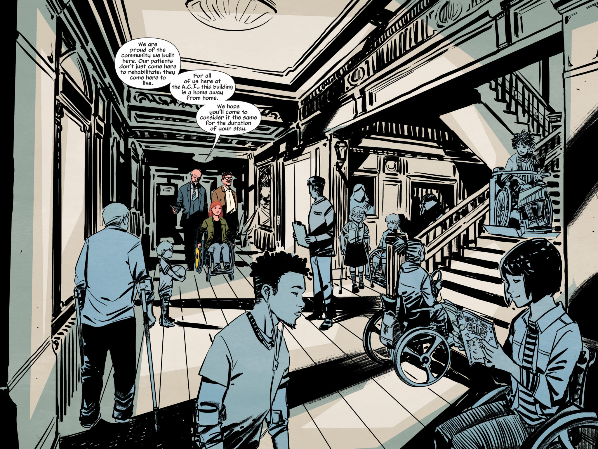
Bellaire’s coloring in The Oracle Code helps Preitano’s artwork pop by making the nonessential pieces of the story the same color. Naturally, with most of the overworld being like this, everything else feels insignificant. There are even times when Babs’ clothing blends in to evoke this feeling of fading away. The purely subjective images (like the puzzle pieces) meanwhile remain bright as signs to improve on. When the contrasts occur, they evoke feelings of hope or intensity. The most notable of which is the bright yellows that encompass those feelings. With The Oracle Code devoting so much of the pages to panels crowded with life and emotion, it takes someone like Clayton Cowles to keep the flow of dialogue going.Some very character defining visuals

Lettering

Oracle Code living up to its name Cowles’ lettering keeps the reader focused while never getting in the way of the art. The letters almost all follow a smooth path of direction. The onomatopoeias throughout the graphic novel also fit perfectly with the atmosphere of the setting. Long hallways with ghostly wails, for example, are perfect for people guessing if Babs is getting depressed or if something is going on. Everything is nothing short of perfect.

The Oracle Code: Must Have

Whether you agree with Barbara recovering from paralysis or not (especially with that phenomenon becoming real), anybody will enjoy The Oracle Code. This self-contained story details Barbara Gordon growing into a hero only she can be: a hacker who got to her lowest point but finds the strength to be who she wants to be regardless of expectations. Because in the end, who needs Batman continuity when you can solve the missing piece of the puzzle in fandom?


Do you like seeing Barbara as Oracle in a solo venture? Leave your thoughts in the comments.

Monkeys Fighting Robots Youtube

Panel Breakdown: Venom’s First Appearance By Todd McFarlane & David Michelinie

Panel Breakdown: Venom's First Appearance By Todd McFarlane & David Michelinie

Welcome to PANEL BREAKDOWN, a weekly series where we take a look at our favorite panels of a comic book. This week we are talking about the first appearance of Venom from Amazing Spider-Man #298, 299, & 300. The story was written by David Michelinie, with art by Todd McFarlane, inks by Bob McLeod, colors by Bob Sharon & Janet Jackson, and Rick Parker & Ken Lopez worked on letters.

What did you think of the first appearance of Venom? Comment below with your thoughts.

Monkeys Fighting Robots Youtube