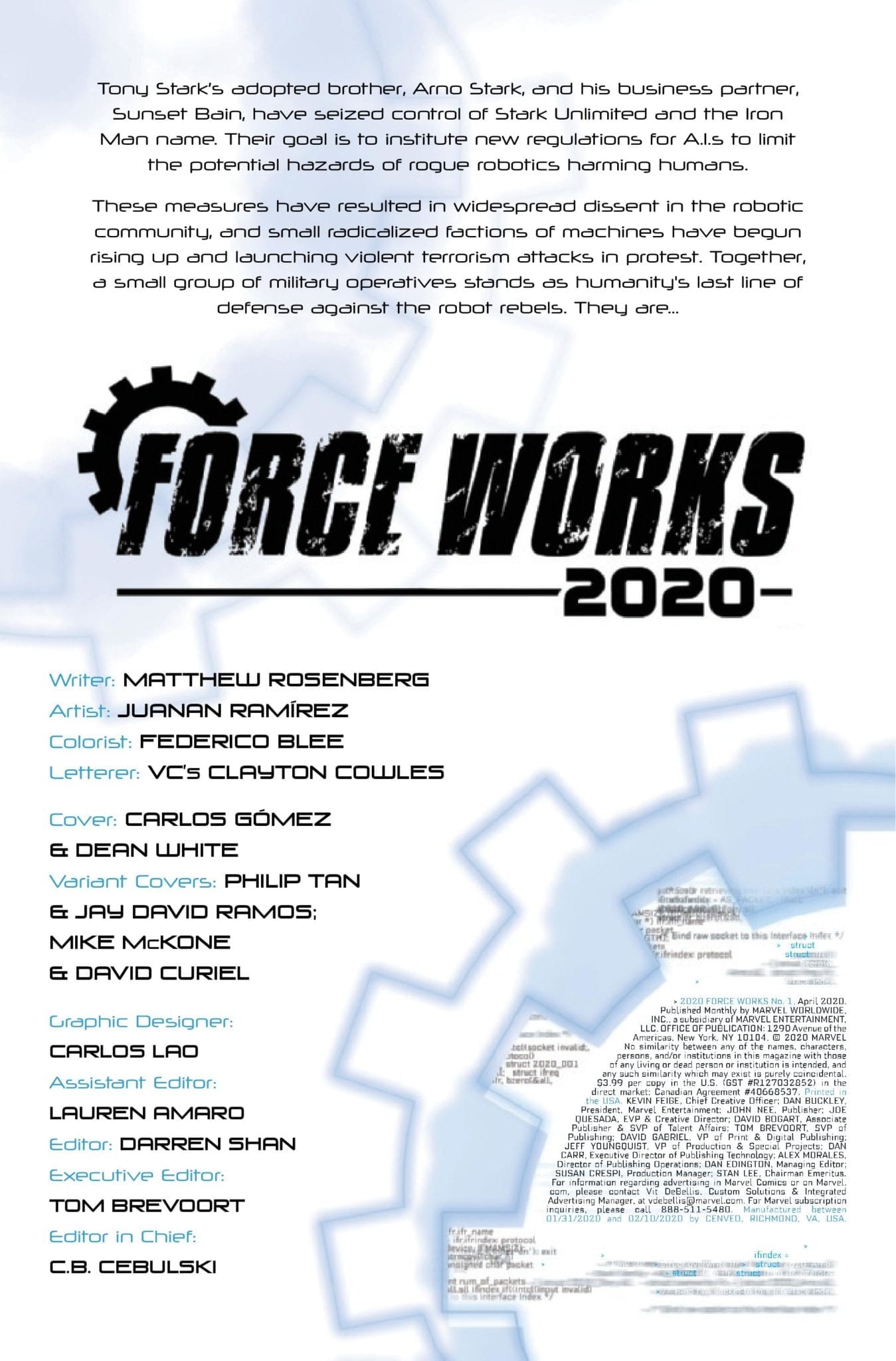
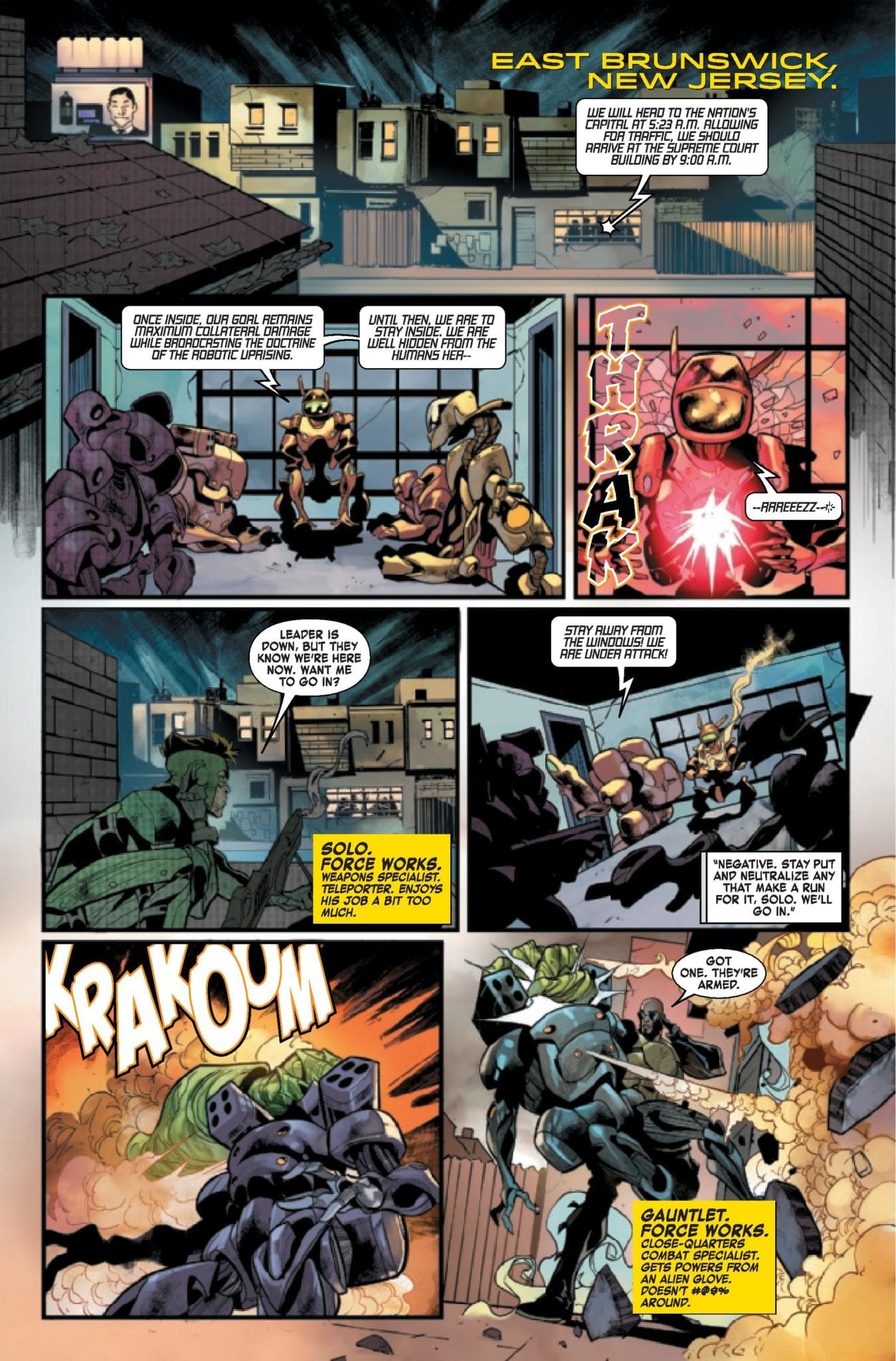
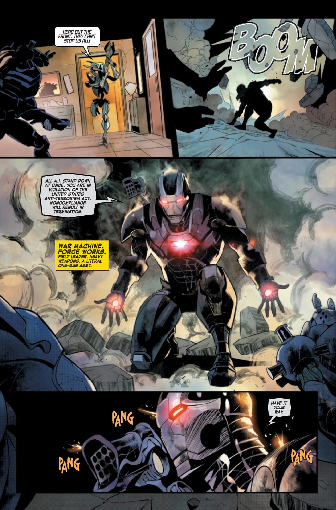
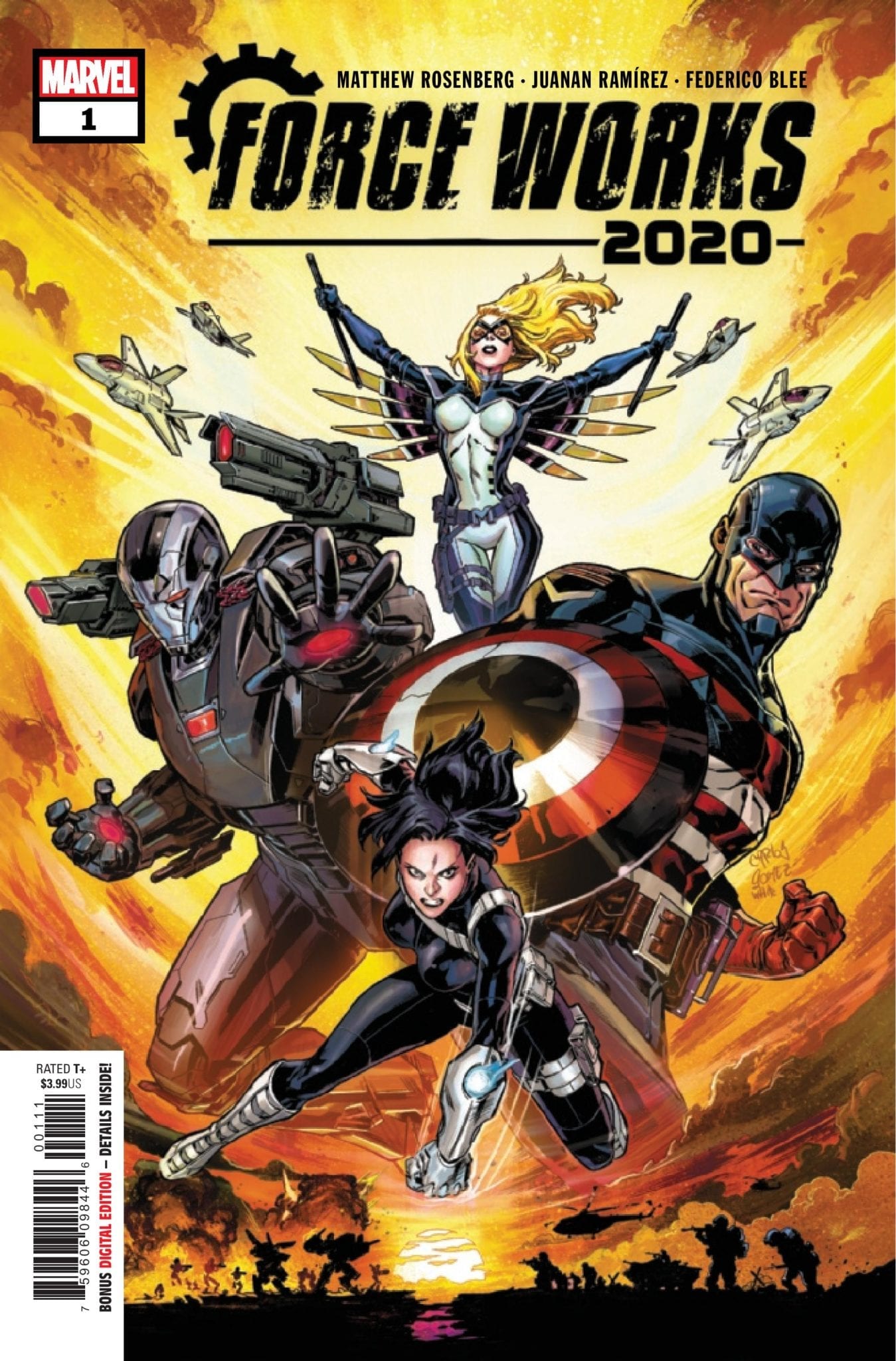
War Machine has his hands full this week in Force Works 2020 #1, out February 26, Marvel Comics sent us a four-page preview for you to check out.
The three-issue mini-series is written by Matthew Rosenberg, with art by Juanan Ramírez, Federico Blee dropped some colors, and you will read Clayton Cowles’ letters.
About the book: The eruption of a violent robot revolution threatens all manner of biological life! Teetering on the precipice of extinction, there’s only one man with enough tactical skill, killer instinct, and ruthless leadership to lead the rebellion: War Machine! Join War Machine and his elite paramilitary squad (U.S.Agent, Mockingbird, and Quake) in the final crusade for humanity’s fate!
Are you reading Iron Man 2020, what do you think of the story arc so far? Give us your thoughts in the comment section below or on social media.
Enjoy the Force Works 2020 #1 preview.
David Michelinie and John Byrne created James Rupert “Rhodey” Rhodes, with his first appearance in Iron Man #118 from January 1979. Rhodes became War Machine in Iron Man #282 back in July 1992. Len Kaminski and Kevin Hopgood created the War Machine Armor.
David Michelinie and artist Marc Silvestri created Solo, and he first appeared in Web of Spider-Man #19 from October 1986.
Dan Slott, Stefano Caselli, and Eric Powell created Joseph Green, aka the Gauntlet. He first appeared in She-Hulk #100
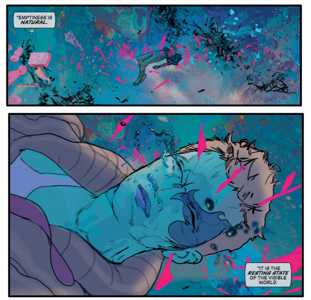
As the second arc of Invisible Kingdom from Dark Horse Comics comes to a close, the world created by G. Willow Wilson and Christian Ward gets a little bit larger and a little bit more complicated.
The last four issues have seen the creators concentrate much of the story on the relationship between Grix and Vess, producing a wonderful character driven narrative. The relationship between the two hots up as the arc comes to an end and the crew of the Sundog face possible destruction in the depths of space.
Invisible Kingdom #10 Credit: Dark Horse Comics
Narrative Style
After so long you begin to get a feel for a comic, an idea of what to expect. The plot may twist and turn but the style of storytelling becomes a constant. With creator owned comics that continue to use the same creators issue after issue, a rhythm is formed and a tone is set for the series. Take a look at Saga or The Walking Dead to see what I mean.
This doesn’t mean that the comic becomes dull or predictable, often quite the opposite. What it means is that the creators become attuned to each other and play to each others strengths. Invisible Kingdom is a prime example of this. You can pick up any issue and see how the writing and the art are inseparable within the comic.
G. Willow Wilson writes emotional dialogue that moves the characters through the action. Their relationships fuel the plot, pushing it forward. Each interaction has an effect that propels the reader further along the narrative.
Christian Ward’s artwork sets the scene. In some cases this means creating an outstanding alien landscape for the action to take place in. At the start of this issue, Grix is floating in the depths of space and in three panels Ward is able to relay the full extent of the danger that the Captain is in.
Ward is also able to add extra weight to Wilson’s words because of his emotive character design. In one scene Grix and Vess have a discussion about their relationship and you know exactly how the scene is going to end. Ward fills the characters with sexual tension, bringing them slowly together through the panel composition. It’s like a scene in a romantic movie where the characters get closer and closer as their conversation catches up with their bodies.
Invisible Kingdom #10 Credit: Dark Horse Comics
Advancing Plot
Invisible Kingdom started as a world expanding, science fiction tale but it has become something so much more. The characters are engaging, even the extras who don’t get much page space. Wilson’s script is honest and heartfelt. She is able to write the big science fiction plot and she does it using personalities and relationship dilemmas.
A number of plot threads are woven effortlessly together and as the reader is focused on one aspect of the story the rest of it is slowly advancing. Everything reads so naturally and this is because of the seamless blend of script and art. The words by Wilson, the lettering by Sal Cipriano, and the art by Ward all focus on the emotional story. This singular vision by the creators gives the comic focus for the reader and allows the plot to maneuver effortlessly around the characters.
Capriano’s soft approach to the word balloons and caption boxes enhance the sense of emotion. The rounded edges of the captions and the inconsistent thickness to the speech balloons create a natural appearance and, as a result, the flow of dialogue is more even, more conversational. You get the impression that these characters are having whispered, intimate conversations. It’s as if we the readers are voyeurs, listening in where we shouldn’t.
Invisible Kingdom #10 Credit: Dark Horse Comics
Conclusion
This issue is the culmination of the character development the creators have been working on since issue 1. Grix and Vess have been on an emotional journey stretching across 10 issues and reaching a significant moment in these pages. But is it too late? For the answer to that you’ll have to read the comic.
This issue is a satisfying end to what has come so far but it is also the start of something new. The ending opens up an exciting prospect for the future of the comic and fans will not be able to wait for the next arc to start.
A perfect blend of science fiction and emotional drama, Invisible Kingdom continues to be more than the sum of its parts.
If fans had been asked to bet what the next big inter-company comics crossover would be, it’s not likely that many would have chosen Sandman and Locke & Key… but that’s exactly what’s happening.
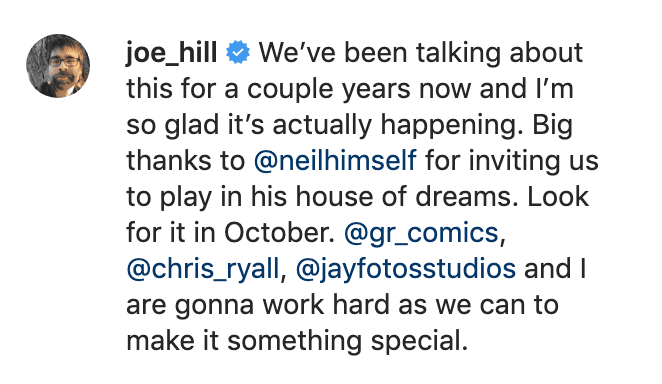
If you think you can unlock the gates of hell and just invite yourself in, you must be dreaming. Coming October 2020: @joe_hill and @GR_comics will debut LOCKE & KEY: HELL & GONE – A SANDMAN UNIVERSE Crossover Event, courtesy of @IDWPublishing and @DCComics. pic.twitter.com/b9I9e3Sa0h
Locke & Key: Hell & Gone will feature the creative team of writer Joe Hill and artist Gabriel Rodriguez. Rodriguez tweeted that the project is “a literal dream come true,” while Hill posted on Instagram that the team is “gonna work as hard as we can to make it something special.”
This news arrives as Locke & Key has become one of Netflix’s most talked-about series, with a Sandman series in development on the streaming service. Hill is, of course, also overseeing DC’s “Hill House” horror label at the moment.
Locke & Key: Hell & Gone will be in comic stores this October. As IDW’s promo says: “If you think you can unlock the gates of Hell and just invite yourself in, you must be dreaming.”
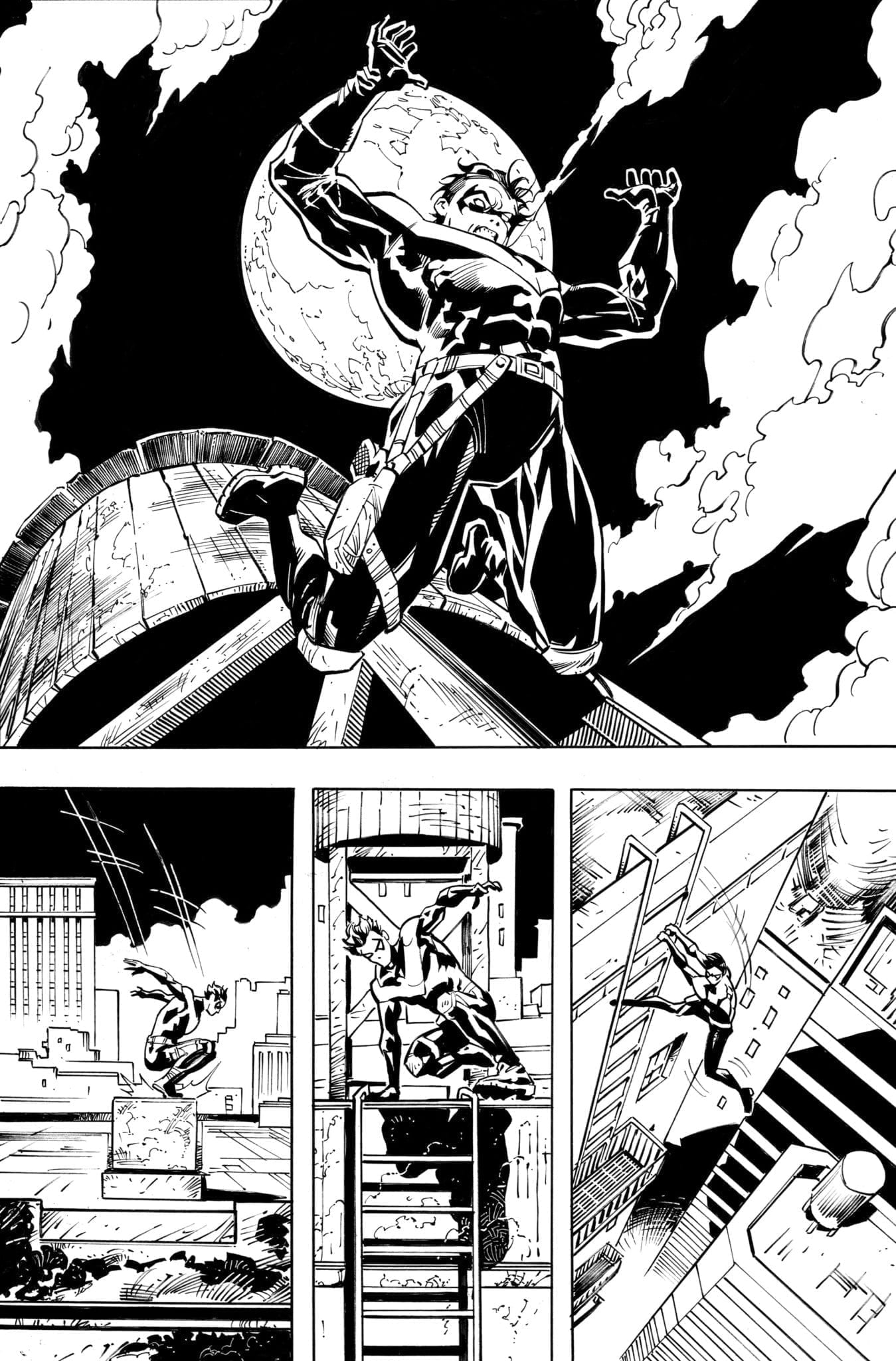
Nightwing #70 doesn’t hit your local comic book shop until March 18, but thanks to DC Comics, Monkeys Fighting Robots has a first look at the interior art by Ryan Benjamin.
The book is written by Dan Jurgens, with art by Benjamin, and cover by Mike Perkins.
About Nightwing #70:
Q: How many Nightwings does it take for one Joker to strike to get to the real one?
A: Four. Four Nightwings running around Blüdhaven.
…and that’s not even the punchline—how will Ric interact with the Joker when he’s not quite sure which one of his two memories is the real one, and exactly how dangerous this clown standing before him is? Is this the issue where the Joker tracks down the real Nightwing—and is the Joker the key to the return of Dick Grayson?
What do you think of Jurgens’ run on Nightwing? Are you excited for Joker War?Comment below with your thoughts.
Bill Finger and artist Bob Kane created Robin, and Dick Grayson was first to wear the costume. Dick first appeared in Detective Comics #38 in April 1940. Marv Wolfman and George Pérez created Nightwing, and his first appearance was in Tales of the Teen Titans #44 back in July of 1984.
The Visitor #3 from Valient Entertainment out this week, has MJ Kim provide some great artwork for Paul Levitz’s mystery as it gets a romantic subplot.
Recap
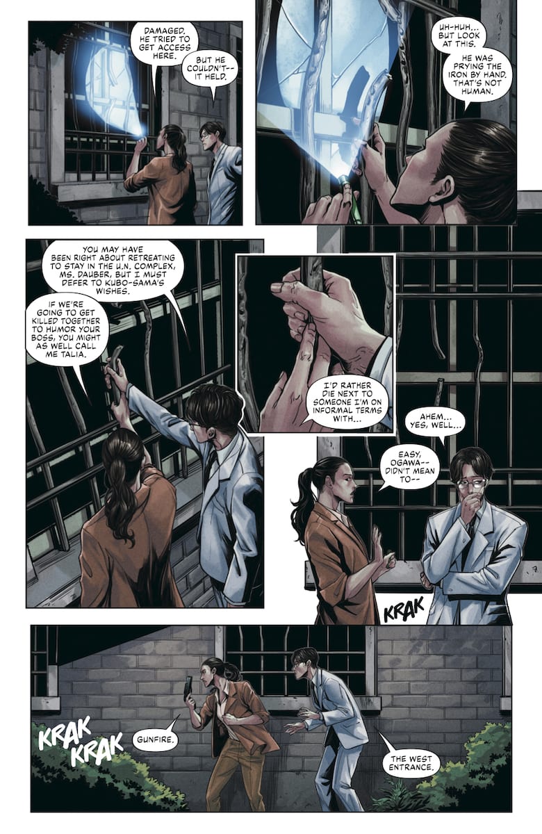
The Visitor revolves around an AI project that Japan is staking its future on. Most details surrounding the project are under wraps; however, the projects seem to have caused some disastrous turns in the future. The titular Visitor arrives from this time to sabotage the project by targeting lead programmer Kubo. However, Kubo is under the protection of his nephew Ogawa and UN Security Agent Talia Daubney. While they manage to keep The Visitor off of Kubo, Japanese officials find from his DNA the Visitor’s origins as an enhanced Japanese man.
The Visitor #3 Is A Distraction
With nobody including Paul Levitz at liberty to reveal crucial story details, The Visitor #3 feels like it’s backpedaling to square two. After the revelations in issue 2, the only thing that changes is seeing The Visitor’s face in flashbacks. Otherwise we get a low tech analysis of Visitor’s origins and a little action that goes nowhere.
Well, that and a romantic subplot between Ogawa and Daubney that exists in the spur of a couple of moments. Which doesn’t make a whole lot of sense. These characters who barely know each other happen to fall in love from their hands touching? But more than that, the series isn’t about them.
The Artwork Advances More Than The Story
MJ Kim steals the spotlight with how she illustrates more than decent body language. The best examples come from the two officials. Abe likes to present himself as high and mighty per his Imperial heritage by suddenly standing up to look down on people. Hayashi’s slender figure and serpent-like movements meanwhile display his likely ulterior motivations.
Kim also demonstrates other skills in how she creates the panels. For the flashback sequences, they possess a very microchip component appearance. Then there are the actions acting parallel. The primary plot gets two-thirds of the page while isolated vertical strips show whats happening elsewhere. Which brings up how Kim uses the binary monochromatic canvases. While it’s a little strange how being outside at night uses white canvases, being inside with the lights off is just perfect for the black canvas. This allows the moments with the Visitor to shine brightest.
Even If The Visitor #3 Shows Itself To Be Dimming
The coloring by Ulises Arreola in The Visitor #3 uses a lot of dark shading. Fitting for the mystery elements and surprise by the Visitor’s bright lights. He even keeps the bright color coding: blue for revelations and orange for danger. Unfortunately, their purposes are very limited in this issue. Most of the revelations, for example, come from how the Visitor makes an entrance.
Simon Bowland’s lettering functions well. All of the word balloons have a decent arrangement to get readers through the story. But, when it comes to the onomatopoeias, they don’t feel like extensions of the action, just decorations. They don’t share a matching color as the effects or objects they come off save for the ones in The Visitor’s flashback. It’s as if the artists are trying to get the details out, but The Visitor #3 won’t let them.
Do Whatever You Want With The Visitor #3
While the artwork remains consistently good, this issue takes a couple of controversial turns. Rather than try to solve the mystery, all we get is what everyone is already aware of from the last issue. But more than that, a romantic subplot has come up to distract the readers for the finale.
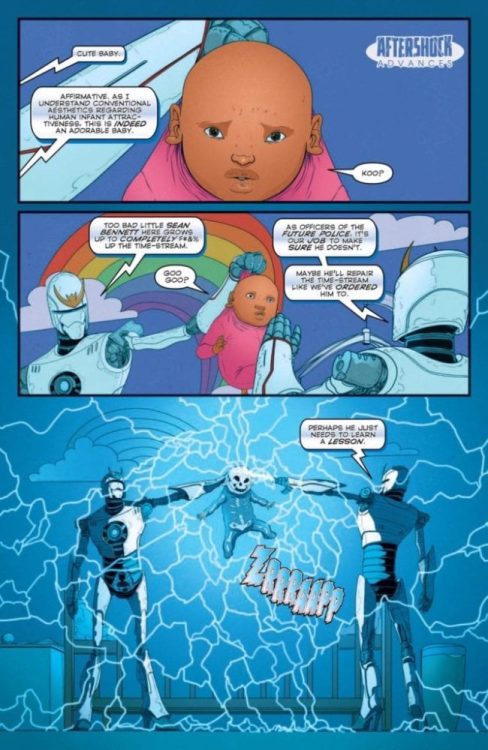
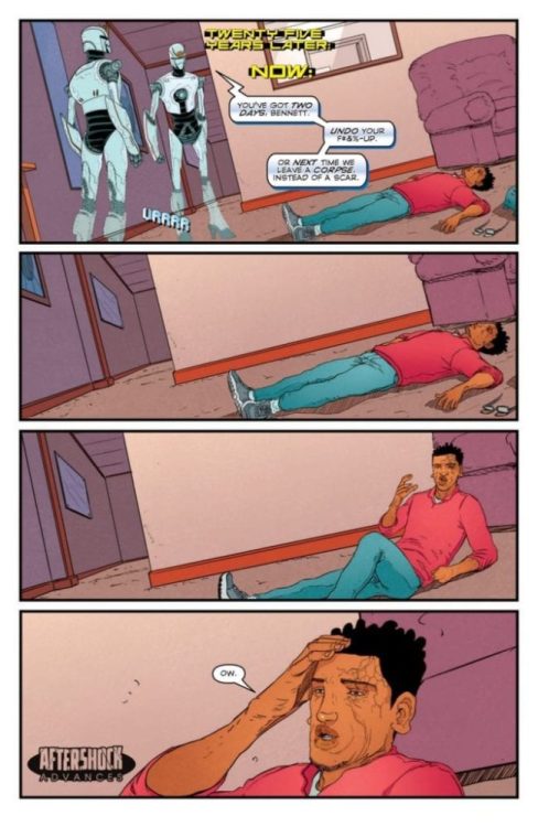
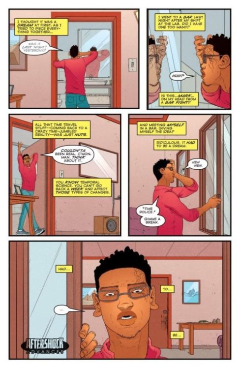
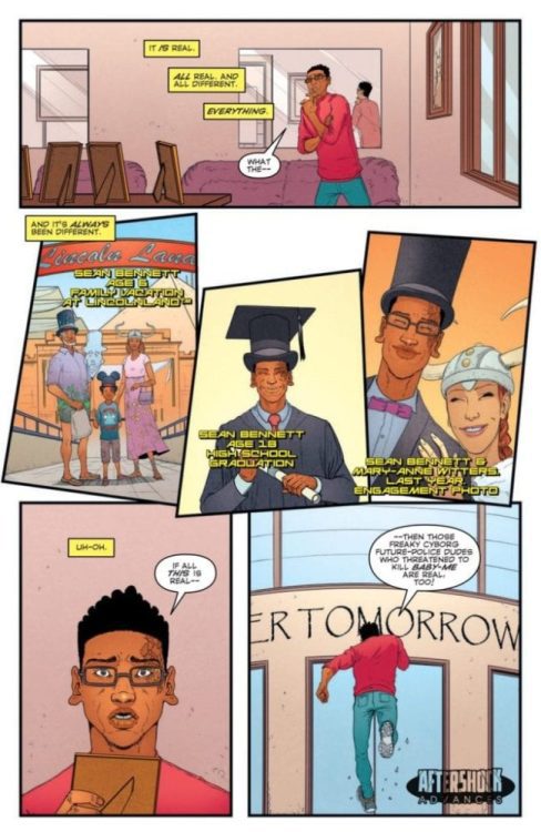
The Man Who F#%&ed Up Time #2, the sci-fi action-comedy doesn’t come out until March 11, but thanks to AfterShock Comics, Monkeys Fighting Robots has an exclusive four-page preview for you.
The book is written and lettered by John Layman, with art by Karl Mostert, colors by Dee Cunniffe, and Mostert & Cunniffe worked on the cover. There is a one in ten incentive cover by Andrew Robinson.
About The Man Who F#%&ed Up Time #2: Time-traveler Sean Bennett has been ordered to fix the damage he did to the space-time continuum, or face the wrath of the Future Police. But to do this, Sean Bennett must face his most dangerous adversary—Sean Bennett?
Did you read the first issue? Comment below with your thoughts.
“Layman’s approach is to jump right in. When the reader meets Sean Bennett, he has already caused cosmic chaos and the opening, energetic pages introduce the mixed-up world that Bennett has created.” – from Darryll Robson review of the first issue.
Sharks. These carnivorous creatures of the seven seas peak our interests and swim through our nightmares. Since Steven Spielberg brought Jaws to the silver screen in 1975, generations of people have been hesitant to even dip their feet in the ocean. And it didn’t stop there. The demand for sharks in popular culture has ebbed and flowed over the decades, with a need to ramp up the terror and camp in how they are presented on screen. There have been giant sharks, cartoon sharks, smart sharks, sharks with frickin’ laser beams on their heads, billionaire sharks, sharknados, and prehistoric sharks, to name a few.
Where can they possibly take sharks next? Were you thinking of an intelligent, weaponized, flying, augmented shark built in a secret government facility? Then you might want to pick up this new comic book.
Written and illustrated by Ben Lacy, with lettering by Nikki Powers – this is Shark of War #1.
Story
It’s Jaws if the shark were the hero. It’s Robocop if the cop were a shark. After a massive bioengineered shark escapes a secret military lab, he makes himself the law of the sea. Able to fly, bullet proof, and armed with guns and teeth, he cuts a swath through the bad guys. But the Mob and the evil scientist who created him have a plan to stop him – make even more dangerous creatures.
This book was clearly written by someone with an engineering background. Such is the case with Ben Lacy, who utilizes 30 years worth of knowledge and professional experience to craft the story and dialogue of Shark of War. There is a considerable amount of technical and military jargon. Mix that with camp and excessive violence, which this book is chock full of, and Shark of War fits perfectly in with this recent era of over-the-top shark sci-fi like The Meg and Sharknado.
Art
Lacy’s artwork is a unique choice. You won’t find any traditional comic book line work here. Instead, he opts for computer generated characters and scenery, akin to The Sims. This untraditional artwork style only adds to the exaggeration and campiness that you’ll find in Shark of War. It’s also a testament to creator Ben Lacy, who wanted to make a comic book, and turned to what he knew best to create the artwork – computers. Indie comic book creators, take note. If you have an idea and are passionate about it, do anything you can to get it done and out there.
Conclusion
Show your love for indie comics by supporting Shark of War #1 on Kickstarter. You can also follow the book on its Facebook page for updates and extra tidbits.
Are you an indie creator with a recently published comic book, or one that you’re crowdsourcing? Let us know!
If there is one person who should see VFW, it’s John Carpenter because this movie feels like a love letter to him and his previous work. VFW is a throwback to past grindhouse films that offered some of the best practical effects that you won’t find today. An absolute bloody treat from start to finish and it’s carried amazingly by a group of veteran actors, VFW is sure to go down as a cult classic if it finds the right following.
Director Joe Begos, who has been cranking out some decent indie films over the past few years returns with another home run. VFW takes place in a society suffering from the spread of a fictional drug called Hype. This drug has become an obsession for many, lead to the destruction of towns, and it will become a problem for a group of Vietnam veterans. After a teen steals a stash from local drug dealers and wanders into a VFW post, the vets are forced to defend their turf and the girl. Directed by Begos, and written by Max Brallier and Matthew McArdle VFW stars Stephen Lang, Fred Williamson, William Sadler, George Wendt, Martin Kove, Sierra McCormick, Tom Williamson, and Travis Hammer.
Fred Williamson, William Sadler, Stephen Lang, Sierra McCormick, and Tom Williamson in VFW
One error in this film is how all the characters are not that developed at all, you spend enough time with them, but you never learn much about these veterans other than they are all old pals and it’s someone’s birthday. However, for a film that keeps it so simple and straightforward, that is enough for the film to work, but not enough to find any investment in these characters. McArdle & Brallier’s screenplay could have been more complex and engaging, but what they put together is still worthy of praise. In this word, America has become a war zone of sorts thanks to the spread of hype, which turns its users violent and desperate for their next fix.
During a night at their local VFW, veterans Fred (Lang), Abe (Williamson), Thomas (Wendt), Lou (Kove), and Shawn (Williamson) are celebrating friendship and Fred’s birthday until Lizard (McCormick) stumbles into their bar with a bag of stolen drugs from Boz (Hammer) and his peers. A local drug dealer in the area, Boz wants his merchandise back, but things become more personal once his brother is killed. From there, McArdle & Brallier put viewers through a gory, action-packed thriller with over the top kills that feels like a loose remake of Carpenter’s Assault on Precinct 13. VFW moves very fast and has some gritty dialogue for fans of grindhouse films to enjoy.
Stephen Lang as Fred in VFW
Our group of veteran actors gives stellar performances across the board, and Lang just has too much fun with his role. He has a well-established career, but more recently he is known for his portrayal of the blind man in 2016’s Don’t Breathe and in VFW he channels the violence of that character and much more. There is a point in the film where he comes face to face with Hammer’s character Boz and he threatens to cut his heart out in a way that will send chills down your spine. The way Lang delivers his lines and carries the character of Fred makes this a very good performance. Williamson, more specifically Fred Williamson stars alongside his son and the chemistry between them is unmatched.
Begos directs this film with ease, he will keep viewers on the edge of their seat all the way through till the final credits. He has been making quite an impact with indie films and he is a master at having a vision for a film and knowing what to do to make that vision come to life. The cinematography by Mike Testin and Steve Moore’s score is also well done, but Moore’s synth score, which is very much like Carpenter helps elevate the tension in this film. One thing that could have been handled a bit better is the lighting, there a few shots in VFW that are just too dark to make out what is happening, but the different shades of red and blue throughout were great to see.
Stephen Lang, William Sadler, Fred Williamson in VFW
VFW is a barn burner of a film that holds no punches and its one of the best films out right now. It is always great to see a film rely heavily on practical effects for its gore because it just proves that CGI doesn’t always need to be used. Also, it turns out that watching a group of war veterans battle drug dealers and their army of junkies is very entertaining. An obvious love letter to Carpenter, VFW is a relentless, blood-drenched action thriller that doesn’t let up.
Welcome to PANEL BREAKDOWN, a weekly series where we take a look at our favorite panels of a comic book. This week we are talking about the new Marvel Comics series Wolverine #1 “Catacombs,” written by Benjamin Percy, with art by Viktor Bogdanovic, colors by Matthew Wilson, and Cory Petit’s letters.
Bogdanovic brings a 90s style to his Wolverine with deep dark emotion.
Part 2 – Viktor Bogdanovic
Part 1 – Adam Kubert
Did you pick up Wolverine #1 this past Wednesday, or did the $7.99 price-tag scare you off? Comment below with your thoughts.
Director Zoé Wittock unveiled a new film at Sundance that uses our love for inanimate objects to weave a beautiful story about love and friendship. To help make the motion picture come to life was cinematographer Thoma Buelens.
Jumbo stars Noémie Merlant alongside one of the most iconic amusement park attractions imaginable — a Ferris wheel. In the film, Merlant plays Jeanne, the janitor at an amusement park with Jumbo, the Ferris wheel, at its center. Jeanne and Jumbo form a relationship of sorts. Things get surreal and maybe a little erotic from there.
PopAxiom caught Thomas between the amusement park and World War I to talk about his road to taking the moving pictures that make a movie what it is.
It’s In The Blood
Thomas is a native of Belgium who credits his love for photography to a past that’s alive in his veins. “It was a little bit pre-wired in my DNA. If I go way back, my grandfather worked in a steel mill in the early 20th century, he had a passion for photography.”
Thomas’ grandmother changed the course of destiny. “My grandmother was a really savvy businesswoman, she suggested they move to the city and open a photography shop, and they actually did it. It was successful, and by the 1950s, they were the biggest sellers of photo gear in the area.”
Though part of a photographic family, Thomas admits, “I wasn’t pushed into photography. I got into skateboarding. I was interested in the skateboarding magazines, and in there was all this artistic photography.”
Thomas’ modern love — skateboarding — met the family business. “My father taught me the basics, and I learned it was easy for me to take nice pictures.”
The Right Brothers
The jump from photography to cinematography required a combination of brothers to create a spark. “One evening, when I was around 16 or 17, I get a call from my brother-in-law about a movie on TV that I should watch. It was The Big Lebowski by the Cohen Brothers.”
The spark created a career that’s now 11 credits deep and counting. “I was a regular kid. I didn’t know anything about cinema. I was into Jurassic Park and Independence Day. I watched that movie [Big Lebowski] … my eyes opened. I stopped skateboarding the same week, went into making a short film, and never looked back.”
Thomas started to do his cinematic homework. “I discovered all the Cohen Brothers films, Hitchcock, and on. The masters. I found out you could study [filmmaking], and by the time I was 20, I was doing internships on sets.”
Thomas was in school while also following his passion and the time came to have a conversation. “I sat my parents down in a Chinese Restaurant and told them, ‘If I pass these Christmas exams, I’ll keep studying, but if I fail, I’ll just go and work in cinema.”
The emerging cinematographer’s final grade was an F, as in ‘fate.’ “The day after that conversation, I got a call from the biggest film production company in Belgium who wanted me to come do set photography. I went to the exams and just filled out my name.”
About Jumbo
A bunch of short films, commercials, and features later, Jumbo appeared. “The script came through my agent who reached out to me. I read it and saw huge photographic potential.”
Thomas went through his usual process while reading a script. “… I go through visual references, but I don’t show it to the director right away. I want to get in their minds and their vision for how they see the movie.”
During his interview with Jumbo director Zoé, “… I saw that it was going in the same direction as my references … I showed her my references, and she was surprised. More than fifty percent of references she put together for herself was the same.”
Needless to say, the pair hit it off. “She has a really strong vision and great experience. It was a nice match.”
As one might imagine, shooting a film that heavily involves a Ferris wheel is no simple task. “One of the biggest challenges was really making Jumbo come to life. It’s an inanimate object, but there’s a lot of interaction between Noémie and Jumbo.”
Making the giant wheel come to life was priority number one. “Light is emotion. We added an enormous amount of lights on it. We had to program over 160 lights onto Jumbo.”
The team got together to give Jumbo a heart. “I worked closely together with Zoe and our amazing production designer William Abelo to attach lights onto Jumbo that could change colors in all the ways we wanted. It was a huge challenge to have it all planned out in such a short period of shooting.” Jumbo was filmed in 30 days.
Jumbo Feels
On such a tight schedule, Thomas talks about how they decided on Jumbo’s feelings. “We didn’t have a lot of ‘test days’ so we had one evening where we programmed Jumbo and said, ‘Ok, this is its happy lighting; this is sad; this is shocked.’ That was quite complex …”
On top of the programmed lights, Thomas explains the other bright side. “On top of the programmed lights, we had the film lights, we had to program them as well to work with the lights on Jumbo.”
Now that Jumbo could feel, there was the matter of making the movie. “There’s a scene where Noémie crawls up on Jumbo … It’s eight to nine meters high [26-29 feet]; we had to have stunt cranes and a special crane with the camera.”
In the end, Thomas says, “All of this was a challenge, but it’s what makes a day exciting.”
Collaboration
No matter the size, 99.9 percent of all film crews require teamwork to succeed. “To me, costume design and production design are so important. In a way, even more, important than cinematography because I can only capture what’s in front of the camera.”
Thomas tells us about his work with production design. “In this film, I had a close relationship with William, and we talked in detail about all the colors and textures of things. That makes me a better cinematographer.”
A goal of the film, Thomas says, was “… to not make the film too magical, keep it realistic. We called it ‘Enhanced Realism.’”
Jumbo was a very real Ferris wheel. “We tried to capture as much as possible in-camera. But we did plenty of CGI … there’s some interaction with oil, we did a lot of tests in-camera as a reference for the CGI artist.”
Wrapping Up
Thomas shares some of the joy he feels about making movies. “When you dream of a shot months in advance and then it’s on the monitor, and you can show it to other people, the hairs on your arm stand up. That’s the best feeling in cinema.”
Outside of the DNA that directed him to this business, cinematographers like Roger Deakins are an influence on Thomas. An even more significant influence though is Robert Richardson. “He has such a vast array of styles. One of my favorite movies is Snow Falling on Cedar. It’s such an amazingly shot film. If you compare that with Nixon, there’s such a difference but still beautiful.”
Thomas continues, “Greig Fraser is another one. He really captures something that was a reference for me on this film. The movie Killing Them Softly, which has that ‘enhanced realism,’ it has this documentary feel … but still quite cinematic. It’s one of the reasons we shot on anamorphic.”
“I’m a big fan of anamorphic,” Thomas says, “I shoot about 80 percent of my stuff, features, and commercials, on anamorphic. It gives you a little more scope in a realistic setting.”
What remake would Thomas like to shoot? “I’m always a little afraid of remakes. Mostly, I think, don’t mess with the original. I do believe in sequels, so, imagine, a sequel to something like Seven or Big Lebowski, that would be amazing to have a chance at that.”
Jumbo premiered at Sundance. So, what’s next? “I’m heading off to Tokyo to shoot a commercial, then I’m on pre-production for a World War I movie, which I cannot go into detail quite yet.”
Will you be watching Jumbo?
Thanks to Thomas Buelens and Impact 24 PR for making this interview possible.
Want to read more interviews like this? CLICK HERE.


 This news arrives as Locke & Key has become one of Netflix’s most talked-about series, with a Sandman series in development on the streaming service. Hill is, of course, also overseeing DC’s


 With nobody including Paul Levitz at liberty to reveal crucial story details, The Visitor #3 feels like it’s backpedaling to square two. After the revelations in
 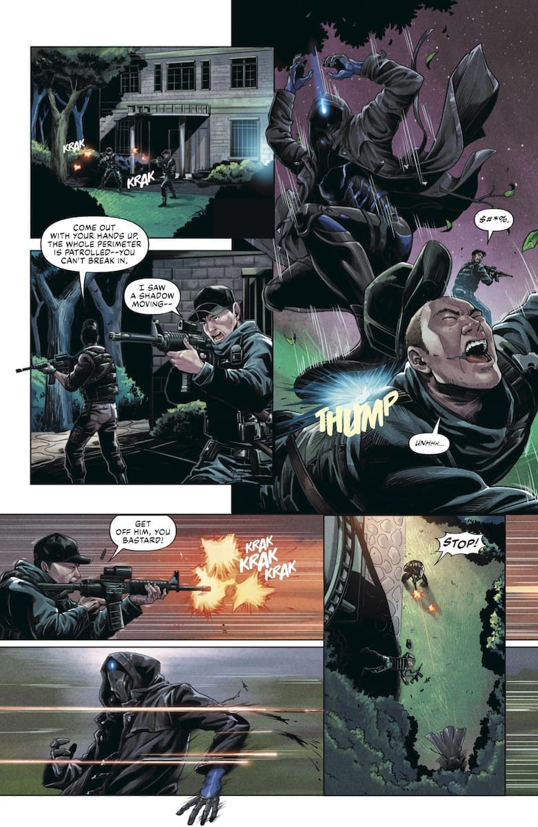 The coloring by Ulises Arreola in The Visitor #3 uses a lot of dark shading. Fitting for the mystery elements and surprise by the Visitor’s bright lights. He even keeps the bright color coding: blue for revelations and orange for danger. Unfortunately, their purposes are very limited in this issue. Most of the revelations, for example, come from how the Visitor makes an entrance.