As the flow of new comic books begin to dry up we’ve all started to revert to older material. Whether it’s catching up on the series that we’ve been stockpiling or pulling out those old comics that haven’t been read in a few years: back issues are being consumed in great numbers.
The best thing about re-reading, more so than the comforting nostalgia, is the small surprises that the comics can hold.
Recently I introduced my children to the delights of the Alien and Predator franchises via the Aliens Vs Predator movie. All the way through the film I kept thinking “I haven’t read the AvP comics in years” so after the kids had gone to bed I went searching.
I collected the Titan Comics, then the Dark Horse Publication, UK Reprints of the American titles. They started around 1990 and contained a mix of comics and articles relating to the joint franchises. Aliens, Predators, Aliens Vs Predators. They were perfect fodder for a young comic and movie fan.
Some of the comics that they reprinted are still among my favourite reads: the precursor to Aliens: The Female War and Peter Milligan’s Aliens: Sacrifice. There is also a beautiful short drawn by Simon Bisley called The Reapers that has an ending that has forever been etched in my mind.
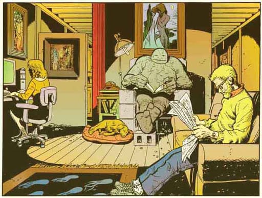
Sole Survivors Credit: Dark Horse Comics
Hidden Pages
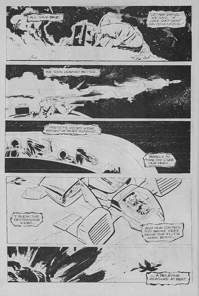
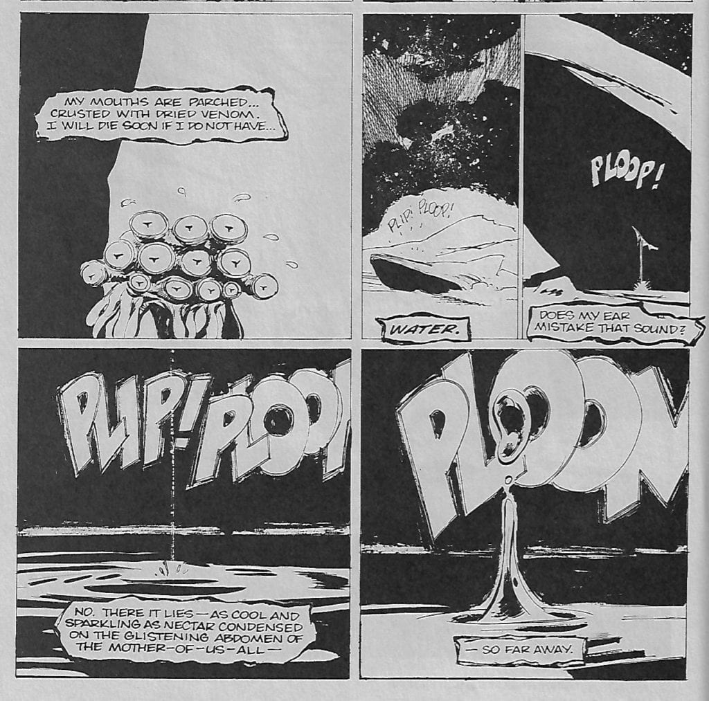
However, in Volume 2 Issue 2 there was a free black and white comic that had nothing to do with the Aliens franchise. Until my current read through I had completely forgotten it was there. The small eight page comic is called Sole Survivors and was written by Randy Stradley, art by Tony Salmons, and letters by David Jackson. It is a wonderful example of modern comic book storytelling, turning a rather run of the mill story idea into something more magical and impressive.
But what makes it so outstanding, especially surrounded by the great Aliens stories reprinted in the comic? It is the simplicity of the idea mixed with the, often, abstract nature of the presentation. The comic was originally created in 1987 and it draws on all of the Science-Fiction tropes popular at the time. It then merges them with an older comic book tradition: the trick or surprise ending most famously used by EC in the 1950’s.
Sole Survivors plays up to all of the 1980’s gung-ho machismo while sneakily subverting it. The central character is a strange, insect-like alien who is difficult for the reader to identify with. Remember, this was the 80’s, the science fiction world was packed with bulging muscles, monosomic heroes, and an array of heavy weaponry. Oh, so many massive guns.
The ideal hero was an ultimate, pumped up version of ourselves and when this finally took hold in Comics we got what we got in the 90’s. Stradley and Salmons, however, are challenging that idea of a hero even before it has become the mainstream in comics. To complicate this, or perhaps to highlight it, they make the protagonist, the villain, more recognisably human.
Sole Survivors Credit: Dark Horse Comics
Subtly Subversive
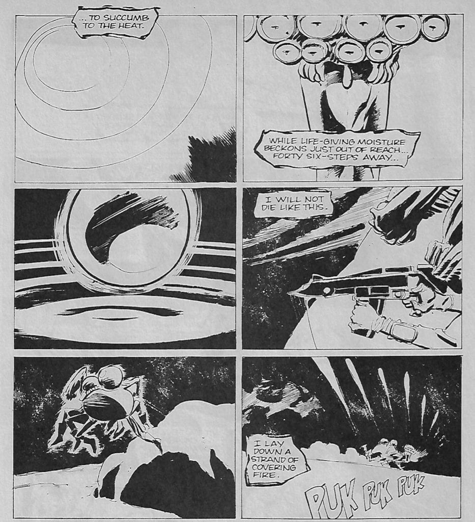
During the standoff in the plot, and the inevitable conflict, we the readers root for the alien: the character who is least like us. This unusual concept is reflected by the abstraction within the art. The panel transitions build emotional responses and challenge the reader to really consider the situation and the two characters. A slow, monotonous dripping of water is contrasted against the life and death struggle as two columns create a tick tock pace in the story.
The Aspect to Aspect jumps heighten the tension while the minimalist element of one side of the page forces the audience to pay closer attention to the other side. The narrative beat away from the character enforces the character’s predicament. It creates an urgency, reiterating the death struggle that is happening.
There is also no consecutive form to the pages. There is a switch between four and five rows of panels per page. The number of panels, and the layouts, also change from page to page not allowing a formal structure to lead the story. This is another contrast to the type of stories that Sole Survivors is referencing.
Sole Survivors Credit: Dark Horse Comics
Distracting Style
At this point it is worth mentioning the lettering by David Jackson. His hand-drawn, scratchy and uneven caption boxes and sound effects give the eight pages of comic a self published look. Especially as it was printed on off-white, newsprint type paper.
Jackson mimics the panel layouts, leading the reader across the page often in an unconventional manner. Silent panels and strategically places caption boxes create verbal gaps or hoops of speech that circumnavigates certain images. This creates a challenging reading experience, not something that you would be expecting from such a comic strip.
The sequels to movies like Alien and Terminator, that fed into a number of comics at the time, were all formulaic. Pleasing and simple structures that helped to make them successful. The presentation of Sole Survivors is not formulaic which allows Stradley’s trick ending to work. Just like an episode of the BBC’s Inside No. 9, the creators lull the reader into a false sense of security by making the build up in the story something out of the ordinary. This acts as a distraction so that they can spring the ending, without the audience having had a chance to guess what’s coming.
By subverting the genre and making the readers question the idea of who, or what, the hero of a story can be, the ending of Sole Survivors shocks you as intended. It is a masterpiece of narrative timing. Everything about it, the Art, the page size, even the paper it is printed on, makes you think it’s a cheap page filler. A gimmick by the publisher. Instead, you have a sophisticated, thoughtful piece of art that challenges the crass commercialism of the larger publication it is a part of.
Sole Survivors Credit: Dark Horse Comics
Subverted Conclusion
The entire creative team were working in ways that undermine the mainstream. At a time when comics were becoming cleaner in appearance, more defined and straight forward, Sole Survivors challenged that notion by resembling underground, self published comics. It has more in common with the weekly 2000AD comic than it does the Dark Horse reprints it was published with.
With a wall of commercialism, sequels, and franchises springing up in the cinemas and moving into comic books, Stradley, Salmons and Jackson are already challenging the tropes the audience were just getting to know. This eight page comic in the middle of a blockbuster tie-in contains more depth and genre critique then any of the chest pounding comics that surrounded it.
I enjoy the Aliens and Predator comics. They formed a large part of my early teenage collection and I still read them with some enjoyment today. However, on this current read through, the most enjoyable part has been rediscovering the majestic Sole Survivors and it’s very modern subversion of science fiction tropes.
Comics from the ’90s gets a bad rep; rightly so in some cases. Much like any era, it has its fair share of hits and misses. It just so happens its misses where the shape of insanely muscle-bound (roided out) leading men, and scantly clad hourglass figured Femme Fatales. Granted, X-Factor #87 has both of those. Yet there are some ’90s hidden gems found in single issues and some fan-favorite runs. One such run was Peter David’s X-Factor, which he went back to years later. In this, David answered a question that may not have been on everyone’s mind but should’ve; what do heroes do after a large crisis? Yeah, others have tried to write a story about heroes going to a therapist, yet David perfected this in the ’90s.
Pencils by Joe Quesada. Inked by Al Milgrom. Colors by Marie Javins. Letters by Richard Starkings and Steve Dutro.
X-FACTOR X-AMINATION
Enter: X-Factor #87 X-amination. Hell, even the name is a great X-title play on the subject. The name’s one of the many great factors in the story, granted we have to go a little back. Not too far back, but to the big X-crossover that ran in a few titles—X-Cutioner’s Song. Going over the whole event would hurt you more than it hurts me. If you thought crossovers were bad now, the ’90s would like to speak to you.
After the big battles, confusing plots, and around the world flight, the X-Factor team needed a breather. Or what the Government mandated them to have; therapy lessons. Any comic can have an issue where the team goes to therapy, and it’s done and over, no lasting impact, add in some humor, grand breaking regulations, and you have yourself a quick issue. The thing is, David used this moment to showcase how each team member felt, how their Government liaison portrayed them, all while adding humor his run is known for. Nonetheless, that isn’t the only factor that makes X-Factor #87 so amazing and one of my favorite X-titles.
Pencils by Joe Quesada. Inked by Al Milgrom. Colors by Marie Javins. Letters by Richard Starkings and Steve Dutro.
David made the issue matter. How so? Every revelation and character development pushed the series further. It was even later revealed to all be a way to get to the team’s secret. Almost like D.C. Comics’ JLA: Tower of Babel.
Not only did it push the series further, but it also gave insight into the team and their personal problems. X-Factor #87 is one of the most important issues in David’s run and X-Factor in general. Plus, David didn’t just pluck the problems that were plaguing the team out of thin air. Throughout his run, he had moments that built towards this. But alas, we can’t speak of build-up or how it changed the series if we don’t go over what transpired.
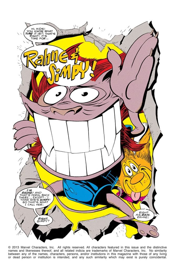
WHEN IT RAHNES, IT POURS FOR X-FACTOR
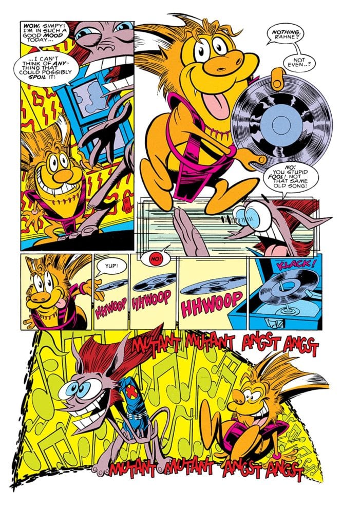
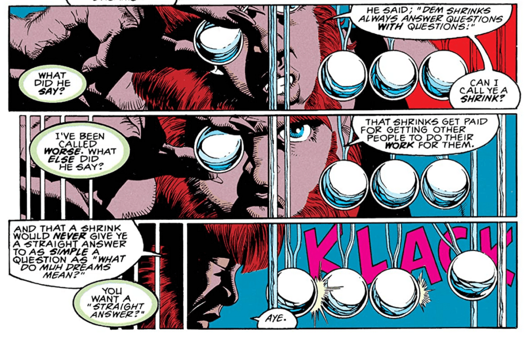
David opens X-Factor #87 with a brilliant Ren & Stimpy nod titled—Rahne & Simpy. Even including a Mutant version of Happy, Happy, Joy, Joy (try getting that out of your head). This isn’t used just for laughs, as it’s a look inside of Rahne Sinclair’s (Wolfsbane) head, via her dreams. In her dreams, she plays out media including herself with Rahne’s World, and Rain Man, as she fell asleep watching it. This transitions into her echoing Guido Carosella’s (Strong Guy) words,” Dem shrinks always answer questions with questions.”
The (Strong) Guy does have a point.
Pencils by Joe Quesada. Inked by Al Milgrom. Colors by Marie Javins. Letters by Richard Starkings and Steve Dutro.
Nonetheless, that pushes the Therapist (we’ll say who later) to prove him wrong by telling Rahne what he thinks. Per usual, it isn’t pretty. Hell, most of the stuff he says is true, while being a little meta. Essentially that she draws characters from T.V./Movies and changing shoes when it looks “good and fits.” This carries into her respect for authority figures and her feelings towards them. Yet when talking about her past Reverend (Reverend Craig) and saying Rahne’s want for love by authority figures is due to the Reverend’s hatred, it hits a nerve.
The thing is, everything the Therapist says hits the nail on the head. It must be hard to have a “sense of self” when you can turn into a literal animal while trying to gain the love from every authority figure. Yet this issue explores Rahne like none other has while showing how her psyche has never been delved into. For someone that can read minds, Xavier is kind of dense if he couldn’t evaluate her as such.
THE PIETRO MAXIMOFF SYNDROME
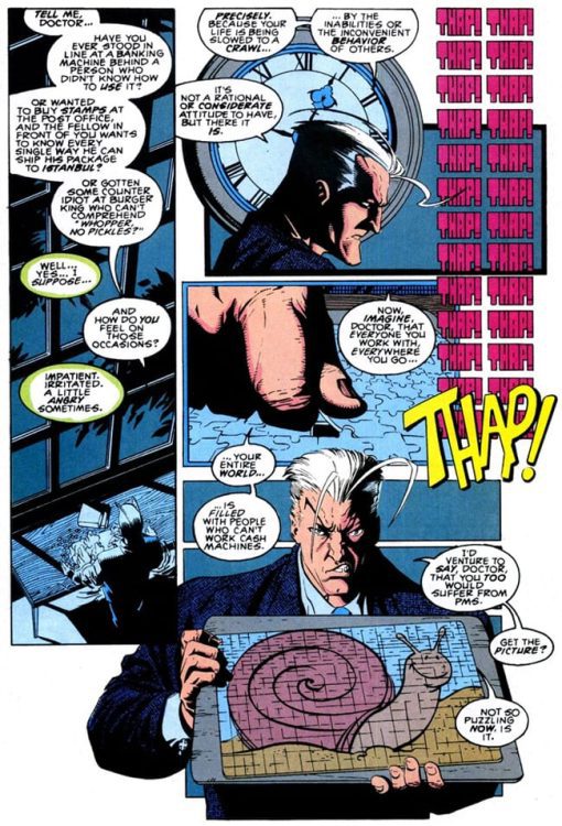
The pages for Pietro Maximoff (Quicksilver) therapy float around often, as it is one of the best deconstructions of him and speedsters in general. Pietro’s analysis in X-Factor #87 changes the way you perceive speedsters while explaining the character’s shitty attitude. Out of all the changes and character development Pietro has gone through the years, this is one of the best, while drastically changing him. Pietro starts the session as he would any, high and mighty. Yet this is where a great term is born—PMS, The Pietro Maximoff Syndrome.
Government liaison Valerie Cooper (Val) coined the term due to Pietro’s “uncontrollable urge to be high-handed and arrogant.” Honestly, it’s a pretty spot-on fit. This leads to the discussion of how Pietro sees others and himself. He doesn’t find himself “superior”, it’s that he holds himself to impossibly high standards that no one comes close to. Following this is one of the best interpretations of superspeed and an amazing visual joke.
Pencils by Joe Quesada. Inked by Al Milgrom. Colors by Marie Javins. Letters by Richard Starkings and Steve Dutro.
Once Pietro receives the puzzle, a constant THAP is lettered throughout courtesy Richard Starkings and Steve Dutro. During the puzzle making, Pietro compares his speed to being in “line at a banking machine behind a person who didn’t know how to use it.” To this, the Therapist replies that that would make him, “Impatient. Irritated.” Pietro proclaims this is due to your life being slowed to a crawl by the inability/inconvenient behavior of others. That this is constantly how he feels where ever he goes. Holding up the puzzle, it is revealed to be a snail with Pietro making a witty response.
Yet, this isn’t the only colossal character changing moment for him, as much like Rahne (and the others); its the beginning of a vast plot.
LORNA’S WEIGHT LOSE PROGRAM
Lorna Dane’s (Polaris) session starts out much like the last two, her showing disdain towards what they’re doing. Yet, unlike the others, she stays the same throughout, while even coming back later on. Continuing to set her side apart from others in X-Factor #87, her problems at first seem superficial. Throughout her first session, she can be seen eyeing the candy on the table with little panels interjected showing them. Alas, she never touches them. This is due to her obsessing over the fact she has lost weight, 15 pounds, to be exact.
Later she claims she was losing weight before her broken jaw, yet in the beginning, she claimed the jaw helped a lot. Her first meeting revolved heavily around this theme of losing weight until she mentions the Therapist “getting into my head.” Trying to dig further, he asks her what exactly she means, to which she breaks down due to all the mind control she has been under. Following this and a few choice words from the Therapist, she leaves, yet later on returns.
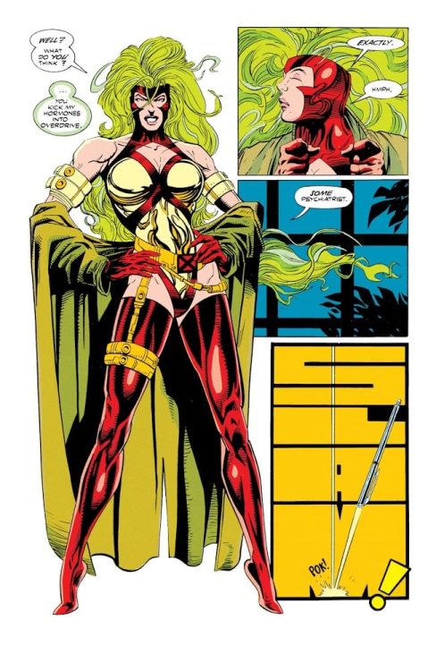
When returning, she mentions that she isn’t repressed, self-conscious, or repulsive; things the Therapist never mentioned. Yet, following is one of the most 90’s outfits reveals that “helps” show off her recent weight loss. After getting the reaction, she desires she storms out. Aside from some of the art and pop culture references, her outfit is the most ’90s thing about the issue. Nonetheless, it feels like she is saying something about the state of over sexualizing woman and their costumes in the era.
Pencils by Joe Quesada. Inked by Al Milgrom. Colors by Marie Javins. Letters by Richard Starkings and Steve Dutro.
Plus, the Therapist’s response is hilarious.
STRONG GUY, STRONG FEELINGS
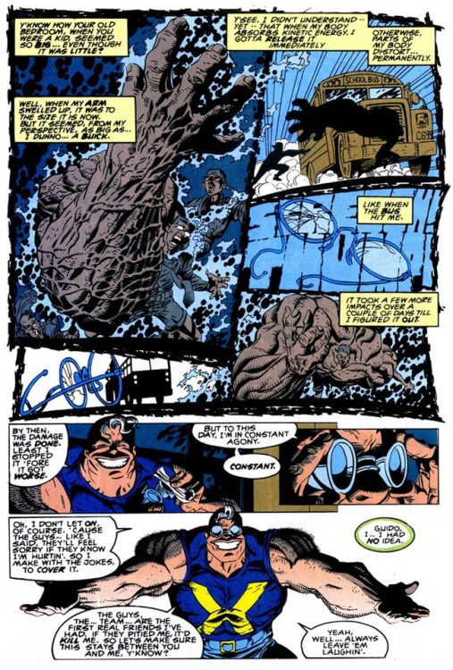
Guido may be one of my favorites. Keeping his usual cool, sophisticated, devil may care attitude, Guido tells the Therapist about the day his powers surfaced. Yet, it turns out his persona may be all a facade. Having been the smartest in class, Guido was hated. But, like every other kid, he wanted to fit in, this caused him to act out. But alas, that didn’t change anything, and after an unfortunate encounter with other kids, he gets jumped. To make matters worse, his mutant powers kick in.
Guido is able to absorb kinetic energy then enhance his physical strength to above normal limits. The thing is, once absorbed, he has to release it in 90 seconds, or the body part would permanently stay like that. Yet, he has no way of knowing this, and while his arm grew to the size of a “Buick,” he was hit by a bus. Thus creating the mountain, we see today. If you’ve ever wondered why his body was so disproportioned, that’s why. Yet, he continues to smile throughout and follows his story with one of the saddest quotes:
But to this day, I’m in constant agony. CONSTANT. Oh, I don’t let on, of course. ‘Cause the guys… Like I said. They’ll feel sorry if they know I’m hurtin’. So I make with the jokes. To cover it. The guys. The…team…are the first real friends I’ve had. If they pitied me, it’d kill me. – Strong Guy
BIG GUY, BIG SMILE
Guido’s story hits hard. Hard enough that throughout the Therapist stays quite. While reading it you may think it’s just another funny story; then you realize he may be telling the truth. Guido may be one of the most fascinating characters. He is a huge strong guy that everyone looks to and is astonished by how big and manly he is. But, deep down, he is continuously struggling, feeling like he has to hide behind a funny face and a near-constant smile. Even his exterior features show his imperfections; what other hero wears glasses when saving lives/fighting due to being near-sighted? He is a character that deserves a more in-depth look at in a new series.
Pencils by Joe Quesada. Inked by Al Milgrom. Colors by Marie Javins. Letters by Richard Starkings and Steve Dutro.
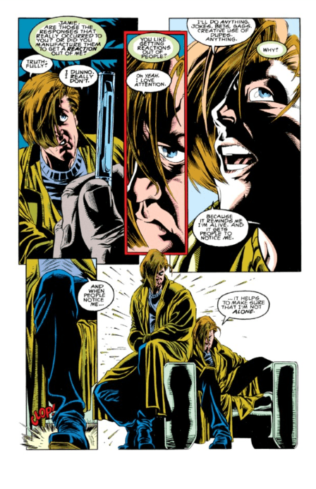
ALONE WITH HIMSELF
Jamie Madrox (Multiple Man) is a man with multiple problems. Although David introduces the readers to one of Jamie’s greatest fears, they don’t play into future issues as much. That’s due to him secretly dealing with the Legacy Virus. Nonetheless, his problem of being afraid of being alone is one many people deal with. Yet, you’d expect a man that can make dupes wouldn’t feel this way. Afraid of being alone, Jamie needs constant attention. To get this, he constantly jokes, gags, and has his dupes do silly things. Much like Guido, he has a facade.
Nonetheless, this fear of being alone for a man that can make multiple dupes is fascinating. Do you know what isn’t fascinating about him? The damn haircut. Talk about emo Peter Parker from Spider-Man 3. The other thing of note is how his session is only two pages, whereas others are longer. Only his, Alex Summers (Havok), and Val are contained to two pages.
Pencils by Joe Quesada. Inked by Al Milgrom. Colors by Marie Javins. Letters by Richard Starkings and Steve Dutro.
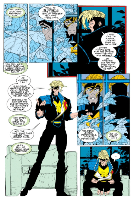
FAMILY PROBLEMS
A leader’s job is hard, especially when you’re a leader for a Government sanctioned Mutant team. Albeit, that’s not all Alex deals with. As his last name entails, he is brother to Scott Summer (Cyclops), the “great” X-Men leader. This fact is one of many that bogs down his mind. How could you ever measure up to a bigger brother like Scott? That and the fact he constantly feels like he has to babysit his team. Knowing the team, this makes complete sense.
Whereas Scott “seems to command respect”, Alex has to “work my butt off.” Out of the whole X-Factor team, Alex has one of the harder jobs with leading them, yet Scott’s presence makes matters worse. This is dealt with later on in multiple factors. One specific moment being when Alex confronts Scott and tells him this. This leads to Scott laying out some of his insecurities, thus helping Alex develop into a stronger leader.
Pencils by Joe Quesada. Inked by Al Milgrom. Colors by Marie Javins. Letters by Richard Starkings and Steve Dutro.
YOU KNOW NOTHING VAL
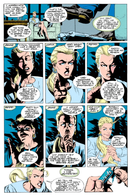
X-Factor #87’s final therapy session is the most damning on its character. In this case for Val, their Government Liaison. The Therapist questions her about everybody on the team. Unsurprisingly Val gets every single one wrong. Instead, she says the exact opposite of what the team members have said. Thus showing how little she cares or how she only cares about how they work. It’s a great two page dive in just how little she knows.
This also shows how you can be around a group (or person) and truly never know them. She supposedly spends so much time with them and knows so much about them. Albeit, it’s truly hard to ever really know someone. It’s beautiful how David writes her responses being the polar opposite. Nonetheless, the most important part of her story happens at the end when she gets abducted.
Pencils by Joe Quesada. Inked by Al Milgrom. Colors by Marie Javins. Letters by Richard Starkings and Steve Dutro.
GUESS WHO
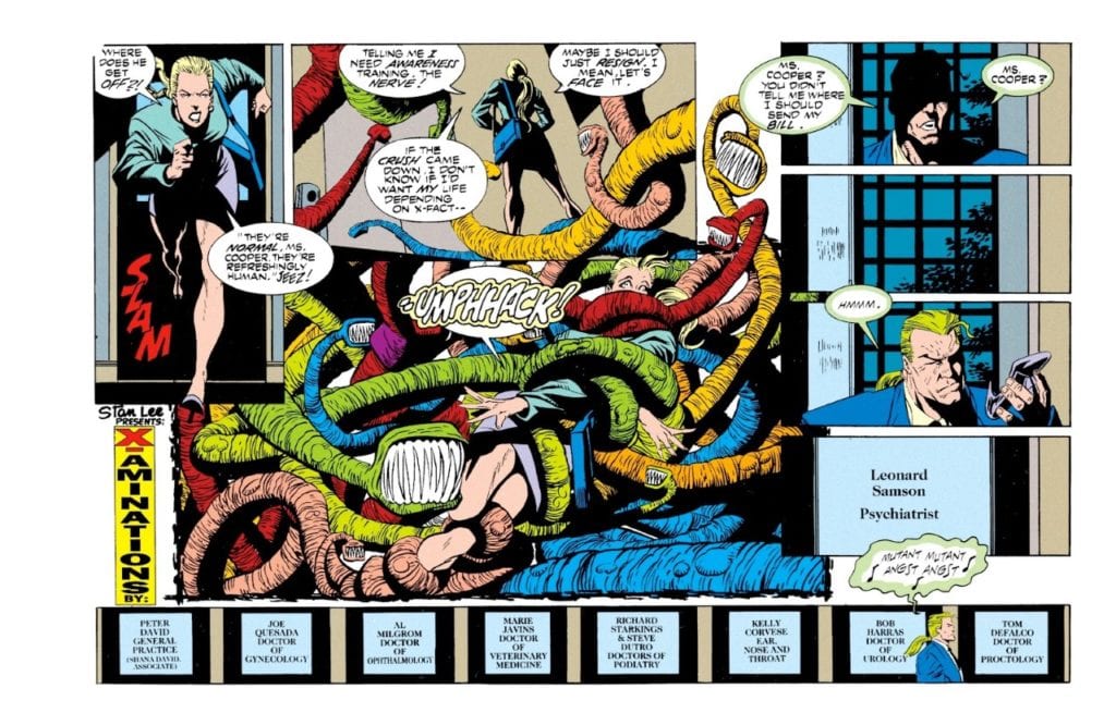
Did you guess who? The therapist all along was Leonard Samson! If you guessed right, congratulations. Sadly Marvel’s website and others spoil this reveal.
THE FUTURE
X-Factor #87 was a pillar for future stories. Rahne’s love for Havok and other authority figures came to ahead. While other head traumas arise. Pietro tried to rekindle his marriage while taking life slowly. Throughout future issues, he can be seen doing hobbies and acting nicer. Lorna seemed to stop caring about her weight while fairly getting over the mind control PTSD. Guido’s past came to haunt him in X-Force Annual #8, while others seemed to notice his facade.
Unlike the others, Jamie’s problem isn’t brought up anytime soon, as he dies from the virus. Plus, he has multiple other problems. Alex gains further development later on when Forge (new Government Liaison) questions the leader on his team. Unlike Val, he is able to assess each member, explaining why they’re needed. This not only shows how different he is from Val but how he has evolved these last issues.
Val’s future plot isn’t as great, as it seems the later writers had no idea what to do. She starts to become “evil” while purposely screwing up the team. Then it’s revealed she was mind-controlled in a very dull moment. It did help her exit; nonetheless, it could’ve been handled better.
Pencils by Joe Quesada. Inked by Al Milgrom. Colors by Marie Javins. Letters by Richard Starkings and Steve Dutro.
X-FACTOR IN TEAM THERAPY
What David did with X-Factor #87 was a huge feat that impacted the rest of his run and others. Not only did he use themes and plots showcased throughout the issue, so did Scott Lobdell and J.M. DeMatteis. What David did with the characters was unprecedented at the time and added layers to the individuals and team. Each member was put under a lens and looked at in a manner that at the time wasn’t usual, and still isn’t.
In the following issues, David, Lobdell, and DeMatteis kept the threads woven here throughout. The following issues revolved around different plots, yet all contained personal stories happening in the background from X-Factor #87 that would continue to shape the characters. Years later, David revisited the idea with X-Factor (VOL.3) #13.
As we close on X-Factor #87, know even superheroes are flawed and need a therapist. It could easily be debated this is when they’re at their best written. Nonetheless, much like heroes need to take care of themselves, so do we.
A lot of us are in need of a little comfort and escape right now, which is hard for some with social isolation. But comics are one of THE best mediums for that. And with no new comic book releases scheduled until further notice, we funny book fans can always turn to our beloved long box collections of issues or collected editions for that escape. With that in mind, a few of us at Monkeys Fighting Robots have decided to give a shout out to some of the comics that help us find comfort when we need it. Check out some of our choices below and make sure to leave some of your own in the comments. Enjoy!
Manny Gomez -Paul Chadwick’s Concrete
On the surface, Paul Chadwick’s (sole creator) series of Concrete stories may seem like yet another typical superhero concept and origin. Ron Lithgow is a government speechwriter whose brain was involuntarily transplanted by aliens into a hulking body made up of something that closely resembles concrete (hence the name).
In his new body, Ron/Concrete decides to use his strength, endurance and new found night and microscopic vision, for a series of adventures he never thought of in his previously normal life. But these aren’t the typical adventures you might think. He’s not out screaming “It’s clobberin’ time!”. Teaming with a writer and a scientist, Concrete decides to explore his new body but also how he now interacts with the world around him. Ron was a bit of an introvert before and his new body pushes further into be an observer to the world around him; it’s the deep observations that ultimately liberate his mind and soul. Throughout a number of short stories, single issues and mini-series, Concrete/Ron learns and begins to appreciate the world around him in a bold new way; eventually, he even becomes an environmentalist. It’s a great use of irony; being trapped in this newfound body that allows you to maybe connect with something outside yourself truly for the first time. In a weird way, I have felt like Concrete lately, trapped at first but then suddenly turning outward and reconnecting with the world and others. Paul Chadwick’s art is also gorgeous and sublime; some of the best black and white pencils you will see. There are several smaller sized volumes out there, and that format makes it the perfect small package to read and give you comfort right now.
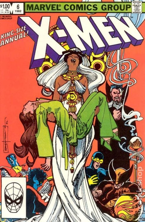
Gabe Hernandez – Uncanny X-Men King-Size Annual, Vol 1 (1982) by Chris Claremont, Bill Sienkiewicz, Bob Wacek, Glynis Wein, and Tom Orechowski
This is one of the comics that’s stuck with me since I was a kid, and perfect for grey, gloomy days stuck inside.
The artwork is gorgeous. I mean, look at that cover. It’s a static portrait shot, and yet it conveys everything about defeat and horror and tragedy without throwing a single punch. All the interior work is on the same level as the cover, something you don’t see much of these days.
As much as it’s an X-Men story, the real lead is Storm, which is significant for portraying a strong female lead in 1982. The story blends two genres effortlessly: horror and superheroes. And, it’s an all-in-one story that doesn’t leave any dangling threads that require additional books to finish.
The writing is not campy or silly. The adults talk like adults; different people with different opinions about how to do things that have chosen to work as a team out of mutual respect and common goals. Nearly every member of the team has something to do with a fairly strong emotional beat. In addition to Storm, Colossus has a moment of self-sacrifice that amps up the determination of the team’s mission, and there’s a death scene with Wolverine that shows he understands how death and killing affect those around him.
Plus, who doesn’t love a good Dracula story? If you’ve grown up watching monster movies (Hammer in particular) the Prince of Darkness is portrayed to perfection here. I highly recommend everyone get a copy of this book.
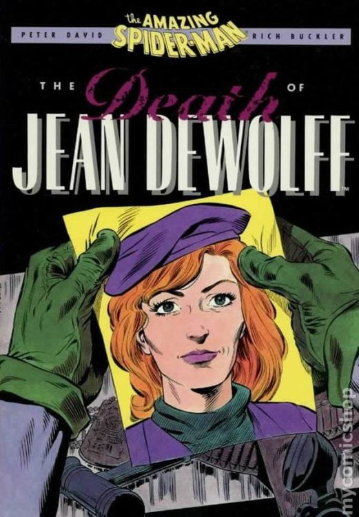
Brandon Mudd – Peter Parker The Spectacular Spider-Man: The Death of Jean DeWolff by Peter David, Rick Buckler, Sal Buscema
When I was a kid, I wasn’t an avid Spider-Man collector, but I did enjoy reading his books from time to time. Being quarantined within our new normal has given me time to look through some of my favorite comics and an arc that still resonates is The Death of Jean DeWolff from Peter Parker The Spectacular Spider-Man Nos. 107-110. The Sin Eater storyline, written brilliantly by Peter David, details the brutal murder of NYPD Captain Jean DeWolff and how the web-slinger reacts to it (SPOILER: Not well). Making matters far worse, it’s revealed our villain is the cop Spidey’s working with to find DeWolff’s assassin. Daredevil—who as Matt Murdock watched Sin Eater shoot and kill a judge—is also searching for the gunman.
I love this story because it shows Spider-Man, blinded by rage and grief, as a Batman-like vigilante with Daredevil believing Sin Eater’s crimes should put him in prison and not in the ground. Peter Parker’s moral compass has never been in doubt since Uncle Ben’s death, but here, we see him willing to throw it away in a moment of rage. David’s story reminds us of the strength it takes to do the right thing and that sometimes, fighting our friends is harder than fighting the bad guys.
Plus, Charles Bronson makes a cameo, so win-win.
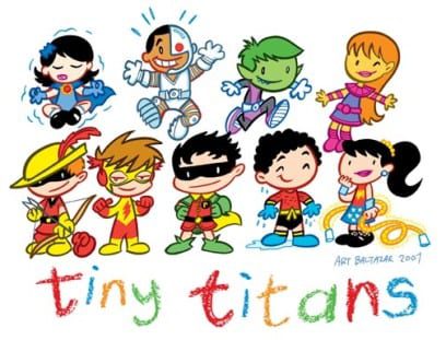
Jake Palermo – The Various Works of Art Baltazar
Art Baltazar’s numerous works evoke a sense of just being young and energetic versions of favorite characters. In Tiny Titans, for example, has the titular team not go into superheroics, but stripping them down to their essential personalities. Anyone who has watched the original Teen Titans show knows the best thing about that show is how the characters react and live with one another. Not to mention with the juvenile antics where even villains from the classic DC canon feel like believable villains. Not as bullies mind you but school staff. I’d certainly take Baltazar’s series over anything like Teen Titans Go!
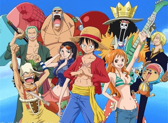
Jason Jeffords Jr – One Piece by Eiichiro Oda
My comfort comic is Eiichiro Oda’s One Piece. I remember when I first read it when it originally released in the monthly Shonen Jump in America. My parents had randomly allowed me to get a volume of the humongous monthly manga collection and after a while, a new series debuted called One Piece. From the get-go, I was instantly hooked. Once they started releasing the individual volumes (Tankōbon) I bought them as fast as possible. Since the beginning, I have reread the series at least four times. The amazing thing is after a while you can just go and read your favorite arc when you need a comfort read.
In these last few weeks, I’ve found myself going back to One Piece’s first few chapters. Although it’s at 975 chapters I find enjoyment and comfort in each one.
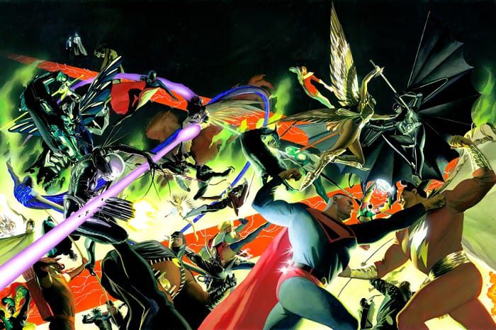
Justin Munday – Kingdom Come by Mark Waid & Alex Ross
Few, if any, comic stories remind us of the meaning and storytelling power of superheroes better than Kingdom Come. This 1996 miniseries presents its readers with a world broiling in chaos and desperate for hope. The classic Justice League heroes of yesteryear have retired or fled into obscurity, displaced by society in favor of lawless anti-hero metahumans. These replacements’ obsession with power and violent means results in a catastrophic event that threatens mass starvation and forces the likes of Superman, Wonder Woman, Green Lantern, and many more back out of retirement to set the world straight again. The events that follow create one of the most troubling, devastations, and inspiring mainstream comics ever created.
Kingdom Come essentially answers the question that has been posed ever since these classic heroes first made their appearance: “Why don’t superheroes just kill the villains?” Waid and Ross’ narrative answers this question by pushing the DC icons to the absolute breaking points of their morality and then reels them back in by reintroducing humanity into the mix. The comic series’ protagonist being a pastor and forced observer of these complex happenings creates a frame of reference into the story that allows the reader to reexamine why superheroes are such a necessity. The fact that even the likes of the Man of Steel and The Dark Knight can be brought back to their senses and reminded of their purpose in the face of both moral and physical devastation by an everyman type character is one of the most inspiring stories in this or any medium. The comfort in this epic is found by reminding ourselves of the absolutely needed principles of being human – truth, justice, mercy, compassion – and that by maintaining those principles, we can overcome tragedy and inspire ourselves and others to improve our world for both ourselves and the people around us.
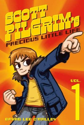
Michael Fromm – Scott Pilgrim’s Precious Little Life by Bryan Lee O’Malley
Let’s take a mental trip back to 2005. Cell phones weren’t smart just yet, and our faces weren’t buried in them for-two thirds of the day. MySpace was the social media channel of choice, and the only drama it created was making friends slightly jealous over not being in your top eight. The world wasn’t so divided on every single issue, at least not from my point of view. It was also the year I stumbled upon Scott Pilgrim’s Precious Little Life in my local comic book shop. I was already an avid comic reader but had only really dabbled in the superhero genre (and Sandman, one of the greatest pieces of literature and art of the 20th century). The energy of the cover initially drew me to the book – a bright orange pinwheel backdrop, big and bold yellow title, 8-bit font for the author Bryan Lee O’Malley’s name, and an average-looking twenty-something pointing up at me. It was smaller than the standard comic book but thicker, like a digest or manga. I skimmed through the pages and, though the artwork was in black and white, I could easily picture the colors in my mind’s eye. Like the cover, I could feel the energy seething through the pages. It had a unique blend of 16-bit video game imagery with the over-expressive eyes and action sequences of a manga.
I bought it on a whim, and actually read the thing when I got home. The characters, their relationships with one another, the language they used, and the conversations they had were something I was wholly able to connect with. Much like the titular Pilgrim, I was a twenty-something still trying to figure out the world I was living in. I didn’t know what I was going to do once I graduated college. I was an awkward, emo, hopeless romantic attempting (and miserably failing) to flirt with girls at house parties. As small-time as my woes and worries were, they still felt like they could pummel me into the ground at any given moment. The world was a scary place for me, and seeing this nerdy, awkward slacker literally beat down his enemies (in explosive, superhero fashion) to win the heart of the girl, and grow up a little, gave me a little comfort.
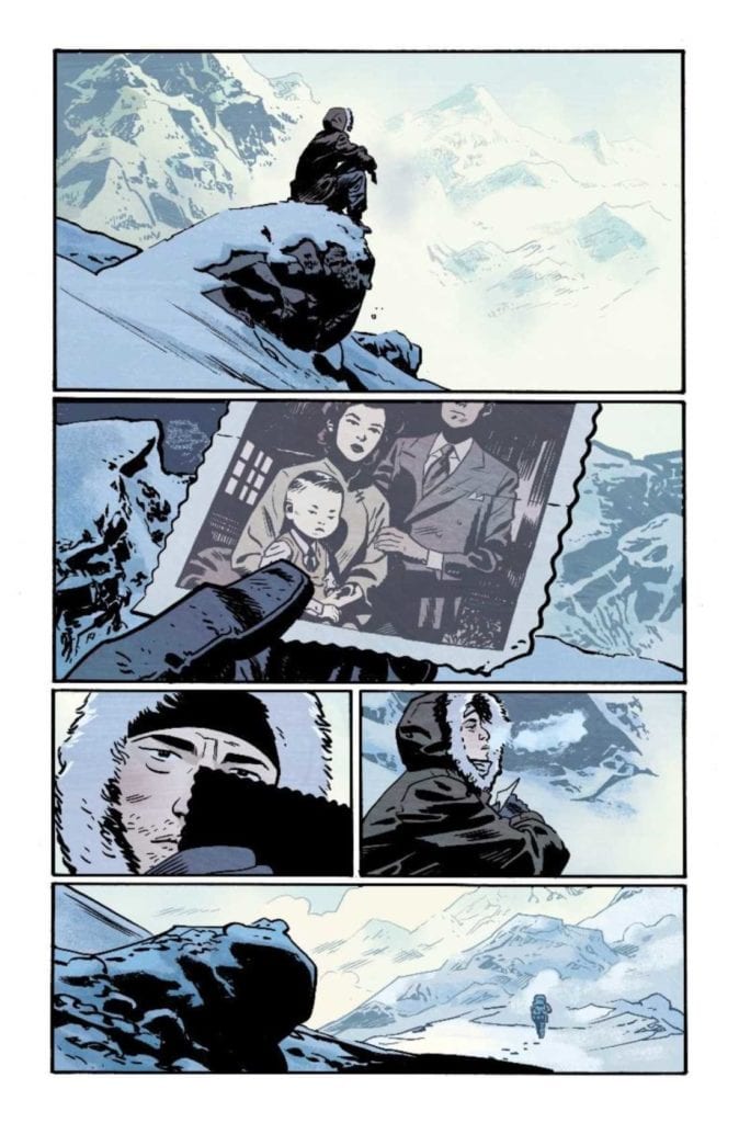
Fire Power by Kirkman & Samnee has an unfortunate pre-release reputation as an Iron Fist rip-off, but Robert Kirkman makes a strong point that first impressions aren’t everything. Hopefully, coming out on April 29, Kirkman and co-creator Chris Samnee deliver a great story about spiritual balance.
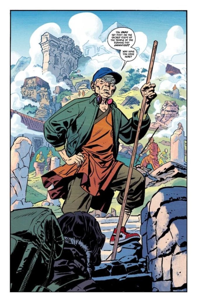
Fire Power The Spirit of Martial Arts
If anyone has watched a certain video about Fake Martial Arts, they get an introduction to why martial arts, in general, has its appeal. It’s a sense of national identity and a chance for people to challenge the status quo, something Kirkman ingrains into every part of this Prelude. Now while Fire Power‘s primary martial art, the Flaming Fist, is indeed fictional, it never strays into the realm of cultish absurdity like Count Dante’s Dim Mak. There is a basis to the secret technique of throwing fireballs like in Street Fighter. But it’s so difficult that nobody is able to replicate it. All of which revolve around two of the main characters.
The Fuel and Oxygen
Pay attention to the mark on her arm.
Owen Johnson, unlike most martial arts protagonists, isn’t trying to become the strongest there is. Neither is he out for revenge. He just wants to learn about his birth parents. That journey leads him all across China, where martial arts masters instill in him a sense of discipline and patience. One that leads him to the Temple of the Flaming Fist. As well as the other major character, sifu Master Wei Lun.
Wei Lun’s character design from Samnee perfectly encapsulates his character. He’s a traditional man who combines the secret world of the temple with the modern world. Complete with wearing sneakers instead of sandals as well as headphones in addition to the traditional gi. This displays his greater patience to not cut himself off from the modern world.
Most people of the temple see it as their only place in the world and never try to do more than necessary. It’s why many temple practitioners give up on the fireball technique. Wei Lun meanwhile always tries to complete the fireball technique as a way of understanding himself and the people around him. This includes Owen when some revelations come to light. Both of these characters show an importance in martial arts, finding the balance in life. For only when you discard notions that hold you back do you fully realize yourself.
The Artwork Has Fire Power
In addition to the above character design of Wei Lun, Samnee’s artwork shows a balance of both character design and landscape detail. The mountainous region looks almost photorealistic. Meanwhile, the details on people’s faces receive a great degree of detail, including their wrinkles. All while evoking the traditional artwork from Chinese calligraphic paintings. The inking for the darker shading always goes into a rhythm that evokes not only moods but also a need for balance between the bright and dark. The dark holds secrets that people are trying to bring to light. Because once Owen embraces the darker sides of the temple, he doesn’t find what he wants, he finds what he needs at the climax.
Coloring
Matt Wilson’s coloring also follows this philosophy of Fire Power. The dark blues of the mountain, in contrast to the warm colors of fire, act almost like an indication between answers and uncertainties. But perhaps that is best on display from the butterflies of the temple. Yellow butterflies are a sign of love, one that shows Owen’s drive to find the love of his parents. But it also means long life, something that both Owen and the temple hope to regain. One that culminates in a large bright yellow flame near the end of the climax.
Lettering
Rus Wooton’s lettering matches significantly with the above art styles. Some of the simple calligraphy when it comes to the onomatopoeias can become complete extensions of actions. The thicker the lines, the stronger the action. When some of those actions receive coloring, it’s usually for something either threatening or revealing. Bright yellows, in particular, drive the reader into revealing the state the characters are in. The word balloons match up when the words turn from black to dark red. By the time of the big action scene large onomatopoeias indicate the climax.
Fire Power is What Netflix’s Iron Fist Should’ve Been
While it’s okay to make comparisons to Iron Fist for advertising’s sake, Fire Power is the way to show a proper origin story. Because first impressions aren’t everything, there are some things you have to try and understand. Some people might show their entire character like Wei Lun, but that’s only because paying too closely to traditions can hold you back. It’s finding that secret and knowing what to do with it that means the most. So don’t assume that just because you’ve seen one Martial Arts series that you’ve seen them all.
Do you think Fire Power is still just an Iron Fist rip-off? Leave your thoughts in the comments.
Star Trek: Picard, the latest series in the five-decade-old Star Trek franchise, finished its ten-episode run on CBS All Access, and the time has come to address the good, the bad, and the ugly about Patrick Stewart’s return to his most iconic role.
Star Trek’s history dates back to 1966 when CBS presented a series with effects that were ahead of their time for television, stories with more moral complexity than most of its contemporaries, and a diverse crew of characters from all around the world and even one from another world. Throughout its history, Star Trek’s exploration of space has often included a deep-dive into human nature itself.
How does Star Trek: Picard fit into all this? Let’s dive into the problems with Picard.
The Good
Star Trek: Picard is a sequel to the Next Generation-era of Trek, which ended with Star Trek: Voyager. Throughout its history, from tv to film and even albums released by various cast members, Star Trek is made whole by its music. Whether you’re a Trek fan or not, you know the original theme song from Alexander Courage. Legendary composer Jerry Goldsmith created the iconic themes for TNG and Voyager while Dennis McCarthy handled Deep Space Nine.
Now, we have Jeff Russo (Fargo), who adds his talents to the long musical history of Trek. He does a fantastic job creating new themes, including the subtly mesmerizing main theme of the show. Russo and company also weave in older themes. When Seven of Nine shows up, listen, there’s a taste of Voyager’s theme. When the Romulans come into the picture, their underscore from the original series adds to their ominous nature. The score is undoubtedly one of the highlights of the series.
Star Trek also has a legacy of casting great acting talent. Picard is no different. Stewart is a legend. Full stop. Surrounding him are actors Allison Pill (Scott Pilgrim vs. The World), Santiago Cabrera (Heroes, Merlin), and Isa Briones (The Assassination of Gianni Versace: American Crime Story) who each do a great job with the material. Jeri Ryan (Star Trek: Voyager, Boston Public) is instantly captivating and makes her return as Seven of Nine a compelling character in new ways. Throughout Picard, the acting is solid, considering what they had to work with.
Ooh, ominous much?
The Bad
Filmmaking is eternally in a complicated relationship with itself. Film and television production is a complex business with a lot of talented people involved with each adding to or subtracting from the whole. There are a lot of reasons that certain aspects of a show or movie don’t work. Budget, direction, contracts, rewrites, actor requests, and time, all play a factor in the final outcome.
With that said, there’s so much that’s lacking in Star Trek: Picard that it’s hard to decide where to start. For a franchise known for cutting-edge special effects, Picard has none. It’s all standard CG, some updated HUDs from Minority Report, and little else. Where previous Trek built a detailed future-world around their characters, Picard seems to take the opposite approach. There’s little visual world-building going on through ten hours of television. At first, it looks like maybe the show went for subtle minimalism, but after a while, it’s clear that it’s more likely due to budget constraints or a lack of effort put into those areas.
Part of the VFX of Star Trek over the years has produced some of the most beautiful starship porn ever committed to film. Yet, in a pivotal, season-ending space battle, it looks like the ships on both sides were simply copy and pasted over and over again. There’s little, if any, variation in ship design, and the entire sequence falls flat. Not to mention, it goes no where. It ends almost as quickly as it began. La Serena, the ship used by Picard and company throughout the season is nothing to write home about and a lot of the close-up CG shots of the ship look dated in real-time.
Overall, Picard is woefully average at best in most departments. The lighting, the costumes, and the production design seem half-hearted or lacking in time or money. For a franchise that has featured the iconic bridges on five shows, La Serena is an opportunity to add to this heritage. However, when the crew is gathered for the classic straight-on shot, it all looks like a warehouse in a super-expensive fan-film.
The Ugly
The writing. Plain and simple. Again, as I mentioned before, the final show is the result of a lot of decisions along the way. But, there are so many gaps in story logic or dropped ideas that it’s clear the writing was never ironed out. Picard feels like every episode got one draft of a script and went straight to production.
A fundamental part of storytelling is what’s referred to as setups and payoffs. You set up a situation then pay it off with something later. In just about every story, whether on TV, film, video games, or books, there will be moments where creators will set up a problem, present a solution, have the solution fail, then have the characters figure out a new solution on the fly. That creates tension and drama. In Picard, they balk at this idea more often than not.
For instance, in one episode, we’re told about a potential problem. The crew has a solution. The solution works as intended and we’re on to the next scene. What was the point of bringing up a problem if it’s going to be resolved without any real consequence or point? This happens time and time again on the show.
Perhaps the biggest crime of the writing is that Picard is an irrelevant character in his own show. It’s not really a show about him but a show about stuff. Most of the stuff isn’t addressed, gets dropped, or glossed over. For several episodes, things just happen around Picard or characters fall right into place where Picard needs them to be. It’s rare that Picard is getting himself out of trouble and is simply saved by another character out of the blue which several more basic building blocks of storytelling. Additionally, a simple re-write to the first episode could exclude Picard altogether for the entire run of the show without much else changing.
Epic Fails
If you know of Alex Kurtzman’s work, it’s no surprise that Picard has such problems. Kurtzman, like JJ Abrams, is less concerned about story cohesiveness and more focused on feeling. And that’s fine. There’s room for all manner of entertainment in the world. But with that stylistic choice come consequences. As with most of their work, it all feels great on the surface, but even a moment of looking deeper at the material causes it to fall apart because there’s little effort put into creating a cohesive narrative.
But the reality is that Kurtzman is, in part, a victim of modern television. Star Trek: Picard could EASILY be a non-Trek related series. It would probably even work better if it was just set in its own little universe. However, it’s not. Because CBS doesn’t own many franchises that can compete in a world of Disney+ and Netflix they have to rely on Star Trek (and to a lesser extent, The Twilight Zone). But that doesn’t mean it needed to lean on Stewart and his iconic character. The character of Picard has one of the finest endings to a television character in history. Though they made four movies after, the character’s legacy is built on those seven seasons of Star Trek: The Next Generation.
Star Trek Beyond Picard
It’s easy to understand why Star Trek: Picard happened. Patrick Stewart is a beloved actor and a big draw to bring in fans. Did it work? Well, that’s hard to tell since streaming services like Netflix and CBS All Access do not release viewer numbers, and they do several little tricks to pad their numbers for shareholders too. There are ways to glean a little information, but it lacks empirical integrity. Yes, the viewership numbers on YouTube for Ready Room, Star Trek: Picard’s after-show hosted by franchise alum Will Wheaton has steadily declined, but that doesn’t say much (if anything) about the overall popularity of the show.
If Star Trek needs to do anything as a franchise, it’s to re-establish its world. They need to take a cue from their own history. When Star Trek: The Next Generation arrived, it brought with it many familiar things from the past, but it also set up the new paradigm. On that foundation, Deep Space Nine, Voyager, and, to some degree, four movies were able to expand the narrative. Picard does not do that sort of thing. It’s a show where stuff happens. Some of it is exciting, a lot of it is frustratingly confusing. Most of it will be irrelevant, forgotten, or ignored by the time season two makes its way onto CBS All Access. But will viewers show up or is CBS ultimately going to be gobbled up by Amazon, Disney, or cash-rich and content-needy Apple? Sadly, Star Trek: Picard isn’t a bad show or a good show. Picard’s a painfully average show (at best) that’s presenting generic science fiction with a Star Trek logo on it. May the franchise boldly go into the creative and innovative realms it once explored.
Is Star Trek: Picard on your watchlist? Did you watch it, love it, and want to nerd rage at the author? Leave your comments below.
With COVID-19 shutting down Diamond Comics Distributors and comic book shops around the world for an indefinite period, the question needs to be asked – What will the comic book industry look like post-crisis? We asked that question to several people around the industry; below are the results.
As a former comic book store owner and the founder of Monkeys Fighting Robots, I think this shutdown will devastate the direct market. Owning a comic book shop is not easy, and the profit margin is paper-thin. The stores that survive and the new ones that open will drastically change their business plans for this new economy. The “new-this-week wall” will get very small, as stores will order the bare minimum when it comes to new issues. The trade paperback and graphic novel section of the store should become the driver of sales. Hook a new reader with a trade, and then get them to start a subscription service for new titles. Having employees that can sell books will be a must-have. The stores that have knowledgeable and personable employees will succeed as they should be able to find the perfect graphic novel for any customer.
As shops scramble to make money during the shutdown, I would expect back issue prices to drop. If the crisis lasts more than 90 days, it should become a buyers market for key issues. The discounts are already starting to roll in on eBay.
The trend that will influence new stores the most will be diversifying your income source. A coffee shop or bar that has comic books is a good example. Comic books are the only industry where you need to start another business to support your first business. The retailers that are agile and extremely creative will survive as the industry goes through its next evolution.
Comics aren’t going anywhere. The way we purchase and consume them will inevitably change, but I feel like that transition was already happening before the pandemic. If anything, COVID-19 could just accelerate those changes.
In a post-COVID-19 world, how comic books are sold will still be a combination of monthly issues, graphic novels, digital comics, and crowdfunded projects – though I believe it’s too early to say how that pie will be divided up, or if new options will become available that no one has thought of yet.
Anthony Composto (journalist & consumer)
If the COVID-19 crisis has taught us anything about comics, it’s that the industry as a whole has to do a better job supporting retailers. Many (mostly independent) publishers have stepped up to try and support comic shops these past few weeks, and I expect a lot of these practices will continue in some form post-crisis. The biggest change I think we’ll see is an increase in publishers allowing returns on their books, with some restrictions of course.
Many local comic shops have ramped up their mail-orders during this crisis, and I think mail-order comics will remain prevalent in the aftermath of COVID-19. Consumers will be skittish to return to brick-and-mortar stores for a while even after the health scare is over (and that will go for all industries, not just comics), so online and over-the-phone purchases will see a large increase.
As far as the retailers themselves go, they will be ordering much lighter moving forward, largely because they’ll still be trying to recover financially. I think they’ll also begin innovating new ways to get comics into the hands of their consumers. My local comic shop, A Comic Shop, has been doing weekly online sales and auctions via Facebook Live for a while now, going back before this whole mess started, and I wouldn’t be surprised to see other shops starting to do similar things.
And finally, it’s been my theory for a long time that comics should begin transitioning away from single issues and into more trades/hardcovers/OGNs, and this crisis might be the thing to convince publishers that’s a smart move.
The comic book industry will look different after the coronavirus crisis comes to an end. It was already in need of serious change. But this global shutdown could be the wake up call it needs. We are living in an increasingly digital world. Audiences are becoming more and more comfortable watching movies and reading comics right from their smart devices. Self-quarantining has merely reinforced that notion. In conclusion, there will still be a place for the traditional “floppy” book, but it will not be the comic industry’s saving grace. In order for it to survive, every aspect of the medium – its format, content, delivery method, publishing frequency, marketing, and pricing – must be scrutinized and re-calibrated.
I hope that the crisis will create positive change. Perhaps the big publishers will focus on content, scaling down the number of releases and focusing on quality month to month storytelling over things like variant covers and massive crossovers that require a checklist to make sure you don’t miss an issue.”
Without a doubt, the Diamond news signals a rough time ahead for local comic shops. While the industry itself is largely able to continue putting out new stories digitally, the local comic shop is a linchpin of the community itself for many readers and collectors. We can sit here and talk about how the industry shouldn’t have allowed Diamond to monopolize distribution over the last several decades, but that’s a moot point right now. It is what it is. I’ve seen some creators suggest on Twitter that the big three (Marvel, DC, and Image) in particular should arrange some kind of digital storefront. Allow readers to buy digital copies now and receive the print versions later when they become available. Can that stem the bleeding and save some of these shops from going under? Maybe. It might be a better option than dumping months of print copies onto their shelves as soon as this ends and expecting consumers to double-dip if the digital versions continue being released as scheduled in the meantime. Regardless of what happens on that front, stores that do have a lot of existing stock in the form of back issues and trades are going to have to get creative with sales and offers to keep that moving as a band-aid until this crisis ends — which is hopefully sooner rather than later.
As a publisher, we naturally worry about the health of our business and the industry from a dollars and cents perspective, and those worries persist even without a global pandemic bearing down upon us. We’re often forced to rethink and adapt to survive in a functioning marketplace, and now that the market has been essentially paralyzed, our urgency to adapt is paramount. One of the big concerns for us as a publisher is not so much distribution but rather the health and welfare of the freelance artists who are the backbone of the industry. During this crisis, it’s become very apparent that so many young artists, writers, colorists, letterers, and designers are saddled with debt from their education, and the basic cost of living is ill-serviced. Many do not have health insurance. The flow of steady and consistent work – especially if they were working on a monthly title – has dried up in the past few months. It’s a pretty bleak scenario, as the work skills that these creators paid a fortune to learn have little demand right now during the shutdown. At Z2, we’re fortunate to be working on graphic novels, so our creators are still getting paid as they have a year’s worth of pages to work on. We consider ourselves fortunate to be in this position.
But moving forward, there might be a few lessons that can be gleaned from this unprecedented scenario. Like in other creative industries, the need for a creator’s union seems more vital than ever. Right now, unless a creator has robust sales numbers to back their services, there is little bargaining power for their services. A union, should its membership be strong enough (if it also includes graphic designers, storyboard artists, etc.) can then work towards building protections such as health insurance plans and child care. Having a collective union that regulates creative costs will also help regulate the cost of our products, and make them accessible to wider audiences who previously couldn’t afford to drop four or five bucks on a single issue. Again at Z2, we keep our rates at the same levels of the majors, and we do it because we genuinely feel art is hard work, and it must be rewarded. Which leads me to the second lesson to be learned for publishers, and that is to set the business standard that one shouldn’t greenlight a project if their finances cannot support it. There are far too many stories of creators not being paid because publishers are counting on their books being successful enough to address their accounts payable. That’s putting the cart before the horse; an industry cannot thrive under those business practices. If you don’t have the money to pay creators, then you don’t do the project until you can pay them for the full project.
I’m not qualified to make suggestions for the comic book shops and distribution, but one thing which will always help shops is if we as publishers create compelling, thoughtful work that they can actually stand behind and sell. The marriage of art and commerce is a tenuous one, but it is also one of the most longstanding in the history of man. We have to find those ways to entertain and push the artform while also being mindful of our ability to find audiences for our products. When the comic book industry thrived, we had the most creatively compelling titles driving it, titles that didn’t rely upon gimmicks or pandering, they were just brilliant, entertaining stories that were executed with heart and soul. This responsibility falls on the shoulders of editors, who have to know the fundamentals of storytelling and art and trust their study, their taste, and most importantly, their instincts. As publishers, we must find, support, and push our editors to simply create the best stories possible. We must create books that give incentive for readers to buy our products, books that provide value in the form of entertainment, provoking of discussion, and the pure joy of reading something new and fresh.
Of course, all of these things can be labeled as idealistic, but nothing starts without an idea, and our ideas must have dates attached to them. Only then can we ever dream of them becoming a reality. We all want comics to survive, and they have through even the darkest of times. And in those darkest of times, they served as a refuge to the harsh realities of the world, a much-needed escape to the realms of possibility and imagination. We should never lose that.
In light of how many comic shops close down during the COVID-19 protocols, publishers, as well as Diamond Distributions, might need to reconsider using preorders as indicators of a title’s success. Pre-orders work best with long-established A-List titles, including Superman, Batman, and Spider-Man. But for the highly-rated series that don’t become viral hits like Black Panther and the Crew or Atlantis Attacks, this is a detriment. With the COVID-19 outbreak not letting many comic stores get product and costing the publishers millions, perhaps this is what will convince publishers not to rely on pre-orders for success. Instead it would be better to use resources like critical responses and post-release date sales to determine success. The best form of advertising isn’t algorithmic procedures like on YouTube or Netflix but how the fans react to them. All the while filtering out the more toxic responses. Because not all criticisms are constructive.
There’s a difference between wishful thinking and educated projection. So, this isn’t about what I want to happen for the Comics Industry, but what I foresee is the likely outcome in the post-COVID-19 world.
Several of the smaller and more rural Local Comics Shops (LCS) will fold…permanently.
Larger, busier, and urban-central LCS will shift focus to a smaller selection of monthly floppies that are more likely to have strong sales (e.g., Comichron Top 10) and a heavier emphasis on reprints of classic stories. They will augment revenue by pushing online sales outside their local area, and they will look to selling comics-related and gaming-related items and events in-store such as Sideshow statues, Magic the Gathering tournaments, etc..
Several of the smaller publishers will either fold and sell off their IP’s to larger publishers or remain open but severely cut staff. They will cease production on monthly floppies in favor of longtail trades. The focus will shift to aggressively farming out their IP’s to other media formats such as movies and television, similar to what Marvel did in the ’90s. To avoid costs with Diamond distribution, the small publishers that remain open will band together to form their own distribution service or develop in-house shipping.
Depending on the number of LCS and smaller publishers that fold, Diamond will be unable to sustain regular operation with significantly reduced volume. One of the Big 2 will offer to buy Diamond as a capital investment that can be written off. The publisher that wins that buyout will further monopolize the monthly market. Smart money says Disney because it can leverage that new distribution arm for all publishing content across all properties (Disney, Marvel Lucasfilm, etc.).
The medium-to-large publishers will also reduce staff and be forced into a sales-based merit system for its properties. Books that don’t sell won’t continue. Artists and writers that don’t make profitable content won’t be retained. Variant cover saturation and regular universe reboots that span multiple titles will become much less frequent. Expect significantly higher staff turnover in the short-term until the (profitable) cream rises to the top.
Since a much smaller pool of creators will be retained by publishers for full-time positions, expect to see greater numbers move to crowd-sourcing platforms ala IGG and Kickstarter. As with medium-to-large publishers, the creators that make good content that customers want to buy will thrive (after a little fumbling on the learning curve). Creators that make content that had previously been supported by publishers, but were not profitable, will leave the comics industry outright or will only remain in comics as a side gig. Some will attempt to go the crowd-sourcing route but will fail.
Conventions will return, but in fewer numbers and much smaller in scope. Alternatively, you could see a few very large conventions pop up that are a consolidated version of several smaller conventions. The publishers that survive will scrutinize the ROI of such events and conclude that hype doesn’t translate to sales. The focus of comic-cons will shift to independent creators more heavily, with a secondary emphasis on celebrity appearances to draw the crowds. The larger publishers won’t bother to show unless it’s to promote other media development such as film and TV shows.
When we finally come crawling out of our geek caves to re-enter life the hope will be that the Comic World will have learned to appreciate those magnificent creators and traders whose work has kept us sane for those difficult weeks. Unfortunately, in a world where key workers and self-employed are expected to survive on barely a living wage and savings, they have never had the chance to amass while millionaires are asking for handouts to save their billion-pound companies, the chances are it’s the small comic shops and lone artists/writers who will suffer the most. The larger publishers will pick up where they left off, using this as a chance to streamline themselves, saving money. It will be up to us, the critics, the reviewers, the collectors, and the readers, to rescue the true heroes of the Comic World: the creators and independent shops. We have to support them in every way we can, making sure they can recover, rebuild, and live on into the future.
What are your thoughts on the comic book industry? Comment below with your ideas.
People photo created by drobotdean - www.freepik.com
Every one of us has enjoyed comics at some point growing up, and even way into adulthood. Comics are entertaining and they are a great learning tool for children who are not yet ready for serious scholarly work.
From the Superman story first published in 1938 to great new characters from DC, Marvel, and Japanese Manga, great writers that have influenced many generations to date have written great comics. What makes a great comic writer, and a great comic? Here is a comprehensive guide to writing comics.
How to get ideas for comics
A great idea starts with ordinary, mundane experiences. To leverage this, you want to carry your notebook on you at all times to note down those curios incidents or comments people make. When musing over your notebook entries later, something in there might just plant that all-important seed for a great comic.
Aside from entertainment, comics in learning are a great visual medium for teaching, especially in elementary school. So, why not draw from your own experience as a student growing up and develop comics that can make learning fun for students? Alternatively, you may approach education authorities and offer your services in writing educational comics.
How to write a winning script for comics
Now that you have found the right idea, pause for a moment, and plan before you start drawing your comic. Drawing on the fly will fly you into the headwinds of confusion and a lost storyline. You want to work by a structured storyline to carry your comic.
Instead of the sketchpad, pull that notebook and start putting down your script. Visualize how the beginning, the middle, and the end of your illustrated story will be and develop an appropriate script. Assume the role of your characters or the story’s hero and create a realistic script in a believable setting that will guide your illustration.
Using writing tools is another great strategy here. Paraphrasing tool from EduBirdie helps you in presenting an idea in many different ways. This enables you to come up with the best words for a sentence and the right structure as well.
Create an engaging layout
Ah yes, the script is right and you know your drawing is top-notch, but will the flow be captivating across the pages?
To preempt this and make sure you do not work for naught, plan your layout so that page endings entice the reader to open the next. Plan your script for every page with a rising urgency for what happens next and then throw it over to the next page.
You don’t want comics you invested a lot of time and resources tossed after the first two or three pages. It is bad for business and it is bad for the reputation. Put a lot of thought into layout planning for stellar comics.
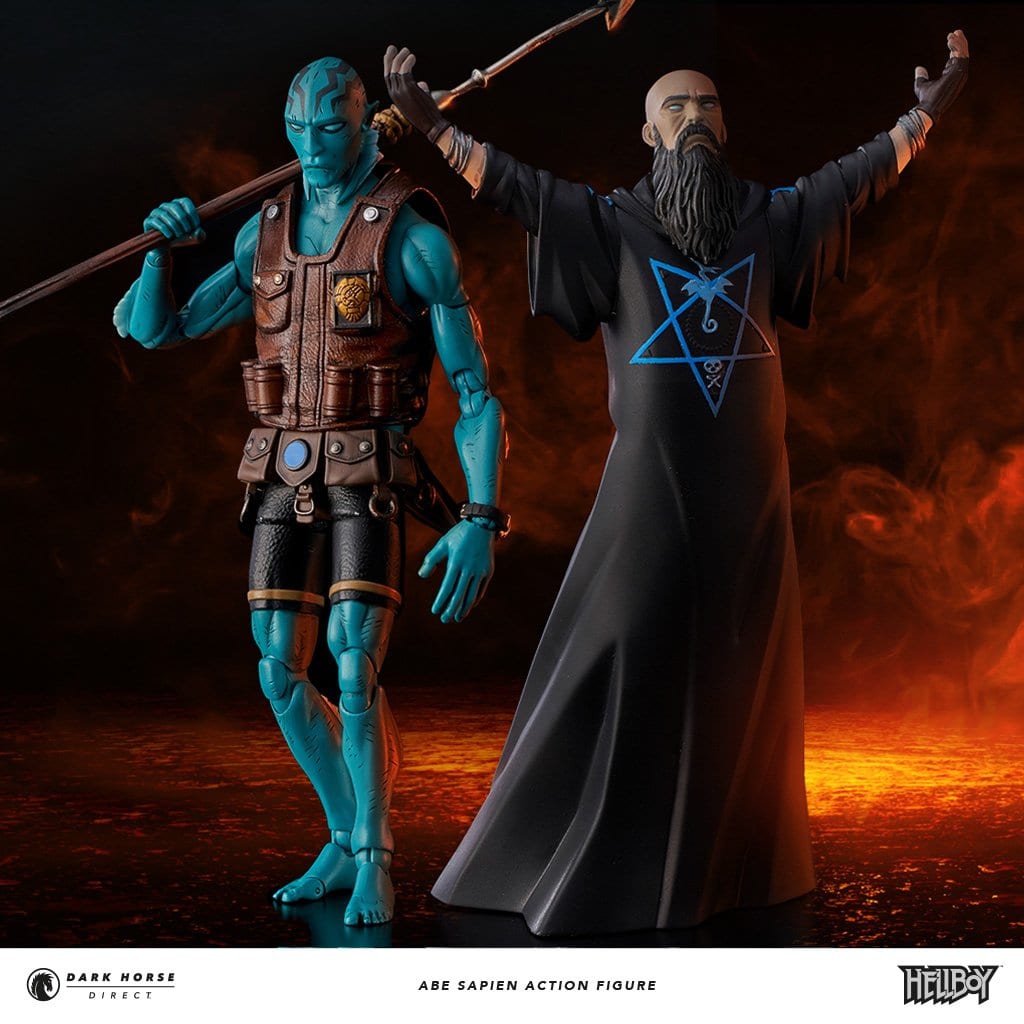
Dark Horse Direct and 1000Toys are releasing a limited edition Abe Sapien figure this summer, but thanks to Dark Horse Direct, Monkeys Fighting Robots has an exclusive look at the brand new Mike Mignola illustration which will be used as the box art.
The Abe Sapien Action Figure will be approximately 6” tall, with Removable Vest, Interchangeable Hands, Pistol, Spear Gun, and Knife. The figure is limited to pre-orders, with a price tag of $119.99. Check out the Mignola piece below.
More details on the figure: Dark Horse Direct, creator Mike Mignola, and 1000Toys are back and proud to introduce the next member of the B.P.R.D. with Abe Sapien! As a follow-up to our best-selling 1/12th scale Hellboy Action Figure, this fully articulated Abe Sapien 1/12th scale action figure stands at approximately 6” tall and features removable vest, interchangeable hands, pistol, spear gun, and knife. The pistol and knife can be holstered on Abe’s belt when not in use. As a Dark Horse Direct exclusive, this figure will also include the archenemy of the B.P.R.D., a separate non-articulated Rasputin figure!
This version is exclusive to Dark Horse Direct, and the edition size will be limited to the number of pre-orders taken in a one-time production run, never to be reproduced. Add this new paranormal investigator to your team and expand your very own B.P.R.D.!
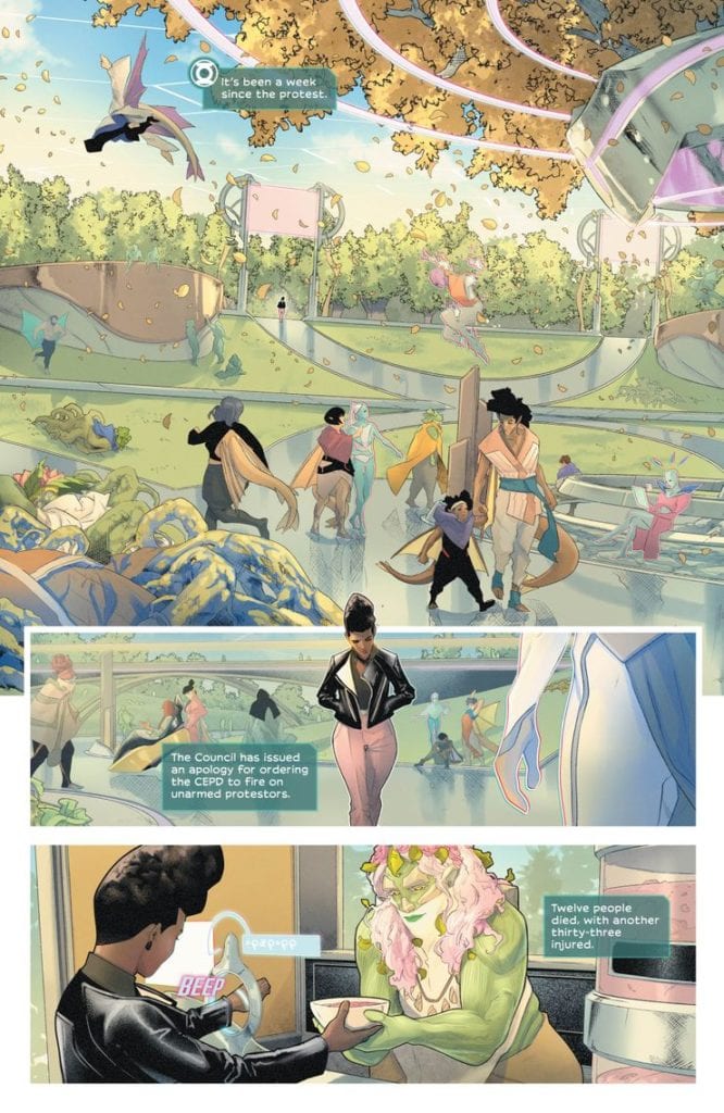
Writer N.K. Jemisin and artist Jamal Campbell’s “Far Sector,” with the help of letterer Deron Bennett, has been a tantalizing blend of space-opera, sci-fi noir and socio-political commentary. Issue #5 offers even more of these stallar elements, but now with some backstory on the character of Jo Mullein and how she became to be the person she is – both as a Green Lantern, and as someone with her moral character.
“The mysteries of Sojourner “Jo” Mullein’s origins and her recruitment into the Green Lantern Corps are finally revealed. Meanwhile, Jo’s attempt to “follow the money” is complicated when she discovers the City Enduring’s form of cryptocurrency is mined by an underclass of artificial lifeforms.”
Writing & Plot
As “Far Sector” continues, N.K. Jemisin‘s creation of the City Enduring becomes more and more obviously a giant metaphor for our own society. Of course, this is what great sci-fi does: it weaves a narrative that offers commentary and/or/ criticism of reality. Issue #5 of this comic adds even more layers to this commentary with Jo’s complex backstory and the discovery of the planet’s own slave labor system. Sojourner’s past may come off as a predictable tale for anyone acquainted with Green Lantern history (no spoilers), but it’s Jemisin’s approach to that story that makes the sequence so memorable. She’s able to inject originality and relatable tragedy into an origin that has most certainly been done before, with a universe we’ve all seen explored in hundreds of ways. Jo’s revelations regarding The City Enduring’s A.I. offer a look at Jemisin’s critique on classism, injecting her socio-political commentary with some class-commentary as well. Of course, this would all mean nothing if the writing itself were dull or clumsy. As can be expected however, the pacing and dialogue are all outstanding once again. Jemisin’s ability to use crime noir genre tropes and apply them so seamlessly to this space opera is astonishing, and her ear for dialogue is wholly unique. This is a sci-fi comic with scripts that fires on all cylinders from month to month.
Art Direction
It’s a rare treat in comics to find an art style that visually fits the writing to the point that no other visual style could possibly work. Jamal Campbell‘s work on “Far Sector” hits that exact point with his gorgeously expressive characters and stunning environments. Issue #5 gives him some work with the sights of Earth living, which allows him to flex his range as an artist. Even the more “mundane” scenery has Campbell’s pristine touch while still holding familiarity with our reality. Character designs are once again unique yet natural, as aliens and A.I.’s are created with recognizable humanoid features that still exude otherworldly qualities. There isn’t much that can be said for Campbell’s art at this point that hasn’t been said already, as it’s so consistently outstanding every issue.
“Far Sector” #5 is a shining example of what makes this comic so special. N.K. Jemisin manages to thoughtfully create original storytelling in a space opera/crime noir style with increasingly compelling doses of social commentary. Jamal Campbell brings the vision to life with pristine, vivid artwork. Letterer Deron Bennett rounds out the talent by creating fonts that accurately gauge the tone of the dialogue and narration and pull the reader into the conversation. Be sure to order a copy from your local comic shop or on ComiXology on 3/25!
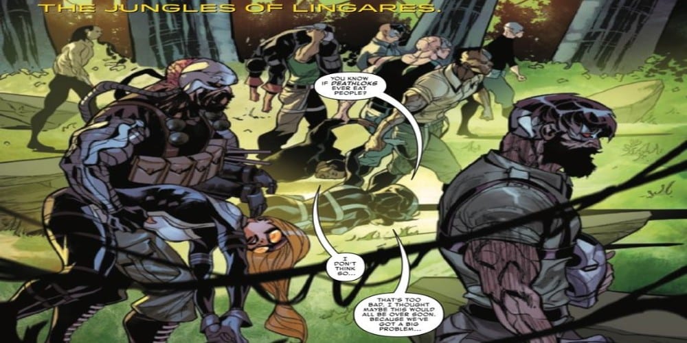
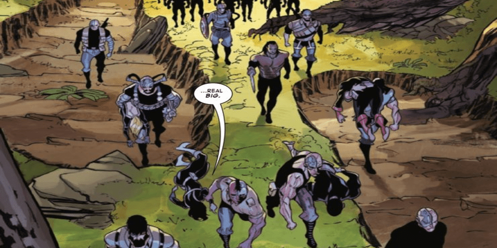
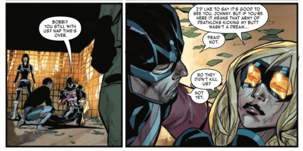
The team faces an army and a major problem in Force Works #2 written by Matthew Rosenberg, art by Juanan Ramirez and Roberto Di Salvo, colorwork by Federico Blee, and lettering by VC’s Travis Lanham. War Machine and his crew have to face off against an entire army of Deathlok. Does this mission in uncharted territory lose momentum or does it bring the heat?
War Machine, U.S.Agent, Mockingbird and Quake have joined forces to fight against the robots for human survival as Force Works! Will they be enough to stop an entire arm of Deathlok?
Writing
The group dynamic established in the previous issue is tested further as the team is captured, stripped of their equipment, and have to figure out how to escape. The back against the wall aspect of the issue is the best part of the issue. Only by banding together and playing off one another are the members of Force Works have to rely on one another if they have any hopes of surviving this ordeal.
Matthew Rosenberg is able to write a great team book but seems to miss out on an opportunity to have a deep character moment. As War Machine is captured, there is a moment when it seems like he is about to be turned into a Deathlok. As Rhodey became a less than glamorous cyborg previously, there is a chance he could experience some PTSD.
Artwork
The pencils and inks by Juanan Ramirez and Roberto Di Salvo offer some distinct facial details showcasing how much trouble the team is in. The damage the characters take in the line of duty is memorable thanks to the art. Two distinct panels worth mentioning feature Quake being hit in the face and the damage which shows the enemies are not pulling their punches as the Deathlok attempt to keep the team down.
The colorwork by Federico Blee helps to make the artwork come off bold and distinct. This is especially true with just how creepy the Deathlok look. The coloring also helps with highlighting the effect of Quake’s powers.
The lettering by VC’s Travis Lanham adds a distinct auditory aspect to the issue. The fonts seem off at times but sound effects used are appropriate. This mixing element leaves a bit to be desired but doesn’t distract from the overall quality of the issue.
Conclusion
With some great action and character meshing together Force Works 2020 #2 has all the earmarks of a phenomenal team comic. It is a shame this team only has one more issue together. Hopefully, after the 2020 event is over, Force Works will return in some way, shape, or form.


 Owen Johnson, unlike most martial arts protagonists, isn’t trying to become the strongest there is. Neither is he out for revenge. He just wants to learn about his birth parents. That journey leads him all across China, where martial arts masters instill in him a sense of discipline and patience. One that leads him to the Temple of the Flaming Fist. As well as the other major character, sifu Master Wei Lun.
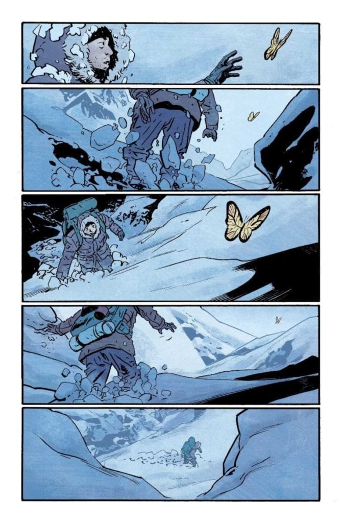 Matt Wilson’s coloring also follows this philosophy of Fire Power. The dark blues of the mountain, in contrast to the warm colors of fire, act almost like an indication between answers and uncertainties. But perhaps that is best on display from the butterflies of the temple.