Home Blog Page 296

The Building Blocks Of Story Telling In SLEEPING BEAUTIES

Sleeping Beauties #1
Sleeping Beauties #1 Credit: IDW Publishing

Constructing a comic book is all about layering. You start with the pencils and inks, or the digital equivalent. Then you add a layer of color followed by another for the lettering. To produce a truly outstanding comic you can make all of the layers meld beautifully into one single work of art, such as in Bill Sienkiewicz’s Stray Toasters or Dave McKean and Todd Klein’s work on Black Orchid. Alternatively, you can make the Craft of Comics part of the comic itself, like painters of the late Modernist art movements whose interest lay in the color, lines, and the spaces in between.

This second approach is harder to produce, especially as a number of different people work on the production of a single comic. Everyone involved has to have the same intention from the very beginning, and unlike a Modernist Artist, the end result has to service the narrative.

Sleeping Beauties #1
Sleeping Beauties #1 Credit: IDW Publishing

Foundations

Action narratives, such as Superhero comics and movies, are designed around set pieces with the consequences of one often leading into another. Horror, as a general rule, is more abstract in formation. The desire to scare or horrify the reader requires careful manipulation with a number of ideas placed on top of each other to draw an audience in. Once the reader is hooked then the writer/artist can do whatever they want, continuing to lay concepts and traumas on top of each other.

IDW Publishing’s new horror comic, Sleeping Beauties, is based on a Stephen and Owen King novel. Stephen King is a master of the genre, and his novels are often tightly constructed narratives that build the tension up to a shattering conclusion. The adaptation is no different, with the constructivism of the plot built into the visual storytelling of the comic itself.

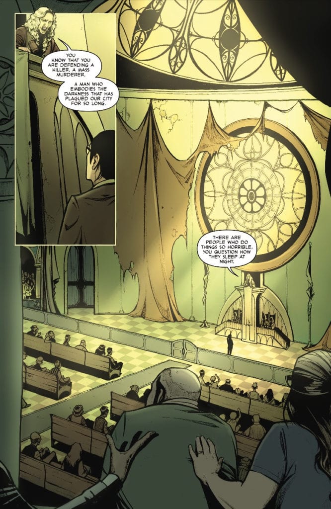
The novel is adapted by Rio Youers, who starts by introducing the readers to each of the three central characters: Eve, Sheriff Norcross, and the incarcerated Ree. This female triumvirate leads the narrative in this issue, and their actions/circumstances are the foundation for the story. The way that artist Alison Sampson introduces the characters into the comic is as important as the characters themselves and is the start of this comic’s construction.

Sleeping Beauties #1
Sleeping Beauties #1 Credit: IDW Publishing

Introductions

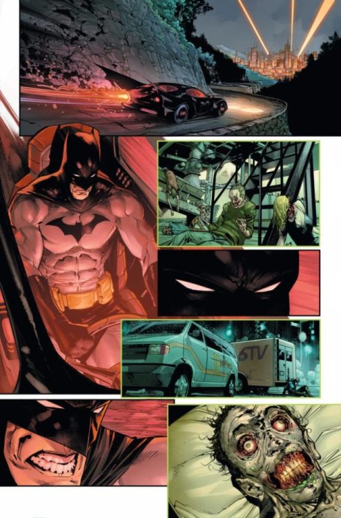
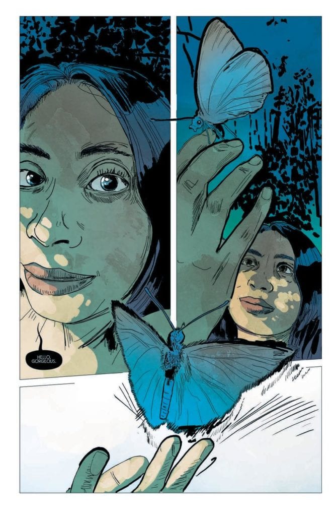
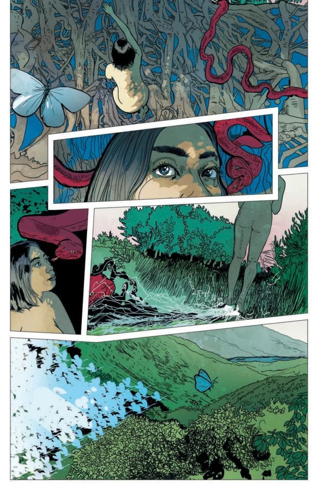
In the first panel of the first scene, the reader meets Eve. Her face takes up the majority of that first panel, and she stares out at the reader. The opening words “Hello, Gorgeous,” appear to be spoken directly to the audience. Instantly you get the impression that this woman is not only important but also powerful. Sampson plays with the confines of the comic page to produce the impression of something much larger. This concept is helped along by the blue moth that is literally breaking out of the third panel on the page. The panel border disappears as the moth flies up and out of the page. The Blue Moth and this idea of transition from one plane to another is an important aspect of Sleeping Beauties and is a continuing visual theme throughout.

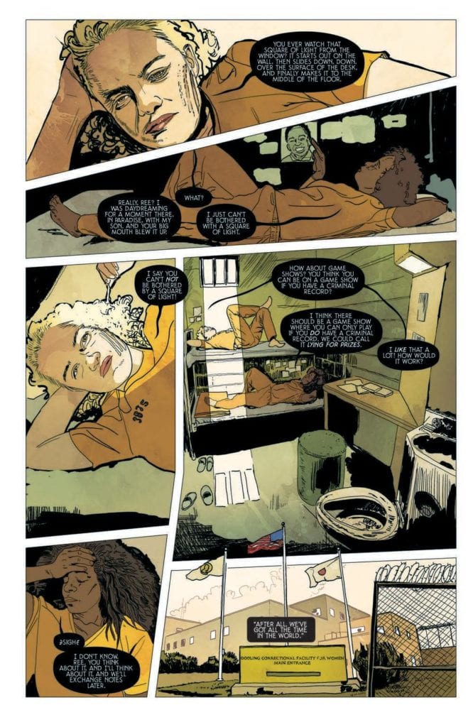
Ree is introduced in the first panel of the second scene. She is positioned at the top of the page with a similar stare that escapes the page and reaches the reader. However, as the scene plays out, her importance is questioned. Is the scene about her, or is it about her cell mate who daydreams on the bunk below? As the plot unfolds, the notion of sleep becomes significant, and all references to it grow in importance.

This leads to the introduction of Lila Norcross. In contrast to Eve, Lila is introduced through her family; her husband and son are the central characters in the scene. Lila starts off in the background before moving to the foreground for the final panel of the scene. This is where her importance is stamped into the comic as she stares out of the page with the same penetrating eyes and her speech invokes the significance of sleep within the story:

“Coffee. Thanks, kiddo… But this’ll have to be one strong brew to keep me awake. I feel like I could sleep until Christmas.”

These introductions of the central characters are just the first building blocks in the visual construction of Sleeping Beauties.

Sleeping Beauties #1
Sleeping Beauties #1 Credit: IDW Publishing

Inks, Color, Letters

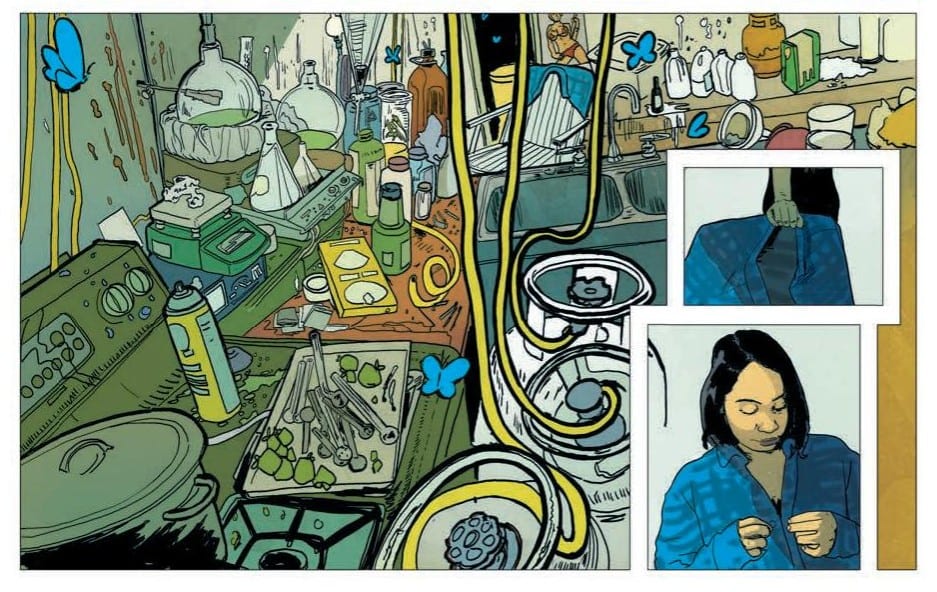
Sampson’s art work is complex and best described as magical realist. She comes from an architectural background which is evident in the way she composes her images, distorting perspective to create uncomfortable scenes. There is an attention to detail that gives off the impression of realism but, like the stories she illustrates, there are more abstract worlds just underneath, waiting to break out.

Triona Farrell picks out elements of the artwork and makes them a colorful focus for a panel or page. The bright blue moths or the carmine snake lead the reader across the page allowing Farrell to fill Sampson’s detailed images with an array of color. This continues the realistic impression but is also a constant reminder to the reader that this is a fantasy world.

The next layer of the image is the lettering by Christa Miesner which immediately stands out. The decision to use black word balloons with a white font is a bold one because it is so uncommon in mainstream comics. The gamble pays off in Sleeping Beauties because it contrasts and compliments the rest of the artwork. The black balloon tails become an extension of the line work, and the overall design blends better with the chaos of color in each panel. It draws attention to the script and forces the reader to work that little bit harder.

Each layer adds something to the panels, the page, and the larger narrative. Just as you would build a character by illustrating their appearance and giving them a specific linguistic voice, the artists in Sleeping Beauties are creating personalities through specific line work, colors, and lettering.

Sleeping Beauties #1
Sleeping Beauties #1 Credit: IDW Publishing

A Final Construct

Like an architectural landmark, a comic is constructed with different layers working together to present a finished product. The different levels may not be noticeable because only the surface is ultimately important but the collective decisions have to gel for the entirety to work. Sampson’s complex images are the driving force behind the artwork but the intended tone is only possible because the colors and lettering match the inks.

If the comic follows the general plot of the novel, then over the ten-issue run, there will be a lot of complex narrative issues to deal with. There are some twists and turns coming that are socially relevant and important in the current climate: an uncontrollable pandemic, gender politics, and a desperate feeling of helplessness. To match this is the complex artwork, driven by Sampson’s obsession with constructing almost abstract scenes that lay the groundwork for character development and plot enhancement. Her colleagues then bring out different aspects of the cast and story to produce a fully rounded visual narrative.

Sleeping Beauties is a visual treat and worth picking apart, layer by layer. The artistry on display is exceptional and complex, befitting the intensity of the plot.

Monkeys Fighting Robots Youtube

RICK AND MORTY SEASON 4 | TV Review

Everyone’s favorite grandfather/grandson sci-fi duo came back for a fourth season. This time they adventures include Morty trying to ensure a life with Jessica, Rick getting revenge after someone used his toilet, Rick and Morty going on a heist, the pair getting trapped in a story train, and two adventures involving time travel.

Rick and Morty was a show that quickly earned a cult audience. It managed to have broad comedy, dark humor, a philosophical edge, and moments of emotional weight. The first three seasons were great, and it is a contender to be one of the best adult animated shows. However, the fourth season offered up more misses than usual.

The fourth season was split into two halves. The first half had more of the duds and there was a sense of lacking when watching. The episode “Claw and Hoarder: Special Ricktim’s Morty” earned a reputation of being the worst episode the series has ever produced. That episode saw Morty getting a dragon, but the dragon gets attached to Rick. This episode took Rick and Morty into fantasy direction, centered around a giant sex joke, and had a rushed conclusion. But this episode doesn’t deserve this reputation – it wasn’t even the worst episode of the season. “Claw and Hoarder: Special Ricktim’s Morty” at least had some funny jokes.

“The Old Man and the Seat,” and “Promortyus” were the worst offerings. “The Old Man and the Seat” was the episode where Rick gets revenge against someone who used his private toilet. The concept was funny because it shows how pity Rick can be, but it was enough to sustain a whole episode and the writers tried to force a poignant ending wasn’t earned. “Promortyus” was even worst. That episode started decently enough with a cold opening, but it suffered from a terrible combination of rambling deliveries and jokes that were intended to shock.

Even some episodes I really liked had problems. “Rattlestar Ricklattca” was a hilarious parody of The Terminator franchise and it was a way for the showrunners to disprove a theory that Rick was really an older Morty. But the episode was formulaic and seem to ignore some of Morty’s character development from the previous seasons because in this episode he tried to do the right thing but made things a lot worst. Season Three’s Morty was shown to be developing a dark side, but this was ignored in “Rattlestar Ricklattca.” The episode made up for this with the insanity of snakes re-enacting The Terminator and brings back the Testicle Monsters.

“The Vat of Acid Episode” also set out to disprove the use of time travel as a plot device. In that episode, Morty gets a device that can save certain points in time and allowed Morty to live life without consequences. But the episode had a dark reveal that only Rick and Morty could do.

The second half of the season was a lot better than the first. There was more consistency, ambition, and felt like the show that people fell in love with. The second half had two of the best episodes of the season: “Never Ricking Morty” and “The Vat of Acid Episode.” “Never Ricking Morty” was this season’s version of “Interdimensional Cable” and “Morty’s Mind Blowers” because like those episodes there were centered around clips. “Never Ricking Morty” was the most meta-episode in the show’s run because it broke down various writing tropes, the Hero’s Journey structure, and screwed with fans by erasing potential story ideas.

“The Vat of Acid Episode” had one of the best sequences in the show’s run. This was a montage where Morty got to act out his darker fantasies and he falls in love. It was this type of invention that helped Rick and Morty stand out as a show.

Even episodes that were more formulaic: i.e. “Childrick of Mort” and “Star Mort Rickturn of the Jerri”, they kept the family dynamic. “Childrick of Mort” was about the family going a camping trip to another planet and it was split into three adventures. Rick and Beth bond when building a society, Morty and Summer think they can survive in the wilds, and Jerry gets abandoned by his family. “Star Mort” was the season finale and saw the family having to work together to stop the Galactic Federation and explored the relationship between Rick and his daughter.

The first half of the fourth season was a big stumble for Rick and Morty, but it does improve a lot it the season half.

Monkeys Fighting Robots Youtube

DC CYBERNETIC SUMMER: The Beach Goes Metal

Cybernetic Summer

If you’ve ever wanted to see a DC Comic featuring Superman, Cyborg, and Cyborg Superman all together, your wish is about to come true. The publisher announced a new 80-page special coming in July: DC Cybernetic Summer.

Check out the official word and preview art below:

Rub some sunscreen on your circuits, because DC’s favorite cyborgs are hitting the beach in DC Cybernetic Summer on July 28! In this sizzling summertime anthology special, Harley Quinn and Sy Borgman conquer a truly titanic water slide, Cyborg, Superman, and Cyborg Superman find it difficult to have a conversation, much less a fight, and Batman tries everything to escape a summer cookout—even taking on the omnipotent Brother Eye and his newly infectious O.M.A.C.s!
And it’s not just the cyborgs hitting the surf! Flashes from across the multiverse gather for a race to claim the fastest flash in the multiverse! Mercury Flash from Earth-44 is out to win it all this year, the only person standing in his way is…Barry Allen! And Red Tornado’s on a camping trip with his wife Kathy and his daughter Traya, but he’s distracted by Justice League matters! When a threat emerges, will Red Tornado be able to protect his family?
All these and more sunburnt stories that are worth getting sand in your motherboard for!
  • Red Tornado in “Summer Camp” by Stephanie Phillips and Leila del Duca
  • Cyborg, Superman, and Cyborg Superman in “Catfish Crisis” by Stuart Moore and Cully Hamner
  • Superboy, starring the Legion of Super-Heroes, in “Summer Lovin’” by Liz Erickson and Nik Virella
  • Batman, O.M.A.C. and Brother Eye in “The Limits of Control” by Corinna Bechko and Gabriel Hardman
  • Robot Man in ��The Summer Blues” by Max Bemis and Greg Smallwood
  • Harley Quinn and Sy Borgman in “Splish Splash Special” by Che Grayson and Marguerite Sauvage
  • Booster Gold, Blue Beetle and Skeets in “The Boys of Summer” by Heath Corson and Scott Koblish
  • Mercury Flash in “The Speedster Games” by Joshua Williamson and David Lafuente
  • Midnighter, Apollo, Monsieur Mallah and The Brain in “Out There” by Steve Orlando and Paul Pelletier
  • Platinum and Wonder Woman in “Fandom” by Andrew Constant and Nicola Scott
DC Cybernetic Summer is an 80-page, Prestige format one-shot on sale at comic book stores and participating online retailers on July 28 with a cover by Dan Mora. For more information on the World’s Greatest Super Heroes, visit www.dccomics.com, the DC YouTube channel, or follow @DCComics and @TheDCNation on social media.
Monkeys Fighting Robots Youtube

BATMAN #95 Brings The Start Of “Joker War”

Batman #95

We’ve gotten the teases and the buildup, but now it’s time for the main event as “Joker War” begins this July. Check out the official DC Comics preview for Part One of the storyline in Batman #95:

BATMAN #95: “JOKER WAR” PART ONE!!

It’s coming… The final showdown between Batman and The Joker explodes in Batman #95, part one of “Joker War,” on sale Tuesday, July 21! Here’s a look at some fantastic art by Jorge Jimenez and Tomeu Morey!

It was always going to come to this. The Clown Prince of Crime and the Dark Knight Detective go head-to-head for the last time. The Joker has never wanted to win before, he’s never wanted his battle with Batman to end, but now his motivation has shifted. He has decided that one way or another, this will be the final chapter to their story. “Joker War” begins here!

Batman #95 (“Joker War,” Part One)

On Sale July 21, 2020

32 Pages

Written by James Tynion IV

Art by Jorge Jimenez

Colors by Tomeu Morey

Letters by Clayton Cowles

Main cover by Jorge Jimenez and Tomeu Morey

The Joker variant cover by Francesco Mattina

1:25 Cardstock variant cover (The Joker) by Jorge Jimenez and Tomeu Morey

Standard and Variant cover price $3.99 US

1:25 Cardstock variant cover price $4.99 US

Monkeys Fighting Robots Youtube

KILLING EVE – Are You Leading or Am I | TV Review

Killing Eve’s third season comes to a close with “Are You Leading or Am I?” and sees Eve and Villanelle work for the first time in the season.

Villanelle has fled to London and meets Carolyn to offer her defection. But Carolyn refuses because Villanelle is no longer able to kill. Her only opinion is to retrieve the money Konstantin stole from The Twelve and she enlists Eve for help. Konstantin also goes to London to get the money. Whilst Carolyn finally finds out who killed Kenny.

The big hook of the season was Kenny’s death: it spurred Eve, Carolyn, and the Bitter Pill team to work together and find out who killed him. The death was recorded as a suicide, even though everyone suspects it was murder. The reveal was Kenny’s death was an accident that was unintentionally caused by Konstantin, or at least that’s what he claims. It was a bitter blow for Carolyn, and she showed her dark side when facing both Konstantin and Paul. It ends the storyline about Kenny’s death and Paul’s involvement with The Twelve, in the less satisfying way possible.

“Are You Leading or Am I?” sees Eve and Villanelle meet for the first time since “Meetings Have Biscuits.” Throughout the series, there was an attraction to each other and a sexual undercurrent. The undercurrent has become overt in this season. In “Meeting Have Biscuits” Eve was able to escape Villanelle by kissing her and their first interactions in this episode was a dance together. The final scene in the episode had a beautiful quality as Eve and Villanelle have a heart-to-heart and decide on what to do next.

Whilst the episode aimed to end some storyline, others were deliberately left open. Season Four was already commissioned before Season Three was even broadcast. So the showrunners knew they had the freedom to leave some open ends, such as Carolyn and Geraldine’s relationship.

“Are You Leading or Am I?” keeps the excellent dialogue and humor that makes the show special. The episode starts off strongly when Carolyn and Villanelle and Carolyn points out that if Villanelle is an assassin who can’t kill then she’s useless. I personally loved Villanelle’s interactions with Rhian (Alexandra Roach) because Villanelle acted like a bored child and annoyed Rhian into striking her. Villanelle had to face an opponent who was could physically match. It’s just a shame that there won’t be any more of Roach in Killing Eve. Villanelle also met up with the Bitter Pill team and when they realized who she was they reacted likes you would expect.

Eve’s mission saw her go to Croydon with a ticket she didn’t know what it meant. It led to a comedic interaction at a bookmakers’ as Eve does a terrible attempt to bribe someone. Whilst Eve was a skill analysis and investigator, her field experience was lacking.

The relationship between Eve and Villanelle continues to compel, the characters were interesting, and the humor still delivers. But as a conclusion to the season “Are You Leading or Am I?” was lacking.

Monkeys Fighting Robots Youtube

Harley Quinn Gets A New Digital Series: BLACK + WHITE + RED

Harley Quinn Black White Red

If you’re a Harley Quinn fan, DC Comics has given you plenty to smile about in recent years. From the character’s different comic titles to her DC Universe show, the Joker’s onetime sidekick has certainly graduated to the A-list. Now comes Harley Quinn: Black + White + Red, a new digital series with an all-star creative lineup.

Here’s the full press release and preview art:

DC PRESENTS HARLEY QUINN: BLACK + WHITE + RED

First Chapter of DC’s Newest Digital First Series Available Now

Future Chapters to Feature Stories by Harley Quinn Co-creator Paul Dini, Eisner Award-Winners Saladin Ahmed, Erica Henderson and Joe Quinones, Fan-Favorite Team of Amanda Conner, Jimmy Palmiotti and Chad Hardin, Along with Comics’ Most Dynamic Storytellers

DC proudly announces the launch of its newest Digital First series, Harley Quinn: Black + White + Red! Publishing each Friday and spanning 14 chapters, this digital series is an anthology of standalone stories told in the vein of the classic Batman: Black & White. The first chapter is available for purchase now on participating digital platforms, including readdc.comComixology, Amazon Kindle, Apple Books, and more.

Each chapter of Harley Quinn: Black + White + Red will be told in traditional black and white with the color red utilized in unique ways throughout each of the individual stories. The debut chapter of the Digital First series is “Harleen: Red” by writer/artist Stjepan Šejić with lettering by Gabriela Downie. Set in the world of Šejić’s New York Times bestselling graphic novel Harleen, this story hints at a “red” that will have meaning only to Harley Quinn!

Harley Quinn: Black + White + Red is a great addition to our Digital First lineup,” said Hank Kanalz, SVP of Publishing Strategy & Support Services. “Each story stands on its own, and this series gives our talent teams the freedom and flexibility to tell innovative stories that could be part of or separate from regular continuity. Everyone has a unique vision for Ms. Quinn—it’ll be fun to see what their creativity delivers.”

Future chapters will feature a fan-favorite lineup of talent, including Harley Quinn co-creator Paul Dini; the team of Amanda Conner, Jimmy Palmiotti, and Chad Hardin; Saladin Ahmed and Javier Rodriguez; Tim Seeley and Juan Ferreyra; Erica Henderson, Daniel Kibblesmith, and more to come throughout the run. And Harley Quinn: Black + White + Red is also the DC writing debut for several acclaimed illustrators! Artists Mirka Andolfo (DC Comics: Bombshells), Dani (The Low, Low Woods), Joe Quinones (Dial H for Hero), and Riley Rossmo (Martian Manhunter) are all developing chapters written in their own voice, paired with art in their distinct styles.

“This is such a cool series with killer art,” said Mark Doyle, DC Executive Editor. “Senior Editor Chris Conroy had the idea to riff on the classic Batman: Black & White series but to do it with Harley in that irreverent, fun way that only Harley can do—and DC Digital First seemed like the perfect format to tell these stories.”

Harley Quinn: Black + White + Red promo art is by Jorge Jiménez.

Harley Quinn: Black + White + Red’s first chapter, with story and art by Stjepan Šejić and lettering by Gabriela Downie, is available now. Subsequent digital chapters of Harley Quinn: Black + White + Red will publish weekly on Fridays through its 14-chapter run. Andolfo’s story will publish July 3, Ahmed and Rodriguez’ collaboration will publish on July 10, and Seeley and Ferreyra’s chapter will publish on July 17 to round out the first month of the series.

DC’s comics are available on participating digital platforms seven days a week, including readdc.com, Comixology, Amazon Kindle, Apple Books, DC UNIVERSE, and more.

Monkeys Fighting Robots Youtube

Exclusive Interview: Alejandro Arbona Of DOCTOR TOMORROW

Exclusive Interview: Alejandro Arbona Of DOCTOR TOMORROW

Doctor Tomorrow is a five-issue mini-series from Valiant Entertainment written by Alejandro Arbona with art by Jim Towe. Issue three-hit your local comic book store this week with a major plot twist. Thanks to Valiant, Monkeys Fighting Robots has an exclusive interview with Arbona.

About Doctor Tomorrow:
Doctor Tomorrow first appeared in Operation: Stormbreaker #1 back 1997, and was created by Mark Waid and Brian Augustyn. The character is reimagined as a teen hothead and star athlete, Bart Simms. He is about to meet the Valiant Universe’s greatest hero…Himself!

WARNING! – There are spoilers below if you have yet to read Doctor Tomorrow #3.

Exclusive Interview: Alejandro Arbona Of DOCTOR TOMORROW

Enjoy The Interview With Alejandro Arbona

MFR – Doctor Tomorrow deals with time travel and a multiverse, how much world-building was involved?

ArbonaThe beauty of working in a shared universe is that there’s already a lot of world-building ready for us to run with, from time travel and giant robots to big, colorful superheroics. At the same time, this is a story we basically cooked up from scratch. The multiverse came up a little bit toward the end of the run of Ivar, Timewalker by Fred Van Lente and Pere Pérez, but for the purposes of this story, we had to build up how all of it works, what the rules are, what the stakes are. But the funny part is that we actually did so much world-building that a lot of it never even made it into the comic, and since this part of the story is over, we’ll never have a chance again. For instance, we’d initially planned a scene where Faith helped out with Bart’s flying lesson. Doctor Tomorrow was really excited to meet her, because 20 years ahead in his own universe, she’s a famous, beloved hero, as Joshua Dysart and Kano established in a comic that I was editor of, Book of Death: Harbinger, where we saw tens of thousands of people turn out in droves to grieve at her funeral. In my original outline of the flying lesson, Doc was so starstruck to meet Faith that he blurted out, “I was at your funeral!” and she got super creeped out. Naturally, that was also meant to foreshadow that Doc turns out to be a huge creep in a lot of ways. Spoiler!

MFR – There is a twist in issue three, can you talk about how you set up the reader for the twist?

ArbonaThere’s a lot that we laid in, during the first two issues, that pays off in issue three, and I think you can see it in the re-read. Doctor Tomorrow is really arrogant and pretty awful in a lot of ways. At first, you might not think about it, because he’s a commanding, take-charge leader, and an alpha superhero type. But look again. He’s quick to give in to anger, quick to resort to violence. He always jumps to the first conclusion, and jumps straight into a fight. And when you realize how much unhappiness and anger the teen Bart has, and how badly he copes with it, you can see how he’s bound to turn into that guy. Bart is literally a supervillain in the making.

MFR – Young Bart is at an important crossroads in his life, and then with the multiverse, he can see how several different paths turn out? Does the multiverse make it easier to write your main character, and if so, how?

ArbonaThe multiverse concept was the whole key to this character. In the original Doctor Tomorrow by Bob Layton and several artists, Bart Simms was a man in the 1940s who received a box that was mysteriously sent back in time full of sci-fi super-gear and schematics. He uses it to build himself all sorts of futuristic gadgets and vehicles, and then he says he’s from the future…a man out of time, with a twist. But as far as being a hero goes, he’s fundamentally compromised. He’s dishonest, he lies about the origin of his powers, and he spends the rest of the series trying to stop whatever caused the box to go back in time to begin with, so he can prevent himself from ever becoming Doctor Tomorrow in the first place and ruining his life. It was a really unorthodox superhero story, and if you can’t quite tell, I’m a huge fan. That and Jim Starlin’s Warlock, another brooding, heady comic about a superhero who becomes his own tormentor and regrets so much of what he’s done. But when Robert Meyers and Drew Baumgartner and Fred Pierce and I started talking about a new take on this character, we knew right away that the time-travel hook couldn’t be repeated. You can’t tell the same story again, and you can’t just tweak it and mix it up, because the balancing act of logic and causality falls apart. We also didn’t want to do anything dark or pessimistic, we were all on the same page that we wanted to do a fun, light-hearted superhero comic and establish a character who was morally upstanding, and aspirational, tinged with a Silver Age sensibility—one of Valiant’s few superheroes ever to wear a cape. In a way, it’s like that Simpsons joke where they do an Itchy & Scratchy focus group and find that the kids want a realistic, down-to-earth show that’s completely off the wall and swarming with magic robots. When I got the prompt to pitch a new Doctor Tomorrow, the idea I seized on right away was the moral compromise at his core, the lie that forms the basis of his superhero persona, and the drama of his remorse about letting himself become that guy…while also being light-hearted, colorful, aspirational, and fun. It’s an extremely tricky balance, and the idea of the multiverse was the key to unlocking that, by splitting up the same Bart into separate characters!

MFR – The trope of time travel tends to lessen the drama since you can easily retcon the story. How do you avoid this as a writer?

ArbonaIn any good story, no matter what genre, the highest stakes are the emotional ones. Even if a story is about life-or-death peril or the Earth hangs in the balance, the main characters are always going through something emotionally, too. If they aren’t, it’s a boring story. That’s why even detective stories and courtroom procedurals, which are just about somebody doing their job, always feature some wrinkle to make it personal for the protagonist. And hitting a time-travel reset button to retcon the plot can’t change that the characters have taken that journey, and the audience with them.

MFR – With a five-issue story, how do you reveal enough to keep the reader wanting more each issue, but not showing too much, or ending an issue on a flat note?

Arbona The challenge of serial storytelling is that each issue needs to tell a fun, engaging story by itself, while it also advances the main story of the series. I can only try my best and write the story that I find entertaining in each issue, and hope the reader agrees with my opinion. But I think that as long as each issue features new twists and surprises, with action and laughs and compelling heart, and ends with a question mark that the reader can’t resist coming back to find out more about, then we’re pulling it off. And you know what, I think we do that! Give us a try and see for yourself, why don’t you!

MFR – The comic book industry is at crossroads here in 2020, what are your predictions when it comes to what the industry will look like in 2030?

ArbonaI could see it going several ways. On the one hand, digital is shaking everything up so quickly that even comics, which were slow to adapt, will continue to evolve, hopefully not just in distribution but also in how they’re created. We’re also finally, finally seeing more widespread acceptance toward comics in libraries and classrooms, and there’s been explosive growth in comics for kids. With more kids reading graphic novels, I can only hope we’ll see more business for comic book stores, but also, comics being sold in more places. I love it when a bookstore has a respectable, worthwhile graphic novel section with stories for a plurality of different readers, not just a few half-assed shelves. On the other hand, the comic book industry is very resilient, both in a good way because it’s tough and in a bad way because it’s resistant to change. In ten years, maybe we’ll still be chugging right along the same way we are now, and I don’t mean that as a good thing. Most comic book stores survive on razor-thin profit margins. Most comic book makers earn very little money and do the work at great personal sacrifice out of love for the art form. The industry is lousy with exploitative working conditions and abuse of all kinds. The decade of the 2030s will be the one-hundredth anniversary of the birth of the modern comic book, and many of those problems have existed for pretty much all those one hundred years. Hopefully, we’ll finally get better at fixing them in the next ten.

MFR – Thank you for your time, and best of luck with Doctor Tomorrow!


What did you think of the interview? Are you reading Doctor Tomorrow? Comment below with your thoughts.

Monkeys Fighting Robots Youtube

Review: BLISS #1 – Where Great Drugs Make For Dependable Hitmen

From the minds of playwright Sean Lewis (The Few, Coyotes) and artist Caitlin Yarsky comes a mind-altering tale of murder and a path to redemption in “Bliss” #1. This debut issue offers a mix of tragic human drama and psychedelic underworld activity. Backed by incredible visuals, this first issue could be the makings of another classic in the Image Comics stable.

“The team behind hit comic Coyotes returns for an all-new, two-arc maxi-series. There’s a drug called Bliss wiping away memories in Feral City. A good-hearted young man, overwhelmed by a deathly sick child and distraught wife, makes a deal to become the personal hitman to three gods, killing those in their way and sending memories down the river of Oblivion in exchange for his family’s well-being. Breaking Bad meets Neil Gaiman’s Sandman in an urban fantasy unlike any you’ve ever seen.”

Writing & Plot

Sean Lewis‘s script in “Bliss” #1 inspires sympathy and moral conflict in the central character and his actions. This comic is set as a frame narrative, meaning that it is a story inside of a story. The main story is about Benton Ohara’s attempt to keep his son alive by becoming a hitman and being allowed to forget his actions. The frame story is a flash-forward and defense of this man’s actions before a tribunal (the identity of Benton’s defender may be a bit of a spoiler). The issue takes place over a span of several years, from the beginning of Benton and his girlfriend Mabel’s new life in Feral City and through the hardships of poverty and illness that led him to become a hitman. This first issue does a brilliant job of setting up the tragedy of Benton’s circumstances, while still acknowledging the fact that many people have been lost or hurt by his actions. The pacing and handling of detail in this issue are stellar, as Lewis utilizes the storytelling capacity of a single comic book to its fullest. He packs this world full of unusual details and mythos without ever stooping to explaining everything. The mystery he creates surrounding the three old crime bosses/gods and the effects of Bliss by themselves are a reason to pick up the following issues. The fact that this is such a character-centered and emotionally effective story, however, is what could end up making this comic a serious hit.

Art Direction

A comic consisting of human sentimentality and mysterious fantasy like “Bliss” #1 needs some stellar visuals to sell the experience. Fortunately, Caitlin Yarsky is on hand, and she delivers in kind. The Coyotes artist draws an immense amount of detail in both her characters and environments, engaging the reader fully in both the plot and setting this comic takes place in. Each individual character looks completely unique and the human characters look plainly, well, human. They aren’t drawn with the sometimes “too perfect to be real” aesthetic comics sometimes have. They look like folks you may see just walking around from the day-to-day. This is combined with the scuzzy, almost neo-futuristic design of Feral City and the fantastical elements within that really define this comic’s gorgeously unique aesthetic. The detritus and decay of dim neon highlight the impoverished status of Benton and Mabel, as well as those living around them. Much of the setting is either desolate or run-down to signify their circumstances, as well as contrast heavily with the appearance of the 3 gods. Their outlandish alien design, like a mix of Alice in Wonderland and Star Wars, is mixed with a lavish setting that is directly opposed to the squalor just outside their door. The color contrasts from scene to scene have a massive effect on the environmental changes as well. Each new area, from the hospital to the gods’ den, is draped in a distinctive hue to match the tone of what is occurring. The visual direction of this comic is wondrously alluring for each and every page and is perfect for this story’s concept.

“Bliss” #1 reads like the love child of Sandman and 100 Bullets. Sean Lewis’s script is emotionally impactful and brilliantly weird. Caitlin Yarsky crafts a visual experience through her detailed pencils and focused panel framing to bring this unique experience to life. If this comic can stay as consistent as this first issue, then Image has another phenomenon on their hands. Be sure to pick up “Bliss’ #1 from your local comic shop on 7/22!

Monkeys Fighting Robots Youtube

SLEEPING BEAUTIES #1: A Sign of Stephen King Fatigue

Sleeping Beauties Cover

Sleeping Beauties #1 out this week from IDW is based on the horror novel by Stephen King and Owen King and adapted by Rio Youers and Alison Sampson.

Sleeping Beauties #1 Has a Decent Outline

Sleeping Beauties is a project the Kings are investing a lot into as advisors. Stephen in particular seems to have some enthusiasm towards comics, having co-created an X-Men villain and co-writing the first American Vampire issues with Scott Snyder. His son Owen meanwhile is a fan of award-winning thriller novelist Rio Youers. Combine all of this with a plot about a pandemic that induces outrage; this sounds like a best-selling formula, especially with these events happening in real-time with Covid-19 and nationwide protests. However, good concepts need just as good or better execution.

Unfortunately, Youers’ writing feels out of place throughout Sleeping Beauties #1. The opening pages are somewhat confusing; some captions would’ve significantly benefitted this piece. To Youers’ credit, he sets up the plot, primary setting, and half of the conflict. Every other action that happens in the plot happens just to move the plot rather than provide an explanation. That being said, seeing the outbreak disease affect one of the main characters does look troubling. Especially considering the reader learns about the full context near the end. One that could have dire ramifications down the road.

Art

Sleeping Beauties #1 has the artwork of Hit-Girl artist Alison Sampson. Sampson’s art at its best gives off a surreal atmosphere from just its opening. When it comes to character designs, however, most of them look emotionally stilted. When the characters you’re supposed to be rooting for have decent family downtime, it’s a little hard to relate to them, especially when the only character to show any other emotion cuts loose and commits gleeful mayhem.

Tríona Farrell, one of Sampson’s regular collaborators, as the colorist is arguably the best part of Sleeping Beauties #1. The muted color she employs for most of the issue sets the dour tone. The blue butterflies are practically messengers of a calamity, all in contrast to the color’s historically calming properties especially when one of these calamities gets decorated in red splotches of blood.

As for Christa Miesner’s lettering, it’s rather confusing. Most of the word balloons are black with white letters. It might be a little better if the words are said with some aggression, like what Clint Norcross says under his breath in his first appearance. But when everybody does this, it just makes it sound like everybody’s grumpy. All except for when the homicidal woman converses with a rabbit through orange balloons. Which implies an otherworldly force behind the disease. As for the wordmarks, they range from being creative with how their color contrasts to the situations at hand to being in the wrong place. At least that’s the latter’s the case with Lila’s encounter with the homicidal woman when she breaks her car before the sound takes place.

Sleeping Beauties #1 Could Be Better

Sleeping Beauties #1 certainly displays the series potential. There’s a very real dour sense happening in the background, but it’s not properly communicated. At least as far as the writing and penciling are concerned. Sleeping Beauties as a whole might improve later on, but for now, people might want to consider watching Castle Rock to satisfy any Stephen King cravings.

Monkeys Fighting Robots Youtube

DC Unveils Jason Fabok’s THREE JOKERS Variant Covers

Three Jokers variant

DC Comics continues to go all-in on the upcoming Batman: Three Jokers by Geoff Johns and Jason Fabok. Following the announcement of collectible playing cards comes word that the book will ship with a collection of variant covers (all by Fabok).

Here’s the official word and a look at six of the covers:

DC REVEALS PREMIUM VARIANT COVERS FOR BATMAN: THREE JOKERS BY SERIES ARTIST JASON FABOK

It’s one of the most anticipated comic book stories of the decade: Batman: Three Jokers by Geoff Johns and Jason Fabok! Debuting in August, this series delivers the payoff to the years-long mystery of why—and how—there are three Jokers, and what that revelation means to the eternal conflict between Batman, his allies, and the Clown Prince of Crime.

To commemorate this landmark series, DC will offer to participating retailers nine Premium Variant Covers for Batman: Three Jokers, each illustrated by series artist Jason Fabok. Along with the main cover and regular variant cover, each issue of Batman: Three Jokers will have three Premium Variant Covers, showcasing Fabok’s interpretation of a different face of The Joker’s madness throughout DC history. All nine of the Premium Variant Covers mirror Fabok’s main covers for the three-issue series, giving a close-up look at even more of The Joker’s terrifying incarnations.

The Premium Variant covers for issue #1, on sale August 25, are as follows:

  • Red Hood (Variant A)
  • Joker Fish (Variant B)
  • Joker Bomb (Variant C)

For issue #2, on sale September 29:

  • Joker Behind Bars (Variant D)
  • Death in the Family/Top Hat & Monocle (Variant E)
  • Joker Applying Makeup (Variant F)

And for the final issue #3, on sale October 27:

  • Batman: The Killing Joke Hawaiian shirt and camera (Variant G)
  • Stand-Up Comedian (Variant H)
  • “Endgame” Mohawk (Variant I)
Monkeys Fighting Robots Youtube