Home Blog Page 259

INTERVIEW: Actor Richard Riehle Has The Best Seat In Limbo

Limbo is a new dark comedy film from Mark Young (Southern Gothic) about Jimmy, a murderer on trial and legendary actor Richard Riehle (Office Space, Star Trek) sits at the epicenter of the courtroom action that’s deciding on the fate of Jimmy’s eternal soul.

In the film, Lew Temple (Walker, Texas Ranger, The Walking Dead) plays Jimmy, a murderer, and maybe a good guy in awful circumstances. Jimmy’s on trial in Hell. Cassiel, played by Scottie Thompson (MacGyver, 12 Monkeys), is ready to defend Jimmy who she believes harbors some good. However, opposing that point of view is Lucian Charles Collier (Lords of Chaos) as Balthazar. In the middle of it all is Richard Riehle.

PopAxiom and Richard discussed the road to reaching 400+ IMDB credits, the roles he gets recognized for the most, and having fun in Limbo.

Enough Foolishness!

Richard Riehle grew up in Wisconsin. Being an actor wasn’t on the radar. “I was in my 4th year at college, and I couldn’t afford to stay any longer. A friend recommended I finish off my credits by taking speech and drama. So, I signed up for everything. I spent a semester living in the theatre basically, and I got my degree …”

After college, Richard “… ended up back in Wisconsin, unloading railroad ties. It was not the most pleasant way to spend a winter.”

A few professors encouraged Richard to head to grad school. Richard became part of the Notre Dame theatre community. “I was already doing all the technical stuff,” Richard says, “ but I auditioned and was cast for a new play.”

The play was the thesis of a young playwright. Richard explains, “… it was sort of a version of One Flew Over The Cuckoo’s Nest only it was set at Great Lakes Naval Hospital after the Korean war. An alcoholic sergeant was taking over the ward, and a nurse is trying to keep him in check.”

The play turned to a hit on campus “… people all over the school saw it. People started asking me about doing different roles, and suddenly I was doing all this acting.”

Richard needed more roles. “My advisor sent me to this theatre he used to work in outside of Detroit called Meadowbrook. I got some roles under my belt there.”

It’s said that all artists get a sense of “imposter syndrome” at some point in time. “I thought, ‘This is crazy. I barely have any training.’ But I decided to keep doing it until somebody says ‘Enough of this foolishness, get out there and make a living somewhere else.’ Knock on wood that no one’s said that so far.”

richard riehle-star trek-interview

Boldly Going …

To date, Richard Riehle’s appeared on Star Trek as three different characters on three different series. The first was as Batai on the award-winning Next Generation episode “The Inner Light.” TV’s schedule back then didn’t “… give you much rehearsal time for working with other actors. While they would do changes on the set,” Richard says, “Patrick Stewart and I would take that time to talk about the characters.”

Richard next appeared on Star Trek: Voyager as Seamus, the lovable drunkard in two episodes centered around the holodeck town Fair Haven. “They had originally planned to use the holodeck town a few more times, but it never happened.”

During Star Trek: Enterprise, Richard returned to the 24th century as Dr. Jeremy Lucas in two more episodes. Richard explains his experience on Star Trek as simple as possible. “I loved working on Star Trek.”

limbo-interview-actor-richard riehle

About Limbo

Limbo is an indie film with a high comedy concept. How did Richard get the part of Philip? “It was interesting. I know the casting director. I’ve done several shows that she’s put me in. She said, ‘We’ve got this low budget film that’s interesting that you’d be great for. Can I send you the script?’”

Of course, Richard said yes and soon, “… read the script,” He says, “and it was so intriguing. The story of Limbo is great, but then to discover that it’s a sort of MacGuffin to what’s really going on.”

Richard’s character, he says, is, “ … so strange. He’s this minor demon there to do a stenographer job, and he’s having such a great time telling bad jokes and trying to lighten the mood.”

About writer-director Mark Young, Richard says, “… he’s terrific.”

Richard’s place in the Limbo story puts him at the center of supernatural courtroom drama. “It wasn’t until I started shooting that I realized I have this amazing front-row seat to all these actors taking their turn.”

Being An Actor

Actors come in all shapes and sizes, but also processes. Famously, Jim Carrey became Andy Kaufman 24/7 for Man on the Moon. Meanwhile, other actors turn characters off and on at will. For Richard, he says, “There are some roles that bleed over, and at the end of the day, I’d still have some of that energy.”

Richard continues, “I spent 20 some years doing theatre before any film or TV. When you’re doing the same show eight times a week and trying to keep it fresh, it’s much more technical, and you can’t live the character 24/7.”

For Richard, his process is simple to start. “I read scripts very carefully and figure out what’s trying to be said by the script. I look at the character and see what his purpose is in telling the story. Then I let myself be moved by the other actors and their characters.”

Aren’t You …

Richard’s in Star Trek, plays the unfortunate, but ultimately victorious Tom in Office Space, and strict father Walt Finnerty in Grounded For Life, among 100s of other memorable characters. Which one does he get recognized for most often? “… people do recognize me as Batai [from Star Trek]. The role I think I do get recognized for the most is Tom Smykowski from Office Space.”

Richard shares his experience of being recognized after having 400+ film and television roles. “I was doing a show in New York while I was in Grounded For Life. I noticed people recognizing me, and I found out that about 50 percent recognize me from Office Space. Another 10-15 percent would recognize me from whatever movie was playing on late night. Sometimes it was Joe Dirt or Jury Duty or The Fugitive. Immediately I knew what was on TV that week.”

Perhaps because he’s been in so many roles, Richard gets recognized for things he hasn’t done too. “Another 10 percent were sure that I was a teacher at their high school or worked at their local deli.”

office space-richard riehle-limbo-actor

Mainstream To Indie

It’s possible that Richard’s done it all as an actor. “I’ve done 15 Santas. I love doing it. One Christmas, I could be in Harold and Kumar as a bong-smoking Santa, and the next, it’s Santa with talking dogs.”

Richard’s gone from small stages to large ones and back again. Yet, he still looks for challenges. “That’s the interesting thing. About, oh, 15 years ago, I made a shift in the things that I was pursuing. Up until then, my agent would try to put me in bigger movies. When I see movies, I gravitate towards independent films because they’re usually fascinating ideas that someone spent a lot of time getting made. They have so much passion and energy to them.”

As one might expect, “It’s not cost-effective for agents to look at independent film,” Richard says, “But they got me auditions for three of them one summer. One was Palindromes by Todd Solondz; another was Mysterious Skin by Gregg Araki and Ken Park by Larry Clark.”

Richard earned some major indie movie cred. More importantly, he explains, “Each experience was 180 degrees different from the one before. Each of the characters was so totally the opposite of the others. They were all things I’d never done before. I said ‘This is what I want to be doing.’”

Wrapping Up

With such a long career and so many great actors, who does Richard hold dear as inspiration? “There’s a fellow by the name of Booth Colman who made a number of films. I did three or four plays with him back in Michigan, and it was amazing to watch him work. How he developed his character and how in the moment he was while performing. Murray Abraham, who I worked with in New York. It was incredible to work with him on stage and see him find new things to add to the role.”

Richard sends some love to his former sit-com family. “The whole gang from Ground For Life was wonderful.”

Limbo is out on a streaming service near you. So, what’s next? “It’s hard to say. There’s a movie called 30 Seconds In Hell, which they want to start shooting in September down in New Mexico. It’s sort of a re-telling of the gunfight at the OK Corral. They bring back all the dead participants from the fight, and they recreate who did what.”

Is Limbo on your watch list?

Thanks to Richard Riehle and October Coast
for making this interview possible.

Want to read more interviews? CLICK HERE.

Monkeys Fighting Robots Youtube

Character Construction In LONELY RECEIVER #1

Lonely Receiver #1 Cover Art Credit: AfterShock Comics

There are hundreds of comics released every month. Some have been going for years whereas others disappear into the night to be forgotten like a mid-series filler episode of Supergirl on CW. The ones that stand the test of time, that have a long run or become the much sought after comics, are the ones that have characters who resonate with the readers. These characters hit it off with the reader and instantly feel like a best friend, or old friend that you can’t escape. They are not always the nicest person in the world but have a depth of personality that makes them more relatable. After-all, no-one is perfect.

Most people who pick up a Marvel or DC superhero comic will most likely know something about the characters in the comic before they even open it up. Spider-Man, Batman, or even a lower tier character like Jessica Jones, tend to attract new readers from elsewhere; either movies, television shows, or other comics. Introductions are therefore slim, if present at all.

With new comics and brand new characters, it’s a different kettle of fish. The creators have to pull the reader into their world in the first few pages by presenting an exciting story, an intriguing world, and most importantly, a relatable central character. It’s not an easy task and one that faces all of the creators working with AfterShock Comics.

AfterShock’s brand revolves around new, exciting projects and they don’t have a backlog of characters to draw from. Instead the creators have to start from scratch and build the character in front of the reader, making sure that they have enough personality and intrigue to make the reader come back month after month. So, how do they do it? Let’s look at the first issue of Lonely Receiver to see how Zac Thompson and Jen Hickman literally build the character from the ground up.

Lonely Received #1
Lonely Receiver #1 Page 1 Credit: AfterShock Comics

The Introduction

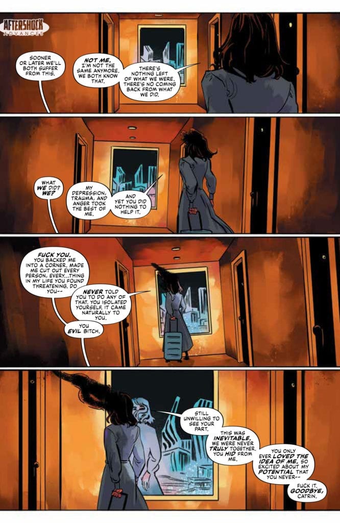
The story opens with a character leaving. As a reader we watch her walk away, arguing with another character who is out of shot. The placement of the word balloons, with their tails leading off the bottom of the panels, makes it feel like the argument is with us, the reader. Thompson’s deliberately non-specific script combined with Simon Bowland’s cleverly placed speech balloons change us from observer to active participant. Within the first page we have been brought into the story on a very personal level.

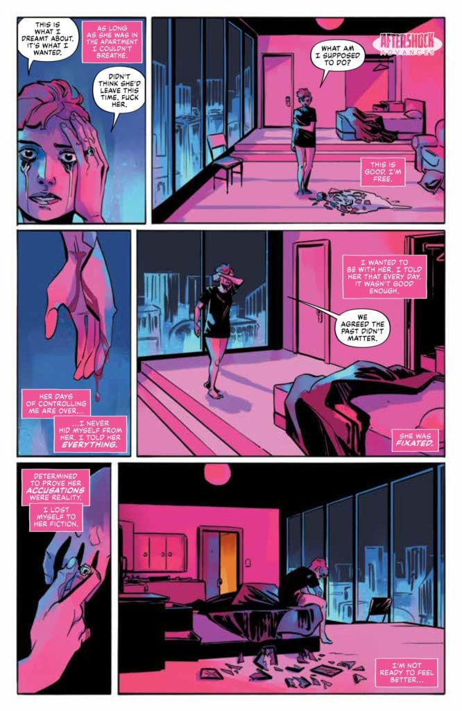
This means that when we turn the page and see our heroine for the first time, we already have a connection with her. We’ve been a part of her breakup and have been forced to share those difficult emotions with her. A page of grief follows, cementing the emotional bond between character and reader. Images of pain and loneliness accompany a voice-over of desperate defiance.

Artist, Jen Hickman, splits the second page into six panels. On the left, leading down the page, are close up images that represent the pain and loss that the character is going through: a tear streaked face, blood running from a cut wrist, and the removal of personal jewellery. On the right of the page, the larger panels represent the loneliness and space left by the breakup. Hickman uses long shots to show the vast, empty apartment. Catrin becomes lost in the space, surrounded by flat fields lacking any detail. Hickman washes the page in icy blues and cool pinks. The visual impression mirrors the narrative that Thompson has already forced the reader to endure.

The strong emotional context creates immediate empathy and is something that everyone can relate to on some level. Reader and character are bound by grief.

Lonely Receiver #1 Page 2 Credit: AfterShock Comics

Growth by Repetition

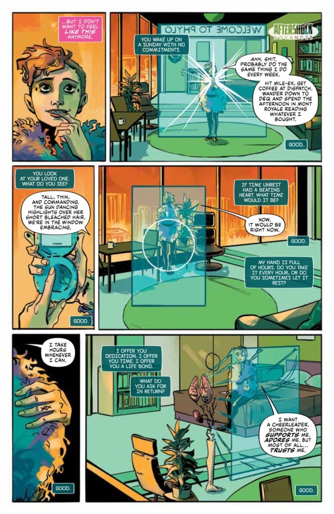
The second page turn gives the reader a different experience. The third page of the comic has a completely different feel, with a warming sensation smiling out from the first panel. Thompson introduces Catrin at her lowest and then builds her up, taking the reader along for the ride.

In order to enforce the turn around in emotions Hickman uses the exact same layout on page 3 as she did on the previous page, even copying the view points almost beat for beat. Only the final panel on the page has a different angle. At rock bottom Catrin was hunched, facing away from the reader, whereas at the start of her new life she sits upright, looking towards us.

The three left panels contrast the previous page, featuring the same close ups but with different emotional connotations. The first panel has a close up of Catrin, this time smiling with a hint of excitement. The second panel focuses on her hands, busy with her mobile phone. This shot serves two functions; firstly it draws the reader’s attention to the mobile device which becomes central to Catrin’s new obsession; and secondly it shows the scar on her wrist. The mark relates to the previous page and shows that Catrin is healing. Time has passed and she is moving on with her life. The third panel on the left again focuses on Catrin’s personal belongings, this time a fluffy coat that is wrapped around her. It is representative of her new life, symbolised by new objects of desire and obsession.

These two pages, identical in layout, show the reader Catrin at her worst and her best. The contrast in color and the comparable panels allow the audience to experience the characters life on a very personal level. For example, note the difference in backgrounds on between the pages in panels two, four and six. Page two is empty while page three is busy and bursting with life. Meanwhile, the overlaying speech relays further information about Catrin’s wants and desires. On page two the script focuses on Catrin’s loss, her past, whereas page three is full of her hopes and dreams.

Lonely Receiver
Lonely Receiver #1 Page 3 Credit: AfterShock Comics

And Then There’s Rhion 

Catrin is the central character but she needs a foil, another character who acts as a catalyst for the story. Enter Rhion. Rhion is a physical representation of the personality constructed by Catrin on her PHYLO X11 mobile phone. The interaction between Catrin and Rhion are central to the narrative and in order for the story to flow the reader has to understand their relationship. Thompson achieves this by focusing the majority of this issue on their time together. He gives the reader their entire relationship, every good and bad aspect, mental and physical interaction. By the end the audience feels as though they have experienced the relationship just as they experienced Catrin’s breakup on the first page.

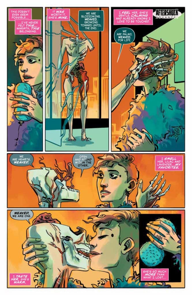
For the experience to work, Rhion has to be as fully formed a character as Catrin. Thompson and Hickman have already proved they can create a character’s personality in two pages. With Rhion they go one step further. They literally show her being constructed from the inside out. As she is built to Catrin’s requirements, the creators again use voice-over to give the reader a deeper insight into the character’s personality.

We are also shown the transition from idea to reality through the speech balloons. Bowland changes the color of the font as Rhion’s construction is complete, switching from black to white. He also slowly changes the color of the balloon symbolising the transition from machine to person.

Page four starts and ends with a panel prominently featuring the mobile device in order to remind the reader where Rhion comes from. This is important because after the page turn, onto page five, Rhion is fully complete and the relationship between the two women appears like any other relationship. It is not until later in the issue that Rhion’s origin plays a part and by then the reader is completely committed to the character’s and their relationship.

Lonely Receiver #1 Page 3 Credit: AfterShock Comics

Emotional Connections

Lonely Receiver is about the building and breaking of a relationship that includes a dramatic twist at the end. It is a science-fiction horror story that relies heavily on the reader’s connection to the central characters. For the narrative to be believable, and provide  the shocking elements successfully, it is imperative that Thompson and Co. draw the audience into their world completely. They do this by making the reader connect instantly with their lead characters.

Across five pages, the creators build and portray the relationship between two fully formed characters in recognisable terms, despite the futuristic way that one of the characters is introduced. The opening pages bind reader and character together by being rich in personality and emotional symbolism. Lonely Receiver creates a narrative version of ‘love at first sight’. We instantly connect with Catrin and Rhion and not only do we become friends, but it feels like we have know them all our lives.

AfterShock Comics are not beholden to a particular genre, although they do favour mature and cerebral stories, but one element that unites their output is Strong Central Characters. Comics like Undone by Blood and Disaster Inc. are very different narratively but they succeed because of the characters that the writers and artists have created. Lonely Receiver by Zac Thompson, Jen Hickman, and Simon Bowland is a prime example of superb character building where the reader becomes emotionally attached to the central cast and, as a result, committed to the story.

Monkeys Fighting Robots Youtube

Review: COMMANDERS IN CRISIS #1 – A Series With A Lot Of Promise

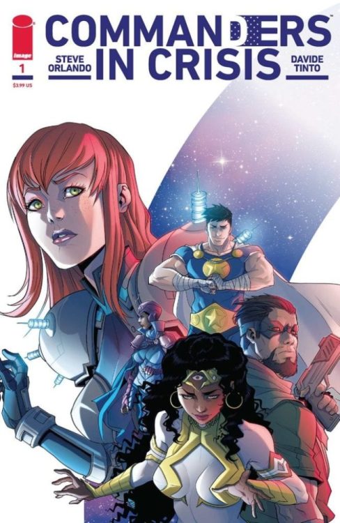
On October 14, Image Comics releases Commanders in Crisis #1 from superstar writer Steve Orlando and artist Davide Tinto. They are joined by colorist Francesca Carotenuto and letterer Fabio Amelia in a story that stretches from the streets of Philadelphia to the halls of power in D.C. to the very fabric of reality itself!

Writing

Orlando has given himself a gargantuan sized task in his first issue. He has to create brand new characters, make readers care about the characters, and establish the cosmology of the world. Commanders in Crisis #1 is pretty ambitious and plays off of past Crisis-tropes from DC Comics in a way that would read like parody if it wasn’t for the fact that Orlando and company seem to be using it to craft a relevant social message for our time. A message of hope, empathy, and the consequences of our present actions on the future.

While this first issue is a little heavy in exposition, which makes the dialogue a bit clunky at times, Orlando establishes the characters, his or her motivations, as well as their backgrounds, laying a clear groundwork for the series. If future issues can avoid being overly exposition-heavy, this has the potential to become a very solid series.

Another danger this series may face is being a bit “on the nose” with its moral and political messaging. If it can be nuanced without being preachy, this could be a very profound series.

Art & Colors

Co-creator Davide’s artistic powers are on display in this issue. Davide can capture the bombastic action in this issue, and there is a fair share of furious action. He is able to capture the movement and motions of the characters well in a very busy issue.

Davide also portrays the emotions of the characters well. Readers meet a lot of new characters in this issue, and it would be very easy for an artist to phone it in when it comes to the facial expressions of multiple characters, but Davide spares no details and draws characters whose faces exude personality.

Davide and Orlando have created characters with unique power sets, and Davide highlights his skills by drawing some very abstract sounding powers. He is, of course, joined in this endeavor by Carotenuto, whose colors assist in portraying the various characters’ abilities.

Carotenuto’s colors are bright and almost shiny in certain places, adding some shading and shadows that make this a lovely book to read.

Letters

Amelia’s letters are quite serviceable in this issue. The sound effects and intros for the characters are nicely stylized, particularly one character’s dialogue, which is uniquely colored when she uses her power. The dialogue is also easy to follow. As noted earlier, there is a lot of expositional dialogue in this issue, but Amelia’s letters never make any of the pages look overcrowded.

Conclusion

Fans of DC Comics crisis events should love Commanders in Crisis #1. It is a pastiche of DC’s crisis stories, which takes those concepts in some potentially unique directions. Morrison fans especially should love what Orlando, Davide, and company are doing in this issue. This story touches on the importance of hope, empathy, and the consequences of allowing those things to disappear from public discourse. I’ll definitely be checking out issue #2!

Review: COMMANDERS IN CRISIS #1 - A Series With A Lot Of Promise

Monkeys Fighting Robots Youtube

Review: BE GAY, DO COMICS—Queer Pride Anthology of the Year

Cover Image

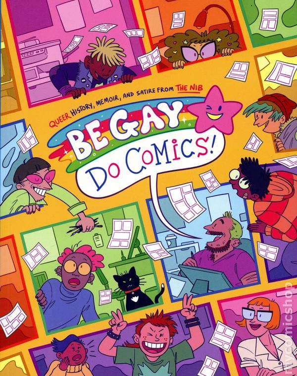
Available now, Be Gay, Do Comics, is the queer anthology you didn’t know you needed. A partnership between The Nib and IDW, the book features stories from forty different contributors, edited together by Matt Bors, Eleri Harris and Matt Lubchansky, Sarah Mirk, and Andy Warner.

Like many pieces of media released this year, this book unintentionally satisfies an emotional need. Because of COVID-19, Pride month didn’t happen as usual. Instead of the typical in-person fun, community-engaging celebrations, everything was relegated to socially-distant internet hangs. Be Gay, Do Comics brings the celebration to you, giving each individual the chance to learn history and empathize with personal stories from diverse creators.

The anthology’s artistic through-line is its cartoonish style, especially in the way people are drawn. Colors are bold and bright, and facial features are unrealistic. Choosing cartoon style over realism makes the book more accessible.

Dimensions

However, that doesn’t mean the stories themselves are cartoonish, two-dimensional narratives. Cartoon style seems to give the creator emotional distance from their personal narrative. This then allows them to capture the essential beats of their story.

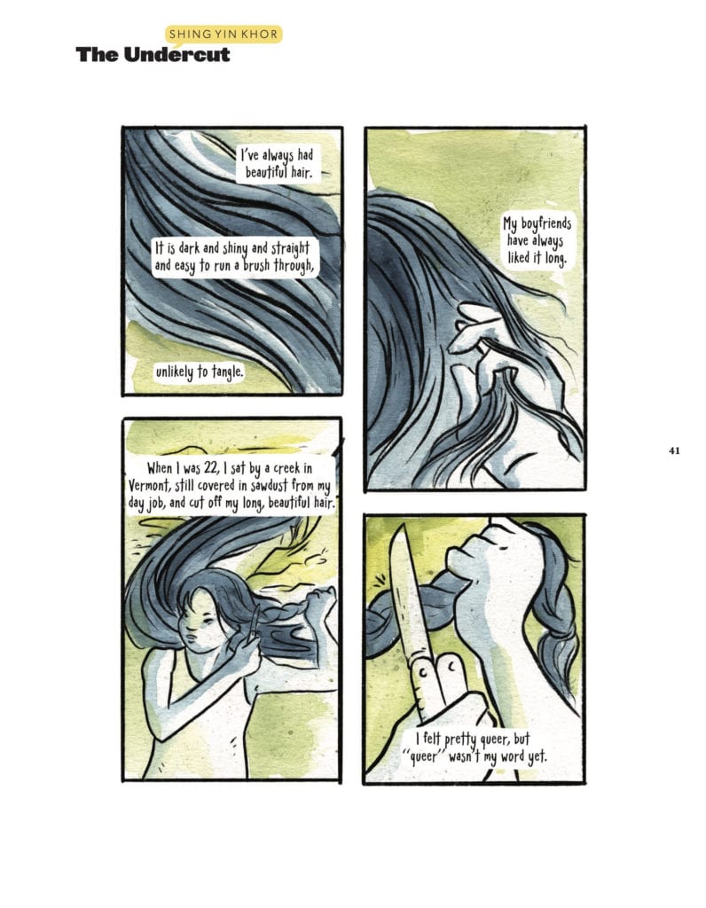
For example, in Shing Yin Khor’s story “The Undercut,” they combine a cartoon-like drawing of self with watercolor and poetic narration. The combination shows how we objectify ourselves, honing in on hair as a sign of identity. Lettering that looks like handwriting adds to the sense of intimacy and introspection the lyrical narration provides.

Cartoon style
Shing Yin Khor tries a new haircut.

Moreover, the same principals apply to the historical stories. In the case of “The Wonderfully Queer World of Moomin” by Mady G, the style is borrowed from the Finnish “Moomin” comic strips by Tove Jansson. Pastel colors and the particular cartoon style of Jansson’s characters lend a sense of whimsy to the story.

Balancing whimsy and emotional intimacy through cartoonish art ensures the book’s accessibility. So we can all have respite and time to reflect on this stressful year. But for LGBTQIA folks, Be Gay, Do Comics hits differently given that queer folk’s increased risk of contracting COVID. If you weren’t satisfied with Pride this year, this book just might help you feel a little less alone.

Monkeys Fighting Robots Youtube

THE DEPARTMENT OF TRUTH #1: How Reality Becomes Subjective

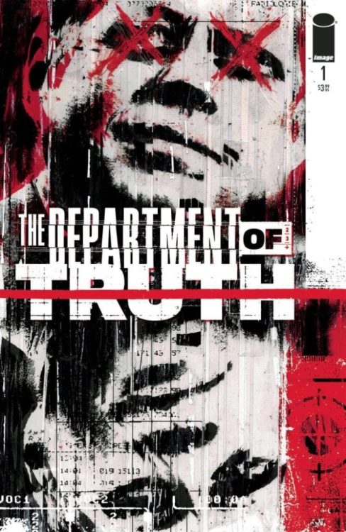
The Department of Truth #1 Cover

The Department Of Truth is a new thriller courtesy of James Tynion IV, Martin Simmonds, and Aditya Bidikar. Image Comics publishes the first issue on September 30, and with MFR already recommending this, it might be good to subscribe to this series. The series delves into the infectiously uncomfortable world of conspiracy theories. Disturbing influences aside, this may be one of the best comics to come out this year with its suspenseful storytelling that leaves readers on the edge of their seats.

The Department Of Truth #1 Story

The Department Of Truth #1 releases alongside Tynion IV’s other series, Something Is Killing The Children. Both books deal with the feeling of helplessness against the impossible. But the threats of the Dept. are not overwhelming just for the effects they have on people; it’s how these threats defy common sense. Unlike monsters that appear only to children, conspiracy theories are like a virus that people can’t shake. Even the reader won’t be able to shake the conspiracy theory’s influence after reading this issue. But specific details would be spoilers.

Reflecting current times of unease and misinformation, this series takes a supernatural spy thriller angle to the social commentary. Because if The Slender Man can invade people’s minds as much as Flat Earth theories, wouldn’t that put them in the same category? The newest recruit of the titular agency, Cole Turner, seems to think so. With the company he’ll be keeping, his and the reader’s world will turn upside down. With real-life twists and turns taking place during the publishing of The Department Of Truth #1, the suspense both on and off the plot will be something to remember. So much that readers won’t get enough of just one read and will re-read it endlessly.

Art

In just the prologue section, The Department Of Truth #1 sets itself up by overwhelming the reader. Simmonds arranges the panels in a grid to try to keep everything in control while the muted/blurry visuals display the difficulty in comprehension. It’s the perfect setup to a spy thriller with how it removes itself from the main story, which features a watercolor design. That design actually has a solid reason for it. In Cole’s perspective, things are strange but still make sense, even the creepier parts like identical smiles that are pasted to people’s faces. This brings unease to a situation already keeping readers on their toes. It’s relatively comparable to the numerous illustrators of Neil Gaiman’s Sandman franchise, like Colleen Doran.

Bidikar’s lettering only adds to this suspense. Most people speak in word balloons that don’t completely connect to the outline. This gives the feeling that everybody is speaking out of context or struggling to give the best answer to a question. Two different kinds of captions even make up two perspectives. The standard captions without voice-over borders are like paperwork descriptions for reports. The other voice-over captions have borders that are like Cole writing his experiences down in notes. The uneven borders, however, feel like they’ve been ripped out and jumbled. For all the professionalism, these descriptions might not be as reliable. It’s almost like the reader is trying to make as much sense of everything as much as Cole, bringing a sense of empathy throughout the issue. Enough to re-read the issue for Cole’s sake.

You’ve Been Approved By The Department of Truth #1

The Department of Truth #1 is a spy thriller like no other. Conspiracies have always been decent plots in comics like The Black Monday Murders, but now the more fantastical side takes hold. It looks like whatever readers believe about intrigue plots is about to be challenged. This series will bring readers in to re-review what’s on this issue just to try and make sense of everything. But no matter how much they try to familiarize themselves, readers might never adjust to it all. The illustrations make everything feel like a dream; even the characters are trying to make sense of everything. Readers are just along for the journey. One they might not mind doing again and again to make sense of everything.

Are you going to pick up The Department Of Truth #1? Leave your thoughts in the comments?

Monkeys Fighting Robots Youtube

Review: BUFFY THE VAMPIRE SLAYER #17—The New Watcher

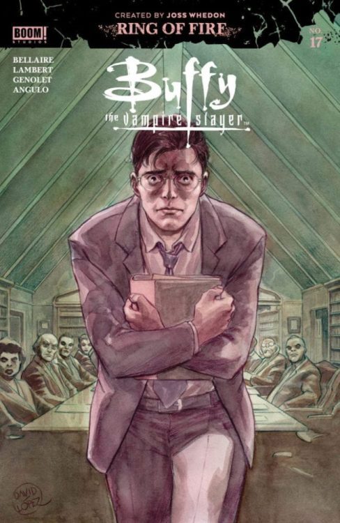
Wesley_Cover

Available now, Boom! Studios’ Buffy the Vampire Slayer #17 combines the written talents of Jordie Bellaire and Jeremy Lambert. Artistic contributions come from illustrator Andres Genolet, colorist Raul Angulo, and letterer Ed Dukeshire. Continuing the Ring of Fire arc, the book welcomes Buffyverse favorite Watcher, Wesley Wyndam-Price, into the fold.

Wesley of the BtVS TV series was an uptight rule-follower, drawing the ire of his Slayer charge Faith, Giles, and the rest of the Scoobies. His run on the original series was brief, however, and he gained most of his popularity as a main character in the Angel spin-off. Played for laughs in the series, Wesley’s uptight nature was part of his charm and set the tone for his introduction in #17.

spoilers ahead

Boot-Licking Hero

The book hilariously opens with Wesley writing self-insert fantasy fan-fiction. It reveals his strong desire to be a hero–and introduces the ghost of Ethan Rayne. Our favorite warlock interrupts the Watcher-in-training to alert him to a council meeting. Here, ghost-Ethan acts as Wesley’s conscience, prodding him for comedic effect and encouragement.

Ethan wants Wyndham-Price to stand up to the status-quo loving head of the Watcher’s Council, Dorothy. Mysteriously, three watchers and a slayer have died in the Cleveland, OH region. Ethan encourages Wesley to investigate and confront the council, partly blaming the murders on the council’s tendency to view Slayers and Watchers as expendable.

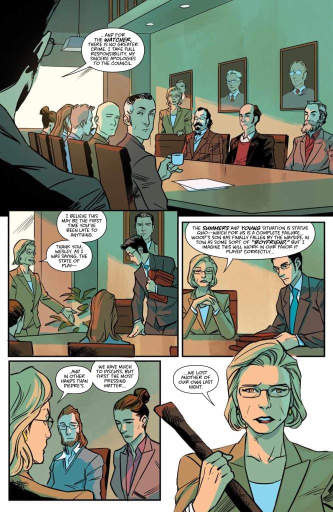
Watcher Council Meeting
WESLEY’S LATE TO A WATCHER COUNCIL MEETING.

But despite Wesley’s desire for heroism, he prefers to be a “boot-licker” instead of a rabble-rouser. He’s a new Watcher, after all, and taking such a risk could lead to unwelcome council scrutiny. Fortunately for Wesley, being a boot-licker works in his favor as Dorothy sends him on his first assignment as a Watcher. He’s to guide an unexpected third Slayer, another apparent fluke of the Hellmouth battle.

Big Stakes

With Ethan’s ever-present specter by his side, the new Watcher is welcomed to Sunnydale by a vampire. Shocked, he stakes the demon with Dorothy’s parting gift. Maybe he’s in over his head.

Characteristic fast-pacing and warm, saturated coloring provide the familiar, inviting backdrop to this exciting new subplot. The heavy use of wide shots emphasizes Wesley’s bashfulness, on occasion diminishing him so much that he almost blends into his environment. This artistic choice and others make issue seventeen a unique character study when compared to others in the series.

For one, Wesley’s interior self is revealed through the fanfiction instead of the more conventional choice of captions as employed in Kendra’s issue (#13). He also gets a purple Ethan ghost torso bearing a strong facial resemblance to the Watcher himself, acting as his conscience. These artistic choices ultimately streamline the story, making it more cinematic while complementing the overall tone and pace of the series.

Nonetheless, it’s the big stakes (in terms of both wooden weapons and plot) that entice. Will who or whatever murdered the Cleveland Watchers pose a threat in Sunnydale? And could this third Slayer possibly be… Faith?! We’ll just have to bite our nails in anticipation.

Monkeys Fighting Robots Youtube

Review: THE OWNERS Offers Familiar Home Invasion Thrills

The Owners is the latest home invasion thriller to mix up elements from previous films that share identical plots. The film is very much a mixture of Don’t Breathe, Villains, and The Visit. Due to that, it doesn’t offer anything that original, but it’s enjoyable for what it has to offer and includes another great performance from Maisie Williams.

While we anxiously wait for the Don’t Breathe sequel to arrive, The Owners is here to remind us to not underestimate the elderly, especially a skilled doctor and his crazed spouse. What start’s off as a robbery quickly turns into an evening of terror. This elderly couple doesn’t take well to intrusion, and these young thieves have made a severe mistake. Directed and co-written by Julius Berg, the film Stars Maisie Williams, Sylvester McCoy, Rita Tushingham, Jake Curran, Andrew Ellis, Ian Kenny, and Stacha Hicks. The Owners follows a group of friends who attempt a robbery, only for the homeowner’s to return sooner than expected. Chaos ensues, as the elderly couple quickly turn the tables on their intruders.

Jake Curran as Gaz in The Owners

Berg penned the script for this bizarre home invasion film with the help of Mathieu Gompel and Geoff Cox. This is yet another project that offers viewers no indication of who to get behind. We follow Mary (williams), Gaz (Curran), Terry (Ellis), and Nathan (Kenny). A group of friends who have underestimated the couple they are about to terrorize, but they themselves are unlikable characters. The elderly couple, Richard (McCoy) and Ellen Huggins (Tushingham), aren’t as defenseless as the film initially makes them. You’ll find yourself struggling to decide which group of criminals you want to see get the upper hand.

The script does include a few touches of foreshadowing and dialogue that effectively establishes multiple setups and payoffs, which is always a great detail. Also, the writers do a great job at connecting the Huggins to two members from the group of intruders. Hints are sprinkled throughout the script, and there are many nods to what is to come, but it’s almost impossible to predict. Sadly, this twist is too familiar, and not refreshing. It probably won’t warrant the big O. It’s clear they want us to get behind Mary, because she’s the most likable. Also, it helps when Williams is acting her butt off in the role. Mary and Terry are fleshed out as the film progresses, but their friends mostly exist to add to the body count.

Sylvester McCoy as Richard Huggins in The Owners

McCoy and Tushingham also offer some great performances. When Williams isn’t eating up the scenery, these two are here to fill in and they deliver. Curran, who is only featured in the first half, absolutely embraces his role as Gaz. Gaz is the pompous leader of the intruders, and for the little time we spend with him, Curran makes the most of it. Berg effectively builds tension throughout the film, and doesn’t let up once the Huggins return to their home. The score featured only heightens the unease you will feel for most of the films runtime. The Owners won’t be the most memorable home invasion film, that position is reserved for You’re Next. Still, this is an adequate horror thriller with a few surprises up its sleeve.

The Owners won’t be breaking new ground, but between Williams, McCoy and Tushingham’s acting chops, it will be enough to keep you interested for its 90 minute runtime. Williams is really shining on her own these days, and this project utilizes her better than the recent New Mutants. Despite it’s unlikable characters, the film features a trio of solid performances, and effective tension building, which is more than enough for fans of the genre to be pleased with.


Monkeys Fighting Robots Youtube

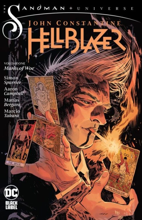
Review: JOHN CONSTANTINE: HELLBLAZER: MARKS OF WOE — Foul-Mouthed And Horrifying Once More

DC Comics’ JOHN CONSTANTINE: HELLBLAZER VOL. 1: MARKS OF WOE is out September 29th, and England’s favorite bastard goes back to his Vertigo roots in this wickedly smart, funny, and exciting collection.

John Constantine is plucked from an apocalyptic future and returned to present-day London with simple instructions: All he has to do is be the best version of himself. But Constantine is a selfish ass — so what does the best version of himself even look like?

Contents & Credits
MARKS OF WOE collects The Sandman Universe Presents: Hellblazer #1, John Constantine: Hellblazer #1-6, and Books of Magic #14. It’s by writer Simon Spurrier and artists Aaron Campbell, Matías Bergara, and Marcio Takara, with colors by Jordie Bellaire and Cris Peter, and letters by Aditya Bidikar. The Books of Magic issue is co-written by Kat Howard and illustrated by Tom Fowler and Craig Taillefer, with colors by Jordan Boyd and letters by Todd Klein. The stunning collection cover is by Bilquis Evely and Mat Lopes.

john constantine hellblazer dc comics review

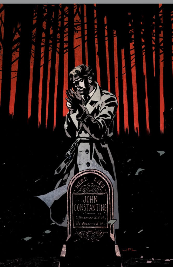
Si Spurrier proves himself to be the perfect choice to write a modern HELLBLAZER comic. His Constantine is sardonic, witty, and outright rude. You love to hate John Constantine, but there’s also a clear pain beneath his surface that makes you root for him. Plus this is DC Black Label, so there’s no censorship here. Spurrier can write Constantine as crass as the character was back in the Vertigo days, and he takes full advantage of that freedom.

That’s going to be the big selling point for a lot of readers: This is a return to form for HELLBLAZER. After he was folded into the mainstream DC Universe and started palling around with the Justice League, Constantine had to be watered down and put on a leash. But now he’s off that leash again. And this doesn’t just mean he can swear openly once more (because, let’s be honest, if that was the main appeal it would get old fast). No, the real benefit is that HELLBLAZER can once again tell darker, more twisted, and more mature horror stories — and boy does it do just that.

Upon returning to the present, Constantine is greeted with an unfamiliar London — a post-Brexit London overflowing with ignorance and hate. There are evil forces at play which are poisoning people and fueling their anger, and the Hellblazer is on the case to take them down (if only for the bragging rights).

This is a book with a lot to say about the current state of London and the world at large. It’s full of smart social commentary, but it never comes off as preachy. If anything, the commentary makes these stories even scarier: Some of the evils that Constantine faces are the same evils that many of us face in the real world every day. The monsters aren’t just metaphorical though, so don’t you worry. MARKS OF WOE is full of terrifying demons that will haunt your nightmares.

john constantine hellblazer dc comics review
Art by Aaron Campbell & Jordie Bellaire

A few different art teams work on this book, but the changes never feel jarring. Each team tackles its own story within the overall story, so the transitions actually feel smooth and natural. Plus, each artist brings a different vibe with his or her style, which elicits various tones and feelings.

Campbell’s London, for instance, is dark and dirty. You feel like the grit is going to rub off on your fingers when you turn the page. Horrors lurk in the shadows. Then Bellaire’s colors peek through the darkness and reveal the magic and wonder hiding beneath the city’s surface. With the combination of inks and colors, the settings recall classic art (particularly the work of Vincent van Gogh), especially in regards to the lighting and skyscapes, which further drives home the magical and mysterious tones of the story.

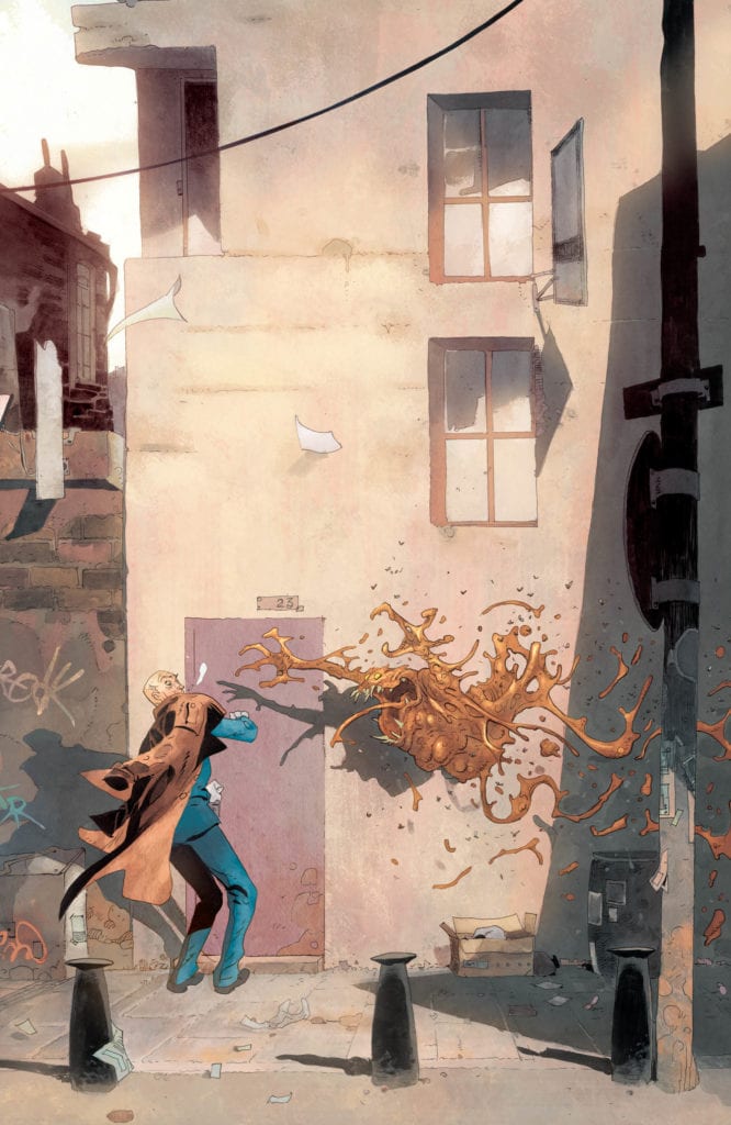
Bergara’s work meanwhile (still with Bellaire’s colors) is then more cartoony and bright. It works well since the story being told in Bergara’s issues is more humorous and fun, but it also sets up the reader for even bigger scares. Because the art and story is more lighthearted, when the terrors strike, they’re all the more terrifying.

john constantine hellblazer dc comics review
Art by Matías Bergara & Jordie Bellaire

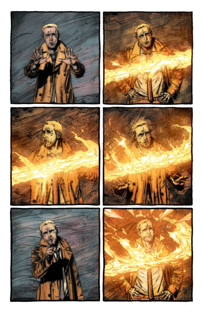
Regardless of their style, though, or how they deliver horror, every artist on MARKS OF WOE is an excellent storyteller. They all know exactly how to frame and utilize silent panels in order to build dread and drama (and even comedy). Personally, I love the repeated use of a single shot during a sequence, changing only a character’s position or facial expression in either subtle or dramatic ways — or even adding a spooky element to the background. Whether the intent is to scare or amuse, it always seems to pay off. Also, ending a page on a shot and then doing a reverse shot on the page turn for a reveal is an excellent way to make the hairs on the back of your readers’ necks stand up.

The point is, when you’re doing a horror comic, the artwork is both the most important and the most difficult component to get right, but this team nails it. They pull every trick out of their respective bags to give you the willies.

If you like horror, or dark fantasy, or smug protagonists that you sometimes want to punch in the face but also maybe grab a drink with, definitely pick up JOHN CONSTANTINE: HELLBLAZER VOL. 1: MARKS OF WOE, out September 29th from DC Comics. With respect to everyone who’s written Constantine over the years, this is peak HELLBLAZER right here.

Monkeys Fighting Robots Youtube

Review: TENET Gives Action-Packed Puzzle

Tenet will warrant head-scratching, multiple re-watches, and a lifetime worth of patience to finally understand the film entirely. Christopher Nolan’s latest sci-fi thriller will do quite a number on the minds of everyone who dares to watch. It’s been said ad nauseam, but Tenet is the most ambitious film to date from the acclaimed director.

In what will easily be called the most baffling film in his career, Tenet impresses more with it’s action sequences than with its complex narrative. Nolan shows so much interest in wanting you to figure out the plot that he neglects giving us any chance to connect with the characters involved. Directed and written by Nolan, the film stars Robert Pattinson, Elizabeth Debicki, Michael Caine, Kenneth Branagh, Dimple Kapadia, and John David Washington. Tenet follows an unnamed CIA agent, as he attempts to manipulate the flow of time to prevent the third world war.

Robert Pattinson as Neil in Tenet

A simple premise that quickly evolves into mind-bender of the year. If Nolan’s intent was to spark conversation, job well done because Tenet is not easy to follow upon first viewing, and that’s the point. Nolan’s script is layered with details to help you along the way, but it will not come together easily with one viewing. Sadly, despite spending many years working on this script, the characters involved have little development. You won’t find yourself caring for them, but Tenet’s compelling plot is enough to keep you interested.

The lead role, simply called the protagonist, is well acted by Washington, but we spend most of the film with this unnamed character and it’s hard to get on his side. Acting aside, this character is not that interesting because very little is known about him outside of trying to save the world. In fact, he is the only character in the film without a name. Tenet features some solid performances from the entire cast, and of course, as seen in the trailers it is filled with impeccable cinematography throughout. Pattinson stars alongside Washington as Neil, who at first glance seems to be a simple sidekick, but then is transformed before the credits roll.

John David Washington In Tenet

Pattinson’s performance here may get a few doubters more hyped for his upcoming Batman persona. Nolan does what he is a master at by directing this film with ease, but I would say this isn’t one of his better outings as a director. Despite that, he is part of the elite, and effectively depicts why his spot is deserved. It’s evident the focus was on putting together a visual spectacle, and that’s exactly what Tenet will be remembered for if nothing else. The dialogue between our characters may be hard to follow at times and the time travel may take multiple viewings to understand. However, Tenet is still a beautifully shot film that features great acting, and a score that is oscar worthy.

The film’s biggest detractor is it’s plot and the muffled dialogue. As ambitious as it is, Tenet has so many missing pieces that you have to put together on your own that it can become tiring. Coined the film that would save cinemas, Tenet is Nolan’s latest attempt at causing moviegoers minds to constantly shift gears while watching. Featuring some of the year’s best action sequences, and probably the only film this year that will cause a migraine. A spy film that won’t go down as his best film, but a movie that needs to be seen many times to appreciate how well made it is, and to fully grasp the concept of inversion. Tenet is another impressive outing from Nolan, who indeed may have just saved cinemas.


Monkeys Fighting Robots Youtube

Marvel Comics Exclusive Preview: X-FACTOR #3

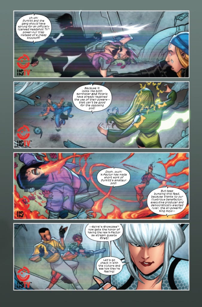
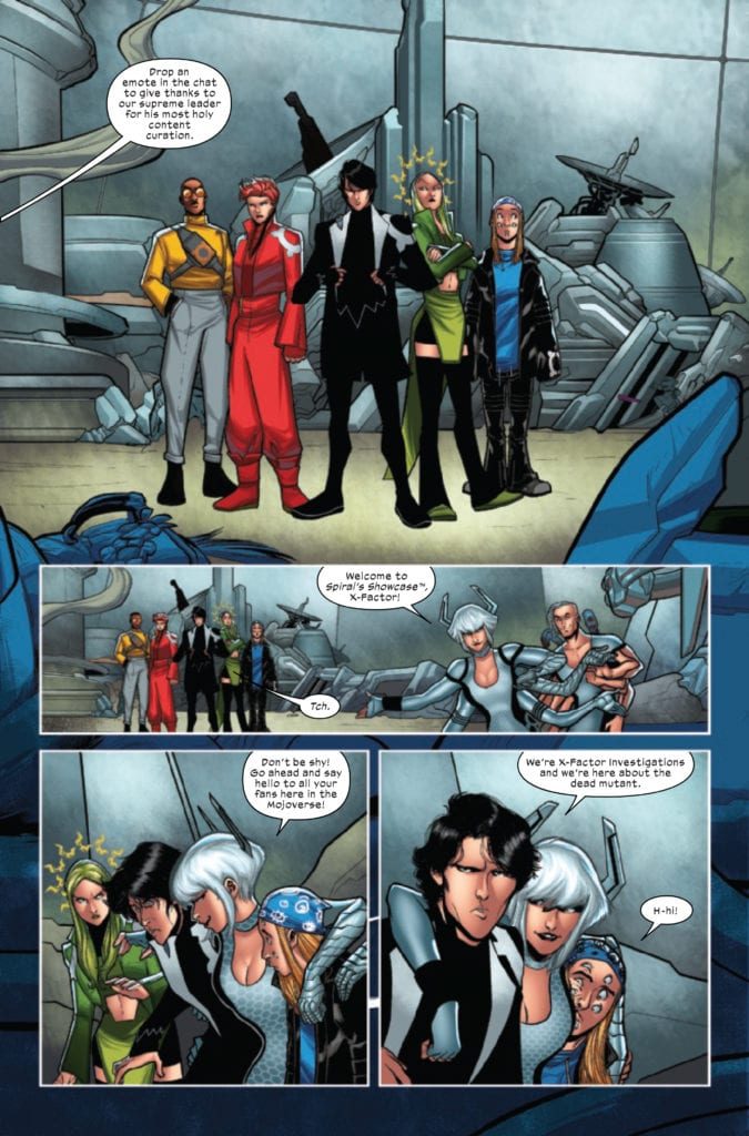
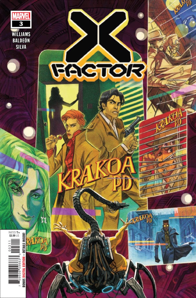
X-FACTOR #3 hits your local comic book store September 9th, but thanks to Marvel Comics, Monkeys Fighting Robots has an exclusive two-page preview for you.

About the issue:
DROWNING IN THE STREAM! Every streamer in the Mojoverse is desperate to get a little of the X-magic on their channel, but all X-Factor wants to do is figure out who murdered a Krakoan citizen.

X-FACTOR #3 is by writer Leah Williams and artist David Baldeon, with colors by Israel Silva and letters by Joe Caramagna.

Krakoa may have conquered death, but that doesn’t mean its citizens will just let murder slide. X-FACTOR focuses on the mutants tasked with investigating any Krakoan deaths prior to resurrection. Williams and Baldeon previously worked together on GWENPOOL STRIKES BACK for Marvel.

Check out the X-FACTOR #3 preview below:


What’s your favorite X-book of the new era? Sound off in the comments!

Monkeys Fighting Robots Youtube