Home Blog Page 250

How The Investigation Unfolds in BATGIRL #49

BATGIRL #49, available Tuesday from DC Comics, brings fans ever closer to the end of Barbara Gordon’s series (for now). It’s also bringing us closer to the truth, as Babs tracks the mysterious Batgirl killer.

***SPOILER WARNING***

spoilers ahead

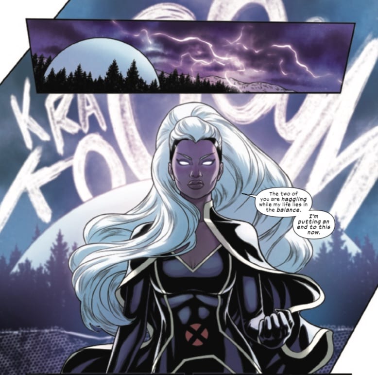
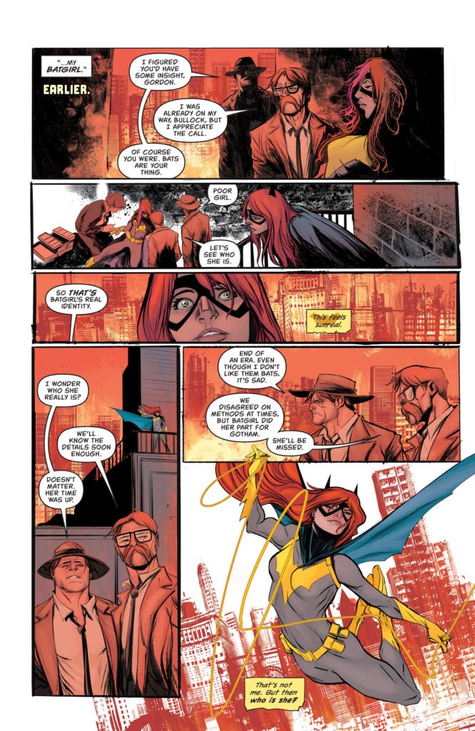
The Joker War may have concluded, but it’s clear that Babs is not going to be getting a break anytime soon. She survived what the Joker had intended for her, but now she’s up against a whole different killer.

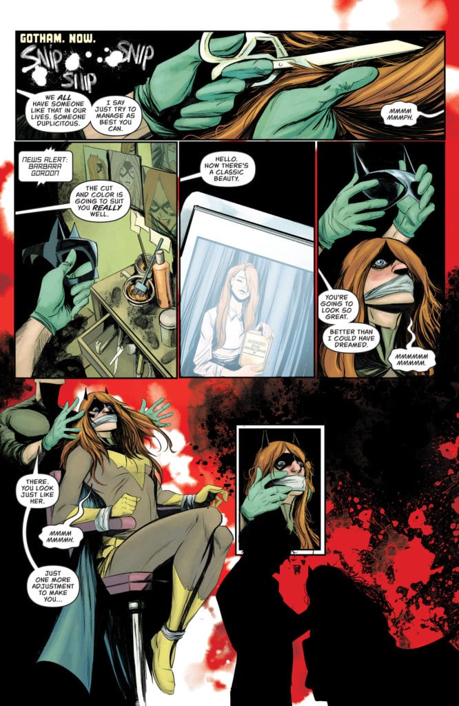
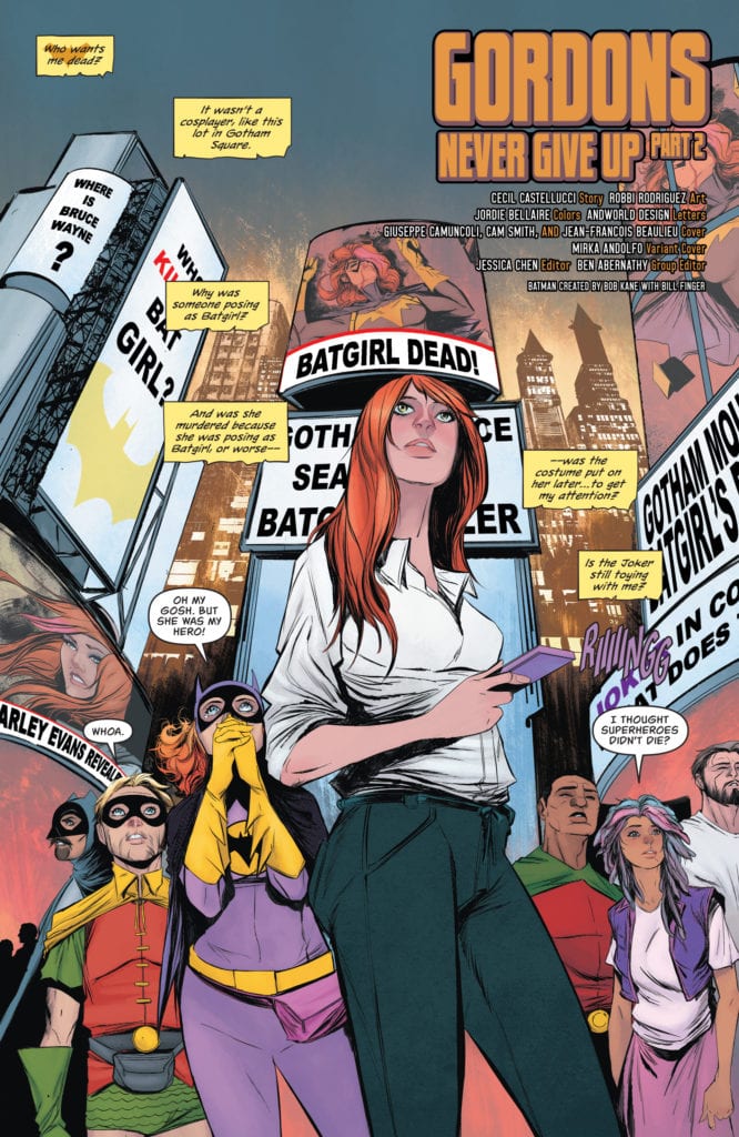
This killer is dressing up women to look like Batgirl, and then killing them. Though perhaps not in that order, that is harder to be certain of. What is certain is that this killer has a type, and both Batgirl and Babs fit it.

The last issue brought with it that dramatic revelation, and now it’s time to see how Babs deals with it all. Not to mention how Gotham responds to the idea of Batgirl being dead (and identified, as far as they know).

A twisted game has begun in Batgirl #49.

The Writing

Batgirl #49 was written by Cecil Castellucci, and you can see how carefully she wove this web. With only so many issues left to wrap up Batgirl’s latest adventures, she’s decided to go out on a bang. One that is quintessentially Batgirl – and Barbara Gordon.

It’s safe to say that this is a pretty dark issue, what with the death of Batgirl looming over everyone’s heads. Once again, we’re facing the trauma that seems to prevalent to Batgirl. Yet it almost feels like we’re on the outside watching in. In this instance, that includes Batgirl as well. It’s an odd twist to that scenario, yet it’s almost refreshing in a way.

Another surprise for this plot arc is the sheer level of family drama going on within the pages. The Gordon family has never been a normal family, but lately, they’ve been worse than ever. Each and every surviving member of the family has their own baggage, and it seems like none of them are capable of forgiving the others.

That may feel like it’s irrelevant to the death of Batgirl, but it is so essential here. In a way, it’s setting the scene, for there’s no doubt that this hunt is a symbol of the baggage that Batgirl herself carries with her. And the enemies she’s created along the way.

The drama also laid the groundwork for the dramatic conclusion to this issue. It’s hard to be certain how Babs will react to what has been done. Or how others will react to her, but the odds are good that it isn’t going to go well. In a way, this feels like we’re heading towards a natural conclusion to the series, which is appropriate.

The death of (a) Batgirl in Batgirl #49.

The Art

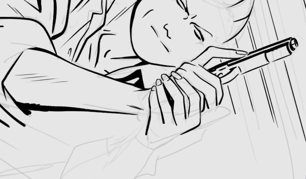
Naturally, the artwork in Batgirl #49 is every bit as daring and bold as the writing itself. However, it shouldn’t surprise fans to hear that the artwork gets a little dark as well. Not literally – the scenes are crisp and clear. It’s merely the scenes portrayed that carry with them a darker tone.

Robbi Rodriguez paved the way for this issue, creating a variety of scenes and emotions – all of which are pivotal to this plot in particular. The implications made within this issue wouldn’t have had the same impact without Rodriguez’s artwork and scenes to make the truth hit home.

Jordie Bellaire was responsible for the colors, which are a striking balance of bright and dark. The shadows within intentionally obfuscate the truth, while the bright colors seem to remind readers of the lives being lost.

Andworld Design provided the lettering, and it was so carefully done here. There’s a lot going on in these pages, from all the dialogue to the running thoughts – not just of Babs, but of her family as well. Yet it is never difficult to tell who is speaking or thinking. Given what happens here, the distinction of characters was vital.

The city is about to have its heart broken in Batgirl #49.

Conclusion

Batgirl #49 is setting up for a potentially dark and foreboding conclusion to Batgirl‘s series. Yet it also feels right, in a way. The themes and twists that the series is currently dealing with. It all feels right at home in Babs’ story.

Monkeys Fighting Robots Youtube

MARGO: ATTACK OF THE SPACE-VAMPIRE – Love Overcomes Assaults

Margo: Attack Of The Space-Vampire Cover

Margo: Attack of the Space-Vampire is this week’s two-issued complementary story from creator Jim Whiting’s Whiting Studio‘s Margo: Intergalactic Trash Collector. Joining Whiting is Charles Santino as co-writer and colorist Chuck Michael Obach for Whiting’s art. The second story features Whiting as writer, letterer, and co-colorist while Marcelo Trom acts as artist, and Thyago Brandao serves as co-colorist. Despite this series’s pulpy nature, this two-pronged release has a theme concerning sexual assault and how familial love acts as a deterrent.

Margo: Intergalactic Trash Collector Prologue/Story Dynamic

Rather than diving right into the titular situation, readers instead get an introduction to the title character. In Applicant, Whiting and Charles Santino introduce new readers to a rather decent first impression. One that shows both Margo’s rocky relationship with her mother but still appreciates what it does for Margo. Especially when it comes to a plot point that has become increasingly relevant for its depiction of workplace sexual harassment, even if it does come with implications of needing to bring cameras everywhere to expose misappropriation and conversely elevate status, even Margo isn’t too fond of the result despite getting the job of the series and her mother’s insistence everything was okay.

Which brings us to Margo: Attack Of The Space Vampire from just Whiting. Margo’s relationship with her mother is as rocky as ever. Yet it’s Margo’s relationship with her late father that takes center stage. This manifests in two forms, an image that is either a recording or a memory, and Margo’s loyal dog Millie. In this way, when the titular vampire appears, it’s a father’s love that goes out of its way to protect his daughter from assaults. No steamy gothic fantasies about vampires are allowed in this story—only affection matters in this and the rest of the series.

Art

Art duties split up among the different takes of the narrative. Whiting does the art in Applicant, where the rough yet simplistically chaotic line work is applicable in different cases. The use of backgrounds really tells the mood of the setting. A very vibrant background is a piece in time to remember, like a mural of an emergency worker. Or a dangerous area that can happen in other places in the Margo series. Meanwhile, a lack of background is where things disappear and transition to a new moment in time. All of which heighten with Chuck Michael Obach’s coloring. For example, a bright and uplifting setting in yellows transition to a green one to reflect a change in less certain times. Or when things are about to become harder with orange and reds, which match the colorations of Margo herself.

Margo: Attack of the Space-Vampire features art from Marcelo Trom. The smoother artwork comes with more cinematic transitions that always seem to shift angles. This can allow for more storytelling, like when parallel points come up. Points like that highlight Whiting’s lettering where word balloons positions intersect from one scene until they come together. The wordmarks with stylizations like a heavy ship landing with a loud “klunk” serve as the lynchpin of those points. The coloring between Thyago Brandao and Whiting mostly highlights points of interest, including lights that guide the reader.

Feel The Love In Margo: Attack of the Space-Vampire

Margo: Attack of the Space-Vampire is a pretty good piece for new readers to get acquainted with. Not only does it introduce a character in a way people relate to at the time of its release, but it also has a good message about familial love. It’s something that manifests differently, like a pet that’s an extension of a late relative. All in an environment that’s constantly changing perspectives but still comes back to the point of origin.

Monkeys Fighting Robots Youtube

Review: BLACKHAND & IRONHEAD–Not Your Father’s Anti-heroes

Amy and Alexia at odds

Available this week, writer and artist David Lopez’ opus Blackhand & Ironhead adapts a Watchmen-esque story for the modern era. Published initially through Brian K. Vaughan’s Panel Syndicate website, script tutor David Munoz and translator Stephen Blanford helped bring this story to life for Image Comics, with a logo by Cris Castan and colors by Nayoung Kim.

Blackhand & Ironhead imagines a future in which a corporate elite has capitalized on battles between superheroes and villains. Much like Watchmen, it deconstructs the superhero mythos, but through the fresh perspectives of two naive young heroines who struggle with a complicated inheritance. Lopez’s keen character writing, combined with his expressive art, make for a fun, thought-provoking book.

The final page of part one, entitled “Family,” is an excellent example of Lopez streamlined, almost cinematic storytelling. It shows us the funeral of Alexia’s (one of the heroines) father, Charles a. k. a. Ironhead, the corporate CEO of Lessep’s. His foundation created televised “cage matches” between heroes and villains, the profits of which covered costs of damages caused by the fights.

Shattered

The wide page is composed of rectangular and triangular panels, like pieces of shattered glass. From close-up to extreme close-up to bird’s eye view, the page communicates emotionally how Alexia’s life has now changed; her image of her father shattered. When the daughter of the notorious villainess Blackhand crashes the funeral to deliver the news that Ironhead was also her father, Alexia reacts stubbornly and violently. Living up to her new inherited name, Ironhead Alexia headbutts Amy, the new Blackhand.

And it’s this interaction that sets up the sister’s dynamic throughout the book. Their reluctant partnership provides a balance of fun and serious reflection, carrying the narrative from moments of social commentary to scenes of classic comic book action. Like a buddy comedy, the sisters banter and ultimately learn how to work together to find out hard truths about their father, Lessep’s, and themselves.

Weird Hero Powers
AMY DESCRIBES HER POWERS.

Given Lopez’s choice of heroines, one might see the book as a love letter to the new generation of young twenty-somethings shouldering the burden of cleaning up their parents’ mess and leading the way into a better future. Blackhand & Ironhead’s outlook seems at once hopeful and wary.

Remains

It ends with Alexia looking back at the foundation as it burns, having uncovered her father’s many dirty secrets sold as good deeds. She holds up half of a fifty dollar bill Amy gave her as symbolic of the dangers of corporate greed; in Amy’s words, “So both of us remember that money is the only thing that matters in this world.” By juxtaposing the burning foundation with Alexia’s consideration of the torn fifty, Lopez is ostensibly saying that we have the power to dismantle corrupt systems but the greed which created them remains.

Or something like that. Blackhand & Ironhead isn’t exactly preachy after all. Ultimately, Lopez created a work intentionally as fun as it is timely and meaningful. It’s a must-read to close out 2020.

Monkeys Fighting Robots Youtube

REVIEW: SKULLDIGGER AND SKELETON BOY #4 Takes the Gloves Off

Skulldigger and Skeleton Boy Lemire Dark Horse

Written by Jeff Lemire, with art by Tonci Zonjic and letters by Steve Wands, Skulldigger and Skeleton Boy #4, out this week from Dark Horse Comics gives us the Gotham City we always wanted. This creative team reminds us over and over again that in Spiral City, anything can happen. Without the safety of being a big-two superhero comic, this issue of Skulldigger and Skeleton Boy is guaranteed to have you on the edge of your seat.

SKULLDIGGER and Skeleton Boy Lemire Dark Horse

Writing

Lemire’s whole Black Hammer universe straddles the line of homage and parody. But in series like Skulldigger and Skeleton Boy, he makes these mirror images of DC and Marvel’s characters his own. GrimJim, Lemire’s Joker-esque character, doesn’t just kidnap people and monologue. His promises pack a punch. So when Tex is at GrimJim’s mercy, we are genuinely worried for Tex’s safety. Lemire also shows us the inherent dysfunction of a vigilante’s world. “Let’s make them hurt,” Skulldigger says as he and Skeleton Boy head out for the night. They’re in it for the catharsis, not for righteousness. Their sheer joy in beating up thugs is proof. Lemire humanizes these characters by making them sadistic. Yet their troubling upbringing makes them impossible to hate.

Art

Zonjic focuses us in on everything that matters. When Detective Reyes is being chewed out by her chief, Zonjic focuses in on their eyes. The chief’s forehead is bulging with a vein, his eyes are wide, and his nose is flared. Reyes looks bored and slightly annoyed. This shows us how used to being chewed out Reyes is. She’s the underdog, and she can’t be bothered with working within the system anymore. These men who think they hold all the power mean nothing to her.

Later, as Skulldigger and Skeleton Boy enter a bar full of thugs, Zonjic sets up three panels on a black background. Each panel is a picture of a thug getting beaten up. One’s head is being pushed through a window, and another is having a cue ball shoved in his mouth, with the last having his teeth knocked out with a board. Each is from the perspective of Skulldigger and Skeleton Boy. They aren’t in frame, they’re the ones causing the pain. By placing this on a black background, and giving us their point of view, Zonjic shows us that they’re savoring each moment. They’re enjoying each swing of their fists.

SKULLDIGGER and Skeleton Boy Lemire Dark Horse
Pencils and inks work in progress from Tonci Zonjic’s Twitter. https://twitter.com/tozozozo/status/1285734555790585857?s=21

Coloring

As Tex and GrimJim talk about the early days of Tex’s time with Skulldigger, back when Skulldigger was the Alley Rat, Zonjic shows us these moments in a light red tone. Tex and the Alley Rat, are just silhouettes jumping over rooftops. The simple imagery makes it look as though those were simpler times. But the red haze Zonjic has colored those scenes in, interplayed with the red blood of Tex at GrimJim’s mercy, shows us it wasn’t so simple. Tex found Skulldigger in a closet; he was born into a world of violence and blood.

When we see Skulldigger back at his hideout, it’s colored in the same tone. He hasn’t escaped his past; he just lives on in the ways Tex taught him, for better or worse. But when he and Skeleton Boy hit the road, as they’re jumping across rooftops, suddenly all color drains from the page. Everything is black and white. This is what makes sense to them. This is simple. It’s as though blood has become a norm for Skulldigger. He lives in a butcher shop, and he beats the crap out of thugs. But in those brief moments, running over rooftops between punches, he’s clean.

Lettering

At one point, as Skulldigger and Skeleton Boy chat in their hideout, Wands gives us a sense of the dynamic between them. When Skeleton Boy asks to go on patrol with Skulldigger, Skulldigger asks him why. “What do you mean?!” Skeleton Boy’s response is high above his head. But Skulldigger’s lines follow, coming down from his mouth. It points out his height in that moment, and Skeleton Boy’s lines that reach upward point out how short he is in comparison. This highlights the difference between them. Skulldigger is a man, a big man at that, while Skeleton Boy is still just a boy.

Wands fills this issue with noise. The thud of a head hitting a table, the slam of a door, the honk of a car horn. He makes the lettering for each sound effect large and emphasized. But as the issue comes to a close, a couple sound effects are noticeably missing. As guns go off, there’s no “blam” to mark the noise. As a result, the moment feels deafening. It’s like the guns are so loud you can’t hear anymore. It also allows us to focus on the damage they’ve caused, more than the sounds of them going off.


Dark Horse’s world of Black Hammer has always been a joy to read. Every issue is an excellent chapter in that universe’s history. But Skulldigger and Skeleton Boy is proving to be the best series yet. With a sense of danger on every page and an incredible feeling of high stakes, this creative team delivers on every issue. Dark Horse’s Skulldigger and Skeleton Boy #4 is the strongest issue yet! It’s definitely a must-read. Pick it up, out from Dark Horse Wednesday September 23, from a comic shop near you.

Monkeys Fighting Robots Youtube

Review: ANGEL + SPIKE #14 Is An Atmospheric Tour De Force

Angel + Spike
Angel + Spike #14 Credit: BOOM! Studios

A new creative team takes on BOOM! Studio’s Angel + Spike comic starting with this week’s issue. Picking up from issue 12, with Fred in the clutches of the evil law firm Wolfram and Hart, experienced horror writer Zac Thompson and award winning artist Hayden Sherman instantly put their stamp on the characters and the series. Where Bryan Edward Hill’s run was about bringing the characters together, this new arc starts by tearing them apart.

Often a change in creators midway through a story can have a fundamental effect on a comic: sometimes good and sometimes not so much. Changes in tone and focus can derail a fast moving narrative, bringing it to a screeching halt and staling further development. This happened to a certain degree with Angel’s sister comic Buffy the Vampire Slayer but how well do Thompson and Sherman adapt to Angel’s world?

Angel + Spike
Angel + Spike #14 Credit: BOOM! Studios

Hit The Ground Running

The previous 13 issues of Angel + Spike have built up an engaging and abundant world, populated with strong, fascinating characters. There has been a story growing underneath but Byan Edward Hill’s focus on character has made the series unmissable month after month. This new issue gives Angel and his crew a new evil to track but ‘character’ is still at the heart of the story and Thompson knows the cast very well.

A violent creature is tearing the homeless of LA apart and it’s up to Angel Investigations to stop the threat. With the help of Kate Lockley it isn’t long before Angel has picked up the creature’s trail. Thompson uses a ‘creature of the week’ formula to ease the reader back into the story after last month’s one shot. The premise of the narrative is not the violent attacks but how each member of the cast reacts to them. This approach allows Thompson to illustrate his understanding of the central characters and the driving forces behind their personalities.

Gunn’s obsession with Lukas: Kate’s devotion to justice: Lilith’s penchant for obscure premonitions: And Angel’s over-protectiveness. All the character beats are here, reiterated and reinforced. None of it feels forced, however, because the framing narrative is so enticing and gripping. The simple slasher-on-the-street story is elevated by the dynamic artwork and Thompson’s commitment to the horror narrative embedded into the Angel mythos.

Angel + Spike
Angel + Spike #14 Credit: BOOM! Studios

Fangs and Claws

The opening page of this issue instantly informs the reader that there is a new look to Angel + Spike. The style is unapologetically different from Gleb Melnikov’s with warped perspectives and brighter coloring. Hayden Sherman uses exaggerated shapes to create the images within the panels, while maintaining a figurative distinction between the characters. The pages are almost impressionistic in style giving the reader a sense of the cold, unforgiving streets and Angel’s equally unwelcoming home.

Roman Titov uses contrasting colors to highlight the action and the characters across the panels. For example, the brightness of the clothing sits starkly against the blues of Angel’s office. When Lilith enters the scene, her jacket and trousers almost blend into the background, as if she is emerging from the scenery and not quite present in the room. Sherman uses a lot of heavy black shadows to create an overpowering atmosphere and Titov enhances this by keeping the majority of the coloring dark, carefully picking out one or two elements per panel.

The overall effect is oppressive. The art truly sets the scene for the cast of characters who are not in a great place. Tensions are running high and rifts are forming. Neither the plot nor the artwork allows the reader to feel comfortable throughout this issue. Not even Ed Dukeshire’s lettering offers any respite. There is a strong emphasis on the negative aspect of the speech, especially near the beginning, through the captions. Dukeshire leads the reader across the page leaving a specific impression in your mind. The words Darkness, Die, Loss and Monster stand out and linger as the images become disturbing and full of fear.

Angel + Spike
Angel + Spike #14 Credit: BOOM! Studios

Conclusion

Angel + Spike has been an impressive comic staking out its horror credentials and building a cast of damaged characters. Hill and Melnikov are a hard act to follow but Thompson and Sherman have filled the roles perfectly. The tone and themes that have kept readers coming back month after month are still front and centre in this new arc but there is the sense of new blood behind the scenes.

Some of the panels are outstanding. A low angle shot of Gunn dipping his fingers into a pool of blood and a field of dead haunting Kate’s vision are dynamic examples that steal the page. These panels capture the reader’s eye on the page turn and draw you through the layouts with a sense of anticipation.

Mixed in with the action and the shocking character moments, and there are a few in this issue, are some wonderful comedic elements. The inclusion of lightness amongst the prevailing darkness is a welcome element. The TV show always relished moments of comedy and it’s pleasing to see that Thompson and Sherman aren’t afraid to add elements of laughter and ridiculousness into the mix. It makes the narrative more rounded, more realistic, and above all more enjoyable.

A change in creative team can usually signal a good dropping off point for regular readers but to do so here would be a massive mistake. Thompson and Sherman, along with Titov and Dukeshire, have taken the reins of Angel + Spike and are driving the comic in the right direction.

Monkeys Fighting Robots Youtube

RAI #7: Making The Connection In Times Of Crisis

Rai #7 Cover

Rai #7 is this week’s release from Valiant Entertainment of Dan Abnett’s epic shared with artist Juan Jose Ryp, colorist Andrew Dalhouse, and letterer Dave Sharpe.

Recap

Rai follows the titular cyborg ronin and his brother Raijin journeying across the land to prevent the rise of their creator. Along the way, Rai sees how his past actions shape the world around them.

Rai #7 Story

Rai #7 details the importance of reaching out to others despite the risks to oneself. Abnett could not have released this issue at a more crucial time after the Covid-19 isolation periods. On one front Rai and Raijin encounter one of Father’s former slaves who, despite her mixed feelings about Rai, help the brothers out. It’s not even to get a hand in surviving; Alice Klane just did what she thought was right. Not unlike Rai’s ward Lula (Spylocke), who, despite the risks, reaches out to Bloodshot. Despite the threat of Father controlling Bloodshot, Spylocke approaches anyway. As of Rai #7, no one can tell if these encounters are good or bad. But they are essential in going forward.

Art

Ryp’s artwork continues to show the visceral nature of Rai #7. Details go into how serious things, even the datastream of Spylocke’s section gives this feeling. The binary code looks like walls obstructing communication between Spylocke and Bloodshot despite being in the background. That’s not even including how pixelated objects look like hazards. From debris that, when viewed from a certain angle, looks like the head of a shark to human bones. Since Spylocke talks about how dangerous they are, it’s like crossing into a predator’s territory. All the more worse when such an important plot point between Spylocke and Bloodshot takes place here.

This actually works well when it comes to Andrew Dalhouse’s coloring. The dull pixelated detail makes Spylocke’s colorful appearance stand out even more. This brings a sense of isolation to a very intense situation. Even in the real world, a looming threat’s effect by shifting the colors of its victims into a pinkish paste creates a sense of foreboding.

Dave Sharpe’s more efficient use of lettering in Rai #7 sees a great use of it in Bloodshot’s contact with Spylocke. The word balloons look like static glitches that display Bloodshot’s state, weakening, limited communication, and desperate. This ends up enhancing the previous artwork near the end when Spylocke and the audience actually see him.

Get Ready in Rai #7

Rai #7 is a display of doing good despite an ever-looming threat. Helping others during bad times might not be too beneficial, but it does pay in the long run, especially when the next issue is about to go into threats on two fronts. One that’s important to Rai’s quest, and the other being Spylocke and Bloodshot doing their part.

Monkeys Fighting Robots Youtube

Review: GIANT-SIZE X-MEN – STORM #1 – With Hickman, A One-Shot Is Never Just A One-Shot

Marvel Comics released Giant-Size X-Men – Storm #1 on September 16. As with the previous issue, Jonathan Hickman is listed as doing “story and words,” while artist Russell Dauterman is credited with “story and art.” They are joined by color artist Matthew Wilson and VC’s Ariana Maher.

spoilers ahead

Hickman’s writing room must be an intimidating place to walk into! One might imagine multiple dry erase boards with multiple lines drawn around the room, attempting to connect different plot threads. One of those plot points concerned the impending death of Storm due to a techno-organic virus she acquired from the Children of the Vault. This issue brings that narrative thread to a conclusion, which began in X-Men #5 and carried through to Giant-Size X-Men – Jean Grey and Emma Frost #1 and Giant-Size X-Men – Fantomex #1 (while setting up a new narrative thread). These one-shots have been surprisingly interconnected, with that connection being made poignant with this issue.

Dauterman’s art in this issue is inventive, as any artist might have been, since any trip to The World, with all of its strange machinations, gives any artist drawing it a chance to be quite imaginative.

This is some serious nightmare fuel!

These eyeball monsters are indeed a bit eerie, and they only become more so as the story progresses. While Wilson’s colors are a bit “solid” in this panel and even Dauterman’s background work is a bit plain, the strangeness escalates as the story unfolds with Dauterman and Wilson combining some nice action scenes with some very cool perception-bending imagery.

This isn’t to say that Dauterman and Wilson don’t have other moments to shine. There is a really well-done sequence with Storm where we see her irritation manifest via her powers as Fantomex and Monet haggle.

Panels like this remind readers that Storm is a badass! Dauterman draws a gorgeous all-around panel, and Wilson’s colors and shading for the lightning and for Storm’s figure are perfect!

They are, of course, joined in this sequence by Maher’s lettering, whose “Kra-Koooom” speaks volumes and is beautifully drawn, serving as a brilliant background for Storm and highlighting the aforementioned badassery.

The lettering throughout is terrific, accentuating each scene without crowding out any of the imagery and servicing a very visual story.

If there’s anything one can learn from reading Jonathan Hickman, a one-shot is never just a one-shot as Hickman has brought to a close a plot that began in the main X-Men title and has run through two other one-shot stories. If readers were wondering (as I was) about some of these random one-shot stories, it’s safe to say that no narrative thread will be left unexplored. Hickman continues to play the long game and has a lot of plates spinning!

What did you think of Giant-Size X-Men – Storm #1? Tell us in the comments below!

Monkeys Fighting Robots Youtube

Review: X-MEN #12 Explains The WHY Of “X Of Swords”

On September 16, Marvel Comics released X-Men #12. This prelude to X of Swords is the last issue that Leinil Francis Yu will be doing interior art for this series (optimistically, we want to say, “For now.”). He is accompanied by writer and Head of X, Jonathan Hickman, colorist Sunny Gho and letterer VC’s Clayton Cowles.

spoilers ahead

Writing & Letters

Where Excalibur #12 set up the “how” of X of SwordsX-Men #12 explains the “why” of it through the exposition of the Summoner, who has a deep connection to Apocalypse, Arrako, and Krakoa. Hickman, as usual, sets up an event with brand new players and a deep mythology. This issue is quintessential Hickman, bursting with detail and lore that is bursting at the seams and, at times, difficult to keep up with or keep track of.

Cowles had his work cut out for him this issue, given the expositional nature of the writing. Cowles is able to keep up with the story and avoid crowding the panel with dialogue boxes. If there is any fault with the lettering, it’s to be found in the insanely complex tale that Hickman weaves.

Art & Colors

As noted earlier, this is Yu’s last issue doing interior art for this book, although he will still be doing the cover art. Yu brings his A-game to the comic book, joined by Sunny Gho on colors. As their Apocalypse emerges from the jungle to speak to Summoner, he is a powerful and imposing presence.

Props need to be given to the Excalibur series team for their work on that series. They’ve done an excellent job playing the long game with his character, but it is nice to see Apocalypse take center stage in this issue and be drawn with a less-cartoony look and a less bright color pallet.

Yu will undoubtedly be missed, and his replacement, Mahmud Asrar will certainly put his own stamp on the book.

Conclusion

Hickman and company have put all the pieces in place. They’ve set up the “how” and “why” of the story. Now, X of Swords is finally upon us! Can Hickman capture lightning in a bottle again like he did with his infinity event during his stint on Avengers/New Avengers? We’ll find out!

What did you think of X-Men #12? Are you excited for X of Swords? Tell us in the comments below!

Monkeys Fighting Robots Youtube

Reflecting On ROYAL CITY: THE COMPLETE COLLECTION

Royal City Cover

Royal City: The Complete Collection (out now) is all 14 issues of Jeff Lemire’s series published by Image Comics with lettering by Steve Wands. This series follows a family still dealing with loneliness after a family death and how it sticks to them. With isolation and trying to control something out of it more relevant than ever, a recent complete collection’s release is perfect for the Covid-19 times.

Royal City: The Complete Collection Story

Royal City: The Complete Collection revolves around the Pike family coming together in the titular city years after the death of the youngest son Tommy. Each member is holding themselves back in some way, often through projections of Tommy. Lemire presents that this is not only because of Tommy’s death but a relatable feeling of isolation.

Anybody in the real world deals with the feeling of just falling into things from teenagers to wayward adults. Marriage, jobs per environment, and the feeling of inadequacy. It’s that feeling of familiarity that people dislike but are dependent on that really hits hard. Perhaps the one that feels this the most is the ghost(s) of Tommy Pike. As Lemire brings up near the end, Tommy represents Royal City itself; a memory stuck in “the in-between.” To properly move on, everyone in the Pike family has to let go of whatever’s holding them back. Whether it’s the factory that’s throughout the series or whatever secrets the family keeps from one another, it all has to come out. The story feels relatable with the months of isolation Covid-19 has put us through.

Art

Lemire continues to use his surreal artwork to illustrate how such a fantastic story, like ghosts, can feel down-to-earth. It certainly helps that the watercolor-effects make situations where color lessens that the sense of isolation kicks in. Sure it can be explained as hallucinations or delusions, but the how or why behind it is meaningless. I mean, look at how the Pike father sees Royal City as radios he fixes. It says a lot about his character about feeling stuck and trying to get some control of his life.

The shifting use of 9-panel grids shows the isolating effects where characters feel separated from one another. Other times there’s the feeling of trying to get control of a situation where some of the panels combine. With an already great story, the visuals enhancing the sense of isolation and trying to control something out of it. At the time of this complete collection’s release, who doesn’t wish to have better control of their life?

Wands ensures that the word balloons and captions look like the pencils that Lemire uses. It’s almost as if this collaboration represents how coming together to help with shortcomings ties into a theme of finding someone to rely on. Lemire couldn’t ask for a better collaborator.

Read Up On Royal City: The Complete Collection

Royal City: The Complete Collection is an excellent series about dealing with the loneliness of feeling stuck. With how the Covid-19 lockdowns affect people, this is probably a good time to check it out. Sometimes real life can be just as strange as fiction.

Monkeys Fighting Robots Youtube

THE AFTER REALM QUARTERLY #3: The Game Is Afoot

The After Realm Quarterly #3 Cover

The After Realm Quarterly #3 published by Image Comics hit your local comic book shops in September from writer and artist Michael Avon Oeming, colorist Taki Soma, and letterer Shawn Lee. After the previous issues introduce the characters, it’s time to get into the campaign.

Recap

Ragnarok has occurred due to Loki and his releaser Oona Lightfoot. Oona, now an Elf ranger with magic dice in hand, maps Midgard looking for traces of the Old Gods.

The After Realm Quarterly #3 Campaign

Oeming approaches The After Realm Quarterly #3 like a game master in a Dungeons & Dragons campaign. D&D has a history of influencing writers, so why should this be any different? It’s not just the use of dice but how Oona gets into her quests. A village in danger of trolls? That’s a classic campaign starter in a hero’s call to action. One page even features an omniscient narrator speaking a game master’s interim exposition. The only one necessary because it’s a matter of reviewing what comes before this page to get the full picture of what’s being said. Because a good campaign requires a reader/player to interact with the world around them.

Oona comes into The After Realm Quarterly #3 with just her task in mind. Everything from her old life is something she would rather forget, even friends like shapeshifting goat Pooka. All to bring up a theme involving the rebirth phase of Ragnarok. While the old world as people know it is gone, people and their culture lives on. Oona even finds herself in a brave new world through tapestry-like pages from Oeming. Each looks like a piece of a new legend about to be told at a junction point.

The Other Players

Oeming’s regular collaborator and wife, Taki Soma brings color to The After Realm Quarterly #3. Within this mostly dark world of blues, purples, and blacks are signs of life. Green, for its association with life and prosperity, usually appears at important points. For example, Oona’s brighter appearance blends into the Crannog people when they invite her to their village. It’s a sign of someone so different being allowed in, unlike say a bartender asking about Oona’s ears. However, darker shades of green are a sign of trepidation, like a villager’s desperate plea for mercy from their attackers.

As letterer, Shawn Lee brings out a mostly efficient use of captions and word balloons in The After Realm Quarterly #3. All of which keep within their boundaries and guide the reader throughout the page. Otherwise, one of the splash pages would look too confusing to read. A little context goes quite a long way from point A to point B. Not to mention the times when consonant and volume get annunciation from wordmark-like fonts. The only flaw comes from occasional times that what’s supposed to be said by one person is said by the wrong one. This creates confusion that requires double-checking to see the intent behind two characters’ relationship. Like, say the troll Thugmul and his master Thornbrakk.

Embrace The After Realm Quarterly #3

With some familiarity with the characters, The After Realm Quarterly #3 can be an enjoyable experience. This series embraces its mythological and tabletop storytelling elements to create something easy enough to follow because legends on this scale need something to ground it to the reader.

Monkeys Fighting Robots Youtube