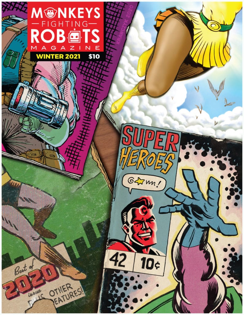
MFR: The Magazine #1 came out in July, and we are working hard on the second issue, which will be in your hands January 2021. As we prepare for the Kickstarter to publish the book (launching November 1st), Geoffrey Krawczyk sent over the cover for issue two, and I couldn’t be more excited about how it came out. Check it out below.
Our theme for issue two is SUPERHEROES, and Geoffrey knocked it out of the park once again (just like he did for our inaugural issue) by paying homage to some of superhero comics’ most iconic artists. (You probably should follow him on Instagram @thegeoffreyk.)
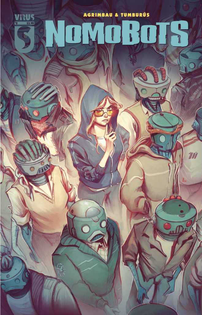
Nomobots is a series from Heavy Metal’s Virus imprint by writer Diego Agrimbau and artist Juan Manuel Tumburus. The first three issues have already been released on June 3, June 17, and August 26, respectively.
Summary
From the official Heavy Metal website:
This is the story of Nadia, one of the last humans in Sileo, a city where Nomobots (a particular kind of robot) rule and govern. She has escaped from a human farm and now she’s being persecuted by the Nomobot Police. Nomobots were created to avoid human extinction, they succeeded but there was a big cost: humans lost their freedom. Nomobots have a conscience, they love and hate, just like any human being, but their metal bodies don’t allow them to feel anything. There’s no pain or pleasure. Their complex minds need to feel. So some of them has mounted farms where human slaves, like Nadia, are submitted to every kind of stimulation, some pleasant, some degrading, some unbearable. These sensations are recorded and saved on capsules called Emopills, and later they are sold on Sileo’s street.
The Points of View of Nomobots
Agrimbau has each of the three issues of Nomobots follow the points-of-view of a different character. This allows the reader to view world through the robot characters instead of the protagonist Nadia. Because if they see it from her perspective, it’s just a typical post-robot uprising series like D4VE. Each issue begins quite literally in the heads of the focus character. This allows the robots to be more empathetic given how they can’t make facial features. The different perspectives show how much the culture around emopills and Nomobot immortality through backups effects the greater society.
Issue one focuses on Jimmy, who, after the psychedelic trip he has in the first pages, sets up the series and setting all at once. In it, the readers meet Nadia. As Nomobots can only act human, they need special pills to feel human sensations. Humans like Nadia need to enact these sensations so that they can be recorded on these “emopills.” Jimmy, after many uses of emopills, becomes attracted to Nadia. It’s hard not to feel bad for him when she hits him and another Nomobot with a monkey wrench in issue 2.
In issue 3, another Nomobot sees Nadia the way the audience might, a force of nature that could destroy Nomobots. Yet it’s not out of fear but reverence. Looking at this world where machines are addicts to sensations, it’s hard not to want it destroyed. But how do you fight something that’s so ingrained in the people’s culture? Especially when the culture has its own form of progressives and conservatives. That’s what undercover cop Rick has to deal with, which, given his abstinence towards the drugs, sets up the next issue nicely. I mean the guy dresses up as a stereotypical pimp because of his lack of understanding of the culture.
Art
Tumburus’ art is nothing if not moody. The minimalistic lines, inking, and muted colors of Nomobots sets up a fitting neo-noir atmosphere. Which is odd considering this series leans more into cyberpunk territory. But really who needs neon signs and constant rain showers when contrast is king? Most of the main characters wear red clothes or accessories. Given the dark colors decorating the pages, it’s a great way to keep attention on the characters. The more red that appears, the more visible or important they feel.
The lettering meanwhile is extremely efficient in how it goes in one smooth line of reading order. Other times it works with the aforementioned red coloring to show two perspectives. One on the person in red and the other party speaking to them. Wordmarks meanwhile can get so powerful they actually become a panel at one point.
Nomobots Are Off To A Great Start
Nomobots #1-3 is only the beginning on what can be one of the most original takes on cyberpunk. By going back to its neo-noir roots with its moodiness and multiple points of view, people see a brand new world to invest in. Because everybody wants to feel something new from unlikely places. Why not see how the presence of one young woman makes this drug addicted world can be so impactful?
In this week’s Strange Academy #3 from Marvel Comics, writer Skottie Young brings a down-to-earth feel to the surreal artwork of Humberto Ramos and colorist Edgar Delgado, all while VC’s Clayton Cowles gives the characters unique voices through lettering.
Strange Academy #3 Gets Freaky
Unlike previous issues which focused on establishing the school, Strange Academy #3 focuses on character. Skottie Young is no stranger to absurdist comedy (i.e. I Hate Fairyland) and drama (i.e. Middlewest). In this issue, he has the quirky class show off their individual personalities. Granted not all of them get a moment to shine, just the ones who take plot precedence. Emily mainly serves as the audience’s viewpoint into the world of magic during the opening lesson where she witnesses the strangeness through the Eye of Agamotto. Yet it’s in the student’s R&R period in New Orleans where a concentration of characters take notice. Doyle Dormmamu is surprisingly lax in how his views magic. Considering his heritage, nothing about it really surprises him unlike Emily who has fun with it.
That is until he encounters fortune teller who shows him a future that actually terrifies him, especially since some of the people in his vision appear near the end of the issue. Fortunately before all of the doom and gloom sets in, these students go out of their way to have each other’s backs. Which, while relieving, also sets up some anticipation for some of that coming dread.
How Art Is Magic
Humberto Ramos illustrates each character with designs that are as quirky as possible while using rotoscoped backgrounds. This makes the characters’ features highly expressive to react to the world around them. When Emily uses the Eye of Agamotto, colorist Edgar Delgado demonstrates Emily’s potential by looking at the other dimensional creatures in color while everything else save for the Ancient One is in grayscale. This ability to interact with a whole other world puts Emily in unfamiliar territory. One that’s she eager to find out about, but should be more careful given her interaction with one creature.
Clayton Cowles gives the cast of Strange Academy #3 unique voices. For example, the Asgardian twins Alvi and Iric sound like two different people despite having the same word balloons. Alvi tries to sound suave and haughty, yet Iric speaks more like a loud jock which is odd considering his height compared to Alvi. Doyle meanwhile has word balloons that look like diabolical smoke, but some of his interactions imply he’s just full of hot air. This all suggests why the dynamic between Alvi and Doyle is a little rocky: if Alvi already deals with one hot head, why deal with another one?
Have A Time With Strange Academy #3
Strange Academy #3 is one of those issues that are easy to get into without background knowledge. Like some of the more casual slice-of-life comics like the Peanuts or Garfield, sometimes just the outline is enough to get a good story. Maybe not a great one, but enough story that can cover different parts of the cast. Because beneath all of the humor and school hours is something ready to happen. And while magic open to interpretation is good, it’s going to require some decent attention to the details to get through it all.
The Olympia trade paperback collects all five issues of a passion project between Curt Pires and his father Tony Pires, with art from Alex Diotto and Jason Copland, and colors and lettering by Dee Cunniffe and Micah Meyers respectively.
The Epic of Olympia
Olympia at first glance looks like a knock-off of Jack Kirby tributes like Kirby: Genesis. However, it is actually an exploration on how comic books affect people, especially across generations. It all revolves around a fan, a comic creator, and a comic character, and tying each of them together is the need for a father figure. POV character Elon, for example, lost his father and finds solace in the comic series featuring Olympian. Olympian’s creator Kirby Spiegelman meanwhile feels lost and without direction, especially after the death of his own father figure. To an even lesser degree, even Olympian is trying to live up to his father’s expectations as ruler and protector of his home. This all likely comes from how Tony Pires himself was battling cancer as he and his son Curt worked on Olympia.
Yet this story is not about feeling helpless after many defeats and losses. It’s how the interaction between the three characters fills the role of a father figure and how it connects them to everyone they love. Elon in particular, despite being only 13, often acts like the most driven of the three. He takes charge of most of the situation while being fully aware of the absurdities surrounding him. Like when Elon despite being a fan still finds Olympian’s over-the-top personality a little odd. It is this mindset that gets Kirby on a path out of his depression and re-evaulate what he’s got to live for. As for Olympian himself, he’s arguably the least dynamic part of Olympia considering how passive he is about events. At most, it’s just his presence that drives everything forward.
The Dynamic Art
That presence however is where most of the passion takes place. On several pages, Alex Diotto promotes actions so simple yet energetic throughout Olympia they practically tell the story through atmosphere. Every subtle change increases the importance of the moments that take place. Most panels that practically repeat are displays of time and dramatic effects, like when Elon waits for Olympian to recover but ends up falling asleep and Olympian is off panel. Then there are the two-page spreads that highlight big dramatic moments, sometimes succeeding pages that anticipate them. The action scenes that follow after can get so wild that traditional panel layout distorts in reaction.
Jason Copland, who works on the art in issue #3, however foregoes all of that in favor of 9 and 3-panel grids for other dramatic effects. In that issue, readers see Kirby struggling to keep control of his life. When those 9-panel grids give way to a splash page, it’s a display of Kirby at his lowest as everything from before comes screeching into this moment. Following this are 3-panel grids where Kirby tries to make sense of everything in a dramatic question, only to be disappointed as he gets no expected answers. Then this sequence reverses as his prior plan takes a new turn.
Colors and Lettering In Simplicity
Dee Cunniffe’s coloring looks relatively simple, but it’s how it makes the above artists’ shorthand stand out in Olympia. Brighter colors help keep the reader’s gaze on events like Olympian’s bright costume and Elon’s clothes during a battle against monsters. The monster’s blue colors and the purple background following them make it easy to contrast against them. Yet the most effective of them all is how Cunniffe highlights the Kirby Krackle to show off the source of energies, blue for Olympian purple for the antagonists.
Micah Myers as letterer works between recycling shorthand and dedicated illustrated wordmarks. Most of those wordmarks are in the in-universe comic book, when those illustrated wordmarks do appear, it’s a sign of of the Olympian comic affecting the world around it. Otherwise it’s just the recycling use of some wordmarks that in the right place are very effective, like when Kirby has a gun to his head and banging is on display. It’s like knocking on the door stealing all of the power from the decision.
Remember Olympia
In this loving tribute to comics from the likes of Jack Kirby, Olympia reminds readers that, while some things end, the spirit behind them lasts forever. Because Tony certainly didn’t seem to want Curt to let his death deter him. If anything, this limited time is what convinced everyone to push out their best efforts — efforts so passionate, it’s difficult for readers not to feel it on the pages.
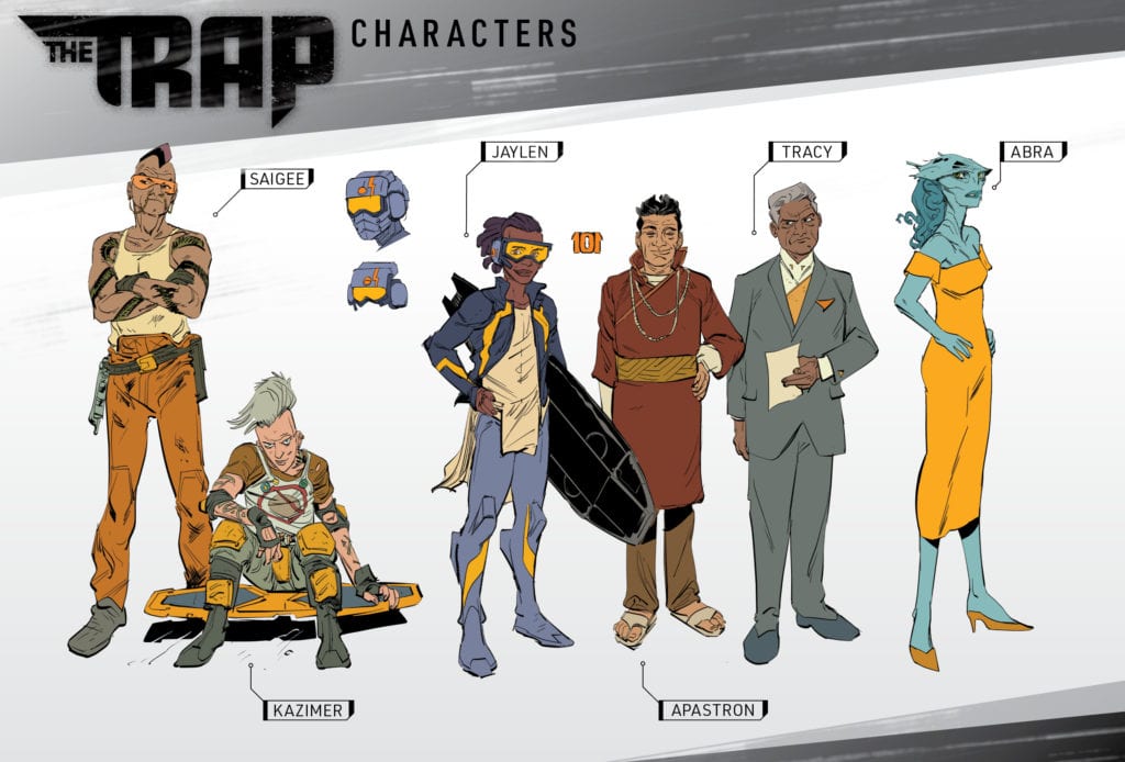
Monkeys Fighting Robots caught up with former Chicago Bears linebacker Lance Briggs and writer Kyle Higgins to chat about their new Kickstarter project The Trap, football compared to art, and the influence of the giant elephant in the room, the political climate of today.
The creative team on the 120-page sci-fi graphic novel includes Briggs, Higgins, artist and co-creator Danilo Beyruth, colorist by Tamra Bonvillain, lettering by Hassan Otsmane-Elhaou, and book design by Sasha Head.
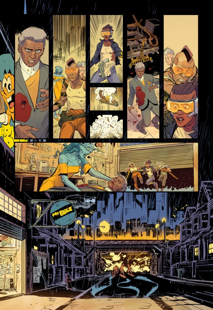
About the book: In THE TRAP, Jaylen Robinson is a rising sports star from a not-so-great part of the galaxy: Earth. He’s worked hard his whole life. Everyone’s saying that Jaylen is the Next Big Thing for the interstellar sport of the future: surfriding. The future is his. This is his chance. Until it’s not. You can support the project here: THE TRAP
LANCE:One hundred percent. It’s a story that’s incredibly personal to me, both because of my background as well as the issues we’re looking to discuss and shine a light on. And creating Jaylen, for me, is also a way to talk to so many kids that are living in less-than-ideal environments. Amongst systems that have failed their own. I see you, and I want you to know — you are special. Even if it doesn’t feel like it.
This book is also an opportunity for me to start doing something that I’ve always dreamed of — sharing my imagination with others. My imagination is what kept me going as a child, as an athlete, and now as an adult. Dreaming of what is possible, even if it seems impossible, is so incredibly important. And writing has been a great way for me to tap into that more and more.
Page 8-9
MFR: What was the world-building process like? Did you push the creative envelope and then reigned it back in, or was there a specific creative vision to expand from?
KYLE:Well, for me, world-building has to come from narrative intent. Meaning, I don’t world build just to world build — I world build for the sake of the story I’m trying to tell. So, THE TRAP started with figuring out the core idea of the series — that in the future, Earth has been annexed into an interstellar coalition of planets, but due to certain events over the generations, we’ve become both the red-headed stepchild of the coalition, as well as prime real estate for the interstellar drug trade. So what that does is it creates a situation and a status for our world where the problems of marginalized communities are the problems for all of us. Because we are all in “the trap” together.
From there, we were able to start really building and refining characters, as well as different aspects of this world to really strengthen the allegory.
LANCE:Right. What do sports of the future look like? What kind of escapism, entertainment, politics, business, etc. would exist?
KYLE:Lance came up with the idea for surfriding, which I love. It was a tricky thing to figure out — the sport of the future needed to be something that multiple species and races could compete in, since it was going to be Jaylen’s best chance of getting out of The Trap and potentially bettering his life off-world. A board based racing sport totally fit the bill.
Page 10
MFR: Kyle and Lance, talk about your emotional reaction the first time you saw Danilo Beyruth’s work on The Trap.
KYLE:Oh, man. I was so excited. I think, Lance, we both looked at the designs and went—
LANCE:“That’s Jaylen!”
KYLE:Exactly, yeah. Like he’d been there the whole time. Fully formed. Just waiting to be drawn.
LANCE:What made it even cooler was when Tamra started putting down colors for him.
KYLE:Yes. Absolutely. Tamra is one of the best in the business, and being able to work with both her and Danilo… we feel incredibly lucky.
MFR: Lance, how has working on the Football Aftershow helped you become a better storyteller?
LANCE:It’s taught me patience, more than anything — having to listen to Alex Brown’s false narratives and falsified facts with a straight face! (Laughs) It’s torture, but I fight through it!
Page 11
MFR: Lance, with playing football at the highest level, there are nerves, but you control your destiny with your play. With art, you put yourself out there emotionally. What are those nerves like?
LANCE:Well, I’m still figuring that part out. But I guess what I would say, is that in football… you’re talking about moments that last 8 to 12 seconds. And of course, you get nervous. Anyone who says they don’t, they’re lying. And if you actually don’t get nervous? Then I don’t think you care to be great. But, I knew that no matter how nervous I would get… I knew I was prepared. Compare that with writing and publishing stories? So far, I don’t know that they’re even comparable. Kyle and I have a process built on trust and respect, so it’s very low risk and low pressure — we talk through everything. If I were doing it solo, I’m sure it would be different.
MFR: Kyle and Lance, the past four years, have been a political dumpster fire of division. How has the current state of the world influenced The Trap?
KYLE:I think the better question is… how has it not? The issues we’re dealing with are not new. But over the last four years, I don’t know how you could argue that they’ve gotten any better.
LANCE:They haven’t. We’re looking to talk about some of them here, through science fiction and storytelling. Hopefully, to show people the issues in a new, hopeful objective — but also relatable — way.
KYLE:If anything, the last four years have really opened my eyes to just how deep the wounds in our country are. And how many of them are not anywhere close to being closed or healed.
MFR: Lance and Kyle, thank you again for your time and best of luck with The Trap!
Have you backed The Trap? What are your Kickstarter buying habits like during the pandemic? Comment below with your thoughts.
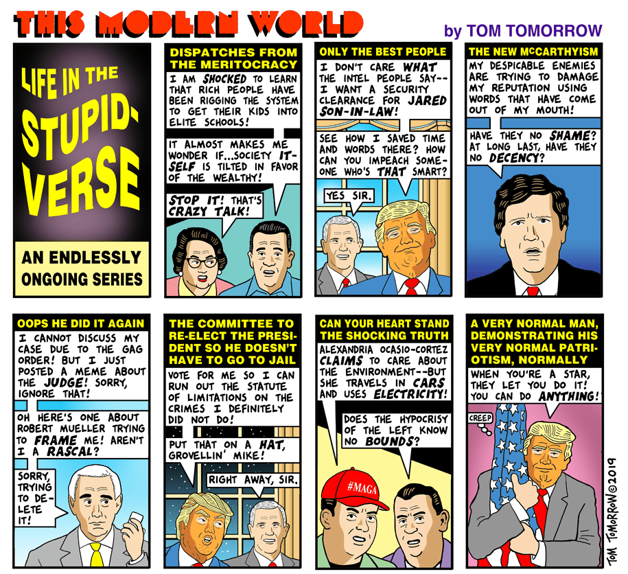
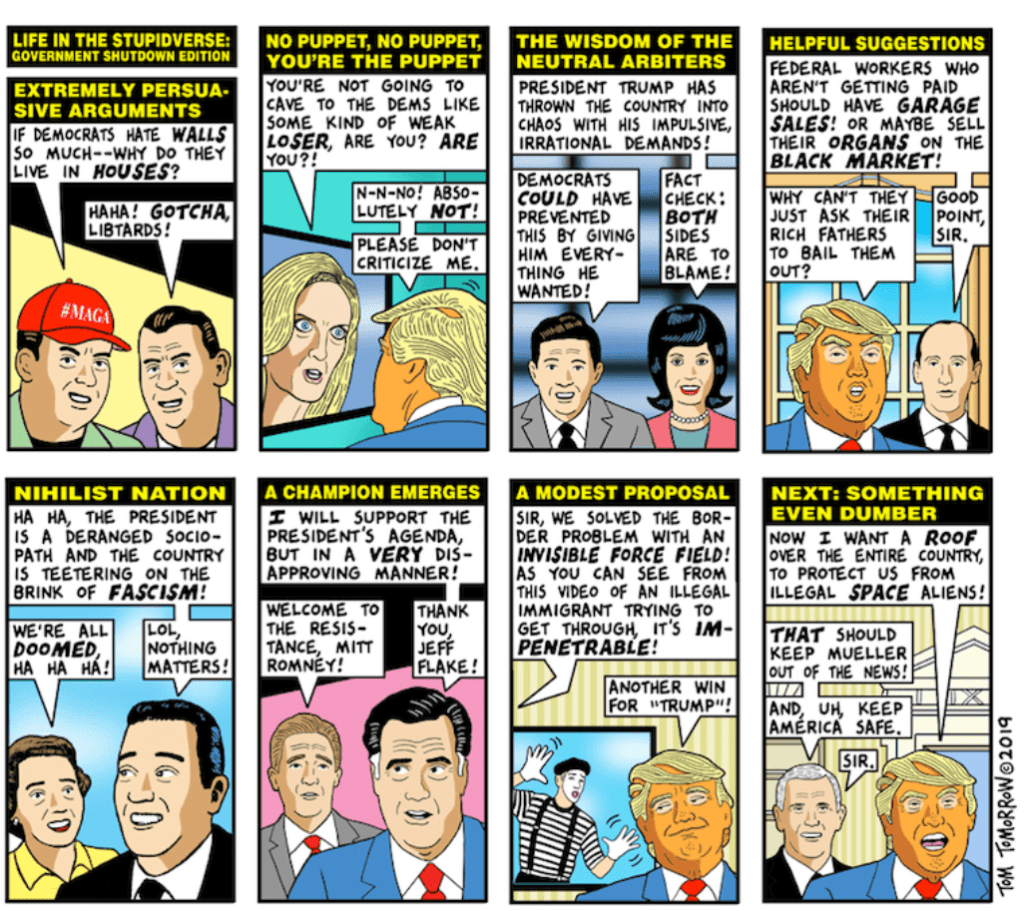
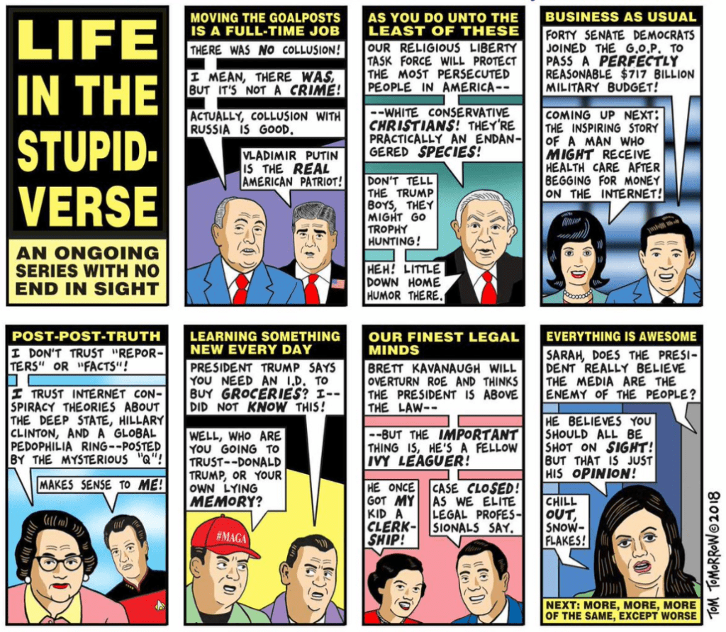
Life in the Stupidverse, out now from IDW Publishing, is a wonderful collection of satire highlighting Donald Trump’s flawed presidency that is certain to give you a chuckle.
Welcome to the Stupidverse! Although I’m not sure, I need to say “welcome.” Many of us have been living in the Stupidverse these past four years. In this collection, the Pulitzer-nominated cartoons of Tom Tomorrow poke fun at the presidency of Donald J. Trump in a diverse variety of entertaining ways. The collection is filled with so many different strips with so many references that you will have to take time to remember all the political chaos that has happened during the current administration.
The writing in the book is phenomenal. Life in the Stupidverse is filled with so many well-executed points and hilarious satire, and that all goes without mentioning just how much content is in the book. Each page has a point to be made. The points may overlap, but the way that Tomorrow makes his points through heavy satire is always entertaining. He also creates satire through many fun ways, such as comparing Trump to a baby, saying this world must be a simulation because of how crazy it is, or by making charts that illustrate circular reasoning.
The pencils and inks of Life in the Stupidverse go well to serve the purpose of his cartoons, and Tomorrow does a good job of varying what is on the page so that his cartoons are still visually interesting. Tomorrow is never afraid to go too crazy with the ideas for his jokes, so each page is its own spectacle of what Tomorrow has used to illustrate his point. There are several strips where the same faces are used repeatedly, which can create a bland feeling, but that is his point. The main focus in nearly all political cartoons is the writing, and Tomorrow certainly delivers on that.
The colors in Life in the Stupidverse are incredibly simple and make the comic strip come to life much more than if it were in black and white. There isn’t anything about the coloring that will necessarily leave you in awe, but it does nothing but add to the writing, which is the most important aspect.
Life in the Stupidverse features lots of interesting uses of lettering, and it greatly adds to the satire of Tomorrow’s work. Whether it be a bold font to establish what a scene is, a calligraphic font to parody Valentine’s Day cards or a wavy font to title a strip, Tomorrow makes fantastic use of lettering to add fun to his political cartoons.
Reading Life in the Stupidverse is a fun, but also slightly painful experience. Tom Tomorrow’s work is brilliant and incredibly funny, but each strip discussing moments of Trump’s presidency feels like reliving trauma. The collection is definitely well worth the read, and well worth the money for that matter. If you are a staunch Republican that loves every word that comes out of Trump’s mouth, you probably won’t enjoy Tomorrow’s satire, but nearly everyone else is sure to enjoy this collection and get a good laugh out of this country’s most recent administration.
Killadelphia #8, out this week, is another fun and gripping issue, full of fearsome vampires, entertaining violence, and a look into the world of Killadelphia‘s afterlife.
About the Book:
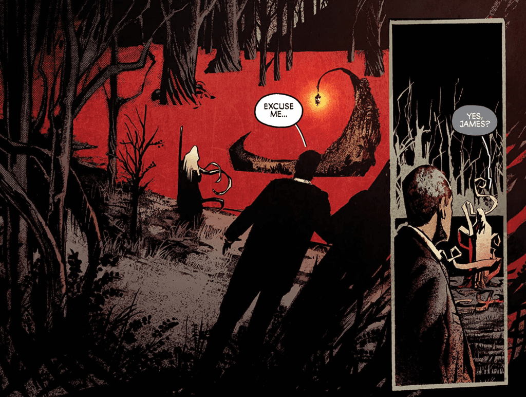
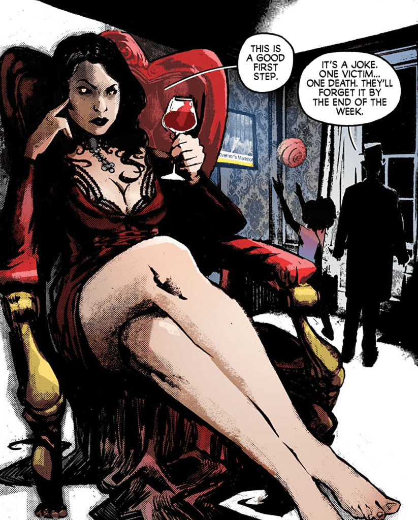
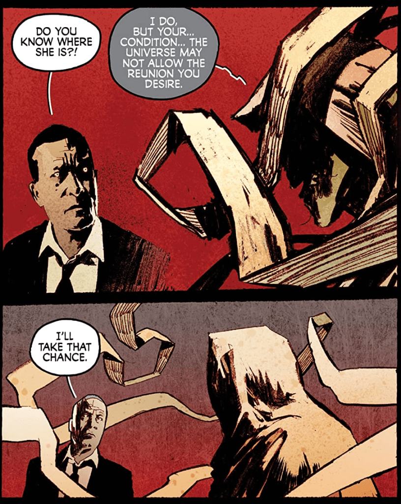
After John Adams was defeated, his wife, Abigail Adams, has taken over leading the vampires. They have already murdered the mayor to alert Philadelphia that they are still around, and now are setting their sights on a bigger target. Jimmy Sangster is dealing with the problem without the help of his undead father, who is exploring the afterlife in search of his deceased wife. All these plotlines come together to make Killadelphia #8 a captivating issue.
Killadelphia #8 Story
The writing of Rodney Barnes in this issue excels at making you want to keep reading. We have the characters we have grown to love facing a new threat lurking somewhere in Philadelphia. The story is always captivating, and the tone of the story being a mix between a police mystery and a horror tale, makes it such a fun read for fans of either genre. The version of the afterlife shown in this issue is another thing that stands out. It seems to take inspiration from the underworld in Greek mythology, but the way the undead fits into the picture and its aesthetics are completely new, and it is an absolute pleasure to see this new take.
A very interesting part of Killadelphia #8’s story is how Barnes can balance three narratives, all happening at once. In this issue, we have scenes of Abigail Adams as she speaks to other vampires, Jimmy Sangster dealing with a disemboweled mayor, and James Sangster Sr. as he navigates the afterlife. These scenes are very nicely interspersed, and there is never a time when it feels one scene is being focused on too much or not enough.
Art
I have nothing but praise for Jason Shawn Alexander’s work on this issue. Every face looks nearly photographic, and his vampires always look cool and frightening. Killadelphia #8 is yet another beautiful showcase of Alexander’s talent. The art in this issue does nothing but make me want to pick up the next, and I have a strong belief that other readers will feel the same.
The colors of Luis NCT fit with Alexander’s line art incredibly well, and his little use of vibrant colors in Killadelphia #8 makes it more impactful when colors do appear. The dark scenes of the issue make it so that when blood is spilled, it pops out on the page; and effortlessly allows scenes full of bright colors to have an ethereal tone.
Marshall Dillon does a great job of having the lettering go along with the art. The color choice of pink for the backgrounds of captions pairs nicely with the red and black color scheme that comprises much of Killadelphia #8. Speech bubbles are very simple and get the point across, and the inverted color scheme of speech bubbles for characters is a good choice to demonstrate that they are otherworldly.
Conclusion
Killadelphia #8 continues the amazing story of the series. The series is so fun, dark, and violent that it’s extremely difficult to put down an issue once you have picked it up. Barnes does fantastic work as he continues to keep the story thrilling, and Alexander, NCT, and Dillon are there to back him every step of the way. Each person plays a vital role in helping Killadelphia become the stunning series it is now, and I can not wait to see where it will lead.
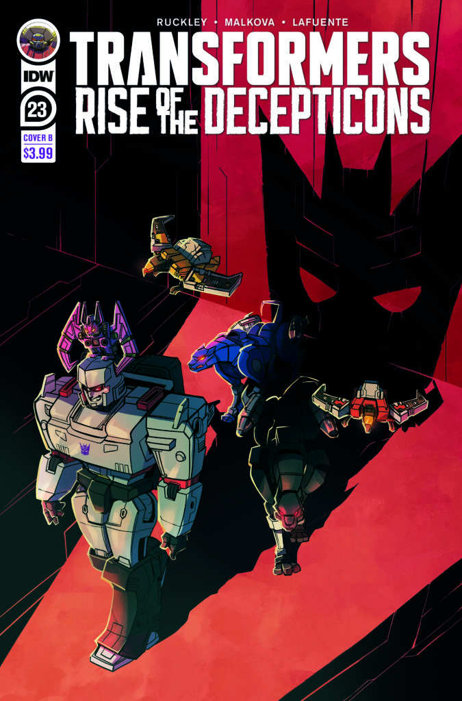
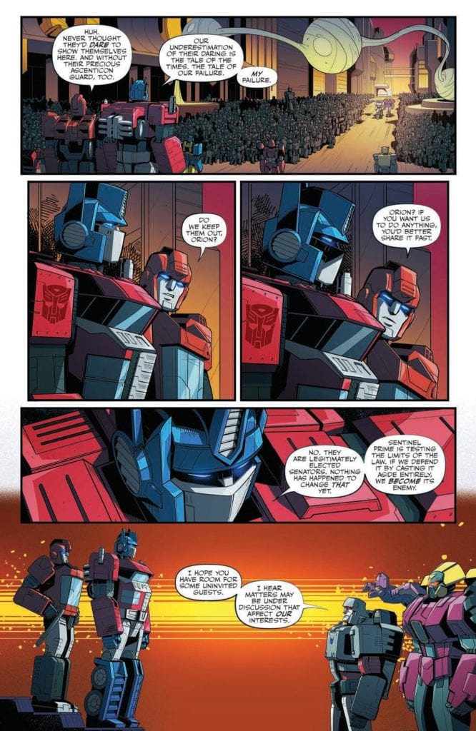
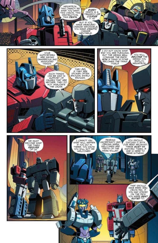
Transformers #23 out this week from IDW Publishing brings the series to a familiar location. The start of the civil war between the Autobots and Decepticons has arrived. The issue is made possible thanks to Brian Ruckely (writer), Anna Malkova (pencils/inks), Joana LaFuente (colors), and Jake M. Wood (lettering).
Cybertron has suffered. The world is in chaos. The situation on the ground truly is a crisis. Sentinel Prime, head senator and leader of the Autobots, will denounce the Ascenticons, the Rise, and anyone he thinks is an enemy of Cybertron’s security.
Writing
This issue arrives at the point everyone knew was coming. From the rumors, whispers, and obvious sub-plots (and the plot of the original cartoon in the 80s), what everyone saw coming has arrived. Megatron addresses the senate and delivers his true intentions. From there, things go downhill for the Autobots.
Though it took a while (and at times felt like it was taking too long) Brian Ruckley, has finally finished the introduction. Moving forward the book will focus on the war between the Autobots and Decepticons. It’s a welcome sight and one can only hope the story will keep moving forward to ensure momentum isn’t lost. The characters don’t need long pontifications anymore about the building civil unrest and the eventual downfall of the society.
Artwork
This issue has some intense moments but strangely not during the battle scenes. Anna Malkova’s art features some very emotional facial expressions, especially by Megatron as he passionately delivers his speech to the senate. Still, compared to the jaw-dropping brutality seen in the previous issue, the combat is tame in comparison.
The color by Joana LaFuente enhances the emotional scenes as they occur throughout the issue. One of the best examples is shown when Megatron is shown entering the door to the Senate. The glow around him makes it feel like a spotlight is a character entering a stage and letting the audience know they have arrived with a purpose.
The lettering work by Jake M. Wood allows the speech to flow very smoothly, which is ideal for this type of event. When a character arrives and delivers a speech intent on laying out their plan to both audiences (the one in the comic and the one reading it), proper sequencing of speech is highly beneficial. Here, Wood’s work makes it feel like the audience is there on the Senate floor as Megatron reveals his dark secrets to the world.
Conclusion
Transformers #23 finally kicks things into high gear. After taking a while, the series has reached the start of the war between the Autobots and Decepticons. From here, action SHOULD be the main focus of the series. The key point in the previous sentence is the word SHOULD.
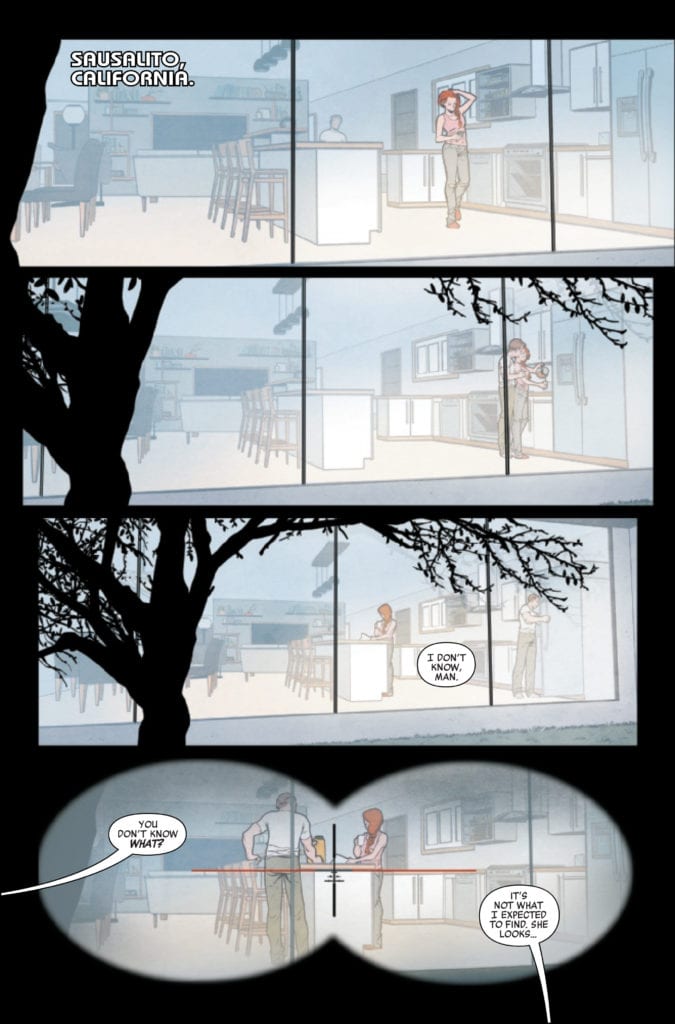
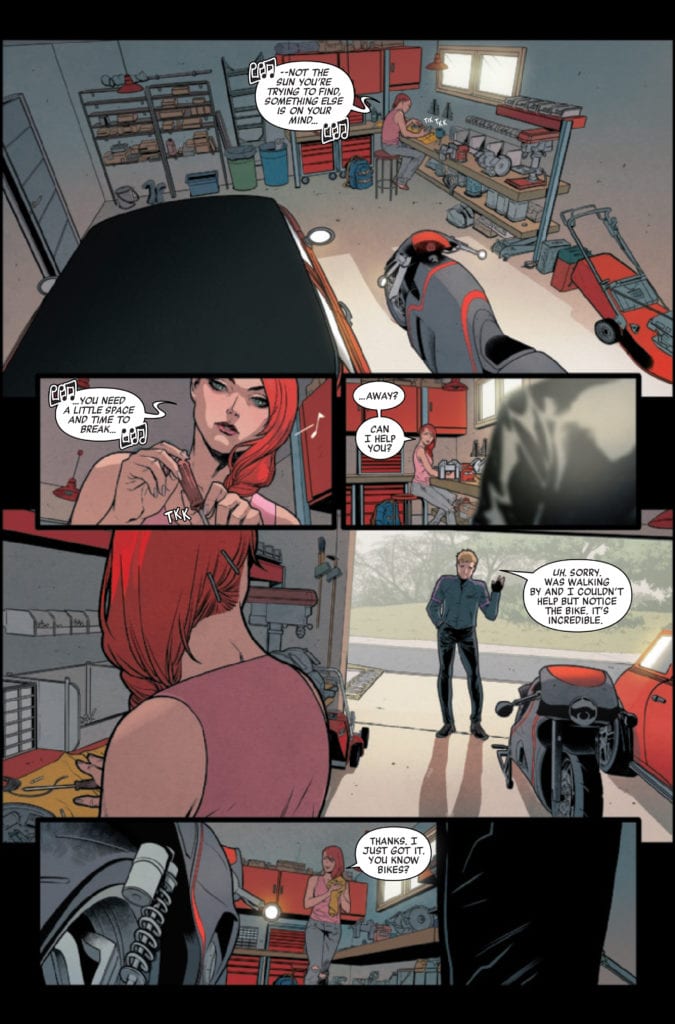
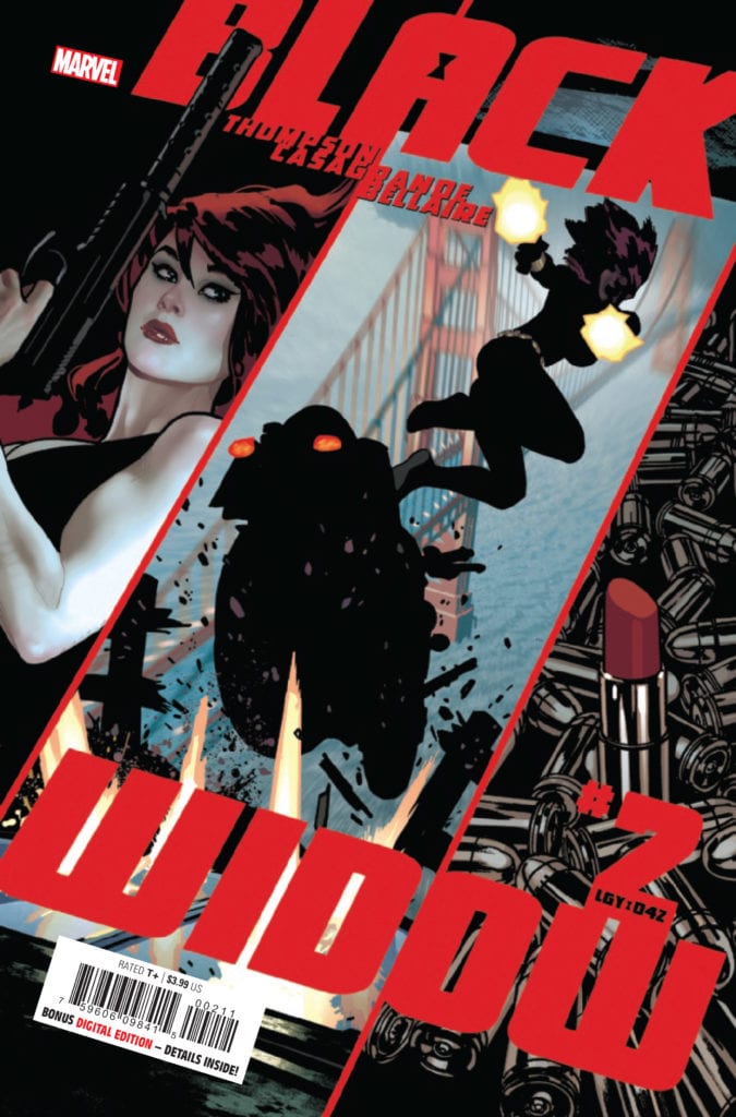
BLACK WIDOW #2 hits your local comic book store October 7th, but thanks to Marvel Comics, Monkeys Fighting Robots has an exclusive four-page preview for you.
About the issue: WIDOW NO MORE? Something is very wrong with Natasha Romanoff: she’s – happy?! Retirement definitely agrees with the world’s deadliest woman as she revels in the perfect life she never even dreamed she could have. But scratch the surface of that perfect life and you’ll find something very wrong – and a woman like Nat just can’t help but scratch.
BLACK WIDOW #2 is by writer Kelly Thompson and artist Elena Casagrande, with colors by Jordie Bellaire, and letters by Cory Petit. The main cover is by Adam Hughes.
MFR critic Cat Wyatt on the first issue of the series:
“BLACK WIDOW #1 is full of creative writing, character development, surprising twists, and absolutely perfect artwork. Altogether, it does the character (and her fans) justice.”
Marvel’s BLACK WIDOW movie is currently scheduled for May 7, 2021 after being delayed twice due to the COVID-19 pandemic. It was originally scheduled for May 2020.
Check out the BLACK WIDOW #2 preview below:
Are you reading BLACK WIDOW? Sound off in the comments!
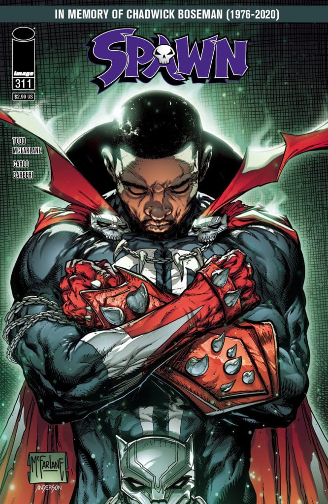
In honor of Chadwick Boseman’s passing, Todd McFarlane has created a touching cover for Image Comics’ SPAWN #311, available on October 28th. The cover features Boseman giving the Wakandan salute while wearing Spawn’s classic costume.
Says McFarlane about the inspiration for the cover: “We should all admire the traits Chadwick shared with us. And the inspiration he gave to millions of children around the globe who got to see a strong, meaningful and proud hero that looked like themselves.”
You can check out the full size cover and read the full Image press release below.
Will you be adding this issue to your collection? Let us know what you think in the Comments section, and please share this post on social media using the links below.
TODD MCFARLANE PAYS TRIBUTE TO CHADWICK BOSEMAN IN UPCOMING SPAWN COVER
PORTLAND, Ore. 09/30/2020 — Image Comics President and SPAWN creator, Todd McFarlane, will pay tribute to Chadwick Boseman in the upcoming SPAWN #311 with a cover in memory of the late actor who brought to life Marvel’s Black Panther character in the Avengers films.
“Given the limited amount of minority characters in the comic industry today that are considered major Superheroes, I thought it appropriate for one of those well-known heroes (Spawn) to pay tribute to a man who made a lasting impact on helping shape such a strong superhero of color,” said McFarlane. “Chadwick Boseman is a person who honed his skills and then made a career using them. Then he fought a fight against his own body that showed the true spirit of this man. We should all admire the traits Chadwick shared with us. And the inspiration he gave to millions of children around the globe who got to see a strong, meaningful and proud hero that looked like themselves.”
SPAWN #311 Cover B by McFarlane (Diamond Code AUG200369) will be available at comic book shops on Wednesday, October 28.


 Agrimbau has each of the three issues of Nomobots follow the points-of-view of a different character. This allows the reader to view world through the robot characters instead of the protagonist Nadia. Because if they see it from her perspective, it’s just a typical post-robot uprising series like D4VE. Each issue begins quite literally in the heads of the focus character. This allows the robots to be more empathetic given how they can’t make facial features. The different perspectives show how much the culture around emopills and Nomobot immortality through backups effects the greater society.
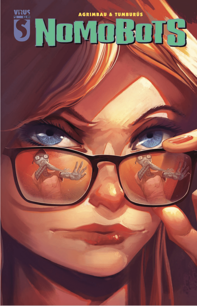 Tumburus’ art is nothing if not moody. The minimalistic lines, inking, and muted colors of Nomobots sets up a fitting neo-noir atmosphere. Which is odd considering this series leans more into cyberpunk territory. But really who needs neon signs and constant rain showers when contrast is king? Most of the main characters wear red clothes or accessories. Given the dark colors decorating the pages, it’s a great way to keep attention on the characters. The more red that appears, the more visible or important they feel.


")